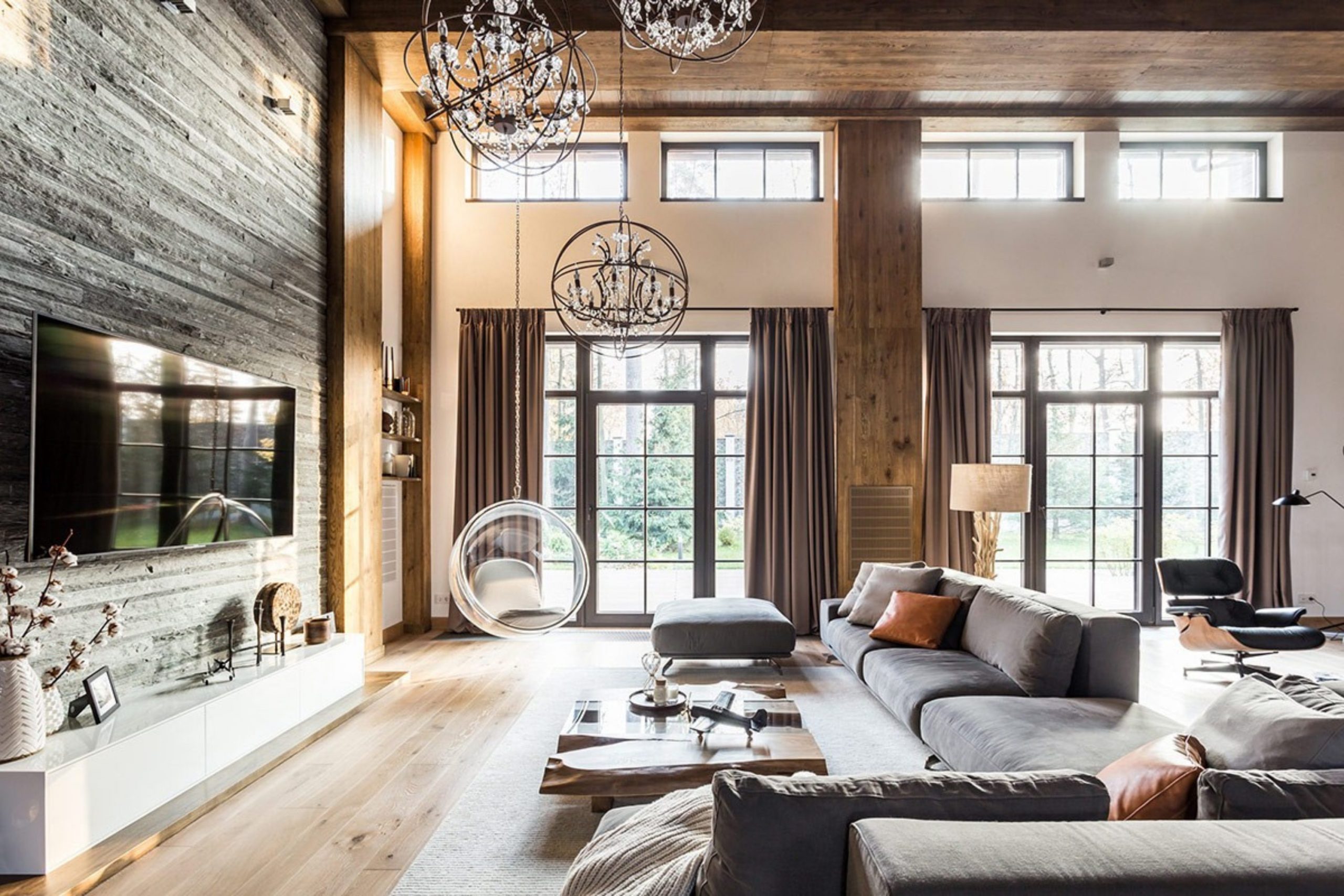
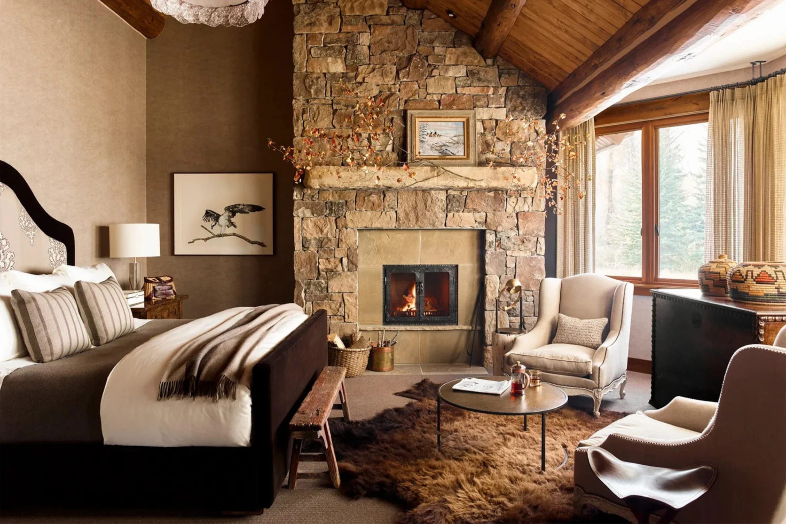
Rustic living is fundamentally about more than just an aesthetic; it is about feeling grounded and deeply connected to the natural world that surrounds us. In our fast-paced, digital age, creating a space that feels tethered to the earth provides a necessary sense of peace and stability.
I have spent years as a dedicated partner to families, helping them navigate the journey of turning hollow houses into true homes—spaces that feel structurally sturdy, emotionally resonant, and genuinely welcoming from the very first step inside.
Choosing the right paint is not merely a cosmetic update; it is the vital first step in breathing a unique soul into a building. The walls are the canvas of your life, and you want colors that evoke the quiet strength of ancient timber, the cool serenity of weathered river stones, and the rich, nurturing warmth of the earth under your feet.
This guide is specifically designed to help you navigate those nuances, selecting shades that transform every room into the architectural equivalent of a warm hug.
Why I Always Trust Sherwin-Williams and Benjamin Moore for the Best Rustic Paint Colors
In my professional experience, I have come to rely almost exclusively on these two industry leaders because their commitment to pigment quality is unparalleled. The science behind their paint is superior; their pigments are exceptionally rich and formulated to stay “true” to the swatch long after the brushes are washed and the walls have fully cured. When you are aiming for an authentic rustic look, the depth of the color is everything. You need a finish that feels organic and multidimensional, completely avoiding the flat, artificial, or “uncanny” look of cheap, plastic-looking synthetic coatings.
Sherwin-Williams offers an incredible range of warm, sophisticated neutrals that act as a perfect partner for reclaimed wood and industrial accents, highlighting the natural imperfections of the grain rather than hiding them.
On the other hand, Benjamin Moore provides specialized historical collections that feel deeply authentic to heritage homes, mountain cabins, and lakeside retreats alike.
These paints are high-performance tools that provide excellent coverage with fewer coats and possess the durability to withstand the daily wear and tear of a busy, active household—from muddy paws to growing children.
How I Choose the Perfect Rustic Shade for Any Home Interior
Selecting the ideal shade for a rustic interior requires a delicate balance between observing the natural light and understanding the specific architecture of a room. I begin by looking for colors that possess a “muddy” or complex undertone—shades that have a hint of gray, brown, or umber mixed in.
This complexity is what makes a paint feel like it was harvested from the forest floor rather than mixed in a factory. A pure, bright color can often feel too modern or jarring, whereas a muted, complex tone settles into the room, making the walls feel like they have always been there.
I also pay close attention to the “LRV” (Light Reflectance Value) of a color to ensure it won’t wash out under bright noon sun or turn into a dark cave during the evening. I test every sample against the most prominent textures in the room, such as a stone fireplace or a heavy oak mantle, to ensure the undertones are singing in harmony. You want a shade that feels lush and significant, yet stays quiet enough to let your personal treasures and architectural details stand out.
It is a masterful balance between being brave enough to choose a color with character and keeping the overall atmosphere cozy and cohesive.
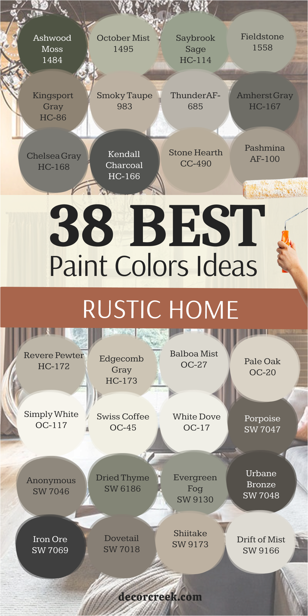
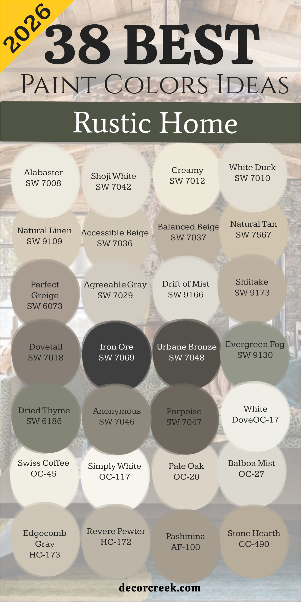
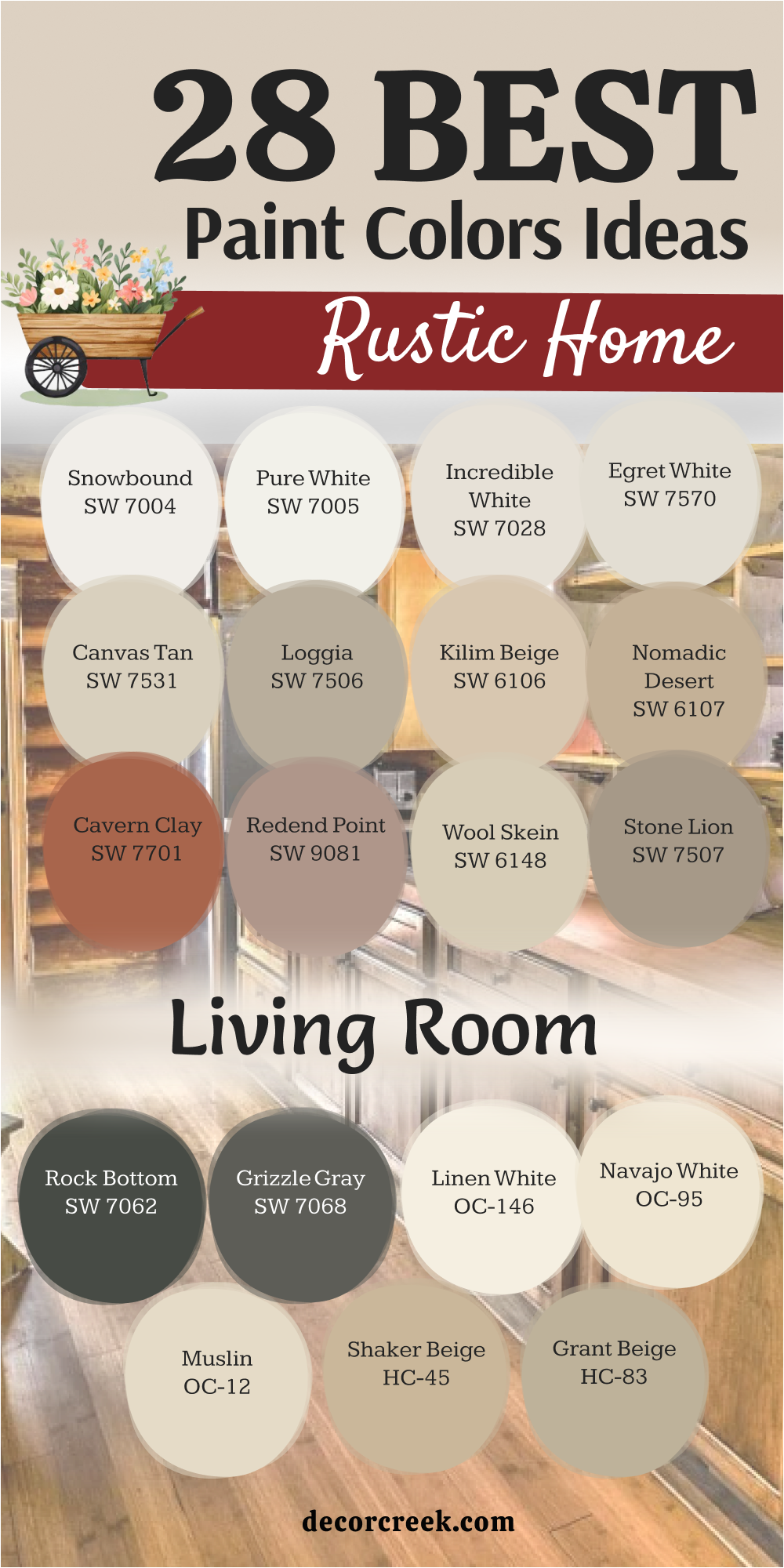
38 Rustic Home Paint Color Ideas In 2026
Alabaster SW 7008
Alabaster SW 7008 is a creamy white that feels like a soft wool blanket on a cold morning. This color avoids looking too stark or cold because it has a hidden warmth. Many people choose it for big open areas where they want a lot of brightness.
It works beautifully with dark wood floors and metal light fixtures. The paint looks fresh but still feels like it has been part of the house for a long time. I like how it picks up the glow of sunshine coming through a window.
It is the kind of white that makes people feel relaxed as soon as they walk in. This shade handles shadows well without turning gray or muddy. You can use it on walls or trim to create a consistent look. It is truly a staple for anyone who loves a farmhouse feel.
Best used in: living rooms, kitchens, hallways, bedrooms, and farmhouse exteriors
Pairs well with: Iron Ore SW 7069, Agreeable Gray SW 7029, Natural Linen SW 9109, warm wood tones The key rule of this color for farmhouse style is to use it where you want natural light to feel kind, soft, and inviting throughout the day.
🎨 Check out the complete guide to this color right HERE 👈

Shoji White SW 7042
Shoji White SW 7042 acts like a bridge between a crisp white and a warm beige. This color is great for homes that have a lot of different wood types inside. It feels very organic and reminds me of handmade paper or light sand.
The warmth in this paint keeps a room from feeling empty or lonely. I often use it in bedrooms where people want to feel safe and tucked in. It looks amazing next to stone fireplaces because it pulls out the lighter flecks in the rock.
The shade is light enough to keep a small room feeling big. It does not compete with your decor but instead supports it quietly. People love how it changes slightly as the sun moves across the sky. It provides a clean look that still feels very much like a part of nature.
Best used in: bedrooms, open floor plans, entryways, and cozy dens
Pairs well with: Urbane Bronze SW 7048, Fawn Brindle SW 7615, Perle Noir SW 9154, light oak furniture The key rule of this color for farmhouse style is to use it where you want natural light to feel kind, soft, and inviting throughout the day.
🎨 Check out the complete guide to this color right HERE 👈

Creamy SW 7012
Creamy SW 7012 delivers exactly what the name says by providing a rich and buttery feel. This color is perfect for kitchens where you want the heart of the home to feel glowing. It has a yellow undertone that is very light and does not feel too bright.
I find that it makes old furniture look like it belongs in a high-end magazine. The paint creates a soft background that makes black hardware pop. It is a very friendly color that welcomes guests with a smile.
You will notice that it hides small marks better than a pure white would. It brings a sense of history to a newer house by adding instant character. Choosing this shade means you want your home to feel sunny even on a cloudy day. It is a classic choice for anyone who loves traditional rustic vibes.
Best used in: kitchens, dining rooms, laundry rooms, and trim work
Pairs well with: Studio Mauve SW 0062, Foothills SW 7514, Pointleaf SW 6161, antique brass The key rule of this color for farmhouse style is to use it where you want natural light to feel kind, soft, and inviting throughout the day.
🎨 Check out the complete guide to this color right HERE 👈

White Duck SW 7010
White Duck SW 7010 is a sophisticated neutral that sits right on the edge of being a gray. This color is very popular for modern cabins that need a bit of a cool touch. It looks very clean but still has enough body to stand up to bright lights.
I like using it in hallways because it makes the transitions between rooms feel smooth. The paint has a way of looking very expensive without trying too hard. It looks wonderful with linen curtains and woven rugs.
You will see that it pairs nicely with both cool blues and warm browns. It is a versatile choice for people who cannot decide between gray and beige. This shade feels very balanced and keeps a home looking organized. It provides a peaceful backdrop for a busy life.
Best used in: hallways, home offices, bathrooms, and exterior siding
Pairs well with: Charcoal Blue SW 2739, Requisite Gray SW 7027, Black Magic SW 6991, navy accents The key rule of this color for farmhouse style is to use it where you want natural light to feel kind, soft, and inviting throughout the day.
🎨 Check out the complete guide to this color right HERE 👈
Natural Linen SW 9109
Natural Linen SW 9109 brings the look of raw fabric right onto your walls. This color is deep enough to show a real contrast against white trim. It feels very earthy and solid which is perfect for a rustic theme.
I suggest this color for living rooms where families spend a lot of time playing games. It does not show dirt easily and makes the room feel very sturdy. The paint has a warmth that reminds me of sun-dried hay or wheat fields.
It looks great with leather sofas and heavy wooden coffee tables. You can feel the weight of the color in a way that makes the house feel well-built. It is a grounded choice for someone who wants a home that feels like a sanctuary. This shade stays consistent in different lighting situations.
Best used in: living rooms, mudrooms, sunrooms, and large basements
Pairs well with: Alabaster SW 7008, Naval SW 6244, Bronze Beauty SW 9501, dark walnut stains The key rule of this color for farmhouse style is to use it where you want natural light to feel kind, soft, and inviting throughout the day.
🎨 Check out the complete guide to this color right HERE 👈

Accessible Beige SW 7036
Accessible Beige SW 7036 is one of the most famous colors for a good reason. This color has a bit of gray in it which stops it from looking like old-fashioned tan. It is a very safe choice for any room in a rustic house.
I often use it for staging because it makes everyone feel comfortable. The paint works with almost any floor color you can imagine. It provides a steady background that lets your colorful pillows or rugs take center stage.
You will find that it makes a room feel finished and polished. It is a hardworking color that looks good even in rooms with small windows. The shade feels modern but still fits perfectly with an old-fashioned porch. It is a reliable friend for any interior designer.
Best used in: entire house interiors, rental properties, kitchens, and foyers
Pairs well with: Sea Salt SW 6204, Urban Bronze SW 7048, Cadet SW 9143, white cabinetry The key rule of this color for farmhouse style is to use it where you want natural light to feel kind, soft, and inviting throughout the day.
🎨 Check out the complete guide to this color right HERE 👈

Balanced Beige SW 7037
Balanced Beige SW 7037 is a step darker than many other neutrals and offers more punch. This color is great for making a large room feel more intimate and close. It has a rich quality that feels very high-end and custom.
I like to use it in dining rooms where people sit down for long Sunday dinners. The paint looks fantastic when paired with thick white crown molding. It creates a sense of drama without being too dark or scary.
You will notice that it brings out the richness in cherry or oak furniture. It is a very solid color that makes a house feel like a fortress. This shade is perfect for creating a cozy corner for reading a book. It feels very stable and helps a home feel grounded.
Best used in: dining rooms, master suites, libraries, and accent walls
Pairs well with: Virtual Taupe SW 7039, Dover White SW 6385, Smoky Blue SW 7604, stone accents The key rule of this color for farmhouse style is to use it where you want natural light to feel kind, soft, and inviting throughout the day.
🎨 Check out the complete guide to this color right HERE 👈

Natural Tan SW 7567
Natural Tan SW 7567 is a light and airy color that reminds me of a sandy beach. This color is perfect for a coastal rustic look that feels breezy. It has no harsh yellow or pink tones which makes it very easy to live with.
I recommend it for guest rooms where you want people to feel at peace. The paint reflects light in a very soft way that is easy on the eyes. It looks lovely with wicker furniture and light blue accents.
You will feel like you are on vacation when you walk into a room painted this color. It is a very humble shade that does not shout for attention. The color helps a room feel open and full of fresh air. It is a great choice for a simple and clean life.
Best used in: guest bedrooms, bathrooms, sun porches, and breakfast nooks
Pairs well with: Rainwashed SW 6211, Pure White SW 7005, Foothills SW 7514, driftwood The key rule of this color for farmhouse style is to use it where you want natural light to feel kind, soft, and inviting throughout the day.
🎨 Check out the complete guide to this color right HERE 👈
Perfect Greige SW 6073
Perfect Greige SW 6073 hits the sweet spot between a warm brown and a cool gray. This color is wonderful for homes that have a mix of metal and wood. It feels very sophisticated and current but stays true to rustic roots.
I use it when a homeowner wants a room to feel updated but still very cozy. The paint has enough depth to make white furniture really stand out. It hides dust and fingerprints very well in high-traffic areas.
You will love how it looks with soft gray carpets or stone tile. It is a very smart color that works in both modern and traditional settings. This shade makes a home feel like a well-designed retreat. It is a strong choice for a main living area.
Best used in: family rooms, hallways, mudrooms, and bedroom walls
Pairs well with: Shoji White SW 7042, Mega Greige SW 7031, Inkwell SW 6992, iron hardware The key rule of this color for farmhouse style is to use it where you want natural light to feel kind, soft, and inviting throughout the day.
🎨 Check out the complete guide to this color right HERE 👈
Agreeable Gray SW 7029
Agreeable Gray SW 7029 is known for fitting into almost any home perfectly. This color is a very light gray that still feels warm because of its beige roots. It is my favorite for making a dark house feel much brighter.
The paint doesn’t look blue or purple like some other grays can. I find that it makes small rooms feel like they have more breathing room. It works well with light wood floors and white shiplap walls.
You will find that your existing furniture looks better against this backdrop. It is a very polite color that gets along with everyone. The shade is perfect for a fresh start in a new home. It makes the whole house feel connected and tidy.
Best used in: living rooms, kitchens, entries, and open concept spaces
Pairs well with: Extra White SW 7006, Brainstorm Bronze SW 7033, Coral Reef SW 6606, light pine The key rule of this color for farmhouse style is to use it where you want natural light to feel kind, soft, and inviting throughout the day.
🎨 Check out the complete guide to this color right HERE 👈

Drift of Mist SW 9166
Drift of Mist SW 9166 is a very light and airy gray that feels like a foggy morning in the mountains. This color works well for homeowners who want a clean look that is not a stark white. It has a soft quality that makes walls look like they are glowing from within.
I often pick this shade for entryways to make the house feel open as soon as you step inside. The paint helps small areas feel much larger than they really are. It pairs beautifully with light-colored woods and silver metal fixtures.
You will notice that it stays looking fresh even in rooms that do not get a lot of sun. It is a very polite color that stays in the background. This shade is perfect for a modern rustic home that needs a touch of light.
Best used in: entryways, small bathrooms, bedrooms, and ceilings
Pairs well with: Urban Bronze SW 7048, Pewter Green SW 6208, Pure White SW 7005, light oak The key rule of this color for farmhouse style is to use it where you want natural light to feel kind, soft, and inviting throughout the day.
🎨 Check out the complete guide to this color right HERE 👈

Shiitake SW 9173
Shiitake SW 9173 is a medium-toned neutral that reminds me of the stones you find in a creek. This color is warm and stony which makes it feel very natural and grounded. I love using this in a kitchen with white cabinets to create a nice contrast.
The paint has a richness that makes a room feel very expensive and custom. It works perfectly with natural textures like jute rugs and linen pillows. You will find that it makes a space feel solid and very well-built.
It does not feel too dark but it definitely has a presence on the wall. The shade handles bright light very well without washing out. It is a great choice for anyone who wants a home that feels like a quiet retreat. This color brings a sense of the outdoors right into your living room.
Best used in: kitchens, dining rooms, master bedrooms, and exterior accents
Pairs well with: Alabaster SW 7008, Greek Villa SW 7551, Iron Ore SW 7069, stone tile The key rule of this color for farmhouse style is to use it where you want natural light to feel kind, soft, and inviting throughout the day.
🎨 Check out the complete guide to this color right HERE 👈

Dovetail SW 7018
Dovetail SW 7018 is a deep gray that has a lot of warmth hidden inside of it. This color is perfect for creating a cozy feeling in a large den or basement. It reminds me of old weathered wood on a barn door. I like to use it on accent walls to give a room some weight and depth.
The paint looks amazing when you put it next to bright white trim and doors. It provides a very masculine and sturdy feel to a home. You will see that it makes colorful art or photos really stand out against the dark background.
It is a very sophisticated choice for a modern rustic look. This shade makes you want to curl up with a blanket and watch a movie. It is a very reliable color for adding character to a plain room.
Best used in: family rooms, offices, media rooms, and kitchen islands
Pairs well with: Repose Gray SW 7015, Eider White SW 7014, Black Magic SW 6991, reclaimed wood The key rule of this color for farmhouse style is to use it where you want natural light to feel kind, soft, and inviting throughout the day.
🎨 Check out the complete guide to this color right HERE 👈

Iron Ore SW 7069
Iron Ore SW 7069 is a bold and dark charcoal that stops just short of being a true black. This color is a favorite for people who want to add a touch of drama to their rustic home. It feels very strong and looks incredible on window frames or interior doors.
I find that it makes a room feel very grounded and secure. The paint has a soft matte look that reminds me of iron tools or old wood stoves. It creates a stunning contrast when paired with very light wood floors.
You can use it in a small room to make it feel like a cozy little cave. It is a very brave choice that pays off by making the house look designer-made. This shade is perfect for highlighting the architectural lines of your home. It brings a modern edge to a traditional rustic setting.
Best used in: accent walls, interior doors, window trim, and kitchen cabinets
Pairs well with: Alabaster SW 7008, Extra White SW 7006, Revere Pewter HC-172, brass hardware The key rule of this color for farmhouse style is to use it where you want natural light to feel kind, soft, and inviting throughout the day.
🎨 Check out the complete guide to this color right HERE 👈

Urbane Bronze SW 7048
Urbane Bronze SW 7048 is a rich and earthy mix of brown and gray that feels very sophisticated. This color was a color of the year because it fits so well with natural materials. It reminds me of dark soil or old bronze statues in a park.
I love using this color in master bedrooms to create a feeling of total rest. The paint has a way of making everything around it look more expensive. It works beautifully with leather furniture and green plants.
You will notice that it feels very warm even though it is a dark shade. It helps a home feel connected to the earth and very private. This color is a great way to make a big room feel more intimate. It is a classic choice for a high-end rustic look.
Best used in: master bedrooms, exteriors, dens, and cabinetry
Pairs well with: Shoji White SW 7042, Modern Gray SW 7632, Messenger Bag SW 7740, copper accents The key rule of this color for farmhouse style is to use it where you want natural light to feel kind, soft, and inviting throughout the day.
🎨 Check out the complete guide to this color right HERE 👈

Evergreen Fog SW 9130
Evergreen Fog SW 9130 is a beautiful green that has a lot of gray mixed into it. This color feels like walking through a forest on a cloudy afternoon. It is a very organic shade that brings a sense of life to any room.
I suggest this color for people who want something different than beige or gray. The paint is very soothing and makes a room feel very fresh and clean. It looks wonderful with light wood furniture and cream-colored fabrics.
You will feel a sense of peace as soon as you walk into a room painted this way. It is a very versatile green that doesn’t feel too bright or overwhelming. This shade is perfect for a home office where you need to focus. It adds a lovely touch of nature to your indoor life.
Best used in: bedrooms, bathrooms, home offices, and kitchen cabinets
Pairs well with: Neutral Ground SW 7568, Dried Edamame SW 6162, Uber Umber SW 9107, gold hardware The key rule of this color for farmhouse style is to use it where you want natural light to feel kind, soft, and inviting throughout the day.
🎨 Check out the complete guide to this color right HERE 👈

Dried Thyme SW 6186
Dried Thyme SW 6186 is a deep and dusty green that feels very traditional and sturdy. This color reminds me of old herb gardens and dried plants hanging in a kitchen. It has a lot of character and works well in homes with a lot of history.
I like to use it in mudrooms to hide the mess and make the area look nice. The paint provides a very strong background for wooden benches and hooks. It feels very cozy and makes a house feel like a true cottage.
You will see that it pairs nicely with warm whites and dark browns. It is a very earthy color that stays looking good for years. This shade is perfect for someone who loves a classic country look. It makes a room feel very stable and welcoming.
Best used in: mudrooms, powder rooms, kitchen islands, and exterior shutters
Pairs well with: Creamy SW 7012, Prairie Grass SW 7546, Latte SW 6108, terracotta tiles The key rule of this color for farmhouse style is to use it where you want natural light to feel kind, soft, and inviting throughout the day.
🎨 Check out the complete guide to this color right HERE 👈

Anonymous SW 7046
Anonymous SW 7046 is a medium-dark neutral that is hard to pin down but looks great everywhere. This color is a mix of gray, brown, and a tiny hint of green. It reminds me of the bark on an old oak tree or weathered stone.
I use this color when a room has too much light and needs to feel more grounded. The paint is very practical because it hides scuffs and marks very well. It works perfectly in a living room with a big stone fireplace.
You will find that it makes your furniture look very intentional and styled. It is a very quiet color that doesn’t demand to be the center of attention. This shade is great for creating a backdrop that feels very solid. It is a smart choice for a hardworking family home.
Best used in: living rooms, hallways, exteriors, and laundry rooms
Pairs well with: Incredible White SW 7028, Dovetail SW 7018, Urbane Bronze SW 7048, rustic metal The key rule of this color for farmhouse style is to use it where you want natural light to feel kind, soft, and inviting throughout the day.
🎨 Check out the complete guide to this color right HERE 👈

Porpoise SW 7047
Porpoise SW 7047 is a deep and warm gray that feels very cozy and protective. This color is a bit darker than a mid-tone gray and adds a lot of depth to a room. It reminds me of the smooth stones you might find at the bottom of a river.
I love using this color in a bedroom where you want to feel tucked away from the world. The paint has a rich quality that makes walls look very thick and sturdy. It looks beautiful when paired with light gray bedding and dark wood nightstands.
You will feel very safe and relaxed in a room with this color. It is a very modern way to do a rustic look without using only browns. This shade is great for making a large space feel more comfortable. It brings a touch of class to any rustic design.
Best used in: master bedrooms, home theaters, exteriors, and accent walls
Pairs well with: Shoji White SW 7042, Mega Greige SW 7031, Peppercorn SW 7674, wool textiles The key rule of this color for farmhouse style is to use it where you want natural light to feel kind, soft, and inviting throughout the day.
🎨 Check out the complete guide to this color right HERE 👈

White Dove OC-17
White Dove OC-17 is a very popular white that feels soft and creamy without being yellow. This color is a favorite for trim and moldings because it looks clean but not cold. It reminds me of a fluffy cloud or the feathers of a bird.
I often use it for kitchen cabinets to make them look bright and fresh. The paint has a tiny bit of gray in it which helps it blend with other colors. It works perfectly with any wood floor color you might have.
You will notice that it makes your wall colors look even better when used on the trim. It is a very classic choice that has been used by designers for a long time. This shade is perfect for creating a light and airy farmhouse look. It makes the whole house feel very clean and unified.
Best used in: trim, ceilings, kitchen cabinets, and bright living rooms
Pairs well with: Revere Pewter HC-172, Balboa Mist OC-27, Hale Navy HC-154, all wood tones The key rule of this color for farmhouse style is to use it where you want natural light to feel kind, soft, and inviting throughout the day.
🎨 Check out the complete guide to this color right HERE 👈

Swiss Coffee OC-45
Swiss Coffee OC-45 is a warm and welcoming white that feels like a big cup of hot cocoa on a winter day. This color is a top pick for designers who want a room to feel bright but very cozy. It has a tiny touch of yellow and green that keeps it from ever looking like a cold hospital room.
I love to use this shade in kitchens because it makes the heart of the home feel very sunny. The paint looks beautiful against dark granite counters or light marble tops. You will see that it makes your wooden cutting boards and copper pots look like art.
It provides a soft background that makes every guest feel right at home. This shade is perfect for people who want a clean look that still feels very human. It stays very consistent even as the light changes from morning to night. You can use it on every wall in the house for a smooth and happy feeling.
Best used in: kitchens, living rooms, trim, and open floor plans
Pairs well with: White Dove OC-17, Fossil AF-65, New Edgecomb Gray, warm oak floors The key rule of this color for farmhouse style is to use it where you want natural light to feel kind, soft, and inviting throughout the day.
🎨 Check out the complete guide to this color right HERE 👈

Simply White OC-117
Simply White OC-117 is a crisp and happy color that brings a lot of energy to a rustic home. This color is famous for being very clean while still having just enough warmth to stay friendly. It reminds me of fresh snow sitting on top of a wooden fence post.
I suggest using this for ceilings and trim to make your wall colors really pop and stand out. The paint reflects a lot of light which helps dark corners feel much more alive. It works perfectly in a craft room or a laundry room where you need to see clearly.
You will notice that it makes your colorful fabrics and baskets look very bright and tidy. It is a very honest color that does not hide what it is. Choosing this shade means you want your home to feel fresh and full of possibilities. It is a great way to make an old house feel brand new again.
Best used in: trim, ceilings, kitchens, and sun-filled bedrooms
Pairs well with: Hale Navy HC-154, Silver Song 1557, Dove Wing OC-18, black metal accents The key rule of this color for farmhouse style is to use it where you want natural light to feel kind, soft, and inviting throughout the day.
🎨 Check out the complete guide to this color right HERE 👈

Pale Oak OC-20
Pale Oak OC-20 is a very light greige that feels as soft as a piece of velvet. This color is wonderful for people who want a neutral that is not quite white and not quite gray. It reminds me of the light bark on a young tree in the middle of a forest.
I often use it in large living areas to keep the house feeling very airy and light. The paint has a way of changing its look depending on what furniture you put near it. It looks very high-end and polished without being stiff or boring.
You will find that it makes your home feel very expensive and well-cared for. It is a very gentle color that helps you relax after a long day of work. This shade is perfect for a modern farmhouse that needs a touch of class. It provides a very steady and beautiful backdrop for your life.
Best used in: living rooms, hallways, bedrooms, and dining areas
Pairs well with: Chantilly Lace OC-65, Wrought Iron 2124-10, Chelsea Gray HC-168, linen textures The key rule of this color for farmhouse style is to use it where you want natural light to feel kind, soft, and inviting throughout the day.
🎨 Check out the complete guide to this color right HERE 👈

Balboa Mist OC-27
Balboa Mist OC-27 is a very light and pretty gray that has a tiny bit of warmth tucked inside. This color feels like a soft sweater that you want to wear all day long. It is a very popular choice for bedrooms because it helps people feel very peaceful.
I like how it looks with white bedding and light wood furniture pieces. The paint doesn’t ever look too blue which is a big plus for a rustic home. It works well in bathrooms to make them feel like a clean and fancy spa.
You will see that it makes your white towels and tiles look very bright. It is a very flexible color that works with almost any style of decor you have. This shade helps a house feel very light and full of fresh air. It is a reliable friend for any room that needs a little lift.
Best used in: bedrooms, bathrooms, nurseries, and small living rooms
Pairs well with: Barren Plain 2111-60, Simply White OC-117, Kendall Charcoal HC-166, silver hardware The key rule of this color for farmhouse style is to use it where you want natural light to feel kind, soft, and inviting throughout the day.
🎨 Check out the complete guide to this color right HERE 👈

Edgecomb Gray HC-173
Edgecomb Gray HC-173 is a classic earthy color that many people call the perfect neutral. This color is a mix of beige and gray that feels very organic and real. It reminds me of smooth stones found on a beach or a dusty country road.
I use this color when a house has a lot of natural wood trim that needs to shine. The paint provides a very warm and stable feeling to every room it is in. It looks amazing with leather chairs and big wool rugs on the floor.
You will love how it makes your home feel like a solid and safe place to be. It is a very hardworking color that stays looking good for many years. This shade is perfect for a traditional rustic look that never goes out of style. It makes the whole house feel very connected and whole.
Best used in: entire house interiors, kitchens, entryways, and family rooms
Pairs well with: Revere Pewter HC-172, White Dove OC-17, Boothbay Gray HC-165, natural stone The key rule of this color for farmhouse style is to use it where you want natural light to feel kind, soft, and inviting throughout the day.
🎨 Check out the complete guide to this color right HERE 👈

Revere Pewter HC-172
Revere Pewter HC-172 is perhaps the most famous neutral color in the world for a good reason. This color is a medium-light greige that feels very sturdy and very dependable. It reminds me of old pewter plates or the side of a mountain.
I recommend this for kitchens with white cabinets to add a bit of weight and depth. The paint has a way of making every room feel very balanced and very calm. It works beautifully with both warm wood and cool metal finishes.
You will find that it makes your home feel very curated and very thoughtful. It is a very strong color that can handle a lot of activity and life. This shade is a must-have for anyone who wants a classic rustic interior. It helps a home feel very grounded and very well-designed.
Best used in: kitchens, dining rooms, hallways, and open concept areas
Pairs well with: Simply White OC-117, Chelsea Gray HC-168, Fog Mist OC-31, dark wood stains The key rule of this color for farmhouse style is to use it where you want natural light to feel kind, soft, and inviting throughout the day.
🎨 Check out the complete guide to this color right HERE 👈

Pashmina AF-100
Pashmina AF-100 is a rich and sophisticated neutral that feels very cozy and deep. This color is like a thicker version of a beige that has a lot of gray mixed in. It reminds me of a warm wool scarf or the coat of a deer in the woods.
I like to use this in dining rooms to make them feel very intimate and very special. The paint looks fantastic when the sun hits it in the late afternoon. It creates a very warm glow that makes people want to stay and talk for hours.
You will see that it pulls out the beauty in your wooden furniture and floors. It is a very elegant choice for a rustic home that wants to feel a bit fancy. This shade is great for making a large room feel very tucked-in and very safe. It brings a lot of soul to your walls.
Best used in: dining rooms, master suites, cozy dens, and accent walls
Pairs well with: Mascarpone AF-20, Copley Gray HC-104, Black Beauty 2128-10, velvet fabrics The key rule of this color for farmhouse style is to use it where you want natural light to feel kind, soft, and inviting throughout the day.
🎨 Check out the complete guide to this color right HERE 👈

Stone Hearth CC-490
Stone Hearth CC-490 is a warm and earthy brown that feels very solid and very natural. This color is perfect for a home that wants to feel like a cabin in the woods. It reminds me of the stones used to build a fireplace or a dirt path.
I often use this in mudrooms or entryways to create a very grounded feeling. The paint is very practical and does not show every little speck of dust. It works beautifully with rustic beams and heavy wooden furniture pieces.
You will feel a sense of strength as soon as you walk into a room with this color. It is a very honest and simple shade that does not try to be anything else. This color is perfect for a home that values tradition and the outdoors. It makes your house feel like it has been there for a hundred years.
Best used in: mudrooms, entryways, basements, and exterior siding
Pairs well with: Cloud White OC-130, Nightfall 1596, Van Courtland Blue HC-145, stone accents The key rule of this color for farmhouse style is to use it where you want natural light to feel kind, soft, and inviting throughout the day.
Kendall Charcoal HC-166
Kendall Charcoal HC-166 is a deep and moody gray that adds a lot of drama to a room. This color is very bold and feels very modern while still being very rustic. It reminds me of a piece of coal or the sky right before a big storm.
I love to use this on a single wall in a bedroom to create a focal point. The paint looks amazing when paired with bright white trim and warm wood accents. It makes your colorful pillows and artwork look very vibrant and very important.
You will find that it makes a room feel very cozy and very private at night. It is a very brave choice that makes your home look like it belongs in a magazine. This shade is perfect for people who are not afraid of a little bit of dark color. It brings a lot of depth and character to your home.
Best used in: accent walls, offices, media rooms, and kitchen islands
Pairs well with: Simply White OC-117, Revere Pewter HC-172, Coventry Gray HC-169, gold hardware The key rule of this color for farmhouse style is to use it where you want natural light to feel kind, soft, and inviting throughout the day.
🎨 Check out the complete guide to this color right HERE 👈

Chelsea Gray HC-168
Chelsea Gray HC-168 is a medium-toned gray that feels very sophisticated and very balanced. This color is a favorite for many designers because it has a lot of richness. It reminds me of a foggy day in a coastal town or an old slate roof.
I suggest using this for kitchen cabinets to create a very high-end rustic look. The paint works beautifully with brass or black hardware for a custom feel. It provides a very strong and very steady background for your daily life.
You will see that it makes your white dishes and flowers look very beautiful. It is a very versatile gray that does not feel too cold or too warm. This shade is perfect for a modern rustic home that wants to feel very stylish. It helps a room feel very finished and very polished.
Best used in: kitchen cabinets, vanity units, dining rooms, and exteriors
Pairs well with: Chantilly Lace OC-65, Revere Pewter HC-172, Stonington Gray HC-170, marble The key rule of this color for farmhouse style is to use it where you want natural light to feel kind, soft, and inviting throughout the day.
🎨 Check out the complete guide to this color right HERE 👈

Amherst Gray HC-167
Amherst Gray HC-167 is a deep and stony shade that feels as solid as a mountain. This color brings a lot of weight to a house and makes it feel very permanent. I love to use it on the outside of a home to make it blend with the trees.
The paint has a touch of green inside it that keeps it feeling very natural. It looks fantastic when you use it for a kitchen island against white cabinets. You will notice that it makes your silver or black hardware look very sharp.
It is a very serious color that helps a room feel very focused and quiet. Many people choose it for their home offices to create a sense of strength. This shade works well with heavy fabrics like wool or thick cotton. It is a great choice for a home that wants to feel very sturdy and well-built.
Best used in: kitchen islands, home offices, exterior siding, and accent walls
Pairs well with: Cloud White OC-130, Stonington Gray HC-170, Woodmont Cream 204, dark slate The key rule of this color for farmhouse style is to use it where you want natural light to feel kind, soft, and inviting throughout the day.
🎨 Check out the complete guide to this color right HERE 👈

Thunder AF-685
Thunder AF-685 is a medium gray that feels very soft and very balanced. This color has a lot of warmth which prevents it from looking like cold concrete. It reminds me of the sky right before a gentle rain begins to fall.
I find that it works wonders in bedrooms where you want to feel tucked in. The paint provides a very steady background that does not distract the eye. It looks lovely with light gray rugs and white wooden furniture.
You will see that it makes your bedroom feel like a very safe place to rest. It is a very humble color that lets your favorite things be the stars of the room. This shade is perfect for a home that needs a touch of modern style. It helps a room feel very organized and very tidy.
Best used in: bedrooms, living rooms, hallways, and laundry rooms
Pairs well with: Steam AF-15, Crystalline AF-485, Flint AF-560, light pine floors The key rule of this color for farmhouse style is to use it where you want natural light to feel kind, soft, and inviting throughout the day.
🎨 Check out the complete guide to this color right HERE 👈

Smoky Taupe 983
Smoky Taupe 983 is a rich mix of brown and gray that feels very organic. This color is like a darker version of sand that has been dampened by the sea. It is a very cozy choice for a family room where everyone gathers together.
I like how it makes a house feel very warm and very lived-in. The paint hides small marks very well which is great for homes with kids. It works beautifully with tan leather sofas and woven baskets.
You will feel a sense of comfort as soon as you sit in a room with this color. It is a very friendly shade that makes a house feel like a home. This color is a must for someone who wants a classic rustic look. It brings a lot of soul and heart to your walls.
Best used in: family rooms, mudrooms, hallways, and basement walls
Pairs well with: Simply White OC-117, Swiss Coffee OC-45, Van Courtland Blue HC-145, jute rugs The key rule of this color for farmhouse style is to use it where you want natural light to feel kind, soft, and inviting throughout the day.
🎨 Check out the complete guide to this color right HERE 👈
Kingsport Gray HC-86
Kingsport Gray HC-86 is a dark and earthy neutral that feels very grounded. This color is more of a warm brown-gray that reminds me of tree bark. It is a very strong choice for an exterior that needs to look natural. I also love to use it in a small den to make it feel extra cozy.
The paint creates a very rich look that feels very custom and high-end. It looks amazing with stone accents and dark metal light fixtures. You will find that it makes your home feel very secure and very solid.
It is a very traditional color that fits perfectly into a rustic setting. This shade helps a house feel like a protective retreat from the busy world. It is a very reliable color for adding instant character.
Best used in: home exteriors, dens, libraries, and dining rooms
Pairs well with: Edgecomb Gray HC-173, Shaker Beige HC-45, Black Forest Green PM-12, stone work The key rule of this color for farmhouse style is to use it where you want natural light to feel kind, soft, and inviting throughout the day.
🎨 Check out the complete guide to this color right HERE 👈
Fieldstone 1558
Fieldstone 1558 is a medium gray that has a lovely green undertone. This color feels like the mossy rocks you would find in an old garden. It is a very fresh choice for a kitchen or a mudroom area. I suggest using it when you want a color that feels very tied to nature.
The paint has a soft and light quality that keeps it from feeling too heavy. It looks wonderful with white trim and light-colored wooden shelves. You will feel very refreshed when you walk into a room painted this color.
It is a very smart color that works well in both old and new houses. This shade is perfect for a home that wants a clean and organic feel. It brings a touch of the forest right into your house.
Best used in: kitchens, mudrooms, bathrooms, and exterior trim
Pairs well with: White Heron OC-57, Gray Owl OC-52, Dragon’s Breath 1547, natural greenery The key rule of this color for farmhouse style is to use it where you want natural light to feel kind, soft, and inviting throughout the day.
Saybrook Sage HC-114
Saybrook Sage HC-114 is a soft and dusty green that feels very old-fashioned. This color reminds me of dried sage leaves or a vintage garden shed. It is a very popular choice for bedrooms because it feels so peaceful.
I like how it brings a bit of color without being too bright or loud. The paint works beautifully with cream-colored linens and dark wood beds. You will notice that it makes your home feel very gentle and very kind.
It is a very traditional green that has been loved for many years. This shade is perfect for a country rustic look that feels very soft. It helps a house feel like a quiet place where you can relax. Choosing this color means you love a home that feels very natural.
Best used in: bedrooms, bathrooms, dining rooms, and exterior siding
Pairs well with: Navajo White OC-95, Swiss Coffee OC-45, Tiverton HC-114, antique furniture The key rule of this color for farmhouse style is to use it where you want natural light to feel kind, soft, and inviting throughout the day.
🎨 Check out the complete guide to this color right HERE 👈

October Mist 1495
October Mist 1495 is a light and silvery green that feels very modern. This color was a color of the year because it is so easy to live with. It reminds me of the stems of a flower or a meadow in the early morning.
I love to use this in a home office to keep the mind feeling clear. The paint has a way of looking very fresh and very updated. It looks great with light wood floors and simple white furniture.
You will feel a sense of newness as soon as you see this color on your walls. It is a very light-hearted color that brings a bit of joy to a home. This shade is perfect for a modern rustic home that needs a soft touch. It makes a room feel very open and full of life.
Best used in: home offices, nurseries, bedrooms, and kitchens
Pairs well with: Gloucester Sage HC-100, Steam AF-15, Hint of Violet 2114-60, light oak The key rule of this color for farmhouse style is to use it where you want natural light to feel kind, soft, and inviting throughout the day.
🎨 Check out the complete guide to this color right HERE 👈

Ashwood Moss 1484
Ashwood Moss 1484 is a very dark and moody green that feels very rich. This color is like the deepest part of a forest where the sun rarely reaches. It is a very bold choice for a library or a cozy reading nook.
I often use it on kitchen cabinets to create a very dramatic and rustic look. The paint looks incredible with brass handles and light marble countertops. You will see that it makes a room feel very expensive and very private.
It provides a very strong contrast against light wood or white ceilings. It is a very brave green that makes your home look very well-designed. This shade is perfect for people who want a home that feels like a sanctuary. It brings a lot of depth and mystery to your walls.
Best used in: library walls, kitchen cabinets, powder rooms, and accent walls
Pairs well with: Pale Oak OC-20, Simply White OC-117, Moon Shadow 1516, brass accents The key rule of this color for farmhouse style is to use it where you want natural light to feel kind, soft, and inviting throughout the day.
🎨 Check out the complete guide to this color right HERE 👈
28 Rustic Home Living Room Paint Color Ideas
Snowbound SW 7004
Snowbound SW 7004 is a soft and cool white that feels very crisp. This color has a tiny bit of gray in it which helps it look very clean. I like to use it in living rooms that have a lot of big windows.
The paint makes the whole room feel very bright and full of energy. It looks wonderful with gray sofas and black metal floor lamps. You will notice that it makes your colorful art look very vivid on the walls.
It is a very simple color that helps a house feel very organized. This shade is perfect for a modern rustic living room that needs a lot of light. It provides a very fresh backdrop for your daily family life. You can use it on walls and trim for a very unified look.
Best used in: living rooms, kitchens, hallways, and modern exteriors
Pairs well with: Colonnade Gray SW 7641, Iron Ore SW 7069, Naval SW 6244, silver fixtures The key rule of this color for farmhouse style is to use it where you want natural light to feel kind, soft, and inviting throughout the day.
🎨 Check out the complete guide to this color right HERE 👈

Pure White SW 7005
Pure White SW 7005 is a very versatile white that is neither too warm nor too cool. This color is a favorite for living rooms because it gets along with every other color. It reminds me of a fresh sheet of paper or a clean cotton shirt.
I suggest using this if you have a lot of different wood colors in your furniture. The paint provides a very steady and honest background for your home. It looks great with natural wood beams and colorful woven rugs.
You will find that it makes your home feel very bright and very welcoming. It is a very polite color that stays in the background where it belongs. This shade is perfect for a home that wants to feel very simple and clean. It helps a room feel very big and full of air.
Best used in: living rooms, trim, ceilings, and kitchen cabinetry
Pairs well with: Agreeable Gray SW 7029, Urbane Bronze SW 7048, Sea Salt SW 6204, all wood tones The key rule of this color for farmhouse style is to use it where you want natural light to feel kind, soft, and inviting throughout the day.
🎨 Check out the complete guide to this color right HERE 👈

Incredible White SW 7028
Incredible White SW 7028 is a very light gray that has a hidden warmth buried deep inside. This color works beautifully in living rooms that need to feel bright but not cold. It reminds me of the soft underside of a river stone or a morning mist.
I find that it makes old wooden floorboards look very rich and very intentional. The paint provides a very clean look that still feels very much like a cozy home. It looks great when paired with thick white trim and navy blue accent pillows.
You will notice that it hides small shadows in the corners of a room very well. It is a very smart choice for a house that has a lot of open space. This shade helps your living room feel very balanced and very ready for guests. It is a lovely way to start a fresh design in a rustic house.
Best used in: living rooms, open floor plans, hallways, and guest bedrooms
Pairs well with: Gray Area SW 7052, Naval SW 6244, Alabaster SW 7008, dark oak The key rule of this color for farmhouse style is to use it where you want natural light to feel kind, soft, and inviting throughout the day.
🎨 Check out the complete guide to this color right HERE 👈
Egret White SW 7570
Egret White SW 7570 is a warm and sandy white that feels very organic and soft. This color is perfect for living rooms where you want to feel a connection to the earth. It reminds me of the beach or a field of dried tall grass in the wind.
I love to use this shade with large stone fireplaces to make the room feel very solid. The paint has a way of making a house feel very peaceful and very quiet. It works beautifully with tan leather chairs and big green potted plants.
You will see that it makes your home feel very welcoming to everyone who enters. It is a very humble color that does not try to be the star of the show. This shade is perfect for a farmhouse living room that wants to feel very natural. It provides a very steady and happy backdrop for family time.
Best used in: living rooms, foyers, kitchens, and exterior trim
Pairs well with: Urban Bronze SW 7048, Anew Gray SW 7030, Foothills SW 7514, natural stone The key rule of this color for farmhouse style is to use it where you want natural light to feel kind, soft, and inviting throughout the day.
🎨 Check out the complete guide to this color right HERE 👈
Canvas Tan SW 7531
Canvas Tan SW 7531 is a rich and creamy neutral that feels like a warm hug. This color is a bit deeper than a standard white and has a lot of personality. It reminds me of heavy linen fabric or a favorite old book.
I suggest using this in living rooms that have a lot of white furniture to create contrast. The paint makes a room feel very thick and very warm even on a rainy day. It looks wonderful with dark walnut wood and brass metal accents.
You will find that it makes your living room feel very established and very well-built. It is a very traditional color that feels very safe and very comfortable. This shade is perfect for people who love a classic country look in their home. It brings a lot of heart to your walls.
Best used in: living rooms, dining areas, sunrooms, and large entryways
Pairs well with: Shoji White SW 7042, Iron Ore SW 7069, Svelte Sage SW 6164, warm wood The key rule of this color for farmhouse style is to use it where you want natural light to feel kind, soft, and inviting throughout the day.
🎨 Check out the complete guide to this color right HERE 👈

Loggia SW 7506
Loggia SW 7506 is a medium-toned greige that feels very sophisticated and very grounded. This color is deep enough to make white trim really stand out and shine. It reminds me of the bark on a tree or a dusty path through a garden.
I often use this in living rooms with high ceilings to make them feel more cozy. The paint provides a very rich background for large pieces of art or family photos. It works perfectly with neutral rugs and soft gray or tan sofas.
You will notice that it makes your home feel very custom and very high-end. It is a very stable color that does not change much in different lights. This shade is a great choice for a modern rustic living room. It helps a room feel very finished and very professional.
Best used in: living rooms, master bedrooms, home offices, and exteriors
Pairs well with: Dover White SW 6385, Urbane Bronze SW 7048, Accessible Beige SW 7036, leather The key rule of this color for farmhouse style is to use it where you want natural light to feel kind, soft, and inviting throughout the day.
🎨 Check out the complete guide to this color right HERE 👈

Kilim Beige SW 6106
Kilim Beige SW 6106 is a warm and sunny tan that has been a favorite for many years. This color feels very friendly and makes a living room feel very full of life. It reminds me of desert sand or the spice in a kitchen cupboard.
I like to use this color in homes that have a lot of traditional wooden furniture. The paint has a way of making a house feel very warm and very lived-in. It looks great with red or orange accent pillows and dark brown rugs.
You will feel a sense of energy and happiness in a room with this color. It is a very honest and simple shade that works well for a busy family home. This color is perfect for a rustic look that feels very warm and very welcoming. It brings a lot of sunny vibes to your interior.
Best used in: living rooms, kitchens, family rooms, and hallways
Pairs well with: Alabaster SW 7008, Latte SW 6108, Homburg Gray SW 7622, warm textiles The key rule of this color for farmhouse style is to use it where you want natural light to feel kind, soft, and inviting throughout the day.
🎨 Check out the complete guide to this color right HERE 👈

Nomadic Desert SW 6107
Nomadic Desert SW 6107 is a step darker than many neutrals and offers a lot of depth. This color is a rich tan that feels very earthy and very solid. It reminds me of a clay pot or a dry canyon wall in the sun.
I recommend this for large living rooms that need a bit more color on the walls. The paint provides a very strong and very steady feeling to the whole house. It looks amazing with black metal furniture and light cream-colored curtains.
You will find that it makes your home feel very secure and very well-designed. It is a very masculine and sturdy color that handles life very well. This shade is perfect for a rustic lodge look that feels very authentic. It helps a room feel very cozy and very private.
Best used in: living rooms, basements, dens, and home libraries
Pairs well with: Kilim Beige SW 6106, Divine White SW 6105, Coffee Bean SW 7001, iron The key rule of this color for farmhouse style is to use it where you want natural light to feel kind, soft, and inviting throughout the day.
🎨 Check out the complete guide to this color right HERE 👈

Cavern Clay SW 7701
Cavern Clay SW 7701 is a bold and warm terracotta that brings a lot of soul to a room. This color is perfect for an accent wall in a living room that needs some heat. It reminds me of the Southwest or a beautiful sunset over a rocky hill.
I love using this color to make a house feel very creative and very unique. The paint looks incredible with natural wood and woven wall hangings. You will see that it makes your green plants look very bright and very healthy.
It is a very brave choice that makes a home feel very artistic and very warm. This shade is great for people who want their rustic home to feel full of personality. It brings a lot of depth and a touch of the desert to your life.
Best used in: accent walls, living rooms, dining rooms, and front doors
Pairs well with: Origami White SW 7636, Moth Wing SW 9174, Distance SW 6243, wood beams The key rule of this color for farmhouse style is to use it where you want natural light to feel kind, soft, and inviting throughout the day.
🎨 Check out the complete guide to this color right HERE 👈

Redend Point SW 9081
Redend Point SW 9081 is a soft and earthy mauve that feels very gentle and very new. This color was a color of the year because it feels so organic and so kind. It reminds me of clay or a soft blush on a spring morning.
I suggest using this in a living room where you want people to feel very relaxed. The paint has a way of making a house feel very modern but still very rustic. It looks lovely with light-colored woods and soft white fabrics.
You will feel a sense of peace as soon as you sit down in a room painted this way. It is a very humble and beautiful color that works well in any light. This shade is perfect for a home that values rest and a soft way of living. It makes a room feel very special and very well-cared for.
Best used in: living rooms, bedrooms, bathrooms, and entryways
Pairs well with: Kestrel White SW 7516, Foothills SW 7514, Hushed Revelry SW 9642, clay pottery The key rule of this color for farmhouse style is to use it where you want natural light to feel kind, soft, and inviting throughout the day.
🎨 Check out the complete guide to this color right HERE 👈

Wool Skein SW 6148
Wool Skein SW 6148 is a light and airy tan that feels as natural as unbleached wool. This color is very easy to live with and works in almost any living room. It reminds me of a favorite sweater or a sack of grain in a farm barn.
I find that it makes a house feel very simple and very honest. The paint doesn’t have any harsh tones and stays looking very clean on the wall. It works beautifully with white-washed wood and soft blue accents.
You will notice that it makes your living room feel very light and very fresh. It is a very polite color that lets your furniture be the center of attention. This shade is perfect for a light farmhouse look that feels very clean. It provides a very steady and happy background for your family.
Best used in: living rooms, kitchens, laundry rooms, and bedrooms
Pairs well with: Alabaster SW 7008, Rainwashed SW 6211, Universal Khaki SW 6150, woven rugs The key rule of this color for farmhouse style is to use it where you want natural light to feel kind, soft, and inviting throughout the day.
🎨 Check out the complete guide to this color right HERE 👈

Stone Lion SW 7507
Stone Lion SW 7507 is a medium greige that has a lot of elegance and weight. This color is perfect for making a living room feel very structured and very solid. It reminds me of the stone walls of a cottage or a piece of old pottery.
I love to use this color when a homeowner wants a look that is very polished. The paint provides a very rich and very warm feeling to the whole interior. It looks great with dark wood floors and light-colored area rugs.
You will see that it makes your home feel very sophisticated and very curated. It is a very reliable color that hides marks and dust very well. This shade is perfect for a high-end rustic living room. It helps a room feel very finished and very expensive.
Best used in: living rooms, master bedrooms, dining rooms, and foyers
Pairs well with: Shoji White SW 7042, Loggia SW 7506, Urbane Bronze SW 7048, dark walnut The key rule of this color for farmhouse style is to use it where you want natural light to feel kind, soft, and inviting throughout the day.
🎨 Check out the complete guide to this color right HERE 👈
Rock Bottom SW 7062
Rock Bottom SW 7062 is a very deep and moody green that almost looks like charcoal in a dark room. This color brings a lot of power to a living room and makes it feel very grounded. It reminds me of the dark moss on the side of a deep canyon wall.
I love to use this color on a fireplace wall to make the flames look very bright and warm. The paint has a rich quality that makes your wooden furniture look like it belongs in a museum. It provides a very strong contrast when you use it with light gray rugs and white trim.
You will find that it makes your living room feel very private and very safe at night. It is a very brave color choice that shows you have a lot of style. This shade is perfect for a modern rustic home that wants a touch of drama. It helps a room feel very solid and very well-built.
Best used in: accent walls, living rooms, library shelving, and exterior trim
Pairs well with: Alabaster SW 7008, Sea Salt SW 6204, Origami White SW 7636, light oak The key rule of this color for farmhouse style is to use it where you want natural light to feel kind, soft, and inviting throughout the day.
🎨 Check out the complete guide to this color right HERE 👈
Grizzle Gray SW 7068
Grizzle Gray SW 7068 is a dark and stormy gray that has a tiny hint of green inside of it. This color feels very natural and reminds me of a big rock in the middle of a forest. It is a great choice for living rooms that have a lot of large windows and bright light.
I find that it makes white sofas and light curtains look very clean and very sharp. The paint stays looking very sophisticated and does not feel too cold or like blue. It works beautifully with natural stone accents and thick wooden mantels.
You will feel a sense of strength as soon as you walk into a room painted this color. It is a very hardworking color that hides fingerprints and dust very well. This shade is perfect for a lodge-style home that wants to feel very sturdy. It brings a lot of depth and a sense of history to your walls.
Best used in: living rooms, home offices, kitchen islands, and exteriors
Pairs well with: Extra White SW 7006, Repose Gray SW 7015, Iron Ore SW 7069, leather The key rule of this color for farmhouse style is to use it where you want natural light to feel kind, soft, and inviting throughout the day.
🎨 Check out the complete guide to this color right HERE 👈

Linen White OC-146
Linen White OC-146 is a warm and buttery white that makes a living room feel very sunny. This color is like the fabric of an old shirt that has been washed many times. It is a favorite for homes that want to feel very traditional and very friendly.
I suggest using this if you want your home to feel like a cozy farmhouse in the country. The paint reflects light in a very soft way that makes everyone look good. It looks wonderful with antique furniture and colorful quilts or pillows.
You will notice that it makes your home feel very welcoming and very full of life. It is a very simple color that helps a house feel very honest and very clean. This shade is perfect for people who love a look that is very light and very happy. It provides a very steady and warm background for your family.
Best used in: living rooms, bedrooms, kitchens, and all trim work
Pairs well with: Simply White OC-117, Revere Pewter HC-172, Woodmont Cream 204, dark pine The key rule of this color for farmhouse style is to use it where you want natural light to feel kind, soft, and inviting throughout the day.
🎨 Check out the complete guide to this color right HERE 👈
Navajo White OC-95
Navajo White OC-95 is a deep and creamy neutral that feels very solid and very warm. This color has been used for a long time because it makes a house feel very established. It reminds me of the walls in an old cottage or a warm piece of toast.
I often use this in living rooms that have a lot of big open spaces. The paint makes the room feel very full and very cozy without being too dark. It works perfectly with dark wood beams and terra cotta floor tiles.
You will see that it makes your home feel very grounded and very well-cared for. It is a very polite color that gets along with almost any other shade of paint. This color is a must for a classic rustic interior that wants to feel very warm. It brings a lot of soul to a room and makes it feel very safe.
Best used in: living rooms, large hallways, entryways, and master suites
Pairs well with: White Dove OC-17, Wrought Iron 2124-10, Saybrook Sage HC-114, warm wood The key rule of this color for farmhouse style is to use it where you want natural light to feel kind, soft, and inviting throughout the day.
🎨 Check out the complete guide to this color right HERE 👈
Muslin OC-12
Muslin OC-12 is a light and sandy tan that feels very organic and very fresh. This color is like a raw piece of fabric that hasn’t been dyed or changed. It is a very easy choice for a living room that needs to feel light but not white.
I like how it looks with light wood floors and white linen curtains. The paint has a very natural feel that helps you stay connected to the outdoors. It provides a very soft background that makes your favorite photos look very special.
You will find that it makes your home feel very breezy and very full of fresh air. It is a very humble color that lets your style show through in the furniture. This shade is perfect for a coastal rustic look that feels very clean. It helps a room feel very organized and very bright.
Best used in: living rooms, guest rooms, bathrooms, and laundry rooms
Pairs well with: Cloud White OC-130, Hale Navy HC-154, Pashmina AF-100, wicker furniture The key rule of this color for farmhouse style is to use it where you want natural light to feel kind, soft, and inviting throughout the day.
🎨 Check out the complete guide to this color right HERE 👈

Shaker Beige HC-45
Shaker Beige HC-45 is a medium-toned tan that feels very traditional and very sturdy. This color has a lot of warmth and reminds me of a field of wheat in the summer. It is a very popular choice for homes that have a lot of wooden trim and doors.
I find that it makes a house feel very warm and very lived-in. The paint has enough depth to stand out against white ceilings and trim. It looks great with green plants and dark leather sofas or chairs.
You will feel a sense of comfort as soon as you walk into a room painted this color. It is a very honest shade that makes a house feel like a real home. This color is perfect for a classic rustic look that stays looking good for years. It brings a lot of heart and a lot of warmth to your walls.
Best used in: living rooms, dining rooms, kitchens, and entryways
Pairs well with: Simply White OC-117, Van Courtland Blue HC-145, Kingsport Gray HC-86, oak The key rule of this color for farmhouse style is to use it where you want natural light to feel kind, soft, and inviting throughout the day.
🎨 Check out the complete guide to this color right HERE 👈

Grant Beige HC-83
Grant Beige HC-83 is a soft and sophisticated greige that feels very balanced. This color is a mix of gray and tan that works in almost any kind of light. It reminds me of the stones you might find on a mountain path.
I recommend this for living rooms that want to feel updated but still very cozy. The paint provides a very steady background that does not pull too much attention. It looks amazing with white shiplap walls and dark metal light fixtures.
You will love how it makes your home feel very curated and very well-designed. It is a very smart color that stays looking fresh all day long. This shade is perfect for a modern farmhouse that needs a touch of class. It helps a room feel very finished and very professional.
Best used in: living rooms, hallways, bedrooms, and open concept spaces
Pairs well with: White Dove OC-17, Swiss Coffee OC-45, Kendall Charcoal HC-166, linen The key rule of this color for farmhouse style is to use it where you want natural light to feel kind, soft, and inviting throughout the day.
🎨 Check out the complete guide to this color right HERE 👈

Alexandria Beige HC-77
Alexandria Beige HC-77 is a deep and rich neutral that feels very high-end. This color has a lot of brown in it and feels as solid as a piece of old furniture. It reminds me of the bark on a tree or the dirt in a healthy garden.
I love to use this in living rooms that have a big stone fireplace. The paint makes the room feel very cozy and very private for the family. It looks incredible with cream-colored rugs and light-colored wooden coffee tables.
You will notice that it makes your home feel very secure and very expensive. It is a very strong color that handles a lot of life and activity. This shade is perfect for a rustic lodge look that feels very authentic. It brings a lot of depth and a touch of the forest to your interior.
Best used in: living rooms, dens, master bedrooms, and home offices
Pairs well with: Edgecomb Gray HC-173, Simply White OC-117, Van Deusen Blue HC-156, leather The key rule of this color for farmhouse style is to use it where you want natural light to feel kind, soft, and inviting throughout the day.
🎨 Check out the complete guide to this color right HERE 👈
Mink 2112-10
Mink 2112-10 is a dark and beautiful gray that has a tiny touch of purple and brown. This color is very sophisticated and makes a living room feel very special. It reminds me of the soft fur of a forest animal or a rainy day in the city.
I suggest using this on a wall behind a big white sofa for a lot of contrast. The paint has a rich quality that makes your home look like a designer planned it. It works beautifully with silver metal accents and gray or white carpets.
You will feel a sense of peace and quiet in a room with this color. It is a very brave choice that pays off by making the house look very modern. This shade is great for people who want their rustic home to feel very fancy. It brings a lot of soul and mystery to your walls.
Best used in: accent walls, living rooms, bedrooms, and powder rooms
Pairs well with: Balboa Mist OC-27, Chantilly Lace OC-65, Revere Pewter HC-172, velvet The key rule of this color for farmhouse style is to use it where you want natural light to feel kind, soft, and inviting throughout the day.
Iron Mountain 2134-30
Iron Mountain 2134-30 is a deep charcoal that feels as strong as iron. This color is a very bold way to make a living room feel very grounded and very cool. It reminds me of the rocks on a high mountain peak or a piece of slate.
I find that it makes wooden beams and floors look very bright and very warm. The paint provides a very strong contrast that makes your white trim look incredible. It works perfectly in a living room where you want to watch movies and relax.
You will find that it makes your home feel very private and very safe from the outside. It is a very brave choice that makes your house look very well-built. This shade is perfect for a modern rustic home that loves dark colors. It helps a room feel very finished and very stylish.
Best used in: accent walls, living rooms, kitchen islands, and exteriors
Pairs well with: Simply White OC-117, Gray Owl OC-52, Classic Gray OC-23, brass hardware The key rule of this color for farmhouse style is to use it where you want natural light to feel kind, soft, and inviting throughout the day.
🎨 Check out the complete guide to this color right HERE 👈

Dark Olive 2140-30
Dark Olive 2140-30 is a deep and mossy green that brings the spirit of the woods into your house. This color feels very heavy and solid like the leaves on an old oak tree in the summer. I love to use it in living rooms that have lots of windows looking out at trees.
The paint creates a very rich look that makes white furniture and cream rugs pop. It has enough brown in it to feel very natural and not too bright or loud. You will see that it makes your home feel like a secret hideaway from the world.
It works beautifully with dark wood floors and brass light fixtures on the walls. This shade is a great choice for anyone who wants a home that feels very sturdy. It helps a room feel very cozy and very much like a part of nature. Many people find it to be a very comforting color for reading and resting.
Best used in: living rooms, study areas, accent walls, and kitchen cabinets
Pairs well with: Revere Pewter HC-172, Simply White OC-117, Woodmont Cream 204, leather furniture The key rule of this color for farmhouse style is to use it where you want natural light to feel kind, soft, and inviting throughout the day.
🎨 Check out the complete guide to this color right HERE 👈
Rustic Taupe 999
Rustic Taupe 999 is a medium brown color that feels very warm and very organic. This color reminds me of the clay you might find in a deep forest path. It is a very safe and happy choice for a living room where kids and pets play.
I find that it makes a house feel very lived-in and very friendly for guests. The paint provides a very steady background that hides small marks and dust very well. It looks wonderful with tan leather sofas and heavy woven blankets on the chairs.
You will feel a sense of strength and comfort as soon as you sit down. It is a very humble color that stays in the background and lets your life happen. This shade is perfect for a traditional rustic look that feels very authentic. It helps a room feel very balanced and very full of heart.
Best used in: living rooms, mudrooms, hallways, and basement walls
Pairs well with: White Dove OC-17, Swiss Coffee OC-45, Kingsport Gray HC-86, jute rugs The key rule of this color for farmhouse style is to use it where you want natural light to feel kind, soft, and inviting throughout the day.
Weimaraner AF-155
Weimaraner AF-155 is a sophisticated greige that has a lot of silver and brown mixed together. This color is very high-end and makes a living room feel like it was professionally styled. It reminds me of the soft coat of a hunting dog or a piece of velvet fabric.
I often use this in homes that have a mix of old wood and new metal pieces. The paint has a rich quality that makes your home feel very expensive and very custom. It looks amazing when the sun hits the walls in the late afternoon.
You will notice that it makes your colorful pillows and art look very intentional. It is a very smart color that stays looking fresh all day and all night. This shade is perfect for a modern farmhouse that needs a touch of class. It helps a room feel very finished and very polished.
Best used in: living rooms, master bedrooms, dining rooms, and foyers
Pairs well with: Steam AF-15, Pashmina AF-100, Flint AF-560, silver metal accents The key rule of this color for farmhouse style is to use it where you want natural light to feel kind, soft, and inviting throughout the day.
🎨 Check out the complete guide to this color right HERE 👈
Silhouette AF-655
Silhouette AF-655 is a dark and mysterious gray that has a tiny touch of red buried inside. This color is very bold and makes a living room feel very private and very safe. It reminds me of the shadows on a mountain or a piece of dark charcoal.
I love to use this on the wall behind a big TV or a stone fireplace. The paint provides a very strong contrast that makes your white trim look very bright. It works perfectly in a room where you want to feel tucked away from the world.
You will find that it makes your home feel very secure and very well-built. It is a very brave choice that makes your house look very modern and very cool. This shade is perfect for people who love a look that is very deep. It brings a lot of soul and character to your interior.
Best used in: accent walls, living rooms, media rooms, and home offices
Pairs well with: Paper White OC-55, Gray Owl OC-52, Wish AF-680, light wood floors The key rule of this color for farmhouse style is to use it where you want natural light to feel kind, soft, and inviting throughout the day.
🎨 Check out the complete guide to this color right HERE 👈
Brownstone CSP-240
Brownstone CSP-240 is a warm and earthy tan that feels very traditional and very solid. This color is like the walls of an old building that has stood for many years. It is a very popular choice for living rooms because it makes everyone feel very comfortable.
I suggest using this if you have a lot of family photos in wooden frames. The paint makes a room feel very warm and very full of history and love. It works beautifully with dark walnut furniture and cream-colored area rugs on the floor.
You will notice that it makes your home feel very welcoming and very grounded. It is a very honest color that helps a house feel like a real home for a family. This shade is perfect for a classic rustic look that feels very cozy. It provides a very steady and happy background for your daily life.
Best used in: living rooms, entryways, dining rooms, and exteriors
Pairs well with: Simply White OC-117, Shaker Beige HC-45, Black Forest Green PM-12, wool rugs The key rule of this color for farmhouse style is to use it where you want natural light to feel kind, soft, and inviting throughout the day.
Bear Creek 1470
Bear Creek 1470 is a medium-dark gray that feels very organic and very stony. This color reminds me of the rocks you would find near a deep river in the woods. It is a very fresh choice for a living room that has a lot of natural wood accents.
I find that it makes light wood furniture and white curtains look very sharp. The paint stays looking very sophisticated and does not feel too cold or too blue. It works beautifully with stone fireplaces and thick wooden mantels over the fire.
You will feel a sense of strength and peace in a room painted this color. It is a very hardworking color that hides marks and dust very well for busy families. This shade is perfect for a lodge-style home that wants to feel very sturdy. It brings a lot of depth and a sense of nature to your walls.
Best used in: living rooms, home offices, kitchen islands, and exterior trim
Pairs well with: Cloud White OC-130, Revere Pewter HC-172, Iron Mountain 2134-30, stone The key rule of this color for farmhouse style is to use it where you want natural light to feel kind, soft, and inviting throughout the day.
via decorcreek.com
26 Modern Rustic Home Paint Color Ideas
White Snow SW 9541
White Snow SW 9541 is a very bright and clean white that feels very modern and fresh. This color is perfect for a modern rustic home that wants to feel very open. It reminds me of a fresh snowfall on a very quiet and cold morning.
I love to use this for walls and trim to make a room look very big. The paint reflects a lot of light which helps every corner of the house feel happy. It looks wonderful with light wood floors and black metal window frames.
You will notice that it makes your home feel very organized and very tidy. It is a very simple color that lets your favorite furniture pieces stand out. This shade is perfect for people who want a look that is very clean and very new. It provides a very fresh backdrop for a modern life in the country.
Best used in: entire house interiors, kitchens, bathrooms, and trim
Pairs well with: Iron Ore SW 7069, Tricorn Black SW 6258, Grayish SW 6001, light oak The key rule of this color for farmhouse style is to use it where you want natural light to feel kind, soft, and inviting throughout the day.
🎨 Check out the complete guide to this color right HERE 👈
Heron Plume SW 6070
Heron Plume SW 6070 is a soft and warm white that has a tiny bit of gray inside. This color is very gentle and makes a modern rustic home feel very kind. It reminds me of the feathers on a bird or a piece of handmade paper.
I often use this color for walls when the trim is a very bright white. The paint has a way of making a house feel very peaceful and very quiet. It works beautifully with natural wood beams and soft gray fabric sofas.
You will see that it makes your home feel very welcoming to every guest. It is a very humble color that does not demand to be the center of attention. This shade is perfect for a home that wants to feel very natural and very light. It provides a very steady and happy background for a simple life.
Best used in: living rooms, bedrooms, hallways, and kitchen cabinetry
Pairs well with: Urban Bronze SW 7048, Perfect Greige SW 6073, City Loft SW 7631, linen The key rule of this color for farmhouse style is to use it where you want natural light to feel kind, soft, and inviting throughout the day.
🎨 Check out the complete guide to this color right HERE 👈
Gossamer Veil SW 9165
Gossamer Veil SW 9165 is a very light greige that feels as soft as a summer breeze. This color is a top choice for a modern rustic look that needs to stay airy. It reminds me of a thin piece of silk or the mist over a lake.
I like to use this color in open floor plans to keep everything feeling connected. The paint has enough depth to show a contrast against white doors and trim. It looks very high-end and polished without being too stiff for a family.
You will find that it makes your home feel very expensive and very well-cared for. It is a very gentle color that helps you feel relaxed when you walk through the door. This shade is perfect for a house that values light and a sense of fresh air. It provides a very beautiful and steady backdrop for your life.
Best used in: open concept areas, living rooms, bedrooms, and entryways
Pairs well with: Alabaster SW 7008, Charcoal Blue SW 2739, Dovetail SW 7018, light wood The key rule of this color for farmhouse style is to use it where you want natural light to feel kind, soft, and inviting throughout the day.
🎨 Check out the complete guide to this color right HERE 👈
Worldly Gray SW 7043
Worldly Gray SW 7043 is a medium-light gray that has a lot of warmth in its roots. This color is perfect for a modern rustic home because it feels both new and old. It reminds me of the stones you find in a river or a gray wood fence.
I find that it works in every room of the house from the kitchen to the bedroom. The paint provides a very clean and very stable feeling to the whole interior. It looks great with black metal accents and warm wood furniture pieces.
You will love how it makes your home feel very curated and very well-designed. It is a very smart color that stays looking good no matter what the weather is like. This shade is a great choice for a fresh start in a new home. It helps a room feel very finished and very professional.
Best used in: entire house interiors, kitchens, family rooms, and mudrooms
Pairs well with: Shoji White SW 7042, Urbane Bronze SW 7048, Naval SW 6244, natural stone The key rule of this color for farmhouse style is to use it where you want natural light to feel kind, soft, and inviting throughout the day.
🎨 Check out the complete guide to this color right HERE 👈
Anew Gray SW 7030
Anew Gray SW 7030 is a medium-light neutral that feels very solid and very reliable on the wall. This color has more depth than a standard gray and brings a lot of warmth into a modern house. It reminds me of the bark on an old tree or a smooth piece of stone from the garden.
I often suggest this for living rooms that have high ceilings and lots of open air. The paint provides a very strong background that makes white furniture look very bright and very clean. It works perfectly with dark wood floors and metal light fixtures in a modern style.
You will find that it makes your home feel very secure and very well-built for a family. It is a very smart color that hides small scuffs and marks very well in busy areas. This shade is a great choice for a modern rustic look that needs to feel grounded. It helps a room feel very finished and very professional throughout the whole day.
Best used in: living rooms, kitchens, entryways, and exterior siding
Pairs well with: Pure White SW 7005, Incredible White SW 7028, Urbane Bronze SW 7048, dark walnut The key rule of this color for farmhouse style is to use it where you want natural light to feel kind, soft, and inviting throughout the day.
🎨 Check out the complete guide to this color right HERE 👈
Pavilion Beige SW 7512
Pavilion Beige SW 7512 is a rich and creamy tan that feels very traditional but works in modern homes too. This color has a lot of soul and reminds me of a warm sandy path in the woods. It is a very friendly choice for a home that wants to feel very welcoming and very soft.
I like to use this color in dining rooms where families sit together for long evening meals. The paint has a way of making a house feel very warm and very full of history and heart. It looks wonderful with dark wood furniture and light cream-colored curtains on the windows.
You will notice that it makes your home feel very established and very safe for everyone. It is a very honest color that stays looking good even when the sun goes down. This shade is perfect for a modern rustic home that values a sense of comfort and peace. It provides a very steady and happy backdrop for your daily life.
Best used in: dining rooms, living rooms, bedrooms, and foyers
Pairs well with: Alabaster SW 7008, Balanced Beige SW 7037, Urban Bronze SW 7048, wool rugs The key rule of this color for farmhouse style is to use it where you want natural light to feel kind, soft, and inviting throughout the day.
🎨 Check out the complete guide to this color right HERE 👈
Latte SW 6108
Latte SW 6108 is a deep and warm tan that feels as rich as a hot drink on a cold morning. This color brings a lot of energy to a room and makes it feel very cozy and very full. It reminds me of the earth in a healthy garden or a piece of soft brown leather.
I recommend this for large rooms that need to feel a bit more intimate and more private. The paint provides a very strong and very steady feeling to the whole interior of the house. It looks amazing with black metal accents and white trim around the doors and windows.
You will love how it makes your home feel very curated and very well-designed for a modern life. It is a very traditional color that fits perfectly into a rustic setting that has many wood tones. This shade helps a house feel like a protective retreat from the busy outside world. It is a very reliable color for adding instant character to any room.
Best used in: family rooms, kitchens, basements, and home offices
Pairs well with: Creamy SW 7012, Kilim Beige SW 6106, Homburg Gray SW 7622, leather The key rule of this color for farmhouse style is to use it where you want natural light to feel kind, soft, and inviting throughout the day.
🎨 Check out the complete guide to this color right HERE 👈
Homburg Gray SW 7622
Homburg Gray SW 7622 is a dark and moody gray that has a lot of blue and green hidden inside. This color is very bold and makes a modern rustic home feel very stylish and very unique. It reminds me of the sky right before a big storm or a deep lake in the mountains.
I love to use this color for kitchen cabinets to make them look very high-end and custom. The paint has a rich quality that makes your brass or gold hardware look very bright. It creates a stunning contrast when you use it with light wood floors and white walls.
You will find that it makes your home feel very secure and very well-built for a modern family. It is a very brave choice that shows you have a lot of confidence in your style. This shade is perfect for people who want a home that feels very deep and very cool. It brings a lot of soul and mystery to your interior walls.
Best used in: kitchen cabinets, accent walls, home offices, and exteriors
Pairs well with: Snowbound SW 7004, Eider White SW 7014, Network Gray SW 7073, gold hardware The key rule of this color for farmhouse style is to use it where you want natural light to feel kind, soft, and inviting throughout the day.
🎨 Check out the complete guide to this color right HERE 👈
Attitude Gray SW 7060
Attitude Gray SW 7060 is a medium-dark gray that feels very organic and very stony to the eye. This color has a lot of green in it which helps it feel very much like a part of nature. It reminds me of a big rock in a forest or the leaves on a dusty plant.
I suggest using this color for mudrooms or entryways to create a very grounded feeling for guests. The paint is very practical because it hides scuffs and marks from kids and pets very well. It looks wonderful with natural wood benches and black metal hooks on the wall for coats.
You will feel a sense of strength and peace as soon as you walk into a room with this color. It is a very honest and simple shade that works well for a modern rustic lifestyle. This shade is perfect for a home that values the outdoors and a sturdy way of living. It makes your house feel very solid and very well-cared for.
Best used in: mudrooms, exteriors, home offices, and kitchen islands
Pairs well with: Repose Gray SW 7015, Extra White SW 7006, Urban Bronze SW 7048, stone The key rule of this color for farmhouse style is to use it where you want natural light to feel kind, soft, and inviting throughout the day.
🎨 Check out the complete guide to this color right HERE 👈
Cyberspace SW 7076
Cyberspace SW 7076 is a very dark navy blue that has a lot of gray mixed into the paint. This color is a favorite for people who want a look that is very deep and very modern. It reminds me of the night sky in the country where you can see all the stars clearly.
I often use this on an accent wall in a bedroom to make the room feel very private. The paint provides a very strong contrast that makes your white bedding look very clean and sharp. It works beautifully with light wood furniture and silver metal accents in a rustic home.
You will notice that it makes your home feel very secure and very safe at night for sleeping. It is a very brave choice that makes your house look like a professional designer styled it. This shade is perfect for a modern rustic look that wants to feel very cool and very deep. It helps a room feel very finished and very polished.
Best used in: accent walls, interior doors, kitchen cabinets, and exteriors
Pairs well with: Alabaster SW 7008, High Reflective White SW 7757, Agreeable Gray SW 7029, silver The key rule of this color for farmhouse style is to use it where you want natural light to feel kind, soft, and inviting throughout the day.
🎨 Check out the complete guide to this color right HERE 👈

Ironclad SW 9570
Ironclad SW 9570 is a deep and sturdy gray that feels as strong as the name suggests for a home. This color is very grounded and brings a lot of weight to a modern rustic interior design. It reminds me of old iron tools or the side of a large mountain on a cloudy day.
I find that it makes a room feel very focused and very quiet for working or resting. The paint has a rich quality that makes your white trim and doors look very bright and very sharp. It works perfectly in a home office where you need to feel stable and ready to get things done.
You will feel a sense of protection as soon as you see this color on your walls in a room. It is a very brave choice that pays off by making the house look very modern and very solid. This shade is great for people who love a look that is very deep and very organic. It brings a lot of character and a sense of history to your modern home.
Best used in: home offices, accent walls, exteriors, and media rooms
Pairs well with: White Snow SW 9541, Heron Plume SW 6070, Forged Steel SW 9565, dark wood The key rule of this color for farmhouse style is to use it where you want natural light to feel kind, soft, and inviting throughout the day.
🎨 Check out the complete guide to this color right HERE 👈

Forged Steel SW 9565
Forged Steel SW 9565 is a medium-toned gray that feels very balanced and very cool to the touch. This color has a lot of modern style and works beautifully in a rustic house that has metal accents. It reminds me of a piece of smooth metal or a foggy morning in a mountain valley near a lake.
I love to use this color in bathrooms to make them feel very clean and very fresh for the family. The paint provides a very steady background that makes your white towels and tiles look very bright. It looks amazing when paired with black hardware and light wood vanity units in a modern style.
You will notice that it makes your home feel very organized and very tidy for a busy life. It is a very polite color that stays in the background and lets your furniture be the star. This shade is perfect for a modern rustic home that needs a touch of cool style. It helps a room feel very open and very full of light.
Best used in: bathrooms, laundry rooms, hallways, and living rooms
Pairs well with: Ironclad SW 9570, Alabaster SW 7008, Pure White SW 7005, silver metal The key rule of this color for farmhouse style is to use it where you want natural light to feel kind, soft, and inviting throughout the day.
🎨 Check out the complete guide to this color right HERE 👈

Pewter Green SW 6208
Pewter Green SW 6208 is a dark and dusty green that feels very traditional and very organic. This color is like a mix of forest leaves and gray stones found in a cold mountain creek. It is a very popular choice for kitchen cabinets because it feels so grounded and so natural.
I suggest using this if you want your modern rustic home to feel like it is part of the woods. The paint has a way of making a house feel very peaceful and very quiet for the whole family. It works beautifully with warm wood floors and brass light fixtures on the walls or ceilings.
You will feel a sense of connection to the earth as soon as you walk into a room with this color. It is a very humble and beautiful color that works well in many different kinds of light. This shade is perfect for a home that values nature and a soft way of living every day. It makes a room feel very special and very well-cared for.
Best used in: kitchen cabinets, accent walls, bedrooms, and exteriors
Pairs well with: Shoji White SW 7042, Sea Salt SW 6204, Spare White SW 6203, brass accents The key rule of this color for farmhouse style is to use it where you want natural light to feel kind, soft, and inviting throughout the day.
🎨 Check out the complete guide to this color right HERE 👈

White Sand OC-10
White Sand OC-10 is a light and warm neutral that feels as soft as the ground on a beach. This color is perfect for a modern rustic home that wants to feel very bright and very airy. It reminds me of a sunny day in the desert or a field of dried grass in the early spring.
I often use this color for large living areas to keep the whole house feeling very light and open. The paint has a tiny bit of warmth that keeps it from looking cold or like a white hospital room. It looks very high-end and polished without being too stiff for kids and pets to live in.
You will find that it makes your home feel very expensive and very well-designed for a modern life. It is a very gentle color that helps you feel relaxed when you are resting on the sofa. This shade is perfect for a house that values fresh air and a sense of light in every room. It provides a very beautiful and steady backdrop for your life.
Best used in: living rooms, hallways, bedrooms, and dining areas
Pairs well with: Chantilly Lace OC-65, Revere Pewter HC-172, Hale Navy HC-154, light wood The key rule of this color for farmhouse style is to use it where you want natural light to feel kind, soft, and inviting throughout the day.
Seapearl OC-19
Seapearl OC-19 is a very light and luminous off-white that feels as smooth as the inside of a shell. This color is a top choice for modern homes because it looks very clean but never feels too sharp or cold. It reminds me of a soft morning fog rolling over a quiet beach in the early hours.
I find that it works perfectly in kitchens where you want the cabinets to look fresh and very bright. The paint has a tiny touch of gray that helps it blend with metal appliances and stone counters. It looks wonderful when paired with light oak floors and simple black hardware for a modern look.
You will notice that it makes your home feel very open and full of fresh air all day. It is a very polite color that stays in the background and lets your furniture shine. This shade is perfect for a house that values a sense of peace and a tidy life. It provides a very beautiful and steady backdrop for your daily family routine.
Best used in: kitchens, living rooms, hallways, and modern trim
Pairs well with: Hale Navy HC-154, Revere Pewter HC-172, Simply White OC-117, light wood The key rule of this color for farmhouse style is to use it where you want natural light to feel kind, soft, and inviting throughout the day.
🎨 Check out the complete guide to this color right HERE 👈

Classic Gray OC-23
Classic Gray OC-23 is a very pale and sophisticated gray that feels as light as a whisper on the wall. This color is wonderful for people who want a neutral that is just a tiny bit deeper than a white. It reminds me of the soft stones you might find on a mountain path or a piece of silk.
I often use it in bedrooms to create a feeling of total rest and a very quiet atmosphere. The paint has a way of looking very high-end and polished without being too stiff or formal. It looks amazing with white bedding and dark wood nightstands for a strong contrast in the room.
You will find that it makes your home feel very expensive and very well-designed for a modern life. It is a very gentle color that helps you feel relaxed as soon as you walk inside. This shade is perfect for a modern farmhouse that needs a touch of class and light. It provides a very steady and beautiful backdrop for your favorite art and family photos.
Best used in: bedrooms, living rooms, nurseries, and open floor plans
Pairs well with: White Dove OC-17, Wrought Iron 2124-10, Stone AF-685, silver accents The key rule of this color for farmhouse style is to use it where you want natural light to feel kind, soft, and inviting throughout the day.
🎨 Check out the complete guide to this color right HERE 👈

Collingwood OC-28
Collingwood OC-28 is a medium-light greige that feels very balanced and very steady for a modern home. This color is a mix of gray and tan that works in almost any kind of light you have. It reminds me of the bark on a tree or a piece of weathered wood on an old barn.
I recommend this for living rooms that want to feel updated but still very cozy and warm. The paint provides a very clean and very stable feeling to the whole interior of the house. It looks great with black metal light fixtures and warm wood furniture pieces in a modern style.
You will love how it makes your home feel very curated and very well-designed for a family. It is a very smart color that stays looking fresh no matter what the weather is like. This shade is a great choice for a fresh start in a new modern rustic home. It helps a room feel very finished and very professional for a busy lifestyle.
Best used in: living rooms, hallways, kitchens, and master bedrooms
Pairs well with: Simply White OC-117, Wickham Gray HC-171, Kendall Charcoal HC-166, oak The key rule of this color for farmhouse style is to use it where you want natural light to feel kind, soft, and inviting throughout the day.
🎨 Check out the complete guide to this color right HERE 👈

Picket Fence CSP-370
Picket Fence CSP-370 is a bright and happy white that feels as crisp as a fresh summer morning. This color brings a lot of energy to a modern rustic home and makes every room feel very clean. It reminds me of a newly painted gate or the pages of a brand new book in a library.
I suggest using this for ceilings and trim to make your wall colors look very sharp and intentional. The paint reflects a lot of light which helps dark corners of the house feel much more alive. It works perfectly in a kitchen or a laundry room where you need things to look very tidy.
You will notice that it makes your colorful flowers and baskets look very bright and very pretty. It is a very honest color that does not hide what it is and stays looking new. Choosing this shade means you want your home to feel fresh and full of possibilities for the future. It is a great way to make an old room feel very modern and very open again.
Best used in: trim, ceilings, kitchens, and sun-filled living rooms
Pairs well with: Revere Pewter HC-172, Gray Owl OC-52, Hale Navy HC-154, black metal The key rule of this color for farmhouse style is to use it where you want natural light to feel kind, soft, and inviting throughout the day.
Smoky Taupe 983
Smoky Taupe 983 is a rich and earthy neutral that feels very grounded and very solid on your walls. This color is a mix of brown and gray that reminds me of the dirt on a healthy farm. It is a very cozy choice for a modern rustic living room where everyone likes to gather together.
I find that it makes a house feel very warm and very lived-in for a growing family. The paint is very practical because it hides small marks and fingerprints from kids and pets very well. It looks wonderful with tan leather sofas and heavy wooden coffee tables in a simple style.
You will feel a sense of comfort and strength as soon as you sit down in the room. It is a very friendly shade that makes a house feel like a real home for the people inside. This color is perfect for a look that feels very warm and very welcoming for guests. It brings a lot of soul and heart to your modern interior design.
Best used in: living rooms, mudrooms, family rooms, and basements
Pairs well with: Simply White OC-117, Swiss Coffee OC-45, Van Courtland Blue HC-145, wood The key rule of this color for farmhouse style is to use it where you want natural light to feel kind, soft, and inviting throughout the day.
🎨 Check out the complete guide to this color right HERE 👈
Brookline Beige HC-47
Brookline Beige HC-47 is a medium-toned tan that feels very traditional and very sturdy for a house. This color has a lot of warmth and reminds me of a field of wheat during the harvest time. It is a very popular choice for modern homes that have a lot of wooden trim and doors.
I find that it makes a house feel very warm and very lived-in for a busy family life. The paint has enough depth to stand out against white ceilings and light-colored trim work. It looks great with green plants and dark leather sofas or chairs in a rustic living room.
You will feel a sense of comfort and safety as soon as you walk into a room painted this color. It is a very honest shade that makes a house feel like a real home for everyone. This color is perfect for a look that stays looking good for many years without changing. It brings a lot of heart and a lot of warmth to your modern interior walls.
Best used in: living rooms, dining rooms, kitchens, and entryways
Pairs well with: White Dove OC-17, Shaker Beige HC-45, Kingsport Gray HC-86, oak furniture The key rule of this color for farmhouse style is to use it where you want natural light to feel kind, soft, and inviting throughout the day.
Taos Taupe 2111-40
Taos Taupe 2111-40 is a deep and stony gray that feels very sophisticated and very grounded for a home. This color has a lot of warmth inside it and reminds me of the bark on an old tree. It is a very strong choice for a modern rustic home that wants to feel very solid and secure.
I love to use this color in a bedroom to create a feeling of total rest and a quiet night. The paint has a rich quality that makes your white furniture and bedding look very bright and clean. It works beautifully with natural stone accents and thick wooden mantels over a fireplace in the room.
You will feel a sense of strength and peace as soon as you see this color on the walls. It is a very hardworking color that hides dust and small marks very well for a family. This shade is perfect for a look that feels very sturdy and very well-built for a long life. It brings a lot of depth and a sense of history to your modern interior.
Best used in: master bedrooms, dens, accent walls, and exterior trim
Pairs well with: Balboa Mist OC-27, Simply White OC-117, Wrought Iron 2124-10, stone The key rule of this color for farmhouse style is to use it where you want natural light to feel kind, soft, and inviting throughout the day.
Wrought Iron 2124-10
Wrought Iron 2124-10 is a very dark charcoal that almost looks like black but has a softer edge. This color is a favorite for people who want to add a lot of drama and style to a room. It feels very strong and looks incredible on window frames or interior doors in a modern home.
I find that it makes a room feel very grounded and very secure for the whole family. The paint has a soft look that reminds me of iron tools or old wood stoves in a cabin. It creates a stunning contrast when paired with very light wood floors or white furniture pieces.
You can use it in a small room to make it feel like a cozy and private little cave. It is a very brave choice that pays off by making the house look like a designer styled it. This shade is perfect for highlighting the architectural lines and the shape of your home. It brings a modern and cool edge to a traditional rustic setting for a family.
Best used in: accent walls, interior doors, window trim, and kitchen islands
Pairs well with: Revere Pewter HC-172, White Dove OC-17, Gray Owl OC-52, brass hardware The key rule of this color for farmhouse style is to use it where you want natural light to feel kind, soft, and inviting throughout the day.
🎨 Check out the complete guide to this color right HERE 👈

Deep Creek 1477
Deep Creek 1477 is a medium-dark gray that has a lovely touch of green and brown inside it. This color feels very organic and reminds me of the mossy rocks you would find in a forest. It is a very fresh choice for a modern rustic home that wants to feel connected to nature.
I suggest using this for a home office to create a feeling of focus and a quiet mind. The paint provides a very strong and very steady background for your wooden desk and books. It looks wonderful with light wood floors and white curtains on the windows for a clean look.
You will feel a sense of strength and peace as soon as you work in a room with this color. It is a very smart color that works well in both old and new houses for a family. This shade is perfect for a home that wants a clean and organic feel for its interior. It brings a touch of the forest and the mountains right into your modern house.
Best used in: home offices, living rooms, mudrooms, and exterior siding
Pairs well with: Cloud White OC-130, Fieldstone 1558, Manchester Tan HC-81, natural wood The key rule of this color for farmhouse style is to use it where you want natural light to feel kind, soft, and inviting throughout the day.
Vintage Vogue 462
Vintage Vogue 462 is a deep and elegant green that feels very rich and very traditional for a home. This color is like the leaves on an old tree in a deep forest where it is very quiet. It is a very bold choice for a dining room where you want to have fancy family dinners.
I often use it on kitchen cabinets to create a very dramatic and modern rustic look for the heart of the home. The paint looks incredible with brass handles and light marble countertops in a modern style. You will see that it makes a room feel very expensive and very private for the whole family.
It provides a very strong contrast against light wood floors or white ceilings in the room. It is a very brave green that makes your home look very well-designed and very unique. This shade is perfect for people who want a home that feels like a sanctuary from the world. It brings a lot of depth and mystery to your modern interior walls.
Best used in: kitchen cabinets, dining rooms, accent walls, and powder rooms
Pairs well with: Pale Oak OC-20, Simply White OC-117, Swiss Coffee OC-45, brass accents The key rule of this color for farmhouse style is to use it where you want natural light to feel kind, soft, and inviting throughout the day.
🎨 Check out the complete guide to this color right HERE 👈

Backwoods 469
Backwoods 469 is a very dark and earthy green that feels as solid as a piece of forest floor. This color is perfect for a modern rustic home that wants to feel very grounded and very natural. It reminds me of the deep pine trees or the moss on the side of a mountain peak.
I love to use this color in a cozy den where you want to relax and read a book. The paint has a rich quality that makes your wooden furniture look like it belongs in a high-end lodge. It provides a very strong contrast when you use it with light gray rugs and white trim work.
You will find that it makes your home feel very private and very safe for everyone in the family. It is a very brave color choice that shows you love the outdoors and have great style. This shade is perfect for a modern home that wants to feel very sturdy and very quiet. It helps a room feel very solid and very well-built for a long life.
Best used in: dens, accent walls, exteriors, and home libraries
Pairs well with: Edgecomb Gray HC-173, White Dove OC-17, Revere Pewter HC-172, leather The key rule of this color for farmhouse style is to use it where you want natural light to feel kind, soft, and inviting throughout the day.
🎨 Check out the complete guide to this color right HERE 👈
Copley Gray HC-104
Copley Gray HC-104 is a medium-dark neutral that feels very sophisticated and very balanced for a home. This color is a mix of gray and brown that works beautifully in any kind of light. It reminds me of the stones you might find on a mountain path or an old stone wall.
I recommend this for home exteriors or living rooms that want to feel very sturdy and very warm. The paint provides a very clean and very stable feeling to the whole interior of the house. It looks amazing with white trim and dark metal light fixtures in a modern rustic style.
You will love how it makes your home feel very curated and very well-designed for a modern life. It is a very smart color that stays looking fresh no matter what the weather is like outside. This shade is a great choice for a fresh start in a modern rustic home for a family. It helps a room feel very finished and very professional for a busy lifestyle.
Best used in: home exteriors, living rooms, dining rooms, and kitchen islands
Pairs well with: Elephant Gray 2109-50, Simply White OC-117, Pashmina AF-100, stone The key rule of this color for farmhouse style is to use it where you want natural light to feel kind, soft, and inviting throughout the day.
🎨 Check out the complete guide to this color right HERE 👈

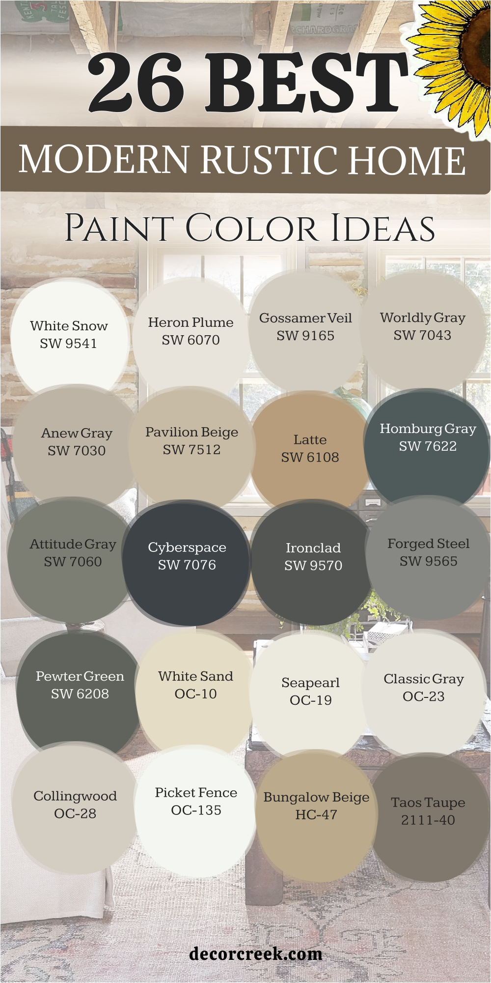
18 Country Rustic Home Paint Color Ideas
Dover White SW 6385
Dover White SW 6385 is a creamy and soft white that feels as warm as a fresh bowl of oats. This color is a staple for country homes because it avoids looking cold or like a plain office. It reminds me of the petals on a daisy or the sun hitting a white picket fence.
I love to use this for trim and cabinets to give the house a very cozy feeling. The paint has a yellow undertone that makes even a dark room feel very happy and bright. It looks wonderful with light pine wood and blue gingham fabrics in a kitchen area.
You will find that it makes your home feel very welcoming to every neighbor who visits. It is a very polite color that has been loved by families for many decades now. This shade is perfect for a country kitchen where you want to bake and talk. It helps the whole house feel very light and very full of sunshine and joy.
Best used in: kitchens, trim, bedrooms, and farmhouse exteriors
Pairs well with: Balanced Beige SW 7037, Sea Salt SW 6204, Bunglehouse Blue SW 0048, warm pine The key rule of this color for farmhouse style is to use it where you want natural light to feel kind, soft, and inviting throughout the day.
🎨 Check out the complete guide to this color right HERE 👈
Shell White SW 8917
Shell White SW 8917 is a very soft and peach-toned white that feels as gentle as a morning hug. This color brings a tiny bit of glow to a country rustic home that needs more warmth. It reminds me of the inside of a seashell or a soft cotton blanket on a bed.
I often use this color for bedrooms to make them feel very quiet and very peaceful. The paint reflects light in a way that makes the walls look like they are blushing. It works beautifully with white-washed furniture and light tan rugs on the floor of a room.
You will notice that it makes your home feel very safe and very sweet for children. It is a very humble color that stays in the background and helps everyone feel relaxed. This shade is perfect for a home that values a soft touch and a very kind spirit. It provides a very steady and happy backdrop for a slow and simple life.
Best used in: bedrooms, nurseries, bathrooms, and living room walls
Pairs well with: Alabaster SW 7008, Accessible Beige SW 7036, Fawn Brindle SW 7615, light oak The key rule of this color for farmhouse style is to use it where you want natural light to feel kind, soft, and inviting throughout the day.
🎨 Check out the complete guide to this color right HERE 👈
Biscuit SW 6112
Biscuit SW 6112 is a rich and warm tan that feels as solid as the ground in a summer field. This color has a lot of heart and makes a country home feel very lived-in and real. It reminds me of a warm piece of bread or the coat of a golden farm dog.
I like to use this color in entryways to make people feel at home right away. The paint provides a very strong and very steady feeling to the whole interior of the house. It looks amazing with dark wood furniture and green plants in large clay pots on the floor.
You will love how it makes your home feel very secure and very well-built for a family. It is a very traditional color that fits perfectly into a rustic setting with many wood tones. This shade helps a house feel like a protective retreat from the busy outside world. It is a very reliable color for adding instant character to a plain living space.
Best used in: entryways, hallways, kitchens, and dining rooms
Pairs well with: Dover White SW 6385, Kilim Beige SW 6106, Latte SW 6108, dark walnut The key rule of this color for farmhouse style is to use it where you want natural light to feel kind, soft, and inviting throughout the day.
🎨 Check out the complete guide to this color right HERE 👈
Tatami Tan SW 6116
Tatami Tan SW 6116 is a deep and golden neutral that feels very earthy and very traditional. This color brings a lot of warmth to a country rustic home and feels as solid as stone. It reminds me of dried straw or the sand you find in a deep river bed.
I suggest using this for a cozy den where you want to sit and listen to music. The paint makes a room feel very thick and very warm even on a cold winter night. It works beautifully with black metal accents and heavy wooden coffee tables in a simple style.
You will find that it makes your home feel very established and very safe for everyone. It is a very honest color that stays looking good for many years without fading away. This shade is perfect for people who love a classic country look that feels very cozy. It brings a lot of soul and a lot of warmth to your interior walls.
Best used in: dens, family rooms, basements, and dining areas
Pairs well with: Canvas Tan SW 7531, Bagel SW 6114, Iron Ore SW 7069, leather furniture The key rule of this color for farmhouse style is to use it where you want natural light to feel kind, soft, and inviting throughout the day.
🎨 Check out the complete guide to this color right HERE 👈
Sandbar SW 7547
Sandbar SW 7547 is a medium-toned greige that feels very organic and very balanced for a house. This color is a mix of gray and tan that works in almost any kind of natural light. It reminds me of the pebbles you find on a country road or a weathered fence post.
I recommend this for living rooms that want to feel updated but still very rustic and warm. The paint provides a very clean and very stable feeling to the whole interior of the house. It looks great with white trim and warm wood furniture pieces in a simple country style.
You will love how it makes your home feel very curated and very well-designed for a family. It is a very smart color that stays looking fresh no matter what the weather is like. This shade is a great choice for a fresh start in a country rustic home for anyone. It helps a room feel very finished and very professional for a busy and happy life.
Best used in: living rooms, kitchens, bathrooms, and exterior trim
Pairs well with: Alabaster SW 7008, Shoji White SW 7042, Urbane Bronze SW 7048, stone The key rule of this color for farmhouse style is to use it where you want natural light to feel kind, soft, and inviting throughout the day.
🎨 Check out the complete guide to this color right HERE 👈
Prairie Grass SW 7546
Prairie Grass SW 7546 is a soft and dusty tan that has a tiny touch of green hidden inside. This color feels very natural and reminds me of a field of wild grass in the afternoon. It is a very fresh choice for a country rustic home that wants to feel tied to nature.
I often use this color for mudrooms or entryways to create a very grounded feeling for guests. The paint is very practical because it hides scuffs and dirt from boots and paws very well. It looks wonderful with natural wood benches and black metal hooks for coats on the wall.
You will feel a sense of strength and peace as soon as you walk into a room. It is a very honest and simple shade that works well for a country lifestyle in a home. This shade is perfect for a house that values the outdoors and a sturdy way of living. It makes your house feel very solid and very well-cared for by the family.
Best used in: mudrooms, entryways, kitchens, and laundry rooms
Pairs well with: Creamy SW 7012, Wool Skein SW 6148, Foothills SW 7514, natural wood The key rule of this color for farmhouse style is to use it where you want natural light to feel kind, soft, and inviting throughout the day.
🎨 Check out the complete guide to this color right HERE 👈
Mudslide SW 9113
Mudslide SW 9113 is a deep and rich brown that feels as warm as the earth in a garden. This color brings a lot of weight to a country home and makes it feel very permanent. It reminds me of the bark on an old oak tree or a piece of dark chocolate candy.
I love to use this color for kitchen islands to make them look very sturdy and solid. The paint has a rich quality that makes your white cabinets and walls look very bright. It works beautifully with copper pots and light-colored wooden floors in a rustic country style.
You will see that it makes your home feel very secure and very private for the whole family. It is a very brave color choice that shows you love the colors of the natural world. This shade is perfect for a country home that wants to feel very warm and very deep. It helps a room feel very cozy and very much like a part of the forest.
Best used in: kitchen islands, accent walls, dens, and home libraries
Pairs well with: Alabaster SW 7008, Kilim Beige SW 6106, Svelte Sage SW 6164, copper The key rule of this color for farmhouse style is to use it where you want natural light to feel kind, soft, and inviting throughout the day.
Downing Earth SW 2820
Downing Earth SW 2820 is a medium-dark brown that feels very traditional and very organic for a home. This color has a lot of history and reminds me of the clay used to make old pots. It is a very popular choice for exteriors or living rooms that want to feel very grounded.
I suggest using this if you want your country rustic home to feel like it has many stories. The paint provides a very strong and very steady background for your wooden furniture and art. It looks amazing with stone accents and dark metal light fixtures on the walls or ceilings.
You will find that it makes your home feel very secure and very well-built for a long life. It is a very traditional color that fits perfectly into a rustic setting with many wood tones. This shade helps a house feel like a protective retreat from the busy outside world. It is a very reliable color for adding instant character to any room.
Best used in: living rooms, home exteriors, dining rooms, and foyers
Pairs well with: Shoji White SW 7042, Roycroft Vellum SW 2833, Rookwood Dark Green SW 2816, stone The key rule of this color for farmhouse style is to use it where you want natural light to feel kind, soft, and inviting throughout the day.
🎨 Check out the complete guide to this color right HERE 👈

Felted Wool SW 9171
Felted Wool SW 9171 is a medium greige that feels as soft as the clay in an artist’s hands. This color is very sophisticated and works beautifully in a country house that wants style. It reminds me of the stones you might find on a mountain path or a piece of silk.
I often use this color for bedrooms to create a feeling of total rest and a quiet night. The paint has a way of looking very high-end and polished without being too stiff or formal. It looks amazing with white bedding and dark wood nightstands for a strong contrast in the room.
You will find that it makes your home feel very expensive and very well-designed for a modern life. It is a very gentle color that helps you feel relaxed as soon as you walk inside. This shade is perfect for a country rustic home that needs a touch of class and light. It provides a very steady and beautiful backdrop for your favorite art and family photos.
Best used in: bedrooms, living rooms, hallways, and master suites
Pairs well with: Snowbound SW 7004, Agreeable Gray SW 7029, Iron Ore SW 7069, wool fabrics The key rule of this color for farmhouse style is to use it where you want natural light to feel kind, soft, and inviting throughout the day.
🎨 Check out the complete guide to this color right HERE 👈
Mountain Peak White OC-121
Mountain Peak White OC-121 is a crisp and clean white that feels as fresh as mountain air. This color is perfect for a country home because it makes everything feel very bright and tidy. It reminds me of the snow on a high peak or a fresh sheet of paper in a book.
I love to use this for walls and trim to make a small room look very big. The paint reflects a lot of light which helps every corner of the house feel very happy. It looks wonderful with light wood floors and colorful quilts in a rustic country style.
You will notice that it makes your home feel very organized and very full of life every day. It is a very simple color that lets your favorite furniture pieces stand out and be seen. This shade is perfect for people who want a look that is very clean and very new. It provides a very fresh backdrop for a happy and simple life in the country.
Best used in: kitchens, bathrooms, bedrooms, and all trim work
Pairs well with: Revere Pewter HC-172, Hale Navy HC-154, Saybrook Sage HC-114, wood The key rule of this color for farmhouse style is to use it where you want natural light to feel kind, soft, and inviting throughout the day.
Mayonnaise OC-85
Mayonnaise OC-85 is a warm and creamy white that feels as soft as a bowl of pudding. This color brings a lot of comfort to a country house and makes it feel very welcoming. It reminds me of the color of real butter or a soft cotton shirt on a sunny morning.
I often use this color in kitchens to make them feel like the warm heart of the home. The paint has a way of making a house feel very peaceful and very quiet for everyone. It works beautifully with natural wood beams and colorful baskets on the shelves or floors.
You will see that it makes your home feel very welcoming to every guest who comes over. It is a very humble color that does not demand to be the center of attention. This shade is perfect for a home that wants to feel very natural and very light. It provides a very steady and happy backdrop for a simple and quiet life.
Best used in: kitchens, dining rooms, hallways, and bedrooms
Pairs well with: White Dove OC-17, Shaker Beige HC-45, Alexandria Beige HC-77, antique brass The key rule of this color for farmhouse style is to use it where you want natural light to feel kind, soft, and inviting throughout the day.
Monroe Bisque HC-26
Monroe Bisque HC-26 is a rich and golden tan that feels as warm as a late afternoon sun. This color has been a favorite for many years because it makes a home feel very traditional. It reminds me of the walls in a historic country house or a piece of honey on toast.
I like to use this color in living rooms where the family likes to sit and talk. The paint makes the room feel very full and very cozy without being too dark or heavy. It works perfectly with dark wood trim and colorful rugs in a rustic country style.
You will see that it makes your home feel very grounded and very well-cared for every day. It is a very polite color that gets along with almost any other shade of paint you have. This color is a must for a classic rustic interior that wants to feel very warm. It brings a lot of soul to a room and makes it feel very safe.
Best used in: living rooms, dining rooms, kitchens, and entryways
Pairs well with: Simply White OC-117, Van Courtland Blue HC-145, Kingsport Gray HC-86, oak The key rule of this color for farmhouse style is to use it where you want natural light to feel kind, soft, and inviting throughout the day.
Lenox Tan HC-44
Lenox Tan HC-44 is a deep and earthy tan that feels as solid as the ground under your feet. This color is more of a warm brown-tan that reminds me of the bark on an old tree. It is a very strong choice for a country home that needs to feel very natural and real.
I also love to use it in a small den to make it feel extra cozy for resting. The paint creates a very rich look that feels very custom and high-end for a family house. It looks amazing with stone accents and dark metal light fixtures on the walls or ceiling.
You will find that it makes your home feel very secure and very well-built for a long life. It is a very traditional color that fits perfectly into a rustic setting for a home. This shade helps a house feel like a protective retreat from the busy world outside. It is a very reliable color for adding instant character to any room.
Best used in: family rooms, entryways, dens, and exteriors
Pairs well with: White Dove OC-17, Edgecomb Gray HC-173, Chelsea Gray HC-168, leather The key rule of this color for farmhouse style is to use it where you want natural light to feel kind, soft, and inviting throughout the day.
🎨 Check out the complete guide to this color right HERE 👈
Spanish Olive 1509
Spanish Olive 1509 is a soft and dusty green that feels as old-fashioned as an old farm. This color reminds me of dried herbs or the leaves on an olive tree in the sun. It is a very popular choice for bedrooms because it feels so peaceful and very quiet.
I like how it brings a bit of color without being too bright or loud for the eyes. The paint works beautifully with cream-colored linens and dark wood furniture in a room. You will notice that it makes your home feel very gentle and very kind to everyone.
It is a very traditional green that has been loved by many people for a long time. This shade is perfect for a country rustic look that feels very soft and very natural. It helps a house feel like a quiet place where you can relax after a day of work. Choosing this color means you love a home that feels very organic and very real.
Best used in: bedrooms, bathrooms, dining rooms, and kitchens
Pairs well with: Simply White OC-117, Revere Pewter HC-172, Pashmina AF-100, light wood The key rule of this color for farmhouse style is to use it where you want natural light to feel kind, soft, and inviting throughout the day.
Caldwell Green HC-124
Caldwell Green HC-124 is a deep and stony green that feels as solid as a piece of history. This color brings a lot of weight to a country home and makes it feel very permanent. I love to use it on the outside of a house to make it blend with the green trees.
The paint has a touch of gray inside it that keeps it feeling very natural and grounded. It looks fantastic when you use it for a kitchen island against white or cream cabinets. You will notice that it makes your silver or black metal hardware look very sharp and clean.
It is a very serious color that helps a room feel very focused and very quiet for the family. Many people choose it for their home offices to create a sense of strength and focus. This shade works well with heavy fabrics like wool or thick cotton in a rustic style. It is a great choice for a home that wants to feel very sturdy and well-built.
Best used in: kitchen islands, home offices, exteriors, and accent walls
Pairs well with: Swiss Coffee OC-45, Pale Oak OC-20, Manchester Tan HC-81, brass The key rule of this color for farmhouse style is to use it where you want natural light to feel kind, soft, and inviting throughout the day.
🎨 Check out the complete guide to this color right HERE 👈
Essex Green HC-188
Essex Green HC-188 is a very dark and moody green that feels as rich as a deep forest. This color is like the deepest part of the woods where the tall pine trees grow close. It is a very bold choice for a library or a cozy reading corner in a country home.
I often use it on kitchen cabinets to create a very dramatic and traditional rustic look. The paint looks incredible with brass handles and light marble countertops in a kitchen area. You will see that it makes a room feel very expensive and very private for the whole family.
It provides a very strong contrast against light wood floors or white ceilings in the room. It is a very brave green that makes your home look very well-designed and very unique. This shade is perfect for people who want a home that feels like a sanctuary from the world. It brings a lot of depth and mystery to your country interior walls.
Best used in: kitchen cabinets, library walls, powder rooms, and front doors
Pairs well with: White Dove OC-17, Revere Pewter HC-172, Wickham Gray HC-171, brass The key rule of this color for farmhouse style is to use it where you want natural light to feel kind, soft, and inviting throughout the day.
🎨 Check out the complete guide to this color right HERE 👈

Leather Saddle Brown 2100-20
Leather Saddle Brown 2100-20 is a deep and warm brown that feels as natural as leather in a barn. This color brings a lot of soul to a country home and makes it feel very grounded and real. It reminds me of an old saddle or the bark on a large oak tree in the sun.
I love to use this color on an accent wall to make the room feel very cozy and safe. The paint has a rich quality that makes your light-colored furniture and rugs look very bright. It works beautifully with natural wood beams and black metal accents in a rustic style.
You will feel a sense of strength and comfort as soon as you see this color in the room. It is a very brave color choice that shows you love the simple colors of the earth. This shade is perfect for a country home that wants to feel very sturdy and very warm. It helps a room feel very solid and very well-built for a long family life.
Best used in: accent walls, dens, entryways, and home offices
Pairs well with: Simply White OC-117, Shaker Beige HC-45, Saybrook Sage HC-114, leather The key rule of this color for farmhouse style is to use it where you want natural light to feel kind, soft, and inviting throughout the day.
Chestertown Buff HC-9
Chestertown Buff HC-9 is a soft and happy yellow-tan that feels as warm as a summer afternoon. This color brings a lot of joy to a country rustic home and makes every room feel bright. It reminds me of the sun on a wheat field or a bowl of fresh corn in the kitchen.
I often use this color in dining rooms to make them feel very friendly and very full of life. The paint has a way of making a house feel very peaceful and very quiet for the whole family. It works beautifully with dark wood trim and colorful woven baskets on the shelves or walls.
You will see that it makes your home feel very welcoming to every guest who comes to visit. It is a very humble color that does not demand to be the center of attention in the room. This shade is perfect for a home that wants to feel very natural and very light for everyone. It provides a very steady and happy backdrop for a simple life in the country.
Best used in: dining rooms, kitchens, living rooms, and sunrooms
Pairs well with: White Dove OC-17, Van Deusen Blue HC-156, Copley Gray HC-104, dark wood The key rule of this color for farmhouse style is to use it where you want natural light to feel kind, soft, and inviting throughout the day.
🎨 Check out the complete guide to this color right HERE 👈
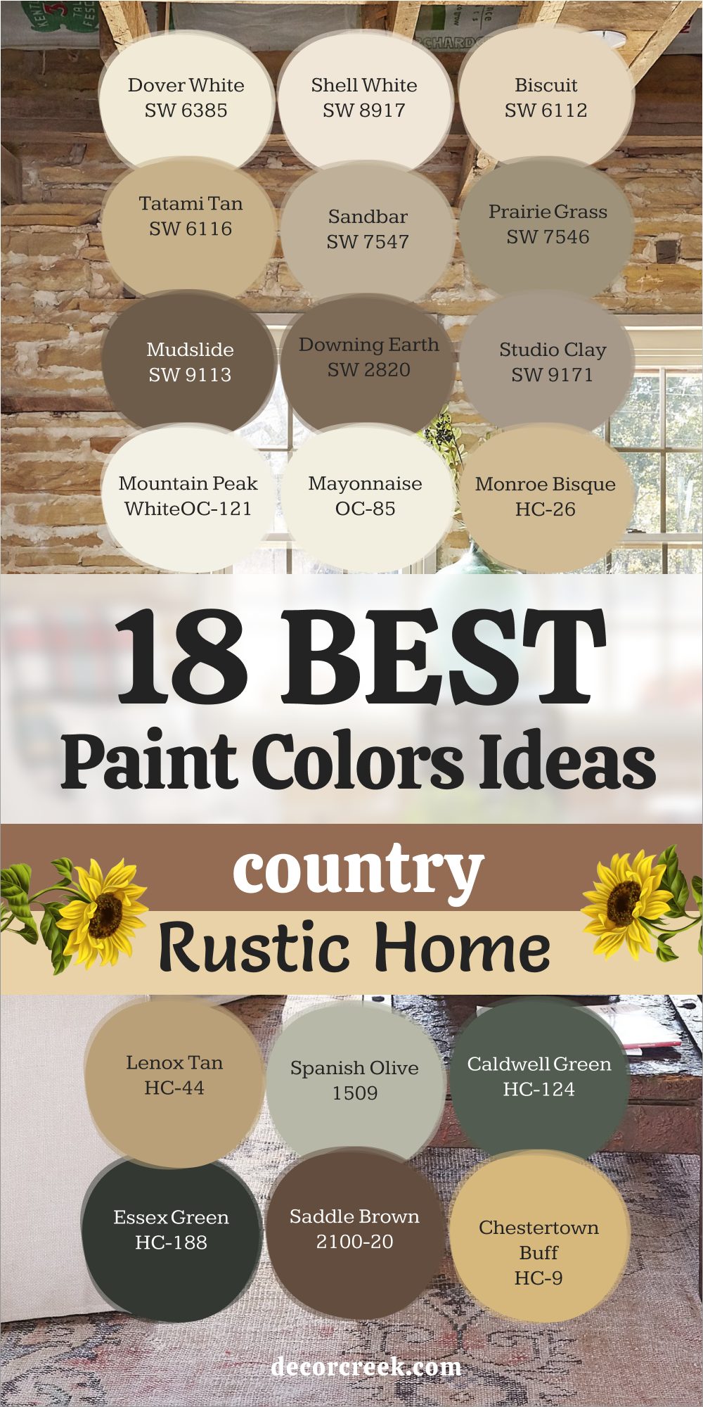
My Final Thoughts about 38 Rustic Home paint color ideas
Picking a paint color is about more than just purchasing a bucket of liquid; it is a profound decision about the atmosphere of your sanctuary. It is about the specific emotional response you want to have when you open your eyes in the morning or when you cross the threshold of your front door after an exhausting day. Every shade carries a frequency—a way of speaking to your mood without saying a word.
Rustic colors, in particular, serve as a bridge between our modern lives and the grounding presence of the earth. They are designed to help us remember the quiet, timeless beauty of the natural world, from the gray of a river stone to the deep green of a hidden forest.
Whether your heart leans toward a soft, luminous white that invites the dawn or a deep, dramatic charcoal that wraps you in a protective embrace, the ultimate metric is simple: make sure the color makes you truly happy.