Art Deco is all about bold shapes and rich feelings that stay in your heart and mind long after you leave a room. I have spent many years helping all kinds of people make their homes look fancy and strong using just a simple bucket of paint and a good brush.
When you take the time to pick the right colors, you change the whole mood of a room from something plain into something truly magical. This beautiful style started a long time ago in a world of jazz and big dreams, but it still looks great today because it uses colors that never go out of style.
I want to show you exactly how to use deep greens, dark blues, and sharp blacks to make your house look like a royal palace from a famous movie. It is not hard at all to get this high-end look if you know which specific cans of paint to buy at the store. You can create a home that feels very important and very solid just by picking a shade that has a lot of history and power behind it.
Every wall in your house is a chance to show off your great taste and make your family feel like they are living in a very special place.
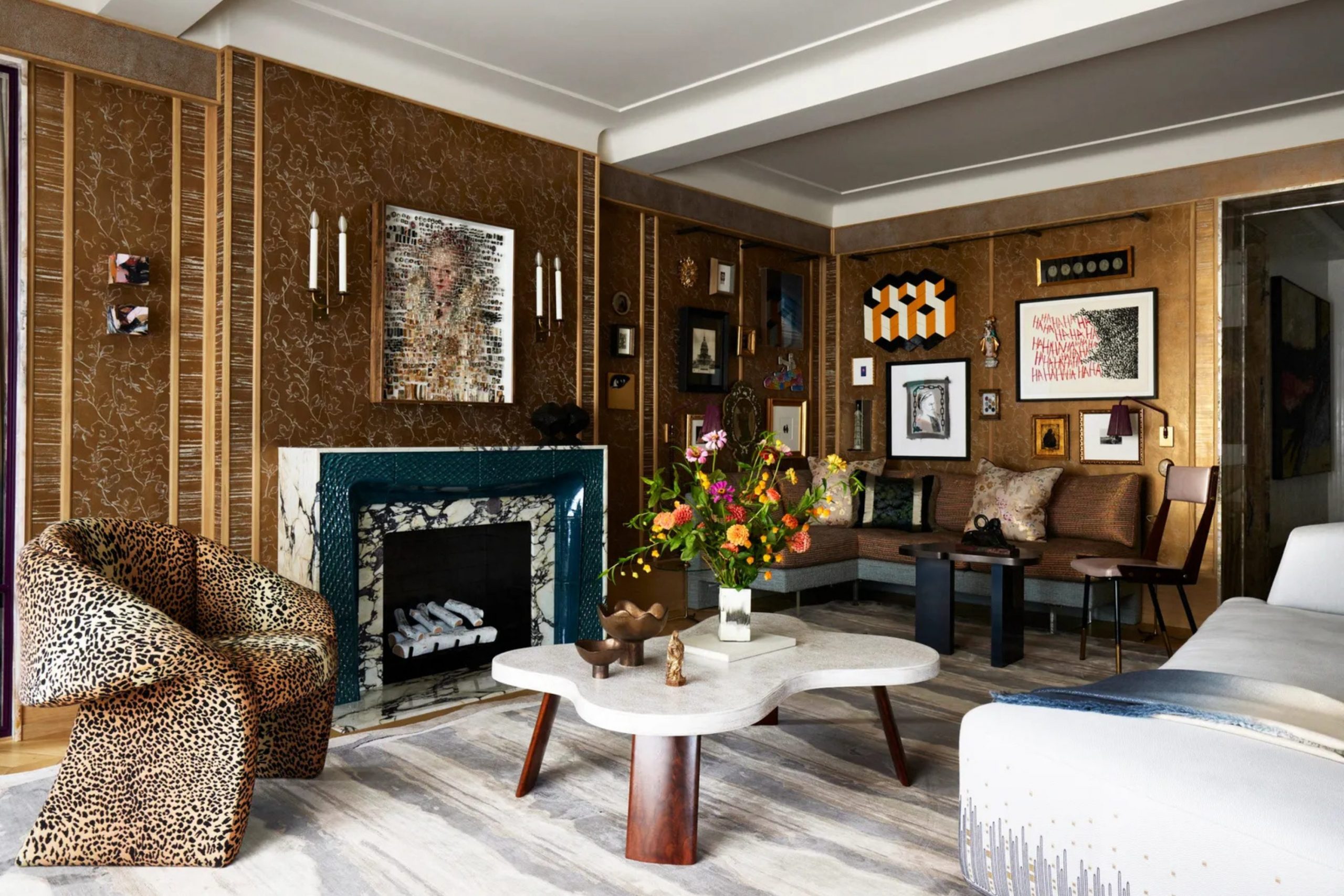
Why I Always Trust Sherwin-Williams and Benjamin Moore for the Best Art Deco Paint Colors
I always use Sherwin-Williams and Benjamin Moore because their paint stays bright and beautiful for a very long time. These famous brands make colors that look very deep and expensive on your walls, almost like they are made of velvet or stone. When I am working on a big house for a client, I need to know the color will look the same in the morning light and under the lamps at night.
These companies have huge books of colors that fit the old-fashioned style perfectly while still feeling fresh for a modern family. Their paint also goes on the wall very smoothly, which is very important for a clean look that does not show streaks or bumps. I trust them to give me the exact shade of gold or forest green I have in my head without any mistakes or surprises.
Using cheap paint usually ends up looking messy and dull, which makes the whole house feel less valuable and less stylish. When you buy the best paint, you are making an investment in your home that will make you smile every time you walk into the room. These brands understand that a home should feel heavy and rich, and they provide the quality to make that happen on every single wall you touch.
How I Choose the Perfect Evergreen Shade for Any Art Deco Interior
Choosing a color starts with looking very closely at the light that comes through the windows in your room. If you have big windows with lots of sun, you can use very dark colors without making the room feel like a dark cave or a cold basement. I look at the gold or silver metal in the room to see if it matches the paint, because metals are a huge part of the Art Deco look.
I also think a lot about how the floor looks because the walls and the floor must be friends and work together to make the room feel balanced. A good color should make you feel very excited and very proud when you walk through the door after a long day at work. I try to pick shades that feel heavy and solid, like a big piece of antique furniture or a strong stone wall.
This makes the furniture you already own look much better and much more expensive than it did against plain white walls. I always tell people to test a small spot on the wall before they paint the whole thing so they can see how the color feels. Taking your time to choose the right shade means you will end up with a home that feels very high-end and very comfortable for a long time.
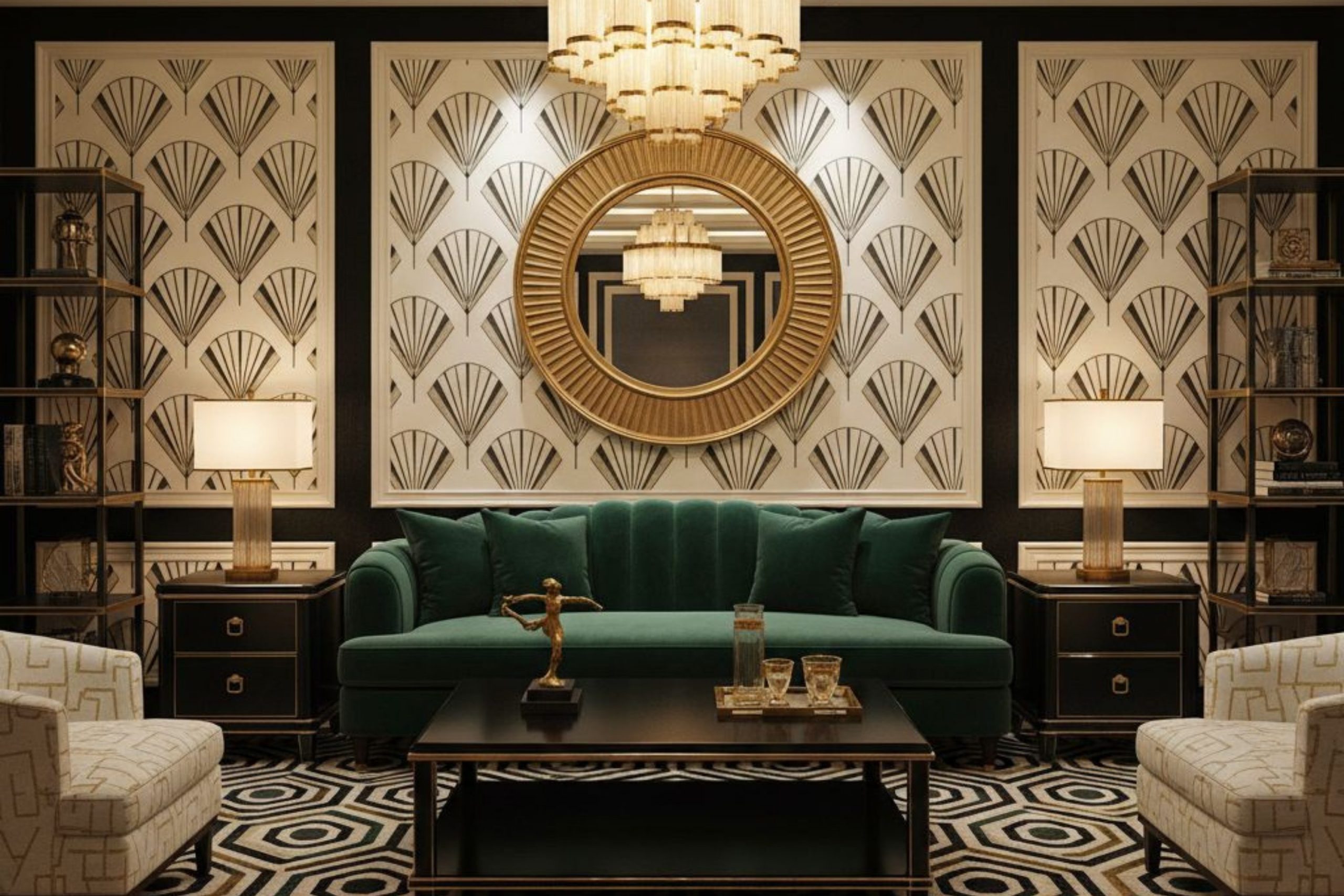
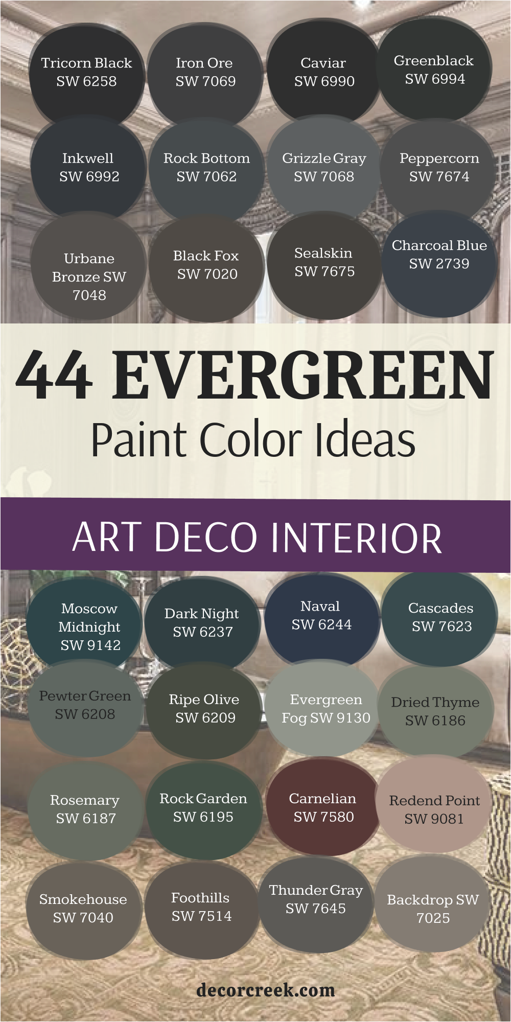
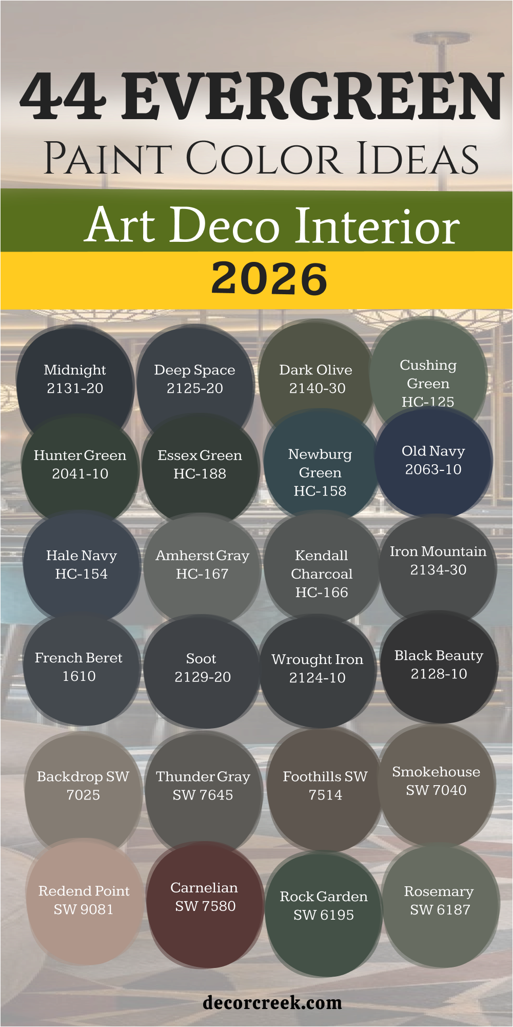
44 Evergreen Paint Color Ideas For The Art Deco Interior in 2026
Tricorn Black SW 6258
Tricorn Black SW 6258 is the most honest black paint you can find for your walls. Black tones in this shade do not have any secret blue or brown colors hiding inside. This paint makes a room feel very tall and serious as soon as it dries.
You should use it on doors or window frames to make them stand out. It works like a frame for a beautiful picture when you put it around a bright room. Many people feel brave when they see such a dark and powerful choice.
It creates a sharp line that helps define the shapes of your furniture. This color is a favorite for people who love the look of expensive old hotels. Using it on a ceiling can make a big room feel much more cozy and private. The finish stays looking clean and sharp for many years without fading away.
Best used in: entryways, office walls, interior doors, and window trim
Pairs well with: Pure White SW 7005, High Reflective White SW 7757, and shiny gold accents The key rule of this color for Art Deco style is to use it where you want to create a strong contrast against light-colored floors or bright metallic decorations.
🎨 Check out the complete guide to this color right HERE 👈
Iron Ore SW 7069
Iron Ore SW 7069 looks like a piece of dark metal that has been polished. This color is not quite black but it is much deeper than a regular gray. It gives a room a very soft feeling even though it is a very dark shade.
You can see it change slightly when the sun hits it during the day. This paint makes big walls look very fancy and filled with character. I like to use it when a room needs to feel solid and grounded. It hides small bumps on the wall better than a very shiny black paint would.
Many owners choose this for their media rooms to make the screen pop. It feels very high-end and works well with heavy velvet curtains. The depth of this color makes any art you hang on it look like it belongs in a museum.
Best used in: bedrooms, libraries, accent walls, and kitchen cabinets
Pairs well with: Repose Gray SW 7015, Extra White SW 7006, and warm brass fixtures The key rule of this color for Art Deco style is to use it on large surfaces where you want a dark look that still feels soft to the touch.
🎨 Check out the complete guide to this color right HERE 👈
Caviar SW 6990
Caviar SW 6990 is a rich color that feels like a dark chocolate bar without the sugar. This paint has a tiny bit of warmth that makes a room feel welcoming. It is a great choice for a dining room where you want people to stay and talk.
The color looks very thick and lush once you put two coats on the wall. It reminds me of the dark clothes people wore to fancy parties a long time ago. This shade is perfect for making a small room feel like a special jewel box.
You will notice how it makes white furniture look even brighter than before. It has a heavy weight to it that makes the architecture of a house feel important. I find that it works best when you have plenty of lamps to create shadows. This color helps you tell a story of luxury and comfort in any part of your home.
Best used in: dining rooms, powder rooms, master bedrooms, and furniture pieces
Pairs well with: Alabaster SW 7008, Goldfinch SW 6905, and dark wood floors The key rule of this color for Art Deco style is to use it in areas where you want to highlight gold frames and mirrors for a classic look.
🎨 Check out the complete guide to this color right HERE 👈
Greenblack SW 6994
Greenblack SW 6994 is a secret color that looks black until you get very close to it. This shade has a deep forest green hidden deep inside the paint. It feels very natural and strong at the same time. You can use it to bring a bit of the outside world into a very modern room.
This color makes a great backdrop for a big leather sofa or a wooden desk. It feels very smart and makes a person feel like they are in a place of learning. The green hint keeps the black from feeling too cold or lonely.
It adds a layer of mystery to the walls that guests will notice and ask about. This paint is very good at making a room feel balanced and quiet. I love how it looks when the lights are turned down low in the evening.
Best used in: home offices, dens, exterior shutters, and accent walls
Pairs well with: Sea Salt SW 6204, Kilim Beige SW 6106, and copper hardware The key rule of this color for Art Deco style is to use it when you want the strength of black but with a hint of nature’s richness.
🎨 Check out the complete guide to this color right HERE 👈
Inkwell SW 6992
Inkwell SW 6992 is a blue so dark that it almost looks like the night sky. This color is much more interesting than a plain dark gray or a simple black. Blue tones peek out when the afternoon sun shines into the room.
It makes a room feel very cool and steady for anyone who spends time there. I suggest using it in a bedroom to help you feel ready for sleep. This shade looks amazing when you put it next to light gray or silver decorations. It has a very professional look that works well in a big city apartment.
The paint feels very smooth and gives the walls a look of high quality. It is a bold choice that shows you have a lot of confidence in your style. People who see this color often think the room looks much more expensive than it really is.
Best used in: bedrooms, study areas, mudrooms, and front doors
Pairs well with: On the Rocks SW 7671, Icicle SW 6238, and silver metallic finishes The key rule of this color for Art Deco style is to use it to create a moody atmosphere that feels both royal and modern at the same time.
🎨 Check out the complete guide to this color right HERE 👈
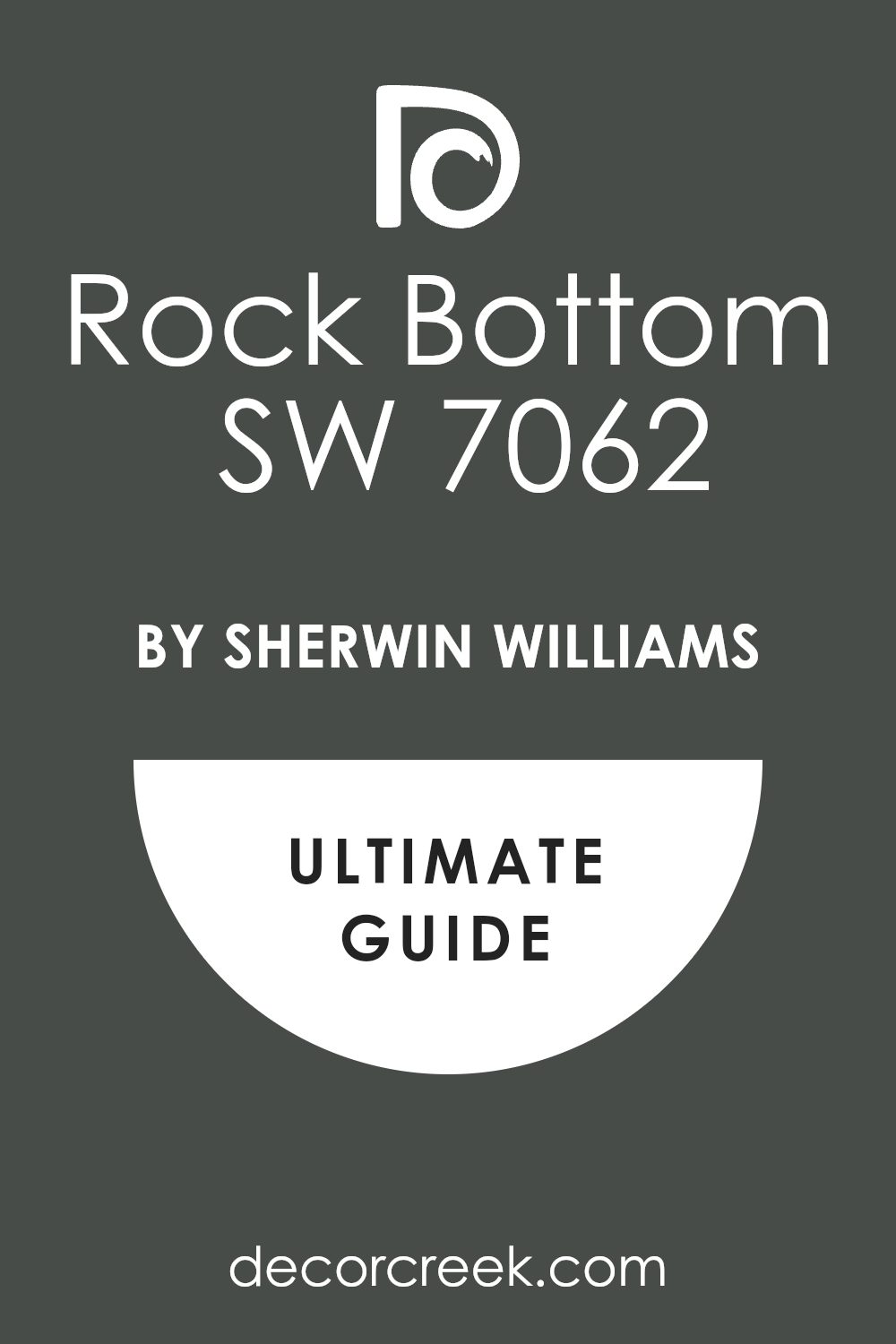
Rock Bottom SW 7062
Rock Bottom SW 7062 is a heavy gray that has a lot of green and brown mixed in. This color feels as solid as a mountain when you see it on a wall. It is a very grounded shade that helps a room feel sturdy and well-made.
You can use it in a hallway to make the transition between rooms feel more interesting. This paint works well with old wooden floors and thick rugs. It does not try to be the star of the show but it makes everything else look better.
Many people like this shade because it feels very earthy and real. It is a great way to use a dark color without it feeling too scary or bright. This color stays looking good even if the room gets a lot of use every day. It is a hardworking paint that brings a sense of history to a new house.
Best used in: hallways, basements, laundry rooms, and kitchen islands
Pairs well with: Agreeable Gray SW 7029, Steamed Milk SW 6126, and bronze accents The key rule of this color for Art Deco style is to use it to bridge the gap between natural wood elements and modern metallic decorations.
🎨 Check out the complete guide to this color right HERE 👈
Grizzle Gray SW 7068
Grizzle Gray SW 7068 is a medium-to-dark gray that has a lot of personality. This color reminds me of a stormy day at the beach where the clouds are very thick. It is a great choice for a living room where you want to display a lot of photos.
The gray is dark enough to be bold but light enough to not feel like a cave. This shade makes a room feel very balanced and easy to be in for long hours. I like to use it on the outside of a house to make it look very grand.
Inside, it works perfectly on cabinets or built-in bookshelves. This paint has a very clean look that never feels messy or disorganized. It is a smart color for people who want a modern look that still feels very classic. You will find that it matches almost any other color you put near it.
Best used in: living rooms, exteriors, cabinets, and bathroom vanities
Pairs well with: Origami White SW 7636, Nebulous White SW 7063, and dark wood The key rule of this color for Art Deco style is to use it as a neutral base that allows your colorful furniture to be the main focus.
🎨 Check out the complete guide to this color right HERE 👈

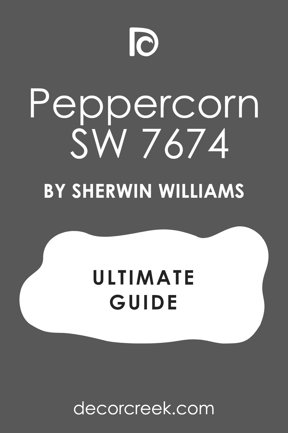
Peppercorn SW 7674
Peppercorn SW 7674 is a very popular gray because it sits right in the middle of dark and light. This color feels very soft and creates a nice mood for a relaxing evening. It does not have any weird blue or purple tones that might surprise you later.
You can use it in a big room to make the walls feel like they are hugging you. This shade is excellent for creating a focal point behind a bed or a sofa. It looks very high-end when paired with white trim and crown molding.
This paint makes a home feel very updated and fresh while keeping a classic vibe. I often pick this color for people who are just starting to try dark colors. It is a safe but beautiful choice that always looks professional. Your friends will think you hired a designer when they see this on your walls.
Best used in: master suites, accent walls, theater rooms, and fireplaces
Pairs well with: City Loft SW 7631, Eider White SW 7014, and black metal The key rule of this color for Art Deco style is to use it where you want a dark feeling that remains neutral and easy to match with decor.
🎨 Check out the complete guide to this color right HERE 👈
Urbane Bronze SW 7048
Urbane Bronze SW 7048 is a warm and earthy color that feels very rich. This shade is a mix of gray and brown with a tiny bit of green hidden inside. It makes a room feel very expensive and well-planned. I love using this color on front doors to give a great first impression.
It reminds me of old statues and grand buildings from a long time ago. This paint creates a very cozy feeling in a large living room. It works very well with natural materials like stone and wood.
Many people choose this color because it feels very grounded and natural. It is a great way to add a lot of drama without using a bright or loud color. This shade is perfect for creating a space that feels like a quiet getaway from the world.
Best used in: front doors, living rooms, exteriors, and cozy dens
Pairs well with: Modern Gray SW 7632, Shoji White SW 7042, and gold or brass The key rule of this color for Art Deco style is to use it to bring a sense of organic luxury and warmth to a room with many hard edges.
🎨 Check out the complete guide to this color right HERE 👈

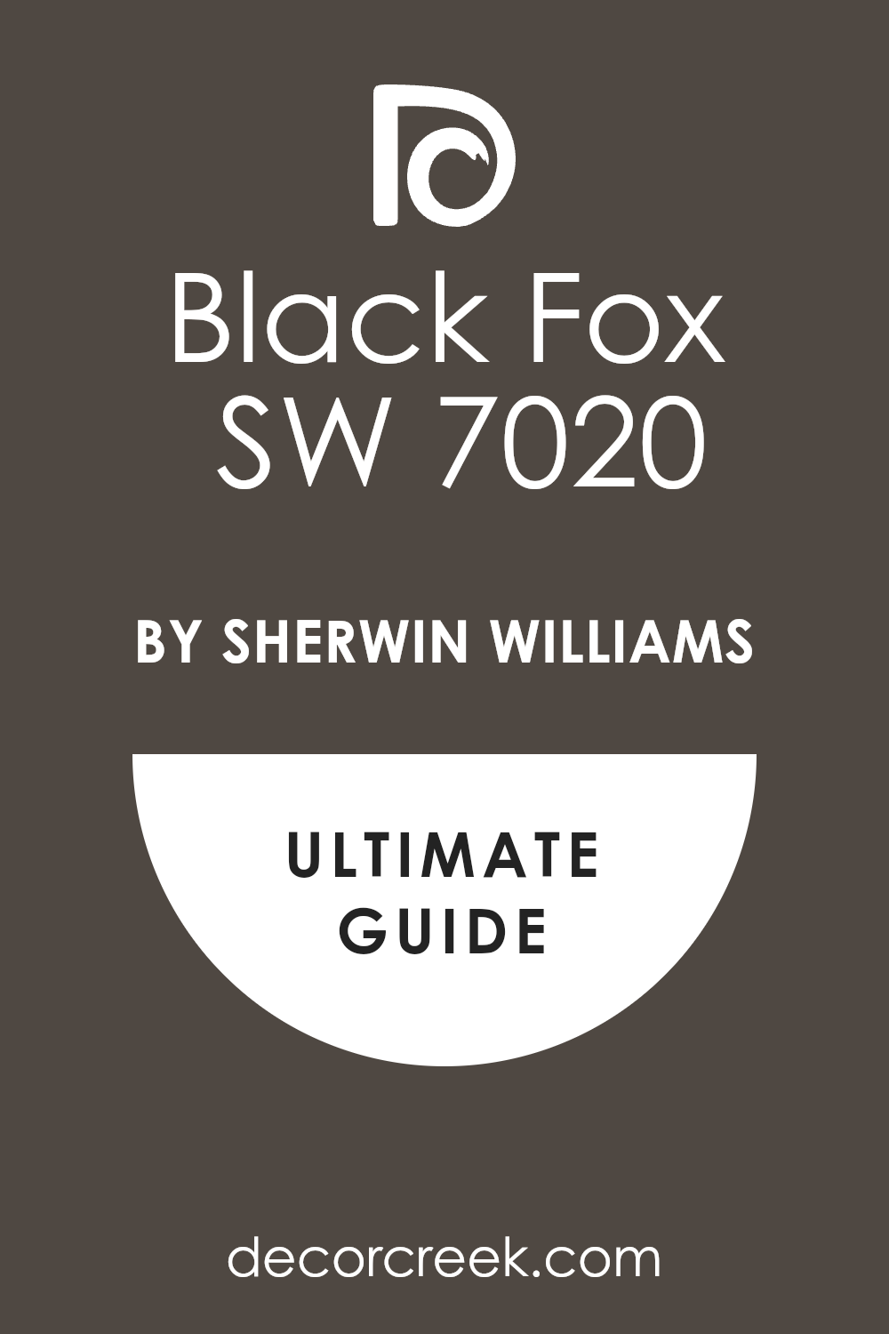
Black Fox SW 7020
Black Fox SW 7020 is a very dark brown that almost looks black in low light. This color is very warm and makes a room feel like a fancy library. It is a great choice for someone who wants a dark look but likes warm tones.
This paint looks amazing next to creamy white colors and soft yellow lights. It feels very solid and gives a room a lot of weight and importance. I like to use it on kitchen cabinets to create a very modern and clean look.
This shade is excellent for making a large room feel more intimate and private. It hides dirt and fingerprints very well, which is great for busy homes. The color has a very deep soul that makes you want to sit down and read a book. It is a very classy choice for any room that needs a bit of extra style.
Best used in: kitchen cabinets, libraries, accent walls, and exterior trim
Pairs well with: Accessable Beige SW 7036, Dover White SW 6385, and warm wood The key rule of this color for Art Deco style is to use it to create a warm, dark background that feels more inviting than a cold black.
🎨 Check out the complete guide to this color right HERE 👈
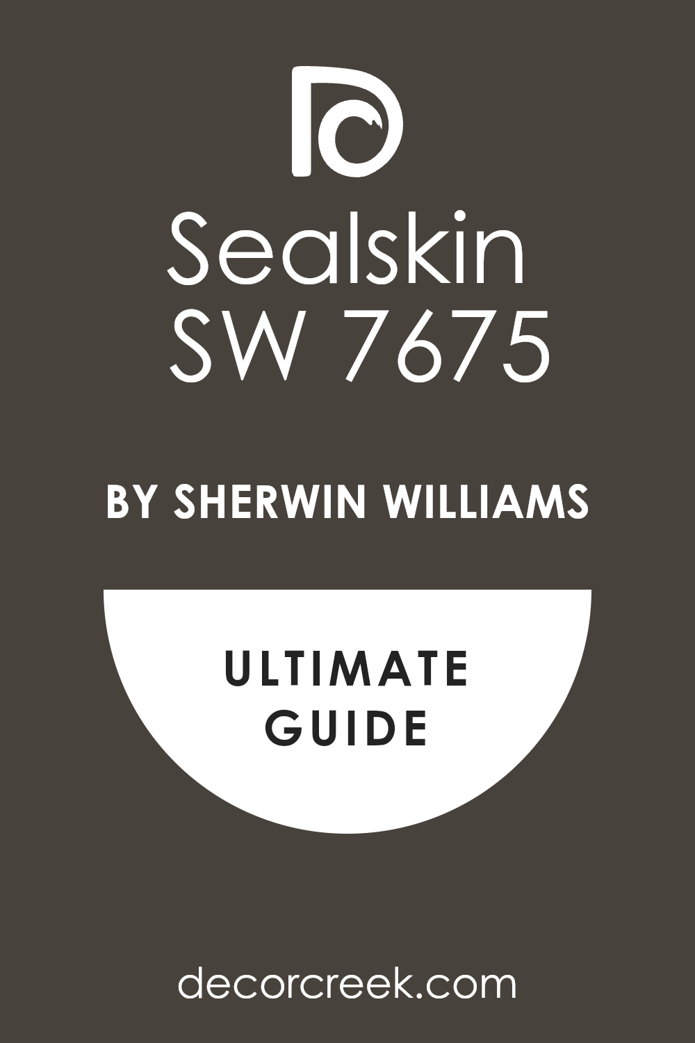
Sealskin SW 7675
Sealskin SW 7675 is a very dark gray that has a lot of rich brown mixed into the paint. This shade makes a room feel like a cozy leather chair in a quiet library. It is a great way to make a big wall look very expensive and solid.
You should use it if you want the room to feel very grounded and strong. The color changes from a dark charcoal to a deep espresso depending on the lamp light. It hides any small scratches on the wall because the color is so thick and deep.
Many people find that this color makes their gold picture frames look much brighter. It adds a lot of drama to a room without feeling too cold or like a plain black. This paint is perfect for creating a mood that is very serious but also very warm. It gives the house a feeling of being very old and well-kept at the same time.
Best used in: master bedrooms, cozy dens, kitchen islands, and front doors
Pairs well with: Alabaster SW 7008, Accessible Beige SW 7036, and warm brass The key rule of this color for Art Deco style is to use it where you want a dark look that feels more organic and less like a machine.
🎨 Check out the complete guide to this color right HERE 👈
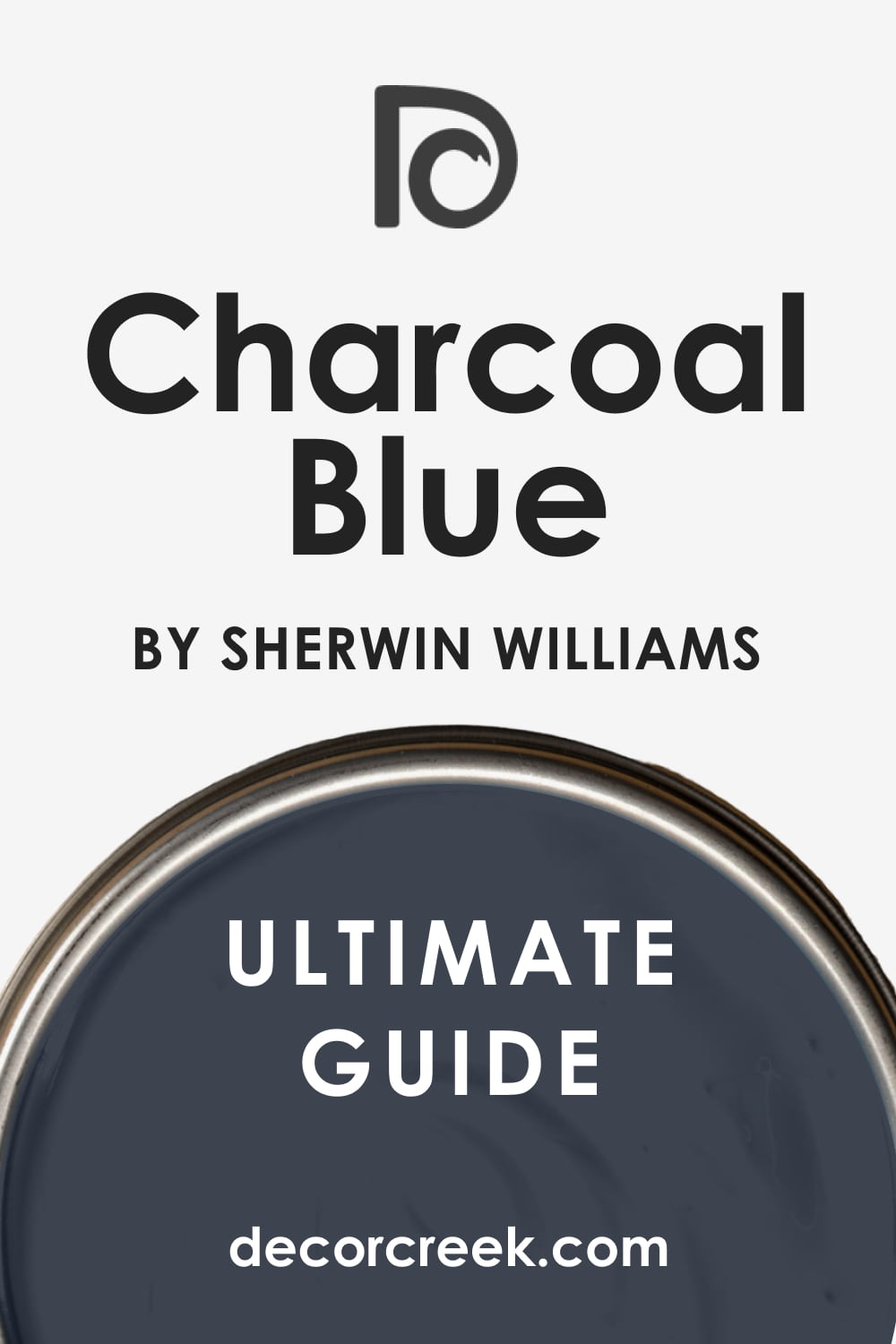
Charcoal Blue SW 2739
Charcoal Blue SW 2739 is a deep navy that has a lot of gray hidden inside every drop. This color makes a room feel very royal and important as soon as you walk inside. It is a fantastic choice for a dining room where you want to host big family dinners.
The blue tones come out more when the sun is high in the sky during lunch. It looks very smart when paired with white trim and dark wood floors. This paint gives a room a very balanced feeling that is not too bright or too dark.
I love how it makes silver or chrome handles on the furniture shine like stars. It is a very popular choice for people who want a color that never goes out of fashion. You will notice how the room feels much more put together with this on the walls. It creates a very professional look that still feels like a happy home.
Best used in: dining rooms, home offices, bedroom walls, and exterior accents
Pairs well with: On the Rocks SW 7671, Extra White SW 7006, and cool silver tones The key rule of this color for Art Deco style is to use it to bring a sense of regal history into a room with modern shapes.
🎨 Check out the complete guide to this color right HERE 👈
Moscow Midnight SW 9142
Moscow Midnight SW 9142 is a very dark teal that feels like the deep ocean at night. This color is very exciting because it is not just blue or just green but both. It makes a room feel very mysterious and full of interesting stories to tell.
You can use it in a small bathroom to make it feel like a secret underwater cave. This shade is perfect for making old furniture look brand new and very stylish. Many guests will stop to ask you what the name of this beautiful paint is.
It has a lot of energy and makes you feel very creative when you are near it. The color is very deep and looks like velvet when the light hits it from the side. I suggest using it on an accent wall if you are afraid of painting the whole room. It brings a lot of life to a house that feels a bit too plain or boring.
Best used in: powder rooms, accent walls, library shelves, and velvet furniture backdrops
Pairs well with: Pure White SW 7005, Goldfinch SW 6905, and rich mahogany wood The key rule of this color for Art Deco style is to use it as a bold statement that shows off your unique and artistic personality.
🎨 Check out the complete guide to this color right HERE 👈

Dark Night SW 6237
Dark Night SW 6237 is a moody blue-green that is very dark and very rich to look at. This color feels very steady and gives the room a sense of peace and quiet strength. It works very well in a bedroom where you want to feel tucked away from the world.
The green tones in the paint make it feel very natural even though it is a dark shade. It creates a wonderful background for big green plants or colorful art pieces. This paint is a favorite for people who want a look that is both old and new.
It looks very expensive and makes the walls feel like they are made of heavy stone. I like to use it in rooms that have a lot of metal decorations to balance them. It makes the whole house feel very smart and carefully designed by a professional expert. You will love how it changes and grows on you every single day you see it.
Best used in: bedrooms, media rooms, reading nooks, and kitchen cabinetry
Pairs well with: Sea Salt SW 6204, Kilim Beige SW 6106, and antique gold The key rule of this color for Art Deco style is to use it to add depth and a touch of nature to a room with many shiny surfaces.
🎨 Check out the complete guide to this color right HERE 👈

Naval SW 6244
Naval SW 6244 is a classic navy blue that makes everyone think of the sea and big ships. This color is very bold and makes a room feel very clean and organized. It is a great choice for a living room that gets a lot of bright natural light.
The blue is very true and does not look purple or green when you put it on. It makes white furniture look very crisp and very sharp like a new suit of clothes. Many people choose this color because it feels very safe but also very high-end.
It works perfectly on a front door to make your house look the best on the block. This paint has a lot of power and makes a room feel very solid and well-built. I find that it makes people feel very confident when they spend time in a room this color. It is a very popular shade that has been a favorite for a very long time.
Best used in: living rooms, front doors, kitchen islands, and bathrooms
Pairs well with: Origami White SW 7636, Goldfinch SW 6905, and light oak wood The key rule of this color for Art Deco style is to use it to create a traditional look that still feels fresh and very energetic.
🎨 Check out the complete guide to this color right HERE 👈

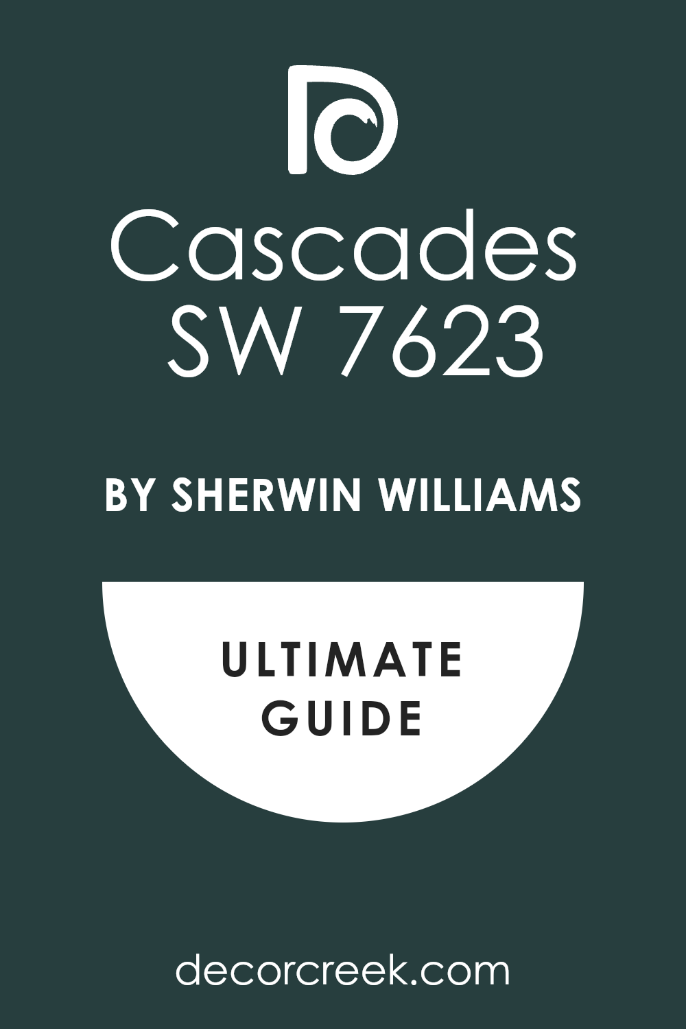
Cascades SW 7623
Cascades SW 7623 is a deep and dark green that looks like a forest after a heavy rain. This color has a lot of blue inside it which makes it feel very cool and refreshing. It is a great choice for a room where you want to feel a connection to nature.
This shade makes a room feel very lush and very expensive without being too loud. You can use it in a study to make the room feel like a place for big ideas. It looks amazing next to light wood and shiny gold lamps or picture frames.
This paint hides fingerprints very well so it is good for doors that get used a lot. It has a very heavy and rich feeling that makes any room look like a palace. Many people feel very relaxed and happy when they are surrounded by this deep green shade. It is a very smart way to bring a bit of the forest into your home.
Best used in: home offices, entryways, kitchen cabinets, and exterior shutters
Pairs well with: Alabaster SW 7008, Woodmont Cream SW 9018, and dark walnut The key rule of this color for Art Deco style is to use it to bridge the gap between hard city lines and soft natural colors.
🎨 Check out the complete guide to this color right HERE 👈
Pewter Green SW 6208
Pewter Green SW 6208 is a medium-dark green that has a lot of gray mixed into the bucket. This color feels very old-fashioned and very classic for a house with a lot of history. It is a great choice for kitchen cabinets to make the room feel very clean and earthy.
The gray in the paint keeps it from looking too bright or like a piece of fruit. It makes the room feel very balanced and very easy to live in for many years. I like to use it on the outside of a house to make it blend in with the trees.
This shade looks very high-end when you pair it with black metal handles and white walls. It is a very hardworking color that stays looking good even in a busy family home. Many people find it to be very soothing and easy on the eyes during the day. It creates a very humble but beautiful look that guests will really appreciate.
Best used in: kitchens, exteriors, mudrooms, and laundry rooms
Pairs well with: Spare White SW 6203, Shoji White SW 7042, and natural stone The key rule of this color for Art Deco style is to use it as a soft alternative to darker greens when you want a lighter feel.
🎨 Check out the complete guide to this color right HERE 👈

Ripe Olive SW 6209
Ripe Olive SW 6209 is a very dark and moody green that feels very organic and real. This color reminds me of old olive trees and moss growing on a stone wall. It is a very deep shade that makes a room feel very private and very cozy for guests.
You can use it in a bedroom to make the bed feel like the center of the world. This paint looks very rich and makes light-colored art pop off the wall like a dream. It has a very strong personality and shows that you are not afraid of bold colors.
Many people choose this for a den or a library to create a very smart look. It works very well with brass and gold accents to create a very royal feeling. The color stays very consistent and does not change too much when the lights go down. It is a very beautiful choice for anyone who loves the colors of the earth.
Best used in: master bedrooms, dens, accent walls, and furniture
Pairs well with: Oyster White SW 7637, Kilim Beige SW 6106, and warm wood tones The key rule of this color for Art Deco style is to use it to create a thick, lush atmosphere that feels both natural and very fancy.
🎨 Check out the complete guide to this color right HERE 👈

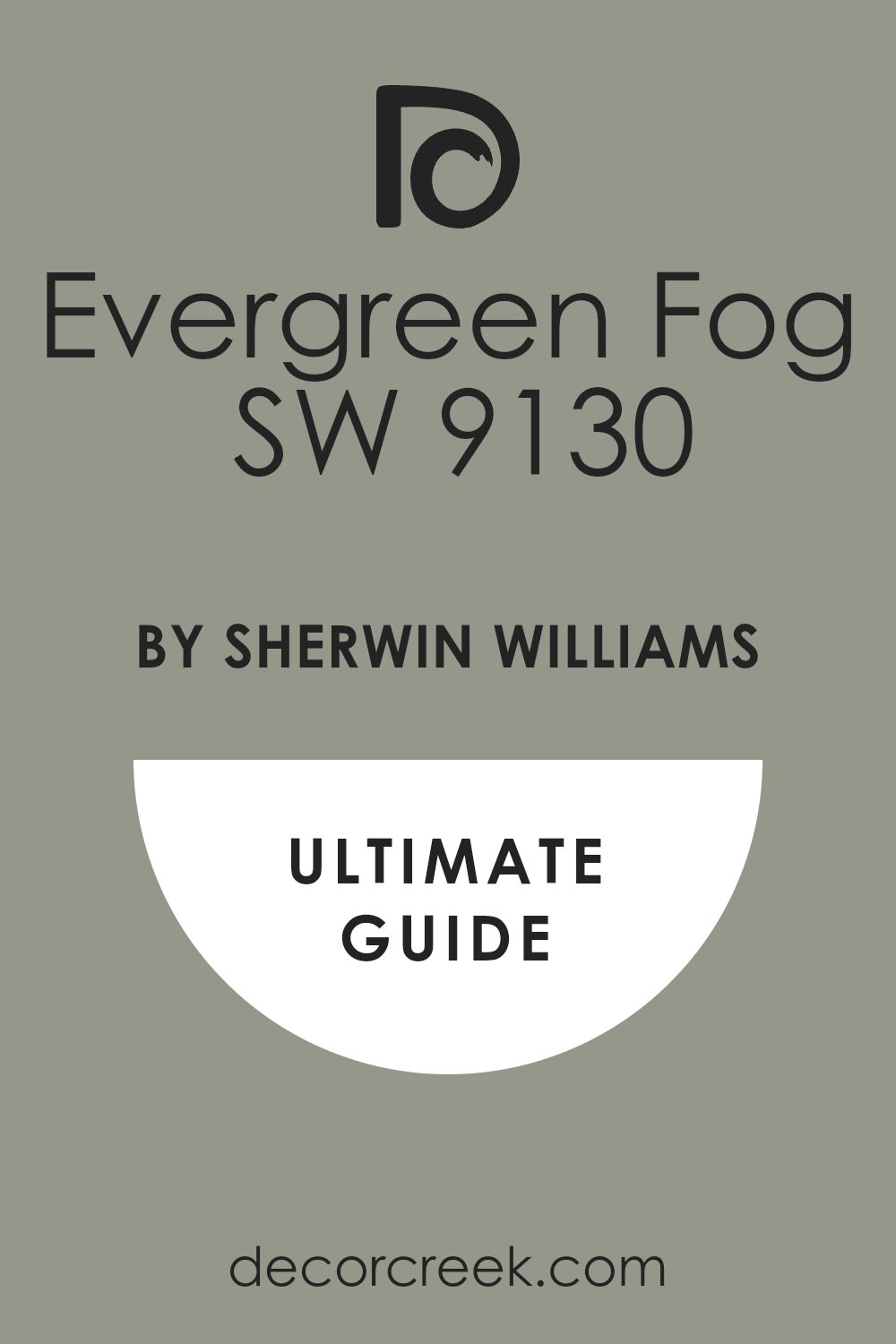
Evergreen Fog SW 9130
Evergreen Fog SW 9130 is a lighter green that feels like a misty morning in a big forest. This color is very soft and makes a room feel very open and very fresh for everyone. It is a great choice for a living room where you want to feel relaxed and happy.
The gray tones in the paint make it feel very modern and very easy to match with furniture. You can use it on all four walls without making the room feel too small or dark. It looks very good with light-colored rugs and soft white curtains in the windows.
This paint is very popular right now because it feels very new and very trendy for houses. It gives a room a very clean look that makes everything feel very organized and tidy. I like to use it in bathrooms to create a very clean and spa-like feeling. It is a friendly color that makes people feel very welcome in your home.
Best used in: living rooms, bathrooms, bedrooms, and kitchen cabinets
Pairs well with: Neutral Ground SW 7568, Dried Edamame SW 6162, and light wood The key rule of this color for Art Deco style is to use it when you want a hint of color that still acts like a neutral base.
🎨 Check out the complete guide to this color right HERE 👈
Dried Thyme SW 6186
Dried Thyme SW 6186 is a heavy green that has a lot of gray and brown mixed inside it. This color feels very solid and very reliable for a room that gets a lot of use every day. It is a great choice for a hallway or a mudroom where people are always coming and going.
The shade is dark enough to hide dirt but light enough to feel very inviting and warm. This paint looks very good with old wooden furniture and antique decorations from long ago. It has a very classic look that makes a house feel like it has many stories to tell.
Many people like this color because it feels very natural and not like a fake or loud green. It creates a very steady mood that makes the house feel very safe and well-built. I suggest using it on cabinets to give your kitchen a very high-end and custom look. It is a very smart color that always looks like a professional picked it out.
Best used in: hallways, mudrooms, kitchen cabinets, and exterior trim
Pairs well with: Alabaster SW 7008, Sea Salt SW 6204, and dark bronze The key rule of this color for Art Deco style is to use it to add a sense of history and age to a newer home.
🎨 Check out the complete guide to this color right HERE 👈

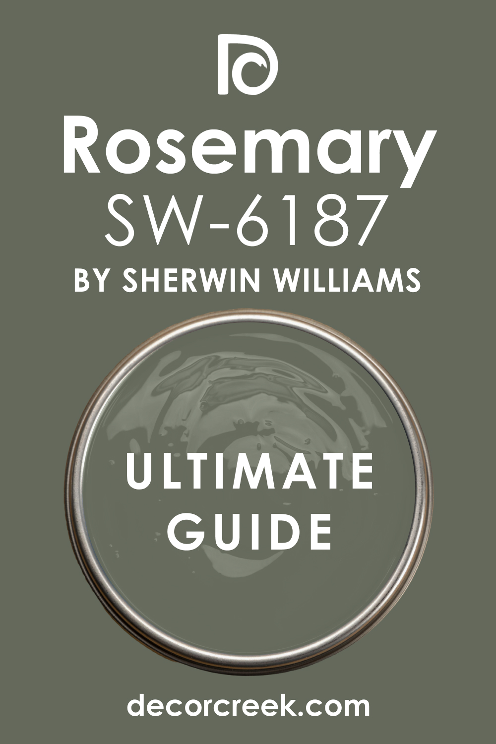
Rosemary SW 6187
Rosemary SW 6187 is a deep green that feels like a herb garden in the late afternoon. This color has a lot of gray and black mixed in to keep it looking very mature and strong. It makes a room feel very expensive and well-thought-out for any visitor.
You should use it in a study or a den to create a place that feels very serious. The shade looks wonderful when you put it next to light wood or white stone counters. It is dark enough to be bold but it does not feel cold or unfriendly to the eyes.
Many people love how this color makes their gold lamps look like real treasure. It gives the walls a very thick and rich look that stays beautiful for a long time. I like to use it on the outside of a house to make it look very grand and natural. This paint is a great way to bring a classic style into a brand-new home today.
Best used in: study rooms, dens, kitchen cabinets, and exterior siding
Pairs well with: Alabaster SW 7008, Greige tones, and warm brass fixtures The key rule of this color for Art Deco style is to use it to create a sense of deep, organic luxury that feels very solid and permanent.
🎨 Check out the complete guide to this color right HERE 👈
Rock Garden SW 6195
Rock Garden SW 6195 is a very dark green that looks like the leaves of a plant deep in the woods. This color is very powerful and makes a room feel very grounded and very safe. It is a fantastic choice for an accent wall behind a big velvet sofa or a bed.
The green tones are very rich and make any gold or silver decorations stand out perfectly. This paint makes a room feel very private and like a special place away from the world. You will notice how it creates a very moody and artistic feeling as soon as it dries.
Many people feel very creative when they are surrounded by such a deep and natural shade. It works very well with dark wood floors to make the whole room feel like a palace. I suggest using it in a dining room to make your dinner parties feel very fancy and special. This color is a bold move that always pays off with a very high-end look.
Best used in: dining rooms, accent walls, bedrooms, and library shelves
Pairs well with: Pure White SW 7005, Goldfinch SW 6905, and dark walnut wood The key rule of this color for Art Deco style is to use it when you want to make a very strong and artistic statement on your walls.
🎨 Check out the complete guide to this color right HERE 👈
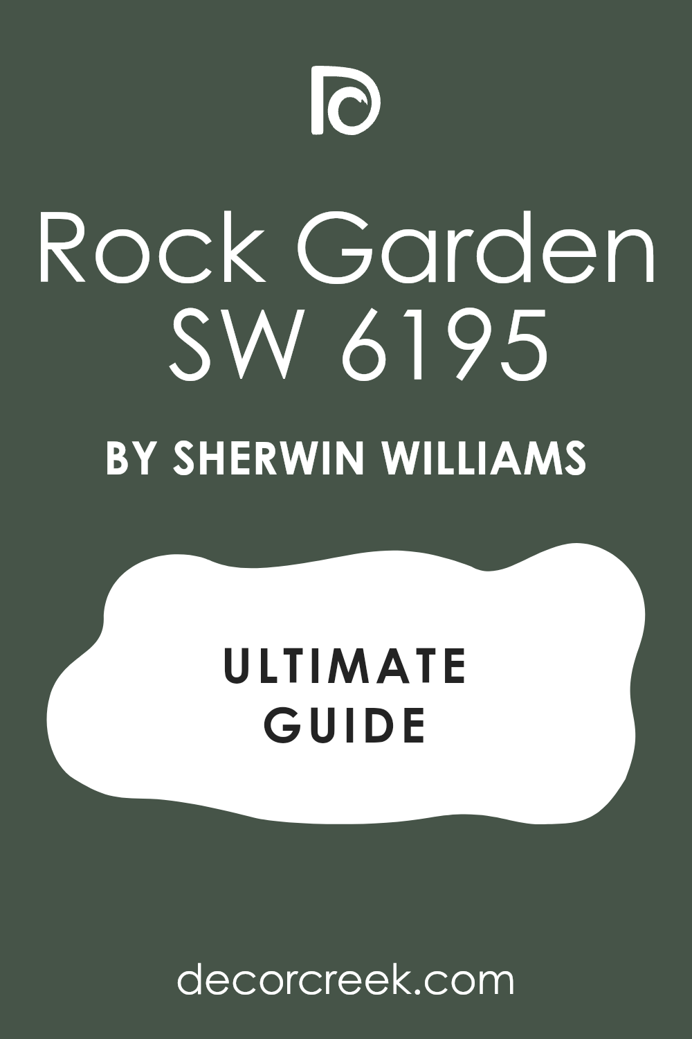
Carnelian SW 7580
Carnelian SW 7580 is a deep red that looks like a dark wine or a precious stone. This color is very warm and makes a room feel very exciting and very full of life. It is a great choice for a dining room where you want people to feel hungry and happy.
The red is very dark so it does not feel too bright or like a toy color. It makes the room feel very royal and very important for anyone who walks inside. This paint looks amazing when you pair it with black furniture and gold mirrors.
Many people choose this color because it feels very brave and very full of personality. It creates a very cozy feeling when you use it in a room with a fireplace. The color has a lot of depth and makes the walls feel very soft and very inviting. I like to use it in small spaces to make them feel like a rich jewel box.
Best used in: dining rooms, powder rooms, library nooks, and front doors
Pairs well with: Tricorn Black SW 6258, Creamy SW 7012, and antique gold The key rule of this color for Art Deco style is to use it to bring a sense of high-energy luxury and warmth to your living space.
🎨 Check out the complete guide to this color right HERE 👈
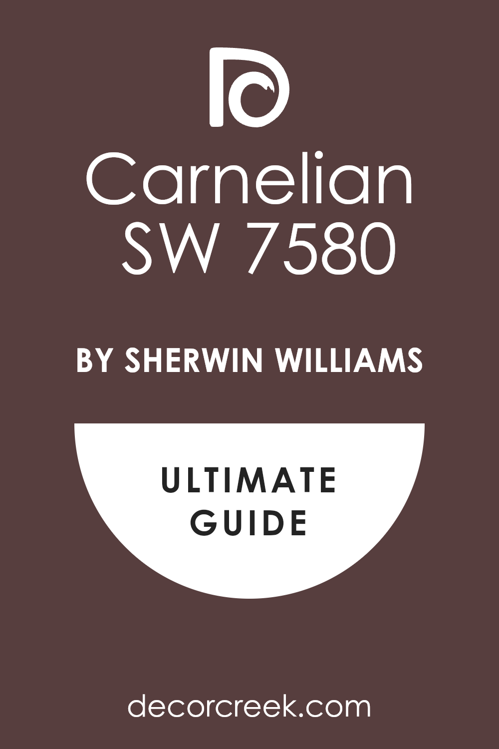
Redend Point SW 9081
Redend Point SW 9081 is a soft and earthy color that looks like a mix of pink and brown clay. This color is very gentle and makes a room feel very kind and very welcoming to everyone. It is a great choice for a bedroom where you want to feel very relaxed and happy.
The shade is very natural and makes the room feel like it is part of the earth. This paint works very well with light wood and soft fabrics like linen or cotton. Many people love this color because it feels very fresh and very modern for a house.
It creates a very balanced mood that is not too loud or too quiet for a family. You will find that it makes your plants look very green and very healthy next to the walls. I like to use it in entryways to give people a very warm hello when they visit. It is a very smart color that makes a home feel very cared for and loved.
Best used in: bedrooms, entryways, living rooms, and cozy reading corners
Pairs well with: Foothills SW 7514, Kestrel White SW 7516, and natural wood The key rule of this color for Art Deco style is to use it as a warm and soft neutral that still has a lot of character.
🎨 Check out the complete guide to this color right HERE 👈
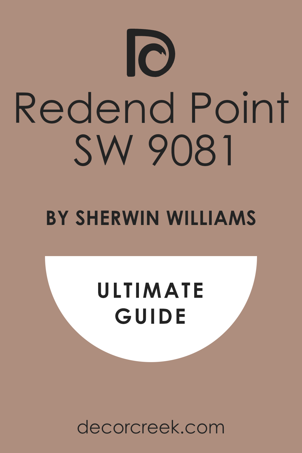
Smokehouse SW 7040
Smokehouse SW 7040 is a deep brown that has a lot of gray hidden inside the paint. This color feels very solid and very strong like the walls of an old mountain cabin. It is a great choice for a room where you want to feel very grounded and very steady.
The shade is very dark but it feels very warm because of the brown tones. This paint looks very high-end when you use it on cabinets or big wooden doors. Many people choose this color because it feels very professional and very smart for a home office.
It creates a very quiet atmosphere that helps you think and get work done. You will notice how it makes white trim look very bright and very clean in the room. I find that it works perfectly with bronze or copper handles on the furniture. It is a very hardworking color that stays looking great even if the room is very busy.
Best used in: home offices, kitchen cabinets, exteriors, and mudrooms
Pairs well with: Urban Bronze SW 7048, Repose Gray SW 7015, and warm metals The key rule of this color for Art Deco style is to use it to add a sense of weight and reliability to the architecture of the house.
🎨 Check out the complete guide to this color right HERE 👈
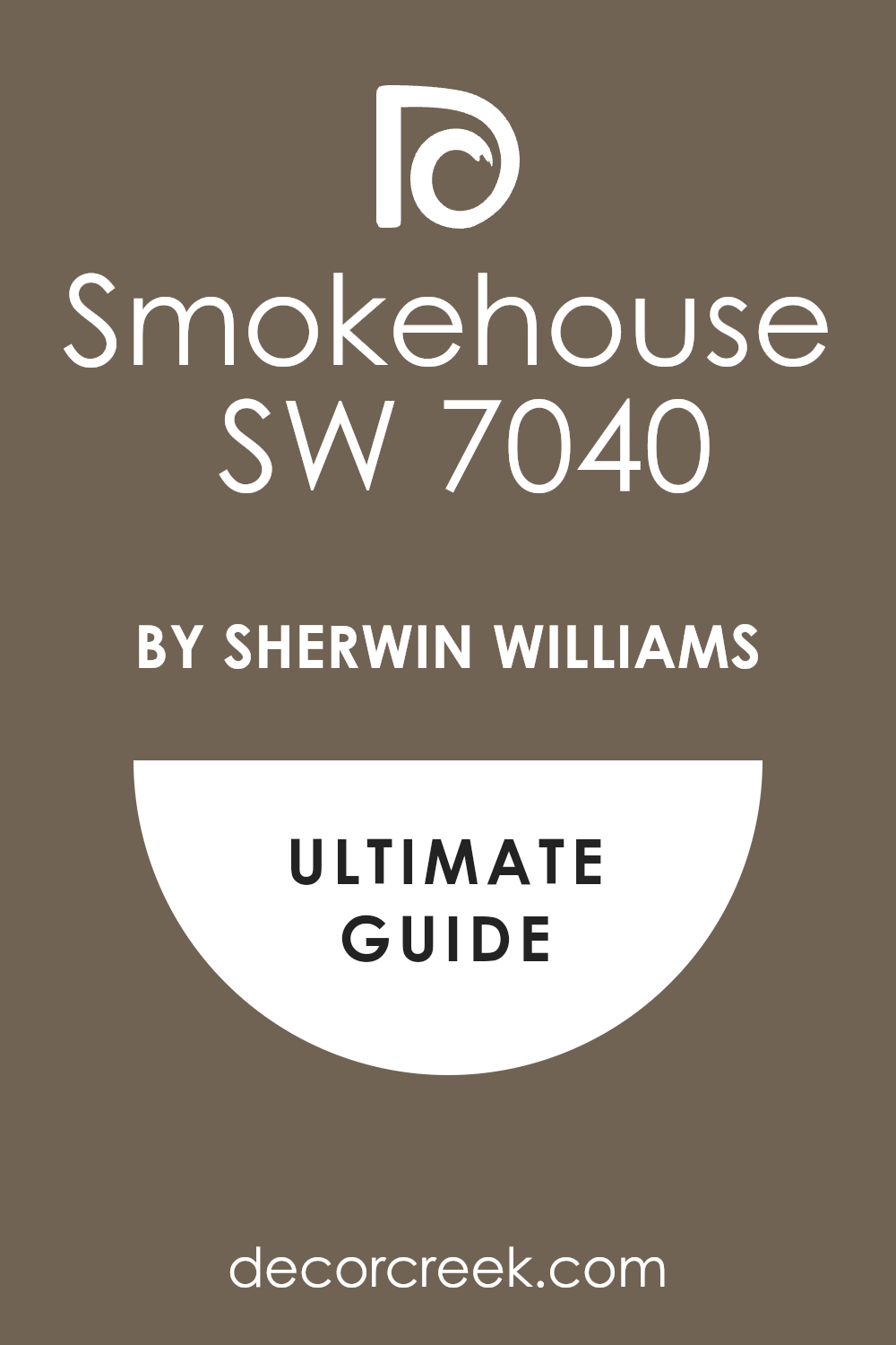
Foothills SW 7514
Foothills SW 7514 is a medium-to-dark brown that feels very earthy and very natural. This color looks like the dirt on a hiking trail or the bark of a big tree. It is a great choice for a living room where you want to use a lot of green plants.
The shade makes the room feel very cozy and very much like a part of the outside world. This paint works very well with creamy white colors and soft yellow light from lamps. Many people find it to be very comfortable and very easy to live with for many years.
It creates a very steady mood that makes everyone feel very at home and very relaxed. I like to use it on the outside of a house to help it blend in with the garden. This color is a very smart way to add drama without using a color that feels too cold. It gives the house a very honest and very sturdy look that people really like.
Best used in: living rooms, exteriors, dens, and master bedrooms
Pairs well with: Redend Point SW 9081, Shoji White SW 7042, and stone accents The key rule of this color for Art Deco style is to use it as a rich and organic background for a very comfortable room.
🎨 Check out the complete guide to this color right HERE 👈
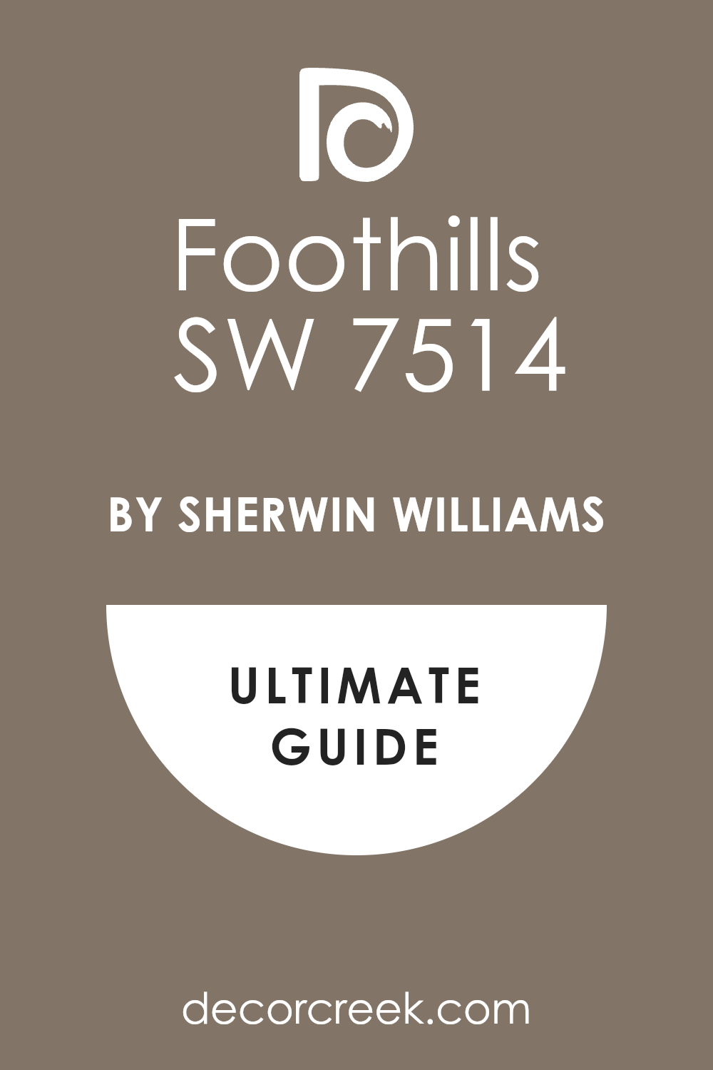
Thunder Gray SW 7645
Thunder Gray SW 7645 is a very deep and dark gray that feels as heavy as a storm cloud. This color is very serious and makes a room feel very important and very modern. It is a fantastic choice for a media room or a place where you watch movies.
The shade is dark enough to make the screen look very bright and very clear. This paint makes the walls feel very solid and like they are made of dark stone. Many people choose this color because it looks very expensive and very high-end for a new house.
It creates a very cool and steady mood that helps you feel very calm and focused. You will see how it makes silver and chrome decorations look very shiny and very pretty. I suggest using it on an accent wall if you want to add a lot of style quickly. It is a very bold choice that shows you have a very good eye for design.
Best used in: theater rooms, accent walls, bathrooms, and modern kitchens
Pairs well with: Extra White SW 7006, Nebulous White SW 7063, and silver metal The key rule of this color for Art Deco style is to use it to create a sharp and very modern look that feels very powerful.
🎨 Check out the complete guide to this color right HERE 👈
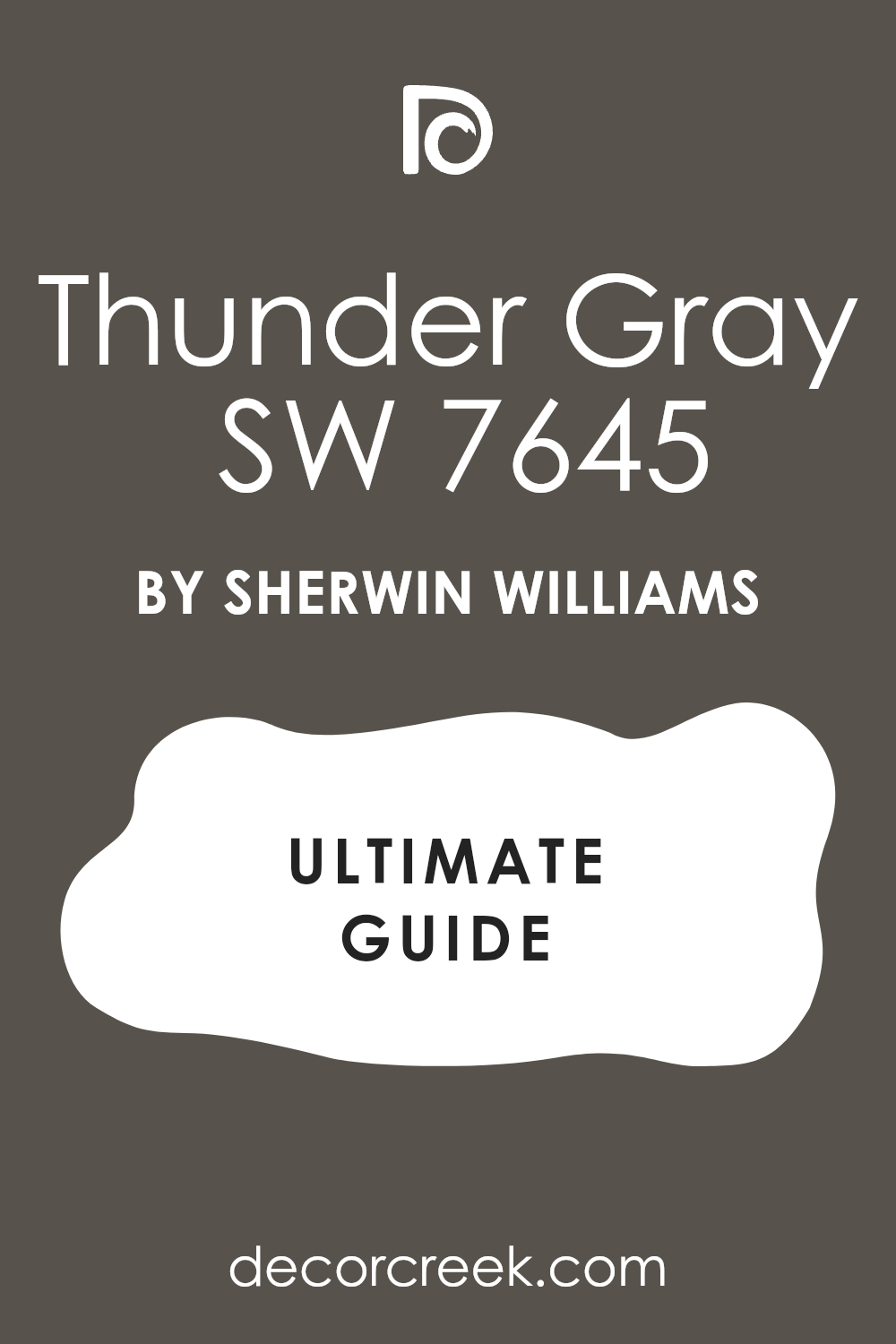
Backdrop SW 7025
Backdrop SW 7025 is a warm gray that has a lot of brown mixed in to make it feel cozy. This color is a great middle ground for someone who wants a dark look that is not too heavy. It makes a room feel very balanced and very easy to be in for a long time.
The shade works very well in a bedroom to help you feel ready for a good sleep. This paint looks very smart when you pair it with white trim and light-colored rugs. Many people love this color because it matches almost any piece of furniture you already have.
It creates a very soft and very inviting feeling that guests will really like. You will find that it makes your home feel very updated and very fresh without being loud. I like to use it in hallways to make the transition between rooms feel very smooth. It is a very friendly and very useful color for any part of your house.
Best used in: bedrooms, hallways, living rooms, and kitchen walls
Pairs well with: Alabaster SW 7008, Urban Bronze SW 7048, and soft textiles The key rule of this color for Art Deco style is to use it as a warm and reliable base that ties the whole house together.
🎨 Check out the complete guide to this color right HERE 👈
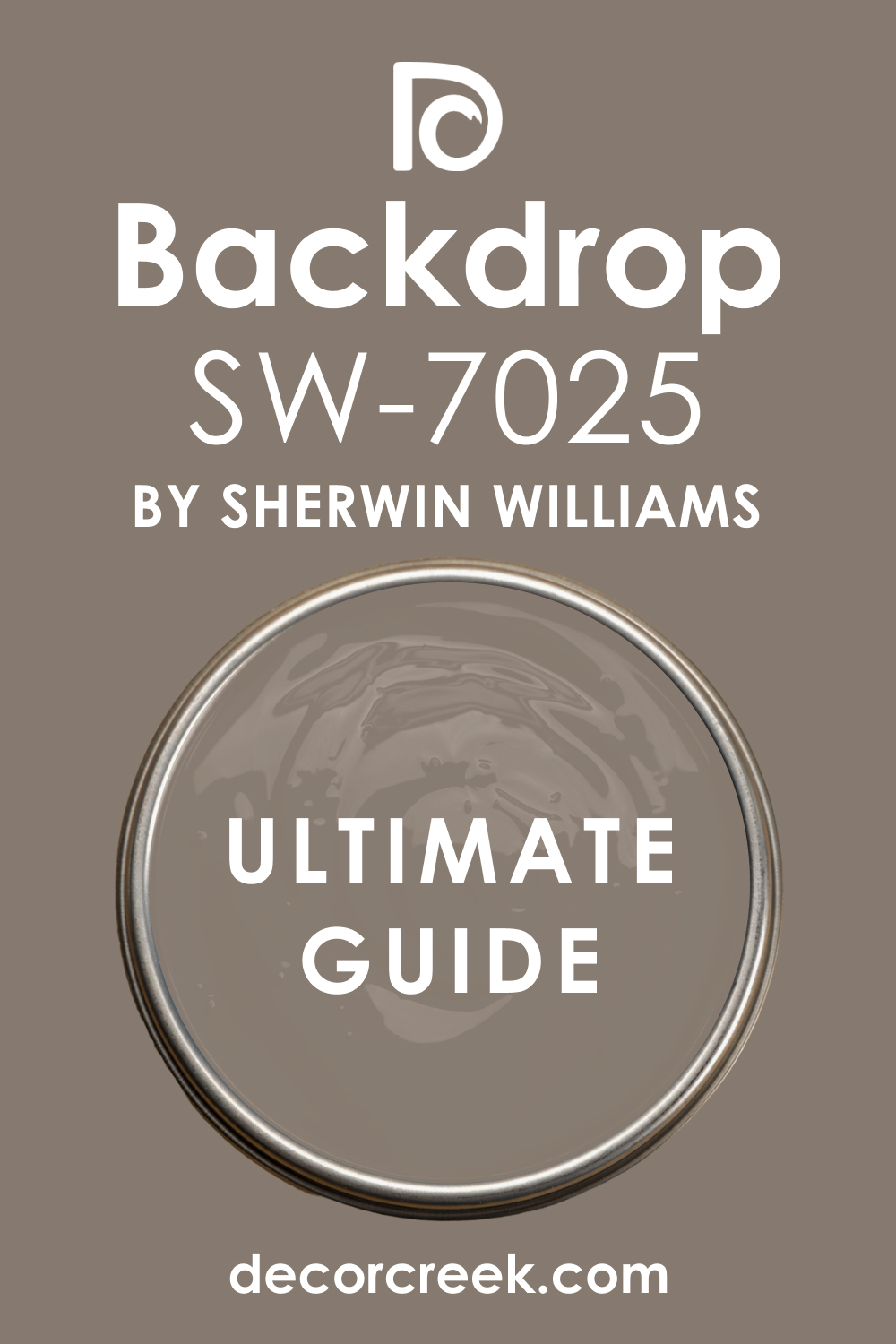
Black Beauty 2128-10
Black Beauty 2128-10 is a very deep and rich black from the Benjamin Moore book. This color is very smooth and makes a room feel like a high-end fashion shop. It is a great choice for doors or window frames to make them look very sharp.
The shade has a tiny bit of warmth that keeps it from feeling like a cold machine. This paint makes the walls look very thick and very expensive for any homeowner. Many people choose this color because it is a classic that never goes out of style.
It creates a very bold and very strong look that makes a statement in any room. You will notice how it makes gold and brass fixtures look very bright and very rich. I like to use it on a ceiling to make a tall room feel much more private and cozy. It is a very beautiful choice for anyone who wants the best black paint for their home.
Best used in: interior doors, window trim, accent walls, and ceilings
Pairs well with: Simply White OC-117, Chantilly Lace OC-65, and gold accents The key rule of this color for Art Deco style is to use it to create a sharp and very clean finish on the details of your room.
🎨 Check out the complete guide to this color right HERE 👈

Wrought Iron 2124-10
Wrought Iron 2124-10 is a very popular dark gray that looks like the metal fences of a big park. This color is not quite black but it is very deep and has a lot of blue and gray in it. It makes a room feel very soft and very fancy at the same time for guests.
You can use it on kitchen cabinets to create a very modern and very clean look. This shade is perfect for making a large room feel more intimate and more special. Many people love this color because it changes slightly when the sun moves across the sky.
It creates a very moody and very cool atmosphere that feels very high-end. You will see how it makes wood floors look very warm and very beautiful next to it. I suggest using it on the front door to give your house a very smart and sturdy look. It is a very stylish choice that always looks professional and well-planned.
Best used in: kitchen cabinets, front doors, accent walls, and exterior trim
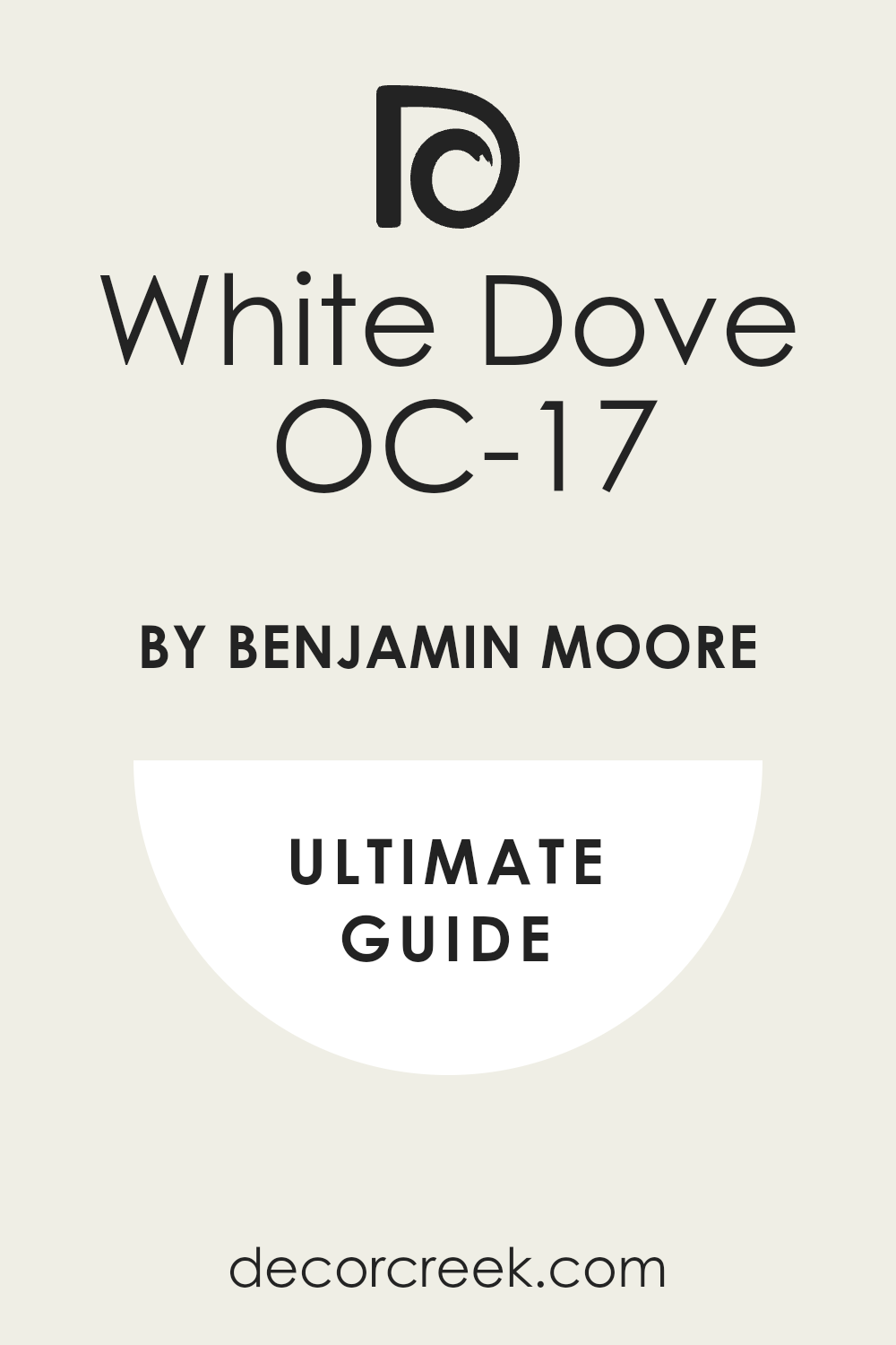
Pairs well with: Gray Owl OC-52, White Dove OC-17, and natural wood The key rule of this color for Art Deco style is to use it when you want a dark and moody look that still feels very soft.
🎨 Check out the complete guide to this color right HERE 👈
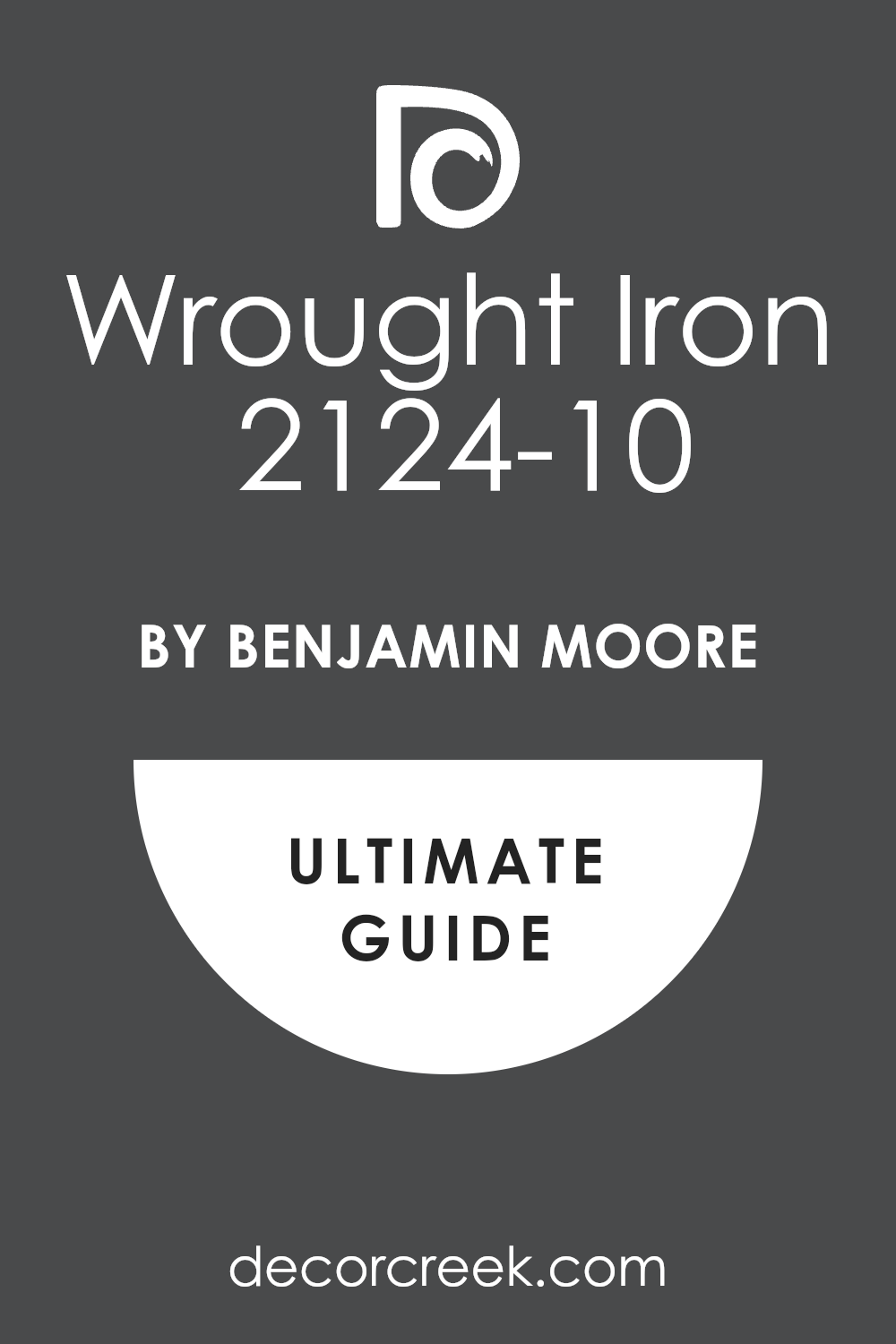
Soot 2129-20
Soot 2129-20 is a very deep and smoky black that has a hint of blue hidden inside. This color makes a room feel like a cozy fireplace on a cold winter night. It is a great choice for an accent wall in a bedroom where you want to feel very safe.
The shade is very dark but it feels softer than a pure black paint would. This paint looks very high-end when you pair it with silver mirrors and white light. Many people love this color because it makes the walls look like they are made of velvet.
It creates a very moody and smart feeling that is perfect for a modern home. You will notice how it makes the furniture in the room look much more expensive. I find that it works very well in a small bathroom to make it feel like a secret jewel box. It is a very stylish choice that shows you have a very bold and artistic spirit.
Best used in: bedrooms, accent walls, powder rooms, and furniture
Pairs well with: Gray Owl OC-52, White Dove OC-17, and cool silver accents The key rule of this color for Art Deco style is to use it to create a soft and smoky backdrop that feels very expensive and private.
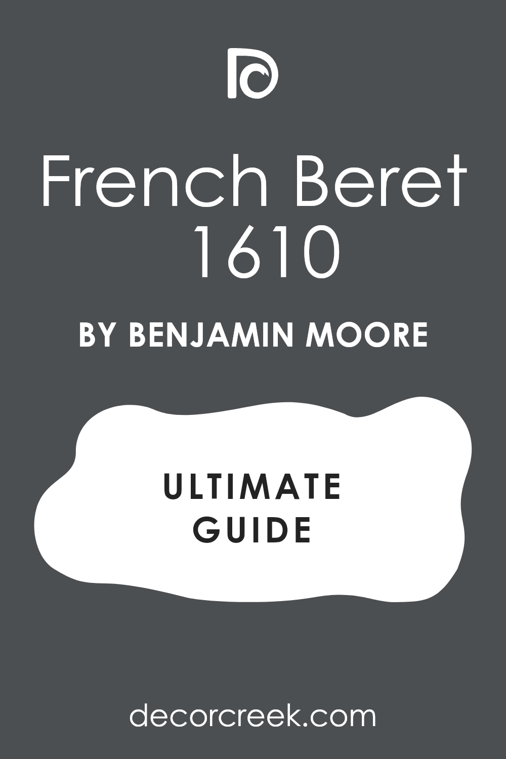
French Beret 1610
French Beret 1610 is a very dark gray that feels very sophisticated and very smart. This color has a lot of blue and a tiny bit of purple mixed into the paint bucket. It makes a room feel very royal and very special for anyone who spends time there.
You should use it in a dining room to make your dinner parties feel like a movie scene. The shade is very deep and gives the walls a lot of weight and a lot of character. This paint looks amazing next to shiny gold frames and big glass windows.
Many people choose this color because it feels very fresh and very updated for a classic style. It creates a very cool and steady mood that helps you feel very focused. You will see how it makes white trim look very sharp and very clean in the house. I like to use it on built-in bookshelves to make them look like they belong in a palace.
Best used in: dining rooms, libraries, bookshelves, and entryways
Pairs well with: Paper White OC-55, Simply White OC-117, and dark wood The key rule of this color for Art Deco style is to use it to bring a touch of European fashion and luxury into your home.
🎨 Check out the complete guide to this color right HERE 👈
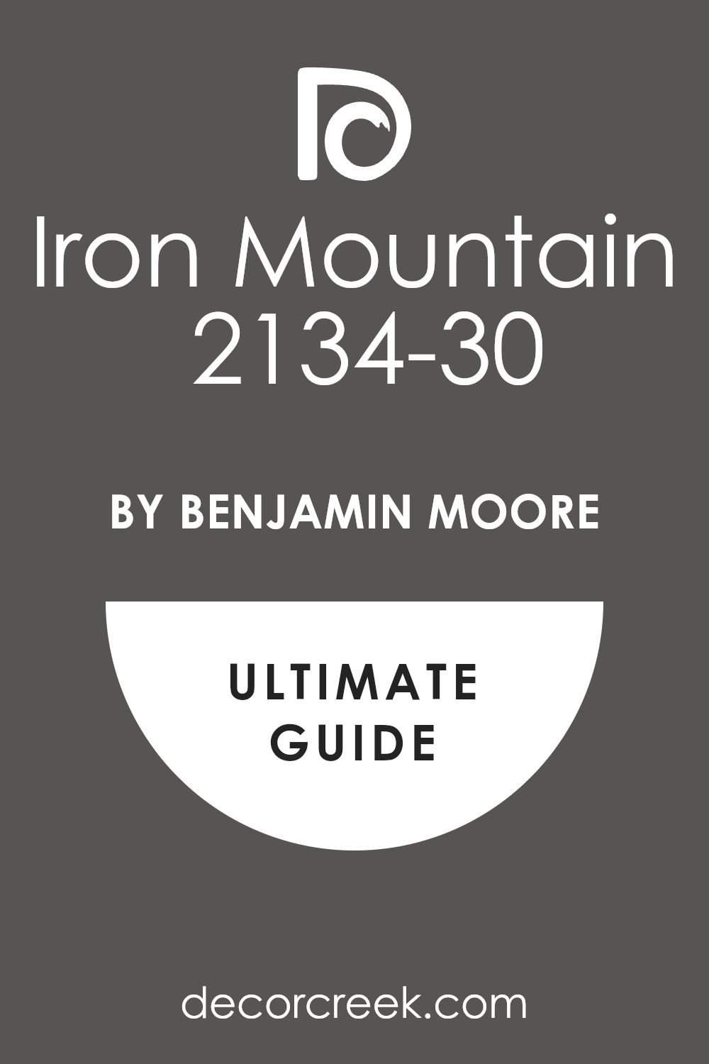
Iron Mountain 2134-30
Iron Mountain 2134-30 is a heavy and strong gray that feels very solid on the walls. This color is not too dark but it has enough power to make a room feel very grounded. It is a fantastic choice for kitchen cabinets to make the heart of the home look very modern.
The shade looks like a piece of dark stone that has been polished by the rain. This paint works very well with silver handles and light gray stone counters. Many people like this color because it feels very steady and very reliable for a busy house.
It creates a very professional look that makes the whole room feel very organized and tidy. You will find that it makes your wooden floors look very warm and very beautiful next to it. I suggest using it in a hallway to make the path through the house feel very grand. It is a very hardworking color that always stays looking very clean and very fresh.
Best used in: kitchen cabinets, hallways, exteriors, and staircases
Pairs well with: Stonington Gray HC-170, Cloud Cover OC-25, and chrome hardware The key rule of this color for Art Deco style is to use it as a strong and neutral base that makes everything else look better.
🎨 Check out the complete guide to this color right HERE 👈
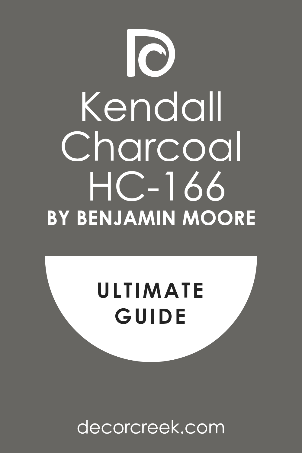
Kendall Charcoal HC-166
Kendall Charcoal HC-166 is a very rich and very deep gray that everyone seems to love. This color feels very warm for a gray and makes a room feel very cozy and very inviting. It is a great choice for a living room where you want to sit and talk with friends.
The shade is dark enough to be bold but it never feels scary or too heavy for the walls. This paint looks very high-end when you use it with white crown molding and big rugs. Many people choose this color because it matches almost any other color you put near it.
It creates a very balanced and very easy feeling that makes you want to stay in the room. You will notice how it makes your art pieces look very bright and very important. I like to use it on the outside of a house to make it look very smart and well-cared for. It is a very safe but beautiful choice that always looks like a professional designer was there.
Best used in: living rooms, exteriors, master suites, and accent walls
Pairs well with: Revere Pewter HC-172, Simply White OC-117, and natural wood The key rule of this color for Art Deco style is to use it where you want a dark feeling that remains very soft and very friendly.
🎨 Check out the complete guide to this color right HERE 👈
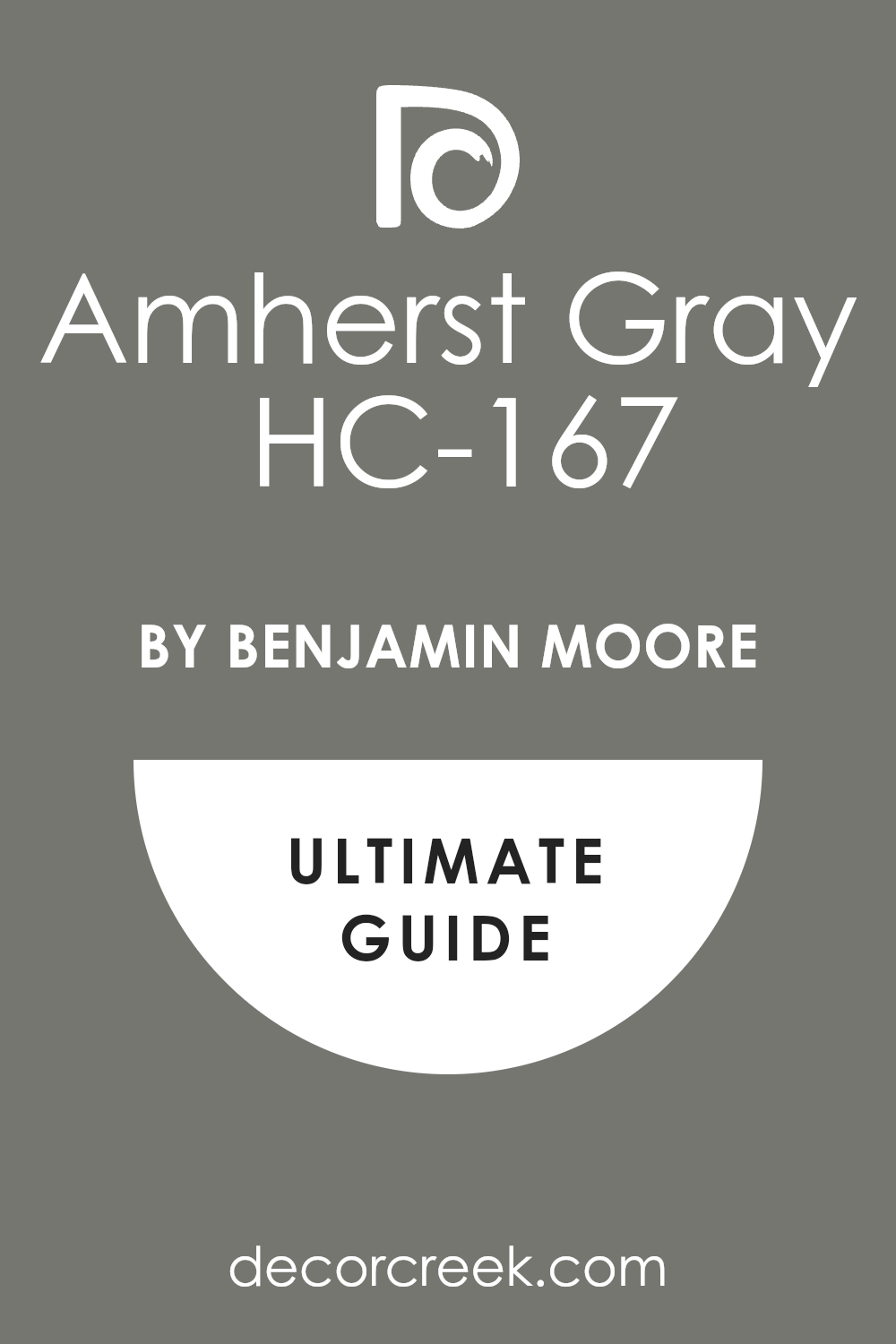
Amherst Gray HC-167
Amherst Gray HC-167 is a medium-dark gray that has a bit of green and brown hidden inside. This color feels very natural and very grounded like the stones in a mountain stream. It is a great choice for a home office where you need to feel very calm and very smart.
The shade is very steady and makes the room feel very solid and well-built for work. This paint works very well with old wooden desks and green lamps from a long time ago. Many people find it to be very comfortable and very easy on the eyes during the day.
It creates a very quiet mood that helps you focus on your big ideas and plans. You will find that it makes your home feel very updated and very professional. I like to use it on the outside trim of a house to give it a very classic and strong look. It is a very useful color that brings a sense of history to any room you paint.
Best used in: home offices, exterior trim, kitchen islands, and mudrooms
Pairs well with: Edgecomb Gray HC-173, Chantilly Lace OC-65, and bronze accents The key rule of this color for Art Deco style is to use it to add a touch of earthy strength and serious character to the room.
🎨 Check out the complete guide to this color right HERE 👈
Hale Navy HC-154
Hale Navy HC-154 is a very famous and very beautiful navy blue that looks good everywhere. This color is very deep and makes a room feel very royal and very important as soon as you see it. It is a fantastic choice for a bedroom where you want to feel like you are in a high-end hotel.
The shade is a very true blue that looks very rich and very thick on the walls. This paint makes white furniture look very bright and very clean like a new pair of shoes. Many people choose this color because it is a classic that never feels old or boring to look at.
It creates a very strong and very confident mood that makes you feel very proud of your home. You will notice how it makes gold and brass fixtures shine like real stars in the night. I suggest using it in a dining room to create a very fancy and very special place for meals. It is a very pretty color that everyone will tell you looks amazing.
Best used in: bedrooms, dining rooms, kitchen islands, and front doors
Pairs well with: White Dove OC-17, Coventry Gray HC-169, and gold or brass The key rule of this color for Art Deco style is to use it to create a look of timeless luxury and high-energy style.
🎨 Check out the complete guide to this color right HERE 👈

Old Navy 2063-10
Old Navy 2063-10 is a very dark and very bold blue that feels very energetic and very fun. This color is a bit brighter than other navies which makes it feel very fresh and very new. It is a great choice for a front door to make your house stand out from all the others.
The shade is very deep and makes the room feel very exciting and very full of life. This paint looks very smart when you pair it with light-colored floors and silver decorations. Many people love this color because it makes them feel very happy and very brave about their style.
It creates a very sharp and very clean look that makes the architecture of the house pop. You will find that it makes your white walls look even whiter and even cleaner than before. I like to use it in a small bathroom to give it a very big and very stylish personality. It is a very cool color that brings a lot of spirit to any room you choose.
Best used in: front doors, bathrooms, accent walls, and exterior shutters
Pairs well with: Simply White OC-117, Sea Haze 2137-50, and silver metallic finishes The key rule of this color for Art Deco style is to use it when you want a dark blue that still feels very bright and very full of energy.
🎨 Check out the complete guide to this color right HERE 👈

Newburg Green HC-158
Newburg Green HC-158 is a beautiful mix of blue and green that feels very old and very rich. This color looks like the teal of a vintage car or a fancy dress from the past. It is a great choice for a living room where you want to feel very artistic and very creative.
The shade is very deep and makes the room feel very private and like a secret place. This paint works very well with gold frames and dark wood furniture from the old days. Many people choose this color because it is very unique and very interesting to look at all day.
It creates a very moody and very high-end feeling that guests will really love. You will notice how it makes the colors in your rugs look very bright and very pretty. I find that it works perfectly in a study to make it feel like a place for writing and reading. It is a very smart color that adds a lot of soul and a lot of depth to your home.
Best used in: living rooms, study areas, kitchen cabinets, and accent walls
Pairs well with: Revere Pewter HC-172, Cloud White OC-130, and warm wood tones The key rule of this color for Art Deco style is to use it to bring a sense of artistic history and deep color into the room.
🎨 Check out the complete guide to this color right HERE 👈

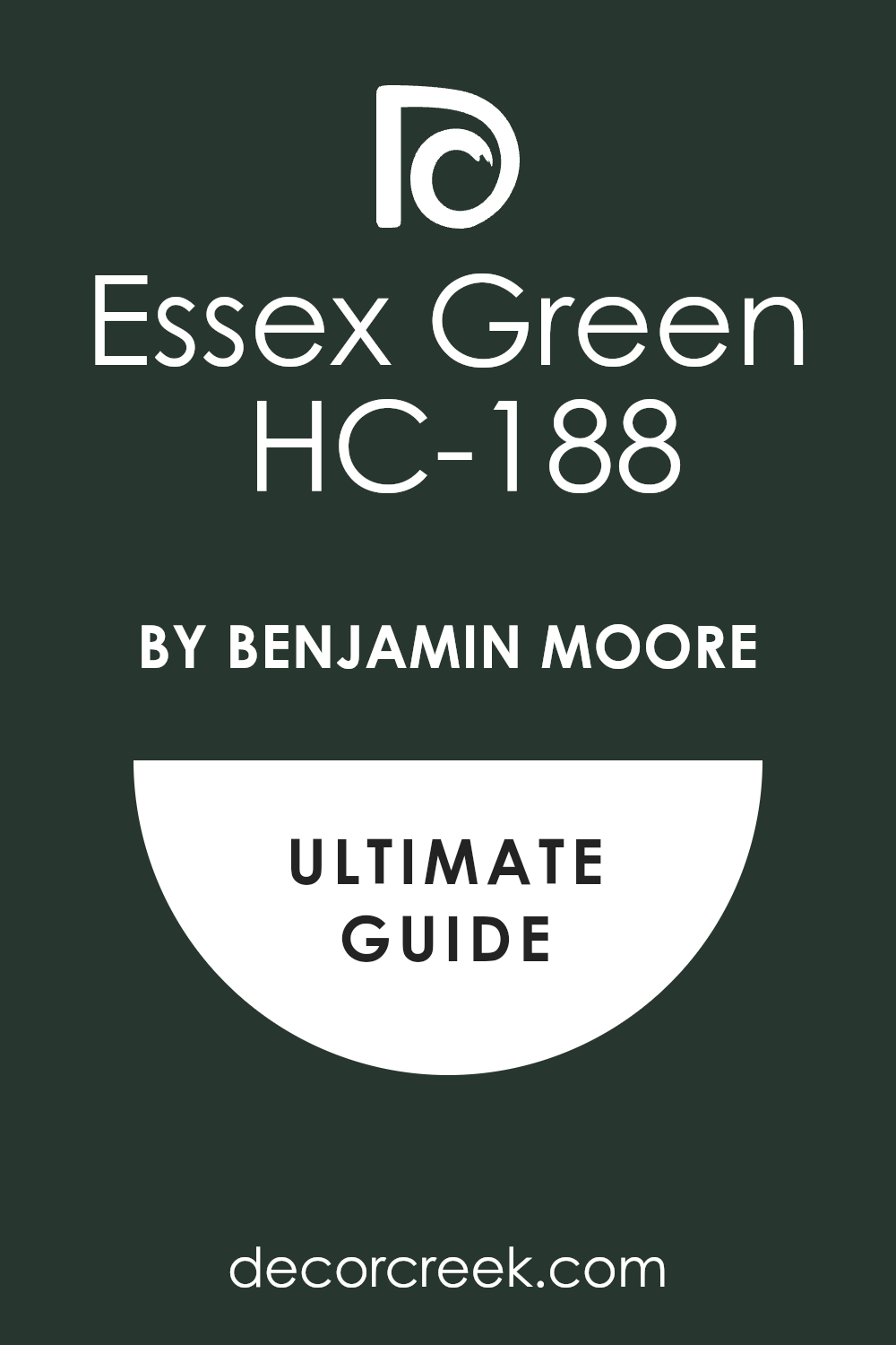
Essex Green HC-188
Essex Green HC-188 is a very dark green that almost looks like black in a room with low light. This color is very rich and feels like the deep forest at the end of the day. It is a fantastic choice for a library or a place where you keep all your favorite books.
The shade is very steady and makes the room feel very safe and very quiet for thinking. This paint makes the walls look very thick and very expensive for anyone who lives there. Many people choose this color because it feels very royal and very much like a palace.
It creates a very grounded and very strong mood that makes the furniture look very solid. You will see how it makes brass and copper lamps look very bright and very beautiful. I suggest using it on kitchen cabinets to give your house a very high-end and custom look. It is a very beautiful choice for anyone who loves the colors of the earth and the woods.
Best used in: libraries, kitchen cabinets, master bedrooms, and exterior doors
Pairs well with: Navajo White OC-95, Wickham Gray HC-171, and warm brass The key rule of this color for Art Deco style is to use it to create a thick and lush feeling that is very private and very fancy.
🎨 Check out the complete guide to this color right HERE 👈
Hunter Green 2041-10
Hunter Green 2041-10 is a classic and strong green that feels very traditional and very powerful. This color is very deep and makes a room feel like an old club for smart people. It is a great choice for a den or a place where you sit by the fire.
The shade is a very true green that looks very rich and very natural on the walls. This paint looks very smart when you pair it with dark leather chairs and wooden tables. Many people love this color because it feels very sturdy and very well-made for a house.
It creates a very cozy and very serious mood that helps you feel very relaxed. You will notice how it makes your green plants look very bright and very healthy next to it. I like to use it on the outside of a house to make it look very grand and very much like a part of the forest. It is a very pretty color that brings a lot of character and a lot of history to your home.
Best used in: dens, exterior siding, home offices, and kitchen cabinets
Pairs well with: Creamy whites, dark leather, and antique gold accents The key rule of this color for Art Deco style is to use it to create a traditional look that feels very solid and very permanent.
🎨 Check out the complete guide to this color right HERE 👈

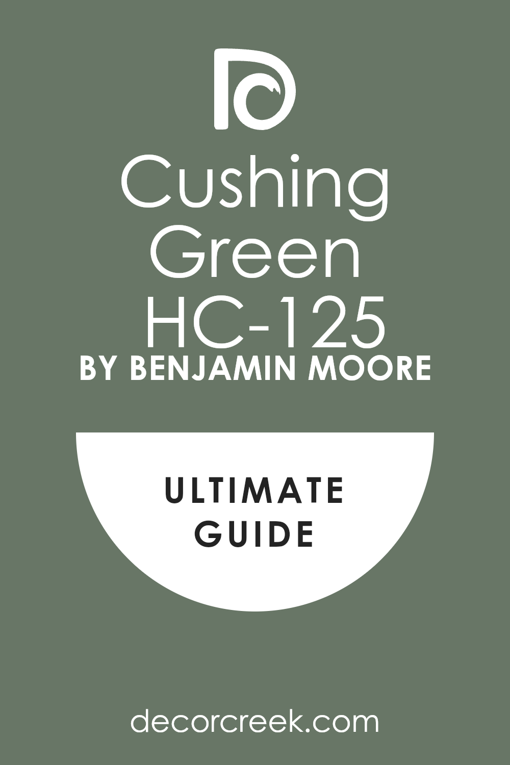
Cushing Green HC-125
Cushing Green HC-125 is a mid-to-dark green that feels very old and very wise. This color has a lot of gray and yellow hidden inside to make it look like a leaf in the shade. It is a great choice for a kitchen where you want to feel very grounded and very close to nature.
The shade is very steady and makes the room feel very solid and well-built for a family. This paint works very well with white stone counters and light wooden floors from the old days. Many people find it to be very comfortable and very easy on the eyes during a long day.
It creates a very quiet mood that helps you feel very focused and very productive at home. You will find that it makes your gold handles look very bright and very pretty on the cabinets. I like to use it in a mudroom to give it a very high-end and very smart look. It is a very useful color that brings a sense of history to any room you paint.
Best used in: kitchens, mudrooms, entryways, and exterior trim
Pairs well with: Pale Oak OC-20, Simply White OC-117, and natural wood The key rule of this color for Art Deco style is to use it to add a touch of earthy strength and serious character to the house.
🎨 Check out the complete guide to this color right HERE 👈
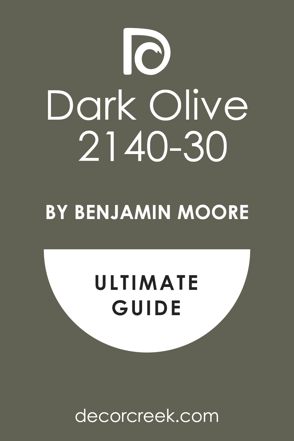
Dark Olive 2140-30
Dark Olive 2140-30 is a deep green that has a lot of warm brown mixed into the paint. This color feels very organic and reminds me of a big forest with lots of old trees. It is a fantastic choice for a bedroom where you want to feel very cozy and very tucked away.
The shade is very rich and makes the walls look very thick and very expensive for guests. This paint makes your green plants look very bright and very happy when they sit next to it. Many people choose this color because it feels very brave and very full of natural spirit.
It creates a very moody and very warm feeling that is perfect for a place of rest. You will see how it makes brass lamps and gold mirrors look like they are worth a lot of money. I suggest using it in a library to make the room feel like a secret place for reading. It is a very beautiful choice for anyone who loves the colors of the earth and the woods.
Best used in: bedrooms, libraries, accent walls, and furniture
Pairs well with: Swiss Coffee OC-45, Revere Pewter HC-172, and warm wood The key rule of this color for Art Deco style is to use it to create a thick and lush feeling that is very private and very fancy.
🎨 Check out the complete guide to this color right HERE 👈
Deep Space 2125-20
Deep Space 2125-20 is a very dark gray that has a lot of blue and purple tones inside. This color feels very modern and very smart for a house in the big city. It is a great choice for a living room where you want to show off your favorite art. The shade is very deep and makes the room feel very private and like a special jewel box.
This paint looks very high-end when you use it with white trim and silver metal decorations. Many people love this color because it changes and looks different every time the light moves. It creates a very cool and very steady mood that makes the house feel very professional.
You will notice how it makes your furniture look very sharp and very clean next to the walls. I find that it works perfectly in a bathroom to make it feel like a very fancy and expensive spa. It is a very stylish choice that shows you have a very bold and artistic eye.
Best used in: living rooms, bathrooms, accent walls, and media rooms
Pairs well with: Chantilly Lace OC-65, Stonington Gray HC-170, and silver accents The key rule of this color for Art Deco style is to use it to create a sharp and very modern look that feels very powerful.
🎨 Check out the complete guide to this color right HERE 👈

Midnight 2131-20
Midnight 2131-20 is a blue so dark that most people will think it is black at first. This color is very mysterious and feels like the sky when the moon is hidden by clouds. It is a fantastic choice for an office where you need to do a lot of deep thinking.
The shade is very rich and makes the room feel very solid and very important for work. This paint works very well with gold frames and dark leather chairs from the old days. Many people choose this color because it feels very royal and very much like a palace for a king.
It creates a very grounded and very strong mood that makes the walls feel very heavy and safe. You will see how it makes white light look very bright and very pretty in the room. I like to use it on the front door to give your house a very smart and sturdy look. It is a very beautiful choice for anyone who wants a color with a lot of soul and mystery.
Best used in: home offices, front doors, bedrooms, and library shelves
Pairs well with: Simply White OC-117, Gray Owl OC-52, and gold or brass The key rule of this color for Art Deco style is to use it to bring a sense of regal history and deep color into the room.
37 Best Paint Color Combo For The Art Deco Interior 1920s
Black Magic SW 6991 + Alabaster SW 7008
Black Magic SW 6991 and Alabaster SW 7008 make a perfect team for a very sharp look. This combination is very famous because it looks like a tuxedo for your living room walls. You should use the black on the doors and the white on the walls to be very smart.

The black is very deep and the white is very soft and looks like a fresh bowl of cream. This pair makes the room feel very tall and very organized for anyone who walks inside. Many people love this look because it never goes out of style and feels very expensive.
It creates a very high-energy mood that makes you feel very proud of your home. You will notice how it makes gold lamps look very bright and very pretty in the room. I find that it works perfectly in an entryway to give guests a very fancy welcome. It is a very clean choice that shows you know how to pick the best colors.
Best used in: entryways, living rooms, kitchens, and master bedrooms
Pairs well with: Gold accents, dark wood floors, and crystal light fixtures The key rule of this color for Art Deco style is to use it where you want a very strong contrast that looks very professional and clean.
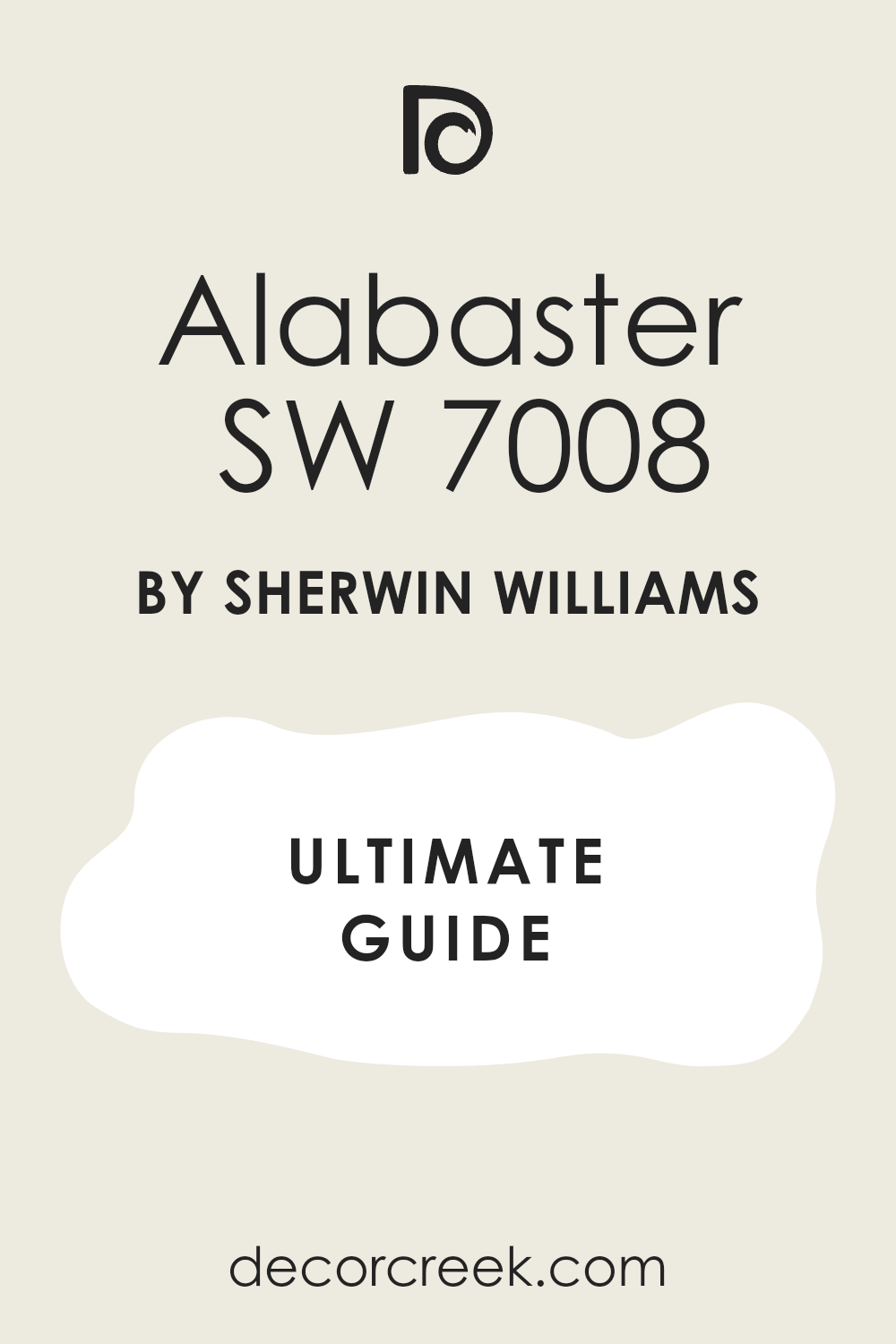
Blue Peacock SW 0064 + Light French Gray SW 0055
Blue Peacock SW 0064 and Light French Gray SW 0055 are a very artistic and very fun pair. This combination looks like the feathers of a bird and the soft clouds in the sky. You should use the blue on an accent wall and the gray on the other walls to stay balanced.
The blue is very deep and rich while the gray is very cool and easy on the eyes. This pair makes the room feel very creative and full of many interesting stories to tell. Many people choose this look because it feels very fresh and very updated for a modern house.
It creates a very steady and very happy mood that makes you want to stay in the room. You will notice how it makes silver decorations shine like real stars next to the blue. I like to use it in a bedroom to make it feel like a very special and private place. It is a very smart choice that brings a lot of life to any room you choose.
Best used in: bedrooms, home offices, bathrooms, and dining rooms
Pairs well with: Silver hardware, white trim, and navy blue textiles The key rule of this color for Art Deco style is to use it to create a cool and artistic atmosphere that feels very high-end.
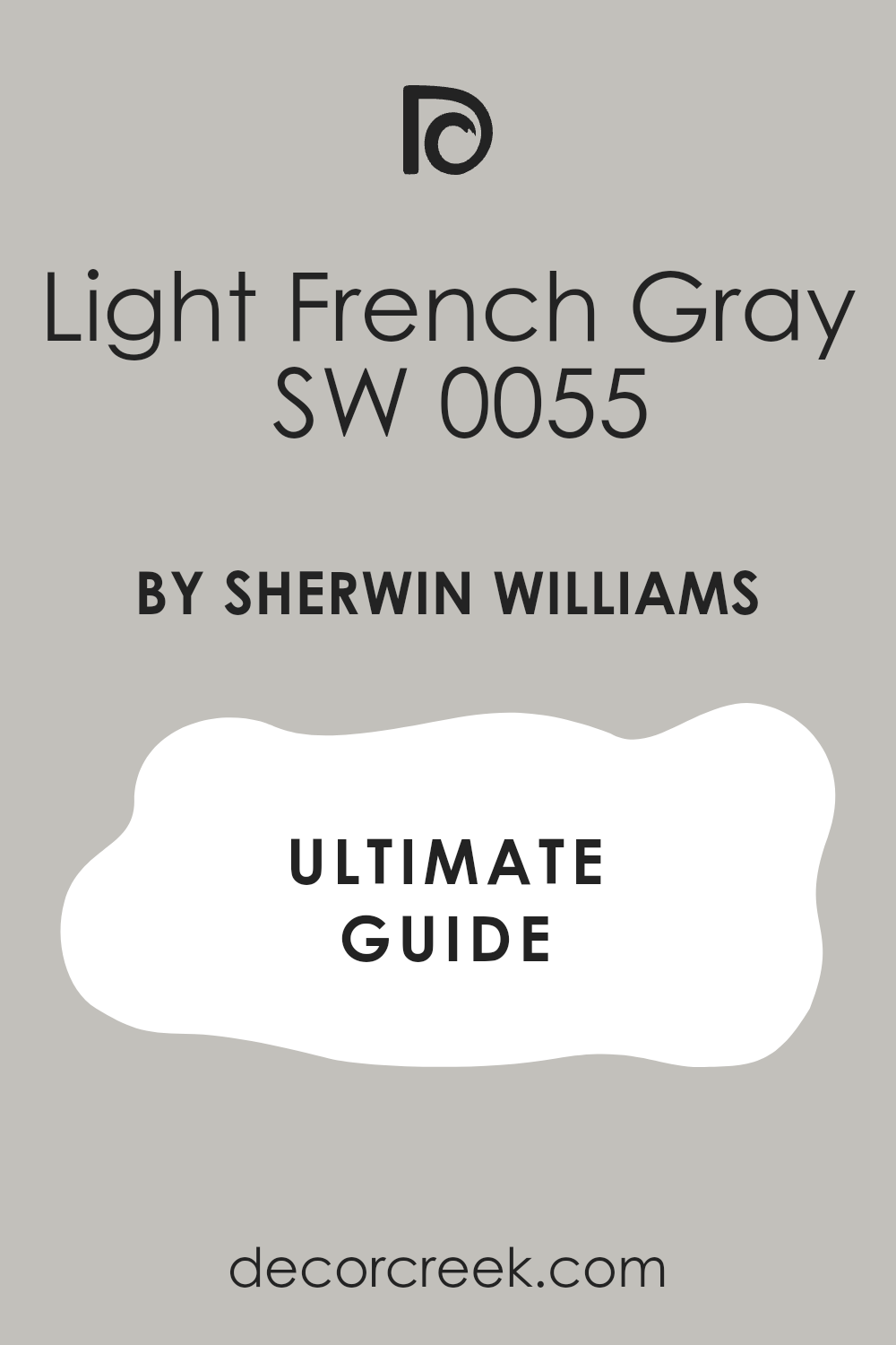
Billiard Green SW 0016 + Pure White SW 7005
Billiard Green SW 0016 and Pure White SW 7005 make a room feel very classic and very strong. This combination looks like an old club where smart people go to play games and talk. You should use the green on the bottom half of the wall and the white on the top.

The green is very deep and looks like the grass in a park on a sunny day. The white is very clean and makes the whole room feel very bright and very fresh. This pair makes the room feel very solid and very well-built for a family to enjoy.
Many people love this look because it feels very royal and very much like a palace for guests. It creates a very grounded and very steady mood that helps you feel very relaxed. You will notice how it makes your wood furniture look very warm and very beautiful. I suggest using it in a dining room to make your dinner parties feel very fancy.
Best used in: dining rooms, libraries, entryways, and kitchen islands
Pairs well with: Dark wood, brass fixtures, and leather furniture The key rule of this color for Art Deco style is to use it to bring a sense of traditional luxury and strength to the house.
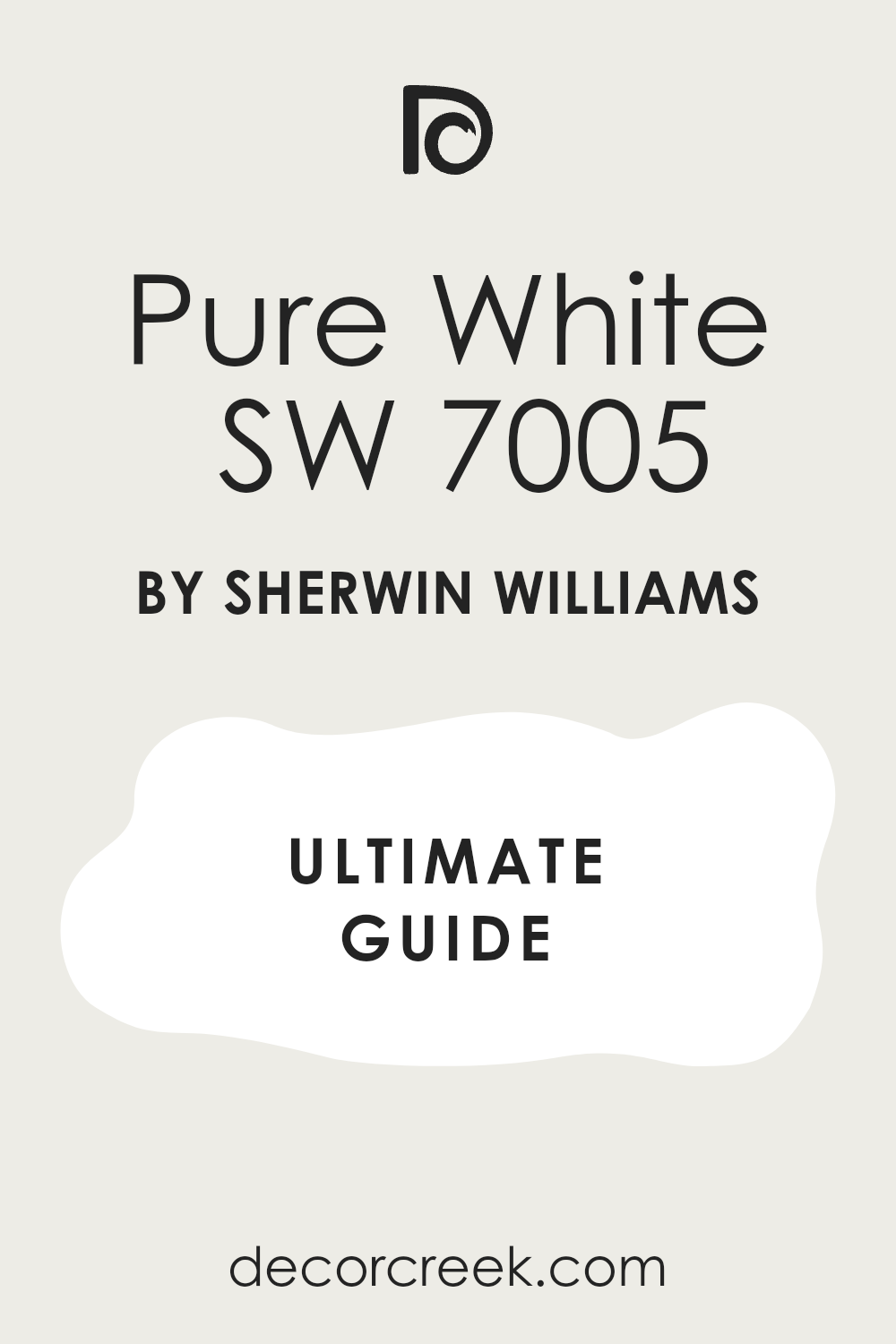
Polished Mahogany SW 2838 + Antique White SW 6119
Polished Mahogany SW 2838 and Antique White SW 6119 are a very warm and very cozy team. This combination looks like a cup of coffee with a lot of warm milk inside it. You should use the mahogany on the cabinets and the white on the walls for a smart look.
The red-brown color is very deep and makes the room feel very expensive and very solid. The white has a tiny bit of yellow that makes the room feel very kind and very welcoming. This pair makes the room feel very old-fashioned in a way that is very beautiful and very rich.
Many people choose this look because it feels very steady and very reliable for a home. It creates a very soft and very inviting feeling that makes guests want to stay and talk. You will find that it makes your gold frames look very bright and very important. I like to use it in a living room to make it feel like a very warm and happy place.
Best used in: living rooms, kitchens, dens, and master bedrooms
Pairs well with: Bronze hardware, warm wood floors, and cream rugs The key rule of this color for Art Deco style is to use it to create a warm and rich background that feels very classic.

Mariner SW 6766 + Creamy SW 7012
Mariner SW 6766 and Creamy SW 7012 make a room feel very bright and very full of energy. This combination looks like the deep blue sea and the soft sand on a beautiful beach. You should use the blue on an accent wall and the creamy white on the rest of the walls.

The blue is very bold and makes the room feel very exciting and very fun for everyone. The white is very soft and makes the room feel very open and very fresh for guests. This pair makes the room feel very balanced and very easy to be in for a long time.
Many people love this look because it feels very fresh and very modern for a house. It creates a very happy and very energetic mood that helps you feel very creative. You will notice how it makes your white furniture look very sharp and very clean. I suggest using it in a child’s room or a playroom to make it feel very special.
Best used in: bedrooms, playrooms, bathrooms, and laundry rooms
Pairs well with: White trim, light wood, and silver or chrome accents The key rule of this color for Art Deco style is to use it when you want a dark blue that still feels very bright and very happy.
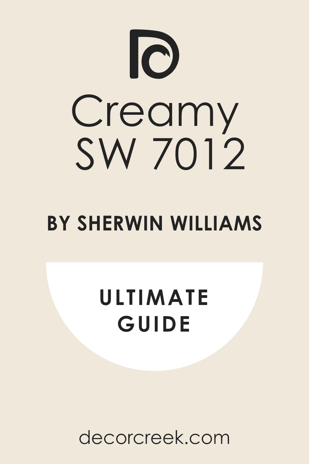
Ceremonial Gold SW 6396 + Tricorn Black SW 6258
Ceremonial Gold SW 6382 and Tricorn Black SW 6258 create a look that is very rich and very powerful. This combination is the ultimate choice for anyone who wants their home to look like a high-end palace. You should use the gold on the main walls and the black on the trim to be very smart.
The gold is very deep and looks like a real piece of shiny jewelry for your house. The black is very honest and helps the gold look even brighter and more expensive than it is. This pair makes the room feel very tall and very important for any guest who visits you.
Many people love this look because it feels very brave and shows you have great style. It creates a very high-energy mood that makes every day feel like a special party. You will notice how it makes your dark wood furniture look very solid and very beautiful. I find that it works perfectly in a dining room to make every meal feel very fancy.
Best used in: dining rooms, entryways, master suites, and formal dens
Pairs well with: Dark walnut wood, crystal chandeliers, and black velvet The key rule of this color for Art Deco style is to use it where you want to create a feeling of royal luxury and bold strength.

Renwick Olive SW 2815 + Ivory Lace SW 7013
Renwick Olive SW 2815 and Ivory Lace SW 7013 make a room feel very steady and very natural. This combination looks like an old garden that has been cared for by a professional for many years. You should use the olive green on the walls and the ivory on the ceiling for a good balance.
The green is very deep and has a lot of gray that makes it feel very mature and smart. The ivory is very soft and makes the room feel very kind and very welcoming to everyone. This pair makes the room feel very grounded and very well-built for a happy family life.
Many people choose this look because it feels very classic and never goes out of fashion. It creates a very quiet and very steady mood that helps you feel very relaxed at home. You will find that it makes your bronze lamps look very bright and very pretty next to the green. I like to use it in a kitchen to make it feel very warm and very solid.
Best used in: kitchens, living rooms, mudrooms, and home offices
Pairs well with: Bronze hardware, light oak floors, and cream-colored fabrics The key rule of this color for Art Deco style is to use it to bring a sense of earthy history and quiet luxury into the house.
Fine Wine SW 6307 + Extra White SW 7006
Fine Wine SW 6307 and Extra White SW 7006 are a very bold and very beautiful team for any room. This combination looks like a glass of dark red juice and a fresh bowl of white sugar. You should use the wine color on an accent wall to make a very big statement to guests.
The red is very dark and feels very royal and very important for a fancy house. The white is very clean and makes the whole room feel very bright and very organized. This pair makes the room feel very exciting and very full of life for everyone who lives there.
Many people love this look because it feels very high-end and very much like a big city apartment. It creates a very energetic and very happy mood that makes you feel very proud. You will notice how it makes silver and chrome decorations look very shiny and very sharp. I suggest using it in a powder room to make it feel like a secret jewel box.
Best used in: powder rooms, dining rooms, accent walls, and entryways
Pairs well with: Silver hardware, black furniture, and white marble stone The key rule of this color for Art Deco style is to use it to create a high-contrast look that feels very artistic and very rich.

Pewter Cast SW 7673 + Sealskin SW 7675
Pewter Cast SW 7673 and Sealskin SW 7675 make a room feel very cool and very sophisticated. This combination uses two dark colors to create a look that is very deep and very interesting. You should use the lighter gray on the walls and the dark brown-gray on the cabinets or doors.
The pewter color is very smooth and makes the room feel very modern and very smart for work. The sealskin color is very heavy and makes the architecture of the house feel very important. This pair makes the room feel very private and like a special getaway from the busy world.
Many people choose this look because it feels very professional and very well-planned by an expert. It creates a very steady and very calm mood that helps you focus on your day. You will find that it makes your white rugs look very bright and very clean next to it. I like to use it in a home office to make it feel like a serious place for big ideas.
Best used in: home offices, kitchens, bathrooms, and media rooms
Pairs well with: White trim, cool gray stone, and stainless steel metal The key rule of this color for Art Deco style is to use it to create a layer of dark colors that feel very soft and very expensive.

Copper Mountain SW 6356 + Pure White SW 7005
Copper Mountain SW 6356 and Pure White SW 7005 make a room feel very warm and very bright. This combination looks like a shiny new penny and a fresh sheet of white paper. You should use the copper on the walls to make the room feel very cozy and very full of energy.
The orange-brown color is very rich and makes the walls look very thick and very solid. The white is very crisp and helps the copper color not feel too heavy or too dark for the room. This pair makes the room feel very inviting and very much like a happy place for a family.
Many people love this look because it feels very unique and very full of personality. It creates a very warm and very happy mood that makes you feel very welcome every time you walk in. You will notice how it makes your green plants look very bright and very healthy. I find that it works perfectly in a living room to make it feel very sunny and very fun.
Best used in: living rooms, kitchens, entryways, and sunrooms
Pairs well with: Dark wood, green textiles, and black metal accents The key rule of this color for Art Deco style is to use it to bring a sense of earthy warmth and high-energy luxury to the house.

Oceanside SW 6496 + Unusual Gray SW 7059
Oceanside SW 6496 and Unusual Gray SW 7059 are a very artistic and very cool pair for your walls. This combination looks like the deep blue sea and a soft stone on a cloudy day. You should use the teal on the bottom of the wall and the gray on the top to stay balanced.
The teal is very bold and makes the room feel very mysterious and very full of stories. The gray is very steady and helps the teal stay looking very smart and very professional. This pair makes the room feel very creative and very much like an art museum for your guests.
Many people choose this look because it feels very fresh and very updated for a modern home. It creates a very cool and very steady mood that helps you feel very creative and happy. You will see how it makes gold frames shine like real stars next to the deep blue paint. I suggest using it in a library to make it feel like a very special place for reading.
Best used in: libraries, bedrooms, bathrooms, and accent walls
Pairs well with: Gold hardware, light gray rugs, and navy blue furniture The key rule of this color for Art Deco style is to use it to create a moody and artistic atmosphere that feels very high-end.
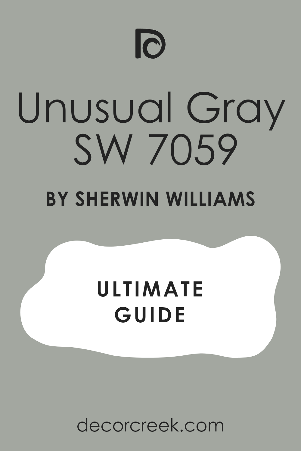
Roycroft Bottle Green SW 2847 + Canvas Tan SW 7531
Roycroft Bottle Green SW 2847 and Canvas Tan SW 7531 make a room feel very old and very sturdy. This combination looks like a deep forest path and the soft sand under a big tree. You should use the dark green on the kitchen cabinets and the tan on the walls for a smart look.
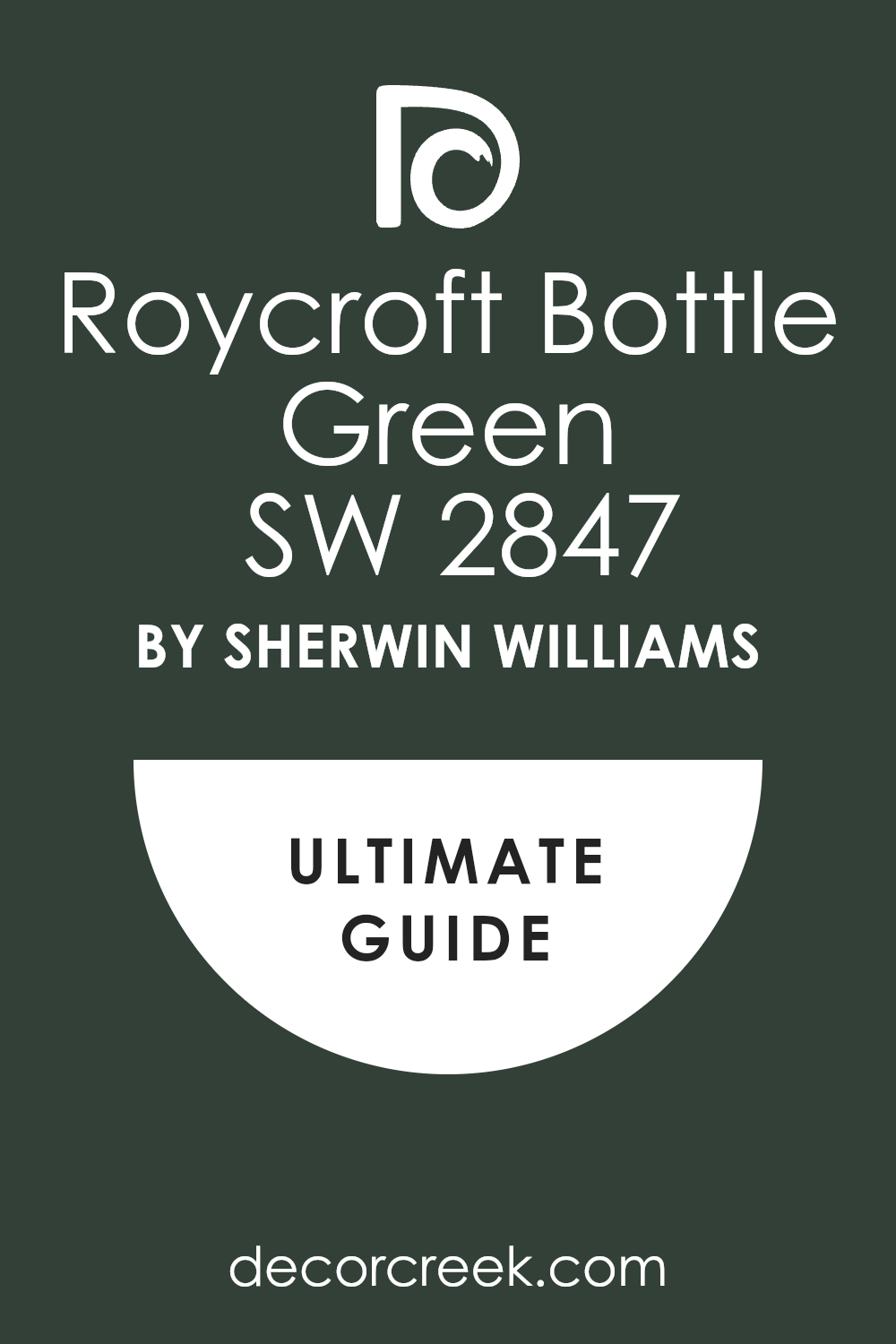
The green is very deep and looks like a bottle from a long time ago. The tan is very warm and makes the room feel very kind and very welcoming to all your guests. This pair makes the room feel very grounded and very well-built for a happy family life.
Many people choose this look because it feels very classic and never goes out of fashion. It creates a very quiet and very steady mood that helps you feel very relaxed. You will notice how it makes your wood floors look very warm and very beautiful next to it. I like to use it in a den to make it feel like a very safe place.
Best used in: kitchens, dens, mudrooms, and home offices
Pairs well with: Bronze hardware, warm wood tones, and cream-colored rugs The key rule of this color for Art Deco style is to use it to bring a sense of natural history and solid luxury into the house.
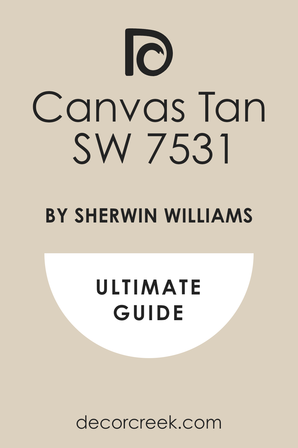
Blackberry SW 7577 + Snowbound SW 7004
Blackberry SW 7577 and Snowbound SW 7004 create a look that is very royal and very clean. This combination looks like a bowl of dark fruit sitting on a white table in the morning. You should use the deep purple on an accent wall to make a very big statement to guests.
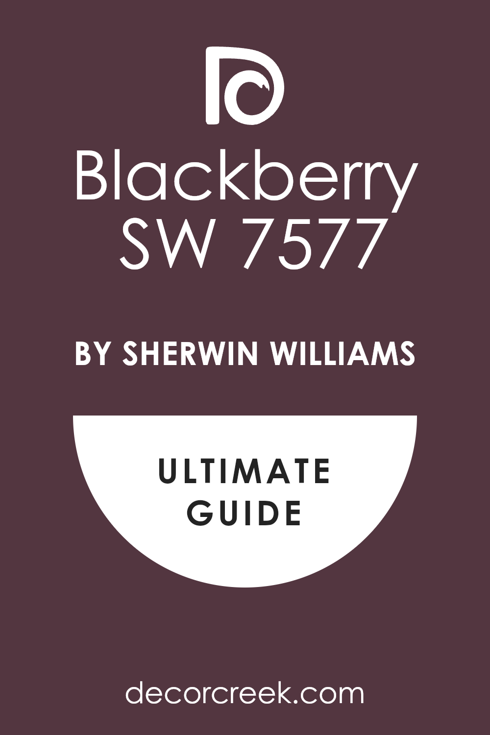
The purple is very dark and feels very expensive and very important for a fancy house. The white is very soft and makes the whole room feel very bright and very fresh for everyone. This pair makes the room feel very exciting and very full of life for anyone who walks inside.
Many people love this look because it feels very high-end and very much like a big city apartment. It creates a very energetic and very happy mood that makes you feel very proud of your home. You will notice how it makes silver and chrome decorations look very shiny and very sharp. I find that it works perfectly in a bedroom.
Best used in: bedrooms, powder rooms, accent walls, and entryways
Pairs well with: Silver hardware, gray textiles, and crystal light fixtures The key rule of this color for Art Deco style is to use it to create a high-contrast look that feels very artistic and very rich.

Wheat Penny SW 7705 + Urbane Bronze SW 7048
Wheat Penny SW 7705 and Urbane Bronze SW 7048 make a room feel very warm and very solid. This combination looks like a shiny copper coin and a dark piece of metal from an old bridge. You should use the orange-brown on the walls and the bronze on the doors for a smart look.
The copper color is very rich and makes the walls look very thick and very full of energy. The bronze is very heavy and helps the copper stay looking very professional and very serious. This pair makes the room feel very inviting and very much like a happy place for a family.
Many people love this look because it feels very unique and very full of personality for a home. It creates a very warm and very happy mood that makes you feel very welcome every time. You will notice how it makes your green plants look very bright and very healthy. I suggest using it in a living room.
Best used in: living rooms, entryways, kitchens, and exteriors
Pairs well with: Dark wood, brass fixtures, and olive green accents The key rule of this color for Art Deco style is to use it to bring a sense of earthy warmth and bold luxury to the house.

Charcoal Blue SW 2739 + Alabaster SW 7008
Charcoal Blue SW 2739 and Alabaster SW 7008 make a perfect team for a very royal and clean look. This combination looks like the night sky and a fresh bowl of white cream in a fancy house. You should use the dark blue on the bottom of the walls and the white on the top.

The blue is very deep and makes the room feel very important and very organized for guests. The white is very soft and makes the room feel very open and very fresh for everyone. This pair makes the room feel very balanced and very easy to be in for a long time.
Many people choose this look because it is a classic that never feels old or boring to look at. It creates a very strong and very confident mood that makes you feel very proud. You will notice how it makes gold and brass fixtures shine like real stars in the dark. I like to use it in a dining room.
Best used in: dining rooms, bedrooms, entryways, and master suites
Pairs well with: Gold hardware, dark wood floors, and white textiles The key rule of this color for Art Deco style is to use it to create a look of timeless luxury and high-energy style.

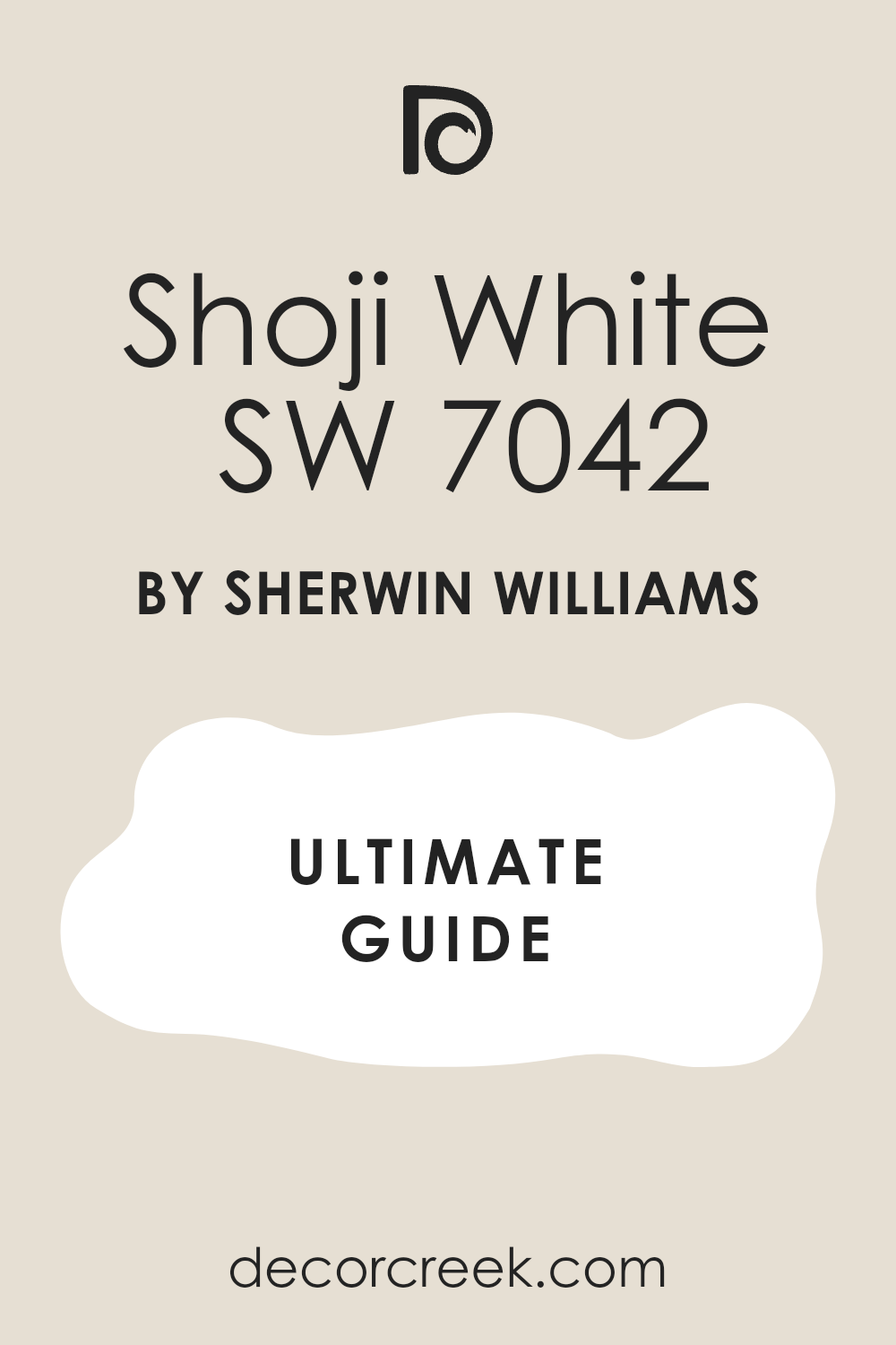
Red Bay SW 6321 + Shoji White SW 7042
Red Bay SW 6321 and Shoji White SW 7042 make a room feel very warm and very exciting. This combination looks like a big red flower and a soft white stone in a garden. You should use the dark red on an accent wall to make the room feel very full of life.
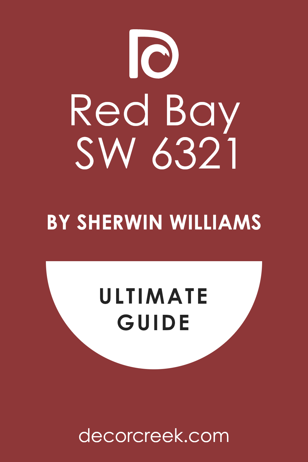
The red is very deep and looks like a royal coat from a long time ago for a king. The white is very soft and helps the red not feel too heavy or too loud for the house. This pair makes the room feel very inviting and very much like a special place for a family.
Many people love this look because it feels very brave and shows you have a very good eye for design. It creates a very warm and very happy mood that makes you feel very energetic every day. You will notice how it makes your black furniture look very sharp and very clean. I find that it works perfectly in a dining room.
Best used in: dining rooms, entryways, powder rooms, and accent walls
Pairs well with: Black metal, warm wood, and antique gold accents The key rule of this color for Art Deco style is to use it to bring a sense of high-energy luxury and warmth to your living space.
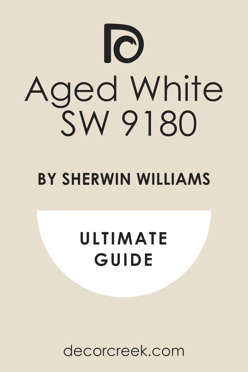
Navel SW 6887 + Aged White SW 9180
Navel SW 6887 and Aged White SW 9180 bring a burst of sun into any part of your house. This combination looks like a bright orange fruit sitting on a warm white tablecloth. You should use the orange on a single wall to keep the room feeling very balanced and smart.
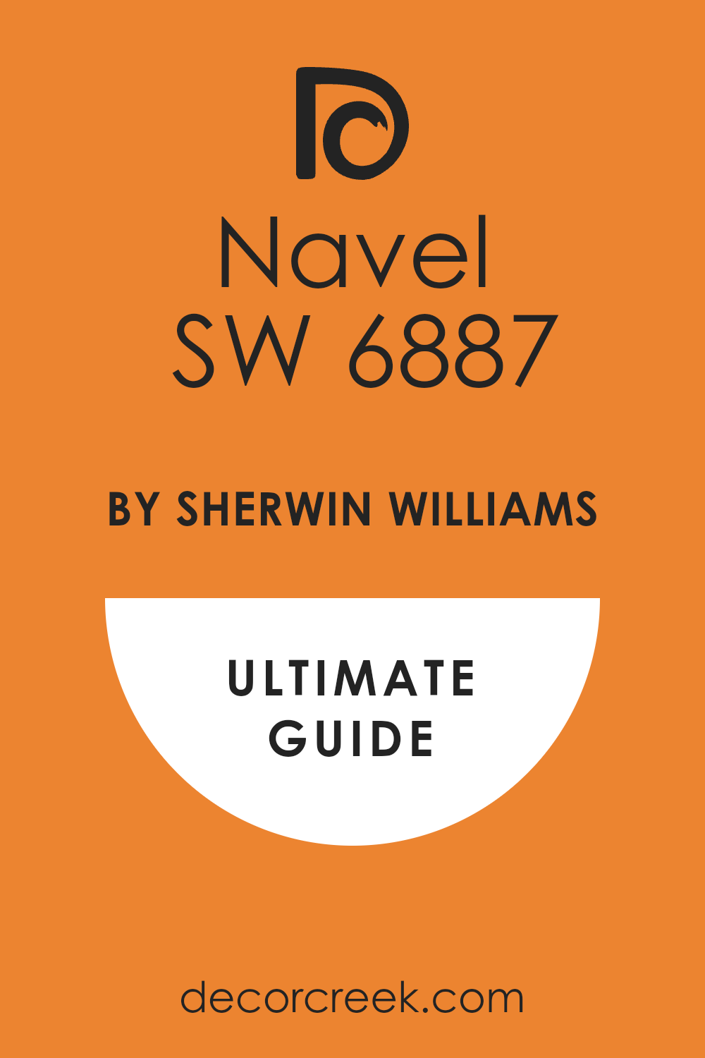
The orange is very bold and makes everyone feel very happy and full of energy as soon as they walk in. The white is very soft and helps the bright color feel very expensive and not like a toy. This pair makes the room feel very creative and very much like a sunny morning in a big city.
Many people love this look because it is very brave and shows you have a lot of fun with your style. It creates a very high-energy mood that makes you feel very proud and very awake. You will notice how it makes your black furniture look very sharp and very clean. I like to use it in a kitchen.
Best used in: kitchens, breakfast nooks, playrooms, and accent walls
Pairs well with: Black metal, dark wood, and white stone counters The key rule of this color for Art Deco style is to use it where you want a very bright and happy feeling that stays very fancy.
Deep Royal 2061-10 + White Dove OC-17
Deep Royal 2061-10 and White Dove OC-17 make a room feel very royal and very organized. This combination looks like the uniform of a king and a soft white feather from a bird. You should use the blue on the walls and the white on all the trim to be very smart.

The blue is very rich and makes the room feel very solid and very important for any visitor. The white is a favorite for many because it looks very clean and very soft at the same time. This pair makes the room feel very tall and very well-built for a family that loves a classic look.
Many people choose this look because it feels very high-end and never goes out of fashion for a house. It creates a very strong and very confident mood that makes you feel very safe and happy. You will see how it makes your gold mirrors shine like real stars. I find that it works perfectly in a bedroom.
Best used in: bedrooms, dining rooms, library shelves, and front doors
Pairs well with: Gold hardware, silver accents, and dark mahogany wood The key rule of this color for Art Deco style is to use it to create a look of regal luxury that is very clean and sharp.
Kalamata AF-630 + Opaline OC-33
Kalamata AF-630 and Opaline OC-33 are a very unique and very artistic team for your home. This combination looks like a dark purple grape and a soft piece of white stone with a hint of green. You should use the purple on the walls and the off-white on the ceiling to stay very balanced.
The purple is very deep and makes the room feel very mysterious and very full of interesting stories. The white is very light and helps the purple stay looking very smart and very professional for guests. This pair makes the room feel very private and like a special jewel box for your favorite things.
Many people choose this look because it feels very fresh and very updated for a modern house today. It creates a very moody and very steady feeling that helps you feel very creative and very proud. You will notice how it makes your silver lamps look very bright and very pretty. I suggest using it in a dining room.
Best used in: dining rooms, powder rooms, bedrooms, and accent walls
Pairs well with: Silver hardware, gray textiles, and dark wood floors The key rule of this color for Art Deco style is to use it to create a moody and artistic atmosphere that feels very high-end.
Tarrytown Green HC-134 + Linen White 912
Tarrytown Green HC-134 and Linen White 912 make a room feel very old and very sturdy for a family. This combination looks like a deep forest and a soft white shirt made of heavy cloth. You should use the green on the bottom of the wall and the white on the top to be very smart.
The green is very rich and makes the room feel very grounded and very well-built for many years. The white is very warm and makes the room feel very kind and very welcoming to all your guests. This pair makes the room feel very classic and very much like a palace from a long time ago.
Many people love this look because it feels very steady and very reliable for a home that gets a lot of use. It creates a very quiet and very steady mood that helps you feel very relaxed and happy. You will see how it makes your bronze handles look very bright and very important. I like to use it in an entryway.
Best used in: entryways, kitchens, mudrooms, and home offices
Pairs well with: Bronze hardware, warm wood tones, and cream rugs The key rule of this color for Art Deco style is to use it to bring a sense of natural history and solid luxury into the house.
Mink 2112-10 + Balboa Mist OC-27
Mink 2112-10 and Balboa Mist OC-27 make a room feel very soft and very expensive for any guest. This combination looks like a dark furry coat and a light gray fog in the morning. You should use the dark brown-gray on an accent wall and the light gray on the other walls.
The dark color is very rich and makes the walls look very thick and very solid for your house. The light gray is very gentle and helps the room feel very open and very fresh for everyone. This pair makes the room feel very balanced and very easy to be in for a long time during the day.
Many people choose this look because it feels very professional and very well-planned by a designer expert. It creates a very steady and very happy mood that makes you feel very comfortable at home. You will notice how it makes your white furniture look very sharp and very clean. I suggest using it in a living room.
Best used in: living rooms, bedrooms, hallways, and master suites
Pairs well with: White trim, silver metal, and soft gray textiles The key rule of this color for Art Deco style is to use it as a soft and reliable base that feels very high-end.
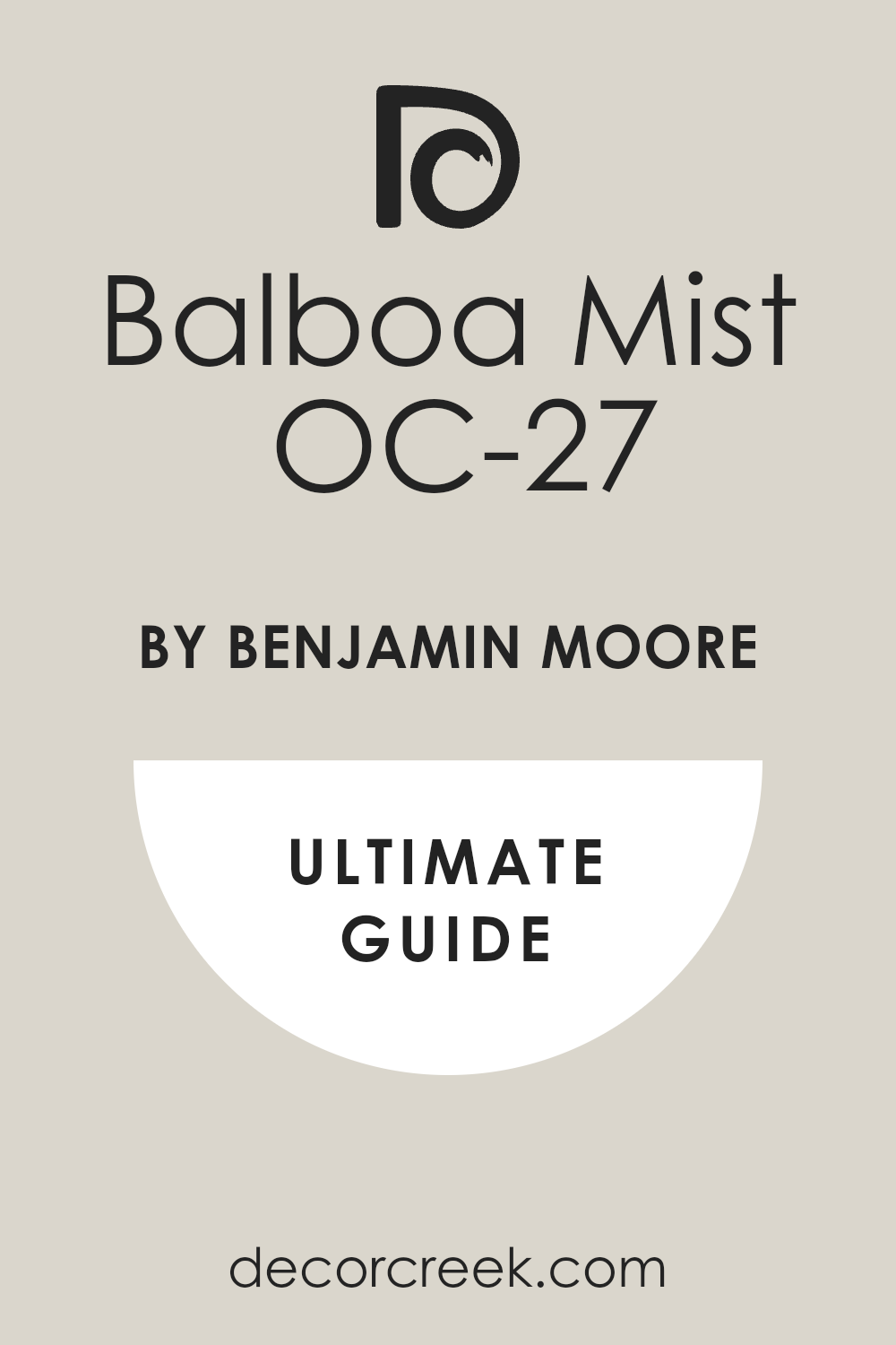
Regent Green 2136-20 + Cloud Cover OC-25
Regent Green 2136-20 and Cloud Cover OC-25 create a look that is very deep and very clean. This combination looks like the darkest pines in the forest standing against a soft white sky. You should use the green on the kitchen cabinets to make the room feel very solid and expensive.
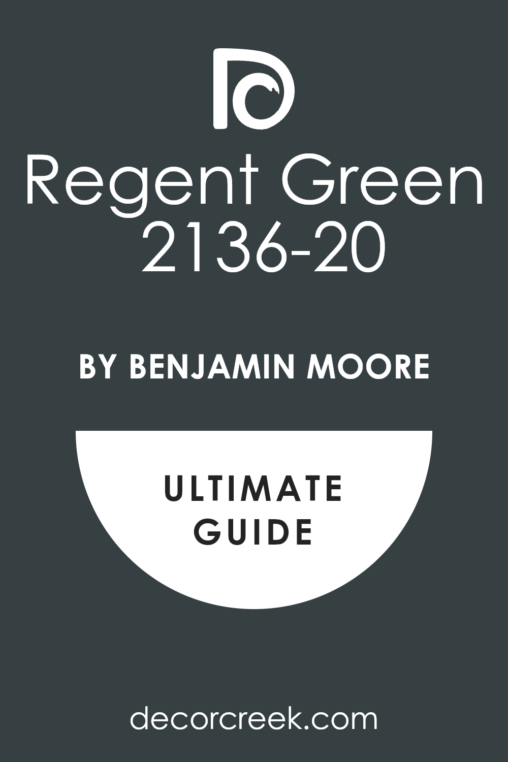
The green is so dark it almost looks black until the sun hits it in the afternoon. The white has a tiny bit of gray that makes the room feel very fresh and very organized for work. This pair makes the room feel very royal and very much like a palace for a smart family.
Many people love this look because it feels very high-end and shows you have a lot of confidence. It creates a very steady and very happy mood that helps you feel very productive at home. You will notice how it makes your silver handles shine like real stars. I like to use it in a large kitchen.
Best used in: kitchens, home offices, master bedrooms, and exterior doors
Pairs well with: Silver hardware, white marble, and light gray textiles The key rule of this color for Art Deco style is to use it to create a sharp and very modern look that feels very powerful.

Galápagos Green 475 + Gray Owl OC-52
Galápagos Green 475 and Gray Owl OC-52 are a very artistic and very earthy team for your home. This combination looks like a tropical leaf and a smooth stone from a quiet river. You should use the green on an accent wall to make a very big statement to any guest.
The green is very rich and makes the room feel very private and like a secret place in the woods. The gray is very light and helps the green stay looking very smart and very professional for the house. This pair makes the room feel very creative and very much like an art museum for your favorite things.
Many people choose this look because it feels very fresh and very updated for a modern house. It creates a very cool and very steady mood that helps you feel very relaxed and happy. You will see how it makes your wood furniture look very warm and very beautiful next to it. I suggest using it in a living room.
Best used in: living rooms, bedrooms, bathrooms, and library nooks
Pairs well with: Light wood, gold accents, and white trim The key rule of this color for Art Deco style is to use it to bring a sense of natural history and deep color into the room.
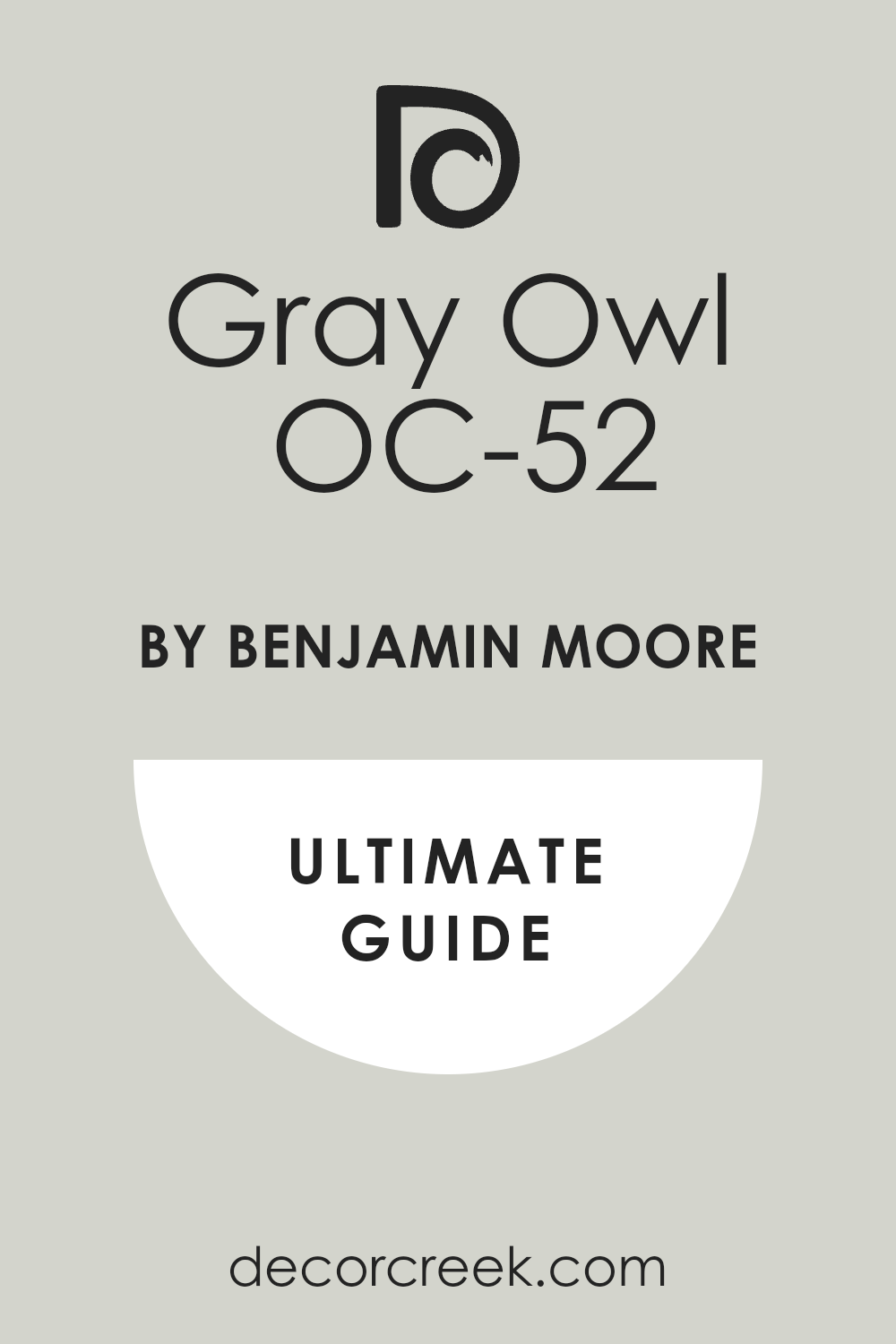
Hale Navy HC-154 + Simply White OC-117
Hale Navy HC-154 and Simply White OC-117 make a perfect team for a very royal and very crisp look. This combination looks like a deep blue suit and a fresh white shirt for a fancy party. You should use the blue on all the walls and the white on the tall trim to be very smart.

The blue is very true and makes the room feel very important and very organized for anyone. The white is very bright and helps the blue look even deeper and more expensive than it is. This pair makes the room feel very tall and very well-built for a family that loves style.
Many people love this look because it is a classic that never feels old or boring to look at. It creates a very strong and very confident mood that makes you feel very proud of your home. You will notice how it makes gold and brass fixtures shine like real stars. I find that it works perfectly in a dining room.
Best used in: dining rooms, bedrooms, entryways, and kitchen islands
Pairs well with: Gold hardware, dark wood floors, and white textiles The key rule of this color for Art Deco style is to use it to create a look of timeless luxury and high-energy style.

Twilight Zone 2127-10 + Moonshine OC-56
Twilight Zone 2127-10 and Moonshine OC-56 make a room feel very cool and very sophisticated for guests. This combination looks like the dark night sky and the soft light of the moon on the grass. You should use the dark charcoal on the doors and the light gray on the walls for a smart look.
The dark color is very deep and makes the architecture of the house feel very solid and important. The light gray is very soft and makes the room feel very open and very fresh for everyone. This pair makes the room feel very balanced and very easy to be in for a long time during the day.
Many people choose this look because it feels very professional and very well-planned by a designer expert. It creates a very steady and very happy mood that makes you feel very comfortable at home. You will notice how it makes your silver decorations look very sharp and very clean. I suggest using it in a hallway.
Best used in: hallways, living rooms, bedrooms, and home offices
Pairs well with: Silver hardware, black metal, and white trim The key rule of this color for Art Deco style is to use it as a soft and reliable base that feels very high-end.
Million Dollar Red 2003-10 + Chantilly Lace OC-65
Million Dollar Red 2003-10 and Chantilly Lace OC-65 are a very bold and very beautiful team for any house. This combination looks like a bright red rose and a fresh bowl of white sugar in the sun. You should use the red on an accent wall to make a very big statement to anyone who visits.

The red is very bright and makes the room feel very exciting and very full of life for a family. The white is very clean and helps the red look very sharp and not like a toy color. This pair makes the room feel very high-end and very much like a big city apartment for a movie star.
Many people love this look because it feels very brave and shows you have a lot of fun with your style. It creates a very energetic and very happy mood that makes you feel very proud. You will notice how it makes your black furniture look very sharp and very clean next to the red. I find that it works perfectly in a powder room.
Best used in: powder rooms, entryways, dining rooms, and accent walls
Pairs well with: Black metal, silver hardware, and white marble stone The key rule of this color for Art Deco style is to use it to create a high-contrast look that feels very artistic and very rich.
Amazon Green 2136-30 + Revere Pewter HC-172
Amazon Green 2136-30 and Revere Pewter HC-172 make a room feel very steady and very natural for a family. This combination looks like a deep jungle leaf and a soft gray stone from an old building. You should use the green on the cabinets and the gray on the walls for a smart look.

The green is very rich and makes the room feel very grounded and very well-built for a happy life. The gray is very warm and makes the room feel very kind and very welcoming to all your guests. This pair makes the room feel very classic and very much like a palace for anyone who stays there.
Many people love this look because it feels very steady and very reliable for a home that gets use. It creates a very quiet and very steady mood that helps you feel very relaxed and happy. You will see how it makes your bronze handles look very bright and very important. I like to use it in a den.
Best used in: dens, kitchens, mudrooms, and home offices
Pairs well with: Bronze hardware, warm wood tones, and cream-colored rugs The key rule of this color for Art Deco style is to use it to bring a sense of natural history and solid luxury into the house.
Tempest AF-590 + Distant Gray OC-68
Tempest AF-590 and Distant Gray OC-68 create a look that is very deep and very airy at the same time. This combination looks like a dark purple cloud and a soft white mist in the early morning. You should use the dark plum color on the walls and the light gray on the trim for a smart look.
The purple is very rich and makes the room feel very private and like a special jewel box. The gray is very cool and helps the dark color stay looking very sharp and very professional for guests. This pair makes the room feel very creative and very much like a fancy shop in a big city.
Many people choose this look because it feels very fresh and very updated for a modern house today. It creates a very moody and very steady feeling that helps you feel very artistic and proud. You will notice how it makes silver lamps look very bright and very pretty. I suggest using it in a bedroom.
Best used in: bedrooms, powder rooms, accent walls, and dining areas
Pairs well with: Silver hardware, cool gray textiles, and crystal accents The key rule of this color for Art Deco style is to use it to create a moody and artistic atmosphere that feels very high-end.
Yorktowne Green HC-133 + White Heron OC-57
Yorktowne Green HC-133 and White Heron OC-57 make a room feel very old and very sturdy for a family. This combination looks like a deep forest lake and a soft white stone on a cloudy day. You should use the teal-green on the cabinets and the off-white on the walls for a smart look.
The green is very rich and makes the room feel very grounded and very well-built for many years. The white is very clean and makes the room feel very open and very fresh for any visitor who comes. This pair makes the room feel very classic and very much like a palace from a long time ago.
Many people love this look because it feels very steady and very reliable for a busy family home. It creates a very quiet and very steady mood that helps you feel very relaxed and happy. You will see how it makes bronze handles look very bright and very important. I like to use it in a kitchen.
Best used in: kitchens, home offices, library shelves, and entryways
Pairs well with: Bronze hardware, warm wood floors, and cream rugs The key rule of this color for Art Deco style is to use it to bring a sense of natural history and solid luxury into the house.
Red Tomato SW 6607 + White Chocolate OC-127
Red Tomato SW 6607 and White Chocolate OC-127 are a very bold and very warm team for your house. This combination looks like a red velvet curtain and a bowl of warm red candy in a theater. You should use the red on the front door or an accent wall to make a very big statement.
The red is very deep and makes everyone feel very excited and very full of life as soon as they see it. The white is very soft and helps the red look very expensive and not too bright for the house. This pair makes the room feel very high-end and very much like a palace for a king or queen.
Many people love this look because it feels very brave and shows you have a lot of fun with your style. It creates a very warm and very happy mood that makes you feel very proud and energetic. You will notice how it makes gold frames look very bright and very pretty. I find that it works perfectly in an entryway.
Best used in: front doors, entryways, dining rooms, and accent walls
Pairs well with: Gold hardware, dark wood furniture, and warm lighting The key rule of this color for Art Deco style is to use it to bring a sense of high-energy luxury and warmth to your living space.

Dark Burgundy 2075-10 + Calm OC-22
Dark Burgundy 2075-10 and Calm OC-22 make a room feel very royal and very soft at the same time. This combination looks like a dark glass of wine and a soft white cloud in the sky. You should use the burgundy on the bottom of the wall and the white on the top for a smart look.
The red-purple is very deep and makes the room feel very important and very organized for guests. The white is very gentle and helps the room feel very open and very fresh for everyone. This pair makes the room feel very balanced and very easy to be in for a long time during the day.
Many people choose this look because it feels very high-end and very much like a big city apartment. It creates a very steady and very happy mood that makes you feel very comfortable at home. You will notice how it makes your silver decorations look very sharp and very clean. I suggest using it in a dining room.
Best used in: dining rooms, master bedrooms, powder rooms, and accent walls
Pairs well with: Silver hardware, gray textiles, and white marble stone The key rule of this color for Art Deco style is to use it to create a high-contrast look that feels very artistic and very rich.
Gentleman’s Gray 2062-20 + Paper White OC-55
Gentleman’s Gray 2062-20 and Paper White OC-55 make a perfect team for a very smart and cool look. This combination looks like a dark blue suit and a fresh white paper in a fancy office. You should use the blue-gray on the walls and the white on the trim to be very professional.

The blue is very rich and makes the room feel very solid and very important for any guest. The white is very clean and helps the blue look even deeper and more expensive than it is. This pair makes the room feel very tall and very well-built for a family that loves a classic style.
Many people love this look because it feels very high-end and never goes out of fashion for a house. It creates a very strong and very confident mood that makes you feel very safe and happy. You will see how it makes your silver mirrors shine like real stars. I find that it works perfectly in a home office.
Best used in: home offices, bedrooms, living rooms, and kitchen islands
Pairs well with: Silver hardware, cool gray stone, and navy blue textiles The key rule of this color for Art Deco style is to use it to create a look of regal luxury that is very clean and sharp.
Oceanside SW 6496 + Simply White OC-117
Oceanside SW 6496 and Simply White OC-117 make a room feel very bright and very full of energy. This combination looks like a deep peacock feather and a fresh white sheet of paper in the sun. You should use the teal on the kitchen island and the white on the walls for a smart look.
The teal is very bold and makes the room feel very exciting and very fun for everyone. The white is very bright and helps the teal look very sharp and not too dark for the house. This pair makes the room feel very creative and very much like a fancy shop in a big city.
Many people love this look because it feels very brave and shows you have a lot of fun with your style. It creates a very happy and very energetic mood that helps you feel very proud and awake. You will notice how it makes your gold handles look very bright and very pretty. I find that it works perfectly in a bathroom.
Best used in: bathrooms, kitchens, accent walls, and bedrooms
Pairs well with: Gold hardware, white stone, and dark wood floors The key rule of this color for Art Deco style is to use it when you want a dark blue-green that still feels very bright and very happy.

Polished Mahogany SW 2838 + Silver Satin OC-26
Polished Mahogany SW 2838 and Silver Satin OC-26 make a room feel very warm and very expensive for guests. This combination looks like a dark wood table and a soft gray cloth for a fancy dinner. You should use the mahogany on the walls and the light gray on the trim for a smart look.
The red-brown is very deep and makes the walls look very thick and very solid for your house. The light gray is very gentle and helps the room feel very open and very fresh for everyone who visits. This pair makes the room feel very balanced and very easy to be in for a long time during the day.
Many people choose this look because it feels very professional and very well-planned by a designer expert. It creates a very warm and very happy mood that makes you feel very comfortable at home. You will notice how it makes your white furniture look very sharp and very clean. I suggest using it in a library.
Best used in: libraries, dining rooms, dens, and master bedrooms
Pairs well with: Bronze hardware, cream rugs, and warm wood floors The key rule of this color for Art Deco style is to use it to create a warm and rich background that feels very classic.
Red Bay SW 6321 + Gray Owl OC-52
Red Bay SW 6321 and Gray Owl OC-52 are a very bold and very artistic team for your home. This combination looks like a dark red flower and a soft gray stone in a quiet garden. You should use the red on an accent wall to make the room feel very full of life and energy.

The red is very deep and looks like a royal coat from a long time ago for a king. The gray is very light and helps the red stay looking very smart and very professional for the house. This pair makes the room feel very creative and very much like an art museum for your favorite things.
Many people love this look because it feels very fresh and shows you have a very good eye for design. It creates a very warm and very happy mood that makes you feel very energetic every single day. You will notice how it makes your black furniture look very sharp and very clean. I suggest using it in a living room.
Best used in: living rooms, entryways, powder rooms, and accent walls
Pairs well with: Black metal, silver hardware, and white trim The key rule of this color for Art Deco style is to use it to bring a sense of high-energy luxury and warmth to your living space.

Black Magic SW 6991 + Pale Oak OC-20
Black Magic SW 6991 and Pale Oak OC-20 make a room feel very sharp and very soft at the same time. This combination looks like a dark black suit and a warm white stone from an old building. You should use the black on the doors and the off-white on the walls for a smart look.

The black is very deep and helps the architecture of the house feel very solid and important for any guest. The off-white is very warm and makes the room feel very kind and very welcoming to all your friends. This pair makes the room feel very tall and very well-built for a family that loves a modern style.
Many people love this look because it never goes out of fashion and feels very expensive. It creates a very high-energy mood that makes you feel very proud and very happy. You will notice how it makes your gold lamps look very bright and very pretty. I find that it works perfectly in an entryway.
Best used in: entryways, living rooms, hallways, and kitchen cabinets
Pairs well with: Gold hardware, dark wood floors, and white textiles The key rule of this color for Art Deco style is to use it where you want a very strong contrast that looks very professional and clean.
Charcoal Blue SW 2739 + Seapearl OC-19
Charcoal Blue SW 2739 and Seapearl OC-19 make a room feel very royal and very fresh for any visitor. This combination looks like the deep ocean and a shiny white pearl from the sea. You should use the blue on the bottom of the walls and the off-white on the top to be very smart.

The blue is very rich and makes the room feel very important and very organized for anyone who walks in. The white is very soft and makes the room feel very open and very fresh for all your guests. This pair makes the room feel very balanced and very easy to be in for a long time during the day.
Many people choose this look because it is a classic that never feels old or boring for a house. It creates a very strong and very confident mood that makes you feel very proud and safe. You will notice how it makes gold and brass fixtures shine like real stars. I like to use it in a bedroom.
Best used in: bedrooms, dining rooms, entryways, and master suites
Pairs well with: Gold hardware, dark wood floors, and white textiles The key rule of this color for Art Deco style is to use it to create a look of timeless luxury and high-energy style.
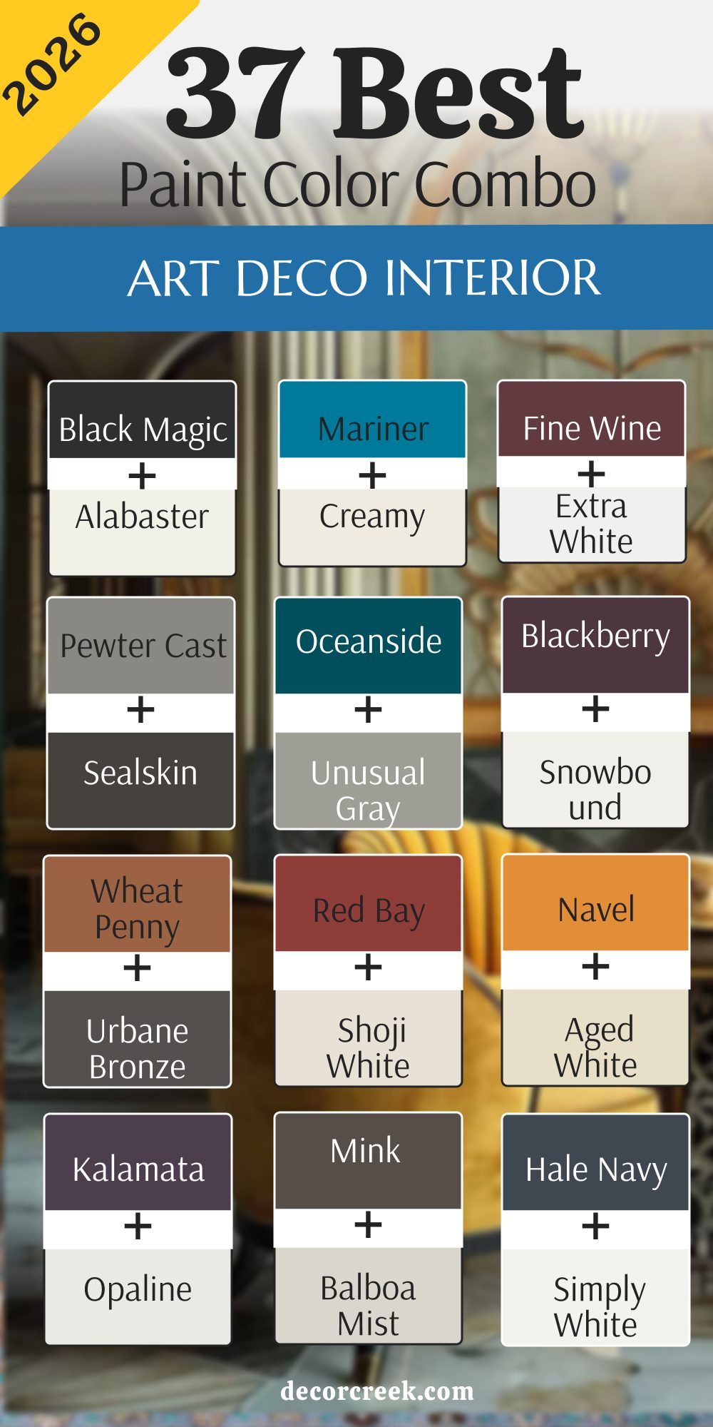
22 Paint Colors For The Modern Art Deco Interior
Black Magic SW 6991
Black Magic SW 6991 is a very deep and dark black that makes any room feel brand new. This color is very strong and helps your furniture look like it belongs to a movie star. You should use it on a wall where you have big windows to catch the light.
The paint is very smooth and gives the house a very expensive and modern feeling. Many people feel very brave when they choose such a dark and powerful shade. It makes gold frames and silver lamps shine much brighter than they usually do.
This color is perfect for a home that wants to look sharp and very clean. It hides any small mess on the wall and stays looking very fresh for a long time. You will find that it makes the whole house feel very smart and well-planned. I like to use it to create a big statement that everyone will remember.
Best used in: entryways, accent walls, interior doors, and modern kitchens
Pairs well with: Alabaster SW 7008, gold accents, and white marble stone The key rule of this color for Art Deco style is to use it where you want a very strong contrast that looks very professional and clean.
🎨 Check out the complete guide to this color right HERE 👈

Charcoal Blue SW 2739
Charcoal Blue SW 2739 is a navy blue that has a lot of gray mixed into the bucket. This color makes a room feel very royal and very cool at the same time. You can use it in a big living room to make the walls feel very solid. The blue tones look very pretty when you have soft yellow lights in the room.
This paint gives a home a very balanced feeling that is not too bright or too dark. I love how it makes the architecture of a house look very important and strong. Many people find this color to be very steady and very easy to live with every day.
It creates a very professional look that still feels like a happy and warm home. You will notice how the room feels much more put together with this on the walls. It is a very smart way to add a lot of style to your favorite space.
Best used in: dining rooms, home offices, bedrooms, and exterior accents
Pairs well with: Extra White SW 7006, silver hardware, and light gray rugs The key rule of this color for Art Deco style is to use it to bring a sense of regal history into a room with modern shapes.
🎨 Check out the complete guide to this color right HERE 👈

Moscow Midnight SW 9142
Moscow Midnight SW 9142 is a very dark teal that feels like a deep forest at night. This color is very exciting because it changes from blue to green when the sun moves. It makes a room feel very mysterious and full of very interesting stories to tell.
You can use it in a small room to make it feel like a secret and fancy box. This shade is perfect for making old furniture look very new and very stylish today. Many guests will stop to ask you what the name of this beautiful paint is.
It has a lot of energy and makes you feel very creative when you are near it. The color is very deep and looks like thick velvet when the light hits it. I suggest using it to bring a lot of life to a house that feels plain. It is a very bold choice that shows you have a very unique personality.
Best used in: powder rooms, accent walls, libraries, and velvet furniture backdrops
Pairs well with: Pure White SW 7005, gold hardware, and dark wood floors The key rule of this color for Art Deco style is to use it as a bold statement that shows off your unique and artistic personality.
🎨 Check out the complete guide to this color right HERE 👈

Dark Night SW 6237
Dark Night SW 6237 is a moody blue-green that is very dark and very rich to see. This color feels very steady and gives the room a sense of quiet and strength. It works very well in a bedroom where you want to feel tucked away and safe.
The green tones in the paint make it feel very natural even though it is dark. It creates a wonderful background for big green plants or colorful art pieces on the wall. This paint is a favorite for people who want a look that is both old and new.
It looks very expensive and makes the walls feel like they are made of stone. I like to use it in rooms that have a lot of metal decorations to balance them. It makes the whole house feel very smart and carefully designed by a real expert. You will love how it changes and grows on you every single day.
Best used in: bedrooms, media rooms, reading nooks, and kitchen cabinetry
Pairs well with: Sea Salt SW 6204, antique gold, and warm beige textiles The key rule of this color for Art Deco style is to use it to add depth and a touch of nature to a room with many shiny surfaces.
🎨 Check out the complete guide to this color right HERE 👈

Blue Peacock SW 0064
Blue Peacock SW 0064 is a very bright and very deep teal that feels very artistic. This color looks like the beautiful feathers of a bird in a very sunny garden. It is a great choice for a room where you want to feel very excited and happy.
The shade is very bold and makes a big statement to anyone who visits your home. You should use it if you want to show off your love for colors and style. This paint makes the room feel very lush and very expensive without being too loud.
It looks amazing next to light wood and shiny gold lamps or picture frames. This color has a lot of power and makes a room feel very solid and well-built. I find that it makes people feel very confident when they spend time in the room. It is a very pretty color that adds a lot of soul to your house.
Best used in: dining rooms, accent walls, entryways, and bathroom vanities
Pairs well with: Light French Gray SW 0055, white trim, and navy blue accents The key rule of this color for Art Deco style is to use it to create a cool and artistic atmosphere that feels very high-end.
Roycroft Bottle Green SW 2847
Roycroft Bottle Green SW 2847 is a very dark green that feels very old and rich. This color looks like the glass bottles people used to have a long time ago. It is a great choice for a study where you want to do a lot of reading. The shade is very steady and makes the room feel very safe and very quiet.
This paint makes the walls look very thick and very expensive for any homeowner today. Many people choose this color because it feels very royal and very much like a palace. It creates a very grounded and very strong mood that makes the furniture look solid.
You will see how it makes brass and copper lamps look very bright and pretty. I suggest using it on kitchen cabinets to give your house a high-end look. It is a very beautiful choice for anyone who loves the colors of the woods.
Best used in: libraries, kitchen cabinets, dens, and exterior shutters
Pairs well with: Canvas Tan SW 7531, bronze hardware, and warm wood tones The key rule of this color for Art Deco style is to use it to bring a sense of natural history and solid luxury into the house.
🎨 Check out the complete guide to this color right HERE 👈

Rock Garden SW 6195
Rock Garden SW 6195 is a deep forest green that makes a room feel very sturdy. This color feels like a thick carpet of moss growing on the side of a mountain. It is a very grounded shade that helps a room feel solid and very well-made.
You can use it in a hallway to make the walk between rooms more interesting. This paint works well with old wooden floors and thick rugs from the store. It does not try to be the star but it makes everything else look much better.
Many people like this shade because it feels very earthy and very real to the eyes. It is a great way to use a dark color without it feeling scary. This color stays looking good even if the room gets a lot of use every day. It is a hardworking paint that brings a sense of history to a new house.
Best used in: dining rooms, accent walls, bedrooms, and library shelves
Pairs well with: Pure White SW 7005, gold accents, and dark walnut wood The key rule of this color for Art Deco style is to use it when you want to make a very strong and artistic statement on your walls.
🎨 Check out the complete guide to this color right HERE 👈

Ravishing Coral SW 6612
Ravishing Coral SW 6612 is a bright and happy color that feels very full of life. This shade looks like a pretty flower in a garden during the hot summer time. It is a great choice for a room where you want to feel very awake and joyful.
The color is very bold and makes a big statement to anyone who walks inside. You should use it on a single wall to make the room feel very special and fun. This paint makes the room feel very creative and very much like a sunny place.
Many people love this color because it is very brave and shows a lot of personality. It creates a very high-energy mood that makes every day feel like a party. You will notice how it makes your white furniture look very sharp and clean. I like to use it in a small bathroom to give it a big spirit.
Best used in: powder rooms, accent walls, playrooms, and breakfast nooks
Pairs well with: Pure White SW 7005, gold accents, and navy blue textiles The key rule of this color for Art Deco style is to use it where you want a very bright and happy feeling that stays very fancy.
Wheat Penny SW 7705
Wheat Penny SW 7705 is a warm orange-brown that looks like a shiny new coin. This color is very rich and makes a room feel very cozy and full of energy. It is a great choice for an entryway to give your guests a very warm welcome.
The shade is very deep and makes the walls look very thick and very solid. This paint works well with dark wood floors and soft yellow lights from your lamps. Many people love this color because it feels very unique and very full of history.
It creates a very warm and very happy mood that makes you feel at home. You will find that it makes your green plants look very bright and very healthy. I suggest using it in a living room to make it feel very sunny and fun. It is a very smart color that adds a lot of soul and warmth to a room.
Best used in: living rooms, entryways, kitchens, and exteriors
Pairs well with: Urbane Bronze SW 7048, brass hardware, and olive green accents The key rule of this color for Art Deco style is to use it to bring a sense of earthy warmth and bold luxury to the house.
Carnelian SW 7580
Carnelian SW 7580 is a deep red that looks like a dark glass of grape juice. This color is very warm and makes a room feel very exciting and very full of life. It is a great choice for a dining room where you want to host big dinners.
The red is very dark so it does not feel like a toy or a bright light. It makes the room feel very royal and very important for anyone who walks in. This paint looks amazing when you pair it with black furniture and big gold mirrors.
Many people choose this color because it feels very brave and shows a lot of heart. It creates a very cozy feeling when you use it in a room with a fireplace. The color has a lot of depth and makes the walls feel very soft and inviting. I like to use it in small spaces to make them feel special.
Best used in: dining rooms, powder rooms, library nooks, and front doors
Pairs well with: Tricorn Black SW 6258, Creamy SW 7012, and antique gold The key rule of this color for Art Deco style is to use it to bring a sense of high-energy luxury and warmth to your living space.
🎨 Check out the complete guide to this color right HERE 👈

Ceremonial Gold SW 6382
Ceremonial Gold SW 6382 is a rich, mustard-toned yellow that feels like a sunset in a desert. This color is very warm and makes any room feel like it is filled with sunshine and expensive jewelry. It is a great way to make a room look very old-fashioned but in a very high-end and stylish way.
You should use it if you want your home to feel very grand and very important to guests. The color is deep enough that it does not look like a bright primary yellow, which makes it feel much more mature.
Many people find that this color makes their dark wood furniture look very solid and very beautiful. It adds a lot of energy to a house without being too loud or too difficult to look at. This paint is perfect for a room where you want to feel very proud and very successful.
Best used in: dining rooms, entryways, formal living rooms, and office ceilings
Pairs well with: Tricorn Black SW 6258, Extra White SW 7006, and dark walnut wood The key rule of this color for Art Deco style is to use it as a bold metallic-like statement that brings a royal feeling to the walls.
Caviar SW 6990
Caviar SW 6990 is a very thick and rich black that feels like a velvet coat on the walls. Caviar SW 6990 makes a room look very expensive and solid as soon as you put it on. This paint is a favorite of mine when I want to create a very private feeling.
The color is so deep that it makes all your furniture look much brighter and cleaner. You should use it if you want the house to feel very grand and very important to everyone. It hides any small bumps on the wall because the color is very strong and dark.
Many people notice that this shade makes their gold mirrors look like real treasure in the room. It adds a lot of drama to a house without feeling cold or like a plain gray machine. This paint is perfect for making a small room feel very cozy and very fancy. It gives the house a feeling of being very well-kept and very stylish for a long time.
Best used in: master bedrooms, media rooms, accent walls, and interior doors
Pairs well with: Alabaster SW 7008, Accessible Beige SW 7036, and warm brass The key rule of this color for Art Deco style is to use it where you want a very dark look that feels heavy and high-end.
🎨 Check out the complete guide to this color right HERE 👈

Sealskin SW 7675
Sealskin SW 7675 is a very dark gray that has a lot of rich brown mixed into the bucket. Sealskin SW 7675 makes a room feel like a cozy leather chair in a very quiet library. This color is a great way to make a big wall look very solid and very old-fashioned.
You should use it if you want the room to feel very grounded and very strong for the family. The shade changes from a dark charcoal to a deep espresso depending on the lamps you use. It hides any small scratches on the wall because the paint is so thick and deep.
Many people find that this color makes their gold picture frames look much brighter than before. It adds a lot of drama to a room without feeling too cold or too plain to the eye. This paint is perfect for creating a mood that is very serious but also very warm. It gives the house a feeling of being very old and well-kept at the same time.
Best used in: master bedrooms, cozy dens, kitchen islands, and front doors
Pairs well with: Alabaster SW 7008, Accessible Beige SW 7036, and warm brass The key rule of this color for Art Deco style is to use it where you want a dark look that feels more organic.
🎨 Check out the complete guide to this color right HERE 👈

Gentleman’s Gray 2062-20
Gentleman’s Gray 2062-20 is a deep blue-gray that looks like a high-end wool suit for your walls. Gentleman’s Gray 2062-20 is very smart and makes any room feel very professional and well-planned. This color is a fantastic choice for a home office where you want to think big thoughts.
The blue tones give the room a lot of energy while the gray keeps it looking very serious. This paint makes the walls look very thick and like they have a lot of soul inside them. Many people choose this color because it feels very royal and very much like a palace.
It creates a very strong mood that helps you feel very safe and very proud. You will notice how it makes silver mirrors and white light look very bright and clean. I find that it works perfectly to make a living room feel very high-end and special. It is a very stylish way to show that you have a very good eye for design.
Best used in: home offices, living rooms, master bedrooms, and kitchen islands
Pairs well with: Paper White OC-55, silver hardware, and navy blue textiles The key rule of this color for Art Deco style is to use it to create a look of regal luxury that is very clean and sharp.
🎨 Check out the complete guide to this color right HERE 👈

Amazon Green 2136-30
Amazon Green 2136-30 is a deep jungle green that makes a room feel very lush and full of life. Amazon Green 2136-30 feels like the leaves of a big plant hidden deep in a rainy forest. This color is a very grounded shade that helps a room feel solid and well-made.
You can use it in a hallway to make the walk between rooms feel much more interesting. This paint works well with old wooden floors and thick rugs from a fancy store. It does not try to be too loud but it makes everything else look much better.
Many people like this shade because it feels very earthy and very real to the eyes. It is a great way to use a dark color without it feeling scary or mean. This color stays looking good even if the room gets a lot of use every day. It is a hardworking paint that brings a sense of history to a brand new house.
Best used in: dens, kitchens, mudrooms, and home offices
Pairs well with: Bronze hardware, warm wood tones, and cream-colored rugs The key rule of this color for Art Deco style is to use it to bring a sense of natural history and solid luxury into the house.
🎨 Check out the complete guide to this color right HERE 👈

Dark Burgundy 2075-10
Dark Burgundy 2075-10 is a very deep red that looks like a dark glass of wine or a royal coat. Dark Burgundy 2075-10 is very warm and makes a room feel very exciting and full of life. This color is a great choice for a dining room where you want to host big dinners.
The red is very dark so it does not feel like a toy or a bright light on the wall. It makes the room feel very royal and very important for any guest who walks inside. This paint looks amazing when you pair it with black furniture and big gold mirrors.
Many people choose this color because it feels very brave and shows a lot of heart and style. It creates a very cozy feeling when you use it in a room with a big fireplace. The color has a lot of depth and makes the walls feel very soft and very inviting. I like to use it in small rooms to make them feel like a jewel box.
Best used in: dining rooms, master bedrooms, powder rooms, and accent walls
Pairs well with: Silver hardware, gray textiles, and white marble stone The key rule of this color for Art Deco style is to use it to create a high-contrast look that feels very artistic and rich.
Hearthstone Brown 2109-20
Hearthstone Brown 2109-20 is a heavy and strong brown that feels like the walls of a big stone house. Hearthstone Brown 2109-20 is very solid and makes a room feel very grounded and steady. This color is a great choice for a room where you want to sit and talk for a long time.
The shade is very dark but it feels very warm because of the chocolate tones inside. This paint looks very high-end when you use it on cabinets or big wooden doors. Many people choose this color because it feels very professional and very smart for a house.
It creates a very quiet atmosphere that helps you feel very relaxed and happy. You will notice how it makes white trim look very bright and very clean in the room. I find that it works perfectly with bronze or copper handles on the furniture. It is a hardworking color that stays looking great even in a very busy home.
Best used in: home offices, kitchen cabinets, exteriors, and mudrooms
Pairs well with: Urban Bronze SW 7048, Repose Gray SW 7015, and warm metals The key rule of this color for Art Deco style is to use it to add a sense of weight and reliability to the house.
Van Deusen Blue HC-156
Van Deusen Blue HC-156 is a medium-dark blue that feels very classic and very strong. Van Deusen Blue HC-156 looks like a deep lake on a beautiful and sunny day. This color is a great choice for a living room where you want to feel both smart and happy.
The shade is very steady and makes the walls feel very solid and very well-built. This paint works very well with white trim and light gray furniture in the house. Many people find this color to be very comfortable and very easy to look at every day.
It creates a mood that is very professional but also very inviting for your guests. You will notice how it makes gold picture frames look very bright and very important. I love how it gives a house a sense of high style without being too dark or moody. It is a very safe and beautiful choice that always looks like a professional designer was there.
Best used in: living rooms, bedrooms, kitchen islands, and exteriors
Pairs well with: Stonington Gray HC-170, Cloud White OC-130, and brass accents The key rule of this color for Art Deco style is to use it to create a classic and balanced look that feels very expensive.
🎨 Check out the complete guide to this color right HERE 👈

Twilight Zone 2127-10
Twilight Zone 2127-10 is a very dark charcoal gray that almost looks like a soft black paint. Twilight Zone 2127-10 makes a room feel very mysterious and very cool for anyone who visits. This color is a great choice for an accent wall where you keep your big television or art.
The shade is very deep and makes the room feel very private and like a special hideout. This paint looks very high-end when you pair it with silver metal and white rugs. Many people choose this color because it feels very professional and like a fancy city apartment.
It creates a very steady mood that helps you feel very focused and very smart at home. You will find that it makes your white furniture look very sharp and very clean. I like to use it to add a lot of style and a modern feeling to a house. It is a bold move that shows you have a very good eye for design.
Best used in: media rooms, bathrooms, accent walls, and hallways
Pairs well with: Silver hardware, black metal, and White Dove OC-17 The key rule of this color for Art Deco style is to use it as a sharp and modern base that feels very powerful.
Soot 2129-20
Soot 2129-20 is a smoky black color that has a tiny bit of blue hidden inside the bucket. Soot 2129-20 makes a room feel like a cozy fireplace on a very cold winter night. This color is a great choice for a bedroom where you want to feel very safe and very tucked in.
The shade is very dark but it feels softer than a regular black because of the blue tones. This paint looks very high-end when you use it with silver mirrors and white light bulbs. Many people love this color because it makes the walls look like they are covered in velvet.
It creates a very moody and smart feeling that is perfect for a modern home today. You will notice how it makes the furniture in the room look much more expensive than it is. I find that it works very well in a small bathroom to make it feel fancy. It is a very stylish choice that shows you have a bold and artistic spirit.
Best used in: bedrooms, accent walls, powder rooms, and furniture
Pairs well with: Gray Owl OC-52, Simply White OC-117, and silver accents The key rule of this color for Art Deco style is to use it to create a soft and smoky backdrop that feels very private.
Chantilly Lace OC-65
Chantilly Lace OC-65 is a very bright and very pure white that feels very fresh and clean. Chantilly Lace OC-65 looks like a fresh bowl of milk or a white flower in the morning sun. This color is a great choice for trim and ceilings to make the whole room pop.
The shade is very crisp and helps all the other dark colors in your house look their best. This paint makes the room feel very open and very large for anyone who walks inside. Many people love this white because it does not look too yellow or too blue in the light.
It creates a mood that is very happy and very organized for a busy family house. You will notice how it makes your dark green or blue walls look very sharp and professional. I use it on every door and window frame to give the house a finished and high-end look. It is a very simple and beautiful color that everyone should have in their home.
Best used in: trim, ceilings, kitchens, bathrooms, and small rooms
Pairs well with: Any dark color, black metal, and light wood floors The key rule of this color for Art Deco style is to use it as a clean and bright frame for your bold and dark colors.
🎨 Check out the complete guide to this color right HERE 👈

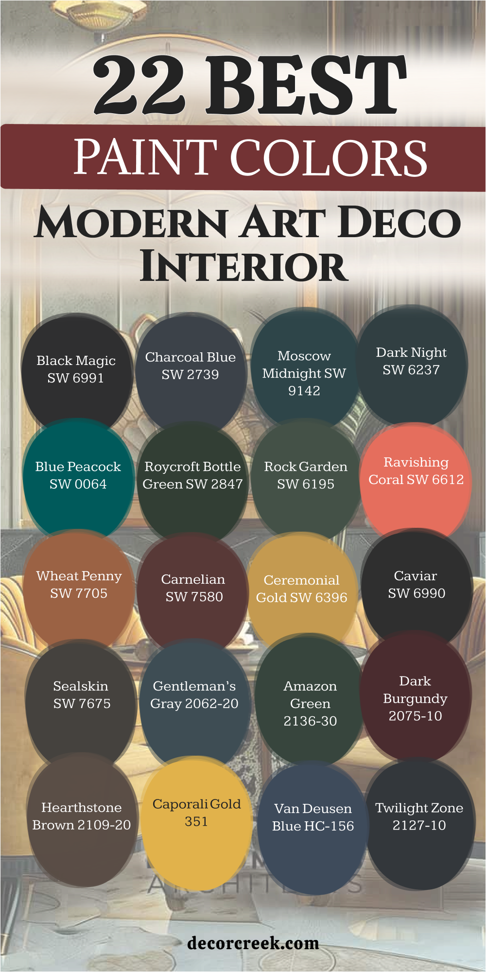
25 Paint Colors For The Contemporary Art Deco Interior
Cyberspace SW 7076
Cyberspace SW 7076 is a very deep navy blue that has a lot of dark gray mixed in. Cyberspace SW 7076 makes a room feel very solid and very important as soon as you walk in. This color is a great choice for an office where you want to do serious work every day.
The shade is very dark and makes the room feel very private and like a special place. This paint looks very high-end when you pair it with silver handles and light gray rugs. Many people choose this color because it feels very professional and like a fancy building.
It creates a very steady mood that helps you feel very focused and very smart. You will find that it makes your white furniture look very sharp and very clean next to it. I like to use it on an accent wall to add a lot of style and power. It is a very bold choice that shows you have a very good eye for modern design.
Best used in: home offices, accent walls, kitchen islands, and bedrooms
Pairs well with: Repose Gray SW 7015, silver hardware, and white trim The key rule of this color for Art Deco style is to use it to create a deep and strong feeling that is very modern.
🎨 Check out the complete guide to this color right HERE 👈

Storm Cloud SW 6249
Storm Cloud SW 6249 is a medium-dark blue that feels very cool and very steady for a house. Storm Cloud SW 6249 looks like the sky right before a big rain begins to fall. This color is a great choice for a living room where you want to sit and talk with friends.
The shade is very balanced and makes the walls feel very solid and very well-made. This paint works very well with white trim and light gray furniture in the room. Many people find this color to be very comfortable and very easy on the eyes during the day.
It creates a mood that is very professional but also very inviting for everyone. You will notice how it makes your silver picture frames look very bright and very clean. I love how it gives a house a sense of high style without being too dark or moody. It is a very safe and beautiful choice that always looks very fresh and very updated.
Best used in: living rooms, bedrooms, bathrooms, and laundry rooms
Pairs well with: Extra White SW 7006, silver hardware, and navy blue accents The key rule of this color for Art Deco style is to use it as a cool and balanced base for a modern room.
🎨 Check out the complete guide to this color right HERE 👈
Slate Tile SW 7624
Slate Tile SW 7624 is a dark blue-gray that looks like a piece of polished stone from the earth. Slate Tile SW 7624 makes a room feel very grounded and very strong for any family. This color is a great choice for a dining room where you want a very smart look.
The shade is very deep and makes the room feel very private and very special for guests. This paint looks very high-end when you pair it with white trim and light wood floors. Many people love this color because it matches almost any piece of furniture you already have.
It creates a very steady mood that helps you feel very safe and happy at home. You will notice how it makes your gold decorations look very bright and very pretty next to it. I find that it works perfectly to make a house look very updated and very professional. It is a very useful color that brings a sense of history to a new room.
Best used in: dining rooms, exteriors, accent walls, and home offices
Pairs well with: Alabaster SW 7008, gold accents, and dark walnut wood The key rule of this color for Art Deco style is to use it to add a sense of weight and stone-like beauty.
🎨 Check out the complete guide to this color right HERE 👈

Riverway SW 6222
Riverway SW 6222 is a beautiful mix of blue and green that feels very rich and very deep. Riverway SW 6222 looks like the water in a big river that is very deep and quiet. This color is a great choice for a bedroom where you want to feel very creative and happy.
The shade is very bold and makes a big statement to anyone who sees your home. You should use it if you want to show off your love for unique and artistic colors. This paint makes the room feel very lush and very expensive without being too loud.
It looks amazing next to light wood and shiny gold lamps or picture frames. This color has a lot of power and makes a room feel very solid and well-built for a family. I find that it makes people feel very confident when they spend a lot of time in the room. It is a very pretty color that adds a lot of soul to any modern house.
Best used in: bedrooms, living rooms, kitchen cabinets, and accent walls
Pairs well with: Pure White SW 7005, gold hardware, and natural wood The key rule of this color for Art Deco style is to use it to bring a sense of artistic history and color.
🎨 Check out the complete guide to this color right HERE 👈

Teal Stencil SW 0018
Teal Stencil SW 0018 is a very dark and rich teal that feels very artistic and very fun for a home. Teal Stencil SW 0018 looks like a vintage car or a fancy dress from a long time ago. This color is a great choice for a room where you want to feel very creative and special.
The shade is very bold and makes a big statement to anyone who walks inside your house. You should use it if you want to show off your unique personality and your good style. This paint makes the room feel very lush and very expensive without being too bright or loud.
It looks amazing next to dark wood and shiny brass lamps or old picture frames. This color has a lot of energy and makes a room feel very solid and very important. I find that it makes people feel very happy and very brave when they are in the room. It is a very pretty color that adds a lot of spirit to your modern living space.
Best used in: dining rooms, study areas, accent walls, and library shelves
Pairs well with: Antique gold, dark wood floors, and Alabaster SW 7008 The key rule of this color for Art Deco style is to use it to create a moody and artistic feeling that is rich.
🎨 Check out the complete guide to this color right HERE 👈

Burlap SW 6137
Burlap SW 6137 is a warm tan color that feels very earthy and very natural for a family home. Burlap SW 6134 looks like a soft sand path or a piece of heavy cloth used for a garden. This color is a great choice for a living room where you want to feel very cozy and happy.
The shade is very steady and makes the walls feel very solid and very well-built for many years. This paint works very well with dark wood floors and soft yellow lights from your lamps. Many people find this color to be very comfortable and very easy on the eyes during the day.
It creates a mood that is very inviting and very much like a warm hug for your guests. You will notice how it makes your green plants look very bright and very healthy next to it. I love how it gives a house a sense of history without being too dark or too loud. It is a very smart and safe choice for any room.
Best used in: living rooms, entryways, bedrooms, and kitchens
Pairs well with: Urbane Bronze SW 7048, Creamy SW 7012, and natural wood The key rule of this color for Art Deco style is to use it as a warm and earthy base for your room.
Foothills SW 7514
Foothills SW 7514 is a medium-to-dark brown that feels very natural and very grounded for a house. Foothills SW 7514 looks like the dirt on a hiking trail or the bark of a very big tree. This color is a great choice for a living room where you want to use a lot of green plants.
The shade makes the room feel very cozy and very much like a part of the outside world. This paint works very well with creamy white colors and soft yellow light from your favorite lamps. Many people find it to be very comfortable and very easy to live with for many years.
It creates a very steady mood that makes everyone feel very at home and very relaxed. I like to use it on the outside of a house to help it blend in with the garden. This color is a very smart way to add drama without using a color that feels too cold. It gives the house a very honest and very sturdy look that people really like.
Best used in: living rooms, exteriors, dens, and master bedrooms
Pairs well with: Redend Point SW 9081, Shoji White SW 7042, and stone accents The key rule of this color for Art Deco style is to use it as a rich and organic background for a room.
🎨 Check out the complete guide to this color right HERE 👈

Cocoon SW 6173
Cocoon SW 6173 is a medium green that has a lot of gray and brown mixed in the bucket. Cocoon SW 6173 looks like a soft leaf in the shade or the color of an old garden gate. This color is a great choice for a kitchen where you want to feel very steady and happy.
The shade is very natural and makes the walls feel very solid and very well-built for a family. This paint works very well with light wood floors and white stone counters in the house. Many people love this color because it feels very quiet and very easy to look at during the day.
It creates a mood that is very inviting and very much like a special place away from the world. You will notice how it makes your bronze handles look very bright and very pretty next to it. I find that it works perfectly to make a house look very updated and very professional. It is a very useful color that brings a sense of nature inside.
Best used in: kitchens, bathrooms, laundry rooms, and home offices
Pairs well with: Alabaster SW 7008, Urban Bronze SW 7048, and natural wood The key rule of this color for Art Deco style is to use it to add a touch of earthy strength and character.
🎨 Check out the complete guide to this color right HERE 👈
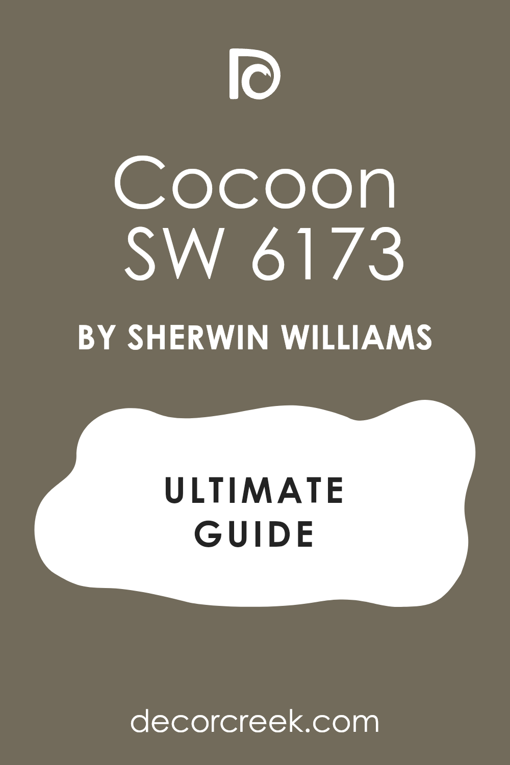
Pewter Tankard SW 0023
Pewter Tankard SW 0023 is a warm gray that feels very solid and very strong like an old metal cup. Pewter Tankard SW 0023 is a great choice for a room where you want to feel very grounded and steady. The shade is not too dark but it has enough power to make a room feel very important.
This paint looks very high-end when you use it on cabinets or big wooden doors in your house. Many people choose this color because it feels very professional and very smart for a modern home. It creates a very quiet atmosphere that helps you think and get your work done happily.
You will notice how it makes white trim look very bright and very clean in the room. I find that it works perfectly with bronze or copper handles on your favorite furniture. It is a very hardworking color that stays looking great even if the room is very busy. It gives the house a very sturdy and reliable look that guests will really like.
Best used in: home offices, kitchen cabinets, hallways, and mudrooms
Pairs well with: Urban Bronze SW 7048, Repose Gray SW 7015, and warm metals The key rule of this color for Art Deco style is to use it to add a sense of weight and reliability.
🎨 Check out the complete guide to this color right HERE 👈
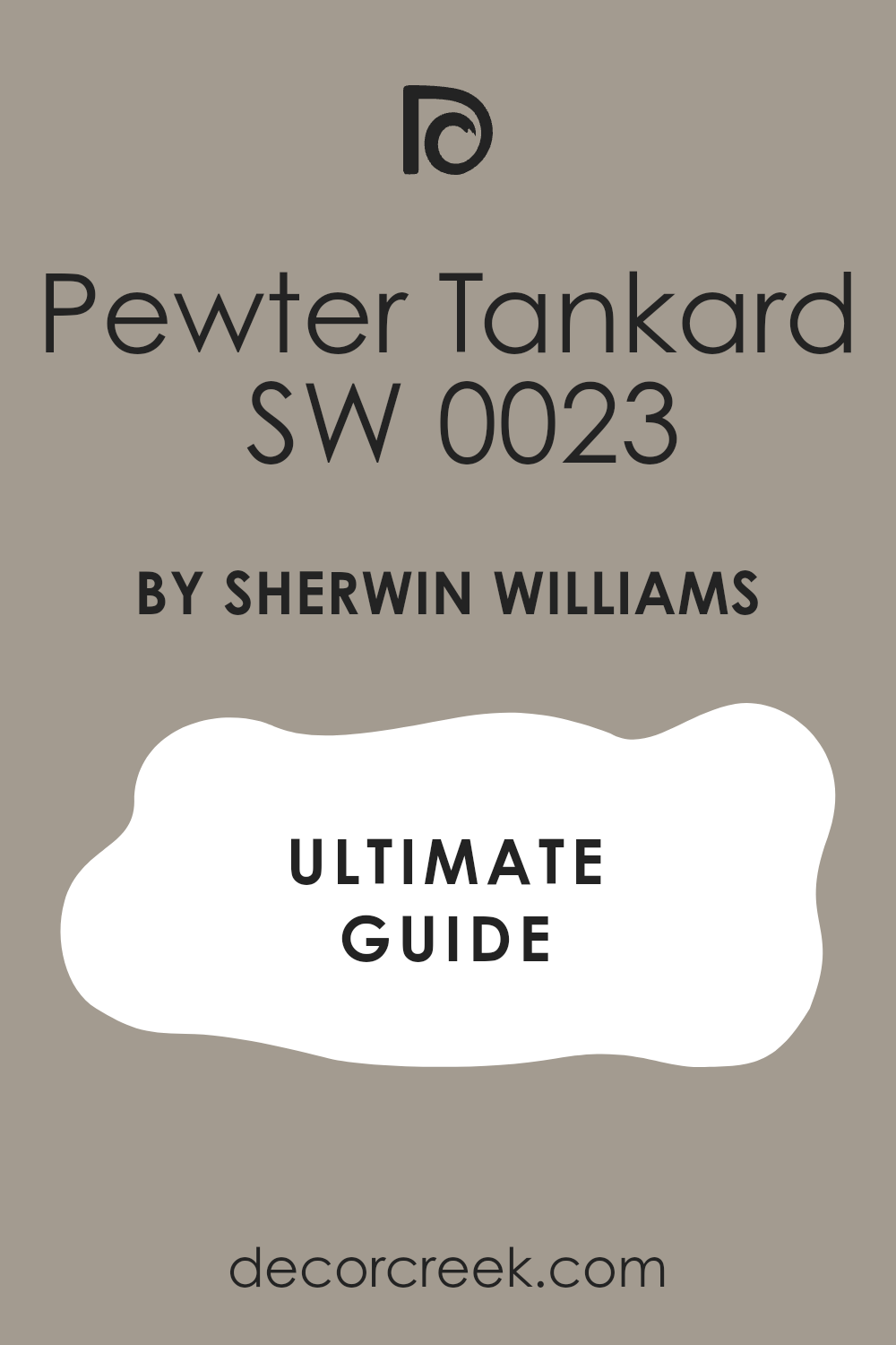
Dovetail SW 7018
Dovetail SW 7018 is a medium gray that feels very balanced and very easy to live with every day. Dovetail SW 7018 looks like a soft stone or a piece of heavy metal used for a big bridge. This color is a great choice for a bedroom where you want to feel very relaxed and very safe.
The shade is very steady and makes the walls feel very solid and very well-built for a family. This paint works very well with white trim and light-colored rugs on the floor. Many people love this color because it matches almost any other color you put near it in the room.
It creates a mood that is very inviting and very much like a professional city apartment. You will find that it makes your home feel very updated and very fresh without being too loud. I like to use it in hallways to make the move between rooms feel very smooth. It is a very friendly and very useful color for any part of your modern house.
Best used in: bedrooms, hallways, living rooms, and kitchen cabinets
Pairs well with: Alabaster SW 7008, Urban Bronze SW 7048, and soft gray rugs The key rule of this color for Art Deco style is to use it as a reliable base that ties the house together.
🎨 Check out the complete guide to this color right HERE 👈

Cocoa Whip SW 9084
Cocoa Whip SW 9084 is a very deep brown that looks like a strong cup of dark coffee in the morning. Cocoa Whip SW 9084 makes a room feel very warm and very expensive as soon as you paint the walls. This color is a great choice for an entryway to give your guests a very high-end welcome.
The shade is very rich and makes the walls look very thick and very solid for your family. This paint works very well with gold frames and dark leather chairs from a fancy shop. Many people choose this color because it feels very royal and very much like a palace for a king.
It creates a very grounded mood that makes you feel very safe and very comfortable at home. You will notice how it makes your white lamps look very bright and very clean next to the dark paint. I find that it works perfectly to create a space that feels very special and full of history. It is a very beautiful choice that always looks very smart.
Best used in: entryways, dining rooms, dens, and master bedrooms
Pairs well with: Alabaster SW 7008, gold hardware, and warm wood floors The key rule of this color for Art Deco style is to use it to bring a sense of rich warmth and luxury.
🎨 Check out the complete guide to this color right HERE 👈

Hushed Auburn SW 9080
Hushed Auburn SW 9080 is a warm reddish-brown that looks like the leaves on a tree during the fall time. Hushed Auburn SW 9080 is very rich and makes a room feel very cozy and full of life for everyone. This color is a great choice for a room where you want to feel very awake and happy.
The shade is very bold and makes a big statement to anyone who walks inside your modern house. You should use it if you want to show off your love for unique and artistic colors from nature. This paint makes the room feel very creative and very much like a sunny and warm place for a family.
Many people love this color because it is very brave and shows a lot of great personality. It creates a very warm mood that makes every day feel like a special party for you. You will notice how it makes your green plants look very bright and very healthy. I like to use it to add a splash of color to a house that needs spirit.
Best used in: dining rooms, accent walls, entryways, and master bedrooms
Pairs well with: Pure White SW 7005, gold accents, and dark wood furniture The key rule of this color for Art Deco style is to use it to bring a sense of earthy energy and warmth
🎨 Check out the complete guide to this color right HERE 👈
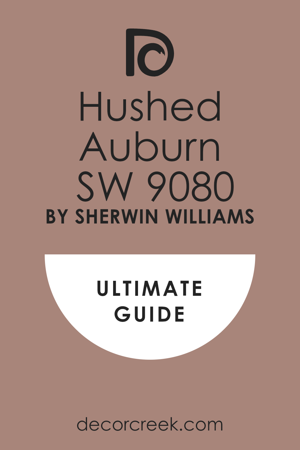
Gold Finch SW 6905
Gold Finch SW 6905 is a bright and happy yellow that feels like a beautiful bird in the summer sun. Gold Finch SW 6905 looks like a bowl of lemons sitting on a table in a very sunny kitchen. This color is a great choice for a room where you want to feel very awake and full of energy.
The shade is very bold and makes a big statement as soon as you enter the house. You should use it if you want to bring a lot of light into a room that is dark. This paint makes the walls look very fresh and very modern for a family to enjoy today.
Many people love this color because it feels very brave and shows you have a fun personality. It creates a high-energy mood that makes every day feel like a special and happy party. You will notice how it makes dark wood furniture look very sharp and very beautiful next to it. I like to use it to add a pop of color to a house that needs excitement.
Best used in: kitchens, playrooms, laundry rooms, and accent walls
Pairs well with: Tricorn Black SW 6258, Simply White OC-117, and navy blue The key rule of this color for Art Deco style is to use it to add a splash of high-energy sunshine.
Black Horizon 2132-30
Black Horizon 2132-30 is a dark gray that has a lot of cool blue and purple tones inside. Black Horizon 2132-30 makes a room feel very modern and very smart for a house in the big city. This color is a great choice for a living room where you want to show off your favorite art.
The shade is very deep and makes the room feel very private and like a special jewel box. This paint looks very high-end when you use it with white trim and silver metal decorations. Many people love this color because it changes and looks different every time the sun moves.
It creates a very cool and steady mood that makes the house feel very professional and clean. You will notice how it makes your furniture look very sharp and very clean next to the dark walls. I find that it works perfectly in a bathroom to make it feel like a very fancy and expensive spa for you. It is a very stylish choice that shows you have a very bold eye.
Best used in: living rooms, bathrooms, accent walls, and hallways
Pairs well with: Chantilly Lace OC-65, silver hardware, and cool gray rugs The key rule of this color for Art Deco style is to use it to create a sharp and powerful look.
Graphite 1603
Graphite 1603 is a very deep and dark gray that feels as heavy as a storm cloud in the sky. Graphite 1603 is very serious and makes a room feel very important and very modern for anyone. This color is a fantastic choice for a media room or a place where you watch movies.
The shade is dark enough to make the television screen look very bright and very clear for you. This paint makes the walls feel very solid and like they are made of dark polished stone. Many people choose this color because it looks very expensive and very high-end for a brand new house.
It creates a very cool and steady mood that helps you feel very focused and happy. You will see how it makes silver and chrome decorations look very shiny and very pretty. I suggest using it on an accent wall if you want to add a lot of style quickly. It is a very bold choice that shows you have a very good eye for modern design.
Best used in: media rooms, accent walls, bathrooms, and modern kitchens
Pairs well with: Extra White SW 7006, silver metal, and light gray rugs The key rule of this color for Art Deco style is to use it to create a sharp and modern look.
🎨 Check out the complete guide to this color right HERE 👈

Raccoon Fur 2126-20
Raccoon Fur 2126-20 is a very dark gray that has a lot of blue mixed into the bucket of paint. Raccoon Fur 2126-20 makes a room feel very royal and very special for anyone who spends time there. This color is a great choice for an accent wall in a bedroom where you want to feel safe.
The shade is very dark but it feels softer than a pure black paint would look on walls. This paint looks very high-end when you pair it with silver mirrors and white light from lamps. Many people love this color because it makes the walls look like they are made of velvet cloth.
It creates a very moody and smart feeling that is perfect for a modern house today. You will notice how it makes the furniture in the room look much more expensive and solid. I find that it works very well in a small room to make it feel like a secret and fancy box. It is a very stylish choice that shows you have a very bold and artistic spirit.
Best used in: bedrooms, accent walls, powder rooms, and library shelves
Pairs well with: Gray Owl OC-52, Simply White OC-117, and silver hardware The key rule of this color for Art Deco style is to use it to create a soft and smoky backdrop.
🎨 Check out the complete guide to this color right HERE 👈

Blue Note 2129-30
Blue Note 2129-30 is a very deep navy blue that feels very sophisticated and very smart for a home. Blue Note 2129-30 looks like the night sky when you are looking out from a big city window. This color is a great choice for a dining room where you want to host very fancy meals.
The shade is very rich and makes the walls feel very solid and very important for any guest. This paint works very well with gold frames and dark wood furniture from a high-end shop. Many people choose this color because it feels very royal and very much like a palace for a leader.
It creates a very grounded mood that makes you feel very safe and very comfortable at home. You will notice how it makes your white lamps look very bright and very clean next to the blue. I find that it works perfectly to create a space that feels very special and full of history. It is a very beautiful choice that always looks very smart and professional.
Best used in: dining rooms, home offices, bedrooms, and kitchen islands
Pairs well with: Simply White OC-117, gold hardware, and dark wood floors The key rule of this color for Art Deco style is to use it to bring a sense of regal history and color.
🎨 Check out the complete guide to this color right HERE 👈

Evening Dove 2128-30
Evening Dove 2128-30 is a medium-dark blue that has a lot of soft gray mixed into the paint. Evening Dove 2128-30 makes a room feel very steady and very cool for anyone who visits your home. This color is a great choice for a bedroom where you want to feel very relaxed and happy.
The shade is very balanced and makes the walls feel very solid and very well-built for a family. This paint works very well with white trim and light gray furniture in the house. Many people find this color to be very comfortable and very easy on the eyes during the day.
It creates a mood that is very professional but also very inviting for all your guests. You will notice how it makes your silver picture frames look very bright and very clean. I love how it gives a house a sense of high style without being too dark or moody. It is a very safe and beautiful choice that always looks very fresh and very updated for today.
Best used in: bedrooms, living rooms, bathrooms, and laundry rooms
Pairs well with: White Dove OC-17, silver hardware, and navy blue accents The key rule of this color for Art Deco style is to use it as a cool and balanced base for a room.
Hidden Sapphire CSP-690
Hidden Sapphire CSP-690 is a very dark and rich blue that looks like a precious stone found in the earth. Hidden Sapphire CSP-690 makes a room feel very royal and very important as soon as you see the walls. This color is a great choice for a dining room where you want to host very special parties.
The shade is very deep and makes the room feel very private and like a secret palace. This paint looks very high-end when you pair it with gold frames and shiny brass lamps in the room. Many people love this color because it feels very brave and shows a lot of heart and style.
It creates a very strong mood that helps you feel very safe and very proud of your home. You will find that it makes your white furniture look very sharp and very clean next to the blue. I find that it works perfectly in a small room to make it feel like a fancy jewel box for you. It is a very beautiful color that adds a lot of soul.
Best used in: dining rooms, powder rooms, accent walls, and bedrooms
Pairs well with: Simply White OC-117, gold hardware, and dark wood floors The key rule of this color for Art Deco style is to use it to bring a sense of high-energy luxury and color.
🎨 Check out the complete guide to this color right HERE 👈

Aegean Teal 2136-40
Aegean Teal 2136-40 is a beautiful mix of blue, green, and gray that feels very rich and very deep. Aegean Teal 2136-40 looks like the water in a quiet sea on a beautiful and sunny afternoon. This color is a great choice for a kitchen where you want to feel both creative and happy.
The shade is very steady and makes the walls feel very solid and very well-built for a family. This paint works very well with light wood floors and white stone counters in the modern house. Many people find this color to be very comfortable and very easy to look at every single day.
It creates a mood that is very professional but also very inviting for all your guests. You will notice how it makes your bronze handles look very bright and very important. I love how it gives a house a sense of high style without being too dark or loud. It is a very safe and beautiful choice that always looks very updated and fresh.
Best used in: kitchens, living rooms, bedrooms, and bathrooms
Pairs well with: Cloud White OC-130, bronze hardware, and natural wood The key rule of this color for Art Deco style is to use it to add a touch of artistic history and color.
🎨 Check out the complete guide to this color right HERE 👈
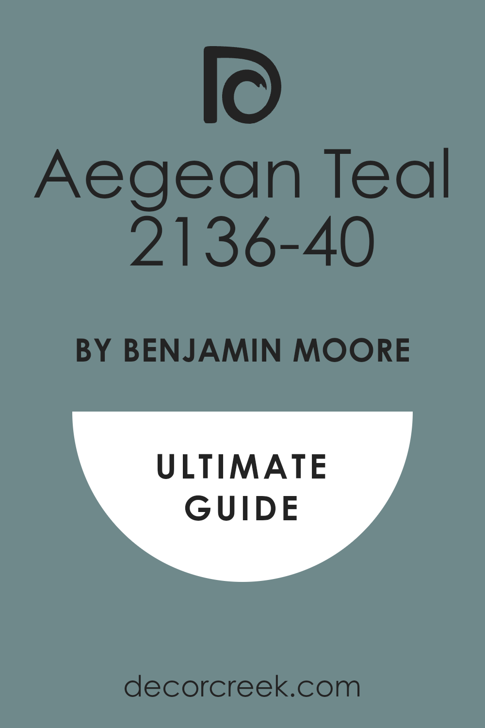
Deep Mulberry 2069-10
Deep Mulberry 2074-10 is a very dark purple that looks like a royal coat or a bowl of dark fruit. Deep Mulberry 2074-10 is very warm and makes a room feel very exciting and full of life for everyone. This color is a great choice for a dining room where you want to host very fancy dinners.
The shade is very dark so it does not feel like a toy or a bright light on the wall. It makes the room feel very royal and very important for any guest who walks inside your house. This paint looks amazing when you pair it with black furniture and big gold mirrors in the room.
Many people choose this color because it feels very brave and shows a lot of heart and style. It creates a very cozy feeling when you use it in a room with a warm fireplace. The color has a lot of depth and makes the walls feel very soft and very inviting. I like to use it in small rooms to make them feel like a rich jewel box.
Best used in: dining rooms, powder rooms, accent walls, and master bedrooms
Pairs well with: Silver hardware, gray textiles, and Simply White OC-117 The key rule of this color for Art Deco style is to use it to create a high-contrast look that feels very artistic.
🎨 Check out the complete guide to this color right HERE 👈

Aztec Brick 2175-10
Aztec Brick 2175-10 is a warm reddish-brown that looks like a heavy brick found in a very old building. Aztec Brick 2175-10 is very rich and makes a room feel very cozy and full of life for your family. This color is a great choice for a room where you want to feel very awake and happy.
The shade is very bold and makes a big statement to anyone who walks inside your modern house. You should use it if you want to show off your love for unique and artistic colors from nature. This paint makes the room feel very creative and very much like a sunny and warm place for anyone.
Many people love this color because it is very brave and shows a lot of great personality. It creates a very warm mood that makes every day feel like a special party for you and your guests. You will notice how it makes your green plants look very bright and very healthy. I like to use it to add a splash of color to a house that needs spirit.
Best used in: living rooms, accent walls, entryways, and master bedrooms
Pairs well with: Pure White SW 7005, gold accents, and dark wood furniture The key rule of this color for Art Deco style is to use it to bring a sense of earthy energy and warmth.
Firenze AF-225
Firenze AF-225 is a bright and warm orange color that feels like a sunset in a very beautiful city. Firenze AF-225 looks like a fresh bowl of fruit sitting on a table in a sunny kitchen. This color is a great choice for a room where you want to feel very awake and full of life.
The shade is very bold and makes a big statement as soon as you enter the house. You should use it if you want to bring a lot of light into a room that is a bit dark. This paint makes the walls look very fresh and very modern for a family to enjoy today.
Many people love this color because it feels very brave and shows you have a fun and happy personality. It creates a high-energy mood that makes every meal feel like a special and warm party. You will notice how it makes dark wood furniture look very sharp and very beautiful next to it. I like to use it to add a pop of color to a house that needs excitement.
Best used in: kitchens, breakfast nooks, dining rooms, and accent walls
Pairs well with: Tricorn Black SW 6258, Simply White OC-117, and navy blue The key rule of this color for Art Deco style is to use it to add a splash of high-energy sunshine to a room.
Smoked Oyster 2109-40
Smoked Oyster 2109-40 is a warm gray that has a lot of soft purple and brown mixed in the paint. Smoked Oyster 2109-40 makes a room feel very balanced and very easy to live with every day for you. This color is a great choice for a bedroom where you want to feel very relaxed and happy.
The shade is very steady and makes the walls feel very solid and very well-built for a family. This paint works very well with white trim and light-colored rugs on the floor of the room. Many people love this color because it matches almost any other color you put near it in the house.
It creates a mood that is very inviting and very much like a professional city apartment for everyone. You will find that it makes your home feel very updated and very fresh without being too loud or bright. I like to use it in hallways to make the move between rooms feel very smooth. It is a very friendly and very useful color for any house.
Best used in: bedrooms, hallways, living rooms, and kitchen cabinets
Pairs well with: Alabaster SW 7008, Urban Bronze SW 7048, and soft gray rugs The key rule of this color for Art Deco style is to use it as a reliable base that ties the house together.
🎨 Check out the complete guide to this color right HERE 👈

Garrison Red HC-66
Garrison Red HC-66 is a deep and rich red that feels very traditional and very powerful for a home. Garrison Red HC-66 looks like a royal coat or a big red chair found in a very fancy library. This color is very warm and makes a room feel very exciting and very full of life for everyone.
It is a great choice for a dining room where you want to host very big and special dinners. The red is very dark so it does not feel like a toy or a bright light on the wall. It makes the room feel very royal and very important for any guest who walks inside your house.
This paint looks amazing when you pair it with black furniture and big gold mirrors in the room. Many people choose this color because it feels very brave and shows a lot of heart and style. It creates a very cozy feeling when you use it in a room with a warm fireplace. The color has a lot of depth and makes the walls feel very soft and very inviting.
Best used in: dining rooms, front doors, library nooks, and accent walls
Pairs well with: Tricorn Black SW 6258, Simply White OC-117, and antique gold The key rule of this color for Art Deco style is to use it to bring a sense of high-energy luxury and warmth.
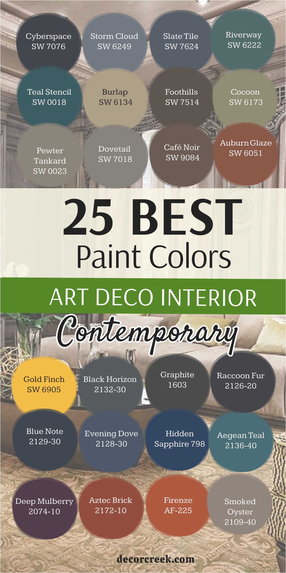
My Final Thoughts about 44 evergreen paint color ideas for the Art Deco Interior
Picking the right paint for your home is exactly like choosing a beautiful coat to wear every single day for the rest of your life. I believe with all my heart that these 44 colors are the best tools you can use to make your house look like a high-end palace where a movie star would live.
You should not be afraid to use very dark colors like Tricorn Black or Hale Navy because they have a special way of making everything else in the room look very expensive. These colors act like a dark velvet stage that helps your gold lamps and silver mirrors shine like real buried treasure in every single room of your house.
I truly love how a simple bucket of paint can make even a tiny, small room feel very cozy and very fancy at the exact same time. You should always take a moment to think about how a color makes you feel deep inside when you walk through the front door after a long day at work.
A good house should feel solid and very well-made so that you and your family can enjoy it and feel safe for many years to come. I really hope these ideas help you feel brave enough and strong enough to try a new and bold look on your walls this year.
Your home is the most important place in the world, and it is a place where you should feel very proud and very happy every single day you wake up. Painting your walls with these rich shades is the fastest and easiest way to make your big dreams for a beautiful and stylish home come true right now.
When you choose a color with a lot of soul, you are telling the world that you have great taste and that you care about the beauty of your surroundings. Do not settle for plain or boring walls when you can have a home that feels like a royal getaway filled with rich feelings and grand style.
