Selecting the perfect paint involves a deep connection to your space and a lot of emotional feeling. When you step into a room and look at your walls, you want to feel immediately proud, settled, and incredibly comfortable. Iron Ore by Sherwin-Williams is a beautifully deep, mysterious charcoal that makes a major, unforgettable statement wherever it is applied.
Because it is so inherently rich, grounding, and visually heavy, it absolutely needs the right coordinating partners to work well and look balanced. I want to guide you through this process and show you exactly how to make it look incredible in your unique space.
Picking the wrong match can easily make your house feel dark, gloomy, or accidentally messy. On the other hand, finding the right match makes every single corner look completely intentional, sophisticated, and sharp. Together, we will look closely at premium design options that bring out the absolute best in this magnificent dark tone.
By the time your project is finished, your entire house is going to look profoundly beautiful, welcoming, and high-end.
Why I Always Trust Sherwin-Williams and Benjamin Moore for the Best Colors That Go With Iron Ore
I have spent years studying interiors and working directly inside various homes to make them perfectly ready for eager buyers. Sherwin-Williams and Benjamin Moore are my absolute favorite, go-to paint brands because their liquid pigments are incredibly rich, deep, and stable.
They do not fade over time, nor do they unexpectedly change into strange, unflattering undertones under different types of artificial lights or changing seasons. When you purchase from these industry leaders, you get exactly what you see on the original sample card without any stressful surprises.
These two premium brands create intentional shades that balance each other out with absolute perfection. When you carefully mix their lighter options with a deep, demanding dark charcoal, they maintain their true, clean character on the wall. Cheaper paints often break down visually and look muddy or cheap when placed directly next to a strong, dominant charcoal like Iron Ore. Taking the time to test these premium options ensures your woodwork, trim, and main walls look distinctly expensive, smooth, and professionally curated.
How I Choose the Perfect Color to Pair With Iron Ore
I always start my design process by checking the amount of natural light flooding into the house throughout the day. Heavy, saturated charcoal naturally absorbs an immense amount of light, so you must add complementary shades that actively give that light back to the room.
I thoroughly analyze the hidden undertones of each potential pairing to make absolutely sure they do not fight or clash with each other on opposite walls. For example, crisp blue undertones feel wonderfully cool and modern, while soft yellow or sandy beige undertones feel instantly cozy, traditional, and warm.
Next, I think deeply about the overall purpose and intended mood of the living space. You want to establish a visual contrast that feels intentionally clean and elegant rather than jarring, chaotic, or distracting to the eye. To guarantee success, I always paint and test large, generous paint patches directly onto the walls so we can watch them change at different times of the day. This vital step keeps you completely safe from making an expensive color mistake that you might regret later on down the road.
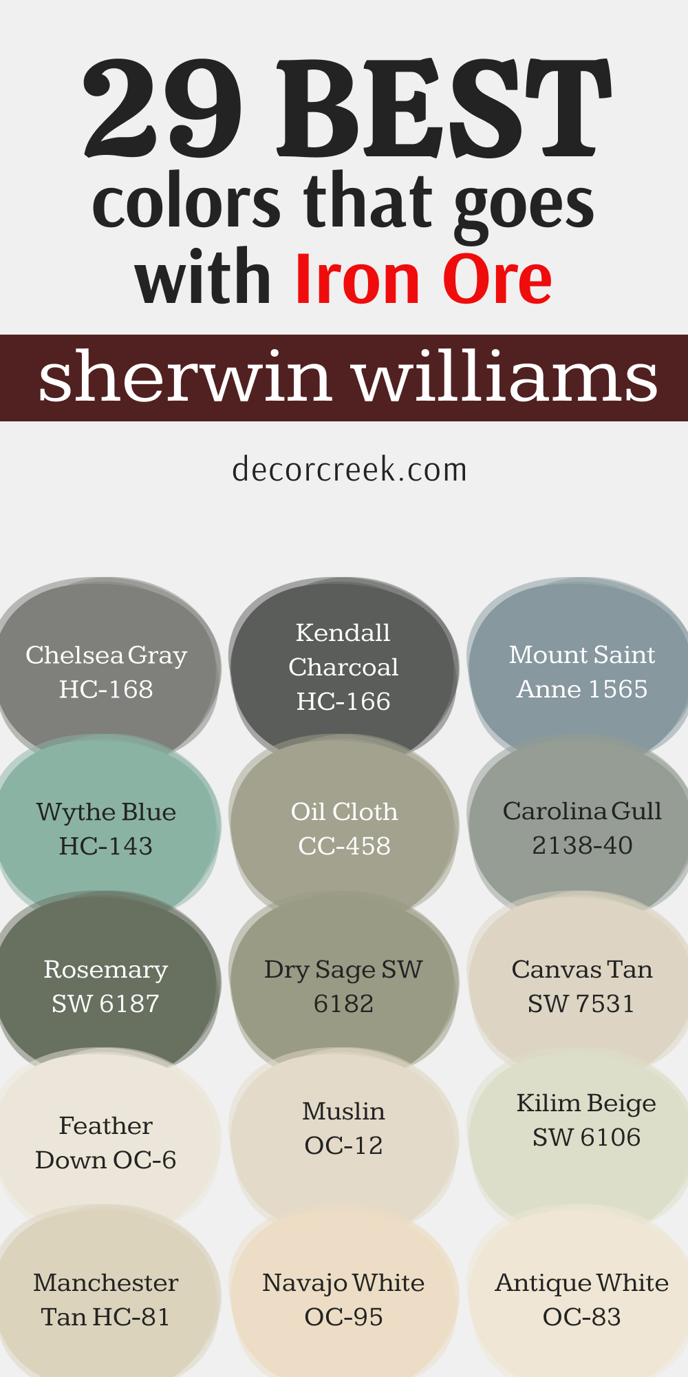
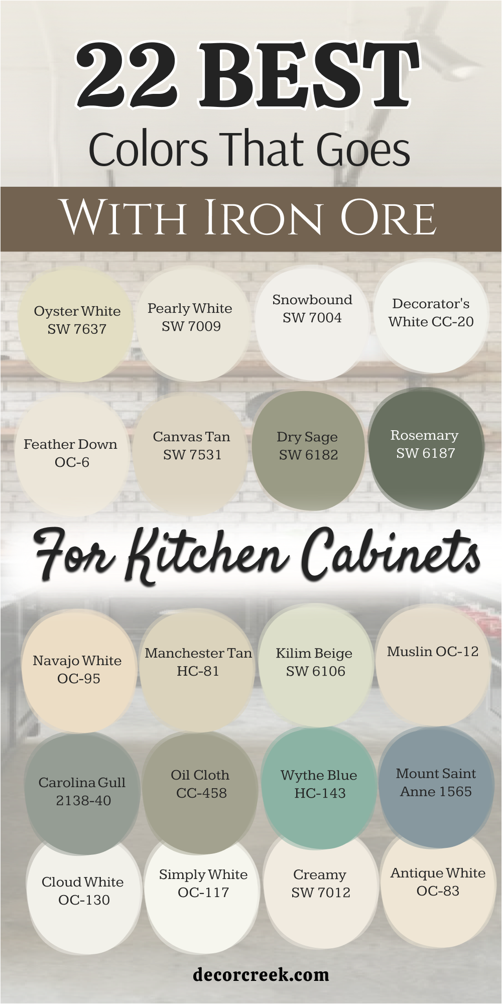
22 Best Colors that Goes with Iron Ore for Kitchen Cabinets
Oyster White SW 7637
Oyster White SW 7637 brings a soft warmth to your woodwork. This choice prevents your kitchen from feeling cold or clinical. It has a tiny hint of green that keeps it looking fresh next to deep charcoal. The contrast looks clean and very high-end.
I love using it on upper cabinets while keeping the dark tone on the bottom rows. It makes the ceiling feel higher. Guests will notice how bright and welcoming the cooking area feels. It looks amazing with brass handles.
Best used in: kitchens, laundry rooms, entryways, and traditional dining areas
Pairs well with: Iron Ore SW 7069, Useful Gray SW 7050, Urbane Bronze SW 7048, light oak flooring The key rule of this color for kitchen style is to use it where you want your cooking area to feel warm and bright without looking stark white.
🎨 Check out the complete guide to this color right HERE 👈
Pearly White SW 7009
Pearly White SW 7009 has a cool undertone that matches charcoal beautifully. It looks like a clean crisp sheet on a sunny morning. This option does not turn yellow even when the afternoon sun hits it directly.
It keeps your cooking area looking neat and tidy. I recommend it for modern homes with clean lines. It works well with stainless steel appliances. Your kitchen will look large and airy. It is a safe choice for any home layout.
Best used in: modern kitchens, small bathrooms, open hallways, and breakfast nooks
Pairs well with: Iron Ore SW 7069, Charcoal Blue SW 2739, Repose Gray SW 7015, brushed nickel fixtures The key rule of this color for crisp style is to use it where you need a clean backdrop that makes dark accents stand out sharply.
🎨 Check out the complete guide to this color right HERE 👈
Snowbound SW 7004
Snowbound SW 7004 is a very popular option because it feels bright and happy. It has a slight gray undertone that connects it to charcoal instantly. This choice makes small cooking areas feel twice as large. It looks wonderful when the morning sun streams through the window.
Homebuyers always love this clean look. It creates a great balance on your cabinet doors. You will enjoy spending time in this bright environment. It makes everyday cooking feel special.
Best used in: small kitchens, bright bedrooms, mudrooms, and open concept living areas
Pairs well with: Iron Ore SW 7069, Mindful Gray SW 7016, Black Magic SW 6991, marble countertops The key rule of this color for bright style is to use it on your upper cabinets to create an airy feeling that opens up the room.
🎨 Check out the complete guide to this color right HERE 👈

Decorator’s White CC-20
Decorator’s White CC-20 is a favorite among professional painters for its pure look. It has a tiny drop of gray that softens the brightness. This option makes your dark island pop like a piece of art. It creates a stunning frame for your dishes and decorations.
The look is sharp and very professional. It never feels dated or old. Your kitchen will feel like a luxury cooking studio. It brings a sense of order to busy rooms.
Best used in: contemporary kitchens, art galleries, home offices, and trim work
Pairs well with: Iron Ore SW 7069, Revere Pewter HC-172, Hale Navy HC-154, quartz countertops The key rule of this color for modern style is to use it on smooth surfaces where you want a clean contrast that highlights architecture.
Cloud White OC-130
Cloud White OC-130 is soft like a fluffy cloud in the sky. It has a gentle creaminess that softens the hard look of dark charcoal. This choice makes the kitchen feel like the true heart of the home.
It coordinates well with warm wood cutting boards and plants. It creates a friendly look that invites people to sit and chat. The finish looks rich and smooth under warm light bulbs. It is excellent for families who love a cozy feeling.
Best used in: family kitchens, cottage dining rooms, cozy bedrooms, and pantry doors
Pairs well with: Iron Ore SW 7069, Pale Oak OC-20, Chelsea Gray HC-168, natural wood accents The key rule of this color for family style is to use it in rooms with plenty of warm lighting to make the environment feel friendly.
🎨 Check out the complete guide to this color right HERE 👈

Simply White OC-117
Simply White OC-117 is bright but carries a lovely hidden warmth. It glows when the sun hits the surface. This choice makes your dark cabinets look rich and deep instead of gloomy. It is a fantastic option for dark kitchens that lack big windows.
It brings a cheerful energy to the entire floor plan. I use it to make standard cabinets look like custom woodwork. Your family will love the clean look. It coordinates beautifully with gold hardware.
Best used in: dark kitchens, small hallways, bathroom vanities, and trim molding
Pairs well with: Iron Ore SW 7069, Classic Gray OC-23, Stonington Gray HC-170, gold accent pieces The key rule of this color for bright style is to use it to bounce light around corners in rooms that lack big windows.
🎨 Check out the complete guide to this color right HERE 👈

Creamy SW 7012
Creamy SW 7012 provides a traditional look that feels very soft and safe. It is a rich ivory that avoids looking yellow or dingy. This option balances the heavy weight of charcoal perfectly. It works beautifully in older homes with lots of character.
It gives a sense of history and comfort to the cooking area. The look is soft on the eyes during bright afternoons. It makes your home feel grounded and peaceful.
Best used in: historic kitchens, large dining rooms, welcoming entryways, and exterior trim
Pairs well with: Iron Ore SW 7069, Mega Greige SW 7031, Accessible Beige SW 7036, antique brass handles The key rule of this color for traditional style is to use it alongside dark accents to create a warm historic look.
🎨 Check out the complete guide to this color right HERE 👈

Antique White OC-83
Antique White OC-83 is a deep rich choice with strong warm tones. It feels like a cozy blanket on a cold day. This option keeps a dark kitchen from feeling too cold or distant. It looks amazing with dark stone countertops and iron hardware.
I choose this for country homes and rustic cabins. It highlights the beauty of natural materials. The contrast is soft and very pleasing to the eye. It creates a relaxing place to bake and cook.
Best used in: rustic kitchens, country living rooms, main entry doors, and cozy dens
Pairs well with: Iron Ore SW 7069, Saybrook Sage HC-114, Manchester Tan HC-81, dark stone surfaces The key rule of this color for rustic style is to use it with natural textures like stone and wood to create a rich look.
Navajo White OC-95
Navajo White OC-95 blends yellow and tan tones into a soft cream finish. It feels warm and full of life. This choice prevents your kitchen from looking like a cold hospital room. It looks beautiful when paired with dark charcoal trim.
It brings an earthy feel to your indoor cooking area. Homeowners who dislike bright whites love this option. It makes large kitchens feel tight and cozy. It hides small smudges and fingerprints well.
Best used in: large kitchens, open living areas, sunny breakfast rooms, and textured walls
Pairs well with: Iron Ore SW 7069, Lenox Tan HC-44, Amherst Gray HC-167, copper pots and pans The key rule of this color for earthy style is to use it where you want to tone down bright sunshine while keeping a warm feeling.
🎨 Check out the complete guide to this color right HERE 👈
Manchester Tan HC-81
Manchester Tan HC-81 is a clean beige that acts like a neutral canvas. It does not lean too orange or too pink. This choice brings an elegant look to your kitchen woodwork. It coordinates beautifully with dark charcoal islands.
It makes the entire room feel steady and well-designed. I love it because it looks great in both morning and evening light. It gives your home a high-end designer look. Your friends will ask for the name of this shade.
Best used in: elegant kitchens, long hallways, formal dining spaces, and home libraries
Pairs well with: Iron Ore SW 7069, Bleeker Beige HC-80, Coventry Gray HC-169, bronze light fixtures The key rule of this color for elegant style is to use it on your main walls or cabinets to establish a steady neutral theme.
🎨 Check out the complete guide to this color right HERE 👈

Kilim Beige SW 6106
Kilim Beige SW 6106 is a warm tan that feels very traditional and solid. It has a tiny red undertone that makes it feel extra cozy. This choice grounds your kitchen when paired with dark charcoal accents.
It looks excellent with warm tile floors and wooden beams. It is a very safe option if you want to avoid gray colors. It makes the room feel friendly and relaxed. It works well for homes with a southwestern or traditional style.
Best used in: traditional kitchens, open family rooms, mudrooms, and warm entryways
Pairs well with: Iron Ore SW 7069, Hopsack SW 6109, Latte SW 6108, terracotta tile flooring The key rule of this color for cozy style is to use it where you want a reliable warm backdrop that handles heavy daily use.
🎨 Check out the complete guide to this color right HERE 👈
Muslin OC-12
Muslin OC-12 looks like natural linen fabric on a sunny day. It is soft, light, and very easy to live with. This choice brings a casual feel to your kitchen cabinets. It cuts through the heavy feeling of dark charcoal paint.
It makes your cooking area feel light without being bright white. I recommend it for casual beach houses or cozy cottages. It looks great with simple black iron hardware. It keeps the mood very relaxed.
Best used in: beach house kitchens, casual dining areas, bright laundry rooms, and cottage walls
Pairs well with: Iron Ore SW 7069, Edgecomb Gray HC-173, Woodmont Cream 204, black iron hardware The key rule of this color for casual style is to use it where you want a soft linen look that softens dark structural elements.
🎨 Check out the complete guide to this color right HERE 👈

Feather Down OC-6
Feather Down OC-6 is an ultra-light gray-beige hybrid. It feels soft and light as air. This option keeps your kitchen looking clean and highly styled. It creates a soft transition into dark charcoal accents.
It looks beautiful on cabinet faces with simple detailing. It makes the room feel soft and quiet. I love using it to create a soft look that does not shout for attention. Your kitchen will look expensive and custom-made.
Best used in: custom kitchens, master bathrooms, quiet reading corners, and bedroom trim
Pairs well with: Iron Ore SW 7069, Swiss Coffee OC-45, Wedgewood Gray HC-146, soft white linen curtains The key rule of this color for custom style is to use it in rooms with large windows to let its light gray-beige tones shine.
Canvas Tan SW 7531
Canvas Tan SW 7531 is a clean khaki color with zero yellow undertones. It looks like crisp canvas fabric. This option makes your dark kitchen island stand out beautifully. It gives a tailored look to your cooking area.
It matches well with light wood floors and modern stone. This shade makes the room feel organized and sharp. It is perfect for people who love a neat look. It brings a fresh energy to old cabinets.
Best used in: tailored kitchens, home offices, long hallways, and laundry room cabinets
Pairs well with: Iron Ore SW 7069, Wool Skein SW 6148, Foothills SW 7514, light oak flooring The key rule of this color for tailored style is to use it on flat panel cabinets for a clean architectural look.
🎨 Check out the complete guide to this color right HERE 👈

Dry Sage SW 6186
Dry Sage SW 6186 is a soft green with gray mixed inside. It looks like dried herbs from the garden. This option brings nature inside your kitchen. It creates a gorgeous earthy look when paired with dark charcoal.
It looks rich on lower cabinets or a center island. It gives your home a unique personality without being too loud. It makes the cooking area feel very grounded. It coordinates perfectly with copper accents.
Best used in: garden-style kitchens, cozy dens, back entryways, and accent islands
Pairs well with: Iron Ore SW 7069, Soft Chamois OC-13, Mountain Road SW 7743, copper hardware The key rule of this color for nature style is to use it on your kitchen island to bring an organic feel indoors.
Rosemary SW 6187
Rosemary SW 6187 is a deep green that feels very rich and bold. It has a lot of gray in it which keeps it sophisticated. This choice looks stunning next to a dark charcoal wall. It makes your kitchen feel like a high-end restaurant kitchen.
It works best in rooms with lots of natural light. It gives a serious designer look to your home. You will feel proud hosting parties in this room. It looks incredible with shiny gold handles.
Best used in: bold kitchens, formal libraries, dining room accent walls, and front doors
Pairs well with: Iron Ore SW 7069, Alabaster SW 7008, Pewter Green SW 6208, gold cabinet handles The key rule of this color for bold style is to use it on full-height cabinets to create a dramatic green backdrop.
🎨 Check out the complete guide to this color right HERE 👈

Carolina Gull 2138-40
Carolina Gull 2138-40 is a medium gray-green that feels like a foggy morning coast. It is smooth and very sophisticated. This choice creates a soft connection with dark charcoal hardware.
It makes your kitchen look custom-built and artistic. It does not show dirt easily, which is great for busy families. It brings a quiet confidence to the room. I love it on kitchen islands with light stone tops. It makes a beautiful statement.
Best used in: artistic kitchens, coastal homes, bathroom vanities, and mudroom lockers
Pairs well with: Iron Ore SW 7069, Chantilly Lace OC-65, Revere Pewter HC-172, light quartz countertops The key rule of this color for coastal style is to use it where you want a medium tone that balances dark metal accents.
🎨 Check out the complete guide to this color right HERE 👈
Oil Cloth CC-458
Oil Cloth CC-458 is a unique greenish-gray with a hint of tan. It looks vintage and very interesting. This choice adds an old-world charm to your kitchen cabinets. It cuts the modern look of dark charcoal and makes it feel historic.
It looks wonderful with exposed brick walls and old wood beams. It creates a rich look that feels lived-in. You will love how it changes throughout the day. It is an excellent choice for historic renovations.
Best used in: vintage kitchens, historic renovations, small pantries, and accent doors
Pairs well with: Iron Ore SW 7069, White Dove OC-17, Stonybrook 1566, exposed brick accents The key rule of this color for vintage style is to use it in rooms with historic details to highlight old-world architecture.
Wythe Blue HC-143
Wythe Blue HC-143 is a beautiful blue-green with a steady gray base. It adds a lovely splash of color without feeling childish. This choice makes a dark kitchen feel cheerful and bright. It looks amazing on a central island surrounded by charcoal walls.
It brings a happy coastal energy to your home. It coordinates well with white dishes and open shelving. Your kitchen will feel like a creative studio. It is a joyful option for any home.
Best used in: cheerful kitchens, beach cottages, guest bathrooms, and sunroom cabinets
Pairs well with: Iron Ore SW 7069, Simply White OC-117, Palladian Blue HC-144, open white shelving The key rule of this color for cheerful style is to use it as a standout accent color against a dark background.
🎨 Check out the complete guide to this color right HERE 👈

Mount Saint Anne 1565
Mount Saint Anne 1565 is a deep slate blue that feels very regal. It has strong gray undertones that connect with charcoal perfectly. This option gives your kitchen cabinets a formal look.
It works beautifully with large silver handles and dark countertops. It looks like the deep ocean on a cloudy day. It gives a strong sense of structure to your walls. I love using it in large open kitchens. It makes a grand impression.
Best used in: formal kitchens, large laundry rooms, home theaters, and statement walls
Pairs well with: Iron Ore SW 7069, Cloud White OC-130, Gray Owl OC-52, silver cabinet hardware The key rule of this color for formal style is to use it on large cabinet banks to create a rich slate blue look.
🎨 Check out the complete guide to this color right HERE 👈
Kendall Charcoal HC-166
Kendall Charcoal HC-166 is a rich dark gray that sits just a bit lighter than charcoal. It creates a subtle monochromatic look. This choice makes your kitchen look incredibly sleek and modern. It feels like a high-end penthouse cooking area.
It works best when you want a moody look. It coordinates beautifully with modern light fixtures. It makes everything in the room feel unified. It is a bold choice for modern design lovers.
Best used in: modern kitchens, urban lofts, home theaters, and trim lines
Pairs well with: Iron Ore SW 7069, Decorator’s White CC-20, Amherst Gray HC-167, modern lighting The key rule of this color for modern style is to use it for a unified look where you match walls and cabinets closely.
🎨 Check out the complete guide to this color right HERE 👈

Chelsea Gray HC-168
Chelsea Gray HC-168 is a warm rich gray that has a medium depth. It feels very solid and trustworthy. This choice contrasts gently with dark charcoal accents. It makes your kitchen look balanced and extremely neat.
It works well with classic white subway tile backsplashes. It gives a professional look to standard kitchen cabinets. I love how stable it feels in any lighting condition. It is a crowd-pleasing color that adds real value.
Best used in: classic kitchens, rented properties, hallway cabinets, and garage doors
Pairs well with: Iron Ore SW 7069, Pure White SW 7005, Horizon OC-53, white subway tiles The key rule of this color for classic style is to use it to ground your cabinets while keeping the upper walls bright white.
🎨 Check out the complete guide to this color right HERE 👈

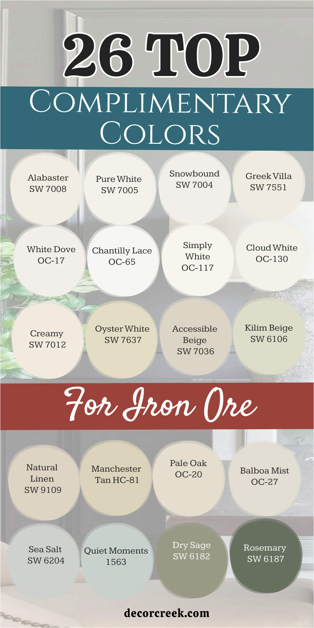
26 Top Complimentary Colors for Iron Ore
Alabaster SW 7008
Alabaster SW 7008 is a beautiful warm white that looks soft and inviting. It prevents dark charcoal from looking too harsh or scary. This choice brings a soft light to your main walls. It makes large living areas feel friendly and connected.
I love how it softens the edges of a dark accent wall. It is the perfect partner for a cozy farmhouse look. It feels like a warm hug when you walk inside.
Best used in: living rooms, kitchens, hallways, bedrooms, and farmhouse exteriors
Pairs well with: Iron Ore SW 7069, Agreeable Gray SW 7029, Natural Linen SW 9109, warm wood tones The key rule of this color for farmhouse style is to use it where you want natural light to feel kind, soft, and inviting throughout the day.
🎨 Check out the complete guide to this color right HERE 👈

Pure White SW 7005
Pure White SW 7005 is a clean shade with a tiny drop of warmth to keep it from looking blue. It creates a sharp border next to dark charcoal lines. This choice makes your baseboards and door frames pop.
It gives a look of absolute neatness to your home. It works brilliantly in any room with modern furniture. It makes the entire house feel fresh and clean. It is my top recommendation for doors and trim.
Best used in: baseboards, door frames, modern living rooms, and bright ceilings
Pairs well with: Iron Ore SW 7069, Dorian Gray SW 7017, Latrobe SW 9170, modern art pieces The key rule of this color for clean style is to use it on your trim and molding to frame dark walls sharply.
🎨 Check out the complete guide to this color right HERE 👈

Snowbound SW 7004
Snowbound SW 7004 works wonderfully as a wall color because it reflects light so well. It has a tiny touch of gray that links it to dark charcoal accents. This option makes your ceilings look high and your halls look wide.
It keeps the energy of the home positive and bright. It is an amazing choice for staging houses for sale. Buyers love how clean and large it makes rooms feel. It acts like a bright reflector.
Best used in: main hallways, tall ceilings, small bedrooms, and open entryways
Pairs well with: Iron Ore SW 7069, Mindful Gray SW 7016, Mega Greige SW 7031, wide plank floors The key rule of this color for bright style is to use it across large open walls to bounce light into dark corners.
🎨 Check out the complete guide to this color right HERE 👈
Greek Villa SW 7551
Greek Villa SW 7551 is a rich white with a lovely sandy undertone. It reminds me of warm stone houses by the sea. This choice takes away the cold feeling of dark metal fixtures. It makes your living spaces feel rich and soft.
It looks stunning when the evening sun glows through the windows. It creates a very soft contrast that is easy to look at. It is perfect for a warm minimalist style.
Best used in: minimalist living rooms, sunny bedrooms, large entryways, and exterior stucco
Pairs well with: Iron Ore SW 7069, Accessible Beige SW 7036, Urbane Bronze SW 7048, textured rugs The key rule of this color for warm style is to use it where you want a rich look that feels soft under evening light.
🎨 Check out the complete guide to this color right HERE 👈

White Dove OC-17
White Dove OC-17 is a legendary color because it looks good in every single house. It has a soft creamy base with a hint of gray. This option matches dark charcoal with incredible grace.
It makes your art pieces stand out like they are in a real museum. It brings a soft luxury to everyday living spaces. You can use it on walls, trim, and ceilings all at once. It is a foolproof choice for any decorator.
Best used in: art galleries, luxury bedrooms, full living rooms, and crown molding
Pairs well with: Iron Ore SW 7069, Revere Pewter HC-172, Balboa Mist OC-27, oil-rubbed bronze The key rule of this color for luxury style is to use it on both walls and trim in different sheens for a high-end look.
🎨 Check out the complete guide to this color right HERE 👈

Chantilly Lace OC-65
Chantilly Lace OC-65 is the brightest, truest white you can find. It has no hidden undertones at all. This choice creates the maximum amount of contrast with dark charcoal paint. It looks like fresh snow sitting against dark rocks.
It makes your home look sharp, modern, and incredibly crisp. It works best in modern homes with massive windows. It feels very clean and forward-thinking. Your home will look bright and clear.
Best used in: modern lofts, bright kitchens, large window frames, and contemporary studios
Pairs well with: Iron Ore SW 7069, Kendall Charcoal HC-166, Hale Navy HC-154, black metal furniture The key rule of this color for modern style is to use it where you want a true white that does not shift color under any light.
🎨 Check out the complete guide to this color right HERE 👈

Simply White OC-117
Simply White OC-117 brings a joyful glow to your main living walls. It keeps its bright character even in dark hallways. This choice pairs beautifully with charcoal doors and window frames. It creates a cheerful atmosphere that lifts your mood.
I love using it to make old plaster walls look fresh and new. It works well with colorful pillows and art. It makes your home feel alive and bright.
Best used in: dark hallways, family rooms, kids’ playrooms, and window trim
Pairs well with: Iron Ore SW 7069, Gray Owl OC-52, Coventry Gray HC-169, colorful decor The key rule of this color for bright style is to use it to cheer up dark family spaces that need extra light.
🎨 Check out the complete guide to this color right HERE 👈
Cloud White OC-130
Cloud White OC-130 feels soft, gentle, and extremely comfortable on the eyes. It softens the stark look of dark charcoal accents. This option makes your living room feel safe and warm. It is an excellent choice for bedrooms where you want to unwind.
It coordinates beautifully with soft fabrics and thick carpets. The look is soft and very high-end without being stiff. It makes your home feel like a peaceful retreat.
Best used in: master bedrooms, cozy living rooms, nursery walls, and reading alcoves
Pairs well with: Iron Ore SW 7069, Pale Oak OC-20, Stonington Gray HC-170, plush wool rugs The key rule of this color for cozy style is to use it in private areas where comfort is your primary goal.
🎨 Check out the complete guide to this color right HERE 👈
Creamy SW 7012
Creamy SW 7012 provides a rich historic feel that grounds a home. It avoids the bright clinical look of modern whites. This choice looks wonderful on wood paneling next to a charcoal fireplace. It makes the room feel established and full of stories.
I use it to add warmth to homes that feel too cold. It looks rich and thick on the walls. It gives a sense of solid comfort to everyone.
Best used in: wood paneling, fireplace walls, formal dining rooms, and historic exteriors
Pairs well with: Iron Ore SW 7069, Superior Bronze SW 6152, Kilim Beige SW 6106, dark stained wood The key rule of this color for historic style is to use it on architectural details to emphasize a classic look.
🎨 Check out the complete guide to this color right HERE 👈
Oyster White SW 7637
Oyster White SW 7637 has a lovely greige quality that looks very modern. It changes gently from gray to beige depending on the hour. This choice matches charcoal accents with great balance. It makes your main living spaces look neutral and highly styled.
It is a fantastic option for open floor plans. It connects different rooms together without any effort. Your home will feel unified and smart.
Best used in: open floor plans, modern farmhouses, large entry halls, and exterior trim
Pairs well with: Iron Ore SW 7069, Mega Greige SW 7031, Sea Salt SW 6204, light stone tiles The key rule of this color for neutral style is to use it as a bridge color to connect dark elements across open rooms.
🎨 Check out the complete guide to this color right HERE 👈
Accessible Beige SW 7036
Accessible Beige SW 7036 is one of the most famous neutrals for a good reason. It has a gray beige mix that goes with everything. This choice softens dark charcoal trim beautifully.
It makes your living room feel cozy but entirely modern. It looks fantastic with wood floors and leather furniture. It is the safest choice for anyone unsure about color. It makes your home feel warm and complete.
Best used in: living rooms, rented spaces, open kitchens, and family basements
Pairs well with: Iron Ore SW 7069, Pure White SW 7005, Tony Taupe SW 7038, leather sofas The key rule of this color for neutral style is to use it on your main walls to create a warm designer look easily.
🎨 Check out the complete guide to this color right HERE 👈

Kilim Beige SW 6106
Kilim Beige SW 6106 brings a solid tan warmth to your walls. It completely blocks out any cold gray tones. This choice looks wonderful in homes with traditional wooden furniture.
It creates a strong contrast that feels very grounded. It makes large open rooms feel smaller and friendlier. It is a great option for family gathering spaces. It brings a traditional comfort to the house.
Best used in: family gathering rooms, high-ceiling entryways, rustic dens, and stairwells
Pairs well with: Iron Ore SW 7069, Divine White SW 6105, Latte SW 6108, oak staircases The key rule of this color for cozy style is to use it on high walls to bring a warm feeling down into the living area.
🎨 Check out the complete guide to this color right HERE 👈
Natural Linen SW 9109
Natural Linen SW 9109 looks like unbleached fabric and feels very organic. It has an earthy quality that pairs well with charcoal accents. This option makes your living spaces feel relaxed and unforced.
It works beautifully with woven baskets and jute rugs. It gives your home a casual designer look. It is an amazing shade for sunny rooms because it absorbs glare. It feels steady and comfortable.
Best used in: sunny sunrooms, casual living areas, guest bedrooms, and laundry rooms
Pairs well with: Iron Ore SW 7069, Alabaster SW 7008, Homberg Gray SW 7622, jute rugs The key rule of this color for organic style is to use it alongside natural textures to build a grounded look.
🎨 Check out the complete guide to this color right HERE 👈

Manchester Tan HC-81
Manchester Tan HC-81 is a sophisticated khaki color that looks very neat. It does not have any unwanted pink or yellow tones. This choice makes dark charcoal doors look incredibly sharp.
It gives a look of order and cleanliness to long hallways. It works well in both historic and brand-new homes. It makes your walls look smooth and professional. It is a great option for a tailored look.
Best used in: long hallways, formal dining rooms, entry doors, and home libraries
Pairs well with: Iron Ore SW 7069, Bleeker Beige HC-80, Chelsea Gray HC-168, dark wood trim The key rule of this color for tailored style is to use it on hallway walls to frame dark interior doors beautifully.
🎨 Check out the complete guide to this color right HERE 👈
Pale Oak OC-20
Pale Oak OC-20 is a light greige that looks elegant and soft. It has a quiet quality that lets dark charcoal take the center stage. This choice makes small rooms look bright and expensive.
It acts like a soft shadow on the walls. It looks wonderful in master bedrooms and formal sitting rooms. It gives your home a high-end luxury feel. Your guests will love the soft atmosphere it creates.
Best used in: master bedrooms, formal sitting rooms, small apartments, and bathroom walls
Pairs well with: Iron Ore SW 7069, White Dove OC-17, Revere Pewter HC-172, silver mirrors The key rule of this color for luxury style is to use it where you want a light neutral that feels soft and expensive.
🎨 Check out the complete guide to this color right HERE 👈
Balboa Mist OC-27
Balboa Mist OC-27 is a pale gray with a tiny warm undertone. It never feels cold or industrial like standard grays. This choice creates a soft monochromatic look with dark charcoal accents.
It makes your living spaces feel modern and clean. It works beautifully with colorful art and modern furniture. It gives a fresh look to any room it goes into. It is a fantastic option for modern apartments.
Best used in: modern apartments, bright living rooms, open entryways, and home offices
Pairs well with: Iron Ore SW 7069, Chantilly Lace OC-65, Kendall Charcoal HC-166, modern art The key rule of this color for modern style is to use it on all four walls to create a sleek light gray foundation.
🎨 Check out the complete guide to this color right HERE 👈

Sea Salt SW 6204
Sea Salt SW 6204 is a magical blue-green gray that changes with the weather. It looks like sea foam on a cloudy day. This choice brings a fresh watery feel next to dark charcoal lines. It makes bathrooms feel like a luxury spa.
It looks beautiful in sunrooms and bright kitchens. It adds a gentle splash of color that feels very grown-up. It makes your home feel light and happy.
Best used in: master bathrooms, sunrooms, bright kitchens, and laundry rooms
Pairs well with: Iron Ore SW 7069, Pure White SW 7005, Rainwashed SW 6211, white fluffy towels The key rule of this color for spa style is to use it in rooms with water fixtures to create a fresh coastal theme.
🎨 Check out the complete guide to this color right HERE 👈

Quiet Moments 1563
Quiet Moments 1563 blends blue, green, and gray into a soft mix. It feels gentle and easy to look at. This option softens the strong look of a dark charcoal wall. It works wonderfully in bedrooms where you want to relax after work.
It gives a sweet historic look to older homes. It pairs beautifully with light gray rugs and silver frames. Your family will enjoy the light feel it brings.
Best used in: bedrooms, reading rooms, nursery walls, and guest bathrooms
Pairs well with: Iron Ore SW 7069, Cloud White OC-130, Beach Glass 1564, silver photo frames The key rule of this color for soft style is to use it on bedroom walls to create a light and pleasing retreat.
🎨 Check out the complete guide to this color right HERE 👈

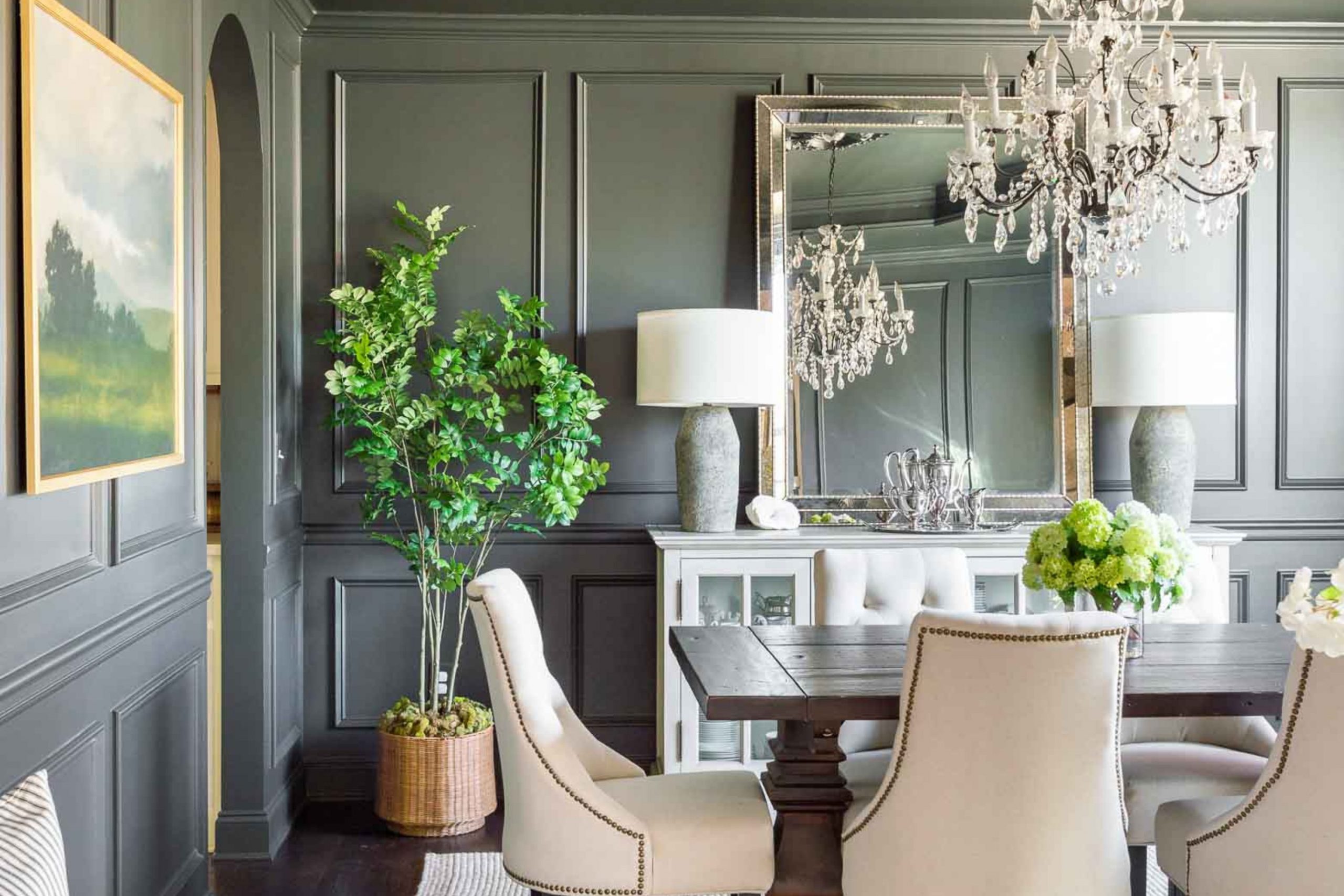
Rosemary SW 6187
Rosemary SW 6187 is a rich deep green that makes a powerful statement. It matches the depth of dark charcoal perfectly. This option creates a dramatic moody look that feels very rich.
It works best in small rooms like half baths or dark libraries. It makes your home look like a high-end designer showroom. It coordinates beautifully with dark wood and brass lamps. It is an adventurous and rewarding choice.
Best used in: half bathrooms, home libraries, accent walls, and media rooms
Pairs well with: Iron Ore SW 7069, Oyster White SW 7637, Clary Sage SW 6178, brass floor lamps The key rule of this color for bold style is to use it in small enclosed rooms to create a dramatic dark environment.
🎨 Check out the complete guide to this color right HERE 👈
October Mist 1495
October Mist 1495 is a soft silver-sage green that feels very modern. It has a light dusty quality that pairs well with charcoal accents. This choice brings a soft natural element to your living walls.
It looks beautiful under soft morning light. It gives a custom designer look to standard rooms. It looks wonderful with light linen curtains and plants. It keeps the atmosphere light and interesting.
Best used in: living rooms, home offices, guest bedrooms, and accent dividers
Pairs well with: Iron Ore SW 7069, White Dove OC-17, Saybrook Sage HC-114, potted indoor plants The key rule of this color for modern style is to use it where you want a hint of green that remains soft and neutral.
🎨 Check out the complete guide to this color right HERE 👈

Carolina Gull 2138-40
Carolina Gull 2138-40 is a medium gray-green with a steady look. It cuts the bright glare of sunny windows. This choice creates an elegant balance next to dark charcoal trim. It looks very smart in home offices and study areas.
It does not demand attention but looks incredibly rich. It hides wall imperfections beautifully. I love how it grounds a room without making it feel small.
Best used in: home offices, study areas, long hallways, and basement walls
Pairs well with: Iron Ore SW 7069, Chantilly Lace OC-65, Pale Oak OC-20, dark oak desks The key rule of this color for smart style is to use it on full office walls to create a professional backdrop for video calls.
🎨 Check out the complete guide to this color right HERE 👈
Wythe Blue HC-143
Wythe Blue HC-143 is a historic blue-green that brings a cheerful look. It provides a stunning pop of color against dark charcoal doors. This choice makes your entryways feel happy and full of energy.
It looks beautiful in coastal homes and historic properties alike. It gives a fun artistic personality to your home. It coordinates perfectly with crisp white trim. Your family will love this bright splash.
Best used in: entryways, front doors, coastal living rooms, and kitchen islands
Pairs well with: Iron Ore SW 7069, Simply White OC-117, Van Alen Green HC-120, white wood trim The key rule of this color for cheerful style is to use it on your front door to make a happy statement.
🎨 Check out the complete guide to this color right HERE 👈
Boothbay Gray HC-165
Boothbay Gray HC-165 is a beautiful blue-gray that feels like a misty morning lake. It is light and very elegant. This choice creates a smooth transition into dark charcoal accents.
It looks gorgeous in formal dining rooms and main bathrooms. It gives a cool clean energy to the entire house. It looks wonderful with classic silver fixtures and white moldings. It is a highly sophisticated shade.
Best used in: formal dining rooms, main bathrooms, large bedrooms, and window shutters
Pairs well with: Iron Ore SW 7069, Decorator’s White CC-20, Stonington Gray HC-170, silver mirrors The key rule of this color for cool style is to use it where you want a clean blue-gray tint that coordinates with dark metal.
🎨 Check out the complete guide to this color right HERE 👈

Hale Navy HC-154
Hale Navy HC-154 is a true classic navy blue that feels deeply royal. It matches the heavy strength of dark charcoal paint. This option creates a very rich masculine look in home theaters and dens.
It looks expensive and highly tailored. It works beautifully with leather furniture and brass lighting. It gives your home a timeless nautical strength. It is a favorite choice for statement walls.
Best used in: home theaters, cozy dens, boys’ bedrooms, and accent walls
Pairs well with: Iron Ore SW 7069, Alabaster SW 7008, Coventry Gray HC-169, brass reading lamps The key rule of this color for navy style is to use it on a main feature wall to create a strong deep look.
🎨 Check out the complete guide to this color right HERE 👈

Kendall Charcoal HC-166
Kendall Charcoal HC-166 brings a deep stone look to your living walls. It sits just one step away from pure charcoal. This choice creates a very sleek moody environment. It looks amazing in modern lofts with high ceilings.
It makes everything in the room look unified and intentional. I use it when a client wants a bold dark look throughout a room. It feels very confident and modern.
Best used in: modern lofts, high-ceiling rooms, media rooms, and outer trim lines
Pairs well with: Iron Ore SW 7069, Pure White SW 7005, Chelsea Gray HC-168, industrial metal furniture The key rule of this color for modern style is to use it on all four walls to create a rich stone gray environment.
🎨 Check out the complete guide to this color right HERE 👈
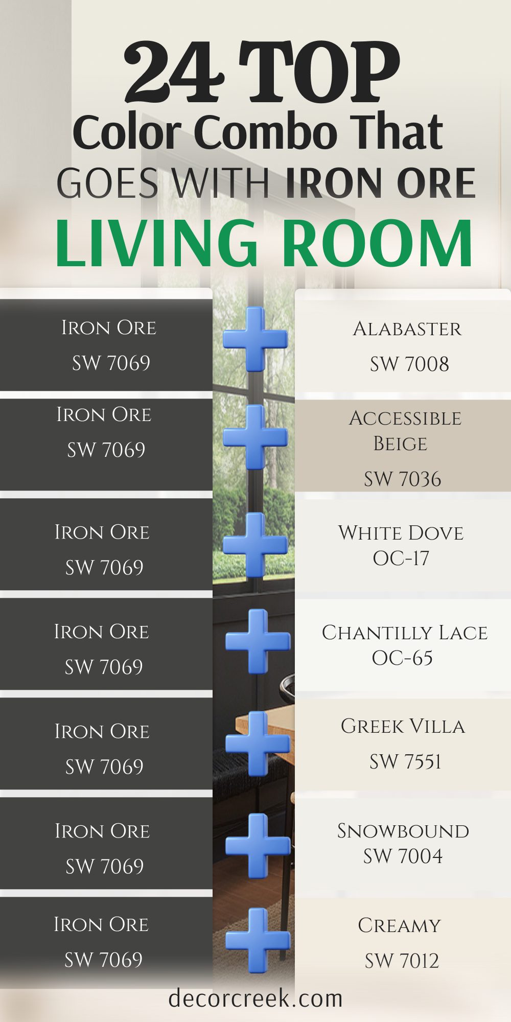
24 Top Color Combo that goes with Iron Ore Living Room
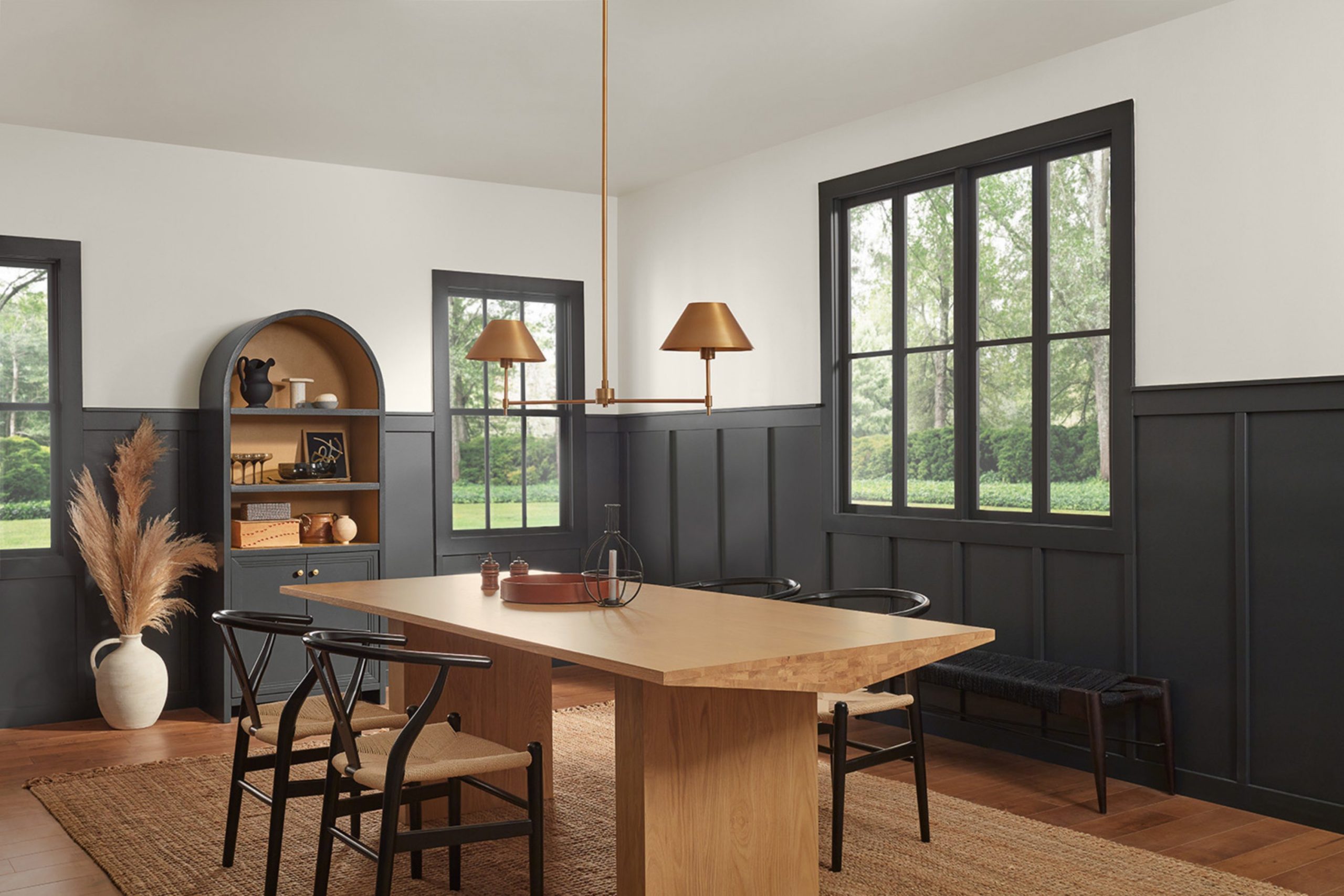
Iron Ore SW 7069 + Alabaster SW 7008
Iron Ore SW 7069 + Alabaster SW 7008 creates a classic high-contrast look that feels warm and friendly. This mix keeps your living room from looking cold or empty. The dark charcoal anchors the accent wall while the creamy white opens the rest of the room.

It looks incredible with warm wood coffee tables and thick rugs. This combo makes your family room feel very cozy. It is a safe and beautiful choice for any home layout.
Best used in: family living rooms, open floor plans, fireplace walls, and accent nooks
Pairs well with: Agreeable Gray SW 7029, natural oak floors, brass lamps, leather accent chairs The key rule of this color for cozy style is to use the light shade on three walls to keep the living room bright.
Iron Ore SW 7069 + White Dove OC-17
Iron Ore SW 7069+ White Dove OC-17 offers a beautiful designer look that feels soft and expensive. The hint of gray in the white connects perfectly with the deep charcoal accent.
This combination looks beautiful under modern light bulbs. It makes your living room look like a picture from a magazine. It frames your windows beautifully. You will love how clean and organized it makes the house look.
Best used in: formal living rooms, open entryways, window frames, and picture frame molding
Pairs well with: Pale Oak OC-20, silver photo frames, wool rugs, glass coffee tables The key rule of this color for luxury style is to use the dark shade on the fireplace to create a striking centerpiece.
Iron Ore SW 7069 + Chantilly Lace OC-65
Iron Ore SW 7069+ Chantilly Lace OC-65 delivers the sharpest modern look possible. There are no hidden undertones to confuse your eyes. This combination is bright, clear, and highly dramatic. It works best with modern black metal furniture and large windows.
It gives a clean artistic feel to your living room walls. Your home will feel fresh and very modern. It is an amazing look for urban apartments.
Best used in: modern apartments, bright lofts, art walls, and minimalist spaces
Pairs well with: Kendall Charcoal HC-166, black metal tracks, white leather sofas, glass accents The key rule of this color for modern style is to use the white on the ceiling to create a sharp line against the dark wall.
Iron Ore SW 7069 + Greek Villa SW 7551
Iron Ore SW 7069 + Greek Villa SW 7551 balances deep charcoal with a rich sandy white. This combination feels soft and easy on the eyes. It takes away the cold look of metal decorations.
It looks beautiful when the evening sun fills the living room. It makes your seating area feel warm and safe. I love using it for a Mediterranean or warm minimalist style.
Best used in: sunny living rooms, cozy seating areas, alcoves, and textured walls
Pairs well with: Accessible Beige SW 7036, jute rugs, linen curtains, woven baskets The key rule of this color for warm style is to use the light shade on long walls to soak up bright afternoon sun.
Iron Ore SW 7069 + Snowbound SW 7004
Iron Ore SW 7069 + Snowbound SW 7004 is a very reliable mix that bounces light around the room. The soft gray undertone in the white connects instantly with the dark charcoal.
This mix makes small living rooms feel double their size. It keeps the energy of the home happy and light. Homebuyers always fall in love with this clean look. It makes everyday living feel bright and orderly.
Best used in: small living rooms, main hallways, dark corners, and high ceilings
Pairs well with: Mindful Gray SW 7016, wide plank floors, green plants, chrome floor lamps The key rule of this color for bright style is to use the white on the ceiling and trim to maximize the light reflection.
Iron Ore SW 7069 + Creamy SW 7012
Iron Ore SW 7069 + Creamy SW 7012 provides a traditional look that feels solid and historic. The rich ivory walls soften the heavy charcoal trim beautifully. This option looks wonderful in older homes with lots of character.
It gives a sense of comfort and stability to the room. It avoids the bright clinical look of modern white paint. It makes your living room feel grounded and ready for guests.
Best used in: historic living rooms, formal sitting areas, wood paneling, and built-in bookshelves
Pairs well with: Kilim Beige SW 6106, dark stained wood, antique brass plates, velvet pillows The key rule of this color for traditional style is to use the ivory on built-in shelves to frame dark books and items.
Iron Ore SW 7069 + Oyster White SW 7637
Iron Ore SW 7069 + Oyster White SW 7637 is a very stylish greige and charcoal mix. It look highly modern and custom-made. The light shade shifts gently from gray to beige throughout the day.
This combination handles different types of lighting with ease. It makes your living room look neutral and smart. It is a fantastic option for connecting open spaces together nicely.
Best used in: open concept living rooms, modern farmhouses, long main walls, and staircases
Pairs well with: Sea Salt SW 6204, light stone tiles, gray wool blankets, black metal lamps The key rule of this color for neutral style is to use the greige on the main walls to create a smooth flow through the home.
Iron Ore SW 7069 + Pearly White SW 7009
Iron Ore SW 7069 + Pearly White SW 7009 has a cool clean character that feels very crisp. It looks like a clean slate in the morning light. This mix keeps your living room looking neat and organized.
It does not turn yellow under direct sunlight. It works perfectly with modern electronics and metal stands. Your living room will feel airy and fresh. It is a very safe option for modern designs.
Best used in: modern media rooms, bright living spaces, corner walls, and display areas
Pairs well with: Repose Gray SW 7015, stainless steel frames, blue pillows, white rugs The key rule of this color for crisp style is to use the light shade to surround your television wall to soften the screen glare.
Iron Ore SW 7069 + Accessible Beige SW 7036
Iron Ore SW 7069 + Accessible Beige SW 7036 is a crowd favorite mix because it feels very balanced. The beige tones warm up the dark charcoal wall perfectly. This option makes your living room feel cozy but entirely modern.
It looks wonderful with leather sofas and wood floors. It is an excellent choice if you want a warm look without using yellow paint. It makes the room feel complete.
Best used in: family living areas, basement dens, accent walls, and open floor plans
Pairs well with: Pure White SW 7005, leather sofas, oak tables, bronze light fixtures The key rule of this color for neutral style is to use the beige on the main seating walls to make guests feel welcome.
Iron Ore SW 7069 + Natural Linen SW 9109
Iron Ore SW 7069 + Natural Linen SW 9109 has an organic quality that feels very relaxed. The linen tones remind me of natural fabrics and sandy paths. This choice cuts through the heavy feel of dark charcoal paint.
It makes your living room look casual and easy to live in. It looks beautiful with woven baskets and large potted plants. It keeps the mood of the room very friendly.
Best used in: casual living rooms, sunrooms, vacation homes, and reading corners
Pairs well with: Alabaster SW 7008, jute rugs, linen curtains, indoor tree pots The key rule of this color for organic style is to use the linen shade on window walls to frame your garden views softly.
Iron Ore SW 7069 + Manchester Tan HC-81
Iron Ore SW 7069 + Manchester Tan HC-81 is a sophisticated mix that looks tailored and neat. The clean khaki wall makes the dark charcoal doors pop beautifully.
This choice gives an organized look to your main living space. It works well in both old and new houses. It makes your walls look smooth and professional. It is an amazing option for a high-end look.
Best used in: formal living rooms, long entry walls, study alcoves, and accent partitions
Pairs well with: Bleeker Beige HC-80, dark wood desks, brass sconces, gray accent chairs The key rule of this color for tailored style is to use the khaki on the main walls to highlight dark charcoal doors.
Iron Ore SW 7069 + Pale Oak OC-20
Iron Ore SW 7069 + Pale Oak OC-20 is an elegant greige mix that looks soft and luxurious. It acts like a soft shadow on the walls, letting the charcoal stand out as art. This choice makes small living rooms look bright and expensive.
It gives your home a high-end designer feel that everyone will admire. It creates a soft atmosphere that helps you unwind. It looks stunning with silver decorations.
Best used in: elegant living rooms, small apartments, corner walls, and gallery spaces
Pairs well with: White Dove OC-17, silver frames, white marble tables, gray curtains The key rule of this color for luxury style is to use the light shade on long walls to make small rooms feel larger.

Iron Ore SW 7069 + Edgecomb Gray HC-173
Iron Ore SW 7069 + Edgecomb Gray HC-173 is a beautiful mix that stays perfectly neutral. The wall color does not shift into pink or green tones. This combination makes your dark charcoal fireplace look incredible.
It gives a steady look to your living room walls. It works well with classic white moldings and dark wood floors. It is a very reliable mix that always looks professional.
Best used in: classic living rooms, fireplace walls, shared family spaces, and open zones
Pairs well with: Simply White OC-117, dark walnut floors, silver lamps, blue accent blankets The key rule of this color for classic style is to use the gray on the main walls to frame a dark fireplace accent.

Iron Ore SW 7069 + Balboa Mist OC-27
Iron Ore SW 7069 + Balboa Mist OC-27 creates a modern light gray look that feels clean and fresh. It avoids the cold industrial look of standard grays. This choice looks wonderful with modern furniture and colorful art prints.
It gives a fresh look to any living room it goes into. It is a fantastic option for urban apartments. Your home will feel sleek and well-designed.
Best used in: modern living rooms, urban apartments, accent walls, and open layouts
Pairs well with: modern art prints, black metal tables, white rugs The key rule of this color for modern style is to use the light gray across all main walls to create a clean foundation.
Iron Ore SW 7069 + Sea Salt SW 6204
Iron Ore SW 7069 + Sea Salt SW 6204 is a unique mix that brings a fresh watery feel to your home. The blue-green gray shifts gently with the daily weather. This choice looks beautiful in bright living rooms with lots of plants.
It adds a gentle splash of color that feels very sophisticated. It breaks up the heavy look of dark charcoal furniture. It makes your living room feel light and happy.
Best used in: bright living rooms, sunroom extensions, plant corners, and cottage spaces
Pairs well with: Pure White SW 7005, green indoor plants, white cotton curtains, light oak tables The key rule of this color for fresh style is to use the blue-green shade on feature walls to bring an organic element inside.
Iron Ore SW 7069 + Quiet Moments 1563
Iron Ore SW 7069 + Quiet Moments 1563 blends blue, green, and gray into a soft wall color. It softens the strong lines of dark charcoal trim. This option works wonderfully in living rooms where you want to relax after a long day.
It gives a sweet look to older homes. It pairs beautifully with light gray rugs and silver frames. Your family will enjoy the light feel it brings.
Best used in: relaxing living rooms, reading corners, historic homes, and alcoves
Pairs well with: Cloud White OC-130, light gray rugs, silver frames, blue linen pillows The key rule of this color for soft style is to use the light mix on the walls to create a light and pleasing environment.
Iron Ore SW 7069 + October Mist 1495
Iron Ore SW 7069 + October Mist 1495 is a soft silver-sage green mix that feels very modern. It brings a soft natural element to your living room walls. It looks beautiful under soft morning light.
It gives a custom designer look to standard rooms. It looks wonderful with light linen curtains and wooden furniture. It keeps the atmosphere light and interesting.
Best used in: modern living rooms, accent dividers, window walls, and plant areas
Pairs well with: White Dove OC-17, linen curtains, oak coffee tables, ceramic pots The key rule of this color for modern style is to use the green on the main wall to create a soft natural backdrop.
Iron Ore SW 7069 + Dry Sage SW 6182
Iron Ore SW 7069 + Dry Sage SW 6182 is an earthy green mix that brings a natural look inside. It grounds the sharp look of dark charcoal accents. This choice looks wonderful in rustic living rooms and cozy dens.
It reminds me of walks in the autumn forest. It pairs beautifully with leather chairs and wood tables. It gives your home a steady organic character.
Best used in: rustic living rooms, cozy dens, fireplace corners, and back seating areas
Pairs well with: Alabaster SW 7008, leather armchairs, raw wood tables, iron floor lamps The key rule of this color for organic style is to use the green around the fireplace to create a warm forest theme.
Iron Ore SW 7069 + Rosemary SW 6187
Iron Ore SW 7069 + Rosemary SW 6187 is a rich deep green mix that makes a powerful statement. It matches the depth of dark charcoal perfectly. This option creates a dramatic moody look that feels very rich.
It works best in small sitting rooms or media centers. It makes your home look like a high-end designer showroom. It coordinates beautifully with dark wood and brass lamps.
Best used in: small sitting rooms, media centers, accent walls, and library corners
Pairs well with: Oyster White SW 7637, dark wood shelves, brass lamps, green velvet sofas The key rule of this color for bold style is to use both dark shades together to create a rich dramatic environment.
Iron Ore SW 7069 + Wythe Blue HC-143
Iron Ore SW 7069 + Wythe Blue HC-143 is a historic blue-green mix that brings a cheerful look. It provides a stunning pop of color against a dark charcoal accent wall. This choice makes your living room feel happy and full of energy.
It looks beautiful in coastal homes and historic properties alike. It gives a fun artistic personality to your home. It coordinates perfectly with white trim.
Best used in: coastal living rooms, entry walls, accent partitions, and built-in frames
Pairs well with: Simply White OC-117, white woodwork, blue glass vases, striped pillows The key rule of this color for cheerful style is to use the blue-green on a central wall to make a happy statement.
Iron Ore SW 7069 + Boothbay Gray HC-165
Iron Ore SW 7069 + Boothbay Gray HC-165 is a beautiful blue-gray mix that feels like a misty morning lake. It is light and very elegant. This choice creates a smooth transition into dark charcoal accents.
It looks gorgeous in formal living rooms and shared seating spaces. It gives a cool clean energy to the entire house. It looks wonderful with classic silver fixtures and white moldings.
Best used in: formal living rooms, shared seating spaces, window borders, and high walls
Pairs well with: Decorator’s White CC-20, silver mirrors, white crown molding, gray curtains The key rule of this color for cool style is to use the blue-gray on high walls to create a clean elegant look.
Iron Ore SW 7069 + Mount Saint Anne 1565
Iron Ore SW 7069 + Mount Saint Anne 1565 is a deep slate blue mix that feels very formal. The gray undertones connect with the charcoal accent wall perfectly. This option gives your living room a strong sense of structure.
It works beautifully with large silver lamps and dark furniture. It looks like the deep ocean on a cloudy day. It makes a grand impression on everyone who walks in.
Best used in: formal living spaces, large dens, entertainment walls, and long partitions
Pairs well with: Cloud White OC-130, dark leather chairs, silver floor lamps, blue rugs The key rule of this color for formal style is to use the slate blue on the largest wall to anchor the room.
Iron Ore SW 7069 + Hale Navy HC-154
Iron Ore SW 7069 + Hale Navy HC-154 is a deep royal mix that feels incredibly strong. It matches the heavy weight of dark charcoal paint perfectly. This option creates a very rich look in home theaters and dark living dens.
It looks expensive and highly tailored. It works beautifully with leather furniture and brass lighting. It gives your home a timeless nautical strength.
Best used in: home theaters, dark living dens, media walls, and accent corners
Pairs well with: Alabaster SW 7008, leather sectionals, brass lighting, dark wood tables The key rule of this color for navy style is to use both deep colors on adjacent walls for a rich media room feel.

Iron Ore SW 7069 + Kendall Charcoal HC-166
Iron Ore SW 7069 + Kendall Charcoal HC-166 brings a deep stone look to your living walls. It sits just one step away from pure charcoal, creating a sleek monochromatic look. This choice creates a very sleek moody environment.
It looks amazing in modern lofts with high ceilings. It makes everything in the room look unified and intentional. It feels very confident and modern.
Best used in: modern lofts, high-ceiling living rooms, urban spaces, and accent walls
Pairs well with: Pure White SW 7005, industrial metal shelves, black leather sofas, gray carpets The key rule of this color for modern style is to use the lighter gray on main walls to support the darker charcoal accent.
27 Top Color Combo that goes with Iron Ore Exterior
Iron Ore SW 7069 + Shoji White SW 7042
Iron Ore SW 7069 + Shoji White SW 7042 looks incredibly rich on a house exterior. The creamy white body softens the heavy dark charcoal trim under bright sunlight.
This combination keeps your home from looking washed out on sunny days. It looks beautiful with natural stone accents near the front door. It gives a warm modern farmhouse look that neighbors will admire. It is a fantastic option for real estate value.
Best used in: house siding, front entryways, garage bodies, and modern farmhouse trim
Pairs well with: natural stone, dark metal gutters, warm wood porch pillars, black light boxes The key rule of this color for exterior style is to use the white on the main siding to reflect intense sunlight beautifully.

Iron Ore SW 7069 + Eider White SW 7014
Iron Ore SW 7069 + Eider White SW 7014 offers a cool gray-white look that feels very clean. The body color stays perfectly gray without shifting into pink tones outside.
This combination highlights the sharp lines of your roof and windows. It gives a look of absolute neatness to your home exterior. It works brilliantly for modern suburban houses. It makes the entire property look fresh and well-kept.
Best used in: modern suburban siding, window trim, porch ceilings, and fascia boards
Pairs well with: gray roof shingles, concrete walkways, silver door handles, black metal railings The key rule of this color for clean style is to use the charcoal on window frames to create a sharp modern look.
Iron Ore SW 7069 + Dover White SW 6385
Iron Ore SW 7069 + Dover White SW 6385 provides a traditional look that feels very solid and welcoming. The rich ivory body looks soft and avoids the blinding glare of pure white paint.
This option balances the heavy weight of charcoal shutters perfectly. It works beautifully on historic properties and traditional two-story homes. It gives a sense of history and comfort to your curb appeal.
Best used in: traditional siding, window shutters, column posts, and front porch walls
Pairs well with: dark red brick, black asphalt shingles, brass door knockers, green lawns The key rule of this color for traditional style is to use the charcoal on shutters to frame the ivory windows traditionally.
Iron Ore SW 7069 + Linen White OC-146
Iron Ore SW 7069 + Linen White OC-146 feels warm, gentle, and extremely elegant under open skies. It reminds me of classic estate homes with beautiful gardens. This option cuts through the hard look of dark metal gutters.
It makes your house look high-end and very custom-made. It coordinates beautifully with brick walkways and green hedges. The look is soft and very pleasing to the eye.
Best used in: estate siding, classic brick trim, sunny porch walls, and garage doors
Pairs well with: brick walkways, copper flashings, dark green hedges, oil-rubbed bronze lamps The key rule of this color for estate style is to use the linen tone on main stucco walls for a rich historic feel.
Iron Ore SW 7069 + Atrium White OC-145
Iron Ore SW 7069 + Atrium White OC-145 carries a lovely peach undertone that glows beautifully at sunset. This choice prevents your house exterior from looking cold or distant.
It looks amazing when paired with dark charcoal trim around the roofline. It brings a cheerful energy to your front yard. It makes your home look welcoming from the street. It is a wonderful option for family homes.
Best used in: family home siding, front gables, porch pillars, and trim borders
Pairs well with: brown roof tiles, dark wood doors, black metal house numbers, warm porch lights The key rule of this color for family style is to use the white on front gables to catch the evening sun nicely.
Iron Ore SW 7069 + Seapearl OC-19
Iron Ore SW 7069 + Seapearl OC-19 is a very popular off-white that looks sophisticated outside. It has a soft gray base that connects instantly with dark charcoal shutters.
This combination makes your house look modern and highly styled. It looks beautiful when the morning sun hits the front of the building. It is an amazing choice for staging houses for a quick sale.
Best used in: modern exterior walls, window trim, garage bodies, and backyard decks
Pairs well with: light gray stone, charcoal roof tiles, black iron address plaques, simple landscaping The key rule of this color for modern style is to use the off-white on main siding blocks for a clean look.

Iron Ore SW 7069 + White Sand OC-10
Iron Ore SW 7069 + White Sand OC-10 brings a lovely desert warmth to your home exterior. It looks like warm sand sitting against dark volcanic rocks. This choice makes your home look neutral and smart under bright daylight.
It is a fantastic option for homes in sunny climates. It handles dust and wind without looking dirty. Your home will feel unified and strong.
Best used in: desert home stucco, sunny exterior walls, main entry columns, and privacy walls
Pairs well with: clay tiles, dark brown wood doors, iron light fixtures, desert landscaping The key rule of this color for desert style is to use the sandy tone on stucco walls to blend with natural dirt and sun.
Iron Ore SW 7069 + Cedar Key SW 7534
Iron Ore SW 7069 + Cedar Key SW 7534 blends tan and gray into a rich exterior body color. It feels very stable and trustworthy under the sun. This choice contrasts gently with dark charcoal roof lines.
It gives a professional look to standard home siding. I love how steady it looks in both morning shade and afternoon sun. It is a crowd-pleasing option that adds real value.
Best used in: suburban home siding, rear deck walls, garage trim, and outdoor pillars
Pairs well with: gray stone veneer, black light fixtures, natural cedar accents, dark shingle roofs The key rule of this color for steady style is to use the tan-gray body to create a balanced look with the dark roof.
Iron Ore SW 7069 + Barcelona Beige 1091
Iron Ore SW 7069 + Barcelona Beige 1091 is a rich khaki shade that looks incredibly tailored on stucco. It does not have any unwanted pink or orange tones under open daylight.
This choice makes dark charcoal trim look sharp and expensive. It gives a look of order to your front yard presentation. It works well for large houses that need a grounding color. Your home will look highly professional.
Best used in: large stucco homes, exterior trim bands, front columns, and retaining walls
Pairs well with: dark bronze gutters, flagstone walkways, black window shutters, dark wood gates The key rule of this color for tailored style is to use the khaki on main stucco bodies to frame dark windows.
Iron Ore SW 7069 + Lenox Tan HC-44
Iron Ore SW 7069 + Lenox Tan HC-44 is a deep gold-tan that brings a traditional warmth to siding. It completely blocks out any cold gray tones from the weather. This choice looks wonderful on houses surrounded by large green trees.
It creates a strong contrast that feels very grounded and historic. It makes your house look small and cozy from the curb. It is a great option for rustic properties.
Best used in: wood siding houses, mountain cabins, front porch accents, and garage doors
Pairs well with: copper gutters, dark stained wood steps, forest green trim, natural stone foundations The key rule of this color for rustic style is to use the golden tan on main wood siding to match forest surroundings.
Iron Ore SW 7069 + Shaker Beige HC-45
Iron Ore SW 7069 + Shaker Beige HC-45 is a classic mid-tone tan that looks very safe and reliable. It acts like a steady canvas for dark charcoal trim lines. This option makes your front door stand out beautifully when painted dark.
It gives a classic look to your neighborhood presentation. It matches well with traditional asphalt roofs and concrete steps. It is perfect for people who love standard design.
Best used in: neighborhood siding, garage doors, backyard fences, and trim frames
Pairs well with: dark brown shingles, white vinyl windows, red brick chimneys, black iron mailboxes The key rule of this color for classic style is to use the beige on siding to highlight dark charcoal roof trim lines.

Iron Ore SW 7069 + Grant Beige HC-83
Iron Ore SW 7069 + Grant Beige HC-83 is an elegant light olive-beige that looks custom-built. It has a quiet quality that lets dark charcoal accents take the lead.
This choice makes your home exterior look expensive and unique. It changes gently with the seasonal greens of your yard. It gives your property a high-end designer feel that neighbors will envy. It looks stunning with dark light boxes.
Best used in: custom exterior walls, front entry gables, backyard patio walls, and window trim
Pairs well with: dark slate stone, black metal furniture, white trim boards, green yard plants The key rule of this color for custom style is to use the olive-beige on main walls to connect with your yard landscaping.

Iron Ore SW 7069 + Perfect Greige SW 6073
Iron Ore SW 7069 + Perfect Greige SW 6073 blends gray and mid-tone beige into a smooth exterior look. It looks modern and clean without feeling cold or industrial.
This choice creates a soft monochromatic look when paired with dark charcoal trim. It works beautifully with modern landscape designs and stone paths. It gives a fresh look to any home exterior it goes onto.
Best used in: modern exterior siding, garage faces, trim dividers, and back deck walls
Pairs well with: concrete paths, black metal address signs, silver door locks, dark gray roofs The key rule of this color for modern style is to use the greige across all siding panels for a clean gray foundation.
Iron Ore SW 7069 + Mega Greige SW 7031
Iron Ore SW 7069 + Mega Greige SW 7031 is a deeper gray-beige that feels very substantial outside. It has a rich quality that handles intense noon sun without fading away.
This choice looks wonderful on large family homes with dark charcoal roofs. It makes the entire building feel steady and well-designed. I love how stable it looks under cloudy winter skies. It is an amazing option for a rich look.
Best used in: large family home siding, double garage doors, foundation blocks, and chimneys
Pairs well with: dark charcoal shingles, black metal lights, white window grids, gray stone steps The key rule of this color for rich style is to use the deep greige on siding to hold color under direct sunlight.
Iron Ore SW 7069 + Sparrow AF-720
Iron Ore SW 7069 + Sparrow AF-720 is a unique earthy gray with a strong brown undertone. It looks vintage and very interesting on home siding. This choice adds an old-world charm to your house exterior.
It cuts the modern look of dark charcoal and makes it feel historic. It looks wonderful with copper accents and old stone pillars. It creates a rich look that feels completely lived-in.
Best used in: vintage home siding, historic restorations, garden sheds, and backyard fences
Pairs well with: copper light fixtures, old stone pillars, dark green shutters, natural wood gates The key rule of this color for vintage style is to use the brown-gray on siding to honor historic architecture styles.
Iron Ore SW 7069 + Taiga SW 9654
Iron Ore SW 7069 + Taiga SW 9654 is a light cool gray that feels fresh as mountain air. It creates a sharp contrast against dark charcoal foundations. This choice makes your house look clean, modern, and incredibly crisp from the street.
It works best on modern homes with large glass walls. It feels very clean and forward-thinking. Your property will look bright and clear throughout the year.
Best used in: modern glass homes, front entry walls, roof trim lines, and balcony panels
Pairs well with: large glass panes, black steel beams, raw concrete steps, silver numbers The key rule of this color for modern style is to use the cool gray on flat panels to emphasize high-end architecture lines.
Iron Ore SW 7069 + Ripe Olive SW 6209
Iron Ore SW 7069 + Ripe Olive SW 6209 is a deep forest green that makes a powerful statement outside. It matches the deep weight of dark charcoal accents perfectly. This option creates a dramatic moody look that looks very rich on cabins.
It works best on homes surrounded by natural woods. It makes your house look like a high-end designer retreat. It coordinates beautifully with dark wood trim and brass outdoor lamps.
Best used in: woodland cabins, front doors, accent gables, and window shutters
Pairs well with: dark wood trim, brass porch lights, pine tree surroundings, black metal rails The key rule of this color for bold style is to use the green on accent gables to create a rich forest theme.

Iron Ore SW 7069 + Backwoods SW 6188
Iron Ore SW 7069 + Backwoods SW 6188 is a medium herbal green that brings a natural look to siding. It grounds the sharp look of dark charcoal trim boards. This choice looks wonderful on lake houses and country properties.
It reminds me of summer camping trips. It pairs beautifully with stone foundations and wooden porch decks. It gives your home a steady organic character from the road.
Best used in: lake house siding, country properties, front porch walls, and garden gates
Pairs well with: stone foundations, natural cedar decks, black iron light boxes, green lawns The key rule of this color for organic style is to use the green on main siding walls to blend with country landscapes.
Iron Ore SW 7069 + Essex Green HC-188
Iron Ore SW 7069 + Essex Green HC-188 is an ultra-dark green that looks almost black in the shade. It brings a deep royal feel to your front door or shutters. This choice looks wonderful on historic brick houses next to charcoal trim lines.
It makes the property feel established and full of elite history. It looks rich and thick under open light. It gives a sense of solid luxury to everyone.
Best used in: front doors, window shutters, historic brick trim, and carriage garage doors
Pairs well with: red brick walls, brass door handles, white window frames, black metal lanterns The key rule of this color for historic style is to use the green on your front door to establish a classic entryway.

Iron Ore SW 7069 + Knoxville Gray HC-160
Iron Ore SW 7069 + Knoxville Gray HC-160 is a rich dark teal-gray that feels very sophisticated outside. It has a beautiful blue-green tone that connects with charcoal trim lines perfectly.
This option gives your home siding a custom architectural look. It works beautifully with silver numbers and modern stone paths. It looks like the deep sea on a stormy afternoon. It makes a grand impression.
Best used in: architectural siding, front accent walls, garage doors, and pool house walls
Pairs well with: modern stone paths, silver house numbers, black metal chairs, white trim accents The key rule of this color for smart style is to use the teal-gray on main siding walls for a custom color look.
Iron Ore SW 7069 + Van Courtland Blue HC-145
Iron Ore SW 7069 + Van Courtland Blue HC-145 is a classic slate blue that feels very regal on siding. It has strong gray undertones that match charcoal trim perfectly. This option gives your home a formal historic look from the curb.
It works beautifully with white window frames and dark shingle roofs. It looks excellent on coastal properties. I love using it on large traditional houses for a proud look.
Best used in: traditional house siding, coastal properties, front gables, and window shutters
Pairs well with: white window trim, charcoal roofs, black iron light boxes, green bushes The key rule of this color for formal style is to use the blue on main siding walls to create a proud look.
Iron Ore SW 7069 + Santorini Blue 1634
Iron Ore SW 7069 + Santorini Blue 1634 is a bright beautiful blue that brings a cheerful look outside. It provides a stunning pop of color against dark charcoal roof borders. This choice makes your beach house feel happy and full of summer energy.
It looks beautiful under bright coastal skies. It gives a fun artistic personality to your home exterior. It coordinates perfectly with crisp white porch railings.
Best used in: beach house siding, cottage walls, front doors, and backyard deck rails
Pairs well with: white porch railings, light wood decks, black metal outdoor lights, blue skies The key rule of this color for cheerful style is to use the blue on main siding to make a happy summer statement.
Iron Ore SW 7069 + Newburyport Blue HC-155
Iron Ore SW 7069 + Newburyport Blue HC-155 is a deep historic navy blue that feels deeply royal. It matches the heavy strength of dark charcoal roof lines perfectly. This option creates a very rich look on colonial house siding.
It looks expensive and highly tailored from the street. It works beautifully with white pillars and brass lighting. It gives your home a timeless nautical strength.
Best used in: colonial siding, waterfront houses, front doors, and garage faces
Pairs well with: white porch pillars, brass outdoor handles, dark gray roofs, brick steps The key rule of this color for navy style is to use the deep blue on main siding boards for a rich classic look.

Iron Ore SW 7069 + Slate Tile SW 7624
Iron Ore SW 7069 + Slate Tile SW 7624 is a dark blue-gray that feels like heavy slate stone. It matches the deep tones of charcoal trim for a moody look. This choice makes your home look incredibly modern and sleek from the street.
It works best when you want a unified dark look on your property. It coordinates beautifully with modern light fixtures. It is a bold choice for modern design lovers.
Best used in: modern siding, urban home fronts, backyard fences, and window frames
Pairs well with: modern outdoor lights, concrete walkways, silver door numbers, black rails The key rule of this color for modern style is to use the blue-gray body to build a sleek unified exterior look.

Iron Ore SW 7069 + Chelsea Gray HC-168
Iron Ore SW 7069 + Chelsea Gray HC-168 is a warm rich gray that looks very stable on siding. This choice contrasts gently with dark charcoal trim borders. It makes your house look balanced and extremely neat from the street.
It works well with classic white window frames and red brick details. It gives a professional look to standard home siding. I love how reliable it feels in any weather.
Best used in: standard house siding, garage doors, backyard trim lines, and porch pillars
Pairs well with: white window frames, red brick chimneys, black metal house lights, gray stone steps The key rule of this color for classic style is to use the gray on siding to ground the home body reliably.
Iron Ore SW 7069 + Amherst Gray HC-167
Iron Ore SW 7069 + Amherst Gray HC-167 is a medium-dark stone gray that feels very solid. It sits nicely against dark charcoal foundations to create a smooth transition. This choice makes your home look highly tailored and professional.
It works beautifully for mountain homes and modern cabins. It does not show dirt or weather stains easily, which is fantastic for maintenance. It brings a quiet confidence to your property.
Best used in: mountain home siding, modern cabins, garage doors, and foundation trim lines
Pairs well with: natural wood beams, stone foundations, black metal lamps, dark gray shingle roofs The key rule of this color for smart style is to use the stone gray on siding to frame natural wood details beautifully.

Iron Ore SW 7069 + Black Fox SW 7020
Iron Ore SW 7069 + Black Fox SW 7020 mixes dark charcoal and deep brown into an ultra-dark body blend. This option looks incredibly rich and dramatic under open skies. It works best on modern architectural homes that want to blend into dark woods.
It makes your house look like an exclusive designer retreat. It coordinates beautifully with dark metal and modern glass doors. It is an adventurous choice.
Best used in: modern architectural siding, exclusive cabins, feature walls, and front entries
Pairs well with: modern glass doors, dark bronze rails, concrete paths, minimal green plantings The key rule of this color for bold style is to use both dark shades across the full exterior for a dramatic dark look.
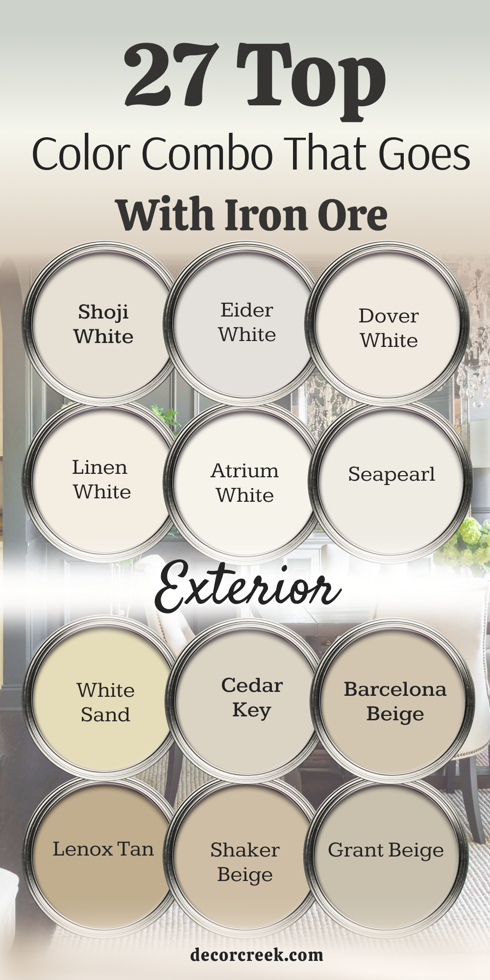
My Final Thoughts about 29 Best Colors that goes with Iron Ore by Sherwin Williams
Working with a heavy, deeply saturated charcoal paint like Iron Ore by Sherwin-Williams is a genuinely exciting and rewarding creative journey for any homeowner. Because of its intense depth and commanding presence, it requires a thoroughly thought-out, clear plan from the very beginning to make sure your home looks beautifully bright, open, and perfectly balanced.
The right matching shades do not just sit passively next to this dramatic charcoal; they actively work to make your architectural woodwork look completely custom-built, while making your main walls look undeniably high-end, sophisticated, and expensive. When you take the time to map out how this dark hue interacts with your doors, baseboards, and ceilings, you elevate the entire structural feel of your living space.
I always make it a strict rule to tell my clients to test these color combinations under their own unique lights at home before making a final, permanent choice. Natural light shifts dramatically throughout the day—from the cool, crisp blue tones of early morning to the warm, golden glow of late afternoon—and you want to be completely happy and satisfied with the results in every single scenario. Trust your personal design instincts, look at how the paint samples behave in real-time, and confidently select the precise mix that makes you feel wonderful, relaxed, and proud every single time you open your front door.
Your home is a direct reflection of your personal taste, and with this careful approach, it is going to look absolutely stunning, cohesive, and professionally designed for years to come.