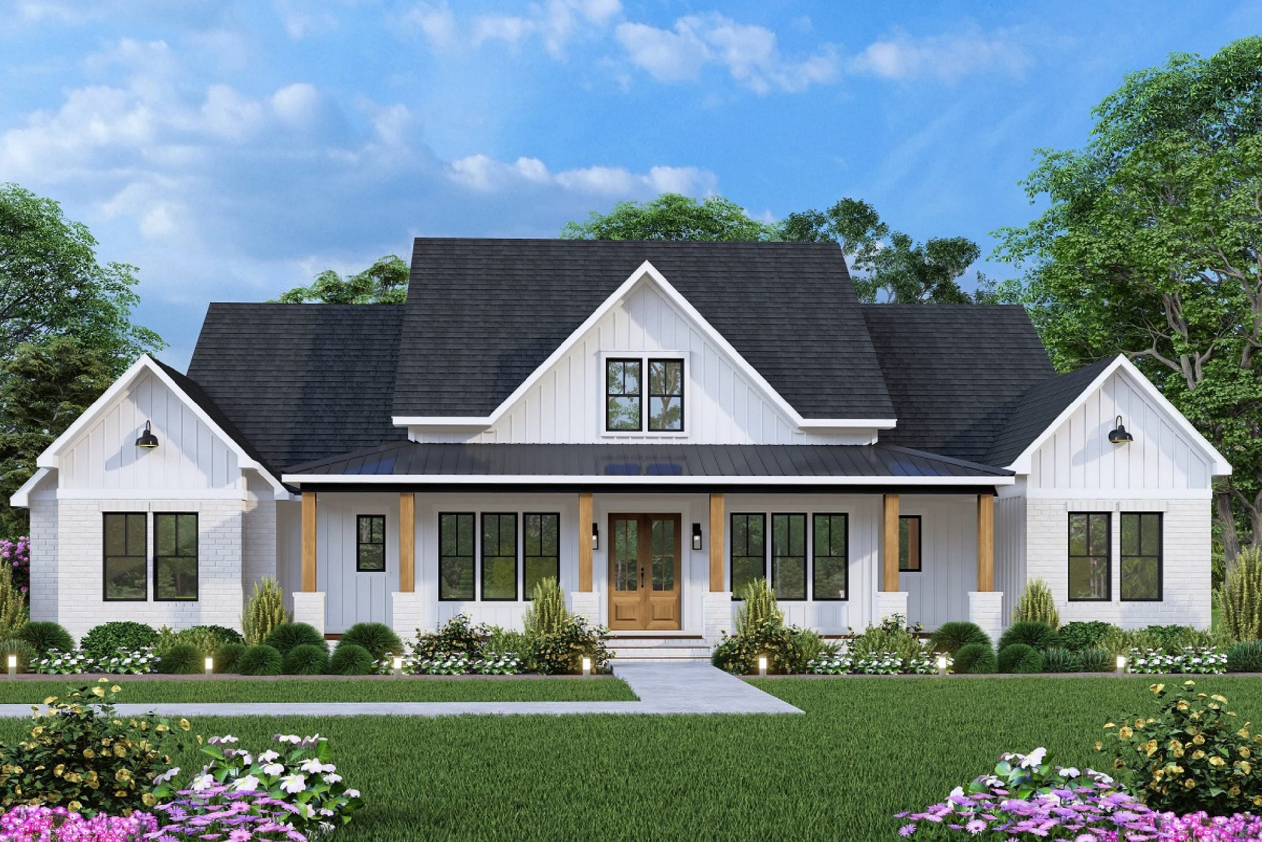
When I think of farmhouse style, I picture warmth, light, and comfort that feel real, not forced. The right paint color sets that feeling before a single piece of furniture is added—it builds the mood that everything else rests on. It tells a story about family, gatherings, and mornings filled with quiet sunshine. A true farmhouse palette feels timeless and grounded, full of colors that invite you to slow down.
Over the years, I’ve learned that farmhouse colors don’t need to impress—they simply need to belong. They whisper kindness through creamy whites, gentle grays, and soft greens that remind us of weathered wood and open fields.
These are the colors that work in every season and every light, creating rooms that feel warm in winter and bright in summer.
Whether it’s a crisp kitchen, a cozy living room, or a welcoming porch, the right shade brings a sense of care and authenticity.
Every brushstroke adds to the story of home. Farmhouse colors are not just about style—they’re about ease, heart, and living simply but beautifully, surrounded by tones that feel familiar and comforting.
Why I Trust Sherwin-Williams and Benjamin Moore for Farmhouse Paints
I’ve tested countless brands over the years, but Sherwin-Williams and Benjamin Moore always stand out for their quality, depth, and consistency. Their paints have a richness that feels effortless—never chalky, never flat, always dependable. The colors hold true through every kind of light, which is essential in farmhouse design where natural lighting shifts throughout the day.
I love how both brands capture the heart of farmhouse style—from soft whites that glow against wooden beams to muted greens that blend perfectly with vintage pieces.
Their finishes are reliable too, offering that ideal middle ground between matte and sheen. The paint feels solid, not fragile, and it wears beautifully over time.
Whether I’m designing a warm, classic farmhouse or a more modern, minimal version, these two brands always give me the palette I trust.
Their whites never feel cold, their beiges never feel dull, and their darker hues carry just the right depth. When I recommend Sherwin-Williams or Benjamin Moore, I know that years from now, the home will still look as welcoming as the day it was painted—that’s the true mark of good color.
How I Choose the Right Farmhouse Paint Color
When I begin choosing colors, I always start with light—because light changes everything. Morning sunlight can make even a quiet beige glow with warmth, while evening shadows can turn a soft gray into something deep and restful. For farmhouse homes, natural light is the soul of the palette. I lean toward colors that feel worn-in and familiar, never sharp or too bold
Soft whites, gentle tans, and muted greens reflect the calm rhythm of everyday living. I also study texture: old wood beams, stone fireplaces, rough linen, and weathered floors all influence how a color will read.
The goal is balance—one warm tone to bring comfort, one grounding neutral to hold the space steady, and one accent that ties it all together. I also think about emotion: kitchens should feel alive and bright; bedrooms should feel restful; exteriors should feel proud yet welcoming.
Every home has its own light, its own pace, its own heart—and the right color simply brings it to life.
Choosing paint isn’t about rules; it’s about harmony, warmth, and that sense of belonging only the right color can give.
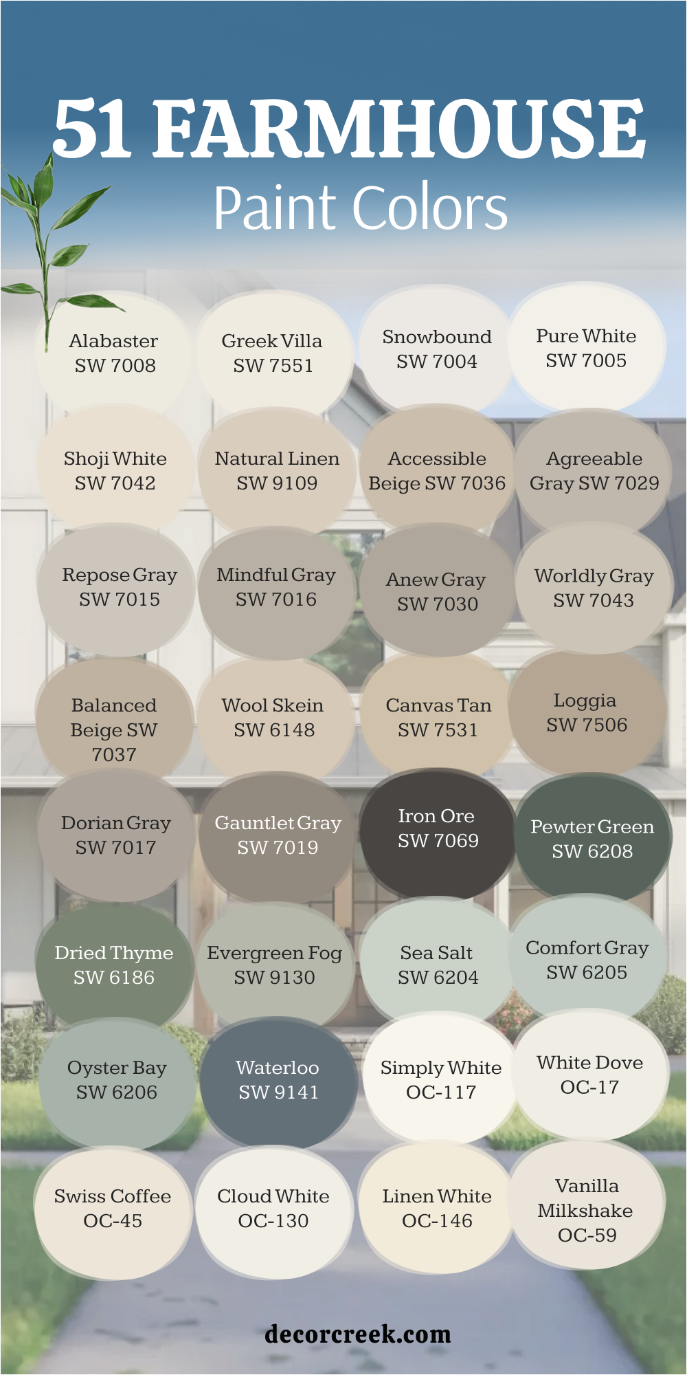
51 Farmhouse Paint Colors in 2026
Alabaster SW 7008
Alabaster is the kind of white that feels soft, warm, and welcoming all at once. It’s not a stark white — it has just a touch of cream that makes light feel gentle instead of sharp. I often use it when I want rooms to look bright but still feel lived in. On interior walls, Alabaster catches sunlight beautifully, giving every corner a quiet glow. On exteriors, it brings that classic farmhouse brightness that pairs perfectly with dark trim or wood details. It works well in any room, from cozy kitchens to open hallways, adding warmth without heaviness. The color has a timeless honesty, making spaces feel cared for and calm. The key rule of this color for farmhouse style is to use it where you want natural light to feel kind and inviting throughout the day.
Best used in: living rooms, kitchen cabinets, and exterior siding
Pairs well with: Urbane Bronze SW 7048, Gray Owl OC-52, and reclaimed wood textures. The key rule of this color for Art Deco style is to use it where you want to create a strong contrast against light-colored floors or bright metallic decorations.
🎨 Check out the complete guide to this color right HERE 👈

Greek Villa SW 7551
Greek Villa brings an easy warmth that feels like sunlight touching freshly painted wood. It’s a clean, creamy white with a touch of softness that makes rooms glow gently. I love it in kitchens and family spaces where brightness matters, but harshness doesn’t belong. It looks beautiful next to warm oak, soft gray accents, or matte black fixtures. Outdoors, Greek Villa gives farmhouses that classic whitewashed look that never feels flat. Inside, it works like a quiet backdrop for cozy textures and rustic finishes. The tone feels balanced, elegant, and simple — exactly what modern farmhouse design needs. The key rule of this color for farmhouse style is to use it to highlight warmth and texture without losing freshness.
Best used in: bedrooms, sunrooms, and trim work
Pairs well with: Sea Salt SW 6204, Pale Oak OC-20, and matte black hardware. The key rule of this color for Art Deco style is to use it where you want to create a strong contrast against light-colored floors or bright metallic decorations.
🎨 Check out the complete guide to this color right HERE 👈

Snowbound SW 7004
Snowbound is a favorite of mine when I want a white that feels crisp but never cold. It leans just slightly cool, which makes it perfect for homes filled with natural light. On walls, it reflects daylight softly, creating an open, airy feeling. I often pair it with wood tones or light grays to balance its brightness. It’s stunning on trim and cabinets too, where it adds a clean edge to rustic details. Snowbound is a great option for both interiors and exteriors, especially when you want a modern farmhouse look that feels clean and classic. The key rule of this color for farmhouse style is to pair it with warm materials — it makes everything around it feel brighter and more natural.
Best used in: bathrooms, hallways, and ceilings
Pairs well with: Iron Ore SW 7069, Silver Marlin 2139-50, and cool-toned marble. The key rule of this color for Art Deco style is to use it where you want to create a strong contrast against light-colored floors or bright metallic decorations.
🎨 Check out the complete guide to this color right HERE 👈

Pure White SW 7005
Pure White has a graceful honesty that works everywhere. It’s bright but still carries a whisper of warmth that keeps it from feeling too sharp. I often use it on trim, ceilings, and cabinets because it frames other colors so beautifully. In a farmhouse, Pure White looks especially lovely against raw wood beams or black hardware. It has that easy charm that makes spaces feel polished but still down-to-earth. It’s also one of my go-to choices for exteriors when I want brightness that looks clean in every kind of light. The key rule of this color for farmhouse style is to let it act as the connecting thread — the color that ties together different textures and tones across the home.
Best used in: modern kitchens, cabinetry, and baseboards
Pairs well with: Hale Navy HC-154, Revere Pewter HC-172, and polished chrome. The key rule of this color for Art Deco style is to use it where you want to create a strong contrast against light-colored floors or bright metallic decorations.
🎨 Check out the complete guide to this color right HERE 👈

Shoji White SW 7042
Shoji White is a beautiful mix of beige and gray that gives warmth without weight. It’s the perfect in-between color for rooms that need softness but also definition. I love using it in living rooms and bedrooms where natural light shifts throughout the day — it glows warm by morning and turns richer by evening. It works so well with wood, rattan, and aged metal finishes. Shoji White is one of those shades that makes a home feel well-loved and lived-in from the start. On exteriors, it brings quiet elegance, pairing beautifully with darker shutters or warm stone. The key rule of this color for farmhouse style is to use it where comfort and character meet.
Best used in: open-concept living areas and master suites
Pairs well with: Dorian Gray SW 7017, Worldly Gray SW 7043, and natural oak. The key rule of this color for Art Deco style is to use it where you want to create a strong contrast against light-colored floors or bright metallic decorations.
🎨 Check out the complete guide to this color right HERE 👈

Natural Linen SW 9109
Natural Linen feels like sunshine filtering through woven drapes. It’s a calm beige that brings warmth to walls without feeling too yellow or heavy. I often recommend it for open living spaces or entryways where you want a gentle, homey atmosphere. It complements natural wood, soft whites, and greenery beautifully. In the evening, it deepens slightly, wrapping the room in a soft glow. It’s one of those colors that adds quiet texture even on smooth walls. The best part is how well it flows with other farmhouse shades, from creamy whites to muted greens. The key rule of this color for farmhouse style is to use it when you want your walls to feel like part of the home’s story.
Best used in: dining rooms and traditional farmhouses
Pairs well with: Pure White SW 7005, Dried Thyme SW 6186, and brass accents. The key rule of this color for Art Deco style is to use it where you want to create a strong contrast against light-colored floors or bright metallic decorations.
🎨 Check out the complete guide to this color right HERE 👈

Accessible Beige SW 7036
Accessible Beige is the definition of easy beauty. It’s warm but balanced, never too brown or too gray. I love how it connects open spaces in farmhouse-style homes — it feels cozy but not confined. On walls, it adds depth while still letting the light bounce softly. It looks incredible with black accents, natural oak, or white trim. This color gives off a steady, grounded feeling, which is why I use it so often in family rooms and hallways. It works just as well in modern or traditional farmhouses. The key rule of this color for farmhouse style is to use it where you want warmth that feels effortless and natural.
Best used in: kitchens, family rooms, and hallways
Pairs well with: Snowbound SW 7004, Repose Gray SW 7015, and dark walnut floors. The key rule of this color for Art Deco style is to use it where you want to create a strong contrast against light-colored floors or bright metallic decorations.
🎨 Check out the complete guide to this color right HERE 👈

Agreeable Gray SW 7029
Agreeable Gray is one of those dependable colors that always looks right. It has the perfect balance of gray and beige, making it versatile for nearly any setting. I love it in kitchens, bedrooms, or entryways because it connects beautifully with wood tones and creamy whites. It feels neutral but never plain, always carrying that farmhouse charm. This shade changes with the light, turning warmer at sunset and cooler in daylight, which adds quiet dimension to a room. It’s modern yet cozy, soft yet strong. The key rule of this color for farmhouse style is to let it serve as your calm middle tone — the one that unites all the other shades around it.
Best used in: bedrooms and north-facing rooms
Pairs well with: Eider White SW 7014, Waterloo SW 9141, and silver finishes. The key rule of this color for Art Deco style is to use it where you want to create a strong contrast against light-colored floors or bright metallic decorations.
🎨 Check out the complete guide to this color right HERE 👈

Repose Gray SW 7015
Repose Gray is my go-to when I want a gray that feels relaxed and natural. It’s soft, adaptable, and never too dark. In farmhouse interiors, it creates the perfect backdrop for warm woods and white accents. I often use it in bedrooms or offices where calm focus matters. It looks especially beautiful next to crisp white trim or shiplap. Repose Gray changes gracefully with lighting, showing more beige tones during the day and a deeper gray at night. The key rule of this color for farmhouse style is to use it when you need a balanced shade that feels warm but not heavy.
Best used in: accent walls and large living spaces
Pairs well with: High Reflective White SW 7757, Pewter Green SW 6208, and light pine. The key rule of this color for Art Deco style is to use it where you want to create a strong contrast against light-colored floors or bright metallic decorations.
🎨 Check out the complete guide to this color right HERE 👈

Mindful Gray SW 7016
Mindful Gray has a cozy depth that adds quiet strength to any farmhouse design. It’s a medium gray with soft warmth underneath, making it feel grounded and inviting. I love using it on cabinets, doors, or accent walls — it brings dimension without feeling dark. It pairs beautifully with creamy whites and warm metals like bronze or brass. Mindful Gray is perfect for spaces where you want sophistication but still a touch of comfort. It also shines outdoors, adding a modern twist to farmhouse exteriors. The key rule of this color for farmhouse style is to use it as a steady anchor tone that keeps your palette balanced.
Best used in: home offices and laundry rooms
Pairs well with: Pure White SW 7005, Balanced Beige SW 7037, and charcoal accents. The key rule of this color for Art Deco style is to use it where you want to create a strong contrast against light-colored floors or bright metallic decorations.
🎨 Check out the complete guide to this color right HERE 👈

Anew Gray SW 7030
Anew Gray is one of those comforting shades that feels steady and calm no matter where you use it. It sits right between warm beige and true gray, giving walls a soft, earthy presence. I often use it in open-concept homes where rooms flow into each other—it keeps everything connected and relaxed. In bright daylight, it looks light and gentle, while in the evening, it deepens into a cozy, grounded tone. Anew Gray pairs beautifully with white trim, light wood, and soft black accents. It’s ideal for a farmhouse that blends modern touches with natural warmth. The key rule of this color for farmhouse style is to use it when you want elegance that feels lived in and real.
Best used in: home offices, laundry rooms, and entryways
Pairs well with: Pure White SW 7005, Balanced Beige SW 7037, and shiny gold accents. The key rule of this color for Art Deco style is to use it where you want to create a strong contrast against light-colored floors or bright metallic decorations.
🎨 Check out the complete guide to this color right HERE 👈

Worldly Gray SW 7043
Worldly Gray is one of my favorite chameleon colors—it shifts beautifully with the light. In the morning it feels warm and creamy, and by evening it takes on a cooler gray undertone. It’s subtle but full of personality, perfect for rooms where you want comfort and balance. I love pairing it with rustic textures like stone, jute rugs, or vintage wood. It’s equally lovely for bedrooms and kitchens, where it helps blend natural and modern details. Worldly Gray feels timeless, always bringing quiet confidence to a room. The key rule of this color for farmhouse style is to use it when you want walls that adapt gently to every hour of the day.
Best used in: guest rooms, staircases, and open living areas
Pairs well with: Shoji White SW 7042, Iron Ore SW 7069, and shiny gold accents. The key rule of this color for Art Deco style is to use it where you want to create a strong contrast against light-colored floors or bright metallic decorations.
🎨 Check out the complete guide to this color right HERE 👈
Balanced Beige SW 7037
Balanced Beige is exactly what its name suggests—a perfect harmony of warmth and neutrality. It’s cozy but never heavy, creating a soft background that works with nearly any farmhouse palette. I often use it in living rooms or entryways where the light changes throughout the day. It looks especially beautiful with creamy trim and deep bronze hardware. Balanced Beige has that lived-in look that makes a home feel settled and inviting. It brings out the warmth in wood and complements both white and gray tones. The key rule of this color for farmhouse style is to use it when you want warmth that feels natural and effortless.
Best used in: primary bedrooms, cozy dens, and kitchen walls
Pairs well with: Alabaster SW 7008, Anew Gray SW 7030, and shiny gold accents. The key rule of this color for Art Deco style is to use it where you want to create a strong contrast against light-colored floors or bright metallic decorations.
🎨 Check out the complete guide to this color right HERE 👈

Wool Skein SW 6148
Wool Skein is one of those gentle neutrals that quietly ties everything together. It has a light beige base with hints of gray, which makes it easy to pair with other farmhouse shades. On walls, it adds just enough color to feel cozy but still keeps rooms light. I love it for bedrooms, hallways, and even kitchens—it works in every kind of light. When paired with wood beams or woven accents, it brings warmth and texture to a space. Wool Skein has that classic farmhouse spirit: simple, honest, and endlessly comfortable. The key rule of this color for farmhouse style is to use it as your go-to for subtle warmth and harmony.
Best used in: classic kitchens, porch ceilings, and sunrooms
Pairs well with: Greek Villa SW 7551, Evergreen Fog SW 9130, and shiny gold accents. The key rule of this color for Art Deco style is to use it where you want to create a strong contrast against light-colored floors or bright metallic decorations.
🎨 Check out the complete guide to this color right HERE 👈

Canvas Tan SW 7531
Canvas Tan feels like sunshine on a quiet afternoon. It’s a light, creamy beige that gives rooms a cozy warmth without feeling too yellow. I often choose it for farmhouse living rooms or kitchens because it pairs so well with wood tones and white trim. It has just enough depth to define the walls while keeping the mood light. Outdoors, Canvas Tan looks classic and welcoming, especially beside darker shutters or metal accents. The best part about this color is its softness—it never tries too hard, it just feels right. The key rule of this color for farmhouse style is to use it where you want a gentle, friendly brightness.
Best used in: airy living rooms, nurseries, and hallways
Pairs well with: Simply White OC-117, Comfort Gray SW 6205, and shiny gold accents. The key rule of this color for Art Deco style is to use it where you want to create a strong contrast against light-colored floors or bright metallic decorations.
🎨 Check out the complete guide to this color right HERE 👈

Loggia SW 7506
Loggia is a beautifully balanced greige that carries quiet strength. It’s a touch deeper than beige, making it perfect for accent walls or exteriors. The color brings a grounded, earthy feeling to farmhouse homes while keeping everything sophisticated. I love how it pairs with natural stone, light wood, and creamy whites. Indoors, it creates a comforting, layered look that feels both modern and rustic. Loggia is a dependable color—it never overwhelms the room but always adds depth. The key rule of this color for farmhouse style is to use it when you want your home to feel warm, stable, and connected to nature.
Best used in: exterior shutters, interior libraries, and accent walls
Pairs well with: Pure White SW 7005, Dorian Gray SW 7017, and shiny gold accents. The key rule of this color for Art Deco style is to use it where you want to create a strong contrast against light-colored floors or bright metallic decorations.
🎨 Check out the complete guide to this color right HERE 👈

Dorian Gray SW 7017
Dorian Gray carries that perfect medium tone that makes rooms feel both calm and grounded. It’s not too dark, not too light—just right for adding character without heaviness. I often use it on cabinetry or accent walls where I want to draw attention without overpowering the space. It complements warm whites, wood, and even muted greens beautifully. The gray has a touch of brown that keeps it from feeling too cool, which works wonderfully in farmhouse interiors. The key rule of this color for farmhouse style is to use it as a steady, thoughtful shade that balances soft neutrals and deeper accents.
Best used in: kitchen islands, bathroom vanities, and exterior trim
Pairs well with: Alabaster SW 7008, Marble finishes, and shiny gold accents. The key rule of this color for Art Deco style is to use it where you want to create a strong contrast against light-colored floors or bright metallic decorations.
🎨 Check out the complete guide to this color right HERE 👈

Gauntlet Gray SW 7019
Gauntlet Gray is a strong, confident color that brings contrast to farmhouse palettes. It’s deep and rich but still warm enough to stay inviting. I love using it on doors, kitchen islands, or furniture pieces to ground lighter walls. Against white trim, Gauntlet Gray stands out beautifully, creating that modern farmhouse look with ease. Outdoors, it looks stunning with wood or stone details. Despite its darker tone, it never feels harsh—it’s bold yet comfortable. The key rule of this color for farmhouse style is to use it as an accent that adds personality and charm without taking over the room.
Best used in: exterior siding, accent walls, and front doors
Pairs well with: Repose Gray SW 7015, Snowbound SW 7004, and shiny gold accents. The key rule of this color for Art Deco style is to use it where you want to create a strong contrast against light-colored floors or bright metallic decorations.
🎨 Check out the complete guide to this color right HERE 👈

Iron Ore SW 7069
Iron Ore is my favorite dark neutral—it’s bold, moody, and full of depth. It’s not quite black, but rich enough to add serious character. In farmhouse design, it works wonders on doors, trim, and accent walls. I also love using it on exteriors for that modern-rustic charm. Iron Ore pairs beautifully with warm whites, beige, and natural wood, creating a perfect contrast that feels inviting. It’s the kind of shade that makes details stand out and gives structure to softer spaces. The key rule of this color for farmhouse style is to use it where you want a bold but balanced statement.
Best used in: window trim, interior doors, and fireplaces
Pairs well with: Alabaster SW 7008, High Reflective White SW 7757, and shiny gold accents. The key rule of this color for Art Deco style is to use it where you want to create a strong contrast against light-colored floors or bright metallic decorations.
🎨 Check out the complete guide to this color right HERE 👈

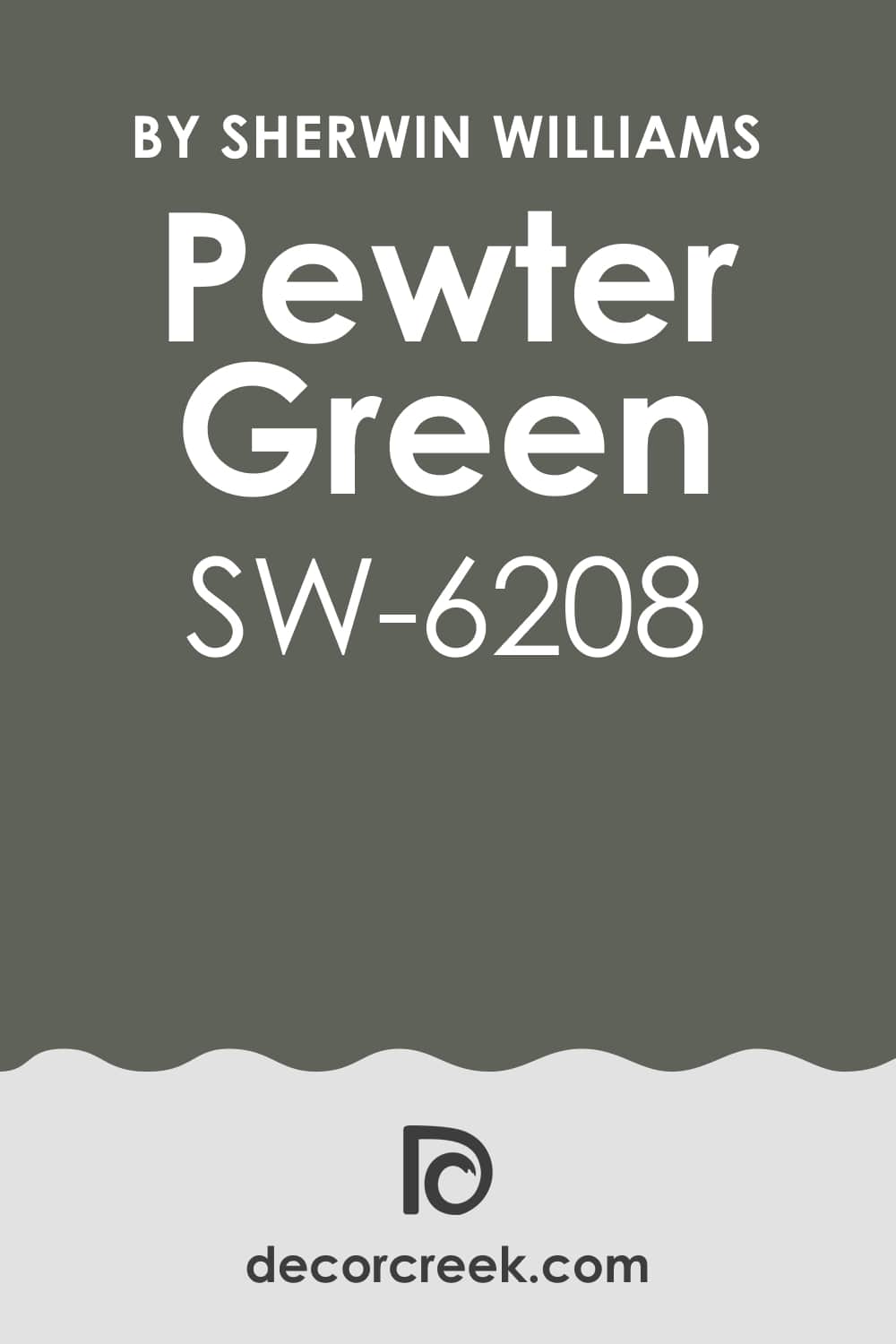
Pewter Green SW 6208
Pewter Green feels like a walk through quiet woods—it’s earthy, deep, and full of warmth. It’s one of my favorite farmhouse colors for cabinets or exteriors because it brings nature right to your walls. In daylight, it shows its green side clearly, while at night, it feels grounded and soft. It pairs beautifully with light stone, warm whites, and brass or black details.
This color makes any space feel anchored and timeless. The key rule of this color for farmhouse style is to use it when you want to bring depth and comfort inspired by the outdoors.
Best used in: mudrooms, cabinetry, and home offices
Pairs well with: Shoji White SW 7042, Pure White SW 7005, and shiny gold accents. The key rule of this color for Art Deco style is to use it where you want to create a strong contrast against light-colored floors or bright metallic decorations.
🎨 Check out the complete guide to this color right HERE 👈
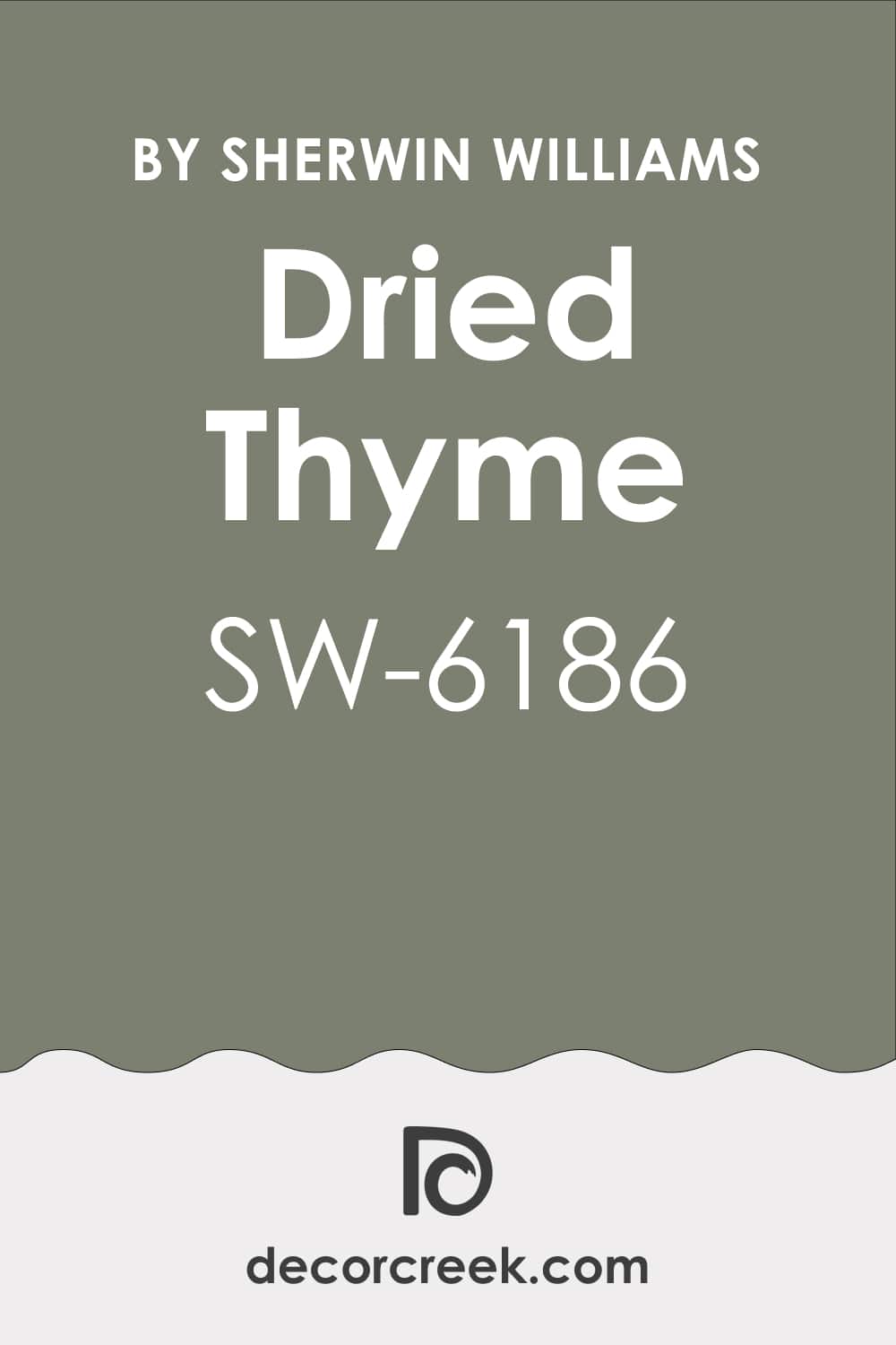
Dried Thyme SW 6186
Dried Thyme is one of my favorite earthy greens because it feels calm, natural, and deeply comforting. It carries a hint of gray that softens the green just enough to make it easy to live with. I love using it in kitchens, mudrooms, or on cabinetry where you want a touch of nature without going bold. It pairs perfectly with creamy whites, brushed brass, or warm wood finishes. In sunlight, it looks fresh and inviting; at night, it deepens into something richer and cozier. Dried Thyme brings that quiet charm that fits so beautifully into farmhouse homes. The key rule of this color for farmhouse style is to use it when you want warmth that feels organic and relaxed.
Best used in: dining room wainscoting, exterior accents, and furniture
Pairs well with: Greek Villa SW 7551, Worldly Gray SW 7043, and shiny gold accents. The key rule of this color for Art Deco style is to use it where you want to create a strong contrast against light-colored floors or bright metallic decorations.
🎨 Check out the complete guide to this color right HERE 👈
Evergreen Fog SW 9130
Evergreen Fog feels like a breath of cool air mixed with soft morning light. It’s a balanced blend of green and gray with just a touch of warmth underneath. I use it often in bedrooms and living rooms when I want something soothing but not dull. It works well with white trim, woven baskets, and rustic wood tones. Evergreen Fog changes beautifully throughout the day, going from silvery green to warm sage by evening. It brings depth without heaviness, giving homes that cozy but updated farmhouse look. The key rule of this color for farmhouse style is to use it where calm and comfort meet.
Best used in: bedrooms, living room accents, and kitchen islands
Pairs well with: Pure White SW 7005, Natural Linen SW 9109, and shiny gold accents. The key rule of this color for Art Deco style is to use it where you want to create a strong contrast against light-colored floors or bright metallic decorations.
🎨 Check out the complete guide to this color right HERE 👈

Sea Salt SW 6204
Sea Salt is one of those shades that always makes a home feel light and relaxed. It’s a gentle mix of green, gray, and blue that changes with the light. I love how it reflects the feel of open skies and soft linens. It’s especially beautiful in bathrooms, bedrooms, or sunrooms where natural light can play across the walls. Sea Salt looks lovely next to white trim, light oak, and soft woven fabrics. It brings a refreshing energy that still feels warm and personal. The key rule of this color for farmhouse style is to use it when you want that easy, airy feeling that stays timeless and welcoming.
Best used in: bathrooms, laundry rooms, and coastal farmhouses
Pairs well with: Snowbound SW 7004, White Dove OC-17, and shiny gold accents. The key rule of this color for Art Deco style is to use it where you want to create a strong contrast against light-colored floors or bright metallic decorations.
🎨 Check out the complete guide to this color right HERE 👈

Comfort Gray SW 6205
Comfort Gray has the same ease as its name. It’s a muted green-gray that feels balanced and restful, perfect for creating soft farmhouse palettes. I like using it in living rooms or kitchens to bring a hint of color without stealing attention from textures or furniture. It pairs beautifully with wood tones, white trim, and black fixtures. The light plays gently on this color, giving the room quiet depth throughout the day. Comfort Gray adds that layer of calm that makes a house feel like a home. The key rule of this color for farmhouse style is to use it where you want subtle color that still carries warmth.
Best used in: master suites, cozy sitting areas, and entryways
Pairs well with: Alabaster SW 7008, Oyster Bay SW 6206, and shiny gold accents. The key rule of this color for Art Deco style is to use it where you want to create a strong contrast against light-colored floors or bright metallic decorations.
🎨 Check out the complete guide to this color right HERE 👈

Oyster Bay SW 6206
Oyster Bay feels like driftwood washed by soft waves—it’s calm, cool, and grounded. The color combines green, gray, and blue undertones in a way that feels both rustic and elegant. I use it often for kitchen cabinets, laundry rooms, or accent walls when I want character without drama. It pairs perfectly with natural stone, white trim, and warm metals. The tone changes with light, showing its soft green side by day and deeper gray in the evening. Oyster Bay gives that perfect farmhouse balance between nature and comfort. The key rule of this color for farmhouse style is to use it to add depth while keeping your home cozy.
Best used in: accent walls, vanity cabinets, and exterior siding
Pairs well with: Sea Salt SW 6204, Pure White SW 7005, and shiny gold accents. The key rule of this color for Art Deco style is to use it where you want to create a strong contrast against light-colored floors or bright metallic decorations.
🎨 Check out the complete guide to this color right HERE 👈

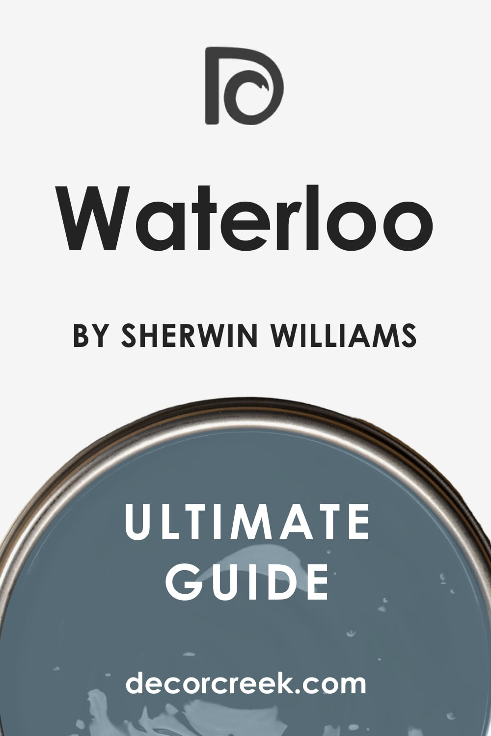
Waterloo SW 9141
Waterloo carries that rich depth that brings quiet strength to a farmhouse palette. It’s a deep blue-gray with warmth that feels both classic and modern. I love it on kitchen islands, doors, or as an exterior accent—it gives structure without feeling too bold. Paired with white trim or warm wood, it creates beautiful contrast. Waterloo feels cozy in low light but bright and full of personality in daylight. It’s ideal for adding character to neutral spaces that need a hint of drama. The key rule of this color for farmhouse style is to use it where you want color that feels strong yet still welcoming.
Best used in: kitchen islands, library walls, and front doors
Pairs well with: Repose Gray SW 7015, Snowbound SW 7004, and shiny gold accents. The key rule of this color for Art Deco style is to use it where you want to create a strong contrast against light-colored floors or bright metallic decorations.
🎨 Check out the complete guide to this color right HERE 👈
Simply White OC-117
Simply White is one of my go-to whites for farmhouse interiors because it never fails to look fresh. It’s bright but not stark, carrying just enough warmth to soften the edges. I use it for trim, walls, or ceilings to bring light into darker spaces. It pairs well with soft grays, greiges, and muted greens. Simply White looks timeless in both modern and traditional farmhouse settings. In daylight it feels open and pure; under warm light it glows softly. The key rule of this color for farmhouse style is to use it when you want true brightness that still feels natural.
Best used in: ceilings, trim, and modern kitchen cabinets
Pairs well with: Hale Navy HC-154, Pale Oak OC-20, and shiny gold accents. The key rule of this color for Art Deco style is to use it where you want to create a strong contrast against light-colored floors or bright metallic decorations.
🎨 Check out the complete guide to this color right HERE 👈

White Dove OC-17
White Dove is smooth, creamy, and endlessly adaptable. It’s the perfect white for creating that bright yet comfortable farmhouse feeling. I often choose it for walls or cabinetry because it reflects light beautifully without feeling too sharp. It’s a little warmer than pure white, which makes it perfect next to natural materials like linen or reclaimed wood. White Dove works in every light, glowing softly in the morning and holding warmth in the evening. The key rule of this color for farmhouse style is to use it when you want classic white that feels friendly and refined.
Best used in: whole-house wall color, trim, and cabinetry
Pairs well with: Revere Pewter HC-172, Classic Gray OC-23, and shiny gold accents. The key rule of this color for Art Deco style is to use it where you want to create a strong contrast against light-colored floors or bright metallic decorations.
🎨 Check out the complete guide to this color right HERE 👈

Swiss Coffee OC-45
Swiss Coffee brings warmth and familiarity to any farmhouse home. It’s a soft off-white with creamy undertones that make rooms feel relaxed and inviting. I love it for open living spaces, hallways, and kitchens where the goal is a soft glow instead of stark contrast. It pairs beautifully with brass accents, natural textures, and warm wood floors. Swiss Coffee adds that lived-in charm that makes a house feel like it’s been loved for years. The key rule of this color for farmhouse style is to use it when you want gentle warmth that stays timeless.
Best used in: traditional living rooms, warm bedrooms, and hallways
Pairs well with: Iron Ore SW 7069, Edgecomb Gray HC-173, and shiny gold accents. The key rule of this color for Art Deco style is to use it where you want to create a strong contrast against light-colored floors or bright metallic decorations.
🎨 Check out the complete guide to this color right HERE 👈

Cloud White OC-130
Cloud White has a beautiful purity that feels airy and uplifting. It’s bright enough to open up darker spaces but still soft enough to feel cozy. I often use it on walls or exteriors when I want that fresh, clean look that works across every season. It pairs effortlessly with stone, metal, and wood, making it one of my most versatile farmhouse whites. The color feels natural and easy on the eyes, changing gently with the light. The key rule of this color for farmhouse style is to use it as a foundation for simplicity, balance, and comfort.
Best used in: kitchen cabinetry, trim, and sunny breakfast nooks
Pairs well with: Gray Owl OC-52, Boothbay Gray HC-165, and shiny gold accents. The key rule of this color for Art Deco style is to use it where you want to create a strong contrast against light-colored floors or bright metallic decorations.
🎨 Check out the complete guide to this color right HERE 👈

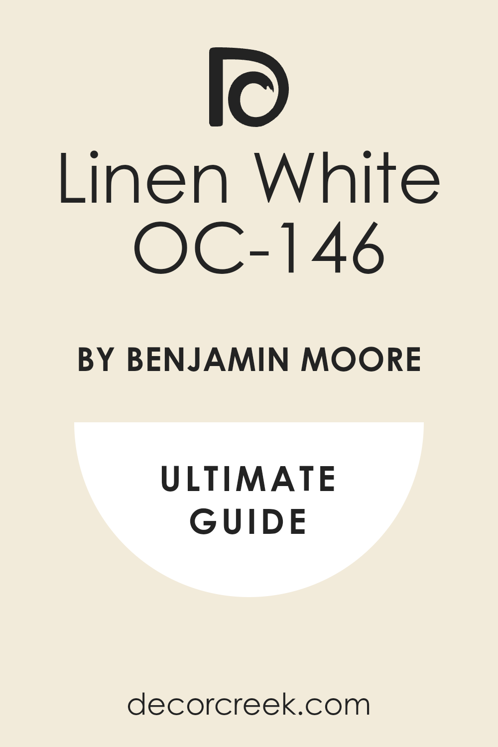
Linen White OC-146
Linen White brings the soft warmth of sunlight through cotton curtains. It’s a creamy shade that feels comforting and familiar, like something that’s always been part of the home. I love using it in kitchens and family rooms where you want brightness that still feels lived-in. It pairs beautifully with darker wood, iron accents, or black-framed windows. This color glows warmly in natural light, giving a farmhouse that golden, homey feeling. On exteriors, it looks timeless and welcoming, especially next to deep green or navy shutters. The key rule of this color for farmhouse style is to use it when you want soft light that feels peaceful and real.
Best used in: antique-style rooms, guest suites, and dining areas
Pairs well with: Simply White OC-117, Natural Cream OC-14, and shiny gold accents. The key rule of this color for Art Deco style is to use it where you want to create a strong contrast against light-colored floors or bright metallic decorations.
🎨 Check out the complete guide to this color right HERE 👈
Vanilla Milkshake OC-59
Vanilla Milkshake is that perfect creamy off-white with a whisper of gray, adding refinement without losing comfort. It’s bright enough for small rooms yet warm enough to make large areas feel cozy. I like using it in kitchens, bedrooms, or entryways where natural textures take the spotlight. It balances rustic wood, soft linens, and black hardware beautifully.
Vanilla Milkshake never feels flat—it carries quiet depth that fits perfectly in farmhouse design. The key rule of this color for farmhouse style is to use it where you want understated warmth that feels natural in every season.
Best used in: nurseries, soft hallways, and master bathrooms
Pairs well with: White Dove OC-17, Balboa Mist OC-27, and shiny gold accents. The key rule of this color for Art Deco style is to use it where you want to create a strong contrast against light-colored floors or bright metallic decorations.
Pale Oak OC-20
Pale Oak is one of my favorite neutrals for farmhouse homes. It sits gracefully between beige and gray, making it soft, warm, and endlessly versatile. On walls, it creates a gentle atmosphere that feels open but still grounded. It pairs perfectly with white trim, matte black details, and worn wood floors. Pale Oak has a soothing quality that works in both modern and traditional settings. In bright daylight it feels creamy; by night, it deepens slightly for a cozy finish. The key rule of this color for farmhouse style is to use it where you want calm comfort that never feels plain.
Best used in: bedrooms, living rooms, and open floor plans
Pairs well with: Simply White OC-117, Pashmina AF-100, and shiny gold accents. The key rule of this color for Art Deco style is to use it where you want to create a strong contrast against light-colored floors or bright metallic decorations.
🎨 Check out the complete guide to this color right HERE 👈

Edgecomb Gray HC-173
Edgecomb Gray feels like the color of aged wood and linen blended together. It’s neutral but full of personality, bringing quiet warmth to any farmhouse room. I love it for open-concept homes because it flows beautifully from space to space. It pairs easily with clean whites, black hardware, or natural stone. This shade works just as well in bedrooms as in kitchens, always adding an inviting charm. Edgecomb Gray adapts to different light, making it both bright and grounded. The key rule of this color for farmhouse style is to use it when you need balance between cozy and classic.
Best used in: family rooms, entryways, and kitchens
Pairs well with: White Dove OC-17, Revere Pewter HC-172, and shiny gold accents. The key rule of this color for Art Deco style is to use it where you want to create a strong contrast against light-colored floors or bright metallic decorations.
🎨 Check out the complete guide to this color right HERE 👈

Balboa Mist OC-27
Balboa Mist is a soft, graceful neutral that brings a feeling of openness. It’s a light gray with a warm undertone, perfect for brightening up farmhouse interiors without losing depth. I often use it in living rooms or hallways—it’s one of those colors that ties the whole house together. It works beautifully with white trim, soft beiges, or even muted greens. Balboa Mist reflects natural light in a way that feels airy and easy to live with. The key rule of this color for farmhouse style is to use it where you want lightness that still feels grounded.
Best used in: master bathrooms, sleek kitchens, and hallways
Pairs well with: Cloud White OC-130, Storm AF-700, and shiny gold accents. The key rule of this color for Art Deco style is to use it where you want to create a strong contrast against light-colored floors or bright metallic decorations.
🎨 Check out the complete guide to this color right HERE 👈

Classic Gray OC-23
Classic Gray is exactly what its name suggests—a true classic. It’s a gentle gray that carries warmth, making it perfect for a farmhouse look that feels calm but never dull. I love it on walls with wood accents or white shiplap; it balances those textures beautifully. In bright daylight, it reads as soft and fresh, while at night, it takes on a warmer, cozier glow. Classic Gray feels timeless, dependable, and relaxed. The key rule of this color for farmhouse style is to use it when you want your home to feel simple, connected, and full of light.
Best used in: hallways, transition spaces, and ceilings
Pairs well with: Simply White OC-117, Collingwood OC-28, and shiny gold accents. The key rule of this color for Art Deco style is to use it where you want to create a strong contrast against light-colored floors or bright metallic decorations.
🎨 Check out the complete guide to this color right HERE 👈

Collingwood OC-28
Collingwood brings elegance and ease together. It’s a greige that works as a bridge between whites and darker tones, making any room feel complete. I often use it in kitchens or dining rooms to give warmth without heaviness. It pairs wonderfully with creamy whites, natural fabrics, and brushed metal finishes. Collingwood feels calm but strong, making walls feel full of life even in neutral palettes. It’s a great choice for modern farmhouses that blend rustic comfort with contemporary charm. The key rule of this color for farmhouse style is to use it when you want depth that still feels airy.
Best used in: modern bedrooms, living areas, and kitchens
Pairs well with: White Dove OC-17, Classic Gray OC-23, and shiny gold accents. The key rule of this color for Art Deco style is to use it where you want to create a strong contrast against light-colored floors or bright metallic decorations.
🎨 Check out the complete guide to this color right HERE 👈

Natural Cream OC-14
Natural Cream has the warmth of morning light. It’s soft, rich, and brings an easy coziness to every corner. This is the shade I turn to for spaces that need comfort—living rooms, hallways, or reading nooks. It glows next to white trim and dark furniture, creating a perfect farmhouse mix of bright and grounded. Natural Cream feels like home in every sense—it’s gentle, welcoming, and classic. The key rule of this color for farmhouse style is to use it where you want comfort that feels built into the walls.
Best used in: kitchens, warm neutral spaces, and entryways
Pairs well with: Simply White OC-117, Clay Beige OC-11, and shiny gold accents. The key rule of this color for Art Deco style is to use it where you want to create a strong contrast against light-colored floors or bright metallic decorations.
🎨 Check out the complete guide to this color right HERE 👈

Clay Beige OC-11
Clay Beige is warm and natural, with just the right amount of earthy depth. It reminds me of soft stone and aged pottery—perfect for a rustic farmhouse look. I use it in spaces where I want warmth without yellow tones, like dining rooms or cozy living areas. It pairs beautifully with dark beams, white trim, or metal fixtures.
Best used in: offices, formal dining rooms, and bedrooms
Pairs well with: White Dove OC-17, Natural Cream OC-14, and shiny gold accents. The key rule of this color for Art Deco style is to use it where you want to create a strong contrast against light-colored floors or bright metallic decorations.
The color brings harmony to any palette, helping a room feel grounded and relaxed.
The key rule of this color for farmhouse style is to use it where organic warmth creates a sense of quiet beauty.
White Sand OC-10
White Sand brings the lightness of coastal air with the coziness of a country home. It’s a gentle beige that makes rooms glow with warmth and simplicity. I love it for open spaces that need brightness but still feel lived in. It pairs beautifully with soft whites, woven baskets, and warm wood floors. On exteriors, it gives homes a fresh, sun-washed look that’s both elegant and approachable.
White Sand is clean, easy, and perfectly suited for farmhouse design.
The key rule of this color for farmhouse style is to use it when you want brightness that still carries heart.
Best used in: beach-style farmhouses, sun-drenched rooms, and hallways
Pairs well with: Simply White OC-117, Grant Beige HC-83, and shiny gold accents. The key rule of this color for Art Deco style is to use it where you want to create a strong contrast against light-colored floors or bright metallic decorations.
Revere Pewter HC-172
Revere Pewter is one of those colors that instantly makes a home feel calm and balanced. It’s a warm gray with soft beige undertones that work beautifully with wood, metal, and stone. I love using it in open living areas or kitchens where you want a color that connects every room. It reflects natural light in a gentle way, never too dark or too pale. Revere Pewter gives farmhouse interiors a sense of quiet confidence and comfort. It’s flexible enough to look timeless in both traditional and modern settings. The key rule of this color for farmhouse style is to use it when you want a strong but gentle base for your home’s palette.
Best used in: whole-house color, open kitchens, and living areas
Pairs well with: White Dove OC-17, Edgecomb Gray HC-173, and shiny gold accents. The key rule of this color for Art Deco style is to use it where you want to create a strong contrast against light-colored floors or bright metallic decorations.
🎨 Check out the complete guide to this color right HERE 👈

Grant Beige HC-83
Grant Beige is warm, cozy, and full of life. It has a natural richness that reminds me of clay and soft linen. On walls, it feels smooth and soothing, creating a connection between light and dark elements in the home. I like pairing it with crisp whites and aged woods for that perfect farmhouse harmony. It glows in sunlight and deepens at night, always keeping a sense of warmth. This color is perfect for living rooms or dining spaces where you want comfort and balance. The key rule of this color for farmhouse style is to use it where you want natural warmth that feels genuine.
Best used in: libraries, accent walls, and entryways
Pairs well with: Simply White OC-117, White Sand OC-10, and shiny gold accents. The key rule of this color for Art Deco style is to use it where you want to create a strong contrast against light-colored floors or bright metallic decorations.
🎨 Check out the complete guide to this color right HERE 👈

Tapestry Beige OC-32
Tapestry Beige feels elegant and grounded at the same time. It’s a warm neutral that works beautifully with rustic beams, natural fabrics, and black or brass accents. I love it for bedrooms and hallways because it wraps the walls in a soft, welcoming tone. It’s light enough to keep a space open but rich enough to add depth. Tapestry Beige has a timeless quality that fits perfectly in both modern and traditional farmhouses.
The key rule of this color for farmhouse style is to use it when you want a warm neutral that feels calm but full of character.
Best used in: traditional bedrooms, entryways, and hallways
Pairs well with: White Dove OC-17, Pashmina AF-100, and shiny gold accents. The key rule of this color for Art Deco style is to use it where you want to create a strong contrast against light-colored floors or bright metallic decorations.
Pashmina AF-100
Pashmina is a deep, sophisticated greige that brings warmth and richness to a home. It’s a great choice for accent walls, cabinetry, or cozy spaces where you want something more defined. I love how it plays against lighter tones like creamy whites or natural wood. It gives depth without feeling too dark, making it perfect for modern farmhouse interiors. Pashmina adds a grounded, earthy mood while staying elegant. The key rule of this color for farmhouse style is to use it when you want quiet strength and soft contrast.
Best used in: accent walls, sophisticated living rooms, and dining areas
Pairs well with: Simply White OC-117, Pale Oak OC-20, and shiny gold accents. The key rule of this color for Art Deco style is to use it where you want to create a strong contrast against light-colored floors or bright metallic decorations.
🎨 Check out the complete guide to this color right HERE 👈

Sparrow AF-720
Sparrow has that moody warmth that feels sophisticated yet inviting. It’s a medium brown-gray that gives rooms depth without feeling heavy. I often use it in dining rooms or bedrooms for a touch of cozy drama. It pairs well with warm whites, brushed metals, and soft textures like linen or wool.
Sparrow feels strong and timeless, giving any farmhouse a sense of presence.
The key rule of this color for farmhouse style is to use it where you want warmth and depth that still feels calm and balanced.
Best used in: exterior siding, home office built-ins, and furniture
Pairs well with: Simply White OC-117, Storm AF-700, and shiny gold accents. The key rule of this color for Art Deco style is to use it where you want to create a strong contrast against light-colored floors or bright metallic decorations.
Storm AF-700
Storm feels modern and classic at once. It’s a smooth gray with a cool undertone that keeps spaces grounded. I love using it on interior doors, kitchen islands, or accent walls—it adds personality while keeping a relaxed vibe. Paired with creamy trim and natural wood, it feels perfectly farmhouse but with a fresh twist. The color reflects light beautifully, showing soft variations throughout the day. The key rule of this color for farmhouse style is to use it when you want definition that stays elegant and understated.
Best used in: kitchen islands, bathroom vanities, and accent walls
Pairs well with: Cloud White OC-130, Balboa Mist OC-27, and shiny gold accents. The key rule of this color for Art Deco style is to use it where you want to create a strong contrast against light-colored floors or bright metallic decorations.
🎨 Check out the complete guide to this color right HERE 👈
Boothbay Gray HC-165
Boothbay Gray is a beautiful blue-gray that brings a coastal freshness to farmhouse homes. It feels airy and welcoming, with just enough color to add life to a space. I love it for kitchen cabinets, laundry rooms, or bathrooms where you want a clean but warm tone. Boothbay Gray pairs wonderfully with white trim and brass or matte black fixtures. On exteriors, it gives homes a soft, classic look that feels both bright and timeless. The key rule of this color for farmhouse style is to use it when you want subtle color that still carries personality.
Best used in: master bathrooms, exterior shutters, and cabinetry
Pairs well with: Simply White OC-117, Silver Marlin 2139-50, and shiny gold accents. The key rule of this color for Art Deco style is to use it where you want to create a strong contrast against light-colored floors or bright metallic decorations.
🎨 Check out the complete guide to this color right HERE 👈

Gray Owl OC-52
Gray Owl is fresh, light, and endlessly flexible. It’s a pale gray with a hint of green that shifts beautifully with natural light. I use it often in small spaces or rooms that need more brightness. It blends perfectly with whites, woods, and black accents, giving that perfect farmhouse contrast. Gray Owl feels crisp in the morning and cozy in the evening. It’s one of those dependable shades that always looks good, no matter where it’s used. The key rule of this color for farmhouse style is to use it where simplicity and lightness matter most.
Best used in: kitchens, open-plan living spaces, and hallways
Pairs well with: White Dove OC-17, Cloud White OC-130, and shiny gold accents. The key rule of this color for Art Deco style is to use it where you want to create a strong contrast against light-colored floors or bright metallic decorations.
🎨 Check out the complete guide to this color right HERE 👈

Silver Marlin 2139-50
Silver Marlin feels like a misty morning over the fields—soft, calm, and full of quiet charm. It’s a cool gray-blue that adds gentle color without being overwhelming. I love it for bedrooms and bathrooms where a peaceful mood makes all the difference. Paired with warm whites and light wood, it feels soothing and natural. On cabinetry, it adds subtle elegance that fits right into a farmhouse palette.
The key rule of this color for farmhouse style is to use it when you want a hint of cool color that feels relaxing and balanced.
Best used in: bedrooms, laundry rooms, and bathrooms
Pairs well with: Simply White OC-117, Boothbay Gray HC-165, and shiny gold accents. The key rule of this color for Art Deco style is to use it where you want to create a strong contrast against light-colored floors or bright metallic decorations.
Boothbay Blue HC-165
Boothbay Blue brings depth and serenity together. It’s a soft blue-gray that works beautifully on farmhouse exteriors, front doors, or interior accents. I love using it in spaces with plenty of natural light—it brightens the mood without stealing attention. This shade pairs effortlessly with crisp white trim, natural wood, and black fixtures. Boothbay Blue adds a timeless farmhouse feel while keeping things fresh and modern. The key rule of this color for farmhouse style is to use it when you want color that feels classic, strong, and easy to live with.
Best used in: front doors, library cabinets, and accent walls
Pairs well with: Simply White OC-117, Hale Navy HC-154, and shiny gold accents. The key rule of this color for Art Deco style is to use it where you want to create a strong contrast against light-colored floors or bright metallic decorations.
🎨 Check out the complete guide to this color right HERE 👈
Hale Navy HC-154
Hale Navy is bold, rich, and full of character. It’s the perfect navy for farmhouse homes because it has warmth underneath its depth. I use it on doors, cabinets, or accent walls to create contrast against soft whites and wood tones. It looks beautiful both indoors and out, holding its color in every kind of light. Hale Navy brings structure and sophistication while keeping that grounded farmhouse comfort. The key rule of this color for farmhouse style is to use it where you want a statement that still feels welcoming and timeless.
Best used in: accent walls, kitchen islands, and exterior trim
Pairs well with: Simply White OC-117, Pure White SW 7005, and shiny gold accents. The key rule of this color for Art Deco style is to use it where you want to create a strong contrast against light-colored floors or bright metallic decorations.
🎨 Check out the complete guide to this color right HERE 👈

Alabaster SW 7008
Alabaster is the color I reach for when I want a home to feel bright but soft, elegant yet familiar. It’s a warm white with just a hint of cream that makes every space glow with comfort. I’ve used it everywhere—from small cottages to large open farmhouses—and it never fails to bring warmth and peace. In natural light, it reflects beautifully without glare, wrapping walls in a gentle, even tone.
What I love most is how it balances textures: it highlights wood grain, makes metal fixtures pop, and gives stone or brick a softer edge. It feels bright in daylight and cozy under lamplight, shifting with the rhythm of a home.
On exteriors, it looks timeless beside black trim or stained wood accents. Alabaster is the definition of simplicity done right—it makes rooms feel loved and lived in. The key rule of this color for farmhouse style is to use it where you want light that feels alive, natural, and full of heart.
Best used in: living rooms, kitchen cabinets, and exterior siding
Pairs well with: Urbane Bronze SW 7048, Gray Owl OC-52, and shiny gold accents. The key rule of this color for Art Deco style is to use it where you want to create a strong contrast against light-colored floors or bright metallic decorations.
🎨 Check out the complete guide to this color right HERE 👈
Greek Villa SW 7551
Greek Villa brings a feeling of warmth that’s clean, open, and inviting. It’s not too creamy, not too cool—just that perfect middle tone that works anywhere. I love how it brings out the charm of shiplap, whitewashed brick, and natural wood beams. In farmhouse kitchens, it creates a soft backdrop for open shelves and vintage pieces. It catches sunlight in the morning and turns buttery warm by evening, filling rooms with quiet comfort.
Greek Villa pairs beautifully with warm wood floors, woven fabrics, and brass or matte black fixtures. On exteriors, it looks graceful against deep green or charcoal accents, giving homes that fresh but lived-in look.
It’s also an excellent choice for ceilings and trim when you want a seamless, layered tone of white. The key rule of this color for farmhouse style is to use it to create an atmosphere that’s bright but grounded—a place that feels open, calm, and filled with care.
Best used in: bedrooms, sunrooms, and trim work
Pairs well with: Sea Salt SW 6204, Pale Oak OC-20, and shiny gold accents. The key rule of this color for Art Deco style is to use it where you want to create a strong contrast against light-colored floors or bright metallic decorations.
🎨 Check out the complete guide to this color right HERE 👈
Snowbound SW 7004
Snowbound is one of those rare whites that manages to feel crisp and welcoming at the same time. It leans slightly cool, but it carries enough softness to work perfectly in farmhouse interiors. I love using it in spaces that need clarity without losing warmth—entryways, living rooms, or kitchens full of natural light. Snowbound pairs beautifully with creamy beiges, soft grays, and dark bronze hardware.
On shiplap, it brings out beautiful texture; on trim, it defines details without harshness. It also works incredibly well in layered neutral palettes where contrast needs to stay gentle.
Outside, it looks clean and classic, especially with warm wood doors or black shutters. Snowbound has a peaceful glow that makes every home feel lighter and fresher. The key rule of this color for farmhouse style is to use it as your base tone for airy balance—it ties old charm and modern comfort together perfectly.
Best used in: bathrooms, hallways, and ceilings
Pairs well with: Iron Ore SW 7069, Silver Marlin 2139-50, and shiny gold accents. The key rule of this color for Art Deco style is to use it where you want to create a strong contrast against light-colored floors or bright metallic decorations.
🎨 Check out the complete guide to this color right HERE 👈
Pure White SW 7005
Pure White feels simple, honest, and effortlessly elegant. It’s the kind of shade that quietly supports everything around it, letting materials and light take the spotlight. It’s bright enough to feel fresh, but never too sharp or sterile. I often use it for trim, cabinetry, and ceilings because it defines edges with soft precision. When paired with warm neutrals or natural wood, it feels organic and balanced.
On farmhouse exteriors, Pure White shines—it looks clean during the day and glows softly in the evening light. It has just enough warmth to work beautifully with any palette, whether rustic, traditional, or modern farmhouse.
What I love most is how it reflects mood: it feels crisp on bright mornings and gentle at night. The key rule of this color for farmhouse style is to use it as a connector—it links rooms and materials together, helping every texture feel natural and true.
Best used in: modern kitchens, cabinetry, and baseboards
Pairs well with: Hale Navy HC-154, Revere Pewter HC-172, and shiny gold accents. The key rule of this color for Art Deco style is to use it where you want to create a strong contrast against light-colored floors or bright metallic decorations.
🎨 Check out the complete guide to this color right HERE 👈
Shoji White SW 7042
Shoji White is like a comforting blanket in color form—it wraps a room with quiet softness. It’s a creamy beige-gray blend that works in almost any lighting, creating a calm and inviting look. I use it often in living rooms and bedrooms, where its warm undertone makes every texture—from linen to wood—feel cozier. During the day, it looks pale and smooth; at night, it takes on deeper, richer tones that make the space feel grounded.
Shoji White is stunning on exteriors too, especially when paired with black windows and natural wood details. It’s warm enough to bring character but neutral enough to act as a perfect backdrop for vintage and modern décor alike.
This is the kind of white that looks beautiful even without styling—it carries its own charm. The key rule of this color for farmhouse style is to use it when you want warmth, ease, and a lived-in feeling that never goes out of style.
Best used in: open-concept living areas, master suites, and exteriors
Pairs well with: Dorian Gray SW 7017, Worldly Gray SW 7043, and shiny gold accents. The key rule of this color for Art Deco style is to use it where you want to create a strong contrast against light-colored floors or bright metallic decorations.
🎨 Check out the complete guide to this color right HERE 👈
Natural Linen SW 9109
Natural Linen feels like sunlight on woven fabric—soft, balanced, and endlessly comforting. It’s one of those neutrals that always looks good, no matter the time of day. The color holds a mix of beige and cream, giving just enough depth to make walls feel warm and full of texture. I love using it in large open spaces, especially with white trim and natural oak floors.
It flows easily from room to room, keeping the home cohesive but never boring. Under bright daylight, it glows gently; in evening light, it turns richer, almost like candlelight.
On farmhouse exteriors, it looks natural and grounded, complementing greenery and stone. Natural Linen pairs beautifully with muted greens, grays, and rustic metals. The key rule of this color for farmhouse style is to use it where you want soft harmony—it makes any home feel collected and welcoming.
Best used in: dining rooms, traditional farmhouses, and entryways
Pairs well with: Pure White SW 7005, Dried Thyme SW 6186, and shiny gold accents. The key rule of this color for Art Deco style is to use it where you want to create a strong contrast against light-colored floors or bright metallic decorations.
🎨 Check out the complete guide to this color right HERE 👈
Accessible Beige SW 7036
Accessible Beige has a warmth that feels personal, like something that instantly makes a house feel like home. It sits beautifully between beige and gray, so it never leans too warm or too cool. I use it in open layouts where I need a color that ties everything together with ease. On walls, it feels calm and neutral; next to white trim, it gains quiet sophistication.
Accessible Beige works especially well in farmhouse interiors with wood accents, black fixtures, or stone fireplaces—it enhances the textures around it.
It looks slightly different throughout the day, shifting between a gentle grayish tone and a soft tan glow. This shade makes rooms feel peaceful and complete. The key rule of this color for farmhouse style is to use it where comfort and consistency matter most—it holds the home together beautifully.
Best used in: entryways, hallways, and whole-house wall color
Pairs well with: Alabaster SW 7008, Gauntlet Gray SW 7019, and shiny gold accents. The key rule of this color for Art Deco style is to use it where you want to create a strong contrast against light-colored floors or bright metallic decorations.
🎨 Check out the complete guide to this color right HERE 👈
Agreeable Gray SW 7029
Agreeable Gray is the color I recommend most often for families who want warmth and calm in the same room. It’s a perfect greige—balanced, timeless, and easy to work with. I’ve seen it transform spaces that once felt too cool or too yellow. In farmhouse settings, it looks stunning against white trim and light wood flooring.
It pairs effortlessly with creamy whites, olive greens, and even dark charcoal accents. What I love about Agreeable Gray is how it adapts—it feels cozy in evening light and fresh in the morning sun.
On cabinetry or walls, it provides that natural, connected feeling that farmhouse design is known for. The key rule of this color for farmhouse style is to use it where you want flexibility—it always finds a way to make every material around it feel right.
Best used in: kitchens, family rooms, and common areas
Pairs well with: Snowbound SW 7004, Repose Gray SW 7015, and shiny gold accents. The key rule of this color for Art Deco style is to use it where you want to create a strong contrast against light-colored floors or bright metallic decorations.
🎨 Check out the complete guide to this color right HERE 👈
Repose Gray SW 7015
Repose Gray carries quiet sophistication with a subtle warmth that makes it perfect for farmhouse homes. It’s neutral enough to act as a backdrop but strong enough to give character. I often use it in bedrooms or family rooms where I want a soothing yet defined feel. It’s versatile—it leans slightly warm in daylight and softens beautifully under lamps at night. Repose Gray complements wood tones, black accents, and linen textures with ease.
It brings a clean, finished look that still feels relaxed and livable. I’ve used it on interior walls, exteriors, and even cabinetry—it performs beautifully everywhere.
The key rule of this color for farmhouse style is to use it when you want balance between coziness and structure—it gives the home quiet strength without ever feeling heavy.
Best used in: bedrooms, north-facing rooms, and living spaces
Pairs well with: Eider White SW 7014, Waterloo SW 9141, and shiny gold accents. The key rule of this color for Art Deco style is to use it where you want to create a strong contrast against light-colored floors or bright metallic decorations.
🎨 Check out the complete guide to this color right HERE 👈
Mindful Gray SW 7016
Mindful Gray is one of my favorite deeper neutrals for farmhouse interiors. It’s grounded and strong but never overbearing. The color carries a subtle warmth that keeps it from feeling flat or cold. I love it on built-ins, interior doors, and accent walls—it adds depth while maintaining calmness.
In natural light, Mindful Gray looks earthy and rich; under soft light, it takes on a cozy, almost velvety tone. It pairs beautifully with warm whites, beige upholstery, and dark bronze details.
On exteriors, it gives homes a modern farmhouse elegance that stands the test of time. Mindful Gray adds dimension without stealing attention—it’s confident yet humble. The key rule of this color for farmhouse style is to use it where you want texture, stability, and timeless comfort in one brushstroke.
Best used in: accent walls, large living spaces, and offices
Pairs well with: High Reflective White SW 7757, Pewter Green SW 6208, and shiny gold accents. The key rule of this color for Art Deco style is to use it where you want to create a strong contrast against light-colored floors or bright metallic decorations.
🎨 Check out the complete guide to this color right HERE 👈
Anew Gray SW 7030
Anew Gray is one of those perfectly balanced shades that feels both dependable and refined. It blends warmth and neutrality so naturally that it adapts to nearly any farmhouse setting. I often use it for main living spaces where I want soft depth but not darkness. The tone shifts gently throughout the day—warm and creamy in sunlight, more grounded in evening light.
It pairs effortlessly with crisp white trim, oak furniture, and iron fixtures. In open layouts, it connects rooms beautifully, letting wood floors and textures stand out.
Anew Gray also works wonders on cabinetry or exteriors when paired with lighter accents. What I love most is how it feels timeless—never trendy, never dated. It holds its place quietly and confidently, much like a well-worn farmhouse table that gets better with time. The key rule of this color for farmhouse style is to use it as your steady, classic base for balance and warmth.
Best used in: home offices, laundry rooms, and transition spaces
Pairs well with: Pure White SW 7005, Balanced Beige SW 7037, and shiny gold accents. The key rule of this color for Art Deco style is to use it where you want to create a strong contrast against light-colored floors or bright metallic decorations.
🎨 Check out the complete guide to this color right HERE 👈
Worldly Gray SW 7043
Worldly Gray carries a gentle calm that fills rooms with comfort and ease. It’s a beautiful greige with soft beige undertones that keep it from ever feeling too cool. I love how it creates flow between rooms, especially in homes with lots of natural light. On walls, it feels smooth and grounded, letting the light move gently across the surface. Worldly Gray pairs beautifully with soft whites, brushed metals, and natural textures.
It complements both rustic and modern farmhouse details, bridging them effortlessly. Outdoors, it looks clean and earthy against stone or wood.
It’s that kind of color that quietly supports the story of the home—it never asks for attention, but you always notice how right it feels. The key rule of this color for farmhouse style is to use it where you want understated warmth and continuity.
Best used in: guest rooms, staircases, and open floor plans
Pairs well with: Shoji White SW 7042, Iron Ore SW 7069, and shiny gold accents. The key rule of this color for Art Deco style is to use it where you want to create a strong contrast against light-colored floors or bright metallic decorations.
🎨 Check out the complete guide to this color right HERE 👈
Balanced Beige SW 7037
Balanced Beige feels familiar and comforting, like the color of sun-baked clay and woven fabric. It’s warm, rich, and steady—the kind of shade that wraps a room in a feeling of safety. I often use it in living rooms or bedrooms where warmth matters most. It pairs beautifully with creamy whites, deep browns, and soft sage tones.
Balanced Beige adds depth to farmhouse spaces without ever feeling heavy. It’s especially stunning with textured pieces—linen curtains, wicker baskets, and aged wood accents.
The tone stays consistent throughout the day, keeping its softness even under artificial light. This color holds a timeless charm, ideal for homes that celebrate simplicity and heart. The key rule of this color for farmhouse style is to use it when you want your space to feel grounded, natural, and effortlessly inviting.
Best used in: primary bedrooms, cozy dens, and kitchen walls
Pairs well with: Alabaster SW 7008, Anew Gray SW 7030, and shiny gold accents. The key rule of this color for Art Deco style is to use it where you want to create a strong contrast against light-colored floors or bright metallic decorations.
🎨 Check out the complete guide to this color right HERE 👈
Wool Skein SW 6148
Wool Skein feels like warmth woven into color. It’s a light beige-gray that gives every room a soft, relaxed energy. I use it when I want the walls to whisper comfort rather than shout for attention. In bright light, it feels airy and fresh; in softer light, it deepens slightly, creating a cozy atmosphere. It pairs seamlessly with white trim, light oak floors, and vintage décor.
Wool Skein has a way of tying together old and new elements in a home—it works with farmhouse antiques as easily as with modern pieces.
On cabinetry, it adds quiet charm; on exteriors, it glows in natural sunlight. This shade holds that gentle honesty I look for in farmhouse design. The key rule of this color for farmhouse style is to use it when you want your home to feel open, warm, and welcoming all at once.
Best used in: classic kitchens, porch ceilings, and sun-drenched rooms
Pairs well with: Greek Villa SW 7551, Evergreen Fog SW 9130, and shiny gold accents. The key rule of this color for Art Deco style is to use it where you want to create a strong contrast against light-colored floors or bright metallic decorations.
🎨 Check out the complete guide to this color right HERE 👈
Canvas Tan SW 7531
Canvas Tan is the color of comfort, pure and simple. It’s warm without being golden, light without being stark. It adds that sunlit softness that makes farmhouse homes feel cozy even on cloudy days. I often choose it for walls in family rooms or kitchens where brightness and warmth need to coexist. It pairs perfectly with white trim, black details, and natural fiber accents.
Outdoors, Canvas Tan looks timeless, especially with brick, wood, or stone. The color shifts slightly in different light—soft beige by day, gentle sand by evening.
It feels balanced and lived-in, bringing a sense of ease that’s essential in farmhouse design. The key rule of this color for farmhouse style is to use it where you want effortless brightness and comfort.
Best used in: airy living rooms, nurseries, and hallways
Pairs well with: Simply White OC-117, Comfort Gray SW 6205, and shiny gold accents. The key rule of this color for Art Deco style is to use it where you want to create a strong contrast against light-colored floors or bright metallic decorations.
🎨 Check out the complete guide to this color right HERE 👈
Loggia SW 7506
Loggia carries a quiet elegance that feels grounded and timeless. It’s a medium greige with warmth that makes it feel cozy even in large, open spaces. I love using it in dining areas or bedrooms, where natural light plays off its gentle undertones. Paired with creamy trim, iron details, and warm wood furniture, Loggia brings a peaceful balance.
On exteriors, it works beautifully with darker shutters or natural stone. This color doesn’t demand attention—it enhances what’s already there, adding depth and warmth.
It reminds me of clay pottery and aged wood, both comforting and classic. Loggia works for those who love neutrals but want a touch of richness. The key rule of this color for farmhouse style is to use it where you want quiet sophistication and warmth in one shade.
Best used in: exterior shutters, interior libraries, and accent walls
Pairs well with: Pure White SW 7005, Dorian Gray SW 7017, and shiny gold accents. The key rule of this color for Art Deco style is to use it where you want to create a strong contrast against light-colored floors or bright metallic decorations.
🎨 Check out the complete guide to this color right HERE 👈
Dorian Gray SW 7017
Dorian Gray adds a layer of refinement to farmhouse interiors. It’s a mid-tone gray that leans warm, making it easy to pair with whites, wood, and metal accents. I often use it on cabinetry, doors, or accent walls for subtle contrast. The color carries presence without overwhelming the space—it feels confident but calm. Under natural light, it takes on a silvery softness; under lamps, it deepens and becomes cozier.
Dorian Gray pairs beautifully with crisp whites like Pure White or Alabaster, grounding the brightness of a farmhouse palette. On exteriors, it offers a contemporary twist that still feels connected to tradition.
The key rule of this color for farmhouse style is to use it where structure and warmth should meet seamlessly.
Best used in: kitchen islands, bathroom vanities, and exterior trim
Pairs well with: Alabaster SW 7008, Snowbound SW 7004, and shiny gold accents. The key rule of this color for Art Deco style is to use it where you want to create a strong contrast against light-colored floors or bright metallic decorations.
🎨 Check out the complete guide to this color right HERE 👈
Gauntlet Gray SW 7019
Gauntlet Gray is rich, bold, and full of character. It’s a dark gray with brown undertones that bring warmth and strength to a farmhouse color palette. I love using it on front doors, kitchen islands, or furniture pieces where a touch of drama feels right. When paired with white walls or warm wood, Gauntlet Gray creates beautiful balance. It’s the kind of shade that feels strong without being harsh, grounded but still welcoming.
Outdoors, it looks stunning against stone or brick. This color makes a statement in a way that feels timeless, not trendy.
The key rule of this color for farmhouse style is to use it for accents that bring confidence and definition to your design.
Best used in: exterior siding, accent walls, and front doors
Pairs well with: Repose Gray SW 7015, Snowbound SW 7004, and shiny gold accents. The key rule of this color for Art Deco style is to use it where you want to create a strong contrast against light-colored floors or bright metallic decorations.
🎨 Check out the complete guide to this color right HERE 👈
Iron Ore SW 7069
Iron Ore is the ultimate dark neutral—it’s deep, elegant, and incredibly versatile. It’s not a flat black but a soft charcoal with a warm base, which makes it ideal for farmhouse homes. I love using it on doors, window trim, or exterior siding for a touch of bold contrast. Inside, it adds sophistication to cabinets and furniture without overwhelming the space. It looks stunning next to whites, beiges, or natural wood.
Iron Ore brings a sense of depth and structure that balances lighter tones perfectly. Even though it’s dark, it never feels cold—it’s confident and full of warmth.
The key rule of this color for farmhouse style is to use it when you want your home to feel grounded and timeless.
Best used in: window trim, interior doors, and fireplaces
Pairs well with: Alabaster SW 7008, Pure White SW 7005, and shiny gold accents. The key rule of this color for Art Deco style is to use it where you want to create a strong contrast against light-colored floors or bright metallic decorations.
🎨 Check out the complete guide to this color right HERE 👈
Pewter Green SW 6208
Pewter Green brings the heart of nature indoors. It’s a deep green-gray with warmth that makes any farmhouse feel settled and peaceful. I use it on cabinetry, built-ins, or exteriors when I want a rich, organic feel. In bright light, it shows its green side; in dim light, it feels more muted and earthy. Pewter Green looks incredible with brass fixtures, stone accents, and light oak finishes.
It gives a home that heritage feeling, as though it’s been loved for generations. Outdoors, it blends seamlessly with the landscape, adding character without flashiness.
The key rule of this color for farmhouse style is to use it where you want comfort rooted in nature and a timeless, welcoming atmosphere.
Best used in: mudrooms, cabinetry, and home offices
Pairs well with: Shoji White SW 7042, Sea Salt SW 6204, and shiny gold accents. The key rule of this color for Art Deco style is to use it where you want to create a strong contrast against light-colored floors or bright metallic decorations.
🎨 Check out the complete guide to this color right HERE 👈
Dried Thyme SW 6186
Dried Thyme is one of those colors that instantly connects a home to nature. It’s an earthy, muted green with a soft gray undertone that keeps it calm and grounded. I love using it when I want a room to feel natural, steady, and welcoming. On kitchen cabinets, it adds warmth without overpowering, and in living spaces, it gives quiet character that never feels too bold.
It pairs beautifully with white walls, brass hardware, and stone textures, creating a palette that feels timeless and honest. In the morning light, Dried Thyme looks fresh and open; by evening, it deepens into a rich, cozy green.
Outdoors, it blends beautifully with trees and garden colors, making exteriors look right at home in their surroundings. The key rule of this color for farmhouse style is to use it when you want your home to carry the grounded comfort of the countryside—warm, natural, and full of heart.
Best used in: dining room wainscoting, exterior accents, and master bedrooms
Pairs well with: Greek Villa SW 7551, Worldly Gray SW 7043, and shiny gold accents. The key rule of this color for Art Deco style is to use it where you want to create a strong contrast against light-colored floors or bright metallic decorations.
🎨 Check out the complete guide to this color right HERE 👈
Evergreen Fog SW 9130
Evergreen Fog is the kind of color that changes the entire feeling of a room. It’s soft and subtle but carries incredible depth—a gentle mix of green, gray, and beige that feels like a breath of fresh air. I use it in bedrooms, hallways, and kitchens where I want a touch of calm but also quiet strength. Evergreen Fog pairs beautifully with creamy whites, gold accents, and wood tones.
It feels balanced in every type of light, never too dark or too pale. I especially love it on exteriors, where it creates that perfect natural harmony with stone and wood.
Indoors, it helps spaces feel connected and full of warmth. Evergreen Fog makes modern farmhouse design feel grounded and alive at the same time. The key rule of this color for farmhouse style is to use it when you want a tone that feels soothing, familiar, and endlessly livable.
Best used in: bedrooms, living room accents, and kitchen islands
Pairs well with: Pure White SW 7005, Natural Linen SW 9109, and shiny gold accents. The key rule of this color for Art Deco style is to use it where you want to create a strong contrast against light-colored floors or bright metallic decorations.
🎨 Check out the complete guide to this color right HERE 👈
Sea Salt SW 6204
Sea Salt always feels like a fresh breeze through open windows. It’s a beautiful mix of green, gray, and blue that brings an airy calmness to farmhouse interiors. This shade reminds me of coastal mornings and linen curtains swaying in soft light. I love using it in bathrooms, bedrooms, and laundry rooms where natural brightness plays across the walls. Sea Salt pairs perfectly with warm whites, sandy beiges, and soft wood tones.
It changes gently with the light—cooler and airy during the day, warmer and cozier in the evening. It’s one of those colors that works in every season, keeping rooms bright but never stark.
In farmhouse spaces, Sea Salt feels natural and relaxed, like it’s been there forever. The key rule of this color for farmhouse style is to use it when you want quiet brightness that feels breezy and personal.
Best used in: bathrooms, laundry rooms, and coastal farmhouses
Pairs well with: Snowbound SW 7004, White Dove OC-17, and shiny gold accents. The key rule of this color for Art Deco style is to use it where you want to create a strong contrast against light-colored floors or bright metallic decorations.
🎨 Check out the complete guide to this color right HERE 👈
Comfort Gray SW 6205
Comfort Gray carries its name perfectly—it’s calm, steady, and easy to live with. This color leans green with a bit of gray, giving it a beautiful earthy undertone that fits right into a farmhouse palette. I often use it for kitchens, living rooms, or home offices where comfort meets character. Comfort Gray pairs effortlessly with creamy trim, rattan textures, and warm metals.
It reflects light gently, changing tone throughout the day but never losing balance. It works beautifully with both warm and cool palettes, which makes it a designer favorite.
Outdoors, it adds soft depth that looks elegant but never formal. Comfort Gray is perfect for creating rooms that invite you to sit down, stay a while, and breathe. The key rule of this color for farmhouse style is to use it when you want to add calm energy and timeless charm to your home.
Best used in: master suites, cozy sitting areas, and entryways
Pairs well with: Alabaster SW 7008, Oyster Bay SW 6206, and shiny gold accents. The key rule of this color for Art Deco style is to use it where you want to create a strong contrast against light-colored floors or bright metallic decorations.
🎨 Check out the complete guide to this color right HERE 👈
Oyster Bay SW 6206
Oyster Bay is a quiet, graceful color that feels like mist over an old farmhouse pond. It’s a medium green-gray that brings both warmth and refinement. I love using it in dining rooms, bathrooms, or accent spaces where I want something classic yet interesting. It pairs beautifully with natural stone, white trim, and brushed metal finishes.
The richness of Oyster Bay gives any space a sense of depth, while its soft undertone keeps things peaceful.
On cabinetry, it feels elegant and comforting at once; on exteriors, it brings a natural, weathered look that ages beautifully. Oyster Bay has a timeless versatility—it’s fresh in bright light and cozy in the evening glow. The key rule of this color for farmhouse style is to use it when you want an earthy balance between rustic and polished.
Best used in: accent walls, vanity cabinets, and bedroom walls
Pairs well with: Sea Salt SW 6204, Pure White SW 7005, and shiny gold accents. The key rule of this color for Art Deco style is to use it where you want to create a strong contrast against light-colored floors or bright metallic decorations.
🎨 Check out the complete guide to this color right HERE 👈
Waterloo SW 9141
Waterloo has a quiet confidence that makes it one of my favorite farmhouse blues. It’s a deep blue-gray with warmth that keeps it rich but never harsh. On interior walls, it brings sophistication and calm; on cabinets or doors, it adds structure and contrast. It pairs beautifully with warm woods, white shiplap, and brushed brass fixtures.
In sunlight, Waterloo feels open and elegant, while in soft light, it deepens into something cozy and steady.
For exteriors, it’s a showstopper—strong but not overpowering, modern yet full of tradition. Waterloo gives farmhouse spaces a refined edge while keeping their down-to-earth appeal. The key rule of this color for farmhouse style is to use it when you want to introduce depth and personality without losing warmth.
Best used in: kitchen islands, library walls, and front doors
Pairs well with: Repose Gray SW 7015, Snowbound SW 7004, and shiny gold accents. The key rule of this color for Art Deco style is to use it where you want to create a strong contrast against light-colored floors or bright metallic decorations.
🎨 Check out the complete guide to this color right HERE 👈
Simply White OC-117
Simply White is a perfect go-to when I want brightness that still feels gentle. It’s crisp but carries a hint of cream that keeps it welcoming and soft. I often use it on walls, ceilings, or trim to tie a farmhouse palette together. It looks clean and pure in natural light, creating an open, airy feel that fits the relaxed farmhouse mood.
Simply White pairs beautifully with grays, muted greens, and natural wood. In rooms with lower light, it reflects beautifully without feeling flat.
Outdoors, it creates a fresh, timeless look that complements any material—from siding to stone. This shade is flexible and full of life, the kind of white that makes a home glow year-round. The key rule of this color for farmhouse style is to use it as your foundation for warmth, light, and ease.
Best used in: ceilings, trim, and modern kitchen cabinets
Pairs well with: Hale Navy HC-154, Pale Oak OC-20, and shiny gold accents. The key rule of this color for Art Deco style is to use it where you want to create a strong contrast against light-colored floors or bright metallic decorations.
🎨 Check out the complete guide to this color right HERE 👈
White Dove OC-17
White Dove feels like softness captured in paint. It’s warm, creamy, and endlessly versatile. I use it constantly for farmhouse interiors because it adapts beautifully to every kind of light. On walls, it brings warmth and brightness without ever feeling stark. On trim, it creates a smooth, seamless finish that works with nearly any wall color.
White Dove pairs naturally with stone, brick, and wood, helping materials shine in their best light. I especially love it for kitchens—it gives cabinetry a classic, handcrafted feel.
It’s also stunning for exteriors, where it looks sun-kissed and natural. White Dove feels cozy and elegant at the same time, which is rare in a white paint. The key rule of this color for farmhouse style is to use it when you want a soft, versatile white that brings balance and comfort.
Best used in: whole-house wall color, trim, and kitchen cabinetry
Pairs well with: Revere Pewter HC-172, Classic Gray OC-23, and shiny gold accents. The key rule of this color for Art Deco style is to use it where you want to create a strong contrast against light-colored floors or bright metallic decorations.
🎨 Check out the complete guide to this color right HERE 👈
Swiss Coffee OC-45
Swiss Coffee is the definition of warmth and charm. It’s a creamy, glowing off-white that feels both relaxed and timeless. I often use it in farmhouse interiors with lots of natural light—it glows softly without looking yellow or dull. It pairs beautifully with warm metals, oak furniture, and crisp trim.
On exteriors, Swiss Coffee gives homes that classic sun-warmed look that never feels dated. Indoors, it creates a soothing mood that makes every space feel lived-in and loved.
What I appreciate most about this color is its subtle richness—it layers warmth without overwhelming. Swiss Coffee works for anyone who wants simplicity with a touch of elegance. The key rule of this color for farmhouse style is to use it where you want to capture that cozy, golden glow of natural light.
Best used in: traditional living rooms, warm bedrooms, and hallways
Pairs well with: Iron Ore SW 7069, Edgecomb Gray HC-173, and shiny gold accents. The key rule of this color for Art Deco style is to use it where you want to create a strong contrast against light-colored floors or bright metallic decorations.
🎨 Check out the complete guide to this color right HERE 👈
Cloud White OC-130
Cloud White has that fresh, open quality that makes homes feel full of light and air. It’s bright and clean but carries a quiet warmth that softens edges beautifully. I love using it as a whole-house white—it flows seamlessly from one space to the next, always feeling calm and consistent. It complements every farmhouse element: shiplap walls, natural wood, stone fireplaces, and black accents.
On exteriors, Cloud White reflects sunlight with an easy brightness that feels timeless. It’s perfect for trim, ceilings, or even siding if you want a crisp but welcoming white.
This shade never competes with other colors—it enhances them, helping every texture shine. The key rule of this color for farmhouse style is to use it when you want effortless brightness that feels both clean and lived-in.
Best used in: kitchen cabinetry, trim, and sunny breakfast nooks
Pairs well with: Gray Owl OC-52, Boothbay Gray HC-165, and shiny gold accents. The key rule of this color for Art Deco style is to use it where you want to create a strong contrast against light-colored floors or bright metallic decorations.
🎨 Check out the complete guide to this color right HERE 👈
Linen White OC-146
Linen White is one of those rare shades that feels instantly familiar, like it’s always been part of the home. It’s a warm, creamy white that brings light and comfort into any space. I love using it in kitchens, dining rooms, and bedrooms where warmth and brightness need to work together. It glows in sunlight, reflecting a soft golden tone that feels gentle on the eyes.
In the evening, it deepens just slightly, wrapping the room in a cozy glow. Linen White pairs beautifully with dark wood beams, natural fabrics, and muted greens.
On farmhouse exteriors, it gives homes that classic, sun-warmed look that feels both inviting and elegant. It’s soft enough to complement rustic finishes yet clean enough to highlight architectural details. The key rule of this color for farmhouse style is to use it where you want gentle light and a timeless feeling of warmth that never fades.
Best used in: antique-style rooms, guest suites, and dining areas
Pairs well with: Simply White OC-117, Natural Cream OC-14, and shiny gold accents. The key rule of this color for Art Deco style is to use it where you want to create a strong contrast against light-colored floors or bright metallic decorations.
🎨 Check out the complete guide to this color right HERE 👈
Vanilla Milkshake OC-59
Vanilla Milkshake feels smooth and balanced—like the color of a quiet morning. It’s an off-white with just a touch of gray, giving it a refined softness that works beautifully in farmhouse homes. I use it when I want a white that feels fresh but not too bright. It’s ideal for kitchens, bathrooms, and open living areas where natural textures play a big role.
Vanilla Milkshake pairs easily with brass fixtures, wood accents, and woven materials. It shifts gracefully with the light—more creamy in the afternoon and softly muted in the evening.
It’s a color that makes rooms feel cared for and full of calm energy. I also love it on ceilings and trim when paired with deeper wall tones; it keeps the space connected but never heavy. The key rule of this color for farmhouse style is to use it where you want light that feels gentle, cozy, and welcoming.
Best used in: nurseries, soft hallways, and master bathrooms
Pairs well with: White Dove OC-17, Balboa Mist OC-27, and shiny gold accents. The key rule of this color for Art Deco style is to use it where you want to create a strong contrast against light-colored floors or bright metallic decorations.
Pale Oak OC-20
Pale Oak is one of my favorite colors for creating a natural flow throughout the home. It sits beautifully between beige and gray, giving it a warmth that feels modern but not stark. I love it in family rooms and bedrooms because it shifts with the light—soft and glowing by day, cozy and intimate at night. Pale Oak works beautifully with white trim, wood furniture, and muted fabrics. It’s perfect for open-concept spaces because it blends effortlessly with other farmhouse neutrals. This color has a way of enhancing texture—linen, wicker, stone—all feel more tactile against it. Pale Oak is also stunning on exteriors, where it feels airy but grounded.
The key rule of this color for farmhouse style is to use it when you want a relaxed, organic tone that connects every room with quiet warmth.
Best used in: bedrooms, living rooms, and open floor plans
Pairs well with: Simply White OC-117, Pashmina AF-100, and shiny gold accents. The key rule of this color for Art Deco style is to use it where you want to create a strong contrast against light-colored floors or bright metallic decorations.
🎨 Check out the complete guide to this color right HERE 👈
Edgecomb Gray HC-173
Edgecomb Gray feels like a comforting whisper of color. It’s a light, warm greige that gives any space a feeling of natural ease. I use it in entryways, living rooms, and even kitchens—it transitions beautifully under changing light. In bright daylight, it feels creamy and open; in softer light, it turns warmer and more inviting. Edgecomb Gray pairs beautifully with crisp white trim, natural wood accents, and warm metals.
It gives depth without darkness, balance without being bland. On exteriors, it creates that perfect weathered farmhouse look that feels classic and clean.
What I love most is its flexibility—it’s never overpowering, but it always makes a space feel more complete. The key rule of this color for farmhouse style is to use it where you want subtle charm and quiet consistency.
Best used in: family rooms, entryways, and kitchens
Pairs well with: White Dove OC-17, Revere Pewter HC-172, and shiny gold accents. The key rule of this color for Art Deco style is to use it where you want to create a strong contrast against light-colored floors or bright metallic decorations.
🎨 Check out the complete guide to this color right HERE 👈
Balboa Mist OC-27
Balboa Mist is like the color of a light morning fog—it’s graceful, calm, and endlessly versatile. It sits between warm and cool tones, making it one of those colors that fits everywhere. I use it often in hallways, living spaces, and bedrooms to keep a house feeling connected and airy. Balboa Mist reflects light beautifully, making even smaller rooms feel open and inviting.
It pairs perfectly with white trim, black fixtures, and light wood floors. In farmhouse interiors, it adds a hint of sophistication while staying soft and casual.
It also works beautifully with green and beige tones, creating easy transitions between rooms. The best part is that it feels timeless—you can pair it with rustic charm or modern simplicity, and it always fits. The key rule of this color for farmhouse style is to use it where you want brightness that feels calm and balanced.
Best used in: master bathrooms, sleek modern kitchens, and hallways
Pairs well with: Cloud White OC-130, Storm AF-700, and shiny gold accents. The key rule of this color for Art Deco style is to use it where you want to create a strong contrast against light-colored floors or bright metallic decorations.
🎨 Check out the complete guide to this color right HERE 👈
Classic Gray OC-23
Classic Gray is a designer’s secret for creating peaceful, light-filled rooms. It’s a gentle gray with a hint of warmth that helps spaces feel open without being stark. I use it in living rooms, kitchens, and bathrooms when I want a tone that looks good in every type of light. Classic Gray pairs wonderfully with natural wood, soft white trim, and stone accents.
It works perfectly as a backdrop for layered textures—linen sofas, woven rugs, and antique finishes all look richer beside it.
Outdoors, it feels fresh and natural against darker accents or metal roofs. This shade brings that perfect farmhouse mix of new and old—it’s bright, cozy, and always welcoming. The key rule of this color for farmhouse style is to use it where you want lightness that still holds warmth and depth.
Best used in: hallways, transition spaces, and ceilings
Pairs well with: Simply White OC-117, Collingwood OC-28, and shiny gold accents. The key rule of this color for Art Deco style is to use it where you want to create a strong contrast against light-colored floors or bright metallic decorations.
🎨 Check out the complete guide to this color right HERE 👈
Collingwood OC-28
Collingwood has a quiet strength that feels timeless. It’s a light greige with warmth that gives rooms an effortless flow. I often use it in kitchens and dining rooms where family gathers—it makes the space feel comfortable and connected. Collingwood pairs perfectly with off-whites, aged wood, and natural fabrics. It’s bright enough to feel open but deep enough to add personality.
This color works beautifully on walls or cabinetry, offering a subtle contrast without ever feeling cold. On exteriors, Collingwood creates a soft, elegant backdrop that works in every season.
It reflects light gently, giving homes a warm, inviting glow. The key rule of this color for farmhouse style is to use it where natural warmth and simple elegance should meet.
Best used in: modern bedrooms, living areas, and kitchens
Pairs well with: White Dove OC-17, Classic Gray OC-23, and shiny gold accents. The key rule of this color for Art Deco style is to use it where you want to create a strong contrast against light-colored floors or bright metallic decorations.
🎨 Check out the complete guide to this color right HERE 👈
Natural Cream OC-14
Natural Cream feels like sunlight poured across old wood floors. It’s a warm beige that creates a soft, glowing backdrop for farmhouse interiors. I love using it in living rooms and bedrooms where you want a color that adds life without overwhelming. It pairs beautifully with white trim, light wood furniture, and woven details.
Natural Cream brings quiet harmony, letting every texture stand out. In natural light, it looks soft and golden; in the evening, it deepens into a cozy, candlelit tone.
On exteriors, it feels welcoming and traditional. It’s one of those shades that never goes out of style—it always feels like home. The key rule of this color for farmhouse style is to use it when you want subtle warmth that feels familiar and kind.
Best used in: kitchens, warm neutral spaces, and entryways
Pairs well with: Simply White OC-117, Clay Beige OC-11, and shiny gold accents. The key rule of this color for Art Deco style is to use it where you want to create a strong contrast against light-colored floors or bright metallic decorations.
🎨 Check out the complete guide to this color right HERE 👈
Clay Beige OC-11
Clay Beige brings earthy warmth and character to any farmhouse home. It’s a true beige with a touch of softness that reminds me of hand-thrown pottery. I use it to add depth and coziness to living rooms and kitchens. It pairs beautifully with natural textures—linen curtains, aged brass, and oak cabinets. Clay Beige feels timeless and organic, a shade that instantly makes a home feel established and welcoming.
It glows gently under warm light and adds dimension without heaviness. Outdoors, it gives exteriors that elegant, grounded tone that fits perfectly among greenery.
The color’s natural undertone helps everything around it feel more complete. The key rule of this color for farmhouse style is to use it when you want your space to feel rustic, calm, and full of quiet charm.
Best used in: offices, formal dining rooms, and guest bedrooms
Pairs well with: White Dove OC-17, Natural Cream OC-14, and shiny gold accents. The key rule of this color for Art Deco style is to use it where you want to create a strong contrast against light-colored floors or bright metallic decorations.
White Sand OC-10
White Sand brings the feeling of soft sunlight and open air. It’s a warm, pale beige that feels breezy and relaxed, perfect for bright farmhouse interiors. I love using it in open-plan spaces or homes that need a cohesive, sunlit tone throughout. It pairs effortlessly with warm whites, natural fiber rugs, and light oak finishes. In daylight, it looks clean and fresh; in evening light, it turns cozy and mellow
On exteriors, White Sand creates that warm, beachy farmhouse feel—simple, timeless, and bright. It also works beautifully in rooms with both cool and warm tones, blending everything together with ease.
The key rule of this color for farmhouse style is to use it when you want easy brightness that feels natural, warm, and welcoming.
Best used in: beach-style farmhouses, sun-drenched rooms, and laundry rooms
Pairs well with: Simply White OC-117, Grant Beige HC-83, and shiny gold accents. The key rule of this color for Art Deco style is to use it where you want to create a strong contrast against light-colored floors or bright metallic decorations.
Revere Pewter HC-172
Revere Pewter is the kind of color that feels like home no matter where it’s used. It’s a warm gray with just enough beige to keep it from feeling cold. I’ve used it for years in farmhouse interiors because it carries balance, grace, and a steady calmness that never goes out of style. In bright light, it feels airy and open; in dim light, it settles into a comfortable, grounded tone.
It pairs beautifully with crisp whites, black metal accents, and natural wood. On cabinetry or built-ins, it adds quiet structure; on walls, it feels endlessly cozy.
Outdoors, it brings elegance to siding or trim without standing out too boldly. Revere Pewter works in every room and every season, always making a house feel lived-in and well-loved. The key rule of this color for farmhouse style is to use it when you want your home to feel timeless, peaceful, and steady.
Best used in: whole-house color, open kitchens, and basement spaces
Pairs well with: White Dove OC-17, Edgecomb Gray HC-173, and shiny gold accents. The key rule of this color for Art Deco style is to use it where you want to create a strong contrast against light-colored floors or bright metallic decorations.
🎨 Check out the complete guide to this color right HERE 👈
Grant Beige HC-83
Grant Beige carries warmth in the most natural way—it’s soft, comforting, and full of quiet charm. This shade reminds me of sunlit stone and linen fabrics, both rustic and refined. I use it often in living rooms and hallways where a touch of warmth can make everything feel more connected. It pairs beautifully with creamy trim, soft white ceilings, and wood accents.
In the daytime, it looks light and fresh; at night, it deepens into a mellow beige with depth and character. Grant Beige also works beautifully with greens and grays, tying them together effortlessly.
It’s flexible enough to work as a neutral backdrop or as a cozy accent. The key rule of this color for farmhouse style is to use it where you want natural warmth that quietly fills the home without asking for attention.
Best used in: libraries, accent walls, and entry halls
Pairs well with: Simply White OC-117, White Sand OC-10, and shiny gold accents. The key rule of this color for Art Deco style is to use it where you want to create a strong contrast against light-colored floors or bright metallic decorations.
🎨 Check out the complete guide to this color right HERE 👈
Tapestry Beige OC-32
Tapestry Beige feels refined and grounded, like the color of woven fabric warmed by the sun. It’s an easy shade to live with—neither too light nor too dark—and fits perfectly in any farmhouse setting. I love using it in bedrooms, kitchens, or entryways where natural light moves throughout the day. It pairs wonderfully with clean whites, aged wood, and subtle black accents.
Tapestry Beige adds just enough depth to make walls feel rich but still open. It’s a beautiful color for creating softness and flow in a home with multiple textures and finishes.
On exteriors, it brings elegance and simplicity, staying bright but not pale. Tapestry Beige always feels balanced and timeless. The key rule of this color for farmhouse style is to use it when you want understated beauty that holds quiet warmth in every corner.
Best used in: traditional bedrooms, entryways, and formal living rooms
Pairs well with: White Dove OC-17, Pashmina AF-100, and shiny gold accents. The key rule of this color for Art Deco style is to use it where you want to create a strong contrast against light-colored floors or bright metallic decorations.
Pashmina AF-100
Pashmina is the kind of greige that brings depth and comfort at once. It’s warm, sophisticated, and full of quiet personality. I use it in farmhouse living rooms, studies, or on cabinetry when I want something with a strong presence that still feels relaxed. Pashmina pairs beautifully with white trim, bronze fixtures, and light oak floors. It adds richness without heaviness, giving homes that cozy, wrapped-in-a-blanket feeling.
It also works beautifully on exteriors, offering a refined alternative to deeper browns or grays. Pashmina changes slightly in different lighting—sometimes showing its warm brown side, other times leaning toward gray.
That movement gives it dimension and life. The key rule of this color for farmhouse style is to use it where you want strength, warmth, and elegance in perfect balance.
Best used in: accent walls, sophisticated living rooms, and master suites
Pairs well with: Simply White OC-117, Pale Oak OC-20, and shiny gold accents. The key rule of this color for Art Deco style is to use it where you want to create a strong contrast against light-colored floors or bright metallic decorations.
🎨 Check out the complete guide to this color right HERE 👈
Sparrow AF-720
Sparrow carries quiet sophistication with a rustic soul. It’s a deep, taupe-gray color that feels strong but approachable. I often use it for farmhouse dining rooms or bedrooms where contrast adds coziness. It works beautifully with creamy whites, brass hardware, and weathered wood finishes. Sparrow gives depth to light-filled spaces and warmth to cooler ones, adjusting gracefully throughout the day.
On cabinetry or doors, it feels both modern and timeless, adding structure without harshness. This shade looks incredible paired with linen, leather, and stone—it complements every natural texture.
Outdoors, it gives exteriors a grounded, established look that feels like it’s been part of the landscape forever. The key rule of this color for farmhouse style is to use it where you want comfortable drama and enduring warmth.
Best used in: exterior siding, home office built-ins, and furniture
Pairs well with: Simply White OC-117, Storm AF-700, and shiny gold accents. The key rule of this color for Art Deco style is to use it where you want to create a strong contrast against light-colored floors or bright metallic decorations.
Storm AF-700
Storm has a cool, confident energy that feels both classic and contemporary. It’s a true gray with just enough warmth to make it feel soft rather than industrial. I love using it in kitchens, offices, and bathrooms to give definition to lighter palettes. Paired with white cabinetry or marble, Storm feels crisp and elegant. In farmhouse homes, it provides that perfect touch of modern balance against rustic textures.
It’s also a great choice for interior doors or furniture pieces that need subtle contrast. On exteriors, it creates a sleek, refined look that still fits naturally into traditional settings.
Storm feels adaptable—it can be bold or quiet depending on how it’s paired. The key rule of this color for farmhouse style is to use it when you want clean contrast that still carries warmth and familiarity.
Best used in: kitchen islands, bathroom vanities, and accent walls
Pairs well with: Cloud White OC-130, Balboa Mist OC-27, and shiny gold accents. The key rule of this color for Art Deco style is to use it where you want to create a strong contrast against light-colored floors or bright metallic decorations.
Boothbay Gray HC-165
Boothbay Gray feels fresh and full of life—it’s a soft blue-gray that instantly brightens farmhouse interiors. It reminds me of early morning skies, clean and open. I love using it on cabinetry, bathroom walls, or built-ins where I want a hint of color that still feels neutral. It pairs beautifully with white trim, warm wood, and brass details.
In natural light, Boothbay Gray feels airy; under soft lighting, it turns deeper and more intimate.
On exteriors, it adds charm and calmness, especially next to stone or cream-colored trim. This color brings a refreshing energy to a farmhouse while keeping the look classic. The key rule of this color for farmhouse style is to use it where you want color that feels soft, steady, and timeless.
Best used in: master bathrooms, exterior shutters, and cabinetry
Pairs well with: Simply White OC-117, Silver Marlin 2139-50, and shiny gold accents. The key rule of this color for Art Deco style is to use it where you want to create a strong contrast against light-colored floors or bright metallic decorations.
🎨 Check out the complete guide to this color right HERE 👈
Gray Owl OC-52
Gray Owl is a light gray that always feels clean, balanced, and adaptable. It’s soft and airy, never too cool or too warm, which makes it one of my favorite all-over farmhouse colors. I use it in smaller rooms or hallways where brightness matters most. Gray Owl reflects light beautifully, keeping spaces open and welcoming. It pairs perfectly with white trim, black fixtures, and wooden accents.
I also love it for cabinetry—it looks polished but still relaxed. This shade works across styles, bridging rustic charm and modern simplicity.
Outdoors, it gives a farmhouse a soft, misty presence that feels both bright and peaceful. The key rule of this color for farmhouse style is to use it when you want a neutral that stays versatile and light.
Best used in: kitchens, open-plan living spaces, and bathrooms
Pairs well with: White Dove OC-17, Cloud White OC-130, and shiny gold accents. The key rule of this color for Art Deco style is to use it where you want to create a strong contrast against light-colored floors or bright metallic decorations.
🎨 Check out the complete guide to this color right HERE 👈
Silver Marlin 2139-50
Silver Marlin feels like calm ocean air captured in color. It’s a cool gray-blue that brings serenity to farmhouse spaces without feeling cold. I often use it in bedrooms and bathrooms where I want a subtle hint of color that stays restful. It pairs beautifully with warm whites, light beiges, and natural wood.
Silver Marlin shifts slightly in different lighting—more blue in bright daylight, softer and grayer in the evening. On cabinetry, it adds elegance and dimension while keeping a fresh mood.
This color is especially lovely in homes with lots of natural textures and soft fabrics. The key rule of this color for farmhouse style is to use it when you want a delicate touch of color that feels light, soothing, and easy to live with.
Best used in: bedrooms, laundry rooms, and powder rooms
Pairs well with: Simply White OC-117, Boothbay Gray HC-165, and shiny gold accents. The key rule of this color for Art Deco style is to use it where you want to create a strong contrast against light-colored floors or bright metallic decorations.
Boothbay Blue HC-165
Boothbay Blue is the perfect example of a farmhouse blue done right. It’s soft but full of depth, giving walls or cabinets a gentle, timeless presence. I love using it in kitchens, entryways, or bathrooms for a hint of color that feels familiar and inviting. It pairs beautifully with white trim, brushed brass, or wood accents. Outdoors, it looks elegant and classic, especially when paired with warm stone or neutral siding. Boothbay Blue has that balanced energy—it’s bright enough to refresh but muted enough to relax. It never overpowers a space; instead, it enhances every texture and material around it. The key rule of this color for farmhouse style is to use it where you want a peaceful accent that still carries strength and charm.
Best used in: front doors, library cabinets, and dining room accents
Pairs well with: Simply White OC-117, Hale Navy HC-154, and shiny gold accents. The key rule of this color for Art Deco style is to use it where you want to create a strong contrast against light-colored floors or bright metallic decorations.
🎨 Check out the complete guide to this color right HERE 👈
Hale Navy HC-154
Hale Navy is rich, deep, and full of personality. It’s the perfect dark color for a farmhouse that needs contrast without losing warmth. I use it on doors, kitchen islands, and built-ins to add sophistication and drama. It looks stunning with crisp white trim, brass lighting, and warm wood floors. Outdoors, Hale Navy brings structure and elegance, standing strong against lighter siding or stonework. Even though it’s bold, it never feels heavy—it holds light beautifully and adds balance to large, open spaces. I love how it works equally well in modern farmhouses and historic homes. The key rule of this color for farmhouse style is to use it where you want confidence, depth, and timeless charm that anchors every other shade around it.
Best used in: accent walls, kitchen islands, and exterior trim
Pairs well with: Simply White OC-117, Pure White SW 7005, and shiny gold accents. The key rule of this color for Art Deco style is to use it where you want to create a strong contrast against light-colored floors or bright metallic decorations
🎨 Check out the complete guide to this color right HERE 👈
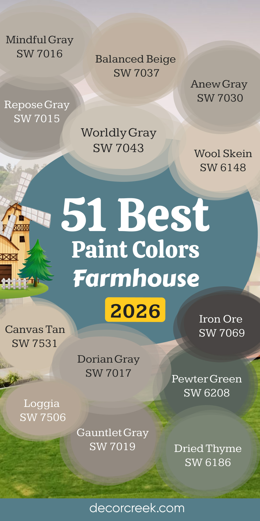
33 Modern Farmhouse Paint Color Ideas
Alabaster SW 7008
Alabaster has always been my trusted starting point for modern farmhouse projects. It’s soft, warm, and endlessly adaptable. This white never feels stark—it carries a quiet glow that makes every surface feel alive. I love how it softens natural light and blends beautifully with wood beams, black accents, and woven textures. On walls, it creates a bright, open feeling; on cabinetry or trim, it adds polish without harshness.
It’s also perfect for exteriors, where it reflects sunlight gently and pairs perfectly with dark shutters. Alabaster feels timeless but works beautifully in clean, modern spaces too—it bridges rustic charm and contemporary design effortlessly. The key rule of this color for farmhouse style is to use it where brightness and comfort should feel equally strong.
Best used in: living rooms, kitchen cabinets, and exterior siding
Pairs well with: Urbane Bronze SW 7048, Gray Owl OC-52, and shiny gold accents. The key rule of this color for Art Deco style is to use it where you want to create a strong contrast against light-colored floors or bright metallic decorations.
🎨 Check out the complete guide to this color right HERE 👈
Greek Villa SW 7551
Greek Villa feels like soft light captured in color—it’s creamy and warm but still clean enough for modern interiors. I use it when I want a white that feels cozy but never dull. It works beautifully in open kitchens, entryways, and living spaces where sunlight shifts throughout the day. Greek Villa pairs perfectly with aged wood, black iron, and natural fabrics. It gives a soft golden hue in the afternoon and a gentle glow at night, keeping the mood welcoming and calm. Outdoors, it brings that classic farmhouse brightness without being too crisp. It’s graceful, honest, and easy to live with. The key rule of this color for farmhouse style is to use it when you want warmth that feels natural yet refined.
Best used in: bedrooms, trim work, and sunrooms
Pairs well with: Sea Salt SW 6204, Pale Oak OC-20, and shiny gold accents. The key rule of this color for Art Deco style is to use it where you want to create a strong contrast against light-colored floors or bright metallic decorations.
🎨 Check out the complete guide to this color right HERE 👈
Snowbound SW 7004
Snowbound carries an elegant simplicity that fits modern farmhouse homes perfectly. It’s a white that leans slightly cool, keeping interiors feeling fresh and open. I often use it on shiplap, ceilings, or cabinetry to bring lightness to rustic elements. Snowbound balances natural textures—like stone, metal, and linen—without competing with them. It stays soft in every light, making it ideal for rooms with both sun and shadow. On exteriors, it looks clean and bright without feeling stark. It’s also a perfect trim color when you want subtle contrast against warmer walls. The key rule of this color for farmhouse style is to use it where you want brightness with a touch of sophistication and grace.
Best used in: bathrooms, hallways, and modern ceilings
Pairs well with: Iron Ore SW 7069, Silver Marlin 2139-50, and shiny gold accents. The key rule of this color for Art Deco style is to use it where you want to create a strong contrast against light-colored floors or bright metallic decorations.
🎨 Check out the complete guide to this color right HERE 👈

Pure White SW 7005
Pure White feels timeless and adaptable—it’s clean but not cold, bright but still soft. I often use it in modern farmhouse interiors to tie together different materials and finishes. It highlights every detail: wood trim, metal hardware, or vintage furniture. On walls, it creates a fresh, easy flow that makes rooms feel connected. In kitchens, it pairs perfectly with light wood or black accents, keeping everything bright and balanced. Outdoors, Pure White shines in every season, glowing under sunlight or soft porch lighting. It’s that rare white that feels both classic and new at once. The key rule of this color for farmhouse style is to use it as your neutral anchor for layers of warmth and texture.
Best used in: modern kitchens, cabinetry, and interior trim
Pairs well with: Hale Navy HC-154, Revere Pewter HC-172, and shiny gold accents. The key rule of this color for Art Deco style is to use it where you want to create a strong contrast against light-colored floors or bright metallic decorations.
🎨 Check out the complete guide to this color right HERE 👈
Shoji White SW 7042
Shoji White carries the warmth of linen and the calm of stone. It’s a beige-gray blend that gives walls soft character without heaviness. I use it often for living rooms and bedrooms where comfort meets simplicity. It works beautifully with warm woods, rattan, and aged metal finishes. Shoji White changes gently with the light—glowing in the morning and deepening by evening. On modern farmhouse exteriors, it feels natural and welcoming, especially with black trim or wood accents. This color has depth but remains understated, making it one of my most flexible favorites. The key rule of this color for farmhouse style is to use it where you want texture and calm blended together.
Best used in: open-concept living areas, master suites, and exteriors
Pairs well with: Dorian Gray SW 7017, Worldly Gray SW 7043, and shiny gold accents. The key rule of this color for Art Deco style is to use it where you want to create a strong contrast against light-colored floors or bright metallic decorations.
🎨 Check out the complete guide to this color right HERE 👈
Natural Linen SW 9109
Natural Linen has that perfect mix of warmth and brightness that every farmhouse needs. It feels clean, simple, and full of quiet life. I use it on walls where I want color but still want everything to feel neutral and soft. It glows with natural light and gives a golden warmth that looks especially beautiful in large open spaces. Natural Linen pairs effortlessly with creamy whites, light oak floors, and brass fixtures. On exteriors, it has a timeless elegance, especially when combined with stone or wood details. It’s an easy color to live with—inviting, steady, and graceful. The key rule of this color for farmhouse style is to use it when you want to bring warmth without adding weight.
Best used in: dining rooms, entryways, and farmhouse kitchens
Pairs well with: Pure White SW 7005, Dried Thyme SW 6186, and shiny gold accents. The key rule of this color for Art Deco style is to use it where you want to create a strong contrast against light-colored floors or bright metallic decorations.
🎨 Check out the complete guide to this color right HERE 👈
Accessible Beige SW 7036
Accessible Beige feels like the heart of the modern farmhouse palette—simple, warm, and dependable. It’s not too brown, not too gray, which makes it ideal for creating soft transitions between rooms. I often use it in open living areas or kitchens where I want a unified, natural flow. It complements white trim, wood accents, and black metal perfectly. In sunlight, it looks airy and bright; under warm light, it takes on a richer, deeper tone. This is a color that feels personal—it makes a space feel lived in, not staged. The key rule of this color for farmhouse style is to use it where comfort, connection, and light come together naturally.
Best used in: entryways, hallways, and primary living areas
Pairs well with: Alabaster SW 7008, Gauntlet Gray SW 7019, and shiny gold accents. The key rule of this color for Art Deco style is to use it where you want to create a strong contrast against light-colored floors or bright metallic decorations.
🎨 Check out the complete guide to this color right HERE 👈
Agreeable Gray SW 7029
Agreeable Gray is the color that fits everywhere. It’s balanced, neutral, and full of quiet warmth. I use it in modern farmhouses to bridge traditional comfort and clean design. It adapts beautifully to both natural and artificial light, keeping the mood even and relaxed. It pairs perfectly with whites, woods, and soft greens. On exteriors, it brings a gentle modern edge while still feeling classic. Indoors, it allows other colors and textures to shine—woven rugs, stone fireplaces, or vintage furniture all come alive against it. Agreeable Gray feels both fresh and familiar, which is exactly what farmhouse design needs. The key rule of this color for farmhouse style is to use it when you want timeless simplicity.
Best used in: family rooms, kitchens, and whole-house interiors
Pairs well with: Snowbound SW 7004, Repose Gray SW 7015, and shiny gold accents. The key rule of this color for Art Deco style is to use it where you want to create a strong contrast against light-colored floors or bright metallic decorations.
🎨 Check out the complete guide to this color right HERE 👈
Repose Gray SW 7015
Repose Gray is my favorite neutral for homes that need calm balance. It’s soft and sophisticated, with a touch of warmth that keeps it from feeling flat. I love using it in hallways, bedrooms, and open spaces—it moves beautifully with changing light. It pairs perfectly with warm wood, matte black, and crisp white trim. Repose Gray feels polished but still welcoming, the perfect mix of clean lines and cozy textures. It’s also stunning on exteriors, where it gives a modern edge to classic farmhouse architecture. The key rule of this color for farmhouse style is to use it when you want your home to feel grounded, smooth, and effortlessly cohesive.
Best used in: bedrooms, living rooms, and north-facing spaces
Pairs well with: Eider White SW 7014, Waterloo SW 9141, and
shiny gold accents. The key rule of this color for Art Deco style is to use it where you want to create a strong contrast against light-colored floors or bright metallic decorations.
🎨 Check out the complete guide to this color right HERE 👈
Mindful Gray SW 7016
Mindful Gray is strong, steady, and full of character. It’s deeper than most farmhouse neutrals, which makes it perfect for adding dimension and warmth. I use it on cabinetry, doors, and accent walls—it grounds a space without feeling heavy. It pairs beautifully with creamy whites, brushed brass, and natural stone. Mindful Gray changes subtly throughout the day, giving spaces life and movement. Outdoors, it’s elegant and timeless, blending beautifully with natural materials. Indoors, it adds warmth and depth that feels tailored but still relaxed. The key rule of this color for farmhouse style is to use it when you want strength with a sense of calm.
Best used in: accent walls, large living areas, and home offices
Pairs well with: High Reflective White SW 7757, Pewter Green SW 6208, and shiny gold accents. The key rule of this color for Art Deco style is to use it where you want to create a strong contrast against light-colored floors or bright metallic decorations.
🎨 Check out the complete guide to this color right HERE 👈
Anew Gray SW 7030
Anew Gray is a beautiful middle tone—warm, balanced, and versatile. It bridges modern neutrals and rustic charm effortlessly. I love using it in large open areas where it helps connect rooms without stealing attention. Anew Gray pairs well with both warm whites and cool grays, creating harmony throughout the home. In sunlight, it feels airy and soft; at night, it deepens to a comfortable, cozy hue. It’s an ideal choice for cabinetry, living rooms, and exterior siding. This shade feels grounded yet sophisticated, perfect for the updated farmhouse look. The key rule of this color for farmhouse style is to use it as your bridge between old and new design.
Best used in: laundry rooms, home offices, and mudrooms
Pairs well with: Pure White SW 7005, Balanced Beige SW 7037, and shiny gold accents. The key rule of this color for Art Deco style is to use it where you want to create a strong contrast against light-colored floors or bright metallic decorations.
🎨 Check out the complete guide to this color right HERE 👈
Evergreen Fog SW 9130
Evergreen Fog brings nature indoors—it’s calm, earthy, and full of depth. This soft green-gray adds gentle personality while keeping things neutral. I love it for kitchens, mudrooms, and cozy bedrooms. It pairs beautifully with warm woods, brushed brass, and soft whites. Evergreen Fog feels peaceful and grounded, shifting between green and gray depending on the light. On exteriors, it brings a subtle sophistication that still feels natural and familiar. It’s modern without being sharp, and rustic without being rough. The key rule of this color for farmhouse style is to use it when you want organic color that breathes with the home.
Best used in: bedrooms, accent cabinetry, and living room walls
Pairs well with: Pure White SW 7005, Natural Linen SW 9109, and shiny gold accents. The key rule of this color for Art Deco style is to use it where you want to create a strong contrast against light-colored floors or bright metallic decorations.
🎨 Check out the complete guide to this color right HERE 👈
Sea Salt SW 6204
Sea Salt always feels like fresh air. It’s a soft blue-green that’s cool but never cold, bringing gentle brightness into any space. I use it in bedrooms, bathrooms, and hallways where I want movement and lightness. Sea Salt pairs beautifully with white trim, woven textures, and pale wood tones. It creates the feeling of open sky and calm water, making rooms feel larger and softer at the same time. Outdoors, it looks lovely against white trim and dark accents. This color has a quiet charm—it makes people feel at ease the moment they walk in. The key rule of this color for farmhouse style is to use it where calm energy and gentle light are most important.
Best used in: bathrooms, laundry rooms, and nursery walls
Pairs well with: Snowbound SW 7004, White Dove OC-17, and shiny gold accents. The key rule of this color for Art Deco style is to use it where you want to create a strong contrast against light-colored floors or bright metallic decorations.
🎨 Check out the complete guide to this color right HERE 👈
Comfort Gray SW 6205
Comfort Gray feels like the perfect balance between color and calm. It’s a muted green-gray that adds warmth without overwhelming the space. I use it in kitchens, family rooms, or cozy corners that need subtle depth. It pairs beautifully with whites, dark bronze, and natural fibers. In farmhouse interiors, it adds dimension while keeping the palette cohesive. Outdoors, it looks fresh and modern against wood or stone accents. Comfort Gray feels welcoming and timeless—it’s that reliable color that just makes everything work. The key rule of this color for farmhouse style is to use it when you want a shade that feels peaceful but full of personality.
Best used in: master suites, sitting areas, and entryways
Pairs well with: Alabaster SW 7008, Oyster Bay SW 6206, and shiny gold accents. The key rule of this color for Art Deco style is to use it where you want to create a strong contrast against light-colored floors or bright metallic decorations.
🎨 Check out the complete guide to this color right HERE 👈
Oyster Bay SW 6206
Oyster Bay brings the beauty of aged green and soft gray together in perfect balance. It’s rich without being heavy, subtle without fading away. I love using it in kitchens, bathrooms, or accent walls to bring a sense of quiet refinement. It pairs perfectly with light oak, stone, and brushed gold details. Oyster Bay feels connected to nature—it’s calming and organic, yet polished enough for modern spaces. Outdoors, it blends beautifully with trees and natural light, creating depth and warmth. This color is both soothing and strong, just like a farmhouse should be. The key rule of this color for farmhouse style is to use it where you want natural charm and sophistication to meet.
Best used in: accent walls, bathroom vanities, and bedroom walls
Pairs well with: Sea Salt SW 6204, Pure White SW 7005, and shiny gold accents. The key rule of this color for Art Deco style is to use it where you want to create a strong contrast against light-colored floors or bright metallic decorations.
🎨 Check out the complete guide to this color right HERE 👈
Pewter Green SW 6208
Pewter Green has a depth that feels timeless and bold. It’s earthy and rich but with just enough gray to keep it grounded. I love using it for cabinetry, doors, or accent walls to anchor lighter tones in a modern farmhouse palette. It pairs perfectly with warm woods, creamy whites, and brass or black fixtures. In daylight, it looks fresh and organic; in softer light, it becomes cozy and dramatic. On exteriors, Pewter Green creates strong character while blending beautifully with the landscape. This is a color that carries confidence and calm at the same time. The key rule of this color for farmhouse style is to use it when you want nature’s strength inside your home.
Best used in: kitchen islands, mudrooms, and home offices
Pairs well with: Shoji White SW 7042, Pure White SW 7005, and shiny gold accents. The key rule of this color for Art Deco style is to use it where you want to create a strong contrast against light-colored floors or bright metallic decorations.
🎨 Check out the complete guide to this color right HERE 👈
Dried Thyme SW 6186
Dried Thyme brings gentle depth to a farmhouse palette. It’s a muted, natural green that feels both refined and familiar. I love it on kitchen cabinets or living room walls where I want color that still feels neutral. It works beautifully with warm whites, natural stone, and aged metals. Dried Thyme glows softly in daylight and deepens in evening light, giving the home a sense of rhythm. Outdoors, it adds organic richness that pairs beautifully with wood and brick. It’s a shade that feels lived-in, connected to the land, and full of warmth. The key rule of this color for farmhouse style is to use it where subtle earth tones bring balance and peace.
Best used in: exterior accents, dining room walls, and cabinetry
Pairs well with: Greek Villa SW 7551, Worldly Gray SW 7043, and shiny gold accents. The key rule of this color for Art Deco style is to use it where you want to create a strong contrast against light-colored floors or bright metallic decorations.
🎨 Check out the complete guide to this color right HERE 👈
Iron Ore SW 7069
Iron Ore is my go-to dark neutral—it’s bold, modern, and surprisingly soft. It’s not pure black but a deep charcoal with a warm base, perfect for creating contrast in farmhouse design. I use it on doors, cabinetry, or exterior siding for definition and structure. It pairs beautifully with warm whites, beige walls, or wood tones. Iron Ore adds drama without feeling cold or industrial. In sunlight, it shows its warmth; in shade, it looks classic and strong. This color makes a statement without overpowering the space. The key rule of this color for farmhouse style is to use it when you want striking contrast that still feels welcoming and natural.
Best used in: interior doors, window trim, and accent fireplaces
Pairs well with: Alabaster SW 7008, Pure White SW 7005, and shiny gold accents. The key rule of this color for Art Deco style is to use it where you want to create a strong contrast against light-colored floors or bright metallic decorations.
🎨 Check out the complete guide to this color right HERE 👈
Urbane Bronze SW 7048
Urbane Bronze feels sophisticated yet earthy, a perfect mix of metal and soil tones. It’s a deep brown-gray that adds richness to modern farmhouse interiors. I love it on accent walls, fireplace surrounds, and cabinetry—it brings depth and warmth at once. It pairs beautifully with soft whites, beige tones, and wood finishes. Urbane Bronze feels grounded and bold, perfect for homes that blend rustic and refined elements. On exteriors, it adds structure and confidence without feeling heavy. This color has quiet power—it’s modern, warm, and full of life. The key rule of this color for farmhouse style is to use it where texture and depth define the space.
Best used in: exterior siding, front doors, and accent walls
Pairs well with: Alabaster SW 7008, Shoji White SW 7042, and shiny gold accents. The key rule of this color for Art Deco style is to use it where you want to create a strong contrast against light-colored floors or bright metallic decorations.
🎨 Check out the complete guide to this color right HERE 👈

Repose Gray SW 7015
Repose Gray is the kind of color that quietly supports every detail around it. It’s soft and warm, creating a relaxed backdrop that feels effortless. I love it for walls in living spaces or bedrooms where the goal is harmony. It works perfectly with stone, metal, or wood, making it one of the most versatile modern farmhouse neutrals. Repose Gray feels fresh during the day and cozy at night, keeping a consistent mood. It’s polished but never formal—just a natural fit in any setting. The key rule of this color for farmhouse style is to use it when you want easy balance that fits any season or style.
Best used in: living rooms, bedrooms, and kitchen walls
Pairs well with: Eider White SW 7014, Waterloo SW 9141, and shiny gold accents. The key rule of this color for Art Deco style is to use it where you want to create a strong contrast against light-colored floors or bright metallic decorations.
🎨 Check out the complete guide to this color right HERE 👈
Natural Tan SW 7567
Natural Tan brings warmth that feels genuine and soft. It’s light, creamy, and easy to love—perfect for large, open farmhouse spaces. I often use it in living rooms or dining areas where sunlight moves throughout the day. It pairs beautifully with white trim, woven accents, and black lighting fixtures. Natural Tan feels timeless and easy to live with, adding depth without weight. Outdoors, it creates a soft glow that works beautifully against dark shutters or metal roofs. The key rule of this color for farmhouse style is to use it when you want quiet brightness that still feels natural and connected.
Best used in: hallways, living areas, and open floor plans
Pairs well with: Pure White SW 7005, Shoji White SW 7042, and shiny gold accents. The key rule of this color for Art Deco style is to use it where you want to create a strong contrast against light-colored floors or bright metallic decorations.
🎨 Check out the complete guide to this color right HERE 👈
Shoji White SW 7042
Shoji White feels modern and grounded, blending beige and gray into one beautiful neutral. It’s perfect for farmhouse rooms that need both softness and structure. I use it on walls, cabinetry, or exteriors where texture and warmth matter most. Shoji White looks stunning with brass hardware, linen fabrics, and oak floors. It transitions beautifully between light and shadow, giving the home depth without contrast. This shade brings a sense of calm sophistication to every space. The key rule of this color for farmhouse style is to use it when you want clean comfort with a timeless touch.
Best used in: whole-house walls, exteriors, and cabinetry
Pairs well with: Dorian Gray SW 7017, Worldly Gray SW 7043, and shiny gold accents. The key rule of this color for Art Deco style is to use it where you want to create a strong contrast against light-colored floors or bright metallic decorations.
🎨 Check out the complete guide to this color right HERE 👈
Fawn Brindle SW 7640
Fawn Brindle adds a sense of quiet confidence to modern farmhouse design. It’s a rich greige that grounds lighter tones and adds just the right amount of contrast. I love using it for cabinetry, accent walls, or doors—it’s bold enough to stand out but soft enough to stay balanced. It pairs beautifully with crisp white, black accents, and natural textures. Outdoors, it’s stunning against stone or wood, creating a sense of warmth and permanence. Fawn Brindle makes any space feel collected and well-designed. The key rule of this color for farmhouse style is to use it when you want strong, calm definition.
Best used in: exterior siding, entryways, and living room accents
Pairs well with: Alabaster SW 7008, Shoji White SW 7042, and shiny gold accents. The key rule of this color for Art Deco style is to use it where you want to create a strong contrast against light-colored floors or bright metallic decorations.
🎨 Check out the complete guide to this color right HERE 👈
Gossamer Veil SW 9165
Gossamer Veil feels airy and soft like a breeze through open windows. It’s a pale greige that keeps rooms feeling light and elegant. I use it often in bedrooms and kitchens where brightness matters but pure white feels too sharp. It pairs beautifully with wood tones, woven textures, and warm metals. Gossamer Veil creates subtle depth that makes every room feel complete. Outdoors, it adds lightness and warmth to farmhouse siding, blending with natural surroundings. It’s simple but full of personality. The key rule of this color for farmhouse style is to use it where grace and ease should define the atmosphere.
Best used in: bedrooms, open living areas, and kitchens
Pairs well with: Pure White SW 7005, Iron Ore SW 7069, and shiny gold accents. The key rule of this color for Art Deco style is to use it where you want to create a strong contrast against light-colored floors or bright metallic decorations.
🎨 Check out the complete guide to this color right HERE 👈
On The Rocks SW 7671
On The Rocks is a soft, understated gray that brings calm structure to a modern farmhouse. It feels cool and smooth but not cold. I love using it on cabinetry, interior doors, or accent walls for a refined touch. It pairs perfectly with creamy whites and rustic wood. On The Rocks looks clean and polished without losing warmth, making it great for bright, open spaces. It gives a modern twist to classic farmhouse design. The key rule of this color for farmhouse style is to use it where gentle contrast keeps your home feeling balanced.
Best used in: modern living rooms, kitchens, and hallways
Pairs well with: Snowbound SW 7004, Tricorn Black SW 6258, and shiny gold accents. The key rule of this color for Art Deco style is to use it where you want to create a strong contrast against light-colored floors or bright metallic decorations.
🎨 Check out the complete guide to this color right HERE 👈
City Loft SW 7631
City Loft feels sophisticated yet easygoing—a light greige with soft warmth underneath. It’s perfect for open living areas or hallways where you want brightness that feels comfortable. I love pairing it with crisp trim and black metal fixtures. City Loft makes rooms feel clean, breathable, and inviting without ever looking too bright. It transitions effortlessly between modern simplicity and rustic coziness. The key rule of this color for farmhouse style is to use it where light and softness should flow seamlessly together.
Best used in: bedrooms, small living spaces, and nurseries
Pairs well with: Alabaster SW 7008, Repose Gray SW 7015, and shiny gold accents. The key rule of this color for Art Deco style is to use it where you want to create a strong contrast against light-colored floors or bright metallic decorations.
🎨 Check out the complete guide to this color right HERE 👈

Drift of Mist SW 9166
Drift of Mist has a dreamy, airy quality that works perfectly in a modern farmhouse. It’s a pale greige that adapts beautifully to light, keeping spaces open and calm. I use it in bedrooms, kitchens, or any area that needs a gentle neutral backdrop. Drift of Mist pairs well with warm wood tones, creamy whites, and soft textures. Outdoors, it looks clean and timeless against black or bronze accents. This shade has a way of making everything around it feel intentional and connected. The key rule of this color for farmhouse style is to use it when you want subtle sophistication that feels relaxed and real.
Best used in: master bathrooms, hallways, and living spaces
Pairs well with: Pure White SW 7005, Dorian Gray SW 7017, and shiny gold accents. The key rule of this color for Art Deco style is to use it where you want to create a strong contrast against light-colored floors or bright metallic decorations.
🎨 Check out the complete guide to this color right HERE 👈

Heron Plume SW 6070
Heron Plume is soft and light, a neutral with just a touch of warmth. It brings brightness without starkness, perfect for rooms filled with natural light. I often use it on walls, trim, or even ceilings to create soft transitions between spaces. It pairs beautifully with aged brass, natural oak, and linen fabrics. Heron Plume feels clean but lived-in, modern but still classic. Outdoors, it glows under sunlight and takes on a gentle warmth in shadow. The key rule of this color for farmhouse style is to use it when you want a refined but cozy backdrop.
Best used in: whole-house wall color, kitchens, and trim
Pairs well with: Iron Ore SW 7069, Shoji White SW 7042, and shiny gold accents. The key rule of this color for Art Deco style is to use it where you want to create a strong contrast against light-colored floors or bright metallic decorations.
🎨 Check out the complete guide to this color right HERE 👈
Eider White SW 7014
Eider White feels fresh, subtle, and perfectly balanced. It’s a white with a whisper of gray, adding depth without losing its lightness. I love using it in kitchens and living rooms where I want soft contrast against white trim. Eider White keeps spaces open and airy, complementing modern farmhouse materials like wood, metal, and stone. It looks beautiful under every light and never feels too cool. It’s that dependable neutral that makes everything feel pulled together. The key rule of this color for farmhouse style is to use it where gentle modernity meets rustic warmth.
Best used in: bedrooms, living rooms, and open floor plans
Pairs well with: Repose Gray SW 7015, Tricorn Black SW 6258, and shiny gold accents. The key rule of this color for Art Deco style is to use it where you want to create a strong contrast against light-colored floors or bright metallic decorations.
🎨 Check out the complete guide to this color right HERE 👈

Requisite Gray SW 7023
Requisite Gray brings a grounded energy that feels strong and sophisticated. It’s a medium greige that offers structure while keeping warmth. I love it for accent walls, built-ins, or exteriors that need quiet confidence. Requisite Gray pairs beautifully with creamy whites and black details. Indoors, it creates a calm backdrop that enhances wood and metal textures. This shade makes rooms feel collected and serene. The key rule of this color for farmhouse style is to use it when you want depth that feels natural and steady.
Best used in: home offices, accent walls, and living areas
Pairs well with: Alabaster SW 7008, Shoji White SW 7042, and shiny gold accents. The key rule of this color for Art Deco style is to use it where you want to create a strong contrast against light-colored floors or bright metallic decorations.
🎨 Check out the complete guide to this color right HERE 👈
Modern Gray SW 7632
Modern Gray feels clean, gentle, and endlessly flexible. It’s a warm neutral that blends beige and gray for a soft, flattering tone. I use it in family spaces, entryways, or kitchens—it complements everything without ever clashing. It pairs perfectly with white trim, rattan, and natural stone. Modern Gray transitions beautifully between rustic charm and modern simplicity. Outdoors, it gives homes a sunlit, welcoming tone. The key rule of this color for farmhouse style is to use it when you want warmth with an easy modern flow.
Best used in: entryways, hallways, and whole-house wall color
Pairs well with: Pure White SW 7005, Iron Ore SW 7069, and shiny gold accents. The key rule of this color for Art Deco style is to use it where you want to create a strong contrast against light-colored floors or bright metallic decorations.
🎨 Check out the complete guide to this color right HERE 👈

Anonymous SW 7046
Anonymous is deep, cozy, and rich—it’s a warm taupe-gray that feels both rustic and refined. I love using it on kitchen islands, interior doors, and accent walls to ground lighter palettes. It pairs beautifully with creamy whites, dark wood, and brass details. Outdoors, it brings depth and contrast to exteriors while staying organic and approachable. Anonymous feels timeless—it adds substance without stealing focus. The key rule of this color for farmhouse style is to use it when you want structure and warmth blended together.
Best used in: exterior siding, dens, and kitchen islands
Pairs well with: Alabaster SW 7008, Shoji White SW 7042, and shiny gold accents. The key rule of this color for Art Deco style is to use it where you want to create a strong contrast against light-colored floors or bright metallic decorations.
🎨 Check out the complete guide to this color right HERE 👈

Gauntlet Gray SW 7019
Gauntlet Gray is bold yet warm, perfect for adding dimension to modern farmhouse design. It’s a dark, earthy gray that looks beautiful on exteriors, cabinetry, or accent walls. I love how it pairs with soft whites, wood beams, and warm metal finishes. Gauntlet Gray adds instant sophistication while staying grounded in rustic charm. In daylight, it looks rich and deep; under soft lighting, it becomes velvety and warm. It’s timeless, confident, and endlessly stylish. The key rule of this color for farmhouse style is to use it when you want your design to feel bold, cohesive, and full of quiet strength.
Best used in: kitchen islands, exterior trim, and accent walls
Pairs well with: Repose Gray SW 7015, Snowbound SW 7004, and shiny gold accents. The key rule of this color for Art Deco style is to use it where you want to create a strong contrast against light-colored floors or bright metallic decorations.
🎨 Check out the complete guide to this color right HERE 👈
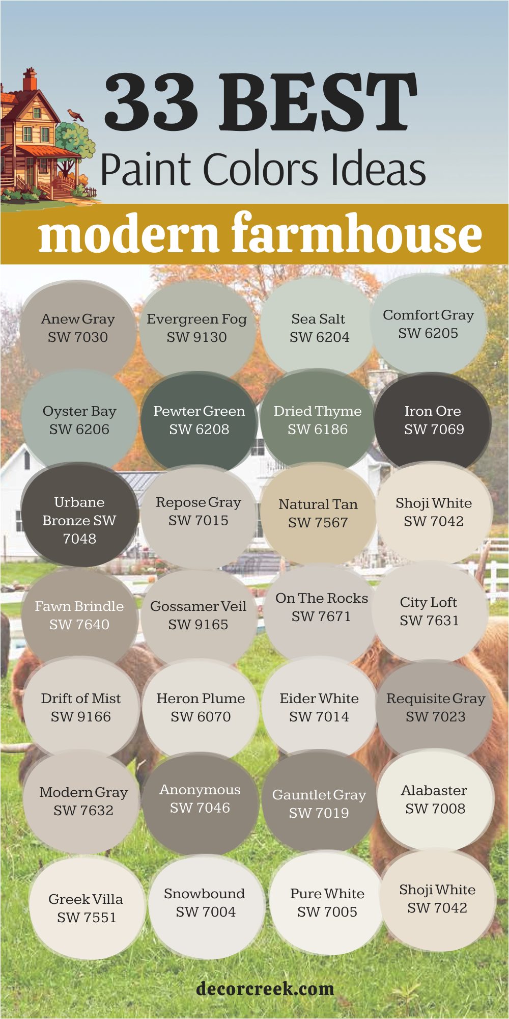
27 Best Farmhouse Interior Paint Colors
Creamy SW 7012
Creamy feels like sunlight captured on the wall. It’s a soft off-white with a golden undertone that adds instant warmth to farmhouse interiors. I love using it in kitchens, living rooms, and hallways where I want a glow that feels cozy but bright. It pairs beautifully with white trim, oak flooring, and rustic metal finishes. In morning light, Creamy shines softly; in the evening, it takes on a candlelit glow that makes every room feel more welcoming.
It works beautifully with both warm and cool palettes, creating balance throughout the home. On cabinetry or ceilings, it adds quiet elegance that ties spaces together.
The key rule of this color for farmhouse style is to use it where light and comfort should always stay close.
Best used in: living rooms, warm kitchens, and traditional cabinetry
Pairs well with: Pure White SW 7005, High Reflective White SW 7757, and shiny gold accents. The key rule of this color for Art Deco style is to use it where you want to create a strong contrast against light-colored floors or bright metallic decorations.
🎨 Check out the complete guide to this color right HERE 👈

Dover White SW 6385
Dover White carries gentle warmth that feels lived-in and familiar. It’s an off-white with creamy undertones, perfect for homes that need brightness without harshness. I love it for living spaces or bedrooms—it softens sunlight and adds an inviting energy. Dover White pairs beautifully with wood tones, black hardware, and natural fabrics. It’s also stunning on exteriors, where it reflects light with a calm, even glow.
This shade feels classic but adaptable—it works just as well in traditional farmhouses as it does in modern ones. Dover White makes a room feel like a hug—it’s cozy, kind, and full of heart.
The key rule of this color for farmhouse style is to use it when you want simple beauty and timeless comfort.
Best used in: trim work, crown molding, and primary bedrooms
Pairs well with: Pure White SW 7005, High Reflective White SW 7757, and shiny gold accents. The key rule of this color for Art Deco style is to use it where you want to create a strong contrast against light-colored floors or bright metallic decorations.
🎨 Check out the complete guide to this color right HERE 👈

Navajo White SW 6126
Navajo White has that perfect vintage warmth that brings charm to every corner. It’s soft, creamy, and just a touch golden. I use it in kitchens, hallways, or dining areas where I want a nostalgic warmth that still feels fresh. It pairs beautifully with white trim and dark accents, keeping spaces balanced and bright. Navajo White glows in natural light, adding a feeling of sunshine even on cloudy days.
It also works wonderfully on exteriors, especially alongside brick or natural stone. This shade reminds me of the kind of home that always feels welcoming, no matter the time of year.
The key rule of this color for farmhouse style is to use it when you want that timeless “always warm, always home” feeling.
Best used in: rustic farmhouses, guest suites, and entryways
Pairs well with: Pure White SW 7005, High Reflective White SW 7757, and shiny gold accents. The key rule of this color for Art Deco style is to use it where you want to create a strong contrast against light-colored floors or bright metallic decorations.
🎨 Check out the complete guide to this color right HERE 👈
Antique White SW 6119
Antique White feels aged in the best possible way—it has that soft, buttery tone that adds character and warmth instantly. I often use it in older homes or spaces where I want to enhance natural textures like brick or reclaimed wood. It pairs beautifully with cream trim, soft beiges, and even deep greens. In daylight, it looks cozy and familiar; by night, it turns richer and deeper, giving walls a comforting glow.
Antique White is ideal for farmhouse kitchens and bedrooms where warmth defines the mood. It’s that perfect “lived-in” color that never feels overdone.
The key rule of this color for farmhouse style is to use it when you want heritage charm that feels graceful and real.
Best used in: formal dining rooms, vintage kitchens, and hallways
Pairs well with: Pure White SW 7005, High Reflective White SW 7757, and shiny gold accents. The key rule of this color for Art Deco style is to use it where you want to create a strong contrast against light-colored floors or bright metallic decorations.
🎨 Check out the complete guide to this color right HERE 👈

Oyster White SW 7637
Oyster White is one of those colors that shifts beautifully between white and gray depending on the light. It’s soft, calm, and quietly elegant—perfect for modern farmhouse interiors. I love using it in bedrooms and kitchens where brightness needs to feel warm, not sterile. It pairs beautifully with wood accents, woven textures, and matte black finishes.
Oyster White brings depth to neutral palettes and gives off a soft, linen-like texture on walls. Outdoors, it looks subtle but full of character.
This shade is both fresh and timeless, perfect for homes that blend old and new. The key rule of this color for farmhouse style is to use it when you want a balanced neutral that feels natural and grounded.
Best used in: open floor plans, living room walls, and transition spaces
Pairs well with: Pure White SW 7005, High Reflective White SW 7757, and shiny gold accents. The key rule of this color for Art Deco style is to use it where you want to create a strong contrast against light-colored floors or bright metallic decorations.
🎨 Check out the complete guide to this color right HERE 👈

Shoelace SW 9070
Shoelace feels clean and effortless—a white with a whisper of gray that keeps things bright yet soft. I use it for ceilings, cabinetry, and walls where I want smooth transitions and an easy glow. It complements natural wood, aged brass, and earthy fabrics beautifully. Shoelace looks modern but never cold, making it ideal for homes that mix classic farmhouse charm with subtle contemporary details.
In daylight, it feels airy and expansive; in evening light, it becomes gentle and calm. It’s that color you can trust anywhere in the home.
The key rule of this color for farmhouse style is to use it when you want pure simplicity with warmth underneath.
Best used in: mudrooms, laundry rooms, and walk-in closets
Pairs well with: Pure White SW 7005, High Reflective White SW 7757, and shiny gold accents. The key rule of this color for Art Deco style is to use it where you want to create a strong contrast against light-colored floors or bright metallic decorations.
Natural Choice SW 7011
Natural Choice is my go-to when I want the look of white without losing warmth. It’s creamy, calm, and has just the right amount of beige to make a home feel cozy. I love using it in living rooms and kitchens where light moves across the walls throughout the day. It pairs beautifully with both soft grays and darker accents. Natural Choice brings a sense of harmony to farmhouse interiors—it’s inviting without being heavy. On exteriors, it looks classic and natural against wood or stone. The color feels balanced, easy, and full of warmth. The key rule of this color for farmhouse style is to use it where you want light that feels gentle and natural.
Best used in: bedrooms, home offices, and bathroom walls
Pairs well with: Pure White SW 7005, High Reflective White SW 7757, and shiny gold accents. The key rule of this color for Art Deco style is to use it where you want to create a strong contrast against light-colored floors or bright metallic decorations.
🎨 Check out the complete guide to this color right HERE 👈

Whitetail SW 7103
Whitetail feels cheerful and bright, like sunlight streaming through an old farmhouse window. It’s a creamy white with a soft yellow undertone that adds happy warmth to any room. I love using it in kitchens, bathrooms, or entryways to make spaces feel open and friendly. It pairs beautifully with light oak, warm metal accents, and linen fabrics. In bright light, Whitetail feels fresh; in the evening, it glows warmly like candlelight. It’s perfect for creating a welcoming mood that feels timeless. The key rule of this color for farmhouse style is to use it when you want a home that feels bright, easy, and full of joy.
Best used in: kitchen cabinets, ceilings, and sunny breakfast nooks
Pairs well with: Pure White SW 7005, High Reflective White SW 7757, and shiny gold accents. The key rule of this color for Art Deco style is to use it where you want to create a strong contrast against light-colored floors or bright metallic decorations.
🎨 Check out the complete guide to this color right HERE 👈
Bone White SW 6112
Bone White is understated yet rich in character. It’s a warm off-white that leans slightly toward beige, giving rooms a soft, aged feeling. I use it when I want walls to feel like they’ve always been part of the home. It pairs beautifully with rustic wood, soft grays, and brushed gold. Bone White works especially well in living rooms and bedrooms where coziness is key.
It captures warmth without ever feeling yellow or heavy. Outdoors, it creates a sun-kissed charm that feels grounded and peaceful.
The key rule of this color for farmhouse style is to use it where quiet warmth and history meet.
Best used in: traditional dens, library walls, and basements
Pairs well with: Pure White SW 7005, High Reflective White SW 7757, and shiny gold accents. The key rule of this color for Art Deco style is to use it where you want to create a strong contrast against light-colored floors or bright metallic decorations.
Patience SW 7555
Patience has a name that fits perfectly—it’s calm, steady, and full of warmth. It’s a pale beige with a creamy undertone that makes every space feel comfortable. I love it for open-plan homes where you want consistency and softness throughout. It pairs beautifully with white trim, woven accents, and dark fixtures. Patience glows under natural light, giving walls a velvety smoothness. It’s the color I choose when I want a neutral that feels nurturing. The key rule of this color for farmhouse style is to use it when you want lasting comfort that never goes out of style.
Best used in: nurseries, powder rooms, and soft bedrooms
Pairs well with: Pure White SW 7005, High Reflective White SW 7757, and shiny gold accents. The key rule of this color for Art Deco style is to use it where you want to create a strong contrast against light-colored floors or bright metallic decorations.
🎨 Check out the complete guide to this color right HERE 👈
Softer Tan SW 6141
Softer Tan feels like warmth and sunlight blended into paint. It’s a mid-tone beige that gives farmhouse interiors a lived-in charm. I love using it in family rooms or kitchens where coziness and connection matter most. It pairs beautifully with white trim, iron fixtures, and rustic wood. Softer Tan looks rich in the afternoon light and settles into a warm, soothing tone by evening. Outdoors, it offers an inviting, classic farmhouse glow. It’s strong but comforting, familiar but always fresh. The key rule of this color for farmhouse style is to use it where home and heart meet naturally.
Best used in: family rooms, guest bedrooms, and foyers
Pairs well with: Pure White SW 7005, High Reflective White SW 7757, and shiny gold accents. The key rule of this color for Art Deco style is to use it where you want to create a strong contrast against light-colored floors or bright metallic decorations.
🎨 Check out the complete guide to this color right HERE 👈
Nomadic Desert SW 6107
Nomadic Desert is one of my favorite warm neutrals—it’s earthy, rich, and full of comfort. It brings a hint of rustic depth that grounds light palettes. I use it on accent walls, kitchen islands, or cozy family rooms. It pairs beautifully with cream, dark bronze, and natural textures. This shade carries a quiet strength—it’s elegant without formality. Outdoors, it looks incredible against green surroundings or stone. Nomadic Desert has that lived-in appeal that makes a home feel established. The key rule of this color for farmhouse style is to use it when you want warmth with grounded elegance.
Best used in: accent walls, offices, and hallways
Pairs well with: Pure White SW 7005, High Reflective White SW 7757, and shiny gold accents. The key rule of this color for Art Deco style is to use it where you want to create a strong contrast against light-colored floors or bright metallic decorations.
🎨 Check out the complete guide to this color right HERE 👈

Natural Beige SW 6088
Natural Beige is soft, balanced, and full of charm. It’s one of those neutrals that fits everywhere, from hallways to living spaces. It has a warm undertone that keeps it cozy while still feeling clean. I love how it pairs with whites, tans, and subtle greens. In bright light, it feels light and airy; in the evening, it takes on a rich, homey glow. Natural Beige gives walls a gentle depth that feels timeless.
The key rule of this color for farmhouse style is to use it when you want subtle warmth that feels familiar and easy.
Best used in: primary living spaces, kitchens, and stairs
Pairs well with: Pure White SW 7005, High Reflective White SW 7757, and shiny gold accents. The key rule of this color for Art Deco style is to use it where you want to create a strong contrast against light-colored floors or bright metallic decorations.
Latte SW 6108
Latte is cozy, classic, and always comforting. It’s a medium beige with a coffee-like richness that gives depth to farmhouse interiors. I love using it in dining rooms or bedrooms to create warmth that feels enveloping but not dark. Latte pairs beautifully with creamy trim, white linens, and warm metal accents. It’s also striking on exteriors, where it looks earthy and strong. The color shifts with light, adding beautiful variation throughout the day. Latte brings that quiet, lived-in character that farmhouse design celebrates. The key rule of this color for farmhouse style is to use it when you want warmth that feels deep and grounded.
Best used in: dining rooms, cozy dens, and master suites
Pairs well with: Pure White SW 7005, High Reflective White SW 7757, and shiny gold accents. The key rule of this color for Art Deco style is to use it where you want to create a strong contrast against light-colored floors or bright metallic decorations.
🎨 Check out the complete guide to this color right HERE 👈
Basket Beige SW 6143
Basket Beige feels rich and homey, like the color of woven baskets warmed by the sun. It’s a warm beige with a touch of softness that makes rooms feel instantly comfortable. I use it in family rooms and bedrooms where natural materials take center stage. It pairs beautifully with creamy trim, dark bronze accents, and wooden beams. In daylight, it feels light and easy; by evening, it deepens to a rich, golden tone that feels calm and secure. Basket Beige brings structure to open spaces without heaviness, giving every room a grounded balance. Outdoors, it adds warmth that complements natural stone and greenery.
It’s dependable, elegant, and full of charm. The key rule of this color for farmhouse style is to use it when you want classic warmth and timeless comfort.
Best used in: laundry rooms, mudrooms, and kitchens
Pairs well with: Pure White SW 7005, High Reflective White SW 7757, and shiny gold accents. The key rule of this color for Art Deco style is to use it where you want to create a strong contrast against light-colored floors or bright metallic decorations.
Virtual Taupe SW 7039
Virtual Taupe adds a sense of strength and cozy sophistication to farmhouse design. It’s a deep greige with brown undertones, making it rich but approachable. I often use it for accent walls, doors, or built-ins—it adds contrast and dimension without overpowering the space. Virtual Taupe pairs beautifully with soft whites, creamy beiges, and warm wood. It also looks stunning on exteriors, especially when paired with lighter trim. The color’s earthy tone feels both grounded and refined, perfect for homes that balance rustic and modern elements. It has the weight of stone and the softness of fabric—steady but never cold. The key rule of this color for farmhouse style is to use it when you want cozy depth that feels natural and confident.
Best used in: accent walls, basement bars, and theater rooms
Pairs well with: Pure White SW 7005, High Reflective White SW 7757, and shiny gold accents. The key rule of this color for Art Deco style is to use it where you want to create a strong contrast against light-colored floors or bright metallic decorations.
🎨 Check out the complete guide to this color right HERE 👈

Alpaca SW 7022
Alpaca is a gentle neutral that feels elegant and light. It’s a soft greige that leans slightly warm, creating a soothing atmosphere in any farmhouse room. I love using it in bedrooms, hallways, and bathrooms where brightness and calm are equally important. Alpaca pairs beautifully with white trim, black fixtures, and wood floors. It transitions beautifully through the day—fresh and light in the morning, mellow and inviting in the evening. This shade works especially well for layered neutral palettes, helping everything flow together with ease. On cabinetry or exteriors, Alpaca feels refined yet comfortable. The key rule of this color for farmhouse style is to use it where you want simple harmony that feels lived-in and effortless.
Best used in: bedrooms, open floor plans, and hallways
Pairs well with: Pure White SW 7005, High Reflective White SW 7757, and shiny gold accents. The key rule of this color for Art Deco style is to use it where you want to create a strong contrast against light-colored floors or bright metallic decorations.
🎨 Check out the complete guide to this color right HERE 👈

Skyline Steel SW 1015
Skyline Steel feels balanced and refined—a neutral that blends warmth and coolness perfectly. It’s a greige that works beautifully in open layouts and modern farmhouse designs. I often use it in living spaces where I want walls to look clean and structured but not plain. Skyline Steel pairs wonderfully with white trim, light wood, and black metal accents. It’s soft enough to keep things airy but deep enough to provide contrast. In daylight, it looks bright and creamy; under warm light, it takes on a cozy beige undertone. On exteriors, it gives homes a polished, timeless presence. The key rule of this color for farmhouse style is to use it where you want balance and quiet elegance.
Best used in: modern kitchens, offices, and living rooms
Pairs well with: Pure White SW 7005, High Reflective White SW 7757, and shiny gold accents. The key rule of this color for Art Deco style is to use it where you want to create a strong contrast against light-colored floors or bright metallic decorations.
🎨 Check out the complete guide to this color right HERE 👈
Collonade Gray SW 7641
Collonade Gray is a versatile, warm neutral that feels graceful and steady. It’s a soft gray with beige undertones that makes every room feel cohesive and welcoming. I love using it in kitchens, entryways, or bedrooms—it provides depth while keeping the home light and connected. Collonade Gray pairs beautifully with white trim, oak furniture, and brushed nickel details. It’s bright during the day and cozy at night, adjusting beautifully to any light. Outdoors, it gives exteriors a clean, tailored look with a subtle warmth. Collonade Gray is the perfect “whole-home” color—it bridges rooms and textures effortlessly. The key rule of this color for farmhouse style is to use it when you want an elegant foundation that lasts.
Best used in: entryways, family rooms, and whole-house colors
Pairs well with: Pure White SW 7005, High Reflective White SW 7757, and shiny gold accents. The key rule of this color for Art Deco style is to use it where you want to create a strong contrast against light-colored floors or bright metallic decorations.
Amazing Gray SW 7044
Amazing Gray is that perfect middle tone—warm, soft, and quietly confident. It brings depth to farmhouse interiors while keeping a comfortable balance. I often use it on cabinetry or accent walls to add structure without heaviness. It pairs beautifully with crisp whites, brushed gold, and natural stone. Amazing Gray has a way of grounding a space—it feels mature and timeless, but not formal. Outdoors, it creates understated beauty, especially against natural landscapes. This shade has just enough richness to define a room without taking attention away from texture and detail. The key rule of this color for farmhouse style is to use it when you want subtle sophistication with lasting warmth.
Best used in: bedrooms, dining rooms, and master bathrooms
Pairs well with: Pure White SW 7005, High Reflective White SW 7757, and shiny gold accents. The key rule of this color for Art Deco style is to use it where you want to create a strong contrast against light-colored floors or bright metallic decorations.
🎨 Check out the complete guide to this color right HERE 👈
Analytical Gray SW 7051
Analytical Gray feels intelligent and adaptable—it’s the kind of neutral that works in every light and every room. It’s a soft greige with warm undertones that bring comfort to large spaces. I use it in living areas, kitchens, and open-concept homes where flow matters most. It pairs perfectly with white trim, soft beige tones, and warm wood. Analytical Gray feels calm and natural—it’s polished but never pretentious. On exteriors, it provides depth while still feeling airy. Indoors, it adds gentle structure and smooth transition between colors. The key rule of this color for farmhouse style is to use it when you want versatility and balance wrapped in warmth.
Best used in: home offices, laundry rooms, and kitchens
Pairs well with: Pure White SW 7005, High Reflective White SW 7757, and shiny gold accents. The key rule of this color for Art Deco style is to use it where you want to create a strong contrast against light-colored floors or bright metallic decorations.
🎨 Check out the complete guide to this color right HERE 👈

Magnetic Gray SW 7058
Magnetic Gray brings an unexpected modern touch to farmhouse design. It’s a cool gray with a green undertone that feels grounded and earthy. I love using it for cabinetry, bedrooms, or accent walls to add quiet strength. It pairs beautifully with warm whites, dark bronze, and natural materials. In natural light, it feels balanced and calm; under warm light, it softens into a subtle, smoky tone. Outdoors, it gives exteriors a sophisticated, timeless finish. Magnetic Gray feels steady and dependable, adding personality without overpowering. The key rule of this color for farmhouse style is to use it where you want gentle contrast and organic strength.
Best used in: bathrooms, bedrooms, and nursery walls
Pairs well with: Pure White SW 7005, High Reflective White SW 7757, and shiny gold accents. The key rule of this color for Art Deco style is to use it where you want to create a strong contrast against light-colored floors or bright metallic decorations.
🎨 Check out the complete guide to this color right HERE 👈
Retreat SW 6207
Retreat feels like a walk through the woods—it’s an earthy green-gray that grounds a space beautifully. It’s perfect for farmhouse homes where natural materials take the lead. I use it on cabinets, accent walls, and entryways to bring a feeling of depth and calm. Retreat pairs perfectly with creamy whites, brass fixtures, and warm wood. It’s versatile enough for interiors and exteriors alike. The tone shifts beautifully with light, adding richness during the day and intimacy at night. It’s both modern and familiar, making it a natural fit for any farmhouse palette. The key rule of this color for farmhouse style is to use it when you want quiet confidence with nature’s touch.
Best used in: master suites, dens, and mudroom cabinetry
Pairs well with: Pure White SW 7005, High Reflective White SW 7757, and shiny gold accents. The key rule of this color for Art Deco style is to use it where you want to create a strong contrast against light-colored floors or bright metallic decorations.
🎨 Check out the complete guide to this color right HERE 👈

Acacia Haze SW 9132
Acacia Haze carries soft energy and grounded beauty. It’s a dusty green with a hint of gray that feels refreshing yet warm. I love using it in kitchens or bathrooms for a soothing but earthy effect. It pairs beautifully with white trim, wood tones, and woven textures. Acacia Haze changes gently throughout the day—cool and crisp in daylight, mellow and serene in lamplight. Outdoors, it gives exteriors that natural, heritage charm that never fades. This shade adds just enough color to feel expressive but remains wonderfully neutral. The key rule of this color for farmhouse style is to use it when you want organic depth and a connection to the landscape.
Best used in: accent walls, bedroom walls, and kitchens
Pairs well with: Pure White SW 7005, High Reflective White SW 7757, and shiny gold accents. The key rule of this color for Art Deco style is to use it where you want to create a strong contrast against light-colored floors or bright metallic decorations.
🎨 Check out the complete guide to this color right HERE 👈

Rosemary SW 6187
Rosemary is deep and comforting, like a warm garden in the afternoon. It’s a rich green-gray that brings both depth and elegance to farmhouse interiors. I use it for kitchen cabinets, doors, or accent walls—it’s bold but approachable. It pairs beautifully with cream trim, brass hardware, and natural stone. Rosemary works especially well in rooms with natural light, where its green tones shine softly. On exteriors, it blends perfectly with nature, adding a refined, earthy charm. This shade feels strong yet familiar, grounding the home with its calm presence. The key rule of this color for farmhouse style is to use it when you want nature’s richness with timeless balance.
Best used in: library walls, kitchen islands, and dining rooms
Pairs well with: Pure White SW 7005, High Reflective White SW 7757, and shiny gold accents. The key rule of this color for Art Deco style is to use it where you want to create a strong contrast against light-colored floors or bright metallic decorations.
🎨 Check out the complete guide to this color right HERE 👈

Shade-Grown SW 6188
Shade-Grown feels bold and organic, the perfect deep accent for a modern farmhouse. It’s a dark green with a touch of gray, full of personality and charm. I love using it for cabinetry, doors, or exteriors—it adds character without overpowering. Shade-Grown pairs beautifully with warm whites, beige tones, and wood finishes. It feels rich and comforting, bringing a quiet confidence to any home. In sunlight, it reveals its earthy green base; in shadow, it looks deep and dramatic. It’s timeless and natural, the perfect way to add contrast and strength to farmhouse palettes. The key rule of this color for farmhouse style is to use it when you want grounded beauty that feels both modern and organic.
Best used in: office accents, basements, and theater rooms
Pairs well with: Pure White SW 7005, High Reflective White SW 7757, and shiny gold accents. The key rule of this color for Art Deco style is to use it where you want to create a strong contrast against light-colored floors or bright metallic decorations.
🎨 Check out the complete guide to this color right HERE 👈
Jasper SW 6216
Jasper is deep, rich, and full of character. It’s a dark green with brown undertones that give it incredible warmth. I love using it for exterior doors, cabinets, or statement walls where boldness feels right at home. Jasper pairs beautifully with white siding, brass fixtures, and natural stone. It feels elegant and powerful without losing its rustic soul. Indoors, it creates intimacy and depth; outdoors, it looks timeless and stately. This is the kind of color that gives a farmhouse its heartbeat—solid, warm, and confident. The key rule of this color for farmhouse style is to use it when you want enduring strength wrapped in warmth.
Best used in: front doors (interior side), dens, and cabinetry
Pairs well with: Pure White SW 7005, High Reflective White SW 7757, and shiny gold accents. The key rule of this color for Art Deco style is to use it where you want to create a strong contrast against light-colored floors or bright metallic decorations
🎨 Check out the complete guide to this color right HERE 👈

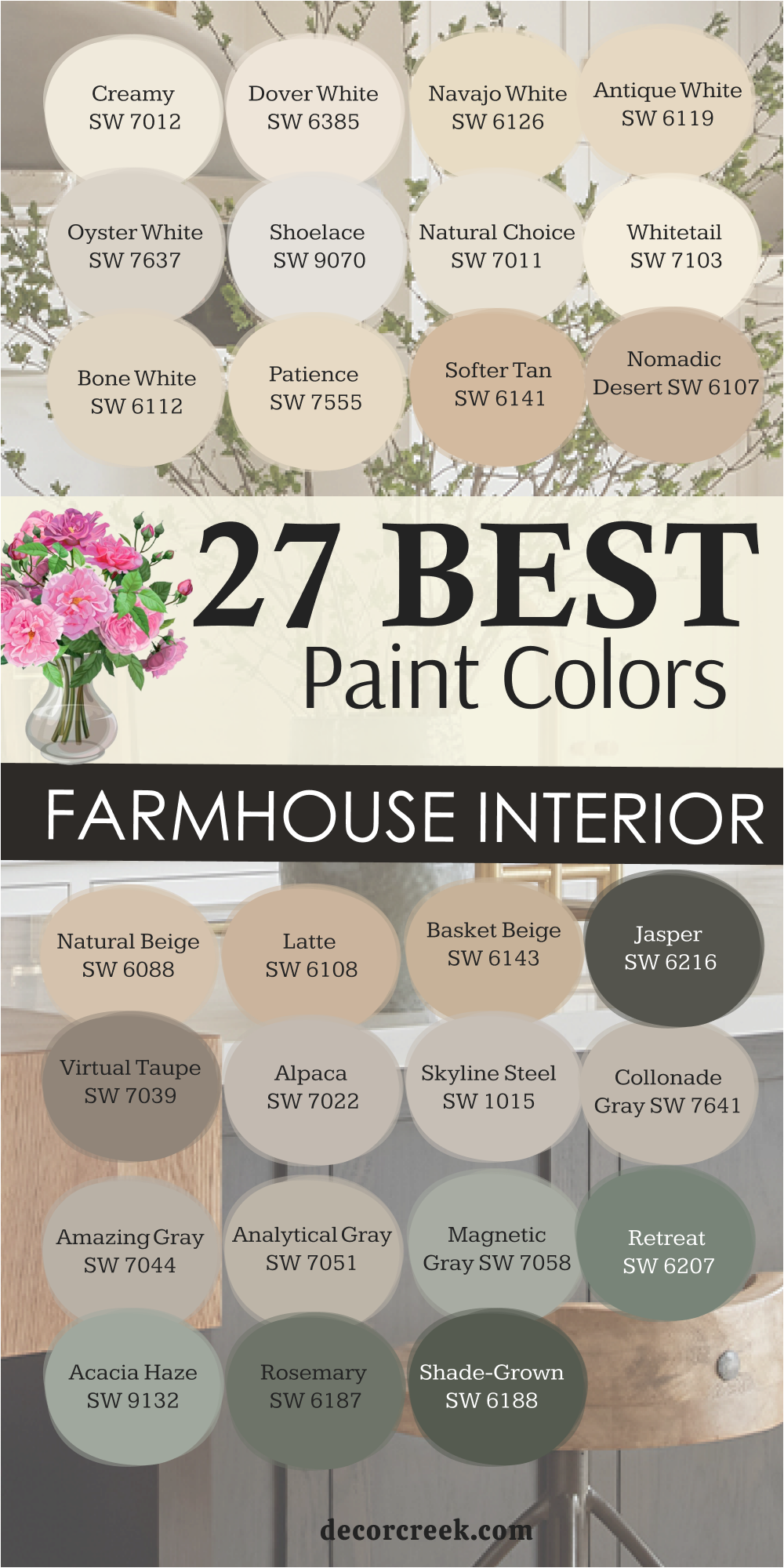
26 best farmhouse exterior paint colors
Westhighland White SW 7566
Westhighland White is one of those shades that never feels too bright or too soft—it’s perfectly balanced. It has a creamy undertone that gives exteriors warmth without yellowing. I love using it on farmhouse siding because it reflects natural light beautifully, making homes glow from sunrise to sunset. It pairs perfectly with black shutters, wood doors, or bronze fixtures. This color feels classic, confident, and endlessly versatile. Whether surrounded by green fields or stone pathways, Westhighland White always feels inviting. It’s bright enough to stand out but warm enough to stay welcoming. The key rule of this color for farmhouse style is to use it when you want a true white that feels natural and lived-in outdoors.
Best used in: exterior siding, trim, and front porches
Pairs well with: Pure White SW 7005, High Reflective White SW 7757, and shiny gold accents. The key rule of this color for Art Deco style is to use it where you want to create a strong contrast against light-colored floors or bright metallic decorations.
🎨 Check out the complete guide to this color right HERE 👈

Incredible White SW 7028
Incredible White has a quiet, timeless quality that works beautifully on farmhouse exteriors. It’s a soft, pale gray with warm undertones that keep it from feeling cold. I love how it shifts with the light—fresh in the morning, gentle by dusk. It pairs beautifully with black trim, wooden shutters, and natural stone details. Incredible White gives exteriors that effortless charm, balancing brightness with warmth. It looks especially lovely on wide siding or board-and-batten, where its subtle tone brings depth and softness. It’s elegant without trying too hard. The key rule of this color for farmhouse style is to use it where you want gentle light and clean lines that stay welcoming.
Best used in: whole-house exterior, entryways, and window trim
Pairs well with: Pure White SW 7005, High Reflective White SW 7757, and shiny gold accents. The key rule of this color for Art Deco style is to use it where you want to create a strong contrast against light-colored floors or bright metallic decorations.
🎨 Check out the complete guide to this color right HERE 👈

Egret White SW 7570
Egret White feels warm and graceful, like a soft blend of cream and gray. It’s one of my favorite neutrals for exteriors because it complements both dark and light trim beautifully. It brings an earthy richness that fits perfectly into farmhouse design. In sunlight, Egret White feels bright but not glaring; in shade, it takes on a cozy, grounded tone. It pairs wonderfully with wood accents, brick details, or black windows. This color works in every season—sunlit summers, snowy winters, rainy days—it always feels balanced. The key rule of this color for farmhouse style is to use it when you want sophistication that still feels like home.
Best used in: exterior siding, columns, and garage doors
Pairs well with: Pure White SW 7005, High Reflective White SW 7757, and shiny gold accents. The key rule of this color for Art Deco style is to use it where you want to create a strong contrast against light-colored floors or bright metallic decorations.
🎨 Check out the complete guide to this color right HERE 👈
Creamy SW 7012
Creamy brings warmth to exteriors in a way few whites can. It’s full of golden undertones that give homes a soft, inviting glow. I love how it makes porches, trim, and siding look sunlit even on cloudy days. Paired with black or green shutters, it looks both classic and cheerful. On brick or stone, Creamy brings harmony and brightness without harsh contrast. It’s that rare exterior white that stays warm through every season. This shade works beautifully for homes surrounded by trees, as it balances natural shadows and greenery perfectly. The key rule of this color for farmhouse style is to use it when you want light that feels warm, soft, and welcoming.
Best used in: exterior body, trim, and front doors
Pairs well with: Pure White SW 7005, High Reflective White SW 7757, and shiny gold accents. The key rule of this color for Art Deco style is to use it where you want to create a strong contrast against light-colored floors or bright metallic decorations.
🎨 Check out the complete guide to this color right HERE 👈
Pearly White SW 7009
Pearly White feels polished and graceful—it’s a clean white with just a touch of warmth that keeps it from feeling sterile. I use it for exteriors where I want brightness with quiet depth. It pairs beautifully with dark window trim, aged bronze hardware, and wood accents. Pearly White glows under sunlight but softens beautifully in the evening. It’s elegant without pretense, modern but still comforting. The tone stays consistent through all seasons, keeping the home timeless and fresh. The key rule of this color for farmhouse style is to use it where brightness and softness should live together effortlessly.
Best used in: exterior siding, shutters, and gables
Pairs well with: Pure White SW 7005, High Reflective White SW 7757, and shiny gold accents. The key rule of this color for Art Deco style is to use it where you want to create a strong contrast against light-colored floors or bright metallic decorations.
🎨 Check out the complete guide to this color right HERE 👈
Natural Choice SW 7011
Natural Choice carries a creamy undertone that feels both refined and welcoming. It’s one of my go-to whites for farmhouse exteriors because it blends beautifully with surrounding landscapes. Against greenery, it looks bright and peaceful; near stone or brick, it feels natural and warm. Natural Choice pairs perfectly with deep gray or wood accents, bringing balance and depth. It’s simple but full of life, adding that handcrafted charm that defines farmhouse design. The key rule of this color for farmhouse style is to use it when you want a warm neutral that fits naturally with its surroundings.
Best used in: porch ceilings, exterior walls, and trim
Pairs well with: Pure White SW 7005, High Reflective White SW 7757, and shiny gold accents. The key rule of this color for Art Deco style is to use it where you want to create a strong contrast against light-colored floors or bright metallic decorations.
🎨 Check out the complete guide to this color right HERE 👈
Dover White SW 6385
Dover White always feels happy—it’s warm, creamy, and full of light. I love it on farmhouse exteriors because it glows in every kind of weather. It pairs beautifully with dark trim or muted green shutters for a charming contrast. Dover White softens architectural lines, giving homes a graceful, inviting look. It’s especially lovely with stone foundations or brick pathways. This shade has personality without flash—it looks timeless and welcoming from the very first glance. The key rule of this color for farmhouse style is to use it when you want a classic white that radiates comfort.
Best used in: exterior trim, soffits, and window frames
Pairs well with: Pure White SW 7005, High Reflective White SW 7757, and shiny gold accents. The key rule of this color for Art Deco style is to use it where you want to create a strong contrast against light-colored floors or bright metallic decorations.
🎨 Check out the complete guide to this color right HERE 👈
Shoji White SW 7042
Shoji White brings quiet warmth to farmhouse exteriors. It’s a beige-gray blend that feels natural and authentic, perfect for homes surrounded by trees or open fields. I love using it with black or bronze windows, which highlight its soft undertone beautifully. It looks refined and rustic at the same time. In morning light, Shoji White feels light and creamy; at sunset, it deepens into a cozy tone that feels aged and elegant. This is a color that works for both traditional and modern farmhouses—it bridges both effortlessly. The key rule of this color for farmhouse style is to use it when you want approachable elegance and timeless calm.
Best used in: modern farmhouse exteriors, siding, and brick
Pairs well with: Pure White SW 7005, High Reflective White SW 7757, and shiny gold accents. The key rule of this color for Art Deco style is to use it where you want to create a strong contrast against light-colored floors or bright metallic decorations.
🎨 Check out the complete guide to this color right HERE 👈
Maison Blanche SW 7526
Maison Blanche feels vintage yet current—a pale beige with a soft, powdery warmth that adds character to farmhouse exteriors. I love using it for homes with wood accents or stone bases because it highlights texture beautifully. It pairs well with muted greens, grays, and browns, giving the home a harmonious, layered look. Maison Blanche brings charm and familiarity—it feels collected and graceful. In every light, it maintains warmth and softness without losing brightness. The key rule of this color for farmhouse style is to use it when you want your exterior to feel warm, classic, and quietly elegant.
Best used in: exterior siding, entryways, and columns
Pairs well with: Pure White SW 7005, High Reflective White SW 7757, and shiny gold accents. The key rule of this color for Art Deco style is to use it where you want to create a strong contrast against light-colored floors or bright metallic decorations.
🎨 Check out the complete guide to this color right HERE 👈
Modern Gray SW 7632
Modern Gray is the perfect balance of neutral warmth and clean structure. It’s a mid-tone greige that looks sophisticated but approachable on farmhouse exteriors. I love pairing it with crisp white trim and wood accents—it makes every detail pop. In daylight, it feels fresh and bright; in shadow, it gains beautiful depth. Modern Gray works for every architectural style but feels especially at home in a modern farmhouse design. It’s easy to maintain and looks grounded against any landscape. The key rule of this color for farmhouse style is to use it when you want a modern neutral that still feels warm and welcoming.
Best used in: whole-house exterior, shutters, and garage doors
Pairs well with: Pure White SW 7005, High Reflective White SW 7757, and shiny gold accents. The key rule of this color for Art Deco style is to use it where you want to create a strong contrast against light-colored floors or bright metallic decorations.
🎨 Check out the complete guide to this color right HERE 👈
Skyline Steel SW 1015
Skyline Steel brings calm and polish to exteriors. It’s a balanced greige that looks refined without being cold. I love using it for homes with wide siding or tall gables—it makes the structure feel smooth and cohesive. Skyline Steel pairs beautifully with black or white trim, natural wood, and stone. In sunlight, it feels open and airy; in shadow, it deepens with quiet richness. This shade fits perfectly into nature—it feels timeless, not trendy. The key rule of this color for farmhouse style is to use it when you want subtle sophistication with an earthy base.
Best used in: exterior body, trim, and accent gable
Pairs well with: Pure White SW 7005, High Reflective White SW 7757, and shiny gold accents. The key rule of this color for Art Deco style is to use it where you want to create a strong contrast against light-colored floors or bright metallic decorations.
🎨 Check out the complete guide to this color right HERE 👈
Amazing Gray SW 7044
Amazing Gray feels calm, confident, and classic. It’s a warm gray that flatters every exterior material—wood, metal, stone, or brick. I often use it on farmhouse siding with bright white trim to create a clean, layered contrast. It holds its tone beautifully through every season, looking polished in summer and cozy in winter. Amazing Gray gives homes a timeless presence—it feels structured without being formal. The key rule of this color for farmhouse style is to use it when you want gentle contrast and lasting charm.
Best used in: exterior siding, shutters, and front doors
Pairs well with: Pure White SW 7005, High Reflective White SW 7757, and shiny gold accents. The key rule of this color for Art Deco style is to use it where you want to create a strong contrast against light-colored floors or bright metallic decorations.
🎨 Check out the complete guide to this color right HERE 👈
Collonade Gray SW 7641
Collonade Gray is graceful and easy to love. It’s warm, neutral, and full of balance. I use it for farmhouse exteriors that need brightness without pure white. It pairs beautifully with black shutters, bronze hardware, or natural wood trim. Collonade Gray feels sophisticated but homey, fitting both modern and classic designs. It’s especially beautiful in evening light when it takes on a golden undertone.
Outdoors, it’s a perfect “quiet” color—never too bold, never too pale. The key rule of this color for farmhouse style is to use it when you want timeless warmth with clean, soft edges.
Best used in: exterior siding, porches, and columns
Pairs well with: Pure White SW 7005, High Reflective White SW 7757, and shiny gold accents. The key rule of this color for Art Deco style is to use it where you want to create a strong contrast against light-colored floors or bright metallic decorations.
Alpaca SW 7022
Alpaca is subtle and graceful—a soft greige that works perfectly for exteriors with natural finishes. It looks stunning alongside stone, brick, or cedar accents. I love how it shifts gently with the light—sometimes beige, sometimes gray, always warm. Alpaca gives a farmhouse exterior a soft, layered look that feels relaxed yet refined. It pairs beautifully with deep brown or black trim for a modern touch. The key rule of this color for farmhouse style is to use it when you want understated elegance and softness.
Best used in: whole-house exterior, entryways, and siding
Pairs well with: Pure White SW 7005, High Reflective White SW 7757, and shiny gold accents. The key rule of this color for Art Deco style is to use it where you want to create a strong contrast against light-colored floors or bright metallic decorations.
🎨 Check out the complete guide to this color right HERE 👈
Analytical Gray SW 7051
Analytical Gray feels thoughtful and balanced, which makes it perfect for large farmhouse exteriors. It’s warm but clean, never muddy or dull. I use it on siding with white or cream trim for a classic combination. Analytical Gray adds depth while keeping an overall airy feel. It’s also lovely on detached barns or sheds where you want a color that blends into the landscape. It’s easy to live with and works beautifully across styles. The key rule of this color for farmhouse style is to use it when you want a calm, timeless tone that feels grounded.
Best used in: exterior body, shutters, and trim
Pairs well with: Pure White SW 7005, High Reflective White SW 7757, and shiny gold accents. The key rule of this color for Art Deco style is to use it where you want to create a strong contrast against light-colored floors or bright metallic decorations.
🎨 Check out the complete guide to this color right HERE 👈
Keystone Gray SW 7504
Keystone Gray is rich, earthy, and full of character. It’s a deeper greige with brown undertones that gives farmhouse exteriors a warm, natural weight. I love pairing it with crisp white trim and warm wood doors. It feels grounded and classic, perfect for homes surrounded by fields or wooded landscapes. In sunlight, it shows a soft sheen; in shade, it turns into a cozy, grounded neutral. Keystone Gray has a reassuring presence—it makes a home look confident and welcoming. The key rule of this color for farmhouse style is to use it when you want depth and stability with lasting appeal.
Best used in: exterior siding, garage doors, and accents
Pairs well with: Pure White SW 7005, High Reflective White SW 7757, and shiny gold accents. The key rule of this color for Art Deco style is to use it where you want to create a strong contrast against light-colored floors or bright metallic decorations.
🎨 Check out the complete guide to this color right HERE 👈
Intellectual Gray SW 7045
Intellectual Gray has a quiet sophistication that feels both smart and comforting. It’s a medium warm gray that pairs perfectly with crisp whites and natural woods. I often use it for exteriors where a soft contrast feels right. It’s elegant but never showy. Intellectual Gray looks particularly beautiful in changing light—it keeps the home consistent through sun and shade. Outdoors, it feels calm and timeless. The key rule of this color for farmhouse style is to use it where you want subtle richness and structure without darkness.
Best used in: whole-house exterior, siding, and trim
Pairs well with: Pure White SW 7005, High Reflective White SW 7757, and shiny gold accents. The key rule of this color for Art Deco style is to use it where you want to create a strong contrast against light-colored floors or bright metallic decorations.
🎨 Check out the complete guide to this color right HERE 👈
Porpoise SW 7047
Porpoise is strong, modern, and warm—a dark taupe that adds drama while staying inviting. I love it for farmhouse exteriors where a little contrast makes a big difference. It pairs beautifully with creamy trim and natural stone. Porpoise creates beautiful dimension in daylight, then turns velvety soft at dusk. It’s perfect for accent features like shutters, doors, or gables. This shade gives a sense of permanence—it feels classic, not trendy. The key rule of this color for farmhouse style is to use it where depth meets calm elegance.
Best used in: accent siding, front doors, and shutters
Pairs well with: Pure White SW 7005, High Reflective White SW 7757, and shiny gold accents. The key rule of this color for Art Deco style is to use it where you want to create a strong contrast against light-colored floors or bright metallic decorations.
🎨 Check out the complete guide to this color right HERE 👈

Anonymous SW 7046
Anonymous feels grounded and confident—it’s a rich, medium-dark gray with brown undertones. It looks incredible on farmhouse exteriors, especially when paired with crisp white trim. This color works beautifully with stone, brick, and natural wood, giving homes warmth and character. It shifts slightly with the light, creating a cozy feel in every season. Anonymous is perfect for those who want contrast without harshness. The key rule of this color for farmhouse style is to use it when you want to make a statement while keeping your home inviting.
Best used in: exterior siding, gables, and columns
Pairs well with: Pure White SW 7005, High Reflective White SW 7757, and shiny gold accents. The key rule of this color for Art Deco style is to use it where you want to create a strong contrast against light-colored floors or bright metallic decorations.
🎨 Check out the complete guide to this color right HERE 👈
Urbane Bronze SW 7048
Urbane Bronze adds richness and depth, perfect for modern farmhouse exteriors. It’s a dark bronze-gray with earthy undertones that bring elegance and structure. I use it for front doors, trim, and accent siding—it pairs beautifully with whites, creams, and natural wood. In sunlight, it glows with a subtle warmth; in shadow, it feels calm and solid. Urbane Bronze adds a sense of permanence, making homes feel rooted and intentional. The key rule of this color for farmhouse style is to use it when you want contrast that feels strong but comfortable.
Best used in: accent siding, trim, and front doors
Pairs well with: Pure White SW 7005, High Reflective White SW 7757, and shiny gold accents. The key rule of this color for Art Deco style is to use it where you want to create a strong contrast against light-colored floors or bright metallic decorations.
🎨 Check out the complete guide to this color right HERE 👈
Black Fox SW 7020
Black Fox is deep, rich, and full of personality. It’s a dark brown-gray that brings bold contrast without harshness. I love using it for farmhouse doors, shutters, and window trim. It pairs beautifully with creamy whites and wood details. Black Fox adds sophistication and balance—it grounds the home while highlighting its textures. It’s especially stunning in the golden light of late afternoon. The key rule of this color for farmhouse style is to use it when you want subtle drama and timeless elegance.
Best used in: exterior accents, shutters, and garage doors
Pairs well with: Pure White SW 7005, High Reflective White SW 7757, and shiny gold accents. The key rule of this color for Art Deco style is to use it where you want to create a strong contrast against light-colored floors or bright metallic decorations.
🎨 Check out the complete guide to this color right HERE 👈

Tricorn Black SW 6258
Tricorn Black is crisp, modern, and classic all at once. It’s a true black with clean edges that brings sharp definition to farmhouse exteriors. I love pairing it with white siding for a striking contrast that never goes out of style. It also works beautifully on doors, shutters, and metal roofs. Tricorn Black adds elegance and simplicity, highlighting architectural details without distraction. It’s that finishing touch that gives a home personality and polish. The key rule of this color for farmhouse style is to use it when you want bold contrast that feels strong and smart.
Best used in: front doors, shutters, and window trim
Pairs well with: Pure White SW 7005, High Reflective White SW 7757, and shiny gold accents. The key rule of this color for Art Deco style is to use it where you want to create a strong contrast against light-colored floors or bright metallic decorations.
🎨 Check out the complete guide to this color right HERE 👈

Iron Ore SW 7069
Iron Ore is one of my favorite deep shades for farmhouse homes. It’s softer than black but still bold, with warm undertones that make it approachable. It works beautifully for siding, trim, or doors. Iron Ore pairs perfectly with white or tan walls, adding instant balance. It feels elegant yet grounded, perfect for both classic and modern farmhouse styles. Outdoors, it glows in sunlight and deepens in shade. The key rule of this color for farmhouse style is to use it when you want depth with a natural warmth.
Best used in: window trim, modern farmhouse siding, and entryways
Pairs well with: Pure White SW 7005, High Reflective White SW 7757, and shiny gold accents. The key rule of this color for Art Deco style is to use it where you want to create a strong contrast against light-colored floors or bright metallic decorations.
🎨 Check out the complete guide to this color right HERE 👈
Pewter Green SW 6208
Pewter Green brings earthy beauty and character to farmhouse exteriors. It’s a muted green-gray that connects perfectly with natural surroundings. I love using it with white trim and wood doors—it feels rustic but refined. Pewter Green shifts with the light, always looking fresh and rich. It’s stunning on siding, shutters, or porches, creating a calm, balanced exterior. This color feels peaceful and timeless, like something that belongs to the landscape itself. The key rule of this color for farmhouse style is to use it when you want harmony between nature and home.
Best used in: front doors, shutters, and exterior accents
Pairs well with: Pure White SW 7005, High Reflective White SW 7757, and shiny gold accents. The key rule of this color for Art Deco style is to use it where you want to create a strong contrast against light-colored floors or bright metallic decorations.
🎨 Check out the complete guide to this color right HERE 👈
Rosemary SW 6187
Rosemary feels grounded and natural, a perfect deep green for farmhouse exteriors. It carries both richness and calm, giving homes an organic sophistication. It pairs beautifully with cream trim, dark hardware, and wood accents. Rosemary changes gently through the day—fresh and green in the morning, deeper and cozier by evening. It’s elegant but never fussy. Outdoors, it creates a strong connection to nature, especially surrounded by trees or gardens. The key rule of this color for farmhouse style is to use it when you want earthy warmth that feels timeless.
Best used in: exterior siding, garage doors, and accents
Pairs well with: Pure White SW 7005, High Reflective White SW 7757, and shiny gold accents. The key rule of this color for Art Deco style is to use it where you want to create a strong contrast against light-colored floors or bright metallic decorations.
🎨 Check out the complete guide to this color right HERE 👈
Sea Serpent SW 7615
Sea Serpent is deep, confident, and full of charm. It’s a navy-gray that adds beautiful contrast to farmhouse exteriors. I love it for doors, shutters, or entire facades—it’s bold but still soft enough to feel classic. It pairs wonderfully with white trim, wood doors, and brass lighting. Sea Serpent looks rich under sunlight and dramatic in shade, giving homes presence without overpowering. It’s perfect for those who want a farmhouse that feels both modern and enduring. The key rule of this color for farmhouse style is to use it when you want sophistication with heart.
Best used in: front doors, accent walls, and shutters
Pairs well with: Pure White SW 7005, High Reflective White SW 7757, and shiny gold accents. The key rule of this color for Art Deco style is to use it where you want to create a strong contrast against light-colored floors or bright metallic decorations.
🎨 Check out the complete guide to this color right HERE 👈
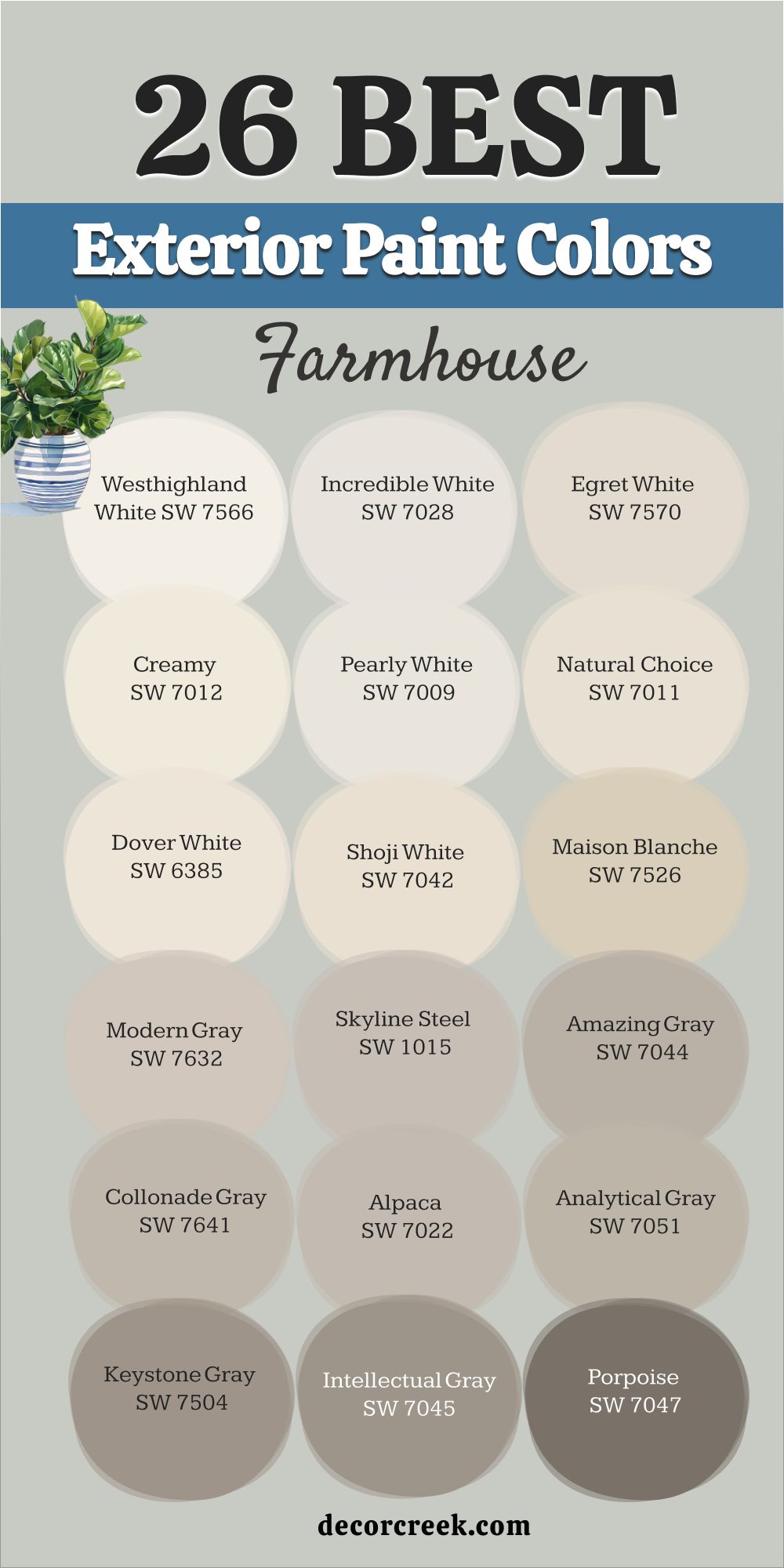
18 Best Green Farmhouse Paint Color Ideas
Clary Sage SW 6178
Clary Sage feels soft, grounded, and completely at home in any farmhouse. It’s a muted green with a touch of gray that makes it both natural and elegant. I love how it brings a sense of calm while still adding color and warmth. On kitchen cabinets or walls, it creates a welcoming, earthy mood that feels timeless. Clary Sage pairs beautifully with white trim, warm wood, and soft brass hardware. Outdoors, it blends beautifully with the landscape, giving exteriors a gentle, organic presence. This color never shouts—it whispers comfort and familiarity. The key rule of this color for farmhouse style is to use it where you want peace, warmth, and a connection to nature.
Best used in: kitchen islands, master bedrooms, and laundry rooms
Pairs well with: Pure White SW 7005, High Reflective White SW 7757, and shiny gold accents. The key rule of this color for Art Deco style is to use it where you want to create a strong contrast against light-colored floors or bright metallic decorations.
🎨 Check out the complete guide to this color right HERE 👈
Softened Green SW 6177
Softened Green feels like a gentle breeze on a warm afternoon. It’s light, airy, and full of freshness without feeling too cool. I love using it in bedrooms, bathrooms, or dining areas where a soft, natural palette is needed. It pairs beautifully with off-whites, beige tones, and aged wood. In bright light, it looks crisp and refreshing; in evening light, it deepens just slightly for a cozy, lived-in feeling. Softened Green has that subtle charm that brings quiet happiness to every space. The key rule of this color for farmhouse style is to use it when you want gentle energy that stays calm and inviting.
Best used in: entryways, bathrooms, and nurseries
Pairs well with: Pure White SW 7005, High Reflective White SW 7757, and shiny gold accents. The key rule of this color for Art Deco style is to use it where you want to create a strong contrast against light-colored floors or bright metallic decorations.
🎨 Check out the complete guide to this color right HERE 👈
Svelte Sage SW 6164
Svelte Sage carries an earthy grace that works perfectly for farmhouse interiors. It’s a balanced green-gray with a hint of warmth that keeps it from feeling cool or dusty. I use it in living rooms or kitchens to bring quiet depth and comfort. It pairs beautifully with natural wood beams, light trim, and brass accents. In daylight, it feels open and refreshing; in the evening, it turns richer and more grounded. Svelte Sage adds a layer of organic charm that makes a home feel rooted and complete. The key rule of this color for farmhouse style is to use it when you want quiet beauty that feels grown and graceful.
Best used in: dining rooms, living areas, and mudrooms
Pairs well with: Pure White SW 7005, High Reflective White SW 7757, and shiny gold accents. The key rule of this color for Art Deco style is to use it where you want to create a strong contrast against light-colored floors or bright metallic decorations.
🎨 Check out the complete guide to this color right HERE 👈
Halcyon Green SW 6213
Halcyon Green feels like a breath of fresh air—it’s soft, balanced, and full of charm. It’s a muted blue-green that brings a cool, relaxed tone to farmhouse spaces. I often use it in kitchens or sunrooms, where natural light enhances its calm personality. It pairs beautifully with crisp white trim, black accents, and light wood. Halcyon Green makes spaces feel connected to the outdoors, yet polished and cozy at the same time. It’s perfect for those who want color that’s soothing but never flat. The key rule of this color for farmhouse style is to use it when you want a breezy, comfortable feel with lasting warmth.
Best used in: bedrooms, home offices, and accent walls
Pairs well with: Pure White SW 7005, High Reflective White SW 7757, and shiny gold accents. The key rule of this color for Art Deco style is to use it where you want to create a strong contrast against light-colored floors or bright metallic decorations.
🎨 Check out the complete guide to this color right HERE 👈
Rainwashed SW 6211
Rainwashed always feels like an open window on a spring morning. It’s a soft blue-green that carries both freshness and warmth. I love using it in bedrooms, bathrooms, and laundry rooms to add color that feels peaceful but still lively. It pairs beautifully with whites, sandy neutrals, and light wood finishes. In natural light, it feels airy and clean; in the evening, it deepens slightly, adding cozy depth. Rainwashed brings the perfect mix of simplicity and charm to farmhouse design. The key rule of this color for farmhouse style is to use it when you want soft color that refreshes without overpowering.
Best used in: bathrooms, sunrooms, and laundry rooms
Pairs well with: Pure White SW 7005, High Reflective White SW 7757, and shiny gold accents. The key rule of this color for Art Deco style is to use it where you want to create a strong contrast against light-colored floors or bright metallic decorations.
🎨 Check out the complete guide to this color right HERE 👈

Acacia Haze SW 9132
Acacia Haze feels calm and mature, like a color that’s been part of the home forever. It’s a muted gray-green that adds quiet richness to interiors. I use it on kitchen cabinets or office walls where natural light helps it breathe. It pairs perfectly with creamy whites, warm metals, and light oak. Acacia Haze feels grounded and organic—it’s the kind of shade that soothes the eye without fading into the background. Outdoors, it brings balance to brick or stone, adding depth that feels natural and welcoming. The key rule of this color for farmhouse style is to use it when you want soft sophistication and a timeless connection to nature.
Best used in: cabinetry, entryways, and bedrooms
Pairs well with: Pure White SW 7005, High Reflective White SW 7757, and shiny gold accents. The key rule of this color for Art Deco style is to use it where you want to create a strong contrast against light-colored floors or bright metallic decorations.
🎨 Check out the complete guide to this color right HERE 👈
Retreat SW 6207
Retreat has a cozy confidence that makes a home feel calm and lived-in. It’s a deep gray-green that feels steady and classic. I love using it on cabinets, accent walls, or exteriors for a rich, organic look. Retreat pairs beautifully with creamy whites, black details, and aged wood. It’s a shade that creates comfort and quiet energy all at once. In daylight, it feels strong but welcoming; in the evening, it becomes warm and serene. This color gives structure without heaviness. The key rule of this color for farmhouse style is to use it where you want a touch of nature’s strength in your home.
Best used in: dens, primary bedrooms, and library walls
Pairs well with: Pure White SW 7005, High Reflective White SW 7757, and shiny gold accents. The key rule of this color for Art Deco style is to use it where you want to create a strong contrast against light-colored floors or bright metallic decorations.
🎨 Check out the complete guide to this color right HERE 👈
Evergreen Fog SW 9130
Evergreen Fog feels calm and graceful, the kind of green that belongs in every farmhouse. It’s soft, balanced, and slightly warm, with a whisper of gray. I use it in bedrooms and kitchens where I want natural character without strong contrast. Evergreen Fog pairs beautifully with off-whites, brass fixtures, and oak tones. It feels different in every light—cooler in morning sun, richer by evening. Outdoors, it gives exteriors a gentle sophistication that’s easy to love. Evergreen Fog feels organic, steady, and effortless. The key rule of this color for farmhouse style is to use it when you want refined simplicity rooted in nature.
Best used in: whole-house walls, kitchen islands, and offices
Pairs well with: Pure White SW 7005, High Reflective White SW 7757, and shiny gold accents. The key rule of this color for Art Deco style is to use it where you want to create a strong contrast against light-colored floors or bright metallic decorations.
🎨 Check out the complete guide to this color right HERE 👈
Pewter Green SW 6208
Pewter Green is deep and confident—a shade that instantly adds richness to a farmhouse palette. It’s a muted green with gray undertones that keeps it grounded and elegant. I love using it for kitchen cabinets, built-ins, or front doors. It pairs beautifully with light wood, creamy whites, and warm brass. Pewter Green adds contrast that feels bold but never loud. Outdoors, it looks incredible against stone, brick, or cedar siding. This color has that enduring quality farmhouse design thrives on—it feels honest, strong, and full of life. The key rule of this color for farmhouse style is to use it when you want character that feels timeless and organic.
Best used in: mudrooms, accent walls, and cabinetry
Pairs well with: Pure White SW 7005, High Reflective White SW 7757, and shiny gold accents. The key rule of this color for Art Deco style is to use it where you want to create a strong contrast against light-colored floors or bright metallic decorations.
🎨 Check out the complete guide to this color right HERE 👈
Dried Thyme SW 6186
Dried Thyme feels like a walk through a garden in late summer—it’s earthy, rich, and comforting. It’s one of my favorite deep greens for farmhouse kitchens or accent walls. It pairs perfectly with creamy trim, warm metals, and natural fabrics. Dried Thyme adds quiet sophistication without feeling heavy. In daylight, it shows its soft green side; in evening light, it takes on a muted gray richness. Outdoors, it blends seamlessly with the landscape, making homes feel grounded and at peace. The key rule of this color for farmhouse style is to use it where you want warmth with a deep, natural soul.
Best used in: exterior accents, dining rooms, and furniture
Pairs well with: Pure White SW 7005, High Reflective White SW 7757, and shiny gold accents. The key rule of this color for Art Deco style is to use it where you want to create a strong contrast against light-colored floors or bright metallic decorations.
🎨 Check out the complete guide to this color right HERE 👈
Rosemary SW 6187
Rosemary carries depth and warmth in perfect balance. It’s a dark green with a soft gray base that makes it rich but not too strong. I love it on cabinets, doors, or feature walls—it adds structure and warmth instantly. Rosemary pairs beautifully with creamy trim, warm wood, and aged metal. Outdoors, it brings a natural charm that feels traditional yet current. This shade reminds me of herbs drying by the window—strong, earthy, and full of life. The key rule of this color for farmhouse style is to use it when you want depth that feels timeless and grounded.
Best used in: library walls, kitchen islands, and entryway
s Pairs well with: Pure White SW 7005, High Reflective White SW 7757, and shiny gold accents. The key rule of this color for Art Deco style is to use it where you want to create a strong contrast against light-colored floors or bright metallic decorations.
🎨 Check out the complete guide to this color right HERE 👈
Shade-Grown SW 6188
Shade-Grown is bold yet peaceful—it’s a deep forest green that adds cozy drama to farmhouse homes. I love using it in kitchens or on exterior siding where contrast creates warmth and character. It pairs beautifully with cream trim, dark hardware, and wood tones. In sunlight, it looks earthy and classic; in shadow, it becomes moody and rich. This color brings confidence without feeling formal. Shade-Grown makes any farmhouse feel rooted in nature and full of quiet strength. The key rule of this color for farmhouse style is to use it when you want dark color that feels elegant and inviting.
Best used in: dens, office accents, and basements
Pairs well with: Pure White SW 7005, High Reflective White SW 7757, and shiny gold accents. The key rule of this color for Art Deco style is to use it where you want to create a strong contrast against light-colored floors or bright metallic decorations.
🎨 Check out the complete guide to this color right HERE 👈
Oakmoss SW 6180
Oakmoss feels deep, organic, and full of personality. It’s an earthy green with a warm base that reminds me of shaded forests and garden paths. I use it on doors, built-ins, or exteriors to give a home instant character. Oakmoss pairs beautifully with cream, wood, and natural stone. It feels bold but familiar, confident but comfortable. This is a shade that brings the outside in, wrapping a home in richness and texture. The key rule of this color for farmhouse style is to use it where you want to celebrate nature’s strength and simplicity.
Best used in: traditional living rooms, trim, and gables
Pairs well with: Pure White SW 7005, High Reflective White SW 7757, and shiny gold accents. The key rule of this color for Art Deco style is to use it where you want to create a strong contrast against light-colored floors or bright metallic decorations.
🎨 Check out the complete guide to this color right HERE 👈
Rookwood Sash Green SW 2811
Rookwood Sash Green carries that vintage farmhouse spirit—it’s deep, earthy, and wonderfully traditional. I love it for front doors, shutters, or dining rooms where classic charm belongs. It pairs perfectly with creamy whites, black fixtures, and wood accents. The color feels warm under sunlight and turns beautifully dramatic as the light fades. It adds instant heritage and balance to modern homes, grounding them with history.
Rookwood Sash Green feels timeless yet personal. The key rule of this color for farmhouse style is to use it when you want depth and tradition in perfect harmony.
Best used in: front doors, shutters, and exterior trim
Pairs well with: Pure White SW 7005, High Reflective White SW 7757, and shiny gold accents. The key rule of this color for Art Deco style is to use it where you want to create a strong contrast against light-colored floors or bright metallic decorations.
Rosemary Sprig SW 6189
Rosemary Sprig is elegant and natural—a medium green that brings freshness and warmth. I often use it in kitchens or mudrooms where natural light brings out its earthy tone. It pairs beautifully with wood accents, cream walls, and soft metals. Rosemary Sprig gives homes that gentle energy that feels both clean and cozy. It’s easy to live with, offering enough color to make a statement but never too much.
Outdoors, it blends beautifully with garden greens and soft light. The key rule of this color for farmhouse style is to use it when you want natural brightness with a quiet, modern touch.
Best used in: nurseries, kitchens, and powder rooms Pairs well with: Pure White SW 7005, High Reflective White SW 7757, and shiny gold accents. The key rule of this color for Art Deco style is to use it where you want to create a strong contrast against light-colored floors or bright metallic decorations.
Succulent SW 9650
Succulent feels like calm and confidence painted on a wall. It’s a mid-tone green-gray that’s rich yet easygoing. I love it for kitchens, offices, and accent walls where color should feel subtle but full of depth. Succulent pairs perfectly with creamy whites, rattan textures, and soft brass finishes. In daylight, it feels fresh and alive; at night, it turns cozy and intimate. Outdoors, it adds modern charm to farmhouse exteriors while blending naturally with the environment. The key rule of this color for farmhouse style is to use it when you want balance between color and comfort.
Best used in: accent walls, cabinetry, and bathroom vanities
Pairs well with: Pure White SW 7005, High Reflective White SW 7757, and shiny gold accents. The key rule of this color for Art Deco style is to use it where you want to create a strong contrast against light-colored floors or bright metallic decorations.
🎨 Check out the complete guide to this color right HERE 👈

Sage Light SW 2851
Sage Light feels graceful and gentle—it’s a soft, weathered green that fits perfectly in farmhouse homes. I love using it in bedrooms, living rooms, and kitchens where quiet color feels best. It pairs beautifully with creamy whites, soft browns, and worn metals. Sage Light feels vintage and honest, the kind of color that looks better with time. Outdoors, it gives homes a soft, heritage-inspired glow. This shade brings calmness and charm in equal measure. The key rule of this color for farmhouse style is to use it when you want a touch of nature that feels elegant and light.
Best used in: bedrooms, sunrooms, and hallways
Pairs well with: Pure White SW 7005, High Reflective White SW 7757, and shiny gold accents. The key rule of this color for Art Deco style is to use it where you want to create a strong contrast against light-colored floors or bright metallic decorations.
🎨 Check out the complete guide to this color right HERE 👈
Vintage Vessel SW 9050
Vintage Vessel feels collected, artistic, and rich with warmth. It’s a muted green with hints of blue and gray, giving it depth and softness at once. I use it when I want color that feels layered and natural, especially on cabinetry or entryways. Vintage Vessel pairs beautifully with creamy whites, wood tones, and antique brass. It has that subtle patina that reminds me of weathered pottery—refined yet full of life. Outdoors, it feels historic and comforting. The key rule of this color for farmhouse style is to use it when you want artistic warmth that stays timeless.
Best used in: entryways, accent spaces, and mudrooms
Pairs well with: Pure White SW 7005, High Reflective White SW 7757, and shiny gold accents. The key rule of this color for Art Deco style is to use it where you want to create a strong contrast against light-colored floors or bright metallic decorations.
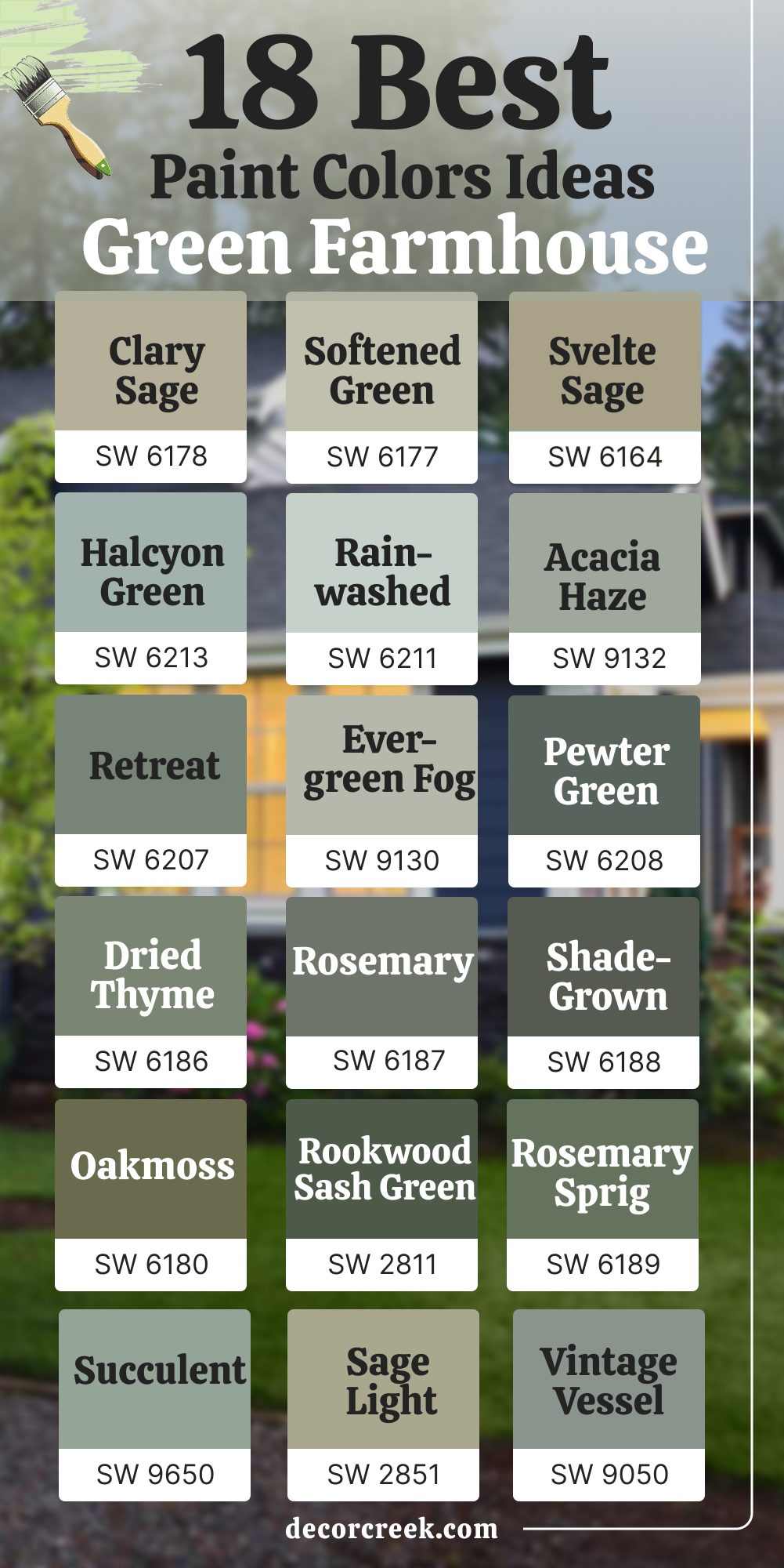
My Final Thoughts on Choosing Farmhouse Paint Colors
When I think about farmhouse colors, I don’t just think about paint—I think about how a home feels when you walk through the door. Every shade tells a story: the soft whites that glow in morning light, the warm beiges that hold the comfort of family gatherings, the greens that remind us of open fields and quiet evenings.
Choosing a farmhouse palette isn’t about chasing trends; it’s about building warmth, honesty, and connection. I’ve always believed the best colors don’t shout—they whisper kindness and stability.
They make your walls feel like part of the family, not just a backdrop.
The trick is to listen to what your home needs. If it craves light, bring in creamy whites. If it needs comfort, choose warm grays or earthy greens. Balance is everything—a mix of texture, tone, and feeling. And no matter which color you choose, make sure it reflects you. A farmhouse should never feel staged—it should feel lived in, loved, and full of quiet life.
That’s the true beauty of color: it doesn’t just change walls, it changes the way a home welcomes you every single day.