First impressions start the very second a guest walks through your front door. That initial moment is powerful; it creates an immediate emotional response that lingers throughout their stay. I have spent many years helping homeowners renovate and refine their spaces, ensuring their houses look polished and intentional for every visitor.
The entrance is far more than just a transition point; it sets the definitive mood for the entire house and serves as a visual prologue that tells a story about who lives there.
If the walls look dingy, scuffed, or the chosen shade simply doesn’t harmonize with the lighting, the whole house feels less inviting and disconnected.
Many people overlook how much a tired palette can weigh down the energy of a room.
Choosing the right paint is the easiest and most cost-effective way to transform your environment, making your home feel instantly friendly, vibrant, and happy. It is the foundation upon which all other decor is built.
I want to guide you through the process of picking a color that doesn’t just look “nice,” but one that makes you smile every time you turn the key and step inside after a long day.
Your home should be your sanctuary, and that feeling starts at the threshold.
Why I Always Trust Sherwin-Williams and Benjamin Moore for the Best Foyer Paint Colors
I only use paint that lasts a long time and looks the same on the wall as it does on the tiny paper chip. Sherwin-Williams makes paint that covers walls really well without needing many coats of liquid. Benjamin Moore has colors that look very rich and do not fade away when the sun hits them.
When I stage a house to sell it, I need the paint to look high quality and very clean. These two brands have the best selections for entryways because they handle light in a very nice way. You do not want to spend money on cheap paint that starts to peel or look muddy after a month.
I trust these companies because they have been around for a long time and all the pros love them. Your home is a big investment, so using the best paint is a very smart choice for your wallet.
How I Choose the Perfect Foyer Paint Color
I always start by looking at how much sun comes through the windows in the morning and afternoon. Dark rooms need light colors to keep them from feeling like a small cave or a basement. I also look at the floor to see if it is dark wood, gray stone, or light tile.
The walls should look good with the floor so nothing looks weird or clashing. I like to paint large samples on the wall before I decide on the final big bucket. Colors change throughout the day as the sun moves across the sky and hits the house.
A color might look great at noon but look strange when you turn on the lamps for dinner. I think about the feeling I want people to have when they enter the front door. Bright whites feel very clean, while deeper tones feel cozy and very solid for a family.
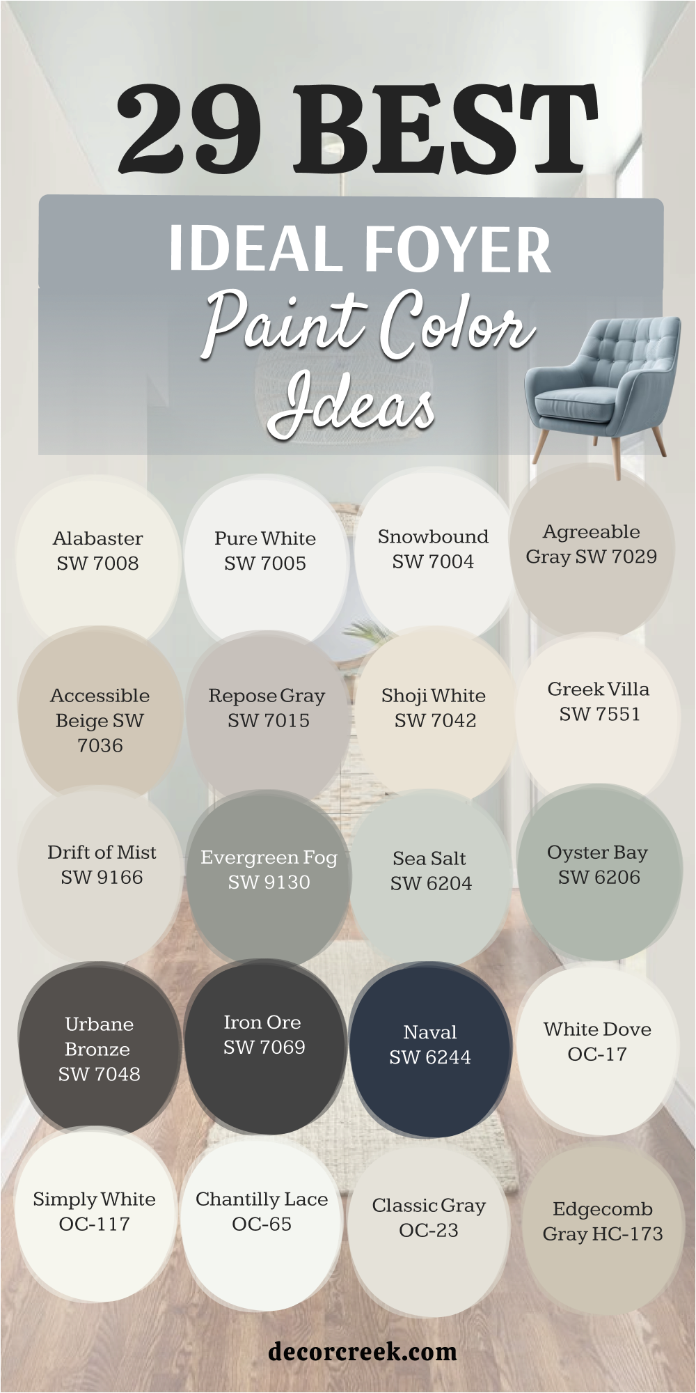
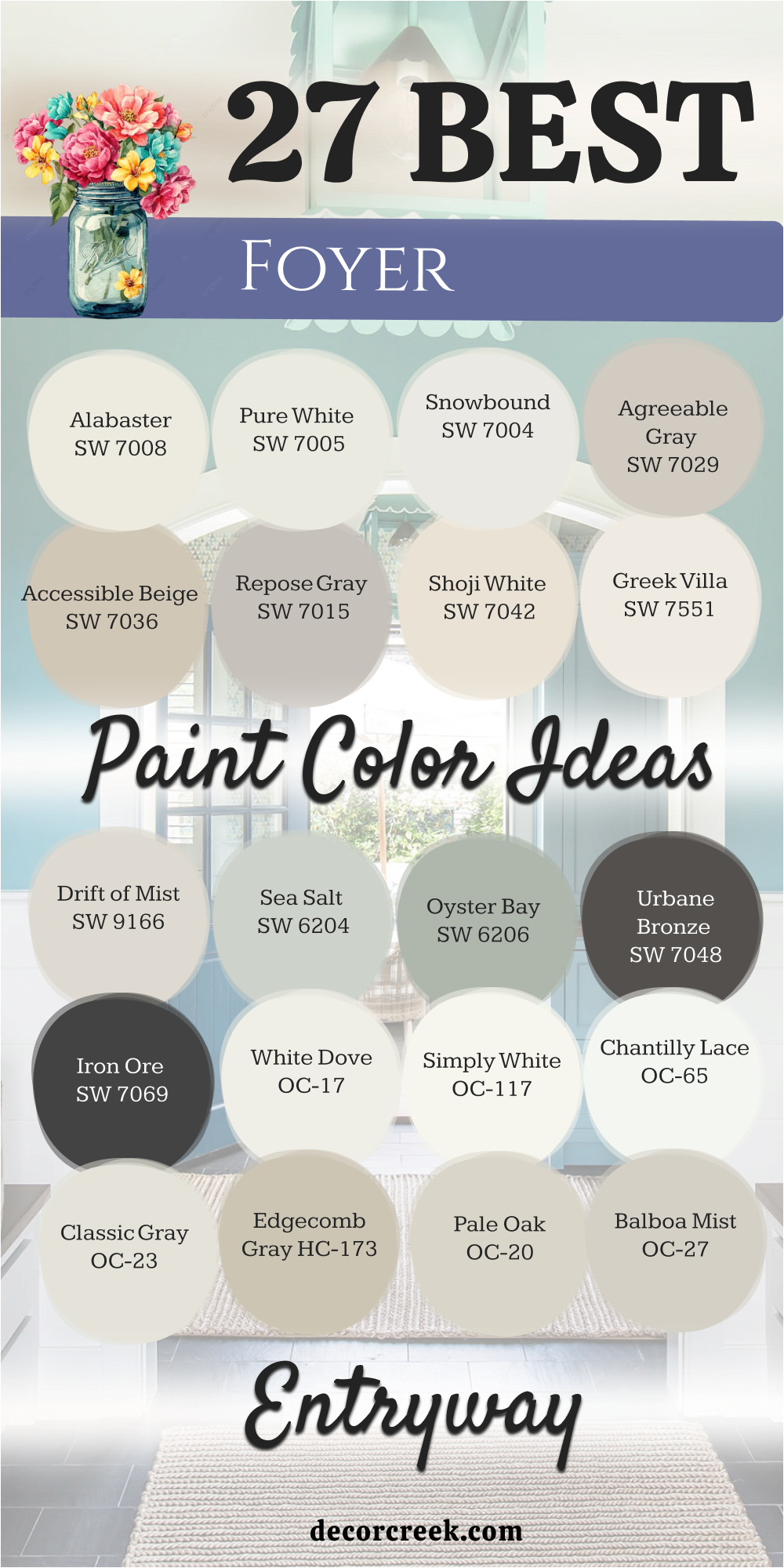
29 Ideal Foyer Paint Color Ideas for 2026
Alabaster SW 7008
Alabaster SW 7008 is a creamy white that feels very cozy and warm for any family. This shade works well because it is not too bright or too yellow for the walls. I use it often when I want a home to feel friendly and very bright inside. It looks great with wooden floors and dark metal handles on the front door.
You will notice it makes the entrance feel much bigger than it really is. Most people love this choice because it feels like a fresh start every day. It is a favorite for many builders because it fits almost any style of furniture.
The light bounces off this paint in a very soft way in the afternoon. It stays looking clean even if your home is very busy with kids or pets. This is a top pick for a classic look that never feels boring or old.
Best used in: living rooms, kitchens, hallways, bedrooms, and farmhouse exteriors
Pairs well with: Iron Ore SW 7069, Agreeable Gray SW 7029, Natural Linen SW 9109, warm wood tones The key rule of this color for farmhouse style is to use it where you want natural light to feel kind, soft, and inviting throughout the day.
🎨 Check out the complete guide to this color right HERE 👈

Pure White SW 7005
Pure White SW 7005 is a very versatile option that does not have any hidden blue or pink tones. This paint makes the trim and doors pop against the walls in a sharp way. I find it helpful for modern homes that need a crisp look for guests.
It is bright enough to lighten up a dark hallway that has no windows. The finish looks very professional and high-end on most surfaces in the house. Many designers pick this when they want a clean background for colorful art pieces.
It feels fresh and light without being cold like a doctor’s office. Guests will think your home looks very well maintained and tidy. It is a solid choice for a house with lots of big windows. You can trust this white to stay looking sharp for many years to come.
Best used in: cabinets, trim, ceilings, entryways, and modern exteriors
Pairs well with: Black Magic SW 6991, March Wind SW 7668, Greystone SW 7013, dark oak The key rule of this color for modern style is to use it where you want the architecture to stand out with a crisp and clean finish.
🎨 Check out the complete guide to this color right HERE 👈

Snowbound SW 7004
Snowbound SW 7004 has a tiny bit of gray in it which helps it look cool. This color is great if you have cool-toned furniture or blue rugs in the hall. I like using it in sunny entryways to keep the room from looking too hot.
It creates a very soft feeling when you walk inside from the garage. The walls will look smooth and very even with this shade of paint. It is a popular pick for homes that are near the water or the beach.
The light in the morning makes this color look very bright and happy. It works well with silver or chrome light fixtures hanging from the ceiling. Most people find it very easy to live with every single day. It gives a sense of order to a messy mudroom where shoes live.
Best used in: entryways, trim, bathrooms, and laundry rooms
Pairs well with: Naval SW 6244, Colonnade Gray SW 7641, Peak Veil SW 9558, marble The key rule of this color for coastal style is to use it to create a crisp and cool backdrop that highlights blue accents.
🎨 Check out the complete guide to this color right HERE 👈

Agreeable Gray SW 7029
Agreeable Gray SW 7029 is the most popular color for people who cannot decide on a shade. This paint looks good in every single house I have ever worked on lately. It changes slightly depending on the light but always looks nice to the eye.
I call it a safe choice because it matches almost everything you own. It makes the entryway feel updated and very stylish for the new year. You will like how it hides small fingerprints better than a bright white.
It provides a nice contrast against white baseboards and window frames. Many homeowners choose this for the whole house to make it feel connected. It is a warm shade that feels very comfortable for a growing family. This is a great choice if you want to sell your house quickly.
Best used in: whole-house painting, entryways, bedrooms, and open floor plans
Pairs well with: Mega Greige SW 7031, Incredible White SW 7028, Sea Salt SW 6204, dark wood floors The key rule of this color for transitional style is to use it as a bridge between warm and cool elements in your home.
🎨 Check out the complete guide to this color right HERE 👈

Accessible Beige SW 7036
Accessible Beige SW 7036 is a warm and earthy tone that feels very solid. This color does not look like the old yellow colors from the past. I use it when a room has lots of stone or brick elements. It makes a large entryway feel less empty and more like a home.
The shade stays true even under the light from your indoor bulbs. It is a very forgiving color for walls that are not perfectly smooth. You will feel a sense of warmth the moment you step inside. It looks amazing with leather furniture or big woven baskets on the floor.
This paint is very popular for traditional homes with a lot of history. It helps create a very grounded feeling in your main entrance.
Best used in: hallways, kitchens, dining rooms, and home offices
Pairs well with: Aesthetic White SW 7035, Urban Bronze SW 7048, Cadet SW 9143, stone accents The key rule of this color for traditional style is to use it to bring a sense of warmth and history to your main living areas.
🎨 Check out the complete guide to this color right HERE 👈

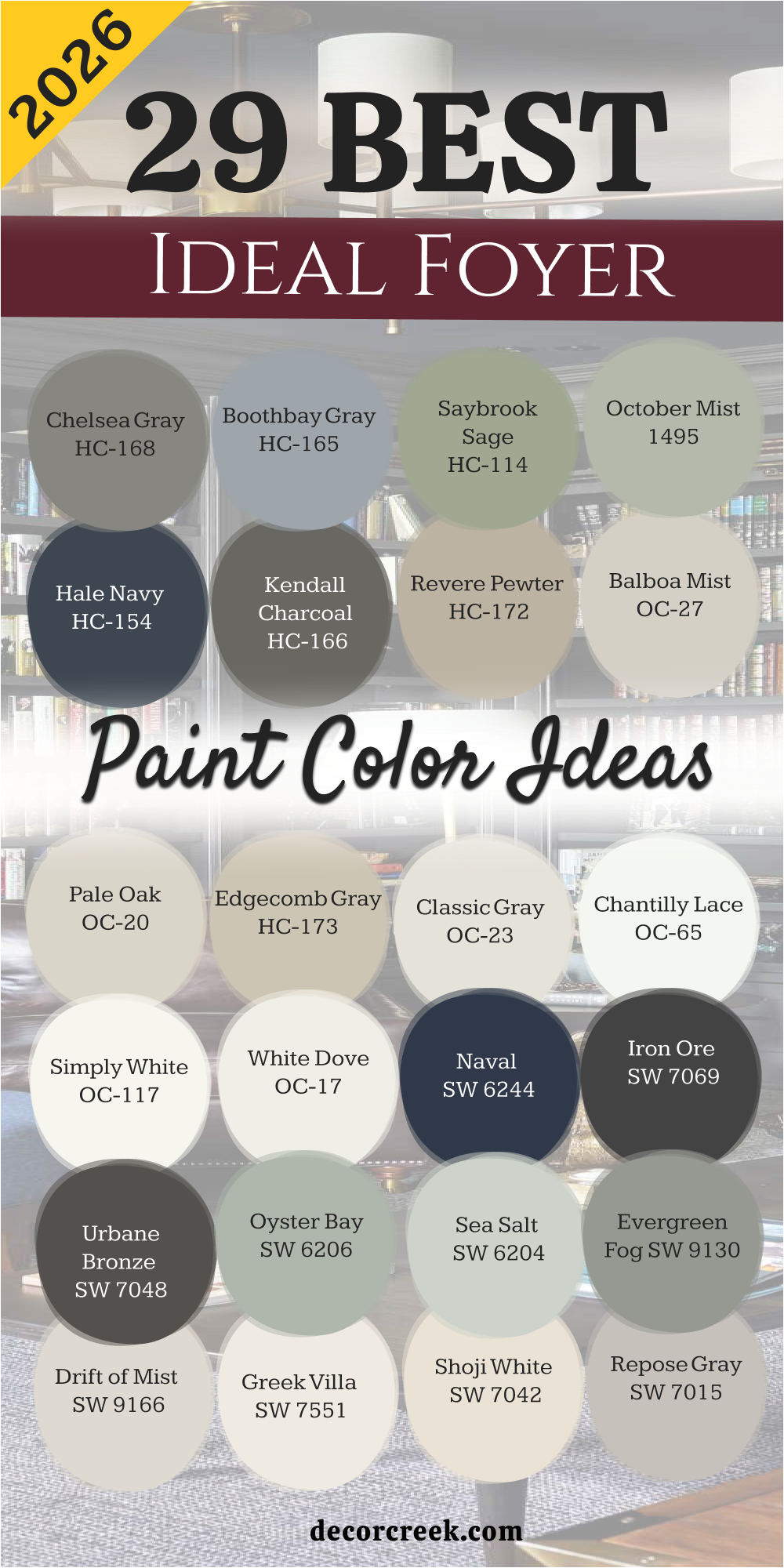
Repose Gray SW 7015
Repose Gray SW 7015 is a cool gray that still has a little bit of warmth. This is my favorite gray for entryways that get a lot of natural sun. It looks very sophisticated and expensive on the walls of the hall.
I often suggest this for people who want a very modern look. It creates a beautiful background for colorful wall decorations and family photos. The color looks very smooth and professional once the paint dries completely.
It is a great middle-ground color that isn’t too light or too dark. You will notice that it makes white trim look very bright and new. Most visitors will ask you for the name of this paint color. It is a very reliable choice for a high-traffic area of the home.
Best used in: entryways, living rooms, bedrooms, and kitchen cabinets
Pairs well with: Eider White SW 7014, Dorian Gray SW 7017, Pavestone SW 7642, navy blue The key rule of this color for contemporary style is to use it to provide a sleek and balanced background for bold furniture.
🎨 Check out the complete guide to this color right HERE 👈

Shoji White SW 7042
Shoji White SW 7042 is a very soft color that sits between white and cream. This shade is perfect for making a home feel very peaceful and quiet. I love how it looks with light wood floors and natural fiber rugs.
It is not as stark as a pure white so it feels more inviting. The paint has a glow to it when the sun hits the walls. I use this for homes that want a minimal and clean look. It works very well in entryways that lead into big open kitchens.
You will find that it makes your home feel very airy and light. It is a very light color but still has enough body to show up. This choice is great for a relaxing home where you can rest.
Best used in: entryways, bedrooms, exteriors, and ceilings
Pairs well with: Fawn Brindle SW 7640, Urban Bronze SW 7048, Pure White SW 7005, light oak The key rule of this color for minimal style is to use it to create a soft and seamless transition between different rooms.
🎨 Check out the complete guide to this color right HERE 👈

Greek Villa SW 7551
Greek Villa SW 7551 is a rich white that looks very fancy and high-end. This color has a sunny feel to it without being too yellow. I pick this when I want a foyer to look very bright and happy. It is a very popular choice for the exterior of the house too.
On the inside it makes the ceiling feel much higher than it is. You will love how it looks with gold or brass light fixtures. It feels like a vacation home every time you walk in the door.
The paint is very thick and covers the old walls beautifully. It is a warm white that makes everyone feel welcome right away. This is a great choice for a friendly and bright family home.
Best used in: entryways, living rooms, whole-house interiors, and trim
Pairs well with: In the Navy SW 9178, Alabaster SW 7008, Woodwork, warm metals The key rule of this color for Mediterranean style is to use it to capture and reflect as much natural light as possible.
🎨 Check out the complete guide to this color right HERE 👈

Drift of Mist SW 9166
Drift of Mist SW 9166 is a very light gray that looks like a soft cloud. This color is great for small foyers that need to feel much bigger. I use it when I want a hint of color without it being bold. It is a very airy shade that lets your furniture be the star.
The walls look very soft and clean with this paint on them. It is a great choice for a modern or coastal style home. You will like how it stays looking the same all day long.
It provides a very gentle contrast against white doors and trim. Most people find it very refreshing to look at when they enter. It is a smart pick for a light and bright entryway area.
Best used in: small entryways, bathrooms, bedrooms, and laundry rooms
Pairs well with: Quicksilver SW 6245, Tin Ceiling SW 9163, Pure White SW 7005, glass accents The key rule of this color for airy style is to use it to make small areas feel much more open and light.
🎨 Check out the complete guide to this color right HERE 👈

Evergreen Fog SW 9130
Evergreen Fog SW 9130 is a beautiful green that has a lot of gray. This color makes an entryway feel like a garden or a park. I love using it to add some personality to a new home. It is a very organic color that looks great with green plants.
The shade feels very grounded and strong on the walls of the foyer. You will notice that it makes a statement without being too loud or crazy. It is a very sophisticated choice for a modern farmhouse look.
The paint looks very rich and deep in the corners of the room. Most guests will find it very interesting and ask about the color. It is a great way to bring the feeling of nature inside.
Best used in: accent walls, entryways, cabinets, and home offices
Pairs well with: Shoji White SW 7042, Urban Bronze SW 7048, Uber Umber SW 9107, natural wood The key rule of this color for organic style is to use it to connect your indoor living area with the natural world outside.
🎨 Check out the complete guide to this color right HERE 👈

Sea Salt SW 6204
Sea Salt SW 6204 is a very popular green that has a lot of gray and blue mixed in. This color changes a lot depending on the light throughout the day. I find it very helpful for making a foyer feel fresh and very light.
It is one of the most famous colors for houses near the coast or beach. The walls look like the ocean on a very cloudy and soft morning. You will like how it makes a small entrance feel much more open.
It works perfectly with white trim and light wood furniture pieces. Most visitors will feel very relaxed as soon as they step inside your door. It is a light shade that does not feel boring or too plain. This is a top pick for anyone who loves a natural look.
Best used in: entryways, bathrooms, bedrooms, and laundry rooms
Pairs well with: Summit Gray SW 7669, Fleur de Sel SW 7666, Heron Plume SW 6070, weathered wood The key rule of this color for coastal style is to use it to bring a soft and natural feeling into your home through gentle color.
🎨 Check out the complete guide to this color right HERE 👈

Oyster Bay SW 6206
Oyster Bay SW 6206 is a deeper version of a green gray that looks very rich. This paint has a lot of personality and makes a room feel very solid. I suggest this for people who want color but do not want it to be too bright.
It looks very high-end when paired with dark wood or gold frames. The shade feels very cool and steady on the walls of the hall. You will notice it creates a very professional look for your main entrance.
It hides marks and scuffs very well in a busy house with many people. Many designers use this to create a look that feels very expensive and custom. It is a great middle-ground color that feels very grounded and strong. Most guests will think you hired a pro to pick this beautiful shade.
Best used in: entryways, dining rooms, kitchen islands, and exteriors
Pairs well with: Sea Salt SW 6204, Spare White SW 6203, Urban Bronze SW 7048, dark walnut The key rule of this color for sophisticated style is to use it to add depth and a touch of color to a neutral home.
🎨 Check out the complete guide to this color right HERE 👈

Urbane Bronze SW 7048
Urbane Bronze SW 7048 is a very dark and moody color that looks like warm metal. This shade is perfect if you want a foyer that feels very bold and modern. I use it on accent walls or front doors to make a big statement.
It is a mix of brown and gray that feels very earthy and natural. The paint makes a room feel very cozy and small in a good way. You will love how white furniture or bright art looks against this dark wall.
It is a very popular choice for modern farmhouses that want a bit of drama. The finish looks very smooth and gives a sense of strength to the house. It is a very brave choice that pays off with a lot of style. Guests will definitely remember your home when you use this deep color.
Best used in: accent walls, front doors, entryways, and home offices
Pairs well with: Shoji White SW 7042, Modern Gray SW 7632, Bone Black SW 9159, light oak floors The key rule of this color for bold style is to use it to create a strong focal point that grounds the entire entrance.
🎨 Check out the complete guide to this color right HERE 👈

Iron Ore SW 7069
Iron Ore SW 7069 is a very deep charcoal gray that is almost black but softer. This color is great for creating a look that is very sharp and cool. I often use it for the trim or the stairs in a large entryway.
It makes any room feel very high-end and like a fancy hotel lobby. The shade is very dark so it needs a lot of light to look its best. You will see how it makes every other color in the room look much brighter.
It is a very solid choice for a modern home with lots of glass. The paint covers very well and looks like heavy stone on the walls. It gives a very powerful feeling to the house when people walk inside. This is a great pick for a homeowner who wants a very trendy look.
Best used in: doors, trim, accent walls, and large foyers
Pairs well with: Alabaster SW 7008, Extra White SW 7006, Nebulous White SW 7063, metal accents The key rule of this color for modern style is to use it to provide a deep contrast that makes architectural lines pop.
🎨 Check out the complete guide to this color right HERE 👈

Naval SW 6244
Naval SW 6244 is a classic navy blue that looks very royal and very deep. This color is a favorite for entryways that want to feel very traditional and smart. I love how it looks with bright white trim and shiny gold lamps.
It is a very confident color that never goes out of style for a home. The shade makes a foyer feel very focused and very tidy for guests. You will notice it works well in both big houses and small cottages.
It brings a sense of the sea and the sky into your living space. The paint looks very rich and does not show dirt or messy handprints. Most people find this blue to be very friendly and very classic to look at. It is a great way to add a lot of color without it being too loud.
Best used in: entryways, cabinets, dining rooms, and front doors
Pairs well with: Origami White SW 7636, Ramie SW 6156, Roycroft Copper SW 2839, brass hardware The key rule of this color for classic style is to use it to create a sense of order and high-end tradition in your home.
🎨 Check out the complete guide to this color right HERE 👈

White Dove OC-17
White Dove OC-17 is a very famous white from Benjamin Moore that people love. This color is a soft white that does not look too yellow or too cold. I use it for almost every house I stage because it is very reliable.
It makes a foyer feel very clean and very light for every guest. The shade has a tiny bit of gray that keeps it looking very soft on the eyes. You will like how it looks in both bright sun and in the evening light.
It is a top choice for trim, doors, and walls to make things match. Most people think this is the perfect white for a family home because it is so kind. It feels very welcoming and does not scream for attention when you enter. This is a solid choice that makes every room look much better.
Best used in: whole-house walls, trim, cabinets, and entryways
Pairs well with: Revere Pewter HC-172, Balboa Mist OC-27, Hale Navy HC-154, dark wood The key rule of this color for versatile style is to use it as a soft and friendly base that works with any decor.
🎨 Check out the complete guide to this color right HERE 👈

Simply White OC-117
Simply White OC-117 is a very crisp and happy white that feels very bright. This color has just a tiny hint of warmth to keep it from feeling like ice. I pick this when a foyer has very little natural light from the windows.
It acts like a lamp by bouncing light all around the small hallway. The paint makes the whole house feel very new and very fresh for the family. You will find that it makes your colorful rugs and art look very amazing.
It is a favorite for many people who like a very clean and simple look. The shade looks very professional on the ceiling and the baseboards too. Most visitors will notice how bright and cheery your home feels right away. It is a great pick for a modern and very clean entrance.
Best used in: ceilings, trim, kitchens, and dark entryways
Pairs well with: Silver Gray 2131-60, Black OC-121, Dove Wing OC-18, colorful accents The key rule of this color for bright style is to use it to maximize light in areas that feel too dark or cramped.
🎨 Check out the complete guide to this color right HERE 👈

Chantilly Lace OC-65
Chantilly Lace OC-65 is the cleanest white you can find with almost no other colors in it. This paint is very bright and makes everything look very sharp and very new. I use it when I want a foyer to look like a modern art gallery.
It does not have any yellow or blue so it is a very pure shade. The walls will look very crisp and give a sense of high quality to the house. You will like how it makes your wood floors look very deep and very rich.
It is a very popular choice for people who want a house that looks very tidy. The light in the room will feel very clear and very natural with this paint. Most people find it to be a very refreshing and very simple choice for a hall. It is a great way to make a bold statement using only white.
Best used in: modern entryways, trim, doors, and art galleries
Pairs well with: Gray Owl OC-52, Kendall Charcoal HC-166, Wood Tones, bold black The key rule of this color for gallery style is to use it to create a completely neutral and bright background for your home.
🎨 Check out the complete guide to this color right HERE 👈

Classic Gray OC-23
Classic Gray OC-23 is a very light and pale gray that feels very sophisticated in a foyer. This color is so light that it often looks like a soft off-white in bright sun. I use it when a homeowner wants a very clean look that is not a flat white.
It provides a very tiny bit of contrast against bright white trim and doors. The walls look very smooth and give a sense of high quality to the entrance. You will like how it stays looking very fresh throughout the morning and night.
It is a perfect choice for people who want a home that feels very airy and light. The shade works well with both silver and gold light fixtures in the hall. Most guests will think your home looks very polished and very well put together. This is a top pick for a modern and very graceful home.
Best used in: entryways, living rooms, bedrooms, and open hallways
Pairs well with: Hale Navy HC-154, Cloud White OC-130, Stone OC-11, dark hardwood The key rule of this color for graceful style is to use it as a very light neutral that adds just a hint of depth to the walls.
🎨 Check out the complete guide to this color right HERE 👈

Edgecomb Gray HC-173
Edgecomb Gray HC-173 is a beautiful mix of gray and beige that feels very organic. This color is a bit darker than a simple white but still keeps the room bright. I find it very helpful for making a large entryway feel cozy and very inviting.
It looks great with natural stone floors and large wooden front doors. The shade changes nicely when the sun hits it to show more warmth or more cool tones. You will notice it makes the whole house feel very connected and very steady.
It is a very popular choice for traditional homes that want to look more modern. The paint covers well and gives a very professional finish to the foyer walls. Most visitors will feel very comfortable as soon as they walk inside. It is a smart pick for a home that needs to feel both clean and very cozy.
Best used in: entryways, kitchens, hallways, and living rooms
Pairs well with: Revere Pewter HC-172, White Dove OC-17, Nickel 2119-50, natural oak The key rule of this color for organic style is to use it to bridge the gap between cool gray accents and warm wooden furniture.
🎨 Check out the complete guide to this color right HERE 👈

Pale Oak OC-20
Pale Oak OC-20 is a very light and creamy neutral that looks like natural wood or sand. This paint makes an entryway feel very soft and very friendly for every guest. I love using it in homes that have a lot of natural light coming from the windows.
It is not too yellow and not too gray so it feels very balanced on the wall. The shade creates a very light feeling that makes small halls look much wider. You will love how it looks with white trim and black metal door handles.
It is a very high-end color that designers use for expensive staging projects. The paint stays looking very tidy and very fresh for a long time. Most people find this color to be very relaxing to look at every day. It is a great choice for a home that wants to feel very bright and very soft.
Best used in: entryways, bedrooms, bathrooms, and laundry rooms
Pairs well with: Chantilly Lace OC-65, Chelsea Gray HC-168, Wrought Iron 2124-10, linen fabrics The key rule of this color for soft style is to use it to create a bright environment that feels much warmer than a standard white.
🎨 Check out the complete guide to this color right HERE 👈

Balboa Mist OC-27
Balboa Mist OC-27 is a very trendy gray that has a tiny touch of warmth inside it. This color is perfect for entryways that need to feel very modern and very clean. I pick this when I want a room to look very cool without feeling like a cold office.
It works very well with marble floors and white painted stairs in the hall. The shade looks very rich and gives a sense of style to the whole entrance. You will like how it provides a nice background for colorful paintings and photos.
It is a very light shade but has enough color to show up against white trim. Many homeowners choose this because it feels very fresh and very new for 2026. Most guests will think your home looks very stylish and very well designed. It is a reliable pick for a high-traffic area that needs to stay looking sharp.
Best used in: entryways, living rooms, kitchens, and master bedrooms
Pairs well with: Simply White OC-117, Barren Plain 2111-60, Kendall Charcoal HC-166, silver hardware The key rule of this color for trendy style is to use it to provide a clean and cool look that still feels very much like a home.
🎨 Check out the complete guide to this color right HERE 👈

Revere Pewter HC-172
Revere Pewter HC-172 is one of the most famous paint colors for a very good reason. This shade is a deep gray-beige that looks very solid and very professional on any wall. I use it when a foyer is very large and needs a color that can stand on its own.
It looks amazing with dark wood floors and large white baseboards in the hall. The color feels very grounded and makes the house feel very strong and well built. You will notice it changes a lot depending on the light bulbs you use at night.
It is a very popular choice for people who want a classic and very expensive look. The paint is very thick and hides any small bumps on the foyer walls. Most visitors will recognize this color because it is a favorite of many top designers. It is a great way to make a big statement with a neutral tone.
Best used in: large entryways, kitchens, family rooms, and whole-house paint
Pairs well with: Edgecomb Gray HC-173, Chelsea Gray HC-168, Simply White OC-117, dark walnut The key rule of this color for solid style is to use it to add a sense of history and weight to your main living areas.
🎨 Check out the complete guide to this color right HERE 👈

Kendall Charcoal HC-166
Kendall Charcoal HC-166 is a very rich and deep dark gray that feels very bold. This color is great for making a foyer look very high-end and very modern for guests. I suggest this for people who have a lot of white trim or white stone floors.
It creates a very big contrast that makes the room look very sharp and tidy. The shade is very dark so it works best in rooms with at least one window. You will see how it makes the entryway feel very cozy and very private for the family.
It is a very solid choice for an accent wall or the wall behind the front door. The paint looks very smooth and hides any dirt or messy marks very well. Most guests will find this color to be very impressive and very stylish to see. It is a great way to show that you are not afraid of using deep colors.
Best used in: accent walls, entryways, home offices, and kitchen islands
Pairs well with: White Dove OC-17, Balboa Mist OC-27, Revere Pewter HC-172, bright metals The key rule of this color for deep style is to use it to create a sense of mystery and luxury in a well-lit entrance.
🎨 Check out the complete guide to this color right HERE 👈

Hale Navy HC-154
Hale Navy HC-154 is a very classic navy blue that many people think is the best blue. This color looks very smart and very royal on the walls of a large foyer. I love using it to create a look that is both traditional and very modern at once.
It looks very sharp with bright white doors and shiny brass light fixtures. The shade is very deep and makes the house feel very stable and very strong. You will notice it creates a very beautiful look when you have a lot of white woodwork.
It is a very popular choice for homes near the water or for very formal houses. The paint is very rich and gives a sense of depth to the whole entrance area. Most people find this blue to be very friendly and very easy to love for years. It is a great choice for a home that wants to feel very special.
Best used in: entryways, dining rooms, library walls, and front doors
Pairs well with: Chantilly Lace OC-65, Classic Gray OC-23, Gray Owl OC-52, gold accents The key rule of this color for royal style is to use it to provide a deep and colorful background that feels very stable.
🎨 Check out the complete guide to this color right HERE 👈

October Mist 1495
October Mist 1495 is a soft and earthy green that feels like a quiet forest. This color is a very nice choice for making a foyer feel very natural and very calm. I use it when a homeowner wants a bit of color that is not too loud or bright.
It looks very good with light wood floors and natural woven rugs on the floor. The shade has a bit of gray in it which keeps it looking very modern and fresh. You will like how it brings a sense of the outdoors into your front hallway.
It is a very unique choice that makes your home stand out from the neighbors. The paint makes the room feel very soft and very friendly for everyone who enters. Most visitors will find this green to be very refreshing and very pleasant to see. It is a great pick for a home that loves nature and soft colors.
Best used in: entryways, bedrooms, kitchens, and cozy nooks
Pairs well with: Steam AF-15, Gloucester Sage HC-100, Hint of Violet 2114-60, light oak The key rule of this color for natural style is to use it to create a soft and organic entrance that feels very grounded.
🎨 Check out the complete guide to this color right HERE 👈

Saybrook Sage HC-114
Saybrook Sage HC-114 is a very traditional green that looks very smart and very classic. This color is a bit brighter than other greens and feels very happy in a foyer. I pick this when a house has a lot of history or a very classic design.
It looks very professional with white trim and dark wooden furniture in the hall. The shade has a very steady feeling that makes the home feel very well kept. You will notice it makes the entrance look very bright and very full of life.
It is a very popular choice for people who want a house that looks very timeless. The paint covers the walls very well and looks very high-end once it is dry. Most guests will think your home looks very charming and very inviting with this color. It is a great way to add color while keeping things very formal.
Best used in: entryways, exteriors, dining rooms, and home offices
Pairs well with: White Dove OC-17, Revere Pewter HC-172, Simply White OC-117, dark mahogany The key rule of this color for charming style is to use it to add a touch of garden-like color to a formal entrance.
🎨 Check out the complete guide to this color right HERE 👈

Boothbay Gray HC-165
Boothbay Gray HC-165 is a beautiful blue-gray that looks like the sea on a cloudy day. This color is very popular for entryways that want to feel very cool and very tidy. I love using it in houses that have a coastal or a very modern feeling.
It looks very sharp with white baseboards and silver light fixtures in the hall. The shade has a very soft feeling that makes the house feel very quiet and peaceful. You will like how it brings a bit of the ocean air into your front entrance.
It is a very sophisticated color that stays looking fresh for a very long time. The paint makes the walls look very smooth and very clean for every single guest. Most visitors will find this blue-gray to be very stylish and very easy to look at. It is a smart pick for a home that wants to feel very light and very cool.
Best used in: entryways, bathrooms, kitchen cabinets, and exteriors
Pairs well with: Chantilly Lace OC-65, Kendall Charcoal HC-166, Simply White OC-117, slate floors The key rule of this color for cool style is to use it to create a crisp and soft look that feels very fresh.
🎨 Check out the complete guide to this color right HERE 👈

Chelsea Gray HC-168
Chelsea Gray HC-168 is a medium-dark gray that feels very rich and very solid on the wall. This color is perfect for an entryway that needs to feel very modern and very expensive. I use it when a homeowner wants a color that is darker than a neutral but lighter than black.
It looks very high-end with white trim and dark metal accents in the front hall. The shade feels very steady and makes the house look very professional and well designed. You will notice it provides a very deep background for white art or bright mirrors.
It is a very popular choice for people who want a look that is very sharp and tidy. The paint is very high quality and hides any small marks from kids or pets very well. Most guests will think you have very good taste when they see this beautiful gray. It is a great way to make your entrance look very custom and very special.
Best used in: entryways, cabinets, accent walls, and home exteriors
Pairs well with: Revere Pewter HC-172, White Dove OC-17, Pale Oak OC-20, gold hardware The key rule of this color for custom style is to use it to provide a deep and balanced gray that feels very high-end.
🎨 Check out the complete guide to this color right HERE 👈

27 Foyer Paint Color Ideas | Entryway
Alabaster SW 7008
Alabaster SW 7008 is a creamy white that feels very cozy and warm for any family. This shade works well because it is not too bright or too yellow for the walls. I use it often when I want a home to feel friendly and very bright inside.
It looks great with wooden floors and dark metal handles on the front door. You will notice it makes the entrance feel much bigger than it really is. Most people love this choice because it feels like a fresh start every day.
It is a favorite for many builders because it fits almost any style of furniture. The light bounces off this paint in a very soft way in the afternoon. It stays looking clean even if your home is very busy with kids or pets. This is a top pick for a classic look that never feels boring or old.
Best used in: living rooms, kitchens, hallways, bedrooms, and farmhouse exteriors
Pairs well with: Iron Ore SW 7069, Agreeable Gray SW 7029, Natural Linen SW 9109, warm wood tones The key rule of this color for farmhouse style is to use it where you want natural light to feel kind, soft, and inviting throughout the day.
🎨 Check out the complete guide to this color right HERE 👈
Pure White SW 7005
Pure White SW 7005 is a very versatile option that does not have any hidden blue or pink tones. This paint makes the trim and doors pop against the walls in a sharp way. I find it helpful for modern homes that need a crisp look for guests.
It is bright enough to lighten up a dark hallway that has no windows. The finish looks very professional and high-end on most surfaces in the house. Many designers pick this when they want a clean background for colorful art pieces.
It feels fresh and light without being cold like a doctor’s office. Guests will think your home looks very well maintained and tidy. It is a solid choice for a house with lots of big windows. You can trust this white to stay looking sharp for many years to come.
Best used in: cabinets, trim, ceilings, entryways, and modern exteriors
Pairs well with: Black Magic SW 6991, March Wind SW 7668, Greystone SW 7013, dark oak The key rule of this color for modern style is to use it where you want the architecture to stand out with a crisp and clean finish.
🎨 Check out the complete guide to this color right HERE 👈
Snowbound SW 7004
Snowbound SW 7004 has a tiny bit of gray in it which helps it look cool. This color is great if you have cool-toned furniture or blue rugs in the hall. I like using it in sunny entryways to keep the room from looking too hot.
It creates a very soft feeling when you walk inside from the garage. The walls will look smooth and very even with this shade of paint. It is a popular pick for homes that are near the water or the beach.
The light in the morning makes this color look very bright and happy. It works well with silver or chrome light fixtures hanging from the ceiling. Most people find it very easy to live with every single day. It gives a sense of order to a messy mudroom where shoes live.
Best used in: entryways, trim, bathrooms, and laundry rooms
Pairs well with: Naval SW 6244, Colonnade Gray SW 7641, Peak Veil SW 9558, marble The key rule of this color for coastal style is to use it to create a crisp and cool backdrop that highlights blue accents.
🎨 Check out the complete guide to this color right HERE 👈
Agreeable Gray SW 7029
Agreeable Gray SW 7029 is the most popular color for people who cannot decide on a shade. This paint looks good in every single house I have ever worked on lately. It changes slightly depending on the light but always looks nice to the eye.
I call it a safe choice because it matches almost everything you own. It makes the entryway feel updated and very stylish for the new year. You will like how it hides small fingerprints better than a bright white.
It provides a nice contrast against white baseboards and window frames. Many homeowners choose this for the whole house to make it feel connected. It is a warm shade that feels very comfortable for a growing family. This is a great choice if you want to sell your house quickly.
Best used in: whole-house painting, entryways, bedrooms, and open floor plans
Pairs well with: Mega Greige SW 7031, Incredible White SW 7028, Sea Salt SW 6204, dark wood floors The key rule of this color for transitional style is to use it as a bridge between warm and cool elements in your home.
🎨 Check out the complete guide to this color right HERE 👈
Accessible Beige SW 7036
Accessible Beige SW 7036 is a warm and earthy tone that feels very solid. This color does not look like the old yellow colors from the past. I use it when a room has lots of stone or brick elements. It makes a large entryway feel less empty and more like a home.
The shade stays true even under the light from your indoor bulbs. It is a very forgiving color for walls that are not perfectly smooth. You will feel a sense of warmth the moment you step inside.
It looks amazing with leather furniture or big woven baskets on the floor. This paint is very popular for traditional homes with a lot of history. It helps create a very grounded feeling in your main entrance.
Best used in: hallways, kitchens, dining rooms, and home offices
Pairs well with: Aesthetic White SW 7035, Urban Bronze SW 7048, Cadet SW 9143, stone accents The key rule of this color for traditional style is to use it to bring a sense of warmth and history to your main living areas.
🎨 Check out the complete guide to this color right HERE 👈
Repose Gray SW 7015
Repose Gray SW 7015 is a cool gray that still has a little bit of warmth. This is my favorite gray for entryways that get a lot of natural sun. It looks very sophisticated and expensive on the walls of the hall.
I often suggest this for people who want a very modern look. It creates a beautiful background for colorful wall decorations and family photos. The color looks very smooth and professional once the paint dries completely.
It is a great middle-ground color that isn’t too light or too dark. You will notice that it makes white trim look very bright and new. Most visitors will ask you for the name of this paint color. It is a very reliable choice for a high-traffic area of the home.
Best used in: entryways, living rooms, bedrooms, and kitchen cabinets
Pairs well with: Eider White SW 7014, Dorian Gray SW 7017, Pavestone SW 7642, navy blue The key rule of this color for contemporary style is to use it to provide a sleek and balanced background for bold furniture.
🎨 Check out the complete guide to this color right HERE 👈
Shoji White SW 7042
Shoji White SW 7042 is a very soft color that sits between white and cream. This shade is perfect for making a home feel very peaceful and quiet. I love how it looks with light wood floors and natural fiber rugs.
It is not as stark as a pure white so it feels more inviting. The paint has a glow to it when the sun hits the walls. I use this for homes that want a minimal and clean look. It works very well in entryways that lead into big open kitchens.
You will find that it makes your home feel very airy and light. It is a very light color but still has enough body to show up. This choice is great for a relaxing home where you can rest.
Best used in: entryways, bedrooms, exteriors, and ceilings
Pairs well with: Fawn Brindle SW 7640, Urban Bronze SW 7048, Pure White SW 7005, light oak The key rule of this color for minimal style is to use it to create a soft and seamless transition between different rooms.
🎨 Check out the complete guide to this color right HERE 👈
Greek Villa SW 7551
Greek Villa SW 7551 is a rich white that looks very fancy and high-end. This color has a sunny feel to it without being too yellow. I pick this when I want a foyer to look very bright and happy. It is a very popular choice for the exterior of the house too.
On the inside it makes the ceiling feel much higher than it is. You will love how it looks with gold or brass light fixtures. It feels like a vacation home every time you walk in the door.
The paint is very thick and covers the old walls beautifully. It is a warm white that makes everyone feel welcome right away. This is a great choice for a friendly and bright family home.
Best used in: entryways, living rooms, whole-house interiors, and trim
Pairs well with: In the Navy SW 9178, Alabaster SW 7008, Woodwork, warm metals The key rule of this color for Mediterranean style is to use it to capture and reflect as much natural light as possible.
🎨 Check out the complete guide to this color right HERE 👈
Drift of Mist SW 9166
Drift of Mist SW 9166 is a very light gray that looks like a soft cloud. This color is great for small foyers that need to feel much bigger. I use it when I want a hint of color without it being bold.
It is a very airy shade that lets your furniture be the star. The walls look very soft and clean with this paint on them. It is a great choice for a modern or coastal style home. You will like how it stays looking the same all day long.
It provides a very gentle contrast against white doors and trim. Most people find it very refreshing to look at when they enter. It is a smart pick for a light and bright entryway area.
Best used in: small entryways, bathrooms, bedrooms, and laundry rooms
Pairs well with: Quicksilver SW 6245, Tin Ceiling SW 9163, Pure White SW 7005, glass accents The key rule of this color for airy style is to use it to make small areas feel much more open and light.
🎨 Check out the complete guide to this color right HERE 👈
Sea Salt SW 6204
Sea Salt SW 6204 is a very popular green that has a lot of gray and blue mixed in. This color changes a lot depending on the light throughout the day. I find it very helpful for making a foyer feel fresh and very light.
It is one of the most famous colors for houses near the coast or beach. The walls look like the ocean on a very cloudy and soft morning. You will like how it makes a small entrance feel much more open.
It works perfectly with white trim and light wood furniture pieces. Most visitors will feel very relaxed as soon as they step inside your door. It is a light shade that does not feel boring or too plain. This is a top pick for anyone who loves a natural look.
Best used in: entryways, bathrooms, bedrooms, and laundry rooms
Pairs well with: Summit Gray SW 7669, Fleur de Sel SW 7666, Heron Plume SW 6070, weathered wood The key rule of this color for coastal style is to use it to bring a soft and natural feeling into your home through gentle color.
🎨 Check out the complete guide to this color right HERE 👈
Oyster Bay SW 6206
Oyster Bay SW 6206 is a deeper version of a green gray that looks very rich. This paint has a lot of personality and makes a room feel very solid. I suggest this for people who want color but do not want it to be too bright.
It looks very high-end when paired with dark wood or gold frames. The shade feels very cool and steady on the walls of the hall. You will notice it creates a very professional look for your main entrance.
It hides marks and scuffs very well in a busy house with many people. Many designers use this to create a look that feels very expensive and custom. It is a great middle-ground color that feels very grounded and strong. Most guests will think you hired a pro to pick this beautiful shade.
Best used in: entryways, dining rooms, kitchen islands, and exteriors
Pairs well with: Sea Salt SW 6204, Spare White SW 6203, Urban Bronze SW 7048, dark walnut The key rule of this color for sophisticated style is to use it to add depth and a touch of color to a neutral home.
🎨 Check out the complete guide to this color right HERE 👈
Urbane Bronze SW 7048
Urbane Bronze SW 7048 is a very dark and moody color that looks like warm metal. This shade is perfect if you want a foyer that feels very bold and modern. I use it on accent walls or front doors to make a big statement.
It is a mix of brown and gray that feels very earthy and natural. The paint makes a room feel very cozy and small in a good way. You will love how white furniture or bright art looks against this dark wall.
It is a very popular choice for modern farmhouses that want a bit of drama. The finish looks very smooth and gives a sense of strength to the house. It is a very brave choice that pays off with a lot of style. Guests will definitely remember your home when you use this deep color.
Best used in: accent walls, front doors, entryways, and home offices
Pairs well with: Shoji White SW 7042, Modern Gray SW 7632, Bone Black SW 9159, light oak floors The key rule of this color for bold style is to use it to create a strong focal point that grounds the entire entrance.
🎨 Check out the complete guide to this color right HERE 👈
Iron Ore SW 7069
Iron Ore SW 7069 is a very deep charcoal gray that is almost black but softer. This color is great for creating a look that is very sharp and cool. I often use it for the trim or the stairs in a large entryway.
It makes any room feel very high-end and like a fancy hotel lobby. The shade is very dark so it needs a lot of light to look its best. You will see how it makes every other color in the room look much brighter.
It is a very solid choice for a modern home with lots of glass. The paint covers very well and looks like heavy stone on the walls. It gives a very powerful feeling to the house when people walk inside. This is a great pick for a homeowner who wants a very trendy look.
Best used in: doors, trim, accent walls, and large foyers
Pairs well with: Alabaster SW 7008, Extra White SW 7006, Nebulous White SW 7063, metal accents The key rule of this color for modern style is to use it to provide a deep contrast that makes architectural lines pop.
🎨 Check out the complete guide to this color right HERE 👈
White Dove OC-17
White Dove OC-17 is a very famous white from Benjamin Moore that people love. This color is a soft white that does not look too yellow or too cold. I use it for almost every house I stage because it is very reliable.
It makes a foyer feel very clean and very light for every guest. The shade has a tiny bit of gray that keeps it looking very soft on the eyes. You will like how it looks in both bright sun and in the evening light.
It is a top choice for trim, doors, and walls to make things match. Most people think this is the perfect white for a family home because it is so kind. It feels very welcoming and does not scream for attention when you enter. This is a solid choice that makes every room look much better.
Best used in: whole-house walls, trim, cabinets, and entryways
Pairs well with: Revere Pewter HC-172, Balboa Mist OC-27, Hale Navy HC-154, dark wood The key rule of this color for versatile style is to use it as a soft and friendly base that works with any decor.
🎨 Check out the complete guide to this color right HERE 👈
Simply White OC-117
Simply White OC-117 is a very crisp and happy white that feels very bright. This color has just a tiny hint of warmth to keep it from feeling like ice. I pick this when a foyer has very little natural light from the windows.
It acts like a lamp by bouncing light all around the small hallway. The paint makes the whole house feel very new and very fresh for the family. You will find that it makes your colorful rugs and art look very amazing.
It is a favorite for many people who like a very clean and simple look. The shade looks very professional on the ceiling and the baseboards too. Most visitors will notice how bright and cheery your home feels right away. It is a great pick for a modern and very clean entrance.
Best used in: ceilings, trim, kitchens, and dark entryways
Pairs well with: Silver Gray 2130-50, Black OC-121, Dove Wing OC-18, colorful accents The key rule of this color for bright style is to use it to maximize light in areas that feel too dark or cramped.
🎨 Check out the complete guide to this color right HERE 👈
Chantilly Lace OC-65
Chantilly Lace OC-65 is the cleanest white you can find with almost no other colors in it. This paint is very bright and makes everything look very sharp and very new. I use it when I want a foyer to look like a modern art gallery.
It does not have any yellow or blue so it is a very pure shade. The walls will look very crisp and give a sense of high quality to the house. You will like how it makes your wood floors look very deep and very rich.
It is a very popular choice for people who want a house that looks very tidy. The light in the room will feel very clear and very natural with this paint. Most people find it to be a very refreshing and very simple choice for a hall. It is a great way to make a bold statement using only white.
Best used in: modern entryways, trim, doors, and art galleries
Pairs well with: Gray Owl OC-52, Kendall Charcoal HC-166, Wood Tones, bold black The key rule of this color for gallery style is to use it to create a completely neutral and bright background for your home.
🎨 Check out the complete guide to this color right HERE 👈
Classic Gray OC-23
Classic Gray OC-23 is a very light and pale gray that feels very sophisticated in a foyer. This color is so light that it often looks like a soft off-white in bright sun. I use it when a homeowner wants a very clean look that is not a flat white.
It provides a very tiny bit of contrast against bright white trim and doors. The walls look very smooth and give a sense of high quality to the entrance. You will like how it stays looking very fresh throughout the morning and night.
It is a perfect choice for people who want a home that feels very airy and light. The shade works well with both silver and gold light fixtures in the hall. Most guests will think your home looks very polished and very well put together. This is a top pick for a modern and very graceful home.
Best used in: entryways, living rooms, bedrooms, and open hallways
Pairs well with: Hale Navy HC-154, Cloud White OC-130, Stone OC-11, dark hardwood The key rule of this color for graceful style is to use it as a very light neutral that adds just a hint of depth to the walls.
🎨 Check out the complete guide to this color right HERE 👈
Edgecomb Gray HC-173
Edgecomb Gray HC-173 is a beautiful mix of gray and beige that feels very organic. This color is a bit darker than a simple white but still keeps the room bright. I find it very helpful for making a large entryway feel cozy and very inviting.
It looks great with natural stone floors and large wooden front doors. The shade changes nicely when the sun hits it to show more warmth or more cool tones. You will notice it makes the whole house feel very connected and very steady.
It is a very popular choice for traditional homes that want to look more modern. The paint covers well and gives a very professional finish to the foyer walls. Most visitors will feel very comfortable as soon as they walk inside. It is a smart pick for a home that needs to feel both clean and very cozy.
Best used in: entryways, kitchens, hallways, and living rooms
Pairs well with: Revere Pewter HC-172, White Dove OC-17, Nickel 2119-50, natural oak The key rule of this color for organic style is to use it to bridge the gap between cool gray accents and warm wooden furniture.
🎨 Check out the complete guide to this color right HERE 👈
Pale Oak OC-20
Pale Oak OC-20 is a very light and creamy neutral that looks like natural wood or sand. This paint makes an entryway feel very soft and very friendly for every guest. I love using it in homes that have a lot of natural light coming from the windows.
It is not too yellow and not too gray so it feels very balanced on the wall. The shade creates a very light feeling that makes small halls look much wider. You will love how it looks with white trim and black metal door handles.
It is a very high-end color that designers use for expensive staging projects. The paint stays looking very tidy and very fresh for a long time. Most people find this color to be very relaxing to look at every day. It is a great choice for a home that wants to feel very bright and very soft.
Best used in: entryways, bedrooms, bathrooms, and laundry rooms
Pairs well with: Chantilly Lace OC-65, Chelsea Gray HC-168, Wrought Iron 2124-10, linen fabrics The key rule of this color for soft style is to use it to create a bright environment that feels much warmer than a standard white.
🎨 Check out the complete guide to this color right HERE 👈
Balboa Mist OC-27
Balboa Mist OC-27 is a very trendy gray that has a tiny touch of warmth inside it. This color is perfect for entryways that need to feel very modern and very clean. I pick this when I want a room to look very cool without feeling like a cold office.
It works very well with marble floors and white painted stairs in the hall. The shade looks very rich and gives a sense of style to the whole entrance. You will like how it provides a nice background for colorful paintings and photos.
It is a very light shade but has enough color to show up against white trim. Many homeowners choose this because it feels very fresh and very new for 2026. Most guests will think your home looks very stylish and very well designed. It is a reliable pick for a high-traffic area that needs to stay looking sharp.
Best used in: entryways, living rooms, kitchens, and master bedrooms
Pairs well with: Simply White OC-117, Barren Plain 2111-60, Kendall Charcoal HC-166, silver hardware The key rule of this color for trendy style is to use it to provide a clean and cool look that still feels very much like a home.
🎨 Check out the complete guide to this color right HERE 👈
Revere Pewter HC-172
Revere Pewter HC-172 is one of the most famous paint colors for a very good reason. This shade is a deep gray-beige that looks very solid and very professional on any wall. I use it when a foyer is very large and needs a color that can stand on its own.
It looks amazing with dark wood floors and large white baseboards in the hall. The color feels very grounded and makes the house feel very strong and well built. You will notice it changes a lot depending on the light bulbs you use at night.
It is a very popular choice for people who want a classic and very expensive look. The paint is very thick and hides any small bumps on the foyer walls. Most visitors will recognize this color because it is a favorite of many top designers. It is a great way to make a big statement with a neutral tone.
Best used in: large entryways, kitchens, family rooms, and whole-house paint
Pairs well with: Edgecomb Gray HC-173, Chelsea Gray HC-168, Simply White OC-117, dark walnut The key rule of this color for solid style is to use it to add a sense of history and weight to your main living areas.
🎨 Check out the complete guide to this color right HERE 👈
Kendall Charcoal HC-166
Kendall Charcoal HC-166 is a very rich and deep dark gray that feels very bold. This color is great for making a foyer look very high-end and very modern for guests. I suggest this for people who have a lot of white trim or white stone floors.
It creates a very big contrast that makes the room look very sharp and tidy. The shade is very dark so it works best in rooms with at least one window. You will see how it makes the entryway feel very cozy and very private for the family.
It is a very solid choice for an accent wall or the wall behind the front door. The paint looks very smooth and hides any dirt or messy marks very well. Most guests will find this color to be very impressive and very stylish to see. It is a great way to show that you are not afraid of using deep colors.
Best used in: accent walls, entryways, home offices, and kitchen islands
Pairs well with: White Dove OC-17, Balboa Mist OC-27, Revere Pewter HC-172, bright metals The key rule of this color for deep style is to use it to create a sense of mystery and luxury in a well-lit entrance.
🎨 Check out the complete guide to this color right HERE 👈
Hale Navy HC-154
Hale Navy HC-154 is a very classic navy blue that many people think is the best blue. This color looks very smart and very royal on the walls of a large foyer. I love using it to create a look that is both traditional and very modern at once.
It looks very sharp with bright white doors and shiny brass light fixtures. The shade is very deep and makes the house feel very stable and very strong. You will notice it creates a very beautiful look when you have a lot of white woodwork.
It is a very popular choice for homes near the water or for very formal houses. The paint is very rich and gives a sense of depth to the whole entrance area. Most people find this blue to be very friendly and very easy to love for years. It is a great choice for a home that wants to feel very special.
Best used in: entryways, dining rooms, library walls, and front doors
Pairs well with: Chantilly Lace OC-65, Classic Gray OC-23, Gray Owl OC-52, gold accents The key rule of this color for royal style is to use it to provide a deep and colorful background that feels very stable.
🎨 Check out the complete guide to this color right HERE 👈
October Mist 1495
October Mist 1495 is a soft and earthy green that feels like a quiet forest. This color is a very nice choice for making a foyer feel very natural and very calm. I use it when a homeowner wants a bit of color that is not too loud or bright.
It looks very good with light wood floors and natural woven rugs on the floor. The shade has a bit of gray in it which keeps it looking very modern and fresh. You will like how it brings a sense of the outdoors into your front hallway.
It is a very unique choice that makes your home stand out from the neighbors. The paint makes the room feel very soft and very friendly for everyone who enters. Most visitors will find this green to be very refreshing and very pleasant to see. It is a great pick for a home that loves nature and soft colors.
Best used in: entryways, bedrooms, kitchens, and cozy nooks
Pairs well with: Steam AF-15, Gloucester Sage HC-100, Hint of Violet 2114-60, light oak The key rule of this color for natural style is to use it to create a soft and organic entrance that feels very grounded.
🎨 Check out the complete guide to this color right HERE 👈
Saybrook Sage HC-114
Saybrook Sage HC-114 is a very traditional green that looks very smart and very classic. This color is a bit brighter than other greens and feels very happy in a foyer. I pick this when a house has a lot of history or a very classic design.
It looks very professional with white trim and dark wooden furniture in the hall. The shade has a very steady feeling that makes the home feel very well kept. You will notice it makes the entrance look very bright and very full of life.
It is a very popular choice for people who want a house that looks very timeless. The paint covers the walls very well and looks very high-end once it is dry. Most guests will think your home looks very charming and very inviting with this color. It is a great way to add color while keeping things very formal.
Best used in: entryways, exteriors, dining rooms, and home offices
Pairs well with: White Dove OC-17, Revere Pewter HC-172, Simply White OC-117, dark mahogany The key rule of this color for charming style is to use it to add a touch of garden-like color to a formal entrance.
🎨 Check out the complete guide to this color right HERE 👈
Boothbay Gray HC-165
Boothbay Gray HC-165 is a beautiful blue-gray that looks like the sea on a cloudy day. This color is very popular for entryways that want to feel very cool and very tidy. I love using it in houses that have a coastal or a very modern feeling.
It looks very sharp with white baseboards and silver light fixtures in the hall. The shade has a very soft feeling that makes the house feel very quiet and peaceful. You will like how it brings a bit of the ocean air into your front entrance.
It is a very sophisticated color that stays looking fresh for a very long time. The paint makes the walls look very smooth and very clean for every single guest. Most visitors will find this blue-gray to be very stylish and very easy to look at. It is a smart pick for a home that wants to feel very light and very cool.
Best used in: entryways, bathrooms, kitchen cabinets, and exteriors
Pairs well with: Chantilly Lace OC-65, Kendall Charcoal HC-166, Simply White OC-117, slate floors The key rule of this color for cool style is to use it to create a crisp and soft look that feels very fresh.
🎨 Check out the complete guide to this color right HERE 👈
Chelsea Gray HC-168
Chelsea Gray HC-168 is a medium-dark gray that feels very rich and very solid on the wall. This color is perfect for an entryway that needs to feel very modern and very expensive. I use it when a homeowner wants a color that is darker than a neutral but lighter than black.
It looks very high-end with white trim and dark metal accents in the front hall. The shade feels very steady and makes the house look very professional and well designed. You will notice it provides a very deep background for white art or bright mirrors.
It is a very popular choice for people who want a look that is very sharp and tidy. The paint is very high quality and hides any small marks from kids or pets very well. Most guests will think you have very good taste when they see this beautiful gray. It is a great way to make your entrance look very custom and very special.
Best used in: entryways, cabinets, accent walls, and home exteriors
Pairs well with: Revere Pewter HC-172, White Dove OC-17, Pale Oak OC-20, gold hardware The key rule of this color for custom style is to use it to provide a deep and balanced gray that feels very high-end.
🎨 Check out the complete guide to this color right HERE 👈
21 Foyer Paint Color Ideas | 2 Story
Creamy SW 7012
Creamy SW 7012 is a soft and rich white that looks wonderful in a grand two-story entrance. This color has a lot of warmth which helps a very large room feel much more like a home. I use it when the ceilings are very high and I want the walls to feel like a warm hug.
It works beautifully with large chandeliers and wooden railings on the stairs. The shade is bright enough to keep the tall walls from looking dark in the corners. You will notice it creates a very soft and very inviting feeling for every single guest.
It is a very reliable choice for homes with a lot of traditional crown molding. The paint looks very thick and high quality when it catches the sunlight from high windows. Most people find this color to be very friendly and very easy to live with. It is a great way to make a big entrance feel cozy and very welcoming.
Best used in: two-story foyers, living rooms, bedrooms, and kitchen cabinets
Pairs well with: Urbane Bronze SW 7048, Antique White SW 6119, Alabaster SW 7008, warm wood tones The key rule of this color for grand style is to use it to soften the look of very high walls while keeping the room bright.
🎨 Check out the complete guide to this color right HERE 👈

Origami White SW 7636
Origami White SW 7636 is a very light and clean neutral that has a hint of violet and gray. This paint is perfect for a tall foyer that needs to feel very modern and very fresh. I find it helpful for houses that want a white look that has a bit more depth and body.
It looks very professional against dark wood floors and black metal light fixtures. The shade stays very true and does not turn yellow even in the bright afternoon sun. You will like how it makes your high ceilings look very crisp and very tidy.
It is a favorite for designers who want a clean background for large pieces of modern art. The finish looks very smooth and gives a sense of high quality to the entire entryway. Most visitors will think your home looks very updated and very well designed. This is a smart choice for a bright and very airy two-story home.
Best used in: entryways, open floor plans, bathrooms, and laundry rooms
Pairs well with: Naval SW 6244, Anew Gray SW 7030, Pure White SW 7005, silver accents The key rule of this color for airy style is to use it to create a seamless look that flows from the floor up to the second story.
🎨 Check out the complete guide to this color right HERE 👈
Westhighland White SW 7566
Westhighland White SW 7566 is a very cheery and bright white that feels very happy. This color is great for a big foyer that gets a lot of natural light from different levels. I pick this when I want the house to feel very clean and very full of energy.
It is a warm white that looks very nice with natural wood and colorful rugs. The paint helps the high walls look very even and very professional in the daylight. You will notice it makes the entrance feel very friendly and very open for every guest.
It is a popular pick for homes that have a lot of white furniture or light gray decor. The shade looks very rich and does not feel thin or cheap on large surfaces. Most people find it to be a very refreshing and very simple choice for a big hall. It is a great way to make a big statement with a very bright color.
Best used in: two-story entries, kitchens, trim, and exteriors
Pairs well with: Iron Ore SW 7069, Agreeable Gray SW 7029, Sea Salt SW 6204, light oak The key rule of this color for bright style is to use it to reflect light throughout a large vertical area to keep it feeling cheery.
🎨 Check out the complete guide to this color right HERE 👈
Natural Linen SW 9109
Natural Linen SW 9109 is a warm and earthy neutral that feels very solid on tall walls. This color looks like natural fabric and makes a large room feel very grounded. I use it when a two-story foyer has a lot of stone work or a large brick fireplace.
It provides a very nice background that feels very cozy for a big family. The shade does not look too yellow and it stays looking very fresh all day long. You will love how it makes the entrance feel much more like a living room.
It is a very high-end choice for traditional homes that want a warm look. The paint covers very well and makes the walls look very smooth and very professional. Most visitors will feel a sense of warmth as soon as they walk in the door. It is a great pick for a home that wants to feel very sturdy and very inviting.
Best used in: entryways, living rooms, dining rooms, and home offices
Pairs well with: Alabaster SW 7008, Urban Bronze SW 7048, Peppercorn SW 7674, natural stone The key rule of this color for organic style is to use it to add a sense of texture and warmth to a large and open area.
🎨 Check out the complete guide to this color right HERE 👈

Canvas Tan SW 7531
Canvas Tan SW 7531 is a very light and sandy neutral that feels very clean. This paint is perfect for a big entrance that needs to feel very modern but still warm. I suggest this for people who like the look of beige but want it to be much lighter.
It looks very nice with white trim and dark wood railings on the stairs. The color creates a very soft look that lets your furniture and art be the star. You will notice it makes the tall walls feel very bright and very well put together.
It is a very reliable choice for homes that have a lot of natural light coming in. The shade looks very rich and gives a sense of style to the whole entrance area. Most people find this color to be very easy to love and very professional to look at. It is a great way to make a large room feel very tidy and very airy.
Best used in: two-story foyers, bedrooms, kitchens, and hallways
Pairs well with: Shoji White SW 7042, Urbane Bronze SW 7048, Granite Peak SW 6250, dark wood The key rule of this color for neutral style is to use it to provide a balanced and light background that works with any decor.
🎨 Check out the complete guide to this color right HERE 👈

Balanced Beige SW 7037
Balanced Beige SW 7037 is a deeper tan that looks very rich on the walls of a big hall. This color has a lot of body and makes a high foyer feel very solid and very safe. I use it when the room is very large and needs a color that can handle the height.
It looks amazing with white baseboards and large wooden front doors for guests. The shade feels very warm and creates a very cozy feeling for the entire house. You will like how it provides a very nice contrast against bright white ceilings.
It is a very popular choice for traditional homes that want a high-quality look. The paint stays looking very clean and does not show dust or small marks easily. Most visitors will think your home looks very expensive and very well maintained. It is a great pick for a home that wants to feel very grounded and very strong.
Best used in: entryways, living rooms, kitchens, and home exteriors
Pairs well with: Accessible Beige SW 7036, Aesthetic White SW 7035, Iron Ore SW 7069, warm metals The key rule of this color for solid style is to use it to give weight and character to very large and open rooms.
🎨 Check out the complete guide to this color right HERE 👈
Modern Gray SW 7632
Modern Gray SW 7632 is a warm gray that feels very sophisticated and very new. This paint is perfect for a two-story entrance that needs to feel very updated for 2026. I love using it because it bridges the gap between old and new styles perfectly.
It looks very sharp with black metal light fixtures and light gray rugs. The color stays very even and looks very professional on the high walls of the hall. You will find that it makes the whole house feel very connected and very stylish.
It is a favorite for designers who are staging homes for modern families to see. The shade looks very rich and gives a sense of order to the entire entrance. Most people find it to be a very refreshing and very professional choice for a large room. It is a great way to make a big statement with a very trendy color.
Best used in: entryways, open floor plans, bedrooms, and kitchen cabinets
Pairs well with: Pure White SW 7005, Urban Bronze SW 7048, Naval SW 6244, silver hardware The key rule of this color for trendy style is to use it to provide a warm and modern feel to a large vertical area.
🎨 Check out the complete guide to this color right HERE 👈
Anew Gray SW 7030
Anew Gray SW 7030 is a deeper warm gray that looks very rich and very solid. This color is great for making a large foyer feel very high-end and very professional. I suggest this for people who want a color that has a bit more strength on the wall.
It creates a very beautiful look when you have a lot of white woodwork and trim. The shade feels very grounded and makes the house feel very stable for the family. You will notice it works well in both natural sun and under the lamps at night.
It is a very popular choice for large homes that have a lot of open areas. The paint looks very smooth and hides any small marks on the foyer walls very well. Most guests will think you have very good taste when they see this beautiful gray. It is a great way to add a lot of style to a big room.
Best used in: two-story foyers, living rooms, bedrooms, and whole-house paint
Pairs well with: Agreeable Gray SW 7029, Incredible White SW 7028, Sea Salt SW 6204, dark wood floors The key rule of this color for professional style is to use it to add depth and a sense of quality to tall walls.
🎨 Check out the complete guide to this color right HERE 👈
Colonnade Gray SW 7641
Colonnade Gray SW 7641 is a classic gray that looks very smart and very tidy. This paint is perfect for a big entrance that needs to feel very modern and very clean. I pick this when I want a room to look very cool but still very inviting for guests.
It works very well with marble floors and white painted stairs in the hall. The color looks very rich and gives a sense of style to the whole entrance area. You will like how it provides a nice background for large mirrors and colorful art.
It is a very reliable choice for homes that want a look that is very sharp. The shade stays very true and does not turn blue or green on the high walls. Most visitors will find this color to be very impressive and very professional to look at. It is a smart pick for a high-traffic area that needs to look new.
Best used in: entryways, living rooms, kitchens, and home offices
Pairs well with: Snowbound SW 7004, Modern Gray SW 7632, Peppercorn SW 7674, stone accents The key rule of this color for classic style is to use it to create a balanced and clean look that flows between levels.
🎨 Check out the complete guide to this color right HERE 👈
Silver Strand SW 7057
Silver Strand SW 7057 is a very light blue-gray that feels very fresh and very airy. This color is a very nice choice for making a large foyer feel very light and very open. I use it when a homeowner wants a bit of color that looks like the sky.
It looks very good with white trim and light gray rugs on the floor of the hall. The shade has a bit of green and gray which keeps it looking very modern. You will notice it makes the tall walls feel very bright and very full of life.
It is a very unique choice that makes your home feel very special for every visitor. The paint makes the room feel very soft and very friendly for everyone who enters. Most people find this color to be very refreshing and very pleasant to see every day. It is a great choice for a home that wants to feel very light and very soft.
Best used in: entryways, bathrooms, bedrooms, and laundry rooms
Pairs well with: Pure White SW 7005, In the Navy SW 9178, Grayish SW 6001, glass accents The key rule of this color for airy style is to use it to make a large and high area feel as light as the sky.
🎨 Check out the complete guide to this color right HERE 👈
Rainwashed SW 6211
Rainwashed SW 6211 is a soft and happy blue-green that looks very fresh. This paint is perfect for a two-story entrance that wants to feel very welcoming. I find it helpful for homes that want to bring a bit of nature inside the house.
It looks very nice with white trim and natural wood furniture in the hall. The color creates a very soft look that feels very light and very clean. You will like how it makes your high ceilings look very bright and very tidy.
It is a favorite for designers who want a home to feel very peaceful for guests. The shade looks very rich and gives a sense of order to the entire entrance. Most people find it to be a very refreshing and very simple choice for a big hall. It is a great way to add color while keeping things very light.
Best used in: entryways, bathrooms, bedrooms, and kitchens
Pairs well with: Alabaster SW 7008, Oyster Bay SW 6206, Sea Salt SW 6204, weathered wood The key rule of this color for natural style is to use it to create a soft and bright entrance that feels very light.
🎨 Check out the complete guide to this color right HERE 👈

Clary Sage SW 6178
Clary Sage SW 6178 is a soft and earthy green that feels very solid on the wall. This color is a very nice choice for making a large foyer feel very grounded. I use it when a homeowner wants a bit of color that looks like a garden.
It looks very good with light wood floors and natural woven rugs in the hall. The shade has a bit of gray which keeps it looking very modern and very fresh. You will like how it brings a sense of the outdoors into your high entrance area.
It is a very unique choice that makes your home feel very special for every guest. The paint makes the room feel very soft and very friendly for everyone who enters. Most visitors will find this green to be very refreshing and very pleasant to see. It is a great pick for a home that loves nature and soft colors.
Best used in: entryways, bedrooms, kitchens, and home offices
Pairs well with: Dover White SW 6385, Sage SW 2860, Urban Bronze SW 7048, warm wood The key rule of this color for organic style is to use it to add a touch of nature to a very large and open area.
🎨 Check out the complete guide to this color right HERE 👈

Softened Green SW 6177
Softened Green SW 6177 is a very light and gentle green that feels very airy. This paint is perfect for a two-story entrance that needs to feel very light and very fresh. I pick this when I want a room to look very calm and very welcoming for guests.
It works very well with white trim and light gray furniture in the hall. The color looks very rich and gives a sense of style to the whole entrance area. You will find that it makes the whole house feel very connected and very peaceful.
It is a very reliable choice for homes that want a look that is very soft. The shade stays very true and does not turn yellow or blue on the high walls. Most visitors will find this color to be very impressive and very professional to look at. It is a smart pick for a home that wants to feel very light.
Best used in: entryways, bathrooms, bedrooms, and laundry rooms
Pairs well with: Alabaster SW 7008, Clary Sage SW 6178, Grayish SW 6001, linen accents The key rule of this color for light style is to use it to create a very soft and bright background that feels very natural.
🎨 Check out the complete guide to this color right HERE 👈
Dried Thyme SW 6186
Dried Thyme SW 6186 is a deeper and more muted green that looks very rich. This color has a lot of body and makes a high foyer feel very solid and very safe. I use it when the room is very large and needs a color that has strength.
It looks amazing with white baseboards and large wooden front doors for every guest. The shade feels very warm and creates a very cozy feeling for the entire house. You will like how it provides a very nice contrast against bright white high ceilings.
It is a very popular choice for traditional homes that want a high-quality look. The paint stays looking very clean and does not show dust or small marks easily. Most people find this color to be very impressive and very professional to look at every day. It is a great pick for a home that wants to feel very grounded.
Best used in: accent walls, entryways, home offices, and cabinets
Pairs well with: Shoji White SW 7042, Urban Bronze SW 7048, Canvas Tan SW 7531, natural wood The key rule of this color for solid style is to use it to add a sense of weight and quality to a large area.
🎨 Check out the complete guide to this color right HERE 👈

Gauntlet Gray SW 7019
Gauntlet Gray SW 7019 is a medium-dark gray that feels very sophisticated and very strong. This paint is perfect for a two-story entrance that needs to feel very modern. I love using it because it makes a big statement on the high walls of the hall.
It looks very sharp with black metal light fixtures and light gray rugs on the floor. The color stays very even and looks very professional on the walls for every guest. You will find that it makes the whole house feel very connected and very stylish.
It is a favorite for designers who are staging homes for modern families to see. The shade looks very rich and gives a sense of order to the entire entrance area. Most visitors will think your home looks very updated and very well designed. It is a great way to make a big statement with a deep color.
Best used in: entryways, living rooms, bedrooms, and home exteriors
Pairs well with: Repose Gray SW 7015, Eider White SW 7014, Black Magic SW 6991, silver hardware The key rule of this color for modern style is to use it to provide a strong and balanced gray that adds a sense of luxury.
🎨 Check out the complete guide to this color right HERE 👈
Porpoise SW 7047
Porpoise SW 7047 is a very deep and warm gray that looks almost like a dark stone. This color is great for making a large foyer feel very high-end and very professional. I suggest this for people who want a color that has a lot of strength on the wall.
It creates a very beautiful look when you have a lot of white woodwork and trim. The shade feels very grounded and makes the house feel very stable for the family. You will notice it works well in both natural sun and under the lamps at night.
It is a very popular choice for large homes that have a lot of open areas and high walls. The paint looks very smooth and hides any small marks on the foyer walls very well. Most guests will find this color to be very impressive and very stylish to see. It is a great way to add a lot of style to a big room.
Best used in: accent walls, entryways, home offices, and exteriors
Pairs well with: Shoji White SW 7042, Urban Bronze SW 7048, Dorian Gray SW 7017, warm metals The key rule of this color for professional style is to use it to provide a deep and earthy background that adds a sense of quality.
🎨 Check out the complete guide to this color right HERE 👈

Tricorn Black SW 6258
Tricorn Black SW 6258 is the most popular black color because it is very pure and very deep. This paint is perfect for making a big statement in a two-story entrance hall. I use it on accent walls, doors, or even the back of a large staircase for guests.
It does not have any hidden colors inside it so it looks very clean and very sharp. The shade makes a room feel very modern and very high-end for every single visitor. You will love how it makes your white trim and bright art look very amazing.
It is a very bold choice that makes the whole house look very stylish and very tidy. The finish looks very professional and gives a sense of strength to the entire home. Most people find it to be a very impressive and very brave choice for a big hall. It is a great way to show that you love modern and very sharp design.
Best used in: doors, trim, accent walls, and large foyers
Pairs well with: Extra White SW 7006, Classic Gray OC-23, Sea Salt SW 6204, gold accents The key rule of this color for bold style is to use it to create a powerful focal point in a very large and open room.
🎨 Check out the complete guide to this color right HERE 👈

Cloud White OC-130
Cloud White OC-130 is a very soft and creamy white that feels very light. This color is a very nice choice for making a large foyer feel very bright and very open. I pick this when I want a room to look very warm without being too yellow for guests.
It looks very good with white trim and natural wood furniture in the hall. The shade has a tiny bit of warmth which keeps it looking very friendly and very soft. You will notice it makes the tall walls feel very bright and very full of life.
It is a very reliable choice for homes that want a look that is very airy. The paint makes the room feel very clean and very welcoming for everyone who enters. Most visitors will find this color to be very refreshing and very pleasant to see every day. It is a great choice for a home that wants to feel very light and very soft.
Best used in: two-story foyers, trim, kitchens, and bedrooms
Pairs well with: Revere Pewter HC-172, Hale Navy HC-154, White Dove OC-17, warm wood tones The key rule of this color for airy style is to use it as a soft and light base that makes high walls feel very friendly.
🎨 Check out the complete guide to this color right HERE 👈

Swiss Coffee OC-45
Swiss Coffee OC-45 is a very popular off-white that feels very rich and very warm. This paint is perfect for a big entrance that needs to feel very cozy and very inviting. I find it helpful for homes that want a white look that is very traditional and very soft.
It looks very nice with large wooden doors and colorful rugs on the floor of the hall. The color creates a very soft look that feels very light and very clean for every guest. You will like how it makes your high ceilings look very bright and very tidy.
It is a favorite for designers who want a home to feel very welcoming and very tidy. The shade looks very rich and gives a sense of order to the entire entrance area. Most people find it to be a very refreshing and very simple choice for a big hall. It is a great way to make a large room feel very cozy.
Best used in: entryways, living rooms, kitchens, and whole-house paint
Pairs well with: Edgecomb Gray HC-173, Simply White OC-117, Shaker Beige HC-45, dark wood The key rule of this color for cozy style is to use it to add a touch of warmth to a very large and open area.
🎨 Check out the complete guide to this color right HERE 👈

Wind’s Breath OC-24
Wind’s Breath OC-24 is a very light and warm neutral that feels very fresh. This color is a very nice choice for making a large foyer feel very bright and very open. I use it when a homeowner wants a bit of color that is lighter than a beige.
It looks very good with white trim and light gray furniture in the hall. The shade has a tiny bit of warmth which keeps it looking very friendly and very soft. You will notice it makes the tall walls feel very bright and very full of life for every visitor.
It is a very unique choice that makes your home feel very special and very tidy. The paint makes the room feel very light and very inviting for everyone who enters. Most visitors will find this color to be very refreshing and very pleasant to see every day. It is a great choice for a home that wants to feel very light.
Best used in: two-story foyers, bedrooms, hallways, and living rooms
Pairs well with: Chantilly Lace OC-65, Revere Pewter HC-172, Balboa Mist OC-27, linen accents The key rule of this color for light style is to use it to provide a soft and bright background that feels very natural.
🎨 Check out the complete guide to this color right HERE 👈
Gray Owl OC-52
Gray Owl OC-52 is a very famous light gray that has a tiny touch of blue inside it. This paint is perfect for a two-story entrance that needs to feel very modern and very cool. I pick this when I want a room to look very crisp and very clean for guests.
It works very well with marble floors and silver light fixtures in the hall. The color looks very rich and gives a sense of style to the whole entrance area. You will find that it makes the whole house feel very connected and very professional.
It is a very reliable choice for homes that want a look that is very fresh and very new. The shade stays very true and does not turn yellow on the high walls of the hall. Most visitors will find this color to be very impressive and very professional to look at. It is a smart pick for a home that wants to feel very cool.
Best used in: entryways, bathrooms, kitchens, and bedrooms
Pairs well with: Simply White OC-117, White Dove OC-17, Hale Navy HC-154, silver hardware The key rule of this color for cool style is to use it to create a crisp and modern look that flows between levels.
🎨 Check out the complete guide to this color right HERE 👈

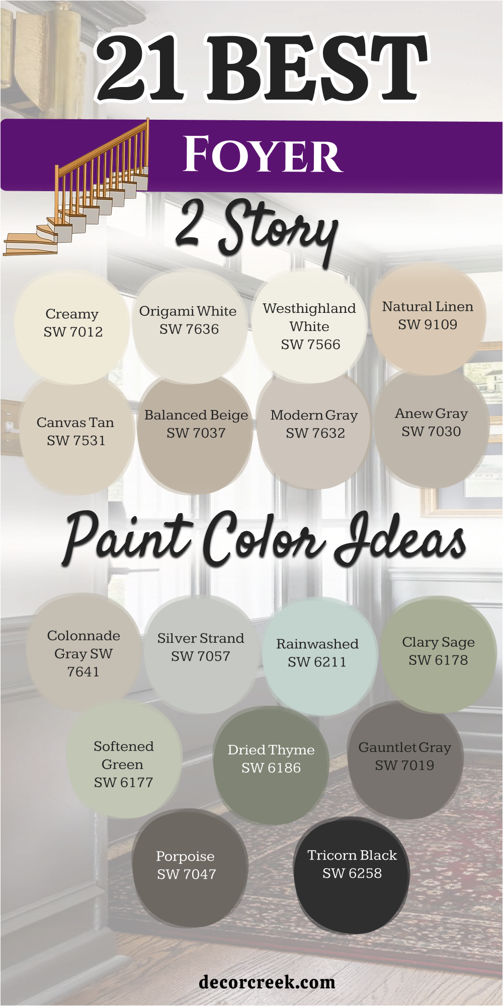
18 Best Small Foyer Paint Color Ideas
Extra White SW 7006
Extra White SW 7006 is a very bright and crisp white that makes a tiny entrance feel much bigger. This color does not have any yellow or blue tones so it looks very clean on the walls. I use it often for small foyers that do not have any windows to bring in light.
It makes the trim and the ceiling blend together which helps the room feel tall and open. You will love how it makes your colorful rugs or artwork stand out in a small area. The paint covers well and gives a very professional look to the front of your home.
It feels very fresh and very tidy every time you walk through the door. Most people find it to be a very simple and very smart choice for a cramped hall. It is a favorite for modern homes that want a very sharp and very bright look. This is a top pick for a clean start in a small area.
Best used in: trim, ceilings, small dark hallways, and bathrooms
Pairs well with: Tricorn Black SW 6258, Revere Pewter HC-172, Gray Owl OC-52, colorful rugs The key rule of this color for bright style is to use it to reflect every bit of light available in a small area to keep it feeling open.
🎨 Check out the complete guide to this color right HERE 👈
High Reflective White SW 7757
High Reflective White SW 7757 is the brightest white you can get to help a small room feel very large. This paint acts like a mirror to bounce light all around a tiny hallway for your guests. I suggest this for the smallest foyers because it makes the walls seem to disappear into the light.
It is a very pure shade that looks very high-end and very professional in the house. The finish is very smooth and makes the entrance look very well maintained and clean. You will notice it makes the whole house feel very new and very happy right away.
It is a great choice for people who love a minimal and very tidy look for their home. The shade stays very white and does not look muddy or dull in the corners of the hall. Most visitors will think your home looks very bright and very cheery with this choice. It is a great way to make a big difference in a very small area.
Best used in: very small foyers, dark corridors, trim, and ceilings
Pairs well with: Iron Ore SW 7069, Wood Tones, Glass accents, bright art The key rule of this color for light style is to use it where you want the most light reflection possible in a windowless entrance.
🎨 Check out the complete guide to this color right HERE 👈
Eider White SW 7014
Eider White SW 7014 is a very soft white that has a tiny bit of gray inside it. This color is perfect for a small foyer that needs to feel cozy but still very bright. I like using it because it is not as stark as a pure white so it feels more like a home.
It looks very nice with light gray rugs and silver metal door handles in the hall. The shade creates a very soft look that hides small marks better than a very bright white. You will find that it makes your small entrance feel very airy and very professional for guests.
It is a popular choice for homes that have a lot of cool gray furniture in the living room. The paint stays looking very fresh and very clean for a very long time in the house. Most people find this color to be very relaxing and very easy to look at every day. It is a great choice for a small and very friendly entryway.
Best used in: small entryways, bedrooms, bathrooms, and kitchens
Pairs well with: Repose Gray SW 7015, Dorian Gray SW 7017, Naval SW 6244, silver hardware The key rule of this color for soft style is to use it to provide a hint of color that keeps a small area from feeling cold.
🎨 Check out the complete guide to this color right HERE 👈
First Star SW 7646
First Star SW 7646 is a very light and cool gray that feels very fresh in a small hall. This paint is great for making a tiny room feel very modern and very clean for visitors. I use it when a homeowner wants a gray look that is light enough to keep the room bright.
It looks very professional against white trim and dark wood floors in the entryway area. The shade has a very airy feeling that makes the walls feel further apart than they are. You will like how it provides a very nice background for silver or black picture frames.
It is a very reliable choice for homes that want a very sharp and very updated look. The paint looks very rich and gives a sense of style to the whole small entrance. Most guests will think your home looks very polished and very well designed with this color. It is a smart pick for a light and very cool small foyer.
Best used in: small entryways, laundry rooms, bathrooms, and bedrooms
Pairs well with: Pure White SW 7005, Anew Gray SW 7030, Charcoal metals, blue accents The key rule of this color for cool style is to use it to create a crisp and modern look that expands a small hallway.
🎨 Check out the complete guide to this color right HERE 👈
City Loft SW 7631
City Loft SW 7631 is a very popular warm gray that feels very soft on the walls of a small room. This color is perfect for a tiny foyer that needs to feel very cozy and very welcoming. I find it helpful for houses that have a mix of warm and cool furniture in the living room.
It looks very nice with light wood floors and natural rugs in the small entrance hall. The shade creates a very light look that feels very clean and very professional for guests. You will notice it makes the entrance feel much more like a real room and less like a hall.
It is a favorite for designers who want a home to feel very inviting and very tidy. The finish looks very high quality and gives a sense of order to the entire small area. Most people find it to be a very refreshing and very simple choice for a small foyer. It is a great way to make a small entrance feel very warm.
Best used in: small entryways, open floor plans, bedrooms, and kitchens
Pairs well with: Alabaster SW 7008, Urban Bronze SW 7048, Natural Linen SW 9109, linen accents The key rule of this color for warm style is to use it to add a touch of coziness to a small and narrow entrance.
🎨 Check out the complete guide to this color right HERE 👈
Crushed Ice SW 7647
Crushed Ice SW 7647 is a very light gray that has a tiny bit of warmth to it. This paint is perfect for a small foyer that needs to feel very modern but not too cold. I suggest this for people who want a clean gray that works well with any kind of light.
It looks very nice with white trim and dark metal light fixtures in the small hall. The color creates a very soft look that lets your front door and floor be the star. You will notice it makes the small walls feel very bright and very well put together.
It is a very reliable choice for homes that have a lot of natural light coming in. The shade looks very rich and gives a sense of style to the whole small entrance area. Most visitors will find this color to be very impressive and very professional to look at. It is a smart pick for a high-traffic small area that needs to look very new.
Best used in: small foyers, bathrooms, laundry rooms, and kitchens
Pairs well with: Snowbound SW 7004, Gauntlet Gray SW 7019, Anew Gray SW 7030, stone floors The key rule of this color for modern style is to use it to provide a balanced and light gray that works with any decor.
🎨 Check out the complete guide to this color right HERE 👈
On the Rocks SW 7671
On the Rocks SW 7671 is a very cool and crisp gray that feels very tidy in a small space. This color is great for making a tiny foyer look very updated and very professional for guests. I love using it because it stays looking like a true gray even when the sun is very bright.
It looks very sharp with white baseboards and silver door handles in the small entrance area. The shade feels very steady and makes the house feel very strong and well built. You will like how it provides a very nice contrast against bright white high ceilings or trim.
It is a very popular choice for people who want a look that is very sharp and very clean. The paint is very high quality and hides any small marks from shoes or bags very well. Most guests will think you have very good taste when they see this beautiful cool gray. It is a great way to make a small entrance look very special.
Best used in: small entryways, bathrooms, bedrooms, and home offices
Pairs well with: Pure White SW 7005, Anew Gray SW 7030, Iron Ore SW 7069, silver hardware The key rule of this color for sharp style is to use it to create a cool and professional look in a small area.
🎨 Check out the complete guide to this color right HERE 👈
Passive SW 7064
Passive SW 7064 is a medium-light cool gray that has a very modern and very fresh feeling. This paint is perfect for a small foyer that needs a bit more color than just a simple white. I use it when a homeowner wants a color that is cool and looks very much like a true gray.
It looks very high-end with white trim and dark metal accents in the front hall. The shade feels very steady and makes the house look very professional and well designed. You will notice it provides a very nice background for colorful art or family photos on the wall.
It is a very popular choice for people who want a look that is very sharp and very tidy. The paint looks very smooth and hides any small marks on the foyer walls very well. Most visitors will find this color to be very impressive and very stylish to see in your home. It is a great way to make your small entrance look very custom.
Best used in: small entryways, bathrooms, bedrooms, and kitchen cabinets
Pairs well with: Extra White SW 7006, Peppercorn SW 7674, Naval SW 6244, black accents The key rule of this color for custom style is to use it to provide a cool and deep gray that makes a small area look expensive.
🎨 Check out the complete guide to this color right HERE 👈
Heron Plume SW 6070
Heron Plume SW 6070 is a very soft and creamy gray that feels very natural in a small room. This color is a very nice choice for making a tiny foyer feel very warm and very open. I pick this when I want a room to look very inviting without being a yellow beige for guests.
It looks very good with white trim and light wood furniture pieces in the small hall. The shade has a bit of gray which keeps it looking very modern and very fresh for 2026. You will notice it makes the small walls feel very bright and very full of life for every visitor.
It is a very unique choice that makes your home feel very special and very tidy. The paint makes the room feel very soft and very friendly for everyone who enters. Most people find this color to be very refreshing and very pleasant to see every day. It is a great choice for a home that wants to feel very light.
Best used in: small foyers, bedrooms, bathrooms, and laundry rooms
Pairs well with: Alabaster SW 7008, Urban Bronze SW 7048, Mega Greige SW 7031, linen fabrics The key rule of this color for light style is to use it to provide a soft and bright background that feels very natural.
🎨 Check out the complete guide to this color right HERE 👈
Decorator’s White OC-149
Decorator’s White OC-149 is a very popular white from Benjamin Moore that has a tiny touch of cool gray. This color is perfect for a small foyer that needs to feel very crisp and very tidy for guests. I use it when I want the walls to look very sharp against colorful furniture or art pieces.
It makes a small hallway feel much wider and much more open for every single visitor. The shade stays very white and does not turn yellow even when you turn on warm lamps. You will love how it makes your white trim and doors look very professional and very new.
It is a favorite for people who want their home to feel very clean and very high-end. The paint looks very rich and does not show dust or small marks easily in the hall. Most guests will think your home looks very bright and very cheery with this choice. It is a solid choice that makes every small room look much better.
Best used in: small entryways, trim, ceilings, and modern kitchens
Pairs well with: Stonington Gray HC-170, Hale Navy HC-154, Revere Pewter HC-172, bold art The key rule of this color for crisp style is to use it as a cool and light base that makes a small area feel bigger.
🎨 Check out the complete guide to this color right HERE 👈
Paper White OC-55
Paper White OC-55 is a very light gray that looks almost like a fresh sheet of white paper. This paint is perfect for a tiny entrance that needs to feel very modern and very fresh. I find it helpful for homes that want a gray look that is very light and very soft for guests.
It looks very professional against white trim and dark wood floors in the small hall. The color stays very even and looks very clean on the walls for every single visitor. You will notice it makes the whole house feel very connected and very stylish right away.
It is a favorite for designers who want a clean background for large mirrors or black frames. The shade looks very rich and gives a sense of high quality to the entire small entryway. Most people find it to be a very refreshing and very simple choice for a small foyer. It is a great way to make a small entrance feel very light.
Best used in: small foyers, bathrooms, laundry rooms, and kitchens
Pairs well with: Chantilly Lace OC-65, Kendall Charcoal HC-166, Simply White OC-117, silver accents The key rule of this color for light style is to use it to create a seamless and bright look in a small area.
Ice Mist OC-67
Ice Mist OC-67 is a very bright white that has a tiny bit of cool blue hidden inside it. This color is a very nice choice for making a small foyer feel very crisp and very open. I pick this when a house has very little natural light coming in through the front door.
It acts like a bright light by bouncing all the available rays around the tiny hallway. The shade makes the whole entrance feel very new and very fresh for every family member. You will love how it makes your white trim and baseboards look very tidy and very sharp.
It is a favorite for people who like a very clean and very simple look for their home. The paint looks very professional and gives a sense of style to the whole small area. Most visitors will notice how bright and cheery your home feels right away. It is a great pick for a modern and very clean small entrance.
Best used in: small dark entryways, trim, ceilings, and bathrooms
Pairs well with: Gray Owl OC-52, Hale Navy HC-154, Black OC-121, blue accents The key rule of this color for bright style is to use it to maximize light in a small hallway that feels too dark.
Nimbus 1465
Nimbus 1465 is a soft and warm gray that feels very cozy in a small entrance hall. This color is a very nice choice for making a tiny foyer feel very friendly and very inviting. I use it when a homeowner wants a color that is light but still feels like a real color.
It looks very good with white trim and natural wood furniture on the floor of the hall. The shade has a tiny bit of warmth which keeps it looking very soft and very pleasant. You will like how it makes your small entrance feel much more like a real room and less like a hall.
It is a very reliable choice for homes that want a look that is very high-end. The paint stays looking very fresh and very clean for a very long time in the house. Most visitors will find this color to be very refreshing and very pleasant to see every day. It is a great choice for a home that wants to feel very soft.
Best used in: small entryways, bedrooms, hallways, and living rooms
Pairs well with: Simply White OC-117, Revere Pewter HC-172, Chelsea Gray HC-168, warm wood The key rule of this color for soft style is to use it to provide a warm and light background that feels very natural.
🎨 Check out the complete guide to this color right HERE 👈
Stonington Gray HC-170
Stonington Gray HC-170 is a very famous and professional gray that looks very smart in a hall. This paint is perfect for a small foyer that needs to feel very modern and very clean. I pick this when I want a room to look very cool but still very inviting for every guest.
It works very well with marble floors and white painted stairs in the small hall area. The color looks very rich and gives a sense of style to the whole small entrance. You will notice it makes the entire house feel very connected and very well designed.
It is a very reliable choice for homes that want a look that is very sharp and tidy. The shade stays very true and does not turn yellow or green on the walls of the hall. Most guests will think your home looks very polished and very impressive with this choice. It is a smart pick for a high-traffic area that needs to look very new.
Best used in: small entryways, kitchens, bathrooms, and home offices
Pairs well with: White Dove OC-17, Coventry Gray HC-169, Hale Navy HC-154, silver hardware The key rule of this color for classic style is to use it to create a balanced and clean look in a small entrance.
🎨 Check out the complete guide to this color right HERE 👈

Coventry Gray HC-169
Coventry Gray HC-169 is a medium-light gray that has a very sophisticated and cool feeling. This color is great for making a small foyer look very high-end and very professional. I suggest this for people who want a color that has a bit more depth on the wall.
It creates a very beautiful look when you have a lot of white woodwork and trim in the hall. The shade feels very grounded and makes the house feel very stable for the family. You will notice it works well in both natural sun and under the lamps at night.
It is a very popular choice for small homes that want a very stylish and very tidy look. The paint looks very smooth and hides any small marks on the foyer walls very well. Most guests will think you have very good taste when they see this beautiful gray. It is a great way to add a lot of style to a small room.
Best used in: small entryways, bedrooms, bathrooms, and kitchen islands
Pairs well with: Stonington Gray HC-170, Simply White OC-117, Chelsea Gray HC-168, black accents The key rule of this color for professional style is to use it to add depth and a sense of quality to a small area.
🎨 Check out the complete guide to this color right HERE 👈

Seapearl OC-19
Seapearl OC-19 is a very soft and creamy white that feels very light in a small room. This paint is perfect for a tiny entrance that needs to feel very bright and very inviting. I find it helpful for houses that want a white look that is very warm and very soft.
It looks very nice with light wood floors and natural rugs on the floor of the hall. The color creates a very soft look that feels very light and very clean for guests. You will notice it makes the small walls feel very bright and very full of life every day.
It is a favorite for designers who want a home to feel very welcoming and very tidy. The shade looks very rich and gives a sense of order to the entire small entrance area. Most people find it to be a very refreshing and very simple choice for a small hall. It is a great way to make a small entrance feel very cozy.
Best used in: small foyers, bedrooms, kitchens, and whole-house paint
Pairs well with: Revere Pewter HC-172, Hale Navy HC-154, Simply White OC-117, warm wood tones The key rule of this color for cozy style is to use it as a soft and light base that makes a small area feel friendly.
🎨 Check out the complete guide to this color right HERE 👈

Horizon OC-53
Horizon OC-53 is a very light and cool gray that feels like a soft fog in the hall. This color is a very nice choice for making a small foyer feel very airy and very open. I use it when a homeowner wants a bit of color that is lighter than a true gray.
It looks very good with white trim and silver light fixtures on the wall of the hall. The shade has a tiny bit of blue and green which keeps it looking very fresh. You will notice it makes the small walls feel very bright and very tidy for every visitor.
It is a very unique choice that makes your home feel very special and very professional. The paint makes the room feel very light and very inviting for everyone who enters. Most visitors will find this color to be very refreshing and very pleasant to see every day. It is a great choice for a home that wants to feel very light.
Best used in: small entryways, bathrooms, bedrooms, and laundry rooms
Pairs well with: Chantilly Lace OC-65, Simply White OC-117, Gray Owl OC-52, silver hardware The key rule of this color for light style is to use it to provide a soft and bright background that feels very natural.
🎨 Check out the complete guide to this color right HERE 👈

Classic Gray OC-23
Classic Gray OC-23 is a very light gray that is so pale it can look like an off-white. This paint is perfect for a small foyer that needs to feel very sophisticated and very clean. I pick this when I want a room to look very polished without being too stark for guests.
It works very well with marble floors and white painted stairs in the small hallway. The color looks very rich and gives a sense of style to the whole entrance area. You will find that it makes the whole house feel very connected and very professional.
It is a very reliable choice for homes that want a look that is very fresh and very new. The shade stays very true and does not turn yellow even in a dark hall. Most guests will think your home looks very stylish and very well designed with this choice. It is a smart pick for a home that wants to feel very light.
Best used in: small entryways, bedrooms, living rooms, and kitchens
Pairs well with: Simply White OC-117, White Dove OC-17, Hale Navy HC-154, dark wood floors The key rule of this color for professional style is to use it to create a crisp and modern look in a small entrance.
🎨 Check out the complete guide to this color right HERE 👈
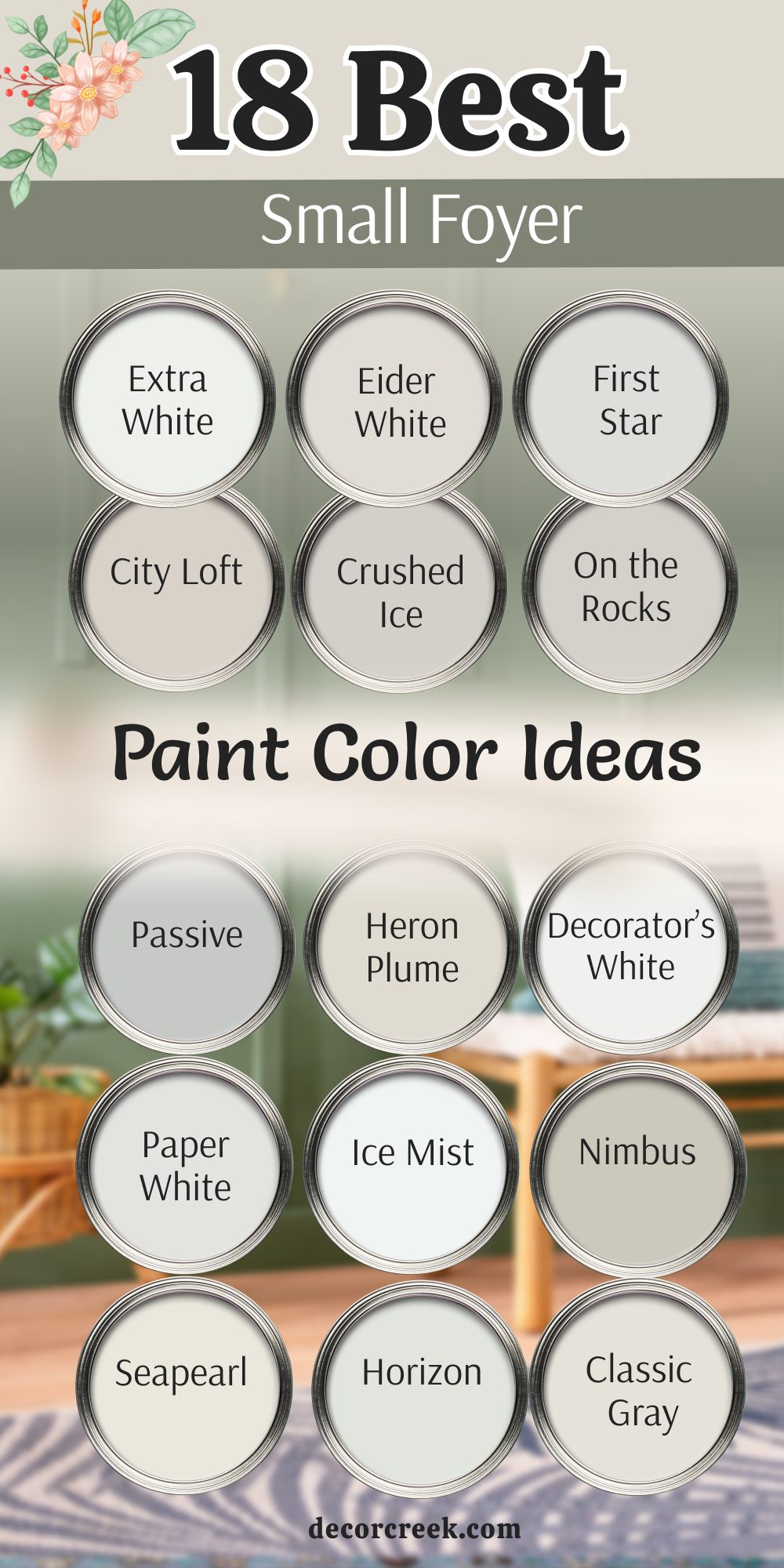
My Final Thoughts about 29 Ideal Foyer Paint Color Ideas
Picking the right paint for your entryway is the best way to start a home project. I have seen how a simple change in color can make a whole house feel brand new. Remember to think about the light in your home before you buy your final bucket.
You want a color that makes you feel happy when you walk through the door after a long day. Sherwin-Williams and Benjamin Moore have so many great choices for every single kind of foyer. Whether you have a big two-story entrance or a tiny hallway, there is a perfect shade for your family.
Do not be afraid to try a sample on the wall first to see how it looks. I hope this list helps you find a color that fits your style and your home perfectly.
Your house should be a place where you feel proud to invite all of your friends.