I have spent many years looking at thousands of different houses and carefully figuring out exactly what makes them look great from the street. Choosing a specific color for the outside of your home is a very big deal because it is the one part of your property that every single person in the neighborhood sees.
It is truly the first thing people notice when they drive by your street or walk past your front gate, and it creates a lasting impression of your personal style. I want to help you find a specific look that makes you feel genuinely happy and proud every time you pull into your driveway after a long day.
This extensive list is full of my absolute favorite picks that I know work perfectly for real homes, real weather conditions, and real families who want their house to look beautiful for a long time.
Why Exterior Paint Color Combinations Matter for the Overall Look of Your Home
The specific colors you pick for your siding and trim tell a very important story about the people who live inside the house. If the colors you choose do not match the architectural style of the building, the whole place can look a bit messy or even confusing to the eye.
However, a good and thoughtful mix of colors makes the windows, porches, and front doors stand out in a very nice and professional way. It can even work like a magic trick to make a small cottage look much bigger or a very tall, thin house look more grounded and solid on the land.
Getting the combination exactly right helps your home fit perfectly into the neighborhood while still looking like a very special and high-end property.
It adds a sense of harmony to the entire street and significantly increases the value of your home for years to come.
How I Choose the Best Exterior Color Combinations for Different House Styles
I always start my design process by looking very closely at the parts of the house that we simply cannot change or paint over. This includes permanent things like the color of the roof shingles, the red or brown brick of the chimneys, or the natural stone used for the walkways and foundation.
I try to find paint shades that play well with those natural materials so that the whole house looks like it was planned by one person from start to finish. Different styles, like modern flat-roof boxes or traditional old farmhouses, need very different types of tones and contrasts to look their absolute best.
I also spend a lot of time thinking about how the bright sun hits the walls at different times of the day, ensuring the color looks just as good in the morning light as it does in the evening shade.
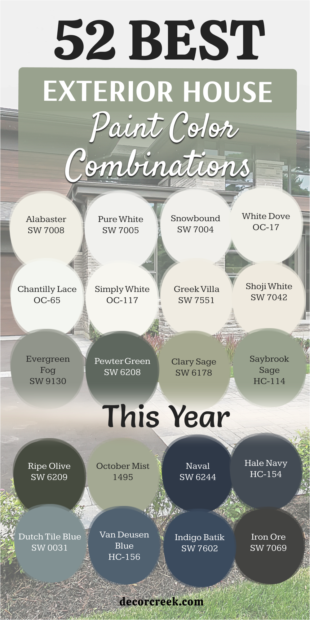
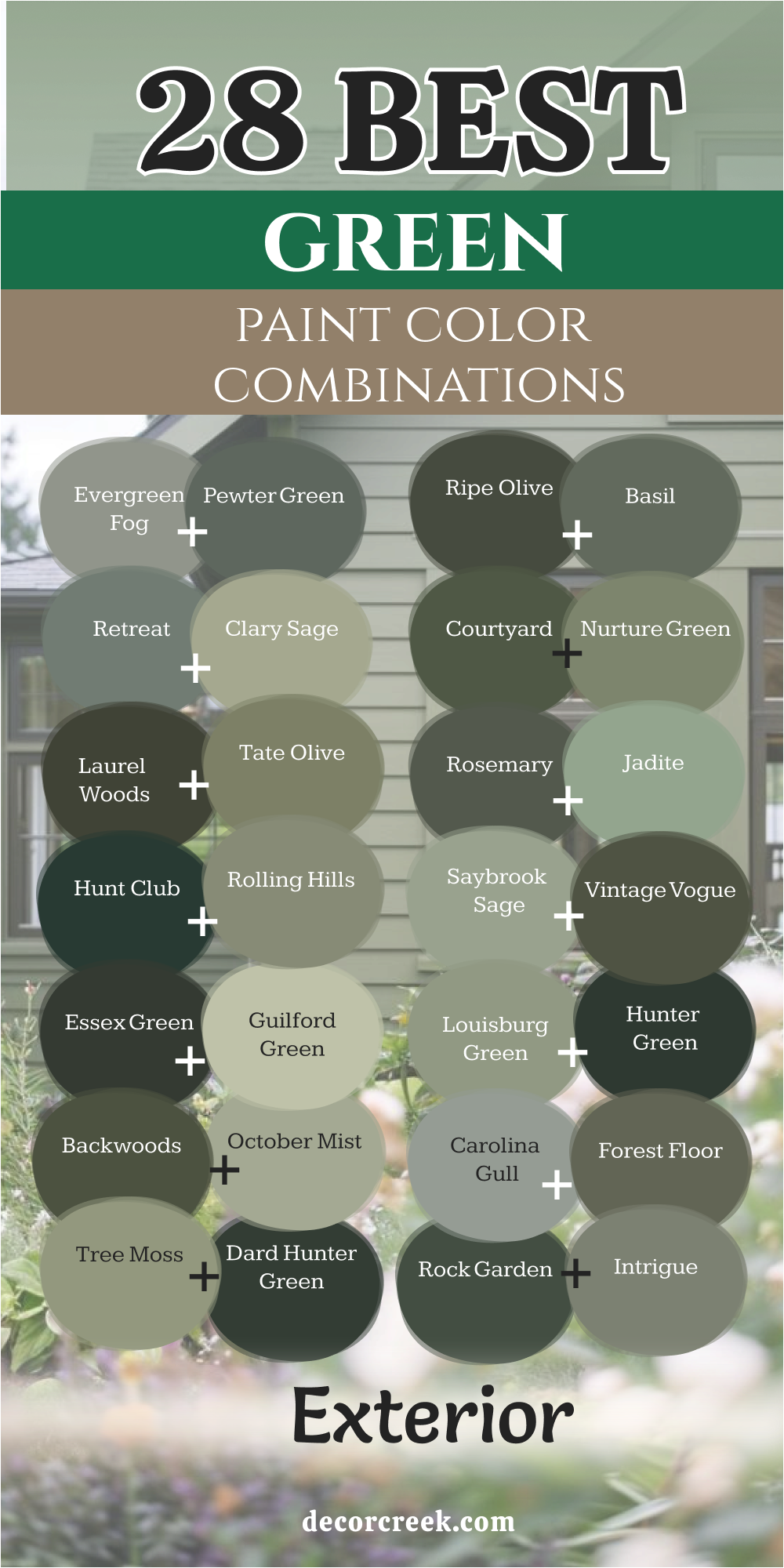
28 Best Green Exterior Paint Color Combinations
Evergreen Fog SW 9130+ Pewter Green SW 6208
Evergreen Fog SW 9130 is a soft choice that looks like a mix of green and gray. This color feels very natural when you put it on a house surrounded by trees. It has a bit of a blue undertone that shows up when the sun is high in the sky.
I like to use it on homes that have a lot of wood accents or stone details. The paint looks rich but does not grab too much attention from the neighbors. Many people find it easy to look at for a long time without getting tired of it. It works well on siding or even on a front door for a pop of color.
You can pair it with a crisp white trim to make the green stand out more. It is a very popular pick for people who want something different than just plain beige. This shade makes a building feel like it belongs in nature.
Best used in: entryways, main siding, shutters, and woodland cottages.
Pairs well with: Shoji White SW 7042, Urbane Bronze SW 7048, and light oak wood.
The key rule of this color for farmhouse style is to use it where you want the building to blend into a garden or a grassy yard.
🎨 Check out the complete guide to this color right HERE 👈

Pewter Green SW 6208 is a dark and cool shade that looks very expensive on a large home. This color has a lot of gray in it which keeps it from looking too bright. I think it looks best when used on a house with a black or dark gray roof.
It creates a very strong look that feels sturdy and well-made. The deep tone helps hide dirt or dust that might get on the walls over time. You should use this if you want your home to have a lot of personality. It looks wonderful next to silver or black metal light fixtures.
The color changes quite a bit depending on if it is a cloudy or a sunny day. It provides a great background for colorful flowers in your front garden. This is a solid choice for someone who likes a bold but professional look.
Best used in: modern exteriors, window trim, and accent walls.
Pairs well with: Extra White SW 7006, Iron Ore SW 7069, and slate stone.
The key rule of this color for farmhouse style is to use it on the main body of the house to create a sense of strength.
🎨 Check out the complete guide to this color right HERE👈

Retreat SW 6207+ Clary Sage SW 6178
Retreat SW 6207 is a mid-tone green that has a very dusty and soft appearance. This color is not too dark and not too light so it fits many different neighborhoods. It reminds me of the ocean or a misty forest in the early morning.
I suggest using this on a house with a lot of white trim to keep it looking fresh. It is a very safe choice if you want to try green but are afraid of it being too loud. The color looks great on horizontal siding or on wooden shingles. It pairs nicely with brickwork that has a bit of gray or tan in it.
People often choose this because it feels very friendly and welcoming to guests. It does not clash with the colors of other houses nearby. This shade is one of my favorites for a cozy home feel.
Best used in: coastal homes, bungalows, and backyard sheds.
Pairs well with: High Reflective White SW 7757, Sea Salt SW 6204, and cedar wood.
The key rule of this color for farmhouse style is to use it to make the porch area feel like a comfortable place to sit.
🎨 Check out the complete guide to this color right HERE 👈

Clary Sage SW 6178 is a light and herbal green that feels very airy and bright. This color has a yellow undertone that makes it feel warm even on a cold day. It is a great pick for a cottage or a house with a large front porch.
I like how it looks when the sun hits it because it seems to glow a little bit. It is light enough to be used as a main color without making the house look too dark. You can use a darker green on the shutters to add some depth to the look.
It looks very pretty next to white fences and green bushes. This color is very easy on the eyes and feels very cheerful. Most people think of a garden when they see this shade on a house. It is a classic choice for a traditional style home.
Best used in: garden sheds, small cottages, and Victorian homes.
Pairs well with: Dover White SW 6385, Sage SW 2860, and red brick.
The key rule of this color for farmhouse style is to use it on the siding to make the home feel bright and happy.
🎨 Check out the complete guide to this color right HERE 👈

Ripe Olive SW 6209+Basil SW 6194
Ripe Olive SW 6209 is a very deep and moody green that looks almost black in the shade. This color is perfect for someone who wants a high-fashion look for their exterior. It makes the architecture of the house stand out very clearly.
I love using this color on modern homes with large windows. The dark green looks very sophisticated when paired with light wood or stone. It is a brave choice that really pays off because it looks so unique. You should make sure you have enough light outside so the house does not look too hidden.
It works beautifully as an accent color on a garage door or a front entrance. This shade feels very grounded and permanent. It is a great way to make a statement without using a bright color.
Best used in: modern cabins, front doors, and accent trim.
Pairs well with: Alabaster SW 7008, Black Magic SW 6991, and walnut wood.
The key rule of this color for farmhouse style is to use it on doors or shutters to add a touch of mystery.
🎨 Check out the complete guide to this color right HERE 👈

Basil SW 6194 is a rich green that looks just like the leaves of the plant it is named after. This color has a nice balance of warmth and coolness that makes it very flexible. I think it looks very handsome on a house with a lot of character and detail.
It is dark enough to be bold but light enough to show off the texture of the wood. The color stays looking good even after years of being out in the sun. It pairs very well with creamy whites rather than bright, stark whites.
This green makes a home feel very established and solid. It is a great middle-ground for people who cannot decide between light and dark. You will find that it looks good with almost any type of landscaping. It is a very reliable color for a long-lasting look.
Best used in: craftsman homes, window shutters, and main siding.
Pairs well with: Creamy SW 7012, Latte SW 6108, and dark stone.
The key rule of this color for farmhouse style is to use it where you want a classic look that never feels old.
🎨 Check out the complete guide to this color right HERE 👈
Courtyard SW 6440+ Nurture Green SW 6451
Courtyard SW 6440 is a deep and grassy green that feels very lush and full of life. This color is great for houses that have a lot of plants and flowers around them. It has a bit of a traditional feel that works well for older neighborhoods.
I like to see this color on a house with a lot of white or tan trim. It makes the house look like it has been there for a long time in a good way. The shade is very saturated so it does not look gray or washed out. It stands out nicely against a clear blue sky.
You might want to use it if you want your house to feel very vibrant. It is a strong color that shows you care about how your home looks. This green is very classic and very proud.
Best used in: traditional homes, accent gables, and garden walls.
Pairs well with: Pure White SW 7005, Balanced Beige SW 7037, and brick paths.
The key rule of this color for farmhouse style is to use it to highlight the beautiful shapes of your roof or windows.
Nurture Green SW 6451 is a bright and energetic green that feels very fresh. This color has a lot of yellow in it which makes it look like new leaves in the spring. I suggest using this if you want your home to be the most colorful one on the block.
It works really well for small houses or beach cottages. The color is very friendly and makes people feel happy when they see it. You should pair it with very light colors to keep the look clean. It might be too bright for a very large mansion but it is perfect for a cozy spot.
This shade is all about having fun with your home design. It looks great with white picket fences and colorful flowers. This is a very lively and upbeat choice for any homeowner.
Best used in: playhouses, cottage siding, and sunrooms.
Pairs well with: Extra White SW 7006, Morning Sun SW 6672, and light gravel.
The key rule of this color for farmhouse style is to use it on small parts of the house to bring a bit of joy.
🎨 Check out the complete guide to this color right HERE 👈
Rosemary SW 6187+Jadite SW 6459
Rosemary SW 6187 is a deep green that has a lot of gray and a tiny bit of blue in it. This color is very popular right now because it looks very modern and stylish. It is a great choice for the main color of a house if you want a dark look.
I find that it looks very good with natural wood pillars or beams. The color feels very heavy and expensive which adds value to the look of your home. It does not change its look much when the sun goes behind a cloud.
This shade is very good at making a house look tucked into its environment. It is a very smart choice for a home in the mountains or near a forest. Many designers love this color because it is so easy to work with. It makes a house feel very private and peaceful.
Best used in: mountain cabins, modern farmhouse siding, and garage doors.
Pairs well with: Eider White SW 7014, Tricorn Black SW 6258, and pine wood.
The key rule of this color for farmhouse style is to use it on the biggest walls to make the house feel solid.
🎨 Check out the complete guide to this color right HERE 👈

Jadite SW 6459 is a cool green that looks a bit like a precious stone. This color has a minty feel but it is much deeper and more mature. I think it looks very unique on a house because not many people use this specific shade.
It works well on homes that have a bit of a retro or vintage style. The color feels very clean and crisp when you see it from the street. It is a great way to add color without using something that looks too much like a primary color.
You can use it on the siding with a very dark trim for a sharp look. It looks especially good in places that get a lot of bright sunlight. This green is very refreshing and stays looking new for a long time. It is a very cool and interesting pick for a creative person.
Best used in: vintage homes, porch ceilings, and accent shutters.
Pairs well with: Snowbound SW 7004, Naval SW 6244, and white marble.
The key rule of this color for farmhouse style is to use it on the front door to give guests a special welcome.
Laurel Woods SW 7749+Dard Hunter Green SW 0041
Laurel Woods SW 7749 is a very dark green that looks like the deep shadows in a thick forest. This color has a lot of black in it which makes it feel very heavy and strong on a house. I think it looks very expensive when you use it on a large home with tall walls.
It is a great choice for a modern cabin or a house that has a lot of stone. The color stays looking very rich even when the sun is shining directly on it. You should use a very light trim color to make the dark green pop out more.
It feels very grounded and makes a building look like it has been there forever. Many people like this because it is a bold way to use a natural color. This shade is one of the darkest greens you can find for an exterior. It creates a very serious and professional look for any property.
Best used in: mountain modern homes, accent gables, front doors, and wooded lots
Pairs well with: Shoji White SW 7042, Urban Bronze SW 7048, and dark slate stone
The key rule of this color for farmhouse style is to use it on the main siding to make the home feel like a part of the land.
🎨 Check out the complete guide to this color right HERE 👈
Dard Hunter Green SW 0041 is a classic and deep green that feels very old-fashioned in a good way. This color is part of a historic collection because it looks so good on traditional homes. It has a very solid feel that reminds me of old libraries or fancy clubs.
I love using this on shutters or front doors to add a bit of history to a house. The color is very saturated and does not look gray or washed out at all. It looks wonderful when paired with gold or brass door handles and lights.
You will find that it stands out beautifully against a red brick wall. This green is very proud and makes a house look very well-kept. It is a great pick if you want a look that will stay in style for a long time. This shade is very elegant and feels very high-end.
Best used in: historic homes, window shutters, front doors, and library additions
Pairs well with: Creamy SW 7012, Rookwood Dark Red SW 2801, and brass accents
The key rule of this color for farmhouse style is to use it on the trim to frame the house with a touch of class.
🎨 Check out the complete guide to this color right HERE 👈
Hunt Club SW 6468+Rock Garden SW 6195
Hunt Club SW 6468 is a cool and dark green that has a tiny hint of blue hidden inside. This color feels very fresh and crisp even though it is quite a dark shade. I like to use it on houses that have a lot of white wood details.
It makes the green look very sharp and clean from the street. The blue undertone keeps it from looking too much like a forest or a tree. It is a very smart choice for a house in a neighborhood with a lot of grass. This color looks very high-quality and makes a home look very sturdy.
It is dark enough to be bold but it still feels very colorful. You can use it on the whole house if you want a very dramatic look. This is a very popular green for people who like a cool and clean feeling.
Best used in: coastal cottages, modern exteriors, and garage doors
Pairs well with: Extra White SW 7006, On the Rocks SW 7671, and silver metal
The key rule of this color for farmhose style is to use it where you want a dark look that still feels very colorful.
Rock Garden SW 6195 is a very rich and mossy green that looks great in the shade. This color has a lot of depth and changes its look throughout the day. I find that it works very well on homes with a lot of natural landscaping.
It looks very soft and heavy at the same time which is a nice mix. The green is dark enough to hide small marks or dirt on the bottom of the house. I suggest using it with a warm white trim to keep the look feeling cozy.
It makes a house feel very private and tucked away from the world. This shade is perfect for a home that has a lot of garden space around it. It feels very established and gives the building a lot of character. This is a very strong and beautiful green for any exterior project.
Best used in: garden-facing walls, craftsman bungalows, and backyard studios
Pairs well with: Alabaster SW 7008, Ancient Marble SW 6162, and flagstone
The key rule of this color for farmhouse style is to use it to make the house feel like it is part of a big garden.
🎨 Check out the complete guide to this color right HERE 👈

Saybrook Sage HC-114+ October Mist 1495
Saybrook Sage HC-114 is a light and airy green that has a lot of gray in it. This color is very easy to use because it is not too bright or too dark. I think it is one of the best colors for a house that gets a lot of sun.
It looks very soft and does not hurt your eyes when the sun hits the walls. The gray tone makes it look very professional and not like a toy house. It pairs perfectly with crisp white trim and a dark gray roof.
Many homeowners pick this color because it feels very friendly and light. It is a great way to use green if you are worried about it being too bold. This shade makes a small house look a bit larger and more open. It is a very pretty and light choice for a family home.
Best used in: suburban houses, small cottages, and porch areas
Pairs well with: Chantilly Lace OC-65, Hale Navy HC-154, and light gray stone
The key rule of this color for farmhouse style is to use it on the siding to make the home feel light and breezy.
🎨 Check out the complete guide to this color right HERE 👈

October Mist 1495 is a very soft and earthy green that feels like a quiet morning. This color was a color of the year because it is so easy to live with. It has a bit of a silver look to it when the sky is cloudy.
I like to use it on houses that have a lot of natural wood or light stone. The color is very light and makes a home feel very clean and new. It is a great pick if you want a color that is just a little bit more than gray.
You can use a dark green or black on the door to give it some contrast. It works well on all types of house styles from old to very new. This green feels very natural and does not stand out in a loud way. It is a very graceful and light shade for any exterior.
Best used in: modern farmhouses, siding, and sunroom exteriors
Pairs well with: Steam AF-15, Gloucester Sage HC-100, and light oak
The key rule of this color for farmhouse style is to use it where you want a soft look that feels very natural.
🎨 Check out the complete guide to this color right HERE 👈

Essex Green HC-188+ Hunter Green 2041-10
Essex Green HC-188 is a very dark and traditional green that looks almost black. This color is very famous for looking great on old, grand houses. It has a very deep and rich look that shows off the quality of the paint.
I love using this color on front doors or on the shutters of a white house. It creates a very strong contrast that looks very sharp and clean. The green is so dark that it feels very solid and heavy. It looks wonderful with gold or silver hardware and light fixtures.
This is a very high-class color that makes a home look very expensive. You should use it if you want a look that is very bold and very classic. This shade is one of the most popular dark greens for a reason.
Best used in: front doors, window shutters, and historic estates
Pairs well with: White Dove OC-17, Black HC-190, and red brick
The key rule of this color for farmhouse style is to use it on the accents to create a very sharp look.
🎨 Check out the complete guide to this color right HERE 👈

Hunter Green 2041-10 is a very deep and true green that reminds me of old money. This color is very classic and has been used on houses for a very long time. It looks very handsome and strong on any type of building.
I think it looks best when it is paired with a very bright white trim. The color is dark enough to be a neutral but it still has a lot of green in it. It works very well on houses that have a lot of big trees in the yard.
The shade feels very permanent and makes a house look very well-built. It is a great choice for a front door if you want a pop of dark color. This green is very reliable and always looks good in the sun. It is a very timeless and sturdy pick for your exterior.
Best used in: traditional siding, shutters, and front entrances
Pairs well with: Simply White OC-117, Revere Pewter HC-172, and dark wood
The key rule of this color for farmhouse style is to use it to give the house a very strong and classic feel.
🎨 Check out the complete guide to this color right HERE 👈

Louisburg Green HC-113+ Guilford Green HC-116
Louisburg Green HC-113 is a mid-tone green that has a lot of warmth and gray in it. This color feels very soft and is very easy to look at for a long time. I like to use it on houses that have a lot of character or old-style wood.
It looks very natural and does not feel like it was made in a factory. The color is light enough to be used as the main color on a big house. It pairs very nicely with cream colors or light tans. This green makes a home feel very cozy and welcoming to anyone who visits.
It is a great choice for a neighborhood that has a lot of older homes. The shade is very balanced and does not lean too far into yellow or blue. It is a very friendly and soft green for a family home.
Best used in: bungalow siding, porch walls, and traditional homes
Pairs well with: Cloud White OC-130, Shaker Beige HC-45, and stone paths
The key rule of this color for farmhouse style is to use it to make the house feel soft and easy to live in.
🎨 Check out the complete guide to this color right HERE 👈
Guilford Green HC-116 is a light and silvery green that feels very fresh and clean. This color has a lot of light in it which makes it look very bright on a house. I think it looks like a soft sage that has been mixed with a bit of silver.
It is a great choice for a home that you want to look airy and open. The color works very well with white trim and light gray accents. It is a very soft color that feels very high-end and special. You can use it on a whole house without it being too much color.
It looks very pretty next to white flowers and light green bushes. This green is very modern but still feels very classic and soft. It is a very beautiful choice for someone who likes light colors.
Best used in: cottage siding, sunrooms, and bedroom window trim
Pairs well with: White Heron OC-57, Stonington Gray HC-170, and light gravel
The key rule of this color for farmhouse style is to use it to make the whole house feel bright and airy.
🎨 Check out the complete guide to this color right HERE 👈
Backwoods 469+ Vintage Vogue 462
Backwoods 469 is a deep and earthy green that feels very grounded and strong. This color has a lot of black and yellow in it which makes it look like a forest floor. I think it looks very expensive when you use it on a house with a lot of natural wood.
It is a great choice for a cabin or a home that has a lot of stone accents. The color stays looking very rich even when the sun is shining directly on it. You should use a creamy white trim to make the dark green feel a bit warmer.
It feels very permanent and makes a building look like it belongs in the trees. Many people like this because it is a bold way to use a natural shade. This green is very dark and looks very professional on a large exterior. It creates a very serious and high-end look for any home.
Best used in: mountain homes, main siding, front doors, and wooded lots
Pairs well with: White Dove OC-17, Urbane Bronze SW 7048, and cedar wood
The key rule of this color for farmhouse style is to use it on the main siding to make the home feel solid.
🎨 Check out the complete guide to this color right HERE 👈
Vintage Vogue 462 is a very dark green that has a lot of smoky gray hidden inside. This color feels very high-fashion and looks great on modern house styles. I find that it works very well on homes with a lot of big windows and metal.
It looks very soft and heavy at the same time which is a very nice mix. The green is dark enough to make the white trim look very bright and clean. I suggest using it if you want your home to look very unique and stylish.
It makes a house feel very private and tucked away from the street. This shade is perfect for a home that wants to make a big statement. It feels very established and gives the building a lot of character and depth. This is a very strong and beautiful green for any modern project.
Best used in: modern exteriors, accent walls, front doors, and trim
Pairs well with: Chantilly Lace OC-65, Black HC-190, and light oak
The key rule of this color for farmhouse style is to use it to add a touch of drama to the porch.
🎨 Check out the complete guide to this color right HERE 👈
Carolina Gull 2138-40+ Forest Floor 1498
Carolina Gull 2138-40 is a mid-tone green that looks like a mix of gray and sage. This color is very easy to use because it is not too dark and not too light. I think it is one of the best colors for a house that has a lot of stone.
It looks very soft and does not hurt your eyes in the bright sun. The gray tone makes it look very professional and not like a bright primary color. It pairs perfectly with white trim and a dark gray roof for a clean look.
Many homeowners pick this color because it feels very friendly and light to the neighbors. It is a great way to use green if you want something that feels very natural. This shade makes a small house look a bit larger and more open to the street. It is a very pretty and light choice for a traditional family home.
Best used in: suburban siding, shutters, and backyard sheds
Pairs well with: Simply White OC-117, Gray Owl OC-52, and flagstone
The key rule of this color for farmhouse style is to use it on the siding to make the home feel light.
🎨 Check out the complete guide to this color right HERE 👈
Forest Floor 1498 is a very rich and muddy green that feels very natural and warm. This color has a lot of brown in it which makes it look very earthy. I like to use it on houses that have a lot of plants and trees around them.
The color is very dark and makes a home feel very sturdy and well-kept. It is a great pick if you want a color that feels very organic and real. You can use a very light cream on the trim to keep the look from being too dark.
It works well on all types of house styles from old cottages to new builds. This green feels very grounded and does not stand out in a loud or bright way. It is a very graceful and heavy shade for a large exterior wall. Many designers love this color because it feels very quiet and sophisticated.
Best used in: country homes, garage doors, and garden walls
Pairs well with: Alabaster SW 7008, Revere Pewter HC-172, and dark brick
The key rule of this color for farmhouse style is to use it where you want a very natural and deep look.
Tree Moss 508+ Tate Olive HC-112
Tree Moss 508 is a light and cheerful green that has a bit of yellow in it. This color feels very fresh and looks like a sunny day in a park. I think it looks best when it is paired with a very bright white trim.
It is a great choice for a cottage or a house with a big front porch. The color is light enough to be a main color without being too much for the eyes. It works very well on houses that have a lot of white wood details.
The shade feels very happy and makes a house look very friendly to guests. It is a great choice for a front door if you want a pop of soft color. This green is very reliable and always looks very clean in the sunlight. It is a very upbeat and sturdy pick for your home exterior.
Best used in: cottage siding, front doors, and sunroom walls
Pairs well with: Cloud White OC-130, Chelsea Gray HC-168, and light stone
The key rule of this color for farmhouse style is to use it to give the house a very happy feel.
🎨 Check out the complete guide to this color right HERE 👈
Tate Olive HC-112 is a classic and deep green that feels very historic and proud. This color is part of a special collection because it looks so good on old homes. It has a very solid feel that reminds me of traditional estates and gardens.
I love using this on shutters or front doors to add a bit of class to a house. The color is very saturated and does not look gray or washed out at all. It looks wonderful when paired with black metal lights and white wood trim.
You will find that it stands out beautifully against a light tan brick wall. This green is very elegant and makes a house look very well-kept and expensive. It is a great pick if you want a look that will stay in style for years. This shade is very sophisticated and feels very high-end for any property.
Best used in: historic exteriors, shutters, and main siding
Pairs well with: White Heron OC-57, Black HC-190, and gold accents
The key rule of this color for farmhouse style is to use it on the trim to frame the house.
🎨 Check out the complete guide to this color right HERE 👈
Rolling Hills 1497+ Intrigue 1580
Rolling Hills 1497 is a soft and dusty green that has a lot of gray in it. This color feels very quiet and is very easy to look at for a long time. I like to use it on houses that have a lot of character or old-style wood.
It looks very natural and does not feel like a color that is too bright. The color is light enough to be used as the main color on a big house. It pairs very nicely with cream colors or light tans for a soft look.
This green makes a home feel very cozy and welcoming to anyone who visits. It is a great choice for a neighborhood that has a lot of trees and grass. The shade is very balanced and does not lean too far into any one tone. It is a very friendly and soft green for a family home exterior.
Best used in: traditional siding, porch walls, and backyard fences
Pairs well with: Chantilly Lace OC-65, Edgecomb Gray HC-173, and stone paths
The key rule of this color for farmhouse style is to use it to make the house feel soft.
Intrigue 1580 is a very cool and dark green that has a lot of blue and gray in it. This color feels very mysterious and looks very expensive on a large building. I think it looks very unique on a house because it changes in different light.
It works well on homes that have a bit of a modern or sharp style. The color feels very clean and crisp when you see it from the street. It is a great way to add color without using something that looks too loud.
You can use it on the siding with a very light trim for a sharp look. It looks especially good in places that get a lot of bright and direct sunlight. This green is very refreshing and stays looking new for a very long time. It is a very cool and interesting pick for a modern homeowner.
Best used in: modern exteriors, front doors, and accent gables
Pairs well with: Simply White OC-117, Iron Ore SW 7069, and silver metal
The key rule of this color for farmhouse style is to use it on the front door to welcome guests.
🎨 Check out the complete guide to this color right HERE 👈
29 Best Blue Exterior Paint Color Combinations
Naval SW 6244+ Indigo Batik SW 7602
Naval SW 6244 is a very dark and classic navy blue that looks like the night sky. This color is very popular because it looks so strong and solid on a house. I think it looks very expensive when you pair it with a bright white trim.
It is a great choice for a front door or for the whole house siding. The color stays looking very rich even when the sun is shining directly on it. You should use a very light color for the door to make the blue pop out.
It feels very grounded and makes a building look like it is very well-made. Many people like this because it is a bold way to use a traditional blue shade. This blue is very dark and looks very professional on any type of home. It creates a very serious and high-end look that people love.
Best used in: front doors, main siding, and window shutters
Pairs well with: Extra White SW 7006, Gray Owl OC-52, and brass hardware
The key rule of this color for farmhouse style is to use it on the main siding for a bold look.
🎨 Check out the complete guide to this color right HERE 👈

Indigo Batik SW 7602 is a rich and deep blue that feels very traditional and proud. This color has a lot of depth and looks very good on a house with white trim. I find that it works very well on homes that have a lot of wood or stone.
It looks very soft and heavy at the same time which is a nice mix. The blue is dark enough to hide small marks or dirt on the bottom of the house. I suggest using it with a crisp white to keep the look feeling very fresh.
It makes a house feel very private and sturdy against the wind and the rain. This shade is perfect for a home that wants to look very classic and solid. It feels very established and gives the building a lot of character and strength. This is a very strong and beautiful blue for any large project.
Best used in: traditional homes, garage doors, and accent walls
Pairs well with: Alabaster SW 7008, Agreeable Gray SW 7029, and silver metal
The key rule of this color for farmhouse style is to use it to make the house feel very solid.
🎨 Check out the complete guide to this color right HERE 👈

Smoky Blue SW 7604+ Rainstorm SW 6230
Smoky Blue SW 7604 is a medium to dark blue that has a lot of gray mixed into it. This color looks very soft and dusty when you see it on a large exterior wall. I think it is a great choice for a house that is near the water or a very open field.
It does not look too bright because the gray keeps the blue feeling very mature and grounded. The color stays looking very nice even when the weather is cloudy or a bit dark outside. You should pair it with a very light white trim to make the blue tones feel more crisp.
It feels very established and makes a building look like it has a lot of history. Many people like this because it is a blue that does not feel like it belongs on a child’s toy. This shade is very professional and looks very high-end on any type of modern home. It creates a very quiet and strong look that most neighbors will really appreciate.
Best used in: coastal homes, main siding, backyard sheds, and shutters
Pairs well with: Extra White SW 7006, Gauntlet Gray SW 7019, and light stone
The key rule of this color for farmhouse style is to use it on the main walls to make the home feel very sturdy and well-kept.
🎨 Check out the complete guide to this color right HERE 👈

Rainstorm SW 6230 is a very deep and moody blue that has a touch of green hidden deep inside. This color looks very rich and expensive when it is painted on a house with a lot of detail. I love how it looks when the sun hits it because you can see more of the colorful tones.
It is a very bold choice that makes a house stand out in a very good way. The dark shade helps make the architecture of the building look very sharp and very clear. You should use a warm white or a light tan for the trim to keep the look from being too cold.
It feels very private and makes a home look like a safe and solid place to live. This blue is very saturated and stays looking very fresh for many years after you paint it. It is a very smart pick for someone who wants a home with a lot of personality. This shade is one of the most powerful blues you can choose for an exterior project.
Best used in: front doors, modern siding, accent gables, and window trim
Pairs well with: Alabaster SW 7008, Accessible Beige SW 7036, and dark wood
The key rule of this color for farmhouse style is to use it on the doors or shutters to add a sense of weight.
🎨 Check out the complete guide to this color right HERE 👈

Gale Force SW 7605+ Moscow Midnight SW 9142
Gale Force SW 7605 is a very dark and stormy blue that looks almost black in the shade. This color is perfect for a house that wants to look very modern and very high-fashion. I find that it works very well on homes with a lot of big windows and metal lights.
It looks very heavy and solid which gives a house a very permanent and strong feel. The blue is so dark that it makes any white trim look extremely bright and extremely clean. I suggest using it if you want your home to be the most stylish one on the street.
It makes a house feel very tucked away and protected from the outside world. This shade is perfect for a home that wants to make a very big statement without using bright colors. It feels very established and gives the building a lot of character and a very deep look. This is a very strong and beautiful blue for any large modern home design.
Best used in: modern exteriors, front doors, garage doors, and siding
Pairs well with: Pure White SW 7005, Iron Ore SW 7069, and natural stone
The key rule of this color for farmhouse style is to use it on the main siding to create a very bold look.
🎨 Check out the complete guide to this color right HERE 👈
Moscow Midnight SW 9142 is a very deep teal blue that has a lot of green and black in it. This color is very unique and looks very sophisticated when you see it on a front door or siding. I think it looks very expensive because it is such a rich and saturated shade of blue.
It works well on homes that have a bit of a vintage or very creative style to them. The color feels very clean and very sharp when you look at it from the sidewalk. It is a great way to add a lot of color without using something that looks too loud.
You can use it on the siding with a very light trim for a very sharp and pretty look. It looks especially good in places that get a lot of bright and direct sunlight during the day. This blue is very refreshing and stays looking very new for a very long time. It is a very cool and interesting pick for a homeowner who likes a deep look.
Best used in: accent walls, front doors, historic homes, and shutters
Pairs well with: Snowbound SW 7004, Urbane Bronze SW 7048, and gold accents
The key rule of this color for farmhouse style is to use it on the front door to give guests a very special welcome.
🎨 Check out the complete guide to this color right HERE 👈
Dress Blues SW 9176+ Sea Mariner SW 9640
Dress Blues SW 9176 is a very true navy blue that looks like a high-quality uniform. This color is very popular because it is a classic that never feels like it is out of style. I think it looks very handsome when you pair it with a very bright white trim and a black roof.
It is a great choice for the whole house if you want a look that is very strong. The color stays looking very rich and does not fade quickly in the hot sun. You should use a light color for the porch area to keep the entrance feeling very open.
It feels very grounded and makes a building look like it is built to last for a long time. Many people like this because it is a very bold way to use a traditional and safe blue. This blue is very dark and looks very professional on any style of neighborhood home. It creates a very serious and high-end look that really adds value to the property.
Best used in: main siding, shutters, front doors, and garage doors
Pairs well with: Extra White SW 7006, Gray Owl OC-52, and silver hardware
The key rule of this color for farmhouse style is to use it on the siding to make the house feel very solid.
🎨 Check out the complete guide to this color right HERE 👈
Sea Mariner SW 9640 is a bright and deep blue that reminds me of the deep part of the ocean. This color has a lot of energy and looks very fresh on a house with a lot of white trim. I find that it works very well on homes that are located in very sunny and bright places.
It looks very clean and very heavy at the same time which is a very nice balance. The blue is dark enough to hide dust but bright enough to show a lot of color from the street. I suggest using it with a very crisp white to keep the whole look feeling very happy.
It makes a house feel very sturdy and very proud of its place in the neighborhood. This shade is perfect for a home that wants to look very classic and very vibrant at once. It feels very established and gives the building a lot of character and a lot of life. This is a very strong and beautiful blue for any person who loves the sea.
Best used in: coastal siding, front doors, backyard fences, and shutters
Pairs well with: Alabaster SW 7008, Sea Salt SW 6204, and light wood
The key rule of this color for farmhouse style is to use it where you want a very fresh and blue look.
🎨 Check out the complete guide to this color right HERE 👈

Refuge SW 6228+ Commodore SW 6524
Refuge SW 6228 is a medium-dark blue that has a lot of gray and a tiny bit of green in it. This color feels very soft and is very easy for people to look at for a long time. I like to use it on houses that have a lot of character or very old-style wood details.
It looks very natural and does not feel like a color that was made to be too bright. The color is light enough to be used as the main color even on a very big house. It pairs very nicely with cream colors or light tans to make the house feel warm.
This blue makes a home feel very cozy and very welcoming to anyone who walks by. It is a great choice for a neighborhood that has a lot of green trees and brown fences. The shade is very balanced and does not lean too far into being too dark or too light. It is a very friendly and soft blue for a traditional family home exterior.
Best used in: suburban siding, porch walls, and garden sheds
Pairs well with: Cloud White OC-130, Balanced Beige SW 7037, and brick paths
The key rule of this color for farmhouse style is to use it to make the house feel very soft and easy.
🎨 Check out the complete guide to this color right HERE 👈
Commodore SW 6524 is a very deep and royal blue that feels very important and very strong. This color is part of a bold collection because it has so much blue pigment in every drop. It has a very solid feel that reminds me of traditional ships and very fancy maritime offices.
I love using this on front doors to add a bit of class and color to a plain house. The color is very saturated and does not look gray or washed out even in the shade. It looks wonderful when it is paired with silver or chrome door handles and light fixtures.
You will find that it stands out beautifully against a white or a light gray wall. This blue is very elegant and makes a house look very well-kept and very expensive. It is a great pick if you want a look that will stay in fashion for many years. This shade is very sophisticated and feels very high-end for any residential property.
Best used in: front doors, shutters, window trim, and accent gables
Pairs well with: Pure White SW 7005, Morning Fog SW 6255, and silver accents
The key rule of this color for farmhouse style is to use it on the accents to make the home look sharp.
🎨 Check out the complete guide to this color right HERE 👈
Blue Horizon SW 6497+ In the Navy SW 9178
Blue Horizon SW 6497 is a light and airy blue that feels very fresh and very clean. This color has a lot of light in it which makes it look very bright on a house. I think it looks like a soft sky blue that has been mixed with a tiny bit of gray.
It is a great choice for a home that you want to look very open and very large. The color works very well with white trim and light gray stone on the bottom of the house. It is a very soft color that feels very high-end and very special to look at.
You can use it on a whole house without it being too much color for the neighborhood. It looks very pretty next to white flowers and dark green bushes in the front yard. This blue is very modern but still feels very classic and very soft for a family. It is a very beautiful choice for someone who likes light and happy colors.
Best used in: cottage siding, sunrooms, beach houses, and porch ceilings
Pairs well with: High Reflective White SW 7757, Gray Seal SW 7661, and light gravel
The key rule of this color for farmhouse style is to use it to make the whole house feel bright.
🎨 Check out the complete guide to this color right HERE 👈
In the Navy SW 9178 is a very dark and deep blue that looks like the deepest part of the ocean. This color is very popular because it looks so strong and very solid on a modern house. I think it looks very expensive when you pair it with a very crisp white trim.
It is a great choice for a front door or for the main siding of a big home. The color stays looking very rich even when the sun is shining directly on the walls. You should use a very light color for the front door to make the blue walls pop out more.
It feels very grounded and makes a building look like it is very well-made and heavy. Many people like this because it is a bold way to use a very traditional navy shade. This blue is very dark and looks very professional on any type of expensive home. It creates a very serious and high-end look that homeowners really love to see.
Best used in: main siding, garage doors, front entrances, and shutters
Pairs well with: Extra White SW 7006, Accessible Beige SW 7036, and brass hardware
The key rule of this color for farmhouse style is to use it on the main siding for a bold look.
🎨 Check out the complete guide to this color right HERE 👈

Dutch Tile Blue SW 0031+ Distance SW 6243
Dutch Tile Blue SW 0031 is a medium-toned blue that looks like it has been mixed with a good amount of gray and a touch of green. This color feels very historical and reminds me of old-fashioned pottery or pretty kitchen tiles.
I think it looks very soft on a house because the color is not too bright or too loud. It is a great choice for a home that has a lot of white wood trim or a light gray roof. The color stays looking very nice even when the sun is not shining directly on the walls.
You should use a creamy white for the windows to make the blue feel a bit warmer. It feels very established and makes a building look like it has been part of the neighborhood for a long time. Many people like this because it is a blue that feels very calm and very grown-up. This shade is very professional and looks very high-end on a cottage or a traditional house. It creates a very quiet and strong look that makes a home feel very special.
Best used in: historic cottages, porch siding, shutters, and backyard offices
Pairs well with: Alabaster SW 7008, Grayish SW 6001, and light stone
The key rule of this color for farmhouse style is to use it where you want a classic look that feels very soft.
🎨 Check out the complete guide to this color right HERE 👈
Distance SW 6243 is a deep and dusty blue that feels very strong and very solid. This color has a lot of gray in it which makes it look very professional on a large exterior wall. I think it looks very expensive when you use it on a house with a lot of white pillars or trim.
It is a great choice for a modern home or a house that has a lot of silver metal details. The color stays looking very rich even when the weather is a bit cloudy or dark. You should use a very bright white trim to make the blue tones stand out more from the street.
It feels very grounded and makes a building look like it is built to last for many years. Many people like this because it is a bold blue that still feels very natural and easy on the eyes. This blue is very dark and looks very high-end on any type of modern architecture. It creates a very serious and professional look that adds a lot of value to your home.
Best used in: modern siding, front doors, garage doors, and window trim
Pairs well with: Extra White SW 7006, On the Rocks SW 7671, and silver metal
The key rule of this color for farmhouse style is to use it on the main siding to make the home feel sturdy.
🎨 Check out the complete guide to this color right HERE 👈

Hale Navy HC-154+ Van Deusen Blue HC-156
Hale Navy HC-154 is a very famous and dark blue that looks like the deepest part of the sea. This color is a favorite for many designers because it looks perfect on almost any house style. I think it looks very handsome when you pair it with a very crisp white trim and a black roof.
It is a great choice for the front door or even the whole house if you want a bold look. The color stays looking very rich and does not look like it is fading in the bright sun. You should use a light color for the porch area to keep the entrance looking very open.
It feels very grounded and makes a building look like it is very expensive and well-made. Many people like this because it is a very strong and traditional navy that never goes out of fashion. This blue is very dark and looks very professional on any neighborhood home. It creates a very serious and high-end look that really makes a house stand out.
Best used in: main siding, front doors, shutters, and garage doors
Pairs well with: Chantilly Lace OC-65, Revere Pewter HC-172, and brass hardware
The key rule of this color for farmhouse style is to use it on the siding to make the house feel solid.
🎨 Check out the complete guide to this color right HERE 👈

Van Deusen Blue HC-156 is a rich and mid-to-dark blue that has a lot of gray and a bit of a historical feel. This color is very flexible because it works well in both the bright sun and the deep shade. I find that it looks very good on homes that have a lot of white wood details and stone.
It looks very clean and very heavy at the same time which is a very nice balance for a house. The blue is dark enough to hide dust but bright enough to show off its color from the sidewalk. I suggest using it with a very crisp white to keep the whole look feeling very fresh.
It makes a house feel very sturdy and very proud of its place on the street. This shade is perfect for a home that wants to look very classic and very smart at the same time. It feels very established and gives the building a lot of character and a lot of strength. This is a very strong and beautiful blue for any traditional or modern project.
Best used in: traditional siding, window shutters, front doors, and accent gables
Pairs well with: Simply White OC-117, Stonington Gray HC-170, and light wood
The key rule of this color for farmhouse style is to use it where you want a very fresh and blue look.
🎨 Check out the complete guide to this color right HERE 👈

Gentleman’s Gray 2062-20 + Newburyport Blue HC-155
Gentleman’s Gray 2062-20 is a very deep teal blue that looks very dark and very moody. This color has a lot of green in it which makes it look very sophisticated on a front door. I think it looks very expensive because it is such a rich and saturated shade of blue.
It works well on homes that have a bit of a vintage or a very creative style to them. The color feels very clean and very sharp when you look at it from the driveway. It is a great way to add a lot of color without using something that looks too bright or loud.
You can use it on the shutters with a very light siding for a very pretty and sharp look. It looks especially good in places that get a lot of bright and direct sunlight during the day. This blue is very refreshing and stays looking very new for a very long time after painting. It is a very cool and interesting pick for a homeowner who likes a deep and rich look.
Best used in: front doors, window shutters, accent walls, and historic trim
Pairs well with: White Dove OC-17, Gray Owl OC-52, and gold accents
The key rule of this color for farmhouse style is to use it on the front door to give guests a special welcome.
🎨 Check out the complete guide to this color right HERE 👈

Newburyport Blue HC-155 is a very true and deep blue that looks like a classic maritime color. This color is very popular because it is a traditional shade that always looks very good. I think it looks very handsome when you pair it with a very bright white trim and red brick.
It is a great choice for the main siding if you want a look that is very strong and bold. The color stays looking very rich and does not change much when the clouds come out. You should use a light color for the windows to keep the house looking very friendly.
It feels very grounded and makes a building look like it is built to last for a long time. Many people like this because it is a very sturdy way to use a traditional and safe blue. This blue is very dark and looks very professional on any style of traditional family home. It creates a very serious and high-end look that neighbors will really admire.
Best used in: colonial homes, main siding, garage doors, and shutters
Pairs well with: Simply White OC-117, Revere Pewter HC-172, and red brick
The key rule of this color for farmhouse style is to use it on the siding to make the house feel solid.
🎨 Check out the complete guide to this color right HERE 👈

Polo Blue 2062-10 + Blue Note 2129-30
Polo Blue 2062-10 is a very dark blue that looks almost black like the midnight sky. This color is perfect for a house that wants to look very modern and very high-fashion. I find that it works very well on homes with a lot of big windows and silver metal lights.
It looks very heavy and solid which gives a house a very permanent and strong feel. The blue is so dark that it makes any white trim look extremely bright and extremely clean. I suggest using it if you want your home to be the most stylish one in the neighborhood.
It makes a house feel very tucked away and protected from the outside world. This shade is perfect for a home that wants to make a very big statement without using loud colors. It feels very established and gives the building a lot of character and a very deep look. This is a very strong and beautiful blue for any large modern home design.
Best used in: modern exteriors, front doors, siding, and accent trim
Pairs well with: Chantilly Lace OC-65, Amherst Gray HC-167, and silver hardware
The key rule of this color for farmhouse style is to use it on the main siding to create a very bold look.
🎨 Check out the complete guide to this color right HERE 👈

Blue Note 2129-30 is a very deep and smoky blue that has a lot of gray and black in it. This color looks very sophisticated when you see it on a front door or a main house wall. I think it looks very expensive because it is such a rich and deep shade of blue.
It works well on homes that have a modern or a very clean and simple style. The color feels very clean and very sharp when you look at it from the street. It is a great way to add a lot of depth without using a color that looks too primary.
You can use it on the siding with a light gray trim for a very smart and pretty look. It looks especially good in places that get a lot of bright sunlight because the blue shows through. This blue is very refreshing and stays looking very new for a long time on your house. It is a very cool and interesting pick for a homeowner who likes a very dark look.
Best used in: accent walls, front doors, garage doors, and modern siding
Pairs well with: White Dove OC-17, Kendall Charcoal HC-166, and natural stone
The key rule of this color for farmhouse style is to use it on the doors to add a sense of weight.
🎨 Check out the complete guide to this color right HERE 👈

Evening Dove 2128-30 + Beacon Gray 2128-60
Evening Dove 2128-30 is a medium-to-dark blue that has a very soft and dusty appearance. This color is very popular because it feels very calm and is very easy to look at. I like to use it on houses that have a lot of white wood trim and a dark gray roof.
It looks very natural and does not feel like a color that is too bright for the street. The color is light enough to be used as the main color on a big house without it being too much. It pairs very nicely with light gray or cream colors to make the home feel very soft.
This blue makes a home feel very cozy and very welcoming to anyone who walks by. It is a great choice for a neighborhood that has a lot of green grass and trees. The shade is very balanced and does not look like it is too dark or too light. It is a very friendly and soft blue for a traditional family home exterior.
Best used in: suburban siding, porch walls, shutters, and backyard fences
Pairs well with: Cloud White OC-130, Stonington Gray HC-170, and stone paths
The key rule of this color for farmhouse style is to use it to make the house feel soft and easy.
Beacon Gray 2128-60 is a light and airy blue that feels very fresh and very clean. This color has a lot of light in it which makes it look very bright on a house. I think it looks like a soft sky blue that has been mixed with a lot of light gray.
It is a great choice for a home that you want to look very open and very large from the street. The color works very well with white trim and dark blue shutters on the windows. It is a very soft color that feels very high-end and very special to look at during the day.
You can use it on a whole house without it being too much color for the neighborhood. It looks very pretty next to white flowers and dark green bushes in the front garden. This blue is very modern but still feels very classic and very soft for a family. It is a very beautiful choice for someone who likes light and happy colors on their house.
Best used in: cottage siding, sunrooms, beach houses, and porch ceilings
Pairs well with: Chantilly Lace OC-65, Hale Navy HC-154, and light gravel
The key rule of this color for farmhouse style is to use it to make the whole house feel bright.
🎨 Check out the complete guide to this color right HERE 👈
Water’s Edge 1635 + Santorini Blue 1634
Water’s Edge 1635 is a medium blue that has a lot of gray and a tiny bit of green in it. This color looks very soft and reminds me of the sky on a misty morning by the lake. I think it is a great choice for a house that has a lot of white trim or light stone.
The color does not look too bright because the gray keeps the blue feeling very mature and grounded. The shade stays looking very nice even when the weather is cloudy or a bit dark outside. You should pair it with a very light white trim to make the blue tones feel more crisp.
It feels very established and makes a building look like it has been part of the neighborhood for a long time. Many people like this because it is a blue that does not feel like it belongs on a child’s toy. This shade is very professional and looks very high-end on any type of modern home. It creates a very quiet and strong look that makes a home feel very special.
Best used in: coastal homes, main siding, backyard sheds, and shutters
Pairs well with: Simply White OC-117, Gray Owl OC-52, and light wood
The key rule of this color for farmhouse style is to use it on the main siding to make the home feel soft.
🎨 Check out the complete guide to this color right HERE 👈
Santorini Blue 1634 is a mid-tone blue that feels very fresh and has a lot of energy. This color looks like the deep blue of the sea but it is muted enough for a house. I find that it works very well on homes that are located in very sunny and bright places.
It looks very clean and very heavy at the same time which is a very nice balance. The blue is dark enough to hide dust but bright enough to show its color from the street. I suggest using it with a very crisp white to keep the whole look feeling very happy.
It makes a house feel very sturdy and very proud of its place in the neighborhood. This shade is perfect for a home that wants to look very classic and very vibrant at once. It feels very established and gives the building a lot of character and a lot of life. This is a very strong and beautiful blue for any person who loves the sea.
Best used in: cottage siding, front doors, backyard fences, and shutters
Pairs well with: Chantilly Lace OC-65, Revere Pewter HC-172, and light stone
The key rule of this color for farmhouse style is to use it where you want a very fresh and blue look.
🎨 Check out the complete guide to this color right HERE 👈
Normandy 2129-40 + Amsterdam AF-550
Normandy 2129-40 is a dusty blue that has a lot of gray and a bit of a historical feel. This color is very flexible because it works well in both the bright sun and the deep shade. I find that it looks very good on homes that have a lot of white wood details and stone.
It looks very clean and very heavy at the same time which is a very nice balance for a house. The blue is dark enough to hide dust but bright enough to show off its color from the sidewalk. I suggest using it with a very crisp white to keep the whole look feeling very fresh.
It makes a house feel very sturdy and very proud of its place on the street. This shade is perfect for a home that wants to look very classic and very smart at the same time. It feels very established and gives the building a lot of character and a lot of strength. This is a very strong and beautiful blue for any traditional or modern project.
Best used in: traditional siding, window shutters, front doors, and accent gables
Pairs well with: White Dove OC-17, Stonington Gray HC-170, and dark wood
The key rule of this color for farmhouse style is to use it to make the house feel very soft and easy.
🎨 Check out the complete guide to this color right HERE 👈
Amsterdam AF-550 is a sophisticated blue that has a lot of gray and a tiny hint of teal. This color feels very modern and looks great on house styles that have a lot of clean lines. I think it looks very expensive because it is such a rich and saturated shade of blue.
It works well on homes that have a bit of a creative or very simple style to them. The color feels very clean and very sharp when you look at it from the driveway. It is a great way to add a lot of color without using something that looks too bright or loud.
You can use it on the siding with a light gray trim for a very pretty and sharp look. It looks especially good in places that get a lot of bright and direct sunlight during the day. This blue is very refreshing and stays looking very new for a long time after painting. It is a very cool and interesting pick for a homeowner who likes a deep look.
Best used in: modern exteriors, front doors, garage doors, and siding
Pairs well with: Simply White OC-117, Kendall Charcoal HC-166, and silver metal
The key rule of this color for farmhouse style is to use it on the front door to give guests a special welcome.
🎨 Check out the complete guide to this color right HERE 👈
Kensington Blue 840 + Blue Spruce 1637
Kensington Blue 840 is a very true and deep blue that looks like a high-quality navy. This color is very popular because it is a classic that never feels like it is out of style. I think it looks very handsome when you pair it with a very bright white trim and a black roof.
It is a great choice for the whole house if you want a look that is very strong. The color stays looking very rich and does not fade quickly in the hot sun. You should use a light color for the porch area to keep the entrance feeling very open.
It feels very grounded and makes a building look like it is built to last for a long time. Many people like this because it is a very bold way to use a traditional and safe blue. This blue is very dark and looks very professional on any style of neighborhood home. It creates a very serious and high-end look that really adds value to the property.
Best used in: main siding, shutters, front doors, and garage doors
Pairs well with: Cloud White OC-130, Gray Owl OC-52, and brass hardware
The key rule of this color for farmhouse style is to use it on the siding to make the house feel very solid.
🎨 Check out the complete guide to this color right HERE 👈
Blue Spruce 1637 is a very deep blue that has a lot of green and gray mixed into it. This color looks like the needles on a dark evergreen tree in the middle of winter. I think it looks very expensive when you use it on a large home with tall walls.
It is a great choice for a modern cabin or a house that has a lot of stone. The color stays looking very rich even when the sun is shining directly on it. You should use a very light trim color to make the dark blue-green pop out more.
It feels very grounded and makes a building look like it has been there forever. Many people like this because it is a bold way to use a natural color on the outside. This shade is one of the darkest and most interesting blues you can find for an exterior. It creates a very serious and professional look for any property that wants to stand out.
Best used in: mountain modern homes, accent gables, front doors, and wooded lots
Pairs well with: White Heron OC-57, Urbane Bronze SW 7048, and dark slate stone
The key rule of this color for farmhouse style is to use it on the main siding to make the home feel solid.
33 Modern Exterior House Paint Color Combinations
Iron Ore SW 7069 + Pure White SW 7005
Iron Ore SW 7069 is a very dark charcoal that looks like the strongest metal on earth. Pure White SW 7005 is a very clean and bright color that makes the dark gray look even deeper. I love this combination for modern homes that have very straight lines and big windows.

The dark color makes the building look very solid and heavy in a very good way. You should use the white on the trim and the dark gray on the main walls. This look is very popular right now because it is very bold and very clean.
It makes a house feel very private and very safe from the outside world. The high contrast between the two colors makes every part of the architecture stand out. This is a very smart choice for a family that wants a home that looks very stylish. Most people will think this house looks very expensive and very well-designed.
Best used in: modern house siding, window trim, and garage doors
Pairs well with: natural wood, silver metal, and black light fixtures
The key rule of this color for farmhouse style is to use it to create a very bold and clean look.

Urbane Bronze SW 7048 + Alabaster SW 7008
Urbane Bronze SW 7048 is a deep and warm gray that has a bit of a brown and green look. Alabaster SW 7008 is a creamy white that feels very soft and welcoming to everyone. I think this is one of the best combinations for a home that wants to feel cozy but modern.

The dark bronze color looks very rich when it is next to the soft white trim. You can use the dark color on the main body of the house or just as an accent. It looks very natural and pairs perfectly with wood pillars and stone walkways.
The white part keeps the house from looking too dark or too heavy in the sun. This look feels very established and makes a building look like it belongs in nature. Many designers love this mix because it is very easy on the eyes. It creates a very quiet and strong look that makes a home feel like a special place.
Best used in: farmhouse exteriors, main siding, and front entrances
Pairs well with: warm wood tones, copper metal, and stone paths
The key rule of this color for farmhouse style is to use it where you want a very natural and soft look.

Gauntlet Gray SW 7019 + Snowbound SW 7004
Gauntlet Gray SW 7019 is a medium-dark gray that feels very sturdy and very professional. Snowbound SW 7004 is a soft white that has a tiny bit of gray in it to keep it from being too bright. I like to use this combination on suburban homes that want to look very clean and updated.
The gray is dark enough to be bold but light enough that it does not hide the house. You can use the white on the shutters and the trim to make the gray look very crisp. It works well on all types of house styles from old to very new builds.
This look feels very grounded and does not stand out in a loud or bright way. It is a very graceful and sturdy combination for a family home exterior. Many people pick this because it is a very safe and very beautiful choice. It makes a house look very well-kept and very modern for a long time.
Best used in: suburban siding, window trim, and backyard sheds
Pairs well with: black metal, white flowers, and gray stone
The key rule of this color for farmhouse style is to use it on the siding to make the home feel sturdy.

Cityscape SW 7067 + Extra White SW 7006
Cityscape SW 7067 is a cool and medium-dark gray that looks like the color of stone buildings in a big city. Extra White SW 7006 is a very bright and very clean white that has no yellow or brown in it at all.
I think this is one of the best combinations for a modern house that wants to look very sharp and very new. The gray is dark enough to show off the white trim but light enough to feel very open. You should use the white on the window frames and the roof line to make the gray look very crisp.
It works very well on homes that have a lot of metal or glass parts. This look feels very professional and tells people that you care a lot about your home design. The high contrast between the cool gray and the bright white makes the house stand out from the street. It is a very smart choice for a family that wants a clean and updated look for their exterior. This combination is very popular because it always looks very fresh and very high-end.
Best used in: modern siding, window trim, garage doors, and urban homes
Pairs well with: silver metal, slate stone, black light fixtures, and glass
The key rule of this color for farmhouse style is to use it where you want a very clean and sharp look.
Dovetail SW 7018 + Shoji White SW 7042
Dovetail SW 7018 is a warm and medium gray that feels very soft and very solid on a house. Shoji White SW 7042 is a creamy and warm white that has a little bit of gray and beige in it. I love this combination because it feels very natural and very easy for people to look at for a long time.
The warm gray looks very rich and expensive when it is paired with the soft and creamy white trim. You can use the gray on the main siding and the white on the porch and the columns. It looks very established and makes a building look like it has been part of the land for many years.
Many homeowners pick this because it is not too dark and it does not feel too cold. The two colors blend together in a way that makes the house feel very cozy and very welcoming. This is a very reliable mix for a family home that wants to look very traditional and very well-kept. It creates a very quiet and strong look that makes a house feel very special.
Best used in: suburban siding, porch columns, window trim, and front entrances
Pairs well with: warm wood, copper accents, stone paths, and tan brick
The key rule of this color for farmhouse style is to use it to make the house feel soft and warm.

Anonymous SW 7046 + Greek Villa SW 7551
Anonymous SW 7046 is a deep and earthy gray that has a lot of brown and green hidden inside. Greek Villa SW 7551 is a very soft and warm white that feels very bright but never looks too harsh. I think this is a great choice for a house that is surrounded by trees and a lot of green plants.

The dark gray-brown color looks very grounded and makes the house look like it is built very sturdy. You should use the white on the trim and the shutters to keep the dark color from feeling too heavy. It works well on all types of house styles from old cottages to very new modern builds.
This look feels very organic and does not stand out in a loud or bright way in the neighborhood. The warm white makes the deep gray look very sophisticated and very expensive to anyone who passes by. Many designers love this color mix because it is very flexible and stays looking good for a long time. It is a very graceful and sturdy combination for a large home exterior.
Best used in: country homes, main siding, backyard walls, and garden sheds
Pairs well with: dark wood, bronze metal, red brick, and green bushes
The key rule of this color for farmhouse style is to use it where you want a very natural and deep look.

Mindful Gray SW 7016 + High Reflective White SW 7757
Mindful Gray SW 7016 is a very popular medium gray that has a perfect balance of warm and cool tones. High Reflective White SW 7757 is the brightest white you can find and it looks very clean and very crisp.

I suggest using this combination if you want your home to look very bright and very updated for the new year. The gray is light enough to be used on the whole house without making it look like a dark box. You should use the bright white on the trim and the porch to make the gray look very sharp.
It feels very fresh and makes a building look like it is very well-kept and very new. Many people like this because it is a very safe and very beautiful choice for any neighborhood. The gray color stays looking very nice even when the sun is not shining directly on the walls. This is a very smart and professional look that adds a lot of value to any style of property. It creates a very quiet and clean look that makes a home feel very happy.
Best used in: suburban homes, main siding, window trim, and garage doors
Pairs well with: black metal, white flowers, silver accents, and gray stone
The key rule of this color for farmhouse style is to use it on the siding to make the home feel light.
Grizzle Gray SW 7068 + Westhighland White SW 7566
Grizzle Gray SW 7068 is a very dark and moody gray that looks almost like the color of deep charcoal. Westhighland White SW 7566 is a soft and creamy white that has a tiny bit of warmth to it. I find that this combination looks very high-fashion and very stylish on a modern or a traditional home.
The dark gray makes the architecture of the house stand out very clearly and look very strong. You should use the white on the windows and the doors to create a very high contrast that looks very clean. It makes a house feel very private and very tucked away from the rest of the world.
This shade is perfect for a home that wants to make a very big statement without using bright colors. The creamy white keeps the dark gray from looking too cold or too scary for a family home. This is a very strong and beautiful mix for any homeowner who likes a deep and rich look. Most people will think this house looks very expensive and very well-designed.
Best used in: modern exteriors, front doors, siding, and accent trim
Pairs well with: natural wood, black light fixtures, slate stone, and silver metal
The key rule of this color for farmhouse style is to use it to create a very bold look.
Software SW 7074 + Origami White SW 7636
Software SW 7074 is a cool and medium-dark gray that has a little bit of blue in its appearance. Origami White SW 7636 is a soft and clean white that has a tiny touch of gray and violet in it. I like this combination for houses that are near the water or in places with a lot of bright blue sky.
The cool gray looks very fresh and very professional when it is paired with the soft white trim. You should use the gray on the main siding and the white on the columns and the window frames. It feels very established and makes a building look like it is built with very high-quality materials.
Many people pick this because it is a very calm and very easy color mix to live with for years. The blue tones in the gray make the house look very unique and very interesting from the street. This is a very reliable and pretty choice for a family home that wants a modern feel. It creates a very quiet and clean look that makes a house feel very sturdy.
Best used in: coastal homes, suburban siding, window trim, and backyard sheds
Pairs well with: silver hardware, blue flowers, light stone, and glass
The key rule of this color for farmhouse style is to use it where you want a fresh and cool look.
Black Magic SW 6991 + Alabaster SW 7008
Black Magic SW 6991 is a very deep and true black that looks like the color of a dark night. Alabaster SW 7008 is a soft and creamy white that is one of the most popular whites for a home. I love this combination for a modern farmhouse look because it is very bold and very classic.
The black color makes the house look very strong and very modern when used on the doors or the windows. You should use the white on the main siding and the black as a sharp accent for the best look. It makes the house look very clean and very well-kept from the sidewalk.
This high contrast tells everyone that you have a very good eye for design and style. The creamy white keeps the black from looking too harsh or too dark for a small house. Many people pick this because it is a look that will never go out of fashion. It creates a very sharp and professional look that makes a home feel very expensive.
Best used in: farmhouse siding, front doors, window trim, and modern homes
Pairs well with: warm wood, black metal, green plants, and stone paths
The key rule of this color for farmhouse style is to use it to create a very sharp and classic look.
Accessible Beige SW 7036 + Pure White SW 7005
Accessible Beige SW 7036 is a very soft and light tan that has a little bit of gray in it. Pure White SW 7005 is a very bright and very clean white that makes the tan look very fresh. I think this is a perfect combination for a family that wants a home that feels very warm and very friendly.

The beige color is very light and makes the whole house look much larger and more open. You should use the white on the trim and the porch to keep the look feeling very updated and clean. It works very well on all types of house styles and in almost any neighborhood in the world.
This look feels very established and makes a building look like it is very well-cared for by the family. The soft tan color does not look too yellow or too orange in the bright sun. This is a very safe and beautiful choice for anyone who wants a traditional and light look. It creates a very quiet and happy look that makes a home feel very cozy.
Best used in: suburban homes, main siding, window trim, and porch areas
Pairs well with: dark wood, black hardware, green bushes, and red brick
The key rule of this color for farmhouse style is to use it to make the home feel light and warm.
Natural Linen SW 9109 + Greek Villa SW 7551
Natural Linen SW 9109 is a warm and sandy tan that looks like the color of a beach on a sunny day. Greek Villa SW 7551 is a soft and warm white that feels very bright and very welcoming to guests. I like this combination for a house that has a lot of natural stone and a light-colored roof.

The tan color looks very rich and very expensive when it is paired with the creamy white trim. You can use the tan on the siding and the white on the windows and the columns for a soft look. It feels very established and makes a building look like it belongs in a beautiful garden.
Many homeowners pick this because it feels very natural and very easy on the eyes. The two colors blend together in a way that makes the house feel very cozy and very safe. This is a very reliable mix for a family home that wants to look very elegant and very soft. It creates a very quiet and strong look that makes a house feel very special.
Best used in: traditional siding, porch columns, window trim, and garden walls
Pairs well with: warm wood, copper metal, stone paths, and flagstone
The key rule of this color for farmhouse style is to use it to make the house feel very soft.
Canvas Tan SW 7531 + Pure White SW 7005
Canvas Tan SW 7531 is a light and warm beige that looks like the color of a clean piece of fabric. Pure White SW 7005 is a very bright and very clean white that makes the beige look very crisp. I think this is a great choice for a house that wants to look very traditional and very well-maintained.

The tan color is light enough to be used on a large house without making it look too dark or heavy. You should use the white on the trim and the doors to keep the look feeling very fresh and new. It works very well on houses that have a lot of white wood details and a gray roof.
This look feels very professional and tells people that your home is a very happy place to live. The soft tan color stays looking very nice even when the weather is a bit cloudy. This is a very smart and beautiful choice for a family that wants a light and classic look. It creates a very quiet and clean look that makes a home feel very sturdy.
Best used in: suburban siding, window trim, garage doors, and backyard sheds
Pairs well with: black hardware, white flowers, dark stone, and green trees
The key rule of this color for farmhouse style is to use it where you want a light and warm look.
Balanced Beige SW 7037 + Shoji White SW 7042
Balanced Beige SW 7037 is a warm and medium-toned tan that looks very solid on the walls of a house. Shoji White SW 7042 is a creamy and soft white that has a tiny bit of gray and beige inside of it. I think this is one of the best combinations for a home that wants to look very natural and very cozy.
The beige is dark enough to show off the white trim but light enough to feel very friendly. You should use the white on the porch and the window frames to make the tan look very clean. It works very well on homes that have a lot of stone or brick parts on the bottom.
This look feels very professional and tells people that you care about your home being a warm place. The two colors blend together in a way that makes the whole building look very well-made. It is a very smart choice for a family that wants a traditional and updated look. This combination is very popular because it always looks very soft and very high-end.
Best used in: suburban siding, porch columns, window trim, and front entrances
Pairs well with: warm wood, copper accents, stone paths, and tan brick
The key rule of this color for farmhouse style is to use it to make the house feel soft and warm.
Tony Taupe SW 7038 + Creamy SW 7012
Tony Taupe SW 7038 is a rich and medium-dark gray-brown that feels very heavy and very sturdy. Creamy SW 7012 is a soft and warm white that looks like the color of fresh milk or silk. I love this combination because it feels very expensive and very established on a large house.
The taupe color looks very rich when it is paired with the soft and creamy white trim. You can use the taupe on the main siding and the white on the columns and the doors. It looks very natural and pairs perfectly with dark wood pillars and stone walkways in the garden.
The white part keeps the house from looking too dark or too heavy when the sun is out. This look feels very permanent and makes a building look like it belongs in a beautiful forest. Many designers love this mix because it is very easy to look at for many years. It creates a very quiet and strong look that makes a home feel like a special place.
Best used in: country estates, main siding, window shutters, and front entrances
Pairs well with: dark wood, bronze metal, flagstone, and green bushes
The key rule of this color for farmhouse style is to use it where you want a very natural and deep look.

Dark Night SW 6237 + Extra White SW 7006
Dark Night SW 6237 is a very deep and moody blue-green that looks like the ocean in a storm. Extra White SW 7006 is a very bright and very clean white that makes the dark color pop. I think this is a great choice for a modern house that wants to make a very big statement.
The dark color makes the building look very sharp and very clear against the blue sky. You should use the white on the trim and the roof line to create a high contrast look. It works well on all types of house styles from old cottages to very new modern builds.
This look feels very high-fashion and does not stand out in a loud way in the neighborhood. The white makes the deep blue look very sophisticated and very expensive to anyone who passes. Many people like this because it is a very bold and beautiful choice for a stylish home. It is a very graceful and sturdy combination for a large home exterior.
Best used in: modern siding, front doors, accent gables, and garage doors
Pairs well with: silver metal, natural wood, slate stone, and black lights
The key rule of this color for farmhouse style is to use it on the doors or shutters to add a sense of weight.
Chelsea Gray HC-168 + White Dove OC-17
Chelsea Gray HC-168 is a medium-dark gray that has a bit of warmth and a lot of depth. White Dove OC-17 is a soft and clean white that is famous for looking good in any light. I suggest using this combination if you want your home to look very professional and very smart.

The gray is dark enough to be bold but it still feels very soft on the eyes. You should use the white on the window frames and the trim to make the gray look very crisp. It feels very fresh and makes a building look like it is very well-kept and very new.
Many people like this because it is a very safe and very beautiful choice for a family home. The gray color stays looking very nice even when the sun is not shining directly on the walls. This is a very smart and professional look that adds a lot of value to any property. It creates a very quiet and clean look that makes a home feel very sturdy.
Best used in: suburban homes, main siding, window trim, and shutters
Pairs well with: black metal, white flowers, silver accents, and gray stone
The key rule of this color for farmhouse style is to use it on the siding to make the home feel sturdy.

Kendall Charcoal HC-166 + Simply White OC-117
Kendall Charcoal HC-166 is a very dark and rich gray that looks like the color of a heavy stone. Simply White OC-117 is a very bright and very clean white that makes the gray look extremely sharp. I find that this combination looks very high-fashion and very stylish on a modern or a traditional home.

The dark gray makes the architecture of the house stand out very clearly and look very strong. You should use the white on the windows and the doors to create a very high contrast. It makes a house feel very private and very tucked away from the rest of the world.
This shade is perfect for a home that wants to make a very big statement without using bright colors. The bright white keeps the dark gray from looking too cold or too scary for a family home. This is a very strong and beautiful mix for any homeowner who likes a deep look. Most people will think this house looks very expensive and very well-designed.
Best used in: modern exteriors, front doors, siding, and accent trim
Pairs well with: natural wood, black light fixtures, slate stone, and silver metal
The key rule of this color for farmhouse style is to use it to create a very bold look.

Wrought Iron 2124-10 + Chantilly Lace OC-65
Wrought Iron 2124-10 is a very deep gray that looks almost like a soft black metal. Chantilly Lace OC-65 is a very bright and very clean white that has no yellow in it at all. I love this combination for a modern farmhouse look because it is very bold and very classic.

The dark color makes the house look very strong and very modern when used on the doors. You should use the white on the main siding and the dark gray as a sharp accent. It makes the house look very clean and very well-kept from the sidewalk or the street.
This high contrast tells everyone that you have a very good eye for design and style. The bright white keeps the dark gray from looking too harsh or too dark for a small house. Many people pick this because it is a look that will never go out of fashion for a family. It creates a very sharp and professional look that makes a home feel very expensive.
Best used in: farmhouse siding, front doors, window trim, and modern homes
Pairs well with: warm wood, black metal, green plants, and stone paths
The key rule of this color for farmhouse style is to use it to create a very sharp and classic look.

Gray Owl OC-52 + Cloud White OC-130
Gray Owl OC-52 is a light and cool gray that looks a bit like the color of a bird’s wing. Cloud White OC-130 is a soft and creamy white that feels very bright and very welcoming. I think this is a perfect combination for a family that wants a home that feels light.
The gray color is very light and makes the whole house look much larger and more open. You should use the white on the trim and the porch to keep the look feeling updated. It works very well on all types of house styles and in almost any neighborhood.
This look feels very established and makes a building look like it is very well-cared for. The soft gray color does not look too yellow or too blue in the bright sun. This is a very safe and beautiful choice for anyone who wants a traditional and light look. It creates a very quiet and happy look that makes a home feel very cozy.
Best used in: suburban homes, main siding, window trim, and porch areas
Pairs well with: dark wood, black hardware, green bushes, and red brick
The key rule of this color for farmhouse style is to use it to make the home feel light.

Edgecomb Gray HC-173 + White Dove OC-17
Edgecomb Gray HC-173 is a soft and warm gray that looks like a mix of gray and tan. White Dove OC-17 is a soft and clean white that feels very bright and very welcoming. I like this combination for a house that has a lot of natural stone and a light roof.

The warm gray color looks very rich and very expensive when it is paired with the white trim. You can use the gray on the siding and the white on the windows for a soft look. It feels very established and makes a building look like it belongs in a beautiful garden.
Many homeowners pick this because it feels very natural and very easy on the eyes. The two colors blend together in a way that makes the house feel very cozy and safe. This is a very reliable mix for a family home that wants to look very elegant. It creates a very quiet and strong look that makes a house feel very special.
Best used in: traditional siding, porch columns, window trim, and garden walls
Pairs well with: warm wood, copper metal, stone paths, and flagstone
The key rule of this color for farmhouse style is to use it to make the house feel very soft.
Revere Pewter HC-172 + Chantilly Lace OC-65
Revere Pewter HC-172 is a medium-light gray that has a lot of warmth and a lot of depth. Chantilly Lace OC-65 is a very bright and very clean white that makes the gray look fresh. I think this is a great choice for a house that wants to look very traditional and well-maintained.

The gray color is light enough to be used on a large house without making it look dark. You should use the white on the trim and the doors to keep the look feeling very new. It works very well on houses that have a lot of white wood details and a gray roof.
This look feels very professional and tells people that your home is a very happy place. The soft gray color stays looking very nice even when the weather is a bit cloudy. This is a very smart and beautiful choice for a family that wants a light and classic look. It creates a very quiet and clean look that makes a home feel very sturdy.
Best used in: suburban siding, window trim, garage doors, and backyard sheds
Pairs well with: black hardware, white flowers, dark stone, and green trees
The key rule of this color for farmhouse style is to use it where you want a light and warm look.
Graphite 1603 + Simply White OC-117
Graphite 1603 is a very dark gray that looks like the color of a pencil lead or a stone. Simply White OC-117 is a very bright and very clean white that makes the gray look extremely sharp. I love this combination for modern homes that have very straight lines and big windows.

The dark color makes the building look very solid and heavy in a very good way. You should use the white on the trim and the dark gray on the main walls. This look is very popular right now because it is very bold and very clean.
It makes a house feel very private and very safe from the outside world. The high contrast between the two colors makes every part of the architecture stand out. This is a very smart choice for a family that wants a home that looks very stylish. Most people will think this house looks very expensive and very well-designed.
Best used in: modern house siding, window trim, and garage doors
Pairs well with: natural wood, silver metal, and black light fixtures
The key rule of this color for farmhouse style is to use it to create a very bold and clean look.
Amherst Gray HC-167 + White Heron OC-57
Amherst Gray HC-167 is a deep and stony gray that looks very strong and very solid on the outside of a house. White Heron OC-57 is a cool and crisp white that has a tiny touch of gray to keep it looking soft.

I think this is a great choice for a home that wants to look very modern and very professional at the same time. The dark gray is heavy enough to make the house look very well-built and sturdy. You should use the white on the trim and the porch to create a sharp and clean contrast.
It works very well on homes that have a lot of black metal lights or silver hardware. This look feels very established and tells people that you care about your home being a safe place. The cool white makes the deep gray look very sophisticated and very expensive to anyone who drives by. Many people like this because it is a very bold and beautiful choice for a stylish family home. It creates a very quiet and strong look that makes a house feel very special.
Best used in: modern siding, front doors, window trim, and garage doors
Pairs well with: silver metal, slate stone, black light fixtures, and glass
The key rule of this color for farmhouse style is to use it where you want a very clean and sharp look.
Storm AF-700 + Chantilly Lace OC-65
Storm AF-700 is a medium-dark gray that looks like the color of the sky right before a big rain. Chantilly Lace OC-65 is a very bright and very clean white that has no yellow in it at all. I love this combination for a modern house that wants to look very sharp and very new this year.
The gray has a cool feeling that makes the white trim look extremely bright and extremely clean. You should use the white on the window frames and the roof line to make the gray look very crisp. It works very well on homes that have a lot of metal or glass parts in the design.
This look feels very professional and tells people that you have a very good eye for color. The high contrast between the cool gray and the bright white makes every part of the house stand out. It is a very smart choice for a family that wants a clean and updated look for their exterior. This combination is very popular because it always looks very fresh and very high-end.
Best used in: modern siding, window trim, garage doors, and urban homes
Pairs well with: silver hardware, blue flowers, light stone, and glass
The key rule of this color for farmhouse style is to use it where you want a fresh and cool look.
Flint AF-560 + White Dove OC-17
Flint AF-560 is a very dark and smoky gray that has a little bit of blue and purple hidden inside. White Dove OC-17 is a soft and clean white that is famous for looking good on any type of building. I find that this combination looks very high-fashion and very stylish on a modern or a traditional home.
The dark gray makes the architecture of the house stand out very clearly and look very strong. You should use the white on the windows and the doors to create a high contrast that looks very clean. It makes a house feel very private and very tucked away from the rest of the street.
This shade is perfect for a home that wants to make a very big statement without using bright colors. The soft white keeps the dark gray from looking too cold or too harsh for a family home. This is a very strong and beautiful mix for any homeowner who likes a deep and rich look. Most people will think this house looks very expensive and very well-designed.
Best used in: modern exteriors, front doors, siding, and accent trim
Pairs well with: natural wood, black light fixtures, slate stone, and silver metal
The key rule of this color for farmhouse style is to use it to create a very bold look.
Classic Gray OC-23 + Chantilly Lace OC-65
Classic Gray OC-23 is a very light and soft gray that looks almost like a warm white in the sun. Chantilly Lace OC-65 is a very bright and very clean white that makes the gray look very fresh. I think this is a perfect combination for a family that wants a home that feels very light and airy.

The gray color is so light that it makes the whole house look much larger and more open. You should use the white on the trim and the porch to keep the look feeling very updated and clean. It works very well on all types of house styles and in almost any neighborhood in the world.
This look feels very established and makes a building look like it is very well-cared for by the family. The soft gray color does not look too yellow or too blue even in the brightest sunlight. This is a very safe and beautiful choice for anyone who wants a traditional and light look. It creates a very quiet and happy look that makes a home feel very cozy.
Best used in: suburban homes, main siding, window trim, and porch areas
Pairs well with: dark wood, black hardware, green bushes, and red brick
The key rule of this color for farmhouse style is to use it to make the home feel light.
Pale Oak OC-20 + White Dove OC-17
Pale Oak OC-20 is a warm and creamy gray that looks like the color of a soft piece of wood. White Dove OC-17 is a soft and clean white that feels very bright and very welcoming to guests. I like this combination for a house that has a lot of natural stone and a light-colored roof.

The warm gray-tan color looks very rich and very expensive when it is paired with the white trim. You can use the gray on the siding and the white on the windows and the columns for a soft look. It feels very established and makes a building look like it belongs in a beautiful garden.
Many homeowners pick this because it feels very natural and very easy on the eyes. The two colors blend together in a way that makes the house feel very cozy and very safe. This is a very reliable mix for a family home that wants to look very elegant and soft. It creates a very quiet and strong look that makes a house feel very special.
Best used in: traditional siding, porch columns, window trim, and garden walls
Pairs well with: warm wood, copper metal, stone paths, and flagstone
The key rule of this color for farmhouse style is to use it to make the house feel very soft.
Balboa Mist OC-27 + Simply White OC-117
Balboa Mist OC-27 is a soft and light gray that has a little bit of warmth hidden inside of it. Simply White OC-117 is a very bright and very clean white that makes the gray look very crisp. I think this is a great choice for a house that wants to look very traditional and very well-maintained.

The gray color is light enough to be used on a large house without making it look too dark. You should use the white on the trim and the doors to keep the look feeling very fresh and new. It works very well on houses that have a lot of white wood details and a gray roof.
This look feels very professional and tells people that your home is a very happy place to live. The soft gray color stays looking very nice even when the weather is a bit cloudy. This is a very smart and beautiful choice for a family that wants a light and classic look. It creates a very quiet and clean look that makes a home feel very sturdy.
Best used in: suburban siding, window trim, garage doors, and backyard sheds
Pairs well with: black hardware, white flowers, dark stone, and green trees
The key rule of this color for farmhouse style is to use it where you want a light and warm look.
Seapearl OC-19 + Chantilly Lace OC-65
Seapearl OC-19 is a very soft white that has a tiny bit of gray and tan to make it look like a pearl. Chantilly Lace OC-65 is a very bright and very clean white that makes the Seapearl look a bit deeper. I love this combination because it feels very fresh and very clean without being too bright for the neighbors.

The soft white color makes the whole house look much larger and more open to the street. You should use the bright white on the trim and the porch to keep the look feeling very updated. It works very well on all types of house styles and in almost any neighborhood.
This look feels very established and makes a building look like it is very well-cared for. The soft off-white color does not look too yellow even in the brightest morning sun. This is a very safe and beautiful choice for anyone who wants a light and very elegant look. It creates a very quiet and happy look that makes a home feel very cozy.
Best used in: traditional siding, coastal homes, porch areas, and window trim
Pairs well with: light blue accents, natural wood, gray stone, and silver metal
The key rule of this color for farmhouse style is to use it to make the house feel very light and airy.
Collingwood OC-28 + White Heron OC-57
Collingwood OC-28 is a medium-light gray that has a bit of warmth and a lot of depth on the walls. White Heron OC-57 is a cool and crisp white that makes the gray look very clean and very professional. I think this is a great choice for a house that wants to look very smart and very well-maintained this year.

The gray color is light enough to be used on a large house without making it look dark or heavy. You should use the white on the trim and the doors to keep the look feeling very fresh. It works very well on houses that have a lot of white wood details and a dark gray roof.
This look feels very professional and tells people that your home is a very sturdy place to live. The soft gray color stays looking very nice even when the sun is not shining directly on it. This is a very smart and beautiful choice for a family that wants a light and classic look. It creates a very quiet and clean look that makes a home feel very sturdy.
Best used in: suburban siding, window trim, garage doors, and front entrances
Pairs well with: black metal, white flowers, silver accents, and gray stone
The key rule of this color for farmhouse style is to use it where you want a light and warm look.
Raccoon Fur 2126-20 + Chantilly Lace OC-65
Raccoon Fur 2126-20 is a very dark gray that has a lot of blue and black mixed into it. Chantilly Lace OC-65 is a very bright and very clean white that makes the dark gray look extremely sharp. I love this combination for modern homes that have very straight lines and big windows for light.
The dark color makes the building look very solid and heavy in a very good way. You should use the white on the trim and the dark gray on the main walls of the house. This look is very popular right now because it is very bold and very clean for a modern family.
It makes a house feel very private and very safe from the rest of the world. The high contrast between the two colors makes every part of the architecture stand out clearly. This is a very smart choice for a family that wants a home that looks very stylish. Most people will think this house looks very expensive and very well-designed.
Best used in: modern house siding, window trim, and garage doors
Pairs well with: silver metal, slate stone, black light fixtures, and glass
The key rule of this color for farmhouse style is to use it to create a very bold and clean look.
Black HC-190 + Simply White OC-117
Black HC-190 is a very deep and true black that looks like the color of coal or a dark night. Simply White OC-117 is a very bright and very clean white that makes the black look extremely sharp. I love this combination for a modern farmhouse look because it is very bold and very classic for any home.
The black color makes the house look very strong and very modern when used on the doors or windows. You should use the white on the main siding and the black as a sharp accent for the best look. It makes the house look very clean and very well-kept from the sidewalk or the street.
This high contrast tells everyone that you have a very good eye for design and style in your neighborhood. The bright white keeps the black from looking too harsh or too dark for a small house. Many people pick this because it is a look that will never go out of fashion. It creates a very sharp and professional look that makes a home feel very expensive.
Best used in: farmhouse siding, front doors, window trim, and modern homes
Pairs well with: warm wood, black metal, green plants, and stone paths
The key rule of this color for farmhouse style is to use it to create a very sharp and classic look.
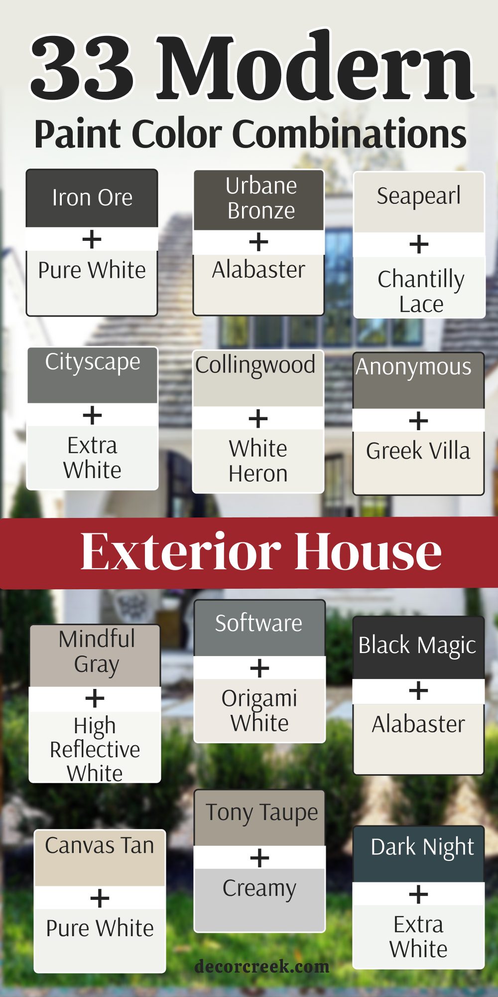
18 Exterior House Paint Color Combinations That Goes With Dark Brown Wood
Alabaster SW 7008 + Dark Brown Wood
Alabaster SW 7008 is a creamy white that feels very soft and welcoming to everyone who visits. This color looks beautiful when it is paired with dark brown wood pillars or a wooden front door. I think this is one of the best combinations for a home that wants to feel cozy but modern.
The dark wood makes the soft white paint look very rich and very expensive from the street. You should use the white on the main siding and the wood on the porch and the columns. It looks very natural and pairs perfectly with stone walkways and green plants in the yard.
The white part keeps the house from looking too dark or too heavy when the sun is out. This look feels very established and makes a building look like it belongs in a beautiful park. Many designers love this mix because it is very easy on the eyes for many years. It creates a very quiet and strong look that makes a home feel like a special place.
Best used in: farmhouse exteriors, main siding, and front entrances
Pairs well with: dark wood, copper metal, stone paths, and green bushes
The key rule of this color for farmhouse style is to use it where you want a very natural and soft look.
🎨 Check out the complete guide to this color right HERE 👈
Greek Villa SW 7551 + Dark Brown Wood
Greek Villa SW 7551 is a very soft and sunny white that has a tiny drop of gold and beige in it. This color looks beautiful when you put it next to dark brown wood beams or a thick wooden front door. I think it is a great choice because the warm white makes the dark wood look very rich and very expensive.
It is a very popular pick for a home that wants to look bright but still feels very cozy and homey. The color stays looking very clean even when the sun is shining directly on the large exterior walls. You should use the white on the main siding to make the dark wood accents really pop out.
It feels very established and makes a building look like it has a lot of history and care. Many people like this because it is a white that does not feel cold or like a hospital room. This shade is very professional and looks very high-end on a large traditional house or a cottage. It creates a very quiet and strong look that makes a home feel very special to the family.
Best used in: farmhouse exteriors, main siding, porch pillars, and window trim
Pairs well with: dark walnut wood, black metal lights, and stone walkways
The key rule of this color for farmhouse style is to use it where you want natural light to feel kind, soft, and inviting throughout the day.
🎨 Check out the complete guide to this color right HERE 👈
Shoji White SW 7042 + Dark Brown Wood
Shoji White SW 7042 is a creamy and warm white that has a little bit of gray and beige hidden inside. This color feels very natural and looks like a soft piece of paper or a smooth stone from a river.
I love this combination because the dark brown wood makes the Shoji White look very clean and very updated. You can use the white on the main walls and the wood on the porch columns or the garage doors. It looks very established and makes a building look like it belongs in a beautiful garden or a forest.
Many homeowners pick this because it is not a stark white and it feels very easy on the eyes. The two materials blend together in a way that makes the house feel very cozy and very safe. This is a very reliable mix for a family home that wants to look very traditional and very well-kept. It creates a very quiet and strong look that makes a house feel very sturdy and very proud.
Best used in: suburban siding, porch columns, window trim, and front entrances
Pairs well with: dark oak wood, copper accents, and tan brick paths
The key rule of this color for farmhouse style is to use it to make the house feel soft and warm.
🎨 Check out the complete guide to this color right HERE 👈
Creamy SW 7012 + Dark Brown Wood
Creamy SW 7012 is a soft and warm white that looks like the color of fresh milk or a silk dress. This color is very popular because it feels very welcoming and makes a house look very friendly. I think it looks very handsome when you pair it with dark brown wood shutters or a wooden porch floor.
It is a great choice for a house that has a lot of trees and green plants in the front yard. The color stays looking very rich and does not look too bright even in the middle of a sunny day. You should use the white on the siding to make the dark wood details look very sharp and very clear.
It feels very grounded and makes a building look like it is built with very high-quality materials. Many people like this because it is a very traditional and safe way to make a home look beautiful. This white is very soft and looks very professional on any type of neighborhood house. It creates a very serious and high-end look that neighbors will really admire for a long time.
Best used in: traditional siding, window shutters, front doors, and porch areas
Pairs well with: dark mahogany wood, bronze hardware, and red brick
The key rule of this color for farmhouse style is to use it to make the house feel very soft and easy.
🎨 Check out the complete guide to this color right HERE 👈
Accessible Beige SW 7036 + Dark Brown Wood
Accessible Beige SW 7036 is a very soft and light tan that has a little bit of gray mixed in for a modern look. This color looks very professional and very smart when it is paired with dark brown wood accents. I find that the dark wood makes the light beige paint look very fresh and very clean from the street.
It is a great choice for a family that wants a home that feels very warm and very inviting to guests. The beige color is light enough to be used on the whole house without making it look too dark. You should use the dark wood on the front door or the garage to create a nice contrast.
It works very well on all types of house styles and in almost any neighborhood in the world. This look feels very established and makes a building look like it is very well-cared for by the family. The soft tan color does not look too yellow or too orange even in the bright afternoon sun. It creates a very quiet and happy look that makes a home feel very cozy.
Best used in: suburban homes, main siding, window trim, and garage doors
Pairs well with: dark walnut wood, black hardware, and gray stone
The key rule of this color for farmhouse style is to use it to make the home feel light and warm.
🎨 Check out the complete guide to this color right HERE 👈
Natural Linen SW 9109 + Dark Brown Wood
Natural Linen SW 9109 is a warm and sandy tan that looks like the color of a clean piece of fabric. This color looks very rich and very expensive when it is paired with dark brown wood pillars or a wooden door. I think this is a perfect combination for a house that wants to look very traditional and very well-maintained.
The tan color is light enough to be used on a large house without making it look too heavy. You should use the wood on the porch and the columns to keep the look feeling very fresh. It works very well on houses that have a lot of natural stone and a light-colored roof.
This look feels very professional and tells people that your home is a very happy place to live. The soft tan color stays looking very nice even when the weather is a bit cloudy or dark. This is a very smart and beautiful choice for a family that wants a light and classic look. It creates a very quiet and clean look that makes a home feel very sturdy.
Best used in: traditional siding, porch columns, window trim, and garden walls
Pairs well with: dark oak wood, copper metal, and flagstone paths
The key rule of this color for farmhouse style is to use it to make the house feel very soft.
🎨 Check out the complete guide to this color right HERE 👈
Balanced Beige SW 7037 + Dark Brown Wood
Balanced Beige SW 7037 is a warm and medium-toned tan that looks very solid on the walls of a house. This color is very popular because it feels very sturdy and makes a house look very well-built. I think it looks very handsome when you pair it with dark brown wood shutters or a wooden front door.
It is a great choice for a house that wants to look very natural and very cozy for the family. The beige is dark enough to show off the wood but light enough to feel very friendly to people. You should use the beige on the main siding and the wood on the accents to make the home look sharp.
It works very well on homes that have a lot of stone or brick parts on the bottom. This look feels very professional and tells people that you care about your home being a warm place. The two materials blend together in a way that makes the whole building look very well-made. It creates a very quiet and strong look that makes a home feel very special.
Best used in: suburban siding, porch columns, window trim, and front entrances
Pairs well with: dark walnut wood, bronze hardware, and tan brick
The key rule of this color for farmhouse style is to use it to make the house feel soft and warm.
🎨 Check out the complete guide to this color right HERE 👈

Tony Taupe SW 7038 + Dark Brown Wood
Tony Taupe SW 7038 is a rich and medium-dark gray-brown that feels very heavy and very sturdy on a house. This color looks very expensive because it is such a deep and saturated shade of taupe. I love this combination because the dark brown wood makes the Tony Taupe look very rich and very sophisticated.
You can use the taupe on the main siding and the wood on the columns and the front door. It looks very natural and pairs perfectly with stone walkways and green plants in the yard. The dark color keeps the house looking very clean and stays looking new for a very long time.
This look feels very permanent and makes a building look like it belongs in a beautiful forest or park. Many designers love this mix because it is very easy to look at for many years without getting tired of it. It creates a very quiet and strong look that makes a home feel like a very special place.
Best used in: country estates, main siding, window shutters, and front entrances
Pairs well with: dark mahogany wood, bronze metal, and flagstone
The key rule of this color for farmhouse style is to use it where you want a very natural and deep look.
🎨 Check out the complete guide to this color right HERE 👈
Mindful Gray SW 7016 + Dark Brown Wood
Mindful Gray SW 7016 is a very popular medium gray that has a perfect balance of warm and cool tones. This color looks very professional and very smart when it is paired with dark brown wood details. I find that the dark wood makes the gray paint look very fresh and very clean from the sidewalk.
It is a great choice for a modern home that wants to look very sleek and very stylish. The gray is dark enough to be bold but it still feels very soft and easy on the eyes. You should use the dark wood on the porch or the garage to create a very nice contrast.
It works very well on all types of house styles and in almost any neighborhood in the city. This look feels very established and makes a building look like it is very well-cared for by the family. The gray color stays looking very nice even when the sun is not shining directly on the walls. It creates a very quiet and clean look that makes a home feel very happy.
Best used in: suburban homes, main siding, window trim, and garage doors
Pairs well with: dark oak wood, black hardware, and silver accents
The key rule of this color for farmhouse style is to use it on the siding to make the home feel light.
🎨 Check out the complete guide to this color right HERE 👈
Dovetail SW 7018 + Dark Brown Wood
Dovetail SW 7018 is a warm and medium gray that feels very soft and very solid on a house wall. This color is a great choice because it looks like a soft stone and feels very modern and fresh. I love this combination because the dark brown wood makes the Dovetail gray look very rich and very expensive.
You can use the gray on the main walls and the wood on the porch columns or the window frames. It looks very natural and pairs perfectly with stone walkways and green bushes in the front garden. The color stays looking very nice and does not look too dark even on a cloudy or a rainy day.
This look feels very established and tells people that you care a lot about your home design. The warm gray makes the house feel very cozy and very welcoming to anyone who drives by. It is a very smart and beautiful choice for a family that wants a home that looks very stylish. It creates a very quiet and strong look that makes a house feel very special.
Best used in: suburban siding, porch columns, window trim, and front entrances
Pairs well with: dark walnut wood, copper accents, and gray stone
The key rule of this color for farmhouse style is to use it to make the house feel soft and warm.
🎨 Check out the complete guide to this color right HERE 👈
Urbane Bronze SW 7048 + Dark Brown Wood
Urbane Bronze SW 7048 is a deep and warm gray that has a bit of a brown and green look inside of it. This color is perfect for a house that wants to look very modern and very high-fashion this year. I think it looks very expensive when you pair it with dark brown wood pillars or a wooden front door.
The dark bronze color looks very rich when it is next to the natural and dark wood tones. You can use the dark paint on the main body of the house to make a very big statement. It looks very natural and pairs perfectly with wood pillars and stone walkways in the garden.
The dark color keeps the house looking very private and very safe from the outside world. This look feels very established and makes a building look like it belongs in a beautiful forest. Many people love this mix because it is very bold and looks very sophisticated. It creates a very quiet and strong look that makes a home feel like a special place.
Best used in: modern exteriors, main siding, front doors, and garage doors
Pairs well with: dark oak wood, copper metal, and stone paths
The key rule of this color for farmhouse style is to use it where you want a very natural and deep look.
🎨 Check out the complete guide to this color right HERE 👈
Iron Ore SW 7069 + Dark Brown Wood
Iron Ore SW 7069 is a very dark and deep charcoal that looks like the color of natural stone or heavy metal. This color looks incredibly modern and high-end when you pair it with dark brown wood accents on a house. I think it is one of the best choices for a home that wants to look very strong and very private.
The dark gray-black paint makes the natural grain of the wood look very rich and very expensive. You should use the dark paint on the main siding and the wood on the porch ceiling or the front door. It feels very established and makes a building look like it is built to last for a very long time.
Many people like this because it is a very bold way to use a dark neutral shade on a large scale. This combination is very popular for mountain modern homes and houses with a lot of glass. It creates a very serious and professional look that adds a lot of value to the property.
Best used in: modern siding, front doors, accent gables, and window trim
Pairs well with: dark walnut wood, silver metal lights, and slate stone
The key rule of this color for farmhouse style is to use it to create a very bold and clean look.
🎨 Check out the complete guide to this color right HERE 👈
Tricorn Black SW 6258 + Dark Brown Wood
Tricorn Black SW 6258 is a very true and deep black that does not have any hidden colors inside of it. This color is perfect for a house that wants to look very sharp and very modern this year. I find that it looks amazing when you pair it with dark brown wood pillars or a wooden garage door.
The black color makes the warm tones in the wood look very bright and very welcoming to guests. You should use the black on the trim or the window frames to create a very high contrast. It makes a house feel very sturdy and protected from the rest of the neighborhood.
This shade is perfect for a home that wants to make a very big statement with a simple color palette. The dark wood keeps the black from looking too cold or too flat in the bright sunlight. This is a very strong and beautiful mix for any homeowner who loves a very clean look. Most people will think this house looks very expensive and very well-designed.
Best used in: modern exteriors, front doors, window trim, and accent walls
Pairs well with: dark oak wood, black metal hardware, and gray stone
The key rule of this color for farmhouse style is to use it to create a very sharp and classic look.
🎨 Check out the complete guide to this color right HERE 👈

Black Magic SW 6991 + Dark Brown Wood
Black Magic SW 6991 is a very deep black that has a tiny bit of warmth that makes it feel very soft. This color looks very sophisticated when you see it on a house with a lot of dark brown wood detail. I think it looks very expensive because it is such a rich and saturated shade of dark paint.
It works well on homes that have a modern or a very creative architectural style to them. The color feels very clean and very sharp when you look at it from the street or the sidewalk. It is a great way to add a lot of depth without using a color that looks too bright or loud.
You can use it on the siding with a dark wood door for a very smart and pretty look. It looks especially good in places that get a lot of bright and direct sunlight during the day. This black is very refreshing and stays looking very new for a long time on your house. It is a very cool and interesting pick for a homeowner who likes a very dark look.
Best used in: farmhouse siding, front doors, garage doors, and modern homes
Pairs well with: dark mahogany wood, bronze light fixtures, and stone paths
The key rule of this color for farmhouse style is to use it to create a very sharp and classic look.
🎨 Check out the complete guide to this color right HERE 👈
Peppercorn SW 7674 + Dark Brown Wood
Peppercorn SW 7674 is a medium-dark gray that looks like the color of a stormy sky or soft charcoal. This color is very popular because it feels very balanced and is very easy for people to look at. I like to use it on houses that have a lot of dark brown wood trim and a dark gray roof.
It looks very natural and does not feel like a color that is too dark or too light for the street. The color is light enough to be used as the main color on a big house without it being too much. It pairs very nicely with dark wood pillars to make the home feel very soft and very warm.
This gray makes a home feel very cozy and very welcoming to anyone who walks by the garden. It is a great choice for a neighborhood that has a lot of green grass and tall trees. The shade is very balanced and does not look like it has any blue or green in it. It is a very friendly and soft gray for a traditional family home exterior.
Best used in: suburban siding, porch walls, shutters, and backyard fences
Pairs well with: dark walnut wood, silver hardware, and gray stone paths
The key rule of this color for farmhouse style is to use it to make the house feel soft.
🎨 Check out the complete guide to this color right HERE 👈
Gauntlet Gray SW 7019 + Dark Brown Wood
Gauntlet Gray SW 7019 is a deep and stony gray that feels very sturdy and very professional on a house. This color looks very smart when it is paired with dark brown wood accents on the porch or the door. I find that the dark wood makes the gray paint look very fresh and very clean from the sidewalk.
It is a great choice for a suburban home that wants to look very updated and very modern. The gray is dark enough to be bold but it still feels very soft and easy on the eyes. You should use the dark wood on the front door or the columns to create a very nice contrast.
It works very well on all types of house styles and in almost any neighborhood in the city. This look feels very established and makes a building look like it is very well-cared for by the family. The gray color stays looking very nice even when the sun is not shining directly on the walls. It creates a very quiet and clean look that makes a home feel very happy.
Best used in: suburban homes, main siding, window trim, and garage doors
Pairs well with: dark oak wood, black metal lights, and gray stone
The key rule of this color for farmhouse style is to use it on the siding to make the home feel sturdy.
🎨 Check out the complete guide to this color right HERE 👈
Cityscape SW 7067 + Dark Brown Wood
Cityscape SW 7067 is a cool and medium-dark gray that looks like the color of stone buildings in a big city. This color looks very professional and very sharp when it is paired with dark brown wood details. I think this is one of the best choices for a modern house that wants to look very new and very clean.
The gray is dark enough to show off the wood accents but light enough to feel very open and bright. You should use the dark wood on the window frames or the roof line to make the gray look very crisp. It works very well on homes that have a lot of metal or glass parts in the architecture.
This look feels very modern and tells people that you care a lot about your home being stylish. The contrast between the cool gray and the dark wood makes every part of the house stand out. It is a very smart choice for a family that wants a clean and updated look for their exterior. This combination is very popular because it always looks very fresh and very high-end.
Best used in: modern siding, window trim, garage doors, and urban homes
Pairs well with: dark walnut wood, silver metal, and slate stone
The key rule of this color for farmhouse style is to use it where you want a very clean and sharp look.
🎨 Check out the complete guide to this color right HERE 👈
Chelsea Gray HC-168 + Dark Brown Wood
Chelsea Gray HC-168 is a medium-dark gray that has a bit of warmth and a lot of depth on the walls. This color is very popular because it feels very sturdy and makes a house look very well-built. I think it looks very handsome when you pair it with dark brown wood shutters or a wooden front door.
It is a great choice for a house that wants to look very natural and very cozy for the family. The gray is dark enough to show off the wood but light enough to feel very friendly to people. You should use the gray on the main siding and the wood on the accents to make the home look sharp.
It works very well on homes that have a lot of stone or brick parts on the bottom. This look feels very professional and tells people that you care about your home being a warm place. The two materials blend together in a way that makes the whole building look very well-made. It creates a very quiet and strong look that makes a home feel very special.
Best used in: suburban homes, main siding, window trim, and shutters
Pairs well with: dark mahogany wood, black hardware, and gray stone
The key rule of this color for farmhouse style is to use it on the siding to make the home feel sturdy.
🎨 Check out the complete guide to this color right HERE 👈
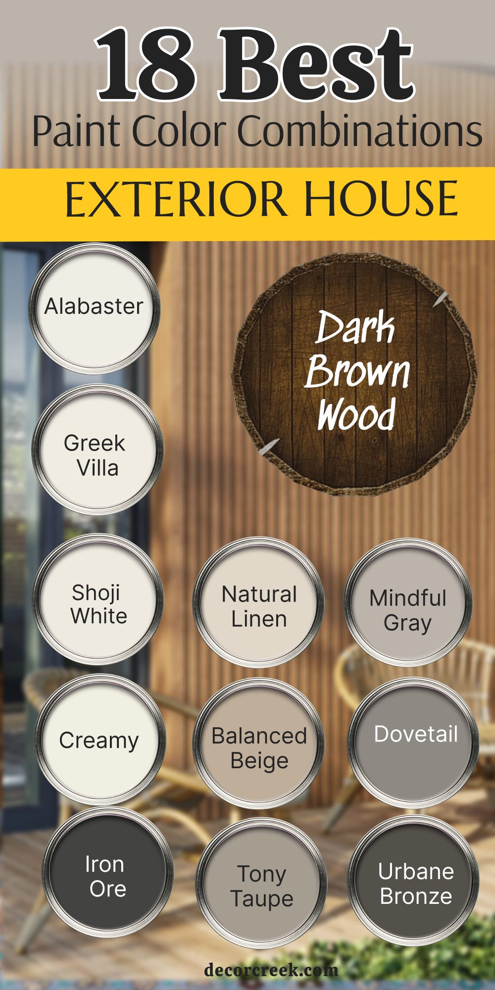
21 Exterior House Paint Color Combinations For the Farmhouse
Alabaster SW 7008 + Tricorn Black SW 6258
Alabaster SW 7008 is a creamy and iconic white that provides a soft, warm glow to any farmhouse. Tricorn Black SW 6258 is a true, deep black that offers the perfect sharp contrast for window frames and doors. I love this combination because it feels very classic but has a modern, high-end edge.
The warmth of Alabaster prevents the house from looking too cold or clinical in the bright sun. You should use the white on the main siding and the black on the shutters to ground the design. It feels very established and makes a building look like it is built with great care.
Many people like this because it is the quintessential “modern farmhouse” look that stays in style. This mix is very professional and creates a stunning first impression for any visitor. It creates a very quiet and strong look that makes a home feel like a sanctuary.
Best used in: classic farmhouse siding, window trim, and front doors
Pairs well with: natural wood porch ceilings, black metal lanterns, and green boxwoods
The key rule of this color for farmhouse style is to use it to achieve that perfect balance between vintage charm and modern lines.
Pure White SW 7005 + Iron Ore SW 7069
Pure White SW 7005 is a clean, bright white that looks very fresh and updated on large exterior walls. Iron Ore SW 7069 is a soft charcoal gray that is just a bit lighter than a true black. I think this is one of the best combinations for a family that wants a very crisp and high-contrast look.
The gray tones in Iron Ore keep the accents from looking too harsh against the bright white siding. You should use the white for the main body of the house and the charcoal for the garage doors. It works very well on homes that have a lot of straight lines and metal roofing.
This look feels very modern and tells people that you have a very sophisticated sense of style. The high contrast makes the architectural details of the porch and gables stand out beautifully. It is a very smart choice for a home that needs to look both sturdy and very stylish.
Best used in: modern farmhouse siding, garage doors, and metal roof accents
Pairs well with: silver hardware, slate stone walkways, and white hydrangeas
The key rule of this color for farmhouse style is to use it to create a very bold and clean look that feels brand new.
Greek Villa SW 7551 + Black Magic SW 6991
Greek Villa SW 7551 is a soft, sunny white that has a tiny drop of gold and beige inside of it. Black Magic SW 6991 is a deep black that has a hint of warmth to match the creamy white perfectly. I find that this combination looks very high-fashion and very cozy at the same time on a large home.
The warm white makes the house feel very welcoming and not at all stark or blinding in the sun. You should use the black on the front door and the window trim to frame the house beautifully. It makes a building feel very private and very tucked away from the rest of the street.
This shade is perfect for a home that wants to make a big statement with a very traditional color palette. The warmth in both colors keeps the design feeling very organic and connected to the land. This is a very strong and beautiful mix for any homeowner who loves a rich, expensive look.
Best used in: traditional farmhouse siding, front doors, and window frames
Pairs well with: warm oak wood, bronze light fixtures, and red brick chimneys
The key rule of this color for farmhouse style is to use it where you want natural light to feel soft and inviting.
Shoji White SW 7042 + Urbane Bronze SW 7048
Shoji White SW 7042 is a complex, creamy white that leans into a very light greige or beige tone. Urbane Bronze SW 7048 is a deep, earthy gray-brown that feels very grounded and very natural. I love this combination because it moves away from high contrast and toward a very soft, tonal look.
The dark bronze looks very rich when it is used on the gables or as an accent against the warm white walls. You can use the white on the main siding and the bronze on the trim for a very sophisticated appearance.
It looks very established and makes a building look like it belongs in a wooded or rural setting. Many homeowners pick this because it is very easy on the eyes and hides dust better than a pure white. The two colors blend together in a way that makes the whole house feel very cozy and very safe. This is a very reliable mix for a farmhouse that wants to feel very sturdy and well-integrated with nature.
Best used in: rural farmhouses, main siding, and accent gables
Pairs well with: copper gutters, stone foundations, and dark wood beams
The key rule of this color for farmhouse style is to use it to make the house feel soft, warm, and natural.
Creamy SW 7012 + Dark Night SW 6237
Creamy SW 7012 is a soft, warm white that feels very traditional and very friendly to guests. Dark Night SW 6237 is a moody, deep blue-green that adds a wonderful pop of color to a farmhouse. I think this is a great choice for a family that wants something a little different from the usual black and white.
The dark green-blue accent makes the house look very unique and very expensive from the street. You should use the creamy white on the siding and the dark color on the shutters or the front door. It feels very grounded and makes a building look like it has a lot of character and history.
The warmth of the white balances the cool tones of the dark accent color perfectly. Many people like this because it is a bold but very safe way to use color on a large exterior. This mix is very professional and creates a very quiet and strong look that neighbors will admire.
Best used in: cottage-style farmhouses, front doors, and window shutters
Pairs well with: natural cedar wood, black metal lights, and white flower gardens
The key rule of this color for farmhouse style is to use it to add a sense of weight and personality to the design.
Snowbound SW 7004 + Gauntlet Gray SW 7019
Snowbound SW 7004 is a versatile white that has a tiny bit of gray to keep it looking soft and clean. Gauntlet Gray SW 7019 is a medium-dark, stony gray that feels very professional and very sturdy. I suggest using this combination if you want your farmhouse to look very updated and very smart.
The gray is dark enough to provide a nice contrast but light enough that it doesn’t feel overwhelming. You should use the white on the main siding and the gray on the trim and the garage doors. It feels very fresh and makes a building look like it is very well-kept and modern.
Many people like this because it is a very safe and beautiful choice that works in any neighborhood. The gray color stays looking very nice even on cloudy days when other colors might look flat. This is a very smart and professional look that adds a lot of value to any style of property.
Best used in: suburban farmhouses, main siding, and garage doors
Pairs well with: silver hardware, gray stone paths, and dark green shrubs
The key rule of this color for farmhouse style is to use it on the siding to make the home feel sturdy and clean.
Westhighland White SW 7566 + Dovetail SW 7018
Westhighland White SW 7566 is a very soft and creamy white that has a tiny bit of warmth. Dovetail SW 7018 is a warm, medium gray that pairs beautifully with creamy tones. I find that this combination looks very high-fashion and very stylish on a traditional farmhouse.
The warm gray on the shutters or trim makes the house look very well-designed and very intentional. You should use the white on the main walls to keep the house looking large and bright in the sun.
It makes a house feel very private and very tucked away while still being very welcoming to friends. This shade is perfect for a home that wants to look soft without using too much brown or tan. The creamy white keeps the gray from looking too cold or industrial for a family home. This is a very strong and beautiful mix for any homeowner who likes a balanced and rich look.
Best used in: traditional farmhouse siding, window trim, and porch columns
Pairs well with: warm wood porch floors, copper accents, and tan stone
The key rule of this color for farmhouse style is to use it to make the house feel soft and easy to live in.
Natural Linen SW 9109 + Iron Ore SW 7069
Natural Linen SW 9109 is a warm, sandy tan that feels very organic and very soft. Iron Ore SW 7069 is a deep charcoal that provides a very modern and sharp edge to the tan base. I think this is a perfect combination for a house that wants to look very traditional but still very current.
The tan color is light enough to be used on a large house without making it look too heavy or dark. You should use the charcoal on the window frames and the front door to ground the design. It works very well on houses that have a lot of natural stone or a dark-colored roof.
This look feels very professional and tells people that your home is a very happy and stable place. The soft tan color stays looking very nice and pairs perfectly with the deep gray accents. This is a very smart and beautiful choice for a family that wants a warm and classic look.
Best used in: country farmhouses, main siding, and front entrances
Pairs well with: dark wood beams, bronze metal, and flagstone paths
The key rule of this color for farmhouse style is to use it to make the house feel very soft and grounded.
Accessible Beige SW 7036 + Tricorn Black SW 6258
Accessible Beige SW 7036 is a very popular light tan that has a little bit of gray to keep it looking modern. Tricorn Black SW 6258 is a true black that makes the soft beige siding look very crisp and clean. I love this combination because it feels very fresh and very updated for a family home.
The beige color is very light and makes the whole house look much larger and more open from the street. You should use the black on the shutters and the trim to create a very sharp and professional look.
It works very well on all types of farmhouse styles and in almost any neighborhood. This look feels very established and makes a building look like it is very well-cared for. The soft tan color does not look too yellow or too orange even in the brightest afternoon sun. It creates a very quiet and happy look that makes a home feel very cozy.
Best used in: modern farmhouse siding, shutters, and window trim
Pairs well with: black metal hardware, white flowers, and gray stone foundations
The key rule of this color for farmhouse style is to use it to make the home feel light and warm.
Mindful Gray SW 7016 + Extra White SW 7006
Mindful Gray SW 7016 is a perfect medium gray that works well in any lighting condition. Extra White SW 7006 is a very bright and very clean white that makes the gray look very sharp. I think this is one of the best choices for a farmhouse that wants to look very clean and very new this year.
The gray is light enough to be used on the whole house without making it look like a dark box. You should use the white on the trim and the porch to keep the look feeling very updated. It feels very fresh and makes a building look like it is very well-maintained and very sturdy.
Many people like this because it is a very safe and beautiful choice for any style of neighborhood. The gray color stays looking very nice and professional even when the sun is not out. This is a very smart look that adds a lot of value and creates a very clean feel.
Best used in: suburban farmhouse siding, porch trim, and window frames
Pairs well with: black light fixtures, silver accents, and white flowering trees
The key rule of this color for farmhouse style is to use it on the siding to make the home feel light and modern.
White Dove OC-17 + Black HC-190
White Dove OC-17 is a soft, creamy white that is a favorite for farmhouses because of its classic feel. Black HC-190 is a deep, true black that creates a very sharp and very traditional contrast. I love this combination for a farmhouse look because it is very bold and will never go out of fashion.
The black color makes the house look very strong and very modern when used on the window trim or the doors. You should use the white on the main siding and the black as a sharp accent for the best visual impact. It makes the house look very clean and very well-kept from the sidewalk or the street.
This high contrast tells everyone that you have a very good eye for classic design and style. The creamy white keeps the black from looking too harsh or too cold for a family home. It creates a very sharp and professional look that makes a home feel very expensive.
Best used in: classic farmhouse siding, window trim, and front doors
Pairs well with: natural wood porch floors, black metal lanterns, and green plants
The key rule of this color for farmhouse style is to use it to create a very sharp and classic look.
Simply White OC-117 + Wrought Iron 2124-10
Simply White OC-117 is a very bright and crisp white that has a tiny bit of warmth to keep it from looking like ice. Wrought Iron 2124-10 is a very deep, moody gray that looks like heavy forged metal. I think this is a perfect combination for a farmhouse that wants to look very sharp and very modern.
The dark gray is not quite black, so it feels a bit softer and more expensive when used on a front door. You should use the white on the main siding and the gray on the window frames to make the house look very clean.
It feels very established and makes the building look like it was designed by a professional architect. Many people like this because it is a very bold way to use dark accents without the house looking too scary. This mix is very professional and creates a very quiet and strong look for a family. It makes a home feel very sturdy and ready for any kind of weather.
Best used in: modern farmhouse siding, front doors, and window trim
Pairs well with: natural wood, black metal lights, and light stone paths
The key rule of this color for farmhouse style is to use it to create a look that is very clean and very updated.
Chantilly Lace OC-65 + Kendall Charcoal HC-166
Chantilly Lace OC-65 is a very pure and very bright white that has no yellow or gray in it at all. Kendall Charcoal HC-166 is a rich, medium-dark gray that feels very solid and very heavy. I love this combination because the white is so bright that it makes the gray look very deep and very interesting.
It is a great choice for a house that you want to look very new and very well-kept from the street. You should use the white on the main body of the house and the charcoal on the garage doors and shutters. It works very well on homes that have a lot of white wood details and a dark gray roof.
This look feels very high-end and tells people that you care a lot about the style of your home. The high contrast makes every part of the porch and the roof line stand out very clearly. It is a very smart choice for a family that wants a home that looks very stylish and very clean.
Best used in: modern siding, garage doors, and window shutters
Pairs well with: silver hardware, white flowers, and gray stone foundations
The key rule of this color for farmhouse style is to use it on the siding to make the home feel very light.
Classic Gray OC-23 + Soot 2129-20
Classic Gray OC-23 is a very light and very soft gray that can look almost like an off-white in the bright sun. Soot 2129-20 is a very dark, smoky black that has a little bit of blue hidden inside of it. I think this is a great choice for a farmhouse that wants to look very sophisticated and very calm.
The soft gray siding makes the house feel very large and very open to the neighborhood. You should use the dark black on the front door and the trim to ground the whole design. It feels very established and makes a building look like it belongs in a very nice part of town.
The blue tones in the black make the house look very unique and much more interesting than a plain black. Many designers love this mix because it is very easy on the eyes and looks very expensive. It creates a very quiet and strong look that makes a home feel like a very special place.
Best used in: traditional siding, front doors, and accent trim
Pairs well with: blue-green plants, silver metal, and dark slate stone
The key rule of this color for farmhouse style is to use it to make the house feel very soft.
Pale Oak OC-20 + Black HC-190
Pale Oak OC-20 is a warm and creamy gray that feels very soft and very natural on a house. Black HC-190 is a very true and very deep black that provides a perfect sharp edge to the warm walls. I find that this combination looks very high-fashion and very cozy at the same time for a family.
The warm gray makes the house feel very welcoming and much friendlier than a cold white. You should use the black on the window frames and the gables to create a very sharp look. It makes a building feel very private and very tucked away from the rest of the world.
This shade is perfect for a home that wants to make a big statement with a very organic feeling. The warmth in the Pale Oak keeps the black from looking too harsh in the middle of a sunny day. This is a very strong and beautiful mix for any homeowner who likes a rich and deep look.
Best used in: traditional siding, window frames, and porch columns
Pairs well with: warm wood, bronze hardware, and red brick paths
The key rule of this color for farmhouse style is to use it where you want a very natural and soft look.
Edgecomb Gray HC-173 + Wrought Iron 2124-10
Edgecomb Gray HC-173 is a soft and earthy gray that has a lot of beige mixed in to make it feel warm. Wrought Iron 2124-10 is a deep, stormy gray that looks very professional and very sturdy on the accents. I love this combination for a farmhouse because it feels very grounded and very solid in its design.
The warm gray-beige siding looks very rich and expensive when it is paired with the dark gray trim. You can use the light color on the main siding and the dark color on the shutters and the porch. It looks very established and makes a building look like it has been there for many years.
Many homeowners pick this because it is a very safe and beautiful choice that never goes out of style. The two colors blend together in a way that makes the house feel very cozy and very safe. This is a very reliable mix for a family home that wants to look very well-kept and very strong.
Best used in: country farmhouses, main siding, and window shutters
Pairs well with: dark wood beams, copper metal, and stone walkways
The key rule of this color for farmhouse style is to use it to make the house feel very soft.
Balboa Mist OC-27 + Kendall Charcoal HC-166
Balboa Mist OC-27 is a very soft and light gray that has a tiny bit of warmth to make it feel inviting. Kendall Charcoal HC-166 is a medium-dark gray that looks like a heavy stone or a piece of lead. I think this is a perfect combination for a family that wants a home that feels very clean and updated.
The light gray siding makes the house look very open and much larger than it really is. You should use the charcoal on the trim and the garage doors to keep the look feeling very fresh. It works very well on all types of farmhouse styles and in almost any neighborhood in the city.
This look feels very established and makes a building look like it is very well-cared for by the family. The soft gray color stays looking very nice even when the weather is a bit cloudy. This is a very smart and beautiful choice for a family that wants a light and classic look. It creates a very quiet and clean look that makes a home feel very sturdy.
Best used in: suburban siding, garage doors, and window trim
Pairs well with: black metal, white flowers, and gray stone
The key rule of this color for farmhouse style is to use it on the siding to make the home feel light.
Cloud White OC-130 + Graphite 1603
Cloud White OC-130 is a soft and creamy white that feels very bright and very welcoming to guests. Graphite 1603 is a very dark and rich gray that looks like the color of a pencil lead. I love this combination because it is a very bold and very classic look for a modern farmhouse.
The dark gray color makes the house look very strong and very modern when used on the doors. You should use the white on the main siding and the graphite as a sharp accent for the windows. It makes the house look very clean and very well-kept from the sidewalk or the street.
This high contrast tells everyone that you have a very good eye for design and style. The creamy white keeps the dark gray from looking too harsh or too cold for a family home. Many people pick this because it is a look that will always be in fashion for a house. It creates a very sharp and professional look that makes a home feel very expensive.
Best used in: farmhouse siding, window trim, and front doors
Pairs well with: natural wood, black hardware, and green garden plants
The key rule of this color for farmhouse style is to use it to create a very sharp and classic look.
Seapearl OC-19 + Amherst Gray HC-167
Seapearl OC-19 is a very soft off-white that has a tiny bit of gray and tan to make it look like a pearl. Amherst Gray HC-167 is a deep and stony gray that looks very strong and very solid. I think this is a great choice for a house that wants to look very smart and very well-maintained.
The soft white makes the whole house look much larger and more open to the street. You should use the gray on the shutters and the gables to create a very nice and professional contrast. It feels very fresh and makes a building look like it is very well-kept and very new this year.
Many people like this because it is a very safe and beautiful choice for a family home. The soft off-white color does not look too yellow even in the brightest morning sun. This is a very smart and professional look that adds a lot of value to any style of property. It creates a very quiet and happy look for the exterior.
Best used in: traditional siding, window shutters, and porch areas
Pairs well with: light wood, silver metal, and gray stone paths
The key rule of this color for farmhouse style is to use it to make the house feel very light and airy.
White Heron OC-57 + Chelsea Gray HC-168
White Heron OC-57 is a cool and crisp white that has a tiny touch of gray to keep it soft. Chelsea Gray HC-168 is a medium-dark gray that has a bit of warmth and a lot of depth on the walls. I find that this combination looks very high-fashion and very professional on a farmhouse.
The gray is dark enough to be bold but it still feels very soft and easy for neighbors to look at. You should use the white on the trim and the porch to make the gray look very sharp. It feels very fresh and makes a building look like it is very well-built and sturdy.
Many people like this because it is a very bold and beautiful choice for a stylish family home. The gray color stays looking very nice even when the sun is not shining directly on it. This is a very smart look that tells people you care about the design of your home. It creates a very quiet and strong look that makes a house feel very special.
Best used in: modern siding, porch trim, and window frames
Pairs well with: silver hardware, black light fixtures, and white flowers
The key rule of this color for farmhouse style is to use it where you want a very clean and sharp look.
Collingwood OC-28 + Black HC-190
Collingwood OC-28 is a medium-light gray that has a bit of warmth and a lot of depth on a house. Black HC-190 is a very true and deep black that looks like the color of coal or a dark night. I love this combination because the light gray is a perfect match for the very dark black accents.
You can use the gray on the main walls and the black on the window frames and the doors. It feels very established and makes a building look like it is built with very high-quality materials. Many people pick this because it is a very calm and very easy color mix to live with for many years.
The black accents make the house look very unique and very interesting from the street. This is a very reliable and pretty choice for a family home that wants a modern farmhouse feel. It creates a very quiet and clean look that makes a house feel very sturdy and very proud.
Best used in: suburban siding, front doors, and window trim
Pairs well with: dark wood, black hardware, and gray stone foundations
The key rule of this color for farmhouse style is to use it to make the home feel sturdy and clean.
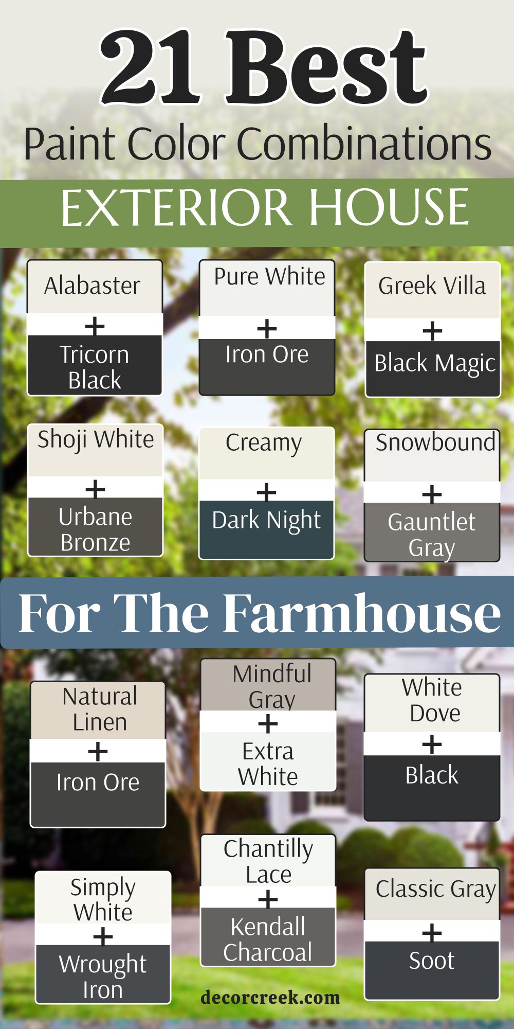
My Final Thoughts about 52 Best Exterior House Paint Color Combinations This Year
Choosing the right color for your home’s exterior is one of the most significant decisions you can make as a homeowner. It is the first thing people see when they pull into your driveway, and it sets the tone for everything that happens inside.
After exploring these 52 combinations—ranging from the deep, moody depths of Hale Navy to the warm, welcoming glow of Alabaster—the “Modern Farmhouse” movement continues to dominate because the pairing of crisp whites with industrial charcoals like Iron Ore highlights architectural bones with professional precision.
We are also seeing a beautiful shift toward organic modernism where earthy neutrals like Stone Lion and Urbane Bronze bridge the gap between nature and architecture, especially when paired with natural materials like dark wood or stone. Ultimately, the success of your project lies in the execution; a high-end look is achieved when the paint is applied smoothly, the trim is crisp, and the colors harmonize with the surrounding landscape.
Don’t be afraid to be bold with your front door or your shutters, but stay grounded with your main siding to ensure your home feels like a sanctuary of pride and peace.
Whether you are aiming for a historic cottage feel or a sleek urban vibe, these 52 combinations offer a professional roadmap to a beautiful transformation that will stay in style for many years to come.