Finding the right paint for your home feels like a big job because you want it to look just right for your family. Light blue is a favorite choice for many people because it feels fresh and makes rooms look much bigger than they really are. I have seen how these shades work in real life through many years of staging houses and helping clients fall in love with their homes.
This color choice is very smart because it brings a sense of happiness and light into any area where you spend your time. It is a very safe way to update your house without spending a lot of money on new furniture. You will notice that the whole house feels more open and clean as soon as the first coat of paint is dry on the walls.
Most people worry that blue will look too cold or too dark, but the right shade fits in any room of the house. These colors act like a neutral base that lets your favorite furniture and colorful art stand out for everyone to see. Whether you want a room to feel very bright and sunny or a bit cozy for resting, light blue is a smart way to go.
It is a very flexible color that works just as well in a small bathroom as it does in a large living room.
I often suggest these tones to people who want a change but do not want the walls to look too bold. You can easily match these blues with white, gray, or even warm wood tones to create a look that feels balanced.
Why I Always Trust Sherwin-Williams and Benjamin Moore for the Best Light Blue Paint Colors
I only pick paints from companies that make high-quality products that last a long time on your walls. Sherwin-Williams and Benjamin Moore have the best collections of blues that look like the real world instead of looking like a plastic toy. Their colors do not change into weird shades or look muddy when you put them on your walls in different types of rooms.
I have tested many brands, and these two always give the most beautiful results for any project I lead. They offer a wide range of finishes that help the paint look smooth and hide any small bumps on the surface. You can feel good knowing that the color you picked from the little paper sample will look exactly the same on your large wall.
The paint covers the walls smoothly, which saves time and money during the project because you do not need as many coats. I know that if I pick a color from their fans, it will look the same in your house as it does in the store under the bright lights. Using these brands helps me feel sure that the final result will be beautiful for my clients and easy for them to keep clean. The quality of the pigments inside the paint means the blue will stay looking new for many years without fading.
This is very important for areas that get a lot of sun from large windows throughout the day. When you use top-quality paint, the job becomes much easier for the person doing the work.
How I Choose the Perfect Light Blue Shade
Picking a shade starts with looking at the windows in your house and seeing how much light comes inside. I always watch how the sun moves through a room at different times of the day to see how the color changes. A blue that looks bright and cheery in the morning might look like a soft gray when the sun goes down in the evening.
You should always look at your paint samples in the morning, at noon, and right before dinner time. This helps you understand if the color will make you happy all day long or if it feels too dark in the shadows. I recommend painting a small piece of board and moving it to different walls to see the difference.
I also check the color of the floors and the rugs that stay in the room because they reflect onto the walls. If you have dark wood floors, a crisp blue looks very clean and sharp and provides a nice contrast. If your floors are light, a blue with a hint of green makes everything feel connected and very natural like a garden. You have to think about the colors of your sofa and your curtains before you make a final choice on the paint. If you have a lot of warm colors, you might want a blue with a tiny bit of gray to keep things soft.
Taking the time to look at all these details will help you find the best match for your home. Finding the right balance between the paint and your things is the secret to a well-designed room.
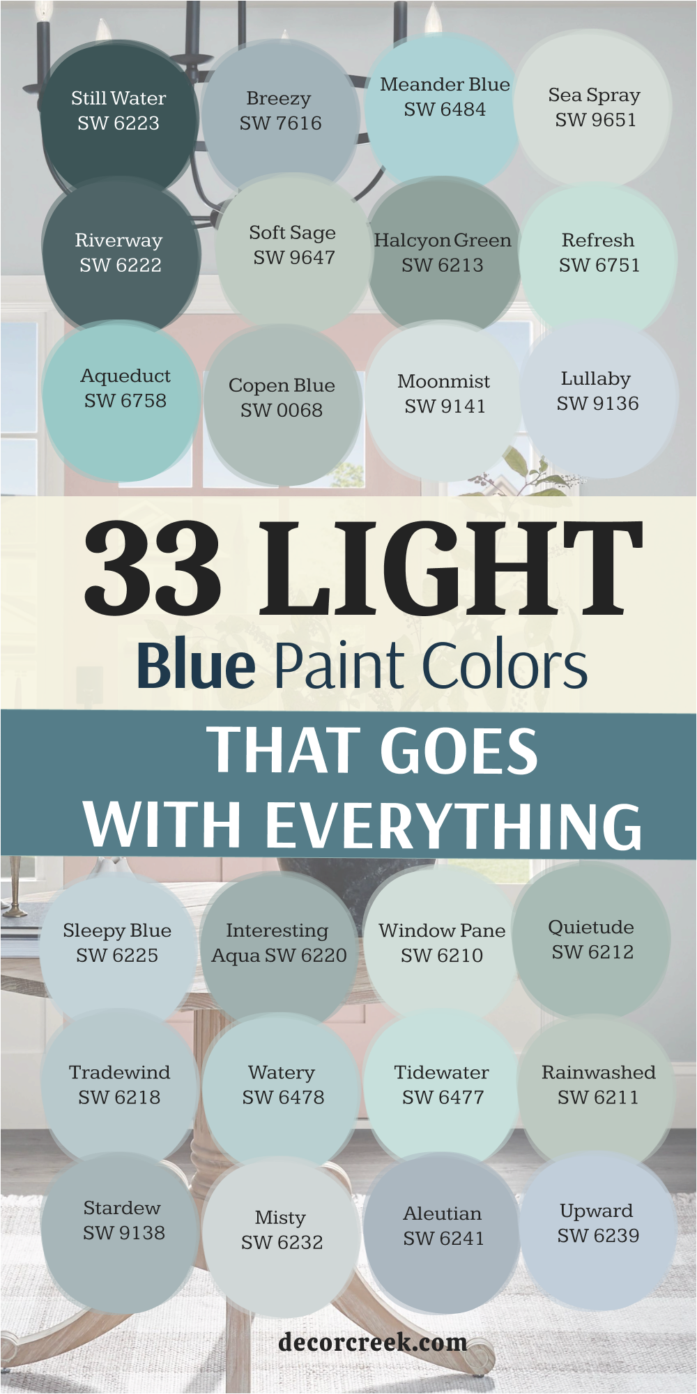
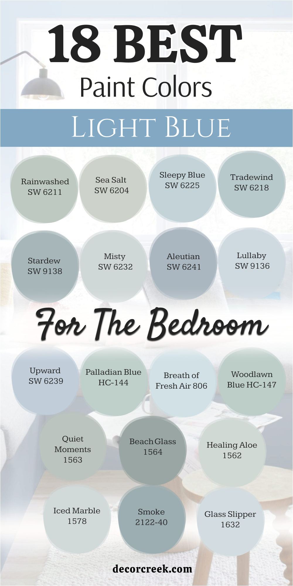
18 Best Light Blue Paint Colors For The Bedroom
Rainwashed SW 6211
Rainwashed SW 6211 brings a very soft feeling to the walls that makes people feel happy. This color has a mix of blue and green that looks like a clear pond. It changes its look depending on how much sun comes through the window.
You will see more green in the afternoon when the light is warm. It works well with white trim because it makes the blue pop out. Many people choose this for their main bedroom because it feels very quiet.
I like to use it when the furniture is made of light-colored wood. The walls will look like they are glowing softly during the day. It is a very safe choice if you cannot decide between blue and green.
Best used in: bedrooms, bathrooms, laundry rooms, and nursery walls
Pairs well with: Pure White SW 7005, Accessible Beige SW 7036, Sea Salt SW 6204, light oak furniture The key rule of this color for farmhouse style is to use it where you want natural light to feel kind, soft, and inviting throughout the day.
🎨 Check out the complete guide to this color right HERE 👈

Sea Salt SW 6204
Sea Salt SW 6204 is one of the most popular colors I use in my staging work. This shade is a very light blend of blue, green, and a tiny bit of gray. It looks different in every house because it reacts to the things around it.
Sometimes it looks like a soft mint and other times it looks like a misty sky. It makes a small bedroom feel much larger than it really is. Most people find it very relaxing to look at before they go to sleep.
It is the perfect choice for a coastal look without being too bright. The color is so light that it almost acts like a white paint with a secret. I suggest this color if you want a room to feel airy and light.
Best used in: bedrooms, bathrooms, kitchens, and entryways
Pairs well with: Alabaster SW 7008, Heron Plume SW 6070, Kilim Beige SW 6106, weathered wood The key rule of this color for farmhouse style is to use it where you want natural light to feel kind, soft, and inviting throughout the day.
🎨 Check out the complete guide to this color right HERE 👈

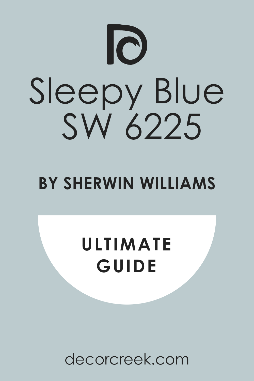
Sleepy Blue SW 6225
Sleepy Blue SW 6225 is a true light blue that reminds people of a clear summer sky. It does not have much gray in it, so it stays very blue on the wall. This color is great for kids’ rooms or a guest bedroom that needs some life.
It looks very traditional and classic when paired with dark brown furniture. The color stays bright even if the room does not have many windows. I think it looks very crisp when you use a bright white on the ceiling.
It gives the room a very clean feeling that makes you want to stay inside. You can use it as a backdrop for colorful pillows and blankets.
Best used in: kids’ bedrooms, nurseries, laundry rooms, and ceilings
Pairs well with: Extra White SW 7006, Naval SW 6244, Dorian Gray SW 7017, dark walnut tones The key rule of this color for farmhouse style is to use it where you want natural light to feel kind, soft, and inviting throughout the day.
🎨 Check out the complete guide to this color right HERE 👈
Tradewind SW 6218
Tradewind SW 6218 has a little bit more depth than the very light blues. This color has a cool undertone that makes a room feel very fresh. It looks amazing in rooms that get a lot of bright southern sunlight.
The blue stays true and does not turn into another color in the shadows. I often pick this when I want a bedroom to feel a bit more sophisticated. It pairs beautifully with silver or gold lamps and hardware.
The walls will feel like a soft breeze is moving through the house. It is a great middle-ground blue that is not too dark.
Best used in: primary bedrooms, bathrooms, dining rooms, and home offices
Pairs well with: High Reflective White SW 7757, Repose Gray SW 7015, Urbane Bronze SW 7048, marble surfaces The key rule of this color for farmhouse style is to use it where you want natural light to feel kind, soft, and inviting throughout the day.
🎨 Check out the complete guide to this color right HERE 👈

Stardew SW 9138
Stardew SW 9138 is a blue that has a good amount of gray hidden inside it. This makes the color feel very grounded and modern for a bedroom. It does not feel like a baby blue, so it works well for adults.
I love how it looks with modern black accents or dark metal bed frames. The gray keeps the blue from feeling too sugary or sweet. It works nicely in a room with large windows and lots of plants.
The color changes beautifully as the sun moves from one side of the house to the other. It feels very cozy when you add soft blankets and textures to the bed.
Best used in: bedrooms, living rooms, mudrooms, and kitchen islands
Pairs well with: Snowbound SW 7004, Iron Ore SW 7069, Drift of Mist SW 9166, black metal accents The key rule of this color for farmhouse style is to use it where you want natural light to feel kind, soft, and inviting throughout the day.
🎨 Check out the complete guide to this color right HERE 👈

Misty SW 6232
Misty SW 6232 is so light that it can almost pass for a light gray in some lights. This color is perfect for people who are afraid of using too much color. It adds just a hint of blue to the walls to keep them from looking boring.
I find that it makes a bedroom feel very open and bright. It looks very smart with white linens and simple decorations. The blue is very faint, like a morning fog over a lake.
It is a great choice if you want your art to be the main focus of the room. This color helps people feel rested as soon as they walk inside.
Best used in: bedrooms, hallways, bathrooms, and ceilings
Pairs well with: Pure White SW 7005, On the Rocks SW 7671, Charcoal Blue SW 2739, light gray rugs The key rule of this color for farmhouse style is to use it where you want natural light to feel kind, soft, and inviting throughout the day.
🎨 Check out the complete guide to this color right HERE 👈

Aleutian SW 6241
Aleutian SW 6241 is a denim-like blue that feels very comfortable and broken-in. It has a dusty quality that makes it feel very soft on the eyes. I use this when I want a bedroom to feel more like a cozy den.
It looks very good with cream colors and warm wood furniture. The color is dark enough to provide a nice contrast against white trim. It reminds me of a favorite pair of jeans that fits just right.
Many men like this blue because it is not too bright or floral. It brings a sense of balance to a room that has a lot of light.
Best used in: bedrooms, studies, boys’ rooms, and accent walls
Pairs well with: Alabaster SW 7008, Mindful Gray SW 7016, Naval SW 6244, warm pine wood The key rule of this color for farmhouse style is to use it where you want natural light to feel kind, soft, and inviting throughout the day.
🎨 Check out the complete guide to this color right HERE 👈
Lullaby SW 9136
Lullaby SW 9136 is a very gentle blue that was made for resting areas. This color is soft and light without being washed out. It has a tiny touch of gray to keep it looking classy.
I think it is the best choice for a nursery or a very quiet guest room. The walls seem to move back, making the whole area feel bigger.
It looks wonderful with soft white curtains and fluffy rugs. You will find that it matches almost any type of flooring. It is a very sweet color that makes everyone feel welcome.
Best used in: nurseries, small bedrooms, bathrooms, and walk-in closets
Pairs well with: Eider White SW 7014, Sea Salt SW 6204, Silver Strand SW 7057, light pink accents The key rule of this color for farmhouse style is to use it where you want natural light to feel kind, soft, and inviting throughout the day.
Upward SW 6239
Upward SW 6239 is a very popular light blue that feels very optimistic. It is a denim blue that has been lightened by the sun. This color works well in bedrooms because it feels very fresh in the morning.
It helps you wake up feeling ready for the day ahead. I like to use it with darker blue accents to give the room more layers. It looks very clean and polished in any light.
The shade is very trendy right now but still feels like it will look good for years. It is a great pick for someone who wants a real blue.
Best used in: bedrooms, entryways, laundry rooms, and porches
Pairs well with: Extra White SW 7006, Tricorn Black SW 6258, Driftwood tones, navy blue The key rule of this color for farmhouse style is to use it where you want natural light to feel kind, soft, and inviting throughout the day.
🎨 Check out the complete guide to this color right HERE 👈

Palladian Blue HC-144
Palladian Blue HC-144 is a famous color that people love for its beauty. It is a perfect mix of blue, green, and cream. This color feels very expensive and high-end when you put it on the walls.
I use it in bedrooms where we want a touch of old-world style. It looks amazing with antique furniture and gold frames. The color changes throughout the day, looking greener when the sun is out.
It makes a room feel like a fancy spa at a hotel. Most people find that it goes with almost everything they already own.
Best used in: main bedrooms, dining rooms, bathrooms, and front doors
Pairs well with: Simply White OC-117, Revere Pewter HC-172, Woodlawn Blue HC-147, gold accents The key rule of this color for farmhouse style is to use it where you want natural light to feel kind, soft, and inviting throughout the day.
🎨 Check out the complete guide to this color right HERE 👈

Breath of Fresh Air 806
Breath of Fresh Air 806 is a very bright and happy shade of blue that lives up to its name. This color has a crisp feel that makes any bedroom look like it is filled with sunshine. It is a very pure blue that does not have much gray or green hidden inside.
I love using this color in rooms that feel a bit dark or cramped. The walls seem to open up and let the room breathe once this paint is dry. It looks wonderful when paired with bright white trim and colorful summer fabrics.
Many families pick this for a guest room to make visitors feel very welcome. It reminds me of looking up at the sky on a perfect spring afternoon. You will find that it makes waking up in the morning a much better experience.
Best used in: bedrooms, sunrooms, small bathrooms, and kitchen breakfast nooks
Pairs well with: Chantilly Lace OC-65, White Dove OC-17, Black Beauty 2128-10, bright yellow accents The key rule of this color for farmhouse style is to use it where you want natural light to feel kind, soft, and inviting throughout the day.
🎨 Check out the complete guide to this color right HERE 👈

Woodlawn Blue HC-147
Woodlawn Blue HC-147 is a very classic color that comes from a special collection of historic shades. This blue has a tiny bit of green that makes it feel very soft and organic.
It is a very popular choice for people who want a traditional look in their home. I often suggest this for bedrooms with dark mahogany or cherry wood furniture. The blue provides a beautiful contrast that makes the wood look very rich and expensive.
It feels very stable and does not change too much when the lights are turned on. The color has enough depth to feel substantial but stays light enough for a small room. It is a very smart choice for a main bedroom that needs to feel very special.
Best used in: primary bedrooms, dining rooms, hallways, and front doors
Pairs well with: Simply White OC-117, Revere Pewter HC-172, Hale Navy HC-154, dark wood antiques The key rule of this color for farmhouse style is to use it where you want natural light to feel kind, soft, and inviting throughout the day.
🎨 Check out the complete guide to this color right HERE 👈
Quiet Moments 1563
Quiet Moments 1563 is a very famous color that designers like me use all the time. This shade is a mix of blue, green, and a lot of gray to keep it very muted.
It is the kind of color that makes you want to sit down and read a book. I find that it works perfectly in bedrooms where the sun is very strong and bright. The gray in the paint helps to cool down the room so it does not feel too hot.
It looks very sophisticated and high-end on the walls without being too dark. This is a very reliable color that looks good in almost any type of lighting. You will love how it makes your white bedding look very clean and crisp.
Best used in: bedrooms, spa-like bathrooms, home offices, and cozy dens
Pairs well with: White Heron OC-57, Shaker Beige HC-45, Wrought Iron 2124-10, linen textures The key rule of this color for farmhouse style is to use it where you want natural light to feel kind, soft, and inviting throughout the day.
🎨 Check out the complete guide to this color right HERE 👈

Beach Glass 1564
Beach Glass 1564 is a slightly darker version of a blue-green color that feels very grounded. This color has a lot of gray in it, which makes it look very natural like a stone.
It is a great choice if you want a bit more color on your bedroom walls. I like to use it when the room has very high ceilings and lots of white trim. The color feels very solid and does not look like a baby blue at all.
It works very well with coastal decorations like wicker baskets and jute rugs. The walls will feel very soft and comfortable throughout the whole day and night. It is a very forgiving color that hides small bumps on the walls very well.
Best used in: bedrooms, bathrooms, laundry rooms, and kitchen cabinets
Pairs well with: Cloud White OC-130, Gray Owl OC-52, Van Deusen Blue HC-156, natural wood tones The key rule of this color for farmhouse style is to use it where you want natural light to feel kind, soft, and inviting throughout the day.
🎨 Check out the complete guide to this color right HERE 👈

Healing Aloe 1562
Healing Aloe 1562 is a very light and airy color that is mostly a soft green-blue. This is one of the lightest shades in this group, making it very easy to live with.
It acts like a neutral color that goes with many different types of furniture and art. I often use this for people who want a hint of color but are very nervous. The color is very soft and does not jump out at you when you walk in.
It makes a bedroom feel very fresh, like a garden early in the morning. It looks very beautiful with light gray or cream carpets on the floor. Most people say it makes their bedroom feel like a very fancy hotel room.
Best used in: small bedrooms, nurseries, guest bathrooms, and entryways
Pairs well with: Decorator’s White CC-20, Fog Mist OC-31, Silver Song 1557, soft pink accents The key rule of this color for farmhouse style is to use it where you want natural light to feel kind, soft, and inviting throughout the day.
🎨 Check out the complete guide to this color right HERE 👈

Iced Marble 1578
Iced Marble 1578 is a very cool blue that has a crisp gray base inside of it. This color feels very modern and clean, which is great for a bedroom update.
It does not have any warm or yellow tones, so it stays very cool and fresh. I like to use it in rooms that have a lot of silver or chrome hardware. The color looks very professional and polished once it is painted on all the walls.
It is light enough to keep the room feeling big but has enough blue to be noticed. You can pair it with dark gray blankets to make the room look very stylish. It is a very good choice for someone who likes a very tidy and organized look.
Best used in: bedrooms, modern kitchens, bathrooms, and home gyms
Pairs well with: Paper White OC-55, Stonington Gray HC-170, Chelsea Gray HC-168, cool metal finishes The key rule of this color for farmhouse style is to use it where you want natural light to feel kind, soft, and inviting throughout the day.
Smoke 2122-40
Smoke 2122-40 is a very beautiful blue that has a smoky gray quality to it. This color feels very expensive and is a favorite for many interior designers I know.
It has a bit of a medium tone, so it shows up very well against white windows. I use this when I want a bedroom to feel very cozy and wrapped in color. It looks amazing during the evening when the lamps are turned on in the room.
The blue feels very deep and interesting without being too dark or heavy. It is a very romantic color that works well for a main bedroom suite. You will find that it makes your furniture look like it belongs in a magazine.
Best used in: primary bedrooms, living rooms, library walls, and dining areas
Pairs well with: Simply White OC-117, Gray Huskie 1473, Kendall Charcoal HC-166, brass light fixtures The key rule of this color for farmhouse style is to use it where you want natural light to feel kind, soft, and inviting throughout the day.
🎨 Check out the complete guide to this color right HERE 👈

Glass Slipper 1632
Glass Slipper 1632 is a very light and delicate blue that feels like a fairy tale. This color is very soft and has a tiny bit of a periwinkle look to it.
It is a very sweet shade that is perfect for a very pretty and light bedroom. I like to use it with white furniture to create a very bright and airy look. The color is so pale that it keeps the room feeling very open and sunny.
It is a great pick for a young girl’s room or a very soft guest bedroom. The walls will look very smooth and clean with this light blue shade. It is a very happy color that makes everyone smile when they see it.
Best used in: nurseries, girls’ bedrooms, bathrooms, and walk-in closets
Pairs well with: White Dove OC-17, Swiss Coffee OC-45, Silver Satin OC-26, floral patterns The key rule of this color for farmhouse style is to use it where you want natural light to feel kind, soft, and inviting throughout the day.
🎨 Check out the complete guide to this color right HERE 👈

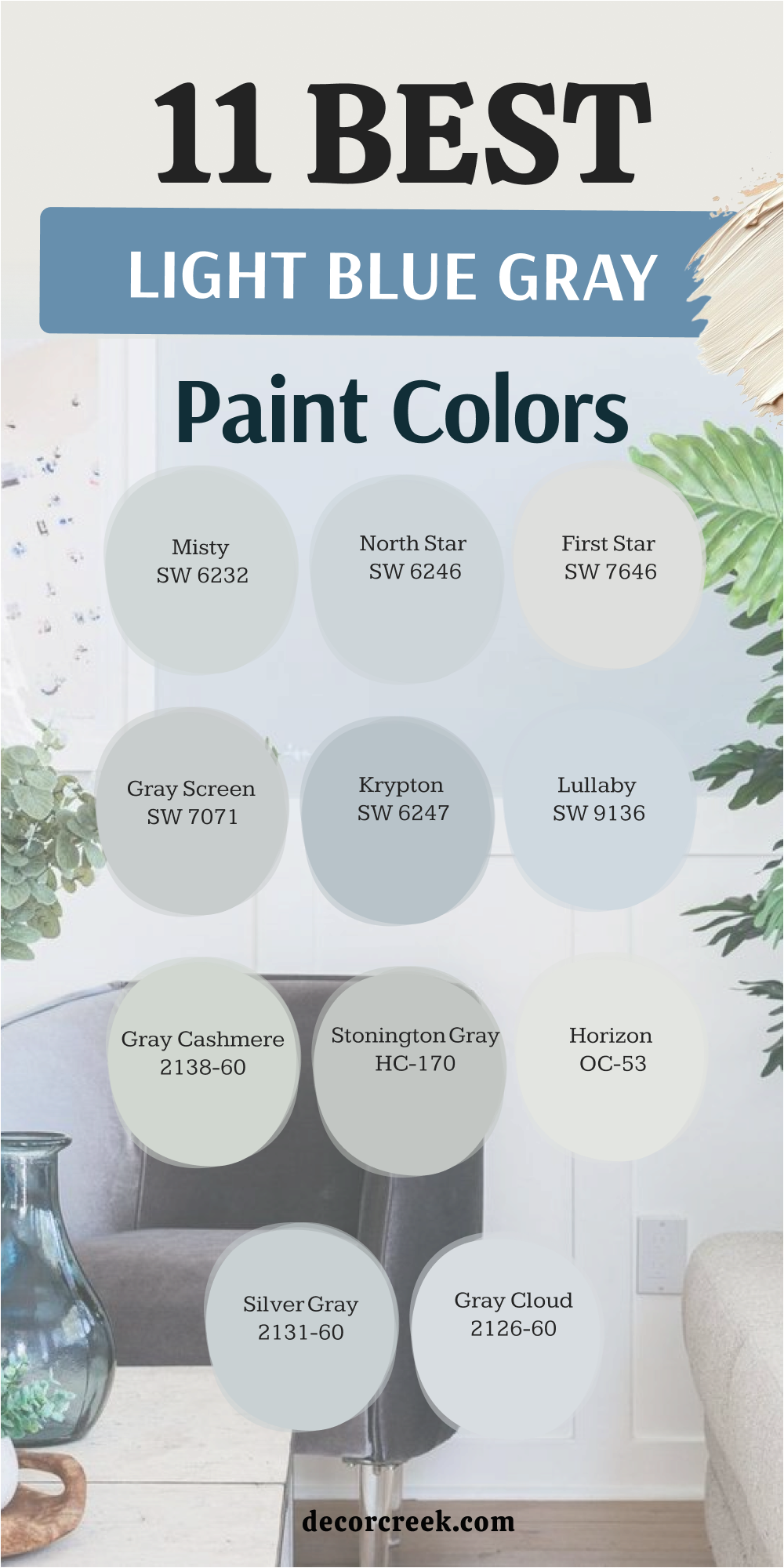
11 Light Blue Gray Paint Colors
Misty SW 6232
Misty SW 6232 is a very light color that stays right on the line between blue and gray. This color is a smart pick if you want a room to look very modern and clean. It has just enough blue to feel interesting but stays gray enough to match everything.
I find that it makes small hallways and bedrooms look much wider than they really are. The paint looks very soft in the morning and a bit more gray in the evening light. It is a very safe choice for someone who wants a professional look in their home.
I like how it acts as a background that does not fight with your colorful rugs or chairs. The walls will feel very fresh and look like they belong in a brand-new house.
Best used in: hallways, bedrooms, bathrooms, and laundry rooms
Pairs well with: Pure White SW 7005, On the Rocks SW 7671, Charcoal Blue SW 2739, light gray rugs The key rule of this color for farmhouse style is to use it where you want natural light to feel kind, soft, and inviting throughout the day.
🎨 Check out the complete guide to this color right HERE 👈
North Star SW 6246
North Star SW 6246 is a cool blue-gray that feels like a crisp winter morning. This color has a very chilly look that helps a sunny room feel much cooler. It is a true gray-blue that looks very crisp when you put it next to white trim.
I often use this for ceilings to make them look like the sky is inside the house. The color is very light but you can definitely see the blue when it hits the walls. It makes a room feel very tidy and very organized because it is so clean.
You will love how it brings out the silver colors in your lamps and picture frames. It is a very popular choice for modern homes that want a touch of color.
Best used in: kitchens, bathrooms, bedrooms, and ceilings
Pairs well with: Extra White SW 7006, Krypton SW 6247, Slate Tile SW 7624, marble countertops The key rule of this color for farmhouse style is to use it where you want natural light to feel kind, soft, and inviting throughout the day.
🎨 Check out the complete guide to this color right HERE 👈

First Star SW 7646
First Star SW 7646 is one of the lightest grays you can find with a tiny drop of blue. This color is so faint that it looks like a cool white until you put a white sheet next to it. It is a great choice for people who want a very bright house that is not just plain white.
I use it in large living areas to make the whole home feel connected and open. The blue keeps the gray from looking muddy or yellow in the shadows of the room. It feels very sophisticated and expensive because it is so light and airy on the walls.
Most people find that this color makes their dark furniture look very sharp and clean. It is a very reliable color that works in any room of the house.
Best used in: living rooms, open floor plans, hallways, and modern kitchens
Pairs well with: High Reflective White SW 7757, Iron Ore SW 7069, Black Magic SW 6991, light wood floors The key rule of this color for farmhouse style is to use it where you want natural light to feel kind, soft, and inviting throughout the day.
🎨 Check out the complete guide to this color right HERE 👈
Gray Screen SW 7071
Gray Screen SW 7071 is a very true gray that has a hidden blue light inside of it. This color feels very solid and strong without being too dark for a small room.
It is a very cool color that does not have any brown or red in it at all. I pick this when a client wants a room to look very sleek and updated. The blue makes the gray look very fresh and prevents it from looking like plain concrete.
It looks wonderful with black accents and very modern furniture pieces. The walls will look very smooth and have a very even color in all types of light. It is a very good pick for a home office where you need to focus.
Best used in: home offices, living rooms, kitchens, and exteriors
Pairs well with: Extra White SW 7006, Morning Fog SW 6255, Tricorn Black SW 6258, stainless steel The key rule of this color for farmhouse style is to use it where you want natural light to feel kind, soft, and inviting throughout the day.
🎨 Check out the complete guide to this color right HERE 👈

Krypton SW 6247
Krypton SW 6247 is a medium-light blue-gray that has a lot of personality. This color is dark enough that everyone will know your walls are a beautiful shade of blue. It has a very slate-like feel that reminds me of stones in a river.
I love using this in bathrooms because it makes the white tub and sink look very bright. The color stays very cool and does not turn purple or green in different lights.
It is a very popular color for staging houses because it looks great in pictures. You will find that it makes your home feel very high-end and very well-designed. It is a great color to use if you have a lot of natural light.
Best used in: master bathrooms, bedrooms, laundry rooms, and kitchen islands
Pairs well with: Snowbound SW 7004, North Star SW 6246, Naval SW 6244, chrome hardware The key rule of this color for farmhouse style is to use it where you want natural light to feel kind, soft, and inviting throughout the day.
🎨 Check out the complete guide to this color right HERE 👈
Lullaby SW 9136
Lullaby SW 9136 is a very soft and sweet blue-gray that feels very gentle. This color is much softer than the other grays because it has a bit more blue in the mix.
It is the perfect choice for a room where you want to feel very relaxed and happy. I find that it looks very nice with cream colors and soft fabrics like wool. The gray keeps the blue from being too bright, so it feels very grown-up and classy.
It makes a small room feel very light and very airy without being boring. Most people say it reminds them of a soft blanket or a very quiet morning. It is a very lovely choice for a bedroom or a nursery for a baby.
Best used in: nurseries, bedrooms, small bathrooms, and reading nooks
Pairs well with: Alabaster SW 7008, Sea Salt SW 6204, Silver Strand SW 7057, warm wood tones The key rule of this color for farmhouse style is to use it where you want natural light to feel kind, soft, and inviting throughout the day.
Gray Cashmere 2138-60
Gray Cashmere 2138-60 is a very special color that changes a lot depending on the light. It is a mix of gray, blue, and a little bit of green that feels very soft.
This color is very famous because it looks like a very expensive piece of clothing. I use it in rooms where we want a very high-end and designer look for the walls. It looks very different at noon than it does at night when the lamps are on.
The color is very light but it has a lot of depth that makes people stop and look. It feels very cozy and very fresh at the same time which is hard to find. You will love how it makes your house feel very unique and very stylish.
Best used in: bedrooms, living rooms, dining rooms, and entryways
Pairs well with: White Dove OC-17, Revere Pewter HC-172, Hale Navy HC-154, gold accents The key rule of this color for farmhouse style is to use it where you want natural light to feel kind, soft, and inviting throughout the day.
🎨 Check out the complete guide to this color right HERE 👈

Stonington Gray HC-170
Stonington Gray HC-170 is a very popular gray that has a very cool blue undertone. This color is a favorite for many people because it looks very professional and clean.
It is a true gray that does not look like mud or sand on the walls. I often suggest this for kitchens because it looks great with white cabinets and stone counters. The blue inside makes the gray feel very fresh and very modern for any house.
It is dark enough to make white trim pop but light enough to keep the room bright. Many people use this for their whole house because it is so easy to live with. It is a very smart choice for someone who wants a classic gray look.
Best used in: kitchens, living rooms, hallways, and house exteriors
Pairs well with: Simply White OC-117, Coventry Gray HC-169, Amherst Gray HC-167, black metal The key rule of this color for farmhouse style is to use it where you want natural light to feel kind, soft, and inviting throughout the day.
🎨 Check out the complete guide to this color right HERE 👈

Horizon OC-53
Horizon OC-53 is a very pale gray that has a very soft blue feeling to it. This color is so light that it acts like a neutral backdrop for all your furniture.
It is a great choice if you want your home to feel very open and full of light. I find that it looks very crisp and clean in rooms with many windows. The blue is very subtle and just makes the gray feel a bit cooler and fresher.
It is a very good pick for modern homes with simple lines and clean decorations. Most people do not even realize it is blue until they see it next to a plain gray. It is a very beautiful and very light color that makes rooms feel huge.
Best used in: bedrooms, bathrooms, hallways, and ceilings
Pairs well with: Chantilly Lace OC-65, Gray Owl OC-52, Stonington Gray HC-170, dark wood floors The key rule of this color for farmhouse style is to use it where you want natural light to feel kind, soft, and inviting throughout the day.
🎨 Check out the complete guide to this color right HERE 👈

Silver Gray 2131-60
Silver Gray 2131-60 is a very cool and misty blue-gray that feels very elegant. This color looks like silver metal that has been turned into a soft paint.
It has a very smooth look on the walls that makes a room feel very polished. I like to use this in dining rooms where you want a bit of a formal feeling. The color is very light but it has a strong presence that makes the room feel finished.
It looks wonderful with white curtains and silver mirrors on the walls. The blue is very clear and does not look muddy even in a room with less light. You will find that it makes your home look very clean and very well-kept.
Best used in: dining rooms, bedrooms, bathrooms, and home offices
Pairs well with: White Heron OC-57, Silver Lake 1598, Blue Note 2129-30, crystal lighting The key rule of this color for farmhouse style is to use it where you want natural light to feel kind, soft, and inviting throughout the day.
Gray Cloud 2126-60
Gray Cloud 2126-60 is a very pretty light blue that has a soft gray base. This color is very cheerful and makes a room feel like a sunny day at the beach.
It is a very soft shade that is perfect for a bedroom where you want to feel happy. I use it to bring a bit of color into a home without it being too much. The gray keeps the blue from looking like a crayon color, so it stays very classy.
It looks very nice with light wood floors and white furniture in a small room. The walls will look like soft clouds and will make the whole room feel very light. It is a very good choice for anyone who loves a true light blue look.
Best used in: nurseries, kids’ rooms, bathrooms, and laundry rooms
Pairs well with: Simply White OC-117, Gray Huskie 1473, Van Courtland Blue HC-145, white linens The key rule of this color for farmhouse style is to use it where you want natural light to feel kind, soft, and inviting throughout the day.
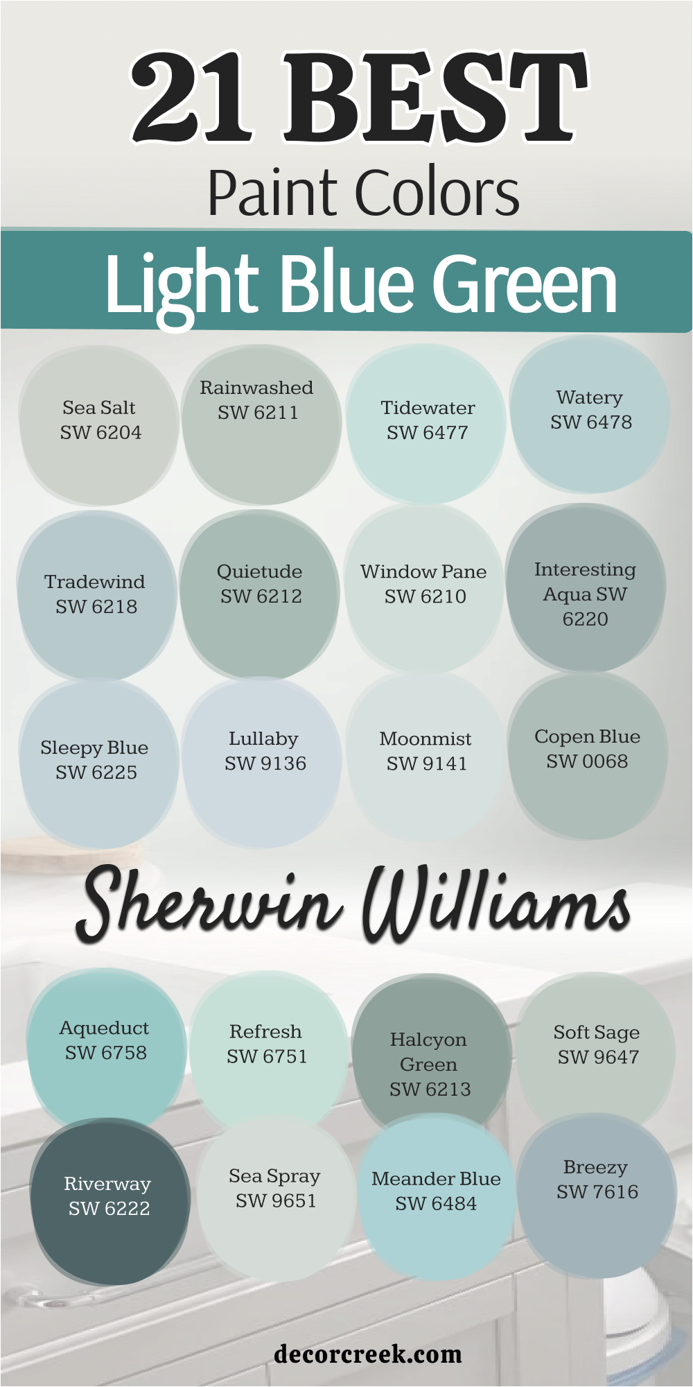
17 Light Blue Green Paint Colors
Sea Salt SW 6204
Sea Salt SW 6204 is a very famous choice for people who love a mix of blue and green. This color changes its look quite a bit depending on how much sun hits the wall.
In a bright room, it looks like a soft green, but in the shade, it looks blue. I use this color in almost every house I stage because people love how it feels. It makes a small room look much bigger and very fresh for new owners.
The gray inside the paint keeps it from looking too bright or like a piece of candy. It is a very smart pick for a kitchen with white cabinets and wood floors. You will find that it matches almost any piece of furniture you already own. The walls will feel very light and clean throughout the whole day.
Best used in: kitchens, bathrooms, bedrooms, and entryways
Pairs well with: Alabaster SW 7008, Heron Plume SW 6087, Kilim Beige SW 6106, weathered wood The key rule of this color for farmhouse style is to use it where you want natural light to feel kind, soft, and inviting throughout the day.
🎨 Check out the complete guide to this color right HERE 👈
Rainwashed SW 6211
Rainwashed SW 6211 is a very pretty color that has more green than a typical blue paint. This shade reminds me of a garden right after a big rain storm has passed.
It is very light and brings a lot of life to a room that feels a bit dull. I like to use it in bathrooms because it makes the white tile look very bright. The color is very soft and does not feel too strong when you paint a whole room.
It works very well with light wood and white trim to create a clean look. Many people find that it makes them feel very happy when they walk inside. You can pair it with cream-colored rugs to make the room feel very cozy. It is a very popular choice for houses near the water.
Best used in: bedrooms, bathrooms, laundry rooms, and nursery walls
Pairs well with: Pure White SW 7005, Accessible Beige SW 7036, Sea Salt SW 6204, light oak furniture The key rule of this color for farmhouse style is to use it where you want natural light to feel kind, soft, and inviting throughout the day.
🎨 Check out the complete guide to this color right HERE 👈
Watery SW 6478
Watery SW 6478 is a very clear blue-green that looks like the shallow water at a beach. This color has a bit more blue in it than the other shades in this group.
It is very bright and makes a room feel very energized and very fresh. I use this when a client wants a room to feel like a vacation spot every day. The color is still light enough to keep the room feeling open and very large.
It looks very crisp when you use it with dark wood floors for contrast. The walls will look very vibrant and full of life in the morning sun. It is a very good pick for a guest room or a happy sunroom. You will love how it makes your white curtains pop.
Best used in: sunrooms, guest bedrooms, bathrooms, and kitchen islands
Pairs well with: Extra White SW 7006, Naval SW 6244, Repose Gray SW 7015, dark brown wood The key rule of this color for farmhouse style is to use it where you want natural light to feel kind, soft, and inviting throughout the day.
🎨 Check out the complete guide to this color right HERE 👈
Tidewater SW 6477
Tidewater SW 6477 is a very soft aqua color that feels very light and very airy. This shade is perfect for people who want a real blue-green look on their walls. It is not gray at all, so it stays very colorful even on cloudy days.
I find that it works wonders in small bathrooms to make them feel much larger. The color is very sweet and looks great in a room for a child or a guest. It pairs beautifully with white furniture and light gray accents in the room.
You will feel like you are outside near the ocean when you see this paint. It is a very clean color that does not look muddy or dark. Most people find it very easy to live with for a long time.
Best used in: bathrooms, nurseries, laundry rooms, and porch ceilings
Pairs well with: Snowbound SW 7004, Agreeable Gray SW 7029, Breezy SW 7616, white wicker The key rule of this color for farmhouse style is to use it where you want natural light to feel kind, soft, and inviting throughout the day.
🎨 Check out the complete guide to this color right HERE 👈

Tradewind SW 6218
Tradewind SW 6218 is a cool blue that has a tiny hint of green and gray hidden inside. This color feels very steady and does not change as much as other light shades. It is a very good choice for a main living area where you want a bit of color.
I often pick this when I want a room to look very polished and well-designed. The green keeps the blue from feeling too cold or like an ice cube. It looks very smart with silver lamps and glass tables in a modern home.
The walls will have a very smooth and even look that feels very professional. You can use it as a base for many different colors of pillows and art. It is a very reliable color that looks good in any house.
Best used in: primary bedrooms, dining rooms, home offices, and bathrooms
Pairs well with: High Reflective White SW 7757, Repose Gray SW 7015, Urbane Bronze SW 7048, marble surfaces The key rule of this color for farmhouse style is to use it where you want natural light to feel kind, soft, and inviting throughout the day.
🎨 Check out the complete guide to this color right HERE 👈
Quietude SW 6212
Quietude SW 6212 is a slightly darker blue-green that feels very rich and very deep. This color has a lot of green in it, making it look like a soft sage. It is a very good choice if you want your walls to have a strong color.
I use it in dining rooms or bedrooms where we want a very cozy feeling. The color looks very expensive and high-end when paired with white crown molding. It feels very grounded and does not look like a bright beach color at all.
You will find that it makes your furniture look very special and very unique. The walls will feel very warm and inviting during the evening hours. It is a very sophisticated shade for any room in your home.
Best used in: dining rooms, bedrooms, front doors, and accent walls
Pairs well with: Alabaster SW 7008, Rainwashed SW 6211, French Roast SW 6069, gold frames The key rule of this color for farmhouse style is to use it where you want natural light to feel kind, soft, and inviting throughout the day.
🎨 Check out the complete guide to this color right HERE 👈
Window Pane SW 6210
Window Pane SW 6210 is a very light and very delicate shade of blue-green. This color is so pale that it acts like a soft white with a secret color. It is perfect for people who want a very bright and very open feeling in their house.
I use it in kitchens to make the area feel very clean and very fresh. The green and blue are very balanced so it does not lean too far either way. It looks very pretty with light gray floors and white marble counters in a room.
The color is very soft and does not distract you from your view outside. It makes a room feel very light and very airy even if the room is small. You will love how it makes your home feel very peaceful.
Best used in: kitchens, bathrooms, hallways, and small bedrooms
Pairs well with: Pure White SW 7005, Sea Salt SW 6204, Dorian Gray SW 7017, light wood tones The key rule of this color for farmhouse style is to use it where you want natural light to feel kind, soft, and inviting throughout the day.
🎨 Check out the complete guide to this color right HERE 👈
Interesting Aqua SW 6220
Interesting Aqua SW 6220 is a medium blue-green that has a lot of gray to keep it soft. This color is very popular for people who want a modern farmhouse look in their home. It is dark enough to make a statement but light enough to be used everywhere.
I find that it looks very good on kitchen cabinets or on a front door. The gray in the paint makes it look very natural like the colors found in stones. It feels very cool and very fresh when you see it on a large wall.
You can pair it with black metal and warm wood to make a great look. The walls will look very stylish and very updated with this beautiful shade. It is a very good choice for someone who loves a bold but soft look.
Best used in: kitchen cabinets, living rooms, bedrooms, and exteriors
Pairs well with: Snowbound SW 7004, Agreeable Gray SW 7029, Iron Ore SW 7069, warm wood The key rule of this color for farmhouse style is to use it where you want natural light to feel kind, soft, and inviting throughout the day.
🎨 Check out the complete guide to this color right HERE 👈
Sleepy Blue SW 6225
Sleepy Blue SW 6225 is a very soft blue that has just a tiny touch of green inside of it. This color is very light and makes a bedroom feel like a very quiet place to rest. It is a true light blue that stays very bright even when the sun goes down.
I like to use it for kids’ rooms because it feels very happy and very clean. The color is very easy to match with different types of bedding and rugs. It looks very crisp with white trim and helps the room feel very organized.
The walls will look like a clear sky and will help you feel very relaxed. You can use it in a laundry room to make chores feel a bit better. It is a very sweet and very pretty color for any small space.
Best used in: kids’ bedrooms, nurseries, laundry rooms, and ceilings
Pairs well with: Extra White SW 7006, Naval SW 6244, Dorian Gray SW 7017, dark walnut tones The key rule of this color for farmhouse style is to use it where you want natural light to feel kind, soft, and inviting throughout the day.
🎨 Check out the complete guide to this color right HERE 👈
Healing Aloe 1562
Healing Aloe 1562 is a very light green-blue that feels very soft and very airy. This color is a favorite for designers because it makes any room look very expensive. It is very pale and works like a neutral color that goes with everything.
I use it in small bedrooms to make them feel like a very fancy hotel suite. The color is very light and does not make the room feel dark at all. It looks very beautiful with white linens and light gray carpets on the floor.
You will find that it makes your home feel very fresh and very updated. The walls will look very smooth and clean in the bright morning light. It is a very safe and very pretty choice for your whole house.
Best used in: small bedrooms, nurseries, guest bathrooms, and entryways
Pairs well with: Decorator’s White CC-20, Fog Mist OC-31, Silver Song 1557, soft pink accents The key rule of this color for farmhouse style is to use it where you want natural light to feel kind, soft, and inviting throughout the day.
🎨 Check out the complete guide to this color right HERE 👈
Beach Glass 1564
Beach Glass 1564 is a beautiful medium shade that brings the feeling of the coast inside. This color has a lot of gray which makes the blue-green look very soft and very natural. It is a great choice if you want more color than just a light gray or white.
I like to use it in bathrooms because it feels very clean and very fresh. The color is dark enough to show off white windows and white doors very well. It looks wonderful with natural wood and woven baskets in a bedroom or living room.
The walls will feel very solid and very comfortable for you and your family. You will love how it makes your home feel like a very special place to be. It is a very popular color that people always ask me about.
Best used in: bedrooms, bathrooms, laundry rooms, and kitchen cabinets
Pairs well with: Cloud White OC-130, Gray Owl OC-52, Van Deusen Blue HC-156, natural wood tones The key rule of this color for farmhouse style is to use it where you want natural light to feel kind, soft, and inviting throughout the day.
🎨 Check out the complete guide to this color right HERE 👈
Palladian Blue HC-144
Palladian Blue HC-144 is a very classic and very high-end shade of blue-green. This color is very famous for making rooms look very grand and very stylish. It is a perfect mix that feels very traditional and very fresh at the same time.
I use it in dining rooms where we want a very fancy look for guests. The color changes beautifully as the sun moves around your house during the day. It looks amazing with gold frames and dark wood furniture in a large room.
You will feel like you live in a very beautiful and very old estate. The walls will look very rich and full of life with this special paint. It is a very good choice for someone who loves a classic home look.
Best used in: main bedrooms, dining rooms, bathrooms, and front doors
Pairs well with: Simply White OC-117, Revere Pewter HC-172, Woodlawn Blue HC-147, gold accents The key rule of this color for farmhouse style is to use it where you want natural light to feel kind, soft, and inviting throughout the day.
🎨 Check out the complete guide to this color right HERE 👈
Wythe Blue HC-143
Wythe Blue HC-143 is a medium blue-green that has a very strong and very clear personality. This color is a bit darker than the others, which makes it look very cozy. It is a very popular choice for a front door because it looks great against any house.
I often use it on an accent wall to bring a lot of color into a living room. The color feels very historic and very classic but still looks great in a new home. It pairs very well with dark gray and warm cream colors in the same room.
You will love how it makes your house stand out and look very well-designed. The walls will feel very warm and very inviting to everyone who visits you. It is a very bold and very beautiful choice for your home.
Best used in: front doors, dining rooms, bedrooms, and kitchen islands
Pairs well with: White Dove OC-17, Shaker Beige HC-45, Van Deusen Blue HC-156, brass hardware The key rule of this color for farmhouse style is to use it where you want natural light to feel kind, soft, and inviting throughout the day.
🎨 Check out the complete guide to this color right HERE 👈

Woodlawn Blue HC-147
Woodlawn Blue HC-147 is a soft and very pretty blue-green that feels very traditional. This color has a tiny bit of gray that keeps it from being too bright or loud. It is a very good choice for a bedroom because it feels very stable and quiet.
I like to use it with white furniture to make a very clean and classic look. The color looks very rich and very expensive when you see it on all the walls. It does not change much in different lights, so it is very easy to pick.
You can pair it with dark wood floors to make the room feel very high-end. The walls will look very polished and very smooth with this beautiful shade of paint. It is a very smart choice for any room in your house.
Best used in: primary bedrooms, dining rooms, hallways, and front doors
Pairs well with: Simply White OC-117, Revere Pewter HC-172, Hale Navy HC-154, dark wood antiques The key rule of this color for farmhouse style is to use it where you want natural light to feel kind, soft, and inviting throughout the day.
🎨 Check out the complete guide to this color right HERE 👈
Gray Cashmere 2138-60
Gray Cashmere 2138-60 is a very light and very soft color that changes a lot. It is a mix of gray and blue-green that feels very sophisticated and very fresh. This color looks different in every house because it reacts to your windows and light.
I use it when a client wants a very high-end look that is not just plain white. The color is very light and makes any room feel very large and very open. It looks very beautiful with white trim and silver accents in a modern bedroom.
You will love how it makes your house feel very unique and very well-planned. The walls will feel very soft and very clean throughout the whole day. It is a very popular choice for a modern home update.
Best used in: bedrooms, living rooms, dining rooms, and entryways
Pairs well with: White Dove OC-17, Revere Pewter HC-172, Hale Navy HC-154, gold accents The key rule of this color for farmhouse style is to use it where you want natural light to feel kind, soft, and inviting throughout the day.
🎨 Check out the complete guide to this color right HERE 👈
Tranquility AF-490
Tranquility AF-490 is a very balanced blue-green that feels very soft and very quiet. This color is part of a special collection that makes picking paint very easy. It is a very light shade that works well in any room where you want to feel good.
I often pick this for a home office because it helps people feel very focused. The color is very soft and does not feel too bright even in a very sunny room. It looks very nice with gray furniture and white curtains in a small space.
You will find that it makes your home feel very peaceful and very well-organized. The walls will look very smooth and have a very pretty color all day long. It is a very good choice for someone who wants a simple and pretty look.
Best used in: home offices, bedrooms, bathrooms, and living rooms
Pairs well with: Steam AF-15, Wish AF-680, Flint AF-560, light gray textiles The key rule of this color for farmhouse style is to use it where you want natural light to feel kind, soft, and inviting throughout the day.
Hollingsworth Green HC-141
Hollingsworth Green HC-141 is a very light green that has a soft blue feeling inside. This color is very fresh and makes a room feel like a beautiful garden in the spring. It is a very light shade that is perfect for a kitchen or a breakfast nook.
I use it to bring a bit of life into a house that feels a bit dark or old. The color is very cheerful and makes everyone feel very happy when they see it. It looks very good with white cabinets and wood floors in a bright room.
You will love how it makes your home feel very airy and very full of light. The walls will look very clean and will make the whole room feel very fresh. It is a very lovely and very pretty choice for any sunny space.
Best used in: kitchens, breakfast nooks, bathrooms, and laundry rooms
Pairs well with: Chantilly Lace OC-65, Revere Pewter HC-172, Boothbay Gray HC-165, wood accents The key rule of this color for farmhouse style is to use it where you want natural light to feel kind, soft, and inviting throughout the day.
🎨 Check out the complete guide to this color right HERE 👈

21 Light Blue Green Paint Colors From Sherwin Williams
Sea Salt SW 6204
Sea Salt SW 6204 is a favorite pick for anyone who wants a soft mix of blue and green. This color changes its look a lot based on the sun in your room. It can look like a cool gray or a soft mint depending on the time of day.
I use this often in staging because it makes houses feel very fresh and new. The color is very light and helps small rooms feel much bigger than they are. It works perfectly with white trim and light wood floors in a kitchen.
Most people find it very easy to live with because it is so soft. The walls will look very clean and will make your furniture stand out nicely. It is a very smart choice for a main living area or a bedroom.
Best used in: kitchens, bathrooms, bedrooms, and entryways
Pairs well with: Alabaster SW 7008, Heron Plume SW 6087, Kilim Beige SW 6106, weathered wood The key rule of this color for farmhouse style is to use it where you want natural light to feel kind, soft, and inviting throughout the day.
🎨 Check out the complete guide to this color right HERE 👈
Rainwashed SW 6211
Rainwashed SW 6211 has a bit more green in it than most light blue paints. This color reminds me of a beautiful garden after a light rain in the spring. It brings a lot of life to a dark room and makes it feel very bright.
I like to use it in bathrooms to make the white tile and tubs look very clean. The shade is very soft and does not feel too strong when painted on all four walls. It looks very good with cream colors and light-colored wood furniture in a bedroom.
Many people choose this for a nursery because it feels very happy and light. You will love how the color changes softly as the sun moves across the sky. It is a very popular choice for a home near the beach or a lake.
Best used in: bedrooms, bathrooms, laundry rooms, and nursery walls
Pairs well with: Pure White SW 7005, Accessible Beige SW 7036, Sea Salt SW 6204, light oak furniture The key rule of this color for farmhouse style is to use it where you want natural light to feel kind, soft, and inviting throughout the day.
🎨 Check out the complete guide to this color right HERE 👈
Tidewater SW 6477
Tidewater SW 6477 is a very light and airy aqua that feels like a clear summer day. This shade is perfect for people who want a real blue-green look without any gray. It stays very colorful even on days when the sky is cloudy or dark outside.
I find that it works very well in laundry rooms to make chores feel a bit more fun. The color is very sweet and looks great with white furniture and light gray accents.
You will feel like you are outside near the ocean every time you walk into the room. It is a very clean color that does not look muddy at all. Most people find that it makes their home feel very cheerful and very bright.
Best used in: bathrooms, nurseries, laundry rooms, and porch ceilings
Pairs well with: Snowbound SW 7004, Agreeable Gray SW 7029, Breezy SW 7616, white wicker The key rule of this color for farmhouse style is to use it where you want natural light to feel kind, soft, and inviting throughout the day.
🎨 Check out the complete guide to this color right HERE 👈
Watery SW 6478
Watery SW 6478 is a very clear blue-green that looks like the shallow water at a tropical beach. This color has a bit more blue than green, which makes it feel very fresh. It is very bright and helps a room feel very energized during the morning hours.
I use this when a client wants their home to feel like a vacation spot every single day. The color is still light enough to keep a small room from feeling too dark. It looks very crisp when you use it with dark wood floors for a big contrast.
The walls will look very vibrant and full of life when the sun hits them. It is a very good pick for a guest room or a happy sunroom.
Best used in: sunrooms, guest bedrooms, bathrooms, and kitchen islands
Pairs well with: Extra White SW 7006, Naval SW 6244, Repose Gray SW 7015, dark brown wood The key rule of this color for farmhouse style is to use it where you want natural light to feel kind, soft, and inviting throughout the day.
🎨 Check out the complete guide to this color right HERE 👈
Tradewind SW 6218
Tradewind SW 6218 is a cool blue that has a tiny hint of green and gray inside. This color feels very steady and does not change as much as other light paints. It is a very good choice for a main living area where you want a bit of color.
I often pick this when I want a room to look very polished and well-planned. The green keeps the blue from feeling too cold or like a piece of ice. It looks very smart with silver lamps and glass tables in a modern home.
The walls will have a very even look that feels very professional and clean. You can use it as a base for many different colors of pillows and art.
Best used in: primary bedrooms, dining rooms, home offices, and bathrooms
Pairs well with: High Reflective White SW 7757, Repose Gray SW 7015, Urbane Bronze SW 7048, marble surfaces The key rule of this color for farmhouse style is to use it where you want natural light to feel kind, soft, and inviting throughout the day.
🎨 Check out the complete guide to this color right HERE 👈
Quietude SW 6212
Quietude SW 6212 is a slightly darker blue-green that feels very rich and very deep. This color has enough green in it to look like a soft sage in some lights.
It is a very good choice if you want your walls to have a strong and clear color. I use it in dining rooms or bedrooms where we want a very cozy and warm feeling. The color looks very expensive when paired with white trim and dark wood furniture.
It feels very grounded and does not look like a bright beach color at all. You will find that it makes your furniture look very special and very unique. The walls will feel very warm and inviting during the evening when the lamps are on.
Best used in: dining rooms, bedrooms, front doors, and accent walls
Pairs well with: Alabaster SW 7008, Rainwashed SW 6211, French Roast SW 6069, gold frames The key rule of this color for farmhouse style is to use it where you want natural light to feel kind, soft, and inviting throughout the day.
🎨 Check out the complete guide to this color right HERE 👈
Window Pane SW 6210
Window Pane SW 6210 is a very light and delicate shade of blue-green paint. This color is so pale that it acts like a soft white with a secret hint of color.
It is perfect for people who want a very bright and open feeling in their whole house. I use it in kitchens to make the cooking area feel very clean and very fresh. The green and blue are very balanced so it does not lean too far to one side.
It looks very pretty with light gray floors and white marble counters in a bathroom. The color is very soft and does not take away from your view out the window. It makes a room feel very light and very airy even if the room is small.
Best used in: kitchens, bathrooms, hallways, and small bedrooms
Pairs well with: Pure White SW 7005, Sea Salt SW 6204, Dorian Gray SW 7017, light wood tones The key rule of this color for farmhouse style is to use it where you want natural light to feel kind, soft, and inviting throughout the day.
🎨 Check out the complete guide to this color right HERE 👈
Interesting Aqua SW 6220
Interesting Aqua SW 6220 is a medium blue-green that has a lot of gray to keep it soft. This color is very popular for people who love the modern farmhouse look in their home. It is dark enough to make a statement but light enough to be used in many rooms.
I find that it looks very good on kitchen cabinets or on a front door. The gray in the paint makes it look very natural like colors found in stones. It feels very cool and very fresh when you see it on a large wall in a living room.
You can pair it with black metal and warm wood to make a great and stylish look. The walls will look very updated and very trendy with this beautiful shade.
Best used in: kitchen cabinets, living rooms, bedrooms, and exteriors
Pairs well with: Snowbound SW 7004, Agreeable Gray SW 7029, Iron Ore SW 7069, warm wood The key rule of this color for farmhouse style is to use it where you want natural light to feel kind, soft, and inviting throughout the day.
🎨 Check out the complete guide to this color right HERE 👈
Sleepy Blue SW 6225
Sleepy Blue SW 6225 is a very soft blue that has a tiny touch of green hidden inside. This color is very light and makes a bedroom feel like a very quiet place to sleep. It is a true light blue that stays very bright even when the sun goes down at night.
I like to use it for kids’ rooms because it feels very happy and very clean. The color is very easy to match with different types of bedding and colorful rugs. It looks very crisp with white trim and helps a room feel very tidy and organized.
The walls will look like a clear sky and will help you feel very relaxed. You can use it in a laundry room to make the room feel much more pleasant.
Best used in: kids’ bedrooms, nurseries, laundry rooms, and ceilings
Pairs well with: Extra White SW 7006, Naval SW 6244, Dorian Gray SW 7017, dark walnut tones The key rule of this color for farmhouse style is to use it where you want natural light to feel kind, soft, and inviting throughout the day.
🎨 Check out the complete guide to this color right HERE 👈
Lullaby SW 9136
Lullaby SW 9136 is a very gentle blue-gray that feels very soft on the eyes. This color is perfect for a nursery because it feels very quiet and very sweet for a baby. It has just enough gray to keep it from being too bright or like a toy color.
I find that it looks very nice with cream furniture and soft white blankets in a bedroom. The color is very light and helps a small room feel very open and very airy. Most people say it makes them feel very peaceful when they sit in a room with this paint.
It is a very lovely choice for a guest room where you want visitors to feel welcome. The walls will look very smooth and very clean in any type of lighting.
Best used in: nurseries, small bedrooms, bathrooms, and walk-in closets
Pairs well with: Eider White SW 7014, Sea Salt SW 6204, Silver Strand SW 7057, light pink accents The key rule of this color for farmhouse style is to use it where you want natural light to feel kind, soft, and inviting throughout the day.
Moonmist SW 9144
Moonmist SW 9144 is a very pale blue that has a soft glow like the moon at night. This color is very light and works well for people who want just a hint of color.
It has a tiny bit of green that makes it feel very fresh and very modern. I use this in hallways to make them feel bright and very wide for my clients. The color is so light that it almost looks white until you see it next to white trim.
It looks very beautiful with silver picture frames and light gray rugs on the floor. You will love how it makes your home feel very airy and very full of light. The walls will look very soft and very clean throughout the whole day.
Best used in: hallways, bathrooms, small bedrooms, and ceilings
Pairs well with: Pure White SW 7005, Misty SW 6232, Slate Tile SW 7624, crystal lighting The key rule of this color for farmhouse style is to use it where you want natural light to feel kind, soft, and inviting throughout the day.
🎨 Check out the complete guide to this color right HERE 👈
Copen Blue SW 0068
Copen Blue SW 0068 is a classic color that feels very historic and very high-end. This blue has a good amount of green and gray that makes it look very soft.
It is a very popular choice for dining rooms because it looks great with dark wood. I often pick this when I want a room to look very polished and very special. The color is light but it has enough depth to stand out in a bright room.
It looks amazing with white crown molding and large windows that let in lots of sun. You will feel like you live in a very fancy and very old house with this paint. The walls will feel very steady and very comfortable for you and your family.
Best used in: dining rooms, main bedrooms, front doors, and historic homes
Pairs well with: Alabaster SW 7008, Accessible Beige SW 7036, Urbane Bronze SW 7048, antiques The key rule of this color for farmhouse style is to use it where you want natural light to feel kind, soft, and inviting throughout the day.
🎨 Check out the complete guide to this color right HERE 👈
Aqueduct SW 6758
Aqueduct SW 6758 is a very bright and happy aqua that brings a lot of energy to a room. This color is for people who love a real blue-green look that is full of life.
It looks like the water in a clear swimming pool on a very hot day. I use this in small spaces like bathrooms to make them feel very fun and very fresh. The color is very clear and does not have any gray to make it look dull or dark.
It looks very crisp with bright white trim and colorful towels on the rack. The walls will look very vibrant and will make the whole room feel very cheerful. You can use it on a piece of furniture to give a room a big pop of color.
Best used in: bathrooms, kids’ rooms, accent furniture, and laundry rooms
Pairs well with: Extra White SW 7006, Tricorn Black SW 6258, Refresh SW 6751, bright accents The key rule of this color for farmhouse style is to use it where you want natural light to feel kind, soft, and inviting throughout the day.
Refresh SW 6751
Refresh SW 6751 is a light and minty blue-green that lives up to its very happy name. This color feels very cool and very clean when you see it on the walls. It is a great choice for a kitchen where you want everything to feel very fresh.
I find that it works well with light gray counters and white cabinets in a bright room. The color is very light and keeps the room feeling very large and very open for everyone. It looks very pretty in a sunroom with lots of plants and natural wood furniture.
You will love how it makes your home feel very upbeat and very full of light. The walls will look very smooth and have a very pretty color all day long.
Best used in: kitchens, sunrooms, bathrooms, and mudrooms
Pairs well with: High Reflective White SW 7757, Gray Screen SW 7071, Aqueduct SW 6758, house plants The key rule of this color for farmhouse style is to use it where you want natural light to feel kind, soft, and inviting throughout the day.
Halcyon Green SW 6213
Halcyon Green SW 6213 is a medium shade that is a very balanced mix of blue and green. This color feels very natural and looks like the colors you see in a deep forest. It is a very good choice if you want a room to feel very cozy and very quiet.
I use it in bedrooms where the goal is to have a very relaxing and soft place to sleep. The color is dark enough to provide a nice contrast against white windows and doors. It looks very high-end and very professional when you paint the whole room.
You will find that it makes your furniture look very special and very well-chosen. The walls will feel very warm and very inviting during the evening hours at home.
Best used in: bedrooms, dining rooms, library walls, and front doors
Pairs well with: Sea Salt SW 6204, Rainwashed SW 6211, French Roast SW 6069, gold hardware The key rule of this color for farmhouse style is to use it where you want natural light to feel kind, soft, and inviting throughout the day.
🎨 Check out the complete guide to this color right HERE 👈
Soft Sage SW 9647
Soft Sage SW 9647 is a very light green that has a soft blue undertone inside of it. This color feels very organic and looks like a fresh herb garden in the sun.
It is a very light shade that is perfect for a kitchen or a breakfast nook. I use it to bring a bit of nature into a house that feels a bit dark or old. The color is very cheerful and makes everyone feel very happy when they walk in.
It looks very good with white cabinets and wood floors in a very bright room. You will love how it makes your home feel very airy and very full of light. The walls will look very clean and will make the whole room feel very fresh.
Best used in: kitchens, breakfast nooks, bathrooms, and laundry rooms
Pairs well with: Snowbound SW 7004, Mindful Gray SW 7016, Halcyon Green SW 6213, wood accents The key rule of this color for farmhouse style is to use it where you want natural light to feel kind, soft, and inviting throughout the day.
🎨 Check out the complete guide to this color right HERE 👈
Riverway SW 6222
Riverway SW 6222 is a dark and moody blue-green that feels very deep and very strong. This color is for people who want a very bold look in their bedroom or office. It has a lot of gray and teal in it, which makes it look very expensive.
I like to use this on an accent wall to make a big statement in a room. The color looks amazing with gold lamps and dark wood furniture in a large space. It makes a room feel very cozy and very wrapped in a beautiful color.
You will love how it looks during the night when the lights are turned down low. The walls will look very rich and very professional with this deep shade of paint.
Best used in: accent walls, offices, dining rooms, and kitchen islands
Pairs well with: Alabaster SW 7008, Tradewind SW 6218, Urbane Bronze SW 7048, brass accents The key rule of this color for farmhouse style is to use it where you want natural light to feel kind, soft, and inviting throughout the day.
🎨 Check out the complete guide to this color right HERE 👈

Sea Spray SW 9651
Sea Spray SW 9651 is a very light and misty color that feels like the fog over the ocean. This shade is a very soft mix of gray and blue-green that is very easy to look at.
It is perfect for a room where you want to feel very calm and very relaxed. I use it in guest rooms to make people feel very comfortable during their stay. The color is so light that it acts like a neutral background for all your art.
It looks very pretty with white curtains and light gray rugs on the floor. You will find that it makes your home feel very fresh and very well-organized. The walls will look very smooth and have a very soft glow all day long.
Best used in: guest bedrooms, bathrooms, hallways, and living rooms
Pairs well with: Pure White SW 7005, Silver Strand SW 7057, Naval SW 6244, driftwood tones The key rule of this color for farmhouse style is to use it where you want natural light to feel kind, soft, and inviting throughout the day.
🎨 Check out the complete guide to this color right HERE 👈
Meander Blue SW 6484
Meander Blue SW 6484 is a very clear and bright blue that has a tiny touch of green. This color feels very upbeat and makes a room look like a beautiful sunny day.
It is a very good pick for a kid’s room or a very happy and light bathroom. I find that it works well with white furniture to create a very clean look. The color is bright but it still feels very soft and very pleasant to be around.
It looks very crisp with white trim and helps a small room feel very open. The walls will look like a clear sky and will make you feel very happy. You can use it in a craft room to help you feel very creative.
Best used in: kids’ bedrooms, bathrooms, laundry rooms, and craft rooms
Pairs well with: Extra White SW 7006, Tidewater SW 6477, Dorian Gray SW 7017, colorful art The key rule of this color for farmhouse style is to use it where you want natural light to feel kind, soft, and inviting throughout the day.
Breezy SW 7616
Breezy SW 7616 is a medium blue-gray that has a soft hint of green inside of it. This color feels very sophisticated and is a great pick for a main bedroom.
It is dark enough to show up well but light enough to keep the room feeling big. I like to use it when a client wants a room to look very polished and very stylish. The color looks very good with dark metal bed frames and white bedding in a room.
It feels very fresh and very cool when you see it on all the walls. You will find that it makes your home look very high-end and very well-designed. The walls will look very even and very smooth in all types of light.
Best used in: primary bedrooms, living rooms, entryways, and exteriors
Pairs well with: Snowbound SW 7004, Tidewater SW 6477, Iron Ore SW 7069, navy accents The key rule of this color for farmhouse style is to use it where you want natural light to feel kind, soft, and inviting throughout the day.
🎨 Check out the complete guide to this color right HERE 👈
Still Water SW 6223
Still Water SW 6223 is a very deep and dark teal that feels very moody and very rich. This color has a lot of blue and green that makes it look like a deep forest pond.
It is a bold choice for an office or a dining room where you want a lot of style. I often suggest this for a small powder room to make it look very dramatic. The color looks amazing with gold hardware and white marble surfaces in a room.
It feels very cozy and very high-end once the paint is dry on the walls. You will love how it makes your white trim pop and look very bright and clean. The walls will look very deep and very professional with this beautiful dark shade.
Best used in: offices, dining rooms, bathrooms, and accent walls
Pairs well with: Alabaster SW 7008, Sea Salt SW 6204, Tricorn Black SW 6258, gold accents The key rule of this color for farmhouse style is to use it where you want natural light to feel kind, soft, and inviting throughout the day.
🎨 Check out the complete guide to this color right HERE 👈

Picking out the right paint is the fastest way to make your home look its best for your family. Light blue is a choice that you will not regret because it makes everyone feel good when they walk inside.
I have used these colors in many houses throughout my career, and they always make the rooms look better than they did before. These shades act like a fresh start for your walls and help your furniture look more expensive. You can trust that blue will stay in style for a long time without looking old or dated. It is a smart way to bring a bit of nature and a lot of light into your daily life.
Remember to test the paint on your walls before you buy the whole can from the store. Every house has different lighting that can change how a color looks from the morning until the night. I always tell people to paint a small patch and watch it as the sun moves across the room. A blue that looks bright at noon might look like a soft gray when you turn on your lamps in the evening. This simple step helps you feel sure that you are making the right choice for your own house.
Once you find your favorite shade, you will love how your home feels every time you walk through the front door.