Finding the right look for your sleeping area often feels like a giant puzzle with many missing pieces. I see many people struggle for weeks to pick hues that truly make them feel good and refreshed when they wake up each morning.
Blue and cream are a perfect pair for a bedroom because they instantly remind us of the calm sea and soft, warm sand. This classic mix makes any room feel light, friendly, and open without ever feeling too cold or like an empty hospital space.
When you combine these two, you create a natural balance that helps the mind settle down for a long and restful night.
It is a timeless choice that works in almost any home, from a small city apartment to a large house by the water.
Why I Always Trust Sherwin-Williams and Benjamin Moore for Blue and Cream Bedroom Palettes
I stick with Sherwin-Williams and Benjamin Moore because their paint stays remarkably true to the tiny swatch you see on the store wall. These professional brands have spent many decades making sure their pigments are high quality so they do not shift in weird ways under different types of lamps or LED bulbs.
When I pick a soft cream from their collections, it does not suddenly turn into a bright neon yellow or a muddy, depressing gray once it dries. Their blue options are also very deep, velvety, and rich, which is incredibly important for achieving a high-quality finish that looks expensive.
Investing in better paint means you will not have to repaint your bedroom for a very long time because the color stays vibrant and beautiful. You can really see the difference in the depth of the pigment when the afternoon sun hits the surface of the wall.
How I Choose the Perfect Blue and Cream Shade for Any Bedroom
Choosing a professional palette always starts with looking closely at how much natural sun comes through your windows during the day. If a room is very dark or faces north, I usually pick a much lighter and warmer cream to help bounce the available light around the corners.
For a large room with lots of big windows, a deeper and moodier blue can keep the entire area from feeling too washed out or too bright in the midday heat. I always tell my clients to paint a small patch on each wall and watch how the color changes its personality from the early morning until the sun goes down at night.
Lighting is the most important factor in design, and seeing the paint in your own home is the only way to be sure of your choice. Taking this extra step ensures that you will love the final result and feel completely comfortable in your newly decorated sanctuary.
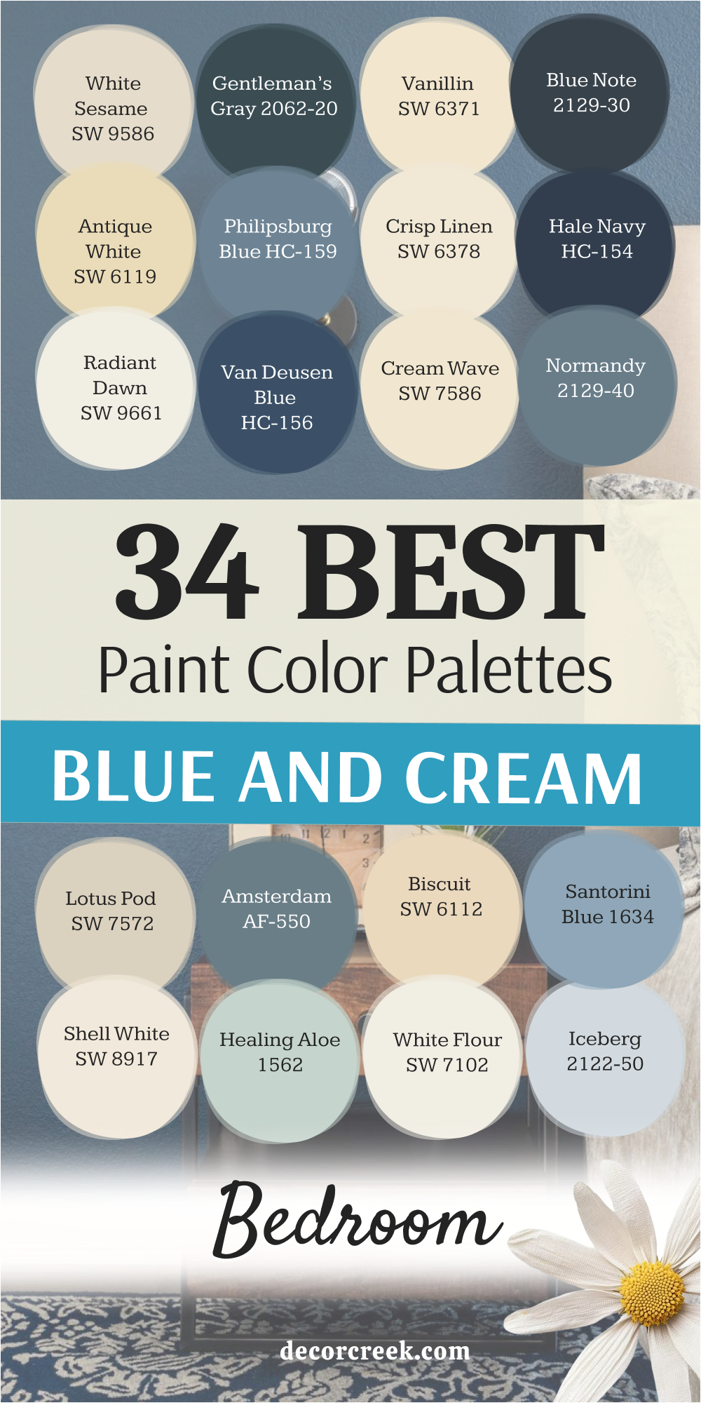
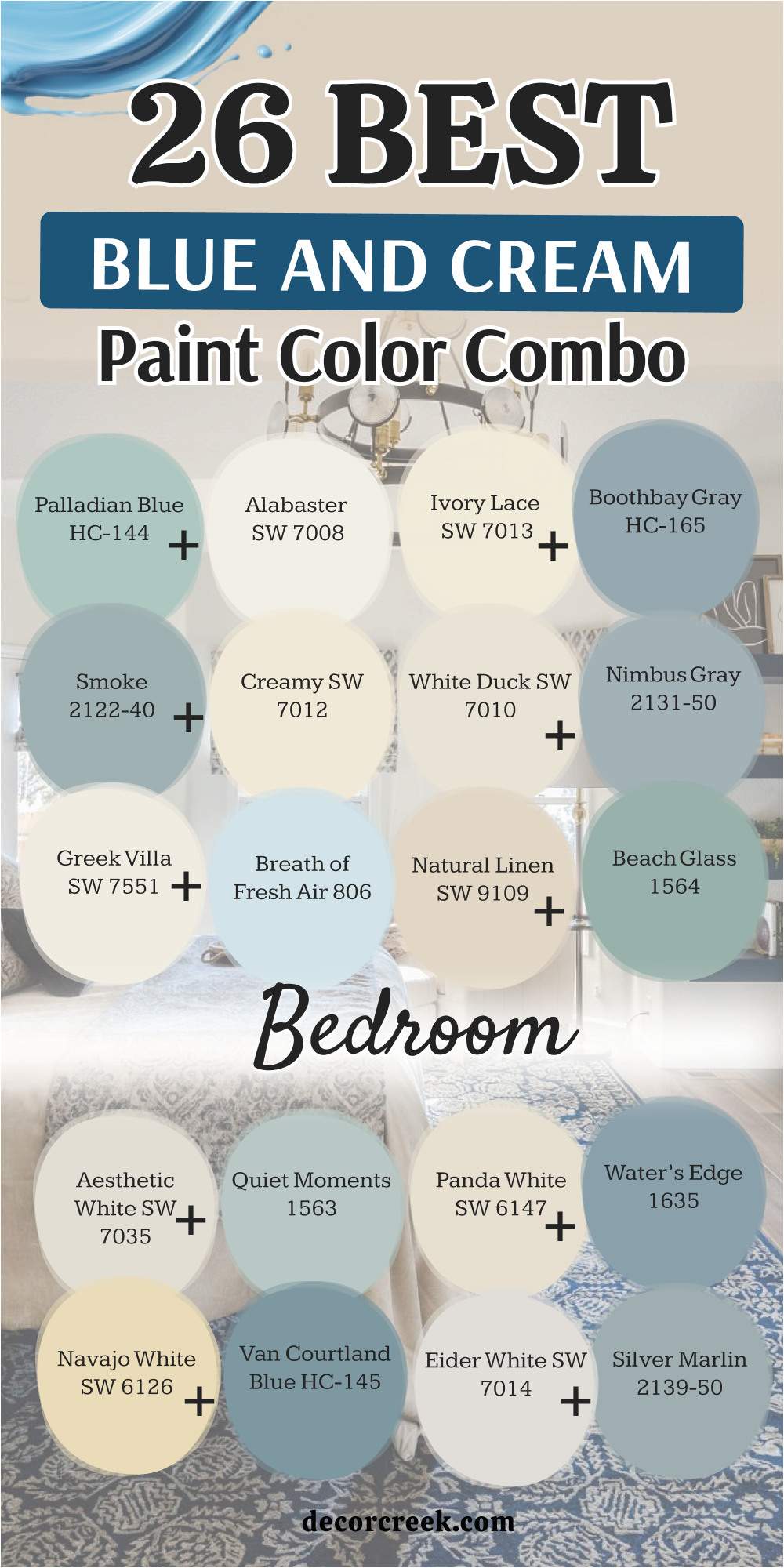
26 Blue and Cream Bedroom Paint Color Combo
Alabaster SW 7008 + Palladian Blue HC-144
Alabaster SW 7008 starts this list as a soft white that feels very cozy and warm. Palladian Blue HC-144 is the partner that brings a touch of the ocean into your home. This mix works because the cream base stops the blue from feeling too chilly.

You will notice how the walls seem to breathe when these two sit side by side. Light wood furniture looks amazing against this specific backdrop. It is a great choice for a guest room where you want people to feel at home.
The balance of these colors keeps the room looking clean but never boring. I often use this duo when a client wants a classic coastal vibe. It makes the ceiling look higher if you use the cream on top. Walking into a room with these colors feels like a fresh breath of air.
Best used in: living rooms, kitchens, hallways, bedrooms, and farmhouse exteriors
Pairs well with: Iron Ore SW 7069, Agreeable Gray SW 7029, Natural Linen SW 9109, warm wood tones
The key rule of this color for farmhouse style is to use it where you want natural light to feel kind, soft, and inviting throughout the day.

Creamy SW 7012 + Smoke 2122-40
Creamy SW 7012 provides a rich and buttery foundation for any wall in your house. Smoke 2122-40 adds a greyish blue tone that looks very smart and sophisticated. Together, they make a room feel like a high-end hotel suite.

You can use the cream on the trim to make the blue walls pop. Many people love how this combination makes white bedding look extra crisp. It is a heavy hitter for master suites that need a bit of drama.
The blue is dark enough to feel cozy but light enough to stay cheerful. I find that brass lamps look stunning when placed against these shades. Your pillows and rugs will be easy to match with such a versatile base. This pair is a safe bet if you want a look that stays stylish for years.
Best used in: bedrooms, master baths, cozy dens, and reading nooks
Pairs well with: Urbane Bronze SW 7048, Pure White SW 7005, Naval SW 6244, dark walnut furniture
The key rule of this color for farmhouse style is to use it where you want natural light to feel kind, soft, and inviting throughout the day.

Shoji White SW 7042 + Wedgewood Gray HC-146
Shoji White SW 7042 is a greige-leaning cream that hides dirt and scuffs very well. Wedgewood Gray HC-146 brings in a stony blue that feels very grounded and solid. This set is perfect for a busy family home where things get messy.

The cream is not too bright, so it does not hurt your eyes in the sun. The blue has a bit of green in it, which reminds me of the forest. It creates a very natural feeling that helps you relax after a long day. I like to use these colors in rooms with lots of plants and wooden floors.
The transition between the two colors is very smooth and easy on the eyes. Your bedroom will feel like a secret hideaway with this earthy palette. It is a solid choice for anyone who likes a more rustic or organic look.
Best used in: entryways, mudrooms, bedrooms, and rustic kitchen cabinets
Pairs well with: Black Magic SW 6991, Repose Gray SW 7015, Sea Salt SW 6204, oak flooring
The key rule of this color for farmhouse style is to use it where you want natural light to feel kind, soft, and inviting throughout the day.
Greek Villa SW 7551 + Breath of Fresh Air 806
Greek Villa SW 7551 is a bright and sunny cream that makes small rooms feel much bigger. Breath of Fresh Air 806 is a light sky blue that makes you feel like you are outside. Using these together is like bringing a sunny day right into your bedroom.

The cream acts like a mirror for any sunlight that hits the walls. The blue is very pale, so it does not dominate the room. This is a wonderful palette for a nursery or a child’s bedroom. It feels very happy and energetic without being too loud or distracting.
White curtains look beautiful hanging against the light blue paint. You will find that this combo makes your morning routine feel much brighter. It is the best pick for a room that does not get a lot of natural light.
Best used in: nurseries, small bedrooms, bathrooms, and sunrooms
Pairs well with: Tricorn Black SW 6258, Revere Pewter HC-172, Wood tones, white linen
The key rule of this color for farmhouse style is to use it where you want natural light to feel kind, soft, and inviting throughout the day.

Ivory Lace SW 7013 + Boothbay Gray HC-165
Ivory Lace SW 7013 is a delicate cream that has a very soft and romantic feel. Boothbay Gray HC-165 is a medium blue with a lot of gray mixed inside it. This combination feels very elegant and works well with antique furniture.
The cream is warm, which prevents the gray-blue from looking too metallic. I suggest using the blue on an accent wall behind your headboard. The rest of the walls can be the cream color to keep things open.
Silver or chrome fixtures look very sharp against these cool blue tones. It is a palette that feels very mature and well put together. Many of my clients choose this for their main bedroom to get a peaceful vibe. It reminds me of a misty morning by a lake in the mountains.
Best used in: master bedrooms, formal dining rooms, hallways, and guest baths
Pairs well with: Wrought Iron BM 2124-10, Classic Gray OC-23, Marble accents, silver hardware
The key rule of this color for farmhouse style is to use it where you want natural light to feel kind, soft, and inviting throughout the day.

White Duck SW 7010 + Nimbus Gray 2131-50
White Duck SW 7010 is a modern cream that looks great in houses with open floors. Nimbus Gray 2131-50 provides a cool blue-gray contrast that is very trendy right now. This duo is great for someone who wants a home that looks like a magazine.
The cream has a tiny bit of gray in it, so it matches the blue perfectly. It is a very professional look that still feels warm enough for a bedroom. You can add pops of navy or dark wood to make the colors stand out.
This palette is very forgiving and looks good in almost any light. I love how it makes colorful artwork on the walls really catch your eye. It is a smart choice for a teenager’s room or a home office. The overall feel is very balanced and organized for any living area.
Best used in: offices, modern bedrooms, laundry rooms, and hallways
Pairs well with: Hale Navy HC-154, Mindful Gray SW 7016, Matte black accents, light oak
The key rule of this color for farmhouse style is to use it where you want natural light to feel kind, soft, and inviting throughout the day.
Natural Linen SW 9109 + Beach Glass 1564
Natural Linen SW 9109 is a darker cream that feels like a warm hug for your walls. Beach Glass 1564 is a watery blue-green that is very popular for a reason. Together, they create a look that is very relaxing and easy to live with.

The linen color hides dust and makes the room feel very cozy at night. The blue-green adds a splash of color that is not too bold or bright. It works very well with natural materials like wicker or jute rugs.
This is a go-to palette for a vacation home or a guest bedroom. It feels very casual and comfortable for people who hate stiff rooms. You will feel like you are on a permanent holiday with these colors. It is one of my favorite combinations for creating a lived-in feel.
Best used in: guest rooms, beach houses, living rooms, and sun porches
Pairs well with: Swiss Coffee OC-45, Woodlawn Blue HC-147, Wicker furniture, linen fabrics
The key rule of this color for farmhouse style is to use it where you want natural light to feel kind, soft, and inviting throughout the day.

Aesthetic White SW 7035 + Quiet Moments 1563
Aesthetic White SW 7035 is a very light cream that almost looks like a soft gray. Quiet Moments 1563 is a pale blue that has a hint of green and gray. This is the most popular pair for people who want a very light room.

It creates a very airy feeling that helps a small bedroom feel open. The cream is very neutral, so it does not clash with any of your stuff. The blue is so light that it almost acts like a neutral color itself.
It is a great choice if you are planning to sell your house soon. Most people find this combination very pleasing and easy to look at. It looks best with white trim and very light-colored wood floors. This palette is the definition of a clean and fresh start for a room.
Best used in: small apartments, nursery rooms, bathrooms, and kitchens
Pairs well with: Chantilly Lace OC-65, Stonington Gray HC-170, Gold accents, light pine
The key rule of this color for farmhouse style is to use it where you want natural light to feel kind, soft, and inviting throughout the day.

Navajo White SW 6126 + Van Courtland Blue HC-145
Navajo White SW 6126 is a classic yellow-based cream that feels very traditional. Van Courtland Blue HC-145 is a strong medium blue that makes a big statement. This pair is for the person who loves a historic or cozy library look.
The cream is very warm and makes the blue feel deep and meaningful. It looks wonderful with dark mahogany or cherry wood furniture pieces. You can use the blue on the walls and the cream on the built-in shelves.
This combination feels very sturdy and has a lot of personality. It is a great way to make a large bedroom feel a bit more intimate. The colors are rich and do not fade away when the sun goes down. I use this when a client wants a room that feels very established.
Best used in: libraries, traditional bedrooms, dining rooms, and home offices
Pairs well with: Dark walnut, Brass hardware, Rich reds, Creamy white trim
The key rule of this color for farmhouse style is to use it where you want natural light to feel kind, soft, and inviting throughout the day.

Panda White SW 6147 + Water’s Edge 1635
Panda White SW 6147 is a unique cream that has a tiny bit of tan in it. Water’s Edge 1635 is a moody blue that looks like a deep lake at dusk. This pair is very cool and helps you fall asleep faster at night.

The cream keeps the dark blue from making the room feel like a cave. It is a very modern look that works well with simple furniture shapes. I like to use large white lamps to contrast against the blue paint.
The tan in the cream helps bridge the gap to your flooring colors. It is a sophisticated choice for a bachelor pad or a modern loft. The blue is very deep and hides imperfections on older plaster walls. You will love how the colors shift and change as the sun moves.
Best used in: modern lofts, master bedrooms, media rooms, and accent walls
Pairs well with: Charcoal gray, Industrial metal, Light maple wood, White bedding
The key rule of this color for farmhouse style is to use it where you want natural light to feel kind, soft, and inviting throughout the day.
Eider White SW 7014 + Silver Marlin 2139-50
Eider White SW 7014 functions as a cool cream that has a very clean and crisp appearance. Silver Marlin 2139-50 adds a wonderful blue-green mix that feels like a quiet day at the coast. This combination is great for making a room feel refreshed and tidy every single morning.
The cool undertones in the paint help to keep the temperature feeling lower during hot summer months. I recommend this pair for rooms that get a lot of bright and direct afternoon sun. It prevents the walls from looking too yellow or glowing too brightly in the heat.
Your bed will look like a soft cloud when surrounded by these gentle and icy tones. It is a very smart look for someone who prefers a modern and sleek home style. Many people find that this palette helps them clear their minds before they go to sleep. You can add dark gray rugs to ground the room and provide a bit of weight.
Best used in: living rooms, kitchens, hallways, bedrooms, and farmhouse exteriors
Pairs well with: Iron Ore SW 7069, Agreeable Gray SW 7029, Natural Linen SW 9109, warm wood tones
The key rule of this color for farmhouse style is to use it where you want natural light to feel kind, soft, and inviting throughout the day.
Casa Blanca SW 7571 + Woodlawn Blue HC-147
Casa Blanca SW 7571 is a very creamy and rich white that feels like antique lace. Woodlawn Blue HC-147 brings in a classic aqua tone that reminds me of vintage glass bottles. This duo creates a very nostalgic and cozy feeling in any bedroom it touches.
The warmth of the cream perfectly balances the bright energy of the light blue paint. It is a fantastic choice if you have a lot of family photos or old books. The colors feel very friendly and welcoming to anyone who steps inside the room.
I love how it looks when you use white flowing curtains on the window frames. This palette makes a guest room feel like a special treat for your visiting friends. It is a very sweet and traditional look that never feels old or out of style. You will find that this mix makes your furniture look much more expensive and polished.
Best used in: living rooms, kitchens, hallways, bedrooms, and farmhouse exteriors
Pairs well with: Iron Ore SW 7069, Agreeable Gray SW 7029, Natural Linen SW 9109, warm wood tones
The key rule of this color for farmhouse style is to use it where you want natural light to feel kind, soft, and inviting throughout the day.
Moderate White SW 6140 + Mount Saint Anne 1565
Moderate White SW 6140 is a sturdy cream that has enough body to stand up to dark colors. Mount Saint Anne 1565 is a medium blue with heavy gray tones that feels very expensive. This pair is ideal for a master bedroom where you want a bit of luxury.
The cream is deep enough that it does not look like a plain white wall. The blue is moody and rich which makes the room feel very private and safe. It works beautifully with large mirrors and shiny metal lamps or drawer pulls.
I often suggest this for rooms with very high ceilings to make them feel closer. The color combination is very balanced and does not lean too far into any one mood. It is a very professional design choice that works for many different personality types. You will love how the gray in the blue keeps the room looking very grown up.
Best used in: living rooms, kitchens, hallways, bedrooms, and farmhouse exteriors
Pairs well with: Iron Ore SW 7069, Agreeable Gray SW 7029, Natural Linen SW 9109, warm wood tones
The key rule of this color for farmhouse style is to use it where you want natural light to feel kind, soft, and inviting throughout the day.

Dover White SW 6385 + Brittany Blue 1633
Dover White SW 6385 is a favorite cream because it feels very soft and easy to live with. Brittany Blue 1633 is a very pretty and light blue that looks like a clear spring sky. This set is perfect for a room where you want to feel happy and lighthearted.
The cream has a bit of warmth that keeps the light blue from looking too cold. It is a very safe choice for a primary bedroom or even a small nursery. The light bounces around the room in a way that makes everything feel very cheerful.
I like to use this with light gray carpet or very light wood floor planks. It is a very clean look that makes the whole house feel much more organized. Your morning coffee will taste better in a room that feels this fresh and bright. Most people agree that this is one of the easiest palettes to get right on the first try.
Best used in: living rooms, kitchens, hallways, bedrooms, and farmhouse exteriors
Pairs well with: Iron Ore SW 7069, Agreeable Gray SW 7029, Natural Linen SW 9109, warm wood tones
The key rule of this color for farmhouse style is to use it where you want natural light to feel kind, soft, and inviting throughout the day.
Steamed Milk SW 7554 + Glass Slipper 1632
Steamed Milk SW 7554 is a thick and creamy color that feels very smooth on the eyes. Glass Slipper 1632 is a very pale blue that almost looks like a whisper of color. This combination is for people who want a room that is nearly all white but with a twist.
The blue is so light that you only notice it when the sun hits it just right. It creates a very soft and dreamy environment that is perfect for sleeping in late. The cream base provides a nice foundation so the room does not feel like a cold hospital.
I recommend using this palette if you have very colorful blankets or bright artwork. The walls will stay in the background and let your favorite things shine out. It is a very humble and quiet mix that makes a home feel very peaceful. You will appreciate how simple and clean this looks every time you walk inside.
Best used in: living rooms, kitchens, hallways, bedrooms, and farmhouse exteriors
Pairs well with: Iron Ore SW 7069, Agreeable Gray SW 7029, Natural Linen SW 9109, warm wood tones
The key rule of this color for farmhouse style is to use it where you want natural light to feel kind, soft, and inviting throughout the day.

Muslin SW 6133 + Blue Hydrangea 2062-60
Muslin SW 6133 is a tan-leaning cream that feels very earthy and naturally warm. Blue Hydrangea 2062-60 is a bright and floral blue that adds a lot of personality. This pair is for someone who is not afraid of a little bit of color in their life.
The cream helps to ground the bright blue so it does not feel too energetic for a bedroom. It reminds me of a beautiful garden in the middle of a sunny summer day. You can use the blue on the furniture or an accent wall for a fun look.
The cream is very good at hiding smudges which makes it great for high-traffic areas. It is a very brave and cheerful choice that makes people smile when they see it. I like to pair this with natural baskets and green leafy indoor plants. This palette will make your bedroom feel like a very special and unique part of the house.
Best used in: living rooms, kitchens, hallways, bedrooms, and farmhouse exteriors
Pairs well with: Iron Ore SW 7069, Agreeable Gray SW 7029, Natural Linen SW 9109, warm wood tones
The key rule of this color for farmhouse style is to use it where you want natural light to feel kind, soft, and inviting throughout the day.
White Flour SW 7102 + Iceberg 2122-50
White Flour SW 7102 is a very light and airy cream that feels like a fresh start. Iceberg 2122-50 is a cool blue that has a lot of gray and white mixed into it. This duo is excellent for making a very cramped room feel much more spacious.
The cream is so light it almost looks white until you put it next to a true white. The blue is very frosty and looks amazing with silver or chrome decorations. It is a very modern palette that works well in homes with a lot of glass.
I suggest this for people who like a very minimalist and clean decorating style. The colors do not fight for attention and let the architecture of the room speak. It is a very smart way to make a dark corner feel much more alive. You will love how this combination makes everything feel very light and weightless.
Best used in: living rooms, kitchens, hallways, bedrooms, and farmhouse exteriors
Pairs well with: Iron Ore SW 7069, Agreeable Gray SW 7029, Natural Linen SW 9109, warm wood tones
The key rule of this color for farmhouse style is to use it where you want natural light to feel kind, soft, and inviting throughout the day.
Shell White SW 8917 + Healing Aloe 1562
Shell White SW 8917 is a peach-toned cream that adds a healthy glow to the room. Healing Aloe 1562 is a very famous blue-green that is known for being very soft. Together they create a look that is very gentle and helps you feel better.
The peach in the cream makes skin tones look very good in the mirror. The blue-green is very light and looks like a soft sage color in some lighting. This is a top choice for master bathrooms or bedrooms where you relax.
It feels very spa-like and high-end without being too fancy or cold. I love how these colors look with light oak wood and white fluffy towels. It is a very organic palette that feels like it came straight from nature. You will find that this mix is very easy to love for a long time.
Best used in: living rooms, kitchens, hallways, bedrooms, and farmhouse exteriors
Pairs well with: Iron Ore SW 7069, Agreeable Gray SW 7029, Natural Linen SW 9109, warm wood tones
The key rule of this color for farmhouse style is to use it where you want natural light to feel kind, soft, and inviting throughout the day.

Biscuit SW 6112 + Santorini Blue 1634
Biscuit SW 6112 is a warm and deep cream that feels very solid and reliable. Santorini Blue 1634 is a medium blue that has a very Mediterranean and sunny feel. This pair is great for a bedroom that needs a little bit of warmth and energy.
The cream is dark enough to feel like a real color on the wall. The blue is vibrant and looks wonderful with dark wood or iron bed frames. It creates a very strong look that feels very anchored and purposeful. I like to use this in guest rooms that get a lot of morning light.
The blue looks very deep and rich when the sun is not hitting it directly. It is a very classic combination that reminds me of old-world travel and adventure. You will love how this makes your bedroom feel like a very important part of the home.
Best used in: living rooms, kitchens, hallways, bedrooms, and farmhouse exteriors
Pairs well with: Iron Ore SW 7069, Agreeable Gray SW 7029, Natural Linen SW 9109, warm wood tones
The key rule of this color for farmhouse style is to use it where you want natural light to feel kind, soft, and inviting throughout the day.
Lotus Pod SW 7572 + Amsterdam AF-550
Lotus Pod SW 7572 is a unique cream that has a bit of gray and brown in it. Amsterdam AF-550 is a very sophisticated blue that looks like denim or a stormy sky. This pair is very modern and looks great in a home with a lot of character.
The cream is very neutral and works well with almost any type of flooring. The blue is dark and moody which is perfect for a deep and restful sleep. I recommend using the blue on the walls and the cream on all the doors and trim.
It creates a very dramatic and high-quality look for a main bedroom. The colors are very trendy but also feel like they will stay stylish for a while. You can add gold or copper accents to make the blue really pop. This is a very smart choice for someone who wants a bedroom that looks very custom.
Best used in: living rooms, kitchens, hallways, bedrooms, and farmhouse exteriors
Pairs well with: Iron Ore SW 7069, Agreeable Gray SW 7029, Natural Linen SW 9109, warm wood tones
The key rule of this color for farmhouse style is to use it where you want natural light to feel kind, soft, and inviting throughout the day.

Cream Wave SW 7586 + Normandy 2129-40
Cream Wave SW 7586 starts this combination with a very fluid and warm energy that fills a room. Normandy 2129-40 is a deep and dusty blue that reminds me of a stormy ocean or a dark sky. Using these two together creates a very strong and balanced look for a large master bedroom.
The cream color is rich enough to hold its own against such a bold and dark blue partner. I love how the dark blue makes white bed sheets look absolutely brilliant and very clean. This is a great choice if you want your sleeping area to feel like a very private and safe cave.
The blue has enough gray in it to keep the room looking very mature and very smart. You can use gold picture frames to add a little bit of sparkle to the darker walls. It is a very high-quality palette that makes your home feel very expensive and well-planned. Most people find that this mix helps them feel very grounded and ready for a long night of rest.
Best used in: living rooms, kitchens, hallways, bedrooms, and farmhouse exteriors
Pairs well with: Iron Ore SW 7069, Agreeable Gray SW 7029, Natural Linen SW 9109, warm wood tones
The key rule of this color for farmhouse style is to use it where you want natural light to feel kind, soft, and inviting throughout the day.
Radiant Dawn SW 9661 + Van Deusen Blue HC-156
Radiant Dawn SW 9661 is a glowing cream that feels like the first bit of sun in the morning. Van Deusen Blue HC-156 is a classic navy that has been a favorite for many years because it is so rich. This pair is for someone who loves a very traditional and navy-themed look in their house.
The cream is bright and helps the dark blue from feeling too heavy or too sad. It looks amazing with white painted trim and very dark hardwood floors under your feet. I suggest using the blue on a single wall to create a very focal point for the bed.
The cream can go on the other three walls to keep the room feeling very large and open. This is a very professional look that works perfectly for a home office or a main bedroom. You will love how the colors stay true and do not change much in different lighting. It is a very reliable choice for anyone who wants a look that is both strong and very friendly.
Best used in: living rooms, kitchens, hallways, bedrooms, and farmhouse exteriors
Pairs well with: Iron Ore SW 7069, Agreeable Gray SW 7029, Natural Linen SW 9109, warm wood tones
The key rule of this color for farmhouse style is to use it where you want natural light to feel kind, soft, and inviting throughout the day.

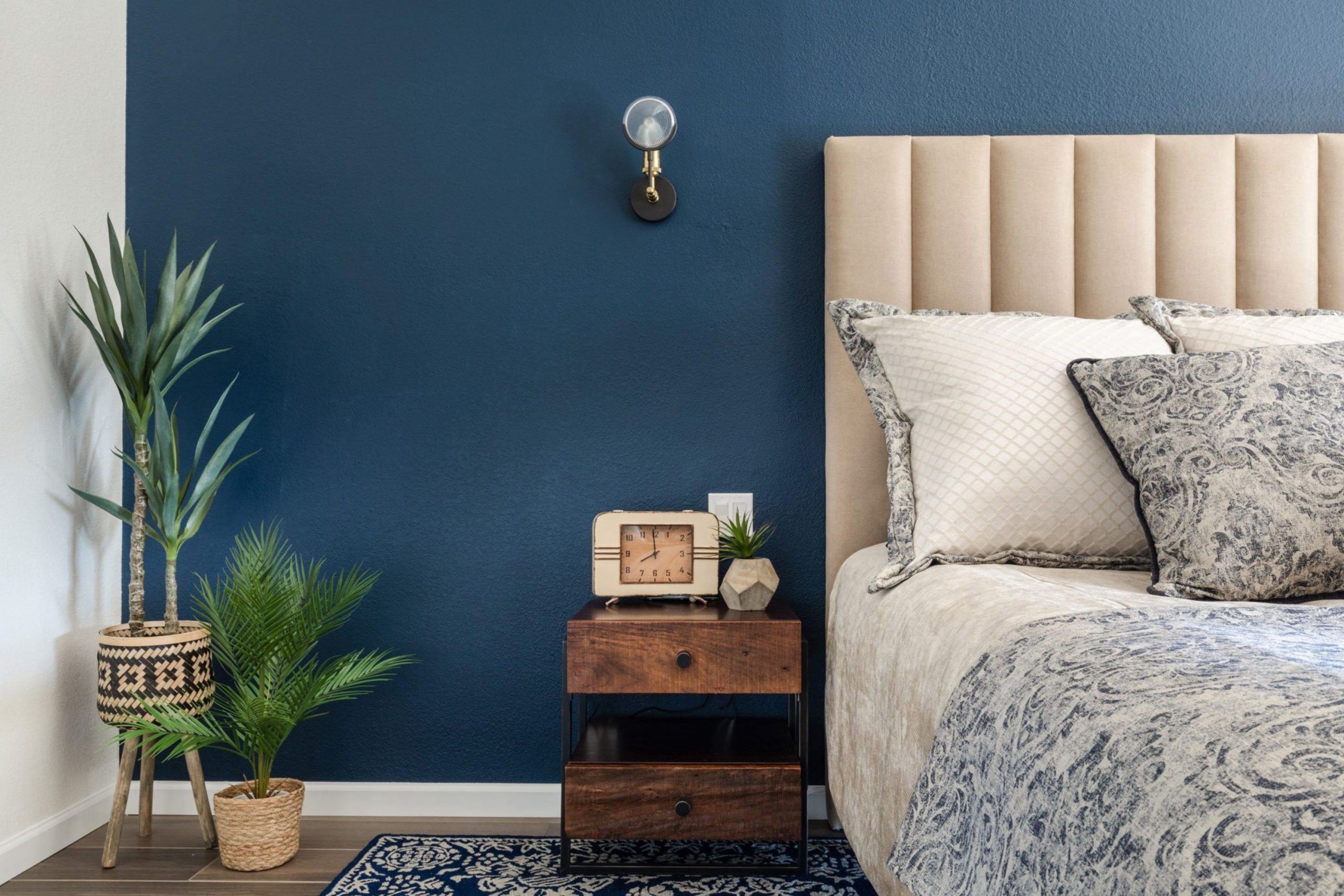
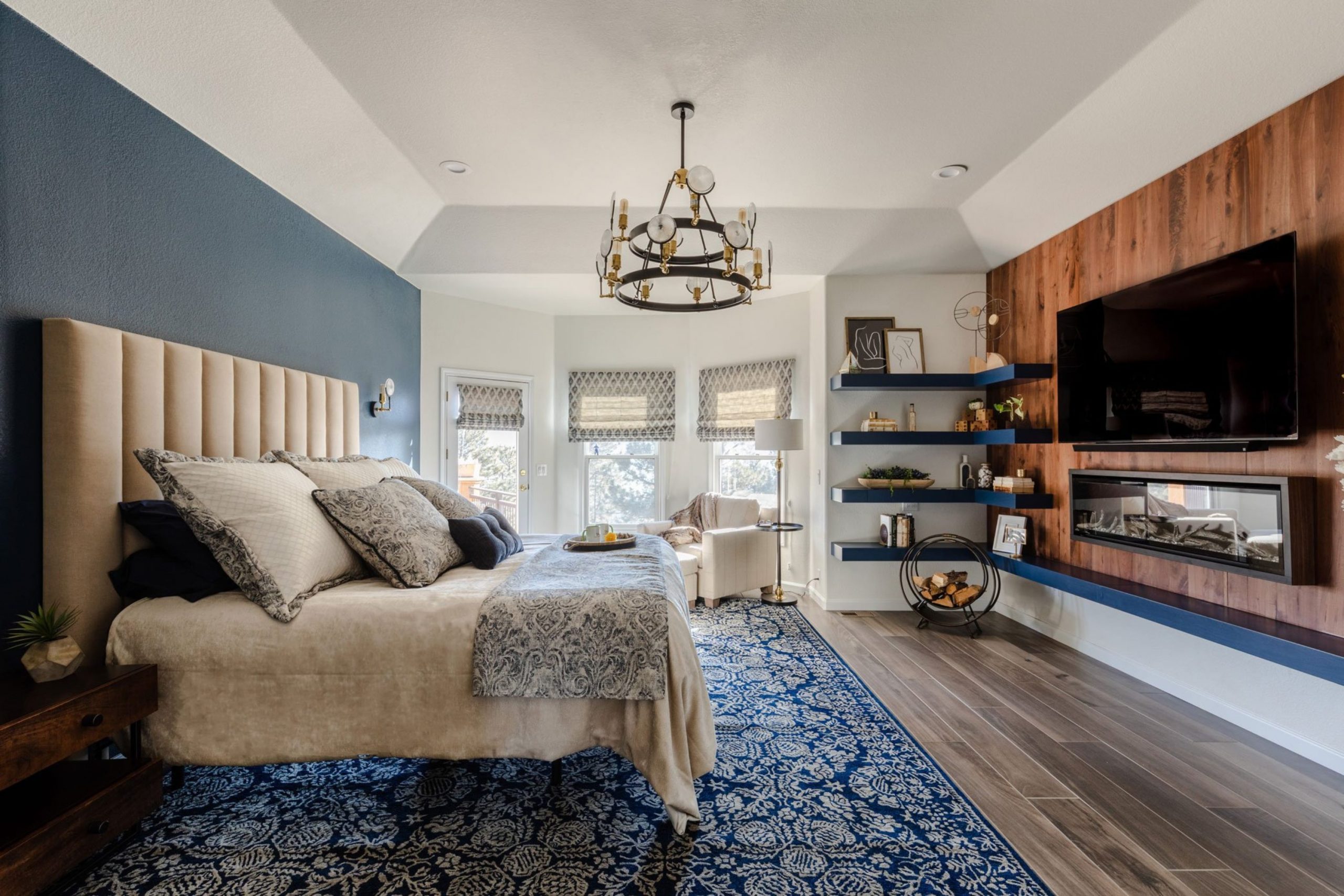
Crisp Linen SW 6378 + Hale Navy HC-154
Crisp Linen SW 6378 is a very clean cream that feels like a freshly ironed shirt for your walls. Hale Navy HC-154 is one of the most famous dark blues because it looks good in every single home. This duo is the gold standard for a nautical or coastal look that feels very high-end.
The cream is warm but not yellow, which makes it a perfect match for a very dark navy. It creates a very sharp contrast that makes the architecture of your room really stand out. I like to use this with thick white molding around the ceiling and the floorboards.
The navy is so deep that it can hide small bumps or marks on your bedroom walls. It is a very brave choice that always pays off with a very beautiful and stylish result. Your friends will think you hired a professional designer when they see this combination. This palette is very popular because it makes a room feel very solid and very well-built.
Best used in: living rooms, kitchens, hallways, bedrooms, and farmhouse exteriors
Pairs well with: Iron Ore SW 7069, Agreeable Gray SW 7029, Natural Linen SW 9109, warm wood tones
The key rule of this color for farmhouse style is to use it where you want natural light to feel kind, soft, and inviting throughout the day.

Antique White SW 6119 + Philipsburg Blue HC-159
Antique White SW 6119 is a very warm and creamy color that feels like it has a long history. Philipsburg Blue HC-159 is a medium blue that has a very soft and chalky finish to it. This pair is wonderful for a historic home or a bedroom with a lot of old-fashioned charm.

The cream is very rich and makes the blue feel very soft and very approachable. It looks beautiful with brass bed frames and old wooden dressers that have a lot of character. I often use this when a client wants a room that feels like it has been there forever.
The blue is not too bright, so it does not distract you when you are trying to relax. It creates a very gentle environment that is perfect for reading a book in the evening. You will appreciate how these colors make your bedroom feel very cozy and very lived-in. It is a very sweet and traditional choice that feels very warm and very safe.
Best used in: living rooms, kitchens, hallways, bedrooms, and farmhouse exteriors
Pairs well with: Iron Ore SW 7069, Agreeable Gray SW 7029, Natural Linen SW 9109, warm wood tones
The key rule of this color for farmhouse style is to use it where you want natural light to feel kind, soft, and inviting throughout the day.
Vanillin SW 6371 + Blue Note 2129-30
Vanillin SW 6371 is a sweet and light cream that reminds me of a tasty vanilla bean. Blue Note 2129-30 is a very dark and moody blue that has a hint of black inside it. This combination is very modern and feels very cool for a younger person or a sleek loft.
The cream is very light and helps to balance the very deep and dark blue paint. I recommend using the dark blue on the ceiling for a very unique and cozy feeling at night. The cream walls will then feel very tall and help the room stay feeling quite large.
This is a very sophisticated look that is perfect for someone who loves modern art. The contrast between the light cream and the dark blue is very striking and very beautiful. You will love how the blue hides the light from the windows when you want to sleep late. It is a very smart and very trendy choice for any modern sleeping area.
Best used in: living rooms, kitchens, hallways, bedrooms, and farmhouse exteriors
Pairs well with: Iron Ore SW 7069, Agreeable Gray SW 7029, Natural Linen SW 9109, warm wood tones
The key rule of this color for farmhouse style is to use it where you want natural light to feel kind, soft, and inviting throughout the day.

White Sesame SW 9586 + Gentleman’s Gray 2062-20
White Sesame SW 9586 is a very neutral cream that has a tiny bit of gray and tan mixed in. Gentleman’s Gray 2062-20 is actually a very deep teal-blue that looks very teal in some lights. This pair is very fancy and looks like it belongs in a very high-end mansion.
The cream is very steady and helps the blue look very rich and very deep. It works wonderfully with velvet pillows and heavy curtains that block out all the light. I suggest this for a master bedroom where you want to feel like a king or a queen.
The blue is very interesting because it changes its look throughout the whole day. It can look very dark at night and very colorful when the sun is shining on it. This is a very bold choice that makes a very big statement in your home. You will find that this palette is very rewarding and looks very polished and very clean.
Best used in: living rooms, kitchens, hallways, bedrooms, and farmhouse exteriors
Pairs well with: Iron Ore SW 7069, Agreeable Gray SW 7029, Natural Linen SW 9109, warm wood tones
The key rule of this color for farmhouse style is to use it where you want natural light to feel kind, soft, and inviting throughout the day.

27 Blue and Cream Bedroom Paint Colors From Sherwin Williams
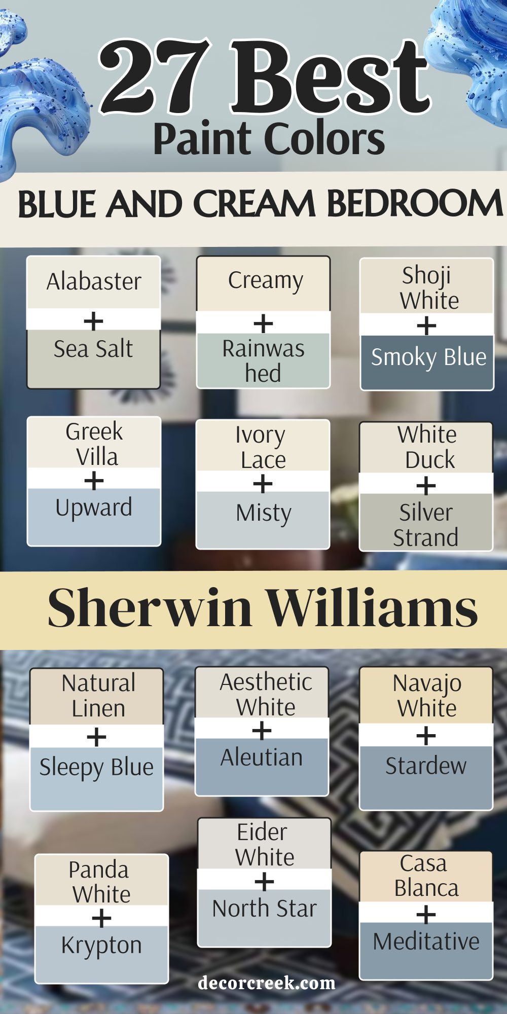
Alabaster SW 7008 + Sea Salt SW 6204
Alabaster SW 7008 is back again because it is a perfect cream that never lets me down. Sea Salt SW 6204 is a very light and airy blue-green that is famous for a reason. This combination is the ultimate choice for a bedroom that feels like a quiet day at the beach.
The cream is very warm and makes the light green-blue look very fresh and very healthy. It is a very soft look that is very easy on the eyes when you wake up in the morning. I love how this looks with white furniture and light-colored rugs on the floor.
It makes a small room feel very big because the colors are so light and so open. Many people use this in their guest rooms because it makes everyone feel very happy. It is a very safe and very beautiful choice that you will not ever get tired of seeing. Your bedroom will feel like a very peaceful and very light place to be every day.
Best used in: living rooms, kitchens, hallways, bedrooms, and farmhouse exteriors
Pairs well with: Iron Ore SW 7069, Agreeable Gray SW 7029, Natural Linen SW 9109, warm wood tones
The key rule of this color for farmhouse style is to use it where you want natural light to feel kind, soft, and inviting throughout the day.

Creamy SW 7012 + Rainwashed SW 6211
Creamy SW 7012 is a very warm and inviting paint that feels very soft on your walls. Rainwashed SW 6211 is a light blue that feels like it has just been cleaned by a rainstorm. This duo is very refreshing and makes a room feel very brand new and very tidy.
The cream is very good at making the blue look like a real color without being too loud. It is a very popular choice for people who want a little bit of color but nothing too dark. I like to use this in rooms that have a lot of white trim and white doors.
The contrast is very gentle and makes the whole house feel very organized and very clean. You will love how the light reflects off these colors in a very kind and very soft way. It is a very friendly palette that works well for people of all different ages. Most of my clients feel very relaxed as soon as they walk into a room with these hues.
Best used in: living rooms, kitchens, hallways, bedrooms, and farmhouse exteriors
Pairs well with: Iron Ore SW 7069, Agreeable Gray SW 7029, Natural Linen SW 9109, warm wood tones
The key rule of this color for farmhouse style is to use it where you want natural light to feel kind, soft, and inviting throughout the day.

Shoji White SW 7042 + Smoky Blue SW 7604
Shoji White SW 7042 is a very versatile cream that can look like a light gray in some rooms. Smoky Blue SW 7604 is a medium blue that has a very dusty and soft appearance. This pair is very modern and looks great in a bedroom with a lot of simple furniture.
The cream is very neutral which allows the smoky blue to be the star of the show. I recommend using the blue on the wall behind your bed to make it look very special. The cream walls will then help the rest of the room feel very light and very open.
This is a very smart look for a bedroom that also has a small desk for working. The colors are very professional but still feel very cozy and very warm for sleeping. You can add black metal lamps to give the room a bit of a modern edge. It is a very balanced and very handsome palette for any home in the city.
Best used in: living rooms, kitchens, hallways, bedrooms, and farmhouse exteriors
Pairs well with: Iron Ore SW 7069, Agreeable Gray SW 7029, Natural Linen SW 9109, warm wood tones
The key rule of this color for farmhouse style is to use it where you want natural light to feel kind, soft, and inviting throughout the day.

Greek Villa SW 7551 + Upward SW 6239
Greek Villa SW 7551 is a very bright cream that feels very sun-drenched and very happy. Upward SW 6239 is a light and airy blue that looks like a beautiful summer afternoon. This combination is very energetic and makes a bedroom feel very bright and very wide.
The cream is very light and acts like a perfect background for the soft blue paint. I love how this looks with light-colored curtains and lots of white pillows on the bed. It makes a room feel very clean and very fresh even on a cloudy day outside.
This is a great choice for a child’s bedroom or a very small guest room. The colors help to bounce the light around so you do not need as many lamps. You will feel very awake and very ready for the day in a room with these colors. It is a very cheerful and very simple palette that is very hard to get wrong.
Best used in: living rooms, kitchens, hallways, bedrooms, and farmhouse exteriors
Pairs well with: Iron Ore SW 7069, Agreeable Gray SW 7029, Natural Linen SW 9109, warm wood tones
The key rule of this color for farmhouse style is to use it where you want natural light to feel kind, soft, and inviting throughout the day.

Ivory Lace SW 7013 + Misty SW 6232
Ivory Lace SW 7013 is a very light and delicate cream that feels like a soft morning light on your walls. Misty SW 6232 is a very pale blue that has a hint of gray, making it look very soft and quiet. This combination is wonderful for a bedroom where you want to feel very peaceful as you drift off to sleep.
The cream is warm enough to keep the light gray-blue from feeling too cold or like a hospital room. I suggest using this duo in a room that gets plenty of natural sunlight to see the colors really shine. It looks very smart with silver or light wood accents throughout the living area.
You will notice how the two colors blend together almost like a soft mist over a sandy beach. This is a very popular pick for guest rooms because it feels very clean and very new. It is a very safe and very pretty choice for anyone who likes a light and airy home. Your bedroom will feel much larger and more open with these two gentle shades.
Best used in: living rooms, kitchens, hallways, bedrooms, and farmhouse exteriors
Pairs well with: Iron Ore SW 7069, Agreeable Gray SW 7029, Natural Linen SW 9109, warm wood tones
The key rule of this color for farmhouse style is to use it where you want natural light to feel kind, soft, and inviting throughout the day.

White Duck SW 7010 + Silver Strand SW 7057
White Duck SW 7010 is a modern cream that has just a tiny touch of gray hidden inside it. Silver Strand SW 7057 is a very famous blue-green-gray that changes its look depending on the time of day.
This pair is very trendy and works perfectly for a bedroom that needs to look very polished and very clean. The cream acts as a steady base that allows the moving colors of the blue-gray to really pop.
I love how this combination looks with dark metal bed frames and white fluffy blankets. It makes a room feel very expensive and like a high-end hotel room. You can use the cream on the trim and the blue-gray on the walls for a very sharp look. This palette is very forgiving and looks good even if your room does not have many windows. It is a very smart choice for a master suite that needs a bit of style. Your friends will ask you for the name of these colors because they look so well-planned.
Best used in: living rooms, kitchens, hallways, bedrooms, and farmhouse exteriors
Pairs well with: Iron Ore SW 7069, Agreeable Gray SW 7029, Natural Linen SW 9109, warm wood tones
The key rule of this color for farmhouse style is to use it where you want natural light to feel kind, soft, and inviting throughout the day.
Natural Linen SW 9109 + Sleepy Blue SW 6225
Natural Linen SW 9109 is a deeper cream that feels very cozy and like a warm hug. Sleepy Blue SW 6225 is a very soft and medium blue that does exactly what its name says. This duo is built for a bedroom where you want to relax and feel very comfortable.
The cream is dark enough to hide small marks and makes the blue feel very rich and very deep. I like to use this with wicker baskets and wood furniture to keep the room feeling very natural. The blue is very pretty and reminds me of a clear sky just before the sun goes down. It is a very traditional look that works well for people who like a classic home style.
You will find that these colors make your bedroom feel very quiet and very steady. It is a very solid choice that feels very warm and very safe for a long night of rest. This palette is one of my favorites for creating a room that feels very lived-in.
Best used in: living rooms, kitchens, hallways, bedrooms, and farmhouse exteriors
Pairs well with: Iron Ore SW 7069, Agreeable Gray SW 7029, Natural Linen SW 9109, warm wood tones
The key rule of this color for farmhouse style is to use it where you want natural light to feel kind, soft, and inviting throughout the day.
Aesthetic White SW 7035 + Aleutian SW 6241
Aesthetic White SW 7035 is a very light cream that has a cool gray undertone. Aleutian SW 6241 is a medium blue that feels very solid and very smart. This combination is great for a bedroom that has a lot of modern furniture and clean lines.
The cream is very light and helps the blue look very deep and very meaningful on the walls. I recommend using the blue on an accent wall behind the bed to create a very focal point. The light cream on the other walls will keep the room from feeling too small or too dark.
It is a very professional look that works well for a guest room or a main bedroom. You can add light gray pillows and rugs to match the cool tones in the paint. This is a very balanced palette that feels very organized and very well-thought-out. You will love how the colors stay looking fresh for a very long time.
Best used in: living rooms, kitchens, hallways, bedrooms, and farmhouse exteriors
Pairs well with: Iron Ore SW 7069, Agreeable Gray SW 7029, Natural Linen SW 9109, warm wood tones
The key rule of this color for farmhouse style is to use it where you want natural light to feel kind, soft, and inviting throughout the day.
Navajo White SW 6126 + Stardew SW 9138
Navajo White SW 6126 is a very warm and classic cream that feels very sunny and very bright. Stardew SW 9138 is a beautiful medium blue with a lot of gray that feels very sophisticated. This pair is for someone who loves a traditional look that also feels a bit modern.
The warm cream makes the cool blue-gray feel very approachable and very friendly. It looks wonderful with dark wood furniture and gold lamps on the nightstands. I often suggest this for rooms that get a lot of morning light so the cream can shine.
The blue is dark enough to feel cozy at night but light enough to stay cheerful in the day. It is a very established look that makes a home feel very well-built and very sturdy. You will find that this palette is very rewarding and looks very polished and very clean. This is a very smart choice for a master bedroom that needs a lot of personality.
Best used in: living rooms, kitchens, hallways, bedrooms, and farmhouse exteriors
Pairs well with: Iron Ore SW 7069, Agreeable Gray SW 7029, Natural Linen SW 9109, warm wood tones
The key rule of this color for farmhouse style is to use it where you want natural light to feel kind, soft, and inviting throughout the day.

Panda White SW 6147 + Krypton SW 6247
Panda White SW 6147 is a unique cream that has a bit of a tan and gray base. Krypton SW 6247 is a very cool blue that looks like the color of the sky on a cloudy day. This duo is very sleek and works well for a modern bedroom or a studio apartment.
The cream helps the cool blue feel a bit warmer and more like a real home. I love how the dark blue tones in Krypton make silver and black decorations look very sharp. You can use this with light wood floors to keep the room feeling very light and very open.
The cream is very good at hiding dust which makes it great for a busy life. It is a very smart and very trendy choice for anyone who loves a minimalist look. You will love how the colors shift and change as the sun moves across the sky. This palette is very cool and helps you fall asleep faster at night.
Best used in: living rooms, kitchens, hallways, bedrooms, and farmhouse exteriors
Pairs well with: Iron Ore SW 7069, Agreeable Gray SW 7029, Natural Linen SW 9109, warm wood tones
The key rule of this color for farmhouse style is to use it where you want natural light to feel kind, soft, and inviting throughout the day.
Eider White SW 7014 + North Star SW 6246
Eider White SW 7014 is a very cool cream that has a hint of gray, making it look very crisp. North Star SW 6246 is a very light and icy blue that feels very fresh and very new. This combination is perfect for a bedroom that gets a lot of hot sun in the afternoon.
The cool colors help to make the room feel much cooler and more comfortable for sleeping. The cream is very light and acts like a mirror to bounce the light around the room. I like to use this with white furniture and light blue pillows to keep the theme going.
It makes a small room feel very big because the colors are so light and so airy. This is a great choice for a guest room or a very small child’s bedroom. You will feel very refreshed and very ready for the day in a room with these hues. It is a very clean and very simple palette that is very hard to get wrong.
Best used in: living rooms, kitchens, hallways, bedrooms, and farmhouse exteriors
Pairs well with: Iron Ore SW 7069, Agreeable Gray SW 7029, Natural Linen SW 9109, warm wood tones
The key rule of this color for farmhouse style is to use it where you want natural light to feel kind, soft, and inviting throughout the day.
Casa Blanca SW 7571 + Meditative SW 6227
Casa Blanca SW 7571 is a very rich and warm cream that feels like a piece of vintage lace. Meditative SW 6227 is a medium blue that has a very soft and quiet energy to it. This pair is wonderful for a bedroom where you want to feel very safe and very relaxed.
The warm cream makes the blue feel very friendly and like a part of the family. It looks beautiful with light wood dressers and white flowing curtains on the windows. I often use this when a client wants a room that feels very nostalgic and very sweet.
The blue is not too bright, so it does not bother your eyes when you are resting. It creates a very gentle environment that is perfect for a long nap on a Sunday afternoon. You will appreciate how these colors make your bedroom feel very cozy and very lived-in. This is a very sweet and traditional choice that feels very warm and very safe.
Best used in: living rooms, kitchens, hallways, bedrooms, and farmhouse exteriors
Pairs well with: Iron Ore SW 7069, Agreeable Gray SW 7029, Natural Linen SW 9109, warm wood tones
The key rule of this color for farmhouse style is to use it where you want natural light to feel kind, soft, and inviting throughout the day.

Moderate White SW 6140 + Lullaby SW 9136
Moderate White SW 6140 is a very steady cream that feels very solid and very reliable. Lullaby SW 9136 is a very soft blue that is designed to help you relax and feel sleepy. This duo is the best pick for a room where you want to get a lot of good rest.
The cream is deep enough to feel like a real color but light enough to stay cheerful. The blue is very gentle and reminds me of a soft blanket or a quiet song. It works very well with white furniture and light-colored rugs on the floor.
I suggest using this for a child’s room or a master bedroom that needs a bit of peace. The colors are very balanced and do not fight each other for your attention. You will love how the light reflects off these shades in a very kind and very soft way. It is a very friendly palette that works well for people who like a very quiet home.
Best used in: living rooms, kitchens, hallways, bedrooms, and farmhouse exteriors
Pairs well with: Iron Ore SW 7069, Agreeable Gray SW 7029, Natural Linen SW 9109, warm wood tones
The key rule of this color for farmhouse style is to use it where you want natural light to feel kind, soft, and inviting throughout the day.
Dover White SW 6385 + Tradewind SW 6218
Dover White SW 6385 is a very popular cream because it feels very soft and very easy to love. Tradewind SW 6218 is a medium-light blue that has a hint of the ocean and the sky. This combination is very refreshing and makes a bedroom feel like it is by the sea.
The cream is warm and makes the light blue look very fresh and very clean. It is a very soft look that is very easy on the eyes when you wake up. I love how this looks with light wood floors and white curtains that catch the breeze.
It makes a room feel very happy and very light without being too bright or loud. This is a great choice for a primary bedroom or a guest suite. You will feel like you are on a small holiday every time you walk into the room. It is a very safe and very beautiful choice that you will not ever get tired of seeing.
Best used in: living rooms, kitchens, hallways, bedrooms, and farmhouse exteriors
Pairs well with: Iron Ore SW 7069, Agreeable Gray SW 7029, Natural Linen SW 9109, warm wood tones
The key rule of this color for farmhouse style is to use it where you want natural light to feel kind, soft, and inviting throughout the day.

Steamed Milk SW 7554 + Tidewater SW 6477
Steamed Milk SW 7554 is a thick and creamy color that feels very smooth on the eyes. Tidewater SW 6477 is a bright and watery blue that makes you feel like you are standing near a clear pool. This duo is perfect for a bedroom where you want to feel refreshed and very awake.
The cream base provides a nice foundation so the bright blue does not feel too sharp or loud. I recommend using this palette if you have light wood furniture and white cotton blankets. The walls will stay in the background but provide a very cheerful feeling to the whole room.
It is a very humble and quiet mix that makes a home feel very peaceful and very light. You will find that this combination helps a small room feel much more open and very airy. Most people agree that this is one of the easiest ways to bring a vacation feeling into your house. Your morning routine will feel much more positive in a room that looks this clean and happy.
Best used in: living rooms, kitchens, hallways, bedrooms, and farmhouse exteriors
Pairs well with: Iron Ore SW 7069, Agreeable Gray SW 7029, Natural Linen SW 9109, warm wood tones
The key rule of this color for farmhouse style is to use it where you want natural light to feel kind, soft, and inviting throughout the day.

Muslin SW 6133 + Dockside Blue SW 7601
Muslin SW 6133 is a tan-leaning cream that feels very earthy and naturally warm on your walls. Dockside Blue SW 7601 is a medium blue that has a very solid and very sturdy appearance. This pair is for someone who wants a bedroom that feels very grounded and very reliable.

The cream helps to balance the strength of the blue so the room stays very cozy for sleeping. It reminds me of old wooden boats and soft sand along a very quiet lake. You can use the blue on the furniture or an accent wall for a very smart and tailored look. The cream is very good at hiding smudges which makes it great for a busy family home. It is a very brave and cheerful choice that makes people feel very welcome when they visit. I like to pair this with natural baskets and green leafy indoor plants for a fresh look. This palette will make your bedroom feel like a very special and very unique part of the house.
Best used in: living rooms, kitchens, hallways, bedrooms, and farmhouse exteriors
Pairs well with: Iron Ore SW 7069, Agreeable Gray SW 7029, Natural Linen SW 9109, warm wood tones
The key rule of this color for farmhouse style is to use it where you want natural light to feel kind, soft, and inviting throughout the day.

White Flour SW 7102 + Jubilee SW 6248
White Flour SW 7102 is a very light and airy cream that feels like a fresh start for your day. Jubilee SW 6248 is a cool blue-gray that looks very smart and very sophisticated on a large wall. This duo is excellent for making a bedroom feel very organized and very well-planned out.
The cream is so light it almost looks white until you put it next to a true white trim. The blue-gray is very calming and looks amazing with silver or chrome decorations on your nightstands. It is a very modern palette that works well in homes with a lot of simple furniture shapes.
I suggest this for people who like a very minimalist and very clean decorating style in their home.
The colors do not fight for attention and let the architecture of the room speak for itself. It is a very smart way to make a dark corner feel much more alive and bright. You will love how this combination makes everything feel very light and very well-balanced.
Best used in: living rooms, kitchens, hallways, bedrooms, and farmhouse exteriors
Pairs well with: Iron Ore SW 7069, Agreeable Gray SW 7029, Natural Linen SW 9109, warm wood tones
The key rule of this color for farmhouse style is to use it where you want natural light to feel kind, soft, and inviting throughout the day.
Shell White SW 8917 + Atmospheric SW 6505
Shell White SW 8917 is a peach-toned cream that adds a healthy and warm glow to the room. Atmospheric SW 6505 is a light and airy blue that feels like looking up at a very clear sky. Together they create a look that is very gentle and helps you feel very good when you wake up.
The peach in the cream makes the light in the room feel very kind and very soft. The blue is very light and looks like a beautiful summer day even when it is raining outside. This is a top choice for guest bedrooms where you want people to feel very relaxed. It feels very high-end without being too fancy or too cold for a normal family home. I love how these colors look with light oak wood and white fluffy rugs on the floor. It is a very organic palette that feels like it came straight from a beautiful nature scene. You will find that this mix is very easy to love for a very long time.
Best used in: living rooms, kitchens, hallways, bedrooms, and farmhouse exteriors
Pairs well with: Iron Ore SW 7069, Agreeable Gray SW 7029, Natural Linen SW 9109, warm wood tones
The key rule of this color for farmhouse style is to use it where you want natural light to feel kind, soft, and inviting throughout the day.

Biscuit SW 6112 + Windy Blue SW 6240
Biscuit SW 6112 is a warm and deep cream that feels very solid and very reliable on the walls. Windy Blue SW 6240 is a medium blue that has a very soft and slightly gray appearance. This pair is great for a bedroom that needs a little bit of warmth and a lot of personality.
The cream is dark enough to feel like a real color that hides marks very well. The blue is very pretty and looks wonderful with dark wood or iron bed frames. It creates a very strong look that feels very anchored and very purposeful for a master suite. I like to use this in guest rooms that get a lot of morning light from the windows. The blue looks very deep and rich when the sun is not hitting it directly in the afternoon. It is a very classic combination that reminds me of a very comfortable and well-kept country home. You will love how this makes your bedroom feel like a very important part of the house.
Best used in: living rooms, kitchens, hallways, bedrooms, and farmhouse exteriors
Pairs well with: Iron Ore SW 7069, Agreeable Gray SW 7029, Natural Linen SW 9109, warm wood tones
The key rule of this color for farmhouse style is to use it where you want natural light to feel kind, soft, and inviting throughout the day.

Lotus Pod SW 7572 + Endless Sea SW 9150
Lotus Pod SW 7572 is a unique cream that has a bit of gray and brown mixed into it. Endless Sea SW 9150 is a very deep and dark blue that makes a very big statement. This pair is very modern and looks great in a bedroom that has a lot of character and style. The cream is very neutral and works well with almost any type of wood flooring you have.
The blue is very moody and rich which is perfect for falling into a very deep sleep. I recommend using the blue on the wall behind your headboard to make the bed the center of the room. The cream walls will then help the rest of the bedroom stay feeling very light and very open. This is a very smart look for someone who wants a bedroom that looks very custom and special. You can add gold or copper lamps to make the dark blue paint really stand out at night. It is a very bold choice that feels very polished and very clean for a modern home.
Best used in: living rooms, kitchens, hallways, bedrooms, and farmhouse exteriors
Pairs well with: Iron Ore SW 7069, Agreeable Gray SW 7029, Natural Linen SW 9109, warm wood tones
The key rule of this color for farmhouse style is to use it where you want natural light to feel kind, soft, and inviting throughout the day.

Cream Wave SW 7586 + Stream SW 6499
Cream Wave SW 7586 provides a very warm and moving energy that fills up the whole room. Stream SW 6499 is a medium blue with a touch of green that feels very natural and very fresh. This duo creates a very balanced look for a bedroom that is used for both resting and reading.
The cream color is rich and helps the green-blue tones feel very friendly and very inviting.
I love how the blue makes white picture frames and light wood furniture look very sharp. This is a great choice if you want your home to feel very connected to the outdoors. The blue is bright enough to stay cheerful but dark enough to feel very cozy at night. You can use the cream on the ceiling to make the whole room feel much taller and wider. It is a very high-quality palette that makes your bedroom feel very expensive and well-planned out.
Most people find that this mix helps them feel very happy and ready for the new day.
Best used in: living rooms, kitchens, hallways, bedrooms, and farmhouse exteriors
Pairs well with: Iron Ore SW 7069, Agreeable Gray SW 7029, Natural Linen SW 9109, warm wood tones
The key rule of this color for farmhouse style is to use it where you want natural light to feel kind, soft, and inviting throughout the day.

Radiant Dawn SW 9661 + Santorini Blue SW 7607
Radiant Dawn SW 9661 is a glowing cream that feels like a warm sunbeam is hitting your walls. Santorini Blue SW 7607 is a rich medium blue that reminds me of the deep water around an island. This pair is for someone who loves a very classic and colorful look in their sleeping area.
The cream is bright and helps the blue from feeling too heavy or too dark in the corners.
It looks amazing with white painted trim and very dark hardwood floors under your feet. I suggest using the blue on a single wall to create a very focal point for your bed. The cream can go on the other walls to keep the bedroom feeling very large and very open. This is a very professional look that works perfectly for a master suite or a guest room.
You will love how the colors stay true and do not change much in different types of lamps. It is a very reliable choice for anyone who wants a look that is strong and friendly.
Best used in: living rooms, kitchens, hallways, bedrooms, and farmhouse exteriors
Pairs well with: Iron Ore SW 7069, Agreeable Gray SW 7029, Natural Linen SW 9109, warm wood tones
The key rule of this color for farmhouse style is to use it where you want natural light to feel kind, soft, and inviting throughout the day.
Crisp Linen SW 6378 + Distance SW 6243
Crisp Linen SW 6378 is a very clean cream that feels like a freshly ironed sheet on your bed. Distance SW 6243 is a deep and smoky blue that looks very smart and very mature on the wall. This duo is the gold standard for a look that feels very high-end and very well-organized.
The cream is warm but not yellow which makes it a perfect match for a very dark blue.
It creates a very sharp contrast that makes the furniture in your room really stand out. I like to use this with thick white molding around the ceiling and the doors. The blue is so deep that it can hide small bumps or marks on your bedroom walls very well. It is a very brave choice that always pays off with a very beautiful and stylish result. Your family will think you are a genius when they see how well these two colors work together.
This palette is very popular because it makes a room feel very solid and very quiet.
Best used in: living rooms, kitchens, hallways, bedrooms, and farmhouse exteriors
Pairs well with: Iron Ore SW 7069, Agreeable Gray SW 7029, Natural Linen SW 9109, warm wood tones
The key rule of this color for farmhouse style is to use it where you want natural light to feel kind, soft, and inviting throughout the day.

Antique White SW 6119 + Refuge SW 6228
Antique White SW 6119 is a very warm and creamy color that feels like it has a long and happy history. Refuge SW 6228 is a deep and comforting blue that feels very safe and very private. This pair is wonderful for a bedroom where you want to shut out the world and just relax.
The cream is very rich and makes the dark blue feel very soft and very approachable. It looks beautiful with brass bed frames and old wooden dressers that have a lot of character. I often use this when a client wants a room that feels very established and very cozy. The blue is dark enough to feel like a warm hug when the sun goes down at night. It creates a very gentle environment that is perfect for resting and feeling very comfortable. You will appreciate how these colors make your bedroom feel very cozy and very lived-in. This is a very sweet and traditional choice that feels very warm and very safe.
Best used in: living rooms, kitchens, hallways, bedrooms, and farmhouse exteriors
Pairs well with: Iron Ore SW 7069, Agreeable Gray SW 7029, Natural Linen SW 9109, warm wood tones
The key rule of this color for farmhouse style is to use it where you want natural light to feel kind, soft, and inviting throughout the day.

Vanillin SW 6371 + Indigo Batik SW 7602
Vanillin SW 6371 is a sweet and light cream that reminds me of a tasty vanilla bean. Indigo Batik SW 7602 is a very dark and moody blue that has a hint of black inside it. This combination is very modern and feels very cool for a younger person or a sleek loft. The cream is very light and helps to balance the very deep and dark blue paint.
I recommend using the dark blue on the ceiling for a very unique and cozy feeling at night.
The cream walls will then feel very tall and help the room stay feeling quite large. This is a very sophisticated look that is perfect for someone who loves modern art. The contrast between the light cream and the dark blue is very striking and very beautiful.
You will love how the blue hides the light from the windows when you want to sleep late. It is a very smart and very trendy choice for any modern sleeping area.
Best used in: living rooms, kitchens, hallways, bedrooms, and farmhouse exteriors
Pairs well with: Iron Ore SW 7069, Agreeable Gray SW 7029, Natural Linen SW 9109, warm wood tones
The key rule of this color for farmhouse style is to use it where you want natural light to feel kind, soft, and inviting throughout the day.

White Sesame SW 9586 + Blue Horizon SW 6497
White Sesame SW 9586 is a very neutral cream that has a tiny bit of gray and tan mixed in. Blue Horizon SW 6497 is a soft and light blue that feels like looking at the sky on a spring day. This duo is excellent for making a bedroom feel very organized and very well-planned out.
The cream is so light it almost looks white until you put it next to a true white trim. The blue is very calming and looks amazing with silver or chrome decorations on your nightstands. It is a very modern palette that works well in homes with a lot of simple furniture shapes. I suggest this for people who like a very minimalist and very clean decorating style in their home. The colors do not fight for attention and let the architecture of the room speak for itself. It is a very smart way to make a dark corner feel much more alive and bright. You will love how this combination makes everything feel very light and very well-balanced.
Best used in: living rooms, kitchens, hallways, bedrooms, and farmhouse exteriors
Pairs well with: Iron Ore SW 7069, Agreeable Gray SW 7029, Natural Linen SW 9109, warm wood tones
The key rule of this color for farmhouse style is to use it where you want natural light to feel kind, soft, and inviting throughout the day.
Divine White SW 6105 + Naval SW 6244
Divine White SW 6105 is a very rich and warm cream that feels like a piece of vintage lace. Naval SW 6244 is a classic navy that has been a favorite for many years because it is so rich. This pair is for someone who loves a very traditional and navy-themed look in their house.
The cream is bright and helps the dark blue from feeling too heavy or too sad. It looks amazing with white painted trim and very dark hardwood floors under your feet. I suggest using the blue on a single wall to create a very focal point for your bed. The cream can go on the other walls to keep the bedroom feeling very large and very open.
This is a very professional look that works perfectly for a master suite or a guest room.
You will love how the colors stay true and do not change much in different types of lamps. It is a very reliable choice for anyone who wants a look that is strong and friendly.
Best used in: living rooms, kitchens, hallways, bedrooms, and farmhouse exteriors
Pairs well with: Iron Ore SW 7069, Agreeable Gray SW 7029, Natural Linen SW 9109, warm wood tones
The key rule of this color for farmhouse style is to use it where you want natural light to feel kind, soft, and inviting throughout the day.

26 Blue and Cream Bedroom Paint Colors From Benjamin moore
White Dove OC-17 + Palladian Blue HC-144
White Dove OC-17 is a soft white that feels very cozy and warm for any wall in your house. Palladian Blue HC-144 is the partner that brings a touch of the ocean into your home. This mix works because the cream base stops the blue from feeling too chilly.

You will notice how the walls seem to breathe when these two sit side by side. Light wood furniture looks amazing against this specific backdrop. It is a great choice for a guest room where you want people to feel at home.
The balance of these colors keeps the room looking clean but never boring. I often use this duo when a client wants a classic coastal vibe. It makes the ceiling look higher if you use the cream on top. Walking into a room with these colors feels like a fresh breath of air.
Best used in: living rooms, kitchens, hallways, bedrooms, and farmhouse exteriors
Pairs well with: Iron Ore SW 7069, Agreeable Gray SW 7029, Natural Linen SW 9109, warm wood tones
The key rule of this color for farmhouse style is to use it where you want natural light to feel kind, soft, and inviting throughout the day.
Swiss Coffee OC-45 + Breath of Fresh Air 806
Swiss Coffee OC-45 provides a rich and buttery foundation for any wall in your house. Breath of Fresh Air 806 is a light sky blue that makes you feel like you are outside. Together, they make a room feel like a high-end hotel suite.

You can use the cream on the trim to make the blue walls pop. Many people love how this combination makes white bedding look extra crisp. It is a heavy hitter for master suites that need a bit of drama.
The blue is dark enough to feel cozy but light enough to stay cheerful. I find that brass lamps look stunning when placed against these shades. Your pillows and rugs will be easy to match with such a versatile base. This pair is a safe bet if you want a look that stays stylish for years.
Best used in: bedrooms, master baths, cozy dens, and reading nooks
Pairs well with: Urbane Bronze SW 7048, Pure White SW 7005, Naval SW 6244, dark walnut furniture
The key rule of this color for farmhouse style is to use it where you want natural light to feel kind, soft, and inviting throughout the day.
Creamy White OC-7 + Wedgewood Gray HC-146
Creamy White OC-7 is a greige-leaning cream that hides dirt and scuffs very well. Wedgewood Gray HC-146 brings in a stony blue that feels very grounded and solid. This set is perfect for a busy family home where things get messy.
The cream is not too bright, so it does not hurt your eyes in the sun. The blue has a bit of green in it, which reminds me of the forest. It creates a very natural feeling that helps you relax after a long day. I like to use these colors in rooms with lots of plants and wooden floors.
The transition between the two colors is very smooth and easy on the eyes. Your bedroom will feel like a secret hideaway with this earthy palette. It is a solid choice for anyone who likes a more rustic or organic look.
Best used in: entryways, mudrooms, bedrooms, and rustic kitchen cabinets
Pairs well with: Black Magic SW 6991, Repose Gray SW 7015, Sea Salt SW 6204, oak flooring
The key rule of this color for farmhouse style is to use it where you want natural light to feel kind, soft, and inviting throughout the day.
Ivory White OC-85 + Boothbay Gray HC-165
Ivory White OC-85 is a bright and sunny cream that makes small rooms feel much bigger. Boothbay Gray HC-165 is a medium blue with a lot of gray mixed inside it. Using these together is like bringing a sunny day right into your bedroom.
The cream acts like a mirror for any sunlight that hits the walls. The blue is very pale, so it does not dominate the room. This is a wonderful palette for a nursery or a child’s bedroom. It feels very happy and energetic without being too loud or distracting.
White curtains look beautiful hanging against the light blue paint. You will find that this combo makes your morning routine feel much brighter. It is the best pick for a room that does not get a lot of natural light.
Best used in: nurseries, small bedrooms, bathrooms, and sunrooms
Pairs well with: Tricorn Black SW 6258, Revere Pewter HC-172, Wood tones, white linen
The key rule of this color for farmhouse style is to use it where you want natural light to feel kind, soft, and inviting throughout the day.
Simply White OC-117 + Smoke 2122-40
Simply White OC-117 is a delicate cream that has a very soft and romantic feel. Smoke 2122-40 adds a greyish blue tone that looks very smart and sophisticated. This combination feels very elegant and works well with antique furniture.

The cream is warm, which prevents the gray-blue from looking too metallic. I suggest using the blue on an accent wall behind your headboard. The rest of the walls can be the cream color to keep things open. Silver or chrome fixtures look very sharp against these cool blue tones.
It is a palette that feels very mature and well put together. Many of my clients choose this for their main bedroom to get a peaceful vibe. It reminds me of a misty morning by a lake in the mountains.
Best used in: master bedrooms, formal dining rooms, hallways, and guest baths
Pairs well with: Wrought Iron BM 2124-10, Classic Gray OC-23, Marble accents, silver hardware
The key rule of this color for farmhouse style is to use it where you want natural light to feel kind, soft, and inviting throughout the day.
Natural Cream OC-14 + Quiet Moments 1563
Natural Cream OC-14 is a modern cream that looks great in houses with open floors. Quiet Moments 1563 is a pale blue that has a hint of green and gray. This duo is great for someone who wants a home that looks like a magazine.

The cream has a tiny bit of gray in it, so it matches the blue perfectly. It is a very professional look that still feels warm enough for a bedroom. You can add pops of navy or dark wood to make the colors stand out.
This palette is very forgiving and looks good in almost any light. I love how it makes colorful artwork on the walls really catch your eye. It is a smart choice for a teenager’s room or a home office. The overall feel is very balanced and organized for any living area.
Best used in: offices, modern bedrooms, laundry rooms, and hallways
Pairs well with: Hale Navy HC-154, Mindful Gray SW 7016, Matte black accents, light oak
The key rule of this color for farmhouse style is to use it where you want natural light to feel kind, soft, and inviting throughout the day.
Timid White OC-39 + Beach Glass 1564
Timid White OC-39 is a darker cream that feels like a warm hug for your walls. Beach Glass 1564 is a watery blue-green that is very popular for a reason. Together, they create a look that is very relaxing and easy to live with.
The linen color hides dust and makes the room feel very cozy at night. The blue-green adds a splash of color that is not too bold or bright. It works very well with natural materials like wicker or jute rugs.
This is a go-to palette for a vacation home or a guest bedroom. It feels very casual and comfortable for people who hate stiff rooms. You will feel like you are on a permanent holiday with these colors. It is one of my favorite combinations for creating a lived-in feel.
Best used in: guest rooms, beach houses, living rooms, and sun porches
Pairs well with: Swiss Coffee OC-45, Woodlawn Blue HC-147, Wicker furniture, linen fabrics
The key rule of this color for farmhouse style is to use it where you want natural light to feel kind, soft, and inviting throughout the day.
Linen White OC-146 + Silver Marlin 2139-50
Linen White OC-146 is a classic and creamy choice that makes any bedroom feel very established and very high-end. Silver Marlin 2139-50 brings in a soft blue-green tone that reminds me of sea glass found on a quiet beach.
This combination is perfect for people who want a room that feels very clean and very organized. The cream color has just enough yellow to keep the cool blue from looking too flat or too gray. I love how this looks when you have large windows that let in a lot of morning light.
It creates a very gentle atmosphere that helps you feel very peaceful as you start your day. You can use the blue on the walls and the cream on all your wooden furniture pieces. This is a very smart look that works well with both modern and older home styles. Most people find that this palette makes their sleeping area feel like a very special retreat. You will love how the colors stay looking fresh and very bright throughout the whole year.
Best used in: living rooms, kitchens, hallways, bedrooms, and farmhouse exteriors
Pairs well with: Iron Ore SW 7069, Agreeable Gray SW 7029, Natural Linen SW 9109, warm wood tones
The key rule of this color for farmhouse style is to use it where you want natural light to feel kind, soft, and inviting throughout the day.
Mayonnaise OC-85 + Ocean Air 2123-50
Mayonnaise OC-85 is a very bright and buttery cream that makes a dark room feel much more sunny. Ocean Air 2123-50 is a very light sky blue that feels very airy and very weightless on the walls. Using these two together is like bringing a beautiful spring morning right into your own bedroom.
The cream acts as a warm background that helps the pale blue look very crisp and very new. I recommend this duo for smaller bedrooms that need to feel a lot larger than they actually are. It works wonderfully with white linen curtains and light-colored rugs on the floorboards.
The blue is so soft that it almost feels like a neutral color that goes with everything. You will find that this combination makes your morning routine feel much more positive and cheerful. It is a very humble and sweet palette that is very easy for anyone to live with. Your bedroom will feel very happy and very light every single time you walk through the door.
Best used in: living rooms, kitchens, hallways, bedrooms, and farmhouse exteriors
Pairs well with: Iron Ore SW 7069, Agreeable Gray SW 7029, Natural Linen SW 9109, warm wood tones
The key rule of this color for farmhouse style is to use it where you want natural light to feel kind, soft, and inviting throughout the day.

Muslin OC-12 + Mount Saint Anne 1565
Muslin OC-12 is a very dependable cream that has a natural and earthy feeling for your home walls. Mount Saint Anne 1565 is a medium blue with heavy gray tones that feels very expensive and very smart.
This pair is ideal for a master bedroom where you want a look that is very mature. The cream is deep enough that it does not look like a plain or boring white wall. The blue is moody and rich which makes the room feel very private and very safe at night.
It works beautifully with large mirrors and shiny metal lamps or dark wood drawer pulls. I often suggest this for rooms with very high ceilings to make them feel closer and more cozy. The color combination is very balanced and does not lean too far into being too cold. It is a very professional design choice that works for many different types of furniture. You will love how the gray in the blue keeps the bedroom looking very grown up and polished.
Best used in: living rooms, kitchens, hallways, bedrooms, and farmhouse exteriors
Pairs well with: Iron Ore SW 7069, Agreeable Gray SW 7029, Natural Linen SW 9109, warm wood tones
The key rule of this color for farmhouse style is to use it where you want natural light to feel kind, soft, and inviting throughout the day.
White Sand OC-10 + Van Courtland Blue HC-145
White Sand OC-10 is a unique cream that has a tiny bit of tan and gray mixed inside it. Van Courtland Blue HC-145 is a strong medium blue that makes a very big and beautiful statement. This pair is for the person who loves a historic look that feels very sturdy and very solid.
The cream is very warm and makes the blue feel very deep and very meaningful on the wall. It looks wonderful with dark mahogany or cherry wood furniture pieces that have a lot of history. You can use the blue on the walls and the cream on the built-in shelves or the trim.
This combination feels very established and has a lot of personality for a main sleeping area. It is a great way to make a large bedroom feel a bit more intimate and very cozy. The colors are rich and do not fade away when the sun goes down in the evening. I use this when a client wants a room that feels very classic and very well-built.
Best used in: living rooms, kitchens, hallways, bedrooms, and farmhouse exteriors
Pairs well with: Iron Ore SW 7069, Agreeable Gray SW 7029, Natural Linen SW 9109, warm wood tones
The key rule of this color for farmhouse style is to use it where you want natural light to feel kind, soft, and inviting throughout the day.
Navajo White OC-95 + Woodlawn Blue HC-147
Navajo White OC-95 is a very warm and classic cream that feels very sunny and very friendly. Woodlawn Blue HC-147 brings in a soft aqua tone that reminds me of old-fashioned glass bottles. This duo creates a very nostalgic and cozy feeling in any bedroom it touches in your house.
The warmth of the cream perfectly balances the bright energy of the light blue paint on the walls. It is a fantastic choice if you have a lot of family photos or old books to display. The colors feel very welcoming to anyone who steps inside the room for a long visit.
I love how it looks when you use white flowing curtains on the large window frames. This palette makes a guest room feel like a special treat for your visiting friends or family. It is a very sweet and traditional look that never feels old or out of style. You will find that this mix makes your furniture look much more polished and very clean.
Best used in: living rooms, kitchens, hallways, bedrooms, and farmhouse exteriors
Pairs well with: Iron Ore SW 7069, Agreeable Gray SW 7029, Natural Linen SW 9109, warm wood tones
The key rule of this color for farmhouse style is to use it where you want natural light to feel kind, soft, and inviting throughout the day.
Bone White OC-143 + Brittany Blue 1633
Bone White OC-143 is a very strong and deep cream that feels very reliable and very steady. Brittany Blue 1633 is a very pretty and light blue that looks like a clear and bright spring sky. This set is perfect for a room where you want to feel very happy and very lighthearted.

The cream has a lot of warmth that keeps the light blue from looking too cold or metallic. It is a very safe choice for a primary bedroom or even a very small child’s room. The light bounces around the room in a way that makes everything feel very cheerful and open.
I like to use this with light gray carpet or very light wood floor planks under the bed. It is a very clean look that makes the whole house feel much more organized and tidy. Your morning coffee will taste better in a room that feels this fresh and very bright. Most people agree that this is one of the easiest ways to get a room looking great.
Best used in: living rooms, kitchens, hallways, bedrooms, and farmhouse exteriors
Pairs well with: Iron Ore SW 7069, Agreeable Gray SW 7029, Natural Linen SW 9109, warm wood tones
The key rule of this color for farmhouse style is to use it where you want natural light to feel kind, soft, and inviting throughout the day.
Cream Froth 2158-70 + Glass Slipper 1632
Cream Froth 2158-70 is a very light and airy cream that feels like a fresh start for your walls. Glass Slipper 1632 is a very pale blue that almost looks like a whisper of soft color. This combination is for people who want a room that is nearly all white but with a small twist.
The blue is so light that you only notice it when the sun hits the wall just right. It creates a very dreamy environment that is perfect for sleeping in very late on the weekend. The cream base provides a nice foundation so the room does not feel like a cold or empty box.
I recommend using this palette if you have very colorful blankets or bright artwork to show. The walls will stay in the background and let your favorite things shine out very brightly. It is a very humble and quiet mix that makes a home feel very peaceful. You will appreciate how simple and clean this looks every time you walk inside the house.
Best used in: living rooms, kitchens, hallways, bedrooms, and farmhouse exteriors
Pairs well with: Iron Ore SW 7069, Agreeable Gray SW 7029, Natural Linen SW 9109, warm wood tones
The key rule of this color for farmhouse style is to use it where you want natural light to feel kind, soft, and inviting throughout the day.
Cloud White OC-130 + Blue Hydrangea 2062-60
Cloud White OC-130 is a very soft and popular cream that feels very light and very fluffy. Blue Hydrangea 2062-60 is a bright and floral blue that adds a lot of personality to the room. This pair is for someone who is not afraid of a little bit of fun color in their life.

The cream helps to ground the bright blue so it does not feel too loud for a bedroom. It reminds me of a beautiful garden in the middle of a very sunny summer day. You can use the blue on a small chair or an accent wall for a very unique look.
The cream is very good at making the room stay feeling very large and very open for everyone. It is a very brave and cheerful choice that makes people smile when they see the walls. I like to pair this with natural baskets and green leafy indoor plants for a fresh feeling. This palette will make your bedroom feel like a very special and very happy part of the house.
Best used in: living rooms, kitchens, hallways, bedrooms, and farmhouse exteriors
Pairs well with: Iron Ore SW 7069, Agreeable Gray SW 7029, Natural Linen SW 9109, warm wood tones
The key rule of this color for farmhouse style is to use it where you want natural light to feel kind, soft, and inviting throughout the day.
Acadia White OC-38 + Santorini Blue 1634
Acadia White OC-38 is a very warm and ivory-like cream that feels very high-end and very soft. Santorini Blue 1634 is a medium blue that has a very sunny and Mediterranean feel to it. This pair is great for a bedroom that needs a little bit of warmth and a lot of energy.
The cream is dark enough to feel like a real color that stands out on the walls. The blue is vibrant and looks wonderful with dark wood or iron bed frames in the middle. It creates a very strong look that feels very anchored and very purposeful for a master suite.
I like to use this in rooms that get a lot of morning light from the high windows. The blue looks very deep and rich when the sun is not hitting the paint directly. It is a very classic combination that reminds me of old-world travel and very bright days. You will love how this makes your bedroom feel like a very important and stylish place.
Best used in: living rooms, kitchens, hallways, bedrooms, and farmhouse exteriors
Pairs well with: Iron Ore SW 7069, Agreeable Gray SW 7029, Natural Linen SW 9109, warm wood tones
The key rule of this color for farmhouse style is to use it where you want natural light to feel kind, soft, and inviting throughout the day.
Milkyway OC-110 + Amsterdam AF-550
Milkyway OC-110 is a very smooth cream that has a tiny bit of gray and tan mixed into it. Amsterdam AF-550 is a very sophisticated blue that looks like a stormy sky or a dark ocean. This pair is very modern and looks great in a home with a lot of character and art.

The cream is very neutral and works well with almost any type of wood flooring you have. The blue is dark and moody which is perfect for a deep and very restful sleep at night. I recommend using the blue on the walls and the cream on all the doors and the trim.
It creates a very dramatic and high-quality look for a main bedroom or a home office. The colors are very trendy but also feel like they will stay stylish for a very long time. You can add gold or copper accents to make the dark blue paint really stand out. This is a very smart choice for someone who wants a bedroom that looks very custom.
Best used in: living rooms, kitchens, hallways, bedrooms, and farmhouse exteriors
Pairs well with: Iron Ore SW 7069, Agreeable Gray SW 7029, Natural Linen SW 9109, warm wood tones
The key rule of this color for farmhouse style is to use it where you want natural light to feel kind, soft, and inviting throughout the day.
Snowfall White OC-118 + Normandy 2129-40
Snowfall White OC-118 is a very bright and crisp cream that feels like a clean start for the day. Normandy 2129-40 is a deep and dusty blue that reminds me of a stormy sea in the winter. Using these two together creates a very strong and balanced look for a large master bedroom.
The cream color is rich enough to hold its own against such a bold and dark blue partner. I love how the dark blue makes white bed sheets look absolutely brilliant and very tidy. This is a great choice if you want your sleeping area to feel like a very private and safe cave.
The blue has enough gray in it to keep the room looking very mature and very smart. You can use gold picture frames to add a little bit of sparkle to the darker walls at night. It is a very high-quality palette that makes your home feel very expensive and well-planned out. Most people find that this mix helps them feel very grounded and very ready for rest.
Best used in: living rooms, kitchens, hallways, bedrooms, and farmhouse exteriors
Pairs well with: Iron Ore SW 7069, Agreeable Gray SW 7029, Natural Linen SW 9109, warm wood tones
The key rule of this color for farmhouse style is to use it where you want natural light to feel kind, soft, and inviting throughout the day.
Seashell OC-120 + Van Deusen Blue HC-156
Seashell OC-120 is a very light and airy cream that feels like a soft beach under your feet. Van Deusen Blue HC-156 is a classic navy that has been a favorite for many years because it is rich. This pair is for someone who loves a very traditional and navy-themed look in their sleeping area.
The cream is bright and helps the dark blue from feeling too heavy or too sad in the corners. It looks amazing with white painted trim and very dark hardwood floors in the bedroom. I suggest using the blue on a single wall to create a very focal point for your bed.
The cream can go on the other walls to keep the bedroom feeling very large and very open. This is a very professional look that works perfectly for a master suite or a guest room. You will love how the colors stay true and do not change much in different types of light. It is a very reliable choice for anyone who wants a look that is strong.
Best used in: living rooms, kitchens, hallways, bedrooms, and farmhouse exteriors
Pairs well with: Iron Ore SW 7069, Agreeable Gray SW 7029, Natural Linen SW 9109, warm wood tones
The key rule of this color for farmhouse style is to use it where you want natural light to feel kind, soft, and inviting throughout the day.
Soft Chamois OC-13 + Hale Navy HC-154
Soft Chamois OC-13 is a very gentle cream that feels like a soft cloth against the wall surface. Hale Navy HC-154 is one of the most famous dark blues because it looks good in every home. This duo is the gold standard for a look that feels very high-end and very well-organized.
The cream is warm but not yellow which makes it a perfect match for a very dark navy. It creates a very sharp contrast that makes the white furniture in your room really stand out. I like to use this with thick white molding around the ceiling and the floorboards.
The navy is so deep that it can hide small bumps or marks on your bedroom walls very well. It is a very brave choice that always pays off with a very beautiful and stylish result. Your friends will think you are a genius when they see how well these two colors work together. This palette is very popular because it makes a room feel very solid and quiet.
Best used in: living rooms, kitchens, hallways, bedrooms, and farmhouse exteriors
Pairs well with: Iron Ore SW 7069, Agreeable Gray SW 7029, Natural Linen SW 9109, warm wood tones
The key rule of this color for farmhouse style is to use it where you want natural light to feel kind, soft, and inviting throughout the day.
White Down OC-131 + Philipsburg Blue HC-159
White Down OC-131 is a very soft and popular cream that feels very cozy and very warm. Philipsburg Blue HC-159 is a medium blue that has a very soft and chalky appearance on the wall. This pair is wonderful for a bedroom where you want to feel very relaxed and very comfortable.

The cream is very rich and makes the blue feel very friendly and like a part of the family. It looks beautiful with light wood dressers and white flowing curtains on the large windows. I often use this when a client wants a room that feels very nostalgic and very sweet.
The blue is not too bright, so it does not bother your eyes when you are resting or reading. It creates a very gentle environment that is perfect for a long nap on a quiet afternoon. You will appreciate how these colors make your bedroom feel very cozy and very lived-in. This is a very sweet and traditional choice that feels very warm and very safe.
Best used in: living rooms, kitchens, hallways, bedrooms, and farmhouse exteriors
Pairs well with: Iron Ore SW 7069, Agreeable Gray SW 7029, Natural Linen SW 9109, warm wood tones
The key rule of this color for farmhouse style is to use it where you want natural light to feel kind, soft, and inviting throughout the day.
Maritime White OC-5 + Blue Note 2129-30
Maritime White OC-5 is a very sturdy cream that has a touch of the ocean and sand mixed in. Blue Note 2129-30 is a very dark and moody blue that has a hint of black inside it. This combination is very modern and feels very cool for a sleek loft or a main bedroom.
The cream is very light and helps to balance the very deep and dark blue paint on the walls. I recommend using the dark blue on the ceiling for a very unique and cozy feeling at night. The cream walls will then feel very tall and help the room stay feeling quite large and open.
This is a very sophisticated look that is perfect for someone who loves modern art and simple lines. The contrast between the light cream and the dark blue is very striking and very beautiful to see. You will love how the blue hides the light from the windows when you want to sleep very late. It is a very smart and very trendy choice for any modern sleeping area.
Best used in: living rooms, kitchens, hallways, bedrooms, and farmhouse exteriors
Pairs well with: Iron Ore SW 7069, Agreeable Gray SW 7029, Natural Linen SW 9109, warm wood tones
The key rule of this color for farmhouse style is to use it where you want natural light to feel kind, soft, and inviting throughout the day.
Atrium White OC-145 + Gentleman’s Gray 2062-20
Atrium White OC-145 is a very bright and glowing cream that feels like a sun-drenched room. Gentleman’s Gray 2062-20 is actually a very deep teal-blue that looks very rich and very deep. This pair is very fancy and looks like it belongs in a very high-end mansion or a nice hotel.
The cream is very steady and helps the blue look very expensive and very polished on the walls. It works wonderfully with velvet pillows and heavy curtains that block out all the night light. I suggest this for a master bedroom where you want to feel like a king or a queen.
The blue is very interesting because it changes its look throughout the whole day as the sun moves. It can look very dark at night and very colorful when the morning sun is shining on it. This is a very bold choice that makes a very big statement in your home for everyone to see. You will find that this palette is very rewarding and looks very clean.
Best used in: living rooms, kitchens, hallways, bedrooms, and farmhouse exteriors
Pairs well with: Iron Ore SW 7069, Agreeable Gray SW 7029, Natural Linen SW 9109, warm wood tones
The key rule of this color for farmhouse style is to use it where you want natural light to feel kind, soft, and inviting throughout the day.
Cotton Balls OC-122 + November Skies 2128-50
Cotton Balls OC-122 is a very light and airy cream that feels like a fluffy cloud on your walls. November Skies 2128-50 is a soft medium blue that has a hint of gray, making it look very quiet. This combination is wonderful for a bedroom where you want to feel very peaceful as you drift off.

The cream is warm enough to keep the light gray-blue from feeling too cold or like a hospital. I suggest using this duo in a room that gets plenty of natural sunlight to see the colors shine. It looks very smart with silver or light wood accents throughout the whole living area of your house.
You will notice how the two colors blend together almost like a soft mist over a very sandy beach. This is a very popular pick for guest rooms because it feels very clean and very new. It is a very safe and very pretty choice for anyone who likes a light and airy home. Your bedroom will feel much larger and more open with these two gentle shades.
Best used in: living rooms, kitchens, hallways, bedrooms, and farmhouse exteriors
Pairs well with: Iron Ore SW 7069, Agreeable Gray SW 7029, Natural Linen SW 9109, warm wood tones
The key rule of this color for farmhouse style is to use it where you want natural light to feel kind, soft, and inviting throughout the day.
White Heron OC-57 + Blue Danube 2062-30
White Heron OC-57 is a very crisp and modern cream that feels very clean and very fresh on the walls. Blue Danube 2062-30 is a very deep and vibrant blue that makes a very big statement in a room. This pair is for someone who is not afraid of a little bit of drama and a lot of style.
The cream helps to balance the strength of the blue so the room stays very cozy for sleeping. It reminds me of deep river water and white birds flying high in the bright sky above. You can use the blue on an accent wall or your furniture for a very smart and tailored look.
The cream is very good at making the room feel very light and very open for everyone inside. It is a very brave and cheerful choice that makes people feel very welcome when they visit your home. I like to pair this with silver lamps and white blankets for a very polished and high-end feeling. This palette will make your bedroom feel very special and unique.
Best used in: living rooms, kitchens, hallways, bedrooms, and farmhouse exteriors
Pairs well with: Iron Ore SW 7069, Agreeable Gray SW 7029, Natural Linen SW 9109, warm wood tones
The key rule of this color for farmhouse style is to use it where you want natural light to feel kind, soft, and inviting throughout the day.

Dove Wing OC-18 + Aegean Teal 2136-40
Dove Wing OC-18 is a very soft and neutral cream that has a tiny bit of gray mixed into it. Aegean Teal 2136-40 is a beautiful and deep blue-green that feels very natural and very rich. This duo is perfect for a bedroom where you want to feel very connected to the nature outside.

The cream is light and helps the deep green-blue tones feel very friendly and very inviting on the walls. I love how the teal blue makes wood furniture and white picture frames look very sharp and clean. This is a great choice if you want your home to feel very relaxing and very well-planned out.
The blue is dark enough to feel cozy at night but bright enough to stay cheerful in the day. You can use the cream on the ceiling to make the whole room feel much taller and wider. It is a very high-quality palette that makes your bedroom feel very expensive and very custom. Most people find that this mix helps them feel very happy and ready.
Best used in: living rooms, kitchens, hallways, bedrooms, and farmhouse exteriors
Pairs well with: Iron Ore SW 7069, Agreeable Gray SW 7029, Natural Linen SW 9109, warm wood tones
The key rule of this color for farmhouse style is to use it where you want natural light to feel kind, soft, and inviting throughout the day.
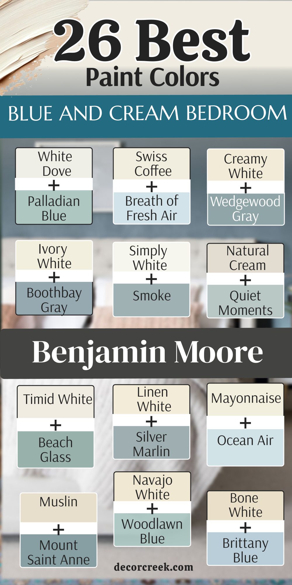
My Final Thoughts about 34 Blue and Cream Bedroom Paint Color Palettes
Selecting a palette for your personal area is all about how you want to feel when you are resting at the end of a very long and busy day. Finding the right balance between comfort and style is a journey that starts with understanding the unique light in your own home. Cream and blue are a perfect team because one is warm and the other is cool, which keeps things balanced and prevents the room from feeling too sterile or too heavy.
This classic combination has been a favorite for many years because it mimics the natural beauty of the sky meeting the sand at the beach. Whether you like a very light room that feels like a soft cloud or a dark room that feels like a deep and private cave, there is a perfect match waiting for you here. I recommend trying a few small samples on your wall to see how they look when the sun goes down and your indoor lamps turn on.
A good paint choice can make your bedroom the most favorite part of your entire house and a place where you truly feel at peace.
By taking the time to test these shades, you ensure that the final result is a space that reflects your personality and your need for relaxation.
Stick with these quality brands like Sherwin-Williams and Benjamin Moore to make sure your walls look exactly the way you imagined them to be in your mind. High-quality pigments are essential because they maintain their richness and do not shift into strange undertones under different lighting conditions.
I hope these many choices help you create a room that makes you smile every morning when you wake up and see the light hitting the walls. Transforming a bedroom is a wonderful way to invest in your own well-being and happiness within your living space. Good luck with your exciting design project and enjoy your beautiful new colors for many wonderful years to come!