Finding the right paint for your house can feel like a big puzzle that is hard to solve. I spend my days looking at how light hits walls and how different shades make people feel when they walk into a room. My goal is to help you pick colors that make you feel happy and proud of your house every single time you walk through the front door.
This year is all about making your house feel like a real home that shows off who you are to all your friends and family. I have picked out these specific pairs because they work well in real life, not just in professional pictures in a magazine. You want your house to look good today and many years from now without it feeling old or boring to look at.
It is important to think about how a color will look in the morning sun and under your lamps at night. A home should feel like a place where you can truly kick off your shoes and be yourself without any worries. Helping you find that perfect match is what makes my job so much fun and very rewarding.
We want to find a look that stays fresh even as your life changes over time.
Why I Rely on Proven Paint Brands When Creating Trendy Home Color Schemes
I always stick with brands like Benjamin Moore and Sherwin-Williams because I know exactly what I am getting in every single bucket. These brands make paint that stays on the wall well and looks the same as the little paper samples you hold in your hand at the store. When you spend your hard-earned money on paint, you want it to cover the old color in just a few coats so you can finish the job quickly.
These companies have spent years making sure their paint does not fade quickly when the bright sun shines on it through your windows. Using these trusted names means I can tell you exactly how a room will look before you even open the metal can to start. It takes the guessing out of the job and keeps you from wasting money on the wrong bucket that you might end up hating later.
I have seen cheaper paints peel or look patchy, and I never want that to happen to your beautiful walls. These big brands have many stores, so if you run out of paint, you can easily go get more that matches perfectly. They also offer different types of finishes that are easy to wipe clean if the kids or pets make a mess.
Investing in quality paint means your home will look better for a much longer time.
How I Select Paint Color Schemes That Feel Modern, Livable, and Long-Lasting
Choosing a color scheme is about more than just picking a pretty shade from a big book of samples. I look for colors that balance each other out so one is light and one is a bit darker to create a nice look. This helps your favorite furniture and your colorful art stand out instead of getting lost against the wall color. I think about how you use each room, like where you eat dinner with your family or where the kids play with their toys on the floor.
A good mix of colors makes the whole house feel like it all belongs together as one big unit instead of a bunch of separate parts. I also watch what is popular in high-end homes to make sure your house looks fresh and stylish compared to others on the street. My choices are meant to be easy to live with every single day without making you feel tired of looking at them.
I consider the size of the room and the height of the ceiling to make sure the paint helps the room feel just right. It is like putting together a great outfit where every piece makes the other pieces look even better. I want you to feel a sense of pride when guests come over to visit and compliment your style. Making a house feel modern but also cozy is a special trick that I love to share with everyone I help.
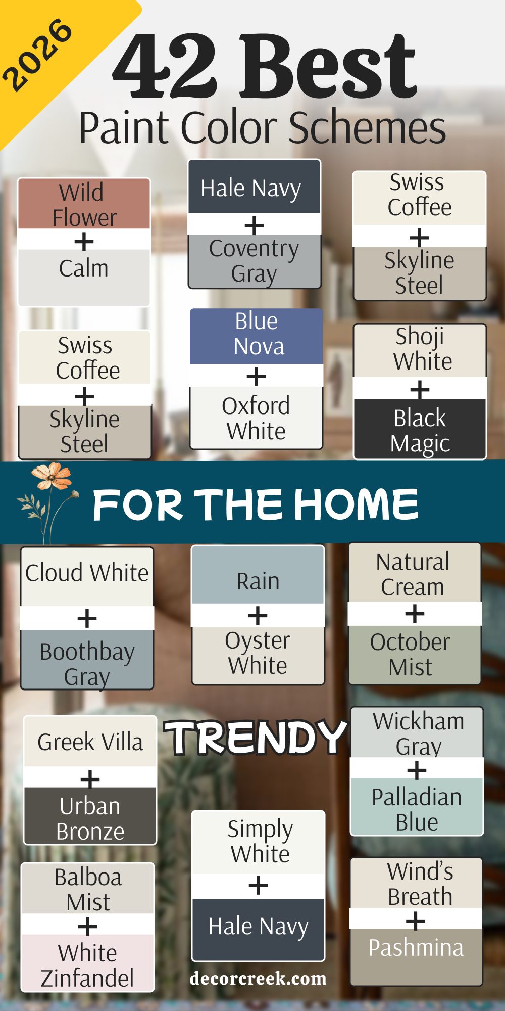
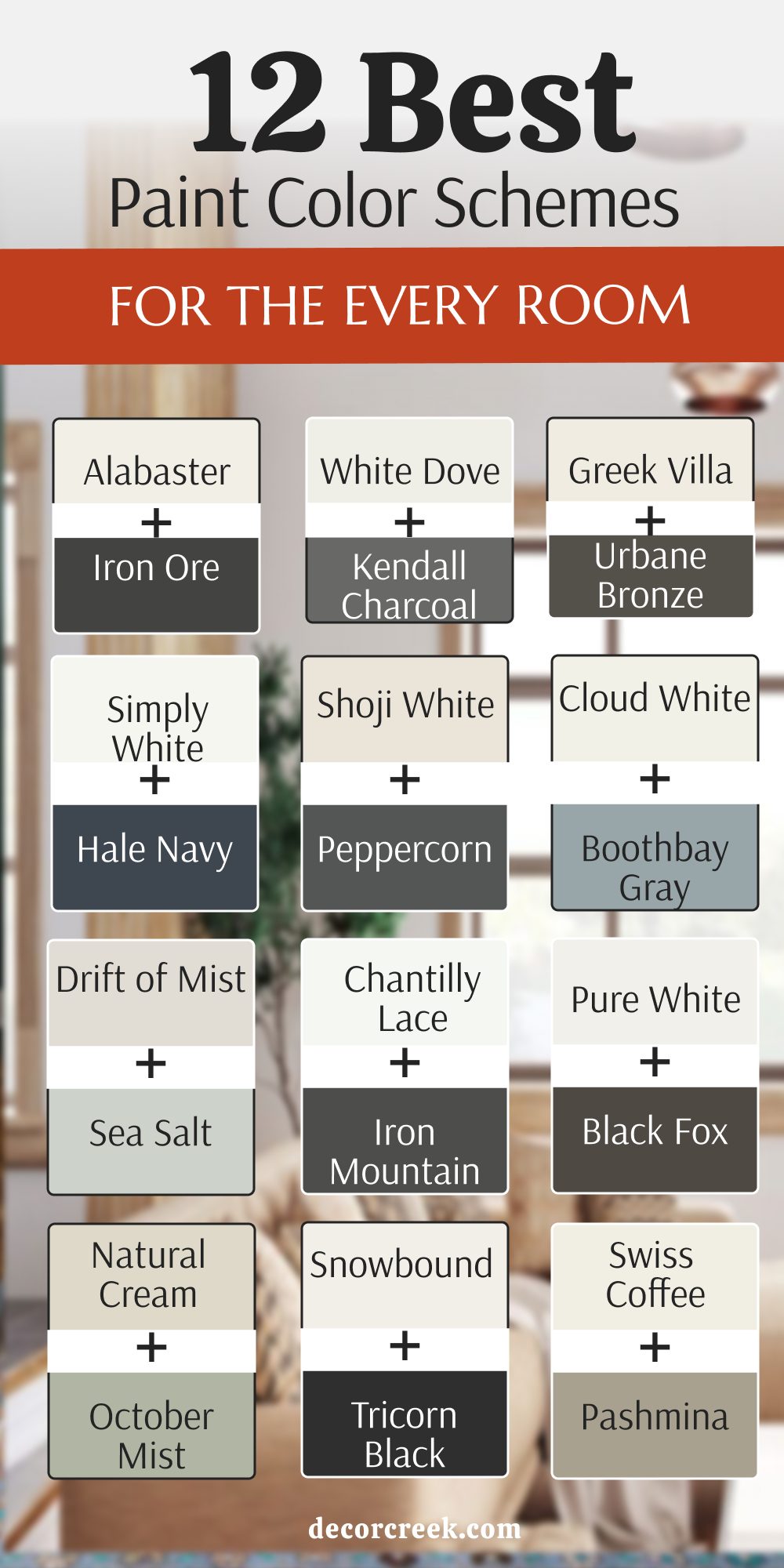
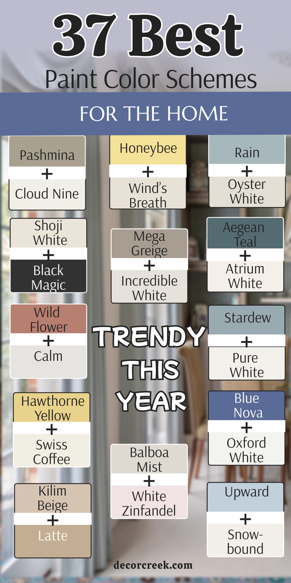
12 Paint Color Schemes For The Every Room
Alabaster SW 7008 + Iron Ore SW 7069
Alabaster SW 7008 acts as a soft white that does not look too yellow or too blue. Iron Ore SW 7069 is a very dark gray that looks almost black but feels much softer. This pair works because the light color makes the walls feel open while the dark color adds a bit of weight. You can use the dark shade on a single wall or even on your interior doors for a crisp look.

Many people like this mix because it looks very clean and organized in any lighting. The dark gray provides a ground for the creamy white to shine against. It creates a high contrast that feels very high-end and intentional.
You will notice that your wood floors look much richer next to these two shades. This combination is a favorite for people who want a house that looks tidy. Using the dark color on the trim can make your windows look like picture frames.
Best used in: living rooms, kitchens, hallways, bedrooms, and farmhouse exteriors
Pairs well with: Iron Ore SW 7069, Agreeable Gray SW 7029, Natural Linen SW 9109, warm wood tones The key rule of this color for farmhouse style is to use it where you want natural light to feel kind, soft, and inviting throughout the day.

White Dove OC-17 + Kendall Charcoal HC-166
White Dove OC-17 is a very popular choice because it has just a tiny bit of gray in it. Kendall Charcoal HC-166 is a deep and rich gray that has a lot of personality. This mix is great for a kitchen where you want light walls and dark cabinets. The white does not feel too bright like a hospital room because of its warm base.

The charcoal color brings a sense of strength to the room without making it feel too small. It is a very balanced look that works well with silver or gold faucets. Many homeowners pick this because it hides dust on the lower parts of the wall. Your furniture will look very fancy when placed in front of these two colors.
It makes the ceiling look higher if you keep the light color up top. This is a very safe and smart choice for a house that needs to look updated.
Best used in: kitchens, home offices, dining rooms, and entryways
Pairs well with: Kendall Charcoal HC-166, Revere Pewter HC-172, Woodlawn Blue HC-147, brass accents The key rule of this color for a polished look is to use it where you want a soft glow that makes every piece of furniture look expensive.

Greek Villa SW 7551 + Urbane Bronze SW 7048
Greek Villa SW 7551 is a sunny white that feels very cozy and welcoming. Urbane Bronze SW 7048 is a unique color that sits right between brown and gray. This combination feels very connected to nature and the outdoors. The white is not harsh, so it makes the room feel very comfortable to sit in for a long time.

The bronze shade is perfect for making a statement on a fireplace or a bookshelf. It looks wonderful when you have green plants in the room. This pair is very popular for people who want a modern look that still feels warm. The darker shade has a bit of a glow to it when the sun hits it directly.
It makes your home feel like a quiet getaway from the busy world outside. You can use the dark color for your window frames to catch the eye.
Best used in: living areas, master bedrooms, exteriors, and sunrooms
Pairs well with: Urbane Bronze SW 7048, Shoji White SW 7042, Sea Salt SW 6204, leather furniture The key rule of this color for a nature-inspired home is to use it in rooms with large windows to bridge the gap between inside and out.

Simply White OC-117 + Hale Navy HC-154
Simply White OC-117 is a very crisp and energetic white that feels full of light. Hale Navy HC-154 is a classic dark blue that people have loved for a very long time. This pair makes a room feel very smart and put together like a navy blue suit.

The white helps the blue stay looking bright instead of turning into a black hole. It is a very popular choice for bedrooms or bathrooms where you want a clean feel. The blue is deep enough to feel very fancy but still looks like a real color.
This combination works well with white tiles and dark wood floors. Many people use this in a boy’s room or a study because it feels very strong. The white reflects all the light in the room to keep things looking fresh. This is a very dependable choice that never goes out of style.
Best used in: bedrooms, bathrooms, laundry rooms, and kitchen islands
Pairs well with: Hale Navy HC-154, Gray Owl OC-52, Stonington Gray HC-170, light oak The key rule of this color for a nautical or crisp look is to use it in areas where you want a sharp contrast that feels organized.

Shoji White SW 7042 + Peppercorn SW 7674
Shoji White SW 7042 is a very soft white that almost looks like a light cream. Peppercorn SW 7674 is a true gray that does not lean too far into blue or brown. This mix is very helpful for rooms that do not get a lot of natural sun.

The white helps bounce what little light there is around the room. The gray is a great choice for making the room feel more grounded and solid. It is a very neutral pair that lets you use any color for your rugs and pillows.
Many designers like this because it is very easy on the eyes. It feels very relaxed and does not demand too much attention. You can use the dark gray on the trim to make the light walls pop. This is a great choice for a whole house because it is so easy to live with. It makes a house feel very cohesive and simple.
Best used in: open floor plans, hallways, guest rooms, and exteriors
Pairs well with: Peppercorn SW 7674, Mindful Gray SW 7016, Urban Bronze SW 7048, black metal The key rule of this color for a minimalist style is to use it as a backdrop for your favorite art and colorful decorations.
Cloud White OC-130 + Boothbay Gray HC-165
Cloud White OC-130 is a soft and airy white that feels very light and fluffy. Boothbay Gray HC-165 is a pretty gray that has a clear blue undertone. This pair feels like a day at the beach with a soft sky and cool water. The white is very gentle and does not have any harsh yellow tones.

The blue-gray color is very soothing and works well in rooms meant for resting. This is a very popular choice for nurseries or main bedrooms. It feels very fresh and clean without being too cold. The blue in the gray comes out more when you have a lot of light in the room.
It makes the walls feel like they are receding, which can make a small room feel bigger. This combination is very friendly and easy to look at. It goes great with light-colored woods and white linens.
Best used in: bedrooms, nurseries, bathrooms, and coastal-style kitchens
Pairs well with: Boothbay Gray HC-165, Wickham Gray HC-171, Swiss Coffee OC-45, rattan textures The key rule of this color for a light and airy feel is to use it in rooms where you want to feel relaxed and away from stress.

Drift of Mist SW 9166 + Sea Salt SW 6204
Drift of Mist SW 9166 is a very light gray that looks like a soft fog. Sea Salt SW 6204 is a famous color that looks like a mix of green, blue, and gray. This pair is very light and makes any room feel much larger than it really is.

The gray provides a neutral base that keeps the green-blue color from looking too bright. It is a very soft combination that is perfect for a bathroom or a spa-like bedroom. Many people love how this color changes throughout the day as the sun moves.
It can look more green in the morning and more blue in the evening. This mix is very popular for houses near the water or in hot climates. It feels very cool and refreshing when you walk inside on a hot day. The light colors make the whole house feel very open.
Best used in: bathrooms, laundry rooms, bedrooms, and small sunrooms
Pairs well with: Sea Salt SW 6204, Pure White SW 7005, Rainwashed SW 6211, white marble The key rule of this color for a fresh look is to use it in spaces where you want to feel a sense of cleanliness and quiet.

Chantilly Lace OC-65 + Iron Mountain 2134-30
Chantilly Lace OC-65 is known for being one of the purest whites you can buy. Iron Mountain 2134-30 is a heavy gray that has a lot of depth and richness. This combination is very modern and looks great in houses with a lot of straight lines.

The white is very bright and makes the gray look even darker and more dramatic. This is a great choice for a modern office or a kitchen with a big island. The gray is very good at hiding fingerprints and dirt on cabinets.
It creates a very sharp look that is very popular in new construction homes. You will find that this pair makes all your furniture look very crisp and new. It is a bold choice that shows you are confident in your style. The white keeps the room from feeling too dark even with the heavy gray.
Best used in: modern kitchens, home offices, accent walls, and exterior trim
Pairs well with: Iron Mountain 2134-30, Gray Owl OC-52, Black 2132-10, polished chrome The key rule of this color for a modern home is to use the bright white to emphasize the clean lines of your architecture.

Pure White SW 7005 + Black Fox SW 7020
Pure White SW 7005 is a white that stays very neutral and does not lean toward any other color. Black Fox SW 7020 is a very dark brown-gray that looks like rich soil or dark wood. This pair is very earthy and feels very solid and strong.

The white keeps the dark color from feeling too heavy or overwhelming. It is a great choice for the outside of a house or for a cozy living room. The dark color looks very expensive and sophisticated when used correctly.
This combination works well with stone and brick work. Many people like this because it feels very grounded and natural. It is a great way to use a dark color without it feeling like a black room. The white makes the dark tones look very deliberate and stylish.
Best used in: living rooms, home libraries, exteriors, and entry doors
Pairs well with: Black Fox SW 7020, Accessible Beige SW 7036, Urbane Bronze SW 7048, stone accents The key rule of this color for a sophisticated look is to use the dark tone on areas you want to highlight as a focal point.

Natural Cream OC-14 + October Mist 1495
Natural Cream OC-14 is a warm and soft greige that feels very lived-in and comfortable. October Mist 1495 is a gentle sage green that was a color of the year for a reason. This pair feels like bringing a bit of the forest inside your home.

The cream color is much warmer than a standard gray and feels very soft on the walls. The green is very muted, so it does not feel like a bright kid’s room. It is a very grown-up way to use color in your house.
This mix is great for a kitchen or a dining room where you want a bit of color. It looks wonderful with medium-toned wood furniture and plants. Many people find this combination very peaceful and easy to be around. It makes your home feel very warm and inviting to guests.
Best used in: kitchens, dining rooms, mudrooms, and cozy dens
Pairs well with: October Mist 1495, Steam AF-15, Saybrook Sage HC-114, warm wood The key rule of this color for a cozy home is to use the green as a soft accent that brings a natural feel to the room.

Snowbound SW 7004 + Tricorn Black SW 6258
Snowbound SW 7004 is a cool white that has a tiny hint of gray to keep it from being too stark. Tricorn Black SW 6258 is the most popular black because it is a true, deep black. This pair is the ultimate choice for a high-contrast look that is very trendy right now.

The white keeps the room feeling huge, while the black adds a lot of drama. Many people use this for their front doors or for window trim. It looks very sharp and clean, especially in a modern farmhouse.
The black makes the white look even brighter and cleaner than it is. This is a very bold choice that makes a big statement to anyone who visits. It works well with any other color you want to add in small amounts. You will see this look in many new magazines because it is so striking.
Best used in: exteriors, entryways, modern kitchens, and bathrooms
Pairs well with: Tricorn Black SW 6258, Repose Gray SW 7015, Iron Ore SW 7069, gold hardware The key rule of this color for a striking look is to use the black sparingly to draw attention to the best parts of the room.

Swiss Coffee OC-45 + Pashmina AF-100
Swiss Coffee OC-45 is a legendary creamy white that designers have used for decades. Pashmina AF-100 is a mid-tone greige that looks like a soft wool sweater. This pair is the definition of comfort and luxury in a home.

The white has a bit of warmth that makes every room feel like it is glowing. The pashmina color is deep enough to provide contrast but light enough to stay neutral. This is a very popular choice for a whole house because it is so soft.
It looks great with white trim and dark wood floors. Many homeowners love this because it makes the house feel very expensive and high-end. It is a very “quiet” look that lets your life be the main focus. This combination will never go out of style and always looks fresh.
Best used in: whole house interiors, living rooms, bedrooms, and hallways
Pairs well with: Pashmina AF-100, Revere Pewter HC-172, Hale Navy HC-154, soft textures The key rule of this color for a high-end feel is to use it in rooms with plenty of soft lighting to enhance the warm undertones.

37 Paint Color Schemes For The Home Trendy This Year
Alabaster SW 7008 + Accessible Beige SW 7036
Alabaster SW 7008 is a very famous white that feels warm like a soft wool blanket. Accessible Beige SW 7036 is the perfect partner because it is a tan color that does not look too yellow. This pair is great for people who want their home to feel bright but also very cozy.
The beige color is dark enough to show a difference between the walls and the white trim. It creates a very soft look that makes a room feel very friendly to guests. Many homeowners use this for their main living areas because it is so easy to live with.
It makes a house feel very clean and tidy without feeling cold like a hospital. You will find that your wood furniture looks very pretty against these warm tones. This is a very safe choice that makes a house feel like it is full of sunlight. It is a classic look that will stay in style for a very long time.
Best used in: living rooms, kitchens, hallways, bedrooms, and farmhouse exteriors
Pairs well with: Iron Ore SW 7069, Agreeable Gray SW 7029, Natural Linen SW 9109, warm wood tones The key rule of this color for farmhouse style is to use it where you want natural light to feel kind, soft, and inviting throughout the day.

White Dove OC-17 + Revere Pewter HC-172
White Dove OC-17 is a soft and creamy white that designers use more than almost any other color. Revere Pewter HC-172 is a very special mix of gray and beige that changes with the light. This combination is a top choice for a house that needs to look updated and fresh.
The white is very gentle and makes the rooms feel very open and large. The gray-beige color adds a bit of depth that makes the walls look very sophisticated. It is a very balanced pair that works well in any room of the house.
Many people pick this because it looks good with both cool blue and warm red decorations. It makes the house feel very unified and put together from room to room. You can use the dark color in the dining room and the light color in the halls. It is a very smart look that makes any home feel much more expensive.
Best used in: open floor plans, kitchens, living rooms, and bedrooms
Pairs well with: Revere Pewter HC-172, Hale Navy HC-154, Chelsea Gray HC-168, dark wood The key rule of this color for a polished look is to use it where you want a soft glow that makes every piece of furniture look expensive.

Greek Villa SW 7551 + Urban Bronze SW 7048
Greek Villa SW 7551 is a bright white that has a tiny bit of warmth to keep it soft. Urban Bronze SW 7048 is a very dark and moody color that looks like a mix of gray and brown. This pair is very trendy right now because it brings a bit of nature inside the house.
The white keeps the room from feeling too dark when you use the bronze as an accent. It is a great choice for a home office or a cozy living room fireplace. The bronze color looks very rich and strong when you put it next to the light white.
Many people love how it makes green plants and leather chairs pop in a room. This combination feels very solid and grounded like a mountain or a forest. It is a bold look that still feels very comfortable to live in every day. The white reflects the sun while the bronze adds a lot of character.
Best used in: living areas, master bedrooms, exteriors, and sunrooms
Pairs well with: Urban Bronze SW 7048, Shoji White SW 7042, Sea Salt SW 6204, leather furniture The key rule of this color for a nature-inspired home is to use it in rooms with large windows to bridge the gap between inside and out.
Chantilly Lace OC-65 + Edgecomb Gray HC-173
Chantilly Lace OC-65 is a very clean white that does not have any hidden blue or yellow tones. Edgecomb Gray HC-173 is a very light and airy greige that feels very modern. This pair is perfect for someone who wants a very bright and open house.
The white is so pure that it makes the light gray look very soft and pretty. This is a very popular choice for modern houses with a lot of natural light. It makes the walls feel very far away, which helps small rooms feel much bigger.
Many designers use this as a base for the whole house because it is so neutral. It lets your colorful pillows and rugs be the star of the show. This combination feels very fresh and updated without being too trendy. It is a very light look that makes a house feel very peaceful and calm.
Best used in: small rooms, hallways, kitchens, and modern living spaces
Pairs well with: Edgecomb Gray HC-173, Revere Pewter HC-172, Hale Navy HC-154, light wood The key rule of this color for a modern home is to use the bright white to emphasize the clean lines of your architecture.

Swiss Coffee OC-45 + Pale Oak OC-20
Swiss Coffee OC-45 is a warm white that makes a room feel like it is giving you a hug. Pale Oak OC-20 is a very light gray that has a bit of warmth to match the white. This pair is very soft and gentle on the eyes for a whole house look.
The white is very creamy and looks great on trim and kitchen cabinets. The gray color is so light that it almost looks like a darker white in some lighting. It is a very popular choice for people who want a house that feels very light and airy.
This combination works well with traditional furniture and soft fabrics. Many homeowners love how it makes their house feel very bright even on cloudy days. It is a very sophisticated look that is also very easy to maintain. The warm tones make the house feel very welcoming to anyone who visits.
Best used in: bedrooms, living rooms, nurseries, and kitchens
Pairs well with: Pale Oak OC-20, Revere Pewter HC-172, Chelsea Gray HC-168, brass accents The key rule of this color for a high-end feel is to use it in rooms with plenty of soft lighting to enhance the warm undertones.

Iron Ore SW 7069 + Repose Gray SW 7015
Iron Ore SW 7069 is a very dark charcoal that looks almost black but is much softer. Repose Gray SW 7015 is a very popular mid-tone gray that works in almost any house. This pair is very modern and looks great in a home with a lot of metal accents.
The dark color is perfect for a front door or a kitchen island to add drama. The lighter gray keeps the rest of the room feeling open and balanced. This is a great choice for a laundry room or a home office where you want a sharp look.
Many people like how the dark gray hides marks and looks very high-end. It makes a very big statement without being too bright or loud. This combination is very steady and makes a house feel very well-built. It looks wonderful with silver or black hardware on your doors and cabinets.
Best used in: home offices, laundry rooms, kitchen islands, and exteriors
Pairs well with: Repose Gray SW 7015, Eider White SW 7014, Black Magic SW 6991, metal accents The key rule of this color for a striking look is to use the dark tone on areas you want to highlight as a focal point.

Hale Navy HC-154 + Coventry Gray HC-169
Hale Navy HC-154 is a deep blue that feels very traditional and strong. Coventry Gray HC-169 is a cool gray that has a tiny bit of blue in it to match. This pair is perfect for a boy’s bedroom or a very smart-looking dining room.
The blue is very rich and makes the gray look very clean and crisp. It is a very popular choice for people who love a classic look that never gets old. The gray is dark enough to show up against white trim but light enough to keep the room bright.
Many homeowners use this blue on their kitchen islands for a pop of color. It looks great with white marble and dark wood floors. This combination feels very organized and put together like a navy blue uniform. It is a very dependable pair that makes a house feel very solid and stylish.
Best used in: dining rooms, bedrooms, kitchen islands, and front doors
Pairs well with: Coventry Gray HC-169, Stonington Gray HC-170, Simply White OC-117, silver hardware The key rule of this color for a nautical or crisp look is to use it in areas where you want a sharp contrast that feels organized.

Naval SW 6244 + Drift of Mist SW 9166
Naval SW 6244 is a dark blue that looks like the deep ocean at night. Drift of Mist SW 9166 is a very light gray that looks like a soft morning sky. This pair is very dramatic and makes a big impression when you walk into a room.

The dark blue is very calming and works well in bedrooms where you want to sleep. The light gray keeps the room from feeling too small or like a cave. It is a very popular choice for an accent wall or for the bottom half of a dining room.
Many people like how the white trim stands out against the dark blue paint. This combination feels very modern and fresh for a house that needs a change. It looks great with gold lamps and white bedding. This is a very bold choice that shows you have great style.
Best used in: bedrooms, bathrooms, dining rooms, and home theaters
Pairs well with: Drift of Mist SW 9166, Pure White SW 7005, Sea Salt SW 6204, gold accents The key rule of this color for a bold look is to use the blue where you want to create a sense of depth and focus.
Kendall Charcoal HC-166 + Simply White OC-117
Kendall Charcoal HC-166 is a deep and rich gray that has a lot of personality and strength. Simply White OC-117 is a very bright and happy white that fills a room with light. This pair is great for a kitchen where you want dark cabinets and very light walls.
The charcoal color is very good at hiding dirt and fingerprints in busy areas. The white makes the dark gray look very intentional and very expensive. It is a very popular choice for modern homes that want a high-contrast look.
Many designers use this for a living room with a lot of big windows. The dark color makes the outside view look like a piece of art on the wall. This combination feels very fresh and very high-end for any house. It is a very smart choice that will look good for a very long time.
Best used in: kitchens, living rooms, exteriors, and home offices
Pairs well with: Simply White OC-117, Revere Pewter HC-172, Hale Navy HC-154, brass hardware The key rule of this color for a polished look is to use it where you want a soft glow that makes every piece of furniture look expensive.
Peppercorn SW 7674 + Agreeable Gray SW 7029
Peppercorn SW 7674 is a very dark gray that looks like a slate stone from the ground. Agreeable Gray SW 7029 is a very famous gray that works in almost any house and any light. This pair is perfect for someone who wants a neutral home with a bit of drama.
The dark gray is a great choice for a media room or a powder bathroom. The lighter gray is the perfect color for the rest of the walls in the house. This is a very popular choice because it is so easy to match with any furniture.
It makes the house feel very balanced and very put together. Many people love how the dark gray makes white cabinets look very bright. This combination is very modern and feels very fresh for a new house. It is a very dependable pair that you will not get tired of looking at.
Best used in: living rooms, whole house interiors, media rooms, and entryways
Pairs well with: Agreeable Gray SW 7029, Alabaster SW 7008, Sea Salt SW 6204, black metal The key rule of this color for a minimalist style is to use it as a backdrop for your favorite art and colorful decorations.

Wrought Iron 2124-10 + Gray Owl OC-52
Wrought Iron 2124-10 is a heavy and deep charcoal that has a tiny hint of navy blue hidden inside it. Gray Owl OC-52 is a very light and cool gray that feels like a fresh breeze in a room. This pair is perfect for a house that has a lot of natural light coming through big windows.

The dark color is great for a fireplace or a long hallway to make it look very sophisticated. The light gray keeps the rest of the walls looking clean and very modern for today. Many people love this mix because it feels very high-end and like a fancy hotel room.
It works very well with silver light fixtures and white marble countertops in a kitchen. You will find that this combination makes your black and white photos look amazing on the wall. This is a very steady choice for people who like a cool and calm feeling in their home. It makes the whole house feel very organized and very smart.
Best used in: living rooms, bedrooms, kitchens, and home offices
Pairs well with: Gray Owl OC-52, Chantilly Lace OC-65, Hale Navy HC-154, marble surfaces The key rule of this color for a modern home is to use the bright white to emphasize the clean lines of your architecture.

Evergreen Fog SW 9130 + Sea Salt SW 6204
Evergreen Fog SW 9130 is a muted green that looks like a forest on a cloudy morning. Sea Salt SW 6204 is a very light and pretty green-blue that feels very soft on the eyes. This pair is very trendy because people want their homes to feel more like the outdoors.

The darker green is great for a dining room or a cozy den where you want to relax. The lighter color is perfect for bathrooms or laundry rooms to make them feel fresh. Many homeowners like this mix because it feels very peaceful and not too bright.
It looks wonderful with light wood floors and white linen curtains on the windows. This combination brings a very natural and earthy feel to any room you put it in. It is a very soft look that makes your house feel like a quiet getaway. You can use the dark green on your kitchen cabinets for a very stylish look.
Best used in: kitchens, bedrooms, bathrooms, and mudrooms
Pairs well with: Sea Salt SW 6204, Shoji White SW 7042, Urban Bronze SW 7048, light oak The key rule of this color for a nature-inspired home is to use it in rooms with large windows to bridge the gap between inside and out.
Saybrook Sage HC-114 + Cloud White OC-130
Saybrook Sage HC-114 is a soft and traditional green that feels very vintage and very sweet. Cloud White OC-130 is a gentle white that makes the green look very crisp and very clean. This pair is a great choice for a cottage or a house with a big front porch.

The green is light enough that it does not feel dark, but it has enough color to be noticed. The white trim makes the green walls look very intentional and very well-planned. Many people use this in their kitchens because it feels very warm and very inviting for family meals.
It looks great with antique furniture and brass handles on the doors. This combination is very friendly and makes everyone feel at home right away. It is a very classic look that reminds people of a beautiful garden in the summer. This is a very happy choice for a house that needs a bit of personality.
Best used in: kitchens, sunrooms, guest bedrooms, and exteriors
Pairs well with: Cloud White OC-130, Revere Pewter HC-172, Manchester Tan HC-81, brass accents The key rule of this color for a polished look is to use it where you want a soft glow that makes every piece of furniture look expensive.
Pewter Green SW 6208 + Spare White SW 6203
Pewter Green SW 6208 is a dark and moody green that looks very expensive and very rich. Spare White SW 6203 is a very cool white that has a bit of gray to match the green. This pair is very popular for home offices or for a cozy library area.

The dark green is very good at making a room feel small and very private for working. The white keeps the ceiling feeling high and the room feeling open at the top. Many designers love this for a kitchen island because it looks very high-end with gold faucets.
It is a very bold choice that shows you are not afraid of using real color. This combination works well with dark wood and leather chairs in a study. It feels very solid and like a house that has been there for a long time. You will love how this green looks when the sun hits it in the afternoon.
Best used in: home offices, kitchen islands, entryways, and master bedrooms
Pairs well with: Spare White SW 6203, Sea Salt SW 6204, Iron Ore SW 7069, gold hardware The key rule of this color for a striking look is to use the dark tone on areas you want to highlight as a focal point.
October Mist 1495 + Steam AF-15
October Mist 1495 is a soft silver-green that was picked as a color of the year for being so pretty. Steam AF-15 is a very clean and soft white that feels like a fresh sheet of paper. This pair is very light and makes a house feel very airy and very open to the world.
The green is so light that it almost looks like a neutral gray in some lights. The white is very bright and makes the whole room feel very clean and very tidy. Many people pick this for their bedrooms because it helps them feel very relaxed and ready for sleep.
It looks great with natural wood and light gray rugs on the floor. This combination is very modern and feels very fresh for a house that needs an update. It is a very gentle look that does not shout for attention but looks very nice. You can use this for a whole house to make it feel very cohesive.
Best used in: bedrooms, living rooms, nurseries, and hallways
Pairs well with: Steam AF-15, Morning Dew 1492, Natural Cream OC-14, light wood The key rule of this color for a cozy home is to use the green as a soft accent that brings a natural feel to the room.
Rosemary SW 6187 + Silver Strand SW 7057
Rosemary SW 6187 is a deep olive green that feels very warm and very grounded in nature. Silver Strand SW 7057 is a very light gray that has a tiny bit of green and blue in it. This pair is very trendy because it feels very organic and like a forest floor.

The dark green is perfect for an accent wall or for the cabinets in a mudroom. The light gray-green color is very soothing and works well in any other room. Many homeowners love this because it feels very expensive but also very comfortable to live in.
It looks amazing with black metal light fixtures and white stone counters. This combination makes a house feel very sturdy and very well-decorated. It is a great choice for someone who wants color but still wants it to feel quiet. The dark green adds a lot of depth to a room that might feel too plain.
Best used in: mudrooms, kitchens, bedrooms, and exteriors
Pairs well with: Silver Strand SW 7057, Alabaster SW 7008, Urban Bronze SW 7048, black metal The key rule of this color for a nature-inspired home is to use it in rooms with large windows to bridge the gap between inside and out.

High Park 467 + Paper White OC-55
High Park 467 is a mid-tone green that looks like a grassy park on a sunny day. Paper White OC-55 is a very light gray-white that feels very crisp and very sharp. This pair is a very fresh choice for a kitchen or a dining area that needs some life.
The green is very happy and makes the room feel very energetic and fun. The white keeps the green from feeling too heavy or like a dark forest. Many people like this for a laundry room to make doing chores feel a bit more pleasant.
It looks great with white cabinets and light wood floors in a modern house. This combination is very clean and makes a house feel very healthy and full of light. It is a very smart look for someone who loves a bit of color in their life. The light gray-white is the perfect backdrop for colorful art on the walls.
Best used in: laundry rooms, kitchens, entryways, and sunrooms
Pairs well with: Paper White OC-55, Simply White OC-117, Kendall Charcoal HC-166, light oak The key rule of this color for a fresh look is to use it in spaces where you want to feel a sense of cleanliness and quiet.
Raspberry Blush 2008-30 + White Heron OC-57
Raspberry Blush 2008-30 is a very bold and happy coral-red that catches everyone’s eye. White Heron OC-57 is a cool white that has a bit of gray to keep the red from being too much. This pair is very trendy for people who want to try the unexpected red trend in their home.
The red is great for a front door or a small powder room to make it look special. The white keeps the rest of the house feeling very open and very modern. Many homeowners use this for a dining room to make it feel very warm and very fun for parties.
It looks amazing with gold mirrors and dark wood furniture in a room. This combination is very brave and shows that you have a very fun personality. The white is very clean and lets the red be the star of the show. It is a very exciting look for a house that needs a big change.
Best used in: dining rooms, front doors, powder rooms, and accent walls
Pairs well with: White Heron OC-57, Gray Owl OC-52, Hale Navy HC-154, gold accents The key rule of this color for a bold look is to use the red where you want to create a sense of depth and focus.
Redend Point SW 9081 + Kestrel White SW 7516
Redend Point SW 9081 is a soft clay color that looks like a warm desert at sunset. Kestrel White SW 7516 is a creamy white that has a bit of tan in it to match the clay. This pair is very popular because it feels very warm and very earthy for a home.

The clay color is very soft and does not feel like a bright pink or a dark red. The white is very inviting and makes the room feel very cozy for a family. Many people use this in their living rooms because it makes everyone feel very relaxed.
It looks great with natural wood and woven baskets for a desert-style look. This combination is very gentle and makes a house feel very grounded and very peaceful. It is a great way to use color without it feeling too loud or too bright. You will love how warm your home feels with these two shades.
Best used in: living rooms, bedrooms, entryways, and bathrooms
Pairs well with: Kestrel White SW 7516, Shoji White SW 7042, Urban Bronze SW 7048, terracotta The key rule of this color for a nature-inspired home is to use it in rooms with large windows to bridge the gap between inside and out.
Caliente AF-290 + Gray Huskie 1473
Caliente AF-290 is a very bright and powerful red that feels full of energy and heat. Gray Huskie 1473 is a mid-tone gray that helps to cool down the red and keep it balanced. This pair is very dramatic and works well in a house that wants to feel very grand.
The red is perfect for an accent wall in a dining room or a home office. The gray is very steady and makes the red look very professional and not too wild. Many designers use this for a front door because it makes the house look very welcoming.
It looks great with black furniture and white trim around the windows. This combination is very strong and makes a big statement to anyone who sees it. The gray is very neutral and keeps the room from feeling too small with the red. It is a very stylish choice for a house that needs some excitement.
Best used in: dining rooms, front doors, home offices, and accent walls
Pairs well with: Gray Huskie 1473, Chantilly Lace OC-65, Black 2132-10, silver accents The key rule of this color for a bold look is to use the red where you want to create a sense of depth and focus.
Red Barn SW 7591 + Creamy SW 7012
Red Barn SW 7591 is a deep and dusty red that looks like the side of a traditional farm building. Creamy SW 7012 is a soft and rich white that feels like fresh milk in a glass. This pair is a wonderful choice for people who want a home that feels very classic and very sturdy.
The red is not too bright, so it feels very grounded and very mature on a wall. The creamy white keeps the dark red from feeling too heavy or too dark in a small room. Many homeowners love this for a dining room because it makes the space feel very warm for dinner.
It looks great with dark wood tables and gold picture frames on the wall. This combination is very traditional and makes a house feel like it has a long history. It is a very cozy look that welcomes guests with open arms. You will notice that this red makes your white trim look very bright and very clean.
Best used in: dining rooms, front doors, kitchens, and traditional living rooms
Pairs well with: Creamy SW 7012, Accessible Beige SW 7036, Urbane Bronze SW 7048, warm wood The key rule of this color for a polished look is to use it where you want a soft glow that makes every piece of furniture look expensive.

First Light 2102-70 + Flint AF-560
First Light 2102-70 is a very pale and refreshing pink that feels like the sky at dawn. Flint AF-560 is a dark and moody gray that has a bit of blue hidden inside it. This pair is very trendy because it balances a very light color with a very dark one.

The pink is so light that it almost looks like a neutral color in a bright room. The dark gray is perfect for making a bedroom feel very private and very quiet for sleeping. Many designers like this mix for a guest room or a modern office because it is very unique.
It looks amazing with silver lamps and white bedding on a bed. This combination feels very modern and shows that you have a very creative eye for style. The pink adds a bit of softness while the gray makes the room feel very solid. It is a very smart look for a house that needs a bit of a feminine touch balanced by strength.
Best used in: bedrooms, home offices, nurseries, and powder rooms
Pairs well with: Flint AF-560, Chantilly Lace OC-65, Hale Navy HC-154, white marble The key rule of this color for a modern home is to use the bright white to emphasize the clean lines of your architecture.
Upward SW 6239 + Snowbound SW 7004
Upward SW 6239 is a very light and breezy blue that feels like a clear day in spring. Snowbound SW 7004 is a cool white that has just enough gray to keep it from being too bright. This pair is very popular for bathrooms or for a bedroom where you want to feel relaxed.

The blue is very soft and does not feel too much like a baby’s room. The white helps the blue stay looking very fresh and very airy throughout the whole day. Many people use this in rooms with a lot of sun to keep them feeling cool and comfortable.
It looks great with light oak floors and white cotton curtains on the windows. This combination is very peaceful and makes a house feel very open and full of life. It is a very simple look that is very easy for anyone to love. You will find that this blue makes a small room feel much bigger than it really is.
Best used in: bathrooms, bedrooms, laundry rooms, and ceilings
Pairs well with: Snowbound SW 7004, Iron Ore SW 7069, Sea Salt SW 6204, light wood The key rule of this color for a fresh look is to use it in spaces where you want to feel a sense of cleanliness and quiet.
Blue Nova 825 + Oxford White CC-30
Blue Nova 825 is a mid-tone blue that has a little bit of purple in it to make it look very royal. Oxford White CC-30 is a very crisp and clean white that makes the blue look very sharp. This pair was a top pick recently because it is very energetic and very fun to look at.
The blue is deep enough to have a lot of character but it is not as dark as a navy blue. The white is very pure and makes the blue walls pop in a very stylish way. Many people like this for a kitchen island or for a main living room wall to add some color.
It looks wonderful with gold handles and white stone counters in a kitchen. This combination feels very modern and very fresh for a house that needs more personality. It is a very bold choice that still feels very professional and well-planned. The purple tones in the blue make it feel very high-end and special.
Best used in: kitchen islands, living rooms, accent walls, and front doors
Pairs well with: Oxford White CC-30, Gray Owl OC-52, Simply White OC-117, gold accents The key rule of this color for a bold look is to use the blue where you want to create a sense of depth and focus.
Stardew SW 9138 + Pure White SW 7005
Stardew SW 9138 is a muted blue that has a lot of gray in it to keep it looking very soft. Pure White SW 7005 is a very neutral white that lets the blue-gray color be the main focus. This pair is very popular for people who want a blue house but want it to feel very calm.
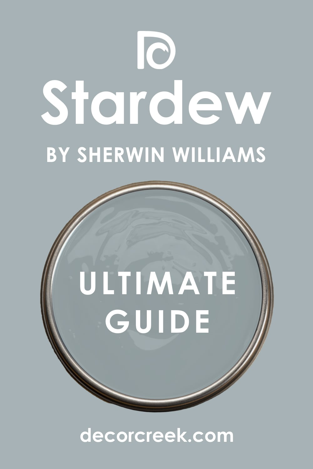
The blue is very dusty and looks great in any lighting without being too bright or loud. The white is very clean and makes the whole room feel very tidy and very organized. Many designers use this in bedrooms because it is so easy on the eyes when you wake up.
It looks great with dark wood furniture and silver decorations in a room. This combination is very sophisticated and makes a house feel very well-decorated. It is a very safe way to use blue if you are worried about it being too colorful. This color mix makes your home feel very peaceful every single day.
Best used in: bedrooms, bathrooms, living rooms, and exteriors
Pairs well with: Pure White SW 7005, Iron Ore SW 7069, Drift of Mist SW 9166, silver metal The key rule of this color for a minimalist style is to use it as a backdrop for your favorite art and colorful decorations.
Aegean Teal 2136-40 + Atrium White OC-145
Aegean Teal 2136-40 is a rich and deep color that is a mix of blue and green with a gray base. Atrium White OC-145 is a warm white that has a tiny bit of pink in it to stay very soft. This pair is very famous for being very balanced and very easy to look at for a long time.
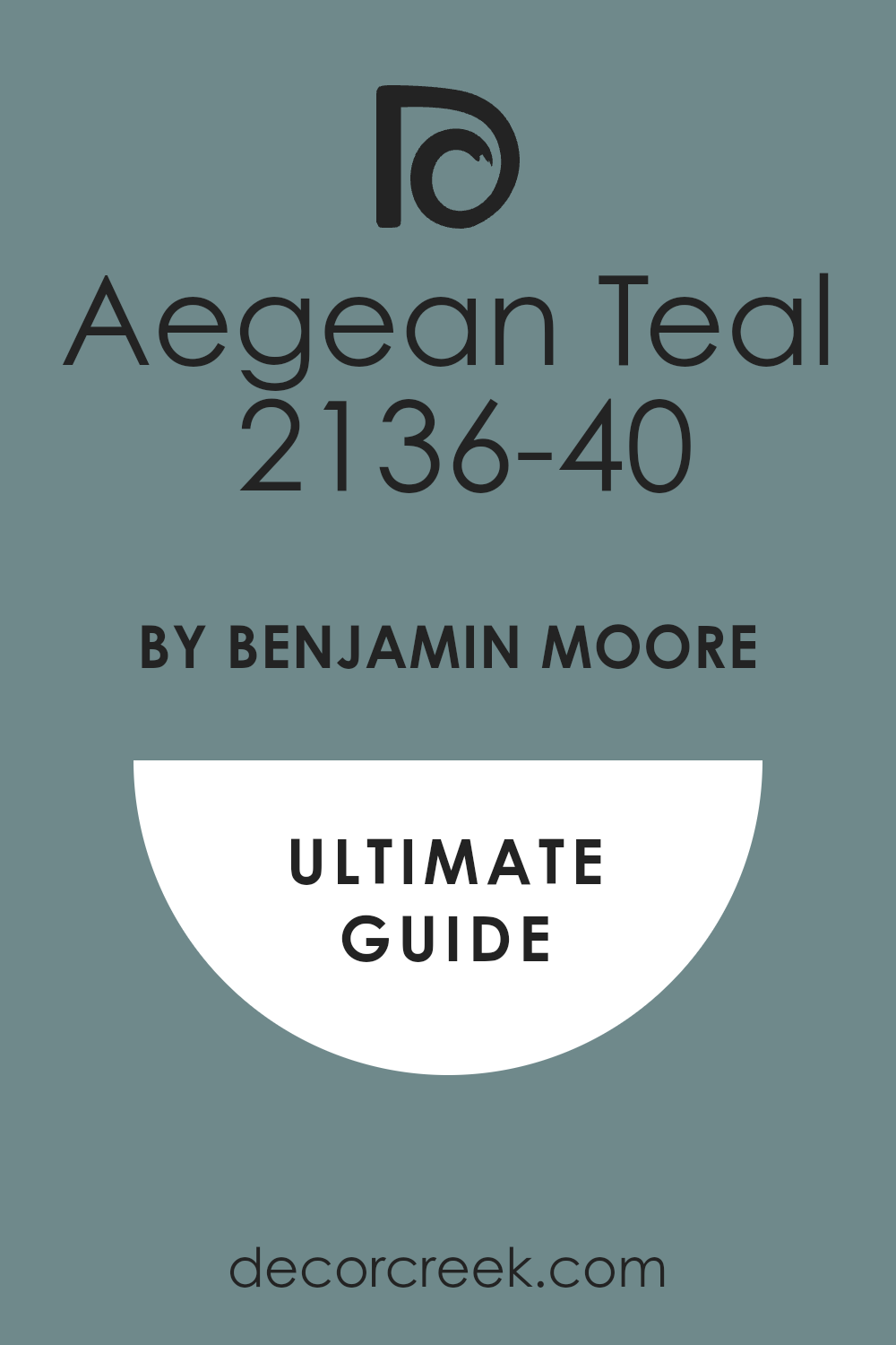
The teal is deep enough to add a lot of drama to a room without making it feel too small. The white is very welcoming and keeps the room from feeling too cold or too blue. Many people love this for their front doors or for a kitchen with white cabinets.
It looks amazing with wood floors and black metal accents in a modern home. This combination feels very artistic and shows that you have a very good eye for color. It is a very cozy choice that makes a house feel very special and very high-end. The green tones in the teal make it feel very connected to nature.
Best used in: front doors, kitchens, living rooms, and bathrooms
Pairs well with: Atrium White OC-145, Revere Pewter HC-172, Hale Navy HC-154, wood accents The key rule of this color for a nature-inspired home is to use it in rooms with large windows to bridge the gap between inside and out.
Rain SW 6219 + Oyster White SW 7637
Rain SW 6219 is a soft and watery blue that feels very quiet and very gentle on the walls. Oyster White SW 7637 is a warm and light greige that looks very much like a natural stone. This pair is a great choice for a house that wants to feel like a spa or a quiet getaway.
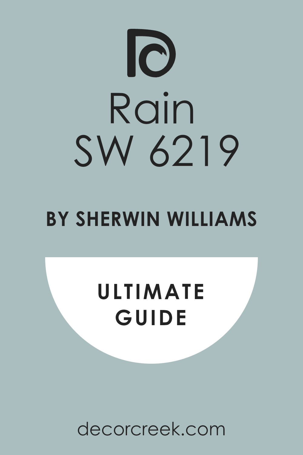
The blue is very light and does not demand too much attention when you enter the room. The warm white-gray color is perfect for the trim to keep the look very soft and very organic. Many homeowners pick this for their master bathrooms because it feels very clean and very relaxed.
It looks great with white towels and light-colored wood in a room. This combination is very peaceful and makes a house feel very light and very airy. It is a very smart look for a house that needs to be a place where you can rest. The blue is just dark enough to show up against the light trim.
Best used in: bathrooms, bedrooms, sunrooms, and laundry rooms
Pairs well with: Oyster White SW 7637, Pure White SW 7005, Sea Salt SW 6204, natural textures The key rule of this color for a fresh look is to use it in spaces where you want to feel a sense of cleanliness and quiet.

Balboa Mist OC-27 + White Zinfandel 1261
Balboa Mist OC-27 is a very popular light gray that has a tiny bit of warmth to stay cozy. White Zinfandel 1261 is a very pale pink that feels very soft and very sweet in a room. This pair is very trendy for nurseries or for a very soft and pretty bedroom.

The gray is neutral enough that it keeps the pink from looking like a child’s toy room. The pink is very subtle and just adds a tiny bit of color to the walls when the light hits it. Many designers use this mix to create a room that feels very feminine but still very grown-up.
It looks amazing with gold hardware and white fluffy rugs on the floor. This combination is very gentle and makes a house feel very warm and very loving. It is a very light look that makes any room feel much more inviting for guests. You will love how soft your home looks with these two colors together.
Best used in: bedrooms, nurseries, powder rooms, and closets
Pairs well with: White Zinfandel 1261, Simply White OC-117, Gray Owl OC-52, gold hardware The key rule of this color for a cozy home is to use the pink as a soft accent that brings a natural feel to the room.
Warm Stone SW 7032 + Eider White SW 7014
Warm Stone SW 7032 is a mid-tone brown-gray that feels very solid and very grounded. Eider White SW 7014 is a cool white that has a bit of gray to keep it from being too bright. This pair is very popular for the outside of a house or for a very cozy living room area.

The dark color looks very expensive and very sturdy when used on large walls. The white is the perfect color for trim to make the dark walls look very sharp and very clean. Many people like this because it feels very natural and looks great with stone or brick.
It is a very smart choice for a home that wants to look modern but still feel very traditional. This combination is very steady and makes a house feel very well-built and very safe. It looks wonderful with black metal lamps and dark wood doors. The gray tones keep the brown from looking too old-fashioned.
Best used in: exteriors, living rooms, entryways, and master bedrooms
Pairs well with: Eider White SW 7014, Urbane Bronze SW 7048, Repose Gray SW 7015, stone accents The key rule of this color for a polished look is to use it where you want a soft glow that makes every piece of furniture look expensive.
Manchester Tan HC-81 + Boothbay Gray HC-165
Manchester Tan HC-81 is a warm and sandy beige that feels like a beach on a sunny day. Boothbay Gray HC-165 is a pretty gray that has a very clear blue undertone to it. This pair is very popular for houses near the water or for people who love a coastal look.

The tan color is very warm and makes the blue-gray color look very cool and very fresh. Many homeowners use this for their main living spaces because it feels very light and very airy. It looks great with white furniture and blue pillows to complete the beachy feeling.
This combination is very classic and makes a house feel very relaxed and very comfortable. It is a very smart way to use two different colors that still feel like they belong together. You will love how this mix makes your house feel like it is always summertime. The tan helps the blue in the gray pop out even more.
Best used in: living rooms, kitchens, entryways, and exteriors
Pairs well with: Boothbay Gray HC-165, White Dove OC-17, Revere Pewter HC-172, light wood The key rule of this color for a fresh look is to use it in spaces where you want to feel a sense of cleanliness and quiet.
Mega Greige SW 7031 + Incredible White SW 7028
Mega Greige SW 7031 is a heavy and warm gray that has enough brown in it to feel very earthy. Incredible White SW 7028 is a very light and cool white that has a tiny bit of gray hidden inside. This pair is very popular for large houses with open floor plans because it adds a lot of depth.
The dark greige is a great choice for a living room with a tall ceiling to make it feel cozy. The light white keeps the hallways and smaller rooms from feeling too dark or cramped. Many people like this mix because it hides dirt very well while still looking very stylish and clean.
It looks wonderful with dark wood floors and large green plants in the corners. This combination makes a house feel very solid and very well-built for a modern family. It is a very smart look that stays in style even as other trends come and go. You will love how the light changes the way these two colors interact throughout the day.
Best used in: living rooms, open floor plans, exteriors, and hallways
Pairs well with: Incredible White SW 7028, Pure White SW 7005, Urban Bronze SW 7048, warm wood The key rule of this color for a polished look is to use it where you want a soft glow that makes every piece of furniture look expensive.
Honeybee 2020-50 + Wind’s Breath OC-24
Honeybee 2020-50 is a soft and sunny yellow that feels very happy and very full of energy. Wind’s Breath OC-24 is a warm and airy white that looks like a soft summer breeze. This pair is perfect for a kitchen or a breakfast nook where you want to feel awake and ready for the day.
The yellow is not too bright, so it feels very gentle and very inviting for a family. The white keeps the room from feeling too yellow or like a child’s playroom. Many homeowners pick this for a laundry room to make doing chores feel much more pleasant.
It looks amazing with white cabinets and light wood floors in a sunny house. This combination is very friendly and makes everyone who walks in feel a sense of joy. It is a very classic look that brings a bit of the sunshine inside your home. The warm white is the perfect partner to keep the yellow looking very fresh and very modern.
Best used in: kitchens, breakfast nooks, laundry rooms, and nurseries
Pairs well with: Wind’s Breath OC-24, Simply White OC-117, Revere Pewter HC-172, light oak The key rule of this color for a cozy home is to use the yellow as a soft accent that brings a natural feel to the room.
Kilim Beige SW 6106 + Latte SW 6108
Kilim Beige SW 6106 is a warm and sandy tan that has been a favorite for many years. Latte SW 6108 is a darker version of the same color that looks like rich coffee with cream. This pair is a great choice for people who love a very traditional and very warm home.

The light beige is perfect for a whole house because it goes with any color of furniture you have. The darker tan is great for a dining room or a study to make it feel very private. Many designers use this for a house that has a lot of traditional wood trim and big rugs.
It looks wonderful with leather chairs and gold light fixtures in a living room. This combination feels very grounded and very sturdy for a busy family house. It is a very safe choice that makes a house feel very welcoming and very comfortable. You will find that these colors make your home feel very warm even on a cold winter day.
Best used in: living rooms, dining rooms, hallways, and home offices
Pairs well with: Latte SW 6108, Alabaster SW 7008, Van Dyke Brown SW 7041, leather furniture The key rule of this color for a polished look is to use it where you want a soft glow that makes every piece of furniture look expensive.
Hawthorne Yellow HC-4 + Swiss Coffee OC-45
Hawthorne Yellow HC-4 is a very famous and soft yellow that looks like a field of flowers. Swiss Coffee OC-45 is a creamy white that makes the yellow look very clean and very updated. This pair is a classic choice for a traditional kitchen or a guest bedroom that needs some light.
The yellow has a bit of gray in it, so it does not look too bright or too loud on the walls. The creamy white trim makes the yellow feel very intentional and very well-planned for the room. Many people love this for their exteriors because it makes the house look very happy and very friendly.
It looks amazing with black shutters and a bright white front door. This combination is very cheerful and makes a house feel like a very happy place to live. It is a very timeless look that always feels fresh and full of life. You will love how the yellow makes your wood floors look very rich and very warm.
Best used in: exteriors, kitchens, guest bedrooms, and sunrooms
Pairs well with: Swiss Coffee OC-45, White Dove OC-17, Hale Navy HC-154, black accents The key rule of this color for a nature-inspired home is to use it in rooms with large windows to bridge the gap between inside and out.
Wild Flower 2090-40 + Calm OC-22
Wild Flower 2090-40 is a soft and dusty coral that feels very artistic and very warm. Calm OC-22 is a very light and peaceful gray that has a tiny bit of lavender inside. This pair is very trendy for people who want to try a bit of color in their bedrooms or bathrooms.
The coral is not too pink, so it feels very mature and very sophisticated on a focal wall. The light gray keeps the rest of the room feeling very airy and very open to the light. Many homeowners pick this mix for a powder room to make it feel like a tiny jewelry box.
It looks great with silver mirrors and white towels for a very clean look. This combination is very gentle and makes a house feel very unique and very personal. It is a very smart way to use a warm color without it feeling too bright or overwhelming. The gray helps the coral look very modern and very stylish for today.
Best used in: powder rooms, bedrooms, accent walls, and nurseries
Pairs well with: Calm OC-22, Chantilly Lace OC-65, Gray Owl OC-52, silver hardware The key rule of this color for a cozy home is to use the coral as a soft accent that brings a natural feel to the room.
Shoji White SW 7042 + Black Magic SW 6991
Shoji White SW 7042 is a very soft white that almost looks like a light beige in certain lights. Black Magic SW 6991 is a deep and true black that feels very powerful and very modern. This pair is the ultimate choice for a high-contrast look that is very popular in new homes.
The white is warm enough that it does not look like a cold white next to the black. The black is perfect for a front door or for a set of stairs to make a big statement. Many designers use this for a modern farmhouse look because it is so clean and so sharp.
It looks amazing with gold hardware and light wood floors in a large room. This combination is very bold and shows that you have a very strong sense of style. It makes a house feel very organized and very well-decorated from the very first step. You will love how the black makes the white look even cleaner than it really is.
Best used in: exteriors, entryways, kitchens, and modern living rooms
Pairs well with: Black Magic SW 6991, Urbane Bronze SW 7048, Repose Gray SW 7015, gold accents The key rule of this color for a striking look is to use the black sparingly to draw attention to the best parts of the room.
Pashmina AF-100 + Cloud Nine OC-119
Pashmina AF-100 is a mid-tone greige that feels as soft and expensive as a real wool scarf. Cloud Nine OC-119 is a very light and airy white that makes the greige look very rich. This pair is a top choice for a whole house because it is so easy to live with every day.
The greige has a bit of warmth that keeps the room from feeling too gray or too cold. The white is very clean and makes the ceiling feel very high and the room feel very open. Many people love this for their main bedrooms because it feels very luxurious and very quiet.
It looks great with dark wood furniture and soft white linens on the bed. This combination is very sophisticated and makes a house feel very high-end and very well-planned. It is a very steady choice that will look good for a very long time without changing. The soft tones make everyone feel very relaxed as soon as they sit down.
Best used in: bedrooms, living rooms, hallways, and whole house interiors
Pairs well with: Cloud Nine OC-119, Revere Pewter HC-172, Hale Navy HC-154, soft textures The key rule of this color for a polished look is to use it where you want a soft glow that makes every piece of furniture look expensive.
27 Whole House Color Palette Schemes From Sherwin Williams
Snowbound SW 7004 + Iron Ore SW 7069
Snowbound SW 7004 is a cool white that has a tiny bit of gray to keep it from being too bright. Iron Ore SW 7069 is a very dark charcoal that looks almost black but feels much softer. This pair is the ultimate choice for a high-contrast look that is very trendy right now.
The white keeps the room feeling huge, while the dark gray adds a lot of drama. Many people use this for their front doors or for window trim to make a statement. It looks very sharp and clean, especially in a modern house with lots of light.
The dark gray makes the white look even brighter and cleaner than it really is. This is a very bold choice that makes a big impact on anyone who visits. It works well with any other color you want to add in small amounts. You will see this look in many new magazines because it is so striking.
Best used in: exteriors, entryways, modern kitchens, and bathrooms
Pairs well with: Iron Ore SW 7069, Repose Gray SW 7015, Tricorn Black SW 6258, gold hardware The key rule of this color for a striking look is to use the dark tone sparingly to draw attention to the best parts of the room.
Alabaster SW 7008 + Accessible Beige SW 7036
Alabaster SW 7008 acts as a soft white that does not look too yellow or too blue. Accessible Beige SW 7036 is the perfect partner because it is a tan color that does not look too orange. This pair is great for people who want their home to feel bright but also very cozy.
The beige color is dark enough to show a difference between the walls and the white trim. It creates a very soft look that makes a room feel very friendly to guests. Many homeowners use this for their main living areas because it is so easy to live with.
It makes a house feel very clean and tidy without feeling cold like a hospital. You will find that your wood furniture looks very pretty against these warm tones. This is a very safe choice that makes a house feel like it is full of sunlight. It is a classic look that will stay in style for a very long time.
Best used in: living rooms, kitchens, hallways, bedrooms, and farmhouse exteriors
Pairs well with: Accessible Beige SW 7036, Iron Ore SW 7069, Agreeable Gray SW 7029, warm wood tones The key rule of this color for farmhouse style is to use it where you want natural light to feel kind, soft, and inviting throughout the day.
Repose Gray SW 7015 + Mindful Gray SW 7016
Repose Gray SW 7015 is a very popular mid-tone gray that works in almost any house and lighting. Mindful Gray SW 7016 is just one step darker, making them a perfect team for a layered look. This pair is great for adding depth to a hallway or a large living room area.
The lighter gray keeps the walls feeling open while the darker gray adds a bit of weight. Many designers like this mix because it stays very neutral without leaning too blue or too brown. It is a very safe way to make a room feel more solid and well-planned.
This combination works well with both silver and black metal accents in a modern home. It makes the house feel very unified as you move from one room to the next. You will love how easy it is to match your furniture with these steady colors. It is a very professional look that makes a house feel very high-end.
Best used in: living rooms, hallways, bedrooms, and open floor plans
Pairs well with: Mindful Gray SW 7016, Eider White SW 7014, Black Magic SW 6991, cool wood tones The key rule of this color for a minimalist style is to use it as a backdrop for your favorite art and colorful decorations.

Sea Salt SW 6204 + Rainwashed SW 6211
Sea Salt SW 6204 is a famous color that looks like a mix of green, blue, and gray. Rainwashed SW 6211 is a bit more colorful and leans into a soft watery blue-green tone. This pair is very light and makes any room feel much larger than it really is.
The colors are very soothing and work well in rooms meant for resting or cleaning. Many people love how these colors change throughout the day as the sun moves across the sky. It can look more green in the morning and more blue in the evening light.
This mix is very popular for houses near the water or in very hot climates. It feels very cool and refreshing when you walk inside on a very hot summer day. The light colors make the whole house feel very open and connected to nature. This combination is very friendly and makes a house feel very peaceful.
Best used in: bathrooms, laundry rooms, bedrooms, and coastal kitchens
Pairs well with: Rainwashed SW 6211, Pure White SW 7005, Oyster White SW 7637, white marble The key rule of this color for a fresh look is to use it in spaces where you want to feel a sense of cleanliness and quiet.

Agreeable Gray SW 7029 + Anew Gray SW 7030
Agreeable Gray SW 7029 is a very famous gray that works in almost any house and any light. Anew Gray SW 7030 is a bit deeper and brings a more grounded feel to a room. This pair is perfect for someone who wants a neutral home with a bit of a classic touch.
The lighter gray is the perfect color for the rest of the walls in the house. The darker shade works well on a focal wall or in a dining room to add some interest. This is a very popular choice because it is so easy to match with any furniture.
It makes the house feel very balanced and very put together from front to back. Many people love how the darker gray makes white window trim look very bright. This combination is very modern and feels very fresh for a busy family house. It is a very dependable pair that you will not get tired of.
Best used in: whole house interiors, living rooms, bedrooms, and entryways
Pairs well with: Anew Gray SW 7030, Alabaster SW 7008, Sea Salt SW 6204, black metal The key rule of this color for a polished look is to use it where you want a soft glow that makes every piece of furniture look expensive.
Pure White SW 7005 + Black Magic SW 6991
Pure White SW 7005 is a white that stays very neutral and does not lean toward any other color. Black Magic SW 6991 is a deep and true black that feels very powerful and very modern. This pair is the ultimate choice for a high-contrast look that is very popular in new homes.
The white is very clean and makes the black look even darker and more dramatic on trim. This is a great choice for a modern office or a kitchen with a big center island. The black is very good at hiding fingerprints and dirt on doors or lower cabinets.
It creates a very sharp look that is very popular in new construction homes right now. You will find that this pair makes all your furniture look very crisp and brand new. It is a bold choice that shows you are confident in your own personal style. The white keeps the room from feeling too dark even with the heavy black.
Best used in: modern kitchens, front doors, home offices, and accent walls
Pairs well with: Black Magic SW 6991, Repose Gray SW 7015, Iron Ore SW 7069, polished chrome The key rule of this color for a modern home is to use the bright white to emphasize the clean lines of your architecture.
Greek Villa SW 7551 + Urban Bronze SW 7048
Greek Villa SW 7551 is a bright white that has a tiny bit of warmth to keep it soft. Urban Bronze SW 7048 is a very dark and moody color that looks like a mix of gray and brown. This pair is very trendy right now because it brings a bit of nature inside the house.
The white keeps the room from feeling too dark when you use the bronze as an accent. It is a great choice for a home office or a cozy living room fireplace area. The bronze color looks very rich and strong when you put it next to the light white.
Many people love how it makes green plants and leather chairs pop in a room. This combination feels very solid and grounded like a mountain or a deep forest. It is a bold look that still feels very comfortable to live in every day. The white reflects the sun while the bronze adds a lot of character.
Best used in: living areas, master bedrooms, exteriors, and sunrooms
Pairs well with: Urban Bronze SW 7048, Shoji White SW 7042, Sea Salt SW 6204, leather furniture The key rule of this color for a nature-inspired home is to use it in rooms with large windows to bridge the gap between inside and out.
Naval SW 6244 + Drift of Mist SW 9166
Naval SW 6244 is a dark blue that looks like the deep ocean at late night. Drift of Mist SW 9166 is a very light gray that looks like a soft morning sky. This pair is very dramatic and makes a big impression when you walk into a room.
The dark blue is very calming and works well in bedrooms where you want to sleep. The light gray keeps the room from feeling too small or like a dark cave. It is a very popular choice for an accent wall or for the bottom half of a wall.
Many people like how the white trim stands out against the dark blue paint. This combination feels very modern and fresh for a house that needs a real change. It looks great with gold lamps and white bedding on a large bed. This is a very bold choice that shows you have very great style.
Best used in: bedrooms, bathrooms, dining rooms, and home theaters
Pairs well with: Drift of Mist SW 9166, Pure White SW 7005, Sea Salt SW 6204, gold accents The key rule of this color for a bold look is to use the blue where you want to create a sense of depth and focus.
Shoji White SW 7042 + Worldly Gray SW 7043
Shoji White SW 7042 is a very soft white that almost looks like a light cream or beige. Worldly Gray SW 7043 is a warm gray that fits perfectly with the soft tones of the white. This pair is a favorite for people who want a house that feels very soft and welcoming.
The white is not harsh, so it makes the room feel very comfortable to sit in. The gray is light enough to stay neutral but dark enough to show up against the trim. Many homeowners use this for their whole house because it is so easy to live with.
It makes the house feel very unified and very tidy from one room to another. You will find that your wood floors look much richer next to these two shades. This combination is very popular for people who want a modern look that feels warm. It is a very dependable pair that never goes out of style.
Best used in: whole house interiors, living rooms, bedrooms, and kitchens
Pairs well with: Worldly Gray SW 7043, Urban Bronze SW 7048, Agreeable Gray SW 7029, warm wood The key rule of this color for a polished look is to use it where you want a soft glow that makes every piece of furniture look expensive.
Swiss Coffee SW 7002 + Skyline Steel SW 1015
Swiss Coffee SW 7002 is a very creamy and warm white that feels very luxurious on the walls. Skyline Steel SW 1015 is a cool mid-tone gray that provides a sharp and modern contrast. This pair is very trendy for houses that want to balance old warmth with new style.
The white makes the walls feel like they are glowing when the sun hits them. The gray is very solid and makes the room feel more grounded and very professional. Many designers like this mix for a large living room or a fancy dining room.
It looks amazing with black metal light fixtures and dark wood furniture in a room. This combination makes a house feel very well-built and very well-decorated for a family. It is a very smart look that makes your home feel like a high-end hotel. You will love how clean and organized these two colors make your house feel.
Best used in: living rooms, dining rooms, entryways, and master bedrooms
Pairs well with: Skyline Steel SW 1015, Alabaster SW 7008, Iron Ore SW 7069, black metal The key rule of this color for a high-end feel is to use it in rooms with plenty of soft lighting to enhance the warm undertones.
Evergreen Fog SW 9130 + Silver Strand SW 7057
Evergreen Fog SW 9130 is a muted green that looks like a forest on a cloudy morning. Silver Strand SW 7057 is a very light gray that has a tiny bit of green and blue inside. This pair is very trendy because people want their homes to feel more like the outdoors.
The darker green is great for a dining room or a cozy den where you want to relax. The lighter color is perfect for bathrooms or laundry rooms to make them feel fresh. Many homeowners like this mix because it feels very peaceful and not too bright.
It looks wonderful with light wood floors and white linen curtains on the windows. This combination brings a very natural and earthy feel to any room you put it in. It is a very soft look that makes your house feel like a quiet getaway. You can use the dark green on your kitchen cabinets for a very stylish look.
Best used in: kitchens, bedrooms, bathrooms, and mudrooms
Pairs well with: Silver Strand SW 7057, Shoji White SW 7042, Urban Bronze SW 7048, light oak The key rule of this color for a nature-inspired home is to use it in rooms with large windows to bridge the gap between inside and out.
Peppercorn SW 7674 + City Loft SW 7631
Peppercorn SW 7674 is a very dark gray that looks like a slate stone from the ground. City Loft SW 7631 is a very soft white that has a tiny bit of gray and tan. This pair is perfect for someone who wants a neutral home with a lot of drama.
The dark gray is a great choice for a media room or a small powder bathroom. The lighter white is the perfect color for the rest of the walls in the house. This is a very popular choice because it is so easy to match with any furniture.
It makes the house feel very balanced and very put together from room to room. Many people love how the dark gray makes white cabinets look very bright and clean. This combination is very modern and feels very fresh for a busy family house. It is a very dependable pair that you will not get tired of looking at.
Best used in: living rooms, whole house interiors, media rooms, and entryways
Pairs well with: City Loft SW 7631, Alabaster SW 7008, Sea Salt SW 6204, black metal The key rule of this color for a minimalist style is to use it as a backdrop for your favorite art and colorful decorations.

Oyster White SW 7637 + Gray Area SW 7052
Oyster White SW 7637 is a warm and light greige that looks very much like a natural stone. Gray Area SW 7052 is a mid-tone gray that feels very solid and very grounded. This pair is a great choice for a house that wants to feel very soft and very organic.
The light white is not harsh, so it makes the room feel very comfortable to sit in. The darker gray is light enough to stay neutral but dark enough to show up against the trim. Many homeowners use this for their whole house because it is so easy to live with.
It makes the house feel very unified and very tidy from one room to another. You will find that your wood floors look much richer next to these two shades. This combination is very popular for people who want a modern look that feels warm. It is a very dependable pair that never goes out of style.
Best used in: whole house interiors, living rooms, bedrooms, and kitchens
Pairs well with: Gray Area SW 7052, Urban Bronze SW 7048, Agreeable Gray SW 7029, warm wood The key rule of this color for a polished look is to use it where you want a soft glow that makes every piece of furniture look expensive.
Creamy SW 7012 + Latte SW 6108
Creamy SW 7012 is a soft and rich white that feels like fresh milk in a glass. Latte SW 6108 is a darker tan that looks like rich coffee with a lot of cream. This pair is a great choice for people who love a very traditional and very warm home.
The light white is perfect for a whole house because it goes with any color of furniture. The darker tan is great for a dining room or a study to make it feel private. Many designers use this for a house that has a lot of traditional wood trim.
It looks wonderful with leather chairs and gold light fixtures in a living room. This combination feels very grounded and very sturdy for a busy family house. It is a very safe choice that makes a house feel very welcoming and very comfortable. You will find that these colors make your home feel very warm even on cold days.
Best used in: living rooms, dining rooms, hallways, and home offices
Pairs well with: Latte SW 6108, Alabaster SW 7008, Van Dyke Brown SW 7041, leather furniture The key rule of this color for a polished look is to use it where you want a soft glow that makes every piece of furniture look expensive.
Eider White SW 7014 + Dorian Gray SW 7017
Eider White SW 7014 is a cool white that has a bit of gray to keep it from being bright. Dorian Gray SW 7017 is a very popular mid-tone gray that works in almost any house. This pair is very modern and looks great in a home with a lot of metal accents.
The light white keeps the walls feeling open while the darker gray adds a bit of weight. Many designers like this mix because it stays very neutral without leaning too blue. It is a very safe way to make a room feel more solid and well-planned.
This combination works well with both silver and black metal accents in a modern home. It makes the house feel very unified as you move from one room to the next. You will love how easy it is to match your furniture with these steady colors. It is a very professional look that makes a house feel very high-end.
Best used in: living rooms, hallways, bedrooms, and open floor plans
Pairs well with: Dorian Gray SW 7017, Pure White SW 7005, Black Magic SW 6991, cool wood tones The key rule of this color for a minimalist style is to use it as a backdrop for your favorite art and colorful decorations.

Upward SW 6239 + Gale Force SW 7605
Upward SW 6239 is a very light and breezy blue that feels like a clear day in spring. Gale Force SW 7605 is a very dark and moody navy blue that looks like a stormy sea. This pair is very dramatic and makes a big impression when you walk into a room.
The dark blue is very calming and works well in bedrooms where you want to sleep. The light blue keeps the room from feeling too small or like a dark cave. It is a very popular choice for an accent wall or for the bottom half of a wall.
Many people like how the white trim stands out against the dark blue paint. This combination feels very modern and fresh for a house that needs a real change. It looks great with gold lamps and white bedding on a large bed. This is a very bold choice that shows you have very great style.
Best used in: bedrooms, bathrooms, dining rooms, and home theaters
Pairs well with: Gale Force SW 7605, Pure White SW 7005, Sea Salt SW 6204, gold accents The key rule of this color for a bold look is to use the blue where you want to create a sense of depth and focus.
Redend Point SW 9081 + Kestrel White SW 7516
Redend Point SW 9081 is a soft clay color that looks like a warm desert at sunset. Kestrel White SW 7516 is a creamy white that has a bit of tan to match the clay. This pair is very popular because it feels very warm and very earthy for a home.
The clay color is very soft and does not feel like a bright pink or a dark red. The white is very inviting and makes the room feel very cozy for a family. Many people use this in their living rooms because it makes everyone feel very relaxed.
It looks great with natural wood and woven baskets for a desert-style look. This combination is very gentle and makes a house feel very grounded and very peaceful. It is a great way to use color without it feeling too loud or too bright. You will love how warm your home feels with these two shades.
Best used in: living rooms, bedrooms, entryways, and bathrooms
Pairs well with: Kestrel White SW 7516, Shoji White SW 7042, Urban Bronze SW 7048, terracotta The key rule of this color for a nature-inspired home is to use it in rooms with large windows to bridge the gap between inside and out.
Pewter Green SW 6208 + Spare White SW 6203
Pewter Green SW 6208 is a dark and moody green that looks very expensive and very rich. Spare White SW 6203 is a very cool white that has a bit of gray to match the green. This pair is very popular for home offices or for a cozy library area.
The dark green is very good at making a room feel small and very private for working. The white keeps the ceiling feeling high and the room feeling open at the top. Many designers love this for a kitchen island because it looks very high-end with gold faucets.
It is a very bold choice that shows you are not afraid of using real color. This combination works well with dark wood and leather chairs in a study. It feels very solid and like a house that has been there for a long time. You will love how this green looks when the sun hits it.
Best used in: home offices, kitchen islands, entryways, and master bedrooms
Pairs well with: Spare White SW 6203, Sea Salt SW 6204, Iron Ore SW 7069, gold hardware The key rule of this color for a striking look is to use the dark tone on areas you want to highlight as a focal point.
Aqua-Sphere SW 7613 + Modern Gray SW 7632
Aqua-Sphere SW 7613 is a deep and rich gray that has a lot of brown hidden inside. Modern Gray SW 7632 is a light and warm gray that fits perfectly with the dark tones. This pair is very trendy for large houses with open floor plans because it adds depth.
The dark gray is a great choice for a living room with a tall ceiling to make it feel cozy. The light gray keeps the hallways and smaller rooms from feeling too dark or cramped. Many people like this mix because it hides dirt very well while still looking very stylish.
It looks wonderful with dark wood floors and large green plants in the corners. This combination makes a house feel very solid and very well-built for a modern family. It is a very smart look that stays in style for a long time. You will love how the light changes these two colors.
Best used in: living rooms, open floor plans, exteriors, and hallways
Pairs well with: Modern Gray SW 7632, Pure White SW 7005, Urban Bronze SW 7048, warm wood The key rule of this color for a polished look is to use it where you want a soft glow that makes every piece of furniture look expensive.

Crushed Ice SW 7647 + Storm Cloud SW 6249
Crushed Ice SW 7647 is a very light and cool gray that looks like a soft fog. Storm Cloud SW 6249 is a mid-tone blue-gray that feels very strong and very steady. This pair is a great choice for a house that wants to feel very fresh and very modern.
The light gray provides a neutral base that keeps the blue-gray from looking too bright. It is a very soft combination that is perfect for a bathroom or a spa-like bedroom. Many people love how this color changes throughout the day as the sun moves.
It can look more gray in the morning and more blue in the evening light. This mix is very popular for houses near the water or in hot climates. It feels very cool and refreshing when you walk inside on a hot day. The light colors make the whole house feel very open.
Best used in: bathrooms, laundry rooms, bedrooms, and small sunrooms
Pairs well with: Storm Cloud SW 6249, Pure White SW 7005, Rainwashed SW 6211, white marble The key rule of this color for a fresh look is to use it in spaces where you want to feel a sense of cleanliness and quiet.
Kilim Beige SW 6106 + Hopsack SW 6109
Kilim Beige SW 6106 is a very warm and sandy tan that has been a favorite for many years because it is so easy to live with. Hopsack SW 6109 is a darker brown that feels very rich and adds a lot of weight to a room. This pair is a great choice for people who love a very traditional and very warm home that feels safe.
The light beige is perfect for a whole house because it goes with any color of furniture you already own. The darker brown is great for a dining room or a study to make it feel very private and quiet. Many designers use this for a house that has a lot of traditional wood trim and big, comfy rugs. It looks wonderful with leather chairs and gold light fixtures in a large living room area.
This combination feels very grounded and very sturdy for a busy family house that gets a lot of use. It is a very safe choice that makes a house feel very welcoming and very comfortable for everyone. You will find that these colors make your home feel very warm even on a cold winter day.
Best used in: living rooms, dining rooms, hallways, and home offices
Pairs well with: Hopsack SW 6109, Alabaster SW 7008, Van Dyke Brown SW 7041, leather furniture The key rule of this color for a polished look is to use it where you want a soft glow that makes every piece of furniture look expensive.
Dover White SW 6385 + Medative SW 6227
Dover White SW 6385 is a very creamy and sunny white that feels like a warm hug when you enter the room. Medative SW 6227 is a soft and dusty blue-green that feels very calm and very peaceful for a home. This pair is a wonderful choice for a bedroom or a bathroom where you want to relax after a long day.
The white is not cold, so it makes the blue-green color look very rich and very intentional. Many people love this mix because it feels very fresh and very clean without being too bright or loud. It looks amazing with light wood floors and white linen curtains on the windows for a soft look.
This combination brings a very natural and earthy feel to any room you put it in. It is a very soft look that makes your house feel like a quiet getaway from the busy world. You can use the blue-green on a focal wall to give the room a lot of personality.
Best used in: bedrooms, bathrooms, nurseries, and sunrooms
Pairs well with: Medative SW 6227, Shoji White SW 7042, Urban Bronze SW 7048, light oak The key rule of this color for a nature-inspired home is to use it in rooms with large windows to bridge the gap between inside and out.
Pearly White SW 7009 + Mega Greige SW 7031
Pearly White SW 7009 is a soft white that has a tiny bit of gray and green to keep it very neutral. Mega Greige SW 7031 is a heavy and warm gray that adds a lot of depth and strength to the walls. This pair is very popular for large houses with open floor plans because it makes everything feel connected.
The dark greige is a great choice for a living room with a tall ceiling to make it feel more cozy. The light white keeps the hallways and smaller rooms from feeling too dark or cramped for space. Many people like this mix because it hides dirt very well while still looking very stylish and very clean.
It looks wonderful with dark wood floors and large green plants in the corners of the room. This combination makes a house feel very solid and very well-built for a modern family. It is a very smart look that stays in style even as other trends come and go.
Best used in: living rooms, open floor plans, exteriors, and hallways
Pairs well with: Mega Greige SW 7031, Pure White SW 7005, Urban Bronze SW 7048, warm wood The key rule of this color for a polished look is to use it where you want a soft glow that makes every piece of furniture look expensive.
Misty SW 6232 + Charcoal Blue SW 2739
Misty SW 6232 is a very light and cool gray that has a tiny hint of blue hidden inside it. Charcoal Blue SW 2739 is a very dark and moody navy that looks very high-end and very sophisticated. This pair is very dramatic and makes a big impression when you walk into a room for the first time.

The dark blue is very calming and works well in a bedroom where you want to get a good sleep. The light gray keeps the room from feeling too small or like a dark cave during the day. It is a very popular choice for an accent wall or for the bottom half of a dining room wall.
Many people like how the white trim stands out against the dark blue paint in the light. This combination feels very modern and fresh for a house that needs a real change of style. It looks great with gold lamps and white bedding on a large, comfortable bed.
Best used in: bedrooms, bathrooms, dining rooms, and home theaters
Pairs well with: Charcoal Blue SW 2739, Pure White SW 7005, Sea Salt SW 6204, gold accents The key rule of this color for a bold look is to use the blue where you want to create a sense of depth and focus.
Origami White SW 7636 + Balanced Beige SW 7037
Origami White SW 7636 is a very clean white that has a bit of warmth to keep it looking soft and friendly. Balanced Beige SW 7037 is a mid-tone tan that feels very steady and very grounded for any room. This pair is a favorite for people who want a house that feels very soft and very welcoming for guests.
The white is not harsh, so it makes the room feel very comfortable to sit in for a long time. The beige is light enough to stay neutral but dark enough to show up against the light trim. Many homeowners use this for their whole house because it is so easy to live with every day.
It makes the house feel very unified and very tidy from one room to another as you walk. You will find that your wood floors look much richer next to these two warm shades. This combination is very popular for people who want a modern look that still feels warm.
Best used in: whole house interiors, living rooms, bedrooms, and kitchens
Pairs well with: Balanced Beige SW 7037, Urban Bronze SW 7048, Agreeable Gray SW 7029, warm wood The key rule of this color for a polished look is to use it where you want a soft glow that makes every piece of furniture look expensive.

Rain SW 6219 + Silvermist SW 7621
Rain SW 6219 is a soft and watery blue that feels very quiet and very gentle on the walls of a room. Silvermist SW 7621 is a slightly darker blue-gray that brings a lot of peace and quiet to a space. This pair is a great choice for a house that wants to feel like a spa or a quiet getaway.
The light blue is very gentle and does not demand too much attention when you enter the room. The darker blue-gray is perfect for the focal wall to keep the look very soft and very organic. Many homeowners pick this for their master bathrooms because it feels very clean and very relaxed for bathing.
It looks great with white towels and light-colored wood in a room for a fresh feel. This combination is very peaceful and makes a house feel very light and very airy for everyone. It is a very smart look for a house that needs to be a place where you can truly rest.
Best used in: bathrooms, bedrooms, sunrooms, and laundry rooms
Pairs well with: Silvermist SW 7621, Pure White SW 7005, Sea Salt SW 6204, natural textures The key rule of this color for a fresh look is to use it in spaces where you want to feel a sense of cleanliness and quiet.

Warm Stone SW 7032 + Aesthetic White SW 7035
Warm Stone SW 7032 is a mid-tone brown-gray that feels very solid and very grounded like a natural rock. Aesthetic White SW 7035 is a very light and soft white that has a tiny bit of warmth to match the stone. This pair is very popular for the outside of a house or for a very cozy living room area.
The dark color looks very expensive and very sturdy when used on large walls or on the trim. The white is the perfect color for the rest of the room to make the dark tones look sharp. Many people like this because it feels very natural and looks great with stone or brick work outside.
It is a very smart choice for a home that wants to look modern but still feel very traditional. This combination is very steady and makes a house feel very well-built and very safe for a family. It looks wonderful with black metal lamps and dark wood doors for a finished look.
Best used in: exteriors, living rooms, entryways, and master bedrooms
Pairs well with: Aesthetic White SW 7035, Urbane Bronze SW 7048, Repose Gray SW 7015, stone accents The key rule of this color for a polished look is to use it where you want a soft glow that makes every piece of furniture look expensive.
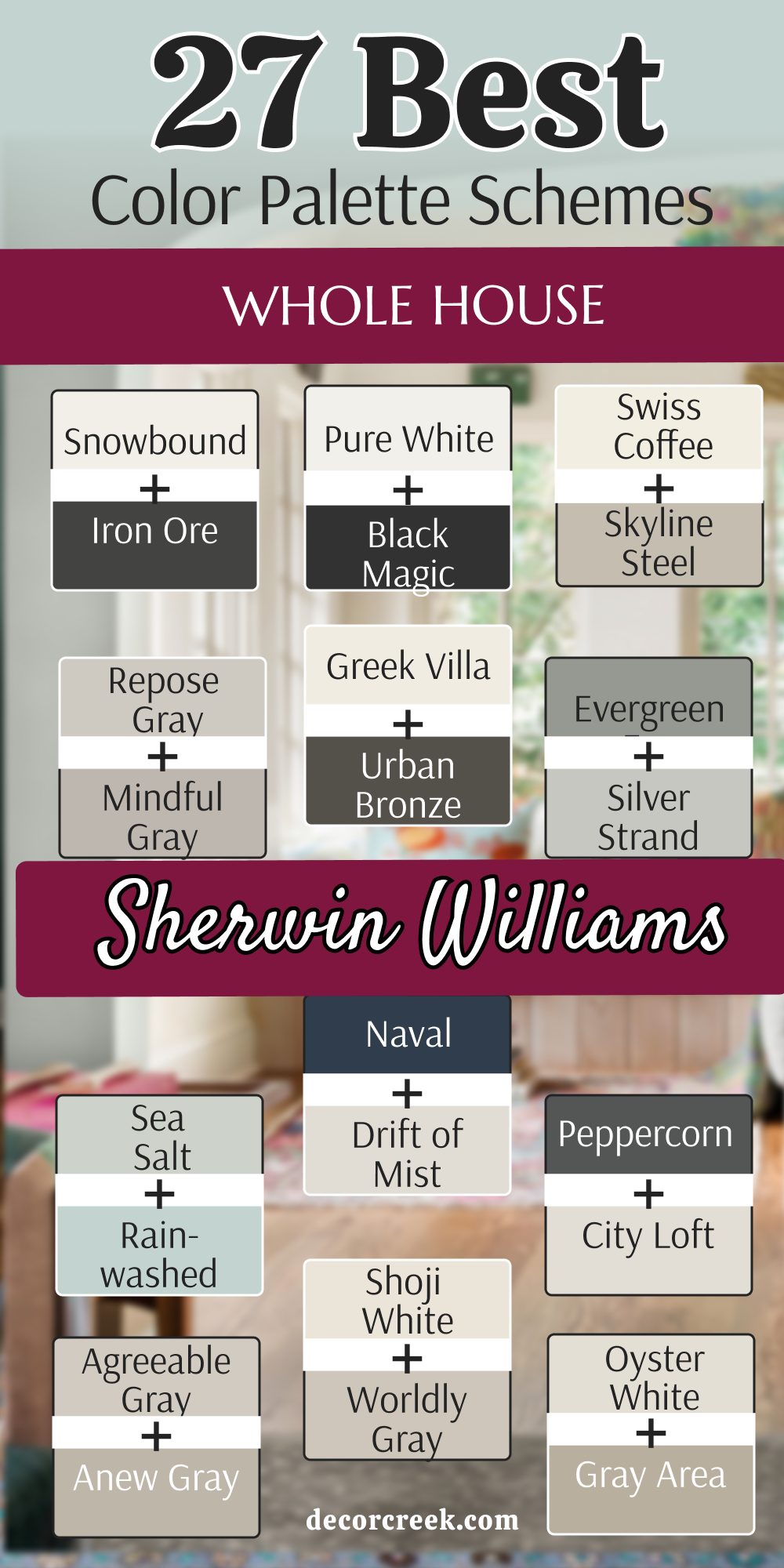
27 Whole House Color Palette Schemes From Benjamin Moore
White Dove OC-17 + Revere Pewter HC-172
White Dove OC-17 is a soft and creamy white that designers use more than almost any other color because it is so reliable. Revere Pewter HC-172 is a very special mix of gray and beige that changes its look based on the light in the room. This combination is a top choice for a house that needs to look updated and fresh without feeling too cold.
The white is very gentle and makes the rooms feel very open and large when used on trim or cabinets. The gray-beige color adds a bit of depth that makes the walls look very sophisticated and high-end for a family. It is a very balanced pair that works well in any room of the house from the kitchen to the bedroom.
Many people pick this because it looks good with both cool blue and warm red decorations you might already own. It makes the house feel very unified and put together as you move from room to room. You can use the dark color in the dining room and the light color in the halls for a smart look. This is a very professional choice that makes any home feel much more expensive and well-planned.
Best used in: open floor plans, kitchens, living rooms, and bedrooms
Pairs well with: Revere Pewter HC-172, Hale Navy HC-154, Chelsea Gray HC-168, dark wood The key rule of this color for a polished look is to use it where you want a soft glow that makes every piece of furniture look expensive.
Chantilly Lace OC-65 + Edgecomb Gray HC-173
Chantilly Lace OC-65 is a very clean white that does not have any hidden blue or yellow tones inside of it. Edgecomb Gray HC-173 is a very light and airy greige that feels very modern and fresh for today. This pair is perfect for someone who wants a very bright and open house that feels full of natural light.
The white is so pure that it makes the light gray look very soft and pretty on the walls. This is a very popular choice for modern houses with a lot of big windows that let the sun in. It makes the walls feel very far away which helps small rooms feel much bigger than they really are. Many designers use this as a base for the whole house because it is so neutral and easy to live with.
It lets your colorful pillows and rugs be the star of the show while the walls stay quiet. This combination feels very fresh and updated without being too trendy or loud for a home. It is a very light look that makes a house feel very peaceful and calm for a busy family.
Best used in: small rooms, hallways, kitchens, and modern living spaces
Pairs well with: Edgecomb Gray HC-173, Revere Pewter HC-172, Hale Navy HC-154, light wood The key rule of this color for a modern home is to use the bright white to emphasize the clean lines of your architecture.
Swiss Coffee OC-45 + Pale Oak OC-20
Swiss Coffee OC-45 is a warm white that makes a room feel like it is giving you a soft hug. Pale Oak OC-20 is a very light gray that has a bit of warmth to match the creamy white perfectly. This pair is very soft and gentle on the eyes for a whole house look that everyone will love.
The white is very creamy and looks great on trim, doors, and even kitchen cabinets for a clean feel. The gray color is so light that it almost looks like a darker white in some types of lighting. It is a very popular choice for people who want a house that feels very light and airy all year.
This combination works well with traditional furniture and soft fabrics like cotton and linen in a room. Many homeowners love how it makes their house feel very bright even on cloudy or rainy days outside. It is a very sophisticated look that is also very easy to maintain for a family with kids or pets. The warm tones make the house feel very welcoming to anyone who visits for the first time.
Best used in: bedrooms, living rooms, nurseries, and kitchens
Pairs well with: Pale Oak OC-20, Revere Pewter HC-172, Chelsea Gray HC-168, brass accents The key rule of this color for a high-end feel is to use it in rooms with plenty of soft lighting to enhance the warm undertones.
Hale Navy HC-154 + Coventry Gray HC-169
Hale Navy HC-154 is a deep and rich blue that feels very traditional and very strong on the walls. Coventry Gray HC-169 is a cool gray that has a tiny bit of blue in it to match the navy perfectly. This pair is perfect for a boy’s bedroom or a very smart-looking dining room for family meals.
The blue is very rich and makes the gray look very clean and very crisp in the light. It is a very popular choice for people who love a classic look that never gets old or out of style. The gray is dark enough to show up against white trim but light enough to keep the room bright.
Many homeowners use this blue on their kitchen islands for a fun pop of real color. It looks great with white marble counters and dark wood floors for a high-end look. This combination feels very organized and put together like a navy blue uniform for your house. It is a very dependable pair that makes a house feel very solid and very stylish for years.
Best used in: dining rooms, bedrooms, kitchen islands, and front doors
Pairs well with: Coventry Gray HC-169, Stonington Gray HC-170, Simply White OC-117, silver hardware The key rule of this color for a nautical or crisp look is to use it in areas where you want a sharp contrast that feels organized.
Simply White OC-117 + Kendall Charcoal HC-166
Simply White OC-117 is a very bright and happy white that fills any room with a lot of natural light. Kendall Charcoal HC-166 is a deep and rich gray that has a lot of personality and strength for a focal point. This pair is great for a kitchen where you want dark cabinets and very light walls for a modern look.
The charcoal color is very good at hiding dirt and fingerprints in busy areas like the kitchen or mudroom. The white makes the dark gray look very intentional and very expensive on the walls or cabinets. It is a very popular choice for modern homes that want a high-contrast look that stands out.
any designers use this for a living room with a lot of big windows to catch the eye. The dark color makes the outside view look like a piece of art on the wall of your home. This combination feels very fresh and very high-end for any house no matter the size. It is a very smart choice that will look good for a very long time without needing a change.
Best used in: kitchens, living rooms, exteriors, and home offices
Pairs well with: Kendall Charcoal HC-166, Revere Pewter HC-172, Hale Navy HC-154, brass hardware The key rule of this color for a polished look is to use it where you want a soft glow that makes every piece of furniture look expensive.
Gray Owl OC-52 + Stonington Gray HC-170
Gray Owl OC-52 is a very light and cool gray that feels like a fresh breeze in a room on a sunny day. Stonington Gray HC-170 is a mid-tone gray that stays very true and does not look too blue or too purple. This pair is great for people who want a cool and calm home that feels very peaceful and quiet.
The lighter gray keeps the walls feeling open and airy while the darker gray adds a bit of weight and focus. Many designers like this mix because it stays very neutral and looks great with silver or black metal accents. It is a very safe way to make a room feel more solid and well-planned for a family.
This combination works well in bathrooms and bedrooms where you want to feel relaxed and ready to rest. It makes the house feel very unified as you move from one room to the next during the day. You will love how clean and organized these two gray shades make your house feel for everyone.
Best used in: bathrooms, bedrooms, kitchens, and whole house interiors
Pairs well with: Stonington Gray HC-170, White Dove OC-17, Hale Navy HC-154, silver metal The key rule of this color for a minimalist style is to use it as a backdrop for your favorite art and colorful decorations.

Cloud White OC-130 + Manchester Tan HC-81
Cloud White OC-130 is a soft and airy white that feels very light and fluffy like a summer cloud. Manchester Tan HC-81 is a warm and sandy beige that feels like a beach on a sunny day with your family. This pair is very popular for people who want a house that feels very soft and very welcoming for guests.
The white is not harsh so it makes the room feel very comfortable to sit in for a long time. The tan is light enough to stay neutral but warm enough to make the room feel cozy and grounded. Many homeowners use this for their whole house because it is so easy to live with every single day.
It makes the house feel very unified and very tidy from one room to another as you walk through. You will find that your wood floors look much richer next to these two warm and natural shades. This combination is very popular for people who want a traditional look that still feels fresh.
Best used in: living rooms, kitchens, entryways, and traditional homes
Pairs well with: Manchester Tan HC-81, Revere Pewter HC-172, Boothbay Gray HC-165, warm wood The key rule of this color for a high-end feel is to use it in rooms with plenty of soft lighting to enhance the warm undertones.
Paper White OC-55 + Mount Saint Anne 1565
Paper White OC-55 is a very light gray-white that feels very crisp and very sharp on the walls of a room. Mount Saint Anne 1565 is a beautiful mid-tone blue-green that has a lot of gray hidden inside of it. This pair is a very fresh choice for a house that wants to feel connected to the sky and the water.
The blue-green color is very soothing and works well in rooms meant for resting or for deep thinking. The light gray-white keeps the room from feeling too dark and lets the color be the star of the show. Many people love this for their master bedrooms or for a quiet study where they can work.
It looks amazing with white trim and light-colored wood floors for a very clean and natural look. This combination brings a very peaceful feel to any room you put it in for your family to enjoy. It is a very soft look that makes your house feel like a quiet getaway from the busy world outside.
Best used in: bedrooms, home offices, bathrooms, and laundry rooms
Pairs well with: Mount Saint Anne 1565, Simply White OC-117, Gray Owl OC-52, silver accents The key rule of this color for a fresh look is to use it in spaces where you want to feel a sense of cleanliness and quiet.
Wickham Gray HC-171 + Palladian Blue HC-144
Wickham Gray HC-171 is a very light gray that has a tiny bit of blue and green hidden inside of it. Palladian Blue HC-144 is a soft and airy blue that feels like a clear sky over a garden. This pair is very popular for people who love a coastal or a vintage look in their home.

The gray is very neutral and keeps the blue from looking too much like a child’s room or a nursery. The blue is very gentle and adds just enough color to make the room feel special and well-decorated. Many designers use this mix for bathrooms or for a sunny kitchen area to make it feel fresh.
It looks wonderful with white cabinets and brass or gold handles for a very classic feeling. This combination is very friendly and makes a house feel very light and very full of life for everyone. It is a very smart way to use a bit of color while keeping the whole house feeling quiet.
Best used in: bathrooms, kitchens, sunrooms, and guest bedrooms
Pairs well with: Palladian Blue HC-144, Cloud White OC-130, Revere Pewter HC-172, light wood The key rule of this color for a fresh look is to use it in spaces where you want to feel a sense of cleanliness and quiet.

Balboa Mist OC-27 + Metropolitan AF-690
Balboa Mist OC-27 is a very popular light gray that has a tiny bit of warmth to stay cozy in any light. Metropolitan AF-690 is a mid-tone gray that feels very sophisticated and very modern for a new home. This pair is a top choice for a whole house because it is so easy to live with every day for a family.
The lighter gray keeps the hallways and smaller rooms feeling open and bright for everyone. The darker gray is perfect for a living room or a dining room to add a bit of focus and style. Many people like this mix because it stays very neutral and looks great with any color of furniture you have.
It works very well with silver light fixtures and white marble counters for a high-end hotel feeling. This combination makes a house feel very well-built and very well-decorated without being too loud. It is a very steady choice that will look good for a very long time without needing to change.
Best used in: living rooms, dining rooms, hallways, and whole house interiors
Pairs well with: Metropolitan AF-690, White Dove OC-17, Hale Navy HC-154, cool wood The key rule of this color for a minimalist style is to use it as a backdrop for your favorite art and colorful decorations.
Classic Gray OC-23 + Chelsea Gray HC-168
Classic Gray OC-23 is a very light and sophisticated off-white that feels like a soft whisper on the walls. Chelsea Gray HC-168 is a deep and powerful gray that adds a lot of strength and style to any room. This pair is perfect for a house where you want a modern look that still feels very solid and very safe.

The light gray is great for large open spaces because it looks clean and bright in the morning sun. The darker gray is a wonderful choice for a media room or a home office to make it feel private. Many homeowners love how this mix makes their white trim and doors look very sharp and very expensive.
It looks amazing with black metal lamps and light oak floors in a large living room area. This combination is very steady and makes a house feel very well-built for a modern family to enjoy. It is a very smart look that stays in style even as other trends come and go quickly. You will find that these colors make your home feel very professional and very well-planned.
Best used in: living rooms, home offices, hallways, and kitchen islands
Pairs well with: Chelsea Gray HC-168, Simply White OC-117, Revere Pewter HC-172, black metal The key rule of this color for a minimalist style is to use it as a backdrop for your favorite art and colorful decorations.

Wind’s Breath OC-24 + Pashmina AF-100
Wind’s Breath OC-24 is a warm and airy white that feels like a soft breeze moving through your home. Pashmina AF-100 is a mid-tone greige that looks as rich and cozy as a real wool sweater on a cold day. This pair is the definition of comfort and high-end style for a house that needs to feel like a home.
The white has a bit of warmth that makes every room feel like it is glowing from the inside. The pashmina color is deep enough to show a difference but light enough to keep the room feeling open. This is a very popular choice for a whole house because it is so soft and easy on the eyes.
It looks great with white trim and dark wood floors in a traditional or modern house. Many people love this because it makes the house feel very expensive and very well-decorated for guests. It is a very quiet look that lets your furniture and your life be the main focus of the room. This combination will always look fresh and will never go out of style for your family.
Best used in: whole house interiors, living rooms, bedrooms, and entryways
Pairs well with: Pashmina AF-100, White Dove OC-17, Hale Navy HC-154, soft textures The key rule of this color for a high-end feel is to use it in rooms with plenty of soft lighting to enhance the warm undertones.
Atrium White OC-145 + Aegean Teal 2136-40
Atrium White OC-145 is a warm and welcoming white that has a tiny bit of pink to keep it very soft. Aegean Teal 2136-40 is a deep and rich color that is a mix of blue and green with a gray base. This pair is very famous for being very balanced and very easy to look at for a long time.
The teal is deep enough to add a lot of drama to a room without making it feel too small. The white is very friendly and keeps the room from feeling too cold or too dark for the family. Many people love this for their front doors or for a kitchen with white cabinets and wood floors.
It looks amazing with natural wood and black metal accents in a modern or a traditional home. This combination feels very artistic and shows that you have a very good eye for picking special colors. It is a very cozy choice that makes a house feel very special and very high-end for everyone. The green tones in the teal make it feel very connected to the trees and nature outside.
Best used in: front doors, kitchens, living rooms, and accent walls
Pairs well with: Aegean Teal 2136-40, Revere Pewter HC-172, Simply White OC-117, wood accents The key rule of this color for a nature-inspired home is to use it in rooms with large windows to bridge the gap between inside and out.
Steam AF-15 + Morning Dew 1493
Steam AF-15 is a very clean and soft white that feels like a fresh sheet of paper in the morning. Morning Dew 1493 is a very light and gentle green that has a lot of gray hidden inside of it. This pair is very light and makes a house feel very airy and very open to the world around it.
The green is so light that it almost looks like a neutral gray when the sun hits the walls. The white is very bright and makes the whole room feel very clean and very tidy for the family. Many people pick this for their bedrooms because it helps them feel very relaxed and ready for a good sleep.
It looks great with natural wood furniture and light gray rugs on the floor of a room. This combination is very modern and feels very fresh for a house that needs a simple update. It is a very gentle look that does not shout for attention but looks very nice and very smart. You can use this for a whole house to make it feel very unified and peaceful.
Best used in: bedrooms, bathrooms, nurseries, and laundry rooms
Pairs well with: Morning Dew 1492, Cloud White OC-130, Gray Owl OC-52, light wood The key rule of this color for a fresh look is to use it in spaces where you want to feel a sense of cleanliness and quiet.
Calm OC-22 + Thunder AF-685
Calm OC-22 is a very light gray that has a tiny hint of lavender to make it feel very peaceful. Thunder AF-685 is a mid-tone gray that feels very solid and very grounded like a summer storm cloud. This pair is a great choice for a house that wants to feel very soft and very sophisticated at the same time.
The lighter gray provides a neutral base that keeps the room feeling open and full of light. The darker gray is perfect for a dining room or a cozy den to add a bit of weight and style. Many people love how this color changes throughout the day as the sun moves across the sky.
It can look more gray in the morning and more soft in the evening light from your lamps. This mix is very popular for modern homes that want a look that is very easy to live with. It feels very cool and refreshing when you walk inside on a hot day to rest. The light colors make the whole house feel very open and very large for everyone.
Best used in: living rooms, bedrooms, bathrooms, and open floor plans
Pairs well with: Thunder AF-685, Chantilly Lace OC-65, Hale Navy HC-154, silver hardware The key rule of this color for a minimalist style is to use it as a backdrop for your favorite art and colorful decorations.

White Heron OC-57 + Silver Half Dollar 2121-40
White Heron OC-57 is a cool white that has a bit of gray to keep it looking very crisp and very sharp. Silver Half Dollar 2121-40 is a mid-tone gray that has a clear blue undertone like a shiny coin. This pair is perfect for a house that wants to feel very modern and very clean for a family.
The white is very bright and makes the gray look even more stylish and very professional on the walls. This is a great choice for a kitchen or a bathroom where you want a very high-end feeling. The gray is very good at hiding marks and looks very intentional next to white trim and doors. It creates a very sharp look that is very popular in new homes being built right now.
You will find that this pair makes all your furniture look very crisp and brand new for your guests. It is a bold choice that shows you are confident in your own personal sense of style. The white keeps the room from feeling too dark even with the cool gray tones.
Best used in: kitchens, bathrooms, laundry rooms, and home offices
Pairs well with: Silver Half Dollar 2121-40, Simply White OC-117, Kendall Charcoal HC-166, silver accents The key rule of this color for a modern home is to use the bright white to emphasize the clean lines of your architecture.
Decorator’s White CC-20 + Boothbay Gray HC-165
Decorator’s White CC-20 is a very crisp white that designers love because it makes everything look clean. Boothbay Gray HC-165 is a pretty gray that has a very clear and soft blue undertone to the color. This pair feels like a day at the beach with a soft sky and cool water for the family.
The white is very pure and does not have any harsh yellow or blue tones hidden inside. The blue-gray color is very soothing and works well in rooms meant for resting and relaxing. This is a very popular choice for nurseries or for the main bedroom in a large house.
It feels very fresh and very clean without being too cold or too dark for the kids. The blue in the gray comes out more when you have a lot of light coming into the room. It makes the walls feel very soft and can make a small room feel much bigger than it is. This combination is very friendly and looks great with light-colored woods and white linen.
Best used in: bedrooms, nurseries, bathrooms, and coastal living rooms
Pairs well with: Boothbay Gray HC-165, Chantilly Lace OC-65, Woodlawn Blue HC-147, rattan textures The key rule of this color for a fresh look is to use it in spaces where you want to feel a sense of cleanliness and quiet.
Mascarpone AF-20 + Sparrow AF-720
Mascarpone AF-20 is a rich and creamy white that feels very luxurious and very warm like a dessert. Sparrow AF-720 is a deep brown-gray that feels very solid and very grounded like a natural stone. This pair is very popular for people who want a home that feels very warm and very sturdy for a family.
The white is very inviting and makes the room feel very cozy when the lamps are on at night. The dark gray-brown color is perfect for an accent wall or for a library to add a bit of drama. Many people use this in their living rooms because it makes everyone feel very relaxed and very comfortable. It looks great with natural wood furniture and woven baskets for a very earthy and natural look.
This combination is very gentle and makes a house feel very grounded and very peaceful for everyone who lives there. It is a great way to use a dark color without it feeling too cold or too modern. You will love how warm your home feels with these two shades.
Best used in: living rooms, bedrooms, entryways, and home libraries
Pairs well with: Sparrow AF-720, White Dove OC-17, Urbane Bronze SW 7048, warm wood The key rule of this color for a high-end feel is to use it in rooms with plenty of soft lighting to enhance the warm undertones.
Seapearl OC-19 + Spanish Olive 1522
Seapearl OC-19 is a very soft white that has a tiny bit of gray and tan to keep it very neutral. Spanish Olive 1522 is a muted green that looks like a field of grass on a soft cloudy morning. This pair is very trendy because people want their homes to feel more like the natural world outside.
The green is very soft and does not feel too bright or like a child’s playroom on the walls. The light white-gray color is perfect for the trim to keep the look very soft and very organic for the family. Many homeowners pick this for their kitchens or for a cozy den where they want to relax and talk.

It looks amazing with light wood floors and white linen curtains on the windows for a fresh feel. This combination brings a very natural and earthy feel to any room you put it in for your house. It is a very soft look that makes your home feel like a quiet getaway from the busy street. You can use the green to make a room feel very special and unique.
Best used in: kitchens, dens, bedrooms, and mudrooms
Pairs well with: Spanish Olive 1522, Simply White OC-117, Kendall Charcoal HC-166, light oak The key rule of this color for a nature-inspired home is to use it in rooms with large windows to bridge the gap between inside and out.
Simply White OC-117 + Van Deusen Blue HC-156
Simply White OC-117 is a very crisp and energetic white that feels full of happy light for the home. Van Deusen Blue HC-156 is a classic mid-tone blue that people have loved for a very long time for its style. This pair makes a room feel very smart and very put together like a navy blue suit for your walls.
The white helps the blue stay looking very bright instead of turning into a dark hole in the room. It is a very popular choice for bedrooms or bathrooms where you want a very clean and fresh feel. The blue is deep enough to feel very fancy but still looks like a real and happy color for the family. This combination works well with white tiles and dark wood floors in a modern or traditional house.
Many people use this in a study or a kitchen island because it feels very strong and very professional. The white reflects all the light in the room to keep things looking fresh and updated for everyone. This is a very dependable choice that never goes out of style for any house.
Best used in: kitchen islands, bedrooms, bathrooms, and home offices
Pairs well with: Van Deusen Blue HC-156, Gray Owl OC-52, Stonington Gray HC-170, brass accents The key rule of this color for a nautical or crisp look is to use it in areas where you want a sharp contrast that feels organized.

Moonshine OC-56 + Mount Saint Anne 1565
Moonshine OC-56 is a very pale and cool gray that feels like the soft light of the moon coming through a window. Mount Saint Anne 1565 is a beautiful blue-green with a gray base that feels very steady and very high-end. This pair is a wonderful choice for a master bedroom or a large bathroom where you want to feel like you are at a fancy spa.
The light gray is so soft that it makes the room feel very quiet and very peaceful for resting. The blue-green color adds a lot of character and makes the space feel very artistic and well-planned. Many people love this mix because it looks great with white marble and silver faucets in a modern home.
It feels very fresh and very clean without being too bright or too loud for your family. This combination is very sophisticated and shows that you have a very good eye for colors that match perfectly. You will love how calm you feel every time you walk into a room painted with these two pretty shades.
Best used in: bedrooms, bathrooms, laundry rooms, and quiet sitting areas
Pairs well with: Mount Saint Anne 1565, Chantilly Lace OC-65, Simply White OC-117, silver hardware The key rule of this color for a fresh look is to use it in spaces where you want to feel a sense of cleanliness and quiet.
Wind’s Breath OC-24 + Woodlawn Blue HC-147
Wind’s Breath OC-24 is a warm and airy white that feels like a soft summer breeze blowing through the house. Woodlawn Blue HC-147 is a soft and traditional blue that feels very vintage and very sweet on the walls. This pair is a great choice for a cottage or a house that needs to feel very friendly and very inviting.
The blue is light enough that it does not feel dark, but it has enough color to make everyone smile when they see it. The warm white trim makes the blue walls look very intentional and very well-planned for a happy family home. Many people use this in their kitchens or sunrooms because it feels very bright and very full of life.
It looks amazing with light-colored wood furniture and white cotton fabrics in a room. This combination is very friendly and makes everyone feel at home right away as soon as they sit down. It is a very classic look that reminds people of a clear blue sky on a perfect day.
Best used in: kitchens, sunrooms, guest bedrooms, and nurseries
Pairs well with: Woodlawn Blue HC-147, Cloud White OC-130, Revere Pewter HC-172, light oak The key rule of this color for a fresh look is to use it in spaces where you want to feel a sense of cleanliness and quiet.
Stonington Gray HC-170 + Amherst Gray HC-167
Stonington Gray HC-170 is a mid-tone gray that stays very true and does not look too blue or too purple in the light. Amherst Gray HC-167 is a darker, moody gray that adds a lot of depth and a very modern feel to a room. This pair is perfect for a house where you want a very steady and very professional look for your family.
The lighter gray is great for hallways because it is very easy to look at and feels very clean. The darker gray is a wonderful choice for an accent wall or a dining room to make it feel very stylish and high-end. Many homeowners love how this mix makes their art and their colorful furniture really stand out against the walls.
It looks amazing with black metal accents and dark wood floors for a very solid feeling. This combination is very modern and makes a house feel very well-built and very well-decorated for today’s style. It is a very smart look that will stay in style for a very long time.
Best used in: living rooms, hallways, dining rooms, and home offices
Pairs well with: Amherst Gray HC-167, White Dove OC-17, Hale Navy HC-154, black metal The key rule of this color for a minimalist style is to use it as a backdrop for your favorite art and colorful decorations.

Simply White OC-117 + Newberryport Blue HC-155
Simply White OC-117 is a very bright and happy white that fills a room with a lot of natural light and energy. Newberryport Blue HC-155 is a rich and traditional blue that looks very smart and very expensive on any wall. This pair is a great choice for a house that wants to feel very classic but also very fresh and very updated.
The white helps the deep blue stay looking very crisp and very sharp instead of feeling too dark or heavy. It is a very popular choice for a front door or for a library where you want to feel very focused and very calm.
Many people love how this blue makes white trim look very bright and very clean in the sun. This combination works well with gold hardware and dark wood floors for a very high-end and traditional look. It feels very organized and makes a house feel very solid and very well-cared for by the family. This is a very dependable choice that never gets old.
Best used in: front doors, home libraries, dining rooms, and kitchen islands
Pairs well with: Newberryport Blue HC-155, Gray Owl OC-52, Simply White OC-117, gold accents The key rule of this color for a nautical or crisp look is to use it in areas where you want a sharp contrast that feels organized.
Ballet White OC-9 + Manchester Tan HC-81
Ballet White OC-9 is a very soft and creamy white that feels as light and graceful as a real dancer in a room. Manchester Tan HC-81 is a warm and sandy beige that feels like a quiet beach on a sunny afternoon.
This pair is very popular for people who want a house that feels very soft and very welcoming for all their friends. The white is not harsh, so it makes the whole room feel very comfortable and very cozy to sit in for a long time. The tan is light enough to stay neutral but warm enough to make the room feel very grounded and very peaceful.
Many homeowners use this for their whole house because it is so easy to live with every single day of the year. It makes the house feel very unified and very tidy as you move from one room to another. You will find that these colors make your home feel very warm even when it is very cold and gray outside.
Best used in: whole house interiors, living rooms, bedrooms, and entryways
Pairs well with: Manchester Tan HC-81, White Dove OC-17, Revere Pewter HC-172, warm wood The key rule of this color for a high-end feel is to use it in rooms with plenty of soft lighting to enhance the warm undertones.
Swiss Coffee OC-45 + Chelsea Gray HC-168
Swiss Coffee OC-45 is a warm and creamy white that makes a room feel very luxurious and very inviting for everyone. Chelsea Gray HC-168 is a deep and powerful gray that adds a lot of focus and a lot of style to the walls.
This pair is a top choice for a house that wants to balance old-fashioned warmth with a very modern and fresh look. The white makes the walls look like they are glowing when the morning sun hits them through the windows.
The gray is very solid and makes the room feel much more grounded and very professional for a family. Many designers like this mix for a large living room or for a fancy dining room where guests eat. It looks amazing with black metal light fixtures and dark wood furniture for a high-end hotel feeling. This combination makes a house feel very well-built and very well-decorated for a modern family. You will love how clean and organized these two colors make your house feel.
Best used in: living rooms, dining rooms, entryways, and kitchen cabinets
Pairs well with: Chelsea Gray HC-168, White Dove OC-17, Hale Navy HC-154, black metal The key rule of this color for a high-end feel is to use it in rooms with plenty of soft lighting to enhance the warm undertones.
Paper White OC-55 + Hale Navy HC-154
Paper White OC-55 is a very light and cool gray-white that feels very crisp and very sharp on the walls of a house. Hale Navy HC-154 is a deep and rich blue that feels very traditional and very powerful for a focal point. This pair is very dramatic and makes a very big impression on anyone who walks into the room for the first time.
The dark blue is very calming and works well in a bedroom where you want to feel very safe and ready for sleep. The light gray-white keeps the room from feeling too small or like a dark cave during the middle of the day.
It is a very popular choice for an accent wall or for the bottom half of a dining room wall to add style. Many people like how the white trim stands out against the dark blue paint when the lights are on. This combination feels very modern and fresh for a house that needs a real and exciting change.
Best used in: bedrooms, dining rooms, kitchen islands, and front doors
Pairs well with: Hale Navy HC-154, Simply White OC-117, Gray Owl OC-52, silver hardware The key rule of this color for a nautical or crisp look is to use it in areas where you want a sharp contrast that feels organized.
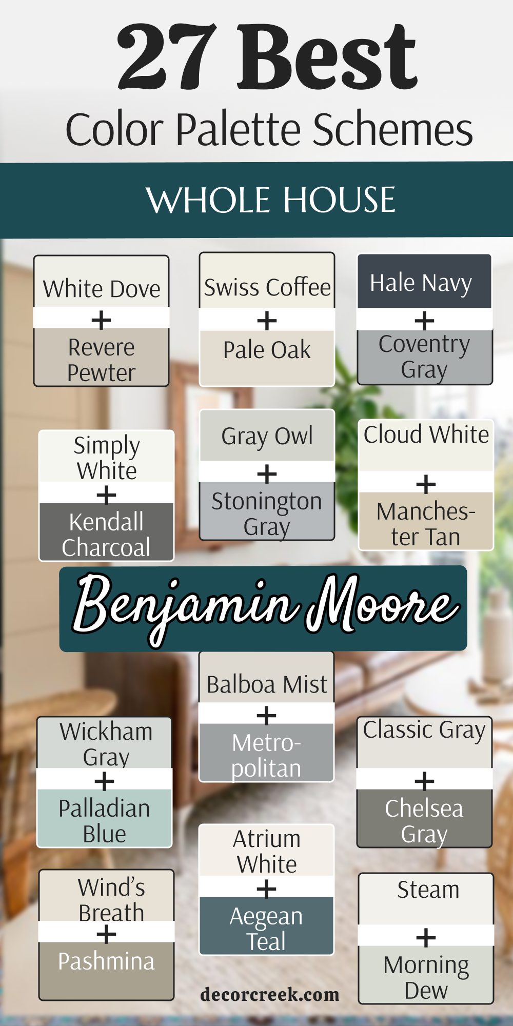
Final Thoughts on Choosing the Perfect Color Scheme for Your Home
Choosing the right paint for your home is a truly significant and essential step toward transforming a simple building into a place where you feel like you truly belong and can be yourself. By carefully looking at how different colors and tones work together in a single space, you create a unique environment that is both beautiful to look at and incredibly comfortable to live in every single day.
Whether you prefer the soft, inviting warmth of a creamy white or the bold, sophisticated drama of a deep navy blue, these 37 specific schemes are designed to look amazing in real-life settings, not just in professional pictures found in magazines.
Using trusted and proven paint brands like Benjamin Moore and Sherwin-Williams ensures that the colors you pick will stay looking fresh, vibrant, and bright for many years to come. It is very important to remember to think about how you use each specific room and to watch how the natural light changes from morning to night before you make your final choice.
Your home is a direct reflection of exactly who you are, and the right paint can help show off your unique personality and style to every friend or family member who visits. I truly hope these ideas help you feel confident, inspired, and excited about starting your next big painting project to transform your beautiful house into the perfect home.