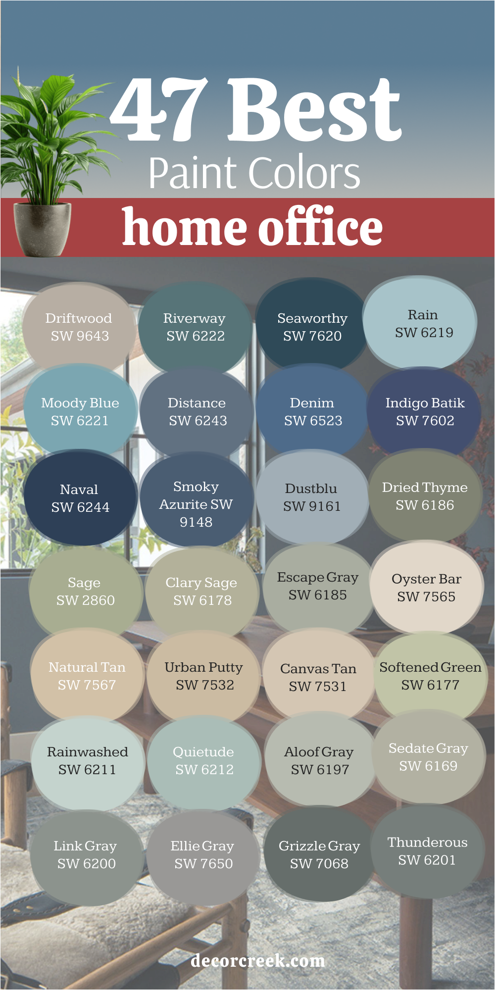
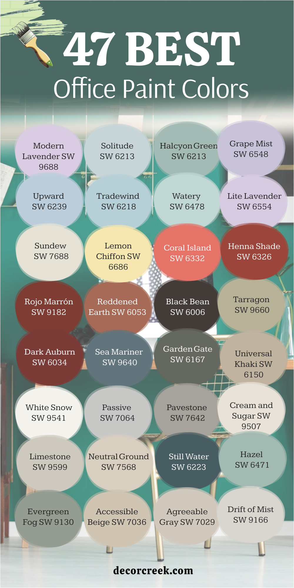
47 Best Office Paint Colors by Sherwin-Williams for 2026
Chic Tones for Focus and Inspiration
When I design an office, I always think about how color can shape focus, energy, and comfort. Paint isn’t just decoration—it sets the mood for how we think and work every day. The right tone can make long hours feel lighter and even spark new ideas. I’ve seen how soft shades bring calm energy to busy workdays, while richer colors can add confidence and power.
An office should feel balanced, not too bright or dull, but a place that helps the mind stay clear. That’s why I choose colors that support concentration and bring personality without distraction.
Each shade I use has its own rhythm—some steady and quiet, others steady but bold. When the walls around you feel right, working feels smoother and more natural.
It’s all about finding tones that make you feel ready to start the day. In this guide, I’ve gathered my favorite office colors that work beautifully in 2026—each tested and loved in real spaces.
via freshcoatpainters.com
Why I Trust Sherwin-Williams for Office Paint Colors
I’ve used many paint brands over the years, but Sherwin-Williams always feels like a reliable partner. Their colors look refined and hold up beautifully in both natural and artificial light, which matters so much in offices. I’ve noticed their formulas resist scuffs, stay true over time, and are easy to maintain.
When I pick a Sherwin-Williams shade for an office, I know it will look as good after long days as it did on the first one. Another reason I trust them is their attention to how color affects mood and productivity.
Their palettes include both energizing tones and relaxing neutrals, giving me flexibility for different types of workspaces. Whether it’s a small home office or a large studio, their paints bring balance between focus and comfort. I love how they offer perfect undertones—never too yellow or too gray.
That control helps me fine-tune a room’s feeling exactly the way I want. It’s a brand that listens to design needs and translates them into color that truly works.
How I Choose the Right Paint Color for an Office Space
Choosing an office color starts with one simple question: how do you want to feel while working? I always look at how much light enters the room, because daylight can completely change how a color appears. If the room feels small or dark, I lean toward soft neutrals or light blues that open it up.
For larger offices, deeper greens and warm grays bring focus and a sense of grounding. I think about what kind of work happens there—creative tasks need energy, while detail work needs calm focus.
Texture and finishes also play a big part; a matte wall keeps glare away, while a satin finish adds a gentle glow. I like to pair wall colors with natural wood, black metal, or cream accents for contrast. Lighting temperature is another secret—warm bulbs soften cooler tones, while daylight bulbs make whites look crisp.
Every choice should support your rhythm, not fight it. My goal is always a color that helps work feel smoother, not harder.
via marthastewart.com
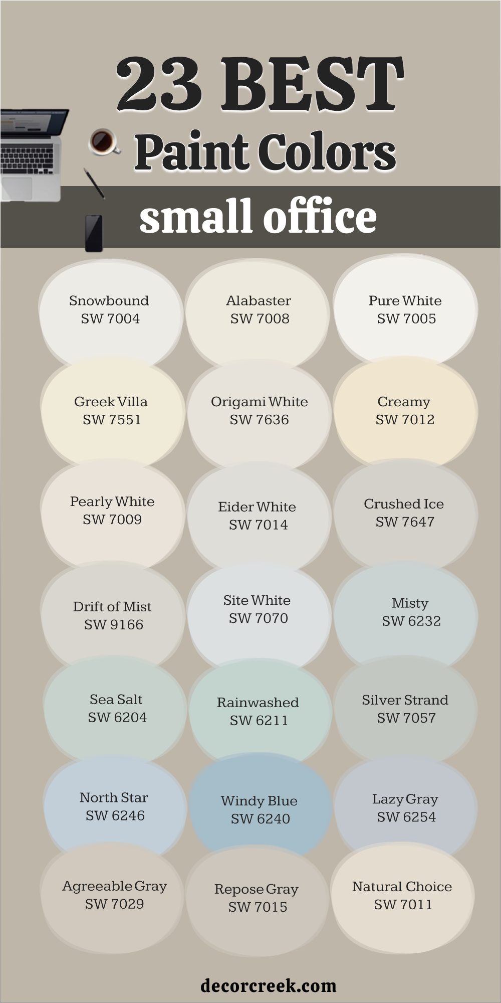
47 Best Office Paint Colors in 2026
Modern Lavender SW 9688
Modern Lavender adds a gentle touch of creativity that feels inspiring, not too sweet. I love how it brings a hint of color without taking over the room. This shade has a gray base that keeps it soft and mature, perfect for a design studio or reading nook. It pairs beautifully with white trim or warm beige furniture.
When sunlight moves across it, the lavender tone glows slightly, giving a peaceful rhythm to the room. I often use it in offices where people want focus with a touch of imagination.
It looks wonderful beside brushed brass or pale oak finishes. The key rule of this color for an office is to balance it with simple, clean decor.
Keep accents muted so the color feels airy and bright. Modern Lavender helps ideas flow with quiet confidence every single day.
Solitude SW 6213
Solitude reminds me of early morning light before the day starts moving too fast. It’s a cool blue-gray that helps slow down the mind and invite focus. I’ve used it in offices where people need concentration without pressure. It feels professional but never cold. This color pairs beautifully with soft whites, tan leather, or light oak wood.
The blue base brings a sense of order and calm thinking. It works especially well on walls near windows, where natural light brings out its depth.
I find that Solitude looks timeless across seasons, steady and clear. The key rule of this color for an office is to keep accents warm—like linen curtains or wood shelves—to balance its cool side.
When the world outside feels rushed, Solitude keeps the room steady.
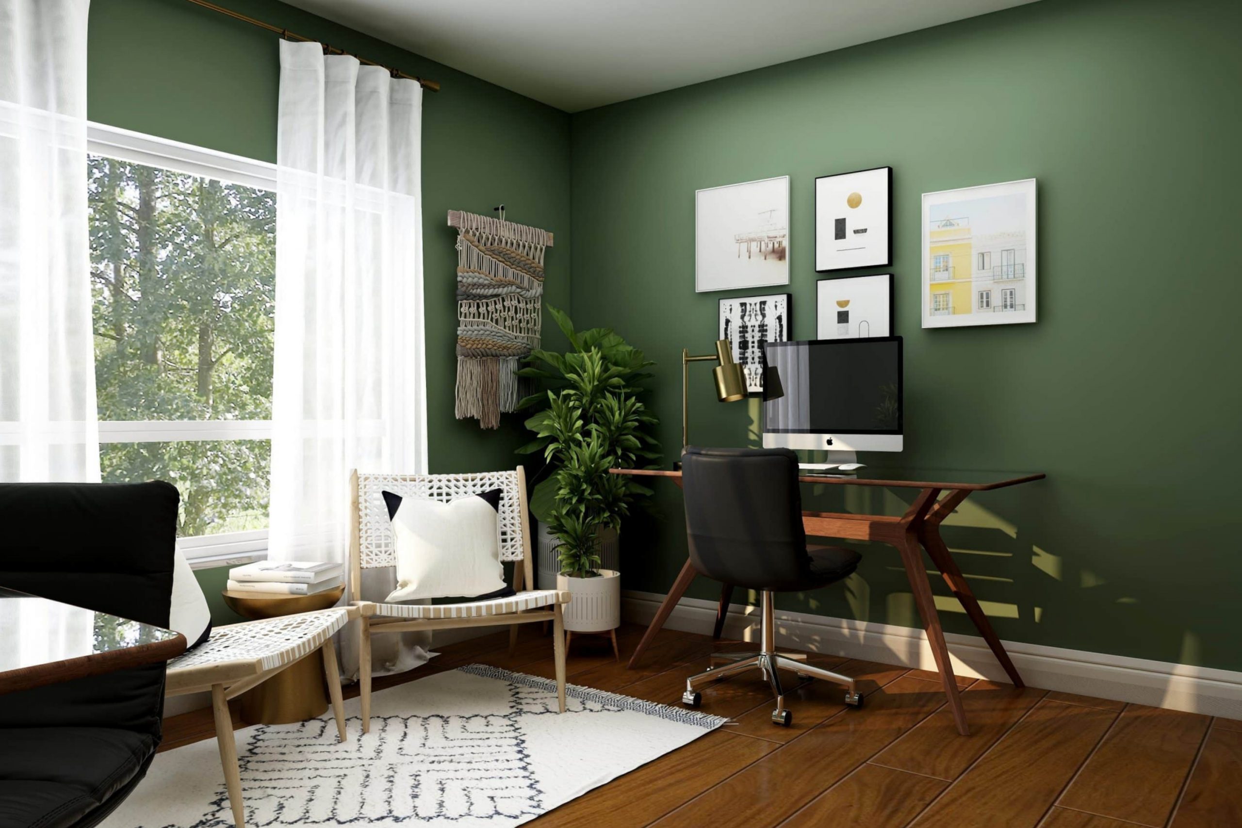
Halcyon Green SW 6213
Halcyon Green feels grounded and fresh at the same time. It’s that perfect mix of gray and green that brings life without noise. I use it often in offices that need calm focus with a natural edge. The tone works beautifully with white trim and darker woods. In daylight, it leans toward sage; in evening light, it deepens into a cozy green-gray.
It helps connect the indoors with nature, which keeps people calm and steady during long hours. This color looks stunning with brass fixtures or woven baskets.
The key rule of this color for an office is to keep lighting warm to highlight its earthy undertones. It’s ideal for people who want a work setting that feels grounded but creative.
Halcyon Green makes thinking feel smoother and more centered.
decorcreek.com
Grape Mist SW 6548
Grape Mist carries a gentle violet touch that feels both light and smart. I love using it in offices where people want personality without distraction. The muted base keeps it sophisticated while the purple tone adds quiet charm. It pairs nicely with warm woods, white walls, or even black frames for contrast.
I’ve seen it make small offices feel elegant and open. When paired with soft lighting, Grape Mist looks powdery and smooth.
The key rule of this color for an office is to balance it with creamy whites or silvery grays. It works beautifully with both modern and vintage furniture.
Grape Mist gives any workspace a thoughtful, graceful mood that lasts all day.
Upward SW 6239
Upward feels light, clean, and easy to live with. It’s a sky-blue tone that opens up an office and keeps the atmosphere fresh. I like it for rooms that need brightness without being harsh. It blends effortlessly with soft grays and warm neutrals. When sunlight hits it, the blue feels airy and calm, helping people stay focused longer.
I’ve used it for creative offices where imagination needs room to grow. The color holds its charm under artificial light too, keeping its tone balanced.
The key rule of this color for an office is to add natural textures—like wood desks or linen curtains—for warmth. Upward feels like a breath of fresh air that quietly supports productivity.
decorcreek.com
Tradewind SW 6218
Tradewind carries that perfect soft blue that feels open and thoughtful. It reminds me of gentle ocean air on quiet mornings. This shade keeps the mood balanced—cool but never distant. I love pairing it with white trim and light natural furniture. It’s perfect for home offices that need freshness and calm thinking.
When light moves across the room, Tradewind shifts slightly, adding depth and comfort. It’s also one of those colors that makes a small office feel larger.
The key rule of this color for an office is to mix it with textures—like jute rugs or oak shelves—for warmth. Tradewind makes everyday work feel lighter and more natural.
via decorcreek.com
Watery SW 6478
Watery is a blend of blue and green that feels fresh and clear. I like how it keeps an office feeling both peaceful and alive. It looks perfect next to crisp white trim or soft beige accents. The color changes beautifully through the day—cooler in the morning, softer at night. I often choose Watery for workspaces where creativity and calm need to meet.
It helps soften hard lines and adds just enough color to keep things interesting. The key rule of this color for an office is to keep the palette light and airy.
Pair it with woven textures or matte finishes for balance. Watery gives the kind of energy that feels steady but alive all day long.
via decorcreek.com
Lite Lavender SW 6554
Lite Lavender brings quiet personality to an office without being bold. It’s a soft, powdery violet that pairs beautifully with white or warm gray. I love using it when a client wants something different but not distracting. The gentle color keeps the room feeling positive and calm. It looks lovely with brass hardware, glass lighting, or natural wood.
In smaller offices, it opens up the space while keeping it cozy. The key rule of this color for an office is to avoid dark, heavy accents—it shines best with light surroundings.
It reflects daylight softly and feels inviting all year. Lite Lavender turns ordinary walls into a soft background for focus and creativity.
via decorcreek.com
Sundew SW 7688
Sundew brings warmth that feels like soft sunlight. It’s a mix of cream and beige with just a hint of peach. I love how it adds light without being too bright. It works perfectly in offices where natural light is limited. This shade pairs beautifully with wood, white, and muted greens. It gives energy to the room but stays easy on the eyes.
The key rule of this color for an office is to use it with matte finishes—it looks more natural that way. Sundew feels cheerful and helps make long hours feel softer.
It’s one of my favorites for creating a calm but optimistic work setting.
Lemon Chiffon SW 6686
Lemon Chiffon is fresh, soft, and happy without feeling childish. It adds a hint of sunshine that helps brighten any office. I often use it in creative spaces or home studios that need energy. It pairs well with white trim, pale woods, or even soft gray furniture.
The yellow tone lifts the mood instantly, especially in rooms with little daylight. It’s a wonderful choice for people who want color but not intensity.
The key rule of this color for an office is to balance it with neutrals to keep it gentle. Lemon Chiffon makes workdays feel lighter and mornings easier. It’s the kind of shade that keeps motivation glowing quietly in the background.
via decorcreek.com
Coral Island SW 6332
Coral Island brings a touch of cheer that never feels loud. It’s a warm coral with a hint of pink that brightens the day just enough. I’ve used it in offices where people need energy and joy without distraction. It pairs beautifully with white trim, tan woods, or woven rattan textures.
When sunlight hits it, the color glows softly, giving life to the room. I love using it behind open shelving or near a window to highlight its warmth.
The key rule of this color for an office is to keep decor simple and neutral so it remains the focus. It also pairs well with brass lighting or cream fabrics. Coral Island makes long workdays feel more friendly and welcoming. It’s a reminder that productivity and positivity can share the same room.
Henna Shade SW 6326
Henna Shade feels like quiet strength. It’s a deep reddish-brown that adds confidence and warmth to an office. I often use it for accent walls or built-ins where I want a strong, grounded feeling. The color works perfectly with creamy whites, dark wood, or black metal. It makes a space feel rich without being too bold.
Under warm lighting, it softens beautifully and gives a comfortable depth. I love pairing it with natural textures like linen or wool.
The key rule of this color for an office is to balance it with plenty of light tones. It’s perfect for those who want their workspace to feel confident and elegant. Henna Shade turns plain walls into something quietly powerful.
Rojo Marrón SW 9182
Rojo Marrón is a deep, earthy red that adds warmth and character to a room. I love it for offices where I want focus with a touch of drama. It pairs beautifully with creamy neutrals, brass fixtures, and dark wood tones. This color has a cozy richness that helps the room feel grounded and welcoming. When sunlight moves across it, Rojo Marrón glows softly without feeling too heavy.
It’s a bold choice that still feels natural. The key rule of this color for an office is to use it on one wall or in smaller doses so it stays balanced.
It works best when paired with light flooring and plenty of natural light. Rojo Marrón brings warmth that encourages confidence and clear thinking.
via decorcreek.com
Reddened Earth SW 6053
Reddened Earth has a clay-like softness that feels both creative and comforting. It’s a muted terracotta that brings warmth without being too strong. I’ve used it in home offices to make work feel grounded and natural. It pairs well with white, cream, and soft gray accents. Under natural light, it shows its warm red tone, while in low light, it deepens to a cozy brownish hue.
I like how it adds personality but still feels professional. The key rule of this color for an office is to pair it with light neutrals and simple textures.
Reddened Earth looks beautiful beside woven baskets, rattan chairs, or light oak. It gives a feeling of calm productivity all day long.
via decorcreek.com
Black Bean SW 6006
Black Bean adds a layer of drama that feels rich and modern. It’s a deep espresso shade that works beautifully for accent walls or cabinetry. I love using it in offices that need grounding and focus. The color has a velvety depth that looks luxurious under soft lighting. It pairs well with warm neutrals, white trim, and brass or gold accents.
When balanced with lighter elements, it adds elegance without feeling heavy. The key rule of this color for an office is to keep other tones light so the dark hue doesn’t close in the room.
I find it perfect for modern setups with clean lines and minimal clutter. Black Bean brings sophistication that inspires focus and confidence.
via decorcreek.com
Tarragon SW 9660
Tarragon feels like a walk through fresh herbs on a warm afternoon. It’s a soft, muted green with gray undertones that makes an office feel steady and welcoming. I use it in rooms where I want balance and mental clarity. It pairs beautifully with light woods, white trim, or woven textures. The green tone adds freshness but never feels too bright.
Under warm light, it deepens slightly, creating a cozy and natural feel. The key rule of this color for an office is to use it with earthy decor and neutral fabrics.
Tarragon helps you stay focused while still feeling connected to nature. It’s one of those shades that stays interesting even after years of workdays.
via decorcreek.com
Dark Auburn SW 6034
Dark Auburn brings quiet richness and warmth to an office. It’s a deep reddish-brown that gives the room an inviting and confident feel. I like it for accent walls, bookcases, or doors where a little drama feels right. It pairs beautifully with creamy whites and natural wood tones. In soft lighting, it feels luxurious and mature without being dark.
The key rule of this color for an office is to balance it with light or neutral furniture. It helps create a cozy, productive environment that feels refined.
Dark Auburn adds a touch of personality while staying grounded and professional. It’s a great way to make your office feel warm and composed.
Sea Mariner SW 9640
Sea Mariner reminds me of a calm horizon on a foggy morning. It’s a deep blue-gray that brings quiet focus to an office. I use it for spaces that need concentration without feeling cold. It pairs perfectly with crisp white trim and brushed brass lighting. The color shifts with light—soft blue by day, deeper by evening.
It works well in creative offices or places where thoughtfulness matters. The key rule of this color for an office is to keep textures simple so the tone can shine.
It complements natural fabrics, matte finishes, and smooth woods. Sea Mariner helps the mind stay calm and steady through long hours of work.
via decorcreek.com
Garden Gate SW 6167
Garden Gate feels earthy and calm like a shaded garden corner. It’s a deep green-gray that adds depth and quiet strength to an office. I love using it for rooms that need structure and grounding. It pairs beautifully with cream walls, wood furniture, and brass details. The tone changes slightly through the day, revealing layers of gray and olive.
It feels natural yet elegant—perfect for professionals who want focus and warmth together. The key rule of this color for an office is to pair it with warm light and light flooring.
Garden Gate creates a balanced mood that’s strong but never heavy. It turns a regular workspace into a thoughtful retreat.
via decorcreek.com
Universal Khaki SW 6150
Universal Khaki is steady, warm, and endlessly adaptable. It’s that perfect earthy neutral that works in any office style. I often use it for walls where I need calm energy and a professional look. The soft brown undertone keeps it cozy, while the beige base makes it bright enough for small rooms. It pairs beautifully with white trim, black accents, or dark wood.
The key rule of this color for an office is to match it with warm lighting to highlight its depth. It feels natural, honest, and supportive of focus.
Universal Khaki helps every office feel grounded and put-together. It’s one of those shades that never goes out of style.
via decorcreek.com
White Snow SW 9541
White Snow brings a clean, bright feeling that makes any office look fresh and focused. It’s one of those perfect whites that feels soft rather than stark. I often use it in smaller workspaces where I want the light to bounce around the room. It pairs beautifully with wood, black metal, or soft blue-gray accents. The tone stays consistent under different lighting, which makes it easy to trust.
The key rule of this color for an office is to layer textures—linen curtains, natural wood, or woven baskets—to keep it from feeling flat. It helps paperwork areas or desks feel uncluttered and calm.
I love how it reflects daylight without glare. White Snow makes work feel lighter, cleaner, and easier to focus on.
via decorcreek.com
Passive SW 7064
Passive is a light gray that’s perfectly balanced—not too cool, not too warm. I use it in offices where I want a calm, neutral backdrop that doesn’t distract. It works beautifully with both modern and traditional styles. The soft tone keeps the room feeling fresh even after long hours. It pairs well with white trim, light wood, or black frames for contrast.
When sunlight moves across it, Passive shows gentle shadows that give depth. The key rule of this color for an office is to avoid clutter—keep lines clean so the gray feels open and smart.
It’s one of my favorite grays for rooms that need focus and ease. Passive brings quiet strength to every corner.
via decorcreek.com
Pavestone SW 7642
Pavestone feels like a steady, grounding color—perfect for offices that need structure. It’s a medium gray with warm undertones that gives a calm, professional look. I love pairing it with white ceilings and tan accents for balance. This color has a stone-like quality that adds quiet sophistication. It’s perfect for built-in cabinets or accent walls behind desks.
The key rule of this color for an office is to keep the lighting warm to highlight its depth. It works especially well with brass or bronze details.
Pavestone makes a workspace feel collected and composed, even on busy days. It’s a shade that works as hard as you do.
via decorcreek.com
Cream and Sugar SW 9507
Cream and Sugar brings a soft, cozy glow to an office without looking too warm. It’s a creamy neutral that feels inviting and easy on the eyes. I like using it when I want a light color that still has warmth. It pairs beautifully with white trim, black metal accents, or light oak furniture. Under daylight, it looks fresh; under warm bulbs, it feels comforting.
The key rule of this color for an office is to add clean lines so it doesn’t feel too casual. Cream and Sugar helps you stay relaxed while keeping the room bright. It’s the perfect color for balancing focus with comfort.
via decorcreek.com
Limestone SW 9599
Limestone has a grounded warmth that reminds me of natural stone. It’s a soft beige-gray that works beautifully for offices that need subtle depth. I like using it on all four walls—it never feels heavy or flat. The color pairs well with crisp whites and dark metal finishes. It gives structure without stealing attention.
The key rule of this color for an office is to use neutral fabrics and simple furniture for a clean look. Limestone adapts easily to any light, staying elegant through the day.
It creates a steady atmosphere that keeps work flowing naturally.
via decorcreek.com
Neutral Ground SW 7568
Neutral Ground is one of my go-to shades for home offices. It’s a warm beige with just a touch of gray, so it fits both modern and classic styles. I love how it makes a space feel calm yet bright. It pairs perfectly with white trim, leather chairs, and black accents. This color has a gentle presence that helps the mind focus without strain.
The key rule of this color for an office is to add texture—like linen, wood, or woven rugs—to make it feel layered.
It looks lovely in natural or artificial light. Neutral Ground helps turn a workroom into a soft, focused environment that feels good all day.
via decorcreek.com
Still Water SW 6223
Still Water feels deep and thoughtful, like a quiet lake. It’s a dark blue-green that adds a hint of mystery to an office. I often use it for accent walls or cabinetry to ground the space. It looks stunning next to brass lighting, cream walls, or warm wood tones. When sunlight touches it, you can see the green undertone come alive.
The key rule of this color for an office is to balance it with soft neutrals so it stays welcoming. Still Water gives a feeling of strength and calm focus.
It’s perfect for rooms where creativity and concentration need to meet.
decorcreek.com
Hazel SW 6471
Hazel brings a breath of nature indoors. It’s a light, fresh green with a hint of blue, perfect for offices that need calm energy. I like it for spaces with natural light, where it feels airy and cheerful. It pairs beautifully with white, tan, or soft gray accents. The key rule of this color for an office is to keep the decor simple so the color stays the highlight.
Hazel works wonderfully with natural fabrics like linen and cotton. It has just enough color to inspire creativity without distraction. Every time I use it, the room feels alive yet peaceful.
decorcreek.com
Evergreen Fog SW 9130
Evergreen Fog feels balanced and timeless—soft green with gray undertones that bring nature’s calm indoors. I often use it in home offices to create a steady and focused mood. It pairs beautifully with off-whites, warm woods, and woven details. This color adapts beautifully to different lights, feeling brighter in daylight and cozier in the evening.
The key rule of this color for an office is to keep other tones muted to let it breathe. It’s both modern and comforting.
Evergreen Fog makes work feel smoother and the room more inviting without distraction.
via decorcreek.com
Accessible Beige SW 7036
Accessible Beige is one of those colors that never fails. It’s warm, gentle, and incredibly flexible. I love using it in offices because it adapts to light beautifully—sometimes grayish, sometimes creamy. It pairs perfectly with white trim, dark wood, or soft gold accents. The color feels clean and balanced, perfect for long workdays.
The key rule of this color for an office is to mix it with clear lines and uncluttered decor.
It creates a feeling of calm focus while still looking stylish. Accessible Beige is the kind of shade that makes a workspace feel professional yet personal.
via decorcreek.com
Agreeable Gray SW 7029
Agreeable Gray is one of my favorite balanced neutrals for office walls. It’s that perfect middle tone—warm enough to feel inviting, cool enough to stay fresh. I love how it adjusts with the light, showing soft beige in the morning and light gray by afternoon. It pairs well with white trim, black frames, or wood furniture.
The color never feels dull; instead, it brings quiet order to a busy space. The key rule of this color for an office is to keep finishes matte to highlight its smooth tone.
It’s a professional yet comfortable backdrop that fits any design style. Agreeable Gray helps create an office where work feels steady and focused all day.
via decorcreek.com
Drift of Mist SW 9166
Drift of Mist has a gentle tone that feels like morning light on soft fabric. It’s a pale gray with just a touch of warmth, perfect for offices that need brightness without glare. I use it often in rooms that feel tight or shadowed. It pairs beautifully with natural wood, black accents, or soft blues.
The key rule of this color for an office is to use warm bulbs to keep it cozy, as cool light can make it appear too gray.
It gives a clean, even backdrop that helps focus your thoughts. Drift of Mist turns small workspaces into places that feel open and balanced.
decorcreek.com
Pure White SW 7005
Pure White is clean but never harsh, which is why I trust it for offices of any size. It’s a neutral white that reflects light evenly and makes every detail stand out. I love using it when I want a bright, professional look that still feels soft. It pairs beautifully with warm wood desks, metal accents, or woven baskets. The tone stays true in all lighting, from morning sun to soft lamps.
The key rule of this color for an office is to add texture so it doesn’t feel plain—think linen drapes or a natural rug. Pure White keeps work areas feeling fresh, easy, and ready for focus.
via decorcreek.com
Iron Ore SW 7069
Iron Ore feels strong and refined—a deep charcoal that adds structure and confidence to an office. It’s perfect for accent walls, cabinets, or doors that need a bold touch. I like how it pairs with crisp white or warm wood tones. Under soft lighting, it looks velvety and elegant rather than heavy. The key rule of this color for an office is to balance it with bright surroundings so it stays sharp, not dark.
It’s great for modern spaces or creative studios that need depth and power. Iron Ore gives any office a polished, confident look that inspires focus.
via decorcreek.com
Peppercorn SW 7674
Peppercorn is rich and cool, like smooth stone after rain. It’s a dark gray that gives an office a serious, stylish look. I often use it behind desks or in reading corners for a sense of quiet focus. It pairs perfectly with warm wood, crisp white trim, and brushed gold accents. The key rule of this color for an office is to let light play across it—daylight makes it soft, while lamplight turns it dramatic.
Peppercorn is ideal for people who want sophistication without the gloom of black. It grounds the room beautifully, helping every element feel purposeful.
via decorcreek.com
Anew Gray SW 7030
Anew Gray has a comforting warmth that works in almost any office. It’s a soft greige—just between beige and gray—that feels modern yet cozy. I like using it when I want the room to feel natural and balanced. It pairs beautifully with cream, black, or light wood furniture. Under natural light, it shifts slightly warmer, creating a gentle tone.
The key rule of this color for an office is to keep contrast light and natural.
It’s perfect for rooms that need calm focus without looking plain. Anew Gray mak1es long work hours feel steady and peaceful.
via decorcreek.com
Misty SW 6232
Misty feels cool and clean, like a soft morning sky. It’s a light blue-gray that keeps the office airy and pleasant. I often use it in smaller rooms that need freshness and light. It looks beautiful with white trim, gray wood tones, or chrome accents. The key rule of this color for an office is to use warm lighting so it stays inviting. Misty adds just enough color to make a workspace feel alive without distraction.
It’s a favorite for people who like a calm, tidy look with a gentle touch of blue.
via decorcreek.com
Sea Salt SW 6204
Sea Salt brings a breath of gentle color that lifts the spirit. It’s a muted green-gray that feels fresh and natural, perfect for home offices. I love how it pairs with white, beige, or even black furniture. The tone shifts through the day—greener in sunlight, softer under lamplight. The key rule of this color for an office is to keep decor light and natural so the shade shines.
Sea Salt creates a setting that’s refreshing but not busy. It’s a color that supports focus and creativity with quiet grace.
via decorcreek.com
Rainwashed SW 6211
Rainwashed feels like soft air after a storm—fresh, balanced, and clear. It’s a light blue-green that brightens the mind without pulling attention away. I like using it for offices that need a bit of life without boldness. It pairs beautifully with white, gray, and sandy beige. When the sun hits it, the room feels open and airy.
The key rule of this color for an office is to mix it with warm textures to keep it grounded.
Rainwashed helps long work hours feel lighter and more positive. It’s one of those colors that never gets tiring to look at.
via decorcreek.com
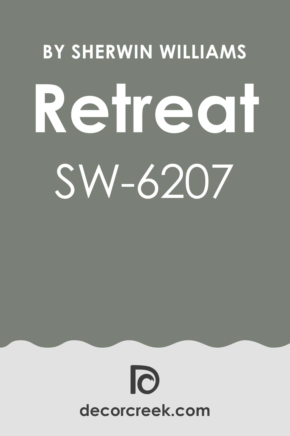
Retreat SW 6207
Retreat feels like a calm pause in a busy day. It’s a soft green-gray with a bit of warmth, perfect for rooms where focus matters. I use it for offices that need depth without darkness. It pairs well with white trim, natural wood, and black details. The tone adds just enough richness to keep the space interesting.
The key rule of this color for an office is to let natural light show its subtle warmth.
It looks beautiful in both modern and traditional settings. Retreat creates a steady, thoughtful feeling that keeps work flowing easily.
decorcreek.com
Oyster Bay SW 6206
Oyster Bay feels calm and collected—a blend of green, blue, and gray that fits beautifully in an office. I like using it when I want the room to feel thoughtful and relaxed but still professional. It pairs perfectly with soft whites, dark metal, or natural oak. The color changes through the day, from cool and airy in the morning to deeper and richer in the evening.
The key rule of this color for an office is to keep your palette simple so the shade can lead.
It’s a wonderful choice for people who work with ideas and need quiet surroundings. Oyster Bay makes an office feel centered, confident, and quietly stylish.
decorcreek.com
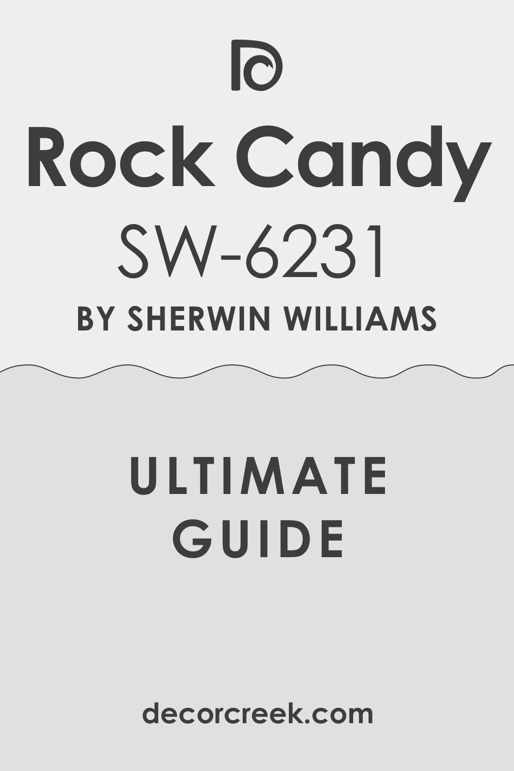
Rock Candy SW 6231
Rock Candy is light and breezy, like a touch of morning mist. It’s a very pale blue-gray that adds freshness without taking over the room. I use it often in offices that feel too small or dark—it instantly lifts the space. It pairs beautifully with white trim, silver accents, and pale wood tones. Under daylight, it feels clean and cool; under warm bulbs, it softens slightly.
The key rule of this color for an office is to add warm textures so it stays welcoming.
Rock Candy gives a soft clarity that helps ideas feel lighter and more focused. It’s simple, modern, and easy to love.
decorcreek.com
Silver Strand SW 7057
Silver Strand feels balanced and peaceful—a light gray with a gentle green tint. It’s perfect for offices where focus and comfort need to meet. I often use it in rooms with both natural and artificial light because it holds its color beautifully. It pairs well with white trim, beige upholstery, or black details. The tone feels modern but never cold.
The key rule of this color for an office is to use natural materials—wood, rattan, or linen—to give it warmth.
Silver Strand makes a workspace feel calm, organized, and softly stylish. It’s one of those shades that quietly improves the whole room.
via decorcreek.com
Repose Gray SW 7015
Repose Gray is one of the most reliable colors I’ve ever used. It’s a warm gray that feels natural and steady, perfect for home offices. The color sits beautifully between beige and gray, creating harmony in almost any light. I love how it pairs with white trim, soft black, or brass fixtures. It’s the kind of neutral that helps you focus without ever feeling dull.
The key rule of this color for an office is to choose warm lighting to bring out its cozy side. Repose Gray makes the room look polished but comfortable—a balance every workspace needs.
decorcreek.com
Dorian Gray SW 7017
Dorian Gray adds a soft, grounded tone to a workroom. It’s a medium gray with just enough warmth to stay welcoming. I often use it for offices that need depth and professionalism without heaviness. It pairs well with crisp white, dark wood, and muted gold accents. The color feels dependable and modern all at once.
The key rule of this color for an office is to balance it with light tones so it doesn’t overpower smaller rooms.
Dorian Gray keeps focus sharp and the setting calm. It’s a strong, confident shade that always looks refined.
via decorcreek.com
Urban Bronze SW 7048
Urban Bronze feels rich and bold—a deep brown-gray that adds quiet power to an office. I love using it on one accent wall or built-in shelving for dramatic depth. It pairs beautifully with soft white, tan, or wood finishes. The tone shifts with light—warm during the day, deep and moody at night.
The key rule of this color for an office is to use it with plenty of natural light or bright accents.
Urban Bronze gives structure and elegance, perfect for those who like their space to feel sophisticated and grounded. It turns a plain office into something truly memorable.
via decorcreek.com
Natural Linen SW 9109
Natural Linen feels soft, warm, and easy on the eyes. It’s a light beige with a touch of cream that makes an office feel inviting. I like how it blends with almost any decor style, from modern to rustic. It pairs beautifully with white trim, soft gray furniture, and woven textures.
The color glows under daylight and stays cozy under warm bulbs.
The key rule of this color for an office is to keep the palette neutral to let its warmth shine. Natural Linen helps the mind relax while keeping the space polished. It’s one of my favorite choices for calm, productive work settings.
via decorcreek.com
Greek Villa SW 7551
Greek Villa is soft and balanced—a creamy white that adds quiet brightness to any office. It’s perfect for spaces that need light without the coldness of pure white. I love how it works with both wood tones and modern black accents. The color feels timeless and steady, perfect for long work hours.
The key rule of this color for an office is to add natural texture—woven baskets, linen, or rattan—to keep it grounded.
Greek Villa keeps the mood fresh and inviting all day. It’s a clean, classic backdrop that fits any style of workspace.
via decorcreek.com
Alabaster SW 7008
Alabaster brings gentle warmth and soft light into an office. It’s one of those whites that feels friendly and natural, never sterile. I use it in rooms where focus and comfort need to meet. It pairs beautifully with oak furniture, black fixtures, and warm textiles. Under sunlight, it glows softly; under lamps, it feels creamy and restful.
The key rule of this color for an office is to keep it paired with simple, natural tones so it stays relaxed.
Alabaster creates a balanced background that helps you think clearly and feel at ease. It’s a quiet finish for days full of ideas.
via decorcreek.comvia decorcreek.com
47 Home Office Paint Colors
Driftwood SW 9643
Driftwood feels soft and grounded, perfect for a home office that needs warmth without heaviness. It’s a mid-tone gray-beige that gives quiet depth to the room. I love pairing it with white trim and black metal fixtures for balance. The tone feels natural, like smooth sand after rain.
It’s steady and dependable, helping focus last longer through the day. The key rule of this color for a home office is to use plenty of light—sunlight or soft bulbs—to highlight its texture.
Driftwood looks beautiful with wood desks and woven rugs. It creates a space that feels stable and collected. It’s a wonderful shade for anyone who wants focus with a gentle mood.
Riverway SW 6222
Riverway feels rich and thoughtful, like a cool stream under shade. It’s a deep blue-green that adds quiet power to a home office. I often use it for accent walls or rooms where creativity meets structure. It pairs perfectly with warm whites, tan, or brass accents. When light hits it, you can see the mix of blue and green dance across the surface.
The key rule of this color for a home office is to balance it with light decor so it stays open. Riverway helps the mind stay calm but alert.
It’s perfect for people who love color that feels both classic and modern.
via decorcreek.com
Seaworthy SW 7620
Seaworthy feels bold and polished, like navy velvet. It’s a deep blue that adds a sense of sophistication to any workspace. I like it for rooms where focus and confidence matter most. The color pairs beautifully with crisp white trim, black details, and warm wood. It looks dramatic under soft lighting but never harsh.
The key rule of this color for a home office is to use it with balance—on one or two walls to add structure.
Seaworthy makes a strong statement while keeping the atmosphere calm and smart. It’s a color that makes every task feel important.
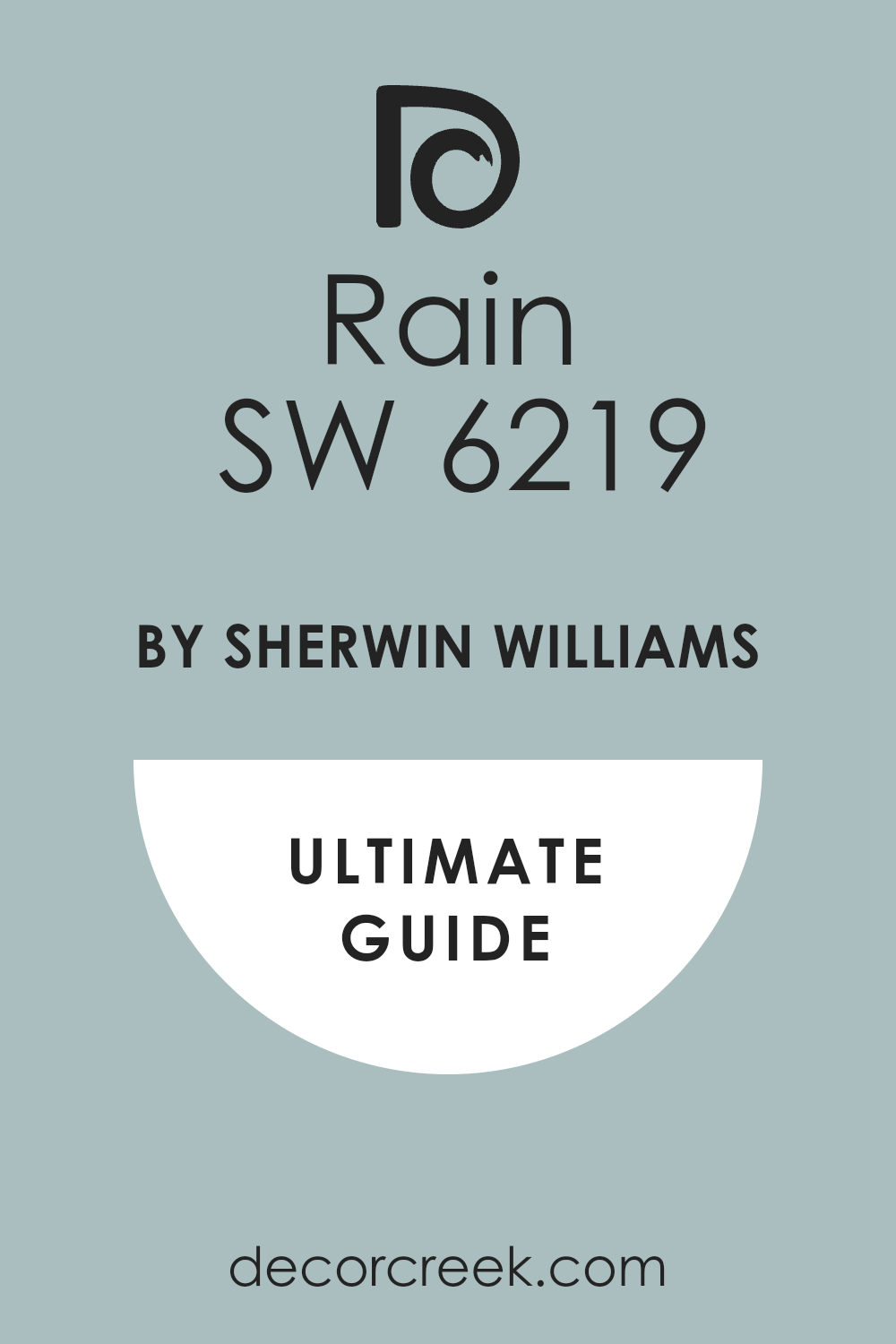
Rain SW 6219
Rain has that perfect soft blue tone that feels refreshing and light. I use it in home offices that need brightness and ease. It pairs beautifully with white trim, silver accents, and pale wood. The color brings a sense of airiness that keeps work feeling clear. It never feels icy or dull, even in low light.
The key rule of this color for a home office is to keep your furniture simple and natural.
Rain helps balance technology with comfort. It’s a shade that makes long workdays feel lighter and more enjoyable.
via decorcreek.com
Moody Blue SW 6221
Moody Blue feels like ocean air—cool, creative, and full of calm energy. It’s a blue that carries depth without darkness, ideal for home offices that need quiet inspiration. It pairs beautifully with white trim and soft beige fabrics. I love how it shifts in the light, sometimes gray-blue, sometimes soft teal.
The key rule of this color for a home office is to add warm accents like wood or brass for balance.
Moody Blue keeps thoughts clear and the atmosphere relaxed. It’s a tone that brings comfort and creativity into perfect rhythm.
decorcreek.com
Distance SW 6243
Distance brings quiet power into a workspace. It’s a deep gray-blue that feels mature and collected. I like using it for accent walls behind desks or bookshelves. It pairs perfectly with crisp whites and natural textures. The tone gives the room depth, making it feel focused and calm.
The key rule of this color for a home office is to keep furniture light or neutral so the space doesn’t close in.
Distance works especially well with warm lighting, which highlights its blue undertones. It gives a thoughtful and composed feeling that lasts all day.
via decorcreek.com
Denim SW 6523
Denim feels classic and steady, just like your favorite jeans. It’s a rich mid-blue that adds quiet confidence to a home office. I love pairing it with bright white trim and black metal accents. It brings a bit of color without stealing focus. The key rule of this color for a home office is to keep decor minimal—simple shapes and soft textures.
Denim works beautifully in natural light, showing hints of gray beneath the blue.
It’s great for people who want an office that feels relaxed but professional. Denim makes any workday a little easier.
decorcreek.com
Indigo Batik SW 7602
Indigo Batik feels artistic and bold without being loud. It’s a dark navy with warmth underneath, perfect for creative home offices. I often use it behind shelving or on walls near windows. It pairs beautifully with warm whites, brass accents, and deep wood tones. Under daylight, it feels crisp; under lamplight, it softens like fabric.
The key rule of this color for a home office is to keep your lighting even—it makes the tone glow beautifully.
Indigo Batik gives your workspace personality and depth while keeping it professional. It’s a shade that makes concentration feel natural.
decorcreek.com
Naval SW 6244
Naval is steady and classic—a deep navy that feels strong but never cold. I like using it for offices that need elegance and focus. It pairs beautifully with crisp whites, camel leather, and warm wood. The color adds richness without cluttering the eye.
The key rule of this color for a home office is to use plenty of light to balance its depth.
Naval looks best with simple, clean decor and natural textures. It’s timeless, smart, and perfectly suited for long working hours. Naval turns every desk into a place that feels confident and clear.
decorcreek.com
Smoky Azurite SW 9148
Smoky Azurite feels mysterious and refined, perfect for those who love moody tones. It’s a deep blue with a gray base that adds a touch of drama to a home office. I use it on accent walls to make a space feel grounded and stylish. It pairs beautifully with cream trim and brass or bronze lighting.
The color changes subtly through the day, showing layers of blue and gray.
The key rule of this color for a home office is to keep other tones soft and natural. Smoky Azurite brings sophistication and a focused atmosphere. It’s ideal for quiet, creative work that needs concentration.
decorcreek.com
Dustblu SW 9161
Dustblu feels like a gentle fog over the sea—soft, cool, and thoughtful. It’s a muted blue-gray that gives a home office calm strength. I love using it in spaces where focus and comfort need to meet. It pairs beautifully with white trim, light wood, and black hardware.
The tone never feels cold; instead, it creates a quiet background that supports deep work.
Under sunlight, it feels airy and light; under warm lamps, it deepens slightly and feels cozy. The key rule of this color for a home office is to keep fabrics natural—linen, cotton, or wool.
Dustblu helps you breathe easier and stay steady through long days. It’s a quiet achiever among colors.
via decorcreek.com
Dried Thyme SW 6186
Dried Thyme brings earthy warmth with a soft, green-gray base. It’s one of my favorite shades for creating a grounded, nature-inspired workspace. The tone feels calm but focused, perfect for home offices that need balance. I like pairing it with white walls, woven baskets, and light oak furniture. It changes gently in the light, sometimes appearing more olive, sometimes more gray.
The key rule of this color for a home office is to mix it with warm lighting to highlight its natural beauty.
Dried Thyme feels like a breath of fresh air and keeps you centered through the busiest days. It’s soft, natural, and always dependable.
decorcreek.com
Sage SW 2860
Sage has a gentle, earthy charm that feels timeless and steady. It’s a muted green that instantly brings comfort and focus into a room. I love using it in home offices where warmth and clarity matter equally. It pairs beautifully with beige tones, white trim, and wood finishes. The color has a way of making everything feel balanced and intentional.
The key rule of this color for a home office is to keep accessories simple—let the color do the quiet work.
Sage feels especially lovely in morning light, bringing a soft, optimistic glow.
It’s perfect for spaces that need both peace and purpose.
via decorcreek.com
Clary Sage SW 6178
Clary Sage feels natural and soothing, like fresh herbs in sunlight. It’s a soft green-gray that works wonderfully for home offices where focus and calm are key. I love pairing it with white trim, light rattan, or soft beige accents. The color’s earthy tone feels stable, helping you stay centered throughout the day.
The key rule of this color for a home office is to use warm light to keep it cozy and organic.
Clary Sage looks especially beautiful with woven textures and greenery nearby.
It’s a welcoming shade that keeps creativity alive without noise.
decorcreek.com
Escape Gray SW 6185
Escape Gray has a grounded beauty that feels both professional and relaxed. It’s a greenish-gray that fits perfectly in modern home offices. I often use it with white trim and dark wood furniture for contrast. The tone feels steady and helps organize the room visually. It never feels harsh or flat; instead, it carries a natural depth that grows through the day.
The key rule of this color for a home office is to pair it with clean lines and uncluttered decor. Escape Gray turns a workspace into a quiet, productive setting that feels balanced.
It’s a shade that helps the mind rest and focus at once.
via decorcreek.com
Oyster Bar SW 7565
Oyster Bar feels warm and elegant—a creamy beige with a soft blush undertone. It’s perfect for home offices that need warmth without color overload. I like pairing it with white trim and brass or tan accents. Under daylight, it feels fresh and open; under lamplight, it glows gently.
The key rule of this color for a home office is to keep your lighting warm to enhance its softness.
Oyster Bar makes work feel cozy and inviting, turning long hours into comfortable ones. It’s a beautiful choice for small or medium-sized rooms that need subtle charm.
via decorcreek.com
Natural Tan SW 7567
Natural Tan has that steady, earthy warmth that makes a home office feel grounded. It’s a balanced beige that stays calm under any light. I love it because it pairs well with almost every accent—black, white, or green. It’s a neutral you can build around endlessly. The key rule of this color for a home office is to use textures like linen, rattan, or jute to keep it interesting.
Natural Tan gives a relaxed structure to your workspace.
It’s dependable, flexible, and ideal for rooms where you need both comfort and focus.
via decorcreek.com
Urban Putty SW 7532
Urban Putty feels like modern simplicity done right. It’s a light tan with warm undertones that gives a clean, easy backdrop for a home office. I use it when I want the space to feel natural and uncluttered. It pairs beautifully with soft white trim and black or gold details. The color brings warmth without taking attention away from your work.
The key rule of this color for a home office is to keep furniture simple and modern.
Urban Putty works with every season, staying inviting and balanced. It’s a shade that helps you stay focused and feel at ease.
Canvas Tan SW 7531
Canvas Tan feels natural and welcoming—a perfect middle ground for any home office. It’s a creamy beige that brings warmth and light without too much color. I like using it for walls that need softness and neutrality. It pairs beautifully with white trim, light wood, or bronze lighting.
The tone stays even throughout the day, creating a steady mood for work. The key rule of this color for a home office is to keep it surrounded by clean, bright finishes.
Canvas Tan brings a quiet charm to your workspace, making every day feel balanced and calm.
via decorcreek.com
Softened Green SW 6177
Softened Green feels gentle and fresh, like leaves touched by sunlight. It’s a muted green-gray that instantly brings balance to a home office. I love pairing it with natural wood, beige upholstery, and white trim. The color keeps the room light and welcoming while adding a hint of nature.
It looks especially beautiful under warm bulbs, where the green feels cozy and refined.
The key rule of this color for a home office is to add texture—woven rugs or rattan pieces make it complete. Softened Green turns work into something that feels grounded and peaceful.
decorcreek.com
Rainwashed SW 6211
Rainwashed feels soft, airy, and balanced—the kind of color that keeps your home office feeling clear and refreshed. It’s a light mix of green and blue that adds brightness without being bold. I love using it when a room needs life but also peace. It pairs perfectly with white trim, light wood, and woven textures.
The color changes beautifully throughout the day, staying gentle but never dull.
The key rule of this color for a home office is to keep accents warm so the tone doesn’t feel too cool. Rainwashed helps you stay productive and relaxed at the same time.
It’s a shade that makes every day a little smoother and lighter.
via decorcreek.com
Quietude SW 6212
Quietude feels like calm focus in color form. It’s a blue-green with a soft gray base, ideal for a home office that needs balance. I often use it for people who want an atmosphere that helps them think clearly. It pairs beautifully with white trim, light tan wood, and brass or rattan accents. The color feels fresh in the morning and cozy by evening.
The key rule of this color for a home office is to avoid harsh contrasts—stick to soft neutrals that let it shine.
Quietude gives a room both comfort and purpose. It’s perfect for steady workdays and quiet creativity.
via decorcreek.com
Aloof Gray SW 6197
Aloof Gray has a gentle charm that brings structure without heaviness. It’s a cool gray with a green undertone, which gives it a natural, grounded feel. I love using it for home offices that need calm energy with a bit of color depth. It pairs beautifully with white trim, black hardware, and natural fabrics.
Under different lighting, it shifts slightly between gray and green, keeping the space interesting.
The key rule of this color for a home office is to add warmth through lighting or soft textures. Aloof Gray keeps your workspace steady and easy to live with.
It’s quietly confident, just like good design should be.
via decorcreek.com
Sedate Gray SW 6169
Sedate Gray feels dependable and calm, perfect for workspaces that need peace. It’s a soft, earthy gray with green undertones that never feels flat. I use it when I want the room to feel professional but welcoming. It pairs well with creamy whites, soft browns, and natural textures.
The color adds warmth without stealing focus.
The key rule of this color for a home office is to layer materials—linen, wood, and rattan look beautiful against it.
Sedate Gray creates a quiet balance that helps long work hours feel easier. It’s a shade that encourages focus without pressure.
Link Gray SW 6200
Link Gray feels modern and strong—a true working color. It’s a medium gray with green and blue hints, perfect for adding depth to a home office. I often use it behind desks or shelving for a subtle accent wall. It pairs beautifully with warm white trim and brushed metal details. The color gives the room a grounded tone that promotes focus.
The key rule of this color for a home office is to keep surrounding shades light so it doesn’t close the room.
Link Gray feels confident, timeless, and ready for serious work. It’s a designer’s secret for adding quiet sophistication.
Ellie Gray SW 7650
Ellie Gray feels polished and modern—a clean mid-gray that makes a home office look refined. It’s soft enough for daily use but has enough depth to feel professional. I love pairing it with white, black, and tan accents for balance. The tone stays true under most lighting, never shifting too blue or too warm.
The key rule of this color for a home office is to use clear, warm light to highlight its smooth tone.
Ellie Gray helps organize the room visually, creating a background that supports focus. It’s simple, elegant, and endlessly practical.
via decorcreek.com
Grizzle Gray SW 7068
Grizzle Gray brings depth and character to a home office. It’s a dark gray with a hint of green, perfect for rooms that need richness and confidence. I often use it on accent walls or cabinetry to ground the design. It pairs beautifully with white, camel leather, or light wood. The color feels serious but not cold—ideal for people who like a bit of drama in their workspace.
The key rule of this color for a home office is to keep lighting warm to reveal its undertones.
Grizzle Gray adds strength and elegance to every detail. It’s bold in the best, most balanced way.
via decorcreek.com
Thunderous SW 6201
Thunderous feels bold yet calm, like a storm rolling in the distance. It’s a deep gray-green that adds mood and focus to a home office. I love it for walls behind desks or built-in shelving. It pairs perfectly with light woods, cream accents, and brass hardware. The tone looks rich and thoughtful under both natural and warm light.
The key rule of this color for a home office is to use it in rooms with some brightness—it thrives with contrast.
Thunderous gives a sense of power and concentration, helping you feel grounded during long days.
Peppercorn SW 7674
Peppercorn feels rich, modern, and endlessly stylish. It’s a dark gray that turns any home office into a focused retreat. I use it on accent walls or cabinetry when I want a dramatic yet professional tone. It pairs beautifully with soft white, tan, and gold finishes. The key rule of this color for a home office is to keep the rest of the decor minimal.
Peppercorn absorbs just enough light to feel smooth and quiet.
It’s a perfect choice for those who want their workspace to feel refined and strong without distraction.
via decorcreek.com
Urbane Bronze SW 7048
Urbane Bronze feels warm, grounded, and full of quiet strength. It’s a mix of gray and brown that brings character to any office. I love using it for people who want a modern yet welcoming look. It pairs beautifully with cream walls, leather chairs, and wood details. The tone feels cozy but powerful, especially under soft light.
The key rule of this color for a home office is to use it on one main wall or piece of built-in furniture.
Urbane Bronze gives an office personality and structure. It’s one of those colors that always looks intentional and composed.
via decorcreek.com
Black Fox SW 7020
Black Fox brings warmth and confidence to a home office. It’s a dark brown-gray that feels rich but never too heavy. I love using it for accent walls, desks, or shelving when I want a moody yet inviting tone. It pairs beautifully with creamy whites, light wood, and brass details. The color has just enough softness to feel comforting during long work hours.
The key rule of this color for a home office is to balance it with plenty of light or pale tones.
Black Fox makes a room feel collected, modern, and full of quiet focus. It’s perfect for people who love strong color that still feels human.
via decorcreek.com
Tricorn Black SW 6258
Tricorn Black feels bold and timeless—a true, neutral black that defines a home office with clarity. I use it sparingly, often on doors, shelving, or a single wall for impact. It pairs beautifully with crisp whites, wood tones, and metallic accents. This shade adds modern edge and strong visual balance to any design.
The key rule of this color for a home office is to pair it with warm light and soft textures to avoid sharpness.
Tricorn Black gives a feeling of precision and confidence. It’s a designer favorite for offices that need focus and contrast without fuss.
via decorcreek.com
Pewter Green SW 6208
Pewter Green feels natural and strong—a dark, mossy green that helps you feel centered. It’s a perfect shade for a home office that needs calm energy and depth. I like pairing it with warm white trim, brass accents, and tan leather. The tone looks rich during the day and even deeper at night.
The key rule of this color for a home office is to mix it with light flooring or neutral furniture.
Pewter Green grounds the mind, helping you stay steady through long hours. It’s bold, elegant, and timeless in every way.
decorcreek.com
Night Owl SW 7061
Night Owl feels moody, modern, and quietly sophisticated. It’s a dark gray-green that brings instant focus to a workspace. I love using it in smaller offices where a touch of drama feels right. It pairs beautifully with white trim, dark wood, and bronze accents.
The tone shifts slightly throughout the day, keeping the space interesting and layered.
The key rule of this color for a home office is to pair it with warm bulbs to show its green undertones.
Night Owl adds depth and style while keeping the mood calm and productive. It’s perfect for long, creative days.
via decorcreek.com
Rosemary SW 6187
Rosemary feels natural and thoughtful—a soft green-gray that’s full of quiet strength. It’s one of my favorite shades for workspaces with wood furniture and warm light. The tone feels earthy and balanced, promoting focus and comfort together. It pairs beautifully with white, beige, and light oak finishes.
Under daylight, Rosemary feels fresh; under lamps, it becomes cozy and grounded.
The key rule of this color for a home office is to keep patterns minimal—it shines best with simple lines. Rosemary helps the mind settle and the room feel balanced. It’s a steady color that never loses its grace.
decorcreek.com
Warm Stone SW 7032
Warm Stone feels like the name suggests—steady and reliable. It’s a warm gray with a touch of brown that adds stability to a home office. I like using it for walls or built-in furniture where I want quiet strength. It pairs beautifully with cream, soft black, and tan accents.
The color feels elegant but easy to live with.
The key rule of this color for a home office is to combine it with natural materials—wood, linen, or jute—to make it inviting.
Warm Stone gives a room a sense of comfort and direction, perfect for productive days.
via decorcreek.com
Antique White SW 6119
Antique White feels soft and cozy, a warm creamy neutral that keeps your home office glowing. It’s perfect for spaces that don’t get much natural light. I love pairing it with brass lighting, dark wood, and soft gray accents. The tone stays gentle throughout the day, always warm but never too yellow.
The key rule of this color for a home office is to add contrast with decor—like black frames or a dark rug.
Antique White creates a welcoming backdrop that helps work feel relaxed and natural. It’s perfect for people who love warmth and ease in their space.
via decorcreek.com
Shoji White SW 7042
Shoji White feels light and refined—a warm off-white that gives just enough softness to a workspace. It’s bright enough to open a room but gentle enough to keep it calm. I love using it in small home offices where clean energy matters most. It pairs beautifully with black fixtures, wood shelves, or tan furniture.
The key rule of this color for a home office is to layer materials so it doesn’t feel too flat.
Shoji White brings subtle warmth and keeps focus on what matters. It’s a timeless, flexible shade that never fails to please.
via decorcreek.com
Navajo White SW 6126
Navajo White brings sunlight into any room. It’s a creamy beige with a golden glow that keeps your home office warm and friendly. I use it when I want a bright yet cozy tone that supports productivity. It pairs beautifully with white trim, soft brown wood, and light gray decor. Under warm light, it feels like a gentle hug for the room.
The key rule of this color for a home office is to avoid pairing it with overly cool tones—stick with neutrals that share its warmth.
Navajo White adds optimism to your day and makes the office feel like home.
via decorcreek.com
Eider White SW 7014
Eider White feels clean and modern with a soft gray undertone. It’s not a stark white but a quiet neutral that keeps a workspace feeling open and thoughtful. I often use it for offices with natural light—it glows softly without glare. It pairs beautifully with black metal, light oak, and linen fabrics.
The color feels adaptable, fitting both classic and modern designs.
The key rule of this color for a home office is to let it breathe—use minimal decor so the tone stays crisp. Eider White helps you think clearly and keeps the room balanced through long hours.
via decorcreek.com
Crushed Ice SW 7647
Crushed Ice feels fresh and smooth, like cool air on a warm day. It’s a light gray with soft warmth underneath, perfect for bright home offices. I love using it when I want the room to feel modern and organized without being cold. It pairs beautifully with white trim, black accents, or light wood tones.
The key rule of this color for a home office is to keep lighting natural—it helps the shade stay balanced.
Crushed Ice reflects daylight beautifully, keeping the room open and airy. It’s one of those dependable colors that quietly supports productivity and calm focus.
via decorcreek.com
Modern Gray SW 7632
Modern Gray has a quiet elegance that always feels fresh. It’s a warm greige that blends perfectly into any home office design. I love using it for spaces that need comfort and clarity together. It pairs beautifully with white trim, gold accents, and light wood furniture. Under natural light, it glows softly; under warm bulbs, it becomes cozy and welcoming.
The key rule of this color for a home office is to avoid clutter—let its simplicity shine.
Modern Gray helps balance creative energy with steady calm. It’s one of my favorite backgrounds for clear, thoughtful work.
via decorcreek.com
Mindful Gray SW 7016
Mindful Gray feels like calm focus in color form. It’s a warm mid-gray that gives your home office depth without heaviness. I use it when I want walls to feel grounded but soft. It pairs beautifully with crisp white trim, tan leather, or brass hardware. The tone adapts easily to both daylight and lamplight, staying smooth and balanced.
The key rule of this color for a home office is to mix it with warm materials—linen, oak, or wool.
Mindful Gray supports long concentration while keeping the room cozy. It’s dependable, stylish, and easy to live with.
via decorcreek.com
Dovetail SW 7018
Dovetail brings richness and poise to a home office. It’s a medium-to-dark gray with brown undertones that feels strong but approachable. I love using it for accent walls, built-ins, or furniture. It pairs beautifully with off-white trim, black details, and warm metallics. The tone carries quiet confidence that helps any room feel composed.
The key rule of this color for a home office is to balance it with light flooring or plenty of sunlight.
Dovetail adds a tailored look to your workspace, perfect for structured, focused energy. It’s sophisticated without ever feeling heavy.
via decorcreek.com
Virtual Taupe SW 7039
Virtual Taupe feels cozy and mature—a warm brown-gray that makes a home office feel secure and welcoming. I use it in rooms where I want focus and comfort to meet. It pairs beautifully with soft whites, cream upholstery, and brass accents. The color’s earthy tone looks elegant in both morning and evening light.
The key rule of this color for a home office is to add light elements around it—curtains, art, or furniture—to keep the space balanced.
Virtual Taupe grounds the mind and brings quiet warmth to long workdays. It’s a trusted choice for refined simplicity.
via decorcreek.com
Foothills SW 7514
Foothills feels like the strength of nature captured indoors. It’s a rich brown-gray that adds warmth and character to a home office. I love using it with warm whites, natural fabrics, and dark wood desks. The tone has depth but still feels easy to work with.
The key rule of this color for a home office is to use it as an accent rather than full coverage—it shines on one main wall or cabinetry.
Foothills gives your workspace a strong, collected feeling that encourages steady focus. It’s earthy, modern, and quietly elegant.
via decorcreek.com
Bungalow Beige SW 7511
Bungalow Beige feels cozy, balanced, and full of light. It’s a soft tan that warms up a home office without distraction. I like pairing it with white trim, black metal, and soft woven textures. The color feels natural and grounded, keeping your focus steady through the day. It’s warm enough to feel welcoming yet neutral enough for a professional look
. The key rule of this color for a home office is to use it with plenty of daylight or warm lighting.
Bungalow Beige adds comfort and softness to any design. It’s a gentle classic that always feels right.
via decorcreek.com
Balanced Beige SW 7037
Balanced Beige feels exactly as its name suggests—perfectly even, calm, and steady. It’s a warm greige that adapts beautifully to any office size or light level. I often use it in rooms that need both brightness and warmth. It pairs perfectly with white trim, wood desks, and natural fabrics.
The key rule of this color for a home office is to keep decor clean and light so the shade feels fresh.
Balanced Beige creates harmony that lasts all day long. It’s one of those dependable tones that makes work feel comfortable and focused.
via decorcreek.comvia decorcreek.com
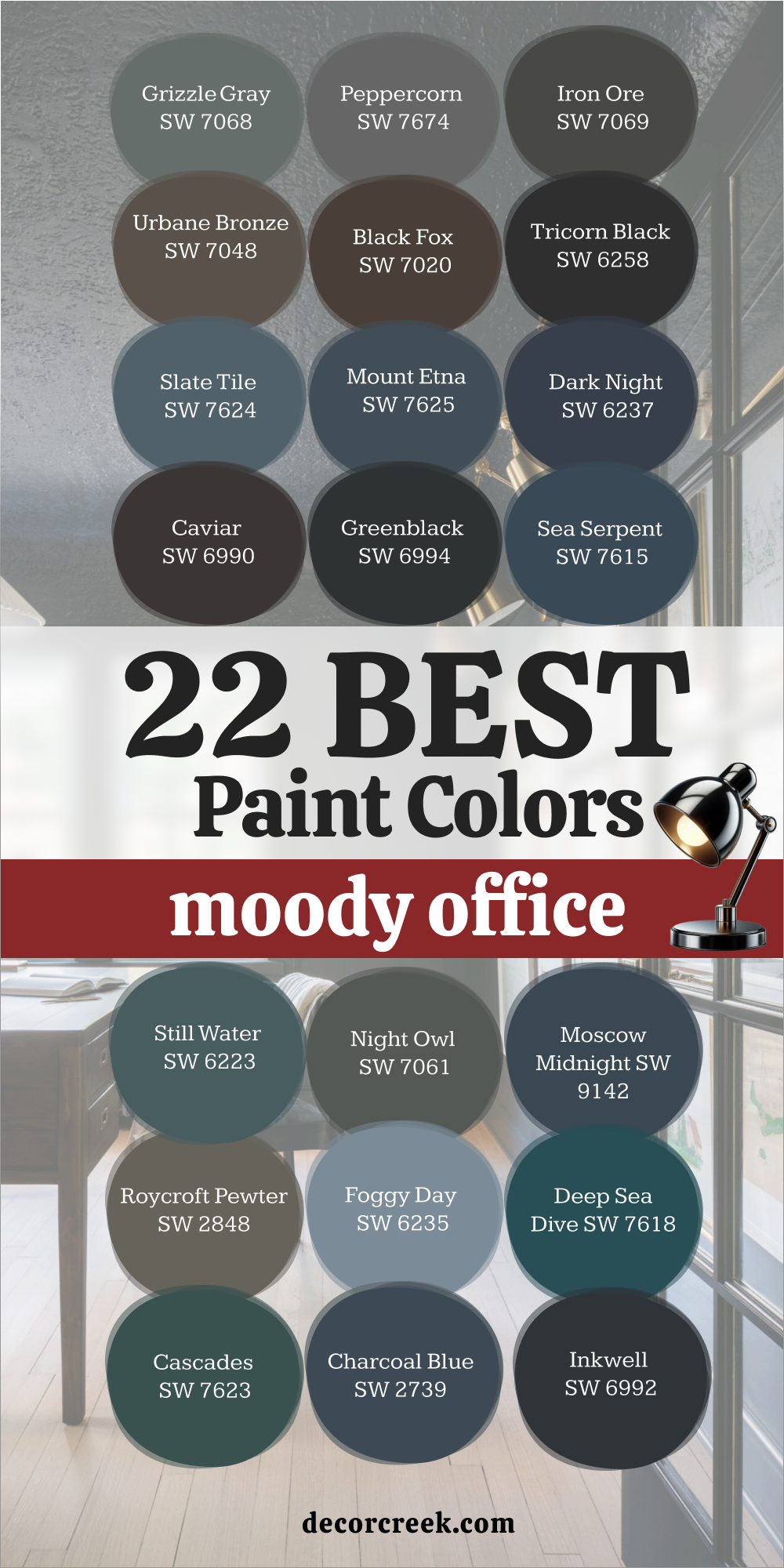
22 Moody Office Paint Colors
Grizzle Gray SW 7068
Grizzle Gray feels deep and confident, the kind of color that instantly adds character to a moody office. It’s a dark gray with green undertones that bring quiet sophistication. I use it for accent walls or entire rooms that need focus and drama. It pairs beautifully with brass lighting, creamy trim, and dark wood.
The tone feels rich during the day and smooth at night. The key rule of this color for an office is to balance it with soft lighting so it stays warm, not heavy.
Grizzle Gray gives structure and calm to spaces where serious thinking happens. It’s bold but never overbearing.
via decorcreek.com
Peppercorn SW 7674
Peppercorn brings elegance and depth with every brushstroke. It’s a dark gray that adds modern confidence to a workspace. I love pairing it with white trim, tan leather, or brushed gold accents. The tone feels cool and sleek but still grounded. Under daylight, it reveals soft shadows that make the walls feel layered.
The key rule of this color for a moody office is to use minimal clutter so it remains clean and powerful.
Peppercorn makes the perfect background for artwork or statement furniture. It gives any office a steady, composed presence.
via decorcreek.com
Iron Ore SW 7069
Iron Ore feels rich, dark, and beautifully dramatic. It’s a near-black gray that turns any office into a space full of focus and style. I use it on walls behind desks or shelves to create a striking backdrop. It pairs perfectly with crisp white trim and warm brass fixtures. The tone feels sophisticated, never gloomy.
The key rule of this color for a moody office is to include layers of light—table lamps, sconces, or sunlight—to show its depth.
Iron Ore makes an office feel sharp, confident, and modern.
via decorcreek.com
Urbane Bronze SW 7048
Urbane Bronze feels bold but warm, wrapping a room in quiet strength. It’s a brown-gray that adds a natural richness to moody workspaces. I love pairing it with off-white walls, wood tones, and soft textures. The color feels elegant and grounded, especially under warm light.
The key rule of this color for a moody office is to use contrast—light fabrics or cream accessories—to highlight its depth.
Urbane Bronze brings professionalism and style together in one beautiful tone. It’s perfect for a modern executive feel at home.
via decorcreek.com
Black Fox SW 7020
Black Fox feels deep and inviting—a perfect mix of brown and charcoal. It creates a moody atmosphere that feels strong but never cold. I love using it for accent walls or cabinetry where I want quiet drama. It pairs beautifully with beige, brass, or light oak. The color’s warmth keeps it approachable even in small offices.
The key rule of this color for a moody office is to mix it with natural light or reflective finishes. Black Fox makes work feel grounded and intentional. It’s rich, warm, and quietly sophisticated.
via decorcreek.com
Tricorn Black SW 6258
Tricorn Black is bold perfection. It’s a pure, neutral black that instantly brings order and confidence to a workspace. I use it when I want clean contrast and striking definition. It pairs beautifully with white trim, warm wood, or brass fixtures. The tone stays consistent under any light, which makes it a dependable choice.
The key rule of this color for a moody office is to balance it with texture—linen drapes, matte finishes, or woven baskets.
Tricorn Black gives clarity and strength, perfect for focused minds. It’s sharp, classic, and endlessly stylish.
via decorcreek.com
Slate Tile SW 7624
Slate Tile feels cool, layered, and effortlessly intelligent—a color that carries mood without heaviness. It’s a rich blue-gray that instantly gives an office both personality and structure. I love using it in creative spaces where imagination and focus need to meet in harmony. It pairs beautifully with warm lighting, creamy whites, and soft brown leather for a perfect mix of comfort and sophistication.
The tone shifts gently throughout the day—soft and calm in the morning, deeper and more elegant at night. It reminds me of smooth river stones, steady and grounding.
The key rule of this color for a moody office is to pair it with warm finishes, such as oak, brass, or woven fabrics, to soften its cool side. Slate Tile helps you think clearly and stay relaxed during long hours of work. It gives a space rhythm and balance, making every corner feel intentional. This shade doesn’t shout—it quietly works hard, creating depth, purpose, and lasting focus.
decorcreek.com
Mount Etna SW 7625
Mount Etna feels mysterious, deep, and powerful—a dark blue-gray that wraps a workspace like a calm evening sky. I use it in offices that need rich personality but also focus. It pairs beautifully with warm whites, dark walnut desks, and soft brass lighting. The tone feels quietly dramatic but never overpowering, giving structure and mood at once.
I love how it changes through the day—cool and sharp in daylight, soft and velvety by lamplight. It’s perfect for people who need a color that inspires without distraction.
The key rule of this color for a moody office is to layer lighting, using warm and dimmable tones to draw out its depth. Add texture with linen, wood, or matte paint finishes to make it come alive.
Mount Etna creates a sense of grounded confidence. It’s modern, refined, and steady—a true designer’s favorite for thoughtful work environments.
via decorcreek.com
Dark Night SW 6237
Dark Night feels like strength and mystery in perfect balance. It’s a dark navy with green undertones that gives a moody office both energy and depth. I love using it when I want a room to feel powerful but not intimidating. It pairs beautifully with brushed gold, walnut, and soft cream details. The color glows under warm light and deepens beautifully in shadow.
The key rule of this color for a moody office is to surround it with texture—woven fabrics, warm woods, or leather bring it to life.
Dark Night works beautifully on all four walls, turning a simple office into a refined, creative retreat. It’s bold but soothing, perfect for people who need to feel focused and inspired at the same time. There’s something about it that feels timeless yet modern—like an elegant suit you never tire of wearing.
decorcreek.com
Caviar SW 6990
via decorcreek.com
feels indulgent, rich, and endlessly stylish. It’s a deep black with a touch of brown that softens its edge and brings warmth to a moody office. I love using it for cabinetry, trim, or an accent wall that deserves attention without noise. It pairs beautifully with warm neutrals, soft cream walls, or gold finishes.
The tone feels elegant under lamplight—never harsh, always smooth. It brings a sense of quiet confidence to a workspace. The key rule of this color for a moody office is to let it breathe—keep decor minimal so its texture and sheen can shine.
Caviar adds instant luxury without effort, making every detail feel intentional. It’s refined, balanced, and full of quiet power. When paired with soft lighting and natural materials, it gives the room a collected, professional grace that lingers.
Greenblack SW 6994
Greenblack feels bold yet alive—a dark black with green undertones that adds energy instead of weight. It’s the perfect choice for a moody office that still needs freshness and movement. I love pairing it with warm leather, brass fixtures, and creamy white trim. The color changes beautifully in different lighting—rich forest one moment, sophisticated charcoal the next.
It feels both strong and intelligent, making any workspace look grounded and purposeful.
The key rule of this color for an office is to layer light—add table lamps, sconces, or under-shelf lighting to bring out its depth.
Greenblack looks incredible with natural materials like wood or stone, giving the room an organic yet modern mood.
It’s dramatic but comfortable, structured but creative—a perfect companion for long, productive hours.
via decorcreek.com
Sea Serpent SW 7615
Sea Serpent feels like the calm strength of ocean depths—dark, rich, and quietly powerful. It’s a mix of navy and charcoal that adds elegance without heaviness. I love using it when I want a workspace to feel grounded but full of character. It pairs beautifully with white trim, soft gold accents, and beige or tan furniture.
The tone deepens with shadows, making the room feel layered and rich. The key rule of this color for a moody office is to let it stand alone—keep surrounding colors soft so it can shine.
Sea Serpent adds mood without pressure, turning long work hours into calm focus. It’s professional yet creative, steady yet inspiring. When paired with warm lighting, it feels like the room is gently wrapped in quiet thought.
via decorcreek.com
Still Water SW 6223
Still Water feels deep and grounded—a dark teal that captures balance perfectly. It’s one of those shades that carries both calm and focus, perfect for thoughtful work. I love pairing it with white trim, warm wood tones, and antique brass fixtures. Under sunlight, it shows a soft blue-green glow; under lamplight, it deepens into luxurious teal.
The key rule of this color for a moody office is to contrast it with lighter pieces—pale desks, white shelves, or natural fabrics—to keep balance.
Still Water gives a workspace quiet confidence, the kind that encourages long concentration without fatigue. It’s rich but never overpowering.
This color adds grace and grounded elegance, making every detail of the office feel intentional.
decorcreek.com
Night Owl SW 7061
Night Owl feels like a thoughtful pause—the kind of color that invites reflection and focus. It’s a blend of deep gray and green that creates quiet drama without darkness. I love using it in small offices or reading corners to add mood and intimacy. It pairs beautifully with soft wood tones, linen upholstery, and warm brass accents.
Under warm lighting, it reveals soft olive undertones that feel natural and calm.
The key rule of this color for a moody office is to keep light low and cozy—lamps and sconces bring out its richness.
Night Owl creates a space where ideas can breathe. It’s sophisticated, balanced, and endlessly intriguing.
via decorcreek.com
Moscow Midnight SW 9142
Moscow Midnight feels bold, striking, and artistic. It’s a deep navy with a hint of teal that brings modern luxury to a moody workspace. I love using it behind shelves or on full walls where I want impact with sophistication. It pairs beautifully with white trim, brass lighting, and black fixtures.
The color’s energy feels intelligent—powerful but never loud. It works best when surrounded by minimal decor so its tone can shine.
The key rule of this color for a moody office is to let light touch it gently; too much brightness can flatten its depth. Moscow Midnight gives the room presence and quiet drama.
It feels confident, creative, and endlessly inspiring—a perfect shade for those who think deeply and design boldly.
Roycroft Pewter SW 2848
Roycroft Pewter feels vintage yet timeless, full of character and quiet strength. It’s a dark mix of gray, green, and brown that adds grounded charm to a moody office. I love pairing it with dark wood furniture, warm leather, and cream accents. The color feels steady, like an old library wall that’s seen years of work and thought.
The key rule of this color for a moody office is to keep light warm and soft—cool light can dull its richness.
Roycroft Pewter creates a collected, confident mood that makes you want to stay and think. It’s earthy, classic, and full of quiet dignity.
It reminds me that good design never rushes—it simply feels right.
via decorcreek.com
Foggy Day SW 6235
Foggy Day feels like a long exhale after a busy morning—a medium blue-gray that carries calm without dullness. It’s a color that helps ideas settle and grow quietly. I love using it in offices where people need to think deeply or write in peace. It pairs beautifully with white trim, brushed gold fixtures, and warm wood details.
During the day, it feels airy and cool, like light fog over water; at night, it turns soft and cozy under lamplight. It’s a tone that welcomes focus but never feels cold.
The key rule of this color for a moody office is to choose a matte finish—it keeps the color rich and smooth, letting light move gently across the walls. Add a textured rug or woven curtains to give it warmth and depth. Foggy Day turns a simple workspace into a place of reflection.
It’s smart, gentle, and quietly powerful—a shade that makes concentration feel natural.
via decorcreek.com
Deep Sea Dive SW 7618
Deep Sea Dive feels like stepping into calm depth—it’s a lush teal that carries energy without noise. It’s bold, confident, and slightly playful, perfect for offices that need a creative edge. I love using it in rooms where ideas and visuals take center stage. It pairs beautifully with soft white trim, warm brass lighting, and dark wooden desks.
Under sunlight, it reveals a bright teal glow; under warm light, it feels rich and velvety. The color has layers—blue for focus, green for calm, and gray for grounding.
The key rule of this color for a moody office is to keep other tones simple—light neutrals and natural textures help it breathe. Deep Sea Dive creates focus with personality, giving small offices a big sense of purpose.
It’s both elegant and lively, the kind of color that keeps your mind sharp but relaxed.
Cascades SW 7623
Cascades feels strong, smooth, and full of quiet depth. It’s a dark blue-green that carries the calm strength of nature. I use it for offices where people want to feel grounded but creative. It pairs beautifully with beige upholstery, black hardware, and warm wood desks. The tone shifts with light—sometimes forest, sometimes teal—but always balanced.
I love how it builds mood without ever feeling heavy. The key rule of this color for a moody office is to add warm lighting and simple textures, like linen or leather, to keep harmony.
Cascades creates an atmosphere of calm focus, helping work flow naturally. It feels timeless and polished, perfect for deep thinking or creative projects that need steady energy.
via decorcreek.com
Charcoal Blue SW 2739
Charcoal Blue feels intelligent and refined, a deep blue-gray that makes an office feel strong and orderly. It’s perfect for people who want a modern workspace that inspires clarity and direction. I love using it in creative studios, libraries, or reading corners. It pairs beautifully with white trim, tan leather chairs, and brushed brass lamps.
The color has a quiet power—it feels like focus in visual form. It holds its tone in both bright and low light, always professional and calm.
The key rule of this color for a moody office is to use texture to add warmth—linen, wood, and soft metal details keep it approachable. Charcoal Blue gives structure to ideas and balance to the room.
It’s one of those colors that looks expensive without trying. It builds confidence with every glance, helping workdays feel composed and steady.
decorcreek.com
Inkwell SW 6992
Inkwell feels dramatic, polished, and endlessly intriguing. It’s a deep blue-black that wraps a room in quiet power. I love using it for home offices that need bold structure and style at once. It pairs beautifully with cream trim, gold fixtures, and rich wood furniture. The tone changes gently through the day, reading as blue by daylight and charcoal by night.
It’s a color that inspires confidence—serious but not stern. The key rule of this color for a moody office is to balance it with brightness: warm bulbs, light rugs, or white ceilings help it shine.
Inkwell feels like creativity contained, elegant but dynamic. It’s perfect for offices that demand focus and sophistication.
When done right, it gives the whole room a sense of thoughtful drama.
via decorcreek.com
Porpoise SW 7047
Porpoise feels warm, smart, and quietly confident. It’s a deep gray-brown that adds subtle mood without feeling heavy. I love using it for offices that need depth and warmth in one stroke. It pairs beautifully with cream trim, soft gray furniture, and bronze or black fixtures. The tone feels earthy and intelligent, creating a space that helps thoughts feel steady and sharp.
During the day, it takes on soft brown notes; under warm light, it becomes rich and velvety. The key rule of this color for a moody office is to keep lighting soft and diffuse—it makes the shade feel layered and alive.
Porpoise works beautifully with natural textures like wood, leather, or linen. It gives your workspace quiet sophistication and an organic, balanced feel.
It’s warm enough for comfort but strong enough to mean business.
via decorcreek.comvia decorcreek.com
23 Small Office Paint Colors
Snowbound SW 7004
Snowbound feels crisp, clear, and full of quiet brightness. It’s a soft white that carries just a whisper of gray, helping small offices look open and calm. I love using it when a room feels boxed in or shadowed because it reflects light beautifully from every direction. It pairs perfectly with natural textures—like jute rugs, woven baskets, or soft linen curtains—that add warmth to its clean tone.
This color makes walls appear taller and corners wider, creating the illusion of space. I’ve seen it transform cluttered rooms into organized, peaceful areas where you can think clearly.
The key rule of this color for a small office is to layer gentle light—table lamps, not harsh overhead bulbs—so it glows softly instead of glaring.
Snowbound works beautifully with black accents or brushed brass for a balanced look. It’s a timeless shade that keeps energy high and distractions low. It makes even the smallest office feel spacious, steady, and smart.
via decorcreek.com
Alabaster SW 7008
Alabaster feels warm and welcoming, like gentle morning light on clean paper. It’s one of those rare whites that brings comfort and brightness at once, which is perfect for compact offices. I love pairing it with natural oak, tan leather, or brass accents to bring out its cozy undertone. In daylight, it glows softly; under warm bulbs, it becomes creamy and inviting.
It helps create a space where your eyes rest easily and your thoughts flow freely. Alabaster is especially beautiful in home offices with limited windows—it brightens without feeling too sharp.
The key rule of this color for a small office is to keep contrasts soft so the space feels seamless and calm. Add soft fabrics or textured baskets to keep it grounded. Alabaster turns tight work areas into spaces that breathe.
It’s warm, comforting, and full of quiet optimism that lasts all day.
via decorcreek.com
Pure White SW 7005
Pure White is clean and balanced, a color that gives small offices clarity and calm. It’s a true neutral white—bright but not stark—that makes light bounce softly through the room. I love using it on walls and ceilings together to make a small office feel tall and unified. It pairs beautifully with black hardware, soft gray textiles, and greenery for a crisp but natural look.
This color brings structure to the workspace, helping your eyes focus without feeling strained
. The key rule of this color for a small office is to add layers of texture—linen curtains, a cotton rug, or matte finishes—to keep it from looking too flat. It works in any light and complements both modern and classic decor.
Pure White helps ideas flow easily, keeping your mind clear and your surroundings simple. It’s the perfect shade for minimalists who love quiet order.
via decorcreek.com
Greek Villa SW 7551
Greek Villa feels creamy and light, adding a soft warmth that’s ideal for small offices. It’s a delicate white that leans just a bit warm, helping the room feel bright but not sterile. I often pair it with light wood, woven chairs, and soft gold accents for a cozy yet professional atmosphere. Greek Villa creates a gentle glow, especially under natural light, making walls feel airy and smooth.
It’s great for rooms where you want brightness without the coldness of pure white.
The key rule of this color for a small office is to keep lines simple and furniture light so the tone remains open.
When paired with sheer curtains or soft lighting, it feels soothing and well-balanced.
Greek Villa turns a compact workspace into a comfortable retreat that encourages long hours of focus without fatigue.
via decorcreek.com
Origami White SW 7636
Origami White feels refined and thoughtful—a clean white with the slightest touch of gray. It’s perfect for small offices that need brightness with a hint of softness. I love how it stays balanced, not too cool or too warm, no matter the time of day. It pairs beautifully with light wood, silver hardware, or muted blue fabrics.
This color adds quiet sophistication without drawing attention. In small rooms, it helps light spread evenly, making the space look structured but cozy. The key rule of this color for a small office is to use warm lighting to highlight its gentle undertones.
Origami White gives the impression of space and simplicity while maintaining warmth.
It’s an excellent choice if you want a clean, modern background that still feels welcoming.
via decorcreek.com
Creamy SW 7012
Creamy feels cozy and luminous, like soft sunlight filtering through sheer curtains. It’s a warm off-white that can make even a small, dark office feel cheerful. I love pairing it with white trim, natural baskets, and brushed gold accents for a classic, polished look. Creamy’s warmth adds personality without cluttering the space.
It works especially well in rooms where you spend long hours—it keeps the mood gentle and relaxed. Under daylight, it feels fresh and creamy; under warm bulbs, it glows softly like candlelight.
The key rule of this color for a small office is to avoid pairing it with cool grays, which can dull its charm. Add plants, wood, or textured fabrics to bring balance.
Creamy helps tiny rooms feel friendly and personal, creating a space that supports focus with comfort.
via decorcreek.com
Pearly White SW 7009
Pearly White feels calm and steady—a color that brings quiet polish to small workspaces. It’s a creamy white with a soft gray base, keeping it balanced and adaptable. I often use it for walls when I want brightness that doesn’t feel too plain. It pairs beautifully with beige or natural tones, creating a cohesive and soft look.
The color works wonders in offices with both natural and artificial light, staying neutral and flattering throughout the day.
The key rule of this color for a small office is to add texture—linen curtains, wooden frames, or metal lamps help it come alive.
Pearly White provides the clean, gentle energy that keeps your mind organized and your surroundings calm. It’s smooth, elegant, and easy to style with any decor.
via decorcreek.com
Eider White SW 7014
Eider White brings modern grace to small offices. It’s a warm white with subtle gray undertones that make it feel sophisticated but still soft. I love using it in compact spaces that need both brightness and depth. It pairs beautifully with black accents, light oak furniture, or muted beige fabrics.
The color gives walls a smooth, even tone that keeps focus on the work instead of the background.
The key rule of this color for a small office is to use natural light—it reveals the beautiful warmth beneath the surface.
Eider White looks incredible in minimalist settings or creative studios. It creates quiet energy that feels modern, peaceful, and focused.
via decorcreek.com
Crushed Ice SW 7647
Crushed Ice feels crisp and refreshing, like a soft breeze through an open window. It’s a light gray that adds brightness without feeling too cold. I love using it to expand small offices visually; it reflects light beautifully, especially when paired with white ceilings. It looks amazing with black hardware, natural wood, and soft blue or green accents.
The key rule of this color for a small office is to mix materials—glass, linen, or warm metal—to balance its coolness.
Crushed Ice keeps walls simple yet stylish, making everything feel organized and open.
It’s one of those subtle colors that creates calm energy without even trying.
via decorcreek.com
Drift of Mist SW 9166
Drift of Mist feels like a gentle breath of air—a pale gray-beige that gives small offices a sense of openness. It’s warm enough to feel comfortable but light enough to look spacious. I love using it for full-wall coverage because it never feels flat or dull. It pairs beautifully with white trim, light wood, and brushed metal fixtures.
The key rule of this color for a small office is to let light move through the room naturally—it enhances the tone’s softness.
Drift of Mist creates a workspace that feels clean, smooth, and easy to focus in.
It’s dependable, soothing, and always flattering.
decorcreek.com
Site White SW 7070
Site White feels cool and modern—a fresh white with a hint of blue-gray that keeps small offices sleek and tidy. I often use it in creative studios or minimal home offices. It pairs beautifully with pale wood, silver finishes, and soft gray fabrics. The tone feels clean, but never harsh, which helps you stay focused without distraction.
The key rule of this color for a small office is to use warm accents—beige, tan, or brass—to balance its cool base.
Site White makes even the smallest corners feel sharp and professional. It’s crisp, modern, and quietly confident.
via decorcreek.com
Misty SW 6232
Misty feels like fresh morning air—light, cool, and soothing. It’s a soft blue-gray that brings clarity and openness to small offices. I use it when I want to make a tight space feel airy without losing warmth. It pairs beautifully with white trim, sandy beige, or natural wood tones. The color gently reflects daylight, helping the room feel more spacious.
I love how it gives calm energy without feeling dull or icy.
The key rule of this color for a small office is to add warmth through texture—woven rugs, brass lamps, or tan chairs balance it perfectly.
Misty works especially well in creative settings or reading nooks. It’s refreshing yet quiet, turning even the smallest workspace into a light, steady environment where thoughts can flow easily.
via decorcreek.com
Sea Salt SW 6204
Sea Salt feels naturally balanced, a soft blend of green, gray, and blue that keeps a small office calm and full of gentle energy. It’s one of those rare shades that adapts beautifully to different lights—cooler in daylight, warmer by lamp. I love pairing it with creamy whites, soft beiges, and woven details.
Sea Salt instantly opens up a room, making walls feel lighter and air easier to breathe. It’s perfect for anyone who needs calm focus during long hours.
The key rule of this color for a small office is to use warm lighting—it brings out the green undertone and adds life.
Sea Salt feels polished yet comfortable, perfect for making a small room feel peaceful but never plain.
via decorcreek.com
Rainwashed SW 6211
Rainwashed feels like soft air after rain—clear, calm, and bright. It’s a blue-green with gray undertones that works magic in small spaces. I use it when I want a sense of freshness that stays gentle all day. It pairs beautifully with white trim, tan furniture, and soft gold details.
The tone changes with light, sometimes cooler, sometimes warmer, but always graceful.
It’s one of those colors that makes work feel easier and days feel a bit lighter.
The key rule of this color for a small office is to keep it paired with natural materials—wood, linen, and rattan make it feel grounded.
Rainwashed keeps energy flowing smoothly, even in compact spaces.
via decorcreek.com
Silver Strand SW 7057
Silver Strand feels crisp and collected—a refined gray-green that brings subtle sophistication to a small office. It’s perfect for creating focus without heaviness. I love pairing it with white trim, beige upholstery, and soft metal accents. The color holds steady in both natural and warm light, never looking too flat. It adds quiet dimension to a room, helping it feel larger and more balanced.
The key rule of this color for a small office is to use matte finishes—they help highlight its smooth, elegant tone.
Silver Strand feels modern but soft, perfect for people who like calm order with a touch of style.
via decorcreek.com
North Star SW 6246
North Star feels cool, airy, and intelligent—a pale blue-gray that brings clarity to small spaces. It’s light enough to reflect brightness yet deep enough to add personality. I love how it pairs with white trim, light wood desks, and silver or brushed brass accents. It gives off a clean, open feeling that helps the mind stay sharp.
The key rule of this color for a small office is to avoid heavy, dark furniture so the light color can do its work.
North Star looks beautiful in morning sunlight and stays smooth under warm lamps at night. It’s the perfect pick for focus and creative thinking in smaller rooms.
decorcreek.com
Windy Blue SW 6240
Windy Blue feels cheerful and relaxed, like a sky after rain. It’s a mid-tone blue that adds personality without overwhelming a small office. I love using it with white trim, woven chairs, or tan accessories for balance. It’s a color that wakes up a space, giving you quiet energy for the day. When light hits it, the walls seem to breathe.
The key rule of this color for a small office is to mix in warm elements like wood or brass so it stays inviting.
Windy Blue turns a plain workspace into a happy one. It’s fresh, inspiring, and always uplifting.
decorcreek.com
Lazy Gray SW 6254
Lazy Gray feels clean, modern, and quietly confident. It’s a cool gray with soft blue undertones, perfect for offices that need both light and calm. I use it when I want to bring structure without heaviness. It pairs beautifully with white trim, dark hardware, and beige accents.
The color keeps its tone through every light change, which makes it easy to trust.
The key rule of this color for a small office is to layer lighting—soft lamps, not harsh overheads—to make the gray glow instead of flattening.
Lazy Gray helps the mind settle and thoughts flow clearly. It’s a dependable shade for productive work.
decorcreek.com
Agreeable Gray SW 7029
Agreeable Gray is one of my most-used colors for small offices. It’s a warm gray-beige that feels calm, flexible, and just right in almost any setting. I love using it for full walls to make the room feel softly wrapped in light. It pairs perfectly with white trim, black metal, or natural oak.
The tone feels warm in the morning and balanced at night. The key rule of this color for a small office is to keep textures simple—let the color take the lead.
Agreeable Gray keeps small spaces organized and full of quiet energy. It’s one of those “can’t go wrong” shades that instantly makes any workspace look polished.
via decorcreek.com
Repose Gray SW 7015
Repose Gray feels calm, graceful, and professional. It’s a balanced gray with just enough warmth to feel comfortable. I love using it when I need a neutral that brings quiet elegance without stealing attention. It pairs beautifully with creamy whites, natural fabrics, and brushed metal finishes
The tone stays steady throughout the day, always soft and even. The key rule of this color for a small office is to use layers of light—it helps bring out its delicate undertone.
Repose Gray makes tight spaces feel open and well-thought-out. It’s the perfect balance between modern and cozy.
decorcreek.com
Natural Choice SW 7011
Natural Choice feels soft, bright, and full of quiet charm. It’s a creamy off-white that makes small offices glow gently. I love how it works with everything—wood furniture, woven textures, even dark accents. It feels both cozy and clean, keeping energy balanced throughout the day.
The key rule of this color for a small office is to use soft light and light-colored decor to enhance its brightness.
Natural Choice gives any space a gentle, thoughtful tone. It’s simple, comfortable, and perfectly suited for long, easy work hours.
via decorcreek.com
Shoji White SW 7042
Shoji White feels like warmth wrapped in simplicity. It’s an off-white with a creamy undertone that softens every corner of a small room. I love pairing it with black or brass accents to give contrast and personality. It works beautifully in both natural and artificial light, keeping the mood steady and calm.
The key rule of this color for a small office is to use it with textured fabrics and organic materials—it comes alive when paired with tactile details.
Shoji White turns even a tiny office into an elegant retreat. It’s cozy, graceful, and quietly refined.
via decorcreek.com
Navajo White SW 6126
Navajo White feels like sunlight you can hold—a soft, warm beige that fills small offices with gentle brightness. It’s perfect for rooms that need warmth without strong color. I love using it with white trim, rattan details, and cream fabrics. The tone feels happy but not loud, like a peaceful morning glow.
The key rule of this color for a small office is to avoid pairing it with cool grays—it shines best with other warm, natural tones.
Navajo White helps you stay focused while keeping your mood lifted. It’s a friendly color that makes work feel easy and light.
via decorcreek.com
My Last Word on Choosing Office Paint Colors
When I choose paint for any office—home or professional—I always think about how it should feel, not just how it looks. The best color is the one that quietly supports your work, your focus, and your mood. I’ve learned that light changes everything; even the most perfect color can look different from morning to evening.
That’s why I always test shades in real light before deciding. Another thing I keep in mind is balance—warm colors add energy, while cool ones bring calm focus, and every office needs a bit of both.
The right undertone can make a room feel more open, grounded, or inspiring without much effort. I never pick a color just because it’s trendy; I choose it because it helps people feel right in their space.
Whether you want soft brightness, deep focus, or steady comfort, your walls can carry that emotion for you. In the end, the best office color is the one that keeps you inspired to do your best work—every single day.
Maisie is a skilled Home Designer with a passion for color and personalized interiors. Since 2015, she has transformed homes across the U.S. A graduate of Savannah College of Art and Design (SCAD) with a BFA in Interior Design, she continues to build her knowledge through certifications and industry involvement.