Finding the right paint for your sitting room feels like a big job that needs a lot of thought. You want a place that feels good when you sit down after a long day of work or school. I have spent many years helping people pick the best looks for their houses so they feel proud.
My goal is to make your home feel like a big hug for your family every single day. This list has my favorite picks to help you get started on your project with high confidence. You should enjoy the process of making your house look beautiful and very special for your guests.
Every wall tells a story about who lives inside and what they love about their life. Taking the time to choose the right shade will make your home feel much more complete. I am here to guide you through every step so you do not feel lost or worried.
Let us find the perfect color that makes you smile every time you walk through the front door.
Why I Always Trust Sherwin-Williams and Benjamin Moore for the Best Sitting Room Paint Colors
I only use the best brands when I work on a home because I want the results to last. Sherwin-Williams and Benjamin Moore have the best quality and the colors look exactly like the little paper samples. These paints go on the wall smoothly and stay looking fresh for a very long time without fading away.
I know I can count on them to make a room look high-end without a lot of extra trouble. You deserve to have paint that makes you proud of your house and makes your neighbors feel impressed. Using these brands means you will not have to redo the work in a few short years.
The pigment in these paints is very strong and covers the old wall colors very easily and quickly. I have seen how these brands stand up to kids playing and pets running around the living area. Investing in good paint saves you money because you use fewer coats to get a perfect finish. Your home is your biggest investment and it deserves the highest quality materials you can find.
How I Choose the Perfect Paint Color for Any Sitting Room
I start by looking at how much sun comes through the windows at different times of the day. Sunlight changes how a color looks from the early morning to the dark night when lamps are on. I also think about the furniture you already own and love to make sure everything matches well.
It is important to pick a shade that makes your couch and rugs look even better than they do now. I always tell people to paint a small patch on the wall first to see it in person before buying. This helps you feel sure about your choice before you buy the whole can and start the big job.
Your home should reflect your personality and make you feel happy every time you walk inside the room. I look at the floors and the wood trim to see if they are warm or cool colors. Planning ahead makes the painting day go much faster and helps avoid any big mistakes with the color. You want a room that feels balanced and looks like a professional designer put it all together for you.
Taking a few extra days to test colors is the best way to ensure you love the final look.
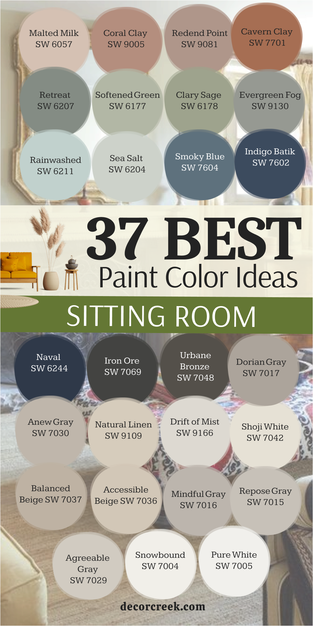
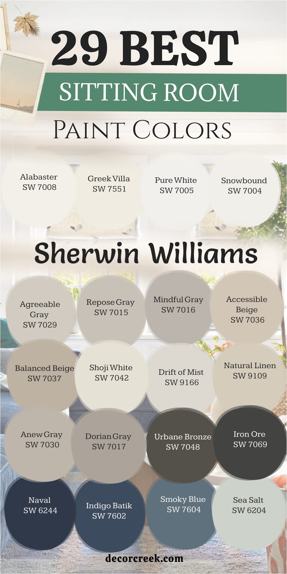
29 Sitting Room Paint Colors from Sherwin Williams
Alabaster SW 7008
Alabaster SW 7008 is a soft white that does not look too bright or cold. This color makes a room feel very friendly and open for your guests.
It has a tiny bit of yellow that keeps it feeling cozy like a warm blanket. Many people pick this because it looks great with wood floors and dark metal. You will notice it glows when the afternoon sun hits the walls. I like to use it in rooms where families spend a lot of time together.
It is a very safe choice if you are worried about picking something too bold. This shade helps your colorful pillows and art stand out. It creates a clean look that never feels boring or plain.
Best used in: living rooms, kitchens, hallways, bedrooms, and farmhouse exteriors
Pairs well with: Iron Ore SW 7069, Agreeable Gray SW 7029, Natural Linen SW 9109, warm wood tones The key rule of this color for farmhouse style is to use it where you want natural light to feel kind, soft, and inviting throughout the day.
🎨 Check out the complete guide to this color right HERE 👈

Greek Villa SW 7551
Greek Villa SW 7551 is a rich white that feels very fancy and clean. This paint has a creamy look that hides dirt better than a pure white. It works well in a sitting room that has a lot of big windows.
You can use it on the walls and the ceiling to make the room feel taller. It reminds me of a vacation home where everything is light and airy. I suggest this for people who want a bright home that still feels relaxing. It looks amazing next to light brown wood or tan rugs.
This color is very popular because it matches almost any style of furniture. Your room will feel much larger once this is on the walls. It is a smart pick for a small sitting room.
Best used in: sitting rooms, entryways, trim, and kitchen cabinets
Pairs well with: Urbane Bronze SW 7048, Anew Gray SW 7030, wood accents The key rule of this color for farmhouse style is to use it where you want natural light to feel kind, soft, and inviting throughout the day.
🎨 Check out the complete guide to this color right HERE 👈

Pure White SW 7005
Pure White SW 7005 is a crisp color that does not have any hidden blue or yellow. This makes it a very easy paint to use in any part of the house.
It looks very modern and makes a room feel very fresh. I use it when I want a sitting room to look sharp and organized. It provides a great background for a gallery wall of family photos. The paint reflects light very well so the room stays bright even on cloudy days.
You will love how it makes your colorful decorations pop. It is one of the most reliable whites I have ever used in my work. Your house will look very neat and updated with this choice. It is a great way to start a fresh look.
Best used in: trim, ceilings, sitting rooms, and modern kitchens
Pairs well with: Sea Salt SW 6204, Naval SW 6244, Black Magic SW 6991 The key rule of this color for farmhouse style is to use it where you want natural light to feel kind, soft, and inviting throughout the day.
🎨 Check out the complete guide to this color right HERE 👈

Snowbound SW 7004
Snowbound SW 7004 has a cool base that makes a room feel very crisp. This color is perfect if you have a lot of grey or blue furniture. It helps a sitting room feel chilly in a good way like a fresh winter morning.
I often pick this for homes that have a lot of dark gray accents. It keeps the room from feeling too heavy or dark. You will see that it looks very clean next to white trim. It is a great choice for a room that gets a lot of hot afternoon sun.
This shade helps balance out the heat with a cool feeling. It makes the architecture of your home look very detailed and nice. Many homeowners love how it looks in a sunny sitting area.
Best used in: bedrooms, sitting rooms, and bathrooms
Pairs well with: Morning Fog SW 6255, Iron Ore SW 7069, Silver Strand SW 7057 The key rule of this color for farmhouse style is to use it where you want natural light to feel kind, soft, and inviting throughout the day.
🎨 Check out the complete guide to this color right HERE 👈

Agreeable Gray SW 7029
Agreeable Gray SW 7029 is the most popular color for a very good reason. This paint is a mix of gray and beige which people call greige. It changes with the light to always look perfect in your sitting room.
It makes the room feel updated without being too cold or industrial. I use this when I want a home to feel welcoming to everyone who enters. It matches almost every rug and curtain you can find in stores.
This color is great for selling a house because everyone likes it. It feels very grounded and makes the walls look smooth. You cannot go wrong with this choice for a family room. It is a solid pick for any wall in your home.
Best used in: entire homes, sitting rooms, and hallways
Pairs well with: Extra White SW 7006, Mega Greige SW 7031, Sea Salt SW 6204 The key rule of this color for farmhouse style is to use it where you want natural light to feel kind, soft, and inviting throughout the day.
🎨 Check out the complete guide to this color right HERE 👈

Repose Gray SW 7015
Repose Gray SW 7015 is a cool gray that looks very stylish on any wall. It has a tiny bit of blue and green hidden deep inside the paint. This makes the room feel very quiet and peaceful for reading a book.
I like to use it in sitting rooms that have a lot of natural wood. The cool gray looks very nice against the warm wood colors. It is a bit darker than a light white so it gives the room some depth. You will find that it makes white trim look very bright and clean.
It is a great color for a home that wants to look current. People love how it makes their furniture look more expensive. It is a very sophisticated choice for your main living area.
Best used in: living areas, bedrooms, and kitchen islands
Pairs well with: Eider White SW 7014, Pavestone SW 7642, Naval SW 6244 The key rule of this color for farmhouse style is to use it where you want natural light to feel kind, soft, and inviting throughout the day.
🎨 Check out the complete guide to this color right HERE 👈

Mindful Gray SW 7016
Mindful Gray SW 7016 is a medium gray that has a lot of strength. This color is great if you want your sitting room to have a bit of drama. It is dark enough to show a contrast against white doors and baseboards.
I use this when a room is very large and needs to feel more filled up. It creates a very sturdy feeling in the home that feels very safe. You will like how it masks small fingerprints or marks on the wall.
It is a very practical choice for families with kids or pets. The color stays looking good even as the sun moves across the sky. It makes a room feel very cozy when you turn on the lamps at night. This is a great choice for a main wall.
Best used in: accent walls, sitting rooms, and exteriors
Pairs well with: Repose Gray SW 7015, Pearly White SW 7009, Homburg Gray SW 7622 The key rule of this color for farmhouse style is to use it where you want natural light to feel kind, soft, and inviting throughout the day.
🎨 Check out the complete guide to this color right HERE 👈

Accessible Beige SW 7036
Accessible Beige SW 7036 is a warm neutral that feels like a sandy beach. This paint does not look pink or yellow which makes it very easy to love. It makes a sitting room feel very earthy and natural for your family.
I suggest this for people who want a home that feels very traditional. It looks great with brown leather couches and green plants. This color makes a room feel very bright but also very comfortable.
You will find that it works in almost any lighting situation. It is a very soft color that does not grab too much attention. This allows your decorations to be the star of the room. It is a very friendly shade for a busy home.
Best used in: open floor plans, sitting rooms, and kitchens
Pairs well with: Alabaster SW 7008, Urban Bronze SW 7048, Cadet SW 9143 The key rule of this color for farmhouse style is to use it where you want natural light to feel kind, soft, and inviting throughout the day.
🎨 Check out the complete guide to this color right HERE 👈

Balanced Beige SW 7037
Balanced Beige SW 7037 is a deeper tan color that feels very rich. It gives a sitting room a very finished and professional look. I like to use this color in rooms with high ceilings and big rugs.
It helps bring the walls in a little bit to make the room feel snug. The color reminds me of a warm cup of coffee with a lot of cream. It looks very handsome with dark wood furniture and gold accents. You will love how it creates a cozy mood for watching movies.
It is a very classic color that will not go out of style next year. This shade makes a home feel very established and well-cared for. It is a perfect choice for a comfortable den.
Best used in: dens, sitting rooms, and home offices
Pairs well with: Snowbound SW 7004, Virtual Taupe SW 7039, Breezy SW 7616 The key rule of this color for farmhouse style is to use it where you want natural light to feel kind, soft, and inviting throughout the day.
🎨 Check out the complete guide to this color right HERE 👈

Shoji White SW 7042
Shoji White SW 7042 is a very warm white that almost looks like a light cream. This color is great for making a room feel very soft and gentle. It works perfectly in homes that have a lot of natural stone or brick.
I use it when I want a sitting room to feel very old-fashioned and sweet. It does not feel harsh at all even in the bright morning sun. You will like how it makes your home feel very relaxed and slow. It is a great background for vintage furniture and old photos.
This color makes a room feel like it has a lot of history and heart. It is very soft on the eyes and very easy to live with. Many people find it very comforting for a quiet room.
Best used in: living rooms, exteriors, and bedrooms
Pairs well with: Urbane Bronze SW 7048, Pure White SW 7005, Fawn Brindle SW 7642 The key rule of this color for farmhouse style is to use it where you want natural light to feel kind, soft, and inviting throughout the day.
🎨 Check out the complete guide to this color right HERE 👈

Drift of Mist SW 9166
Drift of Mist SW 9166 is a very airy and light gray that feels very soft on your walls. This color has a tiny bit of warmth that keeps it from looking like cold concrete in your home. I like to use it in sitting rooms that need to feel very open and very light for the family.
It acts like a very quiet background that lets your colorful furniture be the star of the show. You will notice that it looks almost white in very bright sun but shows its gray side at night. This paint makes a small room feel much larger and much more inviting for your guests to stay.
It is a very polite color that does not demand too much attention from the eyes. I suggest this for people who want a clean look that still feels very cozy and very sweet. Your home will feel very fresh and very updated with this light shade on the walls. It is a very smart choice for a modern and happy living area.
Best used in: bedrooms, sitting rooms, and hallways
Pairs well with: Greek Villa SW 7551, Urban Bronze SW 7048, Pewter Green SW 6208, warm wood tones The key rule of this color for farmhouse style is to use it where you want natural light to feel kind, soft, and inviting throughout the day.
🎨 Check out the complete guide to this color right HERE 👈

Natural Linen SW 9109
Natural Linen SW 9109 is a warm and sandy neutral that feels very organic and very real. This color reminds me of a soft beach or a favorite tan sweater that you love to wear. I use this in sitting rooms to create a very steady and very grounded feeling for the family.
It makes the walls look very rich and very high-quality without being too dark or heavy. You will like how it works with green plants and dark brown wood furniture in your house. This color is very traditional and makes a new house feel like it has a lot of history.
It is a very safe choice because it matches almost any rug or curtain you buy. The paint makes the room feel very sunny and very bright even on days when it is raining. You will find that it hides small marks very well which is great for busy homes. It is a very friendly and very beautiful tan for any sitting room.
Best used in: living rooms, kitchens, and entryways
Pairs well with: Alabaster SW 7008, Divine White SW 6105, Foothills SW 7514, bronze accents The key rule of this color for farmhouse style is to use it where you want natural light to feel kind, soft, and inviting throughout the day.
🎨 Check out the complete guide to this color right HERE 👈

Anew Gray SW 7030
Anew Gray SW 7030 is a medium-light greige that has a lot of warmth and a lot of heart. This color is a bit deeper than the most famous grays which makes it feel very solid. I use this when a sitting room has very high ceilings and needs to feel more snug.
It makes a very nice contrast against bright white doors and white window trim in the room. You will love how it changes from a warm gray to a soft tan as the sun moves. It is a very sophisticated choice that makes your home look very expensive and very well-designed.
This paint helps create a very quiet and very peaceful mood for resting after a long day. It works perfectly with stone fireplaces and rustic wood beams on the ceiling of your house. Many homeowners pick this because it feels very dependable and very classic for a long time. It is a very beautiful and very strong neutral for your main living space.
Best used in: entire homes, sitting rooms, and exterior trim
Pairs well with: Pure White SW 7005, Incredible White SW 7028, Dorian Gray SW 7017, black metal The key rule of this color for farmhouse style is to use it where you want natural light to feel kind, soft, and inviting throughout the day.
🎨 Check out the complete guide to this color right HERE 👈

Dorian Gray SW 7017
Dorian Gray SW 7017 is a true medium gray that looks very professional and very stylish on walls. This color has enough depth to make a big statement in your sitting room without being too dark. I like to use it when people want a room that feels very steady and very high-end.
It looks amazing next to dark wood floors and very bright white baseboards in the home. You will find that it makes your colorful pillows and blankets look very bright and very pretty. This shade of gray feels very cool and very clean even when the house is messy.
It is a great choice for a room that gets a lot of bright light from the windows. The paint makes the architecture of your house look very sharp and very modern for guests. You will love how it creates a very calm and very organized feeling in your main room. It is a very popular color for people who love a classic look.
Best used in: accent walls, sitting rooms, and kitchen islands
Pairs well with: Alabaster SW 7008, Repose Gray SW 7015, Black Magic SW 6991, marble The key rule of this color for farmhouse style is to use it where you want natural light to feel kind, soft, and inviting throughout the day.
🎨 Check out the complete guide to this color right HERE 👈

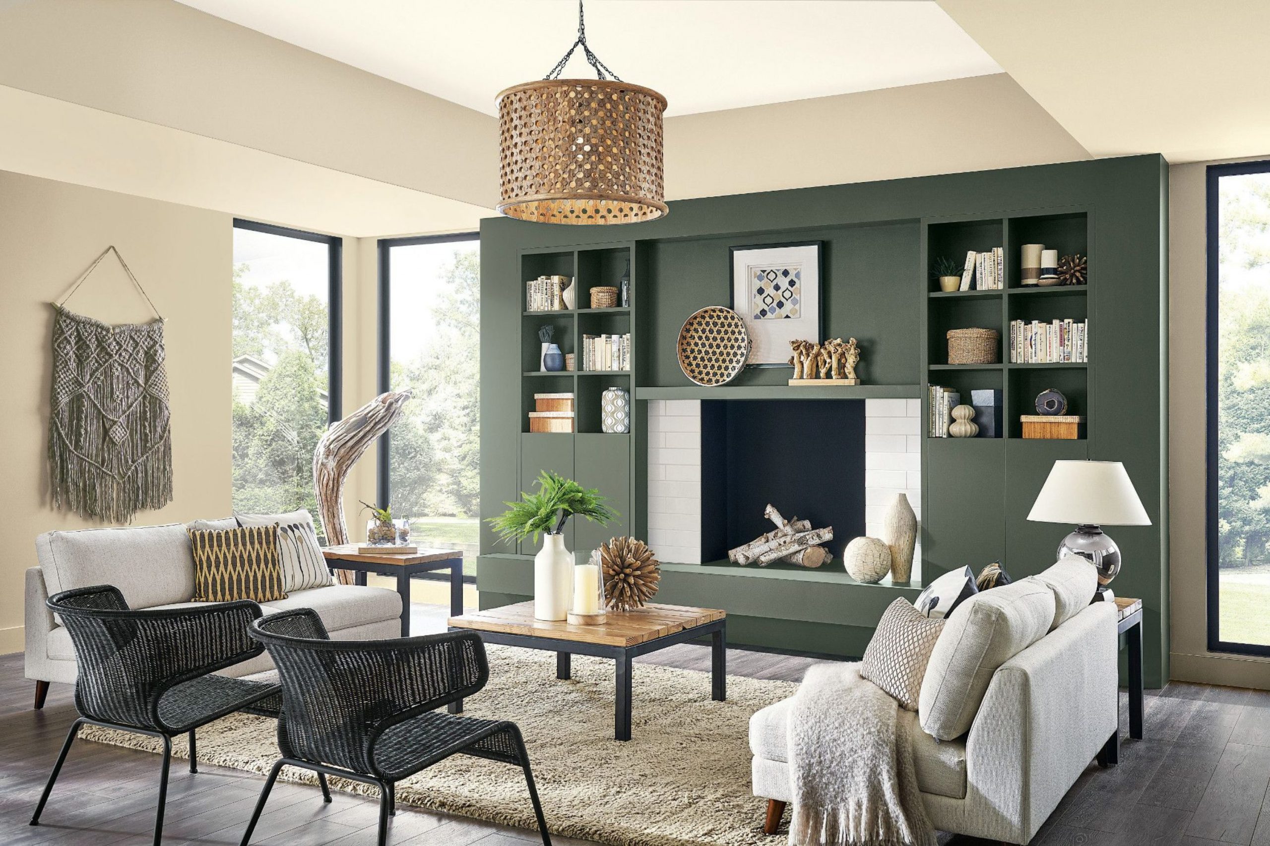
Urbane Bronze SW 7048
Urbane Bronze SW 7048 is a very dark and very moody color that feels very rich and very warm. It is a mix of deep brown and dark gray that looks like aged metal or dark stone. I use this in sitting rooms to create a very private and very cozy feeling for the family.
It makes the room feel like a secret hideaway where you can relax and feel very safe. You will love how gold lamps and green plants pop against these very dark and beautiful walls. This color is a very brave choice that makes your home look like it was styled by an expert.
It helps a very large room feel much more intimate and much more comfortable for talking. The paint hides shadows perfectly and makes the walls feel very thick and very sturdy. It is a very handsome and very noble color that adds a lot of value to a house. Your guests will be very impressed by how smart and stylish your room feels.
Best used in: accent walls, window trim, dens, and home offices
Pairs well with: Shoji White SW 7042, Modern Gray SW 7632, Messenger Bag SW 7740, brass The key rule of this color for farmhouse style is to use it where you want natural light to feel kind, soft, and inviting throughout the day.
🎨 Check out the complete guide to this color right HERE 👈

Iron Ore SW 7069
Iron Ore SW 7069 is a very deep charcoal that is almost black but feels much softer and kinder. This color adds a lot of drama and a lot of style to any sitting room in the house. I use it on accent walls or around a fireplace to make a very big and bold point.
It makes the whole room feel very high-end and very expensive like a luxury hotel suite. You will find that it creates a very cozy mood that is perfect for watching movies at night. This color looks great with light-colored rugs and very bright white trim to create a big contrast.
It is a very strong and very powerful color that makes your home feel very well-protected. The paint is excellent at hiding small bumps on the wall and making everything look very smooth. It feels very modern but also very classic at the same time for a family home. You will love how it makes your furniture look like a piece of art.
Best used in: accent walls, doors, cabinets, and exteriors
Pairs well with: Extra White SW 7006, Classic French Gray SW 0077, wood tones The key rule of this color for farmhouse style is to use it where you want natural light to feel kind, soft, and inviting throughout the day.
🎨 Check out the complete guide to this color right HERE 👈

Naval SW 6244
Naval SW 6244 is a very deep navy blue that feels very classic and very strong for a home. This color reminds me of the deep ocean or a very clear night sky in the summer. I use this in sitting rooms to make the space feel very noble and very well-organized.
It looks incredible when you pair it with bright white trim and warm gold decorations on the wall. You will notice that it makes a room feel very established and very high-quality for your family. This blue is very mature and does not look like a bright color for a child’s room.
It creates a very quiet and very peaceful feeling that helps everyone relax after a busy day. The paint makes a great background for a gallery wall with gold frames and family photos. It is a very traditional color that will stay looking good for many years to come. Your home will feel very grand and very special with this deep blue choice.
Best used in: accent walls, kitchen islands, and sitting rooms
Pairs well with: Pure White SW 7005, Grayish SW 6001, Ramie SW 6156 The key rule of this color for farmhouse style is to use it where you want natural light to feel kind, soft, and inviting throughout the day.
🎨 Check out the complete guide to this color right HERE 👈

Indigo Batik SW 7602
Indigo Batik SW 7602 is a beautiful blue that feels very rich and very full of life. This color is a little bit brighter than a dark navy which makes it feel very happy. I use this in sitting rooms that have a lot of white furniture and light-colored rugs.
It makes the whole room feel very fresh and very coastal like a house by the sea. You will love how it makes your white window frames look very sharp and very clean. This color is very easy to love because it feels very familiar and very comfortable for guests.
It adds a lot of personality to a house without being too loud or too bright. The paint makes a room feel very cool and very refreshing on a hot summer afternoon. It is a great way to bring a little bit of color into a neutral home. Your family will enjoy how much energy and style this blue brings to the room.
Best used in: bedrooms, sitting rooms, and dining areas
Pairs well with: Alabaster SW 7008, Icicle SW 6231, Breezy SW 7616 The key rule of this color for farmhouse style is to use it where you want natural light to feel kind, soft, and inviting throughout the day.
🎨 Check out the complete guide to this color right HERE 👈

Smoky Blue SW 7604
Smoky Blue SW 7604 is a medium-dark blue that has a lot of gray mixed into the paint. This makes the color look very soft and very easy on the eyes in a sitting room. I use this when I want a blue that feels very quiet and very relaxing for a family.
It looks great with medium-toned wood floors and gray furniture in the house. You will find that it creates a very peaceful mood that is perfect for reading a book. This color does not feel too dark because the gray keeps it looking very light and airy.
It is a very sophisticated shade that makes a home feel very well-curated and very smart. The paint makes a room feel very steady and very grounded for everyone who lives there. You will love how it makes the room feel very cozy when the lamps are turned on. It is a very pretty and very gentle blue for any wall in your home.
Best used in: bedrooms, sitting rooms, and bathrooms
Pairs well with: Snowbound SW 7004, On the Rocks SW 7671, Silver Strand SW 7057 The key rule of this color for farmhouse style is to use it where you want natural light to feel kind, soft, and inviting throughout the day.
🎨 Check out the complete guide to this color right HERE 👈

Sea Salt SW 6204
Sea Salt SW 6204 is a very light and very famous green-gray that people love everywhere. This color changes a lot depending on the light to look green or blue or gray. I use this in sitting rooms to make them feel very fresh and very light for the family.
It reminds me of the ocean and soft sand on a very nice vacation day. You will love how it makes your home feel very clean and very open to the sun. This color is very gentle and makes a room feel very happy and very bright for guests.
It looks amazing with white trim and natural wood accents like baskets and bowls. The paint makes a room feel very quiet and very peaceful for resting after work. It is one of the most popular colors because it feels very kind and very sweet. Your family will feel very relaxed in a room painted this beautiful light color.
Best used in: bathrooms, bedrooms, and sitting rooms
Pairs well with: Summit Gray SW 7669, Fleur de Sel SW 7666, Accessible Beige SW 7036 .The key rule of this color for farmhouse style is to use it where you want natural light to feel kind, soft, and inviting throughout the day.
🎨 Check out the complete guide to this color right HERE 👈

Rainwashed SW 6211
Rainwashed SW 6211 is a light and airy green that has a lot of blue hidden inside the paint. This color makes a sitting room feel very fresh and very clean like the air after a spring storm. I use this when I want a home to feel very light and very happy for a young family.
It looks amazing with white furniture and light-colored wood floors in your main living area. You will notice that it makes the room feel very open and very bright for your guests. This color is very gentle and makes a house feel very sweet and very kind for everyone.
It is a great choice for a room that gets a lot of natural sunlight from big windows. The paint makes the walls look very soft and very inviting for a long afternoon nap. You will love how it creates a very peaceful and very quiet mood in your home. It is a very pretty and very popular choice for a refreshing sitting room look.
Best used in: bedrooms, bathrooms, sitting rooms, and laundry rooms
Pairs well with: Pure White SW 7005, Window Pane SW 6210, Grays Harbor SW 6236, light wood The key rule of this color for farmhouse style is to use it where you want natural light to feel kind, soft, and inviting throughout the day.
🎨 Check out the complete guide to this color right HERE 👈

Evergreen Fog SW 9130
Evergreen Fog SW 9130 is a beautiful medium-green that has a bit of gray and blue mixed in. This color was a color of the year because it looks so natural and so earthy on walls. I use this in sitting rooms to make the space feel very steady and very grounded for the family.
It makes a room feel very sophisticated and very high-end without being too dark or heavy. You will love how it looks with warm gold frames and dark wood furniture in the house. This color reminds me of a quiet forest on a misty morning when everything is still.
It is a very modern choice that makes your home look very stylish and very well-designed. The paint helps a room feel very cozy and very safe for your children to play. It hides small marks very well and stays looking fresh for a very long time. Your home will feel very professional and very beautiful with this soft green choice.
Best used in: accent walls, sitting rooms, and kitchen cabinets
Pairs well with: Shoji White SW 7042, Urbane Bronze SW 7048, Uber Umber SW 9107, brass The key rule of this color for farmhouse style is to use it where you want natural light to feel kind, soft, and inviting throughout the day.
🎨 Check out the complete guide to this color right HERE 👈

Clary Sage SW 6178
Clary Sage SW 6178 is a soft and herbal green that feels very traditional and very warm. This color has a yellow base that makes it feel very sunny even on cloudy days. I use this in sitting rooms to create a very inviting and very friendly feeling for guests.
It looks great with creamy white trim and antique wood furniture in a family home. You will like how it makes your home feel very established and very full of heart. This green is very easy to look at and does not feel too bright or too loud.
It reminds me of a garden where everything is growing and looking very healthy. The paint makes a room feel very snug and very comfortable for talking with friends. It is a very classic color that works perfectly in a cottage or a farmhouse style. Your family will enjoy how much warmth and kindness this color brings to the room.
Best used in: sitting rooms, kitchens, and bedrooms
Pairs well with: Sagey SW 6175, Softened Green SW 6177, Dover White SW 6385 The key rule of this color for farmhouse style is to use it where you want natural light to feel kind, soft, and inviting throughout the day.
🎨 Check out the complete guide to this color right HERE 👈

Softened Green SW 6177
Softened Green SW 6177 is a light and grayish green that feels very quiet and very steady. This color is perfect for a sitting room where you want to feel very relaxed and very still. I use this when a homeowner wants a bit of color that still acts like a neutral.
It looks very handsome with gray couches and light tan rugs in the main living space. You will find that it makes a room feel very organized and very well-balanced for the family. This color does not grab too much attention but it makes the walls look very nice.
It is a very smart choice for a home that wants to look current but also very classic. The paint makes a great background for botanical art and green plants in the house. You will love how it creates a very peaceful and very gentle mood for everyone. It is a very reliable and very pretty green for any sitting room wall.
Best used in: bedrooms, sitting rooms, and entryways
Pairs well with: Alabaster SW 7008, Clary Sage SW 6178, Chatura Gray SW 9169 The key rule of this color for farmhouse style is to use it where you want natural light to feel kind, soft, and inviting throughout the day.
🎨 Check out the complete guide to this color right HERE 👈

Retreat SW 6207
Retreat SW 6207 is a deep and misty green that has a lot of gray mixed deep inside. This color is darker than most greens and adds a lot of style and focus to a room. I use this in sitting rooms to make the walls feel very strong and very high-quality.
It creates a very intimate feeling that is perfect for a cozy reading corner by a lamp. You will love how it makes white trim look very bright and very clean in the house. This color feels very expensive and very well-curated for a modern family home.
It reminds me of a stormy sea or a deep forest where the air is very cool. The paint helps a large room feel much more private and much more special for guests. It is a very brave choice that makes your furniture look very high-end and very pretty. Your home will feel very noble and very well-designed with this deep green shade.
Best used in: accent walls, dens, and sitting rooms
Pairs well with: Sea Salt SW 6204, Rainwashed SW 6211, Spare White SW 6203 The key rule of this color for farmhouse style is to use it where you want natural light to feel kind, soft, and inviting throughout the day.
🎨 Check out the complete guide to this color right HERE 👈

Cavern Clay SW 7701
Cavern Clay SW 7701 is a warm and earthy terracotta color that feels very old-fashioned. This paint reminds me of red clay pots and desert sunsets that look very beautiful. I use this in sitting rooms to bring a lot of energy and a lot of warmth to the house.
It makes the room feel very sunny and very friendly for all your family visitors. You will like how it looks with light wood floors and dark green plants in the room. This color is very bold but it feels very natural and very grounded at the same time.
It is a great choice for a room where people gather to talk and have a good time. The paint makes the walls look very rich and very full of life for everyone who enters. You will find that it creates a very unique and very happy environment in your home. It is a very cheering and very warm choice for a main living area wall.
Best used in: accent walls, dining rooms, and sitting rooms
Pairs well with: Origami White SW 7642, Moth Wing SW 9175, Distance SW 6243 The key rule of this color for farmhouse style is to use it where you want natural light to feel kind, soft, and inviting throughout the day.
🎨 Check out the complete guide to this color right HERE 👈

Redend Point SW 9081
Redend Point SW 9081 is a soft and sandy pink-beige that feels very warm and very kind. This color was a color of the year because it makes people feel very safe and very cozy. I use this in sitting rooms to create a very gentle and very welcoming look for the family.
It looks amazing with natural materials like linen, wood, and stone in your house. You will love how it makes the room feel very bright but also very snug at the same time. This color is not too pink and it stays looking like a very sophisticated neutral on the wall.
It feels very earthy and very real like a warm hug for your sitting room. The paint makes the whole home feel very peaceful and very well-balanced for guests. You will notice that it looks very beautiful when the evening sun hits the walls. It is a very sweet and very modern choice for a happy home.
Best used in: bedrooms, sitting rooms, and entryways
Pairs well with: Kestrel White SW 7516, Foothills SW 7514, Hushed Auburn SW 9080 The key rule of this color for farmhouse style is to use it where you want natural light to feel kind, soft, and inviting throughout the day.
🎨 Check out the complete guide to this color right HERE 👈

Coral Clay SW 9005
Coral Clay SW 9005 is a dusty and soft reddish-tan that feels very traditional and very rich. This color has a lot of warmth that makes a sitting room feel very sunny and very bright. I use this when a homeowner wants a room that feels very established and very professional.
It looks great with antique furniture and creamy white trim in a family home. You will like how it adds a lot of personality to the house without being too loud. This color feels very sturdy and very dependable for a room where you spend a lot of time.
It reminds me of old brick buildings that look very handsome and very high-quality. The paint makes a room feel very cozy and very comfortable for long family talks. It is a very classic choice that makes your home feel very warm and very inviting. Your guests will feel very welcome in a room painted this rich and pretty color.
Best used in: dining rooms, sitting rooms, and accent walls
Pairs well with: Alabaster SW 7008, Malted Milk SW 6057, Pointed Leaf SW 6436 The key rule of this color for farmhouse style is to use it where you want natural light to feel kind, soft, and inviting throughout the day.
🎨 Check out the complete guide to this color right HERE 👈

Malted Milk SW 6057
Malted Milk SW 6057 is a very light and creamy tan with a tiny hint of pink inside. This color makes a sitting room feel very soft and very sweet for your children and family. I use this when I want a room to look very clean but also very warm and very light.
It reminds me of a warm drink or a soft blanket that feels very good to touch. You will love how it makes your home feel very bright and very happy for all your guests. This color is a very safe choice for a room where you want to relax and feel very still.
It looks amazing with white curtains and light-colored furniture in the house. The paint makes the walls look very smooth and very inviting for a quiet morning. You will find that it is a very gentle and very pretty neutral for any wall. It is a very cheering shade that makes a house feel like a real home.
Best used in: bedrooms, nurseries, and sitting rooms
Pairs well with: Breathless SW 6022, Coral Clay SW 9005, Snowbound SW 7004 The key rule of this color for farmhouse style is to use it where you want natural light to feel kind, soft, and inviting throughout the day.
🎨 Check out the complete guide to this color right HERE 👈
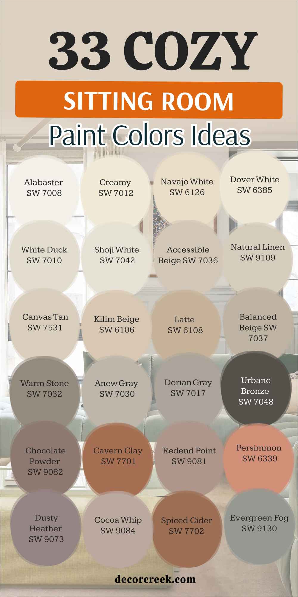
33 Cozy Sitting Room Paint Color Ideas
Alabaster SW 7008
Alabaster SW 7008 is a creamy white that feels very warm and very kind to the eyes. This color makes a sitting room feel like a big hug when you walk inside. I like to use it on walls and trim to create a very soft and very clean look.
It has a tiny bit of yellow that keeps it from looking too bright like a hospital. You will notice that it looks very beautiful when the morning sun hits the house. Many people pick this because it works well with dark wood floors and rustic furniture.
It is a very safe choice if you want a neutral home that feels very snug. This shade helps your colorful art and family photos stand out very nicely. It creates a very friendly and very inviting place for your guests to stay. Your family will love how cozy and light the room feels every single day.
Best used in: living rooms, kitchens, hallways, bedrooms, and farmhouse exteriors
Pairs well with: Iron Ore SW 7069, Agreeable Gray SW 7029, Natural Linen SW 9109, warm wood tones The key rule of this color for farmhouse style is to use it where you want natural light to feel kind, soft, and inviting throughout the day.
🎨 Check out the complete guide to this color right HERE 👈
Creamy SW 7012
Creamy SW 7012 is a rich and warm white that feels very traditional and very soft. This paint has a lot of yellow inside which makes it look like a bowl of vanilla ice cream. I use this in sitting rooms that need to feel very sunny and very bright for the family.
It makes a room feel very happy and very welcoming to everyone who enters the home. You will love how it looks with antique furniture and long curtains in your living area. This color is a bit deeper than Alabaster so it shows up better against white doors.
It creates a very classic look that makes a house feel very established and very high-quality. You will find that it makes your home feel very warm even on a cold winter day. It is a very sweet and very gentle color for a family space. Most people feel very relaxed in a room painted this beautiful and soft shade.
Best used in: bedrooms, sitting rooms, and kitchen cabinets
Pairs well with: Dover White SW 6385, Latrobe SW 9170, Reynard SW 6348 The key rule of this color for farmhouse style is to use it where you want natural light to feel kind, soft, and inviting throughout the day.
🎨 Check out the complete guide to this color right HERE 👈

Shoji White SW 7042
Shoji White SW 7042 is a very warm neutral that sits right between a white and a light greige. This color is great for making a room feel very soft and very gentle for your kids. It works perfectly in homes that have a lot of natural stone or red brick accents.
I use it when I want a sitting room to feel very old-fashioned and very sweet. It does not feel harsh at all even in the very bright afternoon sun. You will like how it makes your home feel very relaxed and very slow for resting.
It is a great background for vintage furniture and old family photos in the house. This color makes a room feel like it has a lot of history and heart. It is very soft on the eyes and very easy to live with every day. Many people find it very comforting for a quiet and peaceful room.
Best used in: living rooms, exteriors, and bedrooms
Pairs well with: Urbane Bronze SW 7048, Pure White SW 7005, Fawn Brindle SW 7642 The key rule of this color for farmhouse style is to use it where you want natural light to feel kind, soft, and inviting throughout the day.
🎨 Check out the complete guide to this color right HERE 👈
Accessible Beige SW 7036
Accessible Beige SW 7036 is a warm and earthy tan that feels like a sandy beach. This paint does not look pink or yellow which makes it very easy to love for years. It makes a sitting room feel very natural and very grounded for your busy family.
I suggest this for people who want a home that feels very traditional and very safe. It looks great with brown leather couches and big green plants in the corner. This color makes a room feel very bright but also very comfortable for sitting down.
You will find that it works in almost any lighting situation in your house. It is a very soft color that does not grab too much attention from your guests. This allows your decorations and rugs to be the star of the whole room. It is a very friendly and very dependable shade for a happy home.
Best used in: open floor plans, sitting rooms, and kitchens
Pairs well with: Alabaster SW 7008, Urban Bronze SW 7048, Cadet SW 9143 The key rule of this color for farmhouse style is to use it where you want natural light to feel kind, soft, and inviting throughout the day.
🎨 Check out the complete guide to this color right HERE 👈
Natural Linen SW 9109
Natural Linen SW 9109 is a warm and sandy neutral that feels very organic and very real. This color reminds me of a soft piece of fabric or a favorite tan sweater. I use this in sitting rooms to create a very steady and very balanced feeling.
It makes the walls look very rich and very high-quality without being too dark. You will like how it works with green plants and dark wood furniture in your house. This color is very traditional and makes a new house feel very cozy and old.
It is a very safe choice because it matches almost any rug or curtain you buy. The paint makes the room feel very sunny and very bright even on cloudy days. You will find that it hides small marks very well which is great for kids. It is a very friendly and very beautiful tan for any family room.
Best used in: living rooms, kitchens, and entryways
Pairs well with: Alabaster SW 7008, Divine White SW 6105, Foothills SW 7514 The key rule of this color for farmhouse style is to use it where you want natural light to feel kind, soft, and inviting throughout the day.
🎨 Check out the complete guide to this color right HERE 👈
Anew Gray SW 7030
Anew Gray SW 7030 is a medium-light greige that has a lot of warmth and heart. This color is a bit deeper than light grays which makes it feel very solid. I use this when a sitting room has high ceilings and needs to feel more snug.
It makes a very nice contrast against bright white doors and white trim. You will love how it changes from a warm gray to a soft tan as the sun moves. It is a very sophisticated choice that makes your home look very expensive and well-designed.
This paint helps create a very quiet and very peaceful mood for resting at night. It works perfectly with stone fireplaces and rustic wood beams in your house. Many homeowners pick this because it feels very dependable and very classic. It is a very beautiful and very strong neutral for your main living space.
Best used in: entire homes, sitting rooms, and exterior trim
Pairs well with: Pure White SW 7005, Incredible White SW 7028, Dorian Gray SW 7017 The key rule of this color for farmhouse style is to use it where you want natural light to feel kind, soft, and inviting throughout the day.
🎨 Check out the complete guide to this color right HERE 👈

Dorian Gray SW 7017
Dorian Gray SW 7017 is a true medium gray that looks very professional and very stylish. This color has enough depth to make a big statement in your sitting room. I like to use it when people want a room that feels very steady and high-end.
It looks amazing next to dark wood floors and very bright white baseboards. You will find that it makes your colorful pillows and blankets look very pretty. This shade of gray feels very cool and very clean even when the house is busy.
It is a great choice for a room that gets a lot of bright light. The paint makes the architecture of your house look very sharp and modern for guests. You will love how it creates a very calm and very organized feeling. It is a very popular color for people who love a classic look.
Best used in: accent walls, sitting rooms, and kitchen islands
Pairs well with: Alabaster SW 7008, Repose Gray SW 7015, Black Magic SW 6991 The key rule of this color for farmhouse style is to use it where you want natural light to feel kind, soft, and inviting throughout the day.
🎨 Check out the complete guide to this color right HERE 👈

Urbane Bronze SW 7048
Urbane Bronze SW 7048 is a dark and moody color that feels very rich and very warm. It is a mix of deep brown and gray that looks like dark metal or stone. I use this in sitting rooms to create a private and very cozy feeling.
It makes the room feel like a secret hideaway where you can feel very safe. You will love how gold lamps and green plants pop against these dark walls. This color is a brave choice that makes your home look like an expert styled it.
It helps a very large room feel much more intimate and comfortable for talking. The paint hides shadows perfectly and makes the walls feel very thick and sturdy. It is a very handsome and noble color that adds a lot of value. Your guests will be very impressed by how smart and stylish your room feels.
Best used in: accent walls, window trim, dens, and home offices
Pairs well with: Shoji White SW 7042, Modern Gray SW 7632, Messenger Bag SW 7740 The key rule of this color for farmhouse style is to use it where you want natural light to feel kind, soft, and inviting throughout the day.
🎨 Check out the complete guide to this color right HERE 👈
Cavern Clay SW 7701
Cavern Clay SW 7701 is a warm and earthy terracotta color that feels very old-fashioned. This paint reminds me of red clay pots and desert sunsets that look very pretty. I use this in sitting rooms to bring a lot of energy and warmth to the house.
It makes the room feel very sunny and very friendly for all your family. You will like how it looks with light wood floors and dark green plants. This color is very bold but it feels very natural and grounded at the same time.
It is a great choice for a room where people gather to talk and laugh. The paint makes the walls look very rich and full of life for everyone. You will find that it creates a very unique and very happy environment. It is a very cheering and very warm choice for a main living area.
Best used in: accent walls, dining rooms, and sitting rooms
Pairs well with: Origami White SW 7636, Moth Wing SW 9175, Distance SW 6243 The key rule of this color for farmhouse style is to use it where you want natural light to feel kind, soft, and inviting throughout the day.
🎨 Check out the complete guide to this color right HERE 👈
Redend Point SW 9081
Redend Point SW 9081 is a soft and sandy pink-beige that feels very warm and kind. This color was a color of the year because it makes people feel very safe. I use this in sitting rooms to create a very gentle and welcoming look.
It looks amazing with natural materials like linen, wood, and stone in your house. You will love how it makes the room feel very bright but also snug. This color is not too pink and stays looking like a sophisticated neutral.
It feels very earthy and very real like a warm hug for your room. The paint makes the whole home feel very peaceful and well-balanced for guests. You will notice that it looks very beautiful when the evening sun hits. It is a very sweet and very modern choice for a happy home.
Best used in: bedrooms, sitting rooms, and entryways
Pairs well with: Kestrel White SW 7516, Foothills SW 7514, Hushed Auburn SW 9080 The key rule of this color for farmhouse style is to use it where you want natural light to feel kind, soft, and inviting throughout the day.
🎨 Check out the complete guide to this color right HERE 👈
Evergreen Fog SW 9130
Evergreen Fog SW 9130 is a beautiful medium-green that has a bit of gray and blue mixed in. This color was a color of the year because it looks so natural and so earthy on walls. I use this in sitting rooms to make the space feel very steady and very grounded for the family.
It makes a room feel very sophisticated and very high-end without being too dark or heavy. You will love how it looks with warm gold frames and dark wood furniture in the house. This color reminds me of a quiet forest on a misty morning when everything is still.
It is a very modern choice that makes your home look very stylish and very well-designed. The paint helps a room feel very cozy and very safe for your children to play. It hides small marks very well and stays looking fresh for a very long time. Your home will feel very professional and very beautiful with this soft green choice.
Best used in: accent walls, sitting rooms, and kitchen cabinets
Pairs well with: Shoji White SW 7042, Urbane Bronze SW 7048, Uber Umber SW 9107, brass The key rule of this color for farmhouse style is to use it where you want natural light to feel kind, soft, and inviting throughout the day.
🎨 Check out the complete guide to this color right HERE 👈
Retreat SW 6207
Retreat SW 6207 is a deep and misty green that has a lot of gray mixed deep inside. This color is darker than most greens and adds a lot of style and focus to a room. I use this in sitting rooms to make the walls feel very strong and very high-quality.
It creates a very intimate feeling that is perfect for a cozy reading corner by a lamp. You will love how it makes white trim look very bright and very clean in the house. This color feels very expensive and very well-curated for a modern family home.
It reminds me of a stormy sea or a deep forest where the air is very cool. The paint helps a large room feel much more private and much more special for guests. It is a very brave choice that makes your furniture look very high-end and very pretty. Your home will feel very noble and very well-designed with this deep green shade.
Best used in: accent walls, dens, and sitting rooms
Pairs well with: Sea Salt SW 6204, Rainwashed SW 6211, Spare White SW 6203 The key rule of this color for farmhouse style is to use it where you want natural light to feel kind, soft, and inviting throughout the day.
🎨 Check out the complete guide to this color right HERE 👈
Clary Sage SW 6178
Clary Sage SW 6178 is a soft and herbal green that feels very traditional and very warm. This color has a yellow base that makes it feel very sunny even on cloudy days. I use this in sitting rooms to create a very inviting and very friendly feeling for guests.
It looks great with creamy white trim and antique wood furniture in a family home. You will like how it makes your home feel very established and very full of heart. This green is very easy to look at and does not feel too bright or too loud.
It reminds me of a garden where everything is growing and looking very healthy. The paint makes a room feel very snug and very comfortable for talking with friends. It is a very classic color that works perfectly in a cottage or a farmhouse style. Your family will enjoy how much warmth and kindness this color brings to the room.
Best used in: sitting rooms, kitchens, and bedrooms
Pairs well with: Sagey SW 6175, Softened Green SW 6177, Dover White SW 6385 The key rule of this color for farmhouse style is to use it where you want natural light to feel kind, soft, and inviting throughout the day.
🎨 Check out the complete guide to this color right HERE 👈
Sea Salt SW 6204
Sea Salt SW 6204 is a very light and very famous green-gray that people love everywhere. This color changes a lot depending on the light to look green or blue or gray. I use this in sitting rooms to make them feel very fresh and very light for the family.
It reminds me of the ocean and soft sand on a very nice vacation day. You will love how it makes your home feel very clean and very open to the sun. This color is very gentle and makes a room feel very happy and very bright for guests.
It looks amazing with white trim and natural wood accents like baskets and bowls. The paint makes a room feel very quiet and very peaceful for resting after work. It is one of the most popular colors because it feels very kind and very sweet. Your family will feel very relaxed in a room painted this beautiful light color.
Best used in: bathrooms, bedrooms, and sitting rooms
Pairs well with: Summit Gray SW 7669, Fleur de Sel SW 7666, Accessible Beige SW 7036 The key rule of this color for farmhouse style is to use it where you want natural light to feel kind, soft, and inviting throughout the day.
🎨 Check out the complete guide to this color right HERE 👈
Rainwashed SW 6211
Rainwashed SW 6211 is a light and airy green that has a lot of blue hidden inside the paint. This color makes a sitting room feel very fresh and very clean like the air after a spring storm. I use this when I want a home to feel very light and very happy for a young family.
It looks amazing with white furniture and light-colored wood floors in your main living area. You will notice that it makes the room feel very open and very bright for your guests. This color is very gentle and makes a house feel very sweet and very kind for everyone.
It is a great choice for a room that gets a lot of natural sunlight from big windows. The paint makes the walls look very soft and very inviting for a long afternoon nap. You will love how it creates a very peaceful and very quiet mood in your home. It is a very pretty and very popular choice for a refreshing sitting room look.
Best used in: bedrooms, bathrooms, sitting rooms, and laundry rooms
Pairs well with: Pure White SW 7005, Window Pane SW 6210, Grays Harbor SW 6236 The key rule of this color for farmhouse style is to use it where you want natural light to feel kind, soft, and inviting throughout the day.
🎨 Check out the complete guide to this color right HERE 👈
Smoky Blue SW 7604
Smoky Blue SW 7604 is a medium-dark blue that has a lot of gray mixed into the paint. This makes the color look very soft and very easy on the eyes in a sitting room. I use this when I want a blue that feels very quiet and very relaxing for a family.
It looks great with medium-toned wood floors and gray furniture in the house. You will find that it creates a very peaceful mood that is perfect for reading a book. This color does not feel too dark because the gray keeps it looking very light and airy.
It is a very sophisticated shade that makes a home feel very well-curated and very smart. The paint makes a room feel very steady and very grounded for everyone who lives there. You will love how it makes the room feel very cozy when the lamps are turned on. It is a very pretty and very gentle blue for any wall in your home.
Best used in: bedrooms, sitting rooms, and bathrooms
Pairs well with: Snowbound SW 7004, On the Rocks SW 7671, Silver Strand SW 7057 The key rule of this color for farmhouse style is to use it where you want natural light to feel kind, soft, and inviting throughout the day.
🎨 Check out the complete guide to this color right HERE 👈
White Dove OC-17
White Dove OC-17 is a famous paint color that designers love to use for a clean look. This white has a tiny bit of gray that keeps it from looking too yellow in the sun. It makes a sitting room look very soft and very pretty for your whole family.
I use it on trim and walls to create a very clean and very organized look. It feels very light and helps a room feel very open and very happy for guests. You will notice that it looks great with both warm wood and cool metal colors.
It is a very flexible choice for a home that likes to change decorations often. This color makes every piece of furniture look a little bit more expensive and nice. It is a very soft and kind shade of white for a main family room. Most people feel very relaxed in a room painted this beautiful and light color.
Best used in: walls, trim, cabinets, and entire homes
Pairs well with: Revere Pewter HC-172, Balboa Mist OC-27, Hale Navy HC-154 The key rule of this color for farmhouse style is to use it where you want natural light to feel kind, soft, and inviting throughout the day.
🎨 Check out the complete guide to this color right HERE 👈

Swiss Coffee OC-45
Swiss Coffee OC-45 is a creamy white that feels very warm and very inviting for visitors. It is a very popular choice for homes that want a snug and cozy feeling. This color looks like the foam on top of a warm drink on a cold day.
I like to use it in sitting rooms with a lot of books and soft chairs. It makes the room feel like a great place to take a long and happy nap. You will love how it looks when you light a fire in the fireplace at night.
It feels very traditional and makes a new house feel like a real family home. This color is very light but it still has a lot of warmth and personality. It is a great way to make a big room feel more personal and very sweet. Your guests will feel very welcome and very comfortable in this beautiful room.
Best used in: living rooms, bedrooms, and kitchen walls
Pairs well with: Fossil AF-65, New Hope Gray 2130-50, natural wood tones The key rule of this color for farmhouse style is to use it where you want natural light to feel kind, soft, and inviting throughout the day.
🎨 Check out the complete guide to this color right HERE 👈

Simply White OC-117
Simply White OC-117 is a very bright and very happy color for any sitting room. It has a tiny hint of yellow that makes it feel like sunshine is on the walls. I use this when a room feels a bit dark and needs more energy and light.
It makes the whole house feel very clean and very organized for your daily life. You will love how it looks with bright green plants and colorful family art. It is a very crisp color that makes everything look brand new and very fresh.
This paint is great for a modern home that wants to feel very light and open. It is a very honest and simple color that people really enjoy living with. You will find that it makes your morning feel even better and more cheerful. It is a very cheering shade for a family space where everyone gathers together.
Best used in: kitchens, trim, and small sitting rooms
Pairs well with: Silver Gray 2131-60, Hale Navy HC-154, Dove Wing OC-18 The key rule of this color for farmhouse style is to use it where you want natural light to feel kind, soft, and inviting throughout the day.
🎨 Check out the complete guide to this color right HERE 👈

Cloud White OC-130
Cloud White OC-130 is a soft and balanced white that feels very light and airy. It is not too warm and not too cool which makes it very easy to use. I use this when I want a sitting room to feel very open and very light.
It reminds me of big fluffy clouds on a very nice and sunny summer day. This color makes a room feel very peaceful and very quiet for resting after work. You will like how it works with many different types of wood and stone flooring.
It is a very sophisticated choice that looks great in any kind of light. This paint makes a home feel very high-end and very well-designed for your guests. It is a great choice for a room where you want to relax and talk. People often say this color makes them feel very light-hearted and very happy.
Best used in: ceilings, walls, and trim
Pairs well with: Pale Oak OC-20, Revere Pewter HC-172, Yosemite Sand AC-4 The key rule of this color for farmhouse style is to use it where you want natural light to feel kind, soft, and inviting throughout the day.
🎨 Check out the complete guide to this color right HERE 👈

Edgecomb Gray HC-173
Edgecomb Gray HC-173 is a light and sandy greige that feels very organic and real. This color is great for a sitting room that needs a little bit of warmth. It is dark enough to stand out against white trim but still feels very light.
I use this for homes that want a natural and earthy look for the family. It looks amazing with linen fabrics and woven baskets in your main living area. You will find that it makes a room feel very steady and very grounded.
It is a very popular color for a reason because it looks good in every house. This shade makes your home feel very put together and very stylish for visitors. It is a very soft color that feels very good to live with every day. Your family will love how cozy and friendly this beautiful room feels.
Best used in: living rooms, hallways, and open spaces
Pairs well with: White Dove OC-17, Hale Navy HC-154, Revere Pewter HC-172 The key rule of this color for farmhouse style is to use it where you want natural light to feel kind, soft, and inviting throughout the day.
🎨 Check out the complete guide to this color right HERE 👈

Revere Pewter HC-172
Revere Pewter HC-172 is a classic color that many people choose for their family homes. It is a medium-light greige that has a lot of depth and very nice character. I use this color when I want a sitting room to feel very solid and high-quality.
It changes looks throughout the day which makes the room feel very interesting and new. You will see it look more gray in the morning and more beige at night. It is a great choice for a room with a lot of traditional furniture and rugs.
This color makes a house feel very expensive and very well-maintained for your guests. It is a very strong neutral that works with almost any accent color you love. People love this color because it feels very dependable and very classic for years. It is a great foundation for a beautiful and very cozy room.
Best used in: whole house paint, sitting rooms, and kitchens
Pairs well with: Simply White OC-117, Chelsea Gray HC-168, Amherst Gray HC-167 The key rule of this color for farmhouse style is to use it where you want natural light to feel kind, soft, and inviting throughout the day.
🎨 Check out the complete guide to this color right HERE 👈

Pale Oak OC-20
Pale Oak OC-20 is a very light and elegant color that feels like a quiet morning. It is a very soft greige that makes a sitting room feel very expensive and nice. I use this for people who want a neutral home that is not just plain white.
It has a very gentle look that makes a room feel very large and very open. You will love how it highlights the natural light coming in the windows of your house. It is a very graceful color that makes furniture look very high-end and very stylish.
This paint is a great choice for a room where you host friends and family members. It feels very clean but also very warm and very welcoming for everyone. Most people find this color to be very soothing and very pretty on the eyes. It is a very light and lovely choice for a sitting room wall.
Best used in: bedrooms, sitting rooms, and hallways
Pairs well with: Chantilly Lace OC-65, Wrought Iron 2124-10, Gray Owl OC-52 The key rule of this color for farmhouse style is to use it where you want natural light to feel kind, soft, and inviting throughout the day.
🎨 Check out the complete guide to this color right HERE 👈

Balboa Mist OC-27
Balboa Mist OC-27 is a very light gray that has a tiny bit of warmth inside. It is a very soft color that makes a sitting room feel very fresh and new. I use this when I want a room to look modern but still feel very cozy.
It reminds me of a misty morning by the ocean in the middle of summer. You will like how it makes your white trim look very sharp and very clean. This color is very easy to look at and does not feel heavy at all for a family.
It is a great choice for a room with a lot of colorful pillows and blankets. The paint makes the whole room feel very bright and very happy for guests. It is a very flexible color that works in many different types of homes. Your family will love how clean and bright the room feels every morning.
Best used in: sitting rooms, kitchens, and bathrooms
Pairs well with: White Dove OC-17, Kendall Charcoal HC-166, Revere Pewter HC-172 The key rule of this color for farmhouse style is to use it where you want natural light to feel kind, soft, and inviting throughout the day.
🎨 Check out the complete guide to this color right HERE 👈

Kendall Charcoal HC-166
Kendall Charcoal HC-166 is a dark and moody gray that adds a lot of style to a home. This color is perfect for a sitting room where you want to feel very snug. I use it on accent walls or even in a whole room for a dramatic look.
It makes the room feel very private and very high-end like a luxury hotel. You will love how it makes gold or brass lamps shine against the dark walls. It is a very brave choice that looks very smart and very professional for your guests.
This color helps a big room feel more intimate and very special for family time. It hides shadows well and makes the room feel very deep and very interesting. People who love a modern look will really enjoy this dark and beautiful shade. It is a very bold and beautiful paint color for a cozy house.
Best used in: accent walls, dens, and home theaters
Pairs well with: Simply White OC-117, Revere Pewter HC-172, natural wood tones The key rule of this color for farmhouse style is to use it where you want natural light to feel kind, soft, and inviting throughout the day.
🎨 Check out the complete guide to this color right HERE 👈

Hale Navy HC-154
Hale Navy HC-154 is a deep blue color that feels very classic and very strong for a room. It is like the color of the deep ocean or a dark night sky at the lake. I use this in sitting rooms to create a very sophisticated and grand feeling.
It looks amazing with bright white trim and rich wood furniture in your house. You will find that it makes a room feel very established and very noble for visitors. This color is a great choice for an accent wall behind a large bookshelf.
It makes the whole house feel very curated and very well-thought-out for your family. The blue is very deep and does not look like a bright color for a child. It feels very mature and very high-quality for a main living area of the home. Your family will feel very cozy and very safe in a room this color.
Best used in: accent walls, kitchen islands, and sitting rooms
Pairs well with: White Dove OC-17, Coventry Gray HC-169, warm wood tones The key rule of this color for farmhouse style is to use it where you want natural light to feel kind, soft, and inviting throughout the day.
🎨 Check out the complete guide to this color right HERE 👈

Hunter Green 2041-10
Hunter Green 2041-10 is a very deep and very dark green that looks like a forest. This color makes a sitting room feel very cozy and very high-end like a library. I use this when I want a room to feel very private and very sturdy for the family.
It looks amazing with leather chairs and warm wood tables in the living area. You will love how it makes your white trim look very bright and very clean. This color is very brave and adds a lot of personality to your home for guests.
It feels very traditional and makes a house feel very established and very old. The paint makes the room feel very snug and perfect for talking at night. It is a very rich and noble color that stays looking good for a long time. Your guests will feel very impressed by how deep and beautiful the walls look.
Best used in: dens, sitting rooms, and accent walls
Pairs well with: Cloud White OC-130, Revere Pewter HC-172, gold accents The key rule of this color for farmhouse style is to use it where you want natural light to feel kind, soft, and inviting throughout the day.
🎨 Check out the complete guide to this color right HERE 👈

October Mist 1495
October Mist 1495 is a soft and silvery green that feels very gentle and natural. This color makes a sitting room feel like a quiet garden in the morning light. I use this when I want a home to feel very peaceful and very kind for the family.
It looks great with light-colored rugs and botanical art on the walls of your house. You will like how it makes a room feel very fresh and very light for everyone. This color is not too bright and it stays looking very soft and professional for years.
It reminds me of the leaves on a sage plant or a misty field in the country. The paint makes the room feel very cozy and very comfortable for reading a book. It is a very sweet and very pretty green that people really love to see. Your family will feel very relaxed in a room painted this beautiful and light color.
Best used in: bedrooms, sitting rooms, and kitchens
Pairs well with: Swiss Coffee OC-45, Steam AF-15, Saybrook Sage HC-114 The key rule of this color for farmhouse style is to use it where you want natural light to feel kind, soft, and inviting throughout the day.
🎨 Check out the complete guide to this color right HERE 👈

Saybrook Sage HC-114
Saybrook Sage HC-114 is a classic green that has a lot of gray and blue inside. This color makes a sitting room feel very steady and very grounded for your family. I use this when I want a room to look very traditional and very well-balanced for guests.
It looks amazing with creamy white trim and natural wood floors in the home. You will love how it makes the room feel very cool and very refreshing on a hot day. This color is very easy on the eyes and feels very quiet and very peaceful.
It reminds me of a country house where everything is slow and very happy. The paint makes a great background for old photos and antique furniture in your house. It is a very sophisticated choice that makes a home feel very high-quality and nice. Your family will enjoy how much heart and warmth this green brings to the room.
Best used in: sitting rooms, exteriors, and bedrooms
Pairs well with: White Dove OC-17, Muslin OC-12, Old Navy 2063-10 The key rule of this color for farmhouse style is to use it where you want natural light to feel kind, soft, and inviting throughout the day.
🎨 Check out the complete guide to this color right HERE 👈

Quiet Moments 1563
Quiet Moments 1563 is a light and airy mix of blue, green, and gray paint. This color makes a sitting room feel very light and very open for your whole family. I use this when I want a home to feel very soft and very gentle for resting.
It reminds me of a clear sky or a very quiet lake on a nice morning. You will love how it makes your white furniture and trim look very fresh and clean. This color is very pretty and makes a room feel very happy and very bright for guests.
It looks amazing with light-colored wood and green plants in the living area. The paint makes the room feel very snug and very comfortable for a quiet afternoon. It is a very sweet and very popular choice because it feels very kind. Your family will feel very relaxed in a room painted this lovely and soft color.
Best used in: bedrooms, bathrooms, and sitting rooms
Pairs well with: Simply White OC-117, Shaker Gray HC-45, Pale Oak OC-20 The key rule of this color for farmhouse style is to use it where you want natural light to feel kind, soft, and inviting throughout the day.
🎨 Check out the complete guide to this color right HERE 👈

Smoke 2122-40
Smoke 2122-40 is a medium-light blue that has a lot of gray mixed into the color. This color makes a sitting room feel very sophisticated and very cool for the family. I use this when I want a room to feel very quiet and very well-organized for visitors.
It looks great with gray couches and dark wood tables in your main living space. You will find that it creates a very peaceful mood that is perfect for resting after work. This color does not feel too bright because the gray keeps it looking very soft.
It is a very professional choice that makes a home feel very high-end and very smart. The paint makes a room feel very steady and very grounded for everyone who lives there. You will love how it makes the room feel very cozy when you turn on the lamps. It is a very pretty and very gentle blue for any family room wall.
Best used in: bedrooms, sitting rooms, and dining areas
Pairs well with: White Dove OC-17, Gray Owl OC-52, Hale Navy HC-154 The key rule of this color for farmhouse style is to use it where you want natural light to feel kind, soft, and inviting throughout the day.
🎨 Check out the complete guide to this color right HERE 👈

Warm Sand CSP-280
Warm Sand CSP-28 is a light and creamy tan that feels like a sunny beach at home. This color makes a sitting room feel very warm and very welcoming for your guests. I use this when I want a room to feel very natural and very earthy for the family.
It looks amazing with brown leather furniture and woven rugs in your house. You will love how it makes the room feel very bright and very happy all day long. This color is not too yellow and it stays looking like a very professional neutral.
It feels very sturdy and very dependable for a room where you spend a lot of time. The paint makes the walls look very soft and very inviting for long family talks. It is a very classic choice that makes your home feel very warm and very snug. Your guests will feel very comfortable in a room painted this beautiful sandy color.
Best used in: living rooms, hallways, and entryways
Pairs well with: Swiss Coffee OC-45, Revere Pewter HC-172, Wood tones The key rule of this color for farmhouse style is to use it where you want natural light to feel kind, soft, and inviting throughout the day.
🎨 Check out the complete guide to this color right HERE 👈

Rustic Taupe 999
Rustic Taupe 999 is a medium-tan color that has a little bit of gray mixed inside. This color makes a sitting room feel very solid and very high-quality for your family. I use this when I want a room to look very traditional and very well-maintained for guests.
It looks great with dark wood floors and stone fireplaces in the living area. You will find that it makes a room feel very snug and very private for resting. This color is great for hiding small marks and staying looking fresh for many years.
It feels very sturdy and very dependable for a busy family home with kids. The paint makes a home feel very welcoming and very friendly to everyone who visits you. It is a very rich and very beautiful tan that adds a lot of heart to a room. Your family will enjoy how much warmth and comfort this color brings to the house.
Best used in: sitting rooms, home offices, and basements
Pairs well with: Simply White OC-117, Manchester Tan HC-81, Wood accents The key rule of this color for farmhouse style is to use it where you want natural light to feel kind, soft, and inviting throughout the day.
27 Warm Neutral Paint Colors For Your Sitting Room
Alabaster SW 7008
Alabaster SW 7008 is a creamy white that feels very warm and very kind to the eyes. This color makes a sitting room feel like a big hug when you walk inside. I like to use it on walls and trim to create a very soft and very clean look.
It has a tiny bit of yellow that keeps it from looking too bright like a hospital. You will notice that it looks very beautiful when the morning sun hits the house. Many people pick this because it works well with dark wood floors and rustic furniture.
It is a very safe choice if you want a neutral home that feels very snug. This shade helps your colorful art and family photos stand out very nicely. It creates a very friendly and very inviting place for your guests to stay. Your family will love how cozy and light the room feels every single day.
Best used in: living rooms, kitchens, hallways, bedrooms, and farmhouse exteriors
Pairs well with: Iron Ore SW 7069, Agreeable Gray SW 7029, Natural Linen SW 9109, warm wood tones The key rule of this color for farmhouse style is to use it where you want natural light to feel kind, soft, and inviting throughout the day.
🎨 Check out the complete guide to this color right HERE 👈
Creamy SW 7012
Creamy SW 7012 is a rich and warm white that feels very traditional and very soft. This paint has a lot of yellow inside which makes it look like a bowl of vanilla ice cream. I use this in sitting rooms that need to feel very sunny and very bright for the family.
It makes a room feel very happy and very welcoming to everyone who enters the home. You will love how it looks with antique furniture and long curtains in your living area. This color is a bit deeper than Alabaster so it shows up better against white doors.
It creates a very classic look that makes a house feel very established and very high-quality. You will find that it makes your home feel very warm even on a cold winter day. It is a very sweet and very gentle color for a family space. Most people feel very relaxed in a room painted this beautiful and soft shade.
Best used in: bedrooms, sitting rooms, and kitchen cabinets
Pairs well with: Dover White SW 6385, Latrobe SW 9170, Reynard SW 6348 The key rule of this color for farmhouse style is to use it where you want natural light to feel kind, soft, and inviting throughout the day.
🎨 Check out the complete guide to this color right HERE 👈
Greek Villa SW 7551
Greek Villa SW 7551 is a rich white that feels very fancy and clean. This paint has a creamy look that hides dirt better than a pure white. It works well in a sitting room that has a lot of big windows.
You can use it on the walls and the ceiling to make the room feel taller. It reminds me of a vacation home where everything is light and airy. I suggest this for people who want a bright home that still feels relaxing. It looks amazing next to light brown wood or tan rugs.
This color is very popular because it matches almost any style of furniture. Your room will feel much larger once this is on the walls. It is a smart pick for a small sitting room.
Best used in: sitting rooms, entryways, trim, and kitchen cabinets
Pairs well with: Urbane Bronze SW 7048, Anew Gray SW 7030, wood accents The key rule of this color for farmhouse style is to use it where you want natural light to feel kind, soft, and inviting throughout the day.
🎨 Check out the complete guide to this color right HERE 👈
White Duck SW 7010
White Duck SW 7010 is a very light neutral that sits between white and tan. This color is great for a sitting room that needs to feel very clean and very light. I use this when I want a soft look that is more interesting than plain white.
It has a very creamy feel that makes a home feel very soft and kind. You will notice that it changes with the sun to look warm and very bright. It is a very safe choice for a room where you want to relax with a book.
This color makes a room feel very spacious and very friendly for visitors. It is a very versatile shade that goes with almost any color of furniture. You will love how it makes your home feel very light and very airy.
Best used in: living rooms, bedrooms, and exteriors
Pairs well with: Alabaster SW 7008, Urban Bronze SW 7048, wood accents The key rule of this color for farmhouse style is to use it where you want natural light to feel kind, soft, and inviting throughout the day.
🎨 Check out the complete guide to this color right HERE 👈

Shoji White SW 7042
Shoji White SW 7042 is a very warm neutral that sits right between a white and a light greige. This color is great for making a room feel very soft and very gentle for your kids. It works perfectly in homes that have a lot of natural stone or red brick accents.
I use it when I want a sitting room to feel very old-fashioned and very sweet. It does not feel harsh at all even in the very bright afternoon sun. You will like how it makes your home feel very relaxed and very slow for resting.
It is a great background for vintage furniture and old family photos in the house. This color makes a room feel like it has a lot of history and heart. It is very soft on the eyes and very easy to live with every day. Many people find it very comforting for a quiet and peaceful room.
Best used in: living rooms, exteriors, and bedrooms
Pairs well with: Urbane Bronze SW 7048, Pure White SW 7005, Fawn Brindle SW 7642 The key rule of this color for farmhouse style is to use it where you want natural light to feel kind, soft, and inviting throughout the day.
🎨 Check out the complete guide to this color right HERE 👈
Accessible Beige SW 7036
Accessible Beige SW 7036 is a warm and earthy tan that feels like a sandy beach. This paint does not look pink or yellow which makes it very easy to love for years. It makes a sitting room feel very natural and very grounded for your busy family.
I suggest this for people who want a home that feels very traditional and very safe. It looks great with brown leather couches and big green plants in the corner. This color makes a room feel very bright but also very comfortable for sitting down.
You will find that it works in almost any lighting situation in your house. It is a very soft color that does not grab too much attention from your guests. This allows your decorations and rugs to be the star of the whole room. It is a very friendly and very dependable shade for a happy home.
Best used in: open floor plans, sitting rooms, and kitchens
Pairs well with: Alabaster SW 7008, Urban Bronze SW 7048, Cadet SW 9143 The key rule of this color for farmhouse style is to use it where you want natural light to feel kind, soft, and inviting throughout the day.
🎨 Check out the complete guide to this color right HERE 👈
Balanced Beige SW 7037
Balanced Beige SW 7037 is a deeper tan color that feels very rich. It gives a sitting room a very finished and professional look. I like to use this color in rooms with high ceilings and big rugs.
It helps bring the walls in a little bit to make the room feel snug. The color reminds me of a warm cup of coffee with a lot of cream. It looks very handsome with dark wood furniture and gold accents. You will love how it creates a cozy mood for watching movies.
It is a very classic color that will not go out of style next year. This shade makes a home feel very established and well-cared for. It is a perfect choice for a comfortable den.
Best used in: dens, sitting rooms, and home offices
Pairs well with: Snowbound SW 7004, Virtual Taupe SW 7039, Breezy SW 7616 The key rule of this color for farmhouse style is to use it where you want natural light to feel kind, soft, and inviting throughout the day.
🎨 Check out the complete guide to this color right HERE 👈

Natural Linen SW 9109
Natural Linen SW 9109 is a warm and sandy neutral that feels very organic and very real. This color reminds me of a soft piece of fabric or a favorite tan sweater. I use this in sitting rooms to create a very steady and very balanced feeling.
It makes the walls look very rich and very high-quality without being too dark. You will like how it works with green plants and dark wood furniture in your house. This color is very traditional and makes a new house feel very cozy and old.
It is a very safe choice because it matches almost any rug or curtain you buy. The paint makes the room feel very sunny and very bright even on cloudy days. You will find that it hides small marks very well which is great for kids. It is a very friendly and very beautiful tan for any family room.
Best used in: living rooms, kitchens, and entryways
Pairs well with: Alabaster SW 7008, Divine White SW 6105, Foothills SW 7514 The key rule of this color for farmhouse style is to use it where you want natural light to feel kind, soft, and inviting throughout the day.
🎨 Check out the complete guide to this color right HERE 👈
Canvas Tan SW 7531
Canvas Tan SW 7531 is a warm and sandy color that feels very organic and real. This paint reminds me of light-colored linen or a soft beach on a cloudy day. I use this in sitting rooms to create a very natural and earthy feeling.
It makes the room feel very steady and very comfortable for daily living. You will like how it works with green plants and woven wood shades. This color is not too dark but it gives the walls a lot of nice character.
It is a very traditional choice that makes a house feel very established. You will find that it hides small marks very well which is great for families. It is a very dependable and very pretty neutral for any home.
Best used in: sitting rooms, entryways, and kitchens
Pairs well with: Pure White SW 7005, Naval SW 6244, Kilim Beige SW 6106 The key rule of this color for farmhouse style is to use it where you want natural light to feel kind, soft, and inviting throughout the day.
🎨 Check out the complete guide to this color right HERE 👈

Kilim Beige SW 6106
Kilim Beige SW 6106 is a classic tan color that has been popular for a long time. It is a very warm shade that makes a sitting room feel very sunny and bright. I use this when a homeowner wants a room that feels very traditional and very safe.
It looks great with red, orange, and brown colors in your rugs or pillows. You will love how it makes a room feel very cozy and very lived-in. This color is a great choice for a home with a lot of wood and brick.
It feels very solid and very reliable for a large family room. Many people pick this because it makes a house feel very warm and very welcoming. It is a very friendly color that makes everyone feel right at home.
Best used in: open floor plans, living rooms, and bedrooms
Pairs well with: Latte SW 6108, Divine White SW 6105, Van Dyke Brown SW 7041 The key rule of this color for farmhouse style is to use it where you want natural light to feel kind, soft, and inviting throughout the day.
🎨 Check out the complete guide to this color right HERE 👈
Latte SW 6108
Latte SW 6108 is a rich and deep tan color that feels very warm and very cozy. It is like the color of a warm drink on a very cold winter day. I use this in sitting rooms to make the walls feel very thick and very sturdy.
It creates a very intimate feeling that is perfect for talking with friends. You will love how it looks with dark brown leather and creamy white pillows. This color makes a room feel very finished and very professional.
t is a great choice for a room with a lot of light because it stays looking rich. The shade makes a home feel very traditional and very high-quality. You will find that it creates a very beautiful and very snug environment.
Best used in: family rooms, kitchens, and basements
Pairs well with: Kilim Beige SW 6106, Macadamia SW 6142, Alabaster SW 7008 The key rule of this color for farmhouse style is to use it where you want natural light to feel kind, soft, and inviting throughout the day.
🎨 Check out the complete guide to this color right HERE 👈
Macadamia SW 6142
Macadamia SW 6142 is a medium-tan color that has a little bit of a green tint. This makes it look very natural and very earthy in a sitting room. I use this when I want a home to feel like it is connected to nature.
It looks very handsome with dark wood floors and stone fireplaces. You will like how it provides a lot of contrast against light-colored trim. This color makes a room feel very strong and very well-balanced.
It is a very unique neutral that adds a lot of personality to a house. You will find that it looks very warm and very inviting at night. This shade makes a home feel very grand and very special for your family. It is a very rich and very beautiful choice for any wall.
Best used in: sitting rooms, home offices, and exteriors
Pairs well with: Softer Tan SW 6141, Universal Khaki SW 6150, Alabaster SW 7008 The key rule of this color for farmhouse style is to use it where you want natural light to feel kind, soft, and inviting throughout the day.
🎨 Check out the complete guide to this color right HERE 👈
Anew Gray SW 7030
Anew Gray SW 7030 is a medium-light greige that has a lot of warmth and heart. This color is a bit deeper than light grays which makes it feel very solid. I use this when a sitting room has high ceilings and needs to feel more snug.
It makes a very nice contrast against bright white doors and white trim. You will love how it changes from a warm gray to a soft tan as the sun moves. It is a very sophisticated choice that makes your home look very expensive and well-designed.
This paint helps create a very quiet and very peaceful mood for resting at night. It works perfectly with stone fireplaces and rustic wood beams in your house. Many homeowners pick this because it feels very dependable and very classic. It is a very beautiful and very strong neutral for your main living space.
Best used in: entire homes, sitting rooms, and exterior trim
Pairs well with: Pure White SW 7005, Incredible White SW 7028, Dorian Gray SW 7017 The key rule of this color for farmhouse style is to use it where you want natural light to feel kind, soft, and inviting throughout the day.
🎨 Check out the complete guide to this color right HERE 👈
Amazing Gray SW 7044
Amazing Gray SW 7044 is a warm gray that feels very modern and very clean. It is a bit darker than some other grays which gives the room more focus. I use this in sitting rooms to make the furniture really stand out and look nice.
It has a very professional look that makes a home feel very updated. You will love how it masks shadows and makes the walls look very smooth. This color works very well with both cool blues and warm tans.
It is a very flexible choice for a home that wants to look current and fresh. The paint makes a room feel very quiet and very peaceful for your family. You will find that it is a very smart and very beautiful neutral color.
Best used in: living rooms, bedrooms, and kitchens
Pairs well with: Carley’s Rose SW 9002, Alabaster SW 7008, Anonymous SW 7046 The key rule of this color for farmhouse style is to use it where you want natural light to feel kind, soft, and inviting throughout the day.
🎨 Check out the complete guide to this color right HERE 👈

White Dove OC-17
White Dove OC-17 is a famous paint color that designers love to use for a clean look. This white has a tiny bit of gray that keeps it from looking too yellow in the sun. It makes a sitting room look very soft and very pretty for your whole family.
I use it on trim and walls to create a very clean and very organized look. It feels very light and helps a room feel very open and very happy for guests. You will notice that it looks great with both warm wood and cool metal colors.
It is a very flexible choice for a home that likes to change decorations often. This color makes every piece of furniture look a little bit more expensive and nice. It is a very soft and kind shade of white for a main family room. Most people feel very relaxed in a room painted this beautiful and light color.
Best used in: walls, trim, cabinets, and entire homes
Pairs well with: Revere Pewter HC-172, Balboa Mist OC-27, Hale Navy HC-154 The key rule of this color for farmhouse style is to use it where you want natural light to feel kind, soft, and inviting throughout the day.
🎨 Check out the complete guide to this color right HERE 👈
Swiss Coffee OC-45
Swiss Coffee OC-45 is a creamy white that feels very warm and very inviting for visitors. It is a very popular choice for homes that want a snug and cozy feeling. This color looks like the foam on top of a warm drink on a cold day.
I like to use it in sitting rooms with a lot of books and soft chairs. It makes the room feel like a great place to take a long and happy nap. You will love how it looks when you light a fire in the fireplace at night.
It feels very traditional and makes a new house feel like a real family home. This color is very light but it still has a lot of warmth and personality. It is a great way to make a big room feel more personal and very sweet. Your guests will feel very welcome and very comfortable in this beautiful room.
Best used in: living rooms, bedrooms, and kitchen walls
Pairs well with: Fossil AF-65, New Hope Gray 2130-50, natural wood tones The key rule of this color for farmhouse style is to use it where you want natural light to feel kind, soft, and inviting throughout the day.
🎨 Check out the complete guide to this color right HERE 👈
Simply White OC-117
Simply White OC-117 is a very bright and very happy color for any sitting room. It has a tiny hint of yellow that makes it feel like sunshine is on the walls. I use this when a room feels a bit dark and needs more energy and light.
It makes the whole house feel very clean and very organized for your daily life. You will love how it looks with bright green plants and colorful family art. It is a very crisp color that makes everything look brand new and very fresh.
This paint is great for a modern home that wants to feel very light and open. It is a very honest and simple color that people really enjoy living with. You will find that it makes your morning feel even better and more cheerful. It is a very cheering shade for a family space where everyone gathers together.
Best used in: kitchens, trim, and small sitting rooms
Pairs well with: Silver Gray 2131-60, Hale Navy HC-154, Dove Wing OC-18 The key rule of this color for farmhouse style is to use it where you want natural light to feel kind, soft, and inviting throughout the day.
🎨 Check out the complete guide to this color right HERE 👈
Cloud White OC-130
Cloud White OC-130 is a soft and balanced white that feels very light and airy. It is not too warm and not too cool which makes it very easy to use. I use this when I want a sitting room to feel very open and very light.
It reminds me of big fluffy clouds on a very nice and sunny summer day. This color makes a room feel very peaceful and very quiet for resting after work. You will like how it works with many different types of wood and stone flooring.
It is a very sophisticated choice that looks great in any kind of light. This paint makes a home feel very high-end and very well-designed for your guests. It is a great choice for a room where you want to relax and talk. People often say this color makes them feel very light-hearted and very happy.
Best used in: ceilings, walls, and trim
Pairs well with: Pale Oak OC-20, Revere Pewter HC-172, Yosemite Sand AC-4 The key rule of this color for farmhouse style is to use it where you want natural light to feel kind, soft, and inviting throughout the day.
🎨 Check out the complete guide to this color right HERE 👈
Navajo White OC-95
Navajo White OC-95 is a very warm and creamy color that has been a favorite for years. It is a very soft yellow-toned white that feels like a sunny afternoon. I use this in sitting rooms to make them feel very bright and very happy.
It looks great with antique furniture and traditional home styles. You will like how it makes a room feel very open and very light for guests. This color is very easy on the eyes and makes a home feel very relaxed.
It is a great choice for a room that needs a little bit of extra cheer. The paint makes the walls look very soft and very inviting for everyone. You will find that it creates a very friendly and very sweet environment.
Best used in: hallways, sitting rooms, and bedrooms
Pairs well with: White Dove OC-17, Simply White OC-117, Wood tones The key rule of this color for farmhouse style is to use it where you want natural light to feel kind, soft, and inviting throughout the day.
🎨 Check out the complete guide to this color right HERE 👈
Edgecomb Gray HC-173
Edgecomb Gray HC-173 is a light and sandy greige that feels very organic and real. This color is great for a sitting room that needs a little bit of warmth. It is dark enough to stand out against white trim but still feels very light.
I use this for homes that want a natural and earthy look for the family. It looks amazing with linen fabrics and woven baskets in your main living area. You will find that it makes a room feel very steady and very grounded.
It is a very popular color for a reason because it looks good in every house. This shade makes your home feel very put together and very stylish for visitors. It is a very soft color that feels very good to live with every day. Your family will love how cozy and friendly this beautiful room feels.
Best used in: living rooms, hallways, and open spaces
Pairs well with: White Dove OC-17, Hale Navy HC-154, Revere Pewter HC-172 The key rule of this color for farmhouse style is to use it where you want natural light to feel kind, soft, and inviting throughout the day.
🎨 Check out the complete guide to this color right HERE 👈
Revere Pewter HC-172
Revere Pewter HC-172 is a classic color that many people choose for their family homes. It is a medium-light greige that has a lot of depth and very nice character. I use this color when I want a sitting room to feel very solid and high-quality.
It changes looks throughout the day which makes the room feel very interesting and new. You will see it look more gray in the morning and more beige at night. It is a great choice for a room with a lot of traditional furniture and rugs.
This color makes a house feel very expensive and very well-maintained for your guests. It is a very strong neutral that works with almost any accent color you love. People love this color because it feels very dependable and very classic for years. It is a great foundation for a beautiful and very cozy room.
Best used in: whole house paint, sitting rooms, and kitchens
Pairs well with: Simply White OC-117, Chelsea Gray HC-168, Amherst Gray HC-167 The key rule of this color for farmhouse style is to use it where you want natural light to feel kind, soft, and inviting throughout the day.
🎨 Check out the complete guide to this color right HERE 👈
Pale Oak OC-20
Pale Oak OC-20 is a very light and elegant color that feels like a quiet morning. It is a very soft greige that makes a sitting room feel very expensive and nice. I use this for people who want a neutral home that is not just plain white.
It has a very gentle look that makes a room feel very large and very open. You will love how it highlights the natural light coming in the windows of your house. It is a very graceful color that makes furniture look very high-end and very stylish.
This paint is a great choice for a room where you host friends and family members. It feels very clean but also very warm and very welcoming for everyone. Most people find this color to be very soothing and very pretty on the eyes. It is a very light and lovely choice for a sitting room wall.
Best used in: bedrooms, sitting rooms, and hallways
Pairs well with: Chantilly Lace OC-65, Wrought Iron 2124-10, Gray Owl OC-52 The key rule of this color for farmhouse style is to use it where you want natural light to feel kind, soft, and inviting throughout the day.
🎨 Check out the complete guide to this color right HERE 👈
Balboa Mist OC-27
Balboa Mist OC-27 is a very light gray that has a tiny bit of warmth inside. It is a very soft color that makes a sitting room feel very fresh and new. I use this when I want a room to look modern but still feel very cozy.
It reminds me of a misty morning by the ocean in the middle of summer. You will like how it makes your white trim look very sharp and very clean. This color is very easy to look at and does not feel heavy at all for a family.
It is a great choice for a room with a lot of colorful pillows and blankets. The paint makes the whole room feel very bright and very happy for guests. It is a very flexible color that works in many different types of homes. Your family will love how clean and bright the room feels every morning.
Best used in: sitting rooms, kitchens, and bathrooms
Pairs well with: White Dove OC-17, Kendall Charcoal HC-166, Revere Pewter HC-172 The key rule of this color for farmhouse style is to use it where you want natural light to feel kind, soft, and inviting throughout the day.
🎨 Check out the complete guide to this color right HERE 👈
Muslin OC-12
Muslin OC-12 is a light tan color that feels like a piece of natural fabric. It is a very soft and very simple neutral for a sitting room. I use this when I want a room to feel very honest and very uncomplicated.
It looks amazing with white curtains and light wood accents in the home. You will love how it makes the room feel very airy and very natural. This color is not too dark and it stays looking bright all day long.
It is a very classic choice that works well in a cottage or a farmhouse. The paint makes the home feel very clean and very well-organized for your family. You will find that it is a very pretty and very gentle color for any wall.
Best used in: bedrooms, sitting rooms, and kitchens
Pairs well with: Simply White OC-117, Revere Pewter HC-172, Wood tones The key rule of this color for farmhouse style is to use it where you want natural light to feel kind, soft, and inviting throughout the day.
🎨 Check out the complete guide to this color right HERE 👈

Manchester Tan HC-81
Manchester Tan HC-81 is a sophisticated tan that feels very light and very fresh. It is a very elegant color that makes a sitting room look very high-end. I use this when I want a neutral that is very polished and very clean.
It looks great with black accents and white trim in a modern house. You will like how it makes the room feel very spacious and very bright. This color is very easy to coordinate with different types of furniture and rugs.
It feels very balanced and does not lean too yellow or too gray. The paint makes a home feel very professional and very well-designed for visitors. You will find that it is a very beautiful and very reliable color for your home.
Best used in: living rooms, hallways, and entire homes
Pairs well with: White Dove OC-17, Edgecomb Gray HC-173, Wood tones The key rule of this color for farmhouse style is to use it where you want natural light to feel kind, soft, and inviting throughout the day.
🎨 Check out the complete guide to this color right HERE 👈

Shaker Beige HC-45
Shaker Beige HC-45 is a medium-tan color that feels very traditional and very warm. It is a very classic color that adds a lot of heart to a sitting room. I use this when I want a home to feel very cozy and very established.
It looks amazing with navy blue or forest green accents in the room. You will love how it makes a room feel very snug and very comfortable. This color is great for hiding small marks and staying looking good for years.
It feels very sturdy and very dependable for a busy family house. The paint makes the home feel very welcoming and very friendly to everyone. You will find that it is a very rich and very beautiful tan for any room.
Best used in: sitting rooms, dining rooms, and hallways
Pairs well with: Simply White OC-117, Hale Navy HC-154, Wood tones The key rule of this color for farmhouse style is to use it where you want natural light to feel kind, soft, and inviting throughout the day.
🎨 Check out the complete guide to this color right HERE 👈

Grant Beige HC-83
Grant Beige HC-83 is a very polite and light tan that has a little bit of gray mixed in. This color makes a sitting room feel very balanced and very professional for guests. I use this when I want a warm neutral that does not look too orange or too yellow.
It looks very handsome with dark wood furniture and light gray accents in the home. You will love how it makes the room feel very quiet and very peaceful for your family. This color is very versatile and works well in rooms that have many different colors.
It is a great foundation for a home that wants to look classic and very well-curated. The paint makes the walls look very smooth and very high-quality for everyone who visits. You will find that it is a very smart and very pretty choice for any sitting room.
Best used in: entryways, sitting rooms, and hallways
Pairs well with: Simply White OC-117, Revere Pewter HC-172, wood accents The key rule of this color for farmhouse style is to use it where you want natural light to feel kind, soft, and inviting throughout the day
🎨 Check out the complete guide to this color right HERE 👈

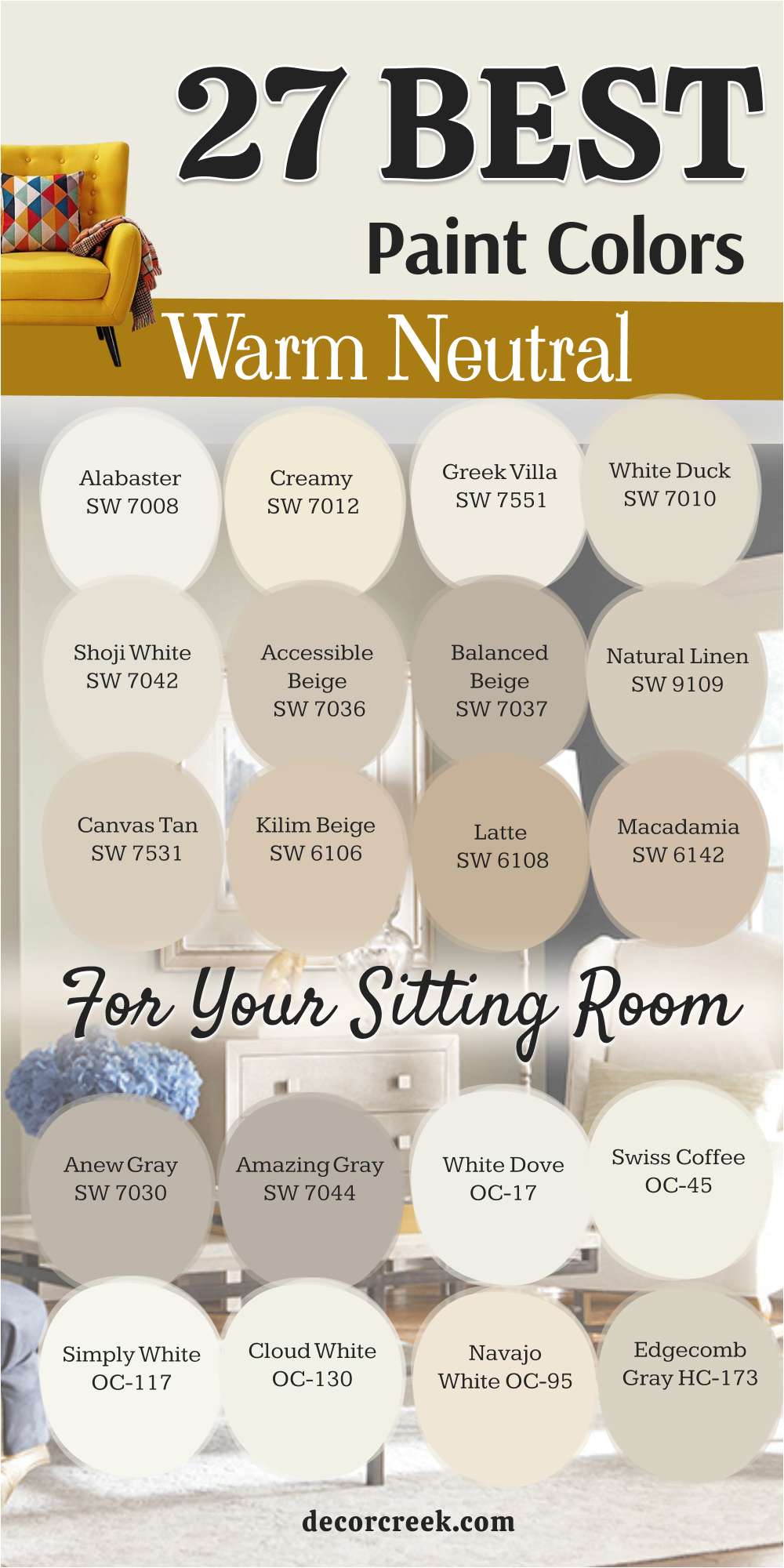
18 Sitting Room Ideas Color Schemes
Alabaster SW 7008 & Iron Ore SW 7069
This color scheme is a classic choice for a sitting room that needs to feel very clean and very modern. Alabaster is a creamy white that makes the walls feel very soft and very light for your family. Iron Ore is a deep charcoal that looks amazing on doors or a fireplace mantle in the same room.
I like to use this mix because it creates a very high-end look without being too cold or harsh. You will love how the dark accents make the light walls look even brighter and more fresh. This pair is very popular for farmhouse styles because it feels very honest and very simple.
Your home will feel very well-organized and very stylish with this beautiful contrast. It is a very safe and very smart way to make a big statement.
Best used in: modern farmhouses, open living areas, and high-ceiling rooms
Pairs well with: light oak floors, black metal lamps, and white linen pillows The key rule of this color for farmhouse style is to use it where you want natural light to feel kind, soft, and inviting throughout the day.
Creamy SW 7012 & Natural Linen SW 9109
This color scheme brings a soft, sun-kissed warmth right into your sitting room. Creamy is a rich, buttery white that feels very inviting and very soft for your guests.
Natural Linen is a classic, sandy neutral that adds a lot of organic texture and steady weight to the walls. I use this combination when a homeowner wants a house that feels like a breezy summer cottage.
You will notice that it makes the room feel very cozy and very bright even on a cloudy morning. This mix looks very pretty with woven textures and light oak decorations in the home. It is a very gentle choice that makes everyone feel very relaxed and very at home.
-
Best used in: sunrooms, traditional living rooms, and farmhouse-style spaces
-
Pairs well with: jute rugs, linen pillows, and light-toned wood furniture
Greek Villa SW 7551 & Anew Gray SW 7030
This sophisticated pairing creates a perfect balance between a bright atmosphere and grounded elegance. Greek Villa is a soft, warm white that feels very luxurious and very clean for your family.
Anew Gray is a mid-tone greige that adds a lot of modern character and depth to an accent wall or cabinets. I recommend this duo for those who want their sitting room to feel updated and very high-end. You will find that it makes the room feel very balanced and very serene throughout the day.
It provides a stunning backdrop for both bold art and neutral furniture. Your guests will appreciate the quiet confidence and polished look this combination provides.
-
Best used in: open-concept living areas, modern entries, and formal lounges
-
Pairs well with: matte black hardware, stone accents, and soft wool rugs
Shoji White SW 7042 & Urbane Bronze SW 7048
This color scheme brings a dramatic, modern contrast right into your sitting room. Shoji White is a warm, creamy neutral that feels very soft and very flexible for your furniture.
Urbane Bronze is a deep, moody gray-brown that adds a lot of rich drama to a fireplace or built-in shelving. I use this combination when a homeowner wants a house that feels very grounded and very sophisticated.
You will notice that it makes the room feel very quiet and very intimate during the evening hours. This mix looks very beautiful with bronze fixtures and natural stone decorations in the home. It is a very stylish choice that makes everyone feel very secure and very impressed.
-
Best used in: contemporary homes, executive dens, and large sitting areas
-
Pairs well with: leather armchairs, metallic accents, and dark wood flooring
White Dove OC-17 & Edgecomb Gray HC-173
This palette brings a timeless, airy grace to any sitting room. White Dove is a legendary soft white that feels very clean and never looks stark or cold.
Edgecomb Gray is a light, “organic” greige that adds a vibrant sense of space and a feeling of calm to the walls. I choose this mix when a homeowner wants a space that feels very classic and very breathable.
You will see how it makes a small room feel much larger and much more open to the light. This pairing looks beautiful with traditional moldings and soft, neutral fabrics. Your family will love how this color scheme makes the home feel very approachable and very elegant.
-
Best used in: classic apartments, cozy sitting rooms, and hallways
-
Pairs well with: silver frames, white marble, and plush neutral carpets
Swiss Coffee OC-45 & Revere Pewter HC-172
This combination is a designer favorite for creating a cozy and very versatile environment. Swiss Coffee is a warm, creamy white that makes the trim feel very soft and very inviting.
Revere Pewter is a celebrated light greige that provides just enough depth to make the walls feel steady and refined. I love this pairing for homeowners who prefer a transitional look that feels very comfortable and very cohesive.
You will notice that it makes the sitting room feel very warm and very welcoming for long family conversations. It serves as a perfect backdrop for a variety of wood tones and colorful accents. Your space will feel very harmonious and very well-designed with this soft transition.
-
Best used in: family rooms, transitional homes, and kitchens
-
Pairs well with: antique gold, cognac leather, and various wood stains
Simply White OC-117 & Balboa Mist OC-27
This color scheme brings a fresh, ethereal glow right into your sitting room. Simply White is a crisp, multi-purpose white that feels very bright and very energized.
Balboa Mist is an ultra-light gray with a hint of warmth that adds a lot of subtle sophistication to the walls. I use this mix when a homeowner wants a house that feels very modern and very expansive.
You will find that it makes the room feel very light and very airy even in spaces with limited windows. This combination looks very lovely with glass accents and minimalist decorations in the home. It is a very clean choice that makes everyone feel very refreshed and very calm.
-
Best used in: modern minimalist homes, bedrooms, and small sitting areas
-
Pairs well with: glass coffee tables, light ash wood, and white linen
Pale Oak OC-20 & Kendall Charcoal HC-166
This pairing brings a stunning high-contrast and very polished feeling to your sitting room. Pale Oak is a soft, graceful greige that feels very elegant and very light for your guests.
Kendall Charcoal is a deep, rich gray that adds a lot of bold structure to a feature wall or window frames. I recommend this combination when a homeowner wants a house that feels very chic and very dramatic.
You will find that it makes the room feel very expensive and very cozy at the same time. This mix looks very pretty with metallic accents and velvet fabrics in the home. It is a very sophisticated choice that makes the whole space feel very tailored and very intentional.
-
Best used in: formal sitting rooms, master suites, and modern lofts
-
Pairs well with: brass lamps, velvet sofas, and black-and-white photography
Sea Salt SW 6204 & Retreat SW 6207
This color scheme brings the soothing essence of a spa right into your sitting room. Sea Salt is a light, ethereal green-gray that feels very refreshing and very cool.
Retreat is a deep, misty green that adds a lot of organic weight and a sense of sanctuary to the space. I use this mix when a homeowner wants a house that feels like a peaceful getaway. You will notice that it makes the room feel very serene and very connected to the outdoors.
This combination looks very lovely with botanical prints and natural wood decorations in the home. It is a very calming choice that makes everyone feel very relaxed and very peaceful.
-
Best used in: coastal homes, master sitting areas, and bathrooms
-
Pairs well with: eucalyptus branches, light oak, and white cotton
Rainwashed SW 6211 & Clary Sage SW 6178
This color scheme brings a soft, garden-inspired freshness to your sitting room. Rainwashed is a delicate, watery green-blue that feels very tranquil and very airy for your guests.
Clary Sage is a muted, herbal green that adds a lot of natural character and steady comfort to the walls. I love this combination when a homeowner wants a house that feels very nurturing and very grounded.
You will find that it makes the room feel very peaceful and very inviting throughout the day. This mix looks very beautiful with vintage furniture and woven accents. It is a very gentle choice that makes everyone feel very centered and very happy.
-
Best used in: country cottages, sun-filled porches, and cozy living rooms
-
Pairs well with: terra cotta, wicker furniture, and cream-colored textiles
Evergreen Fog SW 9130 & Accessible Beige SW 7036
This pairing brings a sophisticated, “new-neutral” vibe right into your sitting room. Evergreen Fog is a gorgeous, chameleon-like green-gray that feels very organic and very trendy.
Accessible Beige is a reliable, warm neutral that adds a lot of soft balance to the trim or surrounding walls. I use this combination when a homeowner wants a house that feels very modern and very harmonious.
You will notice that it makes the room feel very calm and very curated. This mix looks very handsome with wood beams and textured rugs in the home. It is a very versatile choice that makes everyone feel very comfortable and very stylish.
-
Best used in: modern farmhouses, dining-living combos, and entryways
-
Pairs well with: light oak, stone textures, and sage-colored decor
Naval SW 6244 & Alabaster SW 7008
This color scheme brings a bold, nautical elegance to your sitting room. Naval is a deep, authoritative navy that feels very classic and very dramatic.
Alabaster is a soft, creamy white that adds a lot of crisp contrast and light to the ceilings and trim. I love this combination when a homeowner wants a house that feels very confident and very timeless.
You will find that it makes the room feel very tailored and very high-end. This mix looks very beautiful with gold accents and nautical decorations. It is a very striking choice that makes everyone feel very impressed and very focused.
-
Best used in: formal living rooms, dining rooms, and home offices
-
Pairs well with: gold mirrors, white cabinetry, and dark wood floors
Hale Navy HC-154 & Cloud White OC-130
This pairing brings a rich, coastal sophistication right into your sitting room. Hale Navy is a deeply saturated, moody blue that feels very cozy and very regal.
Cloud White is a soft, fluffy white that adds a lot of warmth and lightness to the balance. I recommend this duo for those who want their sitting room to feel like a high-end coastal retreat.
You will find that it makes the room feel very grounded and very luxurious for hosting. It provides a stunning backdrop for light-colored furniture and bright art. Your guests will appreciate the depth and the clean, classic lines this combination provide.
-
Best used in: library-style rooms, coastal estates, and bedrooms
-
Pairs well with: brass hardware, white linen, and driftwood
October Mist 1495 & Swiss Coffee OC-45
This color scheme brings a soft, herbal glow right into your sitting room. October Mist is a gentle, silvery sage that feels very calming and very natural for your guests.
Swiss Coffee is a warm, creamy white that adds a lot of soft light to the trim or the ceiling. I use this mix when a homeowner wants a house that feels very organic and very serene.
You will notice that it makes the room feel very peaceful and very happy even on a gray afternoon. This combination looks very lovely with indoor plants and natural wood decorations. It is a very subtle choice that makes everyone feel very at ease and very relaxed.
-
Best used in: bedrooms, cozy reading nooks, and transitional spaces
-
Pairs well with: indoor greenery, white oak, and soft gray textiles
Saybrook Sage HC-114 & Muslin OC-12
This palette brings a classic, earthy elegance to any sitting room. Saybrook Sage is a muted, historical green that feels very established and very soft.
Muslin is a warm, sandy beige that adds a lot of steady comfort and a sense of tradition to the walls. I choose this mix when a homeowner wants a space that feels very timeless and very nurturing. You will see how it makes a room feel much more cohesive and much more grounded.
This pairing looks beautiful with antique wood and traditional furniture. Your family will love how this color scheme makes the home feel very stable and very lived-in.
-
Best used in: historic homes, traditional sitting rooms, and kitchens
-
Pairs well with: antique furniture, warm wood tones, and floral prints
Smoky Blue SW 7604 & Snowbound SW 7004
This color scheme brings a cool, moody depth right into your sitting room. Smoky Blue is a mid-tone, dusty blue that feels very artistic and very quiet for your guests.
Snowbound is a clean, cool white that adds a lot of crisp energy and light to the balance. I use this combination when a homeowner wants a house that feels very modern and very tranquil. You will notice that it makes the room feel very calm and very expansive throughout the day.
This mix looks very pretty with silver hardware and cool-toned decorations. It is a very refreshing choice that makes everyone feel very focused and very bright.
-
Best used in: modern lofts, creative studios, and bright living areas
-
Pairs well with: chrome fixtures, gray textiles, and blue glass
Dorian Gray SW 7017 & Pure White SW 7005
This combination is the ultimate choice for a clean, professional, and very balanced look. Dorian Gray is a sophisticated, mid-tone gray that feels very steady and very modern for your family.
Pure White is a brilliant, crisp white that adds a lot of sharp contrast to the trim and doors. I love this pairing for homeowners who prefer a clean-lined aesthetic that feels very organized and very chic.
You will notice that it makes the sitting room feel very intentional and very well-structured. It serves as a perfect backdrop for bold pops of color in your decor. Your space will feel very fresh and very sophisticated with this classic gray-and-white look.
-
Best used in: contemporary homes, hallways, and modern sitting rooms
-
Pairs well with: bold abstract art, black furniture, and polished concrete
Iron Ore SW 7069 & Shoji White SW 7042
This color scheme brings a dramatic, high-contrast elegance right into your sitting room. Iron Ore is a deep, soft charcoal that feels very bold and very luxurious for an accent wall.
Shoji White is a warm, creamy neutral that adds a lot of soft light to the surrounding space. I use this mix when a homeowner wants a house that feels very “designer” and very moody.
You will notice that it makes the room feel very secure and very high-end for evening entertainment. This combination looks very handsome with warm wood and textured fabrics in the home. It is a very bold choice that makes everyone feel very impressed and very cozy.
-
Best used in: media rooms, modern living rooms, and bedroom accent walls
-
Pairs well with: warm oak beams, textured rugs, and metallic lighting
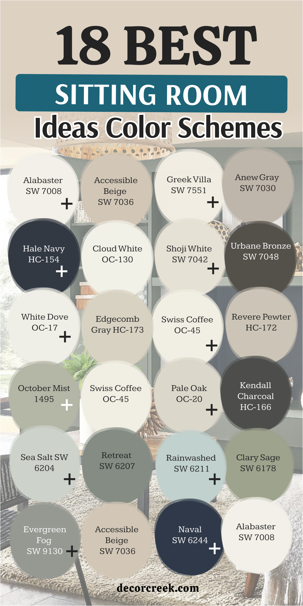
Selecting the perfect color scheme for your sitting room is about much more than just following the latest design trends; it is about creating a foundational atmosphere that reflects your personality and supports your lifestyle. Whether you are drawn to the high-contrast drama of deep charcoals like Iron Ore or the airy, coastal whisper of Sea Salt, the colors you choose will dictate the emotional energy of your home. A well-chosen palette acts as a silent host, making your guests feel immediately welcome and providing your family with a much-needed sanctuary at the end of a long day.
When finalizing your selection from these ideas, always remember that lighting is the ultimate architect of color. A sophisticated greige like Revere Pewter or a soft white like Swiss Coffee can shift beautifully from a warm, sun-drenched glow in the morning to a moody, intimate shade under evening lamplight.
Before committing to a full room, I always suggest observing how your top choices interact with the natural light in your specific space, as this ensures the “kind” and “inviting” feeling you are looking for remains consistent throughout the day.
Another key to a successful sitting room is the balance of visual weight. If you decide to go bold with a deep, authoritative navy or a grounded bronze, it is essential to pair it with a crisp, clean trim like Chantilly Lace or Alabaster to keep the room feeling expansive and organized. This contrast not only highlights the architectural details of your home but also prevents darker tones from becoming overwhelming.
By balancing these “heavy” and “light” elements, you create a space that feels both expensive and approachable.