I know how hard it can be to pick the right paint for your sleeping area. You want it to look good and feel right when you lay your head down at night. Most people stick to just one color because they are afraid of making a mistake. I have spent years helping families make their homes look like they belong in a magazine. Adding a second color is the easiest way to make a room look professional and special.
It is like choosing the right outfit where the top and pants just match perfectly. A good mix of two shades can make a small room feel bigger or a cold room feel much warmer. You do not need a huge budget to change the way your bedroom looks.
A few cans of paint and a weekend of work can give you a brand new place to relax.
My goal is to help you find that perfect pair that makes you smile every time you walk through the door.
My Favorite Two Colour Combination Ideas for Bedroom Walls
Picking colors is my favorite part of being a designer because it changes the mood instantly. I always look for one shade that is light and one that has a bit more punch to it. This creates a balance that keeps the walls from looking boring or flat. I often suggest putting the darker color on the wall behind the bed to create a focal point. This draws your eyes to the most important part of the room as soon as you enter.
Some of my best projects used a mix of a creamy white and a deep, moody blue. It feels like looking at the sky right before the sun goes down. Another great trick is to use two shades of the same color, like a light gray and a dark gray.
This keeps things very simple but adds a layer of style that one color just cannot do alone. I love seeing how happy my clients get when they see their vision finally come to life on the walls.
How I Choose the Right Two Colour Combination for Bedroom Walls
I always start by looking at the windows and how much sun comes into the room during the day. If a room stays dark, I pick lighter colors to help bounce the light around so it does not feel like a cave. If a room gets tons of bright sun, I can use much darker colors without making it feel too small. I also think about the furniture you already have, like the wood on your dresser or the fabric on your bed. Your paint should work with your stuff, not fight against it for attention.
Another big thing I check is the floor color because it acts like a third color in the room. A warm wooden floor looks amazing with greens and blues, while a gray carpet likes cooler tones. I always tell people to paint a small patch on the wall before they do the whole thing.
Colors look different at night under a lamp than they do at noon under the sun. Taking your time to test the paint will save you from a lot of hard work later on.
34 Inspiring Two Colour Combo For Bedroom
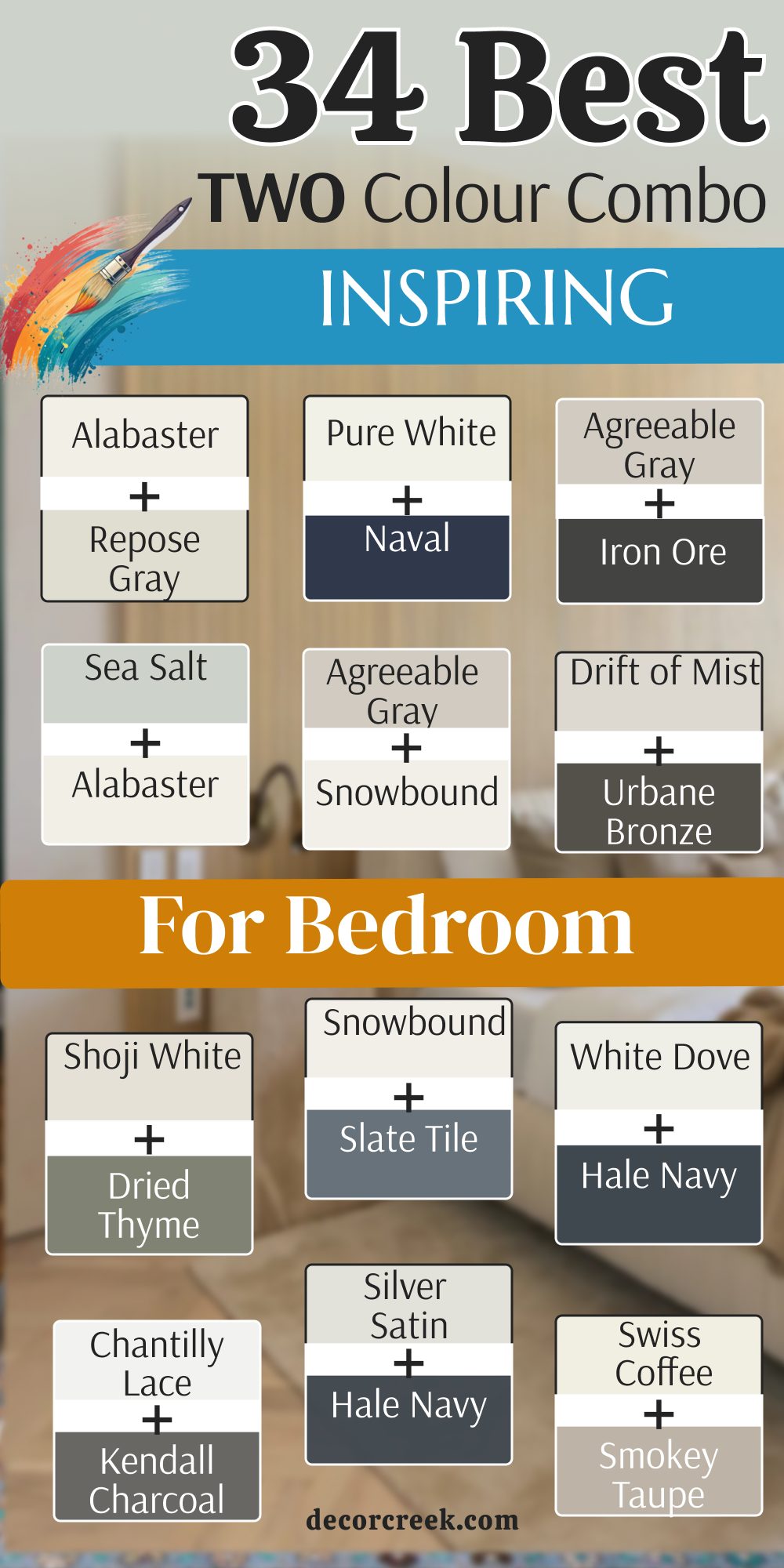
Alabaster SW 7008 + Repose Gray SW 7015
Alabaster SW 7008 acts as the perfect bright base for any bedroom that needs a clean look. Repose Gray SW 7015 brings in a soft touch that keeps the room from looking too stark or cold. This duo works well because both shades have a tiny bit of warmth tucked inside them.

You will notice that the room feels very put together without trying too hard. Walls painted in this mix provide a great backdrop for colorful pillows or bright blankets.
Many people love this pair because it feels very fresh and light on the eyes. Light reflects off the lighter shade and gets captured softly by the gray one. It makes the sleeping area feel very organized and neat throughout the week. You can use the gray on one wall and the white on the others for a nice change. This is a safe choice that never feels out of fashion for a modern home.
Best used in: living rooms, kitchens, hallways, bedrooms, and farmhouse exteriors
Pairs well with: Iron Ore SW 7069, Agreeable Gray SW 7029, Natural Linen SW 9109, warm wood tones The key rule of this color for farmhouse style is to use it where you want natural light to feel kind, soft, and inviting throughout the day.

Pure White SW 7005 + Naval SW 6244
Pure White SW 7005 is the cleanest white you can find to make your trim and walls pop. Naval SW 6244 is a very dark blue that reminds me of the deep ocean at night. Putting these two together creates a very bold look that makes a big statement.

The dark blue wall acts like a giant hug for your bed while the white keeps things bright. This mix is perfect for people who want a room that feels very sturdy and strong.
White furniture looks amazing against the dark blue background in this setup. You will find that this pair makes the room look very expensive and high-end. It is a classic look that works for both kids and adults who like a nautical theme. The contrast is very sharp which helps define the corners and edges of your room. Choosing this pair shows that you are brave and have great taste in home design.
Best used in: bedrooms, bathrooms, front doors, cabinets, and accent walls
Pairs well with: Grayish SW 6001, Carrara Marble, Gold accents, Wood tones The key rule of this color for a bold style is to use it where you want a sense of strength and crisp lines to stand out.

Accessible Beige SW 7036 + Alabaster SW 7008
Accessible Beige SW 7036 is a very friendly color that makes any room feel cozy and lived in. Alabaster SW 7008 adds just enough brightness to keep the beige from feeling too heavy or old. This combination is wonderful for rooms where you want to feel very relaxed after a long day. It feels like a warm cup of cocoa on a cold winter morning. The two shades blend into each other very smoothly without a harsh line.

Wood floors look particularly good when paired with these specific paint choices. You can add lots of different textures like wool or linen to make the room even better. Many families pick this because it hides a little bit of dust better than pure white does.
It is a very forgiving mix that works in almost any type of house. Your bedroom will feel like a soft retreat where you can truly let go of your worries.
Best used in: open floor plans, bedrooms, entryways, and traditional homes
Pairs well with: Urbane Bronze SW 7048, Cadet SW 9143, Sanderling SW 7513, dark woods The key rule of this color for a cozy style is to use it where you want a gentle transition between different rooms and lighting.
Agreeable Gray SW 7029 + Iron Ore SW 7069
Agreeable Gray SW 7029 is famous because it looks good in literally every house I have ever seen. Iron Ore SW 7069 is a very dark charcoal that is almost black but a little softer. When you put them together, you get a very modern and cool vibe that feels very trendy.

The dark wall gives the room a lot of depth and makes the ceiling feel higher. This pair is great for someone who wants a bedroom that feels a bit more serious and sleek.
Gray tones are very popular right now because they match with almost any furniture color. You can use the dark shade on the wall with the most windows to handle the shadows. The lighter gray keeps the rest of the room feeling open and airy so you don’t feel trapped. It is a very balanced look that appeals to many different people. Your bedroom will look like it was designed by a pro with this smart selection.
Best used in: modern bedrooms, home offices, basements, and exterior trim
Pairs well with: Extra White SW 7006, Coral Clay SW 9005, Sea Salt SW 6204, black metal The key rule of this color for a modern style is to use it where you want a sharp contrast that still feels grounded and earthy.

Sea Salt SW 6204 + Alabaster SW 7008
Sea Salt SW 6204 is a magical color that looks green or blue depending on the time of day. Alabaster SW 7008 keeps the look very light and helps the soft green stand out. This mix makes a bedroom feel like a spa or a quiet beach house.

It is very light and easy on the eyes when you first wake up in the morning. You will feel a sense of peace just looking at these two colors together on your walls.
White curtains and light wood furniture are the best matches for this color duo. It is a very popular choice for guest rooms because everyone seems to like it. The color is not too loud but it still has a lot of personality to show off. You can almost feel a cool breeze just by standing in a room painted like this. It is the perfect choice for a bedroom that should feel like a vacation every night.
Best used in: bathrooms, bedrooms, laundry rooms, and sunrooms
Pairs well with: Summit Gray SW 7669, Fleur de Sel SW 7666, Heron Plume SW 6070, wicker The key rule of this color for a spa style is to use it where natural light can change its tone from morning to night.
Misty SW 6232 + Naval SW 6244
Misty SW 6232 is a very light blue that feels like a foggy morning by the lake. Naval SW 6244 adds a deep anchor to the room so it does not feel too floaty or light. Using these two together gives you a very professional and clean blue theme.

It is like wearing a nice suit that fits just right for a special occasion. The light blue is very soothing and helps you fall asleep faster at night.
Darker blue on one wall makes the room feel very cozy and safe like a small nest. You can use silver or chrome lamps to make the room look even more polished. This pair works well for teenagers or adults who want a very tidy and smart bedroom. It is a very cool color palette that helps keep the room feeling fresh even in summer. You will love how the two shades of blue play off each other in the light.
Best used in: boys’ rooms, master bedrooms, dining rooms, and small bathrooms
Pairs well with: Pure White SW 7005, Dorian Gray SW 7017, Silver Strand SW 7057, navy decor The key rule of this color for a blue style is to use it to create a sense of order and quiet strength in your personal area.
Drift of Mist SW 9166 + Urbane Bronze SW 7048
Drift of Mist SW 9166 is a very soft gray that almost looks like a shadow on the wall. Urbane Bronze SW 7048 is a deep, brownish gray that feels very rich and expensive. This combination is perfect for a bedroom that wants to feel very high-end and fancy.

The dark bronze color has a lot of warmth which makes the room feel very snug. It is a great choice if you have a lot of plants because the green leaves pop against the bronze.
The light gray keeps the room from feeling too dark or heavy during the day. This pair is very sophisticated and shows that you know a lot about current styles. It feels very natural and earthy like the colors you would find in a forest. You can use gold or brass hardware to add a little bit of shine to the room. This is a very grown-up look that makes any bedroom feel like a luxury hotel suite.
Best used in: master suites, living rooms, exteriors, and accent walls
Pairs well with: Shoji White SW 7042, Modern Gray SW 7632, Messenger Bag SW 7740, leather The key rule of this color for an earthy style is to use it to bring a sense of the outdoors and nature inside your home.

Creamy SW 7012 + Evergreen Fog SW 9130
Creamy SW 7012 is a very soft and warm white that feels like vanilla ice cream. Evergreen Fog SW 9130 is a beautiful green that has a lot of gray mixed into it. This pair is very popular right now because it feels very natural and quiet.

It makes a bedroom feel like a hidden garden where you can go to hide from the world. The green is very soft and does not feel too bright or overwhelming on the walls.
The warm white helps the green look very rich and full of life. This combination is great for someone who loves nature and wants to bring it inside. It works very well with light oak furniture or woven baskets. You will find that this room feels very peaceful and helps you relax after a busy day. It is a very soft look that makes everyone feel welcome and comfortable.
Best used in: bedrooms, kitchens, cabinets, and mudrooms
Pairs well with: Neutral Ground SW 7568, Dried Thyme SW 6186, Uber Umber SW 9107, gold The key rule of this color for a natural style is to use it to create a soft and organic feeling that mimics the forest floor.

Shoji White SW 7042 + Dried Thyme SW 6186
Shoji White SW 7042 is a very versatile white that has a hint of beige and gray in it. Dried Thyme SW 6186 is a deeper green that looks like the herbs you might grow in a pot. This mix is very grounded and makes a bedroom feel very solid and cozy.

The green is dark enough to be an accent but light enough to not feel like black. It is a very classic look that feels both old-fashioned and brand new at the same time.
The off-white walls make the room feel very large and full of light. This pair is excellent for a room with a lot of wooden furniture or antique pieces. It creates a very warm and inviting atmosphere that is perfect for sleeping. You will feel very connected to nature when you see these colors on your walls. It is a smart choice for anyone who wants a bedroom that feels very stable and comfortable.
Best used in: entryways, bedrooms, exteriors, and traditional living rooms
Pairs well with: Fawn Brindle SW 7615, Greek Villa SW 7551, Black Magic SW 6991, wood The key rule of this color for a traditional style is to use it to bridge the gap between bright whites and deep, natural tones.

Snowbound SW 7004 + Slate Tile SW 7624
Snowbound SW 7004 is a very crisp and cool white that makes everything look very clean. Slate Tile SW 7624 is a dusty blue-gray that looks like the stones on a roof. This combination is very modern and feels very fresh and updated.

The blue-gray color is very relaxing and helps the room feel very quiet. It is a great choice for a bedroom that gets a lot of afternoon sun.
The white walls help the blue-gray pop and look very sharp and defined. This pair is very good for creating a clean and organized look in a small bedroom. It feels very airy and light which helps you breathe easy at the end of the day. You can add some black frames or lamps to finish off the modern look. This is a very stylish choice that makes your room look very sharp and well-designed.
Best used in: modern homes, bathrooms, bedrooms, and kitchen cabinets
Pairs well with: Colonnade Gray SW 7641, Peppercorn SW 7674, Naval SW 6244, silver The key rule of this color for a clean style is to use it to make small areas feel much larger and more open than they are.

White Dove OC-17 + Hale Navy HC-154
White Dove OC-17 is a soft and creamy white that makes any wall look very clean but still very warm. Hale Navy HC-154 is a deep and royal blue that feels very strong and heavy on the eyes. This mix is a classic look that many designers use when they want a room to look very expensive.

You can paint the wall behind your headboard with the dark blue to make the bed stand out. The white walls around it will keep the room from feeling too dark like a small box.
Blue and white together always remind people of the ocean or a very nice summer home. It is a very smart choice for a bedroom because it feels very organized and neat. You will find that this pair works very well with gold lamps or brass handles on your dresser. The dark blue is dark enough to act like a neutral color that goes with almost anything else. White Dove OC-17 helps the dark blue look even deeper and more interesting than it does alone.
Best used in: master bedrooms, dining rooms, kitchen islands, and front doors
Pairs well with: Revere Pewter HC-172, Gray Owl OC-52, Wood tones, Gold hardware The key rule of this color for a classic style is to use it where you want a crisp and sharp look that feels both rich and very bright.

Chantilly Lace OC-65 + Kendall Charcoal HC-166
Chantilly Lace OC-65 is a very bright and pure white that has almost no yellow or blue in it at all. Kendall Charcoal HC-166 is a very dark gray that looks like a heavy stone or a piece of lead. This combination is very modern and looks great in houses that have a lot of big windows.

The dark gray adds a lot of weight to the room which makes it feel very grounded and solid. You will love how the bright white makes the gray look very crisp and clean.
Gray is a very popular color because it lets you use any color you want for your blankets and pillows. This pair feels very professional and like something you would see in a big city apartment. It is a very cool look that stays fresh even when the sun is very hot outside. You can add some black metal furniture to make the room look very industrial and cool. Choosing this pair shows that you like things to be very simple and very well-designed.
Best used in: modern bedrooms, home offices, hallways, and trim work
Pairs well with: Revere Pewter HC-172, Boothbay Gray HC-165, Wood tones, Silver accents The key rule of this color for a modern style is to use it where you want the sharpest contrast possible between light and dark areas.

Classic Gray OC-23 + Simply White OC-117
Classic Gray OC-23 is a very light and airy gray that feels like a soft cloud in the sky. Simply White OC-117 is a warm and glowing white that makes every corner of the room look very bright. This duo is very soft and does not have any harsh lines between the two colors on the wall.

It is a great choice for a very small bedroom where you want to feel like there is a lot of room. The light gray gives just enough color to show where the walls end and the ceiling starts.
Many people like this mix because it is very easy to live with for a long time. It does not demand your attention but it makes everything in the room look much better. You can add colorful art on the walls and the colors will really pop against these light shades. It is a very safe and happy choice for a bedroom that should feel very light and open. Your room will feel like a big breath of fresh air every time you walk inside.
Best used in: nurseries, small bedrooms, laundry rooms, and open living areas
Pairs well with: Hale Navy HC-154, Wrought Iron 2124-10, Silver Satin OC-26, light oak The key rule of this color for a light style is to use it where you want to maximize the feeling of openness and natural brightness.

Edgecomb Gray HC-173 + White Dove OC-17
Edgecomb Gray HC-173 is a very popular “greige” color which means it is a mix of gray and beige. White Dove OC-17 provides a very soft and creamy border that makes the greige look very rich and full. This combination is very warm and makes a bedroom feel very cozy and friendly for anyone.

It is a very natural look that reminds me of sand on a quiet beach during a cloudy day. The colors are very close to each other so the room feels very smooth and balanced.
You will find that this pair works very well with traditional furniture and old family photos. It is a very timeless look that will not feel old in a few years when styles change again. The warmth in the paint helps the room feel very snug and tight when you are under your covers. Many families choose this for their main bedroom because it feels very relaxing and easy to enjoy. It is a very soft and gentle look that makes a house feel like a real home.
Best used in: master suites, entryways, kitchens, and whole-house paint colors
Pairs well with: Revere Pewter HC-172, Hale Navy HC-154, Nickel accents, dark wood The key rule of this color for a warm style is to use it where you want a soft and inviting feel that works in both sun and shade.
Revere Pewter HC-172 + Hale Navy HC-154
Revere Pewter HC-172 is a very famous color because it changes its look depending on the light in the room. Hale Navy HC-154 is a deep blue that brings out the cool gray tones in the pewter paint. This mix is very strong and makes a bedroom feel like a very important and well-decorated place.

It is a great choice for a room with a lot of heavy wood furniture or big rugs. The blue wall adds a lot of personality while the pewter keeps the rest of the room feeling quiet.
Using these two together makes the room look very high-end and like a professional designer lived there. It is a very sturdy look that appeals to people who like a lot of color but still want to be safe. You can use white bedding to break up the darker colors and make the bed look very inviting. The pewter shade is very good at hiding small marks on the wall which is great for busy homes. This is a very smart and stylish choice for a bedroom that needs a little bit of drama.
Best used in: dining rooms, bedrooms, living rooms, and kitchen cabinets
Pairs well with: White Dove OC-17, Simply White OC-117, Gold hardware, leather The key rule of this color for a bold style is to use it where you want a sense of luxury and deep color to fill the room.
Pale Oak OC-20 + Kendall Charcoal HC-166
Pale Oak OC-20 is a very light and elegant gray that has a tiny bit of pink or purple hidden inside it. Kendall Charcoal HC-166 is a very dark and moody gray that makes the light walls look very bright and clean. This pair is very sophisticated and makes a bedroom feel very posh and well-planned.

The light gray is very soft and helps the dark charcoal not feel too heavy or scary on the walls. It is a very modern mix that feels very fresh and updated for a new house.
You can use the dark gray on the wall where you have your TV or your desk to help those items blend in. The light oak color makes the whole room feel very large and full of light during the day. It is a very cool color palette that helps you feel very focused and calm when you are working or resting. This combination is great for someone who wants a very tidy and smart bedroom look. Your room will look very sharp and professional with this great color duo on the walls.
Best used in: modern bedrooms, bathrooms, living rooms, and exterior trim
Pairs well with: Chantilly Lace OC-65, Revere Pewter HC-172, Black metal, wood The key rule of this color for a clean style is to use it to create a sharp and organized feeling in your personal sleeping area.
Balboa Mist OC-27 + White Dove OC-17
Balboa Mist OC-27 is a very soft and light gray that feels very warm and very inviting for a bedroom. White Dove OC-17 is a creamy white that adds just enough brightness to keep the gray from feeling too cold.

This duo is very light and is perfect for a bedroom where you want to feel very relaxed and happy. It is a very gentle look that does not have any big surprises or loud colors on the walls. The two shades work together to make the room feel very smooth and very well-balanced for sleeping.
You can use a lot of different colors for your blankets because these walls will match with almost anything you pick. It is a very flexible choice that works for guest rooms or for your own main sleeping area. The light gray has a tiny bit of beige in it which makes the room feel very snug and cozy at night. You will love how the room looks in the morning when the first light hits the soft gray walls. This is a very beautiful and safe choice for anyone who wants a very pretty and light bedroom.
Best used in: bedrooms, living rooms, open floor plans, and nurseries
Pairs well with: Simply White OC-117, Kendall Charcoal HC-166, Wood tones, soft fabrics The key rule of this color for a soft style is to use it where you want a gentle and warm feeling that stays quiet.
Silver Satin OC-26 + Hale Navy HC-154
Silver Satin OC-26 is a very light gray that almost looks like a soft silver coin on the bedroom wall. Hale Navy HC-154 is a deep blue that provides a very strong and bold contrast to the light gray paint.
This mix is very elegant and makes a bedroom feel very formal and very well-dressed like a fancy suit. The dark blue wall acts like a big anchor that holds the whole room together and makes it feel solid. It is a great choice for a room with a lot of white furniture or light wood floors.
The light gray walls keep the room from feeling too dark even with a big navy blue wall behind the bed. You will find that this pair makes the room look very expensive and like a fancy hotel room you see in magazines. It is a very classic color palette that many people love because it feels very sturdy and smart. You can add some silver lamps to make the room look even more like the name of the light paint. This is a very stylish and bold choice for a bedroom that wants to make a big statement.
Best used in: master suites, home offices, dining rooms, and accent walls
Pairs well with: Chantilly Lace OC-65, Gray Owl OC-52, Silver metal, Navy accents The key rule of this color for an elegant style is to use it to create a sense of deep color and bright light.
Swiss Coffee OC-45 + Smokey Taupe 983
Swiss Coffee OC-45 is a very warm and creamy white that feels like a warm cup of milk on a cold day. Smokey Taupe 983 is a deeper beige that has a little bit of gray mixed into it to keep it looking modern.

This combination is very warm and makes a bedroom feel very snug and very comfortable for sleeping every night. It is a very traditional look that makes a house feel very old-fashioned in a good way like a cozy cottage. The two colors are very close in warmth which makes the room feel very harmonious and soft.
You will find that this pair works very well with dark wood furniture and heavy rugs on the floor. It is a very cozy choice for a bedroom that stays a bit cold during the winter months because of the warmth. The warmth in the paint helps the room feel very friendly and like a place where you can really rest. Many people pick this because it feels very natural and like the colors you see in a quiet forest setting. This is a very soft and inviting choice for a bedroom that should feel like a warm hug.
Best used in: traditional bedrooms, kitchens, hallways, and whole-house colors
Pairs well with: White Dove OC-17, Revere Pewter HC-172, Dark wood, Gold hardware The key rule of this color for a traditional style is to use it to create a warm and friendly feeling.
Alabaster SW 7008 + Evergreen Fog SW 9130
Alabaster SW 7008 is a very soft white that acts as a clean and bright base for your bedroom walls. Evergreen Fog SW 9130 is a beautiful green that has a lot of gray in it like a forest in the morning mist.
This pair is very popular right now because it feels very natural and quiet when you walk into the room. It makes a bedroom feel like a hidden garden where you can go to hide from the busy world outside. The green is very soft and does not feel too bright or too dark on the bedroom walls.
The warm white helps the green look very rich and full of life while keeping the room bright. This combination is great for someone who loves nature and wants to bring that feeling inside their home. It works very well with light oak furniture or woven baskets made of natural wood or straw. You will find that this room feels very peaceful and helps you relax after a long and busy day. It is a very soft look that makes everyone feel welcome and very comfortable in your home.
Best used in: bedrooms, kitchens, cabinets, and mudrooms
Pairs well with: Neutral Ground SW 7568, Dried Thyme SW 6186, Uber Umber SW 9107, gold The key rule of this color for a natural style is to use it to create a soft and organic feeling.
Agreeable Gray SW 7029 + Snowbound SW 7004
Agreeable Gray SW 7029 is a very special color because it looks good with any furniture you already have in your room. Snowbound SW 7004 is a very crisp and cool white that makes the gray look very clean and very updated.
This mix is perfect for people who want a very modern bedroom that feels very light and very airy. The gray is light enough to not feel dark but it still gives the walls a nice bit of color. You will love how the white trim stands out against this popular shade of gray.
Many people choose this pair because it is very easy to change your room later with new pillows or rugs. It acts like a clean canvas where you can add any other colors you like without any trouble. The room will always look very tidy and very professional with these two colors on the walls. It is a very safe and smart choice for a bedroom that you want to look good for many years. Your room will feel very fresh and very organized every time you wake up in the morning.
Best used in: open floor plans, bedrooms, kitchens, and modern homes
Pairs well with: Iron Ore SW 7069, Naval SW 6244, Sea Salt SW 6204, black accents The key rule of this color for a modern style is to use it to make any area feel more open.
Repose Gray SW 7015 + Sea Salt SW 6204
Repose Gray SW 7015 is a light and cool gray that makes a bedroom feel very clean and very organized. Sea Salt SW 6204 is a magical light green-blue that reminds me of the ocean on a very quiet day.
This duo is very light and is perfect for a small room where you want to feel like there is a lot of space. The two colors blend together very softly and do not have a harsh line where they meet on the wall. You will find that this room feels very quiet and very easy to relax in after work.
Light-colored wood floors look amazing when they are paired with these two soft and pretty paint colors. This pair is very popular for guest rooms because it makes everyone feel very welcome and very comfortable. The gray keeps the green from looking like a kid’s room and makes it look very professional for adults. You can add some white curtains to keep the look very airy and very bright during the day. This is a very soft and beautiful choice for a bedroom that should feel like a quiet place.
Best used in: bathrooms, bedrooms, sunrooms, and laundry rooms
Pairs well with: Eider White SW 7014, Silver Strand SW 7057, Wicker, Light wood The key rule of this color for a spa style is to use it to create a soft and watery feeling.
Accessible Beige SW 7036 + Urbane Bronze SW 7048
Accessible Beige SW 7036 is a very warm and friendly color that makes a bedroom feel very snug and cozy. Urbane Bronze SW 7048 is a very dark brownish-gray that looks very rich and very earthy on the accent wall.
This mix is perfect for a room where you want to feel very grounded and very safe at night. The dark bronze color adds a lot of depth and makes the room feel very important and well-designed. You will love how the warm beige keeps the dark color from feeling too heavy in the room.
Many designers pick this pair when they want a house to feel very high-end and very natural for their clients. It works very well with leather chairs or dark wood dressers that have a lot of dark history. The beige walls make the room feel very large while the bronze wall gives it a very cool focal point. You can add some cream-colored rugs to bring the whole look together in a very soft and pretty way. This is a very smart and grown-up choice for a bedroom that wants to feel very solid.
Best used in: living rooms, master suites, exteriors, and entryways
Pairs well with: Alabaster SW 7008, Pure White SW 7005, Bronze metal, Leather The key rule of this color for an earthy style is to use it to create a sense of the outdoors.
White Dove OC-17 + Saybrook Sage HC-114
White Dove OC-17 is a very soft and creamy white that makes any bedroom feel very warm and very inviting. Saybrook Sage HC-114 is a beautiful green that looks like the soft leaves on a plant in a quiet garden.
This combination is very traditional and makes a bedroom feel very cozy and very much like a real home. The green is very soft and does not feel too loud or too bright when you are trying to relax. You will find that this room feels very peaceful and very natural every time you walk inside.
Wood furniture looks particularly good with this specific green because they both come from the natural world outside. It is a very safe and happy choice for a bedroom that you want to enjoy for a very long time. The warm white helps the green look very rich and very full of life throughout the day. You can add some floral patterns or soft rugs to make the room feel even more comfortable and snug. This is a very beautiful and gentle choice for a bedroom that should feel like a quiet place.
Best used in: bedrooms, living rooms, kitchens, and traditional homes
Pairs well with: Revere Pewter HC-172, Simply White OC-117, Wood tones, Brass The key rule of this color for a warm style is to use it to create a soft and inviting feel.

Pale Oak OC-20 + White Dove OC-17
Pale Oak OC-20 is a very light and elegant gray that has a tiny bit of warmth hidden inside it. White Dove OC-17 is a creamy white that makes the light gray look very clean and very high-end on the walls.
This pair is very soft and is perfect for a bedroom where you want to feel very light and very airy. It is a very sophisticated look that does not have any big or loud colors to distract you from rest. The two colors are very close so the room feels very large and very open during the day.
You can use almost any furniture with these walls because they act like a very soft and neutral background. This pair is great for making a small bedroom feel much bigger than it really is in real life. The light gray has a tiny bit of beige in it which makes the room feel very cozy when the lamps are on. You will love how the room looks very clean and very organized with these two soft shades of paint. This is a very smart and pretty choice for a bedroom that should feel very quiet and very light.
Best used in: open floor plans, bedrooms, nurseries, and small living areas
Pairs well with: Kendall Charcoal HC-166, Hale Navy HC-154, Gold accents, white trim The key rule of this color for a light style is to use it to make small areas feel much bigger.
Gray Owl OC-52 + Hale Navy HC-154
Gray Owl OC-52 is a cool gray that has a tiny bit of blue in it when the sun shines on the walls. Hale Navy HC-154 is a deep and royal blue that makes the light gray look very sharp and very clean. This mix is very popular for people who want a bedroom that feels very modern and very well-designed.

The dark blue wall acts like a big anchor for your bed and makes the whole room feel very solid. You will find that this pair makes the room look very professional and like a fancy hotel.
Silver lamps and white bedding look amazing when they are put into a room with these two colors on the walls. It is a very cool color palette that helps you feel very focused and ready for the day when you wake up. The light gray walls keep the room feeling very large while the dark blue adds a lot of style. You can add some black metal frames to finish off the modern look of your bedroom walls. This is a very smart and stylish choice for a bedroom that wants to have a lot of character.
Best used in: master bedrooms, home offices, dining rooms, and kitchen islands
Pairs well with: White Dove OC-17, Simply White OC-117, Silver hardware, Navy decor The key rule of this color for a cool style is to use it to create a sense of order.
Chantilly Lace OC-65 + Boothbay Gray HC-165
Chantilly Lace OC-65 is a very bright and pure white that makes any room feel very clean and very open. Boothbay Gray HC-165 is a soft and dusty blue-gray that feels very quiet and very smart on the bedroom walls.
This duo is very pretty and makes a bedroom feel like a very light and airy place to rest every night. The blue-gray color has a tiny bit of warmth to it so it does not feel too cold in the winter. You will love how the bright white makes the soft blue tones look very fresh and very updated.
Many people like this mix because it feels very tidy and very organized without being too boring or too plain. It works very well with light gray carpets or white wooden furniture in a small bedroom for a kid. The light colors help the room feel very large and full of light during the whole day when the sun is out. You can add some silver frames to the walls to make the room look even more polished and pretty. This is a very soft and stylish choice for a bedroom that should feel very clean and very light.
Best used in: bathrooms, bedrooms, laundry rooms, and small offices
Pairs well with: Hale Navy HC-154, Gray Owl OC-52, Silver hardware, White trim The key rule of this color for a fresh style is to use it where you want to maximize light.

Alabaster SW 7008 + Naval SW 6244
Alabaster SW 7008 is a very soft and creamy white that makes any wall look bright and very warm. Naval SW 6244 is a very dark and royal blue that feels very strong and very heavy on the accent wall.
This mix is a classic look that many designers use when they want a room to look very expensive. You can paint the wall behind your headboard with the dark blue to make your bed stand out as the star. The white walls around it will keep the room from feeling too dark like a small box.
Blue and white together always remind people of the ocean or a very nice summer home near the beach. It is a very smart choice for a bedroom because it feels very organized and very neat for an adult. You will find that this pair works very well with gold lamps or brass handles on your bedroom dresser. The dark blue is dark enough to act like a neutral color that goes with almost anything else you have. Alabaster helps the dark blue look even deeper and more interesting than it does all by itself.
Best used in: master bedrooms, dining rooms, front doors, and kitchen cabinets
Pairs well with: Iron Ore SW 7069, Agreeable Gray SW 7029, Gold accents, warm woods The key rule of this color for a bold style is to use it where you want a sense of strength.
Shoji White SW 7042 + Urbane Bronze SW 7048
Shoji White SW 7042 is a very versatile white that has a hint of beige and gray to keep it soft. Urbane Bronze SW 7048 is a deep brownish gray that feels very rich and very earthy on the focal wall. This combination is very modern and makes a bedroom feel very high-end and very well-planned like a hotel.
The dark wall creates a very strong focal point that makes the whole room look very smart and very cool. You will find that the light white walls help the dark bronze look very crisp and very clean.
Dark bronze is a great choice because it hides shadows and makes the room feel very cozy at night when you sleep. This pair works very well with colorful rugs or bright art because the walls are very simple and neutral. It feels very professional and like something you would see in a big city home design magazine. You can use black metal lamps to complete the look and make the room look very sharp for guests. This is a very brave and stylish choice for a bedroom that wants to have a lot of style.
Best used in: master suites, living rooms, exteriors, and accent walls
Pairs well with: Fawn Brindle SW 7615, Greek Villa SW 7551, Black metal, wood tones The key rule of this color for an earthy style is to use it to bring a sense of nature inside.
Creamy SW 7012 + Retreat SW 6207
Creamy SW 7012 is a very warm and soft white that feels like a big bowl of vanilla cream for your walls. Retreat SW 6207 is a beautiful green that has a lot of blue and gray mixed into it like a foggy forest.
This pair is wonderful for a bedroom because it feels like bringing a piece of the quiet outdoors inside your home. The green wall acts like a soft blanket for your bed while the white keeps the rest of the room light. You will find that this mix makes the room feel very fresh and very natural.
Many people love this green because it is not too bright or loud when you are trying to relax at night. It works very well with light wood furniture or even black metal bed frames for a very modern look. You can add some white pillows and a green throw blanket to match the walls in your room perfectly. The white walls help the green look very deep and rich throughout the whole day as the sun moves. Choosing this pair shows that you want a bedroom that feels like a private getaway.
Best used in: bedrooms, bathrooms, accent walls, and kitchen cabinets
Pairs well with: Urbane Bronze SW 7048, Sea Salt SW 6204, Light wood, black metal The key rule of this color for a natural style is to use it to create a sense of the forest.

Simply White OC-117 + Hale Navy HC-154
Simply White OC-117 is a warm and glowing white that makes every corner of the bedroom look very bright. Hale Navy HC-154 is a deep and royal blue that feels very strong and very sturdy on the focal wall.
This combination is very popular because it makes a bedroom feel very clean and very high-end for an adult. The dark blue wall gives the room a lot of depth and makes the bed look very important and solid. You will love how the bright white makes the blue look very rich and very deep during the day.
White furniture and light-colored rugs are the best matches for this specific and bold color duo in your room. It is a very smart look that stays fresh and updated for a long time without ever feeling old. The light walls help the room feel very large while the dark wall adds a lot of personality and design. You can add some gold lamps to make the room look even more polished and well-designed for your home. This is a very cool and stylish choice for a bedroom that should feel very sharp.
Best used in: master bedrooms, dining rooms, kitchen islands, and front doors
Pairs well with: Revere Pewter HC-172, Gray Owl OC-52, Wood tones, Gold hardware The key rule of this color for a classic style is to use it to create a crisp and sharp look.
Edgecomb Gray HC-173 + Kendall Charcoal HC-166
Edgecomb Gray HC-173 is a very warm “greige” color that makes any bedroom feel very cozy and very friendly. Kendall Charcoal HC-166 is a very dark and moody gray that makes the light walls look very bright and clean.

This pair is very sophisticated and makes a bedroom feel very posh and well-planned like a fancy suite. The light gray is very soft and helps the dark charcoal not feel too heavy or scary on the walls. It is a very modern mix that feels very fresh and updated for a bedroom project.
You can use the dark gray on the wall where you have your TV or your desk to help them blend in. The light gray color makes the whole room feel very large and full of light during the day for you. It is a very cool color palette that helps you feel very focused and quiet when you are resting at night. This combination is great for someone who wants a very tidy and smart bedroom look for their house. Your room will look very sharp and professional with this great color duo on the bedroom walls.
Best used in: master suites, entryways, kitchens, and whole-house colors
Pairs well with: White Dove OC-17, Hale Navy HC-154, Nickel hardware, dark wood The key rule of this color for a warm style is to use it where you want an inviting feel.
Classic Gray OC-23 + Boothbay Gray HC-165
Classic Gray OC-23 is a very light and airy gray that feels like a soft cloud in the sky over your bed. Boothbay Gray HC-165 is a soft and dusty blue-gray that feels very quiet and very smart on the walls.
This duo is very light and is perfect for a small bedroom where you want to feel like there is space. The two colors blend together very softly and do not have a harsh line where they meet on the wall. You will find that this room feels very quiet and very easy to relax in after a day.
Light-colored wood floors look amazing when they are paired with these two soft and pretty paint colors on the walls. This pair is very popular for guest rooms because it makes everyone feel very welcome and very comfortable for sleep. The gray keeps the blue from looking too much like a kid’s room and makes it look very professional for you. You can add some white curtains to keep the look very airy and very bright during the day for light. This is a very soft and beautiful choice for a bedroom that should feel like a quiet place.
Best used in: nurseries, small bedrooms, laundry rooms, and open living areas
Pairs well with: Hale Navy HC-154, Wrought Iron 2124-10, Silver Satin OC-26, light oak The key rule of this color for a light style is to use it where you want to maximize the feeling of openness.
32 Best Ideas For The Two Color Bedroom Walls
Alabaster SW 7008 + Naval SW 6244
Alabaster SW 7008 provides a very soft and creamy base that makes the bedroom feel warm and light. Naval SW 6244 is a deep navy blue that adds a lot of drama and strength to the wall behind your bed.
This mix is a classic look that makes a room feel very expensive and high-end for any homeowner. You will love how the dark blue makes your white pillows and sheets look extra bright and clean. It feels like a very smart and organized space where you can relax after a very long day.
Many people pick this pair because it never goes out of style and looks great with gold lamps. The creamy white keeps the dark blue from making the room feel like a small dark box or a cave. You can add warm wood furniture to make the room feel even more cozy and very well-designed for guests. It is a very sturdy look that works for both modern houses and older traditional homes. Your bedroom will look very sharp and professional with this bold choice of colors on the walls.
Best used in: master bedrooms, dining rooms, front doors, and kitchen cabinets
Pairs well with: Iron Ore SW 7069, Agreeable Gray SW 7029, Gold accents, warm wood tones The key rule of this color for a bold style is to use it where you want a sense of strength and crisp lines.
Agreeable Gray SW 7029 + Pure White SW 7005
Agreeable Gray SW 7029 is a very popular color because it is the perfect mix of gray and beige. Pure White SW 7005 is a very clean and bright white that makes the gray look very fresh and updated.

This duo is excellent for a bedroom where you want things to look very simple and very tidy every day. It acts like a soft background that lets your colorful art or bright blankets be the stars of the room. You will find that the room feels very open and very airy even if it is small.
Light reflects very well off these colors which helps the room feel very happy and full of natural light. This combination is very safe and works with almost any kind of furniture you already have in your house. The gray is light enough that it does not feel heavy or dark when the sun goes down at night. Many families love this look because it feels very modern and very clean for a busy household. It is a very smart and easy choice for a bedroom that should feel very light.
Best used in: open floor plans, bedrooms, kitchens, and whole-house paint
Pairs well with: Sea Salt SW 6204, Naval SW 6244, Black metal, light oak floors The key rule of this color for a modern style is to use it to make any area feel more open and balanced.
Sea Salt SW 6204 + Alabaster SW 7008
Sea Salt SW 6204 is a magical color that can look like a soft green or a light blue depending on the sun. Alabaster SW 7008 keeps the look very light and helps the soft green tone stand out on the walls.
This combination makes a bedroom feel like a quiet spa or a peaceful house right on the beach. It is very soft on the eyes and helps you feel very relaxed when you first wake up. You can almost feel a cool breeze just by looking at these two colors together in your room.
White curtains and light wood furniture are the best things to use with this specific and pretty paint pair. It is a very popular choice for guest rooms because it makes everyone feel very comfortable and very happy. The color is not too loud but it still has a lot of personality to show off to friends. You will love how the room feels very fresh and very natural every single day of the year. This is a very beautiful choice for a bedroom that should feel like a quiet vacation.
Best used in: bathrooms, bedrooms, laundry rooms, and sunrooms
Pairs well with: Summit Gray SW 7669, Heron Plume SW 6070, Wicker, soft white fabrics The key rule of this color for a spa style is to use it where natural light can change its tone.
Repose Gray SW 7015 + Iron Ore SW 7069
Repose Gray SW 7015 is a very light and cool gray that makes a bedroom feel very clean and very neat. Iron Ore SW 7069 is a very dark charcoal that is almost black but feels much softer on the bedroom walls.
This pair is very modern and looks great in houses that have a lot of cool metal or glass. The dark wall adds a lot of depth and makes the ceiling in your bedroom feel much higher. You will find that the light gray keeps the room feeling very airy and very large.
Gray tones are very trendy right now because they make a room look very professional and very well-planned. You can use the dark shade on the wall with the most windows to handle the shadows in the room. The lighter gray keeps everything else looking very open so you do not feel trapped in a dark space. It is a very balanced look that appeals to many different people who like modern home design. Your bedroom will look like a high-end hotel suite with this smart and stylish selection.
Best used in: modern bedrooms, home offices, basements, and exterior trim
Pairs well with: Extra White SW 7006, Sea Salt SW 6204, Black metal, Silver hardware The key rule of this color for a modern style is to use it where you want a sharp contrast that feels grounded.
Accessible Beige SW 7036 + Snowbound SW 7004
Accessible Beige SW 7036 is a very friendly and warm color that makes any bedroom feel very cozy. Snowbound SW 7004 is a very crisp white that adds a bit of cool light to the warm beige walls.
This mix is wonderful for a room where you want to feel very snug and very safe at night. It feels like a warm blanket or a soft sweater on a cold day when you are resting. The two shades blend together very softly without any harsh or loud lines on the bedroom walls.
Wood floors look particularly good when they are paired with these specific and warm paint choices in your house. You can add lots of different textures like wool rugs or linen pillows to make the room even better. Many people pick this because it hides a little bit of dust better than a very bright white does. It is a very forgiving mix that works in almost any type of house or bedroom style. Your bedroom will feel like a soft retreat where you can truly let go of your busy day.
Best used in: open floor plans, bedrooms, entryways, and traditional homes
Pairs well with: Urbane Bronze SW 7048, Cadet SW 9143, Dark wood, soft cream rugs The key rule of this color for a cozy style is to use it where you want a gentle transition between light and shadow.
Creamy SW 7012 + Evergreen Fog SW 9130
Creamy SW 7012 is a very warm white that feels like soft vanilla and makes the walls look very inviting. Evergreen Fog SW 9130 is a beautiful green with a lot of gray in it like a forest in the fog. This pair is very popular because it feels very natural and very quiet when you want to go to sleep.
It makes a bedroom feel like a hidden garden where you can go to hide from the noisy world. The green is very soft and does not feel too bright or too dark on the walls.
The warm white helps the green look very rich and full of life while keeping the room feeling very bright. This combination is great for someone who loves nature and wants to bring that feeling inside the bedroom. It works very well with light oak furniture or woven baskets made of natural straw or wood. You will find that this room feels very peaceful and helps you relax after a very busy day at work. It is a very soft look that makes everyone feel very welcome and very comfortable.
Best used in: bedrooms, kitchens, cabinets, and mudrooms
Pairs well with: Neutral Ground SW 7568, Dried Thyme SW 6186, Gold hardware, Wood tones The key rule of this color for a natural style is to use it to create a soft and organic feeling.
Shoji White SW 7042 + Urbane Bronze SW 7048
Shoji White SW 7042 is a very versatile white that has a hint of beige and gray to keep it soft. Urbane Bronze SW 7048 is a deep brownish gray that feels very rich and very earthy on the accent wall.
This combination is very modern and makes a bedroom feel very high-end and very well-planned for an adult. The dark wall creates a very strong focal point that makes the whole room look very smart and cool. You will find that the light white walls help the dark bronze look very crisp and very clean.
Dark bronze is a great choice because it hides shadows and makes the room feel very cozy at night when sleeping. This pair works very well with colorful rugs or bright art because the walls are very simple and neutral. It feels very professional and like something you would see in a big city home design magazine for families. You can use black metal lamps to complete the look and make the room look very sharp and tidy. This is a very brave and stylish choice for a bedroom that wants to have a lot of style.
Best used in: master suites, living rooms, exteriors, and accent walls
Pairs well with: Fawn Brindle SW 7615, Greek Villa SW 7551, Black metal, Wood tones The key rule of this color for an earthy style is to use it to bring a sense of nature and warmth inside.
Drift of Mist SW 9166 + Dried Thyme SW 6186
Drift of Mist SW 9166 is a very soft gray that looks like a light shadow on the bedroom walls. Dried Thyme SW 6186 is a deep and earthy green that looks like the leaves on a tree in the woods. This mix is very grounded and makes a bedroom feel very solid and very cozy for a good night of sleep.
The green is dark enough to be an accent but it still feels very natural and soft on the eyes. You will feel a sense of peace when you see these two colors working together on your walls.
Warm wood furniture like oak or maple looks especially good with this specific green and gray pair in your room. It is a very classic look that reminds me of a quiet cottage in the middle of a big green field. The light walls make the room feel very inviting while the green wall adds a lot of depth and character. You can add some woven baskets and soft blankets to make the room feel even more like a real home. This is a very smart and natural choice for a bedroom that wants to feel very steady.
Best used in: entryways, bedrooms, exteriors, and traditional living rooms
Pairs well with: Shoji White SW 7042, Fawn Brindle SW 7615, Wood tones, Gold accents The key rule of this color for a traditional style is to use it to bring a sense of nature and history into your home.
Misty SW 6232 + Naval SW 6244
Misty SW 6232 is a very light blue that feels like a foggy morning by a quiet lake or the sea. Naval SW 6244 adds a deep anchor to the room so it does not feel too floaty or too light for an adult. Using these two together gives you a very professional and clean blue theme for your personal bedroom area.
It is like wearing a nice suit that fits just right for a very special and important occasion. The light blue is very soothing and helps you fall asleep much faster at night when you are tired.
Darker blue on one wall makes the room feel very cozy and safe like a small nest for sleeping. You can use silver or chrome lamps to make the room look even more polished and very clean. This pair works well for teenagers or adults who want a very tidy and smart bedroom for their house. It is a very cool color palette that helps keep the room feeling fresh even when it is hot outside. You will love how the two shades of blue play off each other in the natural morning light.
Best used in: boys’ rooms, master bedrooms, dining rooms, and small bathrooms
Pairs well with: Pure White SW 7005, Dorian Gray SW 7017, Navy decor, Silver hardware The key rule of this color for a blue style is to use it to create a sense of order and quiet strength.
White Dove OC-17 + Hale Navy HC-154
White Dove OC-17 is a soft and creamy white that makes any bedroom wall look very clean and warm. Hale Navy HC-154 is a deep and royal blue that feels very strong and heavy on the eyes in a good way.
This mix is a classic look that many designers use when they want a room to look very expensive. You can paint the wall behind your headboard with the dark blue to make your bed stand out as the star. The white walls around it will keep the room from feeling too dark like a small box.
Blue and white together always remind people of the ocean or a very nice summer home near the water. It is a very smart choice for a bedroom because it feels very organized and very neat for an adult. You will find that this pair works very well with gold lamps or brass handles on your bedroom dresser. The dark blue is dark enough to act like a neutral color that goes with almost anything else you own. White Dove helps the dark blue look even deeper and more interesting than it does alone.
Best used in: master bedrooms, dining rooms, kitchen islands, and front doors
Pairs well with: Revere Pewter HC-172, Gray Owl OC-52, Wood tones, Gold hardware The key rule of this color for a classic style is to use it where you want a crisp and sharp look that feels rich.
Chantilly Lace OC-65 + Kendall Charcoal HC-166
Chantilly Lace OC-65 is a very bright and pure white that has almost no yellow or blue in it at all. Kendall Charcoal HC-166 is a very dark gray that looks like a heavy stone or a piece of solid lead. This combination is very modern and looks great in houses that have a lot of big and tall windows.
The dark gray adds a lot of weight to the room which makes it feel very grounded and steady. You will love how the bright white makes the gray look very crisp and very clean on the walls.
Gray is a very popular color because it lets you use any color you want for your blankets and soft pillows. This pair feels very professional and like something you would see in a big and fancy city apartment. It is a very cool look that stays fresh even when the sun is very hot and bright outside. You can add some black metal furniture to make the room look very industrial and very cool. Choosing this pair shows that you like things to be very simple and very well-designed for your bedroom.
Best used in: modern bedrooms, home offices, hallways, and trim work
Pairs well with: Revere Pewter HC-172, Boothbay Gray HC-165, Wood tones, Silver accents The key rule of this color for a modern style is to use it where you want the sharpest contrast possible between light and dark.
Classic Gray OC-23 + Simply White OC-117
Classic Gray OC-23 is a very light and airy gray that feels like a soft cloud in the morning sky. Simply White OC-117 is a warm and glowing white that makes every corner of the room look very bright. This duo is very soft and does not have any harsh or loud lines between the two colors.
It is a great choice for a very small bedroom where you want to feel like there is space. The light gray gives just enough color to show where the walls end and the ceiling starts.
Many people like this mix because it is very easy to live with for a very long time. It does not demand your attention but it makes everything in the room look much better. You can add colorful art on the walls and the colors will really pop against these light shades. It is a very safe and happy choice for a bedroom that should feel very light and open. Your room will feel like a big breath of fresh air every time you walk inside to rest.
Best used in: nurseries, small bedrooms, laundry rooms, and open living areas
Pairs well with: Hale Navy HC-154, Wrought Iron 2124-10, Silver Satin OC-26, light oak The key rule of this color for a light style is to use it where you want to maximize the feeling of openness.
Edgecomb Gray HC-173 + White Dove OC-17
Edgecomb Gray HC-173 is a very popular color because it is a perfect mix of gray and warm beige. White Dove OC-17 provides a very soft and creamy border that makes the gray look very rich and full.
This combination is very warm and makes a bedroom feel very cozy and friendly for any person. It is a very natural look that reminds me of soft sand on a quiet beach during the day. The colors are very close to each other so the room feels very smooth and very well-balanced.
You will find that this pair works very well with traditional furniture and old family photos in frames. It is a very smart look that will not feel old in a few years when styles change. The warmth in the paint helps the room feel very snug and tight when you are under your covers. Many families choose this for their main bedroom because it feels very relaxing and very easy to enjoy. It is a very soft and gentle look that makes a house feel like a real home for you.
Best used in: master suites, entryways, kitchens, and whole-house colors
Pairs well with: Revere Pewter HC-172, Hale Navy HC-154, Nickel accents, dark wood The key rule of this color for a warm style is to use it where you want a soft and inviting feel.
Pale Oak OC-20 + Hale Navy HC-154
Pale Oak OC-20 is a very light gray that has a tiny bit of warmth to keep it from feeling cold. Hale Navy HC-154 is a deep blue that adds a lot of strength and style to the bedroom walls. This mix is very elegant and makes a bedroom feel very formal and very well-planned for guests.
The dark blue wall acts like a big anchor that holds the whole room together for sleep. It is a great choice for a room with a lot of white furniture or light wood floors.
The light gray walls keep the room from feeling too dark even with a big and deep blue wall. You will find that this pair makes the room look very expensive and like a fancy hotel room. It is a very classic color palette that many people love because it feels very sturdy and smart. You can add some silver lamps to make the room look even more polished and very clean. This is a very stylish and bold choice for a bedroom that wants to make a big statement.
Best used in: master suites, home offices, dining rooms, and accent walls
Pairs well with: Chantilly Lace OC-65, Gray Owl OC-52, Silver metal, Navy accents The key rule of this color for an elegant style is to use it to create a sense of deep color and bright light.
Balboa Mist OC-27 + White Dove OC-17
Balboa Mist OC-27 is a very soft and light gray that feels very warm and very inviting. White Dove OC-17 is a creamy white that adds just enough brightness to keep the gray from feeling cold. This duo is very light and is perfect for a bedroom where you want to feel very relaxed.
It is a very gentle look that does not have any big surprises or loud colors on the walls. The two shades work together to make the room feel very smooth and very well-balanced for you.
You can use a lot of different colors for your blankets because these walls will match with almost anything. It is a very flexible choice that works for guest rooms or for your own main bedroom. The light gray has a tiny bit of beige in it which makes the room feel very snug. You will love how the room looks in the morning when the first light hits the soft walls. This is a very beautiful and safe choice for anyone who wants a very pretty and light bedroom.
Best used in: bedrooms, living rooms, open floor plans, and nurseries
Pairs well with: Simply White OC-117, Kendall Charcoal HC-166, Wood tones, soft fabrics The key rule of this color for a soft style is to use it where you want a gentle and warm feeling.
Gray Owl OC-52 + Chantilly Lace OC-65
Gray Owl OC-52 is a cool gray that has a tiny bit of blue in it when the sun shines on it. Chantilly Lace OC-65 is the brightest white you can find and it makes the gray look very crisp. This mix is very popular for modern homes because it feels very clean and very open for everyone.
It is a great choice for a bedroom that you want to feel very fresh and like a brand new place. The cool tones in the gray help the room feel a bit cooler on hot and sunny summer days.
White trim and white doors look amazing when they are next to this specific and clean shade of gray. You will find that this pair makes the room look very light and very airy like a big field. It is a very simple look that does not have a lot of mess or fuss to it. You can add some green plants to the room and the leaves will look very bright against the gray. This is a very smart choice for a bedroom that should feel very clean and very easy to live in.
Best used in: kitchens, bathrooms, bedrooms, and small hallways
Pairs well with: White Dove OC-17, Hale Navy HC-154, Marble, Silver hardware The key rule of this color for a fresh style is to use it where you want to maximize light.
Silver Satin OC-26 + Hale Navy HC-154
Silver Satin OC-26 is a very light gray that almost looks like a soft silver coin on the wall. Hale Navy HC-154 is a deep blue that provides a very strong and bold contrast to the light paint. This mix is very elegant and makes a bedroom feel very formal and very well-dressed like a suit.
The dark blue wall acts like a big anchor that holds the whole room together and looks solid. It is a great choice for a room with a lot of white furniture or light wood floors.
The light gray walls keep the room from feeling too dark even with a big navy blue wall. You will find that this pair makes the room look very expensive and like a fancy hotel room. It is a very classic color palette that many people love because it feels very sturdy and smart. You can add some silver lamps to make the room look even more like the name of the paint. This is a very stylish and bold choice for a bedroom that wants to make a big statement.
Best used in: master suites, home offices, dining rooms, and accent walls
Pairs well with: Chantilly Lace OC-65, Gray Owl OC-52, Silver metal, Navy accents The key rule of this color for an elegant style is to use it to create a sense of deep color.
Swiss Coffee OC-45 + Smokey Taupe 983
Swiss Coffee OC-45 is a very warm and creamy white that feels like a warm cup of milk. Smokey Taupe 983 is a deeper beige that has a little bit of gray mixed in to keep it modern. This combination is very warm and makes a bedroom feel very snug and very comfortable for sleeping.
It is a very traditional look that makes a house feel very old-fashioned in a good way. The two colors are very close in warmth which makes the room feel very harmonious and soft for you.
You will find that this pair works very well with dark wood furniture and heavy rugs on the floor. It is a very cozy choice for a bedroom that stays a bit cold during the winter months. The warmth in the paint helps the room feel very friendly and like a place where you can rest. Many people pick this because it feels very natural and like the colors you see in a forest. This is a very soft and inviting choice for a bedroom that should feel like a warm hug.
Best used in: traditional bedrooms, kitchens, hallways, and whole-house colors
Pairs well with: White Dove OC-17, Revere Pewter HC-172, Dark wood, Gold hardware The key rule of this color for a traditional style is to use it to create a warm feeling.
Alabaster SW 7008 + Retreat SW 6207
Alabaster SW 7008 is a very soft and creamy white that makes any wall look bright and warm. Retreat SW 6207 is a beautiful green that has a lot of blue and gray mixed into it like a forest. This pair is wonderful for a bedroom because it feels like bringing a piece of the quiet outdoors inside.
The green wall acts like a soft blanket for your bed while the white keeps the room light. You will find that this mix makes the room feel very fresh and very natural for you.
Many people love this green because it is not too bright or loud when you are trying to relax. It works very well with light wood furniture or even black metal bed frames for a modern look. You can add some white pillows and a green throw blanket to match the walls in your room. The white walls help the green look very deep and rich throughout the whole day as sun moves. Choosing this pair shows that you want a bedroom that feels like a private and quiet getaway.
Best used in: bedrooms, bathrooms, accent walls, and kitchen cabinets
Pairs well with: Urbane Bronze SW 7048, Sea Salt SW 6204, Light wood, black metal The key rule of this color for a natural style is to use it to create a sense of the forest.
Agreeable Gray SW 7029 + Naval SW 6244
Agreeable Gray SW 7029 is a very famous color because it is the perfect mix of gray and beige. Naval SW 6244 is a very dark and royal blue that looks very smart and very strong on a wall. This duo is great for a bedroom that needs to look very professional and well-organized for you.
The dark blue helps the light gray look very clean and very updated for a modern house. You will love how the blue wall creates a deep space that makes the bed look great.
Gray walls are very good at letting other colors stand out like your favorite art or family photos. This pair feels very sturdy and like something you would see in a very nice hotel suite. It is a very cool look that helps you feel very focused and ready for the day. You can use silver or white lamps to add a bit of shine against the dark blue paint. This is a very stylish choice that makes any bedroom look very expensive and well-planned.
Best used in: master bedrooms, home offices, dining rooms, and front doors
Pairs well with: Pure White SW 7005, Iron Ore SW 7069, Silver hardware, Navy decor The key rule of this color for a bold style is to use it where you want a sharp look.
Pure White SW 7005 + Evergreen Fog SW 9130
Pure White SW 7005 is a very bright and honest white that makes your trim look amazing. Evergreen Fog SW 9130 is a soft green that feels very organic and very quiet on the walls. This combination is very popular right now because it makes a bedroom feel very updated and stylish.
The green has a tiny bit of gray in it which keeps it from looking too bright. You will find that this room feels very soft and very easy on the eyes every day.
White furniture looks particularly good when it is sitting in front of a soft green wall in your room. This pair is excellent for a room where you have a lot of plants because colors work together. It feels very fresh and like a brand new start every morning when the sun comes through. You can add some gold accents to make the room look a little bit more fancy and high-end. This is a very gentle and pretty choice for a bedroom that should feel very light.
Best used in: bedrooms, mudrooms, cabinets, and laundry rooms
Pairs well with: Shoji White SW 7042, Urbane Bronze SW 7048, Gold accents, Wood tones The key rule of this color for an organic style is to use it where you want a soft feeling.
Accessible Beige SW 7036 + Urbane Bronze SW 7048
Accessible Beige SW 7036 is a very warm and friendly color that makes a bedroom feel very cozy. Urbane Bronze SW 7048 is a very dark brownish-gray that looks very rich and earthy on the wall. This mix is perfect for a room where you want to feel very grounded and very safe.
The dark bronze color adds a lot of depth and makes the room feel very important and well-designed. You will love how the warm beige keeps the dark color from feeling too heavy.
Many designers pick this pair when they want a house to feel very high-end and very natural. It works very well with leather chairs or dark wood dressers that have a lot of history. The beige walls make the room feel very large while the bronze wall gives it a cool focal point. You can add some cream-colored rugs to bring the whole look together in a soft way. This is a very smart and grown-up choice for a bedroom that wants to feel very solid.
Best used in: living rooms, master suites, exteriors, and entryways
Pairs well with: Alabaster SW 7008, Pure White SW 7005, Bronze metal, Leather The key rule of this color for an earthy style is to use it to create a sense of nature.
Repose Gray SW 7015 + Sea Salt SW 6204
Repose Gray SW 7015 is a very light and cool gray that makes a bedroom feel very clean. Sea Salt SW 6204 is a magical light green-blue that reminds me of the ocean on a quiet day. This duo is very light and is perfect for a small room where you want to feel like there is space.
The two colors blend together very softly and do not have a harsh line where they meet. You will find that this room feels very quiet and very easy to relax in after work.
Light-colored wood floors look amazing when they are paired with these two soft and pretty paint colors. This pair is very popular for guest rooms because it makes everyone feel very welcome and comfortable. The gray keeps the green from looking like a kid’s room and makes it look very professional. You can add some white curtains to keep the look very airy and very bright during the day. This is a very soft and beautiful choice for a bedroom that should feel like a quiet place.
Best used in: bathrooms, bedrooms, sunrooms, and laundry rooms
Pairs well with: Eider White SW 7014, Silver Strand SW 7057, Wicker, Light wood The key rule of this color for a spa style is to use it to create a soft and watery feeling.
Snowbound SW 7004 + Slate Tile SW 7624
Snowbound SW 7004 is a very crisp and cool white that makes everything look very fresh. Slate Tile SW 7624 is a dusty blue-gray that looks like the stones in a cool mountain stream. This combination is very modern and looks great in a bedroom with simple furniture and clean lines.
The blue-gray color is very soothing and helps the room feel very quiet and very organized. You will love how the bright white makes the blue tones in the gray stand out much more.
White bedding and black picture frames are the perfect matches for this specific and smart color duo. It is a very smart look that stays fresh and updated for a long time without ever feeling old. The light walls help the room feel very large while the dark wall adds personality and style. You can add some silver lamps to make the room look even more polished and well-designed. This is a very cool and stylish choice for a bedroom that should feel very sharp and clean.
Best used in: modern homes, bedrooms, kitchen cabinets, and bathrooms
Pairs well with: Repose Gray SW 7015, Black Magic SW 6991, Silver accents, Navy The key rule of this color for a clean style is to use it where you want to create a sense of order.
Creamy SW 7012 + Dried Thyme SW 6186
Creamy SW 7012 is a very warm and soft white that feels like a big bowl of vanilla pudding. Dried Thyme SW 6186 is a deep and earthy green that looks like the leaves on an old tree. This mix is very grounded and makes a bedroom feel very solid and very cozy for sleeping.
The green is dark enough to be an accent but it still feels very natural and soft on the eyes. You will feel a sense of peace when you see these two colors working together on your walls.
Warm wood furniture like oak or maple looks especially good with this specific green and white pair. It is a very classic look that reminds me of a quiet cottage in the middle of a green field. The white walls make the room feel very inviting while the green wall adds a lot of depth. You can add some woven baskets and soft blankets to make the room feel even more like home. This is a very smart and natural choice for a bedroom that wants to feel very steady.
Best used in: entryways, bedrooms, exteriors, and traditional living rooms
Pairs well with: Shoji White SW 7042, Fawn Brindle SW 7615, Wood tones, Gold The key rule of this color for a traditional style is to use it to bring a sense of history.
Shoji White SW 7042 + Iron Ore SW 7069
Shoji White SW 7042 is a very versatile white that has a tiny bit of beige and gray to keep it soft. Iron Ore SW 7069 is a very dark charcoal that is almost black but has a softer look. This combination is very bold and makes a bedroom feel very modern and high-end for an adult.
The dark wall creates a very strong focal point that makes the room look well-planned and smart. You will find that the light white walls help the dark charcoal look very crisp and very clean.
Dark gray is a great choice because it hides shadows and makes the room feel very cozy at night. This pair works very well with colorful rugs or bright art because the walls are very neutral. It feels very professional and like something you would see in a big city home magazine. You can use black metal lamps to complete the look and make the room look very sharp. This is a very brave and stylish choice for a bedroom that wants to have a lot of personality.
Best used in: modern bedrooms, home offices, exteriors, and accent walls
Pairs well with: Agreeable Gray SW 7029, Extra White SW 7006, Black metal, Wood The key rule of this color for a modern style is to use it where you want a sharp contrast.
Chantilly Lace OC-65 + Boothbay Gray HC-165
Chantilly Lace OC-65 is a very bright and pure white that makes any room feel very clean and open. Boothbay Gray HC-165 is a soft and dusty blue-gray that feels very quiet and smart on the walls. This duo is very pretty and makes a bedroom feel like a very light and airy place to rest.
The blue-gray color has a tiny bit of warmth to it so it does not feel too cold. You will love how the bright white makes the soft blue tones look very fresh and updated.
Many people like this mix because it feels very tidy and very organized without being too boring. It works very well with light gray carpets or white wooden furniture in a small bedroom for a kid. The light colors help the room feel very large and full of light during the day. You can add some silver frames to the walls to make the room look even more polished and pretty. This is a very soft and stylish choice for a bedroom that should feel very clean.
Best used in: bathrooms, bedrooms, laundry rooms, and small offices
Pairs well with: Hale Navy HC-154, Gray Owl OC-52, Silver hardware, White trim The key rule of this color for a fresh style is to use it where you want to maximize light.
White Dove OC-17 + Saybrook Sage HC-114
White Dove OC-17 is a very soft and creamy white that makes any room feel very warm and inviting. Saybrook Sage HC-114 is a beautiful green that looks like the leaves on a sage plant. This combination is very traditional and makes a bedroom feel very cozy and much like a real home.
The green is very soft and does not feel too loud or too bright when you are relaxing. You will find that this room feels very peaceful and very natural every time you walk inside.
Wood furniture looks particularly good with this specific green because they both come from the natural world. It is a very safe and happy choice for a bedroom that you want to enjoy for a long time. The warm white helps the green look very rich and full of life throughout the day. You can add some floral patterns or soft rugs to make the room feel even more comfortable. This is a very beautiful and gentle choice for a bedroom that should feel like a quiet place.
Best used in: bedrooms, living rooms, kitchens, and traditional homes
Pairs well with: Revere Pewter HC-172, Simply White OC-117, Wood tones, Brass The key rule of this color for a warm style is to use it to create a soft and inviting feel.
Pale Oak OC-20 + White Dove OC-17
Pale Oak OC-20 is a very light gray that has a tiny bit of warmth to keep it from feeling cold. White Dove OC-17 is a creamy white that makes the light gray look very clean and high-end. This pair is very soft and is perfect for a bedroom where you want to feel very light and airy.
It is a very sophisticated look that does not have any big or loud colors to distract you. The two colors are very close so the room feels very large and very open during the day.
You can use almost any furniture with these walls because they act like a very soft background. This pair is great for making a small bedroom feel much bigger than it really is in real life. The light gray has a tiny bit of beige in it which makes the room feel cozy when lamps are on. You will love how the room looks very clean and very organized with these two soft shades. This is a very smart and pretty choice for a bedroom that should feel very quiet.
Best used in: open floor plans, bedrooms, nurseries, and small living areas
Pairs well with: Kendall Charcoal HC-166, Hale Navy HC-154, Gold accents, white trim The key rule of this color for a light style is to use it to make small areas feel much bigger.
Gray Owl OC-52 + Hale Navy HC-154
Gray Owl OC-52 is a cool gray that has a tiny bit of blue in it when the sun shines on the walls. Hale Navy HC-154 is a deep and royal blue that makes the light gray look very sharp and clean. This mix is very popular for people who want a bedroom that feels very modern and well-designed.
The dark blue wall acts like a big anchor for your bed and makes the whole room feel solid. You will find that this pair makes the room look very professional and like a hotel.
Silver lamps and white bedding look amazing when they are put into a room with these two colors. It is a very cool color palette that helps you feel very focused and ready for the day. The light gray walls keep the room feeling very large while the dark blue adds a lot of style. You can add some black metal frames to finish off the modern look of your bedroom walls. This is a very smart and stylish choice for a bedroom that wants to have character.
Best used in: master bedrooms, home offices, dining rooms, and kitchen islands
Pairs well with: White Dove OC-17, Simply White OC-117, Silver hardware, Navy decor The key rule of this color for a cool style is to use it to create a sense of order.
Simply White OC-117 + Kendall Charcoal HC-166
Simply White OC-117 is a warm and glowing white that makes every corner of the bedroom look very bright. Kendall Charcoal HC-166 is a very dark gray that adds a lot of drama and style to the walls.
This combination is very popular because it makes a bedroom feel very clean and very high-end for an adult. The dark gray wall gives the room a lot of depth and makes the bed look very important. You will love how the bright white makes the gray look very rich and very deep.
White furniture and light-colored rugs are the best matches for this specific and bold color duo in your room. It is a very smart look that stays fresh and updated for a long time without ever feeling old. The light walls help the room feel very large while the dark wall adds a lot of personality. You can add some gold lamps to make the room look even more polished and well-designed. This is a very cool and stylish choice for a bedroom that should feel very sharp.
Best used in: modern bedrooms, accent walls, home offices, and living rooms
Pairs well with: Revere Pewter HC-172, Gray Owl OC-52, Wood tones, Silver hardware The key rule of this color for a modern style is to use it where you want a sense of strength.
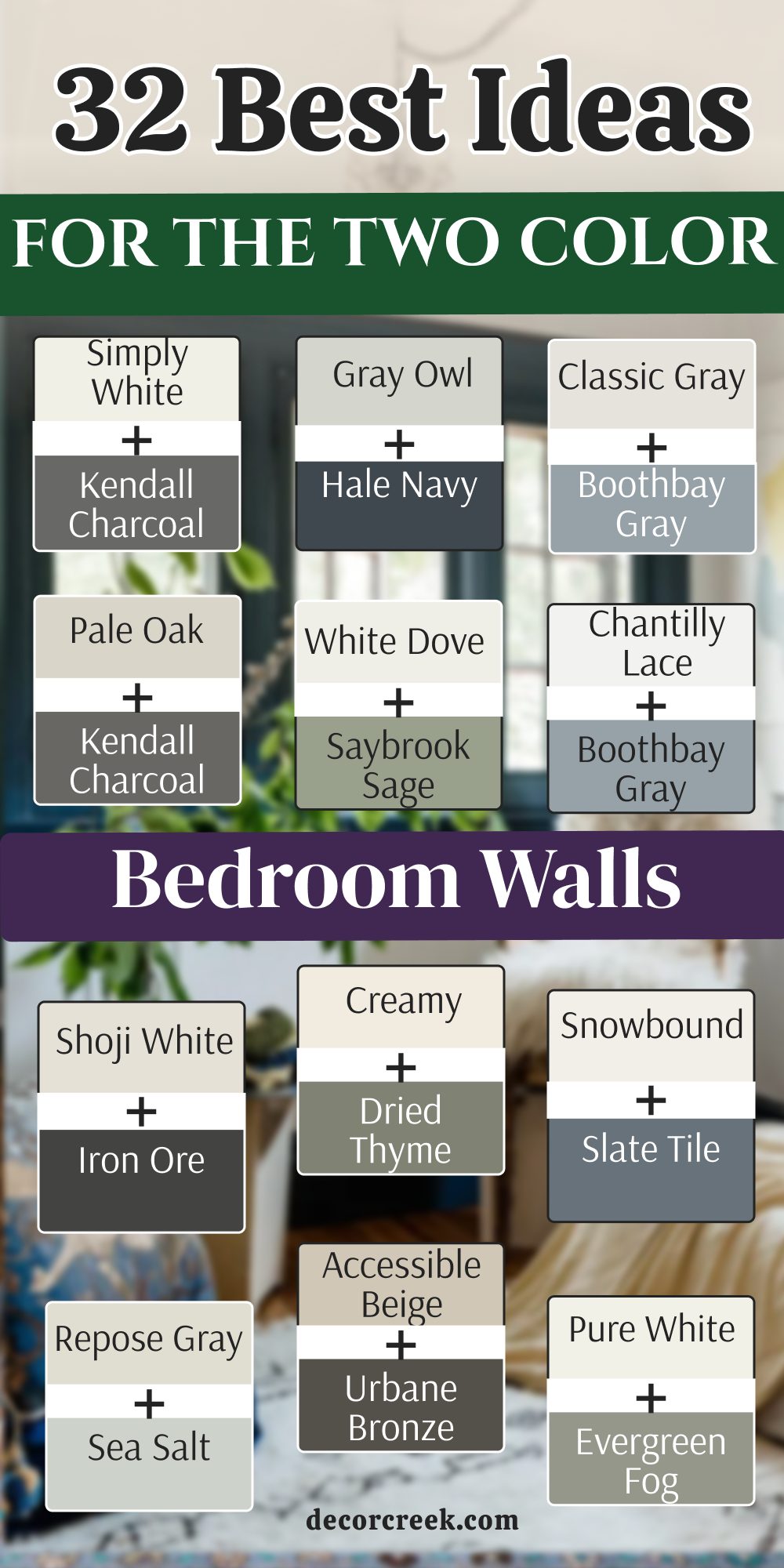
31 Idea For The Best Color Combination For Bedroom This Year
Alabaster SW 7008 + Hale Navy HC-154
Alabaster SW 7008 provides a creamy and soft backdrop that makes any bedroom feel instantly more welcoming. Hale Navy HC-154 is a deep and royal blue that adds a lot of strength to the wall behind your bed. This mix is a favorite this year because it feels very high-end and very polished for an adult.
You will love how the dark blue makes your white pillows and sheets look extra clean and bright. It creates a very smart and organized look that helps you feel ready for sleep at night.
Many people pick this pair because it never feels old and looks great with gold or brass lamps. The creamy white keeps the dark blue from making the room feel like a small dark box. You can add warm wood furniture to make the room feel even more cozy and very well-designed. It is a very sturdy look that works for both modern houses and older traditional homes. Your bedroom will look very sharp and professional with this bold choice of colors on the walls.
Best used in: master bedrooms, dining rooms, front doors, and kitchen cabinets
Pairs well with: Iron Ore SW 7069, Agreeable Gray SW 7029, Gold accents, warm wood tones The key rule of this color for a bold style is to use it where you want a sense of strength and crisp lines.
Agreeable Gray SW 7029 + Boothbay Gray HC-165
Agreeable Gray SW 7029 is a very popular color because it is the perfect mix of gray and beige. Boothbay Gray HC-165 is a soft and dusty blue-gray that adds a bit of quiet color to the walls. This duo is excellent for a bedroom where you want things to look very simple and very tidy.
It acts like a soft background that lets your favorite art or bright blankets be the stars. You will find that the room feels very open and very airy even if it is small.
Light reflects very well off these colors which helps the room feel very happy and full of light. This combination is very safe and works with almost any kind of furniture you already have. The gray is light enough that it does not feel heavy or dark when the sun goes down. Many families love this look because it feels very modern and very clean for a busy household. It is a very smart and easy choice for a bedroom that should feel very light and fresh.
Best used in: open floor plans, bedrooms, kitchens, and whole-house paint
Pairs well with: Sea Salt SW 6204, Naval SW 6244, Black metal, light oak floors The key rule of this color for a modern style is to use it to make any area feel more open and balanced.
Sea Salt SW 6204 + Kendall Charcoal HC-166
Sea Salt SW 6204 is a magical color that can look like a soft green or a light blue. Kendall Charcoal HC-166 is a very dark gray that adds a lot of depth and style to the room. This combination makes a bedroom feel very updated and very high-end for anyone who loves modern design.
It is very soft on the eyes and helps you feel very relaxed when you first wake up. You can see how the dark gray makes the light green tone look even more fresh and bright.
White curtains and light wood furniture are the best things to use with this specific paint pair. It is a very popular choice for master suites because it looks very professional and very smart. The color is not too loud but it still has a lot of personality to show off. You will love how the room feels very fresh and very natural every single day. This is a very beautiful choice for a bedroom that should feel like a quiet and stylish getaway.
Best used in: bathrooms, bedrooms, laundry rooms, and sunrooms
Pairs well with: Summit Gray SW 7669, Heron Plume SW 6070, Wicker, soft white fabrics The key rule of this color for a spa style is to use it where natural light can change its tone.
Repose Gray SW 7015 + Saybrook Sage HC-114
Repose Gray SW 7015 is a very light and cool gray that makes a bedroom feel very clean. Saybrook Sage HC-114 is a beautiful green that feels very organic and very quiet on the walls. This duo is very light and is perfect for a room where you want to feel like there is space.
The two colors blend together very softly and do not have a harsh line where they meet. You will find that this room feels very quiet and very easy to relax in after a day.
Light-colored wood floors look amazing when they are paired with these two soft and pretty paint colors. This pair is very popular for main bedrooms because it makes the room feel very welcome and comfortable. The gray keeps the green from looking like a kid’s room and makes it look very professional. You can add some white curtains to keep the look very airy and very bright during the day. This is a very soft and beautiful choice for a bedroom that should feel like a quiet place.
Best used in: bathrooms, bedrooms, sunrooms, and laundry rooms
Pairs well with: Eider White SW 7014, Silver Strand SW 7057, Wicker, Light wood The key rule of this color for a spa style is to use it to create a soft and watery feeling.
Accessible Beige SW 7036 + Slate Tile SW 7624
Accessible Beige SW 7036 is a very warm and friendly color that makes a bedroom feel very cozy. Slate Tile SW 7624 is a dusty blue-gray that looks like stones in a cool mountain stream. This mix is wonderful for a room where you want to feel very snug and very safe at night.
It feels like a warm blanket or a soft sweater on a cold day when you are resting. The two shades blend together very softly without any harsh or loud lines on the bedroom walls.
Wood floors look particularly good when they are paired with these specific and warm paint choices. You can add lots of different textures like wool rugs or linen pillows to make the room better. Many people pick this because it hides a little bit of dust better than a very bright white. It is a very forgiving mix that works in almost any type of house or bedroom style. Your bedroom will feel like a soft retreat where you can truly let go of your busy day.
Best used in: open floor plans, bedrooms, entryways, and traditional homes
Pairs well with: Urbane Bronze SW 7048, Cadet SW 9143, Dark wood, soft cream rugs The key rule of this color for a cozy style is to use it where you want a gentle transition between light and shadow.
Creamy SW 7012 + Smokey Taupe 983
Creamy SW 7012 is a very warm white that feels like soft vanilla and makes the walls look inviting. Smokey Taupe 983 is a deeper beige that has a little bit of gray mixed into it to stay modern. This combination is very warm and makes a bedroom feel very snug and very comfortable for sleeping.
It is a very traditional look that makes a house feel very old-fashioned in a good way. The two colors are very close in warmth which makes the room feel very harmonious and soft.
You will find that this pair works very well with dark wood furniture and heavy rugs on the floor. It is a very cozy choice for a bedroom that stays a bit cold during the winter months. The warmth in the paint helps the room feel very friendly and like a place where you can rest. Many people pick this because it feels very natural and like the colors you see in a forest. This is a very soft and inviting choice for a bedroom that should feel like a warm hug.
Best used in: traditional bedrooms, kitchens, hallways, and whole-house colors
Pairs well with: White Dove OC-17, Revere Pewter HC-172, Dark wood, Gold hardware The key rule of this color for a traditional style is to use it to create a warm and friendly feeling.
Shoji White SW 7042 + Retreat SW 6207
Shoji White SW 7042 is a very versatile white that has a hint of beige and gray to keep it soft. Retreat SW 6207 is a beautiful green that has a lot of blue and gray mixed into it like a foggy forest. This combination is very modern and makes a bedroom feel very high-end and very well-planned.
The dark wall creates a very strong focal point that makes the whole room look very smart. You will find that the light white walls help the dark green look very crisp and very clean.
Dark green is a great choice because it hides shadows and makes the room feel very cozy at night. This pair works very well with colorful rugs or bright art because the walls are very simple. It feels very professional and like something you would see in a big city home design magazine. You can use black metal lamps to complete the look and make the room look very sharp. This is a very brave and stylish choice for a bedroom that wants to have a lot of style.
Best used in: master suites, living rooms, exteriors, and accent walls
Pairs well with: Fawn Brindle SW 7615, Greek Villa SW 7551, Black metal, Wood tones The key rule of this color for an earthy style is to use it to bring a sense of nature and warmth inside.
Drift of Mist SW 9166 + Dried Thyme SW 6186
Drift of Mist SW 9166 is a very soft gray that looks like a light shadow on the bedroom walls. Dried Thyme SW 6186 is a deep and earthy green that looks like the leaves on a tree. This mix is very grounded and makes a bedroom feel very solid and very cozy for sleeping.
The green is dark enough to be an accent but it still feels very natural and soft on the eyes. You will feel a sense of peace when you see these two colors working together on your walls.
Warm wood furniture like oak or maple looks especially good with this specific green and gray pair. It is a very classic look that reminds me of a quiet cottage in the middle of a green field. The light walls make the room feel very inviting while the green wall adds a lot of depth. You can add some woven baskets and soft blankets to make the room feel even more like home. This is a very smart and natural choice for a bedroom that wants to feel very steady.
Best used in: entryways, bedrooms, exteriors, and traditional living rooms
Pairs well with: Shoji White SW 7042, Fawn Brindle SW 7615, Wood tones, Gold accents The key rule of this color for a traditional style is to use it to bring a sense of nature and history into your home.
Misty SW 6232 + Iron Ore SW 7069
Misty SW 6232 is a very light blue that feels like a foggy morning by a quiet lake or sea. Iron Ore SW 7069 is a very dark charcoal that is almost black but feels much softer on the walls. Using these two together gives you a very professional and clean look for your bedroom area.
It is like wearing a nice suit that fits just right for a very special and important occasion. The light blue is very soothing and helps you fall asleep much faster at night.
Darker charcoal on one wall makes the room feel very cozy and safe like a small nest. You can use silver or chrome lamps to make the room look even more polished and clean. This pair works well for teenagers or adults who want a very tidy and smart bedroom. It is a very cool color palette that helps keep the room feeling fresh even when it is hot outside. You will love how the two shades play off each other in the natural morning light.
Best used in: modern bedrooms, home offices, basements, and exterior trim
Pairs well with: Extra White SW 7006, Sea Salt SW 6204, Black metal, Silver hardware The key rule of this color for a modern style is to use it where you want a sharp contrast that feels grounded.
Snowbound SW 7004 + Evergreen Fog SW 9130
Snowbound SW 7004 is a very crisp and cool white that makes everything look very fresh. Evergreen Fog SW 9130 is a soft green that feels very organic and very quiet on the walls. This combination is very popular right now because it makes a bedroom feel very updated and stylish.
The green has a tiny bit of gray in it which keeps it from looking too bright. You will find that this room feels very soft and very easy on the eyes every day.
White furniture looks particularly good when it is sitting in front of a soft green wall. This pair is excellent for a room where you have a lot of plants because colors work together. It feels very fresh and like a brand new start every morning when the sun comes through. You can add some gold accents to make the room look a little bit more fancy and high-end. This is a very gentle and pretty choice for a bedroom that should feel very light and happy.
Best used in: bedrooms, mudrooms, cabinets, and laundry rooms
Pairs well with: Shoji White SW 7042, Urbane Bronze SW 7048, Gold accents, Wood tones The key rule of this color for an organic style is to use it where you want a soft and leafy feeling that mimics nature.
Pure White SW 7005 + Naval SW 6244
Pure White SW 7005 is a very bright and honest white that makes your trim look amazing. Naval SW 6244 is a very dark and royal blue that feels very strong and sturdy on the wall. This combination is very popular because it makes a bedroom feel very clean and very high-end.
The dark blue wall gives the room a lot of depth and makes the bed look very important. You will love how the bright white makes the blue look very rich and very deep during the day.
White furniture and light-colored rugs are the best matches for this specific and bold color duo. It is a very smart look that stays fresh and updated for a long time without ever feeling old. The light walls help the room feel very large while the dark wall adds a lot of personality and style. You can add some gold lamps to make the room look even more polished and well-designed. This is a very cool and stylish choice for a bedroom that should feel very sharp.
Best used in: master bedrooms, dining rooms, kitchen islands, and front doors
Pairs well with: Revere Pewter HC-172, Gray Owl OC-52, Wood tones, Gold hardware The key rule of this color for a classic style is to use it to create a crisp and sharp look that feels rich.
White Dove OC-17 + Urbane Bronze SW 7048
White Dove OC-17 is a very soft and creamy white that makes any bedroom wall look very clean and warm. Urbane Bronze SW 7048 is a deep brownish gray that feels very rich and very earthy on the accent wall.
This combination is very modern and makes a bedroom feel very high-end and very well-planned for an adult. The dark wall creates a very strong focal point that makes the whole room look very smart. You will find that the light white walls help the dark bronze look very crisp and very clean.
Dark bronze is a great choice because it hides shadows and makes the room feel very cozy at night when you sleep. This pair works very well with colorful rugs or bright art because the walls are very simple and neutral. It feels very professional and like something you would see in a big city home design magazine. You can use black metal lamps to complete the look and make the room look very sharp. This is a very brave and stylish choice for a bedroom that wants to have a lot of style.
Best used in: master suites, living rooms, exteriors, and accent walls
Pairs well with: Shoji White SW 7042, Modern Gray SW 7632, Messenger Bag SW 7740, leather The key rule of this color for an earthy style is to use it to bring a sense of the outdoors and nature inside your home.
Chantilly Lace OC-65 + Pewter Green SW 6208
Chantilly Lace OC-65 is a very bright and pure white that has almost no yellow or blue in it at all. Pewter Green SW 6208 is a deep and cool green that looks like the leaves on an old tree in the dark.
This combination is very modern and looks great in houses that have a lot of big and tall windows. The dark green adds a lot of weight to the room which makes it feel very grounded and steady. You will love how the bright white makes the green look very crisp and very clean on the walls.
Green is a very popular color because it lets you feel very close to nature while you are inside your home. This pair feels very professional and like something you would see in a very nice and fancy city apartment. It is a very cool look that stays fresh even when the sun is very hot and bright outside. You can add some black metal furniture to make the room look very industrial and very cool. Choosing this pair shows that you like things to be very simple and very well-designed for your bedroom.
Best used in: modern bedrooms, home offices, hallways, and trim work
Pairs well with: Revere Pewter HC-172, Boothbay Gray HC-165, Wood tones, Silver accents The key rule of this color for a modern style is to use it where you want the sharpest contrast possible between light and dark.

Classic Gray OC-23 + Rainwashed SW 6211
Classic Gray OC-23 is a very light and airy gray that feels like a soft cloud in the morning sky. Rainwashed SW 6211 is a very soft blue-green that makes the walls look very fresh and very light. This duo is very soft and does not have any harsh or loud lines between the two colors.
It is a great choice for a very small bedroom where you want to feel like there is space. The light gray gives just enough color to show where the walls end and the ceiling starts.
Many people like this mix because it is very easy to live with for a very long time in a home. It does not demand your attention but it makes everything in the room look much better and cleaner. You can add colorful art on the walls and the colors will really pop against these light shades. It is a very safe and happy choice for a bedroom that should feel very light and open. Your room will feel like a big breath of fresh air every time you walk inside to rest.
Best used in: nurseries, small bedrooms, laundry rooms, and open living areas
Pairs well with: Hale Navy HC-154, Wrought Iron 2124-10, Silver Satin OC-26, light oak The key rule of this color for a light style is to use it where you want to maximize the feeling of openness and natural brightness.

Edgecomb Gray HC-173 + October Mist 1495
Edgecomb Gray HC-173 is a very popular color because it is a perfect mix of gray and warm beige. October Mist 1495 is a soft and silvery green that makes any bedroom feel very quiet and very natural.
This combination is very warm and makes a bedroom feel very cozy and friendly for any person. It is a very natural look that reminds me of soft sand and plants on a quiet beach. The colors are very close to each other so the room feels very smooth and very well-balanced.
You will find that this pair works very well with traditional furniture and old family photos in frames. It is a very smart look that will not feel old in a few years when styles change. The warmth in the paint helps the room feel very snug and tight when you are under your covers. Many families choose this for their main bedroom because it feels very relaxing and very easy to enjoy. It is a very soft and gentle look that makes a house feel like a real home for you.
Best used in: master suites, entryways, kitchens, and whole-house colors
Pairs well with: Revere Pewter HC-172, Hale Navy HC-154, Nickel accents, dark wood The key rule of this color for a warm style is to use it where you want a soft and inviting feel that works in both sun and shade.

Pale Oak OC-20 + Thunder AF-685
Pale Oak OC-20 is a very light gray that has a tiny bit of warmth to keep it from feeling cold. Thunder AF-685 is a deeper gray that adds a lot of strength and style to the bedroom walls. This mix is very elegant and makes a bedroom feel very formal and very well-planned for guests.
The dark gray wall acts like a big anchor that holds the whole room together for sleep. It is a great choice for a room with a lot of white furniture or light wood floors.
The light gray walls keep the room from feeling too dark even with a big and deep gray wall. You will find that this pair makes the room look very expensive and like a fancy hotel room. It is a very classic color palette that many people love because it feels very sturdy and smart. You can add some silver lamps to make the room look even more polished and very clean. This is a very stylish and bold choice for a bedroom that wants to make a big statement.
Best used in: master suites, home offices, dining rooms, and accent walls
Pairs well with: Chantilly Lace OC-65, Gray Owl OC-52, Silver metal, Navy accents The key rule of this color for an elegant style is to use it to create a sense of deep color and bright light.

Balboa Mist OC-27 + Aegean Teal 2136-40
Balboa Mist OC-27 is a very soft and light gray that feels very warm and very inviting. Aegean Teal 2136-40 is a deep blue-green that adds a lot of personality and life to the walls. This duo is very light and is perfect for a bedroom where you want to feel very relaxed.
It is a very gentle look that does not have any big surprises or loud colors on the walls. The two shades work together to make the room feel very smooth and very well-balanced for you.
You can use a lot of different colors for your blankets because these walls will match with almost anything. It is a very flexible choice that works for guest rooms or for your own main bedroom. The light gray has a tiny bit of beige in it which makes the room feel very snug. You will love how the room looks in the morning when the first light hits the soft walls. This is a very beautiful and safe choice for anyone who wants a very pretty and light bedroom.
Best used in: bedrooms, living rooms, open floor plans, and nurseries
Pairs well with: Simply White OC-117, Kendall Charcoal HC-166, Wood tones, soft fabrics The key rule of this color for a soft style is to use it where you want a gentle and warm feeling that stays quiet.
Gray Owl OC-52 + Van Deusen Blue HC-156
Gray Owl OC-52 is a cool gray that has a tiny bit of blue in it when the sun shines on it. Van Deusen Blue HC-156 is a very dark and royal blue that makes the gray look very crisp. This mix is very popular for modern homes because it feels very clean and very open for everyone.
It is a great choice for a bedroom that you want to feel very fresh and like a brand new place. The cool tones in the gray help the room feel a bit cooler on hot and sunny summer days.
White trim and white doors look amazing when they are next to this specific and clean shade of gray. You will find that this pair makes the room look very light and very airy like a big field. It is a very simple look that does not have a lot of mess or fuss to it. You can add some green plants to the room and the leaves will look very bright against the gray. This is a very smart choice for a bedroom that should feel very clean and very easy to live in.
Best used in: kitchens, bathrooms, bedrooms, and small hallways
Pairs well with: White Dove OC-17, Hale Navy HC-154, Marble, Silver hardware The key rule of this color for a fresh style is to use it where you want to maximize the feeling of light and clean lines.

Silver Satin OC-26 + Salamander 2050-10
Silver Satin OC-26 is a very light gray that almost looks like a soft silver coin on the wall. Salamander 2050-10 is a very dark green that provides a very strong and bold contrast to the light paint.
This mix is very elegant and makes a bedroom feel very formal and very well-dressed like a suit. The dark green wall acts like a big anchor that holds the whole room together and looks solid. It is a great choice for a room with a lot of white furniture or light wood floors.
The light gray walls keep the room from feeling too dark even with a big dark green wall. You will find that this pair makes the room look very expensive and like a fancy hotel room. It is a very classic color palette that many people love because it feels very sturdy and smart. You can add some silver lamps to make the room look even more like the name of the paint. This is a very stylish and bold choice for a bedroom that wants to make a big statement.
Best used in: master suites, home offices, dining rooms, and accent walls
Pairs well with: Chantilly Lace OC-65, Gray Owl OC-52, Silver metal, Navy accents The key rule of this color for an elegant style is to use it to create a sense of deep color and bright, clean light.

Swiss Coffee OC-45 + Wrought Iron 2124-10
Swiss Coffee OC-45 is a very warm and creamy white that feels like a warm cup of milk. Wrought Iron 2124-10 is a very dark gray that is almost black to keep the room looking modern.
This combination is very warm and makes a bedroom feel very snug and very comfortable for sleeping. It is a very traditional look that makes a house feel very old-fashioned in a good way. The two colors are very close in warmth which makes the room feel very harmonious and soft for you.
You will find that this pair works very well with dark wood furniture and heavy rugs on the floor. It is a very cozy choice for a bedroom that stays a bit cold during the winter months. The warmth in the paint helps the room feel very friendly and like a place where you can rest. Many people pick this because it feels very natural and like the colors you see in a forest. This is a very soft and inviting choice for a bedroom that should feel like a warm hug.
Best used in: traditional bedrooms, kitchens, hallways, and whole-house colors
Pairs well with: White Dove OC-17, Revere Pewter HC-172, Dark wood, Gold hardware The key rule of this color for a traditional style is to use it to create a warm and timeless feeling that is very easy to live with.

Simply White OC-117 + Chelsea Gray HC-168
Simply White OC-117 is a warm and glowing white that makes every corner of the bedroom look very bright. Chelsea Gray HC-168 is a medium gray that adds a lot of drama and style to the walls.
This combination is very popular because it makes a bedroom feel very clean and very high-end for an adult. The gray wall gives the room a lot of depth and makes the bed look very important. You will love how the bright white makes the gray look very rich and very deep during the day.
White furniture and light-colored rugs are the best matches for this specific and bold color duo in your room. It is a very smart look that stays fresh and updated for a long time without ever feeling old. The light walls help the room feel very large while the dark wall adds a lot of personality. You can add some gold lamps to make the room look even more polished and well-designed. This is a very cool and stylish choice for a bedroom that should feel very sharp.
Best used in: modern bedrooms, accent walls, home offices, and living rooms
Pairs well with: Revere Pewter HC-172, Gray Owl OC-52, Wood tones, Silver hardware The key rule of this color for a modern style is to use it where you want a sense of strength and crisp lines to stand out.

Paper White OC-55 + Dark Olive 2140-30
Paper White OC-55 is a very clean white with a tiny touch of gray that makes it feel like fresh stationery. Dark Olive 2140-30 is a deep, earthy green that looks like the leaves of an old tree in a quiet forest.
This pair is very popular this year because people want their bedrooms to feel more connected to nature. The dark green creates a very moody and cozy corner for your bed, while the crisp white keeps the rest of the room feeling organized and bright.
You will find that this combination looks amazing with dark walnut wood or leather headboards. The green is dark enough to act like a neutral, so it doesn’t feel too “colorful” or overwhelming when you are trying to sleep. It’s a very sophisticated choice for someone who wants a bedroom that feels both modern and very peaceful. Adding some brass picture frames will make the green look even richer and more expensive.
Best used in: master bedrooms, cozy dens, and accent walls
Pairs well with: Revere Pewter HC-172, Wood tones, Brass hardware, Leather The key rule of this color for a natural style is to use it to create a sense of deep, quiet comfort.
Collingwood OC-28 + Deep River 1582
Collingwood OC-28 is a “greige” that leans slightly more toward gray, making it look very stony and clean. Deep River 1582 is a dark, mysterious blue-green that changes its look depending on how much light hits the wall.

This pair is for someone who likes the feeling of a rainy day or a deep lake. The dark wall adds a lot of “weight” to the room, making it feel very solid and grounded.
This combination is very high-end and looks great with silver or chrome accents. It feels very modern but also very calm, which is exactly what you want in a place where you sleep. The light walls keep the room from feeling too small, while the dark wall gives you a beautiful focal point for your bed or a piece of art.
Best used in: modern bedrooms, bathrooms, and accent walls
Pairs well with: Chantilly Lace OC-65, Silver hardware, Marble, Cool wood tones The key rule of this color for a cool style is to use it to create a sense of calm and mystery.

Coventry Gray HC-169 + Narragansett Green HC-157
Coventry Gray HC-169 is a classic, medium-toned gray that feels very stable and professional. Narragansett Green HC-157 is a very dark teal that can look almost black in the evening. This duo is very “moody” and perfect for someone who wants their bedroom to feel like a private sanctuary.

The dark green wall makes the room feel very cozy and tucked away from the rest of the world.
You can use white trim to make the colors really pop and look sharp. This pair works very well with gold-toned lamps or warm wood floors to balance out the cool colors. It’s a very smart look that shows you have a strong sense of style and aren’t afraid of dark, rich colors on your walls.
Best used in: master suites, home offices, and moody bedrooms
Pairs well with: Simply White OC-117, Gold accents, Warm wood, Leather The key rule of this color for a bold style is to use it to create a deep, enveloping atmosphere.
Stonington Gray HC-170 + Gentleman’s Gray 2062-20
Stonington Gray HC-170 is a very clean and popular gray that always looks tidy and fresh. Gentleman’s Gray 2062-20 is actually a deep, blackened teal-blue that feels very masculine and very tailored.

This combination looks like a high-quality suit—it is very sharp and very well-organized. It is a great choice for a bedroom that needs to feel both relaxing and very smart.
Because the blue is so dark, it acts like a neutral that goes with almost any other color you put in the room. White bedding and light gray rugs are the perfect matches for this pair. You will love how the light gray walls keep the room feeling big and airy while the dark wall adds a lot of drama behind the bed.
Best used in: master bedrooms, boys’ rooms, and traditional offices
Pairs well with: White Dove OC-17, Silver hardware, Navy decor, Black metal The key rule of this color for an elegant style is to use it to create a tailored and crisp look.

Calm OC-22 + Newburyport Blue HC-155
Calm OC-22 is a very pale, off-white gray that feels as light as a whisper on the walls. Newburyport Blue HC-155 is a classic, nautical navy blue that feels very traditional and very strong.
This pair is perfect for a bedroom where you want a “coastal” feel that isn’t too bright or loud. The blue is deep and rich, while the “Calm” walls live up to their name by keeping everything feeling quiet.
This is a great choice for a room with a lot of natural light, as the blue will look very vibrant during the day. It works wonderfully with light oak or white furniture to keep the room feeling fresh. This combination is very timeless and will make your bedroom feel like a peaceful retreat by the sea.
Best used in: nurseries, guest rooms, and coastal bedrooms
Pairs well with: Simply White OC-117, Light oak, Wicker, Nautical accents The key rule of this color for a light style is to use it to create a fresh and open feeling.

Feather Down OC-6 + Dragon’s Breath 1547
Feather Down OC-6 is a very warm, creamy beige that feels like a soft wool blanket. Dragon’s Breath 1547 is a very dark, warm gray-brown that looks like a piece of dark chocolate. This duo is incredibly cozy and perfect for someone who wants their bedroom to feel very warm and snug.
The dark wall is very moody and adds a lot of “soul” to the room without feeling cold.
This combination looks best with warm wood furniture and soft, textured fabrics like velvet or linen. It’s a very “earthy” look that feels very connected to the ground. You will find that this pair is very relaxing at night under soft lamplight, making it very easy to fall asleep in a room that feels this comfortable.
Best used in: master suites, cozy bedrooms, and living rooms
Pairs well with: White Dove OC-17, Dark wood, Gold accents, warm rugs The key rule of this color for a cozy style is to use it to create a warm and grounded environment.

Cloud White OC-130 + Knoxville Gray HC-160
Cloud White OC-130 is one of the most popular whites because it is soft and creamy but still looks very clean. Knoxville Gray HC-160 is a deep, smoky blue-green gray that feels very sophisticated and modern.

This pair is very balanced—the white is warm enough to feel cozy, while the gray is cool enough to feel very smart.
This mix works very well in houses with a lot of history or traditional trim work. The dark wall makes the white doors and baseboards look very bright and crisp. It’s a very professional look that makes a bedroom feel like it was designed by an expert. Adding some plants will help the green tones in the gray come to life.
Best used in: master bedrooms, kitchens, and traditional homes
Pairs well with: Revere Pewter HC-172, Wood tones, Black metal, Greenery The key rule of this color for a sophisticated style is to use it to balance warmth and coolness.

Intense White OC-51 + Hidden Sapphire CSP-690
Intense White OC-51 is a very light gray that feels very “electric” and clean on the walls. Hidden Sapphire CSP-690 is a deep, jewel-toned blue that adds a huge amount of personality and color to the room.
This pair is for someone who loves color but wants to keep the room looking high-end and not too “bright.” The blue is very rich and makes the room feel like a special jewel box.
You can use this pair with silver or crystal accents to make the room feel extra fancy. The light gray walls are the perfect partner for the blue because they don’t fight for attention. This combination is very energizing in the morning when the sun hits the blue wall, but stays very dark and cozy at night when the lights are low.
Best used in: master bedrooms, accent walls, and glamorous spaces
Pairs well with: Chantilly Lace OC-65, Silver hardware, Glass accents, Navy rugs The key rule of this color for a bold style is to use it to create a sense of luxury and deep color.

Pale Smoke 1584 + Vintage Vogue 462
Pale Smoke 1584 is a light, ethereal gray with a definite blue-green undertone. Vintage Vogue 462 is a deep, dark forest green that feels very “vintage” and full of history.
This pair is very trendy this year as people look for colors that feel more organic and less “sterile.” The light gray walls feel very airy, while the dark green wall adds a lot of character.
This combination looks beautiful with brass hardware and old-fashioned wood furniture. It’s a very “quiet” look that feels very respectful and calm. You will find that this pair makes a bedroom feel very unique and very personal, like a room in a boutique hotel.
Best used in: master bedrooms, library-style rooms, and cozy corners
Pairs well with: White Dove OC-17, Brass accents, Antique wood, Greenery The key rule of this color for a natural style is to use it to create a vintage, organic feel.

Moonshine OC-56 + Black Forest Green HC-187
Moonshine OC-56 is a very pale gray that looks like the surface of the moon—very clean and very cool. Black Forest Green HC-187 is so dark that it almost looks black, but it has a deep green heart that shows up in the light.
This is one of the most dramatic pairs you can choose. The contrast between the light gray and the nearly-black green is very sharp and very modern.
This duo is perfect for a bedroom with a very minimal style. You don’t need a lot of decorations when the walls look this good. It feels very “expensive” and very solid. Use white bedding to break up the dark colors and keep the room looking fresh. This is a brave choice that will make your bedroom the most interesting room in the entire house.
Best used in: modern bedrooms, accent walls, and high-contrast spaces
Pairs well with: Simply White OC-117, Black metal, Silver accents, Modern art The key rule of this color for a high-contrast style is to use it where you want a very sharp and modern look.
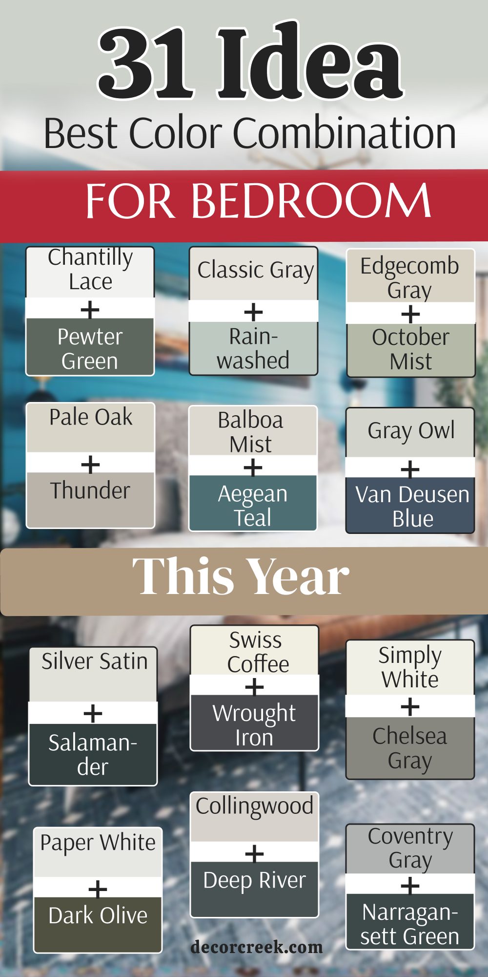
27 Two Colour Combination For Bedroom Walls from Sherwin-Williams
Extra White SW 7006 + Tricorn Black SW 6258
Extra White SW 7006 is a very bright, true white that provides a brilliant, clean backdrop. Tricorn Black SW 6258 is the ultimate neutral black, deep and solid without any sneaky undertones.
This combination is the peak of high-contrast modern design. It creates a bedroom that feels incredibly sharp, sophisticated, and bold.
This duo is perfect for a minimalist aesthetic. The black wall provides a dramatic stage for your bed, while the white walls ensure the space feels expansive. It works best with modern art and monochrome decor.
Best used in: modern master bedrooms, urban lofts, and accent walls
Pairs well with: Silver hardware, gray textiles, and bold primary colors
The key rule: Use this for a “gallery” feel where every piece of furniture stands out.

Origami White SW 7636 + Peppercorn SW 7674
Origami White SW 7636 is a soft, clean white with a subtle gray undertone that prevents it from feeling too stark.
Peppercorn SW 7674 is a deep, moody gray that is slightly softer than true black. Together, they create a balanced, contemporary look that is easy on the eyes.
The gray-on-white theme is very calming for sleep. Peppercorn adds a sense of luxury and depth, while Origami White keeps the atmosphere light and airy. This pair is excellent for those who want drama without the intensity of pure black.
Best used in: contemporary bedrooms, home offices, and media rooms
Pairs well with: Iron Ore SW 7069, light wood floors, and textured gray rugs
The key rule: Use it to create a sophisticated, monochromatic retreat.

Greek Villa SW 7551 + Distance SW 6243
Greek Villa SW 7551 is a sunny, warm white that feels very inviting and cozy. Distance SW 6243 is a dusty, mid-to-dark blue that has a touch of denim in it. This combination feels very comfortable and “lived-in,” perfect for a relaxing bedroom.

The blue is dark enough to feel cozy at night but bright enough to show its color during the day. Greek Villa adds a touch of warmth that makes the blue feel friendly rather than cold. It’s a very balanced look that works well with traditional furniture.
Best used in: master bedrooms, guest rooms, and coastal-themed spaces
Pairs well with: Alabaster SW 7008, warm wood tones, and brass accents
The key rule: Use this to achieve a relaxed, “vacation-at-home” feeling.

Aesthetic White SW 7035 + Cyberspace SW 7076
Aesthetic White SW 7035 is a soft off-white that leans slightly beige, making it very “greige” and versatile. Cyberspace SW 7076 is a very dark, charcoal blue that looks almost black in low light. This is a very high-end, designer look that adds immediate value to a room.

The dark blue-gray of Cyberspace is incredibly soothing and perfect for a focal wall. Aesthetic White softens the transition, ensuring the room stays warm and welcoming. It’s a great choice for a bedroom that doubles as a quiet sanctuary.
Best used in: master suites, libraries, and elegant bedrooms
Pairs well with: Pure White SW 7005, leather furniture, and navy accents
The key rule: Use it where you want a sense of deep, quiet luxury.

Incredible White SW 7028 + Indigo Batik SW 7602
Incredible White SW 7028 is a very light gray that feels clean and modern. Indigo Batik SW 7602 is a rich, medium-to-dark navy that is full of life and color. This pair is a fantastic alternative to traditional navy-and-white because it feels a bit softer and more contemporary.
The navy is vibrant without being “too much,” and the light gray walls provide a crisp frame. This combination works exceptionally well with silver hardware and white bedding. It feels very nautical yet sophisticated.
Best used in: boys’ rooms, master bedrooms, and transitional spaces
Pairs well with: Repose Gray SW 7015, silver metal, and crisp white trim
The key rule: Use it to create a fresh, maritime-inspired look that stays bright.

Natural Linen SW 9109 + In the Navy SW 9178
Natural Linen SW 9109 is a warm, sandy neutral that brings a sense of comfort. In the Navy SW 9178 is a very dark, classic navy blue that is formal and strong. This pair feels very grounded and traditional, like a well-tailored suit.

The warmth of the linen prevents the navy from feeling too cold. This is a great choice for a bedroom with antique wood furniture or heavy drapes. It feels very established and secure, perfect for a long night’s rest.
Best used in: traditional master bedrooms and formal guest suites
Pairs well with: Creamy SW 7012, gold accents, and dark mahogany
The key rule: Use it to achieve a classic, timeless feel that never goes out of style.

Canvas Tan SW 7531 + Storm Cloud SW 6249
Canvas Tan SW 7531 is a soft, earthy beige that feels like a warm beach. Storm Cloud SW 6249 is a beautiful, stormy blue-gray that adds a sense of peace and quiet. This combination is very “organic” and feels like nature brought indoors.

The stormy blue-gray is incredibly soothing for the eyes, while the tan keeps the room feeling sunny. It works perfectly with natural materials like wicker, jute, and linen. You will find that this room feels very balanced and light.
Best used in: coastal bedrooms, sunrooms, and guest rooms
Pairs well with: Shoji White SW 7042, light oak, and soft blues
The key rule: Use it where you want a breezy, natural atmosphere.
White Heron SW 7627 + Dark Night SW 6237
White Heron SW 7627 is a cool, crisp white with a very faint blue-gray undertone. Dark Night SW 6237 is a deep, moody teal-blue that feels very mysterious and high-end. This is a very bold and trendy choice for this year.
The deep green-blue of Dark Night creates an amazing focal point for a headboard. White Heron provides a sharp, clean contrast that makes the teal look even deeper. This pair is perfect for someone who loves rich color but wants a modern feel.
Best used in: master bedrooms, accent walls, and moody dens
Pairs well with: Snowbound SW 7004, copper accents, and dark wood
The key rule: Use it to create a deep, enveloping “cocoon” for sleeping.
Oyster White SW 7637 + Charcoal Blue SW 2739
Oyster White SW 7637 is a very soft, warm neutral that is somewhere between white and beige. Charcoal Blue SW 2739 is a dark, dusty blue that looks like charcoal in certain lights. This pair is incredibly sophisticated and soft.
The “Oyster” tone makes the room feel very cozy, while the Charcoal Blue adds a layer of maturity. This combination is popular because it’s not as harsh as black but has all of the same drama. It works beautifully with soft gray textiles and silver lamps.
Best used in: master suites, formal dining rooms, and bedrooms
Pairs well with: Sea Salt SW 6204, silver hardware, and velvet fabrics
The key rule: Use it for a soft, “smoky” look that feels very refined.
Neutral Ground SW 7568 + Smoky Blue SW 7604
Neutral Ground SW 7568 is a very friendly, light beige that matches almost anything. Smoky Blue SW 7604 is a medium-dark blue with a gray heart that feels very calm and steady. This combination is perfect for a bedroom where you want a bit of color that isn’t too loud.

The blue feels very “safe” and quiet, while Neutral Ground keeps the room feeling warm. It’s a very traditional choice that works well in homes with a lot of natural wood. You will find that this pair makes a bedroom feel very harmonious.
Best used in: traditional bedrooms, hallways, and living rooms
Pairs well with: Alabaster SW 7008, warm wood tones, and bronze
The key rule: Use it for a comfortable, low-stress environment.

Casa Blanca SW 7571 + Gale Force SW 7605
Casa Blanca SW 7571 is a rich, creamy off-white that feels like an antique lace—very warm and very soft. Gale Force SW 7605 is a moody, deep navy with a strong hit of dark green and gray. This pair is incredibly dramatic and looks best in a room where you want to feel tucked away from the world.
The warmth of Casa Blanca prevents the dark wall from feeling too cold or “scary” at night. It’s a very sophisticated look that works beautifully with dark wood furniture and brass lamps. This is a great choice for a master bedroom that needs a lot of character and a “high-end” soul.
Best used in: master suites, library-style bedrooms, and focal walls
Pairs well with: Alabaster SW 7008, brass hardware, and leather accents
The key rule: Use this to create a deep, historic feel that is still very cozy.
Macadamia SW 6142 + Riverway SW 6222
Macadamia SW 6142 is a mid-toned, warm beige that feels very solid and traditional. Riverway SW 6222 is a beautiful, dusty teal that sits right between blue and green. This combination is very popular for traditional homes because it feels very “sturdy” and well-balanced.
The teal adds a splash of color that is very soothing for sleep, while the beige keeps the room feeling sunny during the day. This pair works perfectly with medium-toned wood like oak or cherry. You will love how the room feels very “finished” and intentional with these two rich colors.
Best used in: guest rooms, traditional bedrooms, and home offices
Pairs well with: Creamy SW 7012, warm wood tones, and textured fabrics
The key rule: Use it where you want a comfortable, nature-inspired palette.

Wool Skein SW 6148 + Still Water SW 6223
Wool Skein SW 6148 is a very soft “greige” that looks like natural, unbleached wool. Still Water SW 6223 is a deep, dark teal that is very moody and very quiet. This duo is for the homeowner who wants a bedroom that feels like a quiet lake at dusk.

The dark green-blue of Still Water is very relaxing and helps the mind shut down for sleep. Wool Skein provides a neutral frame that doesn’t compete with the focal wall. It is an excellent choice for a bedroom with a lot of natural light, as the teal will show its true beauty in the sun.
Best used in: master bedrooms, accent walls, and spa-like spaces
Pairs well with: Shoji White SW 7042, black metal, and woven textures
The key rule: Use this to achieve a deep, organic sense of peace.
Eider White SW 7014 + Mountain Air SW 6224
Eider White SW 7014 is a very light, cool gray that often shows a tiny bit of lavender or blue. Mountain Air SW 6224 is a very pale, frosty blue that feels like a cold morning in the mountains. This pair is extremely light and airy, perfect for a very small bedroom.
This combination is very “clean” and feels very youthful and fresh. It works beautifully with white furniture and silver accents. If you want a bedroom that feels like a big, open breath of fresh air, this is the perfect pair for you. It stays very bright even on cloudy days.
Best used in: nurseries, small bedrooms, and laundry rooms
Pairs well with: Snowbound SW 7004, silver hardware, and white-washed wood
The key rule: Use this to make a tiny space feel twice as large.

Heron Plume SW 6070 + Bracing Blue SW 6242
Heron Plume SW 6070 is a warm, soft white with a touch of gray that keeps it from looking yellow.Bracing Blue SW 6242 is a classic, mid-toned denim blue that feels very honest and cheerful. This duo is very “all-American” and works well in almost any house.
The blue is dark enough to feel adult, but bright enough to make the room feel happy. Heron Plume is a great neutral for the other three walls because it is very forgiving and doesn’t clash with different wood types. It is a very safe and stylish choice for a guest room.
Best used in: boys’ rooms, guest bedrooms, and transitional homes
Pairs well with: Extra White SW 7006, navy decor, and light oak
The key rule: Use it for a reliable, “safe” look that everyone likes.

White Flour SW 7102 + Honorable Blue SW 6811
White Flour SW 7102 is a soft, powdery white that is very bright but still feels warm. Honorable Blue SW 6811 is a very strong, royal navy that makes a massive statement. This pair is for someone who wants their bedroom to feel very important and very bold.
The contrast here is very high, which makes the room look very sharp. Honorable Blue is a “power” color—it feels very confident. When paired with White Flour, the room stays energetic and clean. It’s a great choice for a master bedroom that you want to show off to friends.
Best used in: master bedrooms, dining rooms, and high-contrast designs
Pairs well with: Pure White SW 7005, gold accents, and white bedding
The key rule: Use it where you want a sense of strength and crisp beauty.
Steamed Milk SW 7554 + Blue Peacock SW 0064
Steamed Milk SW 7554 is exactly what it sounds like—a very warm, comforting off-white. Blue Peacock SW 0064 is a rich, jewel-toned teal that feels very “designer” and artistic. This combination is very warm and very luxurious.
The teal is deep and “moody,” making it perfect for a bedroom where you want to feel cozy. Steamed Milk keeps the room from feeling too dark and adds a traditional touch. This pair looks amazing with gold frames and velvet pillows, giving the room a “boutique hotel” vibe.
Best used in: master suites, glamorous bedrooms, and entryways
Pairs well with: Alabaster SW 7008, gold metal, and dark walnut wood
The key rule: Use this for a rich, jewel-box feel that is still warm.
Dover White SW 6385 + Mosaic Tile SW 2938
Dover White SW 6385 is a very popular, “creamy” white that feels very sun-baked and warm. Mosaic Tile SW 2938 is a vibrant, mid-toned teal-blue that adds a lot of energy to the walls. This duo is very cheerful and perfect for a room that needs some “life.”
The warmth of Dover White balances the “cool” energy of the teal perfectly. This is a great choice for a teenager’s room or a creative home office. It feels very friendly and welcoming, rather than formal or stiff.
Best used in: children’s rooms, home offices, and happy guest rooms
Pairs well with: Simply White OC-117, bright patterns, and light wood
The key rule: Use it to bring a splash of fun and energy into a room.
Panda White SW 6147 + Great Falls SW 6495
Panda White SW 6147 is a soft, warm off-white with a hint of beige. Great Falls SW 6495 is a deep, smoky teal-blue that feels very “modern organic.” This pair is very trendy right now because it combines a cozy neutral with a deep, natural color.
Great Falls is a very relaxing color for a bedroom because it mimics the colors found in nature. Panda White is the perfect companion because it doesn’t feel too “sterile” or cold. This duo works very well with plants and natural wood furniture.
Best used in: modern bedrooms, accent walls, and living areas
Pairs well with: Shoji White SW 7042, wood tones, and black hardware
The key rule: Use this for a modern, grounded feel that isn’t too dark.
Rice Grain SW 6155 + Lagoon SW 6480
Rice Grain SW 6155 is a traditional, warm beige that has a tiny bit of green hidden inside it. Lagoon SW 6480 is a bright, deep turquoise that feels very bold and “beachy.” This combination is very tropical and full of personality.
This is a great choice if you want your bedroom to feel like a vacation spot. The beige keeps the bright turquoise from being too overwhelming, while the turquoise makes the beige feel much more exciting. It works beautifully with white furniture and coastal decor.
Best used in: coastal homes, kids’ rooms, and adventurous bedrooms
Pairs well with: Dover White SW 6385, wicker, and white fabrics
The key rule: Use it to create a bright, tropical, and happy space.
Mushroom SW 9587+ Jade Dragon SW 9129
Mushroom SW 9587 is a soft, earthy “greige” that feels very natural. Jade Dragon SW 9129 is a beautiful, mid-toned green that looks like a piece of polished jade stone. This duo is very calming and helps a bedroom feel very “peaceful.”
Green is the most relaxing color for the human eye, making Jade Dragon a perfect choice for sleep. Mushroom adds a level of warmth that makes the green feel very sophisticated and adult. This is a very quiet, beautiful choice for a main bedroom.
Best used in: master bedrooms, bathrooms, and nurseries
Pairs well with: Alabaster SW 7008, light oak, and soft green decor
The key rule: Use this to create a soft, botanical-inspired retreat.
Camelback SW 6122 + Hunt Club SW 6468
Camelback SW 6122 is a strong, warm tan that feels very traditional and solid. Hunt Club SW 6468 is a deep forest green that is very dark and very masculine. This combination feels like a traditional “gentleman’s club” or an old library.
This pair is excellent for a room with a lot of dark wood and leather. It feels very established and serious. Hunt Club is a very deep green that makes the room feel very cozy at night, while Camelback provides a warm, sunny contrast during the day.
Best used in: home offices, traditional master bedrooms, and dens
Pairs well with: Creamy SW 7012, leather, and brass accents
The key rule: Use this to achieve a classic, “old-world” feeling of luxury.
Sandbar SW 7547 + Billiard Green SW 0016
Sandbar SW 7547 is a cool, sandy beige that is very versatile. Billiard Green SW 0016 is a very dark, rich green—the color of a classic pool table. This pair is very popular for modern-traditional homes where you want a “bold but safe” look.
The dark green wall adds a massive amount of style and serves as a great backdrop for a wooden bed. Sandbar keeps the rest of the room feeling light and manageable. This is a very smart look that feels very tailored and “high-end.”
Best used in: master bedrooms, accent walls, and exteriors
Pairs well with: Pure White SW 7005, gold hardware, and dark wood
The key rule: Use it where you want a sense of deep color and steady comfort.

Bagel SW 6114 + Isle of Pines SW 6461
Bagel SW 6114 is a warm, golden beige that adds a lot of “glow” to the walls. Isle of Pines SW 6461 is a deep, pine forest green that feels very organic and sturdy. This duo is very “earthy” and warm.
This combination works great in rooms that don’t get much natural light, as “Bagel” helps brighten the space while “Isle of Pines” adds a cozy, dark corner for sleeping. It’s a very natural look that reminds me of a forest in the autumn.
Best used in: cozy bedrooms, traditional living rooms, and cabins
Pairs well with: Dover White SW 6385, wood tones, and warm rugs
The key rule: Use this for a warm, “outdoorsy” feeling inside your home.

Muslin SW 6133 + Basil SW 6194
Muslin SW 6133 is a very soft, light beige that feels as simple as a piece of plain cloth. Basil SW 6194 is a muted, “herb-like” green that is very calming and sophisticated. This pair is very “soft” and easy to live with for many years.
Basil is a very smart green—it’s not too dark and not too bright, making it perfect for an adult bedroom. Muslin provides a very gentle partner that makes the room feel warm and tidy. This is a great choice for someone who wants color but doesn’t want it to be “loud.”
Best used in: master bedrooms, kitchens, and guest rooms
Pairs well with: Alabaster SW 7008, light wood, and natural textures
The key rule: Use it for a quiet, botanical feel that stays gentle.
White Sesame SW 9586 + Rookwood Dark Green SW 2816
White Sesame SW 9586 is a very light, creamy neutral with a hint of warmth. Rookwood Dark Green SW 2816 is a classic, historical dark green that feels very “heritage” and expensive. This duo is very high-end and designer-focused.
Rookwood Dark Green is a very moody color that makes a bedroom feel very secure and quiet. White Sesame is the perfect “clean” companion to keep the room from feeling old-fashioned. This is a great look for a modern home that wants a touch of classic style.
Best used in: master suites, formal offices, and historic homes
Pairs well with: Pure White SW 7005, brass hardware, and velvet
The key rule: Use this to create a sense of deep, historic elegance.
Porcelain SW 0053 + Rookwood Sash Green SW 2810
Porcelain SW 0053 is a very delicate, slightly “pinkish” or warm off-white that feels very soft. Rookwood Sash Green SW 2810 is a mid-to-dark muted green that feels very traditional and calm. This pair is very “Victorian” and elegant.
The softness of Porcelain makes the room feel very romantic and gentle, while the Sash Green adds a solid, natural base. This is a wonderful choice for a guest room or a nursery where you want a “timeless” and peaceful feeling.
Best used in: nurseries, guest rooms, and traditional master bedrooms
Pairs well with: Dover White SW 6385, antique wood, and soft fabrics
The key rule: Use this for a soft, historic look that feels very gentle.
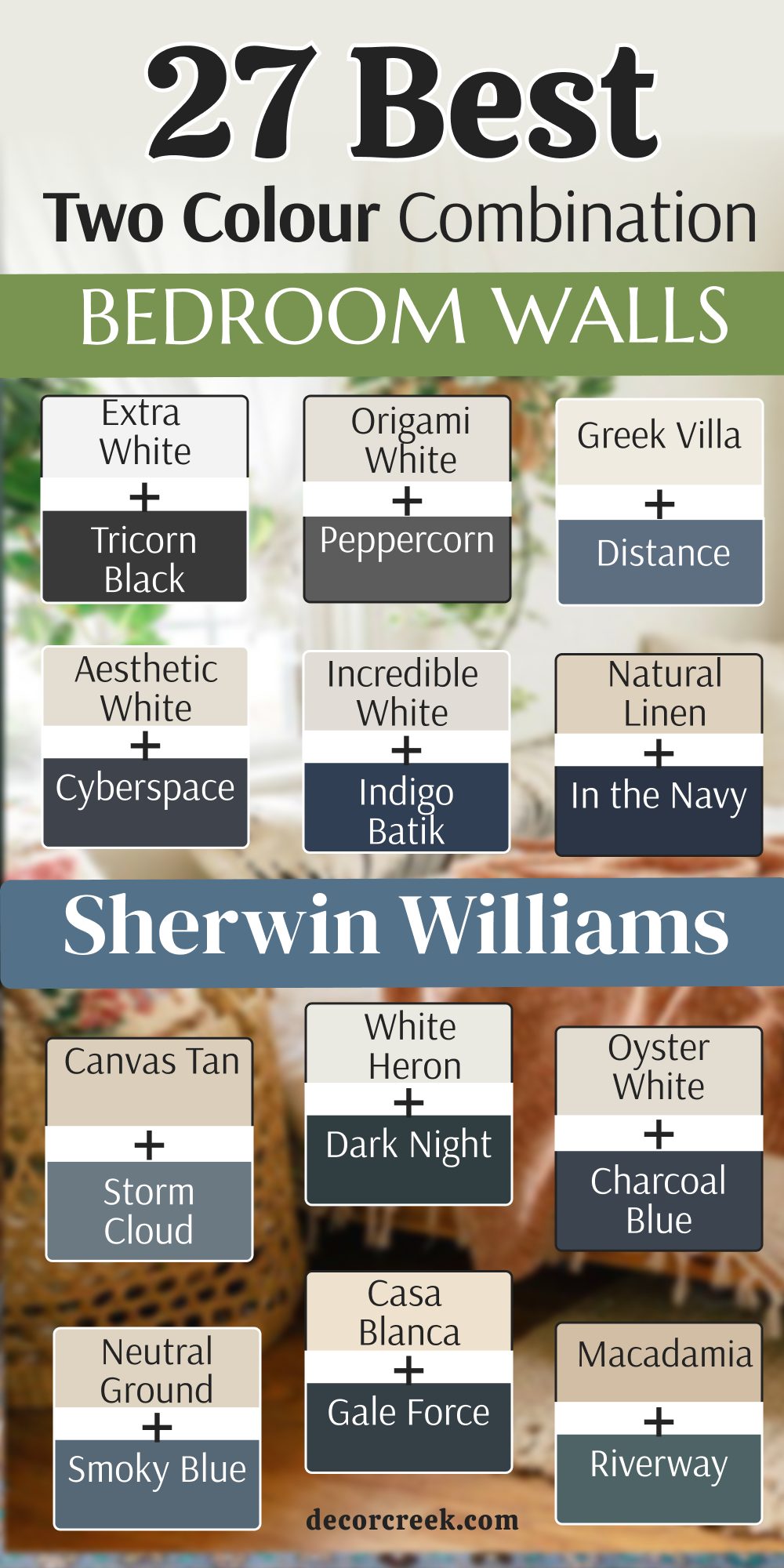
My Final Thoughts about 34 best Two Colour Combination For Bedroom Walls
Choosing the right two-color combination is the fastest way to turn a generic bedroom into a personal sanctuary. It is a powerful design tool that instantly shifts the energy of your home from ordinary to extraordinary.
Whether you lean toward the crisp, high-contrast drama of Extra White and Tricorn Black for a modern edge, or prefer the nature-inspired tranquility of Sea Salt and Agreeable Gray for a beach-house feel, the ultimate secret to success lies in perfect balance. When you mix a strong, saturated color with a softer, neutral partner, you create a visual dialogue that makes the architecture of the room stand out while ensuring the space remains comfortable for everyday living.
An accent wall in a deep, moody shade like Hale Navy or Iron Ore creates a “hug” for your bed, providing a solid visual anchor that signals your brain it’s time to slow down and rest. This dark backdrop makes your headboard and colorful bedding “pop” with much more intensity than a plain white wall ever could. Meanwhile, the lighter partner—be it a creamy Alabaster or a misty Paper White—prevents the room from feeling like a dark cave by reflecting the sun’s rays, keeping the space airy, bright, and highly functional during the daylight hours.
By using this two-tone strategy, you aren’t just painting a wall; you are curating an atmosphere that manages to be both exciting and incredibly peaceful at the same time.