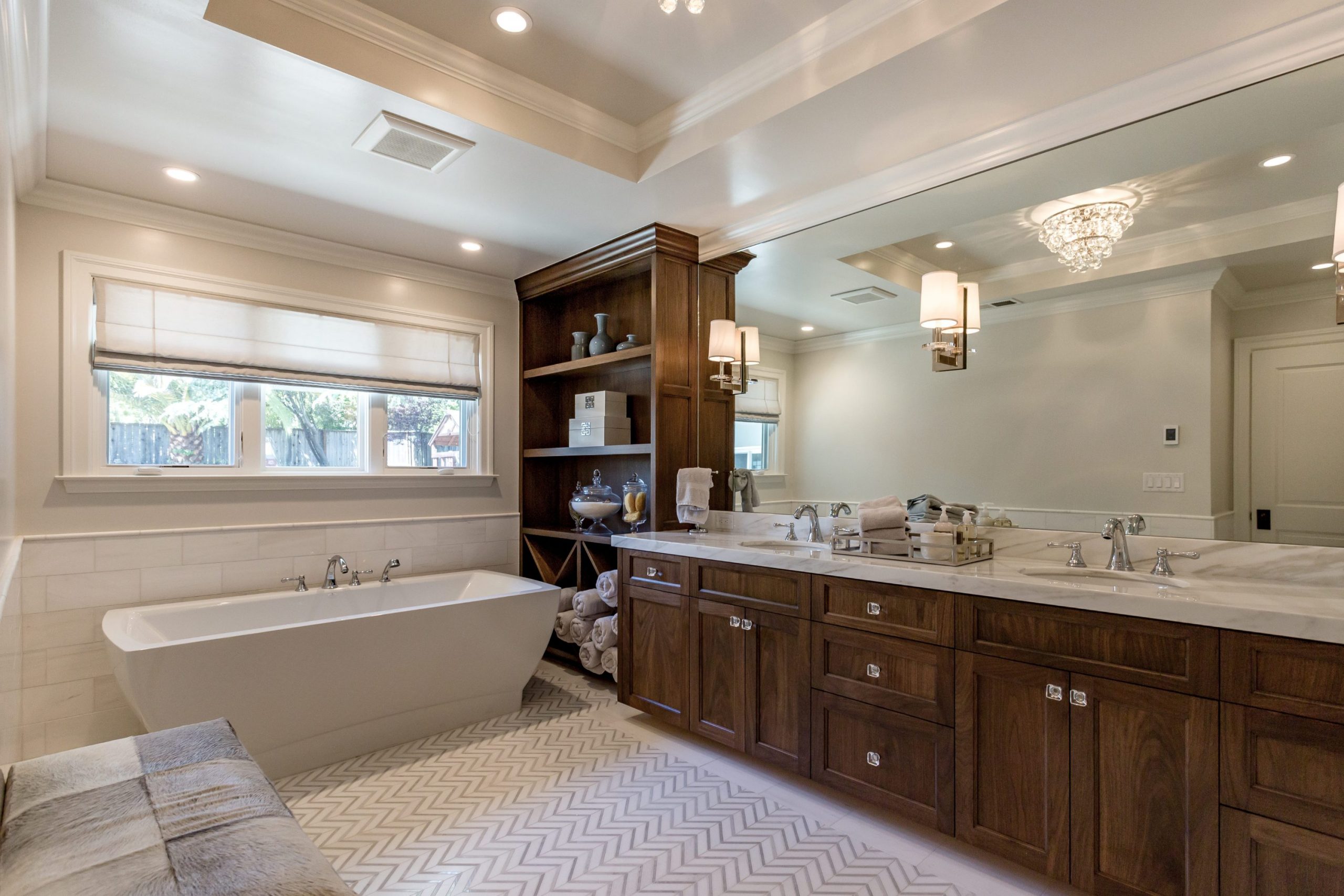
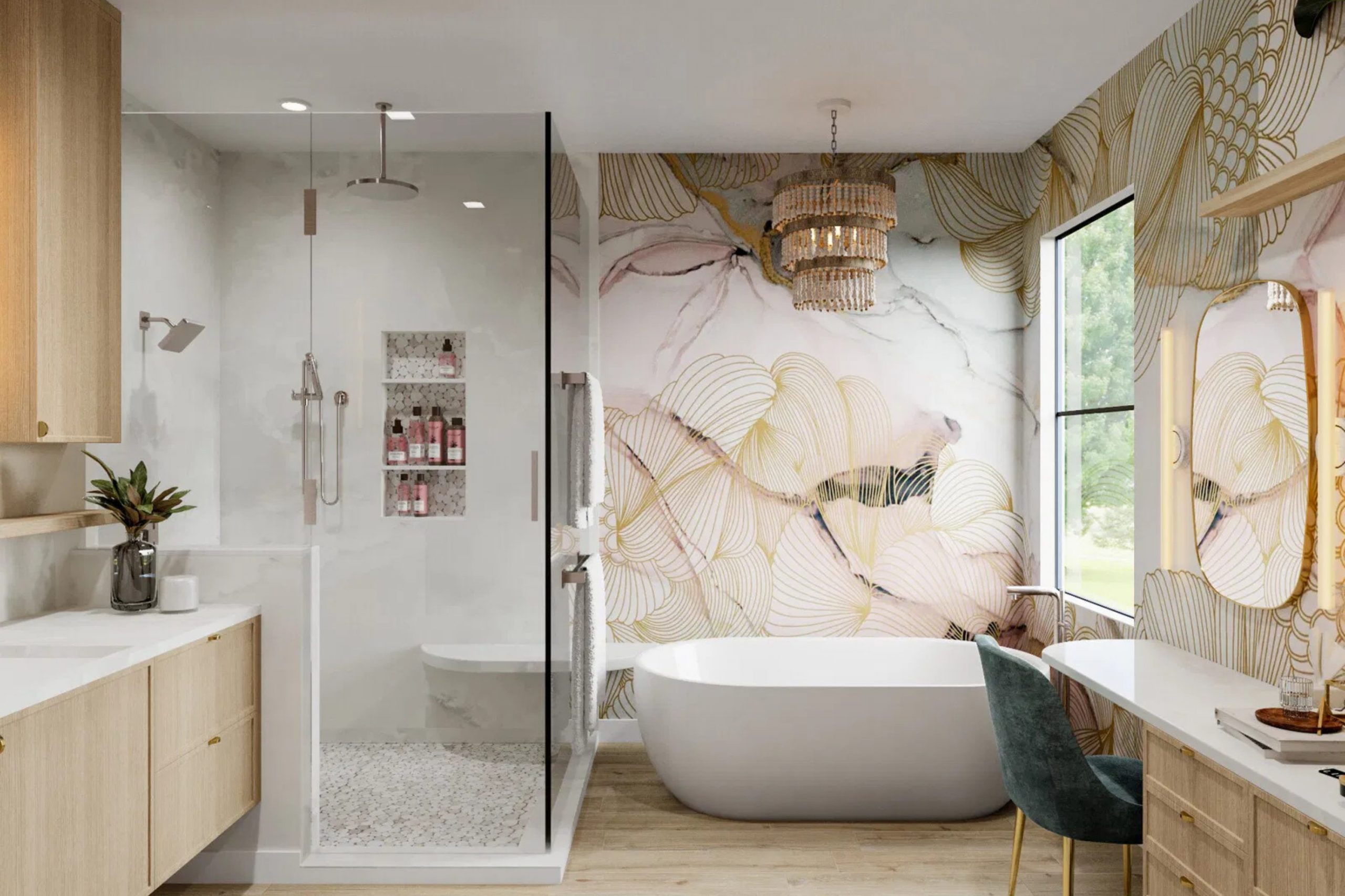
Choosing the right paint for your master bathroom feels like a big job because it is where you start and end your day. I see so many people get stuck looking at thousands of tiny paper squares at the store. My goal is to make this process simple and fun for you so you can love your home. Getting the right look depends on how the light hits your walls and how you want to feel when you brush your teeth.
You should enjoy the process of making your house look its best for your family and guests. I have helped many homeowners find the exact shade that makes them smile every time they walk into the room.
A fresh coat of paint is the easiest way to give your master suite a very high-end and polished appearance. Taking a little time to plan your project now will save you a lot of work later on.
Your bathroom is a very important part of your daily life and it deserves to look beautiful.
Why I Always Trust Sherwin-Williams and Benjamin Moore for Master Bath Paint Colors
I have spent years working as an interior designer and staging homes to look their best for buyers. Sherwin-Williams and Benjamin Moore are the two brands I use for every single project. Their paint stays on the wall even when the bathroom gets very steamy from a hot shower.
The colors look exactly like they do on the sample, so there are no scary surprises when the job is done. These brands offer thick, high-quality paint that covers old marks and bumps on your walls easily.
Using cheap paint often means you have to do two or three times as much work to get a good finish. I trust these professional brands because they hold up against soap, water, and cleaning products for many years. Their color palettes are very well-made and they offer the most modern choices for any style of home. You will find that the paint goes on smoothly and dries very quickly so you can use your room again. Most people find that the extra quality is worth every penny because the results look so professional. Investing in good paint is the secret to a bathroom that looks like it belongs in a magazine.
How I Choose the Perfect Paint Color for Any Master Bathroom
I always look at the floor and the countertop before I pick a bucket of paint. If your tiles are a cool blue, putting a yellow-toned paint on the walls might look a bit messy. I also think about how much sunlight comes through the window during the afternoon. Light colors make a small area feel much bigger and more open to the eye. Darker colors create a cozy mood that makes a large room feel much more private and special.
I also consider the color of your cabinets and the metal on your faucets before making a final choice. If you have gold hardware, a warm white or a deep green might look very rich and expensive. You should always test a small patch of paint on your wall to see how it looks when the sun goes down.
Lighting changes how we see color, so checking it at different times of the day is a very smart move. My method is to balance the hard surfaces like stone and tile with a wall color that feels soft and kind. This helps the whole room feel organized and very well-planned from the top to the bottom.
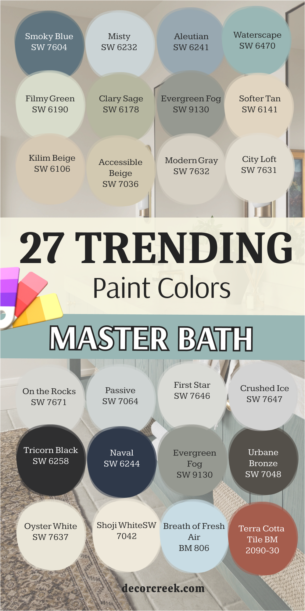
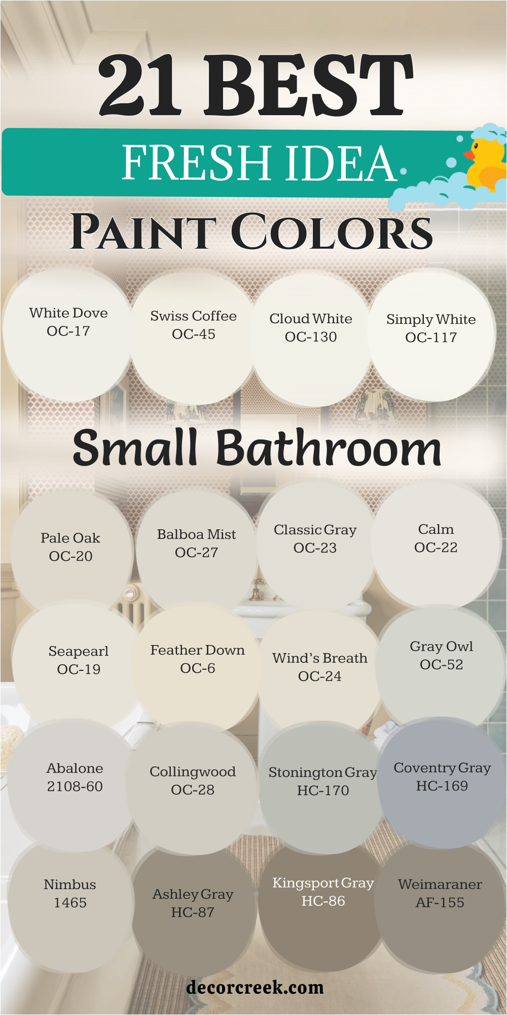
21 Fresh Idea For The Small Bathroom Paint Color
Alabaster SW 7008
Alabaster SW 7008 provides a creamy look that is not too yellow or too bright. This shade works well because it reflects light without making the room feel cold. Many homeowners pick it because it makes white towels look very crisp and clean.
It acts as a soft backdrop for any kind of wood cabinet you might have. The finish looks smooth and rich in rooms that do not have a lot of windows. You will find that it coordinates with almost any rug or shower curtain you choose.
It helps the walls fade into the background so your beautiful bathtub can be the star. This choice is a favorite for people who want a clean look that still feels friendly. It hides small dust marks better than a stark, bright white would. Most people feel very relaxed when they see this tone on their bathroom walls.
Best used in: living rooms, kitchens, hallways, bedrooms, and farmhouse exteriors
Pairs well with: Iron Ore SW 7069, Agreeable Gray SW 7029, Natural Linen SW 9109, warm wood tones The key rule of this color for farmhouse style is to use it where you want natural light to feel kind, soft, and inviting throughout the day.
🎨 Check out the complete guide to this color right HERE 👈

Pure White SW 7005
Pure White SW 7005 is a very steady choice because it has just a tiny drop of black and yellow in it. This mix keeps the paint from looking like a hospital room or a gallon of plain milk. I like using it on the ceiling and the walls at the same time to make the ceiling look higher.
It makes every other decoration in your room stand out more than before. Your gold or silver faucets will shine brightly against this very clean background. It is a smart pick if you want to sell your house because everyone likes a bright bathroom.
The paint feels fresh and light even when the sun goes down and you turn on the lamps. It creates a sense of order and cleanliness that is perfect for a small washroom. Many designers call this their secret weapon for making dark rooms feel much lighter. You can trust it to stay looking great for many years without going out of style.
Best used in: trim, ceilings, cabinets, bathrooms, and modern kitchens
Pairs well with: Black Magic SW 6991, March Wind SW 7668, Perle Noir SW 9154, dark wood floors The key rule of this color for farmhouse style is to use it where you want natural light to feel kind, soft, and inviting throughout the day.
🎨 Check out the complete guide to this color right HERE 👈

White Dove BM OC-17
White Dove BM OC-17 has a reputation for being the softest white you can find for your home. This color has a little bit of gray in it which makes it look very expensive and rich. I often suggest it for people who have older homes with character and charm.
It blends in beautifully with marble countertops that have gray veins running through them. The paint does not feel harsh on your eyes when you wake up early in the morning. It makes the room feel airy and open even if you do not have a window.
Your guests will notice how clean and well-kept your bathroom looks with this on the walls. It provides a gentle glow that makes your skin look good in the vanity mirror. This is a top choice for making a tiny room feel like a professional spa. You will enjoy how it looks with both warm and cool light bulbs in your fixtures.
Best used in: trim, molding, doors, cabinetry, and whole-house wall color
Pairs well with: Revere Pewter BM HC-172, Balboa Mist BM OC-27, Gray Owl BM OC-52, brass hardware The key rule of this color for farmhouse style is to use it where you want natural light to feel kind, soft, and inviting throughout the day.
🎨 Check out the complete guide to this color right HERE 👈

Chantilly Lace BM OC-65
Chantilly Lace BM OC-65 is known for being one of the brightest and truest whites available. It does not have strong blue or yellow undertones to distract your eye. This makes it the perfect partner for colorful artwork or bright blue tiles.
I use it when I want a room to look as modern and sharp as possible. The color reflects the most light of almost any paint you can buy today. It works wonders in a bathroom that feels like a dark cave or a basement.
You will love how it makes your bathroom feel brand new and very polished. It is a crisp choice that helps you feel energized when you get ready for work. Cleaning the walls is easy when you use a high-quality version of this bright shade. It is the gold standard for anyone who loves a very minimalist and clean look.
Best used in: trim, doors, modern kitchens, art galleries, and small bathrooms
Pairs well with: Edgecomb Gray BM HC-173, Hale Navy BM HC-154, Shaker Beige BM HC-45, matte black The key rule of this color for farmhouse style is to use it where you want natural light to feel kind, soft, and inviting throughout the day.
🎨 Check out the complete guide to this color right HERE 👈

Snowbound SW 7004
Snowbound SW 7004 has a cool undertone that makes it pair perfectly with gray floors. It is a very popular white because it feels soft and cozy without being too warm. I like to use it in bathrooms that have a lot of natural light coming in.
The color looks like fresh snow sitting on a branch in the middle of winter. It keeps the room looking organized and tidy even on your busiest mornings. Many people choose it because it looks great next to stainless steel or chrome fixtures.
It makes a small room feel like it has more breathing room for you. The paint is a great middle ground for people who cannot decide between gray and white. It provides a clean look that does not feel too sharp or aggressive. You will find that it makes your colorful rugs and towels pop with energy.
Best used in: exteriors, kitchens, bathrooms, bedrooms, and trim work
Pairs well with: Colonnade Gray SW 7641, Urban Bronze SW 7048, Naval SW 6244, light oak The key rule of this color for farmhouse style is to use it where you want natural light to feel kind, soft, and inviting throughout the day.
🎨 Check out the complete guide to this color right HERE 👈

Agreeable Gray SW 7029
Agreeable Gray SW 7029 is the most popular color for people who are selling their homes. It is a mix of gray and beige which makes it work with almost any furniture. I love how it changes slightly depending on the time of day and the lighting.
It feels warm enough to be cozy but cool enough to look very modern. This color is perfect if you have a mix of different wood tones in your bathroom. It hides fingerprints and scuffs better than a white paint ever could.
The shade creates a very balanced look that most people find very pleasing. It makes the walls feel like a soft hug when you walk into the room. You will not have to worry about your paint clashing with your floor tiles. It is a safe and beautiful choice for anyone who wants a updated look.
Best used in: open floor plans, family rooms, kitchens, bathrooms, and bedrooms
Pairs well with: Sea Salt SW 6204, Steely Gray SW 7664, Incredible White SW 7028, dark walnut The key rule of this color for farmhouse style is to use it where you want natural light to feel kind, soft, and inviting throughout the day.
🎨 Check out the complete guide to this color right HERE 👈

Repose Gray SW 7015
Repose Gray SW 7015 is a cool gray that has just a tiny hint of green and blue. This makes it feel very refreshing and clean when you see it on a large wall. I suggest this color for bathrooms that get a lot of bright sun from the window.
It looks very professional and high-end when paired with white trim and baseboards. The color is dark enough to show a contrast against white cabinets but light enough for small rooms. It gives the room a very tailored and neat appearance that lasts for years.
Many people like how it makes their silver mirrors and hardware look very shiny. It is a great choice for creating a mood that feels very quiet and peaceful. You can put almost any color of flowers in the room and they will look great. It is a dependable shade that never feels too trendy or old-fashioned.
Best used in: master suites, living rooms, hallways, bathrooms, and kitchen islands
Pairs well with: Eider White SW 7014, Pavestone SW 7642, Coral Clay SW 6024, navy accents The key rule of this color for farmhouse style is to use it where you want natural light to feel kind, soft, and inviting throughout the day.
🎨 Check out the complete guide to this color right HERE 👈

Classic Gray OC-23
Classic Gray BM OC-23 is an off-white color that looks like a very light, soft gray. It is one of my favorite colors for making a small bathroom feel very expensive. The shade has a way of catching the light that makes the walls look like silk.
It is much warmer than a standard gray but much cooler than a standard tan. I use it when I want a room to feel very sophisticated and well-planned. It works perfectly with white marble and light-colored wood vanities.
The color is so light that it almost looks white until you put a white towel near it. It provides a very soft background that does not compete for your attention. This is a smart pick for a bathroom where you want to feel relaxed and happy. You will find that it makes your home feel very cohesive and smooth.
Best used in: bedrooms, nurseries, bathrooms, living rooms, and entryways
Pairs well with: Hale Navy BM HC-154, Cloud White BM OC-130, Simply White BM OC-117, slate The key rule of this color for farmhouse style is to use it where you want natural light to feel kind, soft, and inviting throughout the day.
🎨 Check out the complete guide to this color right HERE 👈

Balboa Mist BM OC-27
Balboa Mist BM OC-27 is a warm gray that feels very cozy and inviting to everyone. It has a slight purple undertone that makes it feel very rich and deep. I like this color for bathrooms that feel a bit cold or drafty in the winter.
It adds a sense of warmth to the walls that makes the room feel lived-in. The color changes beautifully from a soft gray to a warm beige as the sun moves. It is a great choice for pairing with traditional furniture and classic decor.
You will love how it highlights the white trim around your doors and windows. It is a popular choice for people who want a neutral home that is not boring. The shade feels very soft on the eyes and helps you wind down at night. It makes a wonderful backdrop for a large soaking tub or a glass shower.
Best used in: dining rooms, bedrooms, bathrooms, hallways, and living areas
Pairs well with: Revere Pewter BM HC-172, Stonington Gray BM HC-170, White Dove BM OC-17, oak The key rule of this color for farmhouse style is to use it where you want natural light to feel kind, soft, and inviting throughout the day.
🎨 Check out the complete guide to this color right HERE 👈

Drift of Mist SW 9166
Drift of Mist SW 9166 is an airy gray that feels very light and gentle on the walls. It is a very soft color that does not have any heavy or dark undertones. I use it when a client wants a gray that will not turn blue or green.
The color looks very clean and works well with many different types of tile. It is a great pick for a bathroom with limited light because it stays bright. You will notice how it makes your bathroom feel wider and more spacious.
It creates a very quiet mood that is perfect for a relaxing bubble bath. The paint is light enough to be used in every room of the house for a flow. It looks very pretty when paired with light blue or green accents in the room. This shade is a reliable choice for anyone who wants a simple, pretty look.
Best used in: small bathrooms, bedrooms, kitchens, ceilings, and open areas
Pairs well with: Quicksilver SW 6245, Gossamer Veil SW 9165, Pure White SW 7005, light stone The key rule of this color for farmhouse style is to use it where you want natural light to feel kind, soft, and inviting throughout the day.
🎨 Check out the complete guide to this color right HERE 👈

Sea Salt SW 6204
Sea Salt SW 6204 is a very famous color that looks like a mix of green, blue, and gray. It changes its look depending on how much sun hits the walls during the day. I often suggest it for people who want their bathroom to feel like a trip to the beach.
This shade makes white trim look very bright and clean in any light. It is light enough to keep a small room from feeling too dark or closed in. You will notice that it matches perfectly with light wood or white cabinets.
Many homeowners find that it helps them feel very peaceful while they get ready. It is a soft choice that does not feel too bold or too loud. The color is very popular because it brings a bit of nature inside your home. You will love how it makes your bathroom feel fresh and very tidy.
Best used in: bathrooms, bedrooms, laundry rooms, kitchens, and sunrooms
Pairs well with: Fleur de Sel SW 7666, Summit Gray SW 7674, Underseas SW 6214, weathered wood The key rule of this color for farmhouse style is to use it where you want natural light to feel kind, soft, and inviting throughout the day.
🎨 Check out the complete guide to this color right HERE 👈

Rainwashed SW 6211
Rainwashed SW 6211 is a light green color that has a little bit of blue tucked inside it. This paint makes a bathroom look like it was just cleaned by a fresh spring rain. I like to use it in rooms that have large windows and lots of plants.
It creates a very airy feeling that makes the walls seem to disappear. You will find that it works well with both dark bronze and silver faucets. The color is very cheerful and helps you wake up with a smile on your face.
It is a great way to add a little bit of color without it being too much for the eye. Many people choose it because it looks very high-end and sophisticated on the wall. It keeps the room looking bright even on days when the weather is cloudy outside. This is a dependable choice for a master suite that needs a little extra light.
Best used in: master bathrooms, bedrooms, entryways, dining rooms, and shutters
Pairs well with: Extra White SW 7006, Window Pane SW 6210, Grays Harbor SW 6236, light linen The key rule of this color for farmhouse style is to use it where you want natural light to feel kind, soft, and inviting throughout the day.
🎨 Check out the complete guide to this color right HERE 👈

Palladian Blue BM HC-144
Palladian Blue BM HC-144 is a classic blue-green that has been a favorite for many years. It looks very soft and reminds me of the sky on a very clear day. I often recommend this for bathrooms that have traditional white pedestal sinks.
The color has a bit of gray in it which keeps it from looking like a child’s bedroom. It feels very elegant and makes your home look like a professional designer styled it. You will enjoy how it brings a sense of quiet to your morning routine.
It pairs beautifully with dark wood floors or light gray tile work. The shade is very inviting and makes guests feel very welcome in your home. It stays looking beautiful as the light moves through the room from morning to night. This is a top pick for creating a bathroom that feels like a quiet getaway.
Best used in: bedrooms, guest baths, living rooms, ceilings, and front doors
Pairs well with: Woodlawn Blue BM HC-147, Shaker Walnut BM HC-41, Simply White BM OC-117, gold accents The key rule of this color for farmhouse style is to use it where you want natural light to feel kind, soft, and inviting throughout the day.
🎨 Check out the complete guide to this color right HERE 👈

Breath of Fresh Air BM 806
Breath of Fresh Air BM 806 is a very light and bright blue that feels very cooling. This color is the perfect choice for a bathroom that gets a lot of hot afternoon sun. I love how it makes the whole room feel like it has more air and light.
It is a very happy color that makes people feel optimistic and energetic. You can use it with white cabinets to create a very clean and modern look. The paint is soft enough that it does not feel like a bright blue crayon.
It helps small bathrooms feel much larger than they actually are. Many of my clients choose this because they want a room that feels very light. It looks wonderful with light-colored rugs and soft white towels on the racks. You will find that it is a very easy color to live with every single day.
Best used in: small bathrooms, nurseries, kitchens, porch ceilings, and bedrooms
Pairs well with: White Heron BM OC-57, Arctic Blue BM 2050-60, Flint BM AF-560, white marble The key rule of this color for farmhouse style is to use it where you want natural light to feel kind, soft, and inviting throughout the day.
🎨 Check out the complete guide to this color right HERE 👈
Comfort Gray SW 6205
Comfort Gray SW 6205 is a medium-toned color that is more green than it is gray. This shade is a bit darker than Sea Salt, which makes it feel very grounded. I like to use it when a bathroom has very high ceilings and needs more color.
It makes the room feel very sturdy and well-designed without being dark. The color looks very rich when you put it next to creamy white trim. It is a smart choice for hiding small splashes or water marks on the wall.
You will notice that it makes your wooden vanity look very warm and expensive. It provides a very steady feeling that helps you relax after a very long day. This color works well in both modern homes and older houses with lots of history. It is a very solid pick for a master bathroom that needs a bit of personality.
Best used in: bedrooms, bathrooms, mudrooms, kitchen cabinets, and accent walls
Pairs well with: Sea Salt SW 6204, Toile Red SW 0006, Greek Villa SW 7551, dark oak The key rule of this color for farmhouse style is to use it where you want natural light to feel kind, soft, and inviting throughout the day.
🎨 Check out the complete guide to this color right HERE 👈

Sea Spray SW 9651
Sea Spray SW 9651 is a very soft and muted green that feels very natural. It looks like the color of smooth stones you might find near the ocean. I suggest this color for people who want a green that is very easy on the eyes.
It does not stand out too much, which makes it a great background for your decor. The color helps create a very quiet mood for your morning shower. It looks very pretty when paired with wicker baskets or natural wood accents.
You will love how it makes your white bathtub look very bright and clean. This shade is very popular for staging homes because it feels very fresh and new. It works in almost any lighting and stays looking the same all day long. This is a great choice if you want a look that feels very soft and simple.
Best used in: bathrooms, laundry rooms, bedrooms, kitchens, and hallways
Pairs well with: Pure White SW 7005, Rainwashed SW 6211, Mindful Gray SW 7016, jute rugs The key rule of this color for farmhouse style is to use it where you want natural light to feel kind, soft, and inviting throughout the day.
🎨 Check out the complete guide to this color right HERE 👈
Healing Aloe BM 1562
Healing Aloe BM 1562 is a very light green that has a lot of gray and blue in it. This color is very famous for making people feel very quiet and happy. I use it when I want a bathroom to feel like a high-end hotel spa.
It is very light and does not make the room feel small or crowded at all. The shade changes nicely depending on if your light bulbs are warm or cool. It is a very soft color that looks great with silver or chrome hardware.
You will find that it makes your bathroom feel very organized and peaceful. Many people like how it makes their skin look healthy when they look in the mirror. It is a very sophisticated choice that never feels like too much color. You can trust it to make your master suite feel very special and well-kept.
Best used in: master bathrooms, bedrooms, nurseries, entryways, and ceilings
Pairs well with: White Dove BM OC-17, Gray Owl BM OC-52, Simply White BM OC-117, slate floors The key rule of this color for farmhouse style is to use it where you want natural light to feel kind, soft, and inviting throughout the day.
🎨 Check out the complete guide to this color right HERE 👈

Soft Fern BM 2144-40
Soft Fern BM 2144-40 is a gentle green that looks like new leaves in the springtime. It has a bit of yellow in it which makes it feel very warm and inviting. I like this color for bathrooms that do not get much sunlight because it feels cozy.
It makes the room feel very alive and full of energy for your morning. The color looks great with traditional wooden cabinets and brass handles. You will enjoy how it brings a natural feeling into your home every day.
It is a medium light color that provides a nice contrast against white tiles. Many homeowners pick it because it feels very friendly and not at all cold. It creates a very comfortable atmosphere that makes you want to stay a while. This is a wonderful pick for a bathroom that needs a little bit of warmth.
Best used in: kitchens, bathrooms, sunrooms, bedrooms, and dining areas
Pairs well with: Chantilly Lace BM OC-65, Cloud White BM OC-130, Chelsea Gray BM HC-168, oak wood The key rule of this color for farmhouse style is to use it where you want natural light to feel kind, soft, and inviting throughout the day.
🎨 Check out the complete guide to this color right HERE 👈
Accessible Beige SW 7036
Accessible Beige SW 7036 is a very popular tan color that does not look like old sand. It has a little bit of gray in it which makes it look very modern and clean. I use this color when I want a bathroom to feel very warm and substantial.
It is the perfect choice for homes that have a lot of beige or brown tile. The color makes white trim pop and look very sharp against the walls. It is a very safe choice because it looks good with almost any other color.
You will love how it hides dust and small marks better than any white paint. It makes a large bathroom feel much more cozy and private for you. This color is a favorite for staging because it makes rooms look very high-end. You can trust it to look great for many years without needing a change.
Best used in: living rooms, kitchens, hallways, bathrooms, and whole-house color
Pairs well with: Alabaster SW 7008, Urban Bronze SW 7048, Cadet SW 9143, dark wood The key rule of this color for farmhouse style is to use it where you want natural light to feel kind, soft, and inviting throughout the day.
🎨 Check out the complete guide to this color right HERE 👈

Edgecomb Gray BM HC-173
Edgecomb Gray BM HC-173 is a beautiful mix of gray and beige that many call a greige. It is very light and makes any bathroom feel very classy and expensive. I recommend it for people who want a neutral look that is not too white.
The color feels very organic and looks great with stone or marble surfaces. It is a very soft shade that does not have any harsh blue or yellow tones. You will notice how it makes your bathroom feel very bright and well-lit.
It creates a very quiet and stable feeling that is perfect for a master suite. Many designers use this color as their go-to choice for a clean and pretty look. It works beautifully with both gold and silver decorations in the room. This is a very reliable color that will make your home feel very polished.
Best used in: open floor plans, bedrooms, bathrooms, hallways, and kitchens
Pairs well with: White Dove BM OC-17, Revere Pewter BM HC-172, Hale Navy BM HC-154, black accents The key rule of this color for farmhouse style is to use it where you want natural light to feel kind, soft, and inviting throughout the day.
🎨 Check out the complete guide to this color right HERE 👈

Creamy SW 7012
Creamy SW 7012 is a warm white that feels like soft butter or rich silk. It is not a cold white, which makes it feel very welcoming and kind on the eyes. I like to use it in bathrooms with traditional styles and lots of detail.
It makes the room feel very soft and creates a gentle glow when the lights are on. The color is very light but still shows a difference against bright white trim. You will love how it makes your bathroom feel very cozy during the cold winter months.
It hides imperfections on older walls much better than a shiny white would. Many people choose it because it makes their home feel very lived-in and comfortable. It pairs perfectly with warm wood tones and bronze metal fixtures. This is a classic choice for a bathroom that needs to feel very warm and sweet.
Best used in: bedrooms, kitchens, bathrooms, trim, and living rooms
Pairs well with: Alabaster SW 7008, Latte SW 6108, Suede SW 7542, warm lighting The key rule of this color for farmhouse style is to use it where you want natural light to feel kind, soft, and inviting throughout the day.
🎨 Check out the complete guide to this color right HERE 👈

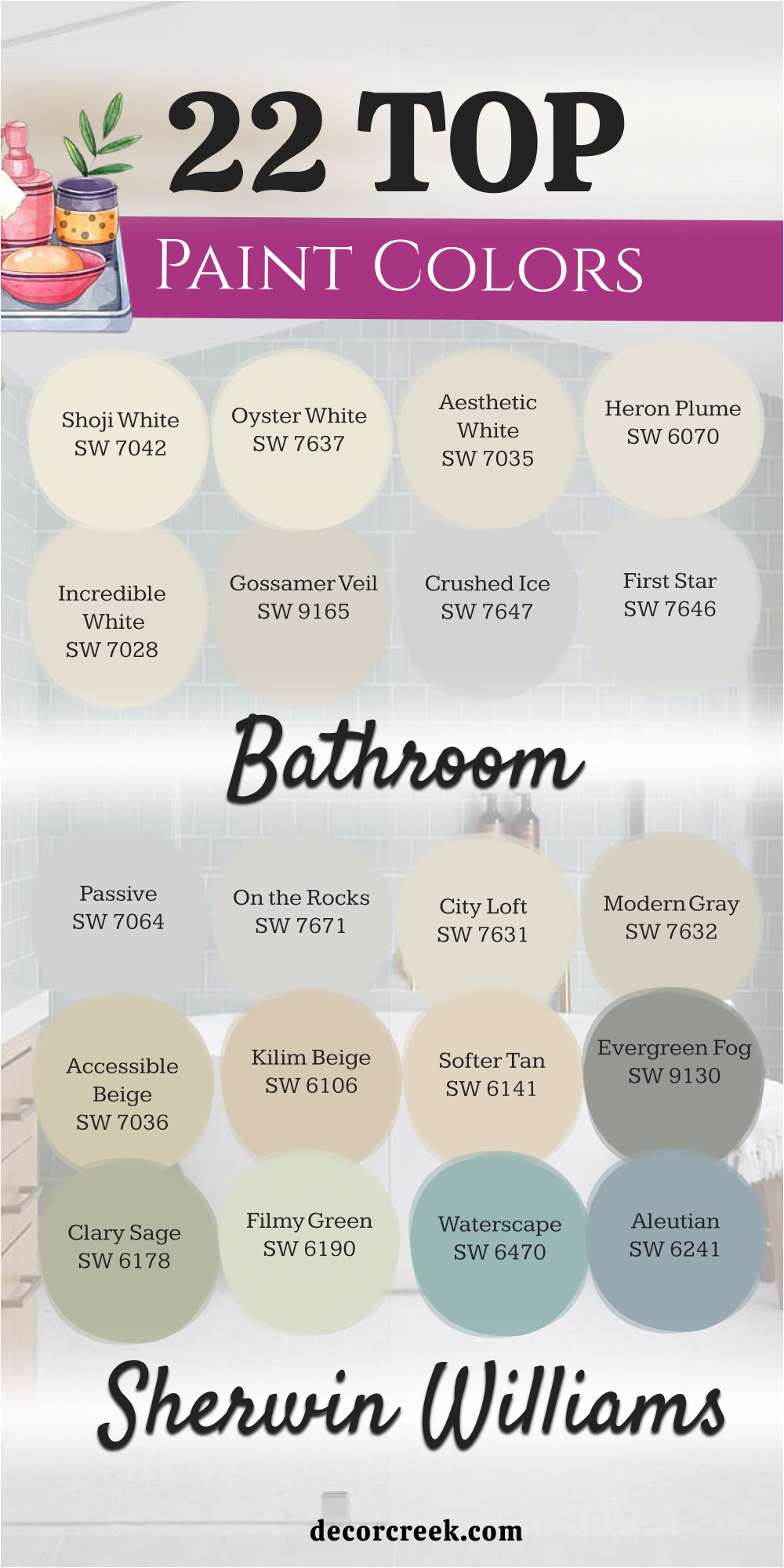
22 Top Sherwin Williams Bathroom Paint Colors
Shoji White SW 7042
Shoji White SW 7042 is a very warm and soft white that sits right between beige and gray. This paint makes a bathroom feel very light without ever looking cold or like a plain piece of paper. I love how it works with natural wood cabinets to make the room look very expensive and well-planned.
It has a tiny bit of cream in it which makes your skin look very healthy in the mirror. You will notice that it hides dust much better than a very bright white would ever do. Many people choose it because it looks very clean but still feels like a warm hug.
It is the perfect choice if you want a neutral look that is not boring or too yellow. This color stays looking the same even when you turn on your warm overhead lights at night. It provides a very steady background that lets your colorful towels and rugs look their best. You will enjoy how it makes your master suite feel very airy and open to the eye.
Best used in: living rooms, kitchens, bathrooms, hallways, and exteriors
Pairs well with: Urbane Bronze SW 7048, Fawn Brindle SW 7615, Pure White SW 7005, light oak The key rule of this color for farmhouse style is to use it where you want natural light to feel kind, soft, and inviting throughout the day.
🎨 Check out the complete guide to this color right HERE 👈

Oyster White SW 7637
Oyster White SW 7637 is a light greige that has a very soft and pearly look on the wall. This shade is darker than a standard white but still keeps the room feeling very bright. I suggest this color for bathrooms that have a lot of white tile or a white bathtub.
It provides just enough contrast so that your white fixtures really stand out and look sharp. The color feels very organic and reminds me of smooth stones found on a beach. You will find that it matches perfectly with gold or brass hardware in your master bath.
It is a very smart pick for a room where you want to feel very quiet and focused. Many homeowners love it because it looks very modern and high-end in any light. It covers the wall very smoothly and hides small bumps or marks quite well. This is a very dependable choice for a clean and very polished look in your home.
Best used in: exteriors, kitchens, bathrooms, bedrooms, and trim
Pairs well with: Agreeable Gray SW 7029, Iron Ore SW 7069, Sea Salt SW 6204, marble The key rule of this color for farmhouse style is to use it where you want natural light to feel kind, soft, and inviting throughout the day.
🎨 Check out the complete guide to this color right HERE 👈
Aesthetic White SW 7035
Aesthetic White SW 7035 is an off-white color that has a very tiny hint of a violet-gray undertone. This makes the paint look very sophisticated and a bit more interesting than a basic tan. I use it when I want a bathroom to feel very light but also very fancy and rich.
It works wonders in a room that has a lot of natural sunlight coming through the window. The color does not turn yellow or blue as the day goes by and the light changes. You will enjoy how it makes your bathroom feel very wide and full of fresh air.
It is a very soft shade that does not compete with your art or your decorations. Many people pick it because it creates a very balanced look that is easy to live with. It makes white trim look very crisp and helps the room feel very organized and tidy. This color is a top choice for a master bathroom that needs to feel very special.
Best used in: bedrooms, living rooms, bathrooms, kitchens, and whole-house color
Pairs well with: Pure White SW 7005, Chelsea Gray BM HC-168, Naval SW 6244, silver The key rule of this color for farmhouse style is to use it where you want natural light to feel kind, soft, and inviting throughout the day.
🎨 Check out the complete guide to this color right HERE 👈

Heron Plume SW 6070
Heron Plume SW 6070 is a very light and airy white that has a soft gray feeling inside it. This color is perfect for a bathroom where you want everything to look very clean and neat. I like to use it on the walls to make a small room feel much larger than it is.
It reflects a lot of light but it still has enough depth to look very high-quality. You will notice that it looks very pretty with light gray floors or white marble counters. The shade is very quiet and does not yell for attention when you walk in.
It makes a great backdrop for a big mirror and some pretty glass jars on the vanity. Many people find that it helps them feel very calm while they are getting ready for work. It is a very reliable color that looks good with almost any kind of lighting you have. You can trust this paint to make your bathroom look very modern and very fresh.
Best used in: bedrooms, bathrooms, hallways, laundry rooms, and trim
Pairs well with: Cityscape SW 7067, Shoji White SW 7042, Sea Salt SW 6204, dark tile The key rule of this color for farmhouse style is to use it where you want natural light to feel kind, soft, and inviting throughout the day.
🎨 Check out the complete guide to this color right HERE 👈
Incredible White SW 7028
Incredible White SW 7028 is a very bright greige that leans a little bit more toward the gray side. This color is a fantastic choice for people who want a gray look that still feels warm. I often suggest it for staging because it makes the bathroom look very updated and brand new.
It has a soft and light feeling that makes the walls look like they are glowing. You will find that it pairs very well with dark navy blue or deep green towels. The paint does a great job of making the room feel open and full of energy.
It is a very clean shade that does not have any weird blue or pink tones in it. Many of my clients love how it highlights their white cabinets and dark hardware. It is a very versatile color that fits in both new houses and very old ones. You will love how it makes your master bath feel like a very light and happy place.
Best used in: living rooms, bedrooms, bathrooms, kitchens, and entries
Pairs well with: Agreeable Gray SW 7029, Alabaster SW 7008, Naval SW 6244, wood tones The key rule of this color for farmhouse style is to use it where you want natural light to feel kind, soft, and inviting throughout the day.
🎨 Check out the complete guide to this color right HERE 👈
Gossamer Veil SW 9165
Gossamer Veil SW 9165 is a light gray that has a very soft and slightly warm undertone. This paint color is a bit deeper than a standard off-white, which gives the walls more life. I love to use it in bathrooms that have high-end silver or chrome plumbing fixtures.
The color looks very professional and gives the room a very finished and polished appearance. You will notice that it stays looking very gray without turning blue in the afternoon sun. It provides a very quiet background for your morning routine and helps you feel organized.
Many homeowners find that it is the perfect middle ground between being too light and too dark. It looks very beautiful with white trim and a white ceiling to create a layered look. This shade is very popular for a master suite because it feels very adult and smart. You will find that it makes your home look very well-maintained and very stylish.
Best used in: bedrooms, living rooms, bathrooms, kitchens, and hallways
Pairs well with: Pure White SW 7005, Drift of Mist SW 9166, Urban Bronze SW 7048, slate The key rule of this color for farmhouse style is to use it where you want natural light to feel kind, soft, and inviting throughout the day.
🎨 Check out the complete guide to this color right HERE 👈
Crushed Ice SW 7647
Crushed Ice SW 7647 is a cool and light gray that feels very refreshing on a bathroom wall. This color is perfect for creating a look that is very crisp and very modern for you. I suggest this color for rooms that have a lot of black or dark gray accents in them.
It makes white sinks and toilets look very bright and very clean to the eye. The shade is very light and helps a small room feel like it has more space and air. You will enjoy how it makes the room feel very cool and steady on a hot summer day.
It is a great choice for people who do not like any yellow or tan in their paint. Many of my clients pick it because it makes their bathroom feel like a high-tech spa. It provides a very clean look that never feels old or out of date for your home. This is a very dependable gray that stays looking sharp in any kind of light.
Best used in: kitchens, bathrooms, bedrooms, offices, and modern living areas
Pairs well with: Snowbound SW 7004, Extra White SW 7006, Tricorn Black SW 6258, silver metal The key rule of this color for farmhouse style is to use it where you want natural light to feel kind, soft, and inviting throughout the day.
🎨 Check out the complete guide to this color right HERE 👈

First Star SW 7646
First Star SW 7646 is a very pale gray that almost looks like a cool white on the wall. This color is great for making a bathroom feel very wide and full of natural light. I like to use it when a client wants a very minimalist and clean look for their home.
It has a tiny hint of blue which makes the room feel very cool and very refreshing. You will find that it makes your colorful bathroom rugs really stand out with bright color. The shade is very soft and does not overwhelm your eyes when you wake up early.
It makes the trim around your windows look very sharp and very crisp in the sun. Many people choose it because it makes their bathroom feel very modern and very simple. It is a very easy color to match with white towels and silver accessories. This choice is perfect for anyone who loves a very light and airy feeling in their room.
Best used in: bedrooms, bathrooms, kitchens, nurseries, and laundry rooms
Pairs well with: Pure White SW 7005, Naval SW 6244, Passive SW 7064, light blue The key rule of this color for farmhouse style is to use it where you want natural light to feel kind, soft, and inviting throughout the day.
🎨 Check out the complete guide to this color right HERE 👈
Passive SW 7064
Passive SW 7064 is a true gray that has a very cool and steady feeling on the wall. This color is a bit darker than some whites, so it shows a lot of character in the room. I recommend it for bathrooms that have a lot of white marble or very light gray tile.
It provides a very cool background that helps you feel very focused and quiet. You will love how it looks with modern black hardware or very sleek silver faucets. The shade is very popular for creating a look that feels very professional and very neat.
It does not have any warm tones, so it keeps the room looking very fresh and cold. Many homeowners find that it makes their master suite feel very private and very secure. It is a great choice for a room where you want to feel very organized every morning. This color stays looking the same all day long and never feels too dark or heavy.
Best used in: bedrooms, bathrooms, living rooms, kitchens, and accent walls
Pairs well with: Extra White SW 7006, Shell White SW 8917, Tricorn Black SW 6258, navy The key rule of this color for farmhouse style is to use it where you want natural light to feel kind, soft, and inviting throughout the day.
🎨 Check out the complete guide to this color right HERE 👈
On the Rocks SW 7671
On the Rocks SW 7671 is a light and clean gray that does not have any hidden colors in it. This makes it a very safe and easy choice for any bathroom you are working on. I use this color when I want a gray that will not turn purple or green in the light.
It looks very steady and provides a very nice contrast against white baseboards and trim. You will enjoy how it makes your bathroom feel very updated and very high-end for a low cost. The shade is light enough to keep a small room from feeling too small or too dark.
It works very well with both dark wood cabinets and bright white painted vanities. Many people pick it because it creates a very quiet and stable mood for the home. It is a very reliable color that looks good with almost any kind of tile or floor. This is a top pick for anyone who wants a perfect gray bathroom that stays beautiful.
Best used in: kitchens, bathrooms, bedrooms, living rooms, and entries
Pairs well with: Pure White SW 7005, Iron Ore SW 7069, Sea Salt SW 6204, chrome The key rule of this color for farmhouse style is to use it where you want natural light to feel kind, soft, and inviting throughout the day.
🎨 Check out the complete guide to this color right HERE 👈
City Loft SW 7631
City Loft SW 7631 is a soft and airy greige that brings a light touch to your bathroom. This color works well because it sits right between a cool gray and a warm tan. I like to use it when a room needs a bit of depth but must stay bright.
It makes white porcelain sinks look very clean and sharp against the walls. You will notice that it shifts slightly with the moving sun throughout the long day. Many homeowners pick it to bridge the gap between different floor and tile colors.
It creates a very gentle mood that helps you feel focused in the morning. This shade is perfect for making a small area feel much larger than it is. It hides small marks on the wall better than a very stark white paint. You can trust it to keep your master suite looking very modern and very fresh.
Best used in: living rooms, kitchens, hallways, bedrooms, and farmhouse exteriors
Pairs well with: Snowbound SW 7004, Urban Bronze SW 7048, Naval SW 6244, light oak The key rule of this color for farmhouse style is to use it where you want natural light to feel kind, soft, and inviting throughout the day.
🎨 Check out the complete guide to this color right HERE 👈
Modern Gray SW 7632
Modern Gray SW 7632 is a warm and rich taupe that feels very solid on the wall. This shade is a bit darker than a standard off-white, which adds a lot of character. I suggest this color for bathrooms that have a lot of white trim to create contrast.
It makes the room feel very sturdy and well-designed from top to bottom. The color does not turn blue or green even when the light is very cool. You will find that it matches perfectly with warm wood floors or tan tiles.
It provides a very quiet background that makes your silver faucets shine brightly. Many designers use it to create a look that feels very expensive and very private. It is a smart choice for a master bathroom where you want to feel tucked away. This color stays looking beautiful and steady regardless of what bulbs you use.
Best used in: master suites, living rooms, hallways, bathrooms, and kitchen islands
Pairs well with: Alabaster SW 7008, Black Magic SW 6991, Sea Salt SW 6204, dark walnut The key rule of this color for farmhouse style is to use it where you want natural light to feel kind, soft, and inviting throughout the day.
🎨 Check out the complete guide to this color right HERE 👈
Accessible Beige SW 7036
Accessible Beige SW 7036 is a very famous tan that has a tiny drop of gray in it. This mix keeps the paint from looking like old yellow sand on your walls. I love how it makes a bathroom feel very warm and very inviting for everyone.
It is a great choice if your bathroom has a lot of brown or earthy tones. The finish looks very smooth and rich in rooms with or without big windows. You will enjoy how it makes your white towels and rugs stand out so well.
It acts as a very reliable backdrop for any style of decoration you like. This color is a favorite for people who want a home that feels very grounded. It hides dust and fingerprints better than almost any other light paint choice. Most people feel very relaxed and happy when they see this tone in their home.
Best used in: open floor plans, family rooms, kitchens, bathrooms, and bedrooms
Pairs well with: Alabaster SW 7008, Urban Bronze SW 7048, Cadet SW 9143, dark wood The key rule of this color for farmhouse style is to use it where you want natural light to feel kind, soft, and inviting throughout the day.
🎨 Check out the complete guide to this color right HERE 👈
Kilim Beige SW 6106
Kilim Beige SW 6106 is a true and warm tan that reminds me of soft desert sand. This color is perfect for adding a sense of warmth to a very large bathroom. I often recommend it for homes with traditional styles and wooden vanities.
It makes the walls feel very cozy and full of life throughout the year. The shade provides a very nice contrast against bright white trim and ceilings. You will find that it makes your bronze or gold fixtures look very high-end.
It is a very popular pick because it feels very natural and very familiar. Many people like how it makes their bathroom feel like a part of the earth. It hides marks and wear very well, making it great for busy family homes. You will love how it creates a very friendly and sunny mood in your room.
Best used in: living rooms, bedrooms, kitchens, entryways, and hallways
Pairs well with: Alabaster SW 7008, Latte SW 6108, Storm Cloud SW 6249, warm wood The key rule of this color for farmhouse style is to use it where you want natural light to feel kind, soft, and inviting throughout the day.
🎨 Check out the complete guide to this color right HERE 👈

Softer Tan SW 6141
Softer Tan SW 6141 is a light and creamy beige that feels very gentle and kind. This color is a bit more yellow than a gray, which makes it feel sunny. I use it when a bathroom feels a bit too cold or dark in the corners.
It helps the light bounce around the room to make it feel more open. You will notice that it creates a very soft and pleasant look for your home. It works beautifully with white tile and light green or blue bathroom accents.
The shade is very quiet and helps you start your day with a focused mind. Many of my clients love how it makes their bathroom feel very clean and tidy. It is a classic choice that never feels like a trend that will go away. You can trust it to make your master suite feel very light and very happy.
Best used in: kitchens, bathrooms, sunrooms, bedrooms, and dining areas
Pairs well with: Alabaster SW 7008, Kilim Beige SW 6106, Urban Bronze SW 7048, oak The key rule of this color for farmhouse style is to use it where you want natural light to feel kind, soft, and inviting throughout the day.
🎨 Check out the complete guide to this color right HERE 👈
Evergreen Fog SW 9130
Evergreen Fog SW 9130 is a deep green-gray that feels very organic and very rich. This color is a great way to add a bit of drama to your bathroom walls. I love to use it behind a white bathtub to make the tub really pop out.
It looks like the forest on a very misty and quiet morning in the woods. The shade is dark enough to feel very private but light enough to stay fresh. You will find that it pairs perfectly with light wood and gold hardware accents.
It creates a very unique look that makes your home stand out from the rest. Many people pick it because it brings a piece of the outside world indoors. It is a very sophisticated choice for a master suite that needs more personality. You will love how it makes your bathroom feel like a very special place.
Best used in: master suites, living rooms, hallways, bathrooms, and kitchen islands
Pairs well with: Shoji White SW 7042, Urbane Bronze SW 7048, Uberberry SW 9132, gold The key rule of this color for farmhouse style is to use it where you want natural light to feel kind, soft, and inviting throughout the day.
🎨 Check out the complete guide to this color right HERE 👈

Clary Sage SW 6178
Clary Sage SW 6178 is a soft and herbal green that feels very steady and natural. This color has a little bit of yellow in it, making it feel very warm. I suggest this shade for bathrooms that have a lot of white or cream tile.
It provides a very pretty background that feels very quiet and very relaxed. You will notice that it looks very good with both silver and bronze metal. The color makes the room feel very alive and full of fresh energy today.
Many homeowners choose it because it feels very traditional and very well-kept. It hides splashes and water marks on the wall better than a light gray. It creates a very comfortable atmosphere that makes you want to stay longer. This choice is a favorite for people who want a green that is very easy.
Best used in: kitchens, bathrooms, sunrooms, bedrooms, and dining areas
Pairs well with: Alabaster SW 7008, Soften Green SW 6177, Pigeon SW 9144, wood tones The key rule of this color for farmhouse style is to use it where you want natural light to feel kind, soft, and inviting throughout the day.
🎨 Check out the complete guide to this color right HERE 👈

Filmy Green SW 6190
Filmy Green SW 6190 is a very light and pale green that feels almost like a white. This color is perfect for adding a tiny hint of color without it being bold. I like to use it in small bathrooms to keep them feeling very airy.
It reflects the light from your windows to make the room feel very bright. You will enjoy how it makes your bathroom look very clean and very updated. The shade is very soft and does not overwhelm the other colors in the room.
It works beautifully with white marble and very light gray tile floors. Many people find that it helps them feel very refreshed when they wake up. It is a very smart choice for a master suite that needs a light touch. You can trust it to keep your home looking very modern and very simple.
Best used in: bedrooms, bathrooms, nurseries, entryways, and ceilings
Pairs well with: Pure White SW 7005, Sea Salt SW 6204, Rainwashed SW 6211, light stone The key rule of this color for farmhouse style is to use it where you want natural light to feel kind, soft, and inviting throughout the day.
🎨 Check out the complete guide to this color right HERE 👈
Waterscape SW 6470
Waterscape SW 6470 is a bright and cheerful blue-green that feels like a pool. This color is a fantastic way to make a bathroom feel very fun and energetic. I often recommend it for guest baths or bathrooms that kids use often.
It makes white trim and cabinets look very crisp and very sharp to the eye. The shade is medium in tone, so it shows a lot of color on the walls. You will find that it matches perfectly with bright white towels and rugs.
It creates a very lively mood that helps everyone start the day with energy. Many homeowners love how it makes their bathroom feel like a vacation home. It is a very bold choice that still feels very clean and very organized. You will love how it brings a big splash of color to your daily life.
Best used in: bathrooms, bedrooms, laundry rooms, kitchens, and sunrooms
Pairs well with: Extra White SW 7006, Rainwashed SW 6211, Naval SW 6244, silver The key rule of this color for farmhouse style is to use it where you want natural light to feel kind, soft, and inviting throughout the day.
🎨 Check out the complete guide to this color right HERE 👈
Aleutian SW 6241
Aleutian SW 6241 is a soft blue that has a lot of gray tucked inside it. This makes the color feel very professional and not too much like a baby room. I use it when a client wants a blue bathroom that feels very high-end.
It looks very steady and provides a very nice backdrop for white fixtures. You will notice that it changes nicely depending on how the sun hits the wall. The shade is very quiet and helps create a mood that is very focused.
Many designers pick it because it makes silver and chrome hardware look very expensive. It works wonders in a bathroom that needs a bit more depth and personality. It hides small marks and wear very well compared to a very light white. You will enjoy how it makes your master suite feel very private and special.
Best used in: master bathrooms, bedrooms, entryways, dining rooms, and shutters
Pairs well with: Pure White SW 7005, Misty SW 6232, Naval SW 6244, dark wood The key rule of this color for farmhouse style is to use it where you want natural light to feel kind, soft, and inviting throughout the day.
🎨 Check out the complete guide to this color right HERE 👈
Misty SW 6232
Misty SW 6232 is a very light blue-gray that feels very cool and very refreshing. This color is perfect for making a small bathroom feel like it has more air. I like to use it when the floor is a cool gray or a white tile. It reflects a lot of light to keep the room looking very bright all day.
You will enjoy how it makes your bathroom feel very organized and very tidy. The shade is very soft and does not have any harsh or dark tones in it. It works beautifully with white cabinets to create a very modern and clean look. Many people choose it because it makes them feel very quiet and happy.
It is a very easy color to match with blue or gray rugs and towels. This is a top pick for anyone who wants a very light and airy feeling.
Best used in: small bathrooms, nurseries, kitchens, porch ceilings, and bedrooms
Pairs well with: Extra White SW 7006, Aleutian SW 6241, Charcoal Blue SW 2739, silver The key rule of this color for farmhouse style is to use it where you want natural light to feel kind, soft, and inviting throughout the day.
🎨 Check out the complete guide to this color right HERE 👈

Smoky Blue SW 7604
Smoky Blue SW 7604 is a dark and deep blue that feels very rich and very bold. This color is a great choice for creating an accent wall in a bathroom. I often suggest it for people who want a room that feels very private.
It makes gold or brass hardware look like jewelry against the dark blue wall. The shade is very strong and gives the room a lot of weight and style. You will find that it matches perfectly with white marble or very light floors.
It creates a very steady mood that helps you feel very secure and focused. Many homeowners pick it because it looks very expensive and very well-planned in a home. It hides marks and scuffs very well, making it a very practical choice for you. You will love how it makes your master bathroom feel very high-end and special.
Best used in: accent walls, dining rooms, bathrooms, front doors, and kitchen islands
Pairs well with: Alabaster SW 7008, Misty SW 6232, Naval SW 6244, brass The key rule of this color for farmhouse style is to use it where you want natural light to feel kind, soft, and inviting throughout the day.
🎨 Check out the complete guide to this color right HERE 👈

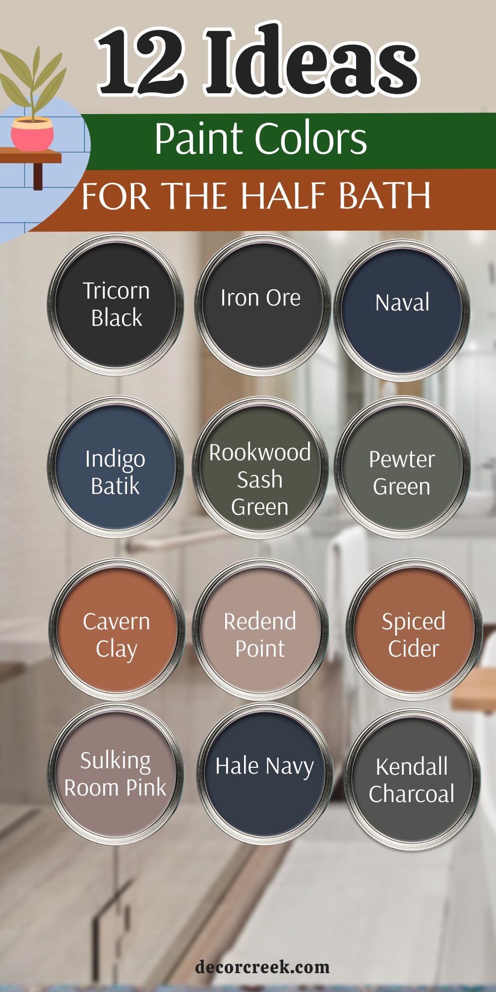
12 Ideas For the Half Bath Paint Colors
Tricorn Black SW 6258
Tricorn Black SW 6258 is a true black that does not have any hidden undertones like blue or brown. This paint makes a very bold statement in a half bath and looks very expensive. I love how it makes gold mirrors and white sinks pop against the dark walls.
It is a very smart choice for a small room where you want to show off your style. The color feels very solid and gives the room a very high-end look for your guests. You will notice that it hides any small bumps on the wall very well because it is so dark.
Many homeowners pick it because it creates a look that feels very modern and very brave. It provides a very steady background that makes every light fixture look like a piece of art. You will find that it keeps the room looking very clean and very organized. This shade is a top pick for anyone who wants a bathroom that people will remember.
Best used in: accent walls, front doors, cabinets, shutters, and half baths
Pairs well with: Pure White SW 7005, Classic French Gray SW 0077, silver or gold hardware The key rule of this color for farmhouse style is to use it where you want natural light to feel kind, soft, and inviting throughout the day.
🎨 Check out the complete guide to this color right HERE 👈

Iron Ore SW 7069
Iron Ore SW 7069 is a very dark charcoal gray that is just a little bit softer than a true black. This color works perfectly in a small half bath to create a very cozy and private feeling. I suggest this shade for people who want a dark look but still want a tiny bit of warmth.
It looks very rich when paired with light wood floors or a white marble vanity top. The color stays looking very steady and does not change much when the lights are turned on. You will enjoy how it makes the white porcelain of your toilet and sink look very bright.
It is a very sophisticated choice that makes your home feel very updated and very professional. Many designers use it to add drama without making the room feel too cold or too sharp. It covers the walls very smoothly and creates a very finished and polished appearance for you. This is a very dependable choice for a modern and very stylish small room.
Best used in: exteriors, kitchen islands, accent walls, bathrooms, and window trim
Pairs well with: Alabaster SW 7008, Nebulous White SW 7063, Extra White SW 7006, brass The key rule of this color for farmhouse style is to use it where you want natural light to feel kind, soft, and inviting throughout the day.
🎨 Check out the complete guide to this color right HERE 👈

Naval SW 6244
Naval SW 6244 is a classic navy blue that feels very traditional and very strong on the wall. This color is a favorite for half baths because it makes the room feel like a small jewel box. I often recommend it for homes that have a lot of white trim and nautical decorations.
It makes gold or brass faucets look very shiny and very high-end against the deep blue. The shade is dark enough to feel very private but it still has a lot of colorful energy. You will find that it pairs beautifully with light gray or white tile floors in your home.
It creates a very quiet and steady mood that helps guests feel very comfortable and relaxed. Many people choose it because it is a color that never goes out of style for a bathroom. It hides water marks and fingerprints very well, which keeps the room looking tidy. You will love how it makes your half bath feel very special and very well-planned.
Best used in: dining rooms, master suites, front doors, kitchen cabinets, and bathrooms
Pairs well with: Eider White SW 7014, Agreeable Gray SW 7029, Kilim Beige SW 6106, gold The key rule of this color for farmhouse style is to use it where you want natural light to feel kind, soft, and inviting throughout the day.
🎨 Check out the complete guide to this color right HERE 👈

Indigo Batik SW 7602
Indigo Batik SW 7602 is a medium-dark blue that has a soft and slightly dusty look to it. This paint is not as dark as navy, which makes it feel a bit more friendly and light. I like to use it in half baths that have a lot of white wood paneling on the bottom half.
It provides a very pretty contrast that makes the room feel very tall and very airy. The color looks like the sky just after the sun has gone down in the evening. You will notice that it matches perfectly with silver or chrome hardware in the washroom.
It is a very cheerful blue that makes people feel happy and energetic when they see it. Many homeowners pick it because it adds a lot of personality without being too overwhelming. It stays looking very clean and fresh even in a small room with no windows at all. This is a great choice for a half bath that needs a splash of classic color.
Best used in: bedrooms, bathrooms, accent walls, entryways, and kitchen islands
Pairs well with: Alabaster SW 7008, Ice Cube SW 6252, Breezy SW 7616, light wood The key rule of this color for farmhouse style is to use it where you want natural light to feel kind, soft, and inviting throughout the day.
🎨 Check out the complete guide to this color right HERE 👈

Rookwood Sash Green SW 2810
Rookwood Sash Green SW 2810 is a deep and earthy green that feels very natural and very old-fashioned. This color is perfect for adding a sense of history and character to a small half bath. I suggest this shade for homes that have a lot of traditional furniture and dark wood trim.
It makes the room feel very sturdy and like it has been there for a very long time. The color looks very rich and expensive when paired with a copper or bronze sink. You will enjoy how it brings a piece of the outside world into your small interior room.
It creates a very quiet and private mood that makes the bathroom feel like a hidden retreat. Many people choose it because it is very unique and makes the home stand out from others. It hides wear and tear very well, making it a very practical choice for a guest bath. This color is a top pick for anyone who loves a very natural and grounded look.
Best used in: exteriors, libraries, bathrooms, study areas, and front doors
Pairs well with: Creamy SW 7012, Ancient Marble SW 6162, Pewter Tankard SW 0023, bronze The key rule of this color for farmhouse style is to use it where you want natural light to feel kind, soft, and inviting throughout the day.
🎨 Check out the complete guide to this color right HERE 👈
Pewter Green SW 6208
Pewter Green SW 6208 is a dark green that has a lot of gray mixed in to keep it soft. This color is very popular right now because it looks very modern and very organic at once. I love to use it in a half bath with a light oak vanity and some white towels.
It makes the wood look very warm and the white look very bright and clean to the eye. The shade is deep enough to provide a lot of drama but it does not feel too dark. You will notice that it changes nicely from green to gray as the light in the room shifts.
It provides a very quiet background that helps you feel very focused and very relaxed today. Many of my clients love how it makes their home feel very updated and very high-end. It hides small splashes on the wall better than a light green paint would ever do. You can trust it to keep your half bath looking very stylish and very tidy.
Best used in: cabinets, accent walls, bathrooms, bedrooms, and exteriors
Pairs well with: Shoji White SW 7042, Sea Salt SW 6204, Spare White SW 6203, light wood The key rule of this color for farmhouse style is to use it where you want natural light to feel kind, soft, and inviting throughout the day.
🎨 Check out the complete guide to this color right HERE 👈

Cavern Clay SW 7701
Cavern Clay SW 7701 is a warm and earthy orange that looks like the color of a clay pot. This color is a fantastic way to bring a lot of warmth and energy into a small half bath. I often recommend it for people who want a room that feels very sunny and very welcoming.
It makes white fixtures look very sharp and gives the room a very earthy and natural feeling. The shade is very bold and makes the bathroom feel very unique and full of life for guests. You will find that it matches perfectly with dark wood or black metal decorations in the home.
It creates a very friendly mood that helps everyone feel very happy when they walk in. Many homeowners pick it because it makes their home feel very cozy and very well-decorated. It hides dust and wear very well, making it a very smart choice for a busy house. You will love how it makes your small room feel like a very warm and special place.
Best used in: accent walls, front doors, bathrooms, dining rooms, and kitchens
Pairs well with: Origami White SW 7636, Moth Wing SW 9174, Distance SW 6243, black metal The key rule of this color for farmhouse style is to use it where you want natural light to feel kind, soft, and inviting throughout the day.
🎨 Check out the complete guide to this color right HERE 👈

Redend Point SW 9081
Redend Point SW 9081 is a soft and sandy color that has a tiny hint of pink and brown. This paint makes a bathroom feel very warm and very gentle on the eyes for everyone. I use this color when I want a room to feel very cozy but still look very modern.
It works wonders in a small half bath that needs a bit of color without being too loud. The color looks very rich and pairs beautifully with creamy white trim and light wood floors. You will find that it makes your bronze faucets look very expensive and very well-chosen for the room.
It creates a very quiet mood that helps you feel very happy and very relaxed every morning. Many people choose it because it is the perfect middle ground between a tan and a pink. It hides small marks on the wall very well and keeps the room looking very clean. This color is a great choice for a guest bath that needs to feel very inviting.
Best used in: living rooms, bedrooms, bathrooms, hallways, and entryways
Pairs well with: Kestrel White SW 7516, Foothills SW 7514, Hushed Revelry SW 9062, warm wood The key rule of this color for farmhouse style is to use it where you want natural light to feel kind, soft, and inviting throughout the day.
🎨 Check out the complete guide to this color right HERE 👈

Spiced Cider SW 7702
Spiced Cider SW 7702 is a rich and warm orange-brown that feels very cozy and very inviting. This color is perfect for a half bath where you want to create a very warm and snug feeling. I like to use it to make a small room feel much more private and special for your guests.
It makes white porcelain sinks look very bright and creates a very high-end look in the home. The shade is very bold and gives the room a lot of character and energy today. You will notice that it looks very good with both dark wood and gold metal accents.
Many homeowners find that it helps their bathroom feel very warm even on cold winter days. It is a very unique choice that makes people notice how well you have decorated your home. It hides scuffs and wear very well, which keeps the room looking very neat and tidy. You will enjoy how it makes your half bath feel like a very warm and friendly place.
Best used in: accent walls, dining areas, bathrooms, libraries, and front doors
Pairs well with: Alabaster SW 7008, Dover White SW 6385, Toasty SW 6095, dark wood The key rule of this color for farmhouse style is to use it where you want natural light to feel kind, soft, and inviting throughout the day.
🎨 Check out the complete guide to this color right HERE 👈
Hale Navy BM HC-154
Hale Navy BM HC-154 is a very dark and deep navy blue that is very famous for being perfect. This color makes a half bath look very professional and very organized for your guests to see. I love how it makes white trim and white sinks look incredibly bright and very clean to the eye.
It has a bit of gray in it which keeps it from looking like a bright blue crayon on the wall. The color feels very solid and gives the room a very high-end and expensive look for you. You will notice that it creates a very quiet and private feeling in a small windowless room.
Many people choose it because it is a classic color that works in almost any style of house today. It hides water splashes and fingerprints very well, which keeps the room looking tidy. You can trust it to make your half bath feel very smart and very well-decorated for years. This shade is a top pick for anyone who wants a perfect and very traditional look.
Best used in: exteriors, kitchen islands, bathrooms, front doors, and bedrooms
Pairs well with: Chantilly Lace BM OC-65, Revere Pewter BM HC-172, Coventry Gray BM HC-169, silver The key rule of this color for farmhouse style is to use it where you want natural light to feel kind, soft, and inviting throughout the day.
🎨 Check out the complete guide to this color right HERE 👈

Kendall Charcoal BM HC-166
Kendall Charcoal BM HC-166 is a deep and rich gray that feels very modern and very expensive on the wall. This color is perfect for creating a look that is very sleek and very polished in a small room. I recommend it for half baths that have modern black hardware or very shiny silver faucets.
It provides a very cool and steady background that helps the room feel very organized and neat. You will enjoy how it makes the white porcelain of your sink look very crisp and very bright. The shade is dark enough to show a lot of character but it stays feeling very fresh and updated.
Many homeowners find that it makes their small bathroom feel very private and very high-end. It hides small marks and scuffs very well, which keeps the room looking clean all day long. It works beautifully with white marble or very light gray tile floors in your home. This is a very reliable color that will make your half bath look like a professional designer styled it.
Best used in: accent walls, exteriors, bathrooms, kitchen cabinets, and offices
Pairs well with: Simply White BM OC-117, Revere Pewter BM HC-172, Chelsea Gray BM HC-168, slate The key rule of this color for farmhouse style is to use it where you want natural light to feel kind, soft, and inviting throughout the day.
🎨 Check out the complete guide to this color right HERE 👈

18 Best Powder Room Paint Colors
Tricorn Black SW 6258
Tricorn Black SW 6258 is a very deep and true black that looks like a midnight sky without any clouds. This color makes a powder room feel like a very fancy and private place for your guests to visit. I love how it makes gold mirrors and white sinks look very bright and very expensive on the wall.
It is a very smart choice for a small room where you want to show off your bold style. The color feels very solid and gives the room a very high-end look that people will remember. You will notice that it hides any small bumps or marks on the wall because it is so dark.
Many homeowners pick it because it creates a look that feels very modern and very brave today. It provides a very steady background that makes every light fixture look like a piece of art. You will find that it keeps the room looking very clean and very organized for you. This shade is a top pick for anyone who wants a bathroom that feels very special.
Best used in: accent walls, front doors, cabinets, shutters, and half baths
Pairs well with: Pure White SW 7005, Classic French Gray SW 0077, silver or gold hardware The key rule of this color for farmhouse style is to use it where you want natural light to feel kind, soft, and inviting throughout the day.
🎨 Check out the complete guide to this color right HERE 👈
Naval SW 6244
Naval SW 6244 is a classic navy blue that feels very traditional and very strong on the wall. This color is a favorite for powder rooms because it makes the room feel like a small jewel box. I often recommend it for homes that have a lot of white trim and nautical decorations.
It makes gold or brass faucets look very shiny and very high-end against the deep blue. The shade is dark enough to feel very private but it still has a lot of colorful energy. You will find that it pairs beautifully with light gray or white tile floors in your home.
It creates a very quiet and steady mood that helps guests feel very comfortable and relaxed. Many people choose it because it is a color that never goes out of style for a bathroom. It hides water marks and fingerprints very well, which keeps the room looking tidy. You will love how it makes your powder room feel very special and very well-planned.
Best used in: dining rooms, master suites, front doors, kitchen cabinets, and bathrooms
Pairs well with: Eider White SW 7014, Agreeable Gray SW 7029, Kilim Beige SW 6106, gold The key rule of this color for farmhouse style is to use it where you want natural light to feel kind, soft, and inviting throughout the day.
🎨 Check out the complete guide to this color right HERE 👈
Evergreen Fog SW 9130
Evergreen Fog SW 9130 is a deep green-gray that feels very organic and very rich on the walls. This color is a great way to add a bit of drama to your small powder room walls. I love to use it behind a white sink to make the porcelain really pop out.
It looks like the forest on a very misty and quiet morning in the woods. The shade is dark enough to feel very private but light enough to stay fresh. You will find that it pairs perfectly with light wood and gold hardware accents.
It creates a very unique look that makes your home stand out from the rest. Many people pick it because it brings a piece of the outside world indoors for guests. It is a very sophisticated choice for a room that needs more personality and depth. You will love how it makes your powder room feel like a very special place.
Best used in: master suites, living rooms, hallways, bathrooms, and kitchen islands
Pairs well with: Shoji White SW 7042, Urbane Bronze SW 7048, Uberberry SW 9132, gold The key rule of this color for farmhouse style is to use it where you want natural light to feel kind, soft, and inviting throughout the day.
🎨 Check out the complete guide to this color right HERE 👈
Urbane Bronze SW 7048
Urbane Bronze SW 7048 is a very dark and earthy color that is a mix of brown and gray. This shade makes a powder room feel very grounded and very high-end for your visitors. I suggest this color for people who want a dark look that still feels very warm.
It looks very rich when paired with light wood floors or a white marble vanity top. The color stays looking very steady and does not change much when the lights are on. You will enjoy how it makes the white porcelain of your toilet look very bright.
It is a very sophisticated choice that makes your home feel very updated and professional. Many designers use it to add drama without making the room feel too cold or too sharp. It covers the walls very smoothly and creates a very finished and polished appearance for you. This is a very dependable choice for a modern and very stylish small room.
Best used in: exteriors, kitchen islands, accent walls, bathrooms, and window trim
Pairs well with: Alabaster SW 7008, Shoji White SW 7042, Modern Gray SW 7632, bronze The key rule of this color for farmhouse style is to use it where you want natural light to feel kind, soft, and inviting throughout the day.
🎨 Check out the complete guide to this color right HERE 👈

Cavern Clay SW 7701
Cavern Clay SW 7701 is a warm and earthy orange that looks like the color of a clay pot. This color is a fantastic way to bring a lot of warmth and energy into a small powder room. I often recommend it for people who want a room that feels very sunny and very welcoming.
It makes white fixtures look very sharp and gives the room a very earthy and natural feeling. The shade is very bold and makes the bathroom feel very unique and full of life. You will find that it matches perfectly with dark wood or black metal decorations in the home.
It creates a very friendly mood that helps everyone feel very happy when they walk in. Many homeowners pick it because it makes their home feel very cozy and very well-decorated. It hides dust and wear very well, making it a very smart choice for a busy house. You will love how it makes your small room feel like a very warm and special place.
Best used in: accent walls, front doors, bathrooms, dining rooms, and kitchens
Pairs well with: Origami White SW 7636, Moth Wing SW 9174, Distance SW 6243, black metal The key rule of this color for farmhouse style is to use it where you want natural light to feel kind, soft, and inviting throughout the day.
🎨 Check out the complete guide to this color right HERE 👈
Agreeable Gray SW 7029
Agreeable Gray SW 7029 is a very popular color because it is a perfect mix of gray and beige. This paint makes a powder room feel very light and very clean without being too cold. I love how it works with any kind of tile or floor you already have in the room.
It has a tiny bit of warmth in it which makes your skin look very healthy in the mirror. You will notice that it hides small marks much better than a very bright white would ever do. Many people choose it because it looks very updated but still feels like a warm hug.
It is the perfect choice if you want a neutral look that is not boring or too yellow. This color stays looking the same even when you turn on your warm overhead lights at night. It provides a very steady background that lets your colorful towels look their best for guests. You will enjoy how it makes your powder room feel very airy and open.
Best used in: open floor plans, family rooms, kitchens, bathrooms, and bedrooms
Pairs well with: Alabaster SW 7008, Sea Salt SW 6204, Steely Gray SW 7664, dark wood The key rule of this color for farmhouse style is to use it where you want natural light to feel kind, soft, and inviting throughout the day.
🎨 Check out the complete guide to this color right HERE 👈
Alabaster SW 7008
Alabaster SW 7008 provides a creamy look that is not too yellow or too bright on the wall. This shade works well in powder rooms because it reflects light without making the room feel cold. Many homeowners pick it because it makes white guest towels look very crisp and clean.
It acts as a soft backdrop for any kind of wood cabinet you might have in the room. The finish looks smooth and rich in rooms that do not have any windows at all. You will find that it coordinates with almost any rug or decoration you choose to add.
It helps the walls fade into the background so your beautiful sink can be the star. This choice is a favorite for people who want a clean look that still feels friendly. It hides small dust marks better than a stark, bright white would do for you. Most people feel very relaxed when they see this tone on their powder room walls.
Best used in: living rooms, kitchens, hallways, bedrooms, and farmhouse exteriors
Pairs well with: Iron Ore SW 7069, Agreeable Gray SW 7029, Natural Linen SW 9109, warm wood tones The key rule of this color for farmhouse style is to use it where you want natural light to feel kind, soft, and inviting throughout the day.
🎨 Check out the complete guide to this color right HERE 👈
Romance SW 6323
Romance SW 6323 is a very soft and light pink that feels very gentle and very sweet. This color is a fantastic way to make a small powder room feel very warm and very happy. I often recommend it for people who want a room that feels very bright and very welcoming.
It makes white porcelain sinks look very sharp and gives the room a very clean feeling. The shade is very light and makes the bathroom feel very unique and full of fresh air. You will find that it matches perfectly with gold or silver metal decorations in the home.
It creates a very friendly mood that helps guests feel very relaxed when they walk in. Many homeowners pick it because it makes their home feel very cozy and very well-decorated. It hides small marks on the wall very well, making it a very smart choice for you. You will love how it makes your small room feel like a very light and special place.
Best used in: bedrooms, powder rooms, nurseries, bathrooms, and accent walls
Pairs well with: Pure White SW 7005, Gossamer Veil SW 9165, Gray Shingle SW 7673, white marble The key rule of this color for farmhouse style is to use it where you want natural light to feel kind, soft, and inviting throughout the day.
🎨 Check out the complete guide to this color right HERE 👈
Hale Navy BM HC-154
Hale Navy BM HC-154 is a very dark and deep navy blue that is very famous for being perfect. This color makes a powder room look very professional and very organized for your guests to see. I love how it makes white trim and white sinks look incredibly bright and clean.
It has a bit of gray in it which keeps it from looking like a bright blue crayon. The color feels very solid and gives the room a very high-end and expensive look for you. You will notice that it creates a very quiet and private feeling in a small windowless room.
Many people choose it because it is a classic color that works in almost any style of house today. It hides water splashes and fingerprints very well, which keeps the room looking tidy and neat. You can trust it to make your powder room feel very smart and very well-decorated for years. This shade is a top pick for anyone who wants a perfect and traditional look.
Best used in: exteriors, kitchen islands, bathrooms, front doors, and bedrooms
Pairs well with: Chantilly Lace BM OC-65, Revere Pewter BM HC-172, Coventry Gray BM HC-169, silver The key rule of this color for farmhouse style is to use it where you want natural light to feel kind, soft, and inviting throughout the day.
🎨 Check out the complete guide to this color right HERE 👈
Kendall Charcoal BM HC-166
Kendall Charcoal BM HC-166 is a deep and rich gray that feels very modern and expensive. This color is perfect for creating a look that is very sleek and polished in a small room. I recommend it for powder rooms that have modern black hardware or very shiny silver faucets.
It provides a very cool and steady background that helps the room feel very organized and neat. You will enjoy how it makes the white porcelain of your sink look very crisp and bright. The shade is dark enough to show a lot of character but it stays feeling very fresh.
Many homeowners find that it makes their small bathroom feel very private and very high-end. It hides small marks and scuffs very well, which keeps the room looking clean all day long. It works beautifully with white marble or very light gray tile floors in your home. This is a very reliable color that will make your powder room look very professional.
Best used in: accent walls, exteriors, bathrooms, kitchen cabinets, and offices
Pairs well with: Simply White BM OC-117, Revere Pewter BM HC-172, Chelsea Gray BM HC-168, slate The key rule of this color for farmhouse style is to use it where you want natural light to feel kind, soft, and inviting throughout the day.
🎨 Check out the complete guide to this color right HERE 👈
Caliente BM AF-290
Caliente BM AF-290 is a very bright and bold red that feels very energetic and very warm. This color is a fantastic way to make a powder room feel very exciting and very fun. I often recommend it for people who want to make a big statement in their small home rooms.
It makes white fixtures look very sharp and gives the room a very traditional and rich feeling. The shade is very strong and makes the bathroom feel very unique and full of life. You will find that it matches perfectly with dark wood or gold metal decorations in the home.
It creates a very lively mood that helps guests feel very energized when they walk in. Many homeowners pick it because it makes their home feel very cozy and very well-decorated for them. It hides marks and wear very well, making it a very smart choice for a busy house today. You will love how it makes your small room feel like a very warm and special place.
Best used in: front doors, dining rooms, accent walls, powder rooms, and kitchens
Pairs well with: White Dove BM OC-17, Black Jack BM 2133-20, Gray Owl BM OC-52, gold The key rule of this color for farmhouse style is to use it where you want natural light to feel kind, soft, and inviting throughout the day.
🎨 Check out the complete guide to this color right HERE 👈
October Mist BM 1495
October Mist BM 1495 is a soft and silver-green that feels very natural and very steady. This color is a great way to add a bit of organic feeling to your powder room walls. I love how it makes white sinks look very clean and very bright against the soft green.
It looks like the color of sage leaves in a garden on a very quiet morning. The shade is light enough to feel very fresh but dark enough to have a lot of style. You will find that it pairs perfectly with light wood and silver hardware accents in the room.
It creates a very unique look that makes your home feel very updated and very professional. Many people pick it because it brings a piece of the outside world indoors for guests to see. It is a very sophisticated choice for a room that needs more personality and a quiet mood. You will love how it makes your powder room feel like a very special place.
Best used in: bedrooms, bathrooms, living rooms, kitchens, and cabinets
Pairs well with: Steam BM AF-15, Gloucester Sage BM HC-100, Hint of Violet BM 2114-60, oak The key rule of this color for farmhouse style is to use it where you want natural light to feel kind, soft, and inviting throughout the day.
🎨 Check out the complete guide to this color right HERE 👈

Chantilly Lace BM OC-65
Chantilly Lace BM OC-65 is known for being one of the brightest and truest whites available for home. It does not have strong blue or yellow undertones to distract your eye from your beautiful decor. This makes it the perfect partner for colorful artwork or bright tile in your powder room.
I use it when I want a room to look as modern and sharp as possible for you. The color reflects the most light of almost any paint you can buy at the store today. It works wonders in a bathroom that feels like a dark cave without any windows at all.
You will love how it makes your bathroom feel brand new and very polished for your guests. It is a crisp choice that helps you feel energized when you walk into the small room. Cleaning the walls is easy when you use a high-quality version of this bright and clean shade. It is the gold standard for anyone who loves a very minimalist and clean look.
Best used in: trim, doors, modern kitchens, art galleries, and small bathrooms
Pairs well with: Edgecomb Gray BM HC-173, Hale Navy BM HC-154, Shaker Beige BM HC-45, matte black The key rule of this color for farmhouse style is to use it where you want natural light to feel kind, soft, and inviting throughout the day.
🎨 Check out the complete guide to this color right HERE 👈
Classic Gray BM OC-23
Classic Gray BM OC-23 is an off-white color that looks like a very light and soft gray. It is one of my favorite colors for making a small powder room feel very expensive. The shade has a way of catching the light that makes the walls look like silk to the eye.
It is much warmer than a standard gray but much cooler than a standard tan paint choice. I use it when I want a room to feel very sophisticated and well-planned for my clients. It works perfectly with white marble and light-colored wood vanities in your small bathroom.
The color is so light that it almost looks white until you put a white towel near it. It provides a very soft background that does not compete for your attention at all today. This is a smart pick for a bathroom where you want to feel relaxed and very happy. You will find that it makes your home feel very cohesive and very smooth.
Best used in: bedrooms, nurseries, bathrooms, living rooms, and entryways
Pairs well with: Hale Navy BM HC-154, Cloud White BM OC-130, Simply White BM OC-117, slate The key rule of this color for farmhouse style is to use it where you want natural light to feel kind, soft, and inviting throughout the day.
🎨 Check out the complete guide to this color right HERE 👈
Revere Pewter BM HC-172
Revere Pewter BM HC-172 is a very famous color that is a perfect mix of gray and beige. This paint makes a powder room feel very warm and very steady without being too dark. I love how it works with any kind of tile or floor you already have in the room.
It has a tiny bit of warmth in it which makes your skin look very healthy in the mirror. You will notice that it hides small marks much better than a very bright white would ever do. Many people choose it because it looks very updated but still feels like a traditional home choice.
It is the perfect choice if you want a look that is not boring or too yellow for guests. This color stays looking the same even when you turn on your warm overhead lights at night. It provides a very steady background that lets your gold or silver hardware look their best. You will enjoy how it makes your powder room feel very solid and very well-planned.
Best used in: living rooms, kitchens, hallways, bathrooms, and bedrooms
Pairs well with: Simply White BM OC-117, Chelsea Gray BM HC-168, Coral Gables BM 2010-40, wood The key rule of this color for farmhouse style is to use it where you want natural light to feel kind, soft, and inviting throughout the day.
🎨 Check out the complete guide to this color right HERE 👈

Pink Bliss BM 2093-70
Pink Bliss BM 2093-70 is a very light and pale pink that feels almost like a white on the wall. This color is perfect for adding a tiny hint of color without it being bold or loud. I like to use it in small powder rooms to keep them feeling very airy and fresh.
It reflects the light from your bulbs to make the room feel very bright for your visitors. You will enjoy how it makes your bathroom look very clean and very updated for your home. The shade is very soft and does not overwhelm the other colors in the small room.
It works beautifully with white marble and very light gray tile floors in your washroom today. Many people find that it helps them feel very refreshed and very happy when they walk in. It is a very smart choice for a room that needs a light touch and a pretty look. You can trust it to keep your home looking very modern and very simple.
Best used in: bedrooms, bathrooms, nurseries, entryways, and ceilings
Pairs well with: Chantilly Lace BM OC-65, Gray Owl BM OC-52, Slate Teal BM 2058-20, white marble The key rule of this color for farmhouse style is to use it where you want natural light to feel kind, soft, and inviting throughout the day.
🎨 Check out the complete guide to this color right HERE 👈
Terra Cotta Tile BM 2090-30
Terra Cotta Tile BM 2090-30 is a warm and rich orange-red that feels very cozy and inviting. This color is perfect for a powder room where you want to create a very warm and snug feeling. I like to use it to make a small room feel much more private and special for your guests.
It makes white porcelain sinks look very bright and creates a very high-end look in the home. The shade is very bold and gives the room a lot of character and energy today. You will notice that it looks very good with both dark wood and gold metal accents in the room.
Many homeowners find that it helps their bathroom feel very warm even on cold winter days. It is a very unique choice that makes people notice how well you have decorated your small space. It hides scuffs and wear very well, which keeps the room looking very neat and tidy for you. You will enjoy how it makes your powder room feel like a very warm and friendly place.
Best used in: accent walls, dining areas, bathrooms, libraries, and front doors
Pairs well with: Cloud White BM OC-130, Simply White BM OC-117, Van Courtland Blue BM HC-145, dark wood The key rule of this color for farmhouse style is to use it where you want natural light to feel kind, soft, and inviting throughout the day.
🎨 Check out the complete guide to this color right HERE 👈

Breath of Fresh Air BM 806
Breath of Fresh Air BM 806 is a very light and bright blue that feels very cooling on the walls. This color is the perfect choice for a powder room that needs to feel very clean and open. I love how it makes the whole room feel like it has more air and light for your guests.
It is a very happy color that makes people feel optimistic and energetic when they visit. You can use it with white cabinets to create a very clean and modern look in your home. The paint is soft enough that it does not feel like a bright blue crayon on the wall.
It helps small bathrooms feel much larger than they actually are to the eye. Many of my clients choose this because they want a room that feels very light and very fresh. It looks wonderful with light-colored rugs and soft white towels on the racks today. You will find that it is a very easy color to live with every single day.
Best used in: small bathrooms, nurseries, kitchens, porch ceilings, and bedrooms
Pairs well with: White Heron BM OC-57, Arctic Blue BM 2050-60, Flint BM AF-560, white marble The key rule of this color for farmhouse style is to use it where you want natural light to feel kind, soft, and inviting throughout the day.
🎨 Check out the complete guide to this color right HERE 👈
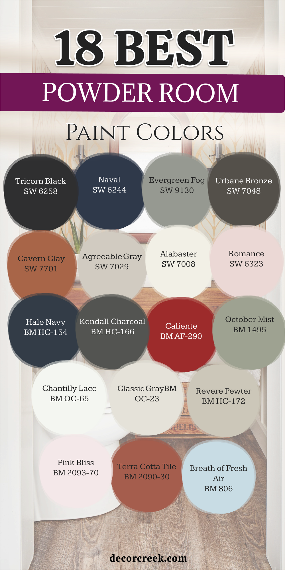
Final
Picking the right paint for your bathroom is about how you want to feel when you wake up. I have shared these colors because they are the ones I trust to make a home look its best. Whether you want a bright white room or a dark and cozy one, these choices will help you. Always remember to look at your paint samples next to your floor and your lights. Your home should be a place that makes you feel happy and ready for anything.
Selecting a new color is the fastest way to make your bathroom feel like a brand new part of your home. These 27 shades are the top picks for anyone who wants a professional and high-end look without any stress. I have seen how the right bucket of paint can make a small area feel much bigger and much more expensive.
You deserve a master suite that makes you feel proud and very comfortable every single day. Take your time to pick the tone that matches your floor and your favorite soft towels.
A beautiful bathroom is a gift you give to yourself and your family to enjoy for many years.