When winter comes, I feel like walls should help us feel safe and warm. Paint colors can change how a room feels faster than any piece of furniture. Soft whites can brighten dark days, warm beiges can make family rooms more inviting, and deep blues or grays can give evenings a rich, cozy mood. I always tell my clients that paint is the easiest way to shift the mood of a home for the season.
It doesn’t take a big remodel or new furniture to make a difference—sometimes just a fresh coat of paint is enough to bring joy back into a room.
This list of shades is my way of showing you how winter can feel softer, brighter, and more comforting inside your home, whether you love simple neutrals or strong, dramatic tones.
Why I Rely on Sherwin-Williams and Benjamin Moore for Winter Home Colors
I trust Sherwin-Williams and Benjamin Moore because I need colors that feel steady in all types of light. In winter, daylight is short and often gray, so I lean on paints that stay true whether the room is glowing with morning sun or lit by a single lamp at night. Both brands give me a wide range of whites, warm tones, and bold accent shades that help every corner of a home feel finished.
I also like how their colors pair so well with natural textures—wood floors, wool rugs, and stone fireplaces all seem to find a match in their palettes.
When I want a living room to glow, a kitchen to feel fresh, or a bedroom to stay inviting, I know these brands will give me shades that last, look rich, and bring comfort through the coldest days.
How I Select the Perfect Shade for Cold-Season Interiors
I always start with light. In winter, sunlight can be weak, so I test colors on large boards and watch them through the day. I notice how a shade looks in the morning, afternoon, and night under lamps. Next, I think about mood. If a family wants cozy evenings, I reach for warm beiges or gentle grays that help rooms feel like a soft blanket.
If brightness is needed, I lean toward creamy whites that bounce light around. I also check how the color pairs with wood, rugs, and metal finishes already in the room, because the wrong undertone can make a room feel off.
A perfect winter shade is one that makes the room feel alive during the day, restful at night, and steady no matter what the season brings outside.
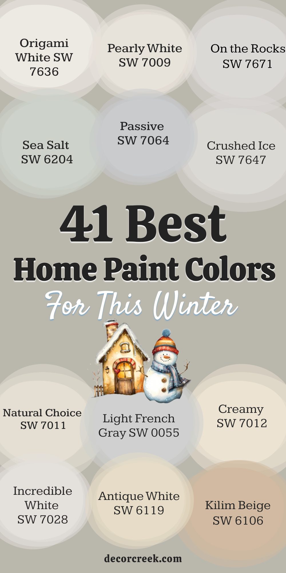
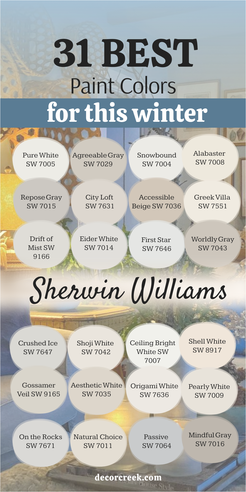
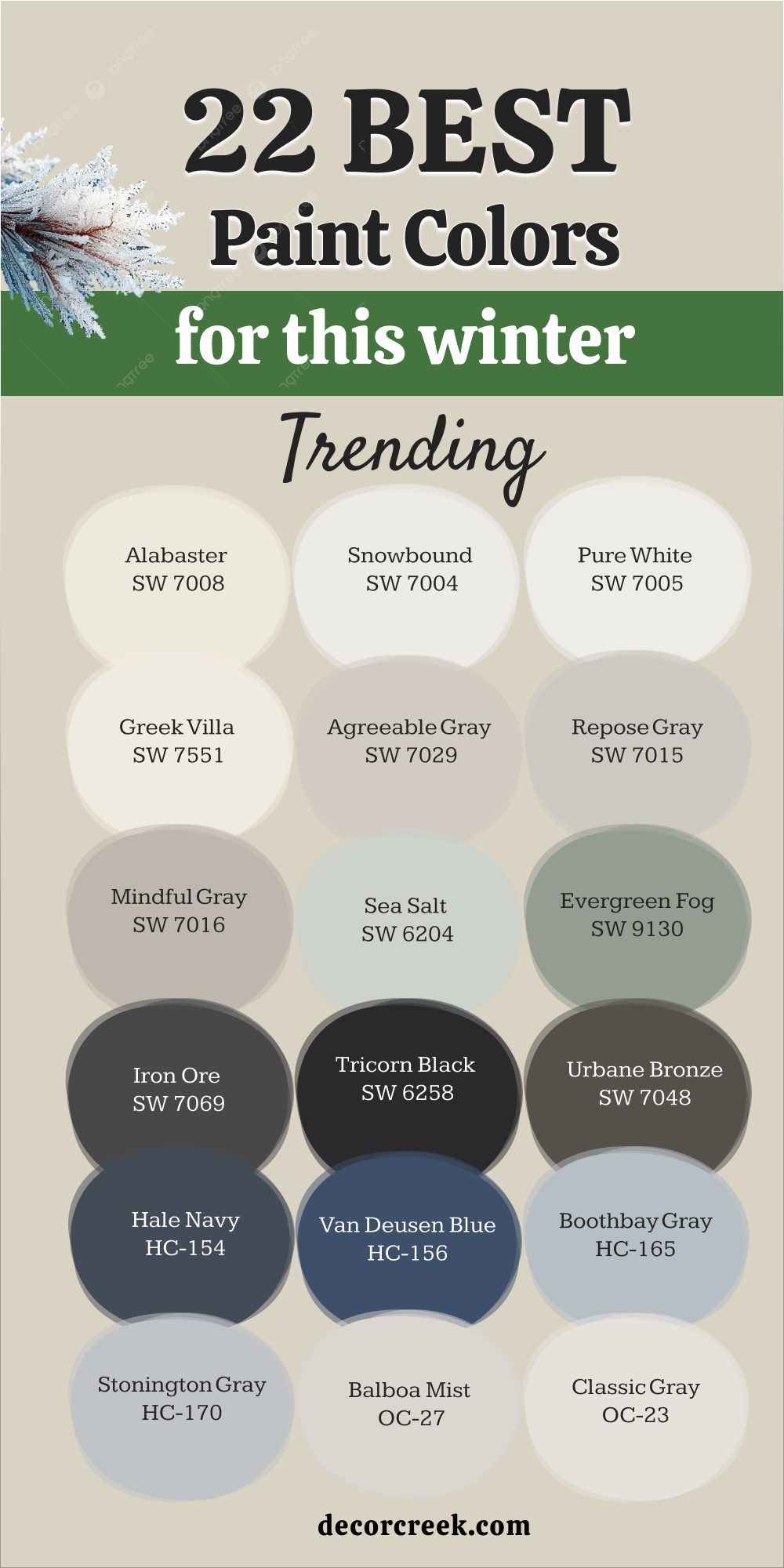
31 Best Paint Colors for This Winter from Sherwin-Williams
Pure White SW 7005
Pure White feels steady and bright, like snow shining outside a window. Pure White makes walls glow without looking harsh, which is why I reach for it in darker rooms during winter. Pure White pairs beautifully with warm woods, soft gray sofas, and wool throws, letting textures shine. Pure White works in kitchens, living rooms, and even small entryways where a clean look is needed.
Pure White makes trim look neat, doors stand out, and ceilings feel taller. Pure White also supports both colorful accents and quiet neutrals, never stealing the show but always making a room look fresh.
Pure White gives me confidence that even on gray winter days, a home will still feel open, light, and welcoming.

Agreeable Gray SW 7029
Agreeable Gray feels warm enough to soften the chill of winter but still light enough to keep a home feeling airy. Agreeable Gray blends with almost any flooring—whether it’s dark wood, pale tile, or cozy carpet. Agreeable Gray creates a backdrop that lets art, furniture, and fabrics come alive without clashing.
Agreeable Gray makes living rooms glow during evenings when family gathers, and mornings feel calm with soft light bouncing off the walls.
Agreeable Gray pairs well with white trim for crisp contrast, yet it also loves earthy browns and muted blues.
Agreeable Gray is a shade I often choose when I want a balanced, welcoming feel that works for every season but feels especially inviting in the cold months.

Snowbound SW 7004
Snowbound feels like the soft brightness of fresh snow under a cloudy sky. Snowbound brings light to rooms that don’t get much winter sun, helping them stay cheerful. Snowbound pairs beautifully with navy, charcoal, or beige, giving a fresh but grounded mix. Snowbound makes trim, ceilings, and cabinets look crisp, giving every corner a polished finish.
Snowbound works in kitchens with white cabinets, in bedrooms with soft fabrics, or in living rooms filled with natural wood.
Snowbound also highlights holiday decorations and makes rooms feel ready for gatherings. Snowbound gives homes a glow that softens winter days and brightens evenings spent with family.

Alabaster SW 7008
Alabaster feels like a warm blanket pulled close during a cold night. Alabaster has a creamy side that feels gentle but never heavy, making it one of my favorite shades for winter. Alabaster pairs perfectly with brass lighting, natural wood tables, and linen curtains, creating comfort without fuss. Alabaster works in bedrooms where rest matters most, in living rooms where families gather, and in dining rooms where soft light matters.
Alabaster balances both bright winter mornings and long cozy evenings with ease. Alabaster also allows darker accents like navy or charcoal to shine while still keeping the room light.
Alabaster is always a safe choice when I want a room to feel like home through the season.

Repose Gray SW 7015
Repose Gray feels balanced, never too warm and never too cool, which makes it perfect for winter when light changes quickly. Repose Gray works in bedrooms, living areas, and even offices where a clean but soft background is needed. Repose Gray pairs with crisp white trim for a polished look, but it also works with deep wood tones for a cozier feeling. Repose Gray makes walls look smooth and helps furniture, art, and fabrics stand out naturally.
Repose Gray feels steady during gray days when the light outside is soft or muted.
Repose Gray also blends with both modern and classic styles, which makes it one of my most trusted shades for families who want a look that lasts through every season but feels extra special in winter.

City Loft SW 7631
City Loft feels gentle with a soft mix of gray and beige that works well in any home. City Loft makes small rooms feel brighter and larger, which is perfect when winter nights feel long. City Loft pairs beautifully with whites, creams, and light woods, giving a smooth and flowing look from one room to the next.
City Loft works especially well in bedrooms, hallways, and entryways where warmth and brightness both matter.
City Loft looks steady in morning sun and soft in evening lamplight, never feeling too flat. City Loft also pairs with muted fabrics and natural textures, which makes it easy to style a cozy winter home. City Loft gives every home a lived-in, inviting look that feels right when days grow short and nights get cold.

Accessible Beige SW 7036
Accessible Beige feels warm and soft, almost like fresh bread on a winter morning. It carries just enough gray to stay balanced, which keeps it from looking flat or yellow. The shade works beautifully with wood floors, stone fireplaces, and textured rugs. Crisp white trim gives it a polished look, while darker accents make it feel grounded.
I love how it adapts to both bright daylight and gentle lamplight, always holding its charm. In family rooms, dining spaces, or bedrooms, this color creates a steady, welcoming comfort that feels right in the colder months.

Greek Villa SW 7551
Greek Villa is a creamy white that glows warmly without being sharp. It pairs effortlessly with brass lamps, rich wood furniture, and woven details that bring depth to a room. In daylight it feels bright and uplifting, while in the evening it turns soft and soothing. I find it especially beautiful in living rooms, kitchens, and hallways where a warm welcome matters. It blends easily with both neutral fabrics and bold patterned rugs.
This shade balances a home in winter, adding brightness with a classic touch that never feels forced.

Drift of Mist SW 9166
Drift of Mist has a soft, airy look, like fog rolling in on a quiet morning. With its gentle mix of gray and beige, it feels clean but still warm. The shade flows well in open living rooms where light changes through the day. Pale wood floors, muted fabrics, and white trim are perfect partners for it. Even on gray afternoons, it keeps a gentle glow that lifts the mood.
I like how it works in bedrooms, kitchens, and home offices where comfort and ease are most important.

Eider White SW 7014
Eider White brings a fresh lightness with a touch of gray, softer than plain white but never dull. It works well in bedrooms and kitchens where brightness is needed most. Dark beams, stone counters, and cozy fabrics all find harmony against it. Doors and trim look crisp and sharp, giving rooms a polished edge. On short winter days, it still feels friendly and open.
This shade keeps interiors simple and clean, while adding just enough warmth to make a home feel lived in.

First Star SW 7646
First Star is cool and crisp, touched with silver that gives walls a fresh brightness. It shines in bathrooms, kitchens, and bedrooms with modern finishes. Pair it with navy or charcoal for a bold look, or with beige for a softer mix. It stays steady under both natural daylight and warm evening lamps. Trim and ceilings take on a lifted glow, making rooms feel taller and lighter.
For me, this color always adds a refreshing spark to a winter home.

Worldly Gray SW 7043
Worldly Gray feels grounded, steady, and warm, with just enough softness to stay inviting. It blends beautifully with creamy trim, natural woods, and layered fabrics. I often use it in living rooms, bedrooms, and entryways where a welcoming mood matters most. In bright daylight it feels open, while under soft lamps it turns cozy and rich.
This shade never feels too heavy, yet it has enough depth to make a room feel secure. It’s one of my trusted picks for families who want a balanced look that lasts all winter.

Crushed Ice SW 7647
Crushed Ice is a soft gray that feels smooth and modern, yet it still carries warmth. It has a clean base that works in both large open rooms and small cozy corners. I like using it in living rooms and kitchens because it reflects light beautifully, even on short winter days. It pairs well with white trim for a crisp finish, but it also looks amazing next to natural wood, woven rugs, and brushed metal accents.
This color doesn’t demand attention, yet it creates a backdrop that makes furniture and fabrics shine. In evening lamplight it feels soft and comfortable, while in daylight it feels fresh and airy.
For me, Crushed Ice is a quiet hero in winter homes—it never feels heavy, but it always adds depth.

Shoji White SW 7042
Shoji White is creamy and soft, with a touch of warmth that makes rooms feel cared for. It has more depth than a simple white, which helps it stay cozy instead of flat. I often use it in bedrooms or family rooms where I want a gentle, lived-in glow. Shoji White works especially well with warm metals like brass and bronze, and it pairs beautifully with textured fabrics like wool and linen.
Under winter sunlight, it feels open and bright, while in the evening it turns rich and soothing. It’s the kind of shade that makes a room feel peaceful without ever looking dull.
This is one of my favorite choices when a family wants comfort but still needs their home to feel light.

Ceiling Bright White SW 7007
Ceiling Bright White is sharp and clean, the kind of color that makes a room feel fresh in seconds. I use it most often on ceilings and trim because it lifts the entire room, giving walls a more polished look. Paired with soft grays or creamy whites, it creates contrast that makes edges look neat and defined. In winter, when natural light is low, this shade helps reflect whatever light is available, keeping the home from feeling dark.
It also works beautifully in kitchens with white cabinets or bathrooms with marble counters. Ceiling Bright White is simple but powerful—it sets the stage for every other color in the room and makes details shine.

Shell White SW 8917
Shell White is a warm, gentle white that feels inviting and soft. It carries a hint of peach that gives walls a subtle glow, which is perfect in winter when rooms can feel too cold. I love using it in dining rooms, bedrooms, and entryways where I want a welcoming tone. It works beautifully with wood trim, woven fabrics, and warm lighting, creating a cozy backdrop.
Shell White also pairs nicely with darker shades like charcoal or navy, adding balance without taking away brightness.
During the day it feels uplifting, and at night it becomes warm and soothing. This is a color that adds quiet elegance while still keeping a home comfortable.

Gossamer Veil SW 9165
Gossamer Veil is a light gray-beige that feels airy and calm, the kind of color that works everywhere. It has enough warmth to avoid looking cold but still feels fresh. I often use it in open-concept homes because it flows beautifully from one room to another. Pair it with crisp trim, soft woods, or woven accents for a balanced look. In the morning it feels bright and clean, while in the evening it turns cozy under soft lamps.
It’s a shade that adapts easily, making it perfect for busy families who want one steady color that works with everything. In winter, Gossamer Veil makes homes feel both grounded and welcoming.

Aesthetic White SW 7035
Aesthetic White is soft and elegant, sitting between white and beige. It has just enough color to feel warm but still reads as light on the wall. I use it in bedrooms, family rooms, and even kitchens when I want a glow that isn’t too stark. This shade works beautifully with natural materials like stone fireplaces, oak floors, and linen curtains.
In daylight it feels smooth and open, while at night it brings a gentle warmth. It pairs nicely with both traditional and modern decor, making it one of the most flexible winter choices.
Aesthetic White helps a home feel comfortable without ever fading into the background—it has a quiet character that lasts.

Origami White SW 7636
Origami White is a soft, warm white that carries a hint of gray, making it gentle and versatile. I often use it in living rooms and bedrooms because it brings a clean look without being stark. It pairs well with both light and dark woods, giving balance no matter the style of the home. In winter light, it feels warm enough to soften a room yet still brightens corners that might otherwise feel dim.
This color also works beautifully with brushed gold or black fixtures, adding a quiet sense of style. During the day it feels airy, and at night it becomes cozy and relaxed.
Origami White is one of those shades that adapts easily, creating harmony in homes through the coldest months.

Pearly White SW 7009
Pearly White has a soft cream tone with just enough warmth to keep it from feeling flat. I love using it in bedrooms or family spaces where comfort is key. It pairs nicely with natural fabrics like cotton or linen and brings out the beauty of wood floors. In kitchens or dining rooms, it creates a welcoming glow that feels right in winter.
Trim painted in brighter white gives it a neat finish, while darker accents help anchor the room.
Morning light makes it feel fresh, while evening lamps turn it into a cozy backdrop. Pearly White has a timeless charm that makes any room feel complete and inviting.

On the Rocks SW 7671
On the Rocks is a light gray with a cool edge that feels fresh and modern. It works beautifully in bathrooms, kitchens, or hallways where crisp detail matters. I like how it pairs with black hardware, silver finishes, or navy accents for a sharp contrast. Even in low winter light, it stays clear and bright, keeping rooms from feeling heavy.
It’s also a great background for art and furniture, letting colors stand out without competing.
In the morning it feels bright and open, while at night it has a sleek, tailored quality. On the Rocks is a go-to when I want a room to feel current but still comfortable.

Tricorn Black SW 6258
Tricorn Black is bold, rich, and full of character. It’s one of the truest blacks, which makes it perfect for accent walls, doors, or cabinetry. I love pairing it with creamy whites for sharp contrast that feels stylish and timeless. In winter, it adds depth to rooms, making them feel grounded and strong. Paired with brass or gold, it takes on a luxe quality, while with wood and linen it feels warm and natural. It’s not a shade for every wall, but when used in the right place, it turns a corner into a statement.
Tricorn Black always adds confidence to a home, especially during the cold season when cozy drama feels welcome.

Passive SW 7064
Passive is a cool gray that feels clean and simple, perfect for modern interiors. I use it in bedrooms, kitchens, and offices where a neat look is important. It pairs nicely with white trim, silver hardware, and dark accents for a balanced effect. On winter days, it reflects what little natural light there is, helping rooms feel open. At night, it takes on a calm, steady quality under soft lamps.
It also works beautifully with stone counters or light wood floors.
Passive is the kind of shade that gives a home a polished feel without demanding attention.

Mindful Gray SW 7016
Mindful Gray is warm, balanced, and easy to live with. It sits between beige and gray, giving walls a steady presence that feels comfortable in winter. I like using it in living rooms, bedrooms, and even kitchens, where it creates a grounding effect. It pairs beautifully with white trim for brightness or with dark wood for depth. Mindful Gray looks welcoming during the day and turns rich under warm evening light. It also complements fabrics like wool, cotton, and velvet, adding layers of comfort.
This is one of those shades that feels safe but never boring, which is why I reach for it often when styling cozy winter homes.

Natural Choice SW 7011
Natural Choice is a soft, creamy neutral that instantly makes a home feel warm. It carries a gentle undertone that works beautifully with wood floors, stone fireplaces, and soft fabrics. I often use it in living rooms or family spaces because it gives the whole room a glow without being too bright. In winter, this shade feels like a cozy blanket, helping to soften gray days.
It pairs perfectly with crisp white trim for contrast, or with deeper tones like charcoal or navy for balance.
Natural Choice adapts easily to both daylight and lamplight, always holding a warm, steady look. For me, it’s one of the easiest ways to bring comfort into a home without making it feel heavy.

Light French Gray SW 0055
Light French Gray is a cool, even gray that feels smooth and polished. It’s not too dark, not too light, which makes it an easy choice for almost any room. I love using it in bedrooms, hallways, and kitchens where I want a crisp, modern backdrop. It works well with bright white trim, black accents, or brushed silver fixtures.
In winter, it reflects what little daylight there is, keeping rooms from feeling dull. Under warm evening light, it feels soft and balanced, never cold.
This shade also supports bold colors in furniture and art, giving them a chance to shine. Light French Gray is dependable, stylish, and always makes a room feel finished.

Creamy SW 7012
Creamy is a warm white that feels like candlelight on the wall. It has a richness that plain whites don’t have, which makes it perfect for winter. I often choose it for dining rooms, bedrooms, and kitchens where I want a soft, inviting glow. It pairs beautifully with wood tones, brass hardware, and natural fabrics, creating a layered and welcoming look. In daylight, it feels fresh and bright; at night, it turns cozy and golden.
This shade is gentle enough to be used on all four walls but strong enough to bring depth to a room. Creamy always makes a home feel lived in, cared for, and warm through the colder months.

Incredible White SW 7028
Incredible White is a very light gray with a whisper of beige, making it a perfect winter neutral. It has more depth than plain white, which gives rooms a soft, elegant look. I like it in bedrooms and living rooms because it feels both fresh and comforting. It pairs well with darker accents like charcoal and navy but also looks beautiful with natural woods and crisp trim. On gray winter days, it helps brighten rooms without feeling stark. In the evening, it takes on a gentle warmth under lamps.
This shade is versatile and easy, a color I turn to when I want a home to feel polished but still inviting.

Antique White SW 6119
Antique White is rich and creamy, with a classic charm that feels right in winter. It has a slightly golden undertone that makes rooms feel warm and lived in. I often use it in dining rooms, family rooms, and hallways where I want a soft, welcoming glow. It pairs beautifully with deep wood finishes, patterned fabrics, and antique-style fixtures. In daylight, it feels smooth and natural, while at night it becomes warm and cozy. This color has a sense of tradition without feeling dated.
Antique White always makes a home feel comfortable, especially during the colder months when warmth is most needed.

Kilim Beige SW 6106
Kilim Beige is a warm, sandy neutral that brings comfort to any room. It leans toward beige but carries a touch of richness that keeps it interesting. I like using it in bedrooms and living areas where families gather, because it feels steady and welcoming. It pairs beautifully with wood floors, cream trim, and soft fabrics like linen and wool. Kilim Beige looks warm in natural light and turns cozy under lamplight.
It works equally well with classic and modern styles, adapting easily to both. This shade makes homes feel grounded and inviting, the kind of place where people want to stay longer on winter evenings.

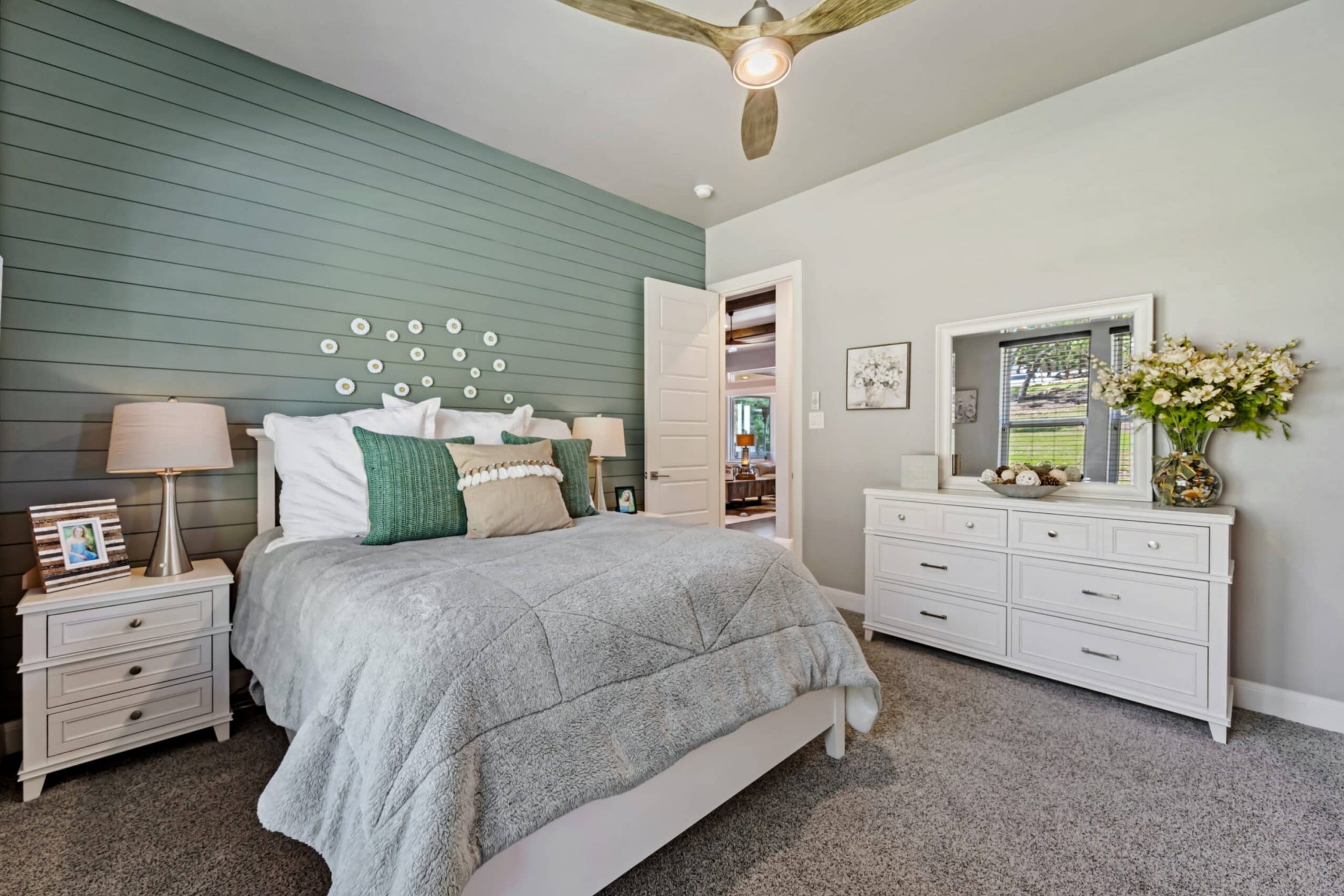
Sea Salt SW 6204
Sea Salt is a soft green-gray that feels fresh and light, almost like a breath of cool winter air. It has just the right balance of color to stand out but still stay quiet on the walls. I love how it shifts through the day—sometimes looking more green, other times leaning toward gray, depending on the light. This makes it perfect for bathrooms, bedrooms, and kitchens where natural and artificial light change often.
Paired with white trim, it feels crisp and refreshing, while with wood and woven textures it takes on a cozy, lived-in mood.
On gray winter days, it lifts the atmosphere, making rooms feel brighter. At night, it softens beautifully, creating a calm and welcoming backdrop. Sea Salt is one of my favorite choices when a home needs a touch of gentle color without losing warmth.

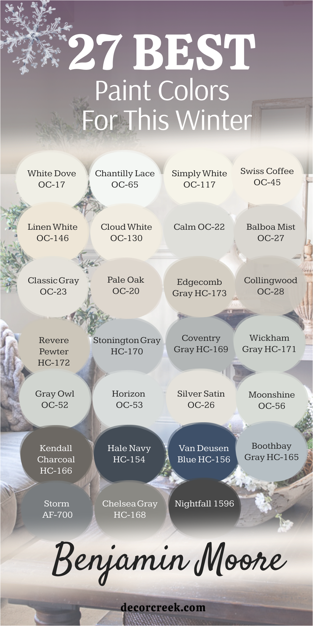
27 Best Paint Colors for This Winter from Benjamin Moore
White Dove OC-17
White Dove is soft, creamy, and always welcoming. It brightens a room without being harsh, which makes it a favorite for winter homes. I often use it in living rooms and bedrooms where I want a glow that feels warm but still clean. It works beautifully with wood floors, cozy rugs, and white trim for a layered look. On gray days, it keeps rooms from feeling dull, and at night it holds a gentle glow under lamps.
This shade is timeless in the best way—it makes a home feel open, warm, and cared for through the season.

Chantilly Lace OC-65
Chantilly Lace is crisp and bright, like fresh snow on a clear morning. It brings a sense of freshness to any room, especially in spaces that need extra light in winter. I love pairing it with navy, charcoal, or bold wood tones for sharp contrast. It works equally well on walls, trim, and cabinets, giving a polished finish everywhere. During short winter days, it helps reflect light and keeps a room feeling alive. In the evenings, it stays clean and crisp under soft lamps.
This is a go-to when I want a home to feel bright and sharp without losing warmth.

Simply White OC-117
Simply White feels cheerful and easy, bringing brightness that lifts a room instantly. It works wonderfully in kitchens, hallways, and family rooms where energy is needed most. I like pairing it with natural textures like wood, rattan, and stone to balance its glow. During gray afternoons, it keeps a space from feeling flat, and in the evening it turns warm under soft lighting. It’s also a flexible choice for trim and doors because it keeps edges neat and sharp.
Simply White is one of those shades that feels safe but never boring, making it perfect for the cold months when a home needs more light.

Swiss Coffee OC-45
Swiss Coffee is creamy and rich, like warm milk on a winter morning. It has just enough depth to bring coziness without looking heavy. I love it in living rooms and dining areas where families spend evenings together. It pairs beautifully with brass fixtures, dark leather, and soft wool fabrics. In daylight, it feels fresh and inviting, while at night it glows warmly under lamps.
This shade also balances well with stone fireplaces or wood accents, creating a layered and lived-in look. Swiss Coffee always adds comfort, making a home feel settled and welcoming during the season.

Linen White OC-146
Linen White is soft and warm, reminding me of favorite blankets and well-worn fabric. It creates a gentle glow that works perfectly in winter when rooms need warmth. I often choose it for bedrooms and family rooms where comfort is the main goal. It pairs beautifully with creams and tans for a layered look, or with darker accents to create balance.
During the day, it feels uplifting, while in the evening it softens into a warm backdrop. This shade is one of those that makes a home feel instantly lived in and loved, which is exactly what we crave during colder months.

Cloud White OC-130
Cloud White is bright but still gentle, making rooms feel fresh without looking stark. It’s one of my favorites for trim and cabinetry because it makes details stand out cleanly. I also like it on walls in kitchens and bedrooms where brightness matters most. It pairs nicely with navy, dark green, or warm wood, creating both contrast and balance. In winter, it helps rooms feel open, especially when daylight is low.
Under lamps, it becomes warm and steady, holding its glow beautifully. Cloud White always makes a home feel polished and ready for gatherings.

Calm OC-22
Calm is soft and steady, with just the right balance of warmth and coolness. It works beautifully in bedrooms where rest is the goal, but I also love it in quiet living areas. The color pairs easily with pale woods, linen fabrics, and muted metals, creating a layered and welcoming look. On gray winter afternoons, it feels gentle and soothing, never flat. Under lamps at night, it holds a soft glow that makes the room feel cared for.
Calm is one of those shades that doesn’t shout but gives a home a peaceful, lived-in warmth all season long.
Balboa Mist OC-27
Balboa Mist has a gray-beige tone that feels balanced and smooth. It’s a favorite for open living rooms because it flows so well from one space to another. The shade pairs with dark trim for a modern edge, or with creamy whites for a softer mix. It feels light in the morning sun, and by evening it takes on a cozy warmth that works perfectly for winter gatherings.
Balboa Mist also loves brass, wood, and woven fabrics, giving homes texture and depth. I often choose it when a family wants something flexible but still warm for the colder months.

Classic Gray OC-23
Classic Gray is gentle and modern, with just enough beige to add warmth. I use it often in bedrooms and dining rooms where a polished backdrop is needed. This color works beautifully with both wood trim and crisp white, adapting easily to different styles. On gray days, it still feels fresh and open, while in the evening it softens into a comforting glow.
Classic Gray pairs nicely with muted blues and greens, adding layers without overwhelming the room. For me, it’s a safe, stylish choice that keeps homes inviting in winter.

Pale Oak OC-20
Pale Oak is warm and creamy, like the softness of wool on a cold morning. It has a light beige-gray tone that blends beautifully with stone fireplaces, oak floors, and linen fabrics. This shade feels cozy in bedrooms, welcoming in living rooms, and soft in hallways. During the day, it lifts a room with brightness, while at night it turns rich and warm under lamps. Pale Oak doesn’t fade into the background—it adds gentle character to a home.
In winter, it’s one of my go-to colors when I want a room to feel truly inviting.

Edgecomb Gray HC-173
Edgecomb Gray is natural and balanced, leaning warm but never heavy. It’s a favorite for family rooms and kitchens where life happens every day. With crisp white trim, it looks fresh and polished, while paired with warm wood it feels grounded and cozy. It shifts beautifully in different lights—bright during the day and comforting in the evening. Edgecomb Gray blends easily with stone, fabric, and metal finishes, which makes styling simple.
It’s a shade that adapts well but always keeps its character, a perfect winter companion.

Collingwood OC-28
Collingwood carries a graceful mix of beige and gray that stays warm all winter long. It feels welcoming in entryways, polished in dining rooms, and steady in bedrooms. I like how it pairs with brushed metal, crisp trim, and soft wood tones. In the morning, it looks clean and bright, while at night it becomes cozy and rich.
Collingwood also works with layered fabrics like cotton, wool, and velvet, giving homes depth. It’s one of those colors that never feels flat, always adding warmth and elegance in colder months.

Revere Pewter HC-172
Revere Pewter is a true classic, warm yet balanced, and always inviting. It works perfectly in entryways and family rooms where people gather during the colder months. The shade pairs naturally with wood beams, stone fireplaces, and soft fabrics, creating a layered and welcoming look. In the morning, it feels bright and open; in the evening, it takes on a cozy depth.
This color also adapts well to both modern and traditional styles, making it easy to use across a whole home. For me, Revere Pewter has always been a safe yet stylish choice that keeps a home feeling comfortable in winter.

Stonington Gray HC-170
Stonington Gray is crisp and cool, a gray that feels fresh and tailored. It works beautifully in kitchens, bathrooms, and hallways where a clean backdrop is needed. I love pairing it with navy accents, bright trim, or polished silver for a sharp finish. During short winter days, it keeps a room from feeling heavy, reflecting just enough light. At night, it feels steady and modern, never too stark
. Stonington Gray makes rooms look polished, but it also pairs well with warm woods to keep balance. This shade always adds a quiet confidence to winter homes.

Coventry Gray HC-169
Coventry Gray is smart, bold, and elegant, sitting in the perfect middle of the gray spectrum. It has enough depth to feel grounded but not so much that it overwhelms a room. I often use it in dining rooms, offices, or accent walls where focus is important. It pairs beautifully with white trim and dark metal fixtures for a clean, modern edge.
On winter afternoons, it looks sharp and defined, while at night it turns rich under warm lighting.
Coventry Gray always adds structure to a space, making it feel strong and stylish through the season.

Wickham Gray HC-171
Wickham Gray is light and airy, with a soft blue undertone that feels refreshing. It brightens bedrooms and bathrooms, especially in homes that need more natural light. Paired with white trim, it feels crisp and clean; with pale woods, it turns warm and comforting. On gray days, it still reflects brightness, keeping a home from feeling dull.
In the evening, it softens gracefully under lamps. Wickham Gray is a wonderful choice when you want something light that still has character. It gives a gentle lift to interiors, perfect for the cold months.

Gray Owl OC-52
Gray Owl is fresh and modern, with a cool side that keeps rooms looking sharp. It works especially well in kitchens and offices where clarity and brightness matter. Marble counters, silver fixtures, and white cabinets all find balance with this shade. During the day, it reflects natural light beautifully, and in the evening it takes on a soft, steady presence.
I like how it supports both bold colors and neutrals in furniture and art, never competing but always enhancing. Gray Owl is an easy way to make a home feel bright and stylish during winter.

Horizon OC-53
Horizon is a soft silver-gray that feels open and uplifting. It looks beautiful in living rooms, bedrooms, and hallways, bringing brightness to every corner. Navy, dark wood, and stone accents pair naturally with this shade, creating balance and depth. On gray winter days, it keeps a home from feeling too heavy, always reflecting whatever light is available.
At night, it takes on a gentle glow, adding comfort without being overwhelming. Horizon is one of those colors that quietly supports a room, letting furniture and fabrics stand out. It’s a simple, elegant choice for winter homes.

Silver Satin OC-26
Silver Satin is light and airy, with just a touch of gray to keep it balanced. It’s a favorite for bedrooms and dining rooms because it feels soft but still polished. Paired with warm woods and woven rugs, it creates a cozy backdrop that works perfectly in winter. Bright white trim gives it a crisp edge, while darker accents add depth. During the day, it feels uplifting and clean; at night, it turns gentle under soft lighting.
This shade has a way of making a room feel inviting without being too bold, which is why I often choose it for family spaces.

Moonshine OC-56
Moonshine is cool and refreshing, with a silvery tone that feels modern. It’s perfect for kitchens, bathrooms, or offices where clarity matters most. I like pairing it with white trim and silver hardware for a neat, tailored look. In daylight, it feels crisp and fresh, while in the evening it holds a soft glow that doesn’t overpower. Moonshine works especially well with stone counters, tile, and glass, making it a natural fit for modern interiors.
It keeps rooms bright and open during winter when light is scarce.
Kendall Charcoal HC-166
Kendall Charcoal is deep and rich, full of character. It’s a bold shade that works beautifully on accent walls, cabinetry, or trim. Paired with creamy whites, it creates a sharp, stylish contrast that feels timeless. In winter, it adds depth and warmth to spaces that need a stronger mood. I love how it pairs with brass fixtures, leather chairs, and dark wood accents.
During the day, it looks strong and confident; at night, it turns cozy and dramatic. Kendall Charcoal is perfect when a home needs a little more presence and sophistication.

Hale Navy HC-154
Hale Navy is a true classic, deep and bold, yet welcoming. It pairs perfectly with crisp white trim for a clean contrast that always looks polished. I often use it in dining rooms, libraries, or bedrooms where I want a strong, stylish mood. In winter, it adds richness to long nights, making rooms feel grounded and safe. Brass, leather, and dark wood pair effortlessly with it, creating layers of texture and warmth.
Hale Navy always makes a statement, yet it still feels comfortable enough to live with every day.

Van Deusen Blue HC-156
Van Deusen Blue is bold and refined, with the depth of navy but a touch more brightness. It feels rich on walls or cabinetry, especially paired with creamy whites for balance. Gold and brass accents shine against it, while dark wood adds depth. During the day, it feels strong and elegant; at night, it turns cozy and rich. I love using it in bedrooms, offices, and even kitchens when I want a tailored, stylish look.
This shade gives a winter home depth without feeling heavy, striking the perfect balance between bold and livable.

Boothbay Gray HC-165
Boothbay Gray is soft and airy, with a gentle blue undertone that keeps it lively. It’s one of my favorite choices for bedrooms and kitchens where brightness matters. Paired with crisp trim, it feels clean and polished; with natural wood, it turns warm and welcoming. On gray days, it reflects light in a way that keeps a room from feeling dull. At night, it softens gracefully, creating a calming mood.
Boothbay Gray also pairs beautifully with navy and green accents, adding layers without taking over. It’s a shade that always feels fresh and cared for in winter.

Storm AF-700
Storm is grounded and sure, a gray that carries weight without being too dark. It works beautifully in studies, dining rooms, and entryways where a strong backdrop is needed. I like pairing it with crisp white trim for contrast, or with warm woods to add balance. During winter days, it feels steady and protective, and at night it turns rich under soft lamps.
It’s a color that holds its own, giving a sense of strength and comfort. Storm makes a home feel safe and lived in, the kind of shade that fits perfectly with long evenings indoors.

Chelsea Gray HC-168
Chelsea Gray is stylish, confident, and full of depth. It’s perfect for cabinetry, accent walls, or entire rooms where you want a polished mood. Paired with brass hardware or dark wood, it feels warm and inviting, while with bright trim it looks sharp and modern. In daylight, it shows a steady richness, and in the evening it becomes cozy and dramatic. Chelsea Gray works well in both traditional and modern interiors, adapting easily to different styles.
It’s a shade I choose when I want a winter home to feel grounded but also full of character.
Nightfall 1596
Nightfall is bold and dramatic, a deep gray that almost leans into black. It brings a strong presence to bedrooms, dining rooms, or living areas where you want impact. White trim creates a crisp contrast, while gold and leather give it richness. In winter, this shade adds warmth by grounding a room and making it feel secure. During the day, it feels strong and modern; at night, it becomes enveloping and cozy.
Nightfall isn’t a color for every wall, but in the right setting, it makes a home feel chic, stylish, and ready for winter evenings.
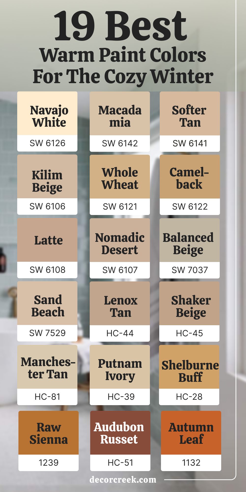
19 Warm Paint Colors for the Cozy Winter
Navajo White SW 6126 (Sherwin-Williams)
Navajo White is creamy, warm, and gentle, like soft candlelight on a cold evening. It has a subtle golden undertone that feels inviting, making rooms instantly more comfortable. I love using it in family rooms, bedrooms, and dining spaces where people gather during winter nights. This shade pairs beautifully with dark wood floors, stone fireplaces, and cozy wool fabrics.
White trim gives it a polished edge, while brass lighting makes it glow warmly. In daylight, it feels uplifting, bringing sunshine into the room; in the evening, it deepens into a soft cocoon that feels safe.
Navajo White is a trusted choice for creating homes that feel nurturing all season long.

Macadamia SW 6142 (Sherwin-Williams)
Macadamia is rich yet approachable, a soft tan with depth that makes a home feel secure. It works beautifully in dining rooms, kitchens, or entryways where warmth is needed most. I like how it pairs with cream trim for a balanced look or with deeper browns for a layered, earthy style. Stone accents, woven rugs, and bronze fixtures all feel at home against this shade.
During winter, it brings a glow that keeps homes from feeling flat or cold. By night, it takes on a deeper richness, making rooms feel grounded.
Macadamia is one of those colors that quietly supports everything around it, letting textures and details shine.
Softer Tan SW 6141 (Sherwin-Williams)
Softer Tan feels inviting and friendly, like the comfort of a familiar blanket. It has a gentle warmth that flows beautifully in living rooms, entryways, and family spaces. With white trim, it looks polished; with wood tones, it blends naturally for a more relaxed style. I love using it with cozy fabrics like flannel, wool, and linen because they enhance its welcoming mood.
On gray afternoons, it holds its warmth, and under soft lamps, it turns golden and glowing.
Softer Tan is the kind of shade that makes guests feel comfortable the moment they walk in, which is why I often recommend it for winter homes.

Kilim Beige SW 6106 (Sherwin-Williams)
Kilim Beige is sandy, rich, and full of warmth, making it perfect for rooms that need comfort during the colder months. It works in bedrooms, living rooms, and hallways where a steady, welcoming feel matters. White trim highlights its warmth, while dark wood floors and stone features add depth. I like pairing it with creamy fabrics, cozy blankets, and natural textures to create layers.
In daylight, it feels cheerful and bright, while in lamplight, it turns richer, almost glowing. Kilim Beige adapts to both classic and modern interiors, which makes it a dependable choice for families.
It’s one of my favorites when I want a space to feel lived in, cared for, and warm.
Whole Wheat SW 6121 (Sherwin-Williams)
Whole Wheat is golden and inviting, with a richness that feels like comfort food for your walls. It’s a wonderful choice for dining rooms and kitchens where families spend time together in the winter. This shade pairs beautifully with white trim, warm wood tables, and textured rugs. Stone counters and bronze hardware also highlight its warmth.
In daylight, it feels sunny and cheerful, almost like bottled sunshine. At night, it takes on a golden depth, creating a space that feels ready for gathering around the table.
Whole Wheat brings both energy and coziness, making it perfect for homes that need extra warmth.

Camelback SW 6122 (Sherwin-Williams)
Camelback is earthy and golden, a shade with strength and stability. It works especially well in bedrooms and family rooms where comfort and grounding are needed most. With creamy trim, it feels fresh; with darker accents, it becomes bold and dramatic. I love how it pairs with leather furniture, brass details, and soft wool rugs, creating a layered, winter-ready look.
During the day, it holds its glow, keeping a room warm even when the sky outside is gray. At night, it turns deep and rich, making a space feel secure and settled.
Camelback is one of those shades that always brings quiet strength and warmth to a home.

Latte SW 6108 (Sherwin-Williams)
Latte is smooth and comforting, the color of your favorite warm drink on a cold morning. It has depth but still feels approachable, which makes it perfect for living rooms, dining areas, and bedrooms. This shade pairs well with natural stone, wood accents, and cozy fabrics like wool and velvet. In winter, it adds a richness that keeps homes from feeling empty or flat.
I love how it looks in daylight, open and cheerful, and how it deepens at night, becoming warm and intimate. Latte is a shade that feels grounded but never heavy, always giving a home a sense of safety.
Nomadic Desert SW 6107 (Sherwin-Williams)
Nomadic Desert is earthy, natural, and strong, the kind of color that gives a room weight and warmth. It works beautifully in open living spaces or larger rooms where depth is needed. Cream trim lightens it, while darker accents make it bold and dramatic. I like pairing it with textured fabrics, rustic wood, and stone fireplaces for a cozy, grounded look.
During the day, it feels balanced and secure; at night, it becomes rich and enveloping.
This shade makes a room feel like a safe retreat from the cold outside, which is why it’s a favorite for winter homes.

Balanced Beige SW 7037 (Sherwin-Williams)
Balanced Beige is smooth and warm, a color that adapts to almost any setting. It feels especially welcoming in living rooms, bedrooms, and hallways where comfort is the goal. White trim sharpens its edges, while wood and natural fabrics bring out its cozy side. On gray days, it keeps its warmth, ensuring rooms never feel dull.
At night, it glows softly, creating an intimate and lived-in mood.
Balanced Beige is one of those dependable shades that works quietly in the background, letting everything else in a room shine while still adding a steady sense of warmth.

Sand Beach SW 7529 (Sherwin-Williams)
Sand Beach is golden and gentle, like soft winter sunlight. It has a natural warmth that makes it perfect for bedrooms, entryways, or dining rooms where a welcoming mood is needed. This shade pairs beautifully with cream trim, dark wood, and woven rugs, creating depth and comfort. In daylight, it lifts a space with cheer; under lamplight, it turns warm and cocoon-like.
Sand Beach also works with both modern and classic styles, which makes it easy to use throughout a home.
It’s a shade that makes cold days feel softer, wrapping the house in a gentle glow.

Lenox Tan HC-44 (Benjamin Moore)
Lenox Tan is rich, golden, and full of life. It’s a warm color that works beautifully in dining rooms, living rooms, and hallways where people gather. I love how it pairs with dark woods, creamy trim, and patterned fabrics, adding energy to a room. In daylight, it feels cheerful, keeping homes from feeling gloomy. In the evening, it deepens, becoming cozy and welcoming.
Lenox Tan creates a steady, warm mood that feels perfect for winter evenings by the fire or family dinners at the table.

Shaker Beige HC-45 (Benjamin Moore)
Shaker Beige is warm, classic, and dependable, a beige that feels like home. It works in bedrooms, family rooms, and entryways where comfort is key. Paired with white trim, it feels polished; with wood tones, it becomes natural and grounded. I like how it reflects light gently during gray days, adding warmth without being heavy.
At night, it glows softly under lamps, creating a cozy, inviting feel. Shaker Beige is a safe choice for families who want steady warmth all winter long.

Manchester Tan HC-81 (Benjamin Moore)
Manchester Tan is soft, light, and welcoming, a beige with just enough brightness to lift a room. I often use it in living rooms and kitchens where families spend time together. White trim makes it crisp, while pale woods and natural textures make it casual and comfortable. In winter, it keeps rooms cheerful, reflecting whatever light is available.
At night, it feels soft and cozy, perfect for evenings at home. Manchester Tan is an easy, approachable shade that makes homes feel open and friendly.

Putnam Ivory HC-39 (Benjamin Moore)
Putnam Ivory is creamy and golden, carrying warmth that makes rooms glow. It works beautifully in dining rooms, bedrooms, and entryways where a welcoming tone is important. I love how it pairs with soft lighting, dark wood, and warm fabrics. During the day, it feels bright and cheerful, while in the evening, it deepens into a golden glow.
Putnam Ivory makes a house feel cared for, full of history and warmth, which makes it perfect for the coldest season.

Shelburne Buff HC-28 (Benjamin Moore)
Shelburne Buff is bold and golden, the kind of color that fills a room with warmth. It works in kitchens, dining areas, and living rooms where people gather in the winter. With white trim, it looks clean and polished; with wood accents, it feels rich and cozy. In daylight, it carries a sunny energy; at night, it turns deeper and more intimate.
Shelburne Buff is strong but never overwhelming, giving homes a sense of cheer and comfort when days are short.
Audubon Russet HC-51 (Benjamin Moore)
Audubon Russet is deep, red-brown, and full of character. It works beautifully in dining rooms, studies, or accent walls where drama is welcome. Paired with cream trim, brass fixtures, and dark woods, it becomes rich and inviting. On winter days, it feels strong and energetic; at night, it glows warmly, wrapping a room in comfort.
Audubon Russet makes homes feel full of life, perfect for the season when we crave warmth.

Autumn Leaf 1131 (Benjamin Moore)
Autumn Leaf is golden-orange, glowing like firelight on a cold evening. It’s bold enough to use on accent walls or in dining spaces, yet it still feels cozy. Creamy trim softens it, while darker woods make it more dramatic. In daylight, it brings energy and warmth; in the evening, it feels glowing and intimate.
Autumn Leaf adds cheer to winter homes, lifting spirits while keeping comfort.
Davenport Tan HC-76 (Benjamin Moore)
Davenport Tan is earthy, rich, and grounding, the kind of shade that makes a home feel secure. It works well in living rooms, bedrooms, and entryways where coziness matters most. Cream trim adds brightness, while wood and natural fabrics enhance its warmth. During the day, it feels steady and balanced; at night, it deepens into a soft cocoon.
Davenport Tan adds quiet strength to a home, making winter evenings feel safe, warm, and inviting

22 Trending Paint Colors for This Winter
Alabaster SW 7008 (Sherwin-Williams)
Alabaster is warm, soft, and glowing, like candlelight filling a room. It’s one of those whites that never feels harsh, which is why I use it so often in winter homes. The creamy undertone gives walls a comforting glow that works in bedrooms, kitchens, and family spaces where people gather most. With brass hardware or warm wood accents, it creates a rich and inviting mood.
I love how it looks during the day when it catches soft sunlight, but I love it even more at night when it glows under lamps.
This shade doesn’t just brighten a home; it makes it feel cared for, which is exactly what winter calls for. Alabaster is always dependable, adding warmth while staying clean and polished.
Snowbound SW 7004 (Sherwin-Williams)
Snowbound feels like the soft glow of freshly fallen snow under a cloudy sky. It brightens spaces that don’t get much natural light, which makes it a favorite for winter bedrooms and hallways. Paired with navy, charcoal, or warm beige, it creates a mix that feels stylish and layered. On trim and ceilings, it adds crisp definition, while on walls, it feels cozy yet fresh.
I often use it in kitchens with white cabinets or marble counters, where it reflects light beautifully.
Snowbound keeps homes from feeling gloomy during short days, and at night, it turns gentle and welcoming. This shade is simple but powerful—it sets the right mood without demanding attention.
Pure White SW 7005 (Sherwin-Williams)
Pure White is clean and steady, the kind of white that never feels too cold. It has just enough warmth to keep it from looking sterile, which makes it perfect for winter interiors. I love how it works in small entryways, open kitchens, and cozy bedrooms alike. Paired with warm wood floors, soft gray fabrics, or even bold art pieces, it adapts easily.
On ceilings and trim, it looks neat and polished; on walls, it opens up a room with brightness.
Even on gray days, it reflects what little light there is, keeping a space from feeling flat. Pure White is one of those shades I trust to create a clean, inviting backdrop in any season, but especially during winter.
Greek Villa SW 7551 (Sherwin-Williams)
Greek Villa is creamy, soft, and warm, like a gentle glow that spreads across the room. It feels more inviting than a sharp white, making it a perfect winter shade. I often use it in living rooms, kitchens, and hallways where a welcoming feel matters most. Paired with brass, woven baskets, or deep wood furniture, it creates a layered, homey style. During daylight, it feels fresh and bright; under lamps in the evening, it softens into a cozy, comforting tone. This shade works beautifully with both modern and classic interiors, blending seamlessly with fabrics and textures.
Greek Villa always feels steady and dependable, the kind of color that makes every corner of a home glow.
Agreeable Gray SW 7029 (Sherwin-Williams)
Agreeable Gray is a soft gray with just enough warmth to feel inviting. It’s a go-to color for family rooms and bedrooms where people spend long evenings together. Paired with white trim, it looks polished; with wood and stone, it feels natural and grounded. I love how it adapts throughout the day—bright and airy in the morning, steady and cozy at night.
It also works well with both neutral and bold fabrics, letting textures and patterns shine. On short winter days, it keeps rooms from feeling cold, always holding onto its warmth.
Agreeable Gray is a dependable backdrop that balances freshness with comfort.

Repose Gray SW 7015 (Sherwin-Williams)
Repose Gray is balanced and stylish, sitting perfectly between warm and cool. It’s a favorite for living rooms and kitchens because it pairs so easily with both modern and traditional elements. White trim makes it feel polished, while dark accents like navy or charcoal add depth. In winter light, it never feels flat—it holds its character in both morning sun and soft evening lamps.
I like how it highlights furniture, art, and fabrics without overpowering them. Repose Gray is the kind of shade that quietly makes a home look finished, welcoming, and cared for, even when the weather outside feels harsh.
Mindful Gray SW 7016 (Sherwin-Williams)
Mindful Gray is warm, steady, and dependable, the kind of shade that makes a home feel safe in winter. It sits between beige and gray, which gives it flexibility without ever feeling dull. I love using it in living rooms and bedrooms where I want a grounded backdrop that still feels light enough to breathe. White trim brings out its freshness, while dark wood and brass add richness.
During short days, it reflects light softly, keeping spaces from looking heavy. At night, it becomes cozy and cocoon-like under lamps.
Mindful Gray is one of those shades that works in both modern and classic homes, always bringing balance and comfort.
Sea Salt SW 6204 (Sherwin-Williams)
Sea Salt is a soft green-gray that shifts beautifully with light, sometimes reading more gray, other times showing a hint of green. That quality makes it lively and interesting in winter homes, especially in bathrooms, bedrooms, and kitchens. Paired with white trim, it feels crisp and refreshing, while with wood and natural fabrics, it turns warm and inviting.
On gray days, it brings a gentle lift, keeping rooms from feeling too flat. In the evening, it softens into a calming tone that feels restful. Sea Salt is one of my favorite choices when a home needs just a touch of color while staying cozy and comforting.
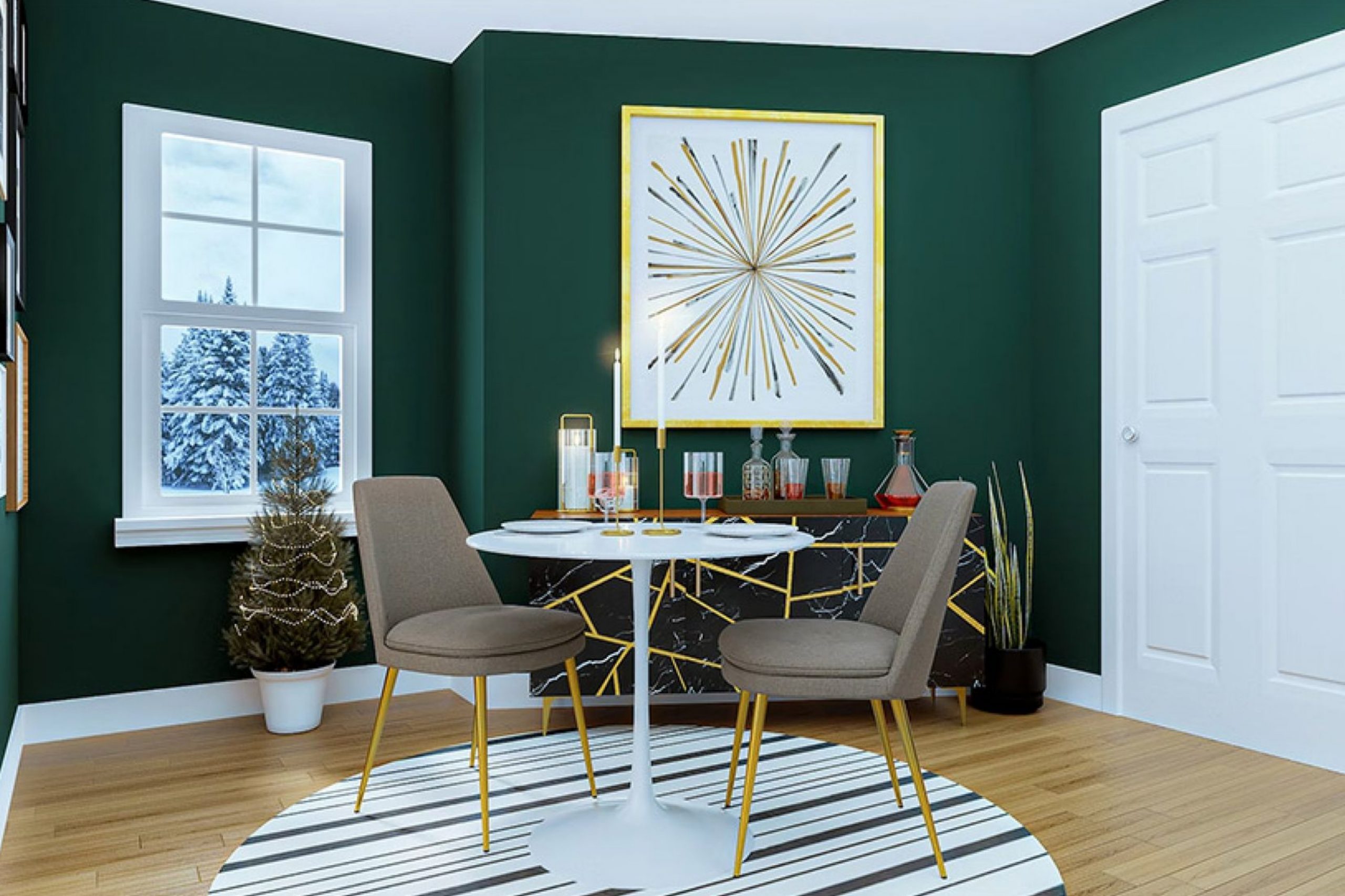
Evergreen Fog SW 9130 (Sherwin-Williams)
Evergreen Fog is earthy, grounded, and rich, with a natural green-gray tone that feels strong in winter. I love using it on accent walls, cabinetry, or even whole rooms when depth is needed. It pairs beautifully with leather furniture, brass fixtures, and stone fireplaces, creating a layered and cozy feel. In daylight, it looks fresh and balanced; at night, it turns deep and soothing, perfect for evenings indoors.
Evergreen Fog adds personality without being overwhelming, making it ideal for families who want warmth and character in their home. This shade feels like nature brought inside, steady and comforting through the season.

Iron Ore SW 7069 (Sherwin-Williams)
Iron Ore is bold and dramatic, a deep charcoal that makes a strong statement. It works beautifully on accent walls, doors, and cabinetry where contrast is needed. I like pairing it with creamy whites for a crisp mix or with warm wood tones for a grounded look. In winter, it adds depth and strength, making rooms feel anchored. During the day, it has a sleek, modern edge; at night, it turns rich and cozy under soft lamps.
Iron Ore is not a background color—it’s a centerpiece that adds drama and comfort at the same time.

Tricorn Black SW 6258 (Sherwin-Williams)
Tricorn Black is one of the truest blacks, rich and confident. I love using it for accent walls, interior doors, or trim when I want a bold design moment. It pairs beautifully with creamy whites, brass hardware, and natural wood, creating sharp contrast. In winter homes, it adds depth and coziness, grounding spaces that might otherwise feel too open.
In daylight, it feels crisp and modern; under evening lighting, it becomes dramatic and enveloping.
Tricorn Black always brings confidence and elegance, making it a perfect winter shade for bold homes.
Urbane Bronze SW 7048 (Sherwin-Williams)
Urbane Bronze is deep, warm, and earthy, sitting somewhere between brown and gray with a hint of green. It feels grounded and cozy, the kind of color that makes a living room or study feel like a retreat. Paired with cream trim, it feels balanced; with brass and leather, it becomes rich and inviting. On gray days, it adds warmth and strength, and at night, it glows softly under warm lamps.
I love how it works as both a main wall color and an accent, giving homes depth without feeling heavy.
Urbane Bronze was once a Color of the Year, and it’s easy to see why—it makes every winter home feel rich and comforting.

Hale Navy HC-154 (Benjamin Moore)
Hale Navy is bold, classic, and always stylish. It’s one of those deep blues that feels rich in winter, adding both drama and comfort. I love using it in dining rooms, libraries, or bedrooms where a strong mood sets the tone. White trim makes it sharp and clean, while brass and leather bring warmth to balance its depth.
During the day, it feels sophisticated and crisp, and at night it becomes cozy and enveloping.
Hale Navy is versatile—it works in traditional homes for a timeless look and in modern spaces for a striking edge. This shade gives winter homes a sense of confidence and richness.
Van Deusen Blue HC-156 (Benjamin Moore)
Van Deusen Blue is deep and refined, with the richness of navy but a touch more brightness. It makes cabinetry, accent walls, and even whole rooms feel strong and tailored. I love pairing it with creamy whites for contrast, or with gold and brass hardware for a polished finish. In daylight, it looks fresh and balanced; at night, it deepens into a dramatic, cozy mood.
This shade works beautifully in bedrooms, studies, and kitchens where color can carry the design.
Van Deusen Blue is perfect for families who want depth without heaviness, keeping homes stylish through the colder months.
Boothbay Gray HC-165 (Benjamin Moore)
Boothbay Gray is soft and airy, a gentle gray with a blue undertone that feels lively in winter. It brightens kitchens and bedrooms, especially in homes that don’t get much sunlight. White trim makes it crisp and fresh, while wood tones give it warmth. On cloudy days, it reflects light softly, keeping rooms open and bright. In the evening, it turns soothing and calm under soft lamps.
I often pair it with navy and dark green accents, which add depth and interest without overwhelming the room.
Boothbay Gray always makes homes feel cared for and inviting, especially in the winter season.
Stonington Gray HC-170 (Benjamin Moore)
Stonington Gray is cool and clean, with a silver undertone that feels sharp and modern. It’s perfect for kitchens, bathrooms, and hallways where clarity matters most. I love pairing it with navy or black for a tailored look, or with white trim for a crisp finish. On short winter days, it reflects what light is available, keeping rooms from feeling heavy.
At night, it has a sleek quality, creating a polished mood. Stonington Gray works with both modern and classic styles, always giving homes a smart, stylish edge.
It’s a dependable shade for families who want brightness without losing character.
Balboa Mist OC-27 (Benjamin Moore)
Balboa Mist is warm and soft, a mix of gray and beige that feels balanced. It flows beautifully through open spaces, which makes it perfect for living rooms and connected areas. Paired with creamy whites, it looks light and airy; with darker trim, it gains depth. During the day, it brightens homes with a gentle glow; at night, it becomes cozy and warm under soft lighting.
I love how it blends with brass, wood, and woven fabrics, creating texture and comfort.
Balboa Mist is flexible but never flat, which makes it one of my favorite choices for winter homes.
Classic Gray OC-23 (Benjamin Moore)
Classic Gray is gentle and modern, with a beige undertone that adds just enough warmth. It’s wonderful in bedrooms, dining rooms, and living spaces where balance is important. This shade pairs easily with crisp trim, natural wood, and soft fabrics. On winter mornings, it feels open and bright; by night, it softens into a cozy glow.
I love how it supports both muted tones and bold accents, giving a home flexibility.
Classic Gray is a safe but stylish choice, bringing warmth and freshness without overpowering the room. It always helps a winter home feel polished and inviting.
Pale Oak OC-20 (Benjamin Moore)
Pale Oak is soft, warm, and comforting, like the glow of a wool blanket in candlelight. It has a gentle mix of beige and gray that makes it versatile but never dull. I love how it works in bedrooms and dining rooms, where a quiet warmth feels most welcome in winter. With white trim, it looks polished; with natural wood, it feels cozy and grounded. In daylight, it brightens a room gently, and in the evening, it turns rich and glowing.
Pale Oak pairs beautifully with layered fabrics like wool and linen, creating depth and texture. It’s one of those shades that feels both stylish and homey, perfect for long winter nights.
White Dove OC-17 (Benjamin Moore)
White Dove is creamy and soft, with warmth that makes it more inviting than a sharp white. I often use it in living rooms and bedrooms where light matters most in the winter. It pairs effortlessly with dark wood floors, brass accents, and cozy fabrics. On cloudy afternoons, it keeps a room cheerful, and under lamplight, it glows gently. It also works wonderfully on trim, doors, and cabinetry, adding polish to every detail.
White Dove feels timeless, but in winter, it shines brightest—it makes homes feel cared for, calm, and welcoming when warmth is needed the most.
Simply White OC-117 (Benjamin Moore)
Simply White is bright, cheerful, and clean, like fresh snow reflecting the sun. It’s perfect for kitchens, hallways, and family spaces where energy is needed. I love how it pairs with natural wood and stone, softening its brightness with texture. On short winter days, it reflects what little light there is, keeping homes from feeling dark. In the evening, it softens beautifully, turning into a warm, inviting glow under lamps.
Simply White also works well as trim or cabinetry color, making edges look crisp and neat. It’s a flexible shade that brings both freshness and comfort to a winter home.
Chelsea Gray HC-168 (Benjamin Moore)
Chelsea Gray is bold and elegant, full of richness and character. It works beautifully on cabinetry, accent walls, or even entire rooms when depth is wanted. Paired with white trim, it looks sharp and modern; with brass or leather, it feels warm and sophisticated. In winter, it adds a grounded, cozy feeling that makes homes feel secure. During the day, it has strength and presence, while at night it turns dramatic and inviting.
Chelsea Gray is perfect for families who want a color that feels stylish but also warm. It’s a strong finish to a palette that highlights the best winter trends.
38 Best Room Paint Colors for This Winter
Dover White SW 6385
Dover White is creamy, warm, and full of comfort. It’s softer than a sharp white, which makes it a perfect choice for winter bedrooms and living spaces. I love how it pairs with warm woods, cozy fabrics, and glowing lamps, creating a layered and inviting look. On walls, it feels cheerful during the day, while at night it becomes golden and soothing.
Trim painted in crisp white sharpens its edges, giving it polish.
Dover White is ideal for families who want brightness but also crave warmth during the colder months.

Marshmallow SW 7001
Marshmallow is soft and light, with a touch of warmth that makes it sweeter than plain white. It works beautifully in bedrooms, nurseries, and kitchens where comfort is the goal. Paired with light woods and creamy trim, it creates a cozy and lived-in feel. During winter days, it reflects light gently, making rooms look brighter. In the evening, it turns warm and glowing, almost candle-like under soft lamps.
Marshmallow makes a home feel open, gentle, and cared for—perfect for the season.
Westhighland White SW 7566
Westhighland White is bright, clear, and crisp, but never harsh. It’s wonderful in family rooms and kitchens where energy is needed most. I love how it works with navy, dark green, or rich wood accents, creating both contrast and balance. On gray days, it helps keep rooms from feeling flat by reflecting every bit of light. At night, it takes on a softer tone, glowing warmly under lamps.
Westhighland White gives a home brightness while still feeling welcoming, which makes it one of my favorite winter whites.

Frosty White SW 6196
Frosty White feels cool and crisp, a clean shade with a hint of blue that gives it freshness. It’s perfect for bathrooms, kitchens, or bedrooms where a modern mood fits. With silver hardware and marble counters, it looks sleek and polished. During the day, it feels open and bright, like a winter morning sky. At night, it becomes softer, creating a refreshing backdrop.
Frosty White is ideal for homes that want clarity and brightness without losing warmth.

Heron Plume SW 6070
Heron Plume is light and airy, with a hint of gray that keeps it soft and approachable. It’s a wonderful choice for bedrooms and hallways where a relaxed backdrop is needed. I love how it pairs with crisp white trim and muted fabrics, creating balance without fuss. During the day, it reflects light gently, making spaces feel larger. At night, it takes on a warm softness, perfect for quiet evenings indoors.
Heron Plume is a simple, graceful shade that makes winter homes feel calm and cared for.

Nuance SW 7049
Nuance is soft and subtle, with a quiet warmth that makes it feel inviting without taking over a room. It’s perfect for bedrooms, dining spaces, or hallways where a gentle glow matters most. Paired with creamy trim, it feels light and polished; with natural wood, it feels warm and lived in. In winter daylight, it reflects light softly, keeping homes from feeling flat.
At night, it takes on a warm, cozy tone that feels safe and welcoming.
Nuance is one of those background shades that makes every room feel harmonious and cared for.
Zurich White SW 7626
Zurich White is crisp but approachable, a clean white with just enough softness. It works beautifully in kitchens, bathrooms, and bedrooms where brightness is needed. With black hardware and stone counters, it feels sleek and modern; with brass and wood, it turns warm and classic. During short winter days, it reflects light beautifully, keeping interiors cheerful.
At night, it softens under lamps, creating a quiet, welcoming glow. Zurich White is an easy shade to live with, bringing clarity and warmth to winter homes.

Icicle SW 6238
Icicle is cool and refreshing, a white with a blue undertone that feels like fresh winter air. It’s wonderful for bathrooms, offices, or bedrooms where clarity and brightness are needed. I love how it pairs with silver finishes, navy accents, and white trim for a clean, crisp look. On gray afternoons, it keeps homes from feeling dull, always reflecting light. At night, it becomes softer, giving a space a refreshing calm.
Icicle is a perfect winter shade for families who want a clean, modern backdrop that still feels inviting.

Olympus White SW 6253
Olympus White is light and airy, with a touch of gray that gives it depth. It’s a great choice for bedrooms, kitchens, or family spaces where comfort and clarity are both important. This shade pairs well with muted blues, dark grays, and natural wood, creating balance and texture. During the day, it feels open and uplifting; at night, it becomes soft and cozy under warm lighting.
Olympus White works beautifully in winter interiors, always keeping rooms from feeling heavy. It’s simple, dependable, and quietly stylish.

Lattice SW 7654
Lattice is a soft gray with just a hint of green, giving it a unique character. It feels refreshing in kitchens and bathrooms, but also warm enough for bedrooms and hallways. Paired with white trim, it feels crisp; with wood accents, it becomes cozy and layered. On winter mornings, it reflects natural light gently, keeping a space bright. In the evening, it deepens slightly, creating a warm, comforting tone.
Lattice is one of those shades that blends well with almost anything, making it perfect for busy family homes in the winter season.

Gray Screen SW 7071
Gray Screen is cool, modern, and clean, a gray that leans slightly blue. It’s perfect for living rooms, offices, and bathrooms where a fresh look is desired. Paired with navy, black, or white, it creates sharp contrast; with warm wood, it feels balanced and inviting. On gray winter days, it holds its brightness, keeping homes from feeling dull.
In the evening, it becomes sleek and polished under soft lighting.
Gray Screen is a reliable choice for families who want a modern backdrop that still feels comfortable.

Monorail Silver SW 7663
Monorail Silver is sleek and modern, a medium gray with a refined edge. It works beautifully in living rooms, dining rooms, or home offices where a stylish backdrop is needed. I love how it pairs with crisp white trim, silver hardware, and darker accents like navy or black. In winter light, it feels steady and balanced, never too cold or heavy.
At night, it deepens into a dramatic, cozy tone that makes a space feel elegant.
Monorail Silver is a wonderful choice for families who want sophistication and comfort in one shade.

Dorian Gray SW 7017
Dorian Gray is warm, approachable, and full of character. It has a natural richness that works in bedrooms, family spaces, and dining rooms where coziness matters most. With white trim, it feels polished; with dark woods and textured fabrics, it turns deep and layered.
During short winter days, it holds onto its warmth, keeping rooms from feeling flat.
At night, it glows under lamplight, making spaces feel intimate and inviting. Dorian Gray is dependable, flexible, and always brings comfort to winter homes.

Dovetail SW 7018
Dovetail is rich and grounding, a deeper gray that brings strength to a room. It works beautifully on accent walls, cabinetry, or entire spaces where drama is wanted. Paired with cream trim, it feels balanced; with brass and leather, it becomes bold and sophisticated. In daylight, it has a tailored quality, and at night, it feels dramatic and cozy.
This shade is ideal for homes that want warmth and depth in the colder months.
Dovetail makes a statement while still feeling livable and welcoming.

Gauntlet Gray SW 7019
Gauntlet Gray is bold and stylish, a deep gray with a warm undertone. It’s perfect for dining rooms, libraries, or bedrooms where a strong presence sets the mood. I like how it pairs with crisp trim, dark wood, and patterned fabrics, creating depth and texture. On winter days, it feels steady and confident; under evening light, it becomes rich and dramatic.
Gauntlet Gray makes homes feel secure and inviting, especially when paired with warm lighting.
It’s a perfect choice for adding character and depth in the cold season.

Grizzle Gray SW 7068
Grizzle Gray is moody and elegant, sitting between gray and green for a rich, earthy feel. It works well in bedrooms, dining rooms, or living rooms where drama feels right. Paired with white trim, it feels crisp; with wood and stone, it becomes grounded and natural. In daylight, it feels sophisticated and calm; at night, it becomes deep and enveloping.
Grizzle Gray makes a home feel cozy and full of personality in winter.
It’s a bold choice, but one that rewards with warmth and richness.

Peppercorn SW 7674
Peppercorn is deep, bold, and dramatic, one of the richest grays in the palette. It’s wonderful on accent walls, cabinetry, or even entire rooms when a strong mood is desired. Paired with creamy whites, it creates contrast that feels modern and stylish. With brass fixtures and warm wood, it becomes rich and cozy. On gray winter days, it adds depth, keeping homes from feeling too plain.
At night, it takes on a cocoon-like quality, perfect for creating inviting spaces. Peppercorn is a favorite for families who want bold design without sacrificing warmth.

Dark Night SW 6237
Dark Night is dramatic and rich, a deep teal that feels bold but comforting in winter. It works beautifully in bedrooms, dining rooms, or studies where color can set the mood. Paired with crisp white trim, it feels modern; with wood and brass, it becomes warm and elegant. In daylight, it shows its blue-green depth, while at night it turns moody and cocoon-like.
Dark Night creates a strong presence that makes a room feel secure and stylish.
It’s a wonderful choice for homes that want both drama and comfort during the colder months.
Seapearl OC-19 (Benjamin Moore)
Seapearl is soft and creamy, with a touch of warmth that makes rooms glow gently. It’s perfect for bedrooms, kitchens, or dining spaces where a quiet backdrop is needed. I love pairing it with light woods, brass accents, and textured fabrics. During short winter days, it helps rooms stay bright and welcoming.
At night, it glows softly under warm lamps, creating a comfortable, lived-in mood.
Seapearl is versatile, flexible, and always dependable for winter homes.

Decorator’s White OC-149 (Benjamin Moore)
Decorator’s White is crisp and clean, with a modern edge. It works beautifully in kitchens, bathrooms, and trim work where sharp detail matters. Paired with navy, charcoal, or wood tones, it creates stylish contrast. On gray winter days, it reflects light to keep spaces fresh. At night, it stays clear and polished under soft lamps.
Decorator’s White is a simple choice that always makes a room look crisp, modern, and ready for gatherings.

Super White OC-152 (Benjamin Moore)
Super White is bright, sharp, and full of energy, the kind of white that makes everything look fresh. It’s a favorite for kitchens and living rooms where clarity matters most. Paired with black, navy, or bold wood tones, it creates drama; with softer fabrics, it feels clean and balanced. During winter days, it helps homes feel brighter, reflecting even the smallest amount of sunlight.
At night, it holds its brightness, keeping a room polished. Super White is ideal for families who want a bold, modern white for their winter interiors.

Horizon Gray 2141-50 (Benjamin Moore)
Horizon Gray is soft and balanced, with a gray-green tone that feels natural and welcoming. It works beautifully in living rooms, bedrooms, or dining spaces where comfort matters. Paired with white trim, it looks fresh; with wood, it feels earthy and grounded. During gray winter days, it lifts a home with a natural, steady glow.
At night, it becomes cozy, creating a warm cocoon for family gatherings.
Horizon Gray is one of those shades that blends easily but still brings personality to a winter home.

Winterwood 1486 (Benjamin Moore)
Winterwood is earthy and muted, a soft green-gray that feels grounded and natural. It works well in bedrooms, dining rooms, or studies where calm comfort is needed. Paired with white trim, it looks polished; with darker woods, it feels rich and layered. On winter mornings, it feels fresh and open; in the evening, it deepens, creating warmth and depth.
Winterwood makes homes feel rooted, giving a sense of security and care.
It’s a wonderful choice for the coldest months when warmth matters most.

Vapor Trails 1556 (Benjamin Moore)
Vapor Trails is light and airy, a gray with a hint of green that adds character without heaviness. It works beautifully in bedrooms, kitchens, and living spaces where brightness is needed. With white trim, it looks crisp and clean; with natural textures, it feels warm and cozy. During the day, it keeps rooms feeling fresh; at night, it softens gracefully.
Vapor Trails is versatile, approachable, and perfect for creating a home that feels inviting through winter.
Smoke 2122-40 (Benjamin Moore)
Smoke is cool and refreshing, a blue-gray that feels crisp but not cold. It’s a great choice for bedrooms and bathrooms where clarity and brightness are important. Paired with white trim, it looks sharp and clean; with wood accents, it feels warmer and more balanced. On gray days, it reflects light beautifully; at night, it creates a cozy, tailored mood.
Smoke is stylish, flexible, and always makes winter homes feel polished.

Gentleman’s Gray 2062-20 (Benjamin Moore)
Gentleman’s Gray is bold and rich, a deep blue with hints of green that add complexity. It works beautifully in dining rooms, libraries, or bedrooms where drama is desired. Paired with brass, leather, and crisp trim, it creates a luxurious feel. In daylight, it feels confident and strong; at night, it becomes moody and cocoon-like.
Gentleman’s Gray gives winter homes personality and depth, making every room feel more interesting and inviting.

Newburyport Blue HC-155 (Benjamin Moore)
Newburyport Blue is classic and nautical, a true blue that feels both fresh and traditional. It’s perfect for bedrooms, kitchens, and entryways where a touch of color feels right. With white trim, it looks sharp and clean; with wood, it feels warm and balanced. During short winter days, it adds brightness and cheer; at night, it becomes cozy and intimate.
Newburyport Blue is dependable, stylish, and perfect for adding character to winter homes.

Oxford Gray 2128-40 (Benjamin Moore)
Oxford Gray is deep and moody, with a rich blue tone that feels dramatic in winter. It works beautifully in bedrooms, studies, or accent walls where depth is wanted. With white trim, it feels crisp; with leather and brass, it feels sophisticated and warm. In daylight, it looks bold and stylish; at night, it becomes cocoon-like and cozy.
Oxford Gray is a strong shade for families who want drama and elegance in their winter interiors.

Brewster Gray HC-162 (Benjamin Moore)
Brewster Gray is classic and balanced, a medium gray that leans slightly blue. It works well in living rooms, bedrooms, or hallways where steadiness is needed. Paired with crisp white trim, it feels polished; with wood accents, it turns warm and inviting. On gray winter days, it reflects light softly, keeping rooms from feeling dull.
At night, it becomes richer, creating comfort and warmth. Brewster Gray is a dependable shade that always feels right in winter homes.

Gray HC-105 (Benjamin Moore)
Rockport Gray is earthy and grounding, a warm gray with depth. It’s perfect for family rooms, dining spaces, or studies where a cozy mood is important. Paired with cream trim, it feels fresh; with wood and leather, it becomes rich and layered. During winter days, it keeps homes steady and secure; in the evening, it feels warm and protective.
Rockport Gray is a trusted shade that adds strength and warmth to interiors.
Amherst Gray HC-167 (Benjamin Moore)
Amherst Gray is bold and confident, a dark gray with richness and depth. It works beautifully on accent walls, cabinetry, or entire rooms where drama is wanted. With white trim, it feels modern; with wood accents, it feels cozy and grounded. In winter, it adds warmth by anchoring a room, making it feel safe and secure.
During the day, it looks strong and stylish; at night, it becomes cocoon-like and dramatic. Amherst Gray is a perfect winter shade for families who want elegance and comfort in one.

Kendall Charcoal HC-166 (Benjamin Moore)
Kendall Charcoal is deep, rich, and versatile, a true charcoal that feels cozy in winter. It pairs beautifully with cream trim, brass fixtures, and dark wood. On cabinetry or accent walls, it creates stylish drama; on entire rooms, it feels bold but inviting. During gray days, it adds depth; at night, it becomes enveloping and warm.
Kendall Charcoal is one of those shades that gives homes confidence and comfort all season long.
Black Forest Green HC-187 (Benjamin Moore)
Black Forest Green is dramatic and bold, a deep green that feels rich and moody. It works beautifully in dining rooms, libraries, or accent walls where a strong mood fits. With brass and leather, it feels luxurious; with wood, it feels natural and grounded. In winter, it adds warmth and coziness, making rooms feel safe.
During the day, it shows its green depth; at night, it becomes cocoon-like and dramatic.
Black Forest Green is perfect for creating a strong, stylish atmosphere in the colder months.

Salamander 2050-10 (Benjamin Moore)
Salamander is bold and daring, a deep green-black that feels dramatic and modern. It’s wonderful for accent walls, cabinetry, or small spaces where richness is needed. Paired with white trim, it creates striking contrast; with wood and brass, it feels warm and elegant. In daylight, it looks crisp and stylish; at night, it becomes moody and cozy.
Salamander is not for every wall, but when used thoughtfully, it makes homes feel bold and unique in winter.

Deep Royal 2061-10 (Benjamin Moore)
Deep Royal is strong and dramatic, a rich blue that adds energy to a room. It’s perfect for bedrooms, studies, or dining areas where bold color sets the mood. With white trim, it feels clean; with dark wood and brass, it feels layered and warm. On short winter days, it adds vibrancy and strength; at night, it becomes cocoon-like and inviting.
Deep Royal brings life to interiors, making winter homes feel more dynamic.

Raccoon Fur 2126-20 (Benjamin Moore)
Raccoon Fur is moody and elegant, a dark gray-black that feels stylish and grounding. It works beautifully in living rooms, bedrooms, or accent walls where drama is wanted. Paired with crisp trim, it feels modern; with leather and brass, it becomes warm and sophisticated. In daylight, it has depth and richness; at night, it becomes enveloping and dramatic.
Raccoon Fur is one of those shades that gives homes a confident, cozy atmosphere all winter long.

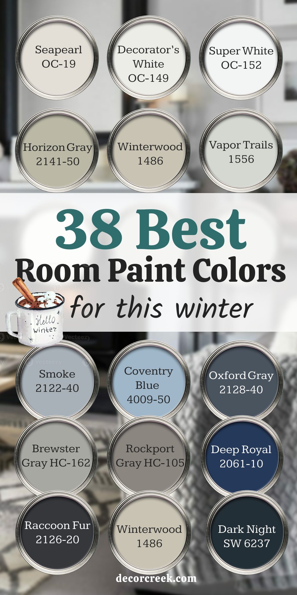
My Closing Thoughts on 41 Cozy Winter Home Paint Colors
When I think about winter homes, I always picture warmth, light, and comfort. The right paint color can bring all of that together, wrapping every room in a mood that feels safe and welcoming. Soft whites add brightness to shorter days, gentle grays create balance when light is low, and warm neutrals bring the sense of being cared for. Deeper shades like navy, charcoal, and green give rooms strength and richness, perfect for long evenings indoors.
What I love most is how these colors change with the season. In the morning they lift a room, making it feel open even when the sky is gray. At night they turn cozy, glowing under lamps and firelight. That shift is what makes winter palettes so special—they work with the rhythm of the season.
Choosing a winter color is more than just paint on the wall. It’s about making a home feel like the place you want to be when the air outside is cold. These 41 shades bring character, warmth, and comfort in their own way.
My last word is simple: let your walls carry some of that winter glow, and every corner of your home will feel more alive, more inviting, and ready for the season ahead.