Finding the absolute right paint makes your entire house feel like a warm, welcoming hug the very moment you walk through the front door. I spend my professional days constantly moving furniture and meticulously picking out color palettes to make homes look flawless and inviting for potential new buyers.
Most people mistakenly think they need a stark, bright white room to make a space look big, but real, authentic warmth only comes from choosing sophisticated shades that possess true depth and character.
I want to show you exactly how to use rich, concentrated pigments to make your house feel incredibly snug and high-end at the same time. You definitely do not need a huge renovation budget to completely change how your home feels to your family and your guests; a single, simple bucket of quality paint can instantly fix a room that currently feels cold, empty, or lonely.
Let’s take a deep dive into how to pick those specific colors that make you want to curl up and stay on the couch all afternoon long.
Why I Rely on Sherwin-Williams and Benjamin Moore for Truly Cozy Wall Colors
I consistently pick these two industry-leading brands because they never let me down when I need to achieve a very specific, high-standard look that feels both lived-in and luxurious. Creating a “cozy” home is all about the quality of the pigment, and these companies have spent decades perfecting the way light interacts with their paint.
If you buy cheap, low-grade paint, you will find that even the “warmest” colors can look streaky, thin, or chalky on your walls, which actually makes a room feel colder.
Benjamin Moore has a proprietary way of making their paints look like expensive, lush velvet fabric rather than just flat color, especially in their Aura and Regal Select lines. Meanwhile, Sherwin-Williams excels at making premium paints that cover the wall beautifully in just one or two coats, providing a rich, buttery finish that feels solid and protective.
Using these trusted brands ensures that the color you fall in love with on the lid is exactly the stunning, reliable result you will see on your finished wall once the furniture is back in place.
How I Choose Wall Paint Shades That Make a Home Feel Warm and Lived-In
Choosing a color that makes a home feel warm isn’t just about picking “beige”—it’s about understanding the secret language of undertones and natural light. I always make it a point to study the windows and the direction of the sun before I ever commit to a shade, because a color that looks cozy in a sun-drenched kitchen might look like a cold shadow in a north-facing bedroom.
To create that “lived-in” feel, I look for colors that have a “dusty” or “muted” quality—colors that feel like they have a history and aren’t trying too hard to be bright.
I also think carefully about the textures in the room; for instance, dark wood or walnut finishes make mid-tone greens and warm grays look significantly richer and more saturated. One of my favorite tricks for maximum coziness is to use a matte or eggshell finish so the walls absorb the light rather than reflecting it, creating a soft, glowing atmosphere that feels intimate.
Most homeowners are initially scared that dark or saturated colors will make a room feel small, but in reality, they act as a sophisticated backdrop that makes your art, your books, and your family photos pop, turning a house into a sanctuary.
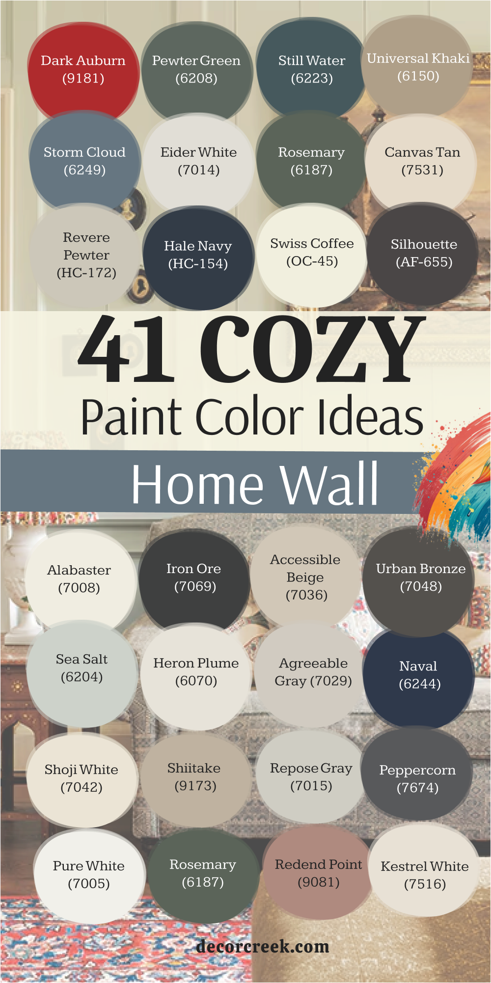
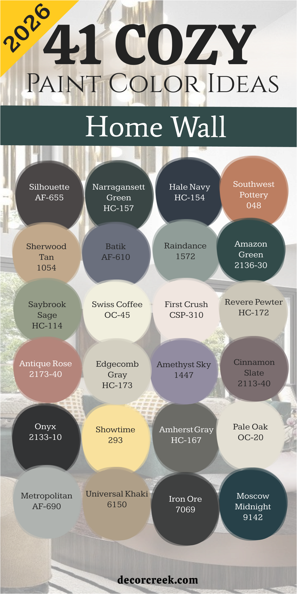
41 Cozy Home Wall Paint Color Ideas In 2026
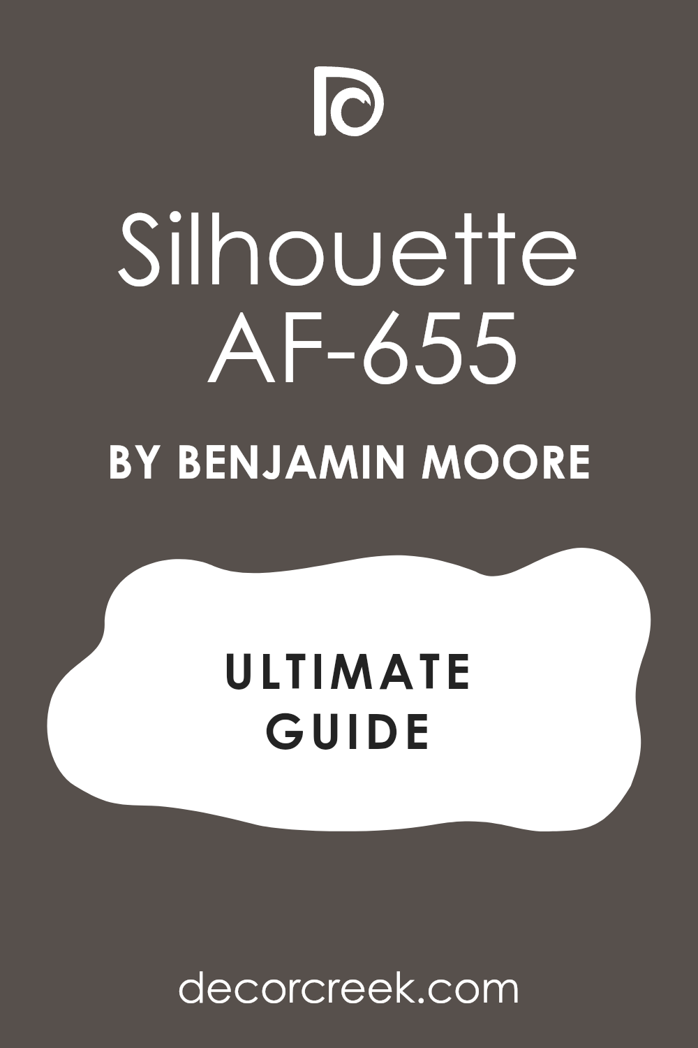
Silhouette AF-655
Silhouette AF-655 is a dark and mysterious shade that brings a lot of drama to a small room. This color looks like a mix of charcoal and a very deep plum. I like to use it in a library or a TV room where you want to feel tucked in.
It makes light-colored furniture pop and look much more expensive than it really is. You will notice that it changes throughout the day as the sun moves across the sky. In the morning it looks almost black, but by noon you can see the purple undertones coming out.
It is a great choice for anyone who wants a bold look without using a bright primary color. Your guests will definitely ask about this color because it looks so unique and high-class. It creates a perfect backdrop for gold frames or white marble accents.
Best used in: dining rooms, bedrooms, accent walls, and home theaters
Pairs well with: Steam AF-15, Paper White OC-55, Silver Satin OC-26, and brushed gold metals The key rule of this color for Art Deco style is to use it in rooms where you want to create a sense of mystery and luxury.
Narragansett Green HC-157
Narragansett Green HC-157 is a classic choice that feels like an old forest at twilight. This color has enough blue in it to keep it from looking like a muddy swamp green. I use this when I want a room to feel formal but still very comfortable for a family.
It works amazingly well on kitchen cabinets if you want something different than the usual white. You can see how it grounds a room and makes the ceiling feel like it is floating. It is a very heavy color, so it helps to have good lighting to show off the pigment.
Most designers love this shade because it never goes out of style and looks great with leather. It reminds me of a fancy hotel lobby where everything feels sturdy and well-made. Your office would look very professional with these deep green walls.
Best used in: home offices, libraries, kitchen cabinetry, and front doors
Pairs well with: Revere Pewter HC-172, Shaker Beige HC-45, and dark walnut wood The key rule of this color for a traditional style is to balance it with light-colored rugs to keep the room from feeling too heavy.
Hale Navy HC-154
Hale Navy HC-154 is the most popular dark blue for a reason because it works in almost every house. This color is like a well-tailored suit that makes everything around it look sharp.
I find that it works best in rooms with lots of white trim to provide a crisp contrast. It is not a bright blue, so it stays looking very mature and calm on the walls. You can use it in a bedroom to help you sleep better because it makes the room feel very dark.
It also looks great on the outside of a house for a very nautical or coastal look. Many people use this as an alternative to black because it feels a bit friendlier. It is a solid choice that you will not get tired of looking at after a few months. This blue handles big windows and bright light without washing out or turning gray.
Best used in: bedrooms, exterior siding, kitchen islands, and bathrooms
Pairs well with: White Dove OC-17, Coventry Gray HC-169, and natural oak floors The key rule of this color for a coastal style is to use bright white accents to make the navy blue stand out.

Southwest Pottery 048
Southwest Pottery 048 is a warm and earthy shade that brings the feeling of the desert inside. This color is a soft terracotta that makes a room feel like it is glowing with sunset light.
I love using this in a breakfast nook or a sunroom to keep the energy high and happy. It is a very friendly color that makes people want to sit down and talk for a long time. You can see how it warms up cool light in rooms that face the north side.
It looks beautiful when paired with green plants and woven baskets. This shade is a great way to add color without making the room feel too loud or chaotic. It reminds me of clay pots and hand-made tiles from a vacation spot. Using this color is an easy way to make a new house feel like it has some history.
Best used in: kitchens, sunrooms, entryways, and laundry rooms
Pairs well with: Atrium White OC-145, Sage Wisdom 1515, and terracotta floor tiles The key rule of this color for a rustic style is to use it with natural textures like linen and wood to enhance the earthy vibe.
Sherwood Tan 1054
Sherwood Tan 1054 is a rich beige that has enough yellow to feel very sunny and bright. This color is much better than a flat tan because it has a golden glow that looks very rich.
I use this in hallways to make them feel less like tunnels and more like part of the home. It is a great background for a gallery wall full of family photos. You will find that it makes your wood floors look deeper and more polished.
It is a very safe choice if you are not sure about using big colors yet. The color stays looking clean even if you have kids or pets running around the house. It is a classic neutral that helps bridge the gap between different rooms. This shade makes a large living room feel much smaller and more intimate for movie nights.
Best used in: hallways, living rooms, basements, and open floor plans
Pairs well with: Cloud White OC-130, Simply White OC-117, and chocolate brown accents The key rule of this color for a cozy style is to use it where you have lots of soft fabrics like blankets and pillows.
Batik AF-610
Batik AF-610 is a sophisticated clay color that sits somewhere between brown and gray. This color is perfect for a bedroom where you want to relax after a long day of work. It feels very grounded and does not try too hard to grab your attention.
I like to use it in rooms that have lots of natural textures like wool and stone. You can see the gray tones come out more when you turn on your lamps at night. It is a very modern color that still feels very old-fashioned and sturdy.
Most people find it very easy to match with their existing furniture and rugs. It provides a nice depth that a regular gray paint simply cannot offer. This color is a secret weapon for making a boring room look like a designer planned it.
Best used in: master bedrooms, cozy dens, and reading nooks
Pairs well with: Steam AF-15, Flint AF-560, and black metal light fixtures The key rule of this color for a modern style is to use it with clean lines and very little clutter on the walls.
Raindance 1572
Raindance 1572 is a beautiful mix of green, blue, and gray that looks like a rainy day. This color is very soothing and makes a bathroom feel like a high-end spa. I love how it looks against white tile and chrome faucets in a clean kitchen.
It is light enough to use on every wall without making the room feel too small. You will notice that it looks more green in some lights and more blue in others.
This makes the room feel alive and interesting as the weather changes outside. It is a very refreshing color that helps you feel focused and ready for the day. Many of my clients pick this for their home offices to help them stay organized. It is a very polite color that does not overwhelm your senses when you walk in.
Best used in: bathrooms, home offices, bedrooms, and nurseries
Pairs well with: White Heron OC-57, Gray Owl OC-52, and light maple wood The key rule of this color for a spa style is to use it with plenty of white towels and natural light.
Amazon Green 2136-30
Amazon Green 2136-30 is a deep teal that feels very tropical and lush at the same time. This color is for people who love nature and want to bring that feeling into their home.
I use this on accent walls behind a bed to create a very strong focal point. It looks amazing with bright pink or yellow accents if you want a fun look. You can also keep it serious by using dark wood furniture and gold lamps.
It is a very thick and rich color that hides bumps on old walls very well. The blue tones in the green make it feel very cool and crisp during the summer. It is a brave choice that always pays off because it looks so custom and rare. This shade makes a room feel like a hidden garden in the middle of a city.
Best used in: accent walls, powder rooms, bedrooms, and eclectic living rooms
Pairs well with: Chantilly Lace OC-65, Pale Oak OC-20, and bright jewel-toned fabrics The key rule of this color for a bold style is to keep the other walls very light so the green can be the star.

Saybrook Sage HC-114
Saybrook Sage HC-114 is a soft green that has been a favorite for many years for good reason. This color feels very organic and reminds me of dried herbs or soft moss. I often use this on the outside of a house with a red brick porch.
It is a very friendly color that makes a house look very welcoming to neighbors. Inside, it works great in a kitchen to make it feel like a farmhouse from a book. You will find that it goes well with almost any kind of wood, from light pine to dark cherry.
It is a very stable color that does not look different when the lights are turned on. Many people find it very peaceful to sit in a room painted this specific shade. It is a great way to add a bit of color without it feeling too bright or childish.
Best used in: kitchens, dining rooms, exterior siding, and shutters
Pairs well with: Cloud White OC-130, Shaker Beige HC-45, and brick or stone accents The key rule of this color for a farmhouse style is to use it with vintage furniture and white accents.

Swiss Coffee OC-45
Swiss Coffee OC-45 is the ultimate warm white that never feels cold or like a hospital. This color is a staple for designers because it is so versatile and easy to live with. I use this on ceilings and trim to make a room feel soft and finished.
It has a tiny bit of yellow and gray that keeps it from looking too stark. You can paint a whole house in this color and it will look bright and clean every day. It is the perfect backdrop for colorful art or busy patterns on your curtains.
Most people do not realize how much better this looks than a basic white from the store. It makes the light in a room feel like it is bouncing off a soft cloud. This is my go-to choice for rental properties because everyone likes how it looks.
Best used in: living rooms, kitchens, hallways, bedrooms, and farmhouse exteriors
Pairs well with: Iron Ore SW 7069, Agreeable Gray SW 7029, and warm wood tones The key rule of this color for a clean style is to use it where you want natural light to feel kind and inviting.

First Crush CSP-310
First Crush CSP-310 is a delicate and creamy pink that feels like a soft breath of air in a room. This color has a hint of peach that keeps it from looking like a nursery for a baby. I love using this in a guest bathroom to give everyone a healthy glow when they look in the mirror.
It is a very sophisticated version of a pastel shade that works well with modern art. You will see how it brightens up a dark corner without needing a big lamp.
It makes a small bedroom feel much larger and more open than a dark color would. Many of my clients pick this because it feels cheerful even on a rainy afternoon. It is a great choice for a ceiling if you want to add a tiny bit of hidden interest. This shade reminds me of silk ribbons and expensive French macarons.
Best used in: bedrooms, bathrooms, nurseries, and dressing rooms
Pairs well with: Simply White OC-117, Gray Owl OC-52, and light gold hardware The key rule of this color for a soft style is to use it with white linens and plenty of natural sunshine to keep it looking fresh.
Revere Pewter HC-172
Revere Pewter HC-172 is a legendary shade because it is the perfect mix of gray and beige. This color is the king of neutrals because it looks good in every single house I have ever staged. I find that it bridges the gap between old-fashioned wood and new modern furniture perfectly.
It is a very sturdy color that makes a living room feel grounded and very high-end. You can see the color change from a cool gray to a warm tan depending on the time of day. It is thick enough to hide small flaws in your drywall that a lighter white might show.
Most people find it very easy to pick out rugs and pillows when they have this on their walls. It is a safe bet if you want to sell your house quickly for a high price. This color makes a kitchen look clean and very professional for a home chef.
Best used in: kitchens, open living areas, hallways, and exteriors
Pairs well with: Hale Navy HC-154, White Dove OC-17, and dark charcoal accents The key rule of this color for a classic style is to use it as a backdrop for bold navy or black accents to create a sharp look.

Antique Rose 2173-40
Antique Rose 2173-40 is a dusty and mature pink that feels like it belongs in a fancy old hotel. This color has a lot of gray in it which makes it look very grown-up and expensive. I use this in dining rooms to make dinner parties feel more intimate and special.
It looks beautiful when the light from a chandelier hits the walls in the evening. You will notice that it creates a very soft and romantic feeling without being too sweet. It is a perfect choice for an accent wall if you want to add some personality to a room.
This shade looks amazing when you pair it with dark wood furniture from the Art Deco era. It is a very stylish way to use pink without making your home look like a toy. Most guests will find this color very interesting and will want to know the name.
Best used in: dining rooms, bedrooms, powder rooms, and accent walls
Pairs well with: Atrium White OC-145, Wrought Iron 2124-10, and warm brass fixtures The key rule of this color for a vintage style is to use it with dark accents to keep the pink from feeling too light.
Edgecomb Gray HC-173
Edgecomb Gray HC-173 is a light and airy neutral that feels like a sandy beach on a cloudy day. This color is a bit lighter than Revere Pewter and works great in rooms that do not get much sun. I use this to make a whole house feel connected and very large.
It is a very soft shade that does not jump out at you when you walk into a room. You will find that it makes your white trim look very bright and clean. It is a very peaceful color that helps you relax as soon as you get home from work.
Many people pick this for their hallways because it makes them feel much wider and brighter. It is a very reliable choice for someone who wants a clean look that is not boring white. This color helps your furniture be the star of the show while the walls stay quiet.
Best used in: living rooms, hallways, bedrooms, and kitchens
Pairs well with: Boothbay Gray HC-165, White Heron OC-57, and natural wood tones The key rule of this color for a minimal style is to use it with very light furniture to keep the room feeling open and breezy.

Amethyst Sky 1447
Amethyst Sky 1447 is a soft and smoky purple that feels very regal and quiet. This color is like the sky just after the sun goes down in the winter. I love using this in a home office to make the room feel very creative and focused.
It is not a bright or loud purple so it stays looking very smart and mature. You can see how it brings a bit of cool energy to a room that has lots of warm light. It looks great when you use silver or chrome accessories to match the cool tones.
This shade is a wonderful way to use a unique color without it feeling overwhelming for your family. It makes a bedroom feel like a very private and safe sanctuary. Most people find that this color helps them feel more artistic and thoughtful.
Best used in: home offices, bedrooms, reading nooks, and craft rooms
Pairs well with: Chantilly Lace OC-65, Metropolitan AF-690, and cool gray fabrics The key rule of this color for a creative style is to use it with plenty of lamps to show off the beautiful purple tones.
Cinnamon Slate 2113-40
Cinnamon Slate 2113-40 is a very complex color that mixes purple, gray, and brown all together. This color is a new favorite for 2026 because it feels so cozy and very sophisticated. I use this in rooms where people gather to sit by a fire or watch a movie.
It has a lot of depth and makes a room feel like it is hugging you from all sides. You will notice that it looks like a different color every time the light changes. It is a great choice for a dramatic look that still feels very natural and earthy.
This shade works perfectly with leather chairs and thick wool blankets for a winter vibe. It is a very brave color that makes your house look like a high-end designer lives there. Your home will feel very sturdy and well-protected with this rich pigment.
Best used in: living rooms, libraries, dens, and master bedrooms
Pairs well with: Steam AF-15, Flint AF-560, and warm copper or bronze metals The key rule of this color for a moody style is to use it on all four walls to get the full effect of the pigment.
Onyx 2133-10
Onyx 2133-10 is a deep and true black that adds a lot of power to any space. This color is the perfect way to add some high-fashion drama to a modern home. I use this on doors or window frames to make them look like iron or expensive metal.
It also works as a stunning accent wall behind a white sofa or a piece of bright art. You will find that it makes every other color in the room look much sharper and brighter. It is a very bold choice but it makes a room look very expensive and well-planned.
Many people are afraid of black paint but it actually makes walls look like they are disappearing. This creates a feeling of endless depth that is very cool for a city apartment. It is a very clean and crisp color that never looks messy if you apply it correctly.
Best used in: accent walls, doors, trim, and modern living rooms
Pairs well with: Simply White OC-117, Gray Owl OC-52, and bright white marble The key rule of this color for a modern style is to use it in small amounts if you are nervous or on all walls for a big statement.
Showtime 293
Showtime 293 is a warm and happy yellow that feels like a burst of morning sunshine. This color is a great way to wake up a house that feels a bit too dark or sad. I like to use this in a kitchen or a laundry room to make chores feel a bit more fun.
It is a very friendly shade that makes guests feel welcome as soon as they see it. You can see how it brightens up the mood of everyone who walks into the room. It looks beautiful when paired with white cabinets and dark hardware for contrast.
This shade is not too bright like a lemon but it has a nice golden depth. It reminds me of summer flowers and happy days spent outside in the garden. Using this color is an easy way to bring a positive energy into your daily life.
Best used in: kitchens, laundry rooms, entryways, and kids’ rooms
Pairs well with: White Dove OC-17, Hale Navy HC-154, and light wood furniture The key rule of this color for a cheerful style is to use it in rooms that get a lot of morning light.
Amherst Gray HC-167
Amherst Gray HC-167 is a strong and masculine gray that feels very solid and dependable. This color has a bit of a green undertone that makes it look like natural stone. I use this in basements or dens to create a space that feels very grounded and private.
It is a great choice for a house that has a lot of traditional architecture and heavy trim. You will find that it makes colorful art look very vivid and professional. It is a very mature color that does not follow trends and will look good for many years.
Many of my male clients love this color for their private offices or workout rooms. It provides a nice sense of order and calm to a busy household. This shade makes a room feel very quiet and helps you focus on your tasks.
Best used in: home offices, basements, exteriors, and accent walls
Pairs well with: Revere Pewter HC-172, Cloud White OC-130, and black leather The key rule of this color for a sturdy style is to use it with heavy furniture and plenty of books.

Pale Oak OC-20
Pale Oak OC-20 is a soft and elegant neutral that looks like the inside of a seashell. This color is very light but it has enough warmth to keep it from feeling like plain white. I use this when a client wants a room to look very expensive but also very simple.
It is a perfect choice for an open living room where the light changes a lot during the day. You will notice that it has a very slight pink or purple undertone that makes it feel very soft. It works amazingly well with light oak floors and white furniture for a very clean look.
This shade is a favorite for staging homes because it makes every room look bigger and brighter. It is a very polite color that stays in the background and lets your life be the main focus. Most people feel very relaxed and happy when they are in a room painted this color.
Best used in: living rooms, bedrooms, kitchens, and whole-house painting
Pairs well with: Chelsea Gray HC-168, Chantilly Lace OC-65, and soft linen fabrics The key rule of this color for an elegant style is to use it with other soft neutrals to create a layered look.

Metropolitan AF-690
Metropolitan AF-690 is a cool and sleek gray that feels like a foggy morning in a big city. This color is very modern and gives a room a very polished and high-end look. I like to use it in kitchens with stainless steel appliances to make everything look seamless.
It is a very neutral shade that does not lean too far into blue or green. You will see how it creates a very crisp background for bold black and white photography. It makes a room feel very quiet and helps you think clearly when you are busy.
Many people choose this color because it looks very sophisticated without being too dark. It reminds me of clean stone and new buildings with lots of glass. This shade is a great way to make an older home feel updated and fresh.
Best used in: kitchens, bathrooms, modern living rooms, and hallways
Pairs well with: Onyx 2133-10, White Heron OC-57, and polished chrome fixtures The key rule of this color for a sleek style is to keep the room very organized and free of clutter.
Universal Khaki SW 6150
Universal Khaki SW 6150 is the official color for 2026 because it is so warm and easy to live with. This color is a perfect blend of tan and brown that feels very natural and earthy. I use this as a base for rooms where I want to add lots of colorful pillows and rugs.
It acts like a warm hug for your walls and makes a large room feel much smaller and more private. You will find that it hides dirt and fingerprints very well in busy family homes. It looks beautiful when the afternoon sun hits it and turns the walls into a golden glow.
Most people feel very grounded and safe when they are surrounded by this sturdy color. It is a great choice for an entryway to welcome people with a sense of warmth. Your home will feel very connected to nature with this organic shade on the walls.
Best used in: living rooms, entryways, bedrooms, and exteriors
Pairs well with: Greek Villa SW 7551, Foothills SW 7514, and warm wood tones The key rule of this color for a grounded style is to use it with other earth tones like olive green or deep clay.
Iron Ore SW 7069
Iron Ore SW 7069 is a very deep charcoal that is much softer than a true jet black. This color is my favorite for creating a moody and dramatic space that still feels very cozy. I love using it on a fireplace wall to make the flames look extra bright and orange.
It has a velvet-like quality that makes the walls look like they are made of expensive fabric. You can use it in a small bathroom to make a big statement that surprises your guests. It looks amazing with white trim because the contrast is so sharp and clean.
Many designers use this on the outside of houses for a very modern and expensive look. It is a bold choice that makes your home stand out from the rest of the neighborhood. This shade provides a perfect backdrop for bright green plants and gold mirrors.
Best used in: accent walls, exteriors, home theaters, and bathrooms
Pairs well with: Alabaster SW 7008, Extra White SW 7006, and light wood floors The key rule of this color for a dramatic style is to use plenty of warm lighting to show off the richness of the gray.

Moscow Midnight SW 9142
Moscow Midnight SW 9142 is a deep and dark teal that feels like the ocean at night. This color is very rich in pigment and adds a lot of personality to a boring room. I use this in dining rooms to create a very formal and high-fashion atmosphere for parties.
It has a beautiful blue-green tone that looks very regal with dark wood furniture. You will notice that it makes the room feel very private and tucked away from the world. It is a great way to use a dark color without it feeling like a cold black or gray.
The green undertones give it a bit of life that keeps the blue from feeling too chilly. Most people find it very relaxing to sit in a room with such a deep and comforting color. It makes your art and furniture look like they belong in a museum gallery.
Best used in: dining rooms, libraries, accent walls, and bedrooms
Pairs well with: Unusual Gray SW 7073, Silver Strand SW 7057, and brass hardware The key rule of this color for an Art Deco style is to pair it with metallic accents and shiny surfaces.
Dark Auburn SW 6034
Dark Auburn SW 6034 is a rich reddish-brown that reminds me of old leather books and autumn leaves. This color is very warm and brings a lot of traditional comfort to a modern home. I like to use it in a study or a den where you want to spend a long time reading.
It makes the room feel very sturdy and full of history even if the house is brand new. You will see how it creates a cozy feeling when you have a lamp turned on in the evening. It is a great choice for anyone who wants to move away from gray and try something more colorful.
This shade looks beautiful with cream-colored furniture and dark wood floors. It is a very mature and sophisticated color that never feels too loud or bright. Your home will feel very established and high-end with this deep pigment.
Best used in: home offices, dens, dining rooms, and library nooks
Pairs well with: Origami White SW 7636, Kilim Beige SW 6106, and leather furniture The key rule of this color for a traditional style is to use it in rooms with lots of natural wood and soft light.
Black Bean SW 6006
Black Bean SW 6006 is a very warm black that has a hint of chocolate brown hidden inside. This color is much more inviting than a cold black and feels very organic and earthy. I use this on kitchen cabinets to give the house a very custom and designer look.
It also works as a great accent color for doors and window frames throughout the house. You will find that it makes a room feel very cozy and small in a good way. It is a very deep shade that requires a few coats to get that perfect smooth finish.
Most people love how it looks against white marble or light granite countertops. It is a very chic and modern choice that still feels very classic and timeless. This color helps you create a space that feels very grounded and permanent.
Best used in: kitchen cabinets, doors, accent walls, and exteriors
Pairs well with: Redend Point SW 9081, Snowbound SW 7004, and light stone surfaces The key rule of this color for a chic style is to use it with very light colors to provide a strong contrast.
Rock Bottom SW 7062
Rock Bottom SW 7062 is a deep forest green with a heavy gray base that looks very natural. This color is perfect for a house in the woods or a home with a lot of outdoor views. I love how it blends in with the trees and makes the room feel like it is part of the garden.
It is a very quiet and serious color that helps you feel very focused and calm. You can see the gray tones come out more on cloudy days when the light is very soft. It is a great alternative to navy blue if you want something that feels a bit more earthy.
This shade looks amazing with copper pots and pans in a large country kitchen. It makes a bedroom feel very dark and safe for a good night of sleep. Most people find that this color stays looking good for many years without getting old.
Best used in: exteriors, bedrooms, kitchens, and home offices
Pairs well with: Shoji White SW 7042, Anew Gray SW 7030, and natural copper accents The key rule of this color for a nature style is to use it with plenty of plants and natural wood finishes.
Henna Shade SW 6326
Henna Shade SW 6326 is a spicy and warm terracotta that brings a lot of energy to a room. This color is very earthy and reminds me of handmade clay pots and warm spices. I like to use this in a kitchen to make the space feel very active and creative for cooking.
It is a very friendly color that makes your guests feel like they can relax and be themselves. You will see how it warms up a cold room that does not get much natural sun during the day. It looks beautiful with woven rugs and colorful fabrics from all over the world.
This shade is a great way to add a bold color that still feels very natural and grounded. It makes a room feel very happy and full of life without being too bright or neon. Your home will feel very unique and full of personality with this warm shade.
Best used in: kitchens, dining rooms, entryways, and sunrooms
Pairs well with: Macadamia SW 6142, Westhighland White SW 7566, and woven textures The key rule of this color for a rustic style is to use it with lots of natural light and organic materials.
Redend Point SW 9081
Redend Point SW 9081 is a soft and sandy pink that feels very calming and easy on the eyes. This color is a perfect neutral for someone who is tired of gray but wants a simple look. I use this in bedrooms to create a very soft and romantic atmosphere that isn’t too feminine.
It has a lot of beige in it which makes it work well with all kinds of furniture. You will notice that it makes the light in the room look very warm and golden in the evening. It is a very modern color that feels very fresh and updated for a new home.
Most people find it very easy to live with because it is so subtle and quiet. It reminds me of desert sand and soft stones found at the beach. This shade is a great way to make a room feel very special without using a loud color.
Best used in: bedrooms, living rooms, bathrooms, and nurseries
Pairs well with: Kestrel White SW 7516, Foothills SW 7514, and soft linen fabrics The key rule of this color for a soft style is to use it with other warm neutrals to create a layered feeling.

Halcyon Green SW 6213
Halcyon Green SW 6213 is a misty and soft blue-green that feels very refreshing and clean. This color is like a breath of fresh air for a room that feels a bit stuffy or dark. I love using this in bathrooms to create a spa-like feeling that helps you relax in the tub.
It is a very balanced color that is not too bright and not too dark for a small space. You will find that it looks great with white cabinets and silver hardware in a laundry room. It has a very natural quality that reminds me of sea glass and cool water.
Many people pick this for their bedrooms to help them feel more peaceful before they go to sleep. It is a very polite color that makes everyone feel welcome and at ease. Your home will feel very light and breezy with this beautiful shade on the walls.
Best used in: bathrooms, bedrooms, laundry rooms, and kitchens
Pairs well with: Pure White SW 7005, Sea Salt SW 6204, and light wood tones The key rule of this color for a spa style is to use it with white accents and plenty of soft light.
Tarragon SW 9660
Tarragon SW 9660 is a deep and herb-like green that feels very sophisticated and classic. This color is perfect for a dining room where you want to have long dinners with your friends. It has a very rich pigment that makes the walls look like they have a lot of history.
I like to pair it with gold frames and white candles to create a very fancy look. You can see how it grounds the room and makes the ceiling feel very high and open. It is a great choice for a home office because it helps you feel very professional and smart.
This shade reminds me of an old garden in England where everything is lush and green. Most people find that it adds a lot of character to a house that might be a bit plain. It is a very sturdy color that looks good in both bright and low light.
Best used in: dining rooms, home offices, accent walls, and libraries
Pairs well with: Creamy SW 7012, Alabaster SW 7008, and dark antique furniture The key rule of this color for a classic style is to use it with warm wood and metallic accents.
Slow Green SW 6456
Slow Green SW 6456 is a very pale and minty green that feels very cool and light. This color is a great way to add a tiny bit of color to a room that you want to keep very bright. I use this in nurseries or kids’ rooms to create a very happy and gentle atmosphere.
It is a very soft shade that does not overwhelm the senses when you walk in. You will notice that it makes a small room feel much larger and more open to the light. It looks beautiful with white furniture and light-colored rugs for a very clean look.
This shade is a refreshing alternative to plain white or gray for a modern house. It reminds me of new leaves in the spring and fresh morning air. Using this color is an easy way to make your home feel very young and full of energy.
Best used in: nurseries, bathrooms, sunrooms, and kitchens
Pairs well with: Extra White SW 7006, Pure White SW 7005, and light gray accents The key rule of this color for a fresh style is to use it with lots of white to keep it looking crisp.
Sea Salt SW 6204
Sea Salt SW 6204 is one of the most famous colors for designers because it is so beautiful and easy to use. This color is a very light mix of green and gray that changes with the light outside. I use this in almost every house I stage because it makes everyone feel happy and relaxed.
It is a perfect choice for a bathroom or a bedroom to create a coastal feeling. You will find that it looks more green in some rooms and more gray in others. It is a very magical color that helps a house feel very clean and well-cared for.
Most people pick this because it is so soft and does not grab too much attention. It reminds me of the ocean on a foggy morning when everything is quiet. This shade is a safe bet if you want a color that everyone will love.
Best used in: bathrooms, bedrooms, kitchens, and living rooms
Pairs well with: Summit Gray SW 7670, Alabaster SW 7008, and natural wood The key rule of this color for a coastal style is to use it with light fabrics and natural textures.

Shiitake SW 9173
Shiitake SW 9173 is a warm and mushroom-like beige that feels very modern and expensive. This color is a great update for the old tan colors that people used to use in their homes. I love using this in living rooms to create a very sophisticated and neutral background.
It is a very “greige” color which means it has both gray and beige inside of it. You will see how it makes your furniture look very high-end and well-chosen. It is a very sturdy color that works well in any room of the house.
Most people find it very easy to match with their existing curtains and rugs. It provides a nice warmth that a regular gray paint simply cannot offer. This color is a secret weapon for making a boring room look like a designer planned it.
Best used in: living rooms, bedrooms, hallways, and kitchens
Pairs well with: Shoji White SW 7042, Urban Bronze SW 7048, and warm metallic accents The key rule of this color for a modern style is to use it as a neutral base for more colorful furniture.

Modern Lavender SW 9688
Modern Lavender SW 9688 is a dusty and gray-toned purple that feels very adult and chic. This color is a great way to use purple without it looking like a child’s bedroom. I use this in guest rooms to make them feel very special and a bit fancy for visitors.
It has a very quiet energy that helps you wind down at the end of a long day. You will notice that it looks very beautiful with silver lamps and white bedding. It is a very unique color that adds a lot of personality to a small space.
Most people find it very surprising how much they like this color once it is on the walls. It reminds me of dried flowers and soft velvet pillows in a quiet reading room. Using this color is an easy way to make your home feel very custom and thoughtful.
Best used in: bedrooms, guest rooms, powder rooms, and reading nooks
Pairs well with: Snowbound SW 7004, Iron Ore SW 7069, and cool gray accents The key rule of this color for a chic style is to use it with silver or chrome to keep it looking modern.
Creamy SW 7012
Creamy SW 7012 is a very soft and buttery white that feels much warmer than a standard paint. This color is perfect for a kitchen where you want it to feel like a cozy heart of the home. I use this on trim and doors to give a house a very gentle and finished look.
It has a tiny bit of yellow that makes it feel very sunny even on a cloudy day. You can paint a whole living room in this color and it will never feel cold or empty. It is the perfect backdrop for colorful family photos or bright pieces of art.
Most people do not realize how much better this looks than a stark white from the store. It makes the light in a room feel like it is glowing from the inside out. This is a great choice for older homes to keep them feeling traditional and sweet.
Best used in: kitchens, living rooms, hallways, and trim
Pairs well with: Latte SW 6108, Dover White SW 6385, and warm wood tones The key rule of this color for a cozy style is to use it where you want the room to feel bright but very warm.

Storm Cloud SW 6249
Storm Cloud SW 6249 is a deep and moody blue-gray that feels very powerful and calm. This color is like the sky right before a big rainstorm begins in the summer. I love using this in a master bedroom to create a very dark and private space for sleeping.
It is a very sophisticated color that makes a room feel very expensive and well-planned. You will find that it makes white furniture pop and look very sharp and clean. It is a great way to add drama to a room without using a bright or loud color.
Most people find it very relaxing to sit in a room with such a deep and comforting shade. It reminds me of the deep ocean and strong stone walls in an old castle. This shade provides a perfect background for silver frames and cool-toned rugs.
Best used in: bedrooms, living rooms, home offices, and accent walls
Pairs well with: Eider White SW 7014, Charcoal Blue SW 2739, and silver hardware The key rule of this color for a moody style is to use it with light-colored flooring to keep the room balanced.
Borscht SW 7578
Borscht SW 7578 is a bold and deep plum color that brings a lot of high-fashion drama. This color is very rich in pigment and makes a room feel like a velvet jewelry box. I use this in dining rooms to make dinner parties feel very special and fancy.
It has a beautiful red-purple tone that looks very regal with gold or brass accents. You will notice that it makes a small powder room feel very surprising and full of style. It is a brave choice for anyone who loves color and wants to show off their personality.
The deep tones make the room feel very private and tucked away from the rest of the house. Most guests will be very impressed by this color because it is so unique and bold. It makes your home feel like a designer curated every single inch of the space.
Best used in: dining rooms, powder rooms, accent walls, and dens
Pairs well with: City Loft SW 7631, Gossamer Veil SW 9165, and gold metallic accents The key rule of this color for a bold style is to use it in rooms where you want to make a big statement.
Upward SW 6239
Upward SW 6239 is a very light and breezy blue that feels like a clear sky in the morning. This color is very refreshing and helps a room feel very open and full of light. I like to use this in a kitchen or a laundry room to keep the energy very high and happy.
It is a very soft shade that does not feel too much like a baby’s room if you pair it with the right furniture. You will notice that it makes a small bathroom feel much wider and cleaner. It looks beautiful with white cabinets and light wood floors for a coastal look.
This shade is a great way to add a bit of cool energy to a room that gets a lot of hot sun. It reminds me of the beach and fresh air on a vacation day. Using this color is an easy way to make your daily life feel a bit lighter.
Best used in: bathrooms, kitchens, laundry rooms, and bedrooms
Pairs well with: Drift of Mist SW 9166, Icicle SW 6238, and white trim The key rule of this color for a light style is to use it with very simple and clean furniture.

Frank Blue SW 6967
Frank Blue SW 6967 is a medium-toned blue that feels very honest and sturdy in a room. This color is a great choice for a boy’s bedroom or a home office because it is very active. I love using this on a kitchen island to add a splash of color to a white kitchen.
It is a very classic blue that does not try to be gray or green like other shades. You can see how it brings a lot of life and personality to a room that feels a bit boring. It looks amazing with white trim and dark wood furniture for a very traditional look.
Most people find this color very easy to like because it is so familiar and friendly. It reminds me of denim jeans and clear water in a swimming pool. This shade is a great way to add a bold look that still feels very safe for a family home.
Best used in: kids’ rooms, kitchen islands, entryways, and home offices
Pairs well with: Pure White SW 7005, Extra White SW 7006, and dark wood accents The key rule of this color for a classic style is to use it with bright white to keep the blue looking crisp.
Rojo Marrón SW 9182
Rojo Marrón SW 9182 is a deep wine color that feels very warm and full of luxury. This color is perfect for a room where you want to feel very snug and protected from the cold. I like to use this in a small den or a TV room to create a very cozy atmosphere.
It has a lot of brown in it which keeps it from looking like a bright primary red. You will see how it makes the room feel very established and full of character. It looks beautiful when you have a fire going in the fireplace and the warm light hits the walls.
This shade is a great choice for anyone who wants a very traditional and high-end look. It reminds me of old libraries and expensive bottles of red wine. Your home will feel very sturdy and well-cared for with this deep shade.
Best used in: dens, dining rooms, libraries, and accent walls
Pairs well with: Toque White SW 7003, Kilim Beige SW 6106, and dark wood furniture The key rule of this color for a traditional style is to use it with warm lighting and heavy fabrics.
28 Cozy Home Paint Color Schemes From Sherwin Williams
Alabaster (SW 7008) + Iron Ore (SW 7069)
Alabaster (SW 7008) + Iron Ore (SW 7069) is the perfect combination for a modern farmhouse look. This pair uses a warm white on the walls and a dark charcoal on the doors or trim. I find that it makes a house look very clean but also very interesting to the eye.

You can see how the dark accents make the white walls look even brighter and softer. It is a very safe choice that always looks very expensive and well-planned. Most people love how it creates a sharp look without feeling cold or like an office.
Your home will feel very updated and fresh with this classic pairing. It is a great way to use a dark color without it feeling too heavy for your family. This scheme is my top choice for making a new house feel very high-end.
Best used in: living rooms, kitchens, hallways, and whole-house schemes
Pairs well with: Natural Linen SW 9109, warm wood tones, and black metal light fixtures The key rule of this color for farmhouse style is to use it where you want natural light to feel kind, soft, and inviting throughout the day.
Accessible Beige (SW 7036) + Urban Bronze (SW 7048)
Accessible Beige (SW 7036) + Urban Bronze (SW 7048) is a duo that feels very grounded and high-end at the same time. This combination uses a soft neutral on the walls and a very dark brownish-gray for the trim or a focal wall.

I find that the beige has enough gray in it to look very modern with the dark bronze accents. You will see how the dark color makes the walls look much lighter and very clean. It is a very safe choice for a living room where you want to feel relaxed but also very stylish.
Most people love how this pair works with almost any kind of wood floor you already have. It reminds me of a luxury hotel where everything is very quiet and looks very expensive. Your home will feel very connected and well-planned with these two colors working together. It is a great way to add drama without using a bright color that might be too much.
Best used in: living rooms, bedrooms, entryways, and home offices
Pairs well with: Urban Bronze SW 7048, Sanderling SW 7513, Cadet SW 9143, and warm stone The key rule of this color for a modern style is to use the dark bronze on doors or window frames to create a sharp and custom look.

Sea Salt (SW 6204) + Heron Plume (SW 6070)
Sea Salt (SW 6204) + Heron Plume (SW 6070) is a very light and breezy pair that makes any room feel like a day at the beach. This combination uses a misty green-gray on the walls and a very soft off-white for the trim and ceiling.
I love using this in bathrooms or bedrooms to create a very quiet and peaceful atmosphere. It is a very refreshing color that looks different as the sun moves across the sky during the day. You will notice that it looks more green in the morning and more gray in the late afternoon.
It looks beautiful with light wood furniture and white linen curtains for a very clean look. This shade is very polite and does not try to grab all the attention in the room. Most people feel very happy and alert when they are surrounded by such a fresh and light palette. Your home will feel very open and full of fresh air with this beautiful coastal duo.
Best used in: bathrooms, bedrooms, laundry rooms, and kitchens
Pairs well with: Heron Plume SW 6070, Fleur de Sel SW 7666, Summit Gray SW 7670, and natural textures The key rule of this color for a coastal style is to use it with plenty of white accents to keep the room looking crisp.
Agreeable Gray (SW 7029) + Naval (SW 6244)
Agreeable Gray (SW 7029) + Naval (SW 6244) is the most popular combination for a reason because it looks good in every house. This scheme uses a warm gray on the walls and a deep navy blue for a kitchen island or a bedroom accent.

I find that this gray is the perfect neutral because it is not too cool and not too warm. You will notice how the navy blue brings out the best tones in the gray paint on the walls. It is a very sturdy combination that works well with both silver and gold hardware.
Most people find it very easy to match their existing furniture to these two classic and safe colors. It reminds me of a well-tailored suit that always looks sharp and professional for any occasion. Your home will feel very established and solid with this beautiful and balanced pair of colors. It is a smart choice for a main living area that needs to stay in style for a long time.
Best used in: living rooms, kitchens, hallways, and master bedrooms
Pairs well with: Naval SW 6244, Incredible White SW 7028, Anew Gray SW 7030, and white trim The key rule of this color for a classic style is to use the navy blue to ground the room and create a strong focal point.

Shoji White (SW 7042) + Shiitake (SW 9173)
Shoji White (SW 7042) + Shiitake (SW 9173) is a very soft and creamy pair that feels very organic and warm. This combination uses a warm off-white on the walls and a mushroom beige for the trim or the cabinets.

I use this when a client wants a very bright room that still feels very snug and cozy. It is a very sophisticated look that makes your home look very custom and very expensive. You will notice that the darker beige makes the white walls look very soft like a cloud.
It is a very safe way to add a bit of depth without using any bold or loud colors. Most people feel very relaxed and happy when they are in a room with this quiet palette. It reminds me of natural linen and handmade pottery in a very peaceful country house. Your home will feel very light and very welcoming with this beautiful and simple combination.
Best used in: living rooms, kitchens, bedrooms, and whole-house painting
Pairs well with: Shiitake SW 9173, Worldly Gray SW 7043, Urban Bronze SW 7048, and natural wood The key rule of this color for a minimal style is to use it with other warm neutrals to create a layered and soft look.
Repose Gray (SW 7015) + Peppercorn (SW 7674)
Repose Gray (SW 7015) + Peppercorn (SW 7674) is a very clean and modern pair that uses two different shades of gray. This scheme uses a light gray on the walls and a very deep charcoal for the fireplace or the doors.
I find that this is a great way to make a house look very updated and very professional. You can see how the dark gray makes the light walls look very crisp and very sharp. It is a very sturdy choice that looks great with black metal accents and white marble.
Most people love how it creates a very polished look without using any bright or distracting colors. It reminds me of a city apartment where everything is very neat and very well-organized. Your home will feel very tidy and very modern with this high-contrast gray palette. It is a perfect choice for a living room where you want to show off your art.
Best used in: living rooms, hallways, bathrooms, and modern kitchens
Pairs well with: Peppercorn SW 7674, Eider White SW 7014, Dorian Gray SW 7017, and black metal The key rule of this color for a sleek style is to use the dark gray on trim or doors to frame the room.
Pure White (SW 7005) + Rosemary (SW 6187)
Pure White (SW 7005) + Rosemary (SW 6187) is a very fresh and natural pair that brings the outdoors into your home. This combination uses a crisp white on the walls and a deep forest green for the cabinets or a study.

I love using this in kitchens to make the space feel very clean and very full of life. It is a very bold look that tells people you have a very strong sense of style. You will notice how the dark green makes the white walls look very bright and very clean.
It is a great way to use a dark color while still keeping the room feeling very open. Most people are surprised by how much they love the green once they see it against the white. It reminds me of a white house with a very big and beautiful garden all around it. Your home will feel very refreshing and very sturdy with this beautiful and organic pair.
Best used in: kitchens, home offices, entryways, and accent walls
Pairs well with: Rosemary SW 6187, March Wind SW 7668, Perle Noir SW 9154, and warm wood The key rule of this color for a nature style is to use it with plenty of wood textures to ground the green.

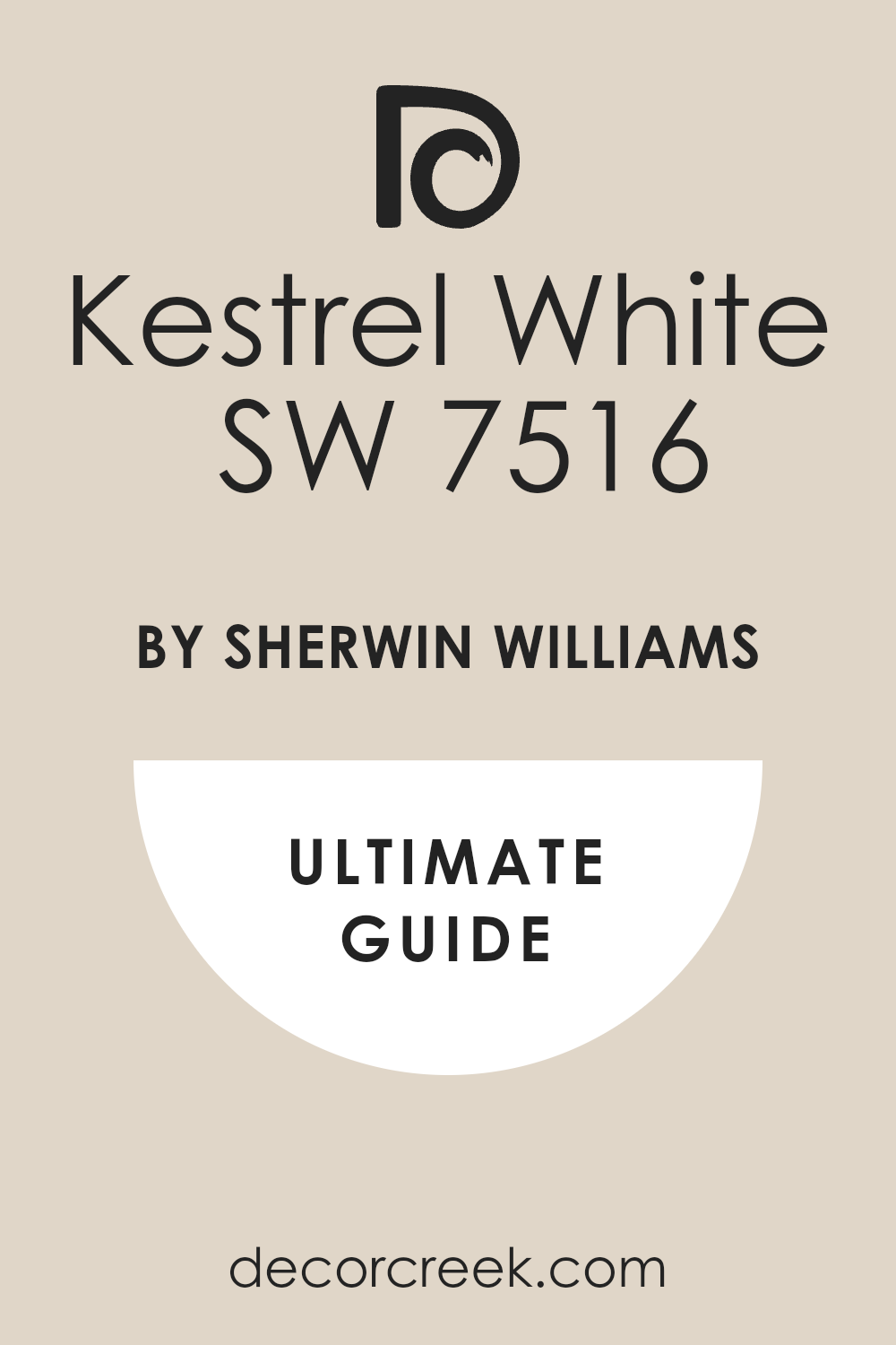
Redend Point (SW 9081) + Kestrel White (SW 7516)
Redend Point (SW 9081) + Kestrel White (SW 7516) is a very warm and sandy pair that feels very soft on the eyes. This combination uses a dusty pink-beige on the walls and a warm off-white for the trim and the ceiling.
I use this in bedrooms to create a very romantic and quiet atmosphere that helps you sleep. It is a very modern color that feels very fresh and updated for a new home in 2026. You will find that it makes the light in the room look very golden and very kind in the evening.
It is a very safe choice for someone who is tired of gray but still wants a neutral look. Most people feel very comfortable and safe when they are in a room with these soft colors. It reminds me of desert sand and warm stones found on a quiet walk in nature. Your home will feel very special and very soft with this beautiful and subtle palette.
Best used in: bedrooms, living rooms, bathrooms, and nurseries
Pairs well with: Kestrel White SW 7516, Foothills SW 7514, Malted Milk SW 6057, and linen The key rule of this color for an earthy style is to use it with other warm tones to create a snug feeling.
Evergreen Fog (SW 9130) + Swiss Coffee (SW 9022)
Evergreen Fog (SW 9130) + Swiss Coffee (SW 9022) is a very organic and soft pair that makes a room feel very grounded. This combination uses a misty green-gray on the walls and a very warm white for the trim and the doors.

I find that this green is very good for helping people feel more relaxed after a long day of work. It is a very subtle shade of green that does not look too bright or like a child’s bedroom. You can see how the warm white makes the green look very sophisticated and very mature.
It looks amazing with natural wood desks and gold hardware for a very classic look. Most people find that this color helps them stay patient and calm in their own home. It reminds me of a foggy morning in the woods where everything is very quiet and still. Your home will feel very refreshing and very peaceful with this natural and soft duo.
Best used in: living rooms, bedrooms, home offices, and kitchens
Pairs well with: Swiss Coffee SW 9022, Urbane Bronze SW 7048, Silvermist SW 7621, and gold The key rule of this color for a natural style is to use it with plenty of plants to bring out the green.
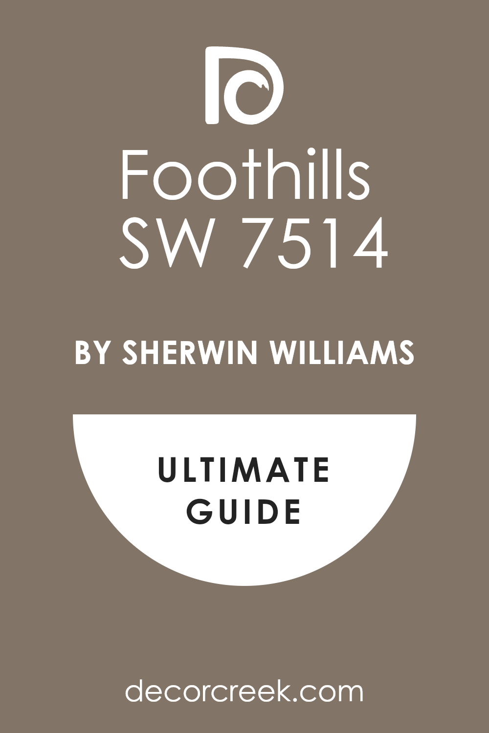
Universal Khaki (SW 6150) + Foothills (SW 7514)
Universal Khaki (SW 6150) + Foothills (SW 7514) is a very sturdy and warm pair that uses two different shades of brown. This scheme uses a warm tan on the walls and a deep brownish-gray for the accents or the furniture.
I use this as a base for rooms where I want to add lots of colorful pillows and heavy rugs. It acts like a warm blanket for your walls and makes a large room feel much smaller and more private. You will find that it hides dirt and fingerprints very well in a busy home with kids or pets.
It looks beautiful when the afternoon sun hits it and turns the walls into a golden glow. Most people feel very grounded and safe when they are surrounded by this sturdy and earthy color. Your home will feel very connected to nature and very well-made with this organic shade on the walls.
Best used in: living rooms, entryways, bedrooms, and exteriors
Pairs well with: Foothills SW 7514, Greek Villa SW 7551, Urban Bronze SW 7048, and leather The key rule of this color for a grounded style is to use it with other earth tones to keep the room cozy.
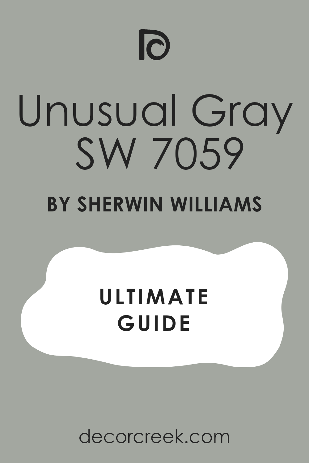
Moscow Midnight (SW 9142) + Unusual Gray (SW 7059)
Moscow Midnight (SW 9142) + Unusual Gray (SW 7059) is a very deep and dramatic pair that feels very high-fashion. This combination uses a dark teal on the walls and a medium gray for the trim or the ceiling.
I use this in dining rooms to create a very formal and special atmosphere for late night parties. It has a beautiful blue-green tone that looks very regal with dark wood furniture and gold lamps. You will notice that it makes the room feel very private and tucked away from the rest of the house.
It is a great way to use a dark color without it feeling like a cold black or a plain gray. Most people find it very relaxing to sit in a room with such a deep and comforting color at night. It makes your art and your furniture look like they belong in a very fancy museum gallery. Your home will feel very unique and very expensive with this bold and rich pair.
Best used in: dining rooms, libraries, accent walls, and bedrooms
Pairs well with: Unusual Gray SW 7073, Silver Strand SW 7057, Rain SW 6219, and brass The key rule of this color for an Art Deco style is to pair it with shiny metals and velvet fabrics.
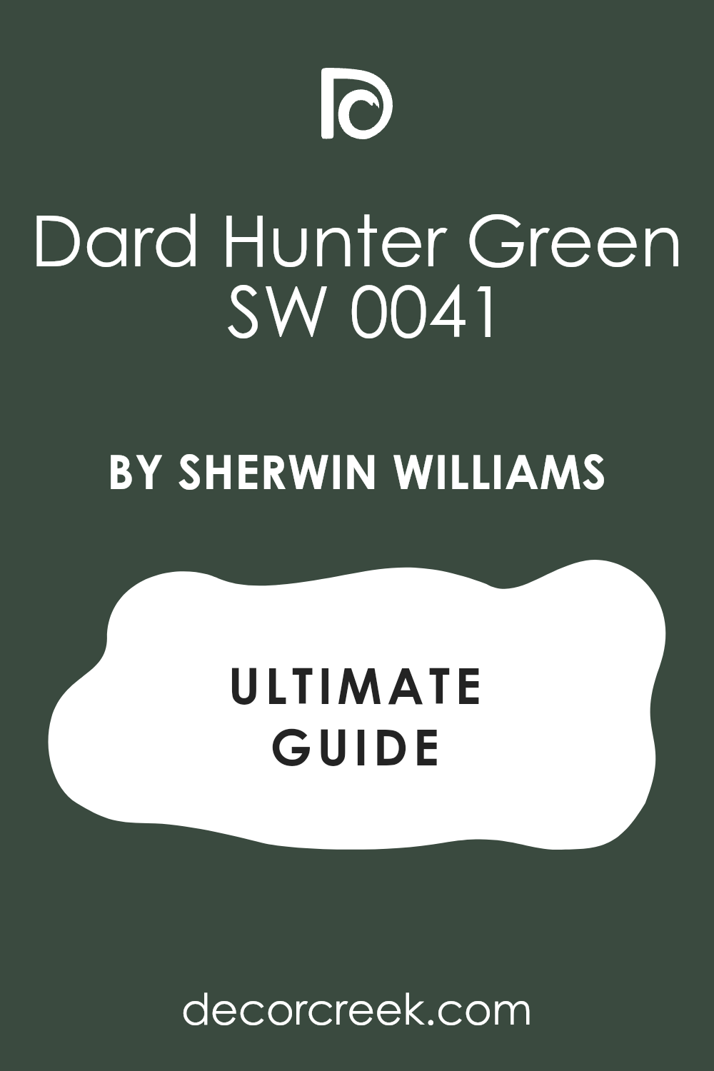
Greek Villa (SW 7551) + Dark Hunter Green (SW 0041)
Greek Villa (SW 7551) + Dark Hunter Green (SW 0041) is a very classic and sharp pair that feels very professional. This combination uses a warm white on the walls and a very deep green for the cabinets or the front door.

I love using this to make a house look very clean but also very full of character and life. It is a very sturdy choice that looks great with traditional architecture and heavy wood furniture. You will notice how the dark green makes the white walls look very bright and very soft.
It is a great way to use a bold color while still keeping the room feeling very open and happy. Most people are very impressed by how high-end this green looks when it is paired with such a soft white. It reminds me of a very fancy old house that has been kept perfectly clean and updated. Your home will feel very established and very solid with this beautiful and traditional duo.
Best used in: kitchens, entryways, front doors, and home offices
Pairs well with: Dark Hunter Green SW 0041, Alabaster SW 7008, Naval SW 6244, and wood The key rule of this color for a classic style is to use the green where you want a strong and dark accent.
Creamy (SW 7012) + Latte (SW 6108)
Creamy (SW 7012) + Latte (SW 6108) is a very soft and buttery pair that feels like a warm cup of coffee. This combination uses a soft white on the walls and a warm tan for the trim or the kitchen cabinets.
I use this when a client wants their home to feel very traditional and very sweet for a family. It has a tiny bit of yellow that makes the room feel very sunny even on a cloudy day. You can see how the darker tan makes the white walls look very rich and very full of depth.
It is a very safe choice that works in almost any kind of home with lots of wood furniture. Most people feel very comfortable and very relaxed in a room with this warm and friendly palette. It reminds me of a country cottage where everyone is welcome to sit down and stay for a while. Your home will feel very cozy and very welcoming with this soft and warm combination.
Best used in: kitchens, living rooms, hallways, and dining rooms
Pairs well with: Latte SW 6108, Dover White SW 6385, Macadamia SW 6142, and warm wood The key rule of this color for a cozy style is to use it where you want the light to feel soft.
Storm Cloud (SW 6249) + Eider White (SW 7014)
Storm Cloud (SW 6249) + Eider White (SW 7014) is a very deep and moody pair that feels very powerful and calm. This scheme uses a blue-gray on the walls and a soft off-white for the trim and the ceiling.
I find that this is a great way to make a master bedroom feel very dark and very private for sleeping. It is a very sophisticated color that makes a room feel very expensive and well-planned by a designer. You will notice that it makes light-colored furniture pop and look very sharp and very clean.
It is a great way to add drama to a room without using a bright or a loud color. Most people find it very relaxing to sit in a room with such a deep and comforting blue shade. It reminds me of the deep ocean and strong stone walls in a very old and sturdy castle. Your home will feel very established and very solid with this beautiful and moody duo.
Best used in: bedrooms, living rooms, home offices, and accent walls
Pairs well with: Eider White SW 7014, Charcoal Blue SW 2739, Upward SW 6239, and silver The key rule of this color for a moody style is to use it with light-colored flooring to stay balanced.
Upward (SW 6239) + Drift of Mist (SW 9166)
Upward (SW 6239) + Drift of Mist (SW 9166) is a very light and breezy pair that feels like a clear sky. This combination uses a soft blue on the walls and a very light gray for the trim and the ceiling.
I like to use this in a kitchen or a laundry room to keep the energy very high and very happy. It is a very soft shade that does not feel too much like a baby’s room if you have modern furniture. You will notice that it makes a small bathroom feel much wider and much cleaner than it really is.
It looks beautiful with white cabinets and light wood floors for a very fresh coastal look. This shade is a great way to add a bit of cool energy to a room that gets a lot of hot sun. It reminds me of the beach and fresh air on a perfect vacation day away from home. Your home will feel very light and very breezy with this beautiful and light combination.
Best used in: bathrooms, kitchens, laundry rooms, and bedrooms
Pairs well with: Drift of Mist SW 9166, Icicle SW 6238, Snowbound SW 7004, and light wood The key rule of this color for a light style is to use it with very simple and clean furniture.

Black Bean (SW 6006) + Gossamer Veil (SW 9165)
Black Bean (SW 6006) + Gossamer Veil (SW 9165) is a very warm and dramatic pair that feels very modern. This combination uses a warm black on the walls and a light “greige” for the trim and the surrounding rooms.
I find that this black is much friendlier than a cold black because it has a lot of brown hidden inside. You can see how the light gray trim makes the dark walls look very rich and like expensive fabric. It is a very bold choice that makes your home look very custom and like a designer planned it.
Most people are surprised by how cozy and snug a room feels when it is painted this dark. It looks amazing against white marble or light stone countertops in a modern kitchen or a bathroom. Your home will feel very established and very solid with this deep and powerful pair of colors. It is a great choice for a house that wants to stand out.
Best used in: kitchen cabinets, accent walls, powder rooms, and dens
Pairs well with: Gossamer Veil SW 9165, Redend Point SW 9081, Snowbound SW 7004, and stone The key rule of this color for a chic style is to use it with very light colors to create contrast.
Natural Choice (SW 7011) + Mega Greige (SW 7031)
Natural Choice (SW 7011) + Mega Greige (SW 7031) is a very sturdy and warm pair that feels very natural. This combination uses a creamy off-white on the walls and a medium gray-beige for the trim or the cabinets.

I use this when a client wants a house to feel very solid and very well-made for a large family. It is a very safe choice that works in almost any kind of home architecture or style you have. You will notice that the darker gray keeps the white walls from looking too stark or too much like a hospital.
It is a very sophisticated look that makes your furniture look very high-end and well-chosen for the room. Most people feel very comfortable and very relaxed in a room with this balanced and quiet palette. It reminds me of soft sand and smooth stones found on a quiet walk in a natural forest. Your home will feel very clean and very welcoming with this beautiful and simple combination.
Best used in: living rooms, hallways, bedrooms, and kitchens
Pairs well with: Mega Greige SW 7031, Shiitake SW 9173, Urban Bronze SW 7048, and wood The key rule of this color for a clean style is to use it where you want the light to feel very soft.

Henna Shade (SW 6326) + Macadamia (SW 6142)
Henna Shade (SW 6326) + Macadamia (SW 6142) is a very spicy and warm pair that brings a lot of energy. This combination uses a warm terracotta on the walls and a creamy tan for the trim and the ceiling.
I like to use this in a kitchen to make the space feel very active and very creative for cooking. It is a very friendly color that makes your guests feel like they can relax and stay for a long time. You will see how it warms up a cold room that does not get much natural sun during the day.
It looks beautiful with woven rugs and colorful fabrics from all over the world for a rustic look. This shade is a great way to add a bold color that still feels very natural and very grounded. It makes a room feel very happy and full of life without being too bright or like a toy. Your home will feel very unique and full of personality with this warm and earthy pair.
Best used in: kitchens, dining rooms, entryways, and sunrooms
Pairs well with: Macadamia SW 6142, Westhighland White SW 7566, Kilim Beige SW 6106, and clay The key rule of this color for a rustic style is to use it with plenty of natural wood and light.
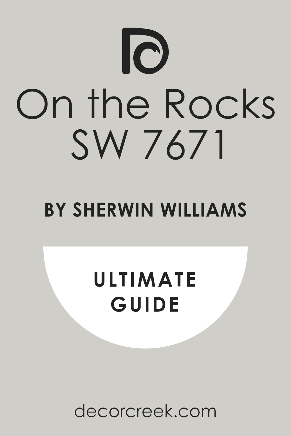
Still Water (SW 6223) + On the Rocks (SW 7671)
Still Water (SW 6223) + On the Rocks (SW 7671) is a very deep and quiet pair that feels very secure. This combination uses a dark blue-green on the walls and a light gray for the trim and the ceiling. I love using this in a master bedroom to create a very private and very focused space for sleeping.

It is a very rich color that makes the walls look like they have a lot of depth and mystery inside. You will find that it makes the room feel like it is a secret sanctuary away from the rest of the house. It looks beautiful with silver hardware and black metal furniture for a very modern and expensive look.
This teal has a bit of gray in it which keeps it from looking too bright or too much like a primary blue. Most people find it very easy to relax in a room with such a deep and comforting palette at night. Your home will feel very grounded and very private with this deep pigment.
Best used in: bedrooms, home offices, accent walls, and dens
Pairs well with: On the Rocks SW 7671, Pure White SW 7005, Charcoal Blue SW 2739, and silver The key rule of this color for a moody style is to use it in rooms with plenty of light to stay balanced.
Silvermist (SW 7621) + Snowbound (SW 7004)
Silvermist (SW 7621) + Snowbound (SW 7004) is a very cool and watery pair that feels very modern and clean. This combination uses a light blue-gray on the walls and a crisp white for the trim and the ceiling. I like to use this in bathrooms to create a spa-like feeling that helps you relax in the morning.
It is a very sophisticated color scheme that looks very polished and very updated in a new house. You will notice that the cool tones make the room feel very crisp and very well-organized for work. It is a great way to add a bit of color without it feeling too bright or too loud for your family.
Most designers love this pairing because it stays looking very smart and never goes out of style for many years. It reminds me of the sky on a cloudy day when everything in the world is very quiet. Your home will feel very tidy and very professional with this beautiful and cool palette.
Best used in: bathrooms, bedrooms, kitchens, and laundry rooms
Pairs well with: Snowbound SW 7004, Silver Strand SW 7057, Iron Ore SW 7069, and chrome The key rule of this color for a sleek style is to use it with very simple furniture to keep it modern.

Borscht (SW 7578) + City Loft (SW 7631)
Borscht (SW 7578) + City Loft (SW 7631) is a very bold and dramatic pair that feels very high-fashion. This combination uses a deep plum on the walls and a light gray-beige for the trim and the ceiling.
I use this in dining rooms to make dinner parties feel very special and very fancy for your guests. It has a beautiful red-purple tone that looks very regal with gold hardware and dark wood furniture. You will notice that it makes a small powder room feel very surprising and very full of big style.
It is a brave choice for anyone who loves color and wants to show off their personality in their home. The deep tones make the room feel very private and tucked away from the rest of the busy house. Most guests will be very impressed by this color because it is so unique and looks so expensive. Your home will feel like a designer curated every single inch of the space for you.
Best used in: dining rooms, powder rooms, accent walls, and dens
Pairs well with: City Loft SW 7631, Gossamer Veil SW 9165, Alabaster SW 7008, and gold The key rule of this color for a bold style is to use it in rooms where you want a big statement.

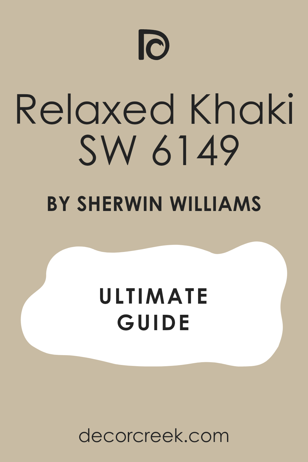
Cavern Clay (SW 7701) + Relaxed Khaki (SW 6149)
Cavern Clay (SW 7701) + Relaxed Khaki (SW 6149) is a very warm and earthy pair that feels very grounded. This combination uses a deep terracotta on the walls and a soft tan for the trim and the ceiling.

I like to use this in a living room to make the space feel very natural and very full of old-world charm. It is a very friendly color that makes your home feel like a warm desert sunset all year long. You will see how the soft tan trim keeps the bold clay color from feeling too loud or too bright.
It looks beautiful with woven rugs and dark wood furniture for a very rustic and cozy look. This shade is a great way to add a lot of character to a house that might be a bit plain. Most people feel very comfortable and very relaxed in a room with this warm and natural palette. Your home will feel very unique and very well-made with this beautiful and earthy pair.
Best used in: living rooms, entryways, kitchens, and sunrooms
Pairs well with: Relaxed Khaki SW 6149, Universal Khaki SW 6150, Origami White SW 7636, and wood The key rule of this color for a rustic style is to use it with natural textures like linen and clay.
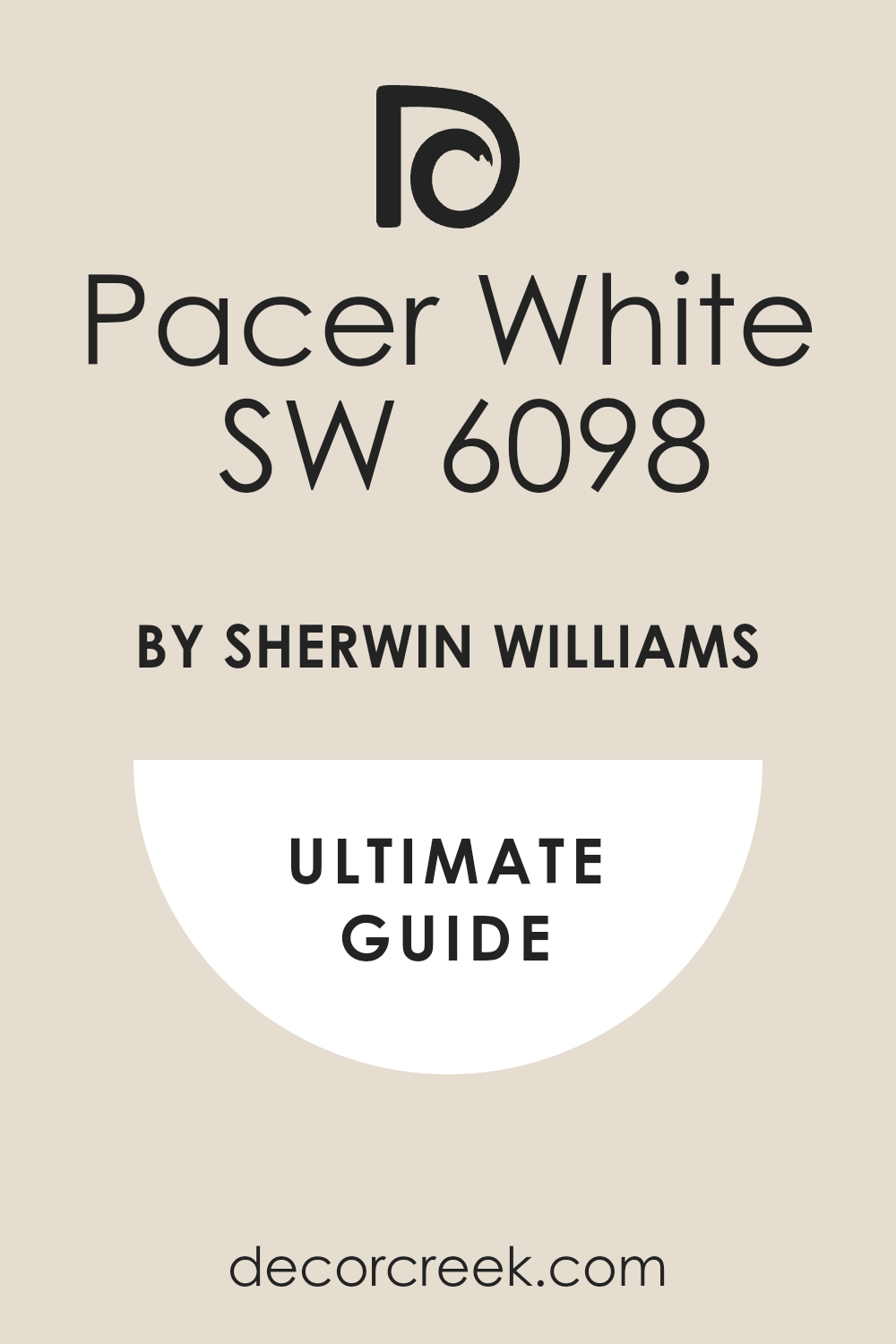
Aleutian (SW 6241) + Pacer White (SW 6098)
Aleutian (SW 6241) + Pacer White (SW 6098) is a very soft and honest blue pair that feels very sturdy. This combination uses a medium blue on the walls and a creamy white for the trim and the ceiling. I love using this in kids’ rooms or laundry rooms to add a splash of happy color that is not too bright.
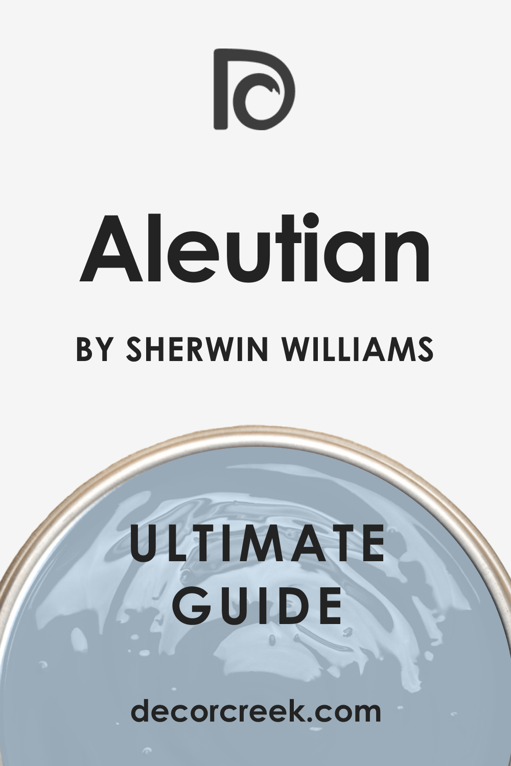
It is a very classic blue that does not try to be gray or green like many other popular shades. You can see how it brings a lot of life and personality to a room that once felt very boring. It looks amazing with white trim and dark wood furniture for a very traditional and clean look.
Most people find this color very easy to like because it is so familiar and very friendly for a family. It reminds me of denim jeans and clear water in a big swimming pool on a summer day. Your home will feel very light and very fresh with this beautiful and sturdy blue combination.
Best used in: kids’ rooms, kitchen islands, laundry rooms, and bedrooms
Pairs well with: Pacer White SW 6098, Naval SW 6244, Alabaster SW 7008, and dark wood The key rule of this color for a classic style is to use it with bright white to keep it looking crisp.
Quixotic Plum (SW 6265) + Breathless (SW 6022)
Quixotic Plum (SW 6265) + Breathless (SW 6022) is a very deep and sophisticated purple pair that feels very chic. This combination uses a dark plum on the walls and a very pale lavender for the trim or the ceiling.
I use this in guest bedrooms to make them feel very special and a bit fancy for your visitors. It has a very quiet energy that helps you wind down and relax at the end of a long day of work. You will notice that it looks very beautiful with silver hardware and white bedding for a clean look.
It is a very unique color that adds a lot of personality to a small space without being too much. Most people find it very surprising how much they like this color once they see it on the walls. It reminds me of dried flowers and soft velvet pillows in a quiet reading room at night. Your home will feel very custom and very thoughtful with this beautiful and purple palette.
Best used in: bedrooms, powder rooms, guest rooms, and reading nooks
Pairs well with: Breathless SW 6022, Snowbound SW 7004, Iron Ore SW 7069, and silver The key rule of this color for a chic style is to use it with silver or chrome to keep it modern.
Skyline Steel (SW 1015) + Tricorn Black (SW 6258)
Skyline Steel (SW 1015) + Tricorn Black (SW 6258) is a very sleek and modern pair that uses gray and a true black. This combination uses a medium stone gray on the walls and a deep black for the doors or the window frames.
I find that this is the best way to make a house look very expensive and very well-planned by a pro. You can see how the black accents make the gray walls look very clean and very sharp for a modern home. It is a very sturdy choice that looks great with white marble and polished metal fixtures throughout the house.
Most people love how it creates a very polished look without using any bright or loud colors that get old. It reminds me of a new city office where everything is very neat and very well-organized for a busy day. Your home will feel very tidy and very modern with this high-contrast and neutral palette.
Best used in: living rooms, hallways, exteriors, and kitchens
Pairs well with: Tricorn Black SW 6258, Extra White SW 7006, Peppercorn SW 7674, and stone The key rule of this color for a sleek style is to use the black on doors to create a custom look.

Debonair (SW 9139) + Balanced Beige (SW 7037)
Debonair (SW 9139) + Balanced Beige (SW 7037) is a very smart and sturdy pair that feels very professional. This combination uses a dusty blue on the walls and a warm tan for the trim and the surrounding furniture. I like to use this in a home office or a den to create a space that feels very grounded and quiet.
It is a very sophisticated color that makes your furniture look very sharp and very well-chosen for the room. You will notice that the warm tan trim keeps the blue walls from feeling too cold or too moody. It looks amazing with traditional rugs and heavy wood furniture for a very established and clean look.
Most people find that this color scheme helps them feel very focused and very calm in their own space. It reminds me of a warm wool sweater that always feels comfortable and looks good for many years. Your home will feel very solid and very well-cared for with this beautiful and smart pair.
Best used in: home offices, dens, bedrooms, and living rooms
Pairs well with: Balanced Beige SW 7037, Aesthetic White SW 7035, Naval SW 6244, and wood The key rule of this color for an elegant style is to use warm light bulbs to bring out the blue.

Bakelite Gold (SW 6368) + Moroccan Spice (SW 6060)
Bakelite Gold (SW 6368) + Moroccan Spice (SW 6060) is a very warm and rich pair that feels like an autumn day. This combination uses a deep golden yellow on the walls and a dark brown for the trim or the furniture.
I love using this in a dining room to make the space feel very active and very creative for big family meals. It is a very friendly color that makes your guests feel like they can relax and stay for a very long time. You will see how it warms up a cold room that does not get much natural sun during the day. It looks beautiful with woven rugs and dark wood furniture for a very rustic and cozy look.
This shade is a great way to add a bold color that still feels very natural and very grounded. It makes a room feel very happy and full of life without being too bright or like a toy. Your home will feel very unique and very full of personality with this warm and golden pair.
Best used in: dining rooms, kitchens, entryways, and accent walls
Pairs well with: Moroccan Brown SW 6060, Alabaster SW 7008, Kilim Beige SW 6106, and wood The key rule of this color for a rustic style is to use it with plenty of warm lighting.
Dark Auburn (SW 9181) + Toque White (SW 7003)
Dark Auburn (SW 9181) + Toque White (SW 7003) is a very rich and warm pair that feels like a cozy library. This combination uses a deep reddish-brown on the walls and a soft off-white for the trim and the ceiling.
I find that this is a great way to make a home office or a den feel very private and very snug. It has a very traditional look that makes your furniture and books look very sturdy and very strong. You will see how the dark walls make the white trim look very sharp and very clean for a modern house. It is a very brave choice that looks great with leather chairs and plenty of natural light.
Most people are very happy with how much warmth this color brings to a room that once felt empty. It reminds me of an old study in a big house where people go to do their best and most focused work. Your home will feel very established and very solid with this beautiful and rich auburn color.
Best used in: home offices, dens, libraries, and accent walls
Pairs well with: Toque White SW 7003, Kilim Beige SW 6106, Urban Bronze SW 7048, and leather The key rule of this color for a traditional style is to use it on all walls to get the full warmth.
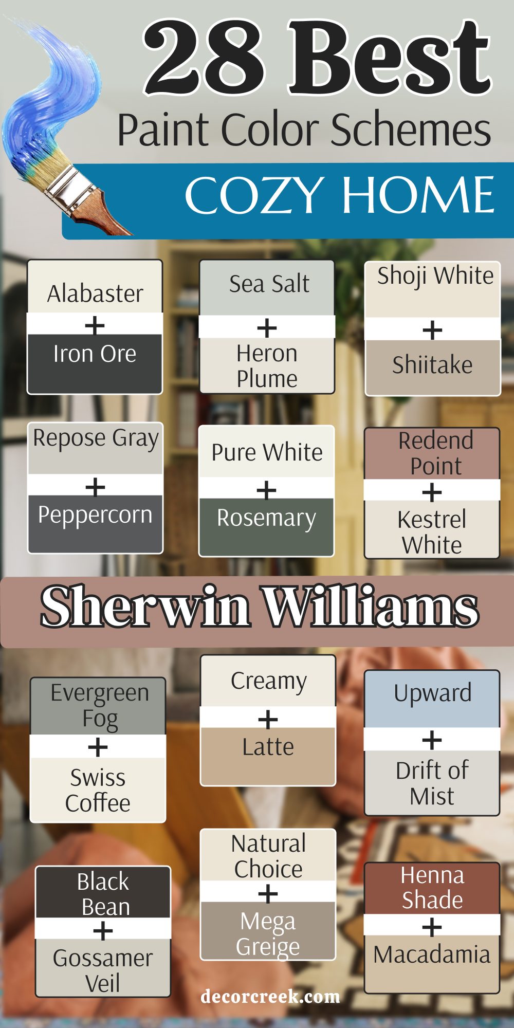
26 Cozy Home Paint Color Schemes From Benjamin Moore
Revere Pewter (HC-172) + Hale Navy (HC-154)
Revere Pewter (HC-172) + Hale Navy (HC-154) is a designer favorite because it is so balanced and smart. This scheme uses a warm gray on the walls and a deep navy for the kitchen island or an accent wall.
I use this when I want a house to look very professional and expensive for a sale. You will notice that the navy blue brings out the cool tones in the gray paint. It is a very sturdy combination that works in almost any kind of house style.
Most people find it very easy to match their furniture to these two classic colors. It reminds me of a high-end beach house where everything is very tidy and clean. Your home will feel very established and solid with this beautiful pair of colors. It is a safe bet for a kitchen renovation that will stay in style for a long time.
Best used in: kitchens, living rooms, and master bedrooms
Pairs well with: White Dove OC-17, natural oak floors, and silver hardware The key rule of this color for a classic style is to use the navy as a strong accent to ground the light gray walls.
Swiss Coffee (OC-45) + Silhouette (AF-655)
Swiss Coffee (OC-45) + Silhouette (AF-655) is a high-contrast pair that feels very modern and very expensive at the same time. This combination uses a warm white on the main walls and a deep charcoal plum for an accent wall or the doors.
I find that the soft yellow tones in the white paint keep the dark Silhouette from looking too cold. You will notice how the dark accents make the white walls look like velvet under your lamps. It is a very smart choice for a bedroom where you want a clean look but also a bit of drama. Most people love how this pair makes their gold mirrors and white bedding look like they belong in a magazine.
It reminds me of a luxury penthouse where everything is very neat and very well-planned. Your home will feel very polished and very stylish with these two colors working together. It is a great way to use a dark color without making the whole room feel small.
Best used in: bedrooms, living rooms, kitchens, and modern entryways
Pairs well with: Silhouette AF-655, Kendall Charcoal HC-166, Newburg Green HC-158, and warm wood tones The key rule of this color for a clean style is to use it where you want natural light to feel kind, soft, and inviting throughout the day.
Pale Oak (OC-20) + Amherst Gray (HC-167)
Pale Oak (OC-20) + Amherst Gray (HC-167) is a very soft and balanced pair that uses two different levels of gray. This combination uses a light sandy gray on the walls and a deep masculine gray for the trim or a fireplace.
I use this when a client wants a room to look very open but also very sturdy and grounded. You will notice that the Pale Oak has a tiny bit of warmth that keeps the Amherst Gray from looking too much like cold stone. It is a very sophisticated look that makes your furniture look very high-end and special. Most people feel very relaxed and very focused when they are in a room with this quiet palette.
It reminds me of a quiet morning at the beach when the sand is cool and the sky is gray. Your home will feel very tidy and very professional with this beautiful and neutral duo. It is a perfect choice for an open floor plan where you want everything to match perfectly.
Best used in: living rooms, hallways, home offices, and master bedrooms
Pairs well with: Amherst Gray HC-167, Chelsea Gray HC-168, Revere Pewter HC-172, and black metal The key rule of this color for an elegant style is to use it with other soft neutrals to create a layered and soft look.
Edgecomb Gray (HC-173) + Boothbay Gray (HC-165)
Edgecomb Gray (HC-173) + Boothbay Gray (HC-165) is a very refreshing and light pair that brings a bit of color to a neutral house. This combination uses a light “greige” on the walls and a soft blue-gray for the cabinets or a kitchen island.
I love using this to make a kitchen feel very clean and very full of life without being too bright. You will see how the blue tones in the Boothbay Gray make the warm walls look very crisp and very sharp. It is a very sturdy choice that works well with both silver and black hardware in a modern home.
Most people find that this color scheme helps them feel very peaceful and very happy in their own kitchen. It reminds me of a summer day when the sky is light blue and everything feels very simple. Your home will feel very open and very fresh with this beautiful and light combination. It is a great way to add a tiny bit of color that everyone will like.
Best used in: kitchens, bathrooms, laundry rooms, and living rooms
Pairs well with: Boothbay Gray HC-165, White Dove OC-17, Hale Navy HC-154, and light wood The key rule of this color for a minimal style is to use it with very light furniture to keep the room feeling open.

White Dove (OC-17) + Narragansett Green (HC-157)
White Dove (OC-17) + Narragansett Green (HC-157) is a very classic and sharp pair that feels very traditional and very strong. This scheme uses a crisp white on the walls and a deep forest green for the built-in shelves or a study. I find that this is a great way to make a room look very expensive and full of character.

You will notice how the dark green makes the white walls look very bright and very clean for a modern house. It is a very bold way to use a dark color while still keeping the room feeling very happy and light. Most guests will be very impressed by how high-end this green looks when it is paired with such a soft white.
It reminds me of a very fancy old house that has been kept perfectly clean and updated for a new family. Your home will feel very established and very solid with this beautiful and traditional duo. It is a smart choice for a front door or a formal dining room.
Best used in: dining rooms, home offices, entryways, and kitchen cabinets
Pairs well with: Narragansett Green HC-157, Revere Pewter HC-172, Stonington Gray HC-170, and brass The key rule of this color for a classic style is to use the dark green to ground the room and create a focal point.
Gray Owl (OC-52) + Stonington Gray (HC-170)
Gray Owl (OC-52) + Stonington Gray (HC-170) is a very clean and professional pair that uses two very popular shades of gray. This combination uses a very light gray on the walls and a medium gray for the doors or the baseboards.

I use this when a client wants a very modern home that feels very light and very well-organized. It is a very cool-toned look that helps a small room feel much wider and much cleaner than it really is. You will notice that the two grays work together to make the whole house look very polished and very neat.
It is a great choice if you have a lot of black or white technology in your home office or living room. Most designers pick this because it looks very high-end without being too loud or using too much color. Your workspace will feel very tidy and very ready for a productive day with this sleek palette.
Best used in: home offices, hallways, bathrooms, and modern living rooms
Pairs well with: Stonington Gray HC-170, White Heron OC-57, Onyx 2133-10, and polished chrome The key rule of this color for a sleek style is to use the darker gray on the trim to create a frame for the walls.

Chantilly Lace (OC-65) + Amazon Green (2136-30)
Chantilly Lace (OC-65) + Amazon Green (2136-30) is a very bold and tropical pair that brings a lot of energy to a room. This combination uses a very bright white on the walls and a deep teal for a big statement wall.

I love using this in a bedroom to create a very strong focal point behind the headboard of the bed. You will see how the dark teal makes the bright white walls look very crisp and very sharp for a modern look. It is a very brave choice that makes your home look very custom and like a designer planned it.
Most people are surprised by how much they love the dark green once they see it against the bright white. It reminds me of a white house with a very big and beautiful garden full of green plants. Your home will feel very refreshing and very unique with this beautiful and organic pair of colors. It is a great way to show off your big personality.
Best used in: accent walls, bedrooms, powder rooms, and eclectic living rooms
Pairs well with: Amazon Green 2136-30, Gray Owl OC-52, Simply White OC-117, and gold The key rule of this color for a bold style is to keep the other walls very light so the green can be the star.
Manchester Tan (HC-81) + Van Deusen Blue (HC-156)
Manchester Tan (HC-81) + Van Deusen Blue (HC-156) is a very sturdy and traditional pair that feels very dependable and warm. This scheme uses a soft tan on the walls and a medium navy blue for the lower half of the walls or the trim.

I find that this tan is the perfect neutral because it feels like warm sand and is very easy to live with. You will notice how the navy blue brings out the golden tones in the tan paint on the walls. It is a very smart look that works well with dark wood furniture and traditional rugs in a living room.
Most people find it very easy to match their existing furniture to these two classic and safe colors. It reminds me of a high-end beach house where everything is very sturdy and very well-made for a family. Your home will feel very established and very solid with this beautiful and balanced pair of colors.
Best used in: living rooms, dining rooms, entryways, and bedrooms
Pairs well with: Van Deusen Blue HC-156, White Dove OC-17, Revere Pewter HC-172, and dark wood The key rule of this color for a traditional style is to use the blue to add a sense of weight and luxury to the room.

Saybrook Sage (HC-114) + Cloud White (OC-130)
Saybrook Sage (HC-114) + Cloud White (OC-130) is a very organic and soft pair that brings the outdoors into your house. This combination uses a gentle herb green on the walls and a warm off-white for the trim and the ceiling.
I love using this for people who want a house that feels very soft and very sweet for their family. It is a very friendly color scheme that makes you feel very relaxed and very happy as soon as you walk in. You will find that the green makes your house look very healthy and full of life under the sun.
It looks amazing with light wood furniture and woven baskets for a very natural and simple look. This shade of green is very stable and does not look too bright even when the room is full of light. Most people feel very connected to nature when they are in a room with these colors. Your home will feel very light and very welcoming with this beautiful and simple duo.
Best used in: kitchens, sunrooms, nurseries, and laundry rooms
Pairs well with: Cloud White OC-130, Shaker Beige HC-45, Edgecomb Gray HC-173, and wood The key rule of this color for a farmhouse style is to use it with vintage furniture and white accents.

Collingwood (OC-28) + Wrought Iron (2124-10)
Collingwood (OC-28) + Wrought Iron (2124-10) is a very clean and modern pair that uses gray and a very dark charcoal. This combination uses a light stone gray on the walls and a deep black-gray for the doors or the window frames.

I find that this is the best way to make a house look very expensive and very well-planned by a pro. You can see how the dark accents make the gray walls look very clean and very sharp for a modern home.
It is a very sturdy choice that looks great with white marble and polished metal fixtures throughout the house. Most people love how it creates a very polished look without using any bright or loud colors that might get old. It reminds me of a new city apartment where everything is very neat and very well-organized for a busy day. Your home will feel very tidy and very modern with this high-contrast and neutral palette.
Best used in: living rooms, hallways, exteriors, and kitchens
Pairs well with: Wrought Iron 2124-10, Chantilly Lace OC-65, Gray Owl OC-52, and stone The key rule of this color for a sleek style is to use the dark charcoal on doors to create a custom look.

Classic Gray (OC-23) + Kendall Charcoal (HC-166)
Classic Gray (OC-23) + Kendall Charcoal (HC-166) is a very sophisticated and high-end pair that feels very modern and very soft. This scheme uses a very light gray on the walls and a deep slate gray for an accent wall or a fireplace.

I use this when a client wants their home to look very polished but still very warm and inviting for guests. It has a very quiet energy that makes the room look very expensive and very well-designed. You will notice that the dark gray makes the light walls look very crisp and very sharp under your lamps.
It is a very safe way to add a bit of drama without using any bold or loud colors in your living room. Most people find that this color scheme helps them feel very grounded and very calm in their own home. It reminds me of natural stone and soft gray clouds on a very quiet and peaceful day. Your home will feel very tidy and very modern with this beautiful gray duo.
Best used in: living rooms, bedrooms, home offices, and accent walls
Pairs well with: Kendall Charcoal HC-166, Simply White OC-117, Revere Pewter HC-172, and silver The key rule of this color for an elegant style is to use the dark gray where you want to create a sense of depth.

Wind’s Breath (OC-24) + French Beret (1610)
Wind’s Breath (OC-24) + French Beret (1610) is a very warm and dramatic pair that feels very high-fashion and chic. This combination uses a creamy off-white on the walls and a deep navy-black for the doors or a study.
I find that this white is much friendlier than a cold white because it has a lot of warmth hidden inside. You can see how the dark accents make the light walls look very rich and like expensive fabric.
It is a very bold choice that makes your home look very custom and like a designer planned it for you. Most people are surprised by how cozy and snug a room feels when it has these dark and light tones together. It looks amazing against dark wood floors or light stone surfaces in a modern kitchen or a bathroom. Your home will feel very established and very solid with this deep and powerful pair of colors.
Best used in: entryways, living rooms, bedrooms, and kitchen cabinets
Pairs well with: French Beret 1610, Hale Navy HC-154, Pale Oak OC-20, and gold The key rule of this color for a chic style is to use the dark color on trim to provide a strong contrast.
Ballet White (OC-9) +Violetta AF-615
Ballet White (OC-9) + Violetta AF-615 is a very soft and warm pair that feels like a quiet evening at home. This combination uses a creamy white on the walls and a deep wine color for an accent wall or the dining room.
I like to use this to make a room feel very bright but also very grounded and very full of character. It is a very safe choice that works in almost any kind of home with lots of traditional furniture. You will notice that the dark plum color makes the warm white walls look very soft and very friendly.
It is a great way to add a bit of drama without making the whole house feel too dark or heavy. Most people feel very comfortable and very relaxed in a room with this balanced and quiet palette. It reminds me of a country cottage where everyone is welcome to sit down and stay for a while. Your home will feel very cozy and very welcoming with this soft and warm combination.
Best used in: dining rooms, living rooms, bedrooms, and entryways
Pairs well with: Muscadine AF-615, Swiss Coffee OC-45, Shaker Beige HC-45, and warm wood The key rule of this color for a cozy style is to use it where you want the light to feel soft.
Quiet Moments (1563) + Shaker Beige (HC-45)
Quiet Moments (1563) + Shaker Beige (HC-45) is a very peaceful and organic pair that brings the feeling of a spa into your home. This combination uses a soft blue-green-gray on the walls and a warm tan for the trim or the furniture.

I love using this in bathrooms or bedrooms to create a very quiet and refreshing atmosphere for your family. It is a very subtle color that looks different as the sun moves across the sky during the day. You will find that the warm tan keeps the cool blue walls from feeling too cold or too moody.
It looks beautiful with light wood furniture and white linen curtains for a very clean and natural look. Most people feel very happy and very relaxed when they are surrounded by such a fresh and light palette. Your home will feel very open and full of fresh air with this beautiful and quiet duo.
Best used in: bedrooms, bathrooms, nurseries, and sunrooms
Pairs well with: Shaker Beige HC-45, White Dove OC-17, Gray Owl OC-52, and natural linen The key rule of this color for a spa style is to use it with plenty of white towels and natural light.

Simply White (OC-117) + Newburg Green (HC-158)
Simply White (OC-117) + Newburg Green (HC-158) is a very fresh and bold pair that brings a lot of high-fashion style. This combination uses a crisp white on the walls and a deep teal for the kitchen cabinets or an accent wall.

I love using this to make a house look very clean but also very full of personality and life. It is a very sturdy choice that looks great with modern architecture and bright gold hardware. You will notice how the dark teal makes the white walls look very bright and very sharp for a designer look.
It is a great way to use a bold color while still keeping the room feeling very open and happy. Most people are very impressed by how high-end this green looks when it is paired with such a crisp white. Your home will feel very established and very solid with this beautiful and powerful duo.
Best used in: kitchens, home offices, entryways, and accent walls
Pairs well with: Newburg Green HC-158, Revere Pewter HC-172, Hale Navy HC-154, and gold The key rule of this color for a bold style is to use the teal where you want a strong and dark accent.
Muslin (OC-12) + Chelsea Gray (HC-168)
Muslin (OC-12) + Chelsea Gray (HC-168) is a very sturdy and warm pair that feels very natural and very well-made. This combination uses a soft creamy tan on the walls and a medium gray for the trim or the cabinets.

I use this when a client wants a house to feel very solid and very safe for a large family. It is a very safe choice that works in almost any kind of home architecture or style you have. You will notice that the medium gray keeps the tan walls from looking too yellow or too old-fashioned.
It is a very sophisticated look that makes your furniture look very high-end and well-chosen for the room. Most people feel very comfortable and very relaxed in a room with this balanced and quiet palette. It reminds me of soft sand and smooth stones found on a quiet walk in a natural forest. Your home will feel very clean and very welcoming with this beautiful and simple combination.
Best used in: living rooms, hallways, bedrooms, and whole-house schemes
Pairs well with: Chelsea Gray HC-168, White Dove OC-17, Amherst Gray HC-167, and wood The key rule of this color for a clean style is to use it where you want the light to feel very soft.

Fog Mist (OC-31) + Rainy Afternoon (1575)
Fog Mist (OC-31) + Rainy Afternoon (1575) is a very moody and deep pair that feels very secure and very quiet. This scheme uses a very light gray on the walls and a dark olive-gray for the study or a library. I find that this is a great way to make a home office feel very private and very focused for work.
It is a very sophisticated color that makes a room feel very expensive and well-planned by a designer. You will notice that it makes your books and art look very sharp and very clean on the dark walls.
It is a great way to add drama to a room without using a bright or a loud color that gets old. Most people find it very relaxing to sit in a room with such a deep and comforting green shade. It reminds me of a cozy cabin in the woods where everything is very quiet and very still. Your home will feel very established and very solid with this beautiful and moody duo.
Best used in: home offices, dens, libraries, and master bedrooms
Pairs well with: Rainy Afternoon 1575, Pashmina AF-100, Simply White OC-117, and leather The key rule of this color for a moody style is to use it in rooms with plenty of lamps to show off the dark green.
Woodlawn Blue (HC-147) + Wythe Blue (HC-143)
Woodlawn Blue (HC-147) + Wythe Blue (HC-143) is a very soft and refreshing pair that uses two different shades of blue-green. This combination uses a light aqua on the walls and a medium teal for the doors or the kitchen island.
I love using this to make a room feel very light and very full of history at the same time. It is a very classic look that works well with white trim and dark wood floors in a traditional home. You will see how the two blues work together to make the room feel very clean and very cool.
It is a great way to add color while still keeping the room feeling very soft and very polite for guests. Most people feel very happy and very alert when they are in a room with these fresh colors. It reminds me of a house by the sea where everything is light and simple. Your home will feel very open and very fresh with this beautiful blue duo.
Best used in: bathrooms, bedrooms, kitchens, and sunrooms
Pairs well with: Wythe Blue HC-143, White Dove OC-17, Gray Owl OC-52, and dark wood The key rule of this color for a spa style is to use it with plenty of white accents to keep the blue looking crisp.

Paper White (OC-55) + Stormy Monday (2112-50)
Paper White (OC-55) + Stormy Monday (2112-50) is a very clean and cool pair that feels very modern and very polished. This scheme uses a very light blue-gray on the walls and a medium slate gray for the trim or the furniture.
I use this when a client wants a very modern home that feels very sharp and very well-organized. It is a very cool-toned look that helps a small room feel much wider and much cleaner than it really is.
You will notice that the medium gray makes the white walls look very crisp and very sharp under your lamps. It is a great choice if you have a lot of black or white technology in your home office or living room. Most designers pick this because it looks very high-end without using any bright or loud colors. Your workspace will feel very tidy and very ready for a productive day with this sleek palette.
Best used in: home offices, bathrooms, kitchens, and modern living rooms
Pairs well with: Stormy Monday 2112-50, Chantilly Lace OC-65, Hale Navy HC-154, and chrome The key rule of this color for a sleek style is to use it with very simple furniture to keep the room modern.
Caliente (AF-290) + Linen White (OC-146)
Caliente (AF-290) + Linen White (OC-146) is a very bold and warm pair that brings a lot of energy and high-fashion drama. This combination uses a bright red for an accent wall or the dining room and a warm white for the rest of the walls.
I find that this is a great way to make a room feel very active and very creative for big family meals. It is a very friendly color that makes your guests feel like they are in a very special and fancy place. You will see how the warm white trim keeps the bold red color from feeling too loud or too bright.
It looks beautiful with dark wood furniture and gold hardware for a very traditional and cozy look. This red is a great way to add a lot of character to a house that might be a bit plain. Most people feel very excited and very happy in a room with this warm and bold palette. Your home will feel very unique and very well-made with this beautiful and energetic pair.
Best used in: dining rooms, entryways, accent walls, and kitchens
Pairs well with: Linen White OC-146, Simply White OC-117, Revere Pewter HC-172, and gold The key rule of this color for a bold style is to use the red where you want to make a big statement.
Metropolitan (AF-690) + Onyx (2133-10)
Metropolitan (AF-690) + Onyx (2133-10) is a very sleek and modern pair that uses gray and a true black. This combination uses a medium gray on the walls and a deep black for the doors or the window frames.
I find that this is the best way to make a house look very expensive and very well-planned by a designer. You can see how the black accents make the gray walls look very clean and very sharp for a modern home. It is a very sturdy choice that looks great with white marble and polished metal fixtures throughout the house.
Most people love how it creates a very polished look without using any bright or loud colors. It reminds me of a new city apartment where everything is very neat and very well-organized for a busy day. Your home will feel very tidy and very modern with this high-contrast and neutral palette. It is a perfect choice for a living room where you want to show off your art.
Best used in: living rooms, hallways, exteriors, and kitchens
Pairs well with: Onyx 2133-10, White Heron OC-57, Gray Owl OC-52, and silver The key rule of this color for a sleek style is to use the black on doors to create a custom look.
Smoke (2122-40) + White Heron (OC-57)
Smoke (2122-40) + White Heron (OC-57) is a very light and breezy pair that makes any room feel very open. This combination uses a soft blue-gray on the walls and a very clean white for the trim and the ceiling.

I love using this in bathrooms or bedrooms to create a very quiet and refreshing atmosphere for your family. It is a very subtle color that looks different as the sun moves across the sky during the day. You will notice that it looks more blue in the morning and more gray in the late afternoon under the clouds.
It looks beautiful with white furniture and light wood floors for a very clean and simple look. This shade is very polite and does not try to grab all the attention in the room. Most people feel very happy and very relaxed when they are surrounded by such a fresh and light palette. Your home will feel very open and full of fresh air with this beautiful blue duo.
Best used in: bathrooms, bedrooms, laundry rooms, and kitchens
Pairs well with: White Heron OC-57, Gray Owl OC-52, Metropolitan AF-690, and light wood The key rule of this color for a coastal style is to use it with plenty of white accents to keep the room looking crisp.
Pashmina (AF-100) + Deep Creek (1477)
Pashmina (AF-100) + Deep Creek (1477) is a very warm and sophisticated pair that feels very soft and very grounded. This combination uses a medium taupe on the walls and a deep olive-brown for the trim or a study.

I like to use this for rooms that need to feel very quiet and very expensive for your family and guests. It has a very “greige” feeling that makes the room look very well-designed and very high-end for a modern house. You can see how the warmth in the paint makes the room feel very inviting for guests or clients.
It is a very sturdy look that works well with traditional rugs and heavy wood furniture throughout the house. Most people find that this color scheme helps them feel very grounded and very calm in their own space. It reminds me of a warm wool sweater on a cold winter day. Your home will feel very established and very solid with this beautiful and warm duo.
Best used in: living rooms, bedrooms, home offices, and dining rooms
Pairs well with: Deep Creek 1477, Simply White OC-117, Shaker Beige HC-45, and warm wood The key rule of this color for an elegant style is to use warm light bulbs to bring out the beige tones.
October Mist (1495) + Gloucester Sage (HC-100)
October Mist (1495) + Gloucester Sage (HC-100) is a very organic and deep green pair that feels very traditional. This combination uses a light sage on the walls and a deep forest green for the built-in shelves or the trim.

I love using this for people who want a house that feels very sturdy and very full of natural character. It is a very rich color scheme that makes your home look like it has been there for a very long time. You can see how the two greens work together to make the room look very polished and very mature.
It looks amazing with old wood furniture and plenty of books on the shelves for a cozy look. This shade of green is very deep and looks very expensive when you pair it with gold or brass lamps. Most people feel very focused and very smart when they are surrounded by such a strong and natural color. Your home will feel very unique and very well-made with this beautiful and organic pair.
Best used in: living rooms, home offices, dens, and exteriors
Pairs well with: Gloucester Sage HC-100, Steam AF-15, Pale Oak OC-20, and dark wood The key rule of this color for a natural style is to use it with plenty of wood to enhance the forest feeling.
Cinnamon Slate (2113-40) + Steam (AF-15)
Cinnamon Slate (2113-40) + Steam (AF-15) is a very moody and high-fashion pair that feels very cozy and very fresh. This scheme uses a deep purple-gray on the walls and a crisp white for the trim and the ceiling.
I find that this is a great way to make a master bedroom feel very private and very snug for a good night of sleep. It is a very sophisticated color that makes a room feel very expensive and well-planned by a designer for you. You will notice that it makes your white bedding look very sharp and very clean on the dark walls.
It is a great way to add drama to a room without using a bright or a loud color that gets old. Most people find it very relaxing to sit in a room with such a deep and comforting purple shade. It reminds me of the sky right after the sun goes down when everything is very quiet. Your home will feel very established and very solid with this beautiful and moody duo.
Best used in: bedrooms, living rooms, dens, and accent walls
Pairs well with: Steam AF-15, Flint AF-560, Revere Pewter HC-172, and silver The key rule of this color for a moody style is to use it on all four walls to get the full effect of the pigment.
Beach Glass (1564) + Van Courtland Blue (HC-145)
Beach Glass (1564) + Van Courtland Blue (HC-145) is a very soft and refreshing blue pair that feels very clean. This combination uses a light blue-green on the walls and a medium navy for the doors or a kitchen island.

I love using this to make a room feel very light and very full of history at the same time. It is a very classic look that works well with white trim and dark wood floors in a traditional home. You will see how the two blues work together to make the room feel very clean and very cool under the sun.
It is a great way to add color while still keeping the room feeling very soft and very polite for your guests. Most people feel very happy and very alert when they are in a room with these fresh and simple colors. It reminds me of a house by the sea where everything is light and simple. Your home will feel very open and very fresh with this beautiful blue duo.
Best used in: bathrooms, bedrooms, kitchens, and sunrooms
Pairs well with: Van Courtland Blue HC-145, White Dove OC-17, Gray Owl OC-52, and wood The key rule of this color for a spa style is to use it with plenty of white accents to keep the blue looking crisp.
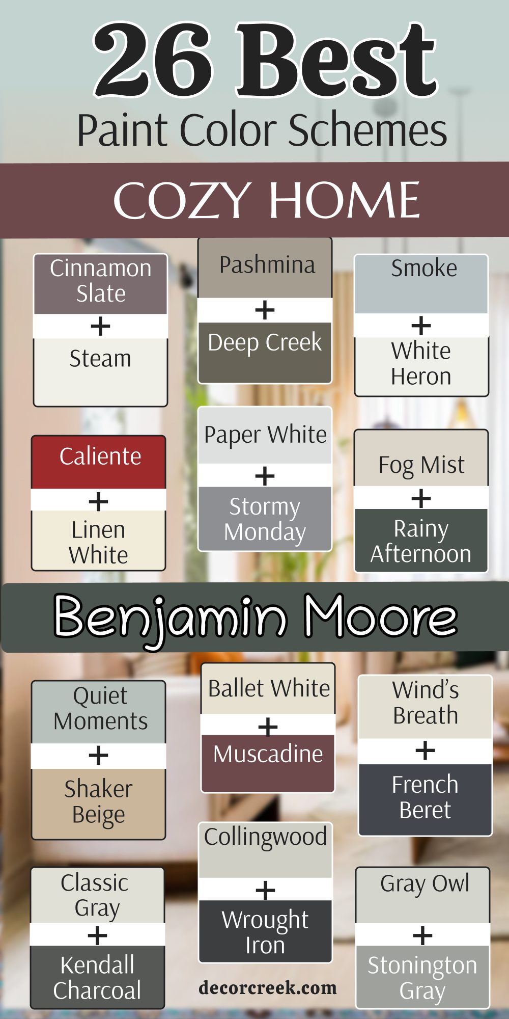
27 Cozy Home Office Paint Color Schemes
Hale Navy (HC-154) + Paper White (OC-55)
Hale Navy (HC-154) + Paper White (OC-55) is a fantastic combination for a home office that needs to feel very serious. This pair uses a dark blue on the walls and a crisp off-white for the ceiling and the trim.
I find that the dark walls help you focus on your computer screen without any glare. It makes the room feel very private and like a real place of work. You will see how the white trim makes the navy blue look very sharp and professional.
It is a great way to make a small spare room feel like a very important part of the house. Most people feel very smart and organized when they are working in a navy blue room. Your home office will look like it belongs to a CEO with this high-contrast scheme. It is a very classic look that never goes out of fashion.
Best used in: home offices, libraries, and study nooks
Pairs well with: Coventry Gray HC-169, walnut wood desks, and brass lamps The key rule of this color for a professional style is to use bright white trim to keep the dark walls from feeling too heavy.
Narragansett Green (HC-157) + Revere Pewter (HC-172)
Narragansett Green (HC-157) + Revere Pewter (HC-172) is a combination that makes any home office feel like a high-end executive suite. This pair uses a deep forest green on the walls and a warm gray for the shelving or the trim.
I find that this specific green is very good for long hours of work because it is very easy on the eyes. You will notice how the warm beige tones in the gray paint keep the room from feeling too cold or dark. It is a very smart look that tells people you take your work seriously.
Most clients love how this scheme makes their books and gold accessories really stand out. It reminds me of a quiet library in a very old and expensive university. Your workspace will feel very sturdy and well-organized with these two colors working together. It is a perfect choice for someone who wants a traditional look that still feels very fresh.
Best used in: home offices, libraries, study dens, and formal dining rooms
Pairs well with: Cloud White OC-130, dark leather chairs, and brass desk lamps The key rule of this color for a professional style is to use the green on the walls and the gray on the built-in cabinets to create depth.
Boothbay Gray (HC-165) + White Dove (OC-17)
Boothbay Gray (HC-165) + White Dove (OC-17) is a very soft and welcoming pair that makes a small office feel much bigger. This combination uses a medium blue-gray on the walls and a soft white for the windows and doors.
I like to use this in rooms that get a lot of natural light to create a very airy feeling. It is a very peaceful choice that helps you stay calm during a busy work day. You can see how the blue tones make the room feel very clean and refreshed.
It is a great choice if you want a bit of color without it being too loud or distracting. Most people find that this color scheme works well with both modern and vintage furniture. It reminds me of a house by the sea where everything is light and simple. Your office will feel very bright and cheerful even on a rainy morning.
Best used in: home offices, guest rooms, bathrooms, and laundry rooms
Pairs well with: Revere Pewter HC-172, light oak wood, and silver accessories The key rule of this color for a light style is to use the white paint on all the trim to keep the gray looking crisp.
Silhouette (AF-655) + Classic Gray (OC-23)
Silhouette (AF-655) + Classic Gray (OC-23) is a very dramatic and modern choice for a home office with a lot of style. This pair uses a dark charcoal plum on the main walls and a very light gray on the ceiling or trim.
I use this when a client wants their office to feel like a private lounge for thinking. It has a very high-fashion look that makes your home look very custom and expensive. You will notice that the dark walls make the light gray trim look almost like bright white.
It is a very bold way to use a dark color while still keeping the room feeling balanced. Most guests will be very impressed by how brave and chic this combination looks. It reminds me of a city apartment where everything is very polished and neat. Your home office will feel very private and like a special sanctuary for your big ideas.
Best used in: home offices, accent walls, master bedrooms, and media rooms
Pairs well with: Steam AF-15, velvet fabrics, and black metal accents The key rule of this color for a moody style is to use the dark color on the walls and keep the ceiling very light to avoid a closed-in feeling.
Saybrook Sage (HC-114) + Ballet White (OC-9)
Saybrook Sage (HC-114) + Ballet White (OC-9) is a very organic and soft combination that brings nature into your workspace. This pair uses a gentle herb green on the walls and a warm creamy white for the surrounding trim.
I love using this for people who do creative work like writing or painting. It is a very friendly color scheme that makes you feel very relaxed and inspired. You will find that the green makes your plants look very healthy and vivid.
It looks amazing with light wood desks and woven baskets for a very natural look. This shade of green is very stable and does not look too bright when the sun comes through the window. Most people feel very connected to the outdoors when they are in a room with these colors. It is a great way to make a boring room feel very soft and sweet.
Best used in: home offices, sunrooms, kitchens, and nurseries
Pairs well with: Shaker Beige HC-45, natural linen, and light pine furniture The key rule of this color for a natural style is to use it with plenty of wood textures to enhance the earthy feeling.
Amazon Green (2136-30) + Wood Grain Accents
Amazon Green (2136-30) + Wood Grain Accents is a very rich and tropical look that makes an office feel very powerful. This combination uses a deep teal green on the walls and relies on the brown tones of your furniture for balance.
I find that this is a great way to make a room feel very cozy and tucked away. It has a very strong personality that makes a big statement about your style. You will see how the green makes the orange and red tones in the wood look very bright.
It is a very thick color that makes the walls look like they are made of heavy stone. Most people love how this color changes from a bright teal in the sun to a deep forest green at night. It reminds me of a hidden jungle bungalow where you can focus on your favorite hobby. Your home office will feel very unique and full of life with this bold choice.
Best used in: home offices, accent walls, dens, and powder rooms
Pairs well with: Chantilly Lace OC-65, walnut wood, and gold hardware The key rule of this color for a bold style is to use large pieces of wood furniture to break up the dark green walls.
Gray Owl (OC-52) + Stonington Gray (HC-170)
Gray Owl (OC-52) + Stonington Gray (HC-170) is a very clean and professional look that uses two different shades of gray. This pair uses a very light gray on the walls and a medium gray for the doors or the baseboards.
I use this when a client wants a very modern and organized office that feels very light. It is a very cool-toned look that helps you stay alert and focused on your work. You will notice that the two grays work together to make the room look very polished.
It is a great choice if you have a lot of black or white technology on your desk. Most designers pick this because it looks very high-end without being too loud or colorful. It reminds me of a new office building where everything is very sharp and neat. Your workspace will feel very tidy and ready for a productive day.
Best used in: home offices, hallways, bathrooms, and modern kitchens
Pairs well with: White Heron OC-57, polished chrome, and black office chairs The key rule of this color for a sleek style is to use the darker gray on the trim to create a frame for the lighter walls.
Pashmina (AF-100) + Chelsea Gray (HC-168)
Pashmina (AF-100) + Chelsea Gray (HC-168) is a very warm and sophisticated pair that feels very soft and cozy. This combination uses a medium taupe on the walls and a deep gray for the accents or furniture.
I like to use this for home offices that are also used as a place to relax and read. It has a very “greige” feeling that makes the room look very expensive and well-designed. You can see how the warmth in the paint makes the room feel very inviting for guests.
It is a very sturdy look that works well with traditional rugs and heavy curtains. Most people find that this color scheme helps them feel very grounded and calm. It reminds me of a warm wool sweater on a cold winter day. Your office will feel very comfortable and like a very important part of your home.
Best used in: home offices, living rooms, bedrooms, and dining rooms
Pairs well with: Simply White OC-117, dark wood floors, and warm metal accents The key rule of this color for an elegant style is to use warm light bulbs to bring out the beige tones in the paint.
October Mist (1495) + Steam (AF-15)
October Mist (1495) + Steam (AF-15) is a very soft and misty green combination that feels very fresh. This pair uses a light sage on the walls and a crisp white on the ceiling and the trim.
I love using this for home offices that need to feel very quiet and peaceful for hard work. It is a very gentle color that does not distract you from your phone calls or writing. You will find that it makes the room feel like it is part of a garden even in the city.
It looks beautiful with light-colored furniture and plenty of books on the shelves. This green has a bit of gray in it which keeps it from looking like a bright lime or mint. Most people find it very easy to live with because it is so subtle and natural. Your office will feel very light and breezy with this soft green palette.
Best used in: home offices, bedrooms, laundry rooms, and kitchens
Pairs well with: Pale Oak OC-20, natural wood, and woven textures The key rule of this color for a quiet style is to use it with white accents to keep the room looking clean.
Rainy Afternoon (1575) + Wind’s Breath (OC-24)
Rainy Afternoon (1575) + Wind’s Breath (OC-24) is a very moody and deep look that feels very secure. This combination uses a dark olive-gray on the walls and a warm off-white for the trim.
I use this when a client wants an office that feels very private and tucked away from the kids. It is a very rich color that makes the walls look like they have a lot of history and depth. You will see how the warm white trim makes the dark green look very sharp and clean.
It is a great choice for anyone who wants a very traditional look that feels very high-end. Most people love how it creates a very focused atmosphere for reading or studying. It reminds me of a cozy cabin where you can hide from the world for a while. Your workspace will feel very grounded and very private with this deep pigment.
Best used in: home offices, dens, bedrooms, and accent walls
Pairs well with: Shaker Beige HC-45, leather chairs, and antique furniture The key rule of this color for a moody style is to use it in rooms with plenty of lamps to show off the dark green tones.
Smoke (2122-40) + Metropolitan (AF-690)
Smoke (2122-40) + Metropolitan (AF-690) is a very cool and watery blue-gray combination that feels very modern. This pair uses a light blue-gray on the walls and a slightly darker gray on the doors or furniture.
I like to use this for offices that need to feel very clean and refreshed for early morning work. It is a very sophisticated color scheme that looks very polished in a new home. You will notice that the blue tones make the room feel very crisp and focused. It is a great way to add color without it feeling too bright or childish for a workplace.
Most designers love this pairing because it stays looking very smart and never goes out of style. It reminds me of the sky on a cloudy day when everything is very quiet. Your home office will feel very tidy and very professional with this cool palette.
Best used in: home offices, bathrooms, kitchens, and bedrooms
Pairs well with: White Heron OC-57, silver hardware, and black metal accents The key rule of this color for a sleek style is to use it with very simple furniture to keep the room looking modern.
Newburg Green (HC-158) + Simply White (OC-117)
Newburg Green (HC-158) + Simply White (OC-117) is a very bold teal and white combination that is full of energy. This scheme uses a deep blue-green on the walls and a bright white for the trim and the ceiling.
I find that this is a great way to make a small home office feel very custom and full of style. It has a very high-fashion look that makes your furniture look very sharp and clean. You will see how the dark walls make your white bookshelves look like a designer planned them.
It is a very sturdy choice that looks great with both gold and silver metal accents. Most people are surprised by how much they love this dark color once the white trim is painted. It reminds me of a fancy office in a city where big decisions are made every day. Your home will feel very established and powerful with this rich teal color.
Best used in: home offices, dining rooms, front doors, and accent walls
Pairs well with: Gray Owl OC-52, dark wood floors, and gold lamps The key rule of this color for a bold style is to use it on all four walls to get the full drama of the teal.
Swiss Coffee (OC-45) + Kendall Charcoal (HC-166)
Swiss Coffee (OC-45) + Kendall Charcoal (HC-166) is a very warm and inviting pair that uses a creamy white and a dark gray. This combination uses the white on the walls and the dark gray for an accent wall or the desk area.
I like to use this to make a room feel very bright but also very grounded and solid. It is a very safe choice that works in almost any kind of home architecture. You will notice that the dark gray makes the warm white look very soft and friendly.
It is a great way to add a bit of drama without making the whole room dark. Most people feel very comfortable and productive in a room with this balanced palette. It reminds me of a modern farmhouse where everything is very cozy and well-made. Your office will feel very clean and very welcoming for your daily tasks.
Best used in: home offices, living rooms, hallways, and kitchens
Pairs well with: Revere Pewter HC-172, warm wood tones, and black metal The key rule of this color for a clean style is to use the charcoal paint where you want to create a strong focal point.
Iron Ore (SW 7069) + Alabaster (SW 7008)
Iron Ore (SW 7069) + Alabaster (SW 7008) is a very striking combination for an office that needs to feel modern and very quiet. This pair uses a deep charcoal on the walls and a soft warm white for the ceiling to keep the room from feeling like a cave.
I find that dark walls are wonderful for working on computers because they stop light from bouncing around and hurting your eyes. You will see how the Alabaster trim makes the dark gray look very rich and like expensive stone.
It is a very bold choice that makes a house look like a professional designer lived there. Most people feel very tucked in and safe when they are working in a room with such a deep color. It reminds me of a high-end studio where big creative projects happen every day. Your home office will feel very private and very sturdy with this powerful duo.
Best used in: home offices, media rooms, bedrooms, and accent walls
Pairs well with: extra white trim, light oak furniture, and black metal lamps The key rule of this color for a modern style is to use the dark shade on all walls to create a seamless and focused environment.
Evergreen Fog (SW 9130) + Shoji White (SW 7042)
Evergreen Fog (SW 9130) + Shoji White (SW 7042) is a very organic and soft pair that brings the feeling of a garden inside your home. This combination uses a dusty green-gray on the walls and a very warm off-white for the trim and doors.
I love using this for people who have very stressful jobs because the color helps you feel more grounded. It is a very subtle shade of green that does not look too bright or like a child’s playroom. You can see how the Shoji White makes the green look very sophisticated and mature.
It looks amazing with natural wood desks and maybe a few leather chairs for a classic look. Most people find that this color helps them stay patient and calm during long phone calls. It reminds me of a foggy forest where everything is very quiet and still. Your office will feel very refreshing and very peaceful with this natural palette.
Best used in: home offices, living rooms, bedrooms, and kitchens
Pairs well with: walnut wood, terracotta accents, and brass hardware The key rule of this color for a natural style is to use it with plenty of indoor plants to bring out the green tones.
Naval (SW 6244) + Agreeable Gray (SW 7029)
Naval (SW 6244) + Agreeable Gray (SW 7029) is a very classic and strong combination that feels very dependable. This scheme uses a deep navy blue on the walls and a popular warm gray for the ceiling or built-in bookshelves.
I find that this blue is very good for making a room look very expensive without trying too hard. You will notice that the Agreeable Gray keeps the navy from feeling too dark or heavy in a small room. It is a very smart look that tells people you are ready to get things done.
Most clients pick this because it looks very sharp with white trim and silver accessories. It reminds me of a navy blue suit that never goes out of style and always looks good. Your workspace will feel very established and very professional with these two sturdy colors. It is a perfect choice for anyone who wants a bold office that still feels very classic.
Best used in: home offices, bedrooms, kitchen islands, and dining rooms
Pairs well with: white dove trim, silver hardware, and navy blue rugs The key rule of this color for a classic style is to use the navy blue as a bold backdrop for light-colored art.
Urban Bronze (SW 7048) + Shiitake (SW 9173)
Urban Bronze (SW 7048) + Shiitake (SW 9173) is a very earthy and rich pair that feels very modern and warm. This combination uses a deep brownish-gray on the walls and a warm mushroom beige for the accents or the ceiling.
I like to use this for offices that need to feel very quiet and private for deep thinking. It has a very natural quality that makes the room feel like it is made of stone and wood. You can see how the warmth in the paint makes the room feel very inviting for guests or clients.
It is a very sturdy look that works well with heavy furniture and thick rugs. Most people find that this color scheme helps them feel very protected and focused. It reminds me of a high-end mountain cabin where everything is very solid and well-made. Your office will feel very comfortable and like a very important part of your daily life.
Best used in: home offices, accent walls, exteriors, and dens
Pairs well with: warm wood tones, gold lamps, and cream-colored fabrics The key rule of this color for an organic style is to use it with natural textures like wool and linen to keep it feeling cozy.
Sea Salt (SW 6204) + Skyline Steel (SW 1015)
Sea Salt (SW 6204) + Skyline Steel (SW 1015) is a very light and airy combination that feels very refreshing for a workspace. This pair uses a misty green-gray on the walls and a slightly warmer gray for the trim or furniture.
I love using this in offices that do not get much natural light to make them feel much brighter. It is a very peaceful choice that helps you feel like you have plenty of room to breathe. You will find that it makes the room feel very clean and very tidy even when you have papers on your desk.
It looks beautiful with white furniture and light-colored rugs for a very modern look. This green is very soft and does not grab too much attention while you are working. Most people feel very happy and alert when they are in a room with these colors. Your office will feel very light and very breezy with this beautiful coastal palette.
Best used in: home offices, bathrooms, laundry rooms, and bedrooms
Pairs well with: pure white trim, light wood, and silver accessories The key rule of this color for a light style is to use it with very simple furniture to keep the room feeling open.
Peppercorn (SW 7674) + Pure White (SW 7005)
Peppercorn (SW 7674) + Pure White (SW 7005) is a very dramatic and clean combination that uses a dark gray and a crisp white. This pair uses the dark gray on the walls and the bright white for the trim and the ceiling.
I use this when a client wants a very modern office that feels very sharp and well-organized. It is a very high-contrast look that makes your furniture look very high-end and special. You will notice that the dark walls make the white trim look very bright and very clean.
It is a great way to add a lot of style to a room without using any bright or loud colors. Most guests will be very impressed by how professional and expensive this combination looks. It reminds me of a city law office where everything is very neat and tidy. Your home office will feel very private and like a real place of work with this deep gray.
Best used in: home offices, accent walls, dining rooms, and media rooms
Pairs well with: black metal, white marble, and polished chrome The key rule of this color for a modern style is to use it with very clean lines and no clutter on the walls.
Rosemary (SW 6187) + Canvas Tan (SW 7531)
Rosemary (SW 6187) + Canvas Tan (SW 7531) is a very deep and earthy green combination that feels very traditional. This pair uses a forest green on the walls and a warm tan for the ceiling or the furniture.
I like to use this for home offices that need to feel very sturdy and full of character. It is a very rich color that makes the room feel like it has been there for a very long time. You can see how the warm tan keeps the dark green from feeling too cold or unfriendly.
It looks amazing with old wood desks and plenty of books on the shelves. This green is very deep and looks very expensive when you pair it with gold or brass lamps. Most people feel very focused and smart when they are surrounded by such a strong and natural color. It reminds me of an old study in a large house where people go to write important letters.
Best used in: home offices, libraries, dens, and dining rooms
Pairs well with: dark wood, leather chairs, and warm brass The key rule of this color for a traditional style is to use it in rooms with lots of wood to enhance the forest feeling.

Storm Cloud (SW 6249) + Eider White (SW 7014)
Storm Cloud (SW 6249) + Eider White (SW 7014) is a very moody and blue-gray combination that feels very calm and quiet. This scheme uses a deep blue-gray on the walls and a very soft off-white for the trim and doors.
I find that this is a great way to make a home office feel very private and tucked away. It has a very sophisticated look that makes your furniture look very sharp and clean. You will notice that the dark walls help you feel more focused on your tasks during the day.
It is a very sturdy choice that looks great with both silver and black metal accents. Most people find it very relaxing to sit in a room with such a deep and comforting color. It reminds me of the ocean right before a rainstorm when everything is very still. Your home will feel very established and solid with this beautiful blue-gray palette.
Best used in: home offices, bedrooms, living rooms, and accent walls
Pairs well with: charcoal gray, silver hardware, and light wood floors The key rule of this color for a moody style is to use it with light-colored flooring to keep the room from feeling too small.
Redend Point (SW 9081) + Kilim Beige (SW 6106)
Redend Point (SW 9081) + Kilim Beige (SW 6106) is a very warm and sandy combination that feels very soft and kind. This pair uses a dusty pink-beige on the walls and a classic warm tan for the trim or accents. I love using this for offices that need to feel very welcoming and not too serious.
It is a very friendly color scheme that makes you feel very relaxed and happy while you work. You will find that the warmth in the paint makes the light in the room look very golden. It looks beautiful with woven baskets and light wood furniture for a very natural look.
This pink-beige is very subtle and does not look too bright even in a very sunny room. Most people feel very comfortable and creative when they are in a room with these colors. It is a great way to make a boring room feel very special and soft.
Best used in: home offices, bedrooms, nurseries, and living rooms
Pairs well with: terracotta pots, linen fabrics, and warm wood The key rule of this color for an earthy style is to use it with other warm tones to create a cozy feeling.

Moscow Midnight (SW 9142) + Drift of Mist (SW 9166)
Moscow Midnight (SW 9142) + Drift of Mist (SW 9166) is a very bold teal and light gray combination that is full of drama. This scheme uses a deep blue-green on the walls and a very light gray for the ceiling and the trim.
I find that this is a great way to make a home office feel very custom and very high-end. It has a very high-fashion look that makes your bookshelves and art look very sharp. You will see how the dark walls make the light gray trim look very crisp and clean.
It is a very sturdy choice that looks great with gold lamps and black metal accents. Most people are very surprised by how much they love this dark color for a place of work. It reminds me of a fancy library in a city where big decisions are made every day. Your office will feel very established and powerful with this rich teal shade.
Best used in: home offices, dining rooms, accent walls, and libraries
Pairs well with: gold hardware, dark wood furniture, and white marble The key rule of this color for a bold style is to use it on all walls to get the full drama of the deep teal.
Universal Khaki (SW 6150) + Greek Villa (SW 7551)
Universal Khaki (SW 6150) + Greek Villa (SW 7551) is a very warm and classic pair that feels very sturdy and dependable. This combination uses a warm tan on the walls and a soft white for the trim and the ceiling.
I like to use this to make a room feel very bright but also very grounded and solid for work. It is a very safe choice that works in almost any kind of home architecture or style. You will notice that the warm tan makes the soft white look very clean and very friendly.
It is a great way to add some warmth without making the whole room feel too dark. Most people feel very comfortable and productive in a room with this balanced and simple palette. It reminds me of a traditional home where everything is very cozy and well-made for a family. Your office will feel very clean and very welcoming for your daily projects.
Best used in: home offices, living rooms, hallways, and entryways
Pairs well with: warm wood tones, black metal, and leather accents The key rule of this color for a clean style is to use it where you want the room to feel bright but very warm.
Still Water (SW 6223) + On the Rocks (SW 7671)
Still Water (SW 6223) + On the Rocks (SW 7671) is a very deep teal and cool gray combination that feels very quiet. This pair uses a dark blue-green on the walls and a light gray for the surrounding trim or doors.
I love using this for offices that need to feel very private and focused for hard work. It is a very rich color that makes the walls look like they have a lot of depth and mystery. You will find that it makes the room feel like it is a secret sanctuary away from the rest of the house.
It looks beautiful with silver hardware and black office chairs for a very modern look. This teal has a bit of gray in it which keeps it from looking too bright or too much like a primary color. Most people find it very easy to work in a room with such a deep and comforting palette. Your office will feel very grounded and very private with this deep pigment.
Best used in: home offices, master bedrooms, accent walls, and dens
Pairs well with: silver hardware, white trim, and black furniture The key rule of this color for a moody style is to use it in rooms with plenty of light to show off the blue tones.
Pewter Green (SW 6208) + Accessible Beige (SW 7036)
Pewter Green (SW 6208) + Accessible Beige (SW 7036) is a very sophisticated green and tan combination that feels very natural. This pair uses a dusty forest green on the walls and a warm “greige” for the trim or furniture.

I use this when a client wants an office that feels very high-end and very comfortable at the same time. It is a very mature color scheme that looks very polished in a house with traditional furniture. You will notice that the warm tan trim makes the green walls look very soft and very inviting.
It is a great way to add color while still keeping the room feeling neutral and calm. Most designers pick this because it looks very smart and always stays in style for many years. It reminds me of a quiet office in a garden where everything is very peaceful. Your workspace will feel very tidy and very professional with this earthy palette.
Best used in: home offices, living rooms, dining rooms, and exteriors
Pairs well with: dark wood, brass accents, and natural linen fabrics The key rule of this color for an elegant style is to use it with warm wood tones to create a cozy feeling.
Dark Auburn (SW 6034) + Origami White (SW 7636)
Dark Auburn (SW 6034) + Origami White (SW 7636) is a very warm reddish-brown and white combination that is full of comfort. This scheme uses a deep wood-like color on the walls and a crisp off-white for the trim and the ceiling.
I find that this is a great way to make a home office feel very cozy and tucked away from the cold. It has a very traditional look that makes your desk and furniture look very sturdy and strong. You will see how the dark walls make your white trim look very sharp and very clean for work.
It is a very brave choice that looks great with leather chairs and plenty of books on the shelves. Most people are very happy with how much warmth this color brings to a room that was once empty. It reminds me of an old study where people go to do their best work. Your home will feel very established and solid with this rich auburn color.
Best used in: home offices, dens, libraries, and accent walls
Pairs well with: leather furniture, warm wood, and gold lamps The key rule of this color for a traditional style is to use it on all walls to get the full warmth of the pigment.
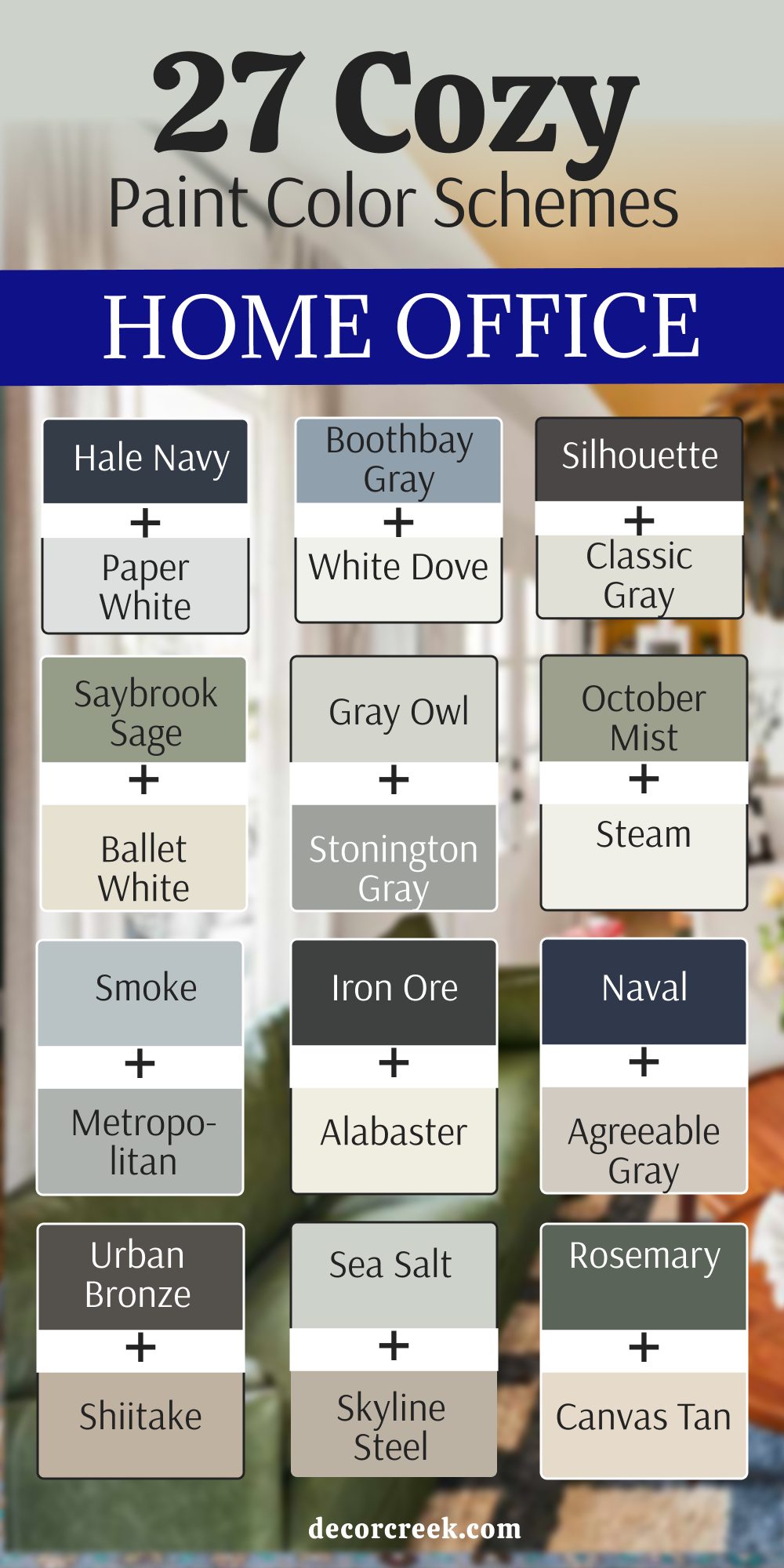
My Final Thoughts About 41 Cozy Home Wall Paint Color Ideas
Picking the perfect paint color is the absolute best way to transform your living space and make your home feel like your own special, private world. I have spent many years as a designer seeing firsthand how a simple change in wall color can completely shift the energy of a room and make a family feel significantly happier and more content in their house. You should always listen to your own intuition and trust what you personally like, picking the specific colors that resonate with your soul and make you want to stay inside and truly relax after a long day of work.
It is a very smart and practical idea to paint a small test patch on your wall and observe how the pigment shifts in appearance as the sun goes down and the shadows grow longer. Natural and artificial light change everything about how we perceive color, and you want to be absolutely sure that you love your walls both in the bright, energetic light of the morning and the soft, warm glow of the night. Your home should be a sanctuary where you feel completely safe, grounded, and very proud of your unique personal style for many years to come.
Whether you find comfort in light, airy whites that open up a space or prefer the bold, protective feeling of very dark forest greens, the right paint will help you reach your design goals more easily than any other renovation. Taking the time to select the right finish and hue ensures that every room tells a story that reflects who you are as a person.
I truly hope this detailed list helps you find the perfect shade for your next big project around the house, giving you a space that feels fresh, updated, and authentically yours.