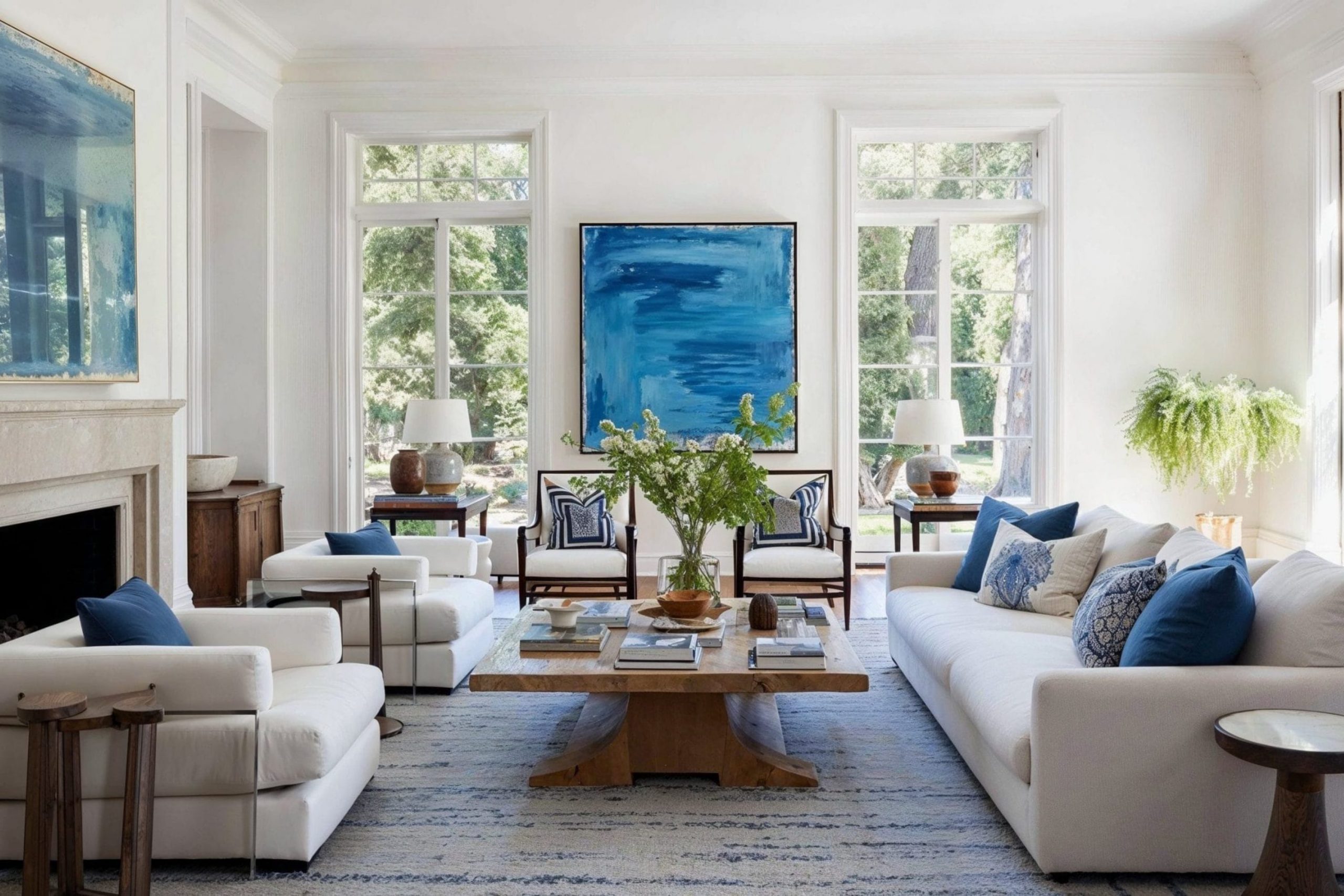
Blue is a favorite choice for many people when they start decorating their homes. I see it used in bedrooms and living rooms because it makes people feel happy and relaxed. Finding the right shade to match your favorite blue can feel like a big puzzle sometimes.
I want to help you pick the best colors so your house looks professional and organized. You do not need to be an expert to make your home look like a magazine cover.
I have picked these shades because they make blue pop and look its best. I have seen how the right pairing can change the entire mood of a family room or a kitchen.
These combinations will help you create a home that you are proud to show off to your friends.
Using my experience as a stager, I know exactly what buyers and homeowners love to see.
Why I Always Trust Sherwin-Williams and Benjamin Moore for Paint Colors That Go With Blue
I have worked as a home stager for a long time and I know which brands work for every project. Sherwin-Williams and Benjamin Moore are the two names I trust most for my clients and my own home. Their paint lasts a long time and the colors always look exactly like the little paper samples in the store.
When you mix their shades with blue, the results are always clean and never look messy or mismatched.
I use these brands because they help me get the job done right the first time without any mistakes. You want your walls to look good for years without fading or looking dull in the sunlight. These companies make it easy to find matching tones for any style of house you have, from old to new.
I always feel confident recommending these paints because the quality is the highest you can find. It makes the painting process much faster and easier for everyone involved.
How I Choose the Right Color to Pair With Blue in Any Room
Choosing the perfect partner for blue always begins with understanding its inherent character, as this color can range from a transparent morning mist to a deep midnight abyss. First, I determine the temperature of the chosen shade, as warm blues with violet undertones harmonize best with soft creamy whites or warm beiges, while cool blues with green or gray notes require the company of clean grays or dazzling whites to create a fresh look.
Next, I evaluate the desired level of contrast, knowing that combining dark navy with bright white will create an energetic, classic atmosphere, whereas pairing light blues with soft misty grays will transform a room into a peaceful sanctuary where the boundaries of the space visually expand.
It is equally important to consider natural light, as in north-facing rooms with their cool light, blue can seem too harsh if not balanced with warm neutrals, while sun-drenched southern spaces easily handle proximity to deep earthy colors.
To create a professionally balanced interior, I apply the rule of three, where blue acts as the main star, a neutral shade serves as the foundation for the walls, and a subtle accent color brings life to the space.
Finally, I always recommend using large paint samples and observing them throughout the day, as the same gray or beige can radically change its appearance depending on the movement of shadows and artificial light, turning from a warm sandy tone into a cool steel gray next to your blue details.
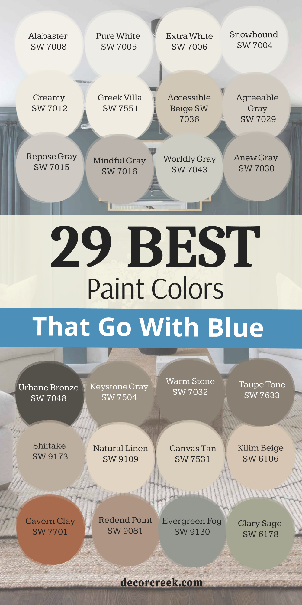
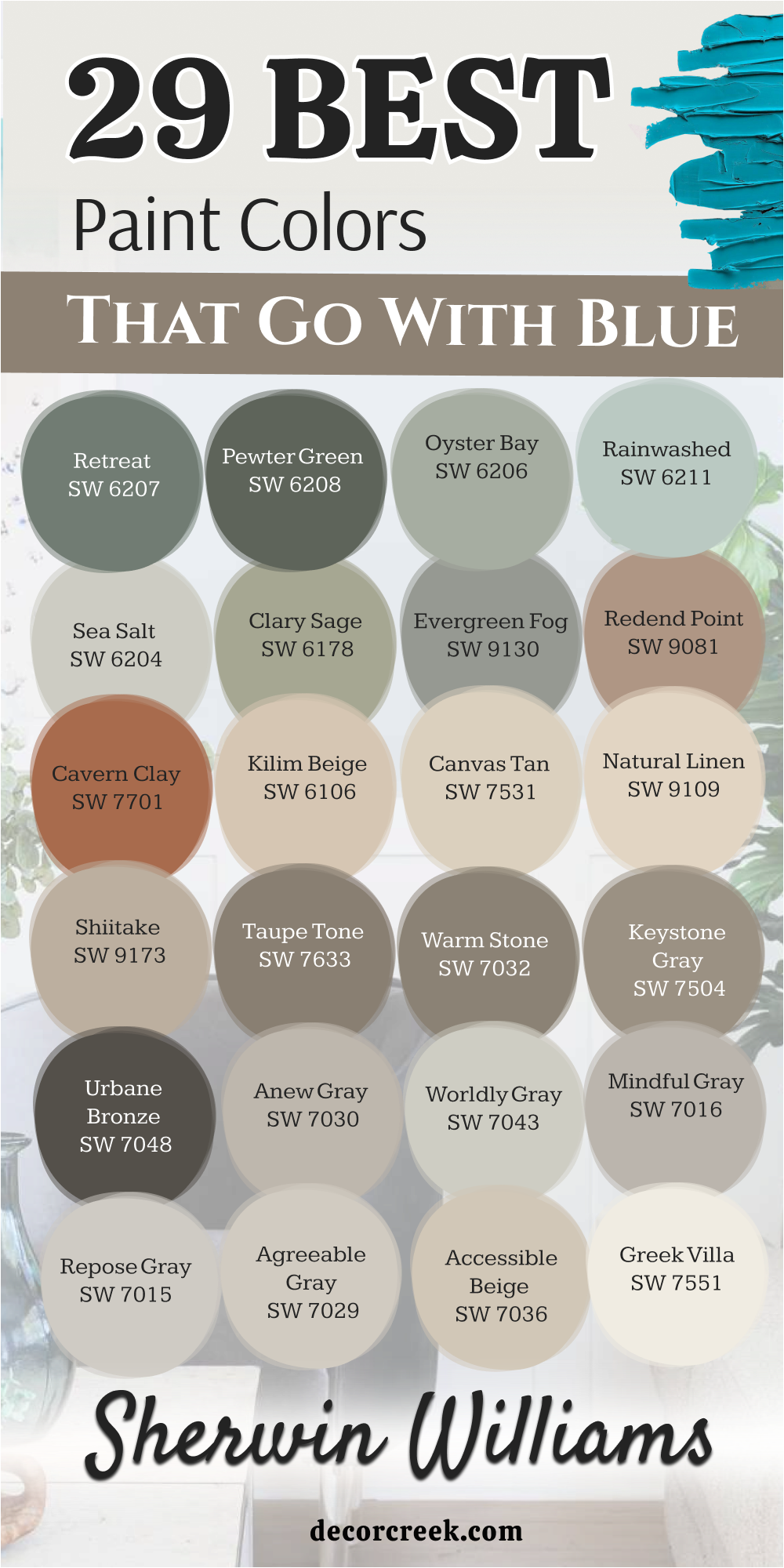
29 Paint Colors that go with Blue from Sherwin Williams
Alabaster SW 7008
Alabaster SW 7008 is a soft white that feels very cozy when you put it near a blue wall. It does not look too bright or like a cold hospital room because it has a little warmth. This shade has a tiny bit of yellow in it to keep things feeling friendly and very inviting.
I love using it on trim because it creates a nice line against a dark blue background in a room. It makes a dark blue room feel much lighter without taking away the beautiful color of the paint. You will notice how it helps the blue look more expensive and very fancy for your guests to see. Many families choose this for their main living areas because it is so easy to live with every day.
It works well if you have a lot of wooden furniture or light wood floors in your house. This is a safe choice if you are worried about picking a white that is too harsh or blue. It creates a beautiful balance that makes everyone feel welcome as soon as they walk through the front door.
Best used in: living rooms, kitchens, hallways, bedrooms, and farmhouse exteriors
Pairs well with: Iron Ore SW 7069, Agreeable Gray SW 7029, Natural Linen SW 9109, warm wood tones The key rule of this color for farmhouse style is to use it where you want natural light to feel kind, soft, and inviting throughout the day.
🎨 Check out the complete guide to this color right HERE 👈

Pure White SW 7005
Pure White SW 7005 is a very clean shade that looks great with every kind of blue paint. It has just a tiny drop of black in it to keep it from being too shiny or bright. I think it is the perfect middle ground for people who cannot decide on a specific white shade.
This color makes a navy blue wall look very sharp and professional for an office or a bedroom. It helps small rooms feel bigger because it reflects the light so well from the windows and lamps. You can use it on the ceiling to make the whole room feel taller and much more open.
It stays looking fresh even after a long time and does not turn yellow as it gets older. I often suggest this for kitchens where there are blue lower cabinets because it looks very modern and tidy. It provides a crisp look that makes your home feel brand new and very well cared for by the owner. This is one of my most used shades for staging houses for sale because everyone likes how it looks.
Best used in: kitchens, bathrooms, trim, ceilings, and modern living areas
Pairs well with: Black Magic SW 6991, March Wind SW 7668, Naval SW 6244, silver hardware The key rule of this color for farmhouse style is to use it as a crisp backdrop that allows your blue accents to be the main star.
🎨 Check out the complete guide to this color right HERE 👈

Extra White SW 7006
Extra White SW 7006 is very bright and has a cool feeling to it that many people enjoy. It works best with blues that have a little bit of gray or purple in them for a match. I use this when I want a room to feel very energetic and clean for a busy family.
It shows off the true pigment of your blue paint without changing how it looks in different lights. This is a great pick for a laundry room or a very sunny sunroom in the back of the house. It makes the air in the room feel light and airy like a cool breeze on a summer day.
You will see a big difference if you use this on your baseboards to frame your blue walls. It helps define the edges of the room very clearly and makes the painting look professional and straight. I like how it looks with modern furniture and metal decorations like silver or black steel frames. This is the brightest white I usually recommend for home interiors because it is so clean and pure.
Best used in: trim, doors, ceilings, sunrooms, and modern homes
Pairs well with: Charcoal Blue SW 2739, Lattice SW 7654, Gray Screen SW 7071, chrome finishes The key rule of this color for farmhouse style is to keep the room feeling very tidy and organized while highlighting architectural details.
🎨 Check out the complete guide to this color right HERE 👈

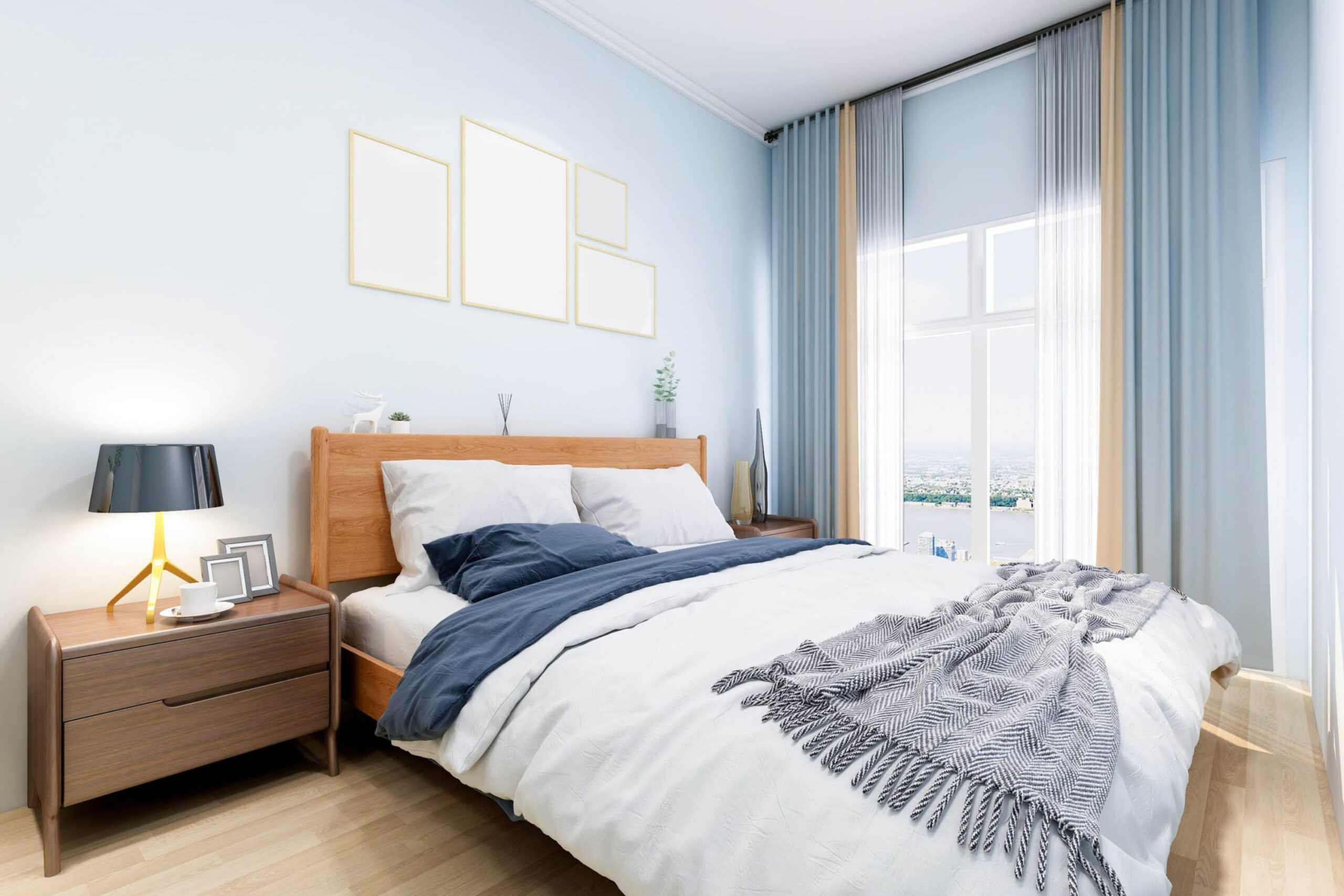
Snowbound SW 7004
Snowbound SW 7004 has a cool undertone that matches light blues perfectly for a very soft look. It can sometimes look a little bit pink or gray depending on the sun and the shadows. I find it works best in bedrooms where you want to feel rested and ready for a good sleep.
This shade is soft on the eyes and does not cause a glare when the lights are on. It looks wonderful when paired with blue bedding or blue curtains that have a little bit of texture. You can use it in a hallway to connect different blue rooms together for a smooth transition.
It gives the house a very smooth and flowing feeling that makes it easy to walk through. I like to use it on the walls when the floor is a light wood color or tan. It makes the whole environment feel very peaceful and quiet like a fresh coat of winter snow. This is a favorite for people who want a modern but soft look that feels very current and stylish.
Best used in: bedrooms, nurseries, hallways, and open floor plans
Pairs well with: Colonnade Gray SW 7641, Storm Cloud SW 6249, Breezy SW 7616, light oak The key rule of this color for farmhouse style is to create a soft environment that makes your blue decorations look very pretty.
🎨 Check out the complete guide to this color right HERE 👈

Creamy SW 7012
Creamy SW 7012 is a very warm and rich color that feels like butter in a sunny kitchen. It is the opposite of a cold white and feels very heavy and solid on the walls. I recommend this when you have a blue that feels a bit too chilly or cold for the room.
It adds a lot of warmth to the room and makes it feel lived-in and very cozy for guests. This shade is great for older homes with a lot of character and traditional wooden trim work. It looks beautiful under warm light bulbs in the evening when the family is all together.
You will love how it makes blue look more traditional and classic like an old country home. It is a very friendly color that makes people want to sit down and stay for a while. I use it often in dining rooms with blue wallpaper to create a very elegant look for meals. It makes the dinner table feel very inviting for the whole family during holidays and special parties.
Best used in: dining rooms, traditional living rooms, cozy bedrooms, and entryways
Pairs well with: Studio Mauve SW 0062, Van Dyke Brown SW 7041, Naval SW 6244, brass accents The key rule of this color for farmhouse style is to bring a sense of history and comfort to rooms that feature deep blue colors.
🎨 Check out the complete guide to this color right HERE 👈

Greek Villa SW 7551
Greek Villa SW 7551 is a popular white that feels like it came from a sunny vacation spot. It has a nice glow that looks amazing next to teal or aqua blues for a beach feel. I think it makes any room feel like it has more windows than it really does in real life.
This color is not too yellow and not too gray so it is very balanced for any wall. It works well for a whole house color if you want a light theme that goes with everything. I see it used a lot in coastal homes near the beach where the light is very bright.
It reminds me of white sand and clear blue water on a very hot and sunny day. You can paint your whole living room in this and use blue pillows for a great professional look. It is very easy to clean and hide small bits of dust that might get on the walls. This is a top choice for a bright and happy home that feels very welcoming to everyone.
Best used in: whole house interiors, coastal living rooms, kitchens, and exteriors
Pairs well with: In the Navy SW 9178, Urban Putty SW 7532, Illusive Green SW 9164, natural fibers The key rule of this color for farmhouse style is to capture the feeling of a bright morning sun to make your blue accents glow.
🎨 Check out the complete guide to this color right HERE 👈

Accessible Beige SW 7036
Accessible Beige SW 7036 is a very famous color because it goes with every blue you can find. It is a tan color that has a little bit of gray hidden inside to keep it looking modern. I love this with blue because it feels very earthy and natural like the colors of the ground.
It keeps a blue room from feeling too much like a baby boy’s room or a nursery. This shade adds a professional touch to your home design that makes it look very high-end. It is great for high-traffic areas like hallways where kids play and move things around a lot.
You won’t see fingerprints on this color as much as you do on white or light gray paint. It makes a great background for blue artwork on the walls or blue frames for your photos. I suggest this for anyone who wants a cozy and modern home that feels very sturdy and nice. It feels very solid and dependable as a base color for your entire house if you want.
Best used in: family rooms, hallways, mudrooms, and open kitchens
Pairs well with: Urban Bronze SW 7048, Cadet SW 9143, Sanderling SW 7513, dark wood The key rule of this color for farmhouse style is to ground the room and provide a sturdy backdrop for any shade of blue.
🎨 Check out the complete guide to this color right HERE 👈

Agreeable Gray SW 7029
Agreeable Gray SW 7029 is the most sold color for a very good reason because it is perfect. It is a perfect mix of gray and beige which designers call greige for a modern look. I find it looks stunning next to light blue or navy blue in a living room or office.
It changes its look depending on the time of day which is very fun to watch. In the morning it looks more gray and in the evening it looks warmer like a tan. It makes your blue furniture stand out and look very important and very stylish for your home.
This is the best choice if you are painting a house to sell it to a new family soon. It makes every room look clean and very well put together without being too much for people. I have used this in hundreds of homes and it never fails to look amazing for my clients. It is a true friend to any blue paint you choose to use in any room of the house.
Best used in: living rooms, bedrooms, kitchens, and large open spaces
Pairs well with: Incredible White SW 7028, Sea Salt SW 6204, Mega Greige SW 7031, black metal The key rule of this color for farmhouse style is to provide a flexible background that works with both warm and cool blue tones.
🎨 Check out the complete guide to this color right HERE 👈

Repose Gray SW 7015
Repose Gray SW 7015 is a slightly cooler gray that looks very chic and very professional on walls. It has a tiny bit of blue in its DNA which makes it match blue walls very easily. I like to use this in bathrooms to make them feel like a fancy spa for the owners.
It is a very sophisticated color that makes a home look expensive and very well designed for guests. This shade looks great with silver or nickel faucets and handles in the kitchen or the bath. It is light enough to keep things bright but dark enough to show contrast against white trim.
You will see it helps the blue in your rugs or pillows pop out and look very vibrant. It is a very steady color that does not change too much in different lights during the day. I think it is great for a modern office or a quiet study area for the children. It helps you focus and makes the room feel very organized and very tidy for your work.
Best used in: bathrooms, offices, bedrooms, and modern kitchens
Pairs well with: Eider White SW 7014, Dorian Gray SW 7017, Pavestone SW 7642, marble The key rule of this color for farmhouse style is to create a sleek and polished look that complements cool blue accents.
🎨 Check out the complete guide to this color right HERE 👈

Mindful Gray SW 7016
Mindful Gray SW 7016 is a medium gray that feels very strong and cozy for a large room. It is a bit darker than some other grays so it shows up well against white doors. I use this when I want a blue room to feel more like a library or a study.
It creates a very warm feeling even though it is a gray color for the most part. This shade is excellent for a feature wall or a cozy den for watching movies at night. It looks very handsome with dark blue leather chairs or couches in a professional office or room.
You can use it in a basement to make it feel less like a basement and more like a room. It hides small marks and scuffs very well which is good for families with pets or young kids. I love how it looks when you have white trim to frame it and make it pop. It is a very reliable color that makes a house feel like a home for a long time.
Best used in: dens, basements, master bedrooms, and accent walls
Pairs well with: Pearly White SW 7009, Homburg Gray SW 7622, Slate Tile SW 7624, stone textures The key rule of this color for farmhouse style is to add a sense of depth and weight to rooms with light blue elements.
🎨 Check out the complete guide to this color right HERE 👈

Worldly Gray SW 7043
Worldly Gray SW 7043 is a warm gray that feels very soft and kind on your living room walls. It is not as green as some other grays which makes it very easy to use for beginners. I think it looks best with blues that have a bit of a green tint for a match.
This color helps a room feel very balanced and not too lopsided when you add blue furniture. It is a great choice for a nursery or a child’s bedroom where you want things light. It makes the blue toys and blankets look very vibrant and fun for the kids to enjoy.
You can use this on all the walls in a house to make it feel unified and simple. It gives a very high-end look without being too flashy or loud for the neighborhood to see. I often recommend this for people who want a change from plain white or beige on walls. It adds just enough color to make the room feel decorated and finished for a professional look.
Best used in: nurseries, hallways, whole house painting, and bedrooms
Pairs well with: Shoji White SW 7042, Amazing Gray SW 7044, Lofty Grey SW 6225, light wood The key rule of this color for farmhouse style is to soften the look of the room while highlighting blue decor.
🎨 Check out the complete guide to this color right HERE 👈
Anew Gray SW 7030
Anew Gray SW 7030 is a bit darker and richer than the most common grays you see in stores. It has a lot of warmth that makes it feel very welcoming at night when the lamps are on. I like to pair this with a very dark navy blue for a dramatic look in a master bedroom.
It makes a big living room feel more intimate and comfortable for your family to gather in. This color is great if you have a lot of large windows that let in the bright afternoon sun. It handles the bright sunlight very well without washing out or looking too thin on the walls.
You will see that it makes white furniture look very bright and clean against the darker background. It is a very popular choice for modern farmhouse styles that use blue accents throughout the house. I love using it in an entryway to give guests a warm welcome as soon as they visit. It sets a very nice tone for the rest of the house and feels very high-end and expensive.
Best used in: entryways, large living rooms, dining areas, and exteriors
Pairs well with: Pure White SW 7005, Mega Greige SW 7031, Breezy SW 7616, dark accents The key rule of this color for farmhouse style is to provide a rich and warm base for your favorite blue pieces.
🎨 Check out the complete guide to this color right HERE 👈
Urbane Bronze SW 7048
Urbane Bronze SW 7048 is a very dark and moody color that is almost brown like a deep forest. It looks incredible when you put it next to a bright or deep blue for a bold look. I use this for kitchen islands or front doors to make a big statement to the neighbors.
It feels very sophisticated and grounded like an old house that has been there for a long time. This shade adds a lot of drama to a room in a good way that people really love. It makes gold or brass handles look like real jewelry on a wall or a cabinet door.
You can use it in a small bathroom to make it feel like a secret cave or a spa. It is a very bold choice that always gets a lot of compliments from anyone who visits. I think it is perfect for people who are not afraid of using dark colors in their homes. It brings a lot of personality to a house that needs some excitement and a new style.
Best used in: kitchen islands, front doors, accent walls, and small bathrooms
Pairs well with: Shoji White SW 7042, Modern Gray SW 7632, Sea Salt SW 6204, gold hardware The key rule of this color for farmhouse style is to create a strong and bold contrast that makes blue stand out.
🎨 Check out the complete guide to this color right HERE 👈

Keystone Gray SW 7504
Keystone Gray SW 7504 is a medium-toned earthy gray with a lot of brown mixed in for warmth. It reminds me of the stones you might find in a mountain stream on a hiking trip. I love this with blue because it feels like the sky meeting the earth in a natural way.
It is a very natural combination that feels very right and comfortable to our eyes at home. This color is great for a home office where you need to stay focused on your work. It does not distract you but still looks very stylish and trendy for your video calls.
You will find that it matches very well with leather chairs and wood desks or shelves. It is a very tough color that does not show much wear and tear or small marks. I often use it in mudrooms or laundry areas for a sturdy look that lasts a long time. It makes those working parts of the house look very beautiful and very well planned out.
Best used in: offices, mudrooms, laundry rooms, and exterior accents
Pairs well with: Greek Villa SW 7551, Kilim Beige SW 6106, In the Navy SW 9178, stone The key rule of this color for farmhouse style is to ground the blue elements of a room with a natural and stony feel.
🎨 Check out the complete guide to this color right HERE 👈
Warm Stone SW 7032
Warm Stone SW 7032 is a deep and cozy tan that feels very luxurious on your bedroom walls. It has a lot of depth that makes a room feel very expensive like a hotel. I think it looks amazing with light blue accents like pillows or rugs in a living room.
This shade is like a warm hug for your walls when you walk in after a long day. It works very well in a master bedroom for a high-end feel that helps you relax. You can use it with white trim to make the color really stand out and look sharp.
It makes the blue colors in the room feel much brighter and happier for your family. I like to use this color when the room has high ceilings that feel a bit too empty. It helps bring the ceiling down a bit to make the room feel less empty and more full. This is a great color for making a large house feel more like a home for everyone.
Best used in: master bedrooms, large family rooms, dining rooms, and libraries
Pairs well with: Alabaster SW 7008, Mortar SW 9584, Indigo Batik SW 7602, linen fabrics The key rule of this color for farmhouse style is to add a touch of luxury and warmth to rooms with blue tones.
🎨 Check out the complete guide to this color right HERE 👈

Taupe Tone SW 7633
Taupe Tone SW 7633 is a classic color that sits between gray and brown for a nice balance. It is very elegant and never goes out of fashion for home design or staging projects. I recommend this for a living room where you want to host guests and have parties.
It makes everyone look good and feels very polite and nice for a social setting at home. This shade works perfectly with blue because they are natural partners in the world of color. It looks especially good with medium blues that are not too dark or too light for the wall.
You can use it on your kitchen cabinets for a very unique look that people will remember. It hides cooking messes well and still looks very pretty and clean after a long day of work. I love how it feels in a room with a lot of green plants and natural light. It is a very flexible color that you will love for many years without wanting to change.
Best used in: living rooms, kitchen cabinets, guest rooms, and hallways
Pairs well with: Extra White SW 7006, Urban Putty SW 7532, Granite Peak SW 6250, greenery The key rule of this color for farmhouse style is to provide an elegant and steady background for your blue decorations.
🎨 Check out the complete guide to this color right HERE 👈
Shiitake SW 9173
Shiitake SW 9173 is a soft and creamy tan that looks like a mushroom you find in the woods. It is very gentle and does not fight with other colors in the room for your attention. I like to use it with soft blues to create a very light feel for a guest room.
This color is great for a guest bathroom or a small spare room that needs some life. It makes the space feel very clean and very carefully decorated by a professional designer. You will find it is very easy to match with different types of wood and floor colors.
It has a very natural vibe that makes people feel very relaxed as soon as they enter. I often use this when I want a room to feel very simple and tidy for my clients. It is a great choice for people who like a minimalist style that is not too cold. This shade keeps things light without being a plain white that might look a bit boring.
Best used in: guest bathrooms, small bedrooms, laundry rooms, and kitchens
Pairs well with: Greek Villa SW 7551, Foothills SW 7514, Aleutian SW 6241, wicker furniture The key rule of this color for farmhouse style is to keep the room feeling simple and light while using blue accents.
🎨 Check out the complete guide to this color right HERE 👈

Natural Linen SW 9109
Natural Linen SW 9109 is a beautiful off-white that looks like real fabric on your home walls. It is very warm and makes a room feel very soft and comfortable for the whole family. I love this with blue because it looks like a summer day at the beach with sand.
This color is perfect for a living room with big comfortable couches and blue pillows or rugs. It makes the room feel very sunny even when it is raining or dark outside during the day. You can use it on the walls and the trim for a very soft look that is easy.
It helps blue patterns in your furniture look very clear and pretty for everyone to see. I use this color a lot in beach houses or vacation rentals because people love the look. It makes people feel like they are on holiday as soon as they walk in the front door. This is a very happy and light color that makes any home feel much bigger and brighter.
Best used in: beach houses, living rooms, bedrooms, and sunny kitchens
Pairs well with: Alabaster SW 7008, Divine White SW 6105, Salty Dog SW 9177, jute rugs The key rule of this color for farmhouse style is to create a breezy and light feel that matches perfectly with blue.
🎨 Check out the complete guide to this color right HERE 👈

Canvas Tan SW 7531
Canvas Tan SW 7531 is a very light beige that is very easy to live with every day. It is a great alternative to white if you want a little more color on your walls. I think it looks best with navy blue or a very dark royal blue for a match.
The contrast between the light tan and the dark blue is very pretty and looks very professional. This color is very good for a home with many different rooms that need to match together. It works as a great bridge between a blue room and a green room in a hallway.
You will see that it makes your blue artwork look very professional and very well framed. It is a very quiet color that lets your furniture do the talking for the whole room. I like it because it never feels like it is too much or too loud for your eyes. It is a very polite color that makes your house feel very stable and very well designed.
Best used in: whole house interiors, hallways, bedrooms, and dining areas
Pairs well with: Pure White SW 7005, Wool Skein SW 6148, Naval SW 6244, black frames The key rule of this color for farmhouse style is to provide a quiet and stable background for all your blue decor.
🎨 Check out the complete guide to this color right HERE 👈

Kilim Beige SW 6106
Kilim Beige SW 6106 is a classic warm beige that has been popular for a very long time now. It has a golden feel to it that makes a room glow when the morning sun hits it. I recommend this with blue because the warm and cool mix is very nice to look at.
It makes a blue sofa look very cozy and makes you want to take a nap right away. This shade is very good at making a large room feel more filled up and less empty. It is a very traditional color that looks great with antique furniture or old wooden tables.
You can use it in a family room where everyone gathers to watch movies and play games. It makes the environment feel very safe and very friendly for kids and pets in the house. I love how it looks with dark wood floors and blue area rugs that have big patterns. It is a very solid choice that has stood the test of time for many home owners.
Best used in: family rooms, entryways, traditional homes, and basements
Pairs well with: Alabaster SW 7008, Latte SW 6108, Storm Cloud SW 6249, warm wood The key rule of this color for farmhouse style is to add a golden glow that makes blue colors feel extra cozy.
🎨 Check out the complete guide to this color right HERE 👈
Cavern Clay SW 7701
Cavern Clay SW 7701 is a very fun and earthy orange-brown color that looks like the desert. It looks absolutely stunning when you pair it with a deep blue color for a high contrast. I use this for people who want their home to feel very unique and cool for their guests.
It reminds me of the desert and the big blue sky above it on a very clear day. This is a great choice for an accent wall in a living room or a creative office. It adds a lot of energy and warmth to a room that might feel cold or a bit boring.
You will see that it makes blue cushions look very bright and exciting for the whole family. It is a very bold color that shows you have a lot of style and a good eye. I like it because it feels very natural and not like a fake plastic color on your walls. It brings a touch of the outdoors inside your house in a beautiful and very trendy way.
Best used in: accent walls, offices, dining rooms, and creative studios
Pairs well with: Origami White SW 7636, Moth Wing SW 9174, Distance SW 6243, terra cotta The key rule of this color for farmhouse style is to bring an earthy and energetic feel that makes blue pop.
🎨 Check out the complete guide to this color right HERE 👈

Redend Point SW 9081
Redend Point SW 9081 is a very soft pinkish-tan that is very trendy right now for home design. It is a very kind color that makes everyone feel good when they see it in a room. I love how it looks with a dusty blue or a very light sky blue for a match.
It creates a very romantic and soft feeling in a bedroom or a guest bathroom. This color is very good at making a room feel very modern and fresh for your friends. It is not a baby pink but a very grown-up and stylish shade for a fancy house.
You can use it on all four walls to create a very soft glow during the day. It makes white furniture look very soft and very clean against the pinkish walls. I often use this for people who want a home that feels very gentle and quiet. It is a very beautiful choice for a peaceful and happy home that everyone will love.
Best used in: bedrooms, bathrooms, sitting rooms, and creative spaces
Pairs well with: Kestrel White SW 7516, Foothills SW 7514, Languid Blue SW 6226, gold accents The key rule of this color for farmhouse style is to provide a gentle and modern glow that complements blue.
🎨 Check out the complete guide to this color right HERE 👈

Evergreen Fog SW 9130
Evergreen Fog SW 9130 is a beautiful green-gray that looks very natural like the trees. It is a very popular color because it feels like bringing a garden inside your house. I think it looks amazing with blues that have a bit of a green tint too for a match.
This color is very relaxing and helps you feel more connected to nature and the sky. It is a great choice for a kitchen or a mudroom where you see the yard outside. You will find that it makes blue flowers or plants look very vibrant and colorful.
It is a very sophisticated color that looks great in any light during the morning or night. I love how it looks with natural wood and black metal accents like door handles. It makes a house feel very modern but also very comfortable and real for your family. This is one of my favorite colors to use for a refreshing and new look.
Best used in: kitchens, mudrooms, living rooms, and exteriors
Pairs well with: Shoji White SW 7042, Urbane Bronze SW 7048, Silvermist SW 7621, natural wood The key rule of this color for farmhouse style is to connect the inside of your house with the blue sky outside.
🎨 Check out the complete guide to this color right HERE 👈

Clary Sage SW 6178
Clary Sage SW 6178 is a soft and herbal green that is very pretty for a wall. It looks wonderful with light blues and makes a room feel very spring-like and fresh. I recommend this for a bathroom where you want a very fresh feeling for your morning routine.
It reminds me of a garden in the morning when the dew is still on the leaves. This color is very light and does not make a room feel small or dark at all. You can use it with white trim to create a very clean and tidy look for your guests.
It helps blue towels or blue tiles look very bright and very clean in the bath. I love using this color in laundry rooms to make chores feel much better and more fun. It is a very cheerful color that always makes me smile when I see it in a home. This is a great pick for a home that needs a little bit of life and color.
Best used in: bathrooms, laundry rooms, bedrooms, and kitchens
Pairs well with: Dover White SW 6385, Sage SW 2860, Tradewind SW 6218, white marble The key rule of this color for farmhouse style is to create a fresh and cheerful feel that highlights blue accents.
🎨 Check out the complete guide to this color right HERE 👈

Sea Salt SW 6204
Sea Salt SW 6204 is a very famous color that is a mix of green, gray, and blue. It is very light and feels like a breath of fresh air in any room of the house. I use this color more than almost any other because it is so beautiful and easy.
It matches every kind of blue you can think of from light sky blue to dark navy. This color changes a lot during the day which makes it very interesting to look at. Sometimes it looks more green and sometimes it looks more blue in the sun.
It is perfect for a bedroom where you want to feel very rested and happy every night. You will love how it makes your whole house feel very light and airy for your family. It is a very popular choice for bathrooms and kitchens too because it looks so clean. This is a must-have color for anyone who loves a coastal or very clean look.
Best used in: bedrooms, bathrooms, kitchens, and whole house interiors
Pairs well with: Summit Gray SW 7669, Fleur de Sel SW 7666, Spare White SW 6203, white trim The key rule of this color for farmhouse style is to make the whole room feel light and airy like a beach day.
🎨 Check out the complete guide to this color right HERE 👈

Rainwashed SW 6211
Rainwashed SW 6211 is a slightly more colorful version of a watery blue-green on your walls. It looks very pretty in a small room to make it feel more important and nice. I like to use it with white furniture and light blue accents like pillows or rugs.
It makes a room feel very clean and very well taken care of by the owner. This color is great for a child’s room because it is fun but not too wild. You can use it in a breakfast nook to make mornings feel more energetic and happy.
It looks beautiful when the sun shines through the windows in the morning for your coffee. I love how it makes a house feel very fresh and very modern for the whole family. It is a very happy color that brings a lot of light into your life every day. This is a great choice for people who want a little more color on their walls.
Best used in: bedrooms, nurseries, breakfast nooks, and bathrooms
Pairs well with: Pure White SW 7005, Window Pane SW 6210, Grashopper SW 6733, light wood The key rule of this color for farmhouse style is to add a happy and colorful touch to any room with blue.
🎨 Check out the complete guide to this color right HERE 👈

Oyster Bay SW 6206
Oyster Bay SW 6206 is a medium green-gray that is very elegant and professional on walls. It has a bit more depth than Sea Salt and feels very sophisticated for a house. I think it looks amazing with dark blue accents and silver hardware on the doors.
This color is great for a dining room where you want a fancy look for guests. It makes a room feel very cool and very collected like a professional designed it. You will see that it helps blue patterns in your rugs look very sharp and clean.
It is a very steady color that looks good in both sun and shade during the day. I often use this color for a bedroom that needs a little more drama and style. It feels very high-end and like a professional designer picked it out for your home. This is a great choice for a house that wants to feel very stylish and very cool.
Best used in: dining rooms, bedrooms, offices, and entryways
Pairs well with: Sea Salt SW 6204, Spare White SW 6203, Naval SW 6244, silver accents The key rule of this color for farmhouse style is to provide a sophisticated and cool base for blue decor.
🎨 Check out the complete guide to this color right HERE 👈

Pewter Green SW 6208
Pewter Green SW 6208 is a dark and rich green that looks very classic and strong. It is a very strong color that makes a big impact in any room you choose. I love how it looks with a very light blue to create a big contrast.
This color is perfect for a study or a library where you want to sit. It feels very traditional and very important like a historic home in a big city. You can use it on a kitchen island to make it the center of the room.
It looks beautiful with gold handles and white marble countertops in a modern kitchen. I like to use this color for a front door to give a great first impression. It is a very bold and beautiful color that people will always remember when they visit. This is a great pick for someone who wants a very strong and handsome home style.
Best used in: libraries, kitchen islands, front doors, and accent walls
Pairs well with: Shoji White SW 7042, Silverstrand SW 7057, Sea Salt SW 6204, gold The key rule of this color for farmhouse style is to create a strong and classic look that highlights blue.
🎨 Check out the complete guide to this color right HERE 👈

Retreat SW 6207
Retreat SW 6207 is a dusty green-gray that feels very quiet and peaceful on your walls. It has a lot of gray in it which makes it match very well with blue accents. I think it is perfect for a master bedroom where you want to hide from the world.
This color is very relaxing and does not make a lot of noise in your house. It works well with light wood and white trim for a very clean look for guests. You can use it in a family room to create a very calm and happy place.
It makes blue patterns in your furniture look very soft and very pretty for everyone. I love how it looks when the lights are low in the evening for a movie. It is a very steady color that feels very solid and very safe for a family. This is a great pick for someone who wants a home that feels very quiet and nice.
Best used in: bedrooms, family rooms, guest rooms, and offices
Pairs well with: Pure White SW 7005, Sea Salt SW 6204, Rainwashed SW 6211, light oak The key rule of this color for farmhouse style is to create a quiet and peaceful place that matches blue.
🎨 Check out the complete guide to this color right HERE 👈

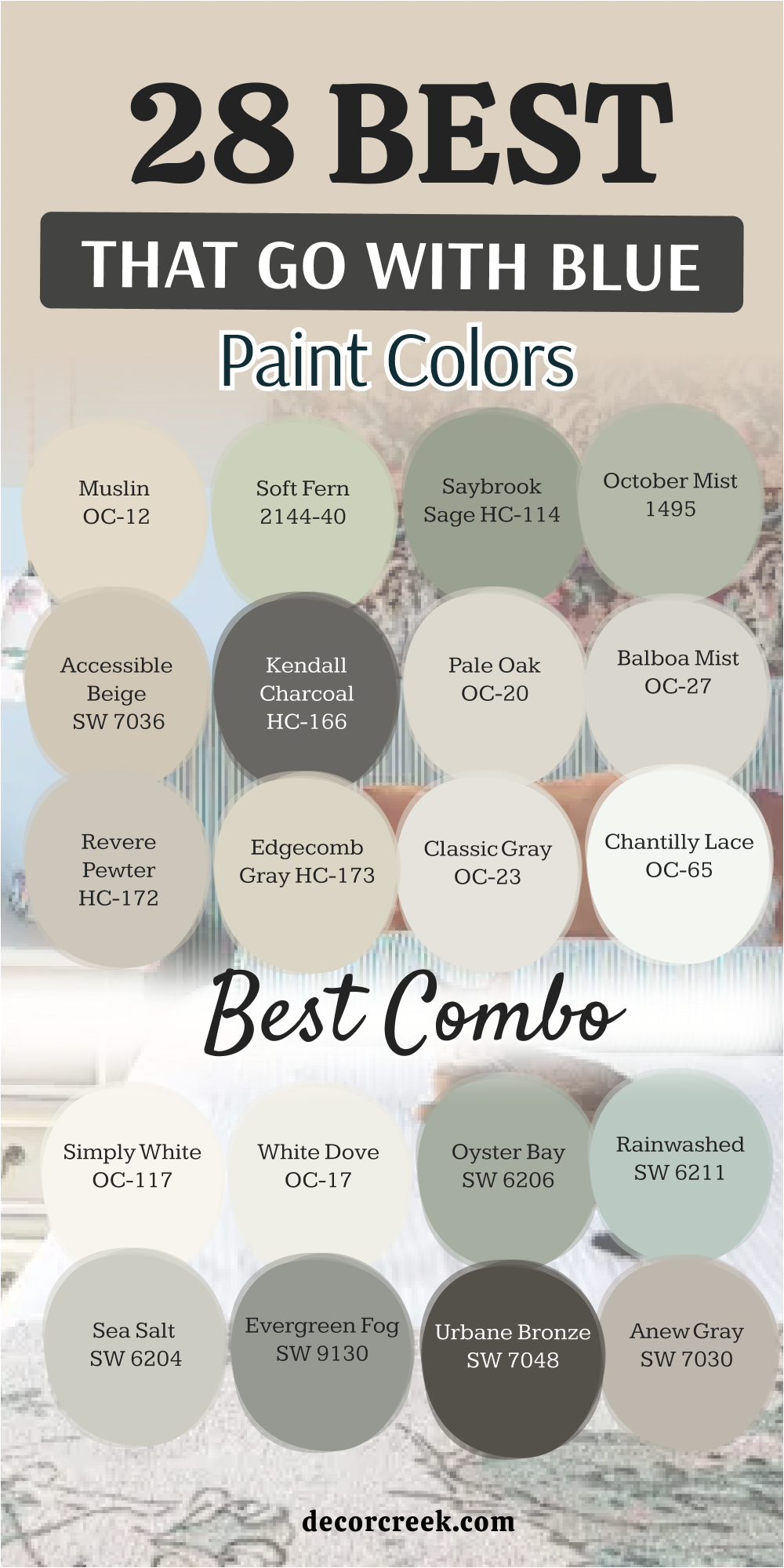
28 Paint Colors that go with Blue Best Combo
Alabaster SW 7008
Alabaster SW 7008 is a soft white that feels very cozy when you put it near a blue wall. It does not look too bright or like a cold hospital room because it has a little warmth. This shade has a tiny bit of yellow in it to keep things feeling friendly and very inviting.
I love using it on trim because it creates a nice line against a dark blue background in a room. It makes a dark blue room feel much lighter without taking away the beautiful color of the paint. You will notice how it helps the blue look more expensive and very fancy for your guests to see.
Many families choose this for their main living areas because it is so easy to live with every day. It works well if you have a lot of wooden furniture or light wood floors in your house.
Best used in: living rooms, kitchens, hallways, and farmhouse exteriors
Pairs well with: Iron Ore SW 7069, Agreeable Gray SW 7029, Natural Linen SW 9109, warm wood The key rule of this color for farmhouse style is to use it where you want natural light to feel kind, soft, and inviting.
🎨 Check out the complete guide to this color right HERE 👈
Pure White SW 7005
Pure White SW 7005 is a very clean shade that looks great with every kind of blue paint. It has just a tiny drop of black in it to keep it from being too shiny or bright. I think it is the perfect middle ground for people who cannot decide on a specific white shade.
This color makes a navy blue wall look very sharp and professional for an office or a bedroom. It helps small rooms feel bigger because it reflects the light so well from the windows and lamps. You can use it on the ceiling to make the whole room feel taller and much more open.
It stays looking fresh even after a long time and does not turn yellow as it gets older. I often suggest this for kitchens where there are blue lower cabinets because it looks very modern and tidy.
Best used in: kitchens, bathrooms, trim, ceilings, and modern living areas
Pairs well with: Black Magic SW 6991, March Wind SW 7668, Naval SW 6244, silver hardware The key rule of this color for farmhouse style is to use it as a crisp backdrop that allows your blue accents to be the main star.
🎨 Check out the complete guide to this color right HERE 👈
Snowbound SW 7004
Snowbound SW 7004 has a cool undertone that matches light blues perfectly for a very soft look. It can sometimes look a little bit pink or gray depending on the sun and the shadows in the room. I find it works best in bedrooms where you want to feel rested and ready for a good sleep.
This shade is soft on the eyes and does not cause a glare when the lights are on at night. It looks wonderful when paired with blue bedding or blue curtains that have a little bit of texture.
You can use it in a hallway to connect different blue rooms together for a smooth transition. It gives the house a very smooth and flowing feeling that makes it easy to walk through. I like to use it on the walls when the floor is a light wood color or tan.
Best used in: bedrooms, nurseries, hallways, and open floor plans
Pairs well with: Colonnade Gray SW 7641, Storm Cloud SW 6249, Breezy SW 7616, light oak The key rule of this color for farmhouse style is to create a soft environment that makes your blue decorations look very pretty.
🎨 Check out the complete guide to this color right HERE 👈
Creamy SW 7012
Creamy SW 7012 is a very warm and rich color that feels like butter in a sunny kitchen. It is the opposite of a cold white and feels very heavy and solid on the walls. I recommend this when you have a blue that feels a bit too chilly or cold for the room.
It adds a lot of warmth to the room and makes it feel lived-in and very cozy for guests. This shade is great for older homes with a lot of character and traditional wooden trim work. It looks beautiful under warm light bulbs in the evening when the family is all together.
You will love how it makes blue look more traditional and classic like an old country home. It is a very friendly color that makes people want to sit down and stay for a while.
Best used in: dining rooms, traditional living rooms, cozy bedrooms, and entryways
Pairs well with: Studio Mauve SW 0062, Van Dyke Brown SW 7041, Naval SW 6244, brass accents The key rule of this color for farmhouse style is to bring a sense of history and comfort to rooms that feature deep blue colors.
🎨 Check out the complete guide to this color right HERE 👈
Greek Villa SW 7551
Greek Villa SW 7551 is a popular white that feels like it came from a sunny vacation spot. It has a nice glow that looks amazing next to teal or aqua blues for a beach feel. I think it makes any room feel like it has more windows than it really does in real life.
This color is not too yellow and not too gray so it is very balanced for any wall. It works well for a whole house color if you want a light theme that goes with everything.
I see it used a lot in coastal homes near the beach where the light is very bright. It reminds me of white sand and clear blue water on a very hot and sunny day. You can paint your whole living room in this and use blue pillows for a great professional look.
Best used in: whole house interiors, coastal living rooms, kitchens, and exteriors
Pairs well with: In the Navy SW 9178, Urban Putty SW 7532, Illusive Green SW 9164, natural fibers The key rule of this color for farmhouse style is to capture the feeling of a bright morning sun to make your blue accents glow.
🎨 Check out the complete guide to this color right HERE 👈
Agreeable Gray SW 7029
Agreeable Gray SW 7029 is the most sold color for a very good reason because it is perfect. It is a perfect mix of gray and beige which designers call greige for a modern look. I find it looks stunning next to light blue or navy blue in a living room or office.
It changes its look depending on the time of day which is very fun to watch. In the morning it looks more gray and in the evening it looks warmer like a tan color. It makes your blue furniture stand out and look very important and very stylish for your home.
This is the best choice if you are painting a house to sell it to a new family soon. It makes every room look clean and very well put together without being too much for people.
Best used in: living rooms, bedrooms, kitchens, and large open spaces
Pairs well with: Incredible White SW 7028, Sea Salt SW 6204, Mega Greige SW 7031, black metal The key rule of this color for farmhouse style is to provide a flexible background that works with both warm and cool blue tones.
🎨 Check out the complete guide to this color right HERE 👈
Repose Gray SW 7015
Repose Gray SW 7015 is a slightly cooler gray that looks very chic and very professional on walls. It has a tiny bit of blue in its DNA which makes it match blue walls very easily. I like to use this in bathrooms to make them feel like a fancy spa for the owners.
It is a very sophisticated color that makes a home look expensive and very well designed for guests. This shade looks great with silver or nickel faucets and handles in the kitchen or the bath.
It is light enough to keep things bright but dark enough to show contrast against white trim. You will see it helps the blue in your rugs or pillows pop out and look very vibrant. It is a very steady color that does not change too much in different lights during the day.
Best used in: bathrooms, offices, bedrooms, and modern kitchens
Pairs well with: Eider White SW 7014, Dorian Gray SW 7017, Pavestone SW 7642, marble The key rule of this color for farmhouse style is to create a sleek and polished look that complements cool blue accents.
🎨 Check out the complete guide to this color right HERE 👈
Accessible Beige SW 7036
Accessible Beige SW 7036 is a very famous color because it goes with every blue you can find. It is a tan color that has a little bit of gray hidden inside to keep it looking modern. I love this with blue because it feels very earthy and natural like the colors of the ground.
It keeps a blue room from feeling too much like a baby boy’s room or a nursery. This shade adds a professional touch to your home design that makes it look very high-end. It is great for high-traffic areas like hallways where kids play and move things around a lot.
You won’t see fingerprints on this color as much as you do on white or light gray paint. It makes a great background for blue artwork on the walls or blue frames for your photos.
Best used in: family rooms, hallways, mudrooms, and open kitchens
Pairs well with: Urban Bronze SW 7048, Cadet SW 9143, Sanderling SW 7513, dark wood The key rule of this color for farmhouse style is to ground the room and provide a sturdy backdrop for any shade of blue.
🎨 Check out the complete guide to this color right HERE 👈
Anew Gray SW 7030
Anew Gray SW 7030 is a bit darker and richer than the most common grays you see in stores. It has a lot of warmth that makes it feel very welcoming at night when the lamps are on. I like to pair this with a very dark navy blue for a dramatic look in a master bedroom.
It makes a big living room feel more intimate and comfortable for your family to gather in. This color is great if you have a lot of large windows that let in the bright afternoon sun. It handles the bright sunlight very well without washing out or looking too thin on the walls.
You will see that it makes white furniture look very bright and clean against the darker background. It is a very popular choice for modern farmhouse styles that use blue accents throughout the house.
Best used in: entryways, large living rooms, dining areas, and exteriors
Pairs well with: Pure White SW 7005, Mega Greige SW 7031, Breezy SW 7616, dark accents The key rule of this color for farmhouse style is to provide a rich and warm base for your favorite blue pieces.
🎨 Check out the complete guide to this color right HERE 👈
Urbane Bronze SW 7048
Urbane Bronze SW 7048 is a very dark and moody color that is almost brown like a deep forest. It looks incredible when you put it next to a bright or deep blue for a bold look. I use this for kitchen islands or front doors to make a big statement to the neighbors.
It feels very sophisticated and grounded like an old house that has been there for a long time. This shade adds a lot of drama to a room in a good way that people really love. It makes gold or brass handles look like real jewelry on a wall or a cabinet door.
You can use it in a small bathroom to make it feel like a secret cave or a spa. It is a very bold choice that always gets a lot of compliments from anyone who visits.
Best used in: kitchen islands, front doors, accent walls, and small bathrooms
Pairs well with: Shoji White SW 7042, Modern Gray SW 7632, Sea Salt SW 6204, gold hardware The key rule of this color for farmhouse style is to create a strong and bold contrast that makes blue stand out.
🎨 Check out the complete guide to this color right HERE 👈
Evergreen Fog SW 9130
Evergreen Fog SW 9130 is a beautiful green-gray that looks very natural like the trees. It is a very popular color because it feels like bringing a garden inside your house. I think it looks amazing with blues that have a bit of a green tint too for a match.
This color is very relaxing and helps you feel more connected to nature and the sky. It is a great choice for a kitchen or a mudroom where you see the yard outside. You will find that it makes blue flowers or plants look very vibrant and colorful.
It is a very sophisticated color that looks great in any light during the morning or night. I love how it looks with natural wood and black metal accents like door handles.
Best used in: kitchens, mudrooms, living rooms, and exteriors
Pairs well with: Shoji White SW 7042, Urbane Bronze SW 7048, Silvermist SW 7621, natural wood The key rule of this color for farmhouse style is to connect the inside of your house with the blue sky outside.
🎨 Check out the complete guide to this color right HERE 👈
Sea Salt SW 6204
Sea Salt SW 6204 is a very famous color that is a mix of green, gray, and blue. It is very light and feels like a breath of fresh air in any room of the house. I use this color more than almost any other because it is so beautiful and easy to use.
It matches every kind of blue you can think of from light sky blue to dark navy. This color changes a lot during the day which makes it very interesting to look at. Sometimes it looks more green and sometimes it looks more blue in the sun.
It is perfect for a bedroom where you want to feel very rested and happy every night. You will love how it makes your whole house feel very light and airy for your family.
Best used in: bedrooms, bathrooms, kitchens, and whole house interiors
Pairs well with: Summit Gray SW 7669, Fleur de Sel SW 7666, Spare White SW 6203, white trim The key rule of this color for farmhouse style is to make the whole room feel light and airy like a beach day.
🎨 Check out the complete guide to this color right HERE 👈
Rainwashed SW 6211
Rainwashed SW 6211 is a slightly more colorful version of a watery blue-green on your walls. It looks very pretty in a small room to make it feel more important and nice. I like to use it with white furniture and light blue accents like pillows or rugs.
It makes a room feel very clean and very well taken care of by the owner. This color is great for a child’s room because it is fun but not too wild for a bedroom. You can use it in a breakfast nook to make mornings feel more energetic and happy.
It looks beautiful when the sun shines through the windows in the morning for your coffee. I love how it makes a house feel very fresh and very modern for the whole family.
Best used in: bedrooms, nurseries, breakfast nooks, and bathrooms
Pairs well with: Pure White SW 7005, Window Pane SW 6210, Grashopper SW 6733, light wood The key rule of this color for farmhouse style is to add a happy and colorful touch to any room with blue.
🎨 Check out the complete guide to this color right HERE 👈
Oyster Bay SW 6206
Oyster Bay SW 6206 is a medium green-gray that is very elegant and professional on walls. It has a bit more depth than Sea Salt and feels very sophisticated for a house. I think it looks amazing with dark blue accents and silver hardware on the doors.
This color is great for a dining room where you want a fancy look for guests. It makes a room feel very cool and very collected like a professional designed it. You will see that it helps blue patterns in your rugs look very sharp and clean.
It is a very steady color that looks good in both sun and shade during the day. I often use this color for a bedroom that needs a little more drama and style.
Best used in: dining rooms, bedrooms, offices, and entryways
Pairs well with: Naval SW 6244, Spare White SW 6203, Sea Salt SW 6204, silver accents The key rule of this color for farmhouse style is to provide a sophisticated and cool base for blue decor.
🎨 Check out the complete guide to this color right HERE 👈
White Dove OC-17
White Dove OC-17 is a very famous off-white from Benjamin Moore that people love. It is very soft and has a little bit of gray that makes it match blue easily. I love using this for the whole house because it is so warm and very clean on the walls.
It makes a blue wall look very professional and very well planned for the owner. This color is great for trim and doors because it is not too bright or too dark. You will see that it makes blue pillows and rugs look very vibrant and happy.
It is a very popular choice for professional stagers because it looks good in photos. I often recommend this for a living room with navy blue furniture for a match.
Best used in: whole house painting, trim, doors, and living rooms
Pairs well with: Hale Navy HC-154, Revere Pewter HC-172, Balboa Mist OC-27, warm wood The key rule of this color for farmhouse style is to provide a soft and clean background for blue accents.
🎨 Check out the complete guide to this color right HERE 👈

Simply White OC-117
Simply White OC-117 is a very bright and happy white that feels very fresh on walls. It has a tiny bit of warmth that keeps it from being too cold for a family. I love this for kitchens with blue cabinets because it looks so crisp and clean.
It makes the blue color really stand out and look its absolute best for the house. This color is great for rooms that do not get a lot of natural light during the day. It helps the room feel much brighter and much more welcoming for your guests to see.
You can use it on the ceiling to make the whole space feel very tall and open. I like how it looks with modern blue decorations and black metal frames on the wall.
Best used in: kitchens, bathrooms, ceilings, and modern living areas
Pairs well with: Van Deusen Blue HC-156, Gray Owl OC-52, Stonington Gray HC-170, black metal The key rule of this color for farmhouse style is to create a bright and happy place that lets blue shine.
🎨 Check out the complete guide to this color right HERE 👈

Chantilly Lace OC-65
Chantilly Lace OC-65 is the cleanest white you can find for your home project. It does not have any yellow or gray in it so it is very pure and bright on the walls. I love using this with very bright blue colors for a high contrast and style.
It makes the room feel very modern and very crisp for your friends and family. This color is great for trim and baseboards to create a very sharp line against blue. You will see that it shows the true color of your blue paint without any changes.
It is a very popular choice for modern homes with a lot of glass and metal. I often use this for a laundry room or a bathroom to make it feel very clean.
Best used in: trim, bathrooms, laundry rooms, and modern kitchens
Pairs well with: Hale Navy HC-154, Classic Gray OC-23, Edgecomb Gray HC-173, silver The key rule of this color for farmhouse style is to create a very clean and pure look that matches blue.
🎨 Check out the complete guide to this color right HERE 👈

Classic Gray OC-23
Classic Gray OC-23 is a very light and soft gray that is almost white on the walls. It is very elegant and looks very expensive in a living room or a bedroom. I love how it looks with a light blue to create a very soft and pretty look.
This color is great for a whole house color because it matches everything you have. It makes the room feel very bright and very well decorated by a professional stager.
You will find that it makes blue artwork on the walls look very important and nice. It is a very quiet color that does not fight with your blue furniture for attention. I often use this for a master bedroom to create a very soft and happy place.
Best used in: whole house interiors, bedrooms, living rooms, and hallways
Pairs well with: Hale Navy HC-154, Simply White OC-117, Revere Pewter HC-172, silver The key rule of this color for farmhouse style is to provide a soft and elegant base for blue decor.
🎨 Check out the complete guide to this color right HERE 👈

Edgecomb Gray HC-173
Edgecomb Gray HC-173 is a beautiful greige that feels very warm and very solid. It is a perfect mix of gray and beige that looks amazing with navy blue accents. I love using this in a family room where everyone gathers for dinner or movies.
It makes the room feel very cozy and very welcoming for the whole family to enjoy. This color is great for rooms with a lot of natural light from big windows. It helps the blue in your pillows and rugs look very rich and very deep for style.
You will see that it makes white trim look very bright and very clean against the walls. It is a very steady color that looks good at any time of the day or night.
Best used in: family rooms, entryways, kitchens, and whole house painting
Pairs well with: Hale Navy HC-154, White Dove OC-17, Revere Pewter HC-172, warm wood The key rule of this color for farmhouse style is to provide a warm and solid background for blue.
🎨 Check out the complete guide to this color right HERE 👈

Revere Pewter HC-172
Revere Pewter HC-172 is one of the most famous colors from Benjamin Moore. It is a medium greige that looks very professional and very high-end on walls. I love how it looks with any kind of blue from light sky blue to navy.
This color is very strong and makes a room feel very well built and solid. It is a great choice for a living room or an office where you want style. You can use it with white trim to create a very classic and pretty look for guests.
It hides scuffs and marks very well which is good for a busy family house. I like how it looks with dark wood floors and blue area rugs with big patterns.
Best used in: living rooms, offices, hallways, and kitchens
Pairs well with: Hale Navy HC-154, Simply White OC-117, Chelsea Gray HC-168, dark wood The key rule of this color for farmhouse style is to provide a professional and strong base for blue.
🎨 Check out the complete guide to this color right HERE 👈

Balboa Mist OC-27
Balboa Mist OC-27 is a soft and pretty gray that has a tiny bit of purple in it. It looks wonderful with blues that have a similar cool tone for a perfect match. I recommend this for a bedroom or a bathroom where you want a soft feel.
This color is very light and helps a small room feel much bigger than it is. It looks very beautiful with silver or nickel hardware on the doors and sinks. You will find that it makes blue towels or blue bedding look very vibrant and nice.
It is a very popular choice for modern homes that want a soft and happy look. I love using this for a nursery to create a very quiet and pretty place for a baby.
Best used in: bedrooms, bathrooms, nurseries, and small living areas
Pairs well with: Hale Navy HC-154, Chantilly Lace OC-65, Revere Pewter HC-172, silver The key rule of this color for farmhouse style is to provide a soft and pretty base for blue decor.
🎨 Check out the complete guide to this color right HERE 👈

Pale Oak OC-20
Pale Oak OC-20 is a very light and warm gray that feels like a natural wood color. It is very elegant and looks very expensive in any room of your house. I love how it looks with a medium blue to create a very balanced and pretty look.
This color is great for a living room where you want to feel relaxed and happy. It makes the room feel very bright and very well decorated for your guests. You will see that it makes blue patterns in your furniture look very sharp and clean.
It is a very quiet color that lets your blue decorations do all the talking for you. I often use this for a master bedroom to create a very soft and happy environment.
Best used in: living rooms, bedrooms, hallways, and whole house painting
Pairs well with: Hale Navy HC-154, White Dove OC-17, Edgecomb Gray HC-173, light wood The key rule of this color for farmhouse style is to provide a soft and natural base for blue decor.
🎨 Check out the complete guide to this color right HERE 👈

Kendall Charcoal HC-166
Kendall Charcoal HC-166 is a very dark and moody gray that looks like a rainy sky. It is a very strong color that makes a big impact in any room you choose. I love how it looks with a bright blue to create a very high contrast and style.
This color is perfect for an office or a library where you want to stay focused. It feels very professional and very important like a high-end designer home. You can use it on an accent wall to make your blue furniture really stand out.
It looks beautiful with gold or brass handles and white trim around the doors. I like to use this color for a dining room to create a very fancy look for guests.
Best used in: offices, dining rooms, accent walls, and libraries
Pairs well with: Simply White OC-117, Revere Pewter HC-172, Hale Navy HC-154, gold The key rule of this color for farmhouse style is to create a strong and moody look that highlights blue.
🎨 Check out the complete guide to this color right HERE 👈

Hale Navy HC-154
Hale Navy HC-154 is a very famous navy blue that looks very classic and strong. It is a very strong color that makes a big impact in any room of the house. I love how it looks with white trim to create a very sharp and pretty look.
This color is perfect for a bedroom or an office where you want a deep color. It feels very traditional and very important like a historic home in a big city. You can use it on your kitchen cabinets for a very unique and professional look.
It looks beautiful with gold or brass hardware and white marble on the counters. I like to use this color for a front door to give a great first impression to guests.
Best used in: accent walls, offices, kitchen cabinets, and front doors
Pairs well with: White Dove OC-17, Revere Pewter HC-172, Gray Owl OC-52, brass The key rule of this color for farmhouse style is to provide a strong and classic blue color for your home.
🎨 Check out the complete guide to this color right HERE 👈

October Mist 1495
October Mist 1495 is a soft and herbal green that looks very natural and pretty. It was a color of the year because it feels like bringing a garden inside your house. I think it looks amazing with light blues to create a very fresh and happy look.
This color is very relaxing and helps you feel more connected to nature and the sky. It is a great choice for a kitchen or a bedroom where you want a soft feeling. You will find that it makes blue pillows or blue flowers look very vibrant and nice.
It is a very sophisticated color that looks great in any light during the day. I love how it looks with natural wood and white trim in a family room.
Best used in: kitchens, bedrooms, living rooms, and offices
Pairs well with: Steam AF-15, Morning Dew 1493, Hale Navy HC-154, natural wood The key rule of this color for farmhouse style is to connect the inside of your house with a natural green feel.
🎨 Check out the complete guide to this color right HERE 👈

Saybrook Sage HC-114
Saybrook Sage HC-114 is a classic and pretty green that has a lot of gray in it. It looks wonderful with blue accents to create a very traditional and nice look. I recommend this for a living room or a dining room where you want style.
This color is very steady and helps a room feel very well built and solid. It looks very beautiful with white trim and dark wood floors for a match. You will find that it makes blue patterns in your rugs look very sharp and clean.
It is a very popular choice for traditional homes that want a soft and happy look. I love using this for a guest room to create a very quiet and pretty place for guests.
Best used in: living rooms, dining rooms, guest rooms, and exteriors
Pairs well with: White Dove OC-17, Revere Pewter HC-172, Hale Navy HC-154, dark wood The key rule of this color for farmhouse style is to provide a classic and steady base for blue decor.
🎨 Check out the complete guide to this color right HERE 👈

Soft Fern 2144-40
Soft Fern 2144-40 is a light and happy green that feels like a sunny day in the woods. It is very pretty and makes a room feel very fresh and very well decorated. I love how it looks with a light blue to create a very soft and spring-like look.
This color is great for a bathroom or a laundry room where you want style. It helps the room feel much brighter and much more welcoming for your whole family. You will see that it makes blue towels or blue tiles look very vibrant and clean.
It is a very quiet color that lets your blue decorations do all the talking for you. I often use this for a breakfast nook to create a very soft and happy environment.
Best used in: bathrooms, laundry rooms, breakfast nooks, and bedrooms
Pairs well with: Simply White OC-117, Gray Owl OC-52, Hale Navy HC-154, silver The key rule of this color for farmhouse style is to provide a fresh and light base for blue decor.
🎨 Check out the complete guide to this color right HERE 👈
Muslin OC-12
Muslin OC-12 is a warm and soft beige that looks like a piece of real fabric. It is very classic and looks very expensive in a living room or a dining room. I love how it looks with a deep blue to create a very high contrast and style.
This color is great for a whole house color because it matches all of your things. It makes the room feel very cozy and very well decorated for your friends and family. You will find that it makes blue furniture look very important and very well placed.
It is a very quiet color that does not fight with your blue pieces for your attention. I often use this for an entryway to give guests a warm and happy welcome to the home.
Best used in: entryways, living rooms, dining rooms, and hallways
Pairs well with: Hale Navy HC-154, White Dove OC-17, Revere Pewter HC-172, warm wood The key rule of this color for farmhouse style is to provide a warm and classic base for blue decor.
🎨 Check out the complete guide to this color right HERE 👈

14 Colors That Goes With Navy Blue
Extra White SW 7006
Extra White SW 7006 is a very bright and cool white that creates a sharp look when paired with navy blue. I love using this combination for a modern or coastal feel because it looks so crisp and energetic.
It makes the deep navy color stand out clearly and keeps the room feeling very fresh for your guests. This is a great choice for trim and ceilings when you have navy blue walls to create a professional finish.
You will see that it helps the navy look its truest and most vibrant under bright morning light. It is a very clean shade that makes your house feel brand new and very well maintained by the family. I often suggest this for laundry rooms or sunny kitchens where you want a very tidy and organized appearance.
Best used in: trim, ceilings, bathrooms, and modern kitchens
Pairs well with: Naval SW 6244, Charcoal Blue SW 2739, silver hardware, black accents The key rule of this color for farmhouse style is to provide a very clean and bright contrast that highlights navy blue.
🎨 Check out the complete guide to this color right HERE 👈
Snowbound SW 7004
Snowbound SW 7004 is a soft white with a cool undertone that matches navy blue for a very peaceful look. It is a bit gentler than a bright white and works perfectly in bedrooms where you want to relax.
I find that it bridges the gap between dark blue and light gray elements in a room very smoothly. This color makes a navy blue accent wall feel sophisticated without being too harsh on the eyes during the day.
You can use it in a nursery or a guest room to create a quiet and very happy environment. It stays looking fresh and clean while providing a slightly softer transition than a pure white paint. I like to use it on the walls when you have navy blue bedding or curtains for a high-end feel.
Best used in: bedrooms, nurseries, hallways, and soft living areas
Pairs well with: Gale Force SW 7605, Storm Cloud SW 6249, light oak, silver The key rule of this color for farmhouse style is to create a soft and cool environment that lets navy blue feel very calm.
🎨 Check out the complete guide to this color right HERE 👈
Greek Villa SW 7551
Greek Villa SW 7551 is a sunny and warm white that feels very inviting next to a deep navy blue. It has a tiny bit of a glow that makes a navy room feel much less cold and more like a home.
I think it looks beautiful in a living room where you have navy blue sofas and a lot of natural light. This color makes the navy feel very rich and classic like a traditional seaside house or a cottage. It is a very balanced shade that does not look too yellow but provides a nice warmth for the family.
You will see that it makes navy blue decorations look very friendly and very approachable for your guests. I often recommend this for whole-house painting because it is so easy to live with every single day.
Best used in: living rooms, entryways, kitchens, and whole house interiors
Pairs well with: In the Navy SW 9178, Urban Putty SW 7532, natural wood, brass accents The key rule of this color for farmhouse style is to add a warm and sunny glow to rooms with navy blue elements.
🎨 Check out the complete guide to this color right HERE 👈
Worldly Gray SW 7043
Worldly Gray SW 7043 is a soft and warm gray that provides a very elegant backdrop for navy blue. It is a very popular greige because it stays neutral and does not fight with other colors in the room.
I love how it makes navy blue furniture look very grounded and very well placed in a modern living area. This shade adds a touch of sophistication to a house and makes it look like a designer planned it.
It works perfectly in hallways that lead into navy blue rooms to create a smooth and professional flow. You will notice that it hides small scuffs and dust well which is great for a busy family home. It is a very steady color that feels very solid and very safe for anyone starting a project.
Best used in: hallways, living rooms, bedrooms, and open floor plans
Pairs well with: Naval SW 6244, Shoji White SW 7042, Lofty Grey SW 6225, dark wood The key rule of this color for farmhouse style is to provide a soft and steady foundation for navy blue decor.
🎨 Check out the complete guide to this color right HERE 👈
Mindful Gray SW 7016
Mindful Gray SW 7016 is a medium gray that feels very strong and professional when paired with navy. It has enough depth to stand up to a dark blue color without getting lost on the walls of a large room.
I recommend this for a home office or a den where you want a very focused and organized environment. It creates a very handsome look that feels very expensive and very well designed for the owner.
This color works beautifully with white trim to frame navy blue accents like rugs or artwork. You will find that it brings a lot of character to a room and makes the navy look very deep and rich. It is a very reliable shade that looks good in both sunny and shady parts of the house.
Best used in: offices, dens, master bedrooms, and dining rooms
Pairs well with: Naval SW 6244, Pearly White SW 7009, Slate Tile SW 7624, stone textures The key rule of this color for farmhouse style is to add a sense of weight and depth to rooms with navy blue.
🎨 Check out the complete guide to this color right HERE 👈
Natural Linen SW 9109
Natural Linen SW 9109 is a warm and sandy off-white that looks like a coastal vacation next to navy blue. It reminds me of the beach and the ocean which is a combination that everyone loves to see.
I love using this in a breakfast nook or a sunny kitchen to create a very happy and light feel. It makes navy blue cabinets or islands look very traditional and very well cared for by the family.
This color adds a lot of warmth to a space and makes it feel very comfortable for sitting and talking. You can use it to make a house feel much bigger and brighter while keeping a very cozy atmosphere. It is a very friendly shade that makes navy blue feel less formal and more relaxed for every day.
Best used in: kitchens, breakfast nooks, living rooms, and beach houses
Pairs well with: Salty Dog SW 9177, Alabaster SW 7008, jute rugs, natural wood The key rule of this color for farmhouse style is to create a breezy and warm feel that pairs naturally with navy.
🎨 Check out the complete guide to this color right HERE 👈
Oyster Bay SW 6206
Oyster Bay SW 6206 is a sophisticated green-gray that offers a unique and cool pairing for navy blue. It feels very designer and high-end because the mix of green and blue tones is very interesting to the eye.
I think it looks amazing in a dining room where you want to impress your guests with a stylish palette. This color provides a very calm and cool environment that makes navy blue look extra rich and deep.
It works well with silver hardware and white trim to create a very polished and professional appearance. You will notice that it helps navy blue patterns in your furniture or rugs look very sharp and clean. It is a great choice for someone who wants a home that feels very current and very well designed.
Best used in: dining rooms, bedrooms, entryways, and offices
Pairs well with: Naval SW 6244, Spare White SW 6203, Sea Salt SW 6204, silver accents The key rule of this color for farmhouse style is to provide a cool and sophisticated base for navy blue decor.
🎨 Check out the complete guide to this color right HERE 👈
Chantilly Lace OC-65
Chantilly Lace OC-65 is the purest white from Benjamin Moore and provides the sharpest contrast to navy blue. It has no hidden undertones so it looks very clean and very bright in any room of the house.
I love this for a modern bathroom or a kitchen where you want everything to look very tidy and brand new. It makes a navy blue vanity or cabinet stand out with a lot of energy and professional style.
This color is perfect for trim and baseboards because it creates a very straight and clean line for the eyes. You will see the true depth of your navy blue paint because this white does not change how it looks. It is a favorite for designers who want a very crisp and high-end finish for their clients.
Best used in: trim, bathrooms, kitchens, and modern living areas
Pairs well with: Hale Navy HC-154, Classic Gray OC-23, Edgecomb Gray HC-173, chrome The key rule of this color for farmhouse style is to create a very clean and pure look that makes navy blue pop.
🎨 Check out the complete guide to this color right HERE 👈
Decorator’s White OC-149
Decorator’s White OC-149 is a soft white with a tiny hint of gray that looks very professional with navy blue. It is a very popular choice for art galleries and designer homes because it is so balanced and clean.
I recommend this for a living room where you have navy blue artwork or a lot of blue decorations. It provides a very quiet and steady background that lets your navy blue pieces do all the talking.
This color makes the whole house feel very bright without being too shiny or harsh for the family. You will notice that it matches very well with silver or nickel hardware in the kitchen and the bath. It is a very smart choice for someone who wants a high-end look that is very easy to live with every day.
Best used in: living rooms, hallways, bathrooms, and galleries
Pairs well with: Hale Navy HC-154, Stonington Gray HC-170, Coventry Gray HC-169, silver The key rule of this color for farmhouse style is to provide a quiet and professional backdrop for navy blue accents.
🎨 Check out the complete guide to this color right HERE 👈
Balboa Mist OC-27
Balboa Mist OC-27 is a warm and pretty gray that feels very soft and welcoming near navy blue. It has a slight mushroom tone that adds a touch of warmth to a cool navy blue color scheme.
I like to use this in a master bedroom to create a very cozy and high-end retreat for the owners. It makes navy blue bedding and pillows look very rich and very well coordinated for the room. This color is great for making a home feel very comfortable and very inviting for your family and guests.
You will love how it works with warm wood floors and navy blue area rugs for a finished look. It is a very popular choice for modern farmhouse designs because it feels both fresh and very cozy at the same time.
Best used in: bedrooms, living rooms, entryways, and master suites
Pairs well with: Hale Navy HC-154, Chantilly Lace OC-65, Revere Pewter HC-172, warm wood The key rule of this color for farmhouse style is to provide a warm and modern base for navy blue decor.
🎨 Check out the complete guide to this color right HERE 👈
Collingwood OC-28
Collingwood OC-28 is a light and airy greige that offers a very steady and balanced look with navy blue. It is a bit cooler than some other tans which makes it a natural partner for a deep navy blue paint.
I think it is perfect for open floor plans where you want a color that flows easily from room to room. This color makes a navy blue accent wall look very professional and very well thought out for the house.
It helps the room feel very bright while providing a soft contrast to the dark blue elements you choose. You will notice that it looks very clean against white trim and makes your navy blue furniture pop. It is a very flexible shade that you will love for many years without wanting to change the style.
Best used in: open floor plans, living rooms, bedrooms, and kitchens
Pairs well with: Hale Navy HC-154, White Dove OC-17, Gray Owl OC-52, black metal The key rule of this color for farmhouse style is to provide a steady and balanced foundation for navy blue.
🎨 Check out the complete guide to this color right HERE 👈

Revere Pewter HC-172
Revere Pewter HC-172 is a classic medium greige that is famous for looking good with every color, especially navy blue. It provides a strong and professional presence on the walls that feels very high-end and expensive.
I love how it makes navy blue cabinets or furniture look very grounded and very traditional for a house. This color is excellent for living rooms and kitchens where you want a lot of style and a solid feel.
It handles different types of light very well and always keeps its handsome appearance for the owners. You will see that it creates a very cohesive look when used throughout a house with navy blue accents. It is a very reliable choice that home stagers use to make every room look its absolute best for guests.
Best used in: living rooms, kitchens, hallways, and offices
Pairs well with: Hale Navy HC-154, Simply White OC-117, Chelsea Gray HC-168, dark wood The key rule of this color for farmhouse style is to provide a professional and strong base for navy blue.
🎨 Check out the complete guide to this color right HERE 👈
October Mist 1495
October Mist 1495 is a soft and herbal green that feels like bringing a touch of nature inside to meet navy blue. It is a very relaxing color that reminds me of a garden or a quiet forest under a big blue sky.
I recommend this for a kitchen or a bedroom where you want a very fresh and happy atmosphere for the family. It makes navy blue accents look very vibrant and very natural in a modern home design.
This color adds a lot of personality to a room and makes it feel very unique and very well cared for. You will find that it works beautifully with natural wood furniture and white trim for a soft look. It is a very sophisticated shade that gives the house a very refreshing and new feeling every day.
Best used in: kitchens, bedrooms, living rooms, and creative spaces
Pairs well with: Hale Navy HC-154, Steam AF-15, Morning Dew 1493, natural wood The key rule of this color for farmhouse style is to connect the inside of your house with a natural green feel that complements navy blue.
🎨 Check out the complete guide to this color right HERE 👈
Gloucester Sage HC-100
Gloucester Sage HC-100 is a dark and rich green-gray that looks absolutely stunning with navy blue. It creates a very strong and professional look that is very high-end for a home library or an office.
I love using this for people who want a bold and moody space that still feels very classic and tidy. It makes the navy blue look very deep and very well put together for your guests to admire.
This color is great for an accent wall or a built-in shelf to add a lot of drama and style to the house. You will see that it makes navy blue patterns look very sharp and very clean in any light. It is a very steady color that always looks very expensive and very well designed for the owner.
Best used in: offices, libraries, accent walls, and dining rooms
Pairs well with: Hale Navy HC-154, Revere Pewter HC-172, White Dove OC-17, dark wood The key rule of this color for farmhouse style is to provide a strong and sophisticated base for navy blue.
🎨 Check out the complete guide to this color right HERE 👈
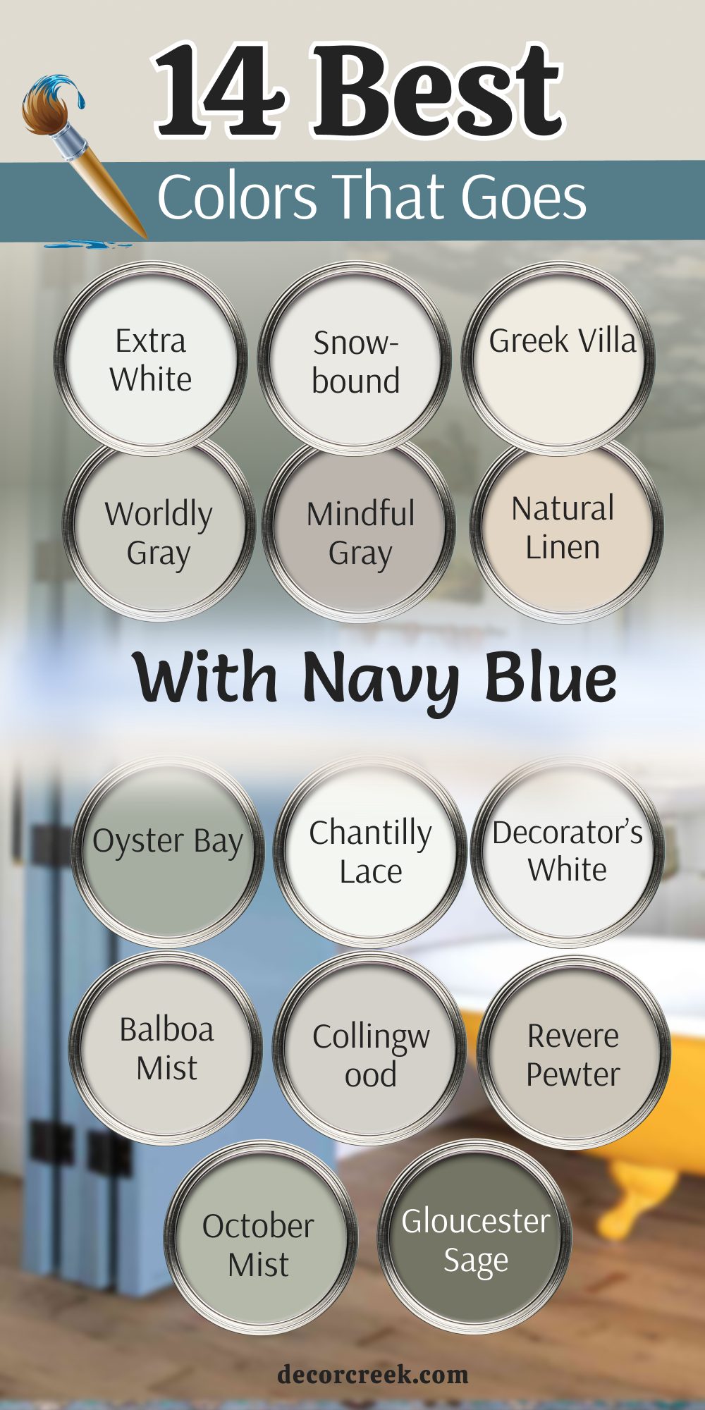
12 Colors That Go With Blue Cabinets
High Reflective White SW 7757
High Reflective White SW 7757 is the brightest white from Sherwin-Williams for your project. It looks absolutely stunning with blue cabinets because it is so pure and clean. I love using this for a very crisp and modern look in any kitchen you have.
It makes the blue cabinets look very sharp and very well defined for the home. This color is great for walls and trim in a kitchen with blue cabinets for style. It helps the whole room feel very bright and very well organized for the family.
You will find that it makes blue cabinets feel very fresh and very happy every day. It is a very popular choice for a clean and simple kitchen design for everyone. This is a great pick for a kitchen that wants to feel very bright and brand new.
Best used in: kitchens, bathrooms, trim, and modern living areas
Pairs well with: Naval SW 6244, Gray Screen SW 7071, silver hardware, marble The key rule of this color for farmhouse style is to create a very clean and bright look with blue cabinets.
🎨 Check out the complete guide to this color right HERE 👈
Shoji White SW 7042
Shoji White SW 7042 is a soft and warm white that looks great with blue cabinets. It adds a little bit of a glow to a kitchen that feels very nice and welcoming. I like to use this for a more traditional or coastal look in your home kitchen.
It makes the blue cabinets look very rich and very expensive for your guests to see. This color is great for a large kitchen with a lot of natural light from windows. It helps the whole room feel very bright and very welcoming for the whole family.
You will see that it makes blue cabinets feel a little bit more friendly and nice. It is a very popular choice for a whole kitchen color that matches blue well. This is a great pick for a kitchen that wants to feel very warm and happy.
Best used in: kitchens, whole house interiors, living rooms, and exteriors
Pairs well with: Naval SW 6244, Urbane Bronze SW 7048, Worldly Gray SW 7043, warm wood The key rule of this color for farmhouse style is to add a warm and friendly glow to kitchens with blue cabinets.
🎨 Check out the complete guide to this color right HERE 👈

Dover White SW 6385
Dover White SW 6385 is a classic and warm white that has been a favorite for a long time. It looks wonderful with blue cabinets because the warm and cool mix is very nice. I recommend this for a kitchen where you want a very traditional and pretty look.
It makes the blue cabinets look very cozy and makes the kitchen feel very lived-in. This color is very good at making a large kitchen feel more filled up and solid. It is a very traditional color that looks great with wooden floors and blue paint.
You can use it on the walls to create a very safe and friendly place for family. It makes the environment feel very warm and very welcoming for kids and pets too. I love how it looks with dark wood accents and blue cabinets in a farmhouse style. It is a very solid choice that has stood the test of time for many homes.
Best used in: kitchens, dining rooms, traditional homes, and entryways
Pairs well with: Naval SW 6244, Clary Sage SW 6178, Accessible Beige SW 7036, warm wood The key rule of this color for farmhouse style is to add a warm and classic feel to kitchens with blue cabinets.
🎨 Check out the complete guide to this color right HERE 👈
Drift of Mist SW 9166
Drift of Mist SW 9166 is a very light and soft gray that looks great with blue cabinets. It is a very professional combination that feels very modern and very chic for style. I love using this for a kitchen where you want a very clean and tidy look.
It makes the blue cabinets look very sharp and very well put together for the owner. This color is great for a room that has a lot of natural light from big windows. It helps the blue cabinets feel a bit more grounded and solid for the house.
You can use it on the walls with white trim for a very professional and nice look. It is a very reliable color that always looks very expensive and very high-end for guests. This is a great choice for a kitchen that wants to feel very stylish and very cool.
Best used in: kitchens, bedrooms, living rooms, and hallways
Pairs well with: Naval SW 6244, Pure White SW 7005, Repose Gray SW 7015, silver The key rule of this color for farmhouse style is to provide a clean and professional base for blue cabinets.
🎨 Check out the complete guide to this color right HERE 👈

Gossamer Veil SW 9165
Gossamer Veil SW 9165 is a soft and pretty greige that looks amazing with blue cabinets. It creates a very warm and inviting feeling even with a dark blue color on cabinets. I recommend this for a kitchen where you want to spend a lot of time with family.
It makes the blue cabinets look very handsome and very traditional for the house. This color is great for a room where you want to feel very comfortable and happy. It helps the blue cabinets feel a little bit more relaxed and nice for everyone.
You will love how it looks with white trim and dark wood floors in the kitchen. It is a very solid color that makes a house feel very safe and very friendly for guests. This is a great pick for a kitchen that needs a little more warmth and style.
Best used in: kitchens, family rooms, bedrooms, and entryways
Pairs well with: Naval SW 6244, Alabaster SW 7008, Agreeable Gray SW 7029, dark wood The key rule of this color for farmhouse style is to add a sense of warmth and comfort to kitchens with blue cabinets.
🎨 Check out the complete guide to this color right HERE 👈
Modern Gray SW 7632
Modern Gray SW 7632 is a medium gray that feels very strong and cozy with blue cabinets. It is a bit darker than some other grays so it shows up well on kitchen walls. I use this when I want a kitchen with blue cabinets to feel more like a dining room.
It creates a very warm feeling even though it is a gray color for the most part. This shade is excellent for a kitchen that is the center of the home for everyone. It looks very handsome with blue cabinets and silver or gold hardware on the doors.
You can use it to make the kitchen feel less like a work room and more like a living room. It hides small marks and scuffs very well which is good for a busy kitchen with kids. I love how it looks when you have white trim to frame the blue cabinets and walls. It is a very reliable color that makes a kitchen feel like a home.
Best used in: kitchens, dining rooms, family rooms, and hallways
Pairs well with: Naval SW 6244, Eider White SW 7014, Urbane Bronze SW 7048, silver The key rule of this color for farmhouse style is to provide a strong and cozy base for blue cabinets.
🎨 Check out the complete guide to this color right HERE 👈
Cloud White OC-130
Cloud White OC-130 is a soft and pretty off-white from Benjamin Moore for your kitchen. It looks absolutely stunning with blue cabinets because it is so warm and gentle. I love using this for a very classic and pretty look in any kitchen you have.
It makes the blue cabinets look very sharp and very well defined for the home. This color is great for walls and trim in a kitchen with blue cabinets for style. It helps the whole room feel very bright and very well organized for the family.
You will find that it makes blue cabinets feel very fresh and very happy every day. It is a very popular choice for a clean and simple kitchen design for everyone. This is a great pick for a kitchen that wants to feel very bright and very soft.
Best used in: kitchens, bathrooms, trim, and living rooms
Pairs well with: Hale Navy HC-154, Gray Owl OC-52, Simply White OC-117, warm wood The key rule of this color for farmhouse style is to create a soft and pretty look with blue cabinets.
🎨 Check out the complete guide to this color right HERE 👈

Swiss Coffee OC-45
Swiss Coffee OC-45 is a very famous and warm white that looks great with blue cabinets. It adds a little bit of a glow to a kitchen that feels very nice and welcoming. I like to use this for a more traditional or classic look in your home kitchen.
It makes the blue cabinets look very rich and very expensive for your guests to see. This color is great for a large kitchen with a lot of natural light from big windows. It helps the whole room feel very bright and very welcoming for the whole family.
You will see that it makes blue cabinets feel a little bit more friendly and nice. It is a very popular choice for a whole kitchen color that matches blue well. This is a great pick for a kitchen that wants to feel very warm and happy for guests.
Best used in: kitchens, living rooms, bedrooms, and whole house painting
Pairs well with: Hale Navy HC-154, Revere Pewter HC-172, White Dove OC-17, warm wood The key rule of this color for farmhouse style is to add a warm and classic glow to kitchens with blue cabinets.
🎨 Check out the complete guide to this color right HERE 👈

Gray Owl OC-52
Gray Owl OC-52 is a soft and cool gray that looks amazing with blue cabinets. It is a very professional combination that feels very modern and very chic for style. I love using this for a kitchen where you want a very clean and tidy look.
It makes the blue cabinets look very sharp and very well put together for the owner. This color is great for a room that has a lot of natural light from big windows. It helps the blue cabinets feel a bit more grounded and solid for the house.
You can use it on the walls with white trim for a very professional and nice look. It is a very reliable color that always looks very expensive and very high-end for guests. This is a great choice for a kitchen that wants to feel very stylish and very cool.
Best used in: kitchens, bathrooms, bedrooms, and living rooms
Pairs well with: Hale Navy HC-154, Chantilly Lace OC-65, Stonington Gray HC-170, silver The key rule of this color for farmhouse style is to provide a cool and professional base for blue cabinets.
🎨 Check out the complete guide to this color right HERE 👈

Moonshine OC-56
Moonshine OC-56 is a very light and soft gray that looks great with blue cabinets. It is a very professional combination that feels very modern and very chic for style. I love using this for a kitchen where you want a very clean and tidy look.
It makes the blue cabinets look very sharp and very well put together for the owner. This color is great for a room that has a lot of natural light from big windows. It helps the blue cabinets feel a bit more grounded and solid for the house.
You can use it on the walls with white trim for a very professional and nice look. It is a very reliable color that always looks very expensive and very high-end for guests. This is a great choice for a kitchen that wants to feel very stylish and very cool.
Best used in: kitchens, bathrooms, bedrooms, and hallways
Pairs well with: Hale Navy HC-154, Simply White OC-117, Revere Pewter HC-172, silver The key rule of this color for farmhouse style is to provide a light and professional base for blue cabinets.
🎨 Check out the complete guide to this color right HERE 👈
Grant Beige HC-83
Grant Beige HC-83 is a soft and pretty beige that looks amazing with blue cabinets. It creates a very warm and inviting feeling even with a dark blue color on cabinets. I recommend this for a kitchen where you want to spend a lot of time with family.
It makes the blue cabinets look very handsome and very traditional for the house. This color is great for a room where you want to feel very comfortable and happy. It helps the blue cabinets feel a little bit more relaxed and nice for everyone.
You will love how it looks with white trim and dark wood floors in the kitchen. It is a very solid color that makes a house feel very safe and very friendly for guests. This is a great pick for a kitchen that needs a little more warmth and style.
Best used in: kitchens, dining rooms, living rooms, and entryways
Pairs well with: Hale Navy HC-154, White Dove OC-17, Revere Pewter HC-172, dark wood The key rule of this color for farmhouse style is to provide a warm and steady base for blue cabinets.
🎨 Check out the complete guide to this color right HERE 👈

Desert Tan 2153-50
Desert Tan 2153-50 is a warm and golden tan that looks great with blue cabinets. It adds a little bit of a glow to a kitchen that feels very nice and welcoming. I like to use this for a more traditional or rustic look in your home kitchen.
It makes the blue cabinets look very rich and very expensive for your guests to see. This color is great for a large kitchen with a lot of natural light from big windows. It helps the whole room feel very bright and very welcoming for the whole family.
You will see that it makes blue cabinets feel a little bit more friendly and nice. It is a very popular choice for a whole kitchen color that matches blue well. This is a great pick for a kitchen that wants to feel very warm and happy for guests.
Best used in: kitchens, dining rooms, family rooms, and basements
Pairs well with: Hale Navy HC-154, Simply White OC-117, warm wood tones, stone The key rule of this color for farmhouse style is to add a warm and golden glow to kitchens with blue cabinets.
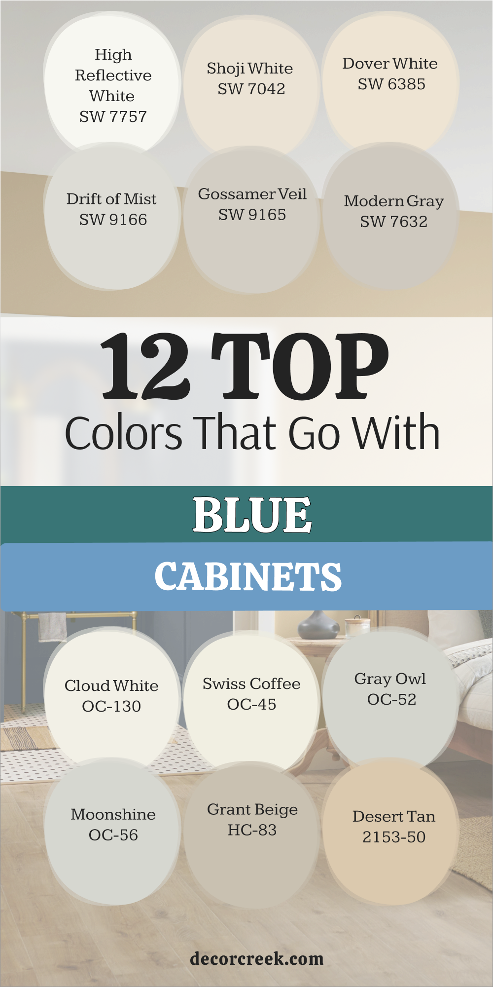
Choosing the right paint does not have to be a scary thing for your home project. I have shared these colors because they always work well with blue and make a house feel nice. You can pick any of these and know that your room will look very professional and very tidy.
Remember to think about how much light your room gets before you start painting your favorite shade. A darker room might need a lighter white, while a big sunny room can handle a darker gray.
Blue is a wonderful color that makes people feel happy, so have fun with your decorating choices. Your home is a place for you to enjoy, and these colors will help you make it great. I hope this list helps you find the perfect match for your blue walls or your blue furniture. Trust your eyes and pick the color that makes you feel the best when you walk in.
Happy painting, and I know your home is going to look absolutely beautiful with these new combinations.