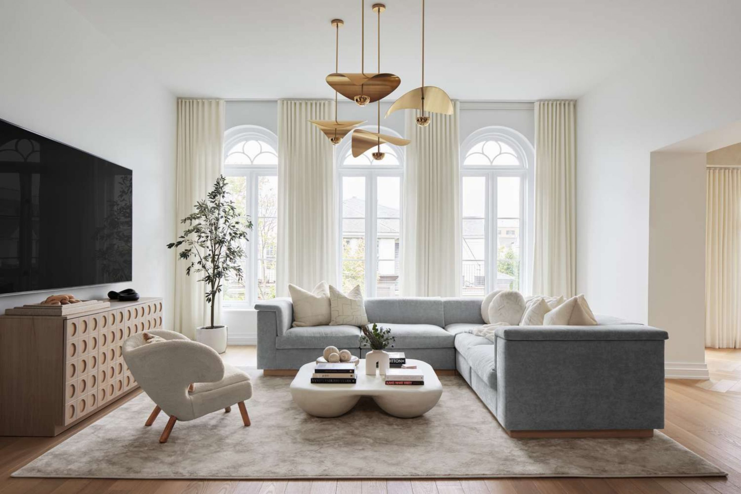
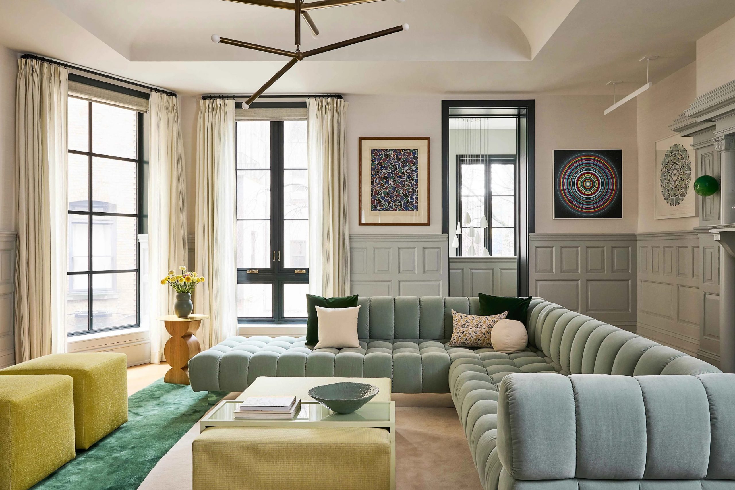
Finding the right pigment for your main seating area is the essential first step toward creating a truly beautiful and harmonious home. I spend my professional days meticulously observing how different types of light hit various wall surfaces to help families feel a deep sense of pride in their living spaces.
A fresh, expertly applied coat of paint has the power to make your entire interior look remarkably clean and high-end without requiring you to spend a fortune on renovations.
You ultimately want a finished look that feels expensive, sophisticated, and makes every guest feel immediately welcome the moment they walk through your front door.
Choosing a truly great color does more than just cover the walls; it helps your existing furniture look significantly better and makes your daily life feel more organized and peaceful.
Why I Always Trust Sherwin-Williams and Benjamin Moore for the Best Living Room Paint Colors
I strictly use these two industry-leading brands because they offer the thickest, most reliable, and highest-quality pigments currently available on the market.
Sherwin-Williams remains my consistent top pick whenever I need a durable finish that can easily handle the daily wear and tear of kids and pets without fading or losing its luster. On the other hand, Benjamin Moore creates incredibly deep, complex tones that look rich and heavy in a way that cheaper, budget-grade paints simply cannot match.
Investing in high-quality paint means you will not have to go through the stress of redoing the entire job in a couple of years because the color stays true and vibrant over time.
These premium brands ensure that my professional staging projects look polished, expensive, and perfectly finished every single time I complete a room.
How I Choose the Perfect Classy Shade for Any Living Room
My selection process always starts by carefully examining the windows to determine exactly how much natural sun enters the space during both the morning and late afternoon hours. Natural light has a dramatic effect on how a color appears, so I make it a strict rule to paint a large, visible sample directly on the wall before making any final decisions.
I specifically look for sophisticated shades that feature a perfectly balanced mix of warm and cool tones so they can seamlessly match different types of wood floors and architectural details. My primary goal is to identify a hue that feels light, airy, and expansive so the room never feels small, dark, or uncomfortably closed in.
Finally, I carefully match the chosen wall color to the largest piece of furniture in the space to ensure the entire design plan fits together with professional precision.
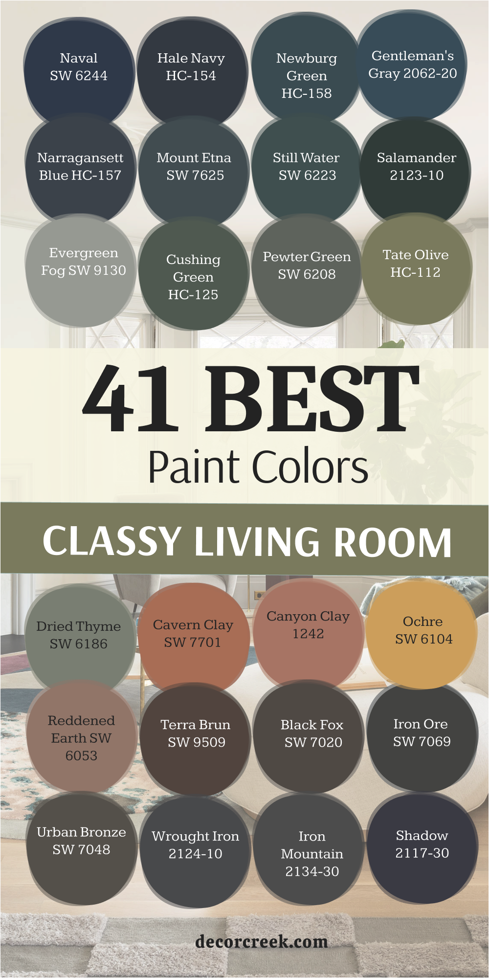
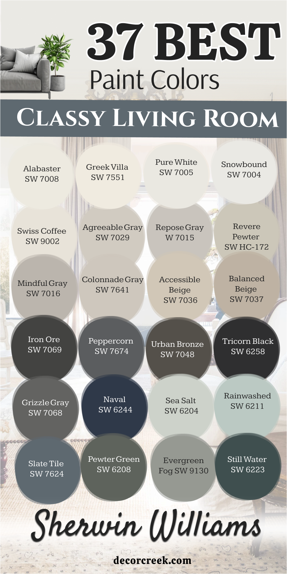
37 Classy Living Room Paint Colors from Sherwin Williams
Alabaster SW 7008
Alabaster SW 7008 is a creamy white that keeps your walls from looking too cold or like a plain hospital room. This pigment brings a soft feeling to your seating area which helps everyone feel more at ease. I love how this shade makes a house feel clean while still staying very friendly for a family. It works well if you have a lot of different wood colors in your furniture or flooring.
You will see that this white looks expensive and high-end even if you are on a tight budget. It reflects the sun nicely so your home feels bright from the morning until the sun goes down.
Many people choose this for a farmhouse look because it feels very natural and not fake. It is a great pick if you want a fresh start for your main living area this year. This color helps your colorful pillows and rugs stand out without fighting for attention.
Alabaster SW 7008 is my top recommendation for a white that feels warm and very inviting for guests.
Best used in: living rooms, kitchens, hallways, bedrooms, and farmhouse exteriors
Pairs well with: Iron Ore SW 7069, Agreeable Gray SW 7029, Natural Linen SW 9109, warm wood tones The key rule of this color for farmhouse style is to use it where you want natural light to feel kind, soft, and inviting throughout the day.
🎨 Check out the complete guide to this color right HERE 👈

Greek Villa SW 7551
Greek Villa SW 7551 is a rich white that has a tiny bit of warmth to make it feel like a sunny day. This shade looks very polished on walls and makes your crown molding look sharp and crisp. I find that it works perfectly in homes that have a lot of natural textures like wool or linen. It is a bright choice that helps a dark room feel much more open and light.
You can use this pigment on every wall in your house to create a smooth and tidy look. It does not turn yellow when the lights are on in the evening which is a huge plus. This color helps your room look larger because it pushes the walls back visually.
Many homeowners love how it makes their artwork look like it is in a real gallery. It is a very clean choice that stays looking good even with a lot of daily activity.
Greek Villa SW 7551 is a wonderful option for a high-end look that stays bright and cheery all year.
Best used in: living rooms, entryways, trim, and sunrooms
Pairs well with: Urbane Bronze SW 7048, Drift of Mist SW 9166, In the Navy SW 9178, light oak The key rule of this color for a bright look is to pair it with plenty of indoor plants to make the white feel fresh and alive.
🎨 Check out the complete guide to this color right HERE 👈

Pure White SW 7005
Pure White SW 7005 is a very flexible white that has a small amount of black to keep it steady. This color is my favorite for trim and doors because it looks very crisp against any other wall pigment. It provides a clean backdrop that makes your furniture and decor look brand new and very sharp. You will notice that it looks great in both modern houses and very old traditional buildings.
It is a hardworking shade that brings a sense of logic and order to a messy living room. This pigment does not have any weird blue or pink tones that might surprise you after the paint dries. It is a top choice for people who want a minimalist home that feels very organized and quiet.
Many designers use this white to make sure the focus stays on the architecture of the room. It is a safe and smart pick for anyone who wants a bright and very polished living area.
Pure White SW 7005 is the ultimate tool for making a home look tidy and professionally designed.
Best used in: kitchens, modern living rooms, trim, ceilings, and bathrooms
Pairs well with: Black Magic SW 6991, March Wind SW 7668, Peppercorn SW 7674, light oak flooring The key rule of this color for a modern style is to use it on both walls and trim to create a seamless and bright backdrop.
🎨 Check out the complete guide to this color right HERE 👈

Snowbound SW 7004
Snowbound SW 7004 is a cool white that has a slight gray undertone to make it look very crisp. This hue is perfect if you have a lot of gray furniture or blue accents in your main room. It makes the air in your house feel light and thin in a way that is very refreshing. I often use this color in staging to make a small house feel like it has a lot more room.
You will find that it looks very sharp next to dark metal light fixtures or black picture frames. This pigment is a great way to make an old room feel modern and very updated. It reflects a lot of light but the gray hint keeps it from being too bright for your eyes.
Many people like this color because it feels very sophisticated and high-quality on the wall. It provides a neutral base that lets you change your decorations whenever you feel like it.
Snowbound SW 7004 is a great choice for a cool and airy home that feels very current.
Best used in: modern homes, bathrooms, trim, and small living areas
Pairs well with: Iron Ore SW 7069, Grayish SW 6001, Colonnade Gray SW 7641, silver metal The key rule of this color for a crisp look is to use it in rooms with cool LED lighting to keep the white looking snowy and sharp.
🎨 Check out the complete guide to this color right HERE 👈

Carley’s Rose SW 9002
Carley’s Rose SW 9002 is a very soft and creamy white that makes a room feel like a warm hug. This pigment is excellent for a family room where you want to sit and talk for a long time. It has a lot of warmth which makes it feel very traditional and full of history. I love how it looks when the fireplace is on and the light bounces off the walls.
You can use this shade to make a large room feel more connected and much less empty. It works beautifully with antique furniture and gold frames or warm brass hardware. This color is a classic that never goes out of style because it makes everyone feel welcome.
Many people prefer this over a bright white because it feels more like a real home. It is a gentle shade that brings a lot of heart and soul to your interior design.
Carley’s Rose SW 9002 is the best pick for a cozy and traditional house that feels very loved.
Best used in: living rooms, bedrooms, kitchens, and traditional homes
Pairs well with: Accessible Beige SW 7036, Urbane Bronze SW 7048, warm wood tones The key rule of this color for a cozy home is to use it in rooms with warm light bulbs to emphasize the creamy and soft tones.
Agreeable Gray SW 7029
Agreeable Gray SW 7029 is a perfect mix of gray and beige that many people call a warm neutral. This color is the most famous choice for selling a house because it looks good to everyone. It changes its tone to match your lighting which makes it very easy to use in any room. I find that it hides small marks from kids or pets better than a plain white paint.
You will see that it makes your white trim look very bright and professionally finished. This pigment brings a sense of balance to a room that has a lot of different colors. It is not too dark so the room still feels big and full of air during the day.
Many homeowners use this as their main color because it is so reliable and looks expensive. It creates a smooth look that helps your home feel put together and very stylish.
Agreeable Gray SW 7029 is a safe and smart choice for a sophisticated home that everyone will love.
Best used in: open layouts, living rooms, entryways, and master suites
Pairs well with: Extra White SW 7006, Mega Greige SW 7031, Sea Salt SW 6204, dark bronze accents The key rule of this color for a balanced look is to use it in rooms with plenty of windows to keep the gray from feeling too heavy.
🎨 Check out the complete guide to this color right HERE 👈

Repose Gray SW 7015
Repose Gray SW 7015 is a slightly cooler gray that feels very balanced and steady on the wall. This pigment is a top choice for living rooms that have a lot of natural sunlight. It has just a tiny hint of brown that keeps it from looking like blue or purple in the shadows. I think this color makes a room look very tailored and neat, like a fine suit.
You can pair it with white furniture for a very high-end look that feels like a luxury hotel. It provides a great background for green plants or blue pillows and decorative blankets. This shade is dark enough to show a contrast against your white trim but light enough to stay airy.
Many people choose this color when they want a true gray that still feels very friendly. It brings a lot of style to a room without being too loud or distracting to the eye.
Repose Gray SW 7015 is a great pick for a modern and polished home that feels very high-quality.
Best used in: living rooms, bedrooms, kitchens, and whole-house painting
Pairs well with: Eider White SW 7014, Pavilion Gray SW 7661, Naval SW 6244, dark wood The key rule of this color for a tailored look is to use it with crisp white trim to make the gray tones look sharp and clean.
🎨 Check out the complete guide to this color right HERE 👈

Revere Pewter HC-172
Revere Pewter HC-172 is a legendary color that sits right between gray and a warm tan. This shade is famous for making any room look much more expensive than it really is. It has a lot of depth which helps the walls feel solid and very well-made. I recommend this to people who want a traditional home that still feels current and trendy.
You will notice that it changes throughout the day as the sun moves across your living room. It works well with both gray and brown colors which makes it very easy to match with furniture. This pigment is a great way to tie a house together if you use it in the hallways and main rooms.
Many designers love this color because it never fails to make a house look beautiful. It provides a rich look that feels very solid and brings a sense of history to the walls.
Revere Pewter SW HC-172 is a classic choice for a sophisticated and very dependable interior.
Best used in: whole-house painting, living rooms, kitchens, and hallways
Pairs well with: White Dove OC-17, Fog Mist OC-31, Chelsea Gray HC-168, dark walnut floors The key rule of this color for a cohesive home is to use it in hallways to tie different colored rooms together.
🎨 Check out the complete guide to this color right HERE 👈

Mindful Gray SW 7016
Mindful Gray SW 7016 is a medium gray that has a lot of strength and presence on your walls. This pigment is darker than the light grays but it still keeps the room feeling open and big. It is a fantastic choice if you have high ceilings and want the room to feel more grounded. I find that it makes white fireplaces or shelving look incredibly bright and sharp.
You can use this color to create a more formal feeling in your main seating area. It hides shadows in the corners very well and gives the room a very consistent look. This shade is perfect for people who want their walls to have a definite color that is not too light.
Many homeowners love how it looks with dark wood floors and light gray rugs. It brings a sense of maturity and high style to a house that needs a fresh update.
Mindful Gray SW 7016 is a strong and stylish pick for a room that needs a bit more depth and character.
Best used in: living rooms, dining rooms, exteriors, and large bedrooms
Pairs well with: Repose Gray SW 7015, Eider White SW 7014, Black Magic SW 6991, oak wood The key rule of this color for a grounded look is to pair it with light-colored rugs to keep the room from feeling too dark at night.
🎨 Check out the complete guide to this color right HERE 👈

Colonnade Gray SW 7641
Colonnade Gray SW 7641 is a warm gray that feels very soft and gentle on the eyes. This color is a great alternative to the most popular grays because it has a bit more personality. It looks very expensive when paired with white trim and dark metal accents like lamps or door handles. I often use this shade in rooms where I want a neutral look that still feels very special.
You will see that it works beautifully with stone or brick fireplaces in your living room. It provides a smooth backdrop that makes your house feel very connected and well-planned. This pigment is light enough to keep a small room feeling airy but warm enough to stay cozy.
Many people like this color because it is very easy to live with for a long time. It brings a touch of class to any wall and helps your furniture look its very best.
Colonnade Gray SW 7641 is a beautiful and soft choice for a home that needs a gentle touch of gray.
Best used in: living rooms, hallways, bedrooms, and kitchens
Pairs well with: Pure White SW 7005, Mindful Gray SW 7016, Naval SW 6244, warm woods The key rule of this color for a soft look is to use it in rooms with lots of natural light to keep the warm gray tones feeling bright.
🎨 Check out the complete guide to this color right HERE 👈
Accessible Beige SW 7036
Accessible Beige SW 7036 is a warm tan that avoids looking too yellow or muddy on your walls. This pigment is a top choice for people who want a neutral home that feels much friendlier than a cold gray. I find that it works perfectly in rooms where you have a lot of white furniture or light wood accents. It reflects enough light to keep your main seating area feeling airy and bright throughout the day.
You will notice that it creates a very high-end look when paired with crisp white trim and doors. This shade is a favorite for staging because it makes a house feel very clean and well-kept for new owners.
It provides a steady backdrop that helps your colorful rugs or artwork look very sharp and professional. Many homeowners love how it brings a sense of logic and peace to a busy family living area. It is a reliable color that stays looking fresh and updated regardless of the current fashion trends.
Accessible Beige SW 7036 is the best pick for a home that needs a warm, light touch without feeling old-fashioned.
Best used in: living rooms, open floor plans, entryways, and kitchens
Pairs well with: Aesthetic White SW 7035, Urban Bronze SW 7048, Cadet SW 9143, dark wood floors The key rule of this color for a clean look is to use it in rooms with large windows to let the sun bring out the soft tan tones.
🎨 Check out the complete guide to this color right HERE 👈

Balanced Beige SW 7037
Balanced Beige SW 7037 is a deeper tan that brings a lot of solid character to your interior walls. This color has more weight than the lighter neutrals, which makes a large room feel much more finished. I often recommend this pigment for living rooms with high ceilings that need a bit more color to feel grounded. It has a rich quality that makes your home look very expensive and carefully designed by a professional.
You can see how it makes light-colored stone fireplaces or white bookshelves pop and look very bright. This shade is excellent for hiding small scuffs or marks in high-traffic areas like hallways or family rooms.
It works beautifully with traditional furniture and heavy fabrics like velvet or thick linen curtains. Many designers choose this color because it provides a warm glow that makes people want to stay and talk. It brings a sense of maturity and quality to your house that is very hard to achieve with thinner paints.
Balanced Beige SW 7037 is a strong and dependable choice for a room that needs a rich, warm finish.
Best used in: living rooms, dining rooms, master bedrooms, and home offices
Pairs well with: Accessible Beige SW 7036, Pure White SW 7005, Backdrop SW 7025, bronze hardware The key rule of this color for a grounded look is to pair it with light rugs to ensure the room stays feeling open and balanced.
🎨 Check out the complete guide to this color right HERE 👈
Iron Ore SW 7069
Iron Ore SW 7069 is a very dark charcoal that looks like soft black velvet on your living room walls. This pigment is perfect for creating a moody and sophisticated vibe that feels very high-end and unique. I love using this color on an accent wall to make a television or a piece of art disappear into the background. It feels much softer and kinder than a true jet black, which makes it easier to use in a home.
You will see that gold lamps or white marble tables look absolutely stunning against this dark backdrop. This shade is a bold way to show off your personal style and make your house stand out from the neighbors.
It provides a great sense of depth that can actually make a wall feel like it is moving further away. Many people are now using this color on their window frames to create a sharp, modern look for the whole room. It brings a feeling of luxury and drama that makes every evening at home feel like a special event.
Iron Ore SW 7069 is the ultimate choice for a homeowner who wants a bold, dark, and very classy atmosphere.
Best used in: accent walls, exteriors, window trim, and fireplace surrounds
Pairs well with: Alabaster SW 7008, Extra White SW 7006, Agreeable Gray SW 7029, cognac leather The key rule of this color for a moody style is to use it in a room with leather furniture to create a rich and warm atmosphere.
🎨 Check out the complete guide to this color right HERE 👈

Peppercorn SW 7674
Peppercorn SW 7674 is a true dark gray that does not have any hidden blue or green undertones. This color is a fantastic middle ground if you want a dark room without going all the way to black. I find that it looks very professional in a home office or a formal seating area where you want a serious look. It provides a crisp and clean finish that makes all your white trim look incredibly bright and sharp.
You can use this pigment to add a touch of modern style to an older house that feels a bit dated. It works well with silver or chrome accents to create a cool and very polished interior design. This shade is dark enough to feel very cozy when you have the lamps on during a rainy afternoon.
Many homeowners love how it creates a sharp contrast with light gray furniture or colorful pillows. It is a hardworking color that brings a sense of high-fashion and order to any wall it covers.
Peppercorn SW 7674 is a great pick for a sophisticated and very balanced dark gray living area.
Best used in: accent walls, dining rooms, media rooms, and kitchen cabinets
Pairs well with: Repose Gray SW 7015, High Reflective White SW 7757, Willow Tree SW 7741, metal finishes The key rule of this color for a sharp look is to use it with very bright white trim to create a professional and clean border.
🎨 Check out the complete guide to this color right HERE 👈

Urban Bronze SW 7048
Urban Bronze SW 7048 is a complex mix of brown and gray that feels very rooted in nature and the earth. This color was a color of the year because it perfectly captures a modern yet very comfortable feeling. I love how it looks when paired with natural wood beams or a large stone fireplace in a living room. It has a rich and heavy look that makes your house feel very solid and well-protected from the world.
You will notice that it changes from a dark gray to a warm bronze depending on the time of day and the sun. This pigment is a top choice for people who want a dark house that still feels very warm and inviting.
It makes green plants look very vibrant and healthy when they are placed against these dark walls. Many designers use this on the outside of homes to create a sleek and very expensive-looking exterior. It brings a touch of the outdoors inside and helps your home feel like a private and stylish retreat.
Urban Bronze SW 7048 is a beautiful and earthy choice for a home that needs a sophisticated, natural look.
Best used in: living room accents, exteriors, front doors, and bedrooms
Pairs well with: Shoji White SW 7042, Modern Gray SW 7632, Bone Black SW 9159, natural wood The key rule of this color for a natural look is to pair it with plenty of organic textures like wool or stone to highlight its earthy tones.
🎨 Check out the complete guide to this color right HERE 👈

Tricorn Black SW 6258
Tricorn Black SW 6258 is the most popular true black because it does not have any distracting undertones at all. This pigment is the best tool for creating a high-contrast look that feels very modern and sharp. I often use it on interior doors or handrails to add a touch of class to a simple hallway or room. It provides a deep and solid finish that makes every other color in your house look much brighter.
You can paint a single wall in this shade to create a focal point that looks like a high-end art gallery. It works wonderfully with bright white trim and colorful modern furniture for a very trendy and bold look.
This color is perfect for hiding imperfections on old furniture if you decide to use it for a DIY project. Many people choose this for their exterior shutters to give their house a classic and very expensive appearance. It brings a sense of finality and strength to a room that makes everything else feel organized.
Tricorn Black SW 6258 is the ultimate choice for a powerful, clean, and very professional black finish.
Best used in: doors, trim, accent walls, kitchen islands, and exteriors
Pairs well with: Classic Light Tones, High Reflective White SW 7757, silver and gold accents, all colors The key rule of this color for a bold statement is to use it on doors to give your home an immediate feel of high quality and style.
🎨 Check out the complete guide to this color right HERE 👈

Grizzle Gray SW 7068
Grizzle Gray SW 7068 is a deep, charcoal-like gray that has a slight hint of blue-green in its base. This color is very popular for people who want a moody look that feels a little bit more colorful than plain gray. I find that it looks very rich in rooms with a lot of natural light that can show off its hidden tones. It provides a heavy and solid backdrop that makes your white sofa or light rugs look very clean.
You will see that it adds a lot of personality to a room that might otherwise feel a bit boring or flat. This pigment is a great choice for a formal living room where you want guests to feel the high quality of your home.
It works well with industrial styles that use a lot of metal, brick, and raw wood materials. Many homeowners love how it creates a cozy and private feeling in a den or a small library area. It is a sophisticated shade that brings a lot of depth and a very modern edge to your walls.
Grizzle Gray SW 7068 is a strong and stylish pick for a room that needs a dark, interesting character.
Best used in: living rooms, exteriors, home theaters, and accent walls
Pairs well with: Pure White SW 7005, Extra White SW 7006, Functional Gray SW 7024, metal accents The key rule of this color for an industrial style is to pair it with raw wood elements to balance the cool gray with natural warmth.
🎨 Check out the complete guide to this color right HERE 👈
Naval SW 6244
Naval SW 6244 is a deep navy blue that adds a lot of confidence and tradition to your main living room. This pigment is a classic choice that feels very expensive, like a high-end navy blazer or a luxury boat. I love how it makes gold or brass hardware look incredibly bright and shiny against the dark blue. It is a fantastic color for creating a formal and very polished look in a dining or seating area.
You will find that it feels very cozy and safe when you use it in a room with a lot of white trim. This shade acts as a neutral that hides marks while adding a huge amount of style to your interior design. It works perfectly with nautical or traditional styles but also looks very fresh in a modern apartment.
Many people choose this blue because it feels very organized and brings a sense of calm to a busy house. It is a bold choice that never goes out of fashion and always looks very high-quality on the wall.
Naval SW 6244 is my top pick for a blue that feels timeless, strong, and very sophisticated.
Best used in: dining rooms, accent walls, office spaces, and kitchen islands
Pairs well with: Eider White SW 7014, Roycroft Copper SW 2839, Kaleidoscope SW 6847, brass hardware The key rule of this color for a bold statement is to use it in rooms with high ceilings so the dark tone does not feel cramped.
🎨 Check out the complete guide to this color right HERE 👈

Hale Navy HC-154
Hale Navy HC-154 is a powerful dark blue that designers love because it is so incredibly balanced. This color looks like the deep sea and brings a lot of weight and importance to your living room walls. I find that it works wonderfully as a backdrop for a large gallery wall with white-matted picture frames. It has a rich quality that makes your furniture look more expensive and your home feel more established.
You can use this pigment to create a dramatic entryway that makes a great first impression on your guests. It hides shadows and imperfections in the drywall better than almost any other dark blue on the market.
This shade is a great way to add a bit of luxury to a room without using a color that is too bright or loud. Many homeowners love how it looks with light oak floors and white linen curtains for a classic look. It brings a sense of history and professional design to any space that needs a strong update.
Hale Navy SW HC-154 is a legendary blue that provides a very high-end and dependable look for your home.
Best used in: accent walls, offices, exteriors, and front doors
Pairs well with: Coventry Gray HC-169, Wickham Gray HC-171, Manchester Tan HC-81, silver accents The key rule of this color for a dramatic room is to use a lot of lamps and mirrors to reflect light against the dark walls.
🎨 Check out the complete guide to this color right HERE 👈

Sea Salt SW 6204
Sea Salt SW 6204 is a light and airy green-gray that makes your house feel like a beach house near the water. This pigment is very special because it changes from green to blue to gray depending on the time of day. I often use this color to make a small, dark room feel much larger and more open than it really is. It brings a touch of nature inside your home which helps everyone feel more relaxed and happy.
You will notice that it looks very fresh and clean when paired with bright white trim and light-colored furniture. This shade is a favorite for bathrooms and living rooms where you want a soft and gentle atmosphere.
It works beautifully with natural materials like wicker, jute, and light-toned wood shelving or tables. Many people choose this color because it is very light but still has a lot of personality compared to a plain white. It provides a breezy and polished look that makes your daily life feel more peaceful and organized.
Sea Salt SW 6204 is the best option for a home that needs a soft, airy touch and a hint of coastal style.
Best used in: bathrooms, bedrooms, sunrooms, and laundry rooms
Pairs well with: Summit Gray SW 7669, Fleur de Sel SW 7666, Heron Plume SW 6070, weathered wood The key rule of this color for a coastal look is to pair it with white trim to make the watery tones look crisp and clear.
🎨 Check out the complete guide to this color right HERE 👈

Rainwashed SW 6211
Rainwashed SW 6211 is a light and airy green that has a good amount of blue and gray mixed into the pigment. This color makes your living room feel like a fresh spring morning right after the clouds have cleared away. I find that it brings a very clean and polite feeling to a home that needs a little bit of color. It works beautifully in houses that have a lot of white furniture and light-colored wooden floors or tables.
You will see that it helps a small room look much larger because the light bounces off the walls so easily. This shade is a top pick for people who want their home to feel like a quiet getaway from the busy world outside.
It provides a soft backdrop that makes your indoor plants look very healthy and bright green against the walls. Many homeowners love how it looks in a sunroom or a seating area with large windows and plenty of light. It is a very friendly choice that makes guests feel comfortable and happy as soon as they sit down.
Rainwashed SW 6211 is the best option for a home that needs a fresh, airy look with a soft touch of color.
Best used in: living rooms, bathrooms, laundry rooms, and bedrooms
Pairs well with: Pure White SW 7005, Window Pane SW 6210, Storm Cloud SW 6249, light wood tones The key rule of this color for a fresh style is to use it in rooms with lots of window light to keep the watery tones looking bright and crisp.
🎨 Check out the complete guide to this color right HERE 👈

Slate Tile SW 7624
Slate Tile SW 7624 is a medium to dark blue that has a heavy gray base to keep it looking very steady. This pigment brings a sense of logic and strength to your walls without being as dark as a true navy blue. I love using this shade in a formal living room because it feels very established and high-quality to the eye. It looks very sharp and professional when you pair it with bright white trim and silver metal accents.
You can use this color to make a large room feel more solid and much less empty or echoing. It hides small marks on the wall very well, which makes it a smart pick for a busy family house. This shade works perfectly with dark leather sofas and heavy wooden bookshelves to create a classic library look.
Many designers choose this blue because it feels very mature and shows that you have great taste in interior design. It provides a rich and polished finish that makes your home feel very expensive and well-planned.
Slate Tile SW 7624 is a strong and stylish choice for a room that needs a deep, sophisticated blue character.
Best used in: accent walls, dining rooms, home offices, and kitchen islands
Pairs well with: Extra White SW 7006, Grayish SW 6001, Link Gray SW 6122, dark leather The key rule of this color for a sophisticated look is to pair it with plenty of warm lamps to keep the gray-blue from feeling too cold at night.
🎨 Check out the complete guide to this color right HERE 👈

Pewter Green SW 6208
Pewter Green SW 6208 is a dark and moody green that has a lot of gray in the mix to keep it looking soft. This color is very trendy right now because it brings a touch of nature inside in a very high-end way. I find that it makes gold picture frames and brass lamps look absolutely stunning and very bright on the wall. It is a fantastic choice for an accent wall or a small room where you want to create a cozy feeling.
You will notice that it adds a lot of depth to your house and makes it feel like a professional designer lived there. This pigment works wonderfully with natural materials like stone, brick, and dark wood beams on the ceiling.
It is dark enough to feel very private and safe, which is great for a room where you watch movies or read. Many homeowners love how it makes their white furniture pop and look incredibly clean and fresh by contrast. It is a bold and smart pick that brings a sense of history and style to any living area.
Pewter Green SW 6208 is the perfect pick for a homeowner who wants a dark, earthy look that is very classy.
Best used in: accent walls, bedrooms, home offices, and kitchen cabinets
Pairs well with: Shoji White SW 7042, Spare White SW 6203, Sea Salt SW 6204, brass hardware The key rule of this color for an earthy style is to use it with warm wooden furniture to balance the cool green with natural warmth.
🎨 Check out the complete guide to this color right HERE 👈

Evergreen Fog SW 9130
Evergreen Fog SW 9130 is a beautiful green-gray that feels very organic and rooted in the natural world around us. This pigment was a color of the year because it perfectly fits the trend of bringing the outdoors into our homes. I love how it looks in a living room with a lot of light oak furniture and soft tan rugs or pillows. It is a medium-toned color that provides enough weight to feel solid but enough light to keep the room airy.
You can use this shade to create a very polished and updated look in an older home that needs a change. It works beautifully with matte black metal accents and large green plants placed in the corners of the room.
This color helps people feel more connected to nature which brings a very good energy to your daily life. Many designers choose this for a whole-house color because it is very easy to live with and looks great in every light. It provides a soft and professional finish that makes your home feel very current and high-fashion.
Evergreen Fog SW 9130 is a wonderful and natural choice for a home that needs a sophisticated, earthy touch.
Best used in: living rooms, bedrooms, exteriors, and cabinetry
Pairs well with: Neutral White, Shoji White SW 7042, Urbane Bronze SW 7048, light wood The key rule of this color for a natural look is to pair it with organic textures like linen to highlight its soft and leafy tones.
🎨 Check out the complete guide to this color right HERE 👈

Minimalist SW 9611
Minimalist SW 9611 is a soft and light neutral that feels very gentle and kind on your living room walls. This pigment is a great alternative to a plain gray or white because it adds a touch of life to the room. I find that it brings a very fresh and healthy feeling to a home that might feel a bit dark or old. It works perfectly with white trim and light-colored curtains to create a very breezy and open atmosphere.
You will see that it makes your furniture look very sharp and helps your house feel more organized and clean. This shade is a top choice for people who want a hint of color that is still very easy to match with decor.
t reflects the sun nicely so your home stays bright from the morning hours until the sun goes down. Many homeowners love how it makes their seating area feel like a peaceful garden room inside the house. It is a light and airy choice that brings a lot of style without being too bold or overwhelming.
Minimalist SW 9611 is a great pick for a soft and cheery home that feels very fresh and updated.
Best used in: living rooms, bathrooms, bedrooms, and kitchens
Pairs well with: Pure White SW 7005, Alabaster SW 7008, Evergreen Fog SW 9130, light wood The key rule of this color for a soft look is to use it in rooms with lots of natural light to keep the green looking crisp and bright.
🎨 Check out the complete guide to this color right HERE 👈

Still Water SW 6223
Still Water SW 6223 is a deep and moody blue-green that brings a huge amount of drama to any wall it covers. This color is very rich and heavy, which makes it perfect for a room where you want to feel very cozy. I love using this pigment on a fireplace wall or in a library area to create a high-end and private look. It makes white artwork or light-colored furniture look absolutely stunning and very expensive by contrast.
You can use this shade to add a sense of mystery and deep style to a house that feels too plain or boring. It works wonderfully with gold accents and dark wood floors to create a very traditional and wealthy appearance.
This pigment is dark enough to hide any small flaws in your walls while adding a lot of professional character. Many people choose this color for their main seating area to make it feel more formal and well-designed for guests. It is a bold choice that shows you have a lot of confidence in your personal interior design style.
Still Water SW 6223 is a strong and stylish pick for a room that needs a dark, interesting blue-green character.
Best used in: accent walls, dining rooms, home offices, and bedrooms
Pairs well with: Alabaster SW 7008, Sea Salt SW 6204, Silver Strand SW 7057, gold accents The key rule of this color for a bold statement is to use a lot of mirrors to reflect light against the deep and moody tones.
🎨 Check out the complete guide to this color right HERE 👈

Clary Sage SW 6178
Clary Sage SW 6178 is a classic green that has just enough yellow and gray to feel very traditional and soft. This pigment reminds people of old country houses and brings a lot of history and heart to your living room. I find that it works perfectly with warm wood furniture and brass lamps or copper decorative pieces. It provides a solid and friendly backdrop that makes everyone feel right at home as soon as they walk in.
You will notice that it looks very fresh when paired with bright white trim and soft tan rugs on the floor. This shade is a favorite for people who want a home that feels very established and high-quality for their family.
It hides dust and small marks very well which makes it a great choice for a hardworking living area. Many designers love this color because it feels very natural and never looks like it is trying too hard to be trendy. It brings a sense of logic and peace to your house and helps your decorations look their very best.
Clary Sage SW 6178 is a beautiful and dependable choice for a home that needs a warm, traditional green touch.
Best used in: living rooms, kitchens, exteriors, and bedrooms
Pairs well with: Dover White SW 6385, Sage SW 2860, Unusual Gray SW 7059, warm wood The key rule of this color for a traditional look is to pair it with cream-colored accents to emphasize the soft and leafy character.
🎨 Check out the complete guide to this color right HERE 👈

Reddened Earth SW 6053
Reddened Earth SW 6053 is a warm and deep terracotta color that brings a lot of heat and energy to your walls. This pigment is perfect for a living room where you want to create a very inviting and earthy atmosphere. I love how it looks when the sun hits the walls and makes the whole room glow with a rich orange-brown tone. It is a fantastic choice for homes that use a lot of natural stone, clay, and dark wooden materials.
You can use this color to make a large room feel much more cozy and much less empty or cold. It works beautifully with traditional rugs and heavy fabrics like wool or woven blankets on the sofa. This shade is a bold way to add a touch of the desert or a Mediterranean look to your daily life.
Many homeowners love how it makes their house feel very unique and full of personality compared to gray houses. It provides a rich and polished finish that makes your home feel very warm and grounded to the earth.
Reddened Earth SW 6053 is the best pick for a home that needs a warm, earthy touch and a lot of bold character.
Best used in: living rooms, dining rooms, accent walls, and exteriors
Pairs well with: Kestrel White SW 7516, Kilim Beige SW 6106, Foothills SW 7514, natural textures The key rule of this color for an earthy style is to use it in rooms with lots of natural light to keep the reddish tones feeling bright and warm.
🎨 Check out the complete guide to this color right HERE 👈
Malted Milk SW 6057
Malted Milk SW 6057 is a very soft and dusty pink-beige that brings a gentle touch of color to your living room. This pigment is a great choice if you want a neutral home that has a tiny bit of a romantic and soft feeling. I find that it works perfectly with light gray furniture and white curtains to create a very airy and light look. It reflects the sun nicely so your house feels very bright and cheerful during the morning and afternoon.
You will see that it makes your white trim look very sharp and helps your house feel more organized and clean. This shade is a favorite for people who want a house that feels very kind and welcoming for guests and family.
It provides a soft backdrop that makes your colorful artwork or family photos look very professional and clear. Many homeowners love how it brings a sense of light and joy to a room that might feel a bit cold or boring. It is a gentle and stylish choice that brings a lot of heart and soul to any wall it covers.
Malted Milk SW 6057 is a great pick for a soft and cheery home that feels very fresh and updated.
Best used in: bedrooms, living rooms, nurseries, and bathrooms
Pairs well with: Alabaster SW 7008, Diverse Gray SW 6031, Poised Taupe SW 6039, light wood The key rule of this color for a soft look is to use it with white-matted frames to make the dusty pink tones look clean and sophisticated.
🎨 Check out the complete guide to this color right HERE 👈
Sand Dune SW 6086
Sand Dune SW 6086 is a warm and natural tan that feels like a sunny day at the beach on your walls. This pigment is a fantastic choice for people who want a neutral home that feels very solid and grounded. I find that it works perfectly in rooms where you have a lot of dark wood furniture or brown leather sofas. It reflects enough light to keep your main seating area feeling airy while still staying very cozy and inviting.
You will notice that it creates a very high-end look when paired with crisp white trim and dark metal accents. This shade is a favorite for people who want a home that feels very established and high-quality for their family.
It provides a steady backdrop that helps your colorful rugs or artwork look very sharp and professional. Many homeowners love how it brings a sense of order and peace to a busy family living area. It is a reliable color that stays looking fresh and updated regardless of the current fashion trends.
Sand Dune SW 6086 is the best pick for a home that needs a warm, natural touch and a very solid finish.
Best used in: living rooms, entryways, bedrooms, and kitchens
Pairs well with: Pure White SW 7005, Accessible Beige SW 7036, Urban Bronze SW 7048, dark wood The key rule of this color for a natural look is to use it in rooms with warm light bulbs to emphasize the soft and sandy tones.
🎨 Check out the complete guide to this color right HERE 👈
Macadamia SW 6142
Macadamia SW 6142 is a rich and creamy tan that brings a lot of warmth and weight to your living room walls. This pigment is much deeper than a basic beige, which makes it look very expensive and high-end in a traditional house. I find that it works perfectly with dark wood floors and heavy furniture because it has the strength to balance those dark elements. It reflects light in a soft way that makes your house feel very solid and well-protected from the outside world.
You will see that it provides a very professional backdrop for white crown molding and tall baseboards. This shade is a favorite for people who want a home that feels very established and full of history and character.
It hides dust and daily wear and tear very well, which makes it a smart choice for a busy family area. Many designers love this color because it makes gold picture frames and brass lamps look absolutely stunning. It brings a sense of logic and maturity to your interior design and helps your whole home feel connected and tidy.
Macadamia SW 6142 is a strong and dependable choice for a room that needs a rich, warm finish and a touch of class.
Best used in: living rooms, kitchens, entryways, and traditional dining rooms
Pairs well with: Alabaster SW 7008, Softer Tan SW 6141, Urban Bronze SW 7048, dark walnut wood The key rule of this color for a traditional look is to use it in rooms with warm light to highlight the golden and creamy tones in the paint.
🎨 Check out the complete guide to this color right HERE 👈
Poised Taupe SW 6039
Poised Taupe SW 6039 is a complex mix of gray and brown that feels very balanced and steady on the wall. This pigment was a color of the year because it bridges the gap between old-fashioned warmth and modern gray trends. I love how it looks in a living room with a lot of light gray furniture and white linen curtains to create a sharp contrast. It provides a moody and sophisticated backdrop that makes your house feel like a high-end hotel lobby or a luxury apartment.
You will notice that it changes its look based on the sun, sometimes looking more gray and sometimes more like a warm wood tone. This shade is a top choice for people who want a dark room that still feels very friendly and not at all cold.
It works beautifully with matte black metal accents and large green plants placed in the corners of the seating area. Many homeowners love how it creates a cozy and private feeling in a room used for reading or talking at night. It is a sophisticated shade that brings a lot of depth and a very modern edge to any wall it covers.
Poised Taupe SW 6039 is a beautiful and earthy choice for a home that needs a sophisticated, balanced look.
Best used in: living rooms, bedrooms, dining rooms, and home offices
Pairs well with: Eider White SW 7014, Malted Milk SW 6057, Peppercorn SW 7674, light oak flooring The key rule of this color for a balanced look is to pair it with light-colored rugs to ensure the room stays feeling open and high-end.
🎨 Check out the complete guide to this color right HERE 👈
Skyline Steel SW 1015
Skyline Steel SW 1015 is a warm stone gray that feels very clean and professional on your living room walls. This pigment is a fantastic alternative to plain gray because it has a lot of hidden warmth that keeps it from looking like cold metal. I find that it works perfectly in modern homes where you want a minimalist look that still feels very welcoming and kind. It reflects the sun nicely so your home stays bright and airy from the morning hours until the sun goes down.
You will see that it makes your white furniture and light-colored rugs look very sharp and helps your house feel more organized. This shade is a favorite for people who want a neutral home that looks very expensive and carefully planned by a designer.
It provides a smooth backdrop that makes your colorful artwork or family photos look very professional and clear. Many homeowners love how it brings a sense of light and order to a room that might feel a bit cluttered or old. It is a hardworking color that brings a sense of high-fashion and logic to any wall it covers.
Skyline Steel SW 1015 is a great pick for a soft and polished home that feels very fresh and updated.
Best used in: whole-house painting, living rooms, kitchens, and hallways
Pairs well with: Pure White SW 7005, Iron Ore SW 7069, Naval SW 6244, silver metal accents The key rule of this color for a polished look is to use it with very bright white trim to create a professional and clean border around the room.
🎨 Check out the complete guide to this color right HERE 👈
Wordly Gray SW 7043
Wordly Gray SW 7043 is a soft and light gray that has just enough green and brown to feel very natural and grounded. This pigment is a top choice for people who want a gray house that does not feel like a cold office or a hospital. I find that it works perfectly in rooms where you have a lot of natural light and light-colored wooden furniture or flooring. It reflects enough light to keep your main seating area feeling airy and bright while still staying very cozy.
You will notice that it creates a very high-end look when paired with crisp white trim and dark metal lamps or door handles. This shade is a favorite for staging homes because it makes every room look very clean and well-kept for new visitors.
It provides a steady backdrop that helps your colorful pillows or rugs look very sharp and professional. Many homeowners love how it brings a sense of balance and peace to a busy family living area. It is a reliable color that stays looking fresh and updated regardless of the current fashion trends in magazines.
Wordly Gray SW 7043 is the best pick for a home that needs a warm, light gray touch without feeling old-fashioned.
Best used in: living rooms, open floor plans, bedrooms, and kitchens
Pairs well with: Shoji White SW 7042, Anew Gray SW 7030, Urbane Bronze SW 7048, light wood The key rule of this color for a clean look is to use it in rooms with large windows to let the sun bring out the soft and natural tones.
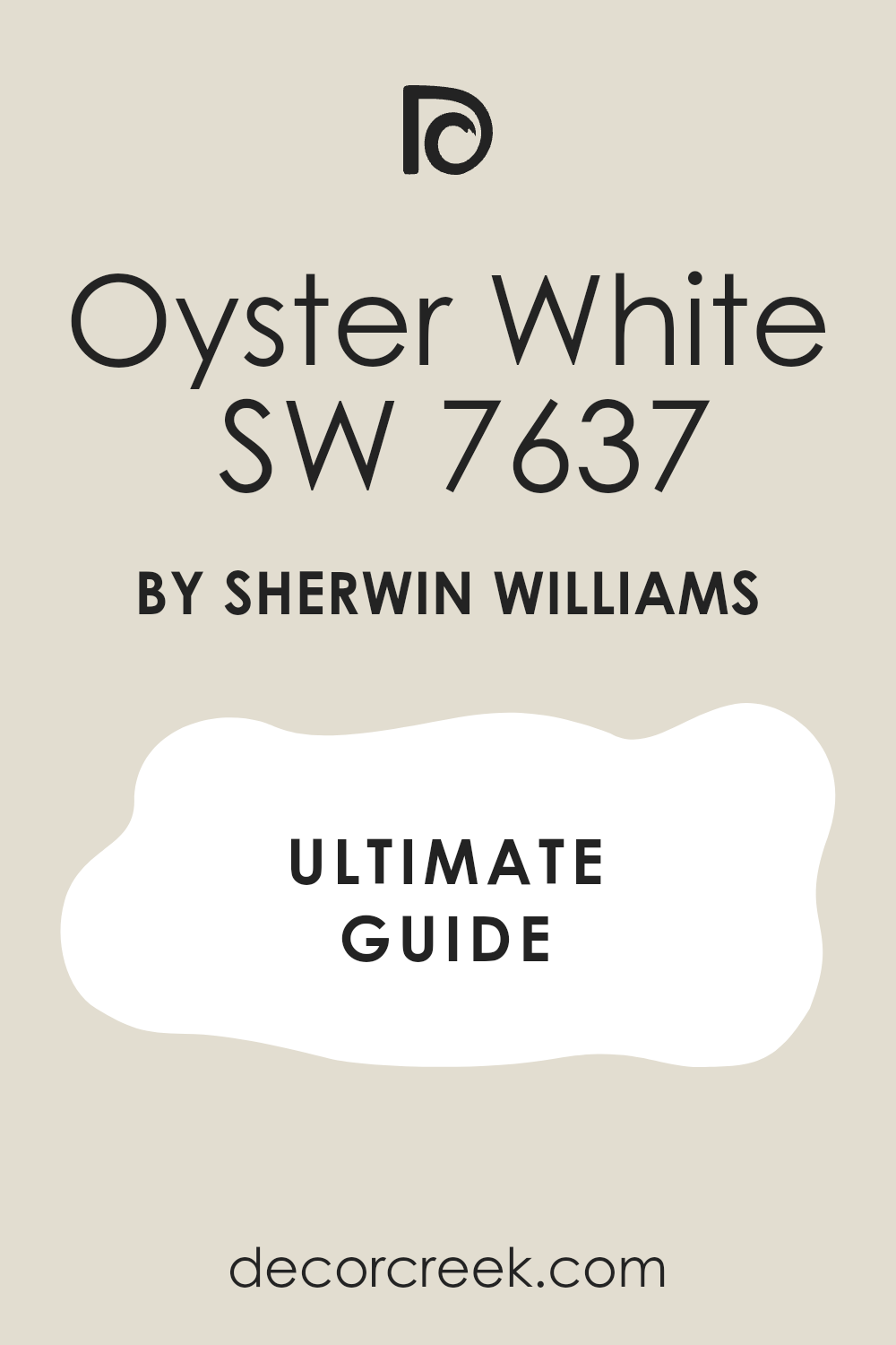
Oyster White SW 7637
Oyster White SW 7637 is a very light and creamy gray-white that brings a soft glow to your living room walls. This pigment is much more interesting than a plain white because it has a lot of depth and character that changes with the light. I love how it looks in a house with a lot of traditional architecture and white crown molding or built-in bookshelves. It provides a clean and airy feeling that helps a small room feel much larger and more open than it really is.
You will see that it looks very fresh and sharp when paired with dark wood floors and black metal light fixtures. This shade is a top choice for people who want a bright home that still feels very warm and full of life for the family.
It works beautifully with natural materials like linen, stone, and light-toned wood shelving or tables. Many homeowners love how it makes their house feel very unique and full of personality compared to basic white houses. It is a gentle and stylish choice that brings a lot of heart and soul to any wall it covers.
Oyster White SW 7637 is a wonderful and natural choice for a home that needs a sophisticated, airy touch.
Best used in: whole-house painting, living rooms, exteriors, and kitchens
Pairs well with: Pure White SW 7005, Sea Salt SW 6204, Urban Bronze SW 7048, dark wood The key rule of this color for an airy style is to use it on both walls and ceilings to create a seamless and very bright environment.
🎨 Check out the complete guide to this color right HERE 👈
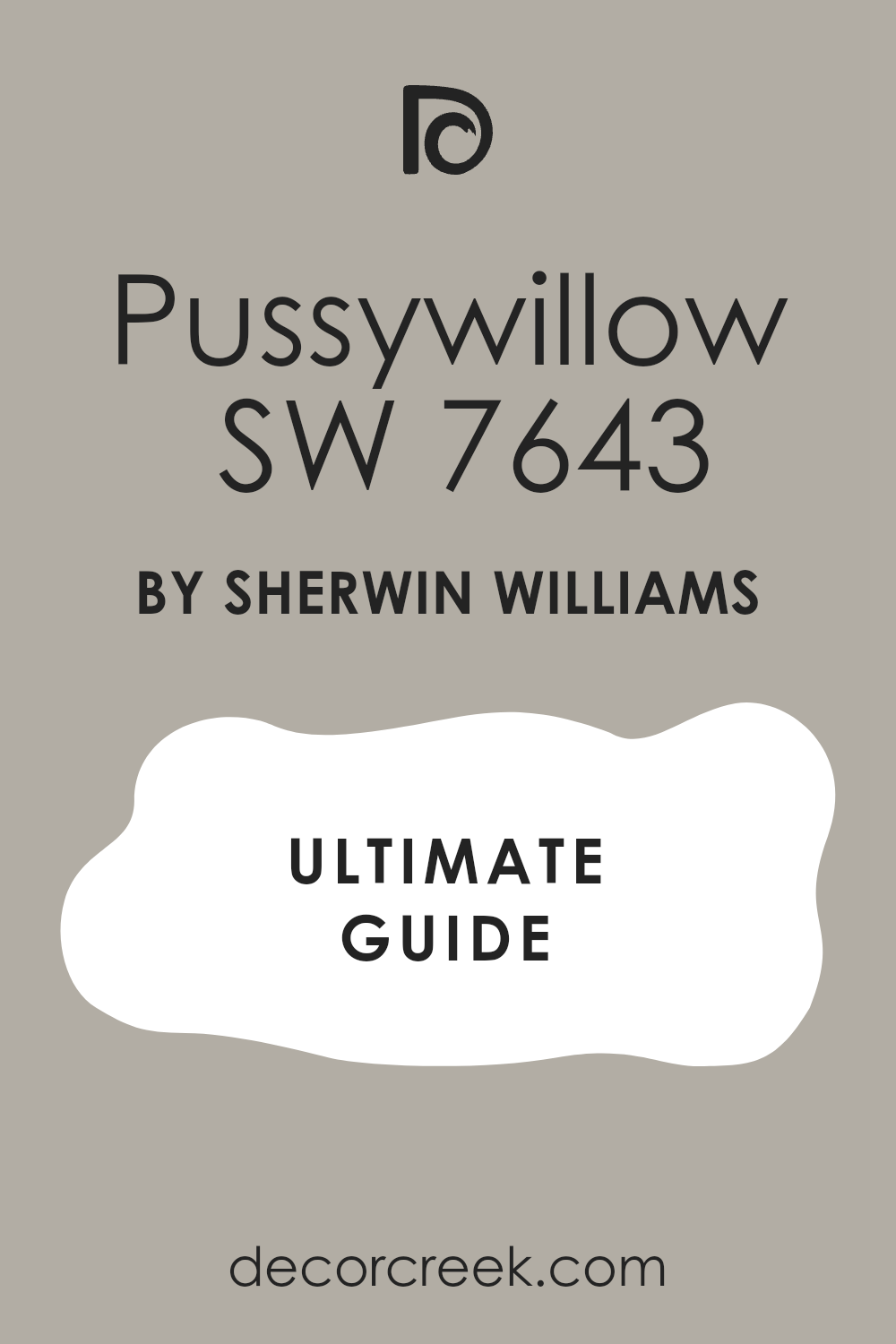
Pussywillow SW 7643
Pussywillow SW 7643 is a medium-toned gray that has a lot of warmth and professional style on your walls. This pigment is perfect for a living room where you want the walls to have a definite color that is not too light or too dark. I find that it makes white fireplaces and shelving look incredibly bright and sharp by providing a steady contrast. It brings a sense of maturity and high design to a house that needs a fresh and modern update for the family.
You can use this color to create a more formal and organized feeling in your main seating area for guests. It hides shadows and small marks very well, which makes it a smart choice for a busy home with kids or pets.
This shade works perfectly with light gray rugs and dark wood furniture to create a very balanced and high-end look. Many designers choose this color because it feels very solid and provides a rich texture that you can almost feel with your eyes. It is a hardworking color that brings a sense of order and high-fashion to any wall it covers.
Pussywillow SW 7643 is a strong and stylish pick for a room that needs a bit more depth and a very polished finish.
Best used in: living rooms, dining rooms, exteriors, and master bedrooms
Pairs well with: Pure White SW 7005, Worldly Gray SW 7043, Iron Ore SW 7069, silver accents The key rule of this color for a polished look is to pair it with light-colored furniture to ensure the room stays feeling open and bright.
🎨 Check out the complete guide to this color right HERE 👈
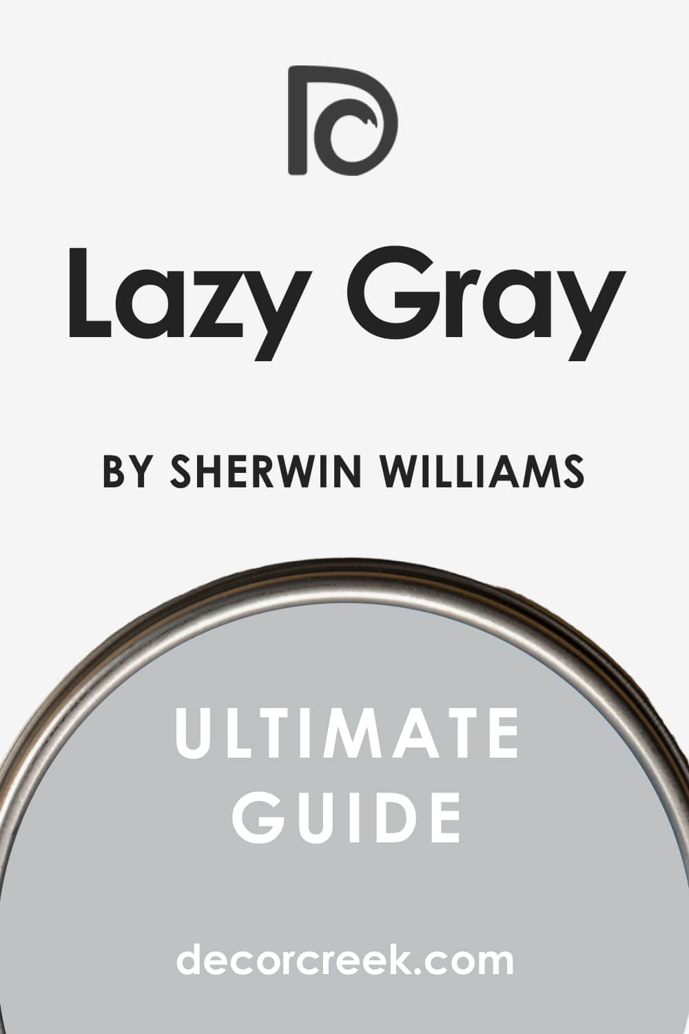
Lazy Gray SW 6254
Lazy Gray SW 6254 is a light and cool blue-gray that makes your house feel as fresh as a clear morning sky. This pigment is a fantastic choice if you want a living room that feels very airy, clean, and modern. I love how it looks when paired with bright white trim and dark metal picture frames to create a sharp contrast. It reflects a lot of light, which helps a small or dark room feel much more open and large than it actually is.
You will notice that it brings a very organized and quiet feeling to a home that might feel a bit cluttered or busy. This shade is a top choice for people who want a modern look that stays very cheerful and bright throughout the day.
It works beautifully with silver or chrome accents and light-colored wooden furniture or shelving. Many homeowners love how it makes their colorful artwork or blue pillows pop and look very sharp and professional. It provides a breezy and polished finish that makes your daily life feel more peaceful and well-planned.
Lazy Gray SW 6254 is the best option for a home that needs a fresh, airy look with a soft touch of cool color.
Best used in: bathrooms, bedrooms, living rooms, and laundry rooms
Pairs well with: Extra White SW 7006, Naval SW 6244, Slate Tile SW 7624, silver metal The key rule of this color for a fresh style is to use it in rooms with lots of window light to keep the cool blue-gray tones looking bright.
🎨 Check out the complete guide to this color right HERE 👈
34 Classy LivingRoom Paint Colors from Benjamin Moore
White Dove OC-17
White Dove OC-17 is a soft and creamy white that is a top pick for designers who want a clean look that avoids being too cold. This pigment has a tiny hint of gray that keeps it from looking yellow when the evening lights come on. I find that it works perfectly in homes with a lot of traditional molding and dark wood floors. It reflects the sun beautifully, which helps your main seating area feel much larger and more open than before.
You will see that it provides a very professional backdrop for colorful rugs and bright velvet furniture. This shade is a favorite for people who want a house that feels very tidy and well-organized for the family.
It hides small marks better than a stark white, which makes it a smart choice for a hardworking living area. Many homeowners love how it brings a sense of logic and peace to their interior design. It is a reliable color that stays looking fresh and updated for a very long time.
White Dove OC-17 is the ultimate choice for a home that needs a soft, bright, and very polished white finish.
Best used in: living rooms, kitchens, trim, doors, and whole-house painting
Pairs well with: Revere Pewter HC-172, Hale Navy HC-154, Balboa Mist OC-27, warm wood tones The key rule of this color for a polished look is to use it on both walls and trim in different finishes to create a high-end, layered feel.
🎨 Check out the complete guide to this color right HERE 👈

Chantilly Lace OC-65
Chantilly Lace OC-65 is famous for being the crispest white with almost no yellow or blue tones in the mix. This pigment makes your home look like a modern art gallery where everything is fresh and very high-quality. I love using this color in small apartments to push the walls back and make the layout feel much bigger. It looks sharp and clean against black metal light fixtures or dark window frames.
You will find that it makes every other color in the room look more vibrant and true to its real tone. This shade is a favorite for people who like a very minimalist and quiet house where everything has a place.
It reflects a massive amount of light, which is great for rooms that do not have many windows. Many designers use this white to ensure the focus stays on the beautiful furniture and architecture. It provides a blank canvas that lets your personal style and your family photos do all the talking.
Chantilly Lace OC-65 is the best option for a bright, fresh, and very modern living environment.
Best used in: trim, ceilings, modern living rooms, and small apartments
Pairs well with: Gray Owl OC-52, Black 2131-10, Kendall Charcoal HC-166, colorful decor The key rule of this color for a bright feel is to use it on the ceiling to make the whole room feel taller and more open.
🎨 Check out the complete guide to this color right HERE 👈

Swiss Coffee OC-45
Swiss Coffee OC-45 is a warm and inviting white that feels like a comfortable home as soon as it dries. This pigment has a rich, creamy base that avoids looking stark or clinical in the morning light. I find that it works perfectly in traditional houses where you want to emphasize a cozy fireplace or soft curtains. It provides a soft glow that makes guests feel welcome and happy to sit and talk for a while.
You can use this shade to make a large room feel more connected and much less empty or cold. It works beautifully with antique furniture and warm brass hardware or gold picture frames. This color is a classic that never goes out of style because it brings a lot of heart to your walls.
Many people prefer this over a bright white because it feels more natural and kind for a family house. It is a gentle shade that brings a lot of soul to your interior design and helps everything feel organized.
Swiss Coffee OC-45 is my favorite warm white for creating a home that feels traditional and very welcoming.
Best used in: living rooms, bedrooms, kitchens, and traditional homes
Pairs well with: White Dove OC-17, Antique Bronze, Hale Navy HC-154, oak wood The key rule of this color for a cozy home is to use it in rooms with warm light bulbs to emphasize the creamy and soft tones.
🎨 Check out the complete guide to this color right HERE 👈

Simply White OC-117
Simply White OC-117 is a bright and cheerful white that has just a tiny drop of warmth to keep it friendly. This pigment was a color of the year because it looks so fresh and professional on almost any surface. I love how it makes a dark hallway or a small living room feel light and airy in an instant. It looks very sharp on kitchen cabinets and built-in bookshelves, making them look high-end and clean.
You will notice that it provides a crisp backdrop for modern artwork and colorful decorative pillows. This shade is a top choice for people who want a bright home that still feels very full of life. It does not pick up weird undertones from the grass outside, so your walls always look true to color.
Many homeowners love how it makes their house feel very updated and much more expensive. It is a hardworking color that brings a sense of order and cleanliness to a busy family house.
Simply White OC-117 is a great pick for a fresh and polished home that feels very current and happy.
Best used in: kitchens, trim, living rooms, and dark hallways
Pairs well with: Silver Gray 2131-60, Hale Navy HC-154, Dove Wing OC-18, colorful accents The key rule of this color for a bright look is to use it in rooms with plenty of sunlight to highlight its crisp and clean character.
🎨 Check out the complete guide to this color right HERE 👈

Cloud White OC-130
Cloud White OC-130 is a soft and balanced white that feels light and airy without being too bright for the eyes. This pigment has a very tiny hint of warmth that makes it look like a soft cloud on a sunny afternoon. I find that it works perfectly in rooms with a lot of natural textures like linen, wool, and light wood. It provides a clean finish that helps a room feel very tidy and well-planned by a professional.
You can use this shade on both walls and trim to create a seamless look that makes a room feel tall. It works beautifully with traditional furniture and soft, flowing curtains to create a very elegant atmosphere.
This color is a favorite for people who want a high-end look that stays very gentle and welcoming. Many designers choose this white because it never feels harsh or clinical, even in very bright rooms. It brings a sense of peace and logic to your house and helps your furniture look its very best.
Cloud White OC-130 is a beautiful and soft choice for a home that needs a gentle touch of bright white.
Best used in: living rooms, bedrooms, trim, and kitchens
Pairs well with: Revere Pewter HC-172, Gray Owl OC-52, Yosemite Sand AC-4, natural textures The key rule of this color for a soft look is to use it with warm wooden furniture to balance the white with natural warmth.
🎨 Check out the complete guide to this color right HERE 👈

Revere Pewter HC-172
Revere Pewter HC-172 is a legendary light gray that has a warm base to keep it from looking cold or metallic. This pigment is famous for making any room look much more expensive and professionally designed than before. I recommend this to people who want a traditional home that still feels very current and trendy today. It has a lot of depth, which helps the walls feel solid and brings a sense of history to the house.
You will notice that it changes throughout the day as the sun moves across your living room furniture. It works well with both gray and brown colors, which makes it very easy to match with your existing rugs.
This color is a great way to tie a house together if you use it in the hallways and the main rooms. Many homeowners love this shade because it never fails to make a house look beautiful and very well-kept. It provides a rich look that feels very steady and brings a sense of quality to your interior design.
Revere Pewter HC-172 is a classic choice for a sophisticated and very dependable living area.
Best used in: whole-house painting, living rooms, kitchens, and hallways
Pairs well with: White Dove OC-17, Fog Mist OC-31, Chelsea Gray HC-168, dark walnut floors The key rule of this color for a cohesive home is to use it in hallways to tie different colored rooms together.
🎨 Check out the complete guide to this color right HERE 👈
Edgecomb Gray HC-173
Edgecomb Gray HC-173 is a soft and light earthy gray that feels very grounded and natural on your walls. This pigment is a great alternative to white if you want a room that feels more finished and solid. I find that it works perfectly in open floor plans where you want a smooth look from one room to the next. It reflects a good amount of light, which helps your main seating area feel airy and bright all day long.
You will see that it makes your white trim look very sharp and professionally finished in every corner. This shade is a top pick for staging because it makes a house feel very clean and welcoming for new people.
It provides a steady backdrop that helps your colorful pillows or family photos look very professional and clear. Many designers choose this color because it is very easy to live with and stays looking great for years. It brings a sense of balance and order to your house and helps your furniture look its very best.
Edgecomb Gray HC-173 is the best pick for a home that needs a warm, light touch without feeling old-fashioned.
Best used in: living rooms, bedrooms, entryways, and open layouts
Pairs well with: White Heron OC-57, Nickel 2119-50, Boothbay Gray HC-165, light oak flooring The key rule of this color for a clean look is to use it in rooms with large windows to let the sun bring out the soft and natural tones.
🎨 Check out the complete guide to this color right HERE 👈

Stonington Gray HC-170
Stonington Gray HC-170 is a cool and clean gray that brings a very modern and professional feel to your walls. This pigment has a slight blue undertone that makes it look very crisp and sharp in the morning light. I love how it looks when paired with bright white trim and dark metal accents like lamps or door handles. It provides a tailored finish that makes your house feel like a high-end apartment or a luxury office.
You can use this shade to create a more formal and organized feeling in your main seating area for guests. It reflects light nicely so your home stays feeling open and airy even if you have a lot of furniture.
This color is perfect for people who want a true gray that feels very sophisticated and high-quality on the wall. Many homeowners love how it makes their blue or navy pillows pop and look very sharp and bright. It brings a sense of high-fashion and logic to your interior design and helps everything feel very current.
Stonington Gray HC-170 is a strong and stylish pick for a room that needs a cool, polished gray character.
Best used in: living rooms, kitchens, bathrooms, and home offices
Pairs well with: Chantilly Lace OC-65, Hale Navy HC-154, Amherst Gray HC-167, silver metal accents The key rule of this color for a tailored look is to use it with crisp white trim to make the gray tones look sharp and clean.
🎨 Check out the complete guide to this color right HERE 👈

Gray Owl OC-52
Gray Owl OC-52 is a light and airy gray that has a tiny hint of green to keep it feeling very fresh and natural. This pigment is a favorite for modern homes because it looks very clean and does not feel heavy or dark. I find that it works perfectly in rooms with a lot of natural sunlight and light-colored wooden floors. It reflects a massive amount of light, which helps a small or dark room feel much more open and large.
You will notice that it brings a very organized and quiet feeling to a home that might feel a bit busy or loud. This shade is a top choice for people who want a modern look that stays very cheerful and bright during the day.
It works beautifully with silver or chrome accents and white linen curtains or soft gray rugs. Many homeowners love how it makes their house feel very updated and much more expensive than it really is. It provides a breezy and polished finish that makes your daily life feel more peaceful and well-planned.
Gray Owl OC-52 is the best option for a home that needs a fresh, airy look with a soft touch of gray.
Best used in: living rooms, bedrooms, kitchens, and whole-house painting
Pairs well with: White Dove OC-17, Simply White OC-117, Wrought Iron 2124-10, light wood The key rule of this color for an airy style is to pair it with plenty of indoor plants to make the green-gray tones feel fresh and alive.
🎨 Check out the complete guide to this color right HERE 👈

Coventry Gray HC-169
Coventry Gray HC-169 is a medium-toned gray that has a very solid and professional presence on your walls. This pigment is dark enough to show a strong contrast against your white trim and doors in every room. I love using this color in a formal living room because it feels very established and high-quality to the eye. It provides a rich finish that makes your furniture look more expensive and your home feel more established.
You can use this shade to make a large room feel more grounded and much less empty or echoing. It hides shadows and small marks very well, which makes it a smart pick for a busy family house with kids.
This color works perfectly with dark leather sofas and silver lamps to create a very balanced and high-end look. Many designers choose this gray because it feels very mature and shows that you have great taste in interior design. It brings a sense of order and high-fashion to your house and helps everything feel very polished.
Coventry Gray HC-169 is a strong and stylish pick for a room that needs a bit more depth and a very polished finish.
Best used in: living rooms, dining rooms, media rooms, and exteriors
Pairs well with: Stonington Gray HC-170, Simply White OC-117, Hale Navy HC-154, silver accents The key rule of this color for a polished look is to pair it with light-colored furniture to ensure the room stays feeling open and bright.
🎨 Check out the complete guide to this color right HERE 👈

Manchester Tan HC-81
Manchester Tan HC-81 is a light and sophisticated beige that looks like a high-end hotel lobby on your walls. This pigment is a favorite for designers because it stays very neutral without turning too pink or too yellow. I find that it works perfectly in living rooms with a lot of dark wood furniture and traditional rugs. It reflects light in a soft way that makes your house feel very solid and well-protected from the outside world.
You will see that it provides a very professional backdrop for white crown molding and tall baseboards. This shade is a top choice for people who want a home that feels very established and full of character.
It hides dust and daily wear very well, which makes it a smart choice for a busy family area. Many designers love this color because it makes gold picture frames and brass lamps look absolutely stunning. It brings a sense of logic and maturity to your interior design and helps your whole home feel connected and tidy.
Manchester Tan HC-81 is a strong and dependable choice for a room that needs a rich, warm finish and a touch of class.
Best used in: living rooms, entryways, kitchens, and hallways
Pairs well with: White Dove OC-17, Boothbay Gray HC-165, Revere Pewter HC-172, dark walnut wood The key rule of this color for a traditional look is to use it in rooms with warm light to highlight the sandy and creamy tones in the paint.
🎨 Check out the complete guide to this color right HERE 👈

Pale Oak OC-20
Pale Oak OC-20 is a very light and airy mix of gray and beige that feels as soft as a morning mist. This pigment is much more interesting than a plain white because it has a lot of depth that changes with the sun. I love how it looks in a house with a lot of modern furniture and white linen curtains or soft rugs. It provides a clean and airy feeling that helps a small room feel much larger and more open than it really is.
You will notice that it looks very fresh and sharp when paired with dark wood floors and black metal light fixtures. This shade is a top choice for people who want a bright home that still feels very warm and full of life.
It works beautifully with natural materials like linen, stone, and light-toned wood shelving or tables. Many homeowners love how it makes their house feel very unique and full of personality compared to basic white houses. It is a gentle and stylish choice that brings a lot of heart and soul to any wall it covers.
Pale Oak OC-20 is a wonderful and natural choice for a home that needs a sophisticated, airy touch.
Best used in: whole-house painting, living rooms, bedrooms, and kitchens
Pairs well with: Chantilly Lace OC-65, Revere Pewter HC-172, Gray Owl OC-52, light oak flooring The key rule of this color for an airy style is to use it on both walls and ceilings to create a seamless and very bright environment.
🎨 Check out the complete guide to this color right HERE 👈

Balboa Mist OC-27
Balboa Mist OC-27 is a light and warm gray that feels very gentle and kind on your living room walls. This pigment is a great alternative to a plain white because it adds a touch of professional style to the room. I find that it brings a very fresh and healthy feeling to a home that might feel a bit dark or old. It works perfectly with white trim and light-colored curtains to create a very breezy and open atmosphere.
You will see that it makes your furniture look very sharp and helps your house feel more organized and clean. This shade is a top choice for people who want a hint of color that is still very easy to match with decor.
It reflects the sun nicely so your home stays bright from the morning hours until the sun goes down. Many homeowners love how it makes their seating area feel like a peaceful and high-end retreat inside the house. It is a light and airy choice that brings a lot of style without being too bold or overwhelming.
Balboa Mist OC-27 is a great pick for a soft and cheery home that feels very fresh and updated.
Best used in: living rooms, bedrooms, entryways, and kitchens
Pairs well with: White Dove OC-17, Simply White OC-117, Kendall Charcoal HC-166, warm wood The key rule of this color for a soft look is to use it in rooms with lots of natural light to keep the warm gray tones feeling bright.
🎨 Check out the complete guide to this color right HERE 👈

Classic Gray OC-23
Classic Gray OC-23 is a very light gray that almost looks like a soft, dirty white in very bright rooms. This pigment is a fantastic tool for creating a high-end look that feels very modern and sharp without being cold. I often use it in open floor plans to connect your seating area and dining room seamlessly and neatly. It provides a clean backdrop that makes your furniture and decor look brand new and very sharp.
You will find that it looks very sharp next to dark metal light fixtures or black picture frames on the wall. This pigment is a great way to make an old room feel modern and very updated for your family. It reflects a massive amount of light, which helps a small or dark room feel much more open.
Many homeowners love how it makes their house feel very organized and much more expensive than it really is. It is a hardworking color that brings a sense of order and cleanliness to a busy family house.
Classic Gray OC-23 is the ultimate choice for a bright, fresh, and very modern living environment.
Best used in: whole-house painting, living rooms, hallways, and dark rooms
Pairs well with: Simply White OC-117, Revere Pewter HC-172, Hale Navy HC-154, silver metal accents The key rule of this color for an airy style is to pair it with very white trim to make the light gray tones look crisp and clear.
🎨 Check out the complete guide to this color right HERE 👈

Collingwood OC-28
Collingwood OC-28 is a medium-light gray that has a very solid and professional presence on your walls. This pigment is dark enough to show a strong contrast against your white trim and doors in every room. I love using this color in a formal living room because it feels very established and high-quality to the eye. It provides a rich finish that makes your furniture look more expensive and your home feel more established.
You can use this shade to make a large room feel more grounded and much less empty or echoing. It hides shadows and small marks very well, which makes it a smart pick for a busy family house. This color works perfectly with dark leather sofas and silver lamps to create a very balanced and high-end look.
Many designers choose this gray because it feels very mature and shows that you have great taste in interior design. It brings a sense of order and high-fashion to your house and helps everything feel very polished.
Collingwood OC-28 is a strong and stylish pick for a room that needs a bit more depth and a very polished finish.
Best used in: living rooms, kitchens, bedrooms, and whole-house painting
Pairs well with: White Dove OC-17, Simply White OC-117, Wrought Iron 2124-10, dark wood The key rule of this color for a polished look is to pair it with light-colored furniture to ensure the room stays feeling open and bright.
🎨 Check out the complete guide to this color right HERE 👈

Hale Navy HC-154
Hale Navy HC-154 is a powerful dark blue that brings a huge amount of drama to any wall it covers. This pigment is very rich and heavy, which makes it perfect for a room where you want to feel very cozy. I love using this color on a fireplace wall or in a library area to create a high-end and private look. It makes white artwork or light-colored furniture look absolutely stunning and very expensive by contrast.
You can use this shade to add a sense of mystery and deep style to a house that feels too plain or boring. It works wonderfully with gold accents and dark wood floors to create a very traditional and wealthy appearance.
This pigment is dark enough to hide any small flaws in your walls while adding a lot of professional character. Many people choose this color for their main seating area to make it feel more formal and well-designed for guests. It is a bold choice that shows you have a lot of confidence in your personal interior design style.
Hale Navy HC-154 is a strong and stylish pick for a room that needs a dark, interesting blue character.
Best used in: accent walls, offices, exteriors, and front doors
Pairs well with: Coventry Gray HC-169, Wickham Gray HC-171, Manchester Tan HC-81, silver accents The key rule of this color for a dramatic room is to use a lot of lamps and mirrors to reflect light against the dark walls.
🎨 Check out the complete guide to this color right HERE 👈
Kendall Charcoal HC-166
Kendall Charcoal HC-166 is a deep gray that has a lot of strength and professional presence on your walls. This pigment is a favorite for people who want a moody look that feels very high-end and unique. I find that it makes white fireplaces and shelving look incredibly bright and sharp by providing a steady contrast. It brings a sense of maturity and high design to a house that needs a fresh and modern update.
You will see that gold lamps or white marble tables look absolutely stunning against this dark backdrop. This shade is a bold way to show off your personal style and make your house stand out from the neighbors.
It provides a great sense of depth that can actually make a wall feel like it is moving further away. Many homeowners love how it creates a cozy and private feeling in a room used for reading or watching movies. It is a sophisticated shade that brings a lot of depth and a very modern edge to any wall it covers.
Kendall Charcoal HC-166 is the perfect choice for a homeowner who wants a bold, dark, and very classy atmosphere.
Best used in: accent walls, dining rooms, exteriors, and fireplace surrounds
Pairs well with: Simply White OC-117, Revere Pewter HC-172, Gray Owl OC-52, cognac leather The key rule of this color for a moody style is to use it in a room with leather furniture to create a rich and warm atmosphere.
🎨 Check out the complete guide to this color right HERE 👈

Chelsea Gray HC-168
Chelsea Gray HC-168 is a medium-to-dark gray that has a very solid and balanced feel on the wall. This pigment is a top choice for people who want their walls to have a definite color that is not too light. I find that it works perfectly in rooms with a lot of natural light that can show off its rich tones. It provides a heavy and solid backdrop that makes your white sofa or light rugs look very clean.
You can use this color to create a more formal and organized feeling in your main seating area for guests. It hides shadows and small marks very well, which makes it a smart choice for a busy home with kids or pets.
This shade works perfectly with light gray rugs and dark wood furniture to create a very balanced and high-end look. Many designers choose this color because it feels very solid and provides a rich texture that you can almost feel with your eyes. It is a hardworking color that brings a sense of order and high-fashion to any wall it covers.
Chelsea Gray HC-168 is a strong and stylish pick for a room that needs a bit more depth and a very polished finish.
Best used in: living rooms, kitchen cabinets, exteriors, and master bedrooms
Pairs well with: White Dove OC-17, Revere Pewter HC-172, Hale Navy HC-154, silver accents The key rule of this color for a polished look is to pair it with light-colored furniture to ensure the room stays feeling open and bright.
🎨 Check out the complete guide to this color right HERE 👈

Amherst Gray HC-167
Amherst Gray HC-167 is a dark and professional gray that brings a sense of logic and weight to your living room. This pigment is perfect for people who want a moody and sophisticated vibe that feels very high-end. I love using this color on an accent wall to make a television or a piece of art stand out. It provides a deep and solid finish that makes every other color in your house look much brighter.
You will notice that it looks very sharp next to dark metal light fixtures or black picture frames on the wall. This pigment is a great way to make an old room feel modern and very updated for your family.
It hides imperfections in the drywall better than almost any other gray on the market today. Many homeowners love how it creates a cozy and private feeling in a room used for watching movies at night. It is a bold choice that shows you have a lot of confidence in your personal interior design style.
Amherst Gray HC-167 is a strong and stylish pick for a room that needs a dark, polished gray character.
Best used in: accent walls, exteriors, dining rooms, and home offices
Pairs well with: Chantilly Lace OC-65, Stonington Gray HC-170, Hale Navy HC-154, dark wood The key rule of this color for a moody style is to use plenty of warm lamps to keep the dark gray from feeling too cold at night.
🎨 Check out the complete guide to this color right HERE 👈

Van Deusen Blue HC-156
Van Deusen Blue HC-156 is a deep and traditional blue that brings a lot of history and heart to your living room. This pigment is a classic choice that feels very expensive, like a high-end luxury hotel lobby or a library. I find that it works perfectly with warm wood furniture and brass lamps or copper decorative pieces. It provides a solid and friendly backdrop that makes everyone feel right at home as soon as they walk in.
You can use this shade to make a large room feel more connected and much less empty or cold. It works beautifully with antique furniture and warm brass hardware or gold picture frames. This color is a classic that never goes out of style because it brings a lot of soul to your walls.
Many people prefer this over a bright white because it feels more natural and kind for a family house. It is a gentle shade that brings a lot of heart and soul to your interior design and helps everything feel organized.
Van Deusen Blue HC-156 is my favorite traditional blue for creating a home that feels warm and very welcoming.
Best used in: living rooms, dining rooms, exteriors, and library areas
Pairs well with: Revere Pewter HC-172, Manchester Tan HC-81, Simply White OC-117, brass hardware The key rule of this color for a traditional look is to pair it with warm wooden furniture to balance the deep blue with natural warmth.
🎨 Check out the complete guide to this color right HERE 👈

Boothbay Gray HC-165
Boothbay Gray HC-165 is a soft and sophisticated blue-gray that brings a touch of the coast into your seating area. This pigment has a muted quality that keeps it from looking like a bright baby blue on your walls. I find that it works perfectly in rooms with a lot of natural sunlight where the blue tones can truly shine. It provides a clean and airy feeling that helps a small house feel much more open and well-planned.
You will see that it looks very sharp and professional when paired with bright white trim and dark wood floors. This shade is a top choice for people who want a hint of color that still stays very high-end and quiet.
It works beautifully with natural materials like linen curtains, jute rugs, and light-toned wooden shelving or tables. Many homeowners love how it brings a sense of logic and peace to a busy family living area. It is a reliable color that stays looking fresh and updated regardless of the current fashion trends.
Boothbay Gray HC-165 is the best option for a home that needs a fresh, airy look with a soft touch of cool color.
Best used in: living rooms, bathrooms, bedrooms, and kitchen islands
Pairs well with: Chantilly Lace OC-65, Simply White OC-117, Revere Pewter HC-172, dark walnut The key rule of this color for a fresh style is to use it in rooms with lots of window light to keep the cool blue-gray tones looking bright and crisp.
🎨 Check out the complete guide to this color right HERE 👈

Palladian Blue HC-144
Palladian Blue HC-144 is a light and airy green-blue that feels like a clear spring morning on your walls. This pigment is a favorite for designers who want to add a sense of life and joy to a dark room. I love how it looks when paired with white furniture and soft tan rugs to create a very breezy atmosphere. It reflects a lot of light, which helps your main seating area feel much larger and more open than before.
You can use this shade to create a very polished and updated look in an older home that needs a change. It works beautifully with warm wood furniture and brass lamps to create a very traditional and wealthy appearance.
This color helps people feel more connected to nature, which brings a very good energy to your daily life. Many homeowners love how it makes their house feel very unique and full of personality compared to basic gray houses. It provides a soft and professional finish that makes your home feel very current and high-fashion.
Palladian Blue HC-144 is a wonderful and natural choice for a home that needs a sophisticated, airy touch.
Best used in: living rooms, bedrooms, bathrooms, and sunrooms
Pairs well with: Woodlawn Blue HC-147, White Dove OC-17, Revere Pewter HC-172, light oak The key rule of this color for a soft look is to pair it with white-matted frames to make the watery tones look clean and sophisticated.
🎨 Check out the complete guide to this color right HERE 👈

Wythe Blue HC-143
Wythe Blue HC-143 is a medium-toned blue-green that has a heavy gray base to keep it looking very steady. This pigment brings a sense of history and strength to your walls without being too loud or bright. I often recommend this color for a formal living room because it feels very established and high-quality to the eye. It looks very sharp and professional when you pair it with bright white trim and silver metal accents.
You will notice that it adds a lot of depth to your house and makes it feel like a professional designer lived there. This shade is dark enough to feel very cozy and private, which is great for a room where you watch movies.
It works perfectly with dark leather sofas and heavy wooden bookshelves to create a classic library look. Many homeowners love how it makes their white furniture pop and look incredibly clean and fresh by contrast. It is a bold and smart pick that brings a sense of history and style to any living area.
Wythe Blue HC-143 is a strong and stylish pick for a room that needs a dark, interesting blue-green character.
Best used in: accent walls, dining rooms, exteriors, and front doors
Pairs well with: Shaker Beige HC-45, Van Alen Raspberry HC-145, White Dove OC-17, gold accents The key rule of this color for a bold statement is to use a lot of mirrors to reflect light against the deep and moody tones.
🎨 Check out the complete guide to this color right HERE 👈

Saybrook Sage HC-114
Saybrook Sage HC-114 is a classic green that has a lot of gray in the mix to keep it looking soft and natural. This pigment reminds people of quiet gardens and brings a lot of heart and soul to your living room. I find that it works perfectly with warm wood furniture and brass lamps or copper decorative pieces. It provides a solid and friendly backdrop that makes everyone feel right at home as soon as they walk in.
You will see that it makes your furniture look very sharp and helps your house feel more organized and clean. This shade is a top choice for people who want a hint of color that is still very easy to match.
It reflects the sun nicely so your home stays bright from the morning hours until the sun goes down. Many designers love this color because it feels very natural and never looks like it is trying too hard. It brings a sense of logic and peace to your house and helps your decorations look their very best.
Saybrook Sage HC-114 is a beautiful and dependable choice for a home that needs a warm, traditional green touch.
Best used in: living rooms, kitchens, exteriors, and bedrooms
Pairs well with: Cloud White OC-130, Revere Pewter HC-172, Edgecomb Gray HC-173, warm wood The key rule of this color for a traditional look is to pair it with cream-colored accents to emphasize the soft and leafy character.
🎨 Check out the complete guide to this color right HERE 👈

October Mist 1495
October Mist 1495 is a soft and earthy sage green that feels very organic and rooted in the natural world. This pigment was a color of the year because it perfectly fits the trend of bringing the outdoors into our homes. I love how it looks in a living room with a lot of light oak furniture and soft tan rugs. It is a medium-toned color that provides enough weight to feel solid but enough light to keep the room airy.
You can use this shade to create a very polished and updated look in an older home that needs a change. It works beautifully with matte black metal accents and large green plants placed in the corners of the room.
This color helps people feel more connected to nature, which brings a very good energy to your daily life. Many designers choose this for a whole-house color because it is very easy to live with and looks great. It provides a soft and professional finish that makes your home feel very current and high-fashion.
October Mist 1495 is a wonderful and natural choice for a home that needs a sophisticated, earthy touch.
Best used in: living rooms, bedrooms, kitchens, and cabinetry
Pairs well with: Steam AF-15, Gloucester Sage HC-100, Collector’s Item AF-45, light wood The key rule of this color for a natural look is to pair it with organic textures like linen to highlight its soft and leafy tones.
🎨 Check out the complete guide to this color right HERE 👈

High Park 467
High Park 467 is a deep and moody green that has a lot of gray in the base to keep it looking soft. This color is very trendy right now because it brings a touch of nature inside in a very high-end way. I find that it makes gold picture frames and brass lamps look absolutely stunning and very bright on the wall. It is a fantastic choice for an accent wall or a small room where you want to create a cozy feeling.
You will notice that it adds a lot of depth to your house and makes it feel like a professional designer lived there. This pigment works wonderfully with natural materials like stone, brick, and dark wood beams on the ceiling.
It is dark enough to feel very private and safe, which is great for a room where you read or talk. Many homeowners love how it makes their white furniture pop and look incredibly clean and fresh by contrast. It is a bold and smart pick that brings a sense of history and style to any living area.
High Park 467 is the perfect pick for a homeowner who wants a dark, earthy look that is very classy.
Best used in: accent walls, living rooms, bedrooms, and library areas
Pairs well with: Simply White OC-117, Gray Owl OC-52, Revere Pewter HC-172, brass hardware The key rule of this color for an earthy style is to use it with warm wooden furniture to balance the cool green with natural warmth.
Shadow 2117-30
Shadow 2117-30 is a deep and mysterious purple-gray that brings a huge amount of drama to your living room. This pigment is very rich and heavy, which makes it perfect for a room where you want a moody atmosphere. I love using this color on an accent wall to make a television or a piece of art disappear into the background. It feels much softer and kinder than a true black, which makes it easier to use in a family house.
You will see that gold lamps or white marble tables look absolutely stunning against this dark backdrop. This shade is a bold way to show off your personal style and make your house stand out from the neighbors.
It provides a great sense of depth that can actually make a wall feel like it is moving further away. Many people choose this color for a media room because it helps the television screen blend into the background. It brings a feeling of luxury and drama that makes every evening at home feel like a special event.
Shadow 2117-30 is the ultimate choice for a homeowner who wants a bold, dark, and very classy atmosphere.
Best used in: accent walls, dining rooms, media rooms, and bedrooms
Pairs well with: Chantilly Lace OC-65, Pale Oak OC-20, Gray Owl OC-52, gold accents The key rule of this color for a moody style is to use plenty of warm lamps to keep the dark tones from feeling too cold at night.
🎨 Check out the complete guide to this color right HERE 👈
Salamander 2050-10
Salamander 2050-10 is a very dark green that almost looks like black in rooms with low light. This color is a fantastic choice if you want a moody and sophisticated vibe that feels very high-end and unique. I love how it looks when paired with natural wood beams or a large stone fireplace in a seating area. It has a rich and heavy look that makes your house feel very solid and well-protected from the world.
You will notice that it changes from a dark green to a deep charcoal depending on the time of day and the sun. This pigment is a top choice for people who want a dark house that still feels very warm and inviting.
It makes green plants look very vibrant and healthy when they are placed against these dark walls. Many designers use this on the outside of homes to create a sleek and very expensive-looking exterior. It brings a touch of the outdoors inside and helps your home feel like a private and stylish retreat.
Salamander 2123-10 is a beautiful and earthy choice for a home that needs a sophisticated, natural look.
Best used in: accent walls, front doors, library areas, and kitchen islands
Pairs well with: Cloud White OC-130, Revere Pewter HC-172, Wickham Gray HC-171, brass hardware The key rule of this color for a bold statement is to pair it with plenty of organic textures like wool or stone to highlight its earthy tones.
🎨 Check out the complete guide to this color right HERE 👈

Wrought Iron 2124-10
Wrought Iron 2124-10 is a charcoal gray that is so dark it looks like soft black velvet on your walls. This pigment is much softer than a true jet black, which makes it easier to live with on a daily basis. I often use this color on interior doors or handrails to add a touch of class to a simple hallway. It provides a deep and solid finish that makes every other color in your house look much brighter.
You can paint a single wall in this shade to create a focal point that looks like a high-end art gallery. It works wonderfully with bright white trim and colorful modern furniture for a very trendy and bold look.
This color is perfect for hiding imperfections on old furniture if you decide to use it for a DIY project. Many designers love this color because it feels very solid and provides a rich texture that you can almost feel. It brings a sense of finality and strength to a room that makes everything else feel organized.
Wrought Iron 2124-10 is the ultimate choice for a powerful, clean, and very professional charcoal finish.
Best used in: doors, trim, accent walls, kitchen islands, and exteriors
Pairs well with: White Dove OC-17, Gray Owl OC-52, Revere Pewter HC-172, silver accents The key rule of this color for a moody style is to use it on doors to give your home an immediate feel of high quality and style.
🎨 Check out the complete guide to this color right HERE 👈

Muskoka Trail 974
Muskoka Trail 974 is a warm and balanced tan that feels very grounded and natural on your living room walls. This pigment is a great alternative to white if you want a room that feels more finished and solid. I find that it works perfectly in open floor plans where you want a smooth look from one room to the next. It reflects a good amount of light, which helps your main seating area feel airy and bright all day long.
You will see that it makes your white trim look very sharp and professionally finished in every corner of the house. This shade is a top pick for people who want a house that feels very clean and welcoming for their family.
It provides a steady backdrop that helps your colorful pillows or rugs look very sharp and professional. Many designers choose this color because it is very easy to live with and stays looking great for many years. It brings a sense of balance and order to your house and helps your furniture look its very best.
Muskoka Trail 974 is a beautiful and dependable choice for a home that needs a warm, traditional tan touch.
Best used in: living rooms, kitchens, hallways, and open floor plans
Pairs well with: White Dove OC-17, Simply White OC-117, Hale Navy HC-154, warm wood The key rule of this color for a traditional look is to use it in rooms with warm light to highlight the sandy and creamy tones in the paint.
🎨 Check out the complete guide to this color right HERE 👈
Natural Cream OC-14
Natural Cream OC-14 is a soft and balanced greige that feels very light and airy on your living room walls. This pigment has just enough warmth to keep your home from feeling cold while avoiding any yellow tones in the evening light. I find that it works perfectly for open floor plans where you want a smooth look that connects different rooms together. It reflects the sun beautifully, which helps a small seating area feel much larger and more open than before.
You will notice that it provides a very professional backdrop for white crown molding and dark wood furniture. This shade is a top choice for people who want a bright home that still feels very solid and well-planned.
It hides small scuffs better than a pure white, which makes it a smart pick for a busy family house with kids. Many designers choose this color because it is very easy to live with and looks great in both morning and afternoon light. It brings a sense of order and high-fashion to your interior design and helps everything feel very polished.
Natural Cream OC-14 is a wonderful and natural choice for a home that needs a sophisticated, airy touch.
Best used in: whole-house painting, living rooms, kitchens, and hallways
Pairs well with: White Dove OC-17, Revere Pewter HC-172, Hale Navy HC-154, light oak flooring The key rule of this color for a clean look is to use it in rooms with large windows to let the sun bring out the soft and natural tones.
🎨 Check out the complete guide to this color right HERE 👈

Grant Beige HC-83
Grant Beige HC-83 is a medium-toned tan that has a slight green undertone to keep it looking very fresh and earthy. This pigment is a classic choice for traditional living rooms where you want the walls to feel solid and very high-quality. I love how it looks when paired with dark wood floors and brass lamps or gold picture frames for a wealthy look. It provides a rich finish that makes your house feel like an established home with a lot of personal history.
You can use this color to make a large room feel more grounded and much less empty or echoing during the day. It works beautifully with traditional rugs and heavy fabrics like wool or thick linen curtains on the windows.
This shade is a favorite for people who want a house that feels very warm and welcoming for guests and family. Many homeowners love how it hides dust and daily wear very well, making it a very hardworking color choice. It brings a sense of maturity and high style to your interior design and helps your whole home feel connected.
Grant Beige HC-83 is a strong and dependable choice for a room that needs a rich, warm finish and a touch of class.
Best used in: living rooms, dining rooms, hallways, and traditional homes
Pairs well with: Simply White OC-117, Revere Pewter HC-172, Manchester Tan HC-81, dark walnut wood The key rule of this color for a traditional look is to pair it with warm wooden furniture to balance the deep tan with natural warmth.
🎨 Check out the complete guide to this color right HERE 👈

Shaker Beige HC-45
Shaker Beige HC-45 is a warm and golden tan that brings a lot of heart and sun into your living room. This pigment is a famous choice for traditional houses because it makes a room feel lived-in and comfortable right away. I find that it works perfectly with antique furniture and warm metal finishes like gold, copper, and antique brass accents. It provides a soft glow that makes people want to sit and talk for a long time in your seating area.
You will see that it makes your white trim look very bright and sharp by providing a steady and warm contrast. This shade is a favorite for people who want a home that feels very traditional and safe for their family.
It hides shadows and small marks very well, which makes it a smart choice for high-traffic areas like entryways. Many designers love this color because it never feels harsh or clinical, even in rooms with very bright morning light. It brings a sense of logic and peace to your house and helps your furniture look its very best.
Shaker Beige HC-45 is the best pick for a cozy and traditional house that feels very loved and very warm.
Best used in: living rooms, kitchens, hallways, and bedrooms
Pairs well with: White Dove OC-17, Cloud White OC-130, Van Deusen Blue HC-156, brass hardware The key rule of this color for a cozy home is to use it in rooms with warm light bulbs to emphasize the golden and soft tones.
🎨 Check out the complete guide to this color right HERE 👈

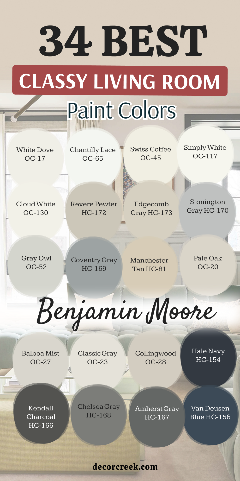
33 Modern Classy Living Room Paint Colors
White Flour SW 7102
White Flour SW 7102 is a very light and creamy white that makes your walls look as fresh as a new loaf of bread. This pigment is a fantastic choice if you want a neutral home that feels much friendlier than a cold or stark white. I find that it works perfectly in modern living rooms where you have a lot of white furniture or light wood accents. It reflects a massive amount of light, which helps a small or dark room feel much more open and large.
You will notice that it creates a very high-end look when paired with dark metal lamps or black window frames. This shade is a top choice for people who want a bright home that still feels very warm and full of life.
It provides a clean backdrop that makes your colorful artwork or family photos look very professional and clear. Many homeowners love how it brings a sense of order and joy to a room that might feel a bit boring. It is a hardworking color that brings a sense of high-fashion and logic to any wall it covers.
White Flour SW 9102 is a great pick for a soft and polished home that feels very fresh and updated.
Best used in: living rooms, kitchens, bedrooms, and whole-house painting
Pairs well with: Iron Ore SW 7069, Agreeable Gray SW 7029, Black Magic SW 6991, light oak The key rule of this color for an airy style is to use it on both walls and ceilings to create a seamless and very bright environment.
🎨 Check out the complete guide to this color right HERE 👈
Shoji White SW 7042
Shoji White SW 7042 is a warm and soft white that sits right between a light beige and a bright white. This pigment is a favorite for modern homes because it looks very clean without feeling too heavy or too old-fashioned. I love how it looks when paired with natural wood beams or a large stone fireplace in a seating area. It provides a neutral and steady backdrop that helps your house feel very connected and well-planned by a professional.
You can use this shade to create a very polished and updated look in a house that needs a fresh touch of color. It works beautifully with matte black metal accents and large green plants placed in the corners of the room.
This color helps a room feel very open and bright during the day while staying cozy when the sun goes down. Many designers choose this for a whole-house color because it is very easy to live with and looks great in every light. It provides a soft and professional finish that makes your home feel very current and high-fashion.
Shoji White SW 7042 is a wonderful and natural choice for a home that needs a sophisticated, airy touch.
Best used in: living rooms, exteriors, bedrooms, and open layouts
Pairs well with: Urban Bronze SW 7048, Agreeable Gray SW 7029, Pure White SW 7005, natural wood The key rule of this color for a clean look is to pair it with natural textures like linen to highlight its soft and creamy tones.
🎨 Check out the complete guide to this color right HERE 👈

White Heron BM OC-57
White Heron BM OC-57 is a cool and crisp white that has a slight gray undertone to keep it looking very sharp. This pigment is perfect for modern living rooms where you want a minimalist look that feels very fresh and organized. I find that it makes your white furniture and light-colored rugs look very clean and professionally designed. It reflects a massive amount of light, which is great for houses that do not have many large windows.
You will see that it provides a very professional backdrop for modern artwork and colorful decorative pillows on the sofa. This shade is a favorite for people who want a tidy and quiet house where every piece of furniture has its own place.
It works beautifully with silver or chrome accents and dark wood floors to create a very high-end apartment look. Many homeowners love how it makes their house feel very updated and much more expensive than it really is. It is a hardworking color that brings a sense of order and cleanliness to a busy family house.
White Heron BM OC-57 is the ultimate choice for a bright, fresh, and very modern living environment.
Best used in: modern living rooms, kitchens, trim, and small apartments
Pairs well with: Gray Owl OC-52, Kendall Charcoal HC-166, Hale Navy HC-154, silver accents The key rule of this color for a bright feel is to use it on the ceiling to make the whole room feel taller and more open.
🎨 Check out the complete guide to this color right HERE 👈
Paper White BM OC-55
Paper White BM OC-55 is a very light gray that feels as clean and fresh as a new sheet of paper on your walls. This pigment has a cool base that keeps it looking very modern and sharp in rooms with a lot of sunlight. I often use this color to make a small or dark room feel much larger and more open than it actually is. It looks very sharp and professional when you pair it with bright white trim and dark metal light fixtures.
You can use this shade to add a sense of high-fashion and logic to a house that feels too plain or boring. It works beautifully with blue or navy accents and light-colored wooden furniture or shelving in your seating area.
This pigment is a great way to make an old room feel modern and very updated for your family. Many homeowners love how it makes their colorful pillows or rugs look very sharp and bright against the wall. It provides a breezy and polished finish that makes your daily life feel more peaceful and well-planned.
Paper White BM OC-55 is a strong and stylish pick for a room that needs a cool, polished gray character.
Best used in: living rooms, kitchens, bathrooms, and bedrooms
Pairs well with: Chantilly Lace OC-65, Stonington Gray HC-170, Hale Navy HC-154, silver metal The key rule of this color for a tailored look is to use it with crisp white trim to make the light gray tones look sharp and clean.
City Loft SW 7631
City Loft SW 7631 is a soft and light mix of gray and beige that feels as airy as a high-end apartment. This pigment is much more interesting than a plain white because it has a lot of depth that changes with the sun. I love how it looks in a house with a lot of modern furniture and white linen curtains or soft rugs. It provides a clean and airy feeling that helps a small room feel much larger and more open than it really is.
You will notice that it looks very fresh and sharp when paired with dark wood floors and black metal light fixtures. This shade is a top choice for people who want a bright home that still feels very warm and full of life.
It works beautifully with natural materials like linen, stone, and light-toned wood shelving or tables in the room. Many homeowners love how it makes their house feel very unique and full of personality compared to basic white houses. It is a gentle and stylish choice that brings a lot of heart and soul to any wall it covers.
City Loft SW 7631 is the best pick for a home that needs a warm, light touch without feeling old-fashioned.
Best used in: whole-house painting, living rooms, bedrooms, and kitchens
Pairs well with: Pure White SW 7005, Agreeable Gray SW 7029, Urban Bronze SW 7048, light oak The key rule of this color for an airy style is to use it on both walls and ceilings to create a seamless and very bright environment.
🎨 Check out the complete guide to this color right HERE 👈
Drift of Mist SW 9166
Drift of Mist SW 9166 is a very light and soft gray that feels like a gentle morning fog on your living room walls. This pigment is a fantastic choice if you want a neutral home that looks very clean and professionally designed. I find that it brings a very organized and quiet feeling to a house that might feel a bit busy or loud. It reflects a massive amount of light, which helps your main seating area stay bright and airy all day long.
You will see that it makes your white furniture and light-colored rugs look very sharp and helps your house feel more organized. This shade is a favorite for people who want a modern look that stays very cheerful and bright during the day.
It works beautifully with silver or chrome accents and white linen curtains or soft gray decorative pillows. Many homeowners love how it makes their house feel very updated and much more expensive than it really is. It provides a breezy and polished finish that makes your daily life feel more peaceful and well-planned.
Drift of Mist SW 9166 is the best option for a home that needs a fresh, airy look with a soft touch of gray.
Best used in: living rooms, bedrooms, kitchens, and whole-house painting
Pairs well with: Pure White SW 7005, Revere Pewter HC-172, Naval SW 6244, silver accents The key rule of this color for an airy style is to pair it with very white trim to make the light gray tones look crisp and clear.
🎨 Check out the complete guide to this color right HERE 👈

Moonshine BM OC-56
Moonshine BM OC-56 is a light and cool gray that has a tiny hint of blue to keep it feeling very fresh and modern. This pigment is a favorite for modern homes because it looks very clean and does not feel heavy or dark. I find that it works perfectly in rooms with a lot of natural sunlight and light-colored wooden furniture or flooring. It reflects a massive amount of light, which helps a small or dark room feel much more open and large.
You can use this shade to create a very polished and updated look in an older home that needs a fresh change. It works beautifully with silver metal accents and white linen curtains or soft gray rugs in your seating area.
This color helps a room feel very open and bright during the day while staying very chic in the evening. Many designers choose this for a whole-house color because it is very easy to live with and looks great. It provides a soft and professional finish that makes your home feel very current and high-fashion.
Moonshine BM OC-56 is a great pick for a fresh and polished home that feels very current and happy.
Best used in: living rooms, bedrooms, bathrooms, and kitchens
Pairs well with: White Dove OC-17, Simply White OC-117, Wrought Iron 2124-10, silver metal The key rule of this color for a crisp look is to use it in rooms with cool LED lighting to keep the gray looking snowy and sharp.
🎨 Check out the complete guide to this color right HERE 👈
Titanium BM OC-49
Titanium BM OC-49 is a sophisticated light gray with a unique green-blue undertone that gives it a “chameleon” quality. This pigment is a fantastic choice if you want a neutral room that feels a bit more interesting than a standard beige. I find that it works perfectly in living rooms that transition into kitchens, as it feels very clean and balanced. It reflects light in a soft, muted way that prevents the room from feeling too sterile or bright.
You will see that it provides a very professional backdrop for white-painted cabinetry and stone surfaces. This shade is a favorite for people who want a home that feels very serene and modern without losing its warmth.
It hides daily dust and small imperfections on the wall very well, making it a practical choice for high-traffic areas. Many designers love this color because it bridges the gap between warm and cool tones seamlessly. It brings a sense of logic and maturity to your interior design and helps your whole home feel connected and tidy.
Titanium BM OC-49 is a wonderful and natural choice for a home that needs a sophisticated, airy touch with a bit of character.
Best used in: kitchens, living rooms, hallways, and bathrooms
Pairs well with: Cloud White OC-130, Shaker Gray 2135-40, Hale Navy HC-154, light marble The key rule of this color for a clean look is to use it in rooms with natural light to let the subtle green and blue tones come alive.
Silver Satin BM OC-26
Silver Satin BM OC-26 is an incredibly light and elegant off-white with just a hint of gray. This pigment is a favorite for people who want a bright home that feels much more expensive than a basic builder-grade white. I find that it works perfectly in open layouts where you want a seamless and airy flow from the entryway to the main seating area. It reflects a massive amount of light, which helps a small or dark room feel much more open and large than it really is.
You can use this shade to create a very crisp and updated look that makes your white trim look incredibly bright. It works beautifully with light wood floors and silver metal accents to create a very high-end and airy atmosphere.
This color is a top choice for staging because it feels very clean, professional, and brand new to anyone who walks in. It provides a breezy and polished finish that makes your daily life feel more peaceful and well-planned.
Best used in: living rooms, bedrooms, hallways, and trim
Pairs well with: Hale Navy HC-154, Metropolitan AF-690, Black 2131-10, light oak
Design Rule: Use it on the walls with a crisp white on the ceiling to maximize the height of the room and create a “gallery” feel.
🎨 Check out the complete guide to this color right HERE 👈
Anew Gray SW 7030
Anew Gray SW 7030 is the perfect “middle-ground” greige that has a bit more depth and saturation than the lighter neutrals. This pigment is ideal for adding weight to your walls without making the room feel closed-in or dark.
I find that it works perfectly in living rooms with high ceilings where you need a color that can hold its own and ground the space. It looks very professional and high-end, especially when paired with natural wood furniture.
You will notice that this shade hides small wall imperfections very well, which makes it a practical choice for a busy family house. It creates a steady, logical backdrop where any colorful piece of art or a bright sofa looks like a carefully planned designer choice. This is a reliable color that stays looking fresh and updated regardless of changing trends.
Best used in: living rooms, kitchens, and hallways
Pairs well with: Pure White SW 7005, Dorian Gray SW 7017, dark walnut wood
Design Rule: Pair it with dark wood floors to create a sophisticated contrast that feels both warm and modern.
🎨 Check out the complete guide to this color right HERE 👈
Mega Greige SW 7031
Mega Greige SW 7031 is a warm and rich stone-gray that brings a lot of heart and coziness into a room. This pigment is significantly warmer than standard gray tones, making it an excellent choice for north-facing rooms where the light can often feel cold or blue. I love this color for its ability to make a large interior feel soft, welcoming, and “wrapped” in warmth.
It looks absolutely stunning with stone fireplaces and leather furniture. This is a top choice for people who want their living room to look solid and traditional but still very current.
Many homeowners love this shade because it gives the home a feeling of an expensive country estate. It brings a sense of maturity and character to your interior design.
Best used in: large living rooms, bedrooms, and home offices
Pairs well with: Alabaster SW 7008, Urbane Bronze SW 7048, cognac leather
Design Rule: Use it in rooms with plenty of texture—like wool rugs and linen pillows—to emphasize its cozy and high-end nature.
🎨 Check out the complete guide to this color right HERE 👈
Metropolitan AF-690
Metropolitan AF-690 is a sophisticated, urban gray that feels very tailored and polished. This pigment has a very clean finish that avoids shifting into “muddy” tones, staying true to its refined gray character even in evening light. I love how it looks in a living room with silver accents and plush, light-colored rugs to create a luxury hotel atmosphere.
You will notice that it provides a very steady and cool backdrop that makes your house feel organized and well-planned. It is a top choice for modern homes where you want a neutral that still makes a quiet statement of quality.
Many homeowners love how it creates a peaceful environment that makes the seating area feel like a private retreat from the world.
Best used in: living rooms, bedrooms, and modern apartments
Pairs well with: Simply White OC-117, Kendall Charcoal HC-166, silver metal
Design Rule: Pair it with matte black hardware and large green plants to create a very current and chic environment.
Thunder BM AF-685
Thunder BM AF-685 is a sophisticated, medium-toned greige that brings a lot of solid presence to your walls. This pigment has a very rich and “meaty” feel to it, making it look incredibly high-end in a large living room. I often recommend this color for spaces with high ceilings because it has the strength to make a large room feel more grounded and cozy.
You will see that it creates a very high-end look when paired with crisp white trim and dark wood floors. This shade is a favorite for people who want a home that feels professional and carefully planned by a designer.
Many homeowners love this color because it acts as a perfect bridge between traditional warmth and modern style. It brings a sense of maturity to your interior design and helps everything feel very tidy.
Best used in: living rooms, master bedrooms, and dining rooms
Pairs well with: Simply White OC-117, Metropolitan AF-690, dark walnut
Design Rule: Use a light-colored rug to balance the depth of the walls and ensure the room stays feeling open and high-end.
🎨 Check out the complete guide to this color right HERE 👈

Pashmina BM AF-100
Pashmina BM AF-100 is a deep and rich greige that feels as soft and expensive as the fabric it is named after. This pigment has a lot of “muddy” warmth, which makes it look incredibly high-end in a traditional or transitional house. I find that it works perfectly with dark wood furniture and brass lamps to create a very wealthy and established look.
You can use this shade to make a large room feel more connected and much less cold during the day. It works beautifully with traditional rugs and heavy fabrics like wool or thick linen curtains.
This color is a favorite for people who want a house that feels very mature and professionally designed. It brings a sense of history and professional character to any space that needs a strong update.
Best used in: living rooms, dining rooms, and home offices
Pairs well with: Simply White OC-117, Shaker Beige HC-45, black accents
Design Rule: Pair it with light-colored furniture and “creamy” whites to ensure the room stays feeling sophisticated and not too heavy.
🎨 Check out the complete guide to this color right HERE 👈

Dorian Gray SW 7017
Dorian Gray SW 7017 is a classic, medium-toned gray that looks very noble and restrained. It is a very “true” gray with no unwanted yellow or blue undertones, making it a gold standard for neutral design.
I often recommend it for creating a strong architectural contrast against white trim and doors. It provides a rich finish that makes your furniture look more expensive.
You will see that gold, brass, or chrome details absolutely shine against this backdrop. It is a color for those who appreciate order and modern classics. It helps a living room look “assembled” and stylish, much like the homes you see in professional design magazines.
Best used in: living rooms, exteriors, and kitchen islands
Pairs well with: Eider White SW 7014, Repose Gray SW 7015, marble surfaces
Design Rule: Use it on the walls in a room with a white marble fireplace to create a look that is both timeless and high-fashion.
🎨 Check out the complete guide to this color right HERE 👈

Gauntlet Gray SW 7019
Gauntlet Gray SW 7019 is a deep, dark gray that immediately adds drama and mystery to a room. This pigment is perfect for creating a cozy, “cloistered” atmosphere.
I find it to be an excellent choice for media rooms or fireplace lounges where you want to relax and feel safe in the evening. Despite its depth, it remains warm enough to feel inviting rather than cold.
This shade makes an interior feel very expensive and unique. It serves as a stunning backdrop for modern art and light-colored furniture. If you want your home to stand out and feel like a private luxury retreat, this bold gray is exactly what you need. It brings a sense of confidence and luxury to your space.
Best used in: accent walls, offices, and home theaters
Pairs well with: Repose Gray SW 7015, Pure White SW 7005, copper accents
Design Rule: In a dark-painted room, use plenty of lamps and mirrors to reflect light and create a layered, moody atmosphere.
🎨 Check out the complete guide to this color right HERE 👈
Chelsea Gray BM HC-168
Chelsea Gray BM HC-168 is a medium-to-dark gray that has a very solid and balanced feel on the wall. This pigment is a top choice for people who want their walls to have a definite color that isn’t too light but still feels neutral. I find that it works perfectly in rooms with a lot of natural light that can show off its rich, velvet-like tones.
You can use this color to create a more formal and organized feeling in your main seating area. It hides dust and daily wear very well, making it a smart choice for a busy home with kids or pets.
It is a hardworking color that brings a sense of order and high-fashion to any wall it covers.
Best used in: living rooms, kitchen cabinets, and master bedrooms
Pairs well with: White Dove OC-17, Revere Pewter HC-172, silver accents
Design Rule: Pair it with light-colored furniture and “crisp” white trim to ensure the gray tones look sharp and clean.
🎨 Check out the complete guide to this color right HERE 👈
Iron Mountain BM 2134-30
Iron Mountain BM 2134-30 is a soft black that looks like dark charcoal or weathered slate. This pigment is much softer and “kinder” than a true jet black, which makes it much easier to live with in a family house.
I love using it for interior doors or window frames to add a touch of class and graphic logic to a simple room.
On these walls, light wood and white artwork look absolutely stunning and very expensive. This is a choice for bold homeowners who want to create an interior with a strong personality. It absorbs excess light, making the room incredibly cozy for evening relaxation with a book or a movie.
Best used in: accent walls, fireplaces, and interior doors
Pairs well with: Revere Pewter HC-172, Cloud White OC-130, natural textures
Design Rule: Use this color to hide the television by painting the TV wall—the screen will blend into the dark background, making the room look much tidier.
🎨 Check out the complete guide to this color right HERE 👈

Black Fox SW 7020
Black Fox SW 7020 is a unique and rich dark brown-gray that feels like a warm embrace. This pigment is a fantastic alternative to black because it has a hidden chocolatey depth that keeps a room from feeling cold.
I find that it works perfectly for an accent wall in a living room with a lot of natural stone or warm wood beams. It creates a sense of luxury that feels very grounded and earthy.
You will see that cream-colored furniture and gold lamps look incredibly bright and high-end against this dark backdrop. This shade is a top choice for people who want a moody, sophisticated vibe that still feels connected to nature. It provides a great sense of weight that can make a large, open space feel much more intimate and cozy.
Best used in: accent walls, exteriors, and home offices
Pairs well with: Shoji White SW 7042, Agreeable Gray SW 7029, cognac leather
Design Rule: Pair it with warm lighting and leather furniture to highlight the rich, dark brown undertones and create a wealthy atmosphere.
🎨 Check out the complete guide to this color right HERE 👈
Black Jack BM 2133-20
Black Jack BM 2133-20 is a crisp and modern black that feels very sharp and intentional. This pigment is a favorite for designers who want to add a “graphic” element to a house.
I find that it works perfectly to ground a room that has a lot of white or light gray, making the architecture of your home look much more expensive and well-planned.
You can use this shade to create a stunning focal point in a modern living area. It makes colorful artwork pop and gives your family photos a professional, gallery-like appearance. It brings a sense of finality and strength to your interior design and helps everything feel very current.
Best used in: interior doors, window trim, and furniture
Pairs well with: Chantilly Lace OC-65, Gray Owl OC-52, silver accents
Design Rule: Use it on the front door or interior doors to give your home an immediate feeling of high quality and designer style.
Newburg Green BM HC-158
Newburg Green BM HC-158 is a deep, teal-leaning blue that brings a massive amount of history and character to your walls.
I love using this color in a formal seating area where you want to create a sense of drama and elegance. It has enough green in it to feel very rooted and earthy, while the blue keeps it looking fresh and cool.
You will notice that brass hardware and gold picture frames look absolutely stunning against this rich backdrop. This shade is a bold way to show off your personal style and make your house stand out with a “designer” look. It provides a great sense of depth that makes a room feel very private and safe for evening relaxation.
Best used in: dining rooms, home offices, and cabinetry
Pairs well with: Revere Pewter HC-172, Manchester Tan HC-81, gold accents
Design Rule: Pair it with warm wood furniture and white artwork to balance the deep teal with natural warmth and professional clarity.
🎨 Check out the complete guide to this color right HERE 👈
Mount Etna SW 7625
Mount Etna SW 7625 is a complex, dark slate blue with strong green and gray influence. This pigment is a “chameleon” color that changes its personality depending on the sun, sometimes looking dark gray and other times a rich forest teal. I find that it brings a very moody and high-end feeling to a home that needs a bold change.
This shade is dark enough to feel very cozy, which is great for a media room or a bedroom. It works perfectly with natural materials like stone and dark wood beams.
Many homeowners love how it makes their white furniture look incredibly clean and sharp by contrast. It is a bold and smart pick that brings a sense of mystery and style to any living area.
Best used in: accent walls, exteriors, and kitchen islands
Pairs well with: Alabaster SW 7008, Sea Salt SW 6204, silver metal
Design Rule: Use it in rooms with large windows to let the sun show off the subtle green-blue shifts and keep the dark tones from feeling flat.
🎨 Check out the complete guide to this color right HERE 👈
Narragansett Blue BM HC-157
Narragansett Blue BM HC-157 is a classic, deep navy that feels very solid and trustworthy. This pigment is a top choice for people who want a dark blue that avoids looking too “royal” or bright. I love how it looks in a traditional living room with a lot of white trim and light oak floors. It makes your home feel very established and well-made.
You can use this shade to create a very formal and organized feeling in your main seating area for guests. It hides shadows and marks very well, making it a smart pick for a hardworking family house.
This color works perfectly with gold accents and leather furniture to create a very balanced and high-end look.
Best used in: accent walls, dining rooms, and front doors
Pairs well with: Stonington Gray HC-170, Cloud White OC-130, brass hardware
Design Rule: Pair it with very bright white trim and plenty of lamps to create a professional and clean border around the deep blue.
Gentleman’s Gray BM 2062-20
Gentleman’s Gray BM 2062-20 is actually a deep, blackened teal that looks incredibly sophisticated and “dapper.” This pigment is much more interesting than a standard navy because the hint of green gives it a rich, jewelry-like quality. I find that it looks very high-end in a room with a lot of books, leather, and traditional art.
You will notice that gold lamps or white marble tables look absolutely stunning against this dark backdrop. This shade is a bold way to make your house feel like a private club or a luxury library.
It provides a great sense of depth that can actually make a wall feel like it is moving further away.
Best used in: home offices, library areas, and front doors
Pairs well with: Pale Oak OC-20, Revere Pewter HC-172, gold accents
Design Rule: Use plenty of mirrors and light-colored artwork to reflect light against the deep tones and keep the room from feeling too small.
🎨 Check out the complete guide to this color right HERE 👈

Silver Strand SW 7057
Silver Strand SW 7057 is a light and airy gray with very clear green and blue undertones. This pigment is a favorite for creating a “spa-like” or coastal feeling in a home.
I find that it brings a very organized and quiet feeling to a house that might feel a bit busy. It reflects a massive amount of light, which helps a small or dark room feel much more open.
You will notice that it looks very fresh and clean when paired with bright white trim and light-colored furniture. This shade is a favorite for living rooms where you want a soft and gentle atmosphere. It works beautifully with natural materials like wicker, jute, and light-toned wood.
Best used in: bathrooms, bedrooms, and sunrooms
Pairs well with: Pure White SW 7005, Naval SW 6244, silver metal
Design Rule: Pair it with crisp white trim and blue accents to make the watery tones look crisp and clear.
🎨 Check out the complete guide to this color right HERE 👈
October Mist BM 1495
October Mist 1495 is a soft and earthy sage green that feels organic and rooted in the natural world. This pigment was a color of the year because it perfectly fits the trend of bringing the outdoors into our homes. I love how it looks in a living room with a lot of light oak furniture and soft tan rugs.
You can use this shade to create a very polished and updated look in an older home. It works beautifully with matte black metal accents and large green plants.
This color helps people feel more connected to nature, which brings a very good energy to your daily life.
Best used in: living rooms, bedrooms, and cabinetry
Pairs well with: Steam AF-15, Gloucester Sage HC-100, light wood
Design Rule: Pair it with organic textures like linen and wool to highlight its soft and leafy character.
🎨 Check out the complete guide to this color right HERE 👈
Dried Thyme SW 6186
Dried Thyme SW 6186 is a deep, organic green with a strong gray undertone that keeps it looking very mature and professional. This pigment is part of the move toward “biophilic” design, bringing the feeling of a forest floor into your living room. I love how it looks when paired with natural oak furniture and brass light fixtures.
You will notice that it adds a lot of depth to your house and makes it feel like a professional retreat.
This shade is dark enough to feel very private and safe, which is great for a room where you watch movies or read. It is a bold and smart pick that brings a sense of history and style to any living area.
Best used in: accent walls, offices, and cabinetry
Pairs well with: Shoji White SW 7042, Sea Salt SW 6204, brass hardware
Design Rule: Pair it with plenty of warm wood elements to balance the cool green with natural warmth and an earthy feeling.
🎨 Check out the complete guide to this color right HERE 👈

Copley Gray BM HC-104
Copley Gray BM HC-104 is a sophisticated “earthy” gray with a heavy green-brown base. This pigment is a top choice for people who want a neutral that feels solid and connected to the outdoors.
I often recommend this for living rooms with large stone fireplaces or traditional architecture.
You will see that it creates a very high-end look when paired with creamy white trim and dark metal accents. This shade is a favorite for people who want a home that feels established and full of character. It hides dust and daily wear very well, making it a smart choice for a busy family area.
Best used in: exteriors, living rooms, and traditional offices
Pairs well with: Elephant Tusk OC-8, Dragon’s Breath 1547, warm wood
Design Rule: Use it in rooms with warm light to highlight the sandy and mossy tones in the paint and create a rich, traditional atmosphere.
🎨 Check out the complete guide to this color right HERE 👈
Tate Olive BM HC-112
Tate Olive BM HC-112 is a rich, medium-to-dark olive green that feels traditional and high-end. This pigment brings a huge amount of heart and soul to a room, reminding people of old country estates. I find that it works perfectly with warm wood furniture and brass lamps to create a wealthy and established look.
You can use this shade to make a large room feel more connected and much less empty. It works beautifully with antique furniture and heavy fabrics like wool or woven blankets on the sofa.
Many designers love this color because it feels very natural and never looks like it is trying too hard to be trendy.
Best used in: living rooms, dining rooms, and home offices
Pairs well with: Manchester Tan HC-81, Simply White OC-117, gold accents
Design Rule: Pair it with cream-colored accents and warm wood to emphasize the soft, leafy, and historical character of the paint.
🎨 Check out the complete guide to this color right HERE 👈
Redend Point SW 9081
Redend Point SW 9081 is a soft and earthy “blush-beige” that feels warm and welcoming. This pigment is a great choice if you want a neutral home that has a tiny bit of a romantic and soft feeling without being “pink.” I find that it works perfectly with light gray furniture and natural wood to create a very airy and light look.
You will see that it makes your white trim look very sharp and helps your house feel more organized and clean.
This shade is a favorite for people who want a house that feels very kind and welcoming for guests and family. It provides a soft backdrop that makes your colorful artwork look professional and clear.
Best used in: bedrooms, living rooms, and entryways
Pairs well with: Kestrel White SW 7516, Foothills SW 7514, natural stone
Design Rule: Use it with plenty of organic materials like stone, wood, or linen to highlight its warm, sandy tones and keep the room looking grounded.
🎨 Check out the complete guide to this color right HERE 👈

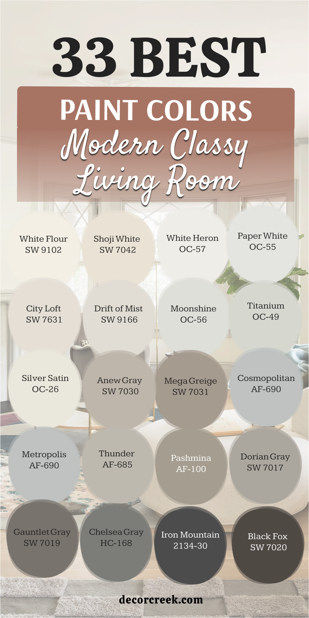
18 Classy Boho Living Room Paint Colors
Swiss Coffee BM OC-45
Swiss Coffee BM OC-45 is a classic, warm white that provides the perfect foundation for a boho-inspired living room. This pigment is loved for its creamy undertones that prevent the room from feeling cold or clinical.
I find that it acts as a soft, glowing backdrop for eclectic decor, such as rattan furniture and colorful woven wall hangings. It reflects light in a gentle way that makes your seating area feel welcoming and lived-in.
You will see that it provides a beautiful contrast against dark wood floors and green house plants. This shade is a top choice for people who want a bright home that still feels very cozy and soulful. It hides small imperfections better than a stark white, making it a very practical choice for a busy family space. Many designers love this color because it bridges the gap between modern clean lines and vintage boho charm.
Best used in: whole-house painting, living rooms, and bedrooms
Pairs well with: Revere Pewter HC-172, terracotta accents, natural oak
Design Rule: Pair it with plenty of “earthy” textures like jute and linen to bring out the creamy, organic warmth of the paint.
🎨 Check out the complete guide to this color right HERE 👈
Old Fashioned Peach OC-79
Old Fashioned Peach OC-79 is a sophisticated, “antique” white with a hint of gray and green that keeps it looking grounded and natural. This pigment feels like a vintage treasure, making it ideal for a classy boho look that includes thrifted finds and historical details.
I love how it looks in a room with a lot of natural sunlight, where the subtle green undertones keep the space feeling fresh and connected to the outdoors.
You can use this shade to create a room that feels established and full of character. It works beautifully with matte black metal accents and warm leather sofas. This color is a favorite for those who want a neutral home that has a bit more “soul” and history than a standard off-white. It provides a quiet, professional finish that makes your eclectic decorations look very intentional and curated.
Best used in: living rooms, cabinetry, and entryways
Pairs well with: Saybrook Sage HC-114, dark walnut, gold accents
Design Rule: Use this color in rooms with large indoor plants; the subtle green in the paint will make the foliage look incredibly vibrant.
Cotton SW 9581
Cotton SW 9581 is a very light and airy white that feels as soft as the fabric itself. This pigment is a fantastic choice if you want a “clean” boho vibe—think white-on-white textures with a few wooden accents. I find that it reflects a massive amount of light, which helps a small living room feel much larger and more open. It provides a crisp backdrop that makes your colorful bohemian rugs or pillows really stand out.
You will notice that it looks very sharp and modern when paired with black window frames or dark metal light fixtures. This shade is a top choice for people who want a bright, happy home that feels fresh every morning.
It brings a sense of order and cleanliness to a room that might have a lot of different patterns and textures. It is a hardworking color that provides a breezy, polished finish to any wall.
Best used in: living rooms, small spaces, and ceilings
Pairs well with: Iron Ore SW 7069, light oak, dried pampas grass
Design Rule: To keep a boho room from looking too busy, use this color on both walls and trim to create a seamless, calming environment.
🎨 Check out the complete guide to this color right HERE 👈

Aged White SW 9180
Aged White SW 9180 is a rich, medium-toned cream that brings a sense of luxury and traditional warmth to a bohemian space. This pigment has a “buttery” quality that makes a room feel safe and cozy as soon as the sun goes down. I recommend this to people who want a boho look that leans more toward a “collected” and wealthy feel. It works perfectly with heavy fabrics and oversized furniture.
You will see that it makes your white artwork and light-colored shelving look very sharp by providing a steady, warm contrast. This shade is a favorite for people who want a home that feels like a private sanctuary.
It hides shadows and daily scuffs very well, making it a smart choice for high-traffic living areas. Many designers choose this color because it feels very mature and provides a rich, high-end texture to the walls.
Best used in: living rooms, hallways, and traditional boho spaces
Pairs well with: Urban Bronze SW 7048, terracotta, warm brass hardware
Design Rule: Pair it with dark, antique wood furniture to balance the creaminess with a sense of history and weight.
🎨 Check out the complete guide to this color right HERE 👈
White Flour SW 7102
White Flour SW 7102 is a very light, friendly white that feels like a soft morning light in your house. This pigment is much warmer than a standard white, making it a great pick for a “modern boho” living room where you want things to stay bright but welcoming. I find that it works perfectly with light wood accents and minimalist decor, helping the whole room feel connected and tidy.
You will notice that it creates a very high-end look when paired with dark metal lamps or black frames. This shade is a favorite for people who want a bright home that still feels full of life.
It provides a clean backdrop that makes your family photos and artwork look professional. Many homeowners love how it brings a sense of order and joy to a room that might feel a bit dark.
Best used in: whole-house painting, kitchens, and living rooms
Pairs well with: Agreeable Gray SW 7029, terracotta pottery, natural textures
Design Rule: Use this color in a room with a lot of natural wood to create a “scandi-boho” look that is both clean and warm.
🎨 Check out the complete guide to this color right HERE 👈
Canvas Tan SW 7531
Canvas Tan SW 7531 is a soft and balanced tan that feels like a piece of natural linen on your walls. This pigment is a fantastic tool for a boho living room because it feels very grounded and organic without being too “yellow.” I often use it to create a warm, neutral base for rooms that feature a lot of woven baskets and light-colored wooden furniture.
You can use this shade to add a sense of high-fashion and logic to a house that feels too plain. It works beautifully with navy or forest green accents and light-colored wooden shelving.
This pigment is a great way to make a room feel updated and very professional for your family. Many homeowners love how it makes their colorful rugs look sharp against the wall while keeping the overall vibe peaceful.
Best used in: living rooms, hallways, and entryways
Pairs well with: Naval SW 6244, October Mist 1495, light oak
Design Rule: Use this color in a room with plenty of natural sunlight to bring out its sandy, beachy undertones.
🎨 Check out the complete guide to this color right HERE 👈

Opal BM OC-73
Opal BM OC-73 is an incredibly light and delicate white with a tiny hint of pink and cream. This pigment is perfect for a “romantic boho” style, as it adds a very soft glow to the walls that changes with the sun.
I find that it brings a very fresh and healthy feeling to a home that might feel a bit dark or cold. It works perfectly with white linen curtains and soft, plush rugs to create a breezy atmosphere.
You will see that it makes your furniture look very sharp and helps your house feel more organized and clean. This shade is a top choice for people who want a hint of color that is still very easy to match with various decor styles. It reflects the sun nicely so your home stays bright from the morning until the evening. It is a light and airy choice that brings a lot of heart to any wall.
Best used in: bedrooms, living rooms, and sunrooms
Pairs well with: White Dove OC-17, soft blush accents, gold metal
Design Rule: Pair it with copper or gold accents to highlight the subtle, warm glow within the paint.
Pink Damask BM OC-72
Pink Damask BM OC-72 is a very light off-white with a sophisticated pink undertone that feels like a sunset on your walls. This pigment is a favorite for a “chic boho” look because it adds a touch of personality without being overwhelming.
I love how it looks when paired with light gray furniture and natural wood to create a very airy and light look. It brings a sense of warmth and kindness to your daily life.
You can use this shade to create a very polished and updated look in an older home that needs a fresh touch. It works beautifully with matte black metal accents and large green plants. This color helps people feel more connected to a cozy, inviting environment, which brings a very good energy to the house. Many homeowners love how it makes their house feel unique and full of character.
Best used in: living rooms, bedrooms, and powder rooms
Pairs well with: Gray Owl OC-52, Simply White OC-117, light oak
Design Rule: Use this color in a room with north-facing light to warm up the space and prevent it from feeling too blue or cold.
Terra Brun SW 6048
Terra Brun SW 6048 is a deep, powerful chocolate brown that brings a massive amount of drama and “earthiness” to a boho room. This pigment is very rich and heavy, making it perfect for an accent wall or a cozy library corner.
I love using this color to ground a room that has a lot of bright, colorful patterns. It makes light-colored furniture and white artwork look absolutely stunning and very expensive by contrast.
You will see that gold lamps or white marble tables look incredible against this dark, earthy backdrop. This shade is a bold way to show off your personal style and make your house feel like a high-end retreat. It provides a great sense of depth that makes a wall feel solid and well-protected. Many people choose this color for a room used for reading or relaxing at night because of its cozy atmosphere.
Best used in: accent walls, offices, and library areas
Pairs well with: Swiss Coffee OC-45, terracotta, brass hardware
Design Rule: Pair it with a cognac leather sofa to create a rich, layered look that defines the “classy boho” aesthetic.
Cavern Clay SW 7701
Cavern Clay SW 7701 is a vibrant and warm terracotta that feels like the heart of the desert. This pigment is the ultimate “boho” color, bringing a sense of adventure and natural warmth to your seating area.
I find that it works perfectly with natural wood, woven rugs, and a lot of indoor plants. It provides a rich and friendly backdrop that makes everyone feel right at home as soon as they walk in.
You can use this shade to add a sense of history and professional style to a house that feels too plain or modern. It works wonderfully with turquoise or navy accents to create a very balanced and high-end look. This color is a classic for the bohemian style because it brings a lot of soul to your walls. Many people prefer this over a neutral because it feels more natural and full of life.
Best used in: accent walls, entryways, and dining rooms
Pairs well with: Shoji White SW 7042, Naval SW 6244, light oak
Design Rule: Use this color in a room with plenty of “cool” accents (like blue pillows or green plants) to balance the intense warmth of the clay.
🎨 Check out the complete guide to this color right HERE 👈

Indian White BM 985
Indian White BM 985 is a deep, sophisticated cream that feels very grounded and traditional. This pigment has a lot of “body” to it, making the walls feel solid and high-quality.
I find that it works perfectly for a “vintage boho” look where you want a smooth, warm transition between rooms. It reflects light in a soft, golden way that helps your main seating area feel airy and bright all day long.
You will see that it provides a very professional backdrop for white crown molding and dark wood furniture. This shade is a top pick for people who want a house that feels very clean and welcoming for their family. It provides a steady backdrop that helps your colorful pillows or rugs look very sharp and professional. Many homeowners love this color because it feels very mature and stays looking great for many years.
Best used in: living rooms, kitchens, and hallways
Pairs well with: White Dove OC-17, terracotta accents, dark walnut
Design Rule: Pair it with “off-white” linens and textures to create a monochromatic, high-end boho look that feels very calm.
Cushing Green BM HC-125
Cushing Green BM HC-125 is a deep, historic forest green that brings a lot of strength and professional presence to your walls. This pigment is a favorite for designers who want a “moody boho” look that feels very high-end and unique.
I find that it makes gold picture frames and brass lamps look absolutely stunning. It brings a sense of maturity and high design to a house that needs a fresh and modern update.
You will notice that it adds a lot of depth to your house and makes it feel like a professional retreat. This shade is dark enough to feel very private and safe, which is great for a room where you watch movies or talk. Many homeowners love how it makes their white furniture pop and look incredibly clean and fresh by contrast. It is a bold and smart pick that brings a sense of history to any living area.
Best used in: accent walls, offices, and library areas
Pairs well with: Manchester Tan HC-81, Simply White OC-117, cognac leather
Design Rule: Use it in a room with a lot of natural wood elements to create a “forest-cabin” boho vibe that feels very luxurious.
🎨 Check out the complete guide to this color right HERE 👈
Sand Dune SW 6086
Sand Dune SW 6086 is a medium-toned, warm tan that feels like a desert landscape on your walls. This pigment is a great alternative to white if you want a room that feels more finished and solid.
I find that it works perfectly in bohemian seating areas with a lot of natural textures like jute and wicker. It reflects a good amount of light, which helps your house feel airy and bright all day long.
You will see that it makes your white trim look very sharp and professionally finished. This shade is a top pick for people who want a house that feels very warm and welcoming for their family. It provides a steady backdrop that helps your colorful bohemian pillows or rugs look very sharp. Many designers choose this color because it is very easy to live with and stays looking great for many years.
Best used in: living rooms, entryways, and hallways
Pairs well with: Alabaster SW 7008, Cavern Clay SW 7701, dark wood
Design Rule: Use it in a room with warm “sunset” colors like orange and yellow to create a harmonious and cozy environment.
🎨 Check out the complete guide to this color right HERE 👈
Earthy Ochre SW 9532
Earthy Ochre SW 9532 is a deep and rich golden-yellow that brings a huge amount of heart and sun into your living room. This pigment is a classic choice for boho houses because it makes a room feel happy and full of energy.
I find that it works perfectly with warm wood furniture and brass lamps or copper decorative pieces. It provides a soft glow that makes people want to sit and talk for a long time.
You will notice that it adds a sense of history and professional style to a house that feels too plain. It works wonderfully with dark wood floors and navy blue accents to create a very balanced and high-end look. This color is a bold choice that shows you have a lot of confidence in your personal interior design style. Many people choose this for their main seating area to make it feel more formal and well-designed for guests.
Best used in: accent walls, dining rooms, and entryways
Pairs well with: Pure White SW 7005, Naval SW 6244, natural wood
Design Rule: Pair it with dark, “moody” colors like navy or charcoal to keep the golden yellow from feeling too bright or overwhelming.
🎨 Check out the complete guide to this color right HERE 👈
Sonoma Clay 1242
Sonoma Clay 1242 is a sophisticated and muted terracotta that feels very grounded and high-end. This pigment is much softer than a bright orange, making it easier to live with on a daily basis.
I often use this color for an accent wall to create a focal point that looks like a high-end art gallery. It provides a deep and solid finish that makes every other color in your house look much brighter.
You can use this shade to create a sense of mystery and deep style in a house that feels too plain or boring. It works wonderfully with gold accents and dark wood floors to create a very traditional and wealthy appearance. This pigment is dark enough to hide any small flaws in your walls while adding a lot of professional character. It is a bold choice that brings a sense of heart and soul to your interior design.
Best used in: accent walls, dining rooms, and bedrooms
Pairs well with: Cloud White OC-130, Saybrook Sage HC-114, brass hardware
Design Rule: Use this color in a room with a lot of “natural” elements like stone or unfinished wood to emphasize its earthy, canyon-inspired tones.
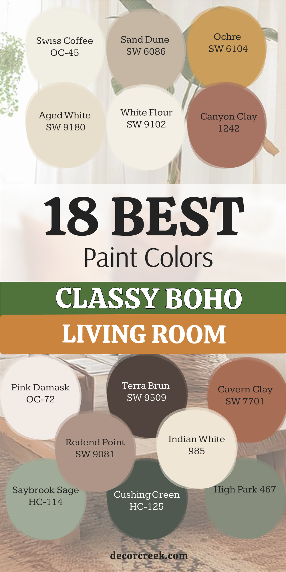
Picking a paint color is a big decision that shapes how you feel in your home every single day. The right shade can make a room feel brighter, warmer, and more inviting from the moment you walk in. I hope this list helps you find a color that feels just right and makes you smile each time you open your front door.
Remember, paint is one of the simplest ways to refresh your home and give it a polished, well-designed look without a huge effort. It can highlight your favorite furniture, bring your decor together, and create a look that feels complete. Trust your instincts and choose a color that works with your lifestyle, your lighting, and the pieces you already love.
Take your time, test a few samples, and see how they look throughout the day. A beautiful home starts with a thoughtful color choice on the walls, and now you have the ideas and confidence to make a choice that feels right for you and your family.