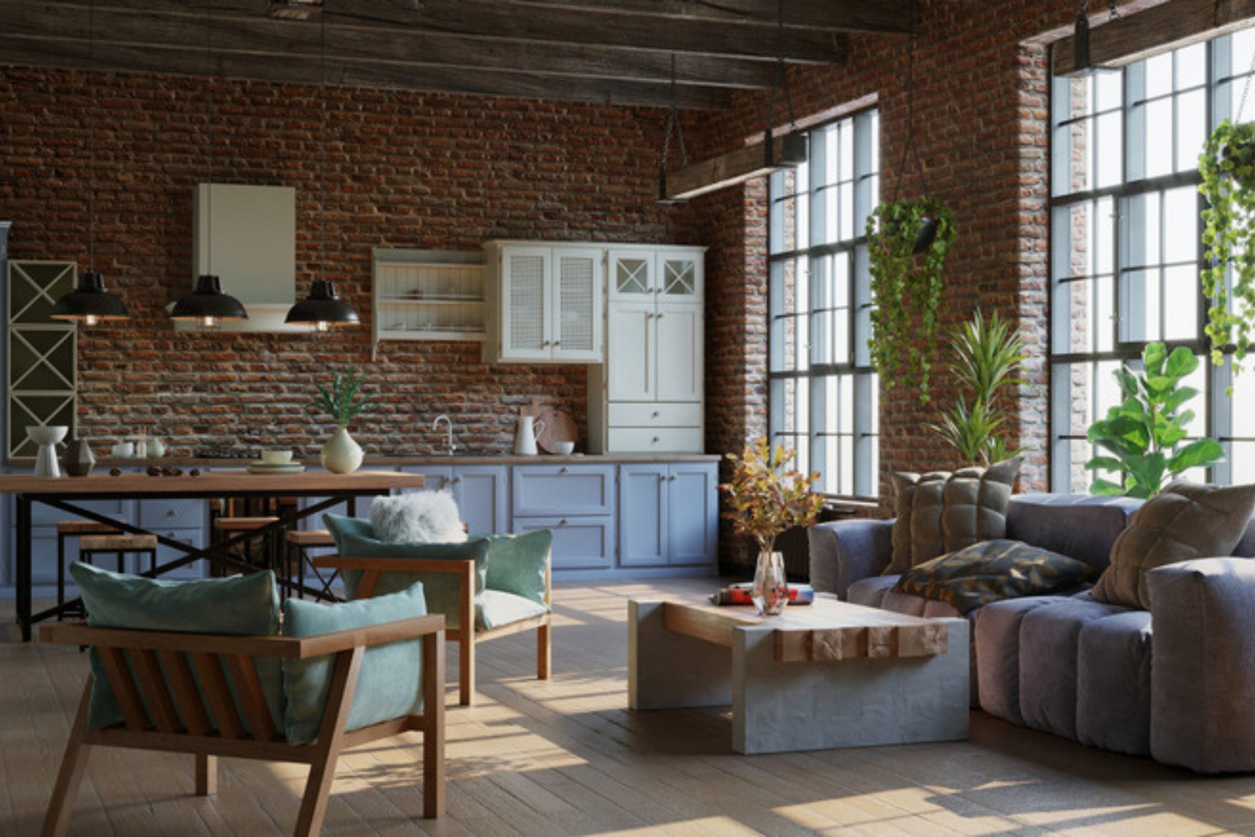
I have spent years walking through old factories and warehouses turned into homes. The industrial look is about raw beauty and honest materials. Choosing the right paint is the most important part of making these large areas feel like home. You want colors that look like metal, concrete, and old wood.
The right palette makes your furniture stand out and gives your walls a sturdy personality. I have picked out my favorite shades that work every single time.
These colors will help you get that cool, edgy vibe without making your rooms feel cold or lonely. Let’s look at how to use these professional picks in your own house.
Why I Always Trust Sherwin-Williams and Benjamin Moore for Industrial Design Paint Colors
I always turn to these two brands because their pigments are deep and reliable. When you are trying to mimic the look of aged steel or heavy stone, you need paint that has real weight to it. Sherwin-Williams has a fantastic range of grays that never look purple or blue by mistake. Their coatings are tough and can handle the busy life of a family home.
Benjamin Moore offers some of the richest dark tones I have ever seen. Their Historical Collection is a secret weapon for anyone who loves the industrial style.
These colors stay true under different lights throughout the day. I know that when I pick a swatch from them, the final result will look exactly like I planned.
How I Choose the Perfect Industrial Paint Color for Any Space
I start by looking at the natural light coming through your windows. If you have big floor-to-ceiling windows, you can go very dark without the room feeling like a cave. I also check the materials already in the room, like red brick or exposed pipes. You want a color that talks to those materials instead of fighting with them.
I like to test large samples on different walls before making a final choice. The way a gray looks next to a wooden beam is different from how it looks next to a metal stairs.
My goal is to find a balance between the hard edges of industrial items and the comfort of a home. We want your guests to feel interested and relaxed the moment they walk inside.
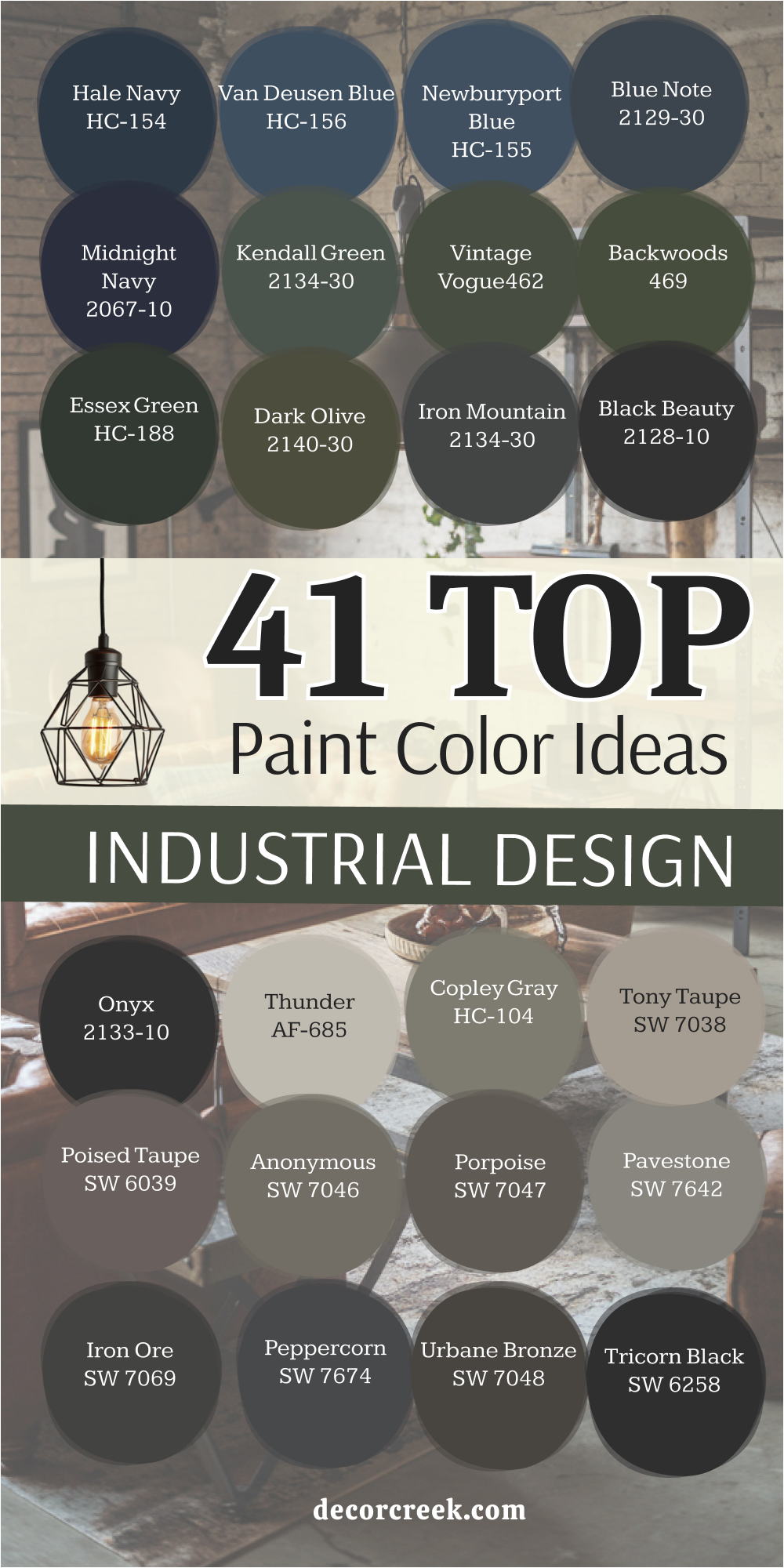
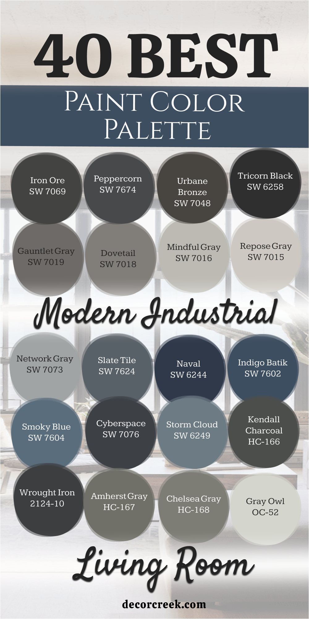
40 Modern Industrial Living Room Paint Color Palette
Iron Ore SW 7069
Iron Ore SW 7069 is a deep charcoal that looks like heavy metal beams. This shade works perfectly when you want to make a bold statement on an accent wall. It has enough warmth to keep it from looking like a flat black.
Many people use it to highlight window frames or doors for a sharp look. Lighting plays a big role in how this dark tone behaves in your room. It pairs beautifully with light oak floors or white marble counters. You will notice it brings out the texture in brick walls very well.
It is one of the most popular choices for a modern warehouse feel. I find that it hides small imperfections on older walls quite nicely. This color gives a sense of strength to any area it covers.
Best used in: living rooms, bedrooms, kitchen cabinets, and interior doors
Pairs well with: Extra White SW 7006, Revere Pewter HC-172, Honey Oak, and cognac leather The key rule of this color for industrial style is to use it where you want to ground the room with a sense of heavy, structural weight.
👉 Read the full guide for this color HERE 👈

Peppercorn SW 7674
Peppercorn SW 7674 sits right in the middle of the dark gray scale. This paint has a very balanced personality that fits almost any lighting situation. It mimics the look of wet pavement or weathered slate.
I love using it in hallways to create a sense of mystery. It makes colorful art pieces pop off the wall with a lot of energy. The finish looks professional and high-end even on a tight budget.
You can use it on all four walls if you have enough lamps and overhead lights. It creates a cozy feeling that is still very grown-up and stylish. The undertones are neutral so it does not shift toward blue or green. It is a safe bet for someone new to dark interior colors.
Best used in: media rooms, home offices, accent walls, and bathroom vanities
Pairs well with: Agreeable Gray SW 7029, Carrara marble, brass fixtures, and light gray textiles The key rule of this color for industrial style is to use it as a neutral anchor that allows your metal furniture to be the star.
👉 Read the full guide for this color HERE 👈

Urbane Bronze SW 7048
Urbane Bronze SW 7048 is a unique mix of brown and gray that feels very earthy. This color reminds me of old bronze statues found in city parks. It brings a natural element into a room filled with machines and metal.
I often recommend it for rooms with lots of indoor plants. The warmth in this paint makes a large room feel much more inviting. It bridges the gap between modern metal and traditional wood furniture.
You will see it change slightly throughout the day as the sun moves. It looks expensive and sophisticated on tall walls or fireplace surrounds. This shade is great for hiding dust and fingerprints in high-traffic areas. It feels grounded and solid which is exactly what industrial design needs.
Best used in: exteriors, living rooms, built-in bookshelves, and master suites
Pairs well with: Modern Gray SW 7358, Shoji White SW 7042, copper accents, and dark wood The key rule of this color for industrial style is to use it to soften the coldness of metal pipes with its organic, muddy warmth.
👉 Read the full guide for this color HERE 👈

Tricorn Black SW 6258
Tricorn Black SW 6258 is the truest black you can find for your home projects. It does not have any hidden colors like blue or brown inside it. This makes it a very powerful tool for creating high contrast.
I use it on metal railings to make them look like forged iron. A little bit of this paint goes a long way in a smaller room. It works wonders on kitchen islands to create a focal point.
The finish is crisp and clean providing a very modern edge to the house. It is the perfect backdrop for neon signs or bright white posters. Using it on a ceiling can actually make the ceiling feel like it goes on forever. It is a classic choice that never feels out of fashion in a city loft.
Best used in: window trim, railings, front doors, and dramatic accent walls
Pairs well with: Pure White SW 7005, Classic Gray OC-23, bright yellow, and stainless steel The key rule of this color for industrial style is to use it on structural elements to define the lines of the room clearly.
👉 Read the full guide for this color HERE 👈

Gauntlet Gray SW 7019
Gauntlet Gray SW 7019 is a strong, medium-to-dark gray with a lot of punch. This color reminds me of the steel used in old bridges and skyscrapers. It is dark enough to be moody but light enough to use in a basement.
I think it looks best when paired with light gray rugs. The tone is very masculine and sturdy making it great for a home gym or office. It creates a very professional atmosphere that helps you stay focused.
You can see the depth of the pigment when the light hits it from the side. It works well in kitchens with concrete countertops. It is a very forgiving color that hides scuffs from shoes and furniture. This makes it a smart choice for families with kids or pets.
Best used in: kitchens, mudrooms, hallways, and exterior siding
Pairs well with: Repose Gray SW 7015, Eider White SW 7014, navy blue, and weathered wood The key rule of this color for industrial style is to use it as a bridge between your lightest grays and your darkest blacks.
👉 Read the full guide for this color HERE 👈

Dovetail SW 7018
Dovetail SW 7018 is a warm gray that feels like a piece of soft flannel. This color looks wonderful next to reclaimed wood planks on a wall. It has just enough depth to stand out against white trim and ceilings.
I like to use it in bedrooms where you want a relaxed vibe. The shade does not feel cold or metallic like some other grays. It mimics the look of high-quality wool or concrete that has been polished.
You will find that it makes light wood furniture look very bright and clean. It is easy to live with for many years without getting tired of it. The way it catches the morning light is very pretty and welcoming. It is a solid middle-ground choice for any industrial living room.
Best used in: bedrooms, living rooms, laundry rooms, and cabinets
Pairs well with: Repose Gray SW 7015, Black Magic SW 6991, oak wood, and cream rugs The key rule of this color for industrial style is to use it to bring a sense of softness to rooms filled with hard metal edges.
👉 Read the full guide for this color HERE 👈

Mindful Gray SW 7016
Mindful Gray SW 7016 is a versatile gray that leans slightly into the warm side. This color works perfectly for rooms that do not get a lot of natural sun. It makes small apartments feel much bigger than they actually are.
I often suggest this for people who want a neutral that isn’t white. It provides a great background for a gallery wall of black and white photos. The color reminds me of a cloudy sky over a city skyline.
It looks very clean and crisp next to dark iron light fixtures. You can use it in every room to keep a consistent look in your home. It stays true to its gray roots without looking like concrete. The feeling it creates is one of organized and modern living.
Best used in: open concept spaces, entryways, bathrooms, and exterior trim
Pairs well with: Pearly White SW 7009, Homburg Gray SW 7622, navy accents, and gold The key rule of this color for industrial style is to use it as a light base that makes the architecture of the building stand out.
👉 Read the full guide for this color HERE 👈

Repose Gray SW 7015
Repose Gray SW 7015 is a light gray that almost every designer keeps in their kit. It is famous for being a flexible choice because it matches everything. This color feels like the soft side of concrete before it gets too dark.
I use it as a main wall color for entire open-floor plans. It makes a room feel large and airy while still adding a touch of color. You will notice that it picks up the colors of the things around it.
If you have a lot of blue furniture it might look a tiny bit cool. If you have warm wood it feels very cozy and soft. This is a great choice if you are worried about making a room too dark. It provides a clean slate for any kind of industrial decor you choose.
Best used in: whole-house painting, entryways, kitchens, and nursery walls
Pairs well with: Eider White SW 7014, Dorian Gray SW 7017, black metal, and teal The key rule of this color for industrial style is to use it as a bright backdrop that keeps your heavy furniture from feeling too bulky.
👉 Read the full guide for this color HERE 👈

Network Gray SW 7073
Network Gray SW 7073 is a cool gray that has a very modern and tech-like feel. This color reminds me of brushed aluminum or modern office equipment. It works well in rooms with lots of glass and stainless steel.
I like to use it in modern kitchens to give a very sharp look. The blue undertone makes it feel fresh and very clean. It looks great with white furniture and dark navy accent pillows.
You will find it creates a very productive feeling in a home office. The way it reflects light helps to brighten up a dark corner. It is a very popular pick for houses with a minimalist industrial look. This shade is perfect for someone who wants a very crisp and cool atmosphere.
Best used in: home offices, modern kitchens, bathrooms, and accent walls
Pairs well with: Extra White SW 7006, Web Gray SW 7075, chrome, and glass The key rule of this color for industrial style is to use it to emphasize a clean, mechanical, and modern aesthetic.
👉 Read the full guide for this color HERE 👈
Slate Tile SW 7624
Slate Tile SW 7624 is a deep blue-gray that looks like heavy stone. This color brings a lot of mood and character to a main living area. It feels very solid and permanent like the foundation of a building.
I love how it looks when paired with copper pipes and warm wood. The blue in it adds a layer of richness that simple gray lacks. It makes a room feel very quiet and private like a secret club.
You should use it on a wall that gets a lot of direct light. It shows off the texture of drywall or plaster in a beautiful way. The depth of this paint makes any room look more expensive. It is a fantastic choice for a dramatic industrial makeover.
Best used in: accent walls, dining rooms, library spaces, and furniture pieces
Pairs well with: Alabaster SW 7008, Canvas Tan SW 7531, copper, and dark leather The key rule of this color for industrial style is to use it to provide a sense of luxury and depth within a rugged environment.
👉 Read the full guide for this color HERE 👈

Naval SW 6244
Naval SW 6244 is a deep, royal navy blue that brings a splash of color to industrial rooms. Industrial style does not have to be just gray and black to look professional. This blue looks amazing next to exposed orange bricks and raw metal pipes. It feels like the color of a midnight sky over a big city skyline.
I love using this in bedrooms to create a sense of deep rest and focus. It pairs perfectly with gold or brass lamps and modern cabinet handles. The color is very saturated and rich, giving your walls a velvet-like appearance. It adds a layer of luxury to the raw materials found in typical industrial lofts.
This blue is dark enough to act as a neutral in many lighting situations. It is a bold choice that always gets compliments from everyone who visits your home.
Best used in: dining rooms, bedrooms, office nooks, and vanity cabinets
Pairs well with: Alabaster SW 7008, Canvas Tan SW 7531, tan leather, and light wood The key rule of this color for industrial style is to use it when you want to add a sense of history and classic elegance to a raw room.
👉 Read the full guide for this color HERE 👈

Indigo Batik SW 7602
Indigo Batik SW 7602 is a denim-like blue that feels comfortable and lived-in. This color works well if you want a blue that is a bit brighter than a traditional navy. It reminds me of heavy canvas work clothes used in old factories. I like how it brings a friendly energy to a large, open living area.
The shade has enough gray in it to keep it from looking too bright or childish. It looks very handsome next to light gray concrete floors and white trim. You can use it as a focal point in a kitchen by painting just the lower cabinets. It creates a very sturdy and reliable look that fits the industrial theme perfectly.
This color is great for rooms where you spend a lot of time with friends. It feels grounded and honest without being too dark or moody for a family.
Best used in: kitchen islands, living room accent walls, laundry rooms, and front doors
Pairs well with: Incredible White SW 7028, Peppercorn SW 7674, natural oak, and silver The key rule of this color for industrial style is to use it to create a relaxed and approachable atmosphere within a structured design.
👉 Read the full guide for this color HERE 👈

Smoky Blue SW 7604
Smoky Blue SW 7604 is a medium-dark blue with a very strong gray personality. This color reminds me of smoke rising from a factory chimney against a cloudy sky. It is a fantastic choice for those who want color but love the industrial gray look. I find it looks very sophisticated in home libraries or studies.
The dusty finish of this paint makes it feel very soft to the eye. It helps to hide uneven spots on old plaster or drywall because it does not reflect too much light. It works beautifully with dark walnut wood and black iron furniture. You will notice it feels very calm and steady throughout the day.
This shade is perfect for making a room feel more integrated and finished. It provides a cool backdrop that lets your industrial lighting fixtures really shine.
Best used in: offices, guest bedrooms, accent walls, and furniture makeovers
Pairs well with: Neutral Ground SW 7568, Iron Ore SW 7069, dark wood, and white textiles The key rule of this color for industrial style is to use it to soften the look of hard surfaces like metal and glass.
👉 Read the full guide for this color HERE 👈

Cyberspace SW 7076
Cyberspace SW 7076 is a very dark navy that almost looks like charcoal in some lights. This color is the ultimate choice for a moody and modern industrial vibe. It feels like the deep shadows in an old warehouse at night. I use it to create a lot of drama in small bathrooms or entryways.
The depth of this paint is incredible and makes walls feel like they are receding. It creates a very high-end look when paired with light gray stone or tile. You will see that it makes any white art or furniture look extremely bright and sharp. It is a very powerful color that gives a room a definite edge.
Using this on a ceiling can make a tall room feel much more private and cozy. It is a favorite for people who want a very contemporary and bold home.
Best used in: media rooms, bathrooms, accent walls, and exterior accents
Pairs well with: Aesthetic White SW 7035, Gray Owl OC-52, stainless steel, and light gray The key rule of this color for industrial style is to use it to create deep contrast and a sense of modern mystery.
👉 Read the full guide for this color HERE 👈

Storm Cloud SW 6249
Storm Cloud SW 6249 is a deep, stormy blue-gray that has a lot of movement. This color reminds me of a heavy rainstorm moving over the city docks. It is a great middle-ground color for those who think navy is too dark. I love how it changes from blue to gray depending on the time of day.
The tone is very cool and professional, making it great for a workspace. It looks stunning when paired with light wood floors and white area rugs. You can use it to add a bit of a maritime industrial feel to your home. It feels very fresh and clean without being too bright or distracting.
This shade is very reliable and looks great in both small and large quantities. It brings a sense of the outdoors inside in a very structured way.
Best used in: bedrooms, living rooms, home offices, and kitchen cabinets
Pairs well with: Canvas Tan SW 7531, Extra White SW 7006, copper, and navy blue The key rule of this color for industrial style is to use it as a sophisticated alternative to standard mid-tone grays.
👉 Read the full guide for this color HERE 👈
Kendall Charcoal HC-166
Kendall Charcoal HC-166 is a rich, versatile dark gray from the Benjamin Moore collection. This color has a slightly green undertone that makes it feel very natural and organic. It looks like the heavy slate stones used in old flooring or roofing. I find it creates a very high-end look in main living rooms.
It is a favorite for designers because it looks good in almost any lighting situation. The color is deep but doesn’t feel cold like some other industrial grays can. It works very well as a background for wooden shelves and exposed metal pipes. You can use it to make a large room feel a bit more intimate and warm.
The matte finish of this paint is particularly beautiful on large, flat walls. It gives a solid and dependable feel to the entire structure of the house.
Best used in: living rooms, fireplace walls, exteriors, and cabinetry
Pairs well with: Simply White OC-117, Revere Pewter HC-172, walnut wood, and cream fabrics The key rule of this color for industrial style is to use it to create a sophisticated, moody vibe that still feels connected to nature.
👉 Read the full guide for this color HERE 👈

Wrought Iron 2124-10
Wrought Iron 2124-10 is a very dark gray that is just a few steps away from black. It has a softened look that makes it feel like metal that has been handled for many years. I think it is the best color for painting old radiators or interior pipework. It gives a sense of age and character to even the newest construction.
This color provides a lot of drama without being as harsh as a pure, flat black. It looks very soft and chalky in a flat finish, which I highly recommend for this shade. It is a great choice for a bedroom wall behind a bed with a metal frame. You will love how it makes colorful pillows and blankets stand out.
It is a sturdy color that handles the bright light of a big window very well. It feels like a permanent and structural part of the building’s history.
Best used in: accent walls, exteriors, metal furniture, and cozy dens
Pairs well with: Cloud White OC-130, Stonington Gray HC-170, brick, and warm textiles The key rule of this color for industrial style is to use it to mimic the look of aged, hand-forged metal throughout your home.
👉 Read the full guide for this color HERE 👈

Amherst Gray HC-167
Amherst Gray HC-167 is a medium-to-dark gray that has a very stony and solid feel. This color reminds me of the concrete foundations of old city buildings. It is a very neutral choice that doesn’t lean too much toward blue or brown. I like to use it on the exterior of homes for a modern, industrial look.
The shade provides a very clean and organized feeling to any room it is in. It looks fantastic when paired with bright white trim and dark wood floors. You can use it in a kitchen with stainless steel appliances for a professional look. It stays looking fresh even after years of use in a busy household.
This color is very easy to coordinate with different types of furniture and art. It acts as a reliable anchor for the rest of your interior design choices.
Best used in: exteriors, kitchens, hallways, and living room walls
Pairs well with: White Heron OC-57, Hale Navy HC-154, black metal, and light oak The key rule of this color for industrial style is to use it when you want a strong, neutral gray that looks like natural stone.
👉 Read the full guide for this color HERE 👈

Chelsea Gray HC-168
Chelsea Gray HC-168 is a sophisticated gray that has a bit of warmth hidden inside it. This color reminds me of the weathered wood and metal found on old ships. It is dark enough to be interesting but light enough to not be scary for a new painter. I often use it for painting bathroom vanities or kitchen islands.
The warmth in this gray keeps it from feeling like a cold office building. It looks very high-end when paired with marble or light-colored stone. You will notice that it brings out the best in both gold and silver hardware. It creates a very balanced and polished look in any space.
This shade is a classic choice for people who want a modern look that still feels cozy. It is a very welcoming color that works in almost any room of the house.
Best used in: kitchens, bathrooms, living rooms, and bedrooms
Pairs well with: Gray Owl OC-52, Simply White OC-117, brass hardware, and dark wood The key rule of this color for industrial style is to use it to create a refined and polished version of the industrial look.
👉 Read the full guide for this color HERE 👈

Gray Owl OC-52
Gray Owl OC-52 is a light, airy gray that is a favorite for whole-house painting. This color has a very slight blue-green undertone that makes it feel very fresh. It reminds me of the early morning mist in a city park. I use it to make small, cramped rooms feel much more open and bright.
The color is very delicate and changes a lot based on the light in the room. In some lights, it looks like a very light gray, and in others, it feels more like a cool off-white. It is a perfect backdrop for heavy industrial furniture made of iron and wood. You will love how it makes your home feel clean and organized.
This shade is a great choice if you want to keep your walls light but still want a hint of color. It provides a beautiful and soft contrast to darker industrial elements.
Best used in: whole-house painting, small bedrooms, kitchens, and bathrooms
Pairs well with: White Dove OC-17, Hale Navy HC-154, black accents, and light wood The key rule of this color for industrial style is to use it as a bright and clean base that lets your architectural details stand out.
👉 Read the full guide for this color HERE 👈

Hale Navy HC-154
Hale Navy HC-154 is often called the perfect navy blue by many experts because it is so dependable. It has a good amount of gray in it, which helps it blend into an industrial theme without feeling too bright. This color reminds me of old nautical equipment and heavy wool coats worn by sailors. I like to use it on kitchen islands for a pop of classic style that still feels very tough.
It is a transition color that works in both modern and old homes with ease. The gray tones keep it from looking like a child’s bedroom blue, which is a common mistake. It looks stunning when paired with bright white trim and dark, weathered floors. You will find that it makes your wooden furniture look much more expensive and polished.
This shade is great for creating a private feeling in a small corner of the house. It is a choice that people stay happy with for many years because it never goes out of style.
Best used in: offices, library walls, kitchen islands, and front doors
Pairs well with: Gray Owl OC-52, Bone White, cognac leather, and silver hardware The key rule of this color for industrial style is to use it to introduce a cool, professional mood that breaks up the monotony of gray.
👉 Read the full guide for this color HERE 👈

Van Deusen Blue HC-156
Van Deusen Blue HC-156 is a historical blue that feels very established and sturdy. This color has a lot of depth and looks like the painted metal doors found in old city buildings. It is a bit lighter than a deep navy, which makes it easier to use on all four walls. I find it works perfectly in a living room that features a lot of metal shelving.
The blue has a slightly muted quality that helps it act as a neutral backdrop. It brings a sense of order and tradition to a room filled with raw, industrial materials. You will notice it looks particularly handsome under warm yellow light bulbs at night. It provides a nice balance between being a bold color and a quiet background.
This paint is very thick with pigment and covers walls beautifully in just a few coats. It gives a sense of history to any room, even if the building is brand new.
Best used in: living rooms, dining rooms, home offices, and cabinetry
Pairs well with: Stonington Gray HC-170, Cloud White OC-130, brass, and dark oak The key rule of this color for industrial style is to use it when you want a blue that feels like it has been there for decades.
👉 Read the full guide for this color HERE 👈

Newburyport Blue HC-155
Newburyport Blue HC-155 is a rich and classic blue that brings a lot of personality to a home. This color reminds me of the deep water in a busy city harbor. It is a great choice for those who want a blue that feels very crisp and clean. I love using it on the lower half of a wall with light gray on the top.
The shade looks very sharp next to silver pipes and stainless steel appliances. It has a way of making a room feel very fresh and energetic without being too loud. You can see the depth of the blue even in a room that does not have many windows. It works well with both light and dark wood furniture.
This color is very reliable and stays looking new for a long time. It adds a layer of confidence to your interior design that is hard to ignore.
Best used in: kitchens, bathrooms, laundry rooms, and accent walls
Pairs well with: Calm OC-22, Wrought Iron 2124-10, white marble, and chrome The key rule of this color for industrial style is to use it to create a sharp, high-contrast look that feels very organized.
👉 Read the full guide for this color HERE 👈

Blue Note 2129-30
Blue Note 2129-30 is a very dark, moody blue that leans heavily into black. This color feels like a jazz club in an old industrial basement. It is one of the most sophisticated colors I use for modern warehouse styles. I often suggest it for a bedroom wall to make the space feel very private and secure.
The color has a hidden complexity that shows up when the sun hits it. It looks like a very dark gray until you see it next to actual black paint. This makes it feel very layered and interesting on a large wall. It pairs beautifully with velvet fabrics and raw, unfinished wood.
Using this shade requires a bit of courage, but the result is always very high-end. It creates a atmosphere that feels both creative and very serious.
Best used in: master bedrooms, media rooms, entryways, and accent furniture
Pairs well with: Classic Gray OC-23, Wickham Gray HC-171, gold accents, and tan leather The key rule of this color for industrial style is to use it to create a deep, artistic mood that feels very exclusive.
👉 Read the full guide for this color HERE 👈
Midnight Navy 2067-10
Midnight Navy 2067-10 is a very dark and powerful blue that is almost like a deep ink. This color reminds me of the sky just before it turns completely black at night. It is a fantastic tool for making a large room feel much more intimate and grounded. I like to use it in rooms with very high ceilings to bring the focus down.
The finish looks very smooth and rich, which adds a lot of quality to the walls. It creates a very strong contrast with light-colored rugs or sofas. You will find that it makes metal light fixtures stand out like pieces of jewelry. It is a bold choice that defines the boundaries of a room very clearly.
This shade is perfect for someone who wants to commit to a very dark and cozy interior. It feels very solid and permanent, giving the room a sense of lasting beauty.
Best used in: dining rooms, library spaces, accent walls, and exterior doors
Pairs well with: Chantilly Lace OC-65, Revere Pewter HC-172, copper, and walnut wood The key rule of this color for industrial style is to use it to add a sense of infinite depth to a room’s focal point.
Kendal Green SW 6467
Kendal Green SW 6467 is a deep, forest green that has a lot of gray mixed in. This color brings a natural, plant-like feel to a home filled with stone and metal. It reminds me of the moss growing on old brick walls in a hidden city courtyard. I find it looks very smart in a home office where you need to focus.
The gray tones keep it from looking too much like a bright jungle green. It feels very grounded and works well with heavy wooden desks and black iron lamps. You will notice it makes a room feel very quiet and steady. It is a great way to add color while still keeping things very professional.
This shade is a favorite for people who love the industrial look but want a connection to nature. It creates a very calm and productive environment for working or reading.
Best used in: offices, mudrooms, kitchens, and furniture pieces
Pairs well with: Edgecomb Gray HC-173, Black Beauty 2128-10, warm wood, and brass The key rule of this color for industrial style is to use it to introduce a natural element that softens the look of mechanical parts.
Vintage Vogue 462
Vintage Vogue 462 is a rich, dark green that feels very old-fashioned and high-end. This color looks like the heavy billiard tables or library curtains from a past era. It brings a lot of class and weight to an industrial living room. I often recommend it for painting a fireplace wall to make it the center of attention.
The color is deep enough to act as a dark neutral in many situations. It pairs beautifully with dark leather chairs and brass floor lamps. You can see how much depth it has when you use it in a room with a lot of natural light. It creates a very luxurious feeling that is still very rugged and strong.
This shade is a bold choice that makes a house feel like it has many stories to tell. It is perfect for creating a space that feels both historic and very modern.
Best used in: living rooms, dens, dining rooms, and cabinetry
Pairs well with: Pale Smoke 1584, Iron Mountain 2134-30, cognac leather, and gold The key rule of this color for industrial style is to use it to create a sense of heritage and luxury within a raw space.
👉 Read the full guide for this color HERE 👈
Backwoods 469
Backwoods 469 is a deep, earthy green that feels very honest and simple. This color reminds me of the dark pine forests found outside of the city. It is a great choice for those who want a color that feels very organic and raw. I love using it in bedrooms to create a very peaceful and grounded atmosphere.
The shade has a lot of brown in it, which helps it match perfectly with wooden beams. It looks very natural next to red brick walls and stone floors. You will find that it makes a room feel very sturdy and well-built. It is a very forgiving color that handles daily life with kids and pets very well.
This green is very popular for cabins or homes that use a lot of natural materials. It brings a sense of the wild into a structured industrial setting.
Best used in: bedrooms, entryways, exteriors, and accent walls
Pairs well with: Swiss Coffee OC-45, Chelsea Gray HC-168, reclaimed wood, and black iron The key rule of this color for industrial style is to use it to emphasize a connection between the building and the earth.
👉 Read the full guide for this color HERE 👈
Essex Green HC-188
Essex Green HC-188 is a very dark, near-black green that is extremely sophisticated. This color looks like the painted metal of a very old and expensive car. It brings a lot of drama and mystery to an industrial interior. I use it to make a small library or reading nook feel very special.
The color is so dark that it often looks black in rooms with little light. When the sun hits it, the deep green pigment really shows its beauty. It pairs perfectly with bright gold or warm copper accents. It creates a very sharp and finished look that feels very high-quality.
Using this color on built-in shelves makes books and objects look very important. It is a classic choice for a masculine and powerful room design.
Best used in: library walls, front doors, kitchen islands, and small offices
Pairs well with: White Heron OC-57, Gray Owl OC-52, brass hardware, and dark leather The key rule of this color for industrial style is to use it as a dark, jewel-toned alternative to standard black.
👉 Read the full guide for this color HERE 👈

Dark Olive 2140-30
Dark Olive 2140-30 is a warm, muddy green that has a lot of personality. This color reminds me of old military equipment and heavy canvas bags. It fits the industrial theme perfectly because it feels very functional and tough. I like to use it in kitchens to create a very unique and trendy look.
The warmth in the green makes a room feel much more inviting and comfortable. It looks amazing when paired with light gray stone and black metal stools. You can see the yellow and brown tones inside it when it is next to a window. It is a very versatile color that works with many different wood types.
This shade is a great pick for someone who wants an industrial look that is a little bit different. It feels very creative and helps a room stand out from the crowd.
Best used in: kitchens, mudrooms, living room accent walls, and exteriors
Pairs well with: Paper White OC-55, Wrought Iron 2124-10, light oak, and black hardware The key rule of this color for industrial style is to use it to add a rugged, utilitarian feel to your living space.
👉 Read the full guide for this color HERE 👈
Iron Mountain 2134-30
Iron Mountain 2134-30 is a heavy, warm gray that feels like a solid slab of stone. This color has a beautiful depth that makes it look much more interesting than a simple flat gray. It reminds me of the thick concrete walls found in historic downtown workshops. I love using this on a fireplace or a main wall to give the room a clear center.
The slight brown undertone keeps the color from feeling too cold or metallic. It creates a very sturdy backdrop for light-colored furniture and bright art pieces. You will see that it changes its look quite a bit as the natural light moves across the room. It feels very permanent and gives a sense of security to the whole house.
This shade is a fantastic choice for those who want a dark room that still feels cozy at night. It hides wear and tear very well, making it perfect for a busy home life.
Best used in: living rooms, fireplace surrounds, exteriors, and accent walls
Pairs well with: Cloud White OC-130, Chelsea Gray HC-168, cognac leather, and warm wood The key rule of this color for industrial style is to use it when you want the strength of stone without the coldness of blue-grays.
👉 Read the full guide for this color HERE 👈

Black Beauty 2128-10
Black Beauty 2128-10 is a very rich black that has a hint of warmth hidden deep inside. This color reminds me of the smooth, painted ironwork on old city gates. It is much softer than a standard black, which makes it feel more like a part of the home. I like to use it on bookshelves to make them look like built-in metal structures.
The warmth in the paint prevents the room from feeling like a dark box. It provides a very sharp contrast when you use it next to light-colored stone or brick. You will notice it makes gold and brass fixtures glow with a lot of energy. It is a very sophisticated choice for a modern, industrial bedroom or office.
Using this shade on a single wall can make a small room feel like it has much more depth. It is a classic and powerful color that always stays in style.
Best used in: accent walls, built-in shelving, interior doors, and window trim
Pairs well with: Edgecomb Gray HC-173, Revere Pewter HC-172, brass hardware, and white textiles The key rule of this color for industrial style is to use it to create a high-end, polished look that still feels approachable.
👉 Read the full guide for this color HERE 👈
Onyx 2133-10
Onyx 2133-10 is a very clean and deep black that looks very modern and sharp. This color reminds me of the polished stone floors in a high-end city gallery. It is a great tool for creating a very minimalist and organized industrial vibe. I often suggest it for kitchen cabinets to get a very sleek and professional look.
The color is very neutral and does not lean toward any other shades like blue or green. It creates a very strong outline for the room and highlights the architectural lines of the building. You can use it to make old, ugly radiators look like cool pieces of industrial art. It stays looking very crisp and fresh for many years.
This paint is perfect for someone who loves a high-contrast design that feels very bold. It brings a definite sense of confidence to any space it covers.
Best used in: kitchen cabinets, railings, accent walls, and exterior trim
Pairs well with: Simply White OC-117, Gray Owl OC-52, stainless steel, and glass The key rule of this color for industrial style is to use it to define the structural edges of the room with absolute clarity.
Thunder AF-685
Thunder AF-685 is a sophisticated mid-tone gray that has a very soft and balanced feel. This color reminds me of a city sky just before a storm arrives in the afternoon. It is a great choice for those who want a neutral that is more interesting than basic beige. I find it works perfectly in large living areas where you want a consistent look.
The color has a very slight warmth that makes it feel very welcoming and homey. It looks wonderful when paired with dark iron light fixtures and wooden beams. You will notice that it makes a room feel very calm and organized throughout the day. It is a very flexible shade that matches almost any type of furniture you own.
This gray is very easy to live with and does not feel heavy or overwhelming. It provides a beautiful and clean backdrop for a busy family life.
Best used in: whole-house painting, bedrooms, living rooms, and hallways
Pairs well with: Steam AF-15, Wrought Iron 2124-10, navy blue, and light oak The key rule of this color for industrial style is to use it as a gentle, neutral base that connects different rooms together.
👉 Read the full guide for this color HERE 👈

Copley Gray HC-104
Copley Gray HC-104 is a medium-dark gray with a very strong earthy and green personality. This color reminds me of the weathered stone walls of an old factory building. It brings a lot of natural character into a room filled with glass and metal. I like to use it on the exterior of homes to give them a sturdy, industrial feel.
The shade feels very grounded and works beautifully with red brick and dark wood. It has a very professional look that makes a home office feel like a place where real work happens. You can see the depth of the color when it is paired with bright white trim. It stays looking very rich and solid even in very bright sunlight.
This is a great choice for people who want an industrial look that feels very connected to the outdoors. It creates a very steady and reliable atmosphere in any room.
Best used in: exteriors, home offices, kitchens, and accent walls
Pairs well with: Elephant Tusk OC-8, Hale Navy HC-154, red brick, and black metal The key rule of this color for industrial style is to use it to blend mechanical design with the natural colors of stone and earth.
👉 Read the full guide for this color HERE 👈
Tony Taupe SW 7038
Tony Taupe SW 7038 is a rich, warm neutral that bridges the gap between gray and brown perfectly. This color reminds me of the heavy cardboard and paper used in old shipping warehouses. It is a fantastic choice for those who want an industrial look that feels very warm and cozy. I love using it in bedrooms to create a very relaxed and soft environment.
The color provides a lot of warmth without ever looking too yellow or orange. It looks very handsome next to dark metal bed frames and light gray rugs. You will notice it makes a room feel very solid and well-furnished even with just a few pieces. It is a very forgiving shade that hides dust and marks very well.
This taupe is a favorite for people who want to soften the hard edges of industrial design. It brings a sense of comfort and history to the modern home.
Best used in: bedrooms, living rooms, dining rooms, and exterior siding
Pairs well with: Shoji White SW 7042, Urbane Bronze SW 7048, dark wood, and cream fabrics The key rule of this color for industrial style is to use it to bring a sense of organic warmth to a room filled with cold metal.
👉 Read the full guide for this color HERE 👈
Poised Taupe SW 6039
Poised Taupe SW 6039 is a unique color that mixes gray with a very slight hint of purple or red. This color reminds me of the weathered stone found in old European city centers. It brings a lot of elegance and mystery to an industrial living room. I often recommend it for those who want a neutral that feels very high-end and special.
The shade changes its personality quite a bit depending on what colors are next to it. It can look like a warm gray or a very soft brown depending on the light. It pairs beautifully with silver metal and light-colored wood floors. You will find that it creates a very sophisticated and artistic feeling in your home.
This color is perfect for creating a space that feels both modern and very classic. It adds a layer of complexity to the walls that keeps the room looking interesting.
Best used in: living rooms, bathrooms, accent walls, and master suites
Pairs well with: Eider White SW 7014, Black Magic SW 6991, silver hardware, and light oak The key rule of this color for industrial style is to use it to add a touch of artistic flair to a rugged, mechanical design.
👉 Read the full guide for this color HERE 👈
Anonymous SW 7046
Anonymous SW 7046 is a medium-dark gray with a very stony and dependable feel. This color reminds me of the concrete pillars in a large urban warehouse. It is a very neutral choice that doesn’t try to be anything other than a solid, sturdy gray. I like to use it in kitchens with concrete countertops for a very integrated look.
The shade provides a very clean and organized feeling to any space it covers. It looks fantastic when paired with bright white ceilings and dark metal light fixtures. You can use it in a mudroom or hallway to create a very functional and tough appearance. It stays looking great even in rooms that get a lot of daily use.
This color is a very safe bet for anyone who wants a professional industrial look. It acts as a reliable anchor for all your other design choices.
Best used in: kitchens, hallways, mudrooms, and exteriors
Pairs well with: Incredible White SW 7028, Gauntlet Gray SW 7019, black iron, and light wood The key rule of this color for industrial style is to use it when you want a strong, mid-tone gray that feels very structural.
👉 Read the full guide for this color HERE 👈

Porpoise SW 7047
Porpoise SW 7047 is a deep, warm gray that has a very rich and earthy personality. This color reminds me of the weathered wood and metal on old docks by the sea. It is dark enough to be very moody but has enough warmth to feel very welcoming. I often suggest it for home offices where you want a sense of focus and quiet.
The color has a lot of depth and looks very high-end when it is used on all four walls. It pairs beautifully with cognac leather chairs and brass desk lamps. You will notice it makes a room feel very private and secure from the outside world. It is a very sturdy shade that handles the light of a big window very well.
This choice is great for people who want a dark and cozy industrial vibe. It feels very grounded and permanent, giving the room a sense of real history.
Best used in: home offices, bedrooms, accent walls, and cabinetry
Pairs well with: Amazing Gray SW 7043, Urbane Bronze SW 7048, cognac leather, and gold The key rule of this color for industrial style is to use it to create a sophisticated and cozy atmosphere within a raw space.
👉 Read the full guide for this color HERE 👈

Pavestone SW 7642
Pavestone SW 7642 is a solid, medium-gray that feels like a piece of old sidewalk stone. This color is very reliable and works well in almost any industrial design plan. It reminds me of the sturdy paving stones used in city squares and old factory yards. I like to use it as a main wall color for rooms that feature a lot of exposed brick.
The shade is very neutral and does not shift toward blue or green, which makes it very easy to match. It looks very clean and professional next to black metal window frames and light wood floors. You can use it to create a very consistent and organized look throughout your house. It provides a perfect middle ground between light and dark colors.
This gray is a favorite for those who want a simple and honest industrial look. It stays looking fresh and modern for a long time without needing much care.
Best used in: living rooms, kitchens, exteriors, and hallways
Pairs well with: Greek Villa SW 7551, Iron Ore SW 7069, red brick, and dark wood The key rule of this color for industrial style is to use it as a dependable, mid-tone neutral that makes your raw materials stand out.
👉 Read the full guide for this color HERE 👈

37 Cozy Industrial Living Room Paint Color Scheme
Agreeable Gray SW 7029
Agreeable Gray SW 7029 is the ultimate flexible neutral for a home that needs to feel both modern and welcoming. This color has a perfect balance of gray and beige that prevents it from ever feeling cold. It reminds me of the soft dust on old stone floors in a sunlit workshop. I use it as a primary wall color to make large industrial spaces feel much more like a home.
The shade changes beautifully as the light moves throughout your room during the day. It looks very clean next to white trim but also stands its ground against dark metal. You will find that it makes your furniture look more expensive and your rooms feel more open. It is a very safe choice if you are worried about a room feeling too dark or moody.
This paint is a favorite because it coordinates with almost any wood tone or metal finish. It provides a peaceful backdrop that lets your industrial decor be the main focus.
Best used in: living rooms, kitchens, hallways, and open-floor plans
Pairs well with: Incredible White SW 7028, Anew Gray SW 7030, black metal, and warm wood The key rule of this color for industrial style is to use it as a soft base that bridges the gap between cold metal and cozy living.
👉 Read the full guide for this color HERE 👈

Anew Gray SW 7030
Anew Gray SW 7030 is a step darker than Agreeable Gray and brings a bit more punch to the walls. This color has a stony quality that feels very solid and dependable in a large living area. It reminds me of weathered concrete that has been warmed up by years of use. I often suggest it for hallways to create a sense of strength and continuity.
The warmth in this gray keeps it from feeling like a sterile office building. It works wonderfully with reclaimed wood shelves and iron light fixtures. You will notice that it adds a layer of sophistication to the room without being overwhelming. It is a very sturdy color that handles high-traffic areas like mudrooms very well.
Using this shade on all four walls creates a very cohesive and finished look. It is a reliable choice for anyone who wants a professional yet comfortable atmosphere.
Best used in: entryways, living rooms, kitchens, and exterior siding
Pairs well with: Pure White SW 7005, Mindful Gray SW 7016, navy accents, and oak The key rule of this color for industrial style is to use it when you want the look of concrete but the feeling of a warm blanket.
👉 Read the full guide for this color HERE 👈
Worldly Gray SW 7043
Worldly Gray SW 7043 is a beautiful, muted gray that has a very natural and earthy personality. This color reminds me of the soft silt found at the bottom of a river near an old mill. It is a fantastic choice for creating a cozy industrial vibe that feels connected to the world. I love using it in bedrooms to make the space feel very quiet and secure.
The color has a slight green undertone that makes it look very soft under natural light. It pairs beautifully with linen fabrics and raw, unfinished wooden beams. You will find that it makes a room feel very grounded and honest. It is a very forgiving color that hides small marks and dust very effectively.
This shade is perfect for someone who wants an industrial look that is a little more organic. It brings a sense of the outdoors into a room filled with man-made materials.
Best used in: bedrooms, dining rooms, bathrooms, and laundry rooms
Pairs well with: Shoji White SW 7042, Porpoise SW 7047, copper, and dark walnut The key rule of this color for industrial style is to use it to soften the hard edges of a room with its natural, earthy tone.
👉 Read the full guide for this color HERE 👈
Amazing Gray SW 7044
Amazing Gray SW 7044 is a rich, medium-toned gray that carries a lot of warmth and depth. This color looks like the heavy stone blocks used in the foundations of historic city buildings. It brings a lot of character and weight to a living room without making it feel small. I often recommend it for a fireplace wall or a cozy reading nook.
The shade provides a very solid backdrop for metal furniture and bright, colorful art pieces. It feels very established and high-quality, giving your home a sense of lasting beauty. You can see the depth of the pigment when it is paired with light gray stone or tile. It stays looking very fresh and modern for a long time.
This color is a great pick for those who want a strong industrial look that still feels very inviting. It creates a steady and reliable atmosphere that is perfect for relaxing at the end of the day.
Best used in: living rooms, home offices, kitchens, and accent walls
Pairs well with: Alabaster SW 7008, Anonymous SW 7046, brass, and dark leather The key rule of this color for industrial style is to use it to provide a sense of architectural strength and permanence.
👉 Read the full guide for this color HERE 👈
Alpaca SW 7022
Alpaca SW 7022 is a very soft and light gray that has a unique hint of brown and violet. This color reminds me of the weathered wool coats worn by workers in old cold factories. It brings a very artistic and interesting touch to an industrial interior. I like to use it in bathrooms to create a clean yet very cozy feeling.
The color changes a lot depending on the light and can look like a warm taupe in some situations. It looks very high-end when paired with silver metal and white marble counters. You will notice it makes a room feel very polished and well-designed. It is a great alternative to standard grays if you want something with a little more personality.
Using this shade creates a very balanced and sophisticated atmosphere in your home. It adds a layer of softness that makes industrial furniture look much more comfortable.
Best used in: bathrooms, bedrooms, small living rooms, and nursery walls
Pairs well with: Extra White SW 7006, Urban Bronze SW 7048, silver, and light oak The key rule of this color for industrial style is to use it to add a touch of refined softness to a rugged room.
👉 Read the full guide for this color HERE 👈
Functional Gray SW 7024
Functional Gray SW 7024 is a hard-working, medium-dark gray that lives up to its name perfectly. This color reminds me of the painted metal machinery found in a busy urban workshop. It is a very practical and tough choice for rooms that get a lot of daily use. I often suggest it for mudrooms or home gyms to give them a professional look.
The shade provides a very clean and organized feeling to any space it covers. It looks fantastic when paired with bright white ceilings and dark iron railings. You can use it to create a very structured and efficient look throughout your house. It stays looking great even in rooms that handle a lot of wear and tear.
This color is a safe bet for anyone who wants a no-nonsense industrial vibe. It acts as a reliable anchor that makes your architectural details stand out clearly.
Best used in: mudrooms, home gyms, kitchens, and exterior trim
Pairs well with: Snowbound SW 7004, Gauntlet Gray SW 7019, black iron, and stainless steel The key rule of this color for industrial style is to use it when you want a strong, utilitarian look that is also very durable.
👉 Read the full guide for this color HERE 👈
Warm Stone SW 7032
Warm Stone SW 7032 is a deep, rich neutral that feels like a solid piece of sun-warmed granite. This color has a lot of brown in it, which makes it feel very natural and comforting. It reminds me of the thick stone walls of an old city warehouse. I love using this in a large dining room to make the space feel much more intimate.
The color provides a very high-end look that matches perfectly with dark wood and leather furniture. It feels very grounded and permanent, giving your home a sense of real stability. You will find that it brings out the best in gold or copper light fixtures. It is a very sophisticated choice for a cozy industrial makeover.
This shade is perfect for those who want a dark room that still feels very warm and welcoming. It creates a very steady and reliable atmosphere for family gatherings.
Best used in: dining rooms, living rooms, accent walls, and exteriors
Pairs well with: Shoji White SW 7042, Tony Taupe SW 7038, copper, and dark walnut The key rule of this color for industrial style is to use it to bring a sense of natural, earthy warmth to a mechanical design.
👉 Read the full guide for this color HERE 👈

Colonnade Gray SW 7641
Colonnade Gray SW 7641 is a classic, medium-toned gray that feels very balanced and clean. This color reminds me of the stone pillars found in public buildings or old factories. It is a very neutral choice that works well in almost any industrial setting. I like to use it as a main wall color for rooms with a lot of natural light.
The shade provides a very crisp and professional feeling to your home. It looks very smart next to black metal window frames and light-colored wooden floors. You can use it to create a very consistent and organized look throughout your entire house. It provides a perfect middle ground between very light and very dark grays.
This gray is a favorite for those who want a simple and honest look. It stays looking fresh and modern for a long time and is very easy to coordinate with.
Best used in: whole-house painting, living rooms, kitchens, and hallways
Pairs well with: Greek Villa SW 7551, Iron Ore SW 7069, black metal, and light oak The key rule of this color for industrial style is to use it as a dependable, mid-tone neutral that makes your materials stand out.
👉 Read the full guide for this color HERE 👈
Essential Gray SW 6002
Essential Gray SW 6002 is a cool, light-to-medium gray that has a very clean and modern appearance. This color reminds me of the brushed steel or aluminum used in modern loft apartments. It works well in rooms where you want a very sharp and focused atmosphere. I often recommend it for home offices or tech-focused spaces.
The blue undertone makes the color feel very fresh and active. It looks great with white furniture and dark navy accent pillows for a high-contrast look. You will find it creates a very productive feeling that helps you stay on task. It is a very popular pick for houses with a very contemporary industrial style.
This shade is perfect for someone who wants a very crisp and cool atmosphere. It provides a beautiful backdrop for modern art and high-tech gadgets.
Best used in: home offices, kitchens, bathrooms, and modern living rooms
Pairs well with: Extra White SW 7006, Network Gray SW 7073, chrome, and glass The key rule of this color for industrial style is to use it to emphasize a clean, mechanical, and modern aesthetic.
👉 Read the full guide for this color HERE 👈

Intellectual Gray SW 7045
Intellectual Gray SW 7045 is a sophisticated, medium-dark gray with a hint of green and brown. This color feels very thoughtful and established, like an old library in a city building. It brings a lot of character and wisdom to a room. I find it looks very handsome in a study or a room filled with books and metal shelves.
The muted tones keep it from being too bright, making it a very steady and calm choice. It pairs beautifully with dark wood and brass lamps for a very high-end look. You can see the depth of the color when it is used on an accent wall. It creates a very private and focused feeling that is perfect for concentration.
This shade is a favorite for those who want an industrial look that feels very refined and classic. It adds a layer of history and depth to any room it is used in.
Best used in: offices, libraries, living room accent walls, and cabinetry
Pairs well with: Alabaster SW 7008, Urban Bronze SW 7048, brass, and dark leather The key rule of this color for industrial style is to use it to create a sophisticated and focused mood.
👉 Read the full guide for this color HERE 👈
Gibraltar SW 6257
Gibraltar SW 6257 is a deep, stormy blue-gray that feels as solid as a mountain. This color reminds me of the painted steel hulls of old ships docked at an industrial port. It brings a lot of mood and weight to a living room without being as harsh as a true black. I love using this on a main wall to create a sense of deep mystery and history.
The blue tones in this paint give it a layer of richness that simple grays often lack. It looks stunning when paired with warm copper pipes and light oak furniture. You will notice it makes white art frames and light gray sofas look incredibly bright. It provides a very quiet and private feeling that is perfect for a cozy evening at home.
This shade is a fantastic choice for those who want a dramatic industrial makeover that feels very high-end. It hides small wall marks very well and stays looking fresh for a long time.
Best used in: accent walls, dining rooms, library spaces, and home offices
Pairs well with: Alabaster SW 7008, Canvas Tan SW 7531, copper accents, and dark leather The key rule of this color for industrial style is to use it to provide a sense of luxury and structural depth.
👉 Read the full guide for this color HERE 👈
Distance SW 6243
Distance SW 6243 is a medium-to-dark blue that has a very dusty and aged appearance. This color reminds me of the faded blue paint on old factory doors that have seen decades of sun. It is a very comfortable choice for those who want color that still feels like a neutral. I often suggest it for bedrooms where you want a sense of peace and rest.
The gray undertones keep the blue from looking too bright or like a child’s room. It looks very handsome next to black iron bed frames and reclaimed wood nightstands. You will find that it creates a very balanced and steady mood throughout the day. It is a very reliable color that matches many different types of industrial decor.
This shade is perfect for making a large, open room feel more connected and finished. It adds a touch of classic style to the raw materials of an industrial loft.
Best used in: bedrooms, living rooms, kitchen islands, and accent walls
Pairs well with: Incredible White SW 7028, Peppercorn SW 7674, light oak, and silver The key rule of this color for industrial style is to use it to add a calm, historical blue that softens a cold room.
👉 Read the full guide for this color HERE 👈

Stardew SW 9138
Stardew SW 9138 is a light, airy blue-gray that feels very fresh and modern. This color reminds me of the early morning light reflecting off the windows of a city skyscraper. It is a great choice for small apartments that need to feel much bigger and brighter. I like to use it in kitchens to create a very clean and professional look.
The color is very delicate and shifts between blue and gray depending on the weather outside. It looks very crisp next to white cabinets and stainless steel appliances. You will notice it makes a room feel very organized and quiet. It is a perfect backdrop for a collection of black and white photography.
This shade is a favorite for those who want a hint of color without losing the industrial vibe. It provides a beautiful and soft contrast to darker metal elements in your house.
Best used in: kitchens, bathrooms, laundry rooms, and small bedrooms
Pairs well with: Pure White SW 7005, Iron Ore SW 7069, chrome, and light wood The key rule of this color for industrial style is to use it as a bright and clean base that makes small areas feel open.
👉 Read the full guide for this color HERE 👈
Foggy Day SW 6235
Foggy Day SW 6235 is a deep, saturated blue-gray that has a lot of personality. This color reminds me of the thick mist rolling over an industrial canal in the morning. It is a very bold and artistic choice that brings a lot of life to the walls. I often recommend it for dining rooms where you want to create a high-end atmosphere.
The depth of this paint makes it feel very solid and permanent, like a part of the building. It pairs beautifully with gold light fixtures and dark walnut dining tables. You can see the rich pigments clearly in a room with large windows. It creates a very sophisticated feeling that is still very rugged and strong.
Using this shade on an accent wall makes it a great conversation piece for your guests. It is a very confident color that gives a home a definite sense of style.
Best used in: dining rooms, living room accent walls, entryways, and cabinetry
Pairs well with: Shoji White SW 7042, Urbane Bronze SW 7048, brass, and dark wood The key rule of this color for industrial style is to use it to create a moody, artistic focal point in a raw room.
👉 Read the full guide for this color HERE 👈
Delft SW 9134
Delft SW 9134 is a medium blue with a very strong gray personality that feels very lived-in. This color reminds me of the denim work aprons used by craftsmen in old city shops. It is a very honest and simple blue that fits the industrial theme perfectly. I like to use it in home offices to create a very steady and focused workspace.
The muted quality of the blue keeps it from being too loud or distracting while you work. It looks very natural next to light gray concrete and black metal shelves. You will find that it makes a room feel very productive and organized. It is a very versatile color that works well with many different wood tones.
This shade is a great pick for someone who wants an industrial look that is friendly and approachable. It feels very creative and helps a room stand out in a quiet way.
Best used in: home offices, guest rooms, mudrooms, and furniture makeovers
Pairs well with: Neutral Ground SW 7568, Gauntlet Gray SW 7019, light oak, and black hardware The key rule of this color for industrial style is to use it to add a rugged, utilitarian blue to your living space.
👉 Read the full guide for this color HERE 👈
Rookwood Dark Green SW 2816
Rookwood Dark Green SW 2816 is a deep, historic green that carries a lot of weight and authority. This color reminds me of the painted metal doors on old grand libraries or city buildings. It brings a sense of tradition and permanence to an industrial home. I often use it for painting kitchen cabinets to get a very high-end look.
The color is very dark and can look almost black in rooms that do not have much light. When the sun hits it, the rich green tones create a very luxurious feeling. It pairs perfectly with brass handles and warm wooden countertops. You will notice it makes a room feel very private and well-protected.
This shade is a favorite for those who want to add a layer of classic luxury to their industrial design. It feels very solid and gives a room a sense of lasting history.
Best used in: kitchen cabinets, library walls, front doors, and accent walls
Pairs well with: White Flour SW 7102, Tricorn Black SW 6258, brass, and warm wood The key rule of this color for industrial style is to use it to create a sense of heritage and luxury within a raw room.
Pewter Green SW 6208
Pewter Green SW 6208 is a sophisticated, medium-dark green that has a lot of gray in it. This color reminds me of the weathered metal statues found in old city parks and gardens. It brings a very natural and earthy touch to a home filled with stone and iron. I find it looks very smart in a living room with a lot of indoor plants.
The gray tones keep the green from looking too bright, making it a very steady and calm choice. It looks wonderful when paired with dark iron light fixtures and cognac leather chairs. You will find that it makes a room feel very quiet and organized. It is a great way to add color while still keeping a very professional look.
This shade is a favorite for people who love the industrial style but want a connection to the earth. It creates a very calm and welcoming environment for relaxing with friends.
Best used in: living rooms, bedrooms, home offices, and exteriors
Pairs well with: Spare White SW 6203, Iron Ore SW 7069, cognac leather, and light oak The key rule of this color for industrial style is to use it to introduce a natural, metallic green that softens hard edges.
👉 Read the full guide for this color HERE 👈

Shade Grown SW 6188
Shade Grown SW 6188 is a very dark, muddy green that feels extremely grounded and sturdy. This color reminds me of the deep moss on the side of an old stone factory by a river. It is a fantastic tool for making a large room feel much more intimate and secure. I like to use it in bedrooms to create a very private and quiet atmosphere.
The color is deep enough to act as a dark neutral in many lighting situations. It pairs beautifully with dark wood and warm copper accents. You can see how much depth it has when you use it on a wall that gets a lot of direct light. It creates a very luxurious feeling that is still very rugged and honest.
This shade is a bold choice that makes a house feel like it has been there for a long time. It is perfect for creating a space that feels both historic and very modern.
Best used in: bedrooms, dens, accent walls, and cabinetry
Pairs well with: Shoji White SW 7042, Black Fox SW 7020, copper, and dark walnut The key rule of this color for industrial style is to use it to add a sense of organic depth and permanence.
👉 Read the full guide for this color HERE 👈
Jasper SW 6216
Jasper SW 6216 is a near-black green that is incredibly powerful and sophisticated. This color looks like the polished stone or painted ironwork found in high-end city lofts. It brings a lot of drama and mystery to an industrial interior. I use it to make a small reading nook or bathroom feel very special and exclusive.
The color is so dark that it provides a very sharp contrast with light-colored furniture and art. When the sun hits it, the deep green pigment really shows its hidden beauty. It pairs perfectly with bright gold or warm brass light fixtures. It creates a very sharp and finished look that feels very high-quality.
Using this shade on a single wall can make a small room feel like it has infinite depth. It is a classic choice for a masculine and powerful room design.
Best used in: accent walls, library walls, front doors, and kitchen islands
Pairs well with: Alabaster SW 7008, Tricorn Black SW 6258, brass, and light oak The key rule of this color for industrial style is to use it as a dark, jewel-toned alternative to basic black.
👉 Read the full guide for this color HERE 👈
Privilege Green SW 6193
Privilege Green SW 6193 is a medium-toned green with a very soft and dusty appearance. This color reminds me of the sage-colored equipment used in old workshops and laboratories. It brings a very artistic and creative touch to an industrial living room. I often recommend it for those who want a color that feels very fresh and calm.
The shade has enough gray in it to keep it from looking too bright or like a garden green. It looks very handsome next to light gray concrete floors and black metal shelving. You will notice it makes a room feel very balanced and easy to live in. It is a great way to add a bit of personality to a neutral home.
This green is very popular for people who want to bridge the gap between industrial and traditional styles. It creates a very welcoming and interesting atmosphere in any room.
Best used in: living rooms, bedrooms, kitchens, and cabinetry
Pairs well with: Dover White SW 6385, Urbane Bronze SW 7048, black iron, and warm wood The key rule of this color for industrial style is to use it to add a touch of artistic, vintage color to a raw space.
👉 Read the full guide for this color HERE 👈
Rockport Gray HC-105
Rockport Gray HC-105 is a stately, medium-dark gray that feels like a solid slab of weathered limestone. This color has a perfect amount of warmth that keeps it from feeling like cold, uninviting metal. It reminds me of the thick structural pillars found in historic city factories. I love using this in a main living area to give the walls a sense of history and strength.
The color provides a very professional and high-end backdrop for industrial furniture. It looks particularly handsome when paired with dark iron light fixtures and cognac leather sofas.
You will notice that it brings out the natural grain in wooden beams and floors beautifully. It is a very reliable shade that handles different types of light without shifting its personality.
Best used in: living rooms, exteriors, home offices, and kitchen cabinets
Pairs well with: Simply White OC-117, Hale Navy HC-154, cognac leather, and black metal The key rule of this color for industrial style is to use it when you want a strong, stony gray that feels permanent and secure.
👉 Read the full guide for this color HERE 👈
Stonington Gray HC-170
Stonington Gray HC-170 is a cool, crisp gray that has a very modern and mechanical feel. This color reminds me of the brushed aluminum and steel used in modern city architecture. It is a fantastic choice for those who want a very sharp and clean industrial look. I often recommend it for kitchens with stainless steel appliances to emphasize a professional workspace.
The blue undertone makes the color feel very fresh and active, even on a cloudy day. It looks great with dark navy accents and black metal stools for a high-contrast look.
You will find it creates a very productive feeling in a home office or a studio. It is a very popular pick for houses with a minimalist and contemporary style.
Best used in: kitchens, home offices, bathrooms, and modern living rooms
Pairs well with: Chantilly Lace OC-65, Hale Navy HC-154, chrome, and glass The key rule of this color for industrial style is to use it to emphasize a clean, professional, and modern aesthetic.
👉 Read the full guide for this color HERE 👈

Coventry Gray HC-169
Coventry Gray HC-169 is a medium-toned gray that has a very strong and balanced personality. This color reminds me of the heavy steel beams and bridges found in industrial city centers. It is a very neutral choice that works well in almost any industrial design plan. I like to use it on a main wall to give the room a clear sense of structure.
The shade provides a very solid and dependable feeling to any space it covers. It looks fantastic when paired with bright white ceilings and dark iron railings.
You can use it to create a very consistent and professional look throughout your house. It provides a perfect middle ground between light and dark grays.
Best used in: living rooms, hallways, mudrooms, and exteriors
Pairs well with: Cloud White OC-130, Wrought Iron 2124-10, black iron, and light wood The key rule of this color for industrial style is to use it as a dependable, mid-tone neutral that highlights your building’s architecture.
👉 Read the full guide for this color HERE 👈

Boothbay Gray HC-165
Boothbay Gray HC-165 is a medium-light blue-gray that has a very soft and dusty appearance. This color reminds me of the painted metal siding on old coastal warehouses. It is a very comfortable choice for those who want a bit of color that still feels like a neutral. I often suggest it for bathrooms or laundry rooms to create a clean and quiet environment.
The gray undertones keep the blue from looking too bright or overwhelming. It looks very handsome next to black iron fixtures and light-colored wooden floors.
You will find that it creates a very balanced and steady mood in any room. It is a very reliable color that matches many different types of industrial decor.
Best used in: bathrooms, laundry rooms, bedrooms, and kitchen islands
Pairs well with: Simply White OC-117, Kendall Charcoal HC-166, silver hardware, and light wood The key rule of this color for industrial style is to use it as a sophisticated, cool alternative to standard grays.
👉 Read the full guide for this color HERE 👈

Cape May Cobblestone 1474
Cape May Cobblestone 1474 is a classic, mid-tone gray that feels like a smooth, rain-washed street. This color is warm enough to feel cozy but cool enough to maintain that industrial edge. It reminds me of the stones used in historic city squares. I love how it looks when used as a background for a gallery wall with black frames.
This shade is very versatile and handles natural light exceptionally well. It pairs perfectly with white trim and dark, weathered wood floors.
You can use it in a living room to bridge the gap between metal furniture and soft textiles. It creates an atmosphere that is both grounded and very sophisticated.
Best used in: living rooms, bedrooms, and exterior siding
Pairs well with: White Dove OC-17, Wrought Iron 2124-10, navy accents, and brass The key rule of this color for industrial style is to use it to create a sense of timeless urban elegance.
River Reflections 1552
River Reflections 1552 is a deep, warm gray that leans toward taupe. This color reminds me of the murky, swirling water of a river near a shipping dock. It brings a lot of organic warmth to a room filled with machines and metal. I often recommend it for a home office where you want a cozy yet professional feeling.
The color has a lot of depth and makes a room feel very private and well-built. It looks amazing next to light gray stone and black metal light fixtures.
You will notice it brings out the best in both gold and silver hardware. It creates a very balanced and polished look that feels very high-quality.
Best used in: home offices, dens, bedrooms, and cabinetry
Pairs well with: Steam AF-15, Kendall Charcoal HC-166, dark wood, and copper The key rule of this color for industrial style is to use it to bring a sense of natural, muddy warmth to a structured design.
👉 Read the full guide for this color HERE 👈
Nimbus Gray 2131-50
Nimbus Gray 2131-50 is a beautiful, airy blue-gray that feels very cool and fresh. This color reminds me of a cloudy sky reflecting off a glass-walled factory. It is a great choice for those who want an industrial look that isn’t too heavy or dark. I like to use it in kitchens to give a very sharp and modern appearance.
The blue in it is subtle but adds a layer of richness that simple gray lacks. It looks very clean next to white subway tiles and stainless steel appliances.
You will notice it makes a room feel very quiet and organized. It provides a beautiful and soft contrast to darker industrial elements like iron furniture.
Best used in: kitchens, bathrooms, and small living areas
Pairs well with: Chantilly Lace OC-65, Hale Navy HC-154, black metal, and chrome The key rule of this color for industrial style is to use it to create a crisp, high-contrast look that feels very modern.
Whale Gray 2134-40
Whale Gray 2134-40 is a strong, dark blue-gray that brings a lot of mood and weight. This color looks like the heavy metal machinery or industrial boilers found in warehouse basements. It is a very bold choice that defines the boundaries of a room very clearly. I often use it as an accent wall to ground a large, open-concept space.
The depth of this paint is incredible and makes walls feel very solid. It works wonders on a fireplace surround or a media wall to create a focal point.
You will find it creates a very cozy and secure feeling at night under soft lighting. It is a favorite for people who want a contemporary and powerful home style.
Best used in: accent walls, media rooms, and exterior trim
Pairs well with: Cloud White OC-130, Stonington Gray HC-170, cognac leather, and silver The key rule of this color for industrial style is to use it to add a sense of infinite depth and structural weight.
Stone Hearth 984
Stone Hearth 984 is a warm, earthy neutral that bridges the gap between beige and gray perfectly. This color reminds me of the light stone dust on old workshop floors. It is a fantastic choice for those who want an industrial look that feels very warm and inviting. I love using it in living rooms to soften the look of exposed brick and metal pipes.
The color provides a lot of warmth without ever looking too yellow. It looks very handsome next to dark metal furniture and light gray rugs.
You will notice it makes a room feel very solid and well-furnished. It is a very forgiving shade that hides daily life marks and dust very effectively.
Best used in: living rooms, entryways, and bedrooms
Pairs well with: Simply White OC-117, Urbane Bronze SW 7048, dark wood, and cream fabrics The key rule of this color for industrial style is to use it to bring a sense of comfort and organic warmth to a raw space.
👉 Read the full guide for this color HERE 👈
Sparrow AF-720
Sparrow AF-720 is a rich, earthy gray with a hint of brown that feels very sophisticated. This color reminds me of the weathered wood and metal found on old ships and docks. It brings a lot of class and weight to an industrial interior. I often recommend it for painting built-in bookshelves or a cozy den.
The warmth in this gray keeps it from feeling cold like some other industrial shades. It looks very high-end when paired with light-colored stone or white marble.
You will notice it brings out the best in both gold and copper fixtures. It creates a very balanced and polished look that is perfect for a refined industrial home.
Best used in: dens, home offices, libraries, and cabinetry
Pairs well with: White Heron OC-57, Hale Navy HC-154, brass, and dark leather The key rule of this color for industrial style is to use it to create a refined and cozy version of the industrial aesthetic.
👉 Read the full guide for this color HERE 👈
Bear Creek 1470
Bear Creek 1470 is a deep, dark gray that has a very stony and solid personality. This color reminds me of the heavy concrete foundations of old city buildings. It is a very neutral choice that doesn’t lean too much toward blue or brown. I like to use it on the exterior of homes for a modern, industrial look that feels very permanent.
The shade provides a very clean and organized feeling to any room. It looks fantastic when paired with bright white trim and dark metal light fixtures.
You can use it in a kitchen with concrete countertops for a very integrated and professional look. It stays looking fresh even after years of use in a high-traffic household.
Best used in: exteriors, kitchens, and dramatic accent walls
Pairs well with: White Dove OC-17, Black Beauty 2128-10, concrete, and stainless steel The key rule of this color for industrial style is to use it when you want a strong, neutral gray that feels like natural stone.
Dark Basalt 2072-10
Dark Basalt 2072-10 is a very deep, near-black color with a hint of purple-gray hidden inside. This color reminds me of the volcanic rock or heavy metal beams used in structural engineering. It brings a lot of drama and mystery to an industrial room. I use it to make a small entryway or a bathroom feel very special and bold.
The color is so dark that it provides a very sharp contrast with light-colored furniture. When the sun hits it, the deep pigments show a layer of richness that makes the room feel high-end.
It pairs perfectly with warm copper light fixtures and raw, unfinished wood. It creates a very sharp and finished look that feels very powerful.
Best used in: accent walls, bathrooms, and exterior accents
Pairs well with: Classic Gray OC-23, copper, light oak, and white textiles The key rule of this color for industrial style is to use it to create deep contrast and a sense of modern, structural mystery.
Deep Creek 1477
Deep Creek 1477 is a rich, medium-to-dark gray with a strong earthy tone. This color reminds me of the silt and stone found near old industrial rivers. It brings a lot of natural character into a room filled with glass and metal. I often recommend it for a living room with a lot of indoor plants to bridge the gap between nature and architecture.
The shade feels very grounded and works beautifully with red brick and dark wood. It has a very professional look that makes a room feel like it has many stories to tell.
You can see the depth of the color when it is used on a large, flat wall. It creates a very steady and reliable atmosphere that is perfect for a busy home.
Best used in: living rooms, home offices, and exteriors
Pairs well with: Cloud White OC-130, Wrought Iron 2124-10, red brick, and black iron The key rule of this color for industrial style is to use it to blend mechanical design with the natural colors of stone and earth.
Dragon’s Breath 1547
Dragon’s Breath 1547 is a unique, very dark gray-brown that feels extremely moody and sophisticated. This color reminds me of the smoke and soot on the walls of an old blacksmith shop. It is a fantastic tool for making a large room feel much more intimate and secure. I like to use it on a fireplace wall to make it the center of attention.
The warmth in the paint prevents it from feeling like a cold black. It provides a very high-end look when paired with cognac leather chairs and brass floor lamps.
You can see how much depth it has when you use it in a room with a lot of natural light. It creates a very luxurious feeling that is still very rugged and strong.
Best used in: accent walls, fireplace surrounds, and cozy dens
Pairs well with: Feather Down OC-6, Revere Pewter HC-172, cognac leather, and gold The key rule of this color for industrial style is to use it to add a sense of organic depth and vintage luxury.
👉 Read the full guide for this color HERE 👈
Sandy Hook Gray HC-108
Sandy Hook Gray HC-108 is a medium-toned earthy gray with a very strong green personality. This color reminds me of the moss-covered stone walls of an old city factory. It brings a natural and plant-like feel to a home filled with stone and metal. I find it looks very smart in a kitchen or a room with a lot of wooden shelves.
The gray tones keep the green from looking too bright, making it a very steady and calm choice. It pairs beautifully with dark wood and black iron lamps for a very high-end look.
You will notice it makes a room feel very quiet and organized. It is a great way to add color while still keeping things very professional and grounded.
Best used in: kitchens, home offices, and living room walls
Pairs well with: White Heron OC-57, Black Beauty 2128-10, warm wood, and black iron The key rule of this color for industrial style is to use it to introduce a natural element that softens the look of mechanical parts.
Nightfall 1596
Nightfall 1596 is a deep, near-black charcoal that has a very soft and chalky appearance. This color feels like the deep shadows in an old warehouse at dusk. It is one of the most sophisticated colors for a modern industrial style. I often suggest it for a bedroom wall to make the space feel very private and quiet.
The depth of this paint is incredible and makes walls feel like they are receding, which can make a small room feel deeper. It pairs beautifully with light gray rugs and silver metal fixtures.
You will find it creates a very artistic and creative feeling in your home. It is a very powerful color that gives a room a definite edge.
Best used in: bedrooms, media rooms, and dramatic accent walls
Pairs well with: Simply White OC-117, Stonington Gray HC-170, silver, and light wood The key rule of this color for industrial style is to use it to create a deep, artistic mood that feels exclusive and modern.
👉 Read the full guide for this color HERE 👈
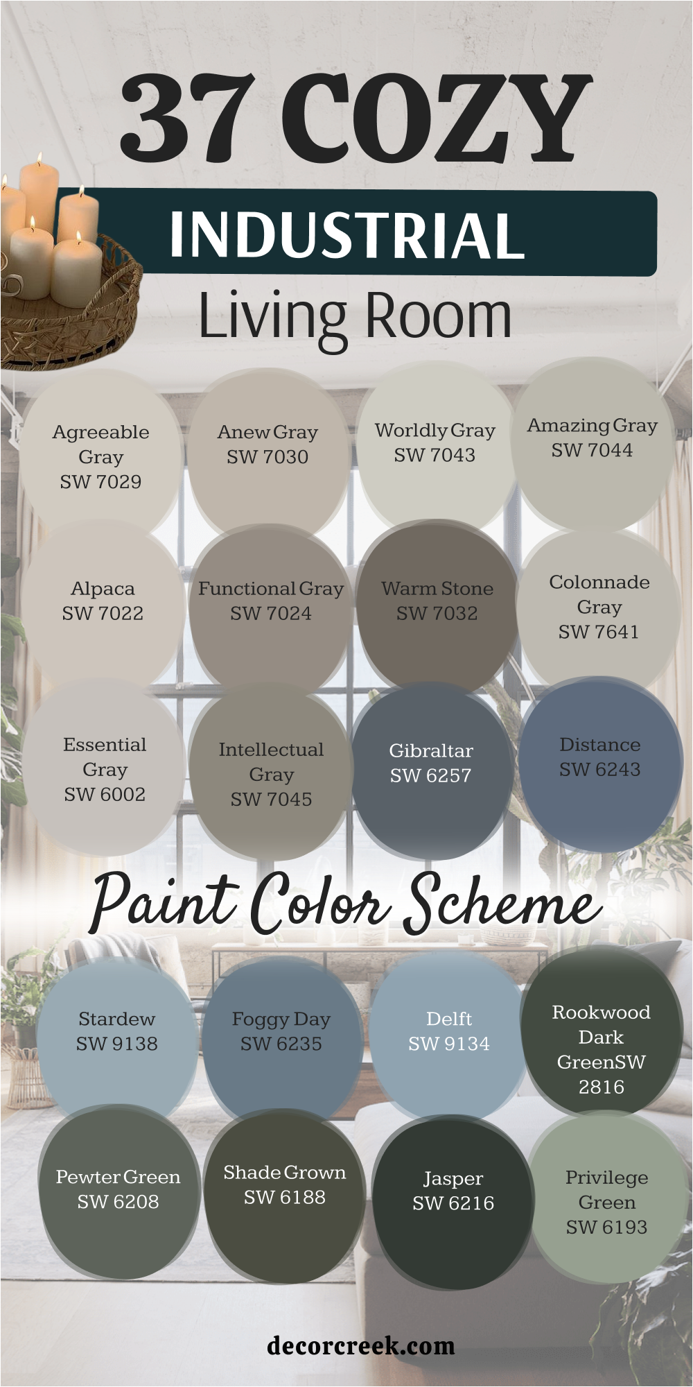
39 Industrial Style Paint Color Ideas This Year
Cityscape SW 7067
Cityscape SW 7067 is a dark, mid-tone gray that captures the professional look of a modern metropolis. This color reminds me of the concrete and steel found in high-rise lofts. It is a solid choice for those who want a strong wall color that doesn’t feel as heavy as charcoal. I find it works best in rooms with large windows where the natural light can show off its neutral character.
The shade provides a very clean backdrop for industrial art and black metal light fixtures. It stays looking very sharp and organized, which helps a room feel more structured.
You will notice it pairs beautifully with light gray stone and stainless steel elements. It is a reliable pick for a modern home office or a kitchen with a tech-focused design.
Best used in: home offices, kitchens, and exterior accents
Pairs well with: Snowbound SW 7004, Iron Ore SW 7069, chrome, and glass The key rule of this color for industrial style is to use it to create a sense of urban structure and focus.
👉 Read the full guide for this color HERE 👈
Grizzle Gray SW 7068
Grizzle Gray SW 7068 is a deep, moody charcoal that brings a lot of weight and drama to a space. This color looks like the heavy iron machinery found in old shipping yards. It is a fantastic tool for grounding a large room with high ceilings. I love using it on a fireplace wall to make it a bold architectural feature.
The color has a lot of depth and makes a room feel very private and secure. It looks amazing next to light wood floors and white marble counters for a high-contrast look.
You will find it creates a very cozy atmosphere at night when paired with warm yellow lighting. It is a favorite for people who want a contemporary and powerful industrial vibe.
Best used in: accent walls, media rooms, and living room focal points
Pairs well with: Cityscape SW 7067, Eider White SW 7014, cognac leather, and silver The key rule of this color for industrial style is to use it to add a sense of infinite depth and structural weight.
👉 Read the full guide for this color HERE 👈
Wall Street SW 7665
Wall Street SW 7665 is a sophisticated blue-gray that feels very professional and established. This color reminds me of the slate tiles and metal cladding used in modern city architecture. It is a great choice for those who want a bit of color that still functions as a serious neutral. I often recommend it for dining rooms to create a high-end atmosphere.
The blue tones add a layer of richness that makes the walls feel more interesting than standard gray. It looks very sharp next to black metal window frames and white trim.
You will find it creates a very balanced and steady mood in any room. It is a very reliable color that matches many different types of industrial furniture.
Best used in: dining rooms, home offices, and cabinetry
Pairs well with: Alabaster SW 7008, Web Gray SW 7075, dark wood, and brass The key rule of this color for industrial style is to use it as a sophisticated, cool alternative to standard mid-tone grays.
👉 Read the full guide for this color HERE 👈
Attitude Gray SW 7060
Attitude Gray SW 7060 is a medium-dark gray with a very strong green personality. This color reminds me of the weathered metal equipment used in old workshops. It brings a natural and plant-like feel to a home filled with stone and iron. I find it looks very smart in a living room with a lot of wooden shelves and leather seating.
The gray tones keep the green from looking too bright, making it a very steady and calm choice. It looks wonderful when paired with dark iron light fixtures and cognac leather chairs.
You will notice it makes a room feel very quiet and organized. It is a great way to add color while still keeping a very professional and grounded look.
Best used in: living rooms, bedrooms, and home offices
Pairs well with: Repose Gray SW 7015, Tricorn Black SW 6258, cognac leather, and light oak The key rule of this color for industrial style is to use it to introduce a natural element that softens the look of mechanical parts.
👉 Read the full guide for this color HERE 👈
Tin Lizzie SW 9163
Tin Lizzie SW 9163 is a classic, medium-toned gray that feels very balanced and clean. This color reminds me of the brushed metal and tin panels found in industrial ceilings. It is a very neutral choice that works well in almost any design plan. I like to use it as a main wall color for rooms that feature a lot of exposed brick.
The shade provides a very crisp and professional feeling to your home. It looks very smart next to black metal frames and light-colored wooden floors. You can use it to create a very consistent and organized look throughout your house.
It provides a perfect middle ground between light and dark colors.
Best used in: whole-house painting, kitchens, and hallways
Pairs well with: Extra White SW 7006, Peppercorn SW 7674, black iron, and light wood The key rule of this color for industrial style is to use it as a dependable, mid-tone neutral that highlights raw materials.
👉 Read the full guide for this color HERE 👈
Earl Grey SW 7660
Earl Grey SW 7660 is a sophisticated, warm gray that has a very soft and balanced feel. This color reminds me of the soft shadows in a sunlit urban loft. It is a great choice for those who want a neutral that is more interesting than basic beige. I find it works perfectly in large living areas where you want a consistent look.
The color has a very slight warmth that makes it feel very welcoming and homey. It looks wonderful when paired with dark iron light fixtures and wooden beams.
You will notice that it makes a room feel very calm and organized throughout the day. It is a very flexible shade that matches almost any type of furniture you own.
Best used in: living rooms, open-floor plans, and bedrooms
Pairs well with: Snowbound SW 7004, Urbane Bronze SW 7048, navy blue, and light oak The key rule of this color for industrial style is to use it as a gentle, neutral base that connects different rooms together.
👉 Read the full guide for this color HERE 👈
Cast Iron SW 6202
Cast Iron SW 6202 is a very deep, near-black green that is extremely sophisticated. This color looks like the painted metal of old structural supports or antique machinery. It brings a lot of drama and mystery to an industrial interior. I use it to make a small reading nook or bathroom feel very special and exclusive.
The color is so dark that it often looks black in low light. When the sun hits it, the deep green pigment really shows its beauty. It pairs perfectly with bright gold or warm copper accents.
It creates a very sharp and finished look that feels very high-quality.
Best used in: accent walls, cabinetry, and front doors
Pairs well with: Alabaster SW 7008, Pewter Green SW 6208, brass, and dark leather The key rule of this color for industrial style is to use it as a dark, jewel-toned alternative to standard black.
👉 Read the full guide for this color HERE 👈
Web Gray SW 7075
Web Gray SW 7075 is a cool gray with a very modern and tech-like feel. This color reminds me of the brushed aluminum or charcoal metal used in modern offices. It works well in rooms with lots of glass and stainless steel. I like to use it in modern kitchens to give a very sharp and professional look.
The blue undertone makes the color feel fresh and active. It looks great with white furniture and dark navy accent pillows. You will find it creates a very productive feeling in a home office.
The way it reflects light helps to brighten up a dark corner without losing its cool edge.
Best used in: home offices, kitchens, and modern living rooms
Pairs well with: Extra White SW 7006, Wall Street SW 7665, chrome, and glass The key rule of this color for industrial style is to use it to emphasize a clean, mechanical, and modern aesthetic.
👉 Read the full guide for this color HERE 👈
Software SW 7074
Software SW 7074 is a medium-dark gray that has a very crisp and balanced personality. This color reminds me of the hardware and machinery found in a modern urban workshop. It is a very practical and tough choice for rooms that get a lot of daily use. I often suggest it for mudrooms or home gyms to give them a professional look.
The shade provides a very clean and organized feeling to any space. It looks fantastic when paired with bright white ceilings and dark iron railings.
You can use it to create a very structured and efficient look throughout your house. It stays looking great even in rooms that handle a lot of wear and tear.
Best used in: mudrooms, kitchens, and home offices
Pairs well with: Pure White SW 7005, Web Gray SW 7075, black iron, and stainless steel The key rule of this color for industrial style is to use it when you want a strong, utilitarian look that is also very durable.
👉 Read the full guide for this color HERE 👈
Forged Steel SW 9565
Forged Steel SW 9565 is a rich, heavy gray that captures the look of raw metal perfectly. This color has a beautiful depth that makes it look much more interesting than a flat charcoal. It reminds me of the thick structural elements found in historic city lofts. I love using this on a fireplace or an accent wall to give the room a clear center.
The color provides a very sturdy backdrop for light-colored furniture and bright art pieces. It feels very permanent and gives a sense of security to the whole house.
You will find it creates a very high-end look when paired with light gray stone or tile. It is a classic and powerful color that always stays in style.
Best used in: accent walls, fireplaces, and exteriors
Pairs well with: Snowbound SW 7004, Cityscape SW 7067, cognac leather, and warm wood The key rule of this color for industrial style is to use it to provide a sense of architectural strength and structural weight.
👉 Read the full guide for this color HERE 👈
Inkwell SW 6992
Inkwell SW 6992 is a very dark, near-black blue that is extremely moody and sophisticated. This color feels like a deep pool of ink in an old industrial office. It is one of the most powerful colors I use for modern warehouse styles. I often suggest it for a bedroom wall to make the space feel very private and secure.
The depth of this paint is incredible and makes walls feel like they are receding. It creates a very high-end look when paired with light gray stone or white marble.
You will see that it makes any white art or furniture look extremely bright and sharp. It is a very bold choice that gives a room a definite edge.
Best used in: accent walls, media rooms, and entryways
Pairs well with: Classic Gray OC-23, silver, light oak, and white textiles The key rule of this color for industrial style is to use it to create deep contrast and a sense of modern mystery.
👉 Read the full guide for this color HERE 👈
Anchors Aweigh SW 9179
Anchors Aweigh SW 9179 is a deep, royal navy blue that brings a splash of color to industrial rooms. This blue looks amazing next to exposed orange bricks and raw metal pipes. It feels like the color of a midnight sky over a busy city port. I love using this in bedrooms to create a sense of deep rest and focus.
It pairs perfectly with gold or brass lamps and modern cabinet handles. The color is very saturated and rich, giving your walls a velvet-like appearance.
It adds a layer of luxury to the raw materials found in typical industrial lofts. This blue is dark enough to act as a neutral in many lighting situations.
Best used in: dining rooms, bedrooms, and kitchen islands
Pairs well with: Alabaster SW 7008, tan leather, and light wood The key rule of this color for industrial style is to use it when you want to add a sense of history and classic elegance to a raw room.
👉 Read the full guide for this color HERE 👈
Sea Mariner SW 9640
Sea Mariner SW 9640 is a rich and classic navy that brings a lot of personality to a home. This color reminds me of the deep water in a busy city harbor. It is a great choice for those who want a blue that feels very crisp and clean. I love using it on the lower half of a wall with light gray on the top.
The shade looks very sharp next to silver pipes and stainless steel appliances. It has a way of making a room feel very fresh and energetic without being too loud.
You can see the depth of the blue even in a room that does not have many windows. It works well with both light and dark wood furniture.
Best used in: kitchens, bathrooms, and accent walls
Pairs well with: Pure White SW 7005, black metal, and silver hardware The key rule of this color for industrial style is to use it to create a sharp, high-contrast look that feels very organized.
👉 Read the full guide for this color HERE 👈
Regatta SW 6517
Regatta SW 6517 is a bright, bold blue that brings a lot of energy to an industrial space. This color reminds me of the painted metal accents found on modern city buildings. It is a fantastic choice for those who want to move away from neutrals and add some excitement. I find it looks very smart on a kitchen island or a front door.
The color is very saturated and makes a room feel very active and creative. It looks amazing next to light gray concrete floors and white trim.
You will find it creates a very productive feeling in a home studio or office. It is a very popular pick for houses with a contemporary and artistic style.
Best used in: kitchen islands, front doors, and accent furniture
Pairs well with: Snowbound SW 7004, Network Gray SW 7073, and light oak The key rule of this color for industrial style is to use it as a bold, modern accent that stands out against a neutral background.
Mineral Deposit SW 7652
Mineral Deposit SW 7652 is a medium-light blue-gray that has a very soft and dusty appearance. This color reminds me of the weathered metal siding found on old coastal warehouses. It is a comfortable choice for those who want a bit of color that still functions as a neutral. I often suggest it for bathrooms or laundry rooms to create a quiet environment.
The gray undertones keep the blue from looking too bright or overwhelming. It looks very handsome next to black iron fixtures and light-colored wooden floors.
You will find that it creates a balanced and steady mood in any room. It is a very reliable color that matches many different types of industrial decor.
Best used in: bathrooms, laundry rooms, and bedrooms
Pairs well with: Alabaster SW 7008, Repose Gray SW 7015, and dark wood The key rule of this color for industrial style is to use it as a sophisticated, cool alternative to standard grays.
👉 Read the full guide for this color HERE 👈
Greenblack SW 6994
Greenblack SW 6994 is a very dark, near-black green that is extremely sophisticated. This color looks like the painted ironwork or old structural beams from a past era. It brings a lot of drama and mystery to an industrial interior. I use it to make a small reading nook or bathroom feel very special and exclusive.
The color is so dark that it often looks black until the sun hits it. When it does, the deep green pigment shows its hidden beauty. It pairs perfectly with bright gold or warm brass light fixtures.
It creates a very sharp and finished look that feels very high-quality and powerful.
Best used in: accent walls, cabinetry, and front doors
Pairs well with: Pure White SW 7005, brass hardware, and dark leather The key rule of this color for industrial style is to use it as a dark, jewel-toned alternative to basic black.
👉 Read the full guide for this color HERE 👈
Olympic Range SW 7750
Olympic Range SW 7750 is a deep, forest green that has a lot of gray mixed in. This color brings a natural, plant-like feel to a home filled with stone and metal. It reminds me of the moss growing on old brick walls in a hidden city courtyard. I find it looks very smart in a home office where you need to focus.
The gray tones keep it from looking too bright, making it a very steady and calm choice. It works well with heavy wooden desks and black iron lamps.
You will notice it makes a room feel very quiet and organized. It is a great way to add color while still keeping things very professional and grounded.
Best used in: home offices, mudrooms, and kitchens
Pairs well with: Shoji White SW 7042, Urbane Bronze SW 7048, and warm wood The key rule of this color for industrial style is to use it to introduce a natural element that softens the look of mechanical parts.
Retreat SW 6207
Retreat SW 6207 is a sophisticated, medium-dark green that has a lot of gray in it. This color reminds me of the weathered metal statues found in old city parks. It brings a very natural and earthy touch to a home filled with stone and iron. I find it looks very smart in a living room with a lot of indoor plants.
The gray tones keep the green from looking too bright, making it a very steady and calm choice. It looks wonderful when paired with dark iron light fixtures and cognac leather chairs.
You will find that it makes a room feel very quiet and organized. It is a great way to add color while still keeping a very professional and grounded look.
Best used in: living rooms, bedrooms, and home offices
Pairs well with: Alabaster SW 7008, Iron Ore SW 7069, and cognac leather The key rule of this color for industrial style is to use it to introduce a natural, metallic green that softens hard edges.
👉 Read the full guide for this color HERE 👈

Basil SW 6194
Basil SW 6194 is a medium-toned green with a very soft and dusty appearance. This color reminds me of the sage-colored equipment used in old workshops. It brings a very artistic and creative touch to an industrial living room. I often recommend it for those who want a color that feels very fresh and calm.
The shade has enough gray in it to keep it from looking too bright or like a garden green. It looks very handsome next to light gray concrete floors and black metal shelving.
You will notice it makes a room feel very balanced and easy to live in. It is a great way to add personality while maintaining a grounded, industrial vibe.
Best used in: living rooms, kitchens, and cabinetry
Pairs well with: Greek Villa SW 7551, Urbane Bronze SW 7048, and dark wood The key rule of this color for industrial style is to use it to add a touch of artistic, vintage color to a raw space.
👉 Read the full guide for this color HERE 👈
Rosemary SW 6187
Rosemary SW 6187 is a deep, moody green that feels very earthy and established. This color reminds me of the painted metal doors or old structural supports in historic city buildings. It brings a lot of class and weight to an industrial interior. I often recommend it for painting a kitchen island or a cozy den.
The color is deep enough to act as a dark neutral in many situations. It pairs beautifully with dark wood and warm brass accents. You can see the depth of the color when it is used on an accent wall.
It creates a very private and focused feeling that is perfect for concentration and relaxation.
Best used in: kitchen islands, dens, and accent walls
Pairs well with: Alabaster SW 7008, Tricorn Black SW 6258, and brass hardware The key rule of this color for industrial style is to use it to create a sophisticated, moody vibe that still feels connected to nature.
👉 Read the full guide for this color HERE 👈

Barren Plain 2111-60
Barren Plain 2111-60 is a light, sophisticated gray that has a very clean and airy feel. This color reminds me of the soft shadows on a concrete wall in an urban gallery. It is a great choice for making a small room feel much more open and quiet. I like to use it in bedrooms to create a very calm and restful environment.
The color is very delicate and stays true to its neutral roots without looking too yellow or blue. It looks very crisp next to white trim and dark metal light fixtures.
You will love how it makes your home feel clean and organized. It provides a beautiful and soft contrast to darker industrial elements like iron furniture.
Best used in: bedrooms, living rooms, and small entryways
Pairs well with: Chantilly Lace OC-65, Wrought Iron 2124-10, and silver hardware The key rule of this color for industrial style is to use it as a bright base that lets your architectural details stand out.
👉 Read the full guide for this color HERE 👈
Iron Gate 1545
Iron Gate 1545 is a dark, heavy charcoal that feels as solid as its name suggests. This color reminds me of the forged iron gates and structural beams in historic city centers. It brings a lot of drama and strength to a living room without being as harsh as a true black. I love using this on a main wall to give the room a clear sense of history.
The shade provides a very sturdy backdrop for light-colored furniture and bright art pieces. It feels very permanent and gives a sense of security to the whole house.
You will find it creates a very high-end look when paired with light gray stone or tile. It is a classic and powerful color that always stays in style.
Best used in: accent walls, fireplaces, and entryways
Pairs well with: Cloud White OC-130, Chelsea Gray HC-168, and cognac leather The key rule of this color for industrial style is to use it to provide a sense of architectural strength and structural weight.
Gargoyle 1546
Gargoyle 1546 is a deep, warm gray that leans toward taupe. This color reminds me of the weathered stone statues found on the roofs of old city buildings. It brings a lot of organic warmth to a room filled with machines and metal. I often recommend it for a home office where you want a cozy yet professional feeling.
The color has a lot of depth and makes a room feel very private and well-built. It looks amazing next to light gray stone and black metal light fixtures.
You will notice it brings out the best in both gold and silver hardware. It creates a very balanced and polished look that feels very high-quality.
Best used in: home offices, dens, and cabinetry
Pairs well with: Steam AF-15, Kendall Charcoal HC-166, and brass hardware The key rule of this color for industrial style is to use it to bring a sense of natural, muddy warmth to a structured design.
Lead Gray 2131-30
Lead Gray 2131-30 is a strong, dark blue-gray that brings a lot of mood and weight. This color looks like the heavy metal machinery or structural beams found in urban lofts. It is a very bold choice that defines the boundaries of a room very clearly. I often use it as an accent wall to ground a large, open-concept space.
The depth of this paint is incredible and makes walls feel very solid. It works wonders on a fireplace surround or a media wall to create a focal point.
You will find it creates a very cozy and secure feeling at night under soft lighting. It is a favorite for people who want a contemporary and powerful industrial style.
Best used in: accent walls, media rooms, and living room focal points
Pairs well with: White Heron OC-57, Hale Navy HC-154, and chrome The key rule of this color for industrial style is to use it to add a sense of infinite depth and structural weight.
Flint AF-560
Flint AF-560 is a dark, sophisticated gray that has a very stony and solid feel. This color reminds me of the deep gray stones used in historic foundations. It is a very neutral choice that doesn’t lean too much toward blue or brown. I like to use it on the exterior of homes for a modern, industrial look that feels very permanent and secure.
The shade provides a very clean and organized feeling to any room. It looks fantastic when paired with bright white trim and dark metal light fixtures.
You can use it in a kitchen with concrete countertops for a very integrated look. It stays looking fresh even after years of use in a high-traffic household.
Best used in: exteriors, kitchens, and dramatic accent walls
Pairs well with: Cloud White OC-130, Black Beauty 2128-10, and stainless steel The key rule of this color for industrial style is to use it when you want a strong, neutral gray that feels like natural stone.
Mysterious AF-565
Mysterious AF-565 is a very dark, near-black blue that is extremely moody and sophisticated. This color feels like the deep shadows in an old warehouse at night. It is one of the most powerful colors I use for modern warehouse styles. I often suggest it for a bedroom wall to make the space feel very private and secure.
The depth of this paint is incredible and makes walls feel like they are receding. It creates a very high-end look when paired with light gray stone or white marble.
You will see that it makes any white art or furniture look extremely bright and sharp. It is a very bold choice that gives a room a definite edge.
Best used in: accent walls, media rooms, and entryways
Pairs well with: Classic Gray OC-23, silver hardware, and light oak The key rule of this color for industrial style is to use it to create deep contrast and a sense of modern mystery.
👉 Read the full guide for this color HERE 👈
Shadow 2117-30
Shadow 2117-30 is a deep, rich purple-gray that brings a lot of mood and artistic flair. This color looks like the dark corners of a city loft at dusk. It is a very bold and artistic choice that brings a lot of life to the walls. I often recommend it for a bedroom where you want to create a high-end, private atmosphere.
The depth of this paint makes it feel very solid and permanent. It pairs beautifully with velvet fabrics and dark metal bed frames. You can see the rich pigments clearly in a room with soft, warm lighting.
It creates a very sophisticated feeling that is still very rugged and strong.
Best used in: bedrooms, accent walls, and creative studios
Pairs well with: Calm OC-22, Wrought Iron 2124-10, and silver accents The key rule of this color for industrial style is to use it to create a moody, artistic focal point in a raw room.
👉 Read the full guide for this color HERE 👈
Deep River 1582
Deep River 1582 is a dark, moody green with a strong gray personality. This color reminds me of the dark, swirling water of a river near an industrial port. It is a fantastic choice for those who want color but love the industrial gray look. I find it looks very sophisticated in home libraries or studies.
The dusty finish of this paint makes it feel very soft to the eye. It looks beautifully with dark walnut wood and black iron furniture. You will notice it feels very calm and steady throughout the day.
It provides a cool backdrop that lets your industrial lighting fixtures really shine.
Best used in: libraries, dens, and accent walls
Pairs well with: Collingwood OC-28, Black Forest Green 2130-20, and dark wood The key rule of this color for industrial style is to use it to soften the look of hard surfaces like metal and glass.
👉 Read the full guide for this color HERE 👈
Polo Blue 2062-10
Polo Blue 2062-10 is a very dark and powerful navy that is almost like a deep ink. This color reminds me of the sky just before it turns completely black at night. It is a fantastic tool for making a large room feel much more intimate and grounded. I like to use it in rooms with very high ceilings to bring the focus down.
The finish looks very smooth and rich, which adds a lot of quality to the walls. It creates a very strong contrast with light-colored rugs or sofas. You will find that it makes metal light fixtures stand out like pieces of jewelry.
It is a bold choice that defines the boundaries of a room very clearly.
Best used in: dining rooms, accent walls, and library spaces
Pairs well with: Simply White OC-117, Revere Pewter HC-172, and brass The key rule of this color for industrial style is to use it to add a sense of infinite depth to a room’s focal point.
👉 Read the full guide for this color HERE 👈
Gentleman’s Gray 2062-20
Gentleman’s Gray 2062-20 is a deep, sophisticated blue that has a very strong and established feel. This color looks like the painted metal doors found in old city offices. It is a bit lighter than a deep navy, which makes it easier to use on all four walls. I find it works perfectly in a living room that features a lot of metal shelving.
The blue has a slightly muted quality that helps it act as a neutral backdrop. It brings a sense of order and tradition to a room filled with raw materials.
You will notice it looks particularly handsome under warm yellow light bulbs at night. It provides a nice balance between being a bold color and a quiet background.
Best used in: living rooms, home offices, and cabinetry
Pairs well with: Stonington Gray HC-170, Cloud White OC-130, and brass The key rule of this color for industrial style is to use it when you want a blue that feels like it has been there for decades.
👉 Read the full guide for this color HERE 👈

Soot 2129-20
Soot 2129-20 is a very dark, near-black gray that has a softened, chalky appearance. This color feels like the shadows in an old factory corner. It is one of the most sophisticated choices for a modern industrial style. I often suggest it for a bedroom wall or a media room to make the space feel very private and quiet.
The depth of this paint is incredible and makes walls feel like they are receding. It pairs beautifully with light gray rugs and silver metal fixtures.
You will find it creates a very artistic and creative feeling in your home. It is a very powerful color that gives a room a definite edge without being too harsh.
Best used in: bedrooms, media rooms, and accent walls
Pairs well with: Classic Gray OC-23, Wickham Gray HC-171, and silver The key rule of this color for industrial style is to use it to create a deep, artistic mood that feels exclusive and modern.
Bittersweet Chocolate 2114-10
Bittersweet Chocolate 2114-10 is a very dark, rich brown that is nearly black. This color reminds me of the old, oil-stained wooden floors in a historic factory. it brings a lot of warmth and organic character to an industrial interior. I use it to make a large room feel much more intimate and grounded.
The color is deep enough to act as a dark neutral in many situations. It pairs beautifully with cognac leather chairs and brass floor lamps.
You can see how much depth it has when you use it on a wall that gets a lot of direct light. It creates a very luxurious feeling that is still very rugged and honest.
Best used in: accent walls, dens, and cabinetry
Pairs well with: Swiss Coffee OC-45, Chelsea Gray HC-168, and cognac leather The key rule of this color for industrial style is to use it to add a sense of organic depth and vintage luxury.
Brownstone CSP-240
Brownstone CSP-240 is a medium-dark brown with a stony personality. This color reminds me of the weathered stone walls of city buildings. It brings a lot of natural character into a room filled with glass and metal. I often recommend it for a living room with a lot of wooden shelves and dark iron light fixtures.
The shade feels very grounded and works beautifully with reclaimed wood beams. It has a very professional look that makes a room feel like it has real history.
You can see the depth of the color when it is used on a large wall. It creates a very steady and reliable atmosphere that is perfect for a busy home.
Best used in: living rooms, entryways, and exteriors
Pairs well with: Alabaster SW 7008, Wrought Iron 2124-10, and dark wood The key rule of this color for industrial style is to use it to blend mechanical design with the natural colors of stone and earth.
Mink 2112-10
Mink 2112-10 is a dark, sophisticated brown-gray that feels very rich and high-end. This color looks like the weathered wood and metal on old docks. It is dark enough to be very moody but has enough warmth to feel very welcoming. I often suggest it for home offices where you want a sense of focus and quiet.
The color has a lot of depth and looks very high-end when it is used on all four walls. It pairs beautifully with cognac leather chairs and brass desk lamps.
You will notice it makes a room feel very private and secure. It is a very sturdy shade that handles the light of a big window very well.
Best used in: home offices, bedrooms, and accent walls
Pairs well with: Amazing Gray SW 7043, Urbane Bronze SW 7048, and brass The key rule of this color for industrial style is to use it to create a sophisticated and cozy atmosphere within a raw space.
French Beret 1610
French Beret 1610 is a dark, sophisticated gray with a strong blue personality. This color reminds me of the charcoal metal used in city architecture. It is a great choice for those who want a bit of color that still functions as a serious neutral. I often recommend it for dining rooms or media rooms to create a high-end atmosphere.
The blue tones add a layer of richness that makes the walls feel more interesting than standard gray. It looks very sharp next to black metal window frames and white trim.
You will find it creates a very balanced and steady mood in any room. It is a very reliable color that matches many different types of industrial furniture.
Best used in: media rooms, dining rooms, and cabinetry
Pairs well with: Chantilly Lace OC-65, Stonington Gray HC-170, and chrome The key rule of this color for industrial style is to use it as a sophisticated, cool alternative to standard mid-tone grays.
👉 Read the full guide for this color HERE 👈
Branchport Brown HC-72
Branchport Brown HC-72 is a medium-dark brown that has a very solid and established feel. This color looks like the heavy wooden beams and floors found in old factories. It brings a lot of warmth and tradition to a room filled with metal and glass. I find it works perfectly in a living room with a lot of industrial shelving.
The brown has a slightly muted quality that helps it act as a neutral backdrop. It brings a sense of order and history to a room filled with raw materials.
You will notice it looks particularly handsome under warm yellow light bulbs at night. It provides a nice balance between being a bold color and a quiet background.
Best used in: living rooms, dens, and exteriors
Pairs well with: Cloud White OC-130, Chelsea Gray HC-168, and black metal The key rule of this color for industrial style is to use it when you want a brown that feels like it has been there for decades.
Black Pepper 2130-40
Black Pepper 2130-40 is a medium-dark gray with a strong blue undertone. This color reminds me of the painted metal siding on old industrial buildings. It is a comfortable choice for those who want a bit of color that still feels like a neutral. I often suggest it for bathrooms or laundry rooms to create a clean and quiet environment.
The gray undertones keep the blue from looking too bright or overwhelming. It looks very handsome next to black iron fixtures and light-colored wooden floors.
You will find that it creates a balanced and steady mood in any room. It is a very reliable color that matches many different types of industrial decor.
Best used in: bathrooms, laundry rooms, and kitchens
Pairs well with: Simply White OC-117, Kendall Charcoal HC-166, and silver The key rule of this color for industrial style is to use it as a sophisticated, cool alternative to standard grays.
Deep Space 2125-20
Deep Space 2125-20 is a very dark, near-black blue-gray that is extremely moody and sophisticated. This color feels like the deep shadows in an old warehouse. It is one of the most powerful colors I use for modern warehouse styles. I often suggest it for a bedroom wall to make the space feel very private and secure.
The depth of this paint is incredible and makes walls feel like they are receding. It creates a very high-end look when paired with light gray stone or white marble.
You will see that it makes any white art or furniture look extremely bright and sharp. It is a very bold choice that gives a room a definite edge.
Best used in: accent walls, media rooms, and entryways
Pairs well with: Classic Gray OC-23, silver hardware, and light oak The key rule of this color for industrial style is to use it to create deep contrast and a sense of modern mystery.
👉 Read the full guide for this color HERE 👈
Night Train 1567
Night Train 1567 is a medium-dark blue-gray with a very soft and dusty appearance. This color reminds me of the morning mist rolling over an industrial canal. It is a fantastic choice for those who want color but love the industrial gray look. I find it looks very sophisticated in home libraries or studies.
The dusty finish of this paint makes it feel very soft to the eye. It looks beautifully with dark walnut wood and black iron furniture.
You will notice it feels very calm and steady throughout the day. It provides a cool backdrop that lets your industrial lighting fixtures really shine.
Best used in: libraries, dens, and accent walls
Pairs well with: Collingwood OC-28, Wrought Iron 2124-10, and dark wood The key rule of this color for industrial style is to use it to soften the look of hard surfaces like metal and glass.
👉 Read the full guide for this color HERE 👈
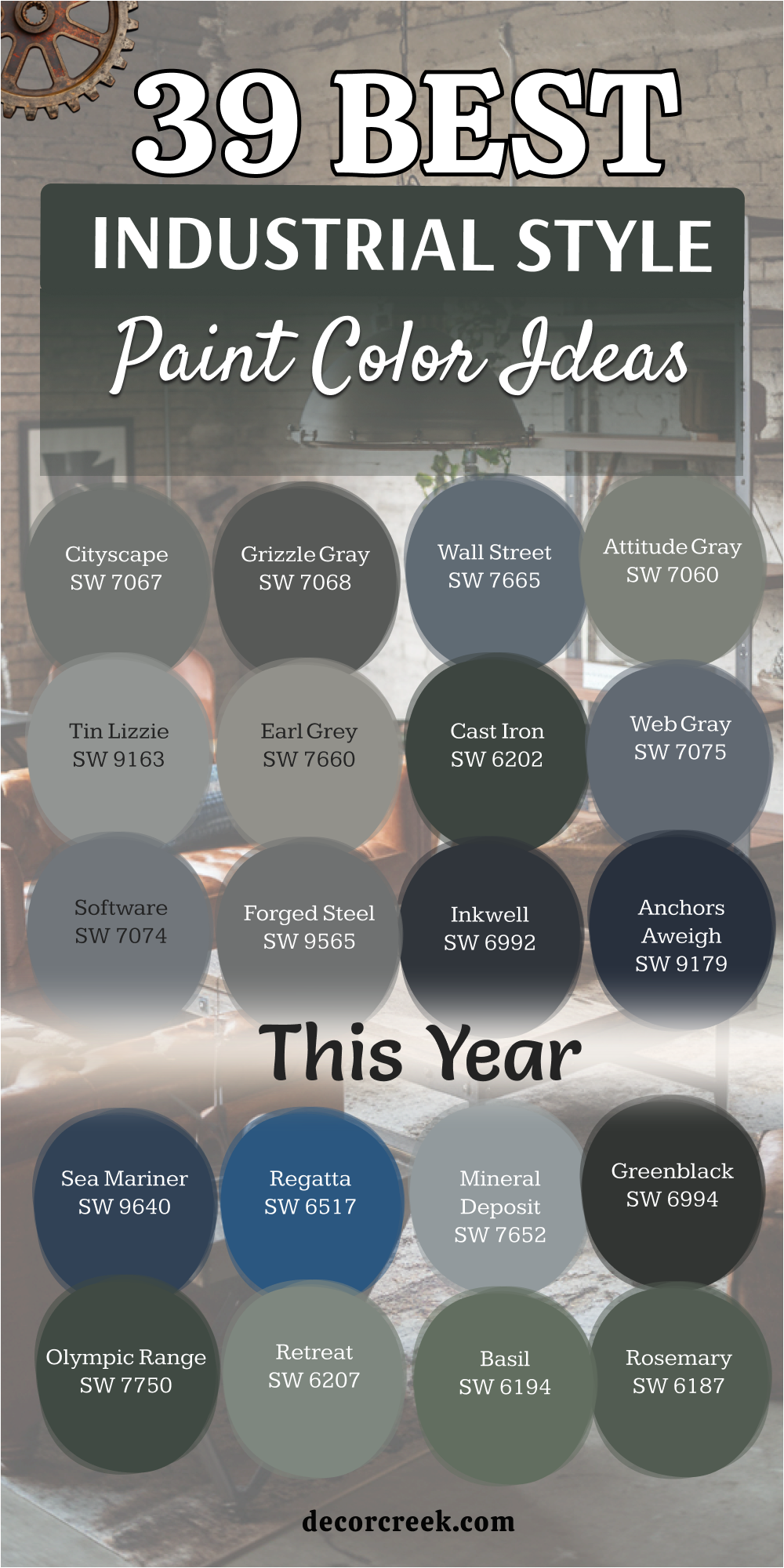
29 Industrial Farmhouse Living Room Paint Color Palette
Accessible Beige SW 7036
Accessible Beige SW 7036 is the gold standard for an industrial farmhouse look. It takes the coldness out of a room filled with metal and replaces it with a soft, sandy warmth.
It reminds me of the color of old, sun-bleached burlap sacks found in a farm shed. It is a very safe choice that makes every room feel cozy and inviting while still looking very modern.
Best used in: living rooms, open-floor plans, and entryways
Pairs well with: Urbane Bronze SW 7048, black iron, and weathered oak The key rule of this color for industrial farmhouse style is to use it as a bridge between warm wood floors and cool metal accents.
👉 Read the full guide for this color HERE 👈

Natural Linen SW 9109
Natural Linen SW 9109 is a beautiful, airy neutral that feels like a crisp afternoon in a countryside barn. This color has a bit more “yellow” than a standard gray, which helps it glow under warm indoor lighting.
It provides a very clean backdrop for a gallery wall featuring black and white photography or vintage farm tools.
Best used in: bedrooms, kitchens, and sunlit living areas
Pairs well with: Tricorn Black SW 6258, cream textiles, and dark walnut The key rule of this color for industrial farmhouse style is to use it to keep a room feeling bright and organic.
👉 Read the full guide for this color HERE 👈

Canvas Tan SW 7531
Canvas Tan SW 7531 is a soft, muted khaki that brings a sense of history to the walls. This color reminds me of the heavy canvas tarps used in old workshops.
It is a fantastic choice if you have a lot of white furniture and want the walls to provide a subtle, warm contrast without being too dark.
Best used in: dining rooms, hallways, and living room walls
Pairs well with: Gibraltar SW 6257, white trim, and galvanized metal The key rule of this color for industrial farmhouse style is to use it to provide a sturdy, dependable background that isn’t white.
👉 Read the full guide for this color HERE 👈

Neutral Ground SW 7568
Neutral Ground SW 7568 is a very light, creamy off-white that feels extremely balanced. It has just enough gray in it to look sophisticated next to industrial pipes, but enough beige to feel like a farmhouse classic.
I love using this in kitchens with open shelving to create a very clean and organized look.
Best used in: kitchens, bathrooms, and small living spaces
Pairs well with: Iron Ore SW 7069, light gray stone, and natural wood The key rule of this color for industrial farmhouse style is to use it as a bright, “greige” base that opens up the room.
👉 Read the full guide for this color HERE 👈

Shiitake SW 9173
Shiitake SW 9173 is a medium-toned neutral that carries a lot of stony depth. This color looks like the weathered stone found in old barn foundations.
It is a strong choice for an accent wall or a home office where you want a sense of focus and quiet. It feels very grounded and permanent.
Best used in: home offices, accent walls, and exteriors
Pairs well with: Alabaster SW 7008, black hardware, and leather furniture The key rule of this color for industrial farmhouse style is to use it to add architectural weight to a room.
👉 Read the full guide for this color HERE 👈

Balanced Beige SW 7037
Balanced Beige SW 7037 is exactly what the name suggests—a perfect middle ground. It is a step darker than Accessible Beige and works wonderfully in rooms with very high ceilings.
This color reminds me of the warm earth in a freshly plowed field. It makes a large industrial space feel much more intimate and lived-in.
Best used in: large living rooms, bedrooms, and dining areas
Pairs well with: Snowbound SW 7004, dark iron, and reclaimed wood The key rule of this color for industrial farmhouse style is to use it to ground a large space with high ceilings.
👉 Read the full guide for this color HERE 👈
Tavern Taupe SW 7508
Tavern Taupe SW 7508 is a rich, medium-dark neutral that feels very established and high-end. This color reminds me of the heavy wooden beams in an old city tavern.
It brings a lot of class to the industrial farmhouse theme. I often suggest it for a cozy den or a library space where you want a moody, vintage vibe.
Best used in: dens, home libraries, and cabinetry
Pairs well with: Shoji White SW 7042, brass fixtures, and dark leather The key rule of this color for industrial farmhouse style is to use it to create a sense of history and warmth.
👉 Read the full guide for this color HERE 👈
Loggia SW 7506
Loggia SW 7506 is a sophisticated, warm gray that has a very soft and balanced feel. This color looks like the smooth plaster on a historic farmhouse wall.
It is a great choice for those who want a neutral that is more interesting than basic beige. It works perfectly in rooms that feature both metal and soft fabrics.
Best used in: living rooms, master suites, and hallways
Pairs well with: Pure White SW 7005, black metal, and linen textiles The key rule of this color for industrial farmhouse style is to use it to create a soft, professional look.
👉 Read the full guide for this color HERE 👈

Prairie Grass SW 7546
Prairie Grass SW 7546 is a medium-toned neutral with a very slight green-tan undertone. This color reminds me of dry grass at the end of summer.
It brings a very natural and earthy touch to a home. I find it looks very smart in a kitchen or a room with a lot of wooden elements.
Best used in: kitchens, mudrooms, and laundry rooms
Pairs well with: Greek Villa SW 7551, dark walnut, and black hardware The key rule of this color for industrial farmhouse style is to use it to introduce a subtle, organic earthiness.
👉 Read the full guide for this color HERE 👈
Sand Dune SW 6086
Sand Dune SW 6086 is a warm, light-to-medium tan that feels very sunny and optimistic. This color reminds me of the soft sand in a farm yard.
It is a great way to add warmth to a room that has a lot of cold metal or concrete. It creates a very welcoming and friendly atmosphere.
Best used in: bedrooms, nurseries, and sunrooms
Pairs well with: Extra White SW 7006, navy blue, and light oak The key rule of this color for industrial farmhouse style is to use it to brighten a space with a cozy, sun-warmed feel.
👉 Read the full guide for this color HERE 👈
Oyster White SW 7637
Oyster White SW 7637 is a very popular off-white that leans toward a light gray-beige. This color reminds me of the clean, whitewashed stone of a modern farmhouse.
It is the perfect choice for those who want a bright space that still feels “solid.” It handles different types of light very well without looking too yellow.
Best used in: whole-house walls, kitchens, and exteriors
Pairs well with: Sea Salt SW 6204, black iron, and light gray stone The key rule of this color for industrial farmhouse style is to use it as a crisp, modern backdrop for dark metal furniture.
👉 Read the full guide for this color HERE 👈
Shoji White SW 7042
Shoji White SW 7042 is a soft, warm white that is incredibly versatile. This color reminds me of the cream-colored paper used in old workshops.
It is a fantastic choice for those who want a minimalist look that is still very inviting. It looks very clean next to dark metal window frames and warm wood floors.
Best used in: open-floor plans, living rooms, and bedrooms
Pairs well with: Urbane Bronze SW 7048, dark wood, and silver hardware The key rule of this color for industrial farmhouse style is to use it to create an airy, minimalist space that doesn’t feel cold.
👉 Read the full guide for this color HERE 👈

Greek Villa SW 7551
Greek Villa SW 7551 is a rich, warm white that has a very sunny and clean appearance. This color looks like the bright, painted wood of a classic farmhouse porch.
It is a great tool for making small rooms feel much bigger. I love using it on all the walls and trim to create a very high-end, seamless look.
Best used in: trim, ceilings, and small living areas
Pairs well with: Pewter Green SW 6208, gold fixtures, and light oak The key rule of this color for industrial farmhouse style is to use it to maximize light and a sense of cleanliness.
👉 Read the full guide for this color HERE 👈

White Duck SW 7010
White Duck SW 7010 is a light, creamy neutral that sits right between white and beige. This color reminds me of the soft feathers of farm animals.
It is a fantastic choice if you want a neutral that feels very balanced and quiet. It looks very sophisticated when paired with black metal shelving and light gray rugs.
Best used in: bedrooms, kitchens, and hallways
Pairs well with: Iron Ore SW 7069, cream fabrics, and stainless steel The key rule of this color for industrial farmhouse style is to use it for a soft, understated, and clean look.
👉 Read the full guide for this color HERE 👈
Natural Choice SW 7011
Natural Choice SW 7011 is a very warm and inviting off-white that feels extremely homey. This color reminds me of the natural, untreated wood used in barn construction.
It is a great choice for those who want to soften the “industrial” side of their home. It creates a very steady and reliable atmosphere.
Best used in: living rooms, dining rooms, and whole-house painting
Pairs well with: Anonymous SW 7046, dark walnut, and black iron The key rule of this color for industrial farmhouse style is to use it to add a layer of domestic comfort to a raw space.
👉 Read the full guide for this color HERE 👈
Soft Fern 2144-40
Soft Fern 2144-40 is a light, muted green that brings a breath of fresh air into a room. This color reminds me of the first green shoots in a spring garden.
It is a beautiful way to add color to an industrial farmhouse kitchen. It feels very natural and creative, especially when paired with light wood and white tile.
Best used in: kitchens, bathrooms, and laundry rooms
Pairs well with: Pure White SW 7005, brass hardware, and light oak The key rule of this color for industrial farmhouse style is to use it to introduce a gentle, organic energy.
Clary Sage SW 6178
Clary Sage SW 6178 is a sophisticated, medium-light green that has a lot of gray in it. This color reminds me of the sage plants in a farmhouse garden.
It is a very calm and steady choice that feels very established. It works beautifully with black iron bed frames and reclaimed wood furniture.
Best used in: bedrooms, home offices, and cabinetry
Pairs well with: Alabaster SW 7008, dark wood, and black hardware The key rule of this color for industrial farmhouse style is to use it to add a peaceful, vintage color to the room.
👉 Read the full guide for this color HERE 👈

Escape Gray SW 6185
Escape Gray SW 6185 is a medium-toned gray with a very strong green personality. This color reminds me of the weathered metal equipment found in old farm buildings.
It brings a natural and sturdy feel to a home. It looks very smart in a living room with a lot of wooden shelves and leather seating.
Best used in: living rooms, exteriors, and accent walls
Pairs well with: Snowbound SW 7004, cognac leather, and black iron The key rule of this color for industrial farmhouse style is to use it to bridge the gap between industrial metal and farmhouse nature.
👉 Read the full guide for this color HERE 👈
Evergreen Fog SW 9130
Evergreen Fog SW 9130 is a stunning, mid-tone green-gray that feels very modern and organic. This color reminds me of a misty forest near a rustic lodge.
It is a fantastic choice for an accent wall or kitchen cabinets. It provides a very sophisticated look that is still very rugged and honest.
Best used in: kitchen cabinets, accent walls, and bedrooms
Pairs well with: Shoji White SW 7042, brass fixtures, and light wood The key rule of this color for industrial farmhouse style is to use it for a high-end, “new traditional” look.
👉 Read the full guide for this color HERE 👈

Laurel Woods SW 7749
Laurel Woods SW 7749 is a very dark, moody green that carries a lot of weight. This color reminds me of the deep shadows in a thick forest.
It is a bold choice for a home office or a cozy den. It creates a very private and secure feeling, especially when paired with warm wood and leather.
Best used in: dens, home offices, and accent walls
Pairs well with: Greek Villa SW 7551, cognac leather, and gold accents The key rule of this color for industrial farmhouse style is to use it to add deep, organic mystery and drama.
👉 Read the full guide for this color HERE 👈
Silhouette AF-655
Silhouette AF-655 is a deep, near-black charcoal with a hint of warmth. This color reminds me of the iron hardware on old barn doors.
It is an incredible choice for creating a powerful focal point. It makes white furniture and bright art look absolutely stunning and sharp.
Best used in: accent walls, interior doors, and window trim
Pairs well with: Revere Pewter HC-172, white textiles, and silver hardware The key rule of this color for industrial farmhouse style is to use it to define the structural edges of the room with absolute clarity.
👉 Read the full guide for this color HERE 👈
Rustic Taupe 999
Rustic Taupe 999 is a rich, warm neutral that bridges the gap between gray and brown perfectly. This color reminds me of the weathered wood of an old farm fence.
It is a fantastic choice for those who want an industrial look that feels very cozy. It brings a sense of history and comfort to the modern home.
Best used in: living rooms, bedrooms, and exteriors
Pairs well with: White Dove OC-17, dark wood, and black metal The key rule of this color for industrial farmhouse style is to use it to add organic warmth to a room with cold metal elements.
Pashmina AF-100
Pashmina AF-100 is a sophisticated, mid-tone “greige” that has a very soft and balanced feel. This color looks like the heavy wool blankets used in a rustic farmhouse.
It is a great choice for those who want a wall color that is both cozy and very professional. It handles natural light beautifully and stays true to its neutral roots.
Best used in: living rooms, master bedrooms, and dining areas
Pairs well with: Simply White OC-117, dark walnut, and silver The key rule of this color for industrial farmhouse style is to use it as a soft, dependable backdrop for varied materials.
👉 Read the full guide for this color HERE 👈

Edgecomb Gray HC-173
Edgecomb Gray HC-173 is a light, airy neutral that feels like a piece of organic linen. This color is a farmhouse favorite because it makes any room feel calm and restful.
It reminds me of the soft sand and dust found in a country workshop. It provides a beautiful and soft contrast to darker industrial elements.
Best used in: bedrooms, hallways, and small living rooms
Pairs well with: Simply White OC-117, Kendall Charcoal HC-166, and black iron The key rule of this color for industrial farmhouse style is to use it to bring a sense of natural softness to the room.
👉 Read the full guide for this color HERE 👈

Revere Pewter HC-172
Revere Pewter HC-172 is the legendary neutral that works in almost any home. This color is the perfect bridge between warm beige and cool gray.
It reminds me of the soft, aged plaster of a city loft. It makes the whole house feel connected and open, providing a peaceful and organized backdrop.
Best used in: whole-house walls, kitchens, and living rooms
Pairs well with: White Dove OC-17, black metal, and dark wood The key rule of this color for industrial farmhouse style is to use it as a light base that softens the look of hard stone and metal.
👉 Read the full guide for this color HERE 👈

Knoxville Gray HC-160
Knoxville Gray HC-160 is a deep, saturated blue-green-gray that has a lot of personality. This color reminds me of the painted metal on old machinery.
It is a very bold and artistic choice that brings a lot of life to the walls. I often recommend it for cabinetry or a high-end accent wall.
Best used in: cabinetry, accent walls, and home offices
Pairs well with: Steam AF-15, warm wood, and brass hardware The key rule of this color for industrial farmhouse style is to use it to create a moody, artistic focal point.
👉 Read the full guide for this color HERE 👈
Vintage Pewter CSP-110
Vintage Pewter CSP-110 is a medium-dark gray with a very strong earthy and green undertone. This color reminds me of the weathered stone foundations of historic buildings.
It brings a lot of natural character into a room. It has a very professional look that makes a home office feel like a place of history and work.
Best used in: exteriors, home offices, and cabinetry
Pairs well with: White Heron OC-57, dark wood, and black iron The key rule of this color for industrial farmhouse style is to use it to blend mechanical design with natural, stony tones.
Kingsport Gray HC-86
Kingsport Gray HC-86 is a rich, medium-dark brown-gray that feels very grounded and sturdy. This color reminds me of the heavy wooden beams and stone in a rustic lodge.
It is a fantastic choice for making a large room feel much more intimate and secure. It creates a very luxurious feeling that is still very rugged.
Best used in: living rooms, dens, and exteriors
Pairs well with: Cloud White OC-130, cognac leather, and black metal The key rule of this color for industrial farmhouse style is to use it to add a sense of organic depth and permanence.
👉 Read the full guide for this color HERE 👈
Tudor Brown HC-185
Tudor Brown HC-185 is a deep, dark brown that feels extremely established. This color looks like the oil-stained wood found in old farm workshops.
It is a bold choice that brings a sense of tradition and history to the home. It pairs perfectly with warm brass lamps and white textiles for a high-contrast look.
Best used in: accent walls, library spaces, and built-in shelving
Pairs well with: Swiss Coffee OC-45, brass hardware, and cream fabrics The key rule of this color for industrial farmhouse style is to use it to add a sense of deep, historic warmth.
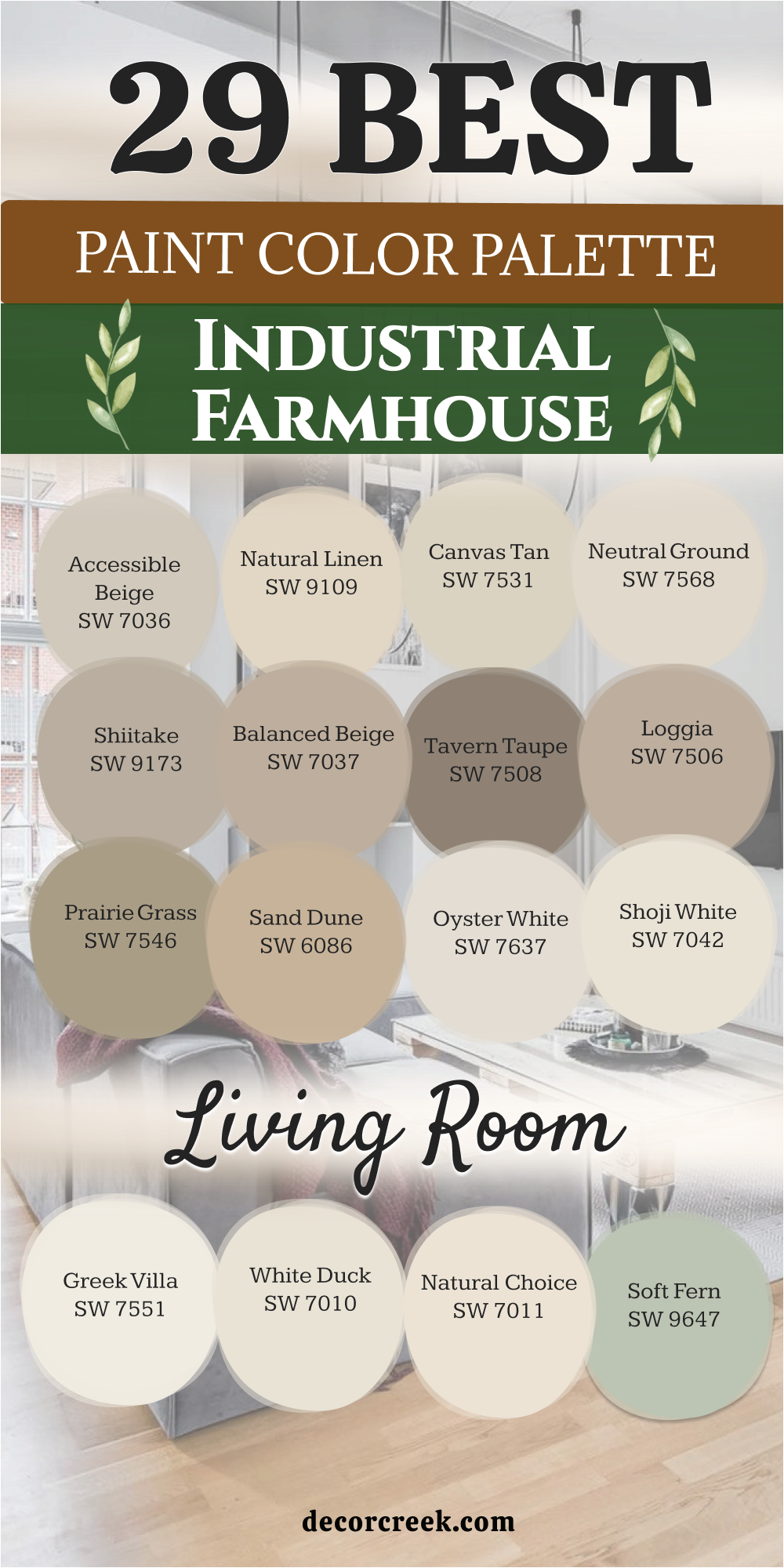
27 Warm Industrial Living Room Paint Color Scheme
Warm Stone SW 7032
Warm Stone SW 7032 is a sophisticated, medium-dark gray that leans heavily into its brown undertones. This color reminds me of the thick, aged concrete foundations of a historic warehouse that has been warmed by decades of afternoon sun.
It is a fantastic choice for an accent wall behind a metal-framed shelving unit, as it provides a solid, “built-in” feel to the room.
Best used in: living room accent walls, fireplaces, and entryways
Pairs well with: Shoji White SW 7042, black iron, and light-toned wood floors The key rule of this color for warm industrial style is to use it to ground the space with a sense of architectural permanence.
👉 Read the full guide for this color HERE 👈
Mega Greige SW 7031
Mega Greige SW 7031 is a powerful mid-tone that perfectly balances gray and beige. It has a slightly more “meaty” and substantial feel than lighter greiges.
This color reminds me of the heavy stone worktops found in old industrial bakeries. It creates a very steady and reliable atmosphere that handles both natural and artificial light with ease.
Best used in: main living room walls, hallways, and open-plan spaces
Pairs well with: Pure White SW 7005, dark walnut, and charcoal textiles The key rule of this color for warm industrial style is to use it as a dependable, warm neutral that bridges the gap between metal and comfort.
👉 Read the full guide for this color HERE 👈

Felted Wool SW 9171
Felted Wool SW 9171 is a unique, earthy neutral with a very soft and organic appearance. This color reminds me of the raw, undyed wool used in vintage industrial textile mills.
It brings a layer of softness to a room that might otherwise feel too “hard” due to metal pipes or brick. It is a very comforting shade that works beautifully in areas meant for relaxation.
Best used in: bedrooms, cozy living room corners, and reading nooks
Pairs well with: Alabaster SW 7008, Urbane Bronze SW 7048, and woven textures The key rule of this color for warm industrial style is to use it to add a tactile, organic softness to a structured environment.
👉 Read the full guide for this color HERE 👈
Nutshell SW 6040
Nutshell SW 6040 is a mid-to-dark brown that feels incredibly earthy and honest. This color reminds me of the natural wood patinas found on antique workbench tops.
It is a bold choice for those who want to move away from gray and embrace a more traditional, “workshop” warmth. It creates a very focused and grounded feeling in a study or den.
Best used in: home offices, library walls, and cabinetry
Pairs well with: Creamy SW 7012, copper accents, and dark leather The key rule of this color for warm industrial style is to use it to provide a sense of vintage, handcrafted history.
Cocoa Whip SW 9084
Cocoa Whip SW 9084 is a light, creamy brown that feels like a warm cup of coffee in a sunlit loft. This color has enough warmth to make a room feel very cozy, but enough gray to keep it looking modern.
It is a great alternative to standard beige for those who want a bit more “flavor” on their walls without going too dark.
Best used in: kitchens, breakfast nooks, and guest bedrooms
Pairs well with: Snowbound SW 7004, black hardware, and reclaimed wood The key rule of this color for warm industrial style is to use it to create a bright, inviting atmosphere that still feels grounded.
👉 Read the full guide for this color HERE 👈
Latte SW 6108
Latte SW 6108 is a classic, warm tan that brings a Mediterranean or desert warmth to an industrial setting. This color reminds me of the sun-baked bricks found in old factory courtyards.
It is an excellent choice for a room with a lot of natural light, as it creates a glowing, comfortable environment that softens the “cold” edge of metal furniture.
Best used in: living rooms, sunrooms, and dining areas
Pairs well with: Greek Villa SW 7551, dark iron, and terracotta accents The key rule of this color for warm industrial style is to use it to maximize the feeling of sun-drenched comfort.
👉 Read the full guide for this color HERE 👈
Mudslide SW 9113
Mudslide SW 9113 is a deep, rich brown with a hint of gray that makes it feel very sophisticated. This color reminds me of the dark, fertile earth outside an old rural workshop.
It is a fantastic tool for creating a moody, high-end look on a budget. I love using this in a bedroom to make the space feel like a private, secure sanctuary.
Best used in: master bedrooms, accent walls, and media rooms
Pairs well with: Accessible Beige SW 7036, gold light fixtures, and white bedding The key rule of this color for warm industrial style is to use it to add a sense of luxury and deep, organic focus.
Tavern Taupe SW 7508
Tavern Taupe SW 7508 is a medium-dark neutral that feels very established and sturdy. This color reminds me of the heavy wooden beams in a historic urban pub.
It brings a lot of class to the industrial theme, making it feel less like a garage and more like a curated gallery. It handles shadows beautifully and looks great under dim evening lighting.
Best used in: dens, dining rooms, and cabinetry
Pairs well with: Shoji White SW 7042, brass hardware, and dark wood The key rule of this color for warm industrial style is to use it to create a sense of history and quiet strength.
👉 Read the full guide for this color HERE 👈
Sanderling SW 7513
Sanderling SW 7513 is a mid-tone beige with a very clean and professional personality. This color reminds me of the sand and stone used in modern architectural concrete.
It is a very neutral choice that works well in almost any industrial design plan. It provides a perfect middle ground that coordinates easily with both light and dark furniture.
Best used in: hallways, living rooms, and office spaces
Pairs well with: Pure White SW 7005, Iron Ore SW 7069, and silver accents The key rule of this color for warm industrial style is to use it as a dependable, “stony” neutral that doesn’t lean too yellow.
👉 Read the full guide for this color HERE 👈

Spalding Gray SW 6074
Spalding Gray SW 6074 is a deep, warm gray that has a very solid and architectural feel. This color looks like the heavy slate or stone slabs used in historic city buildings.
It brings a lot of drama and strength to a living room without being as cold as a blue-gray. It is a reliable shade that feels very permanent and well-built.
Best used in: exterior accents, living room walls, and kitchen islands
Pairs well with: Alabaster SW 7008, copper accents, and dark leather The key rule of this color for warm industrial style is to use it when you want a strong, “stony” gray that feels warm and secure.
👉 Read the full guide for this color HERE 👈
Sable SW 6083
Sable SW 6083 is a dark, velvety brown that feels extremely rich and sophisticated. This color reminds me of the deep, oil-rubbed bronze finishes found on vintage industrial hardware.
It is a bold choice for creating a high-contrast look in a modern loft. It makes white art frames and light-colored sofas look incredibly bright and sharp.
Best used in: accent walls, powder rooms, and library spaces
Pairs well with: Incredible White SW 7028, brass fixtures, and light oak The key rule of this color for warm industrial style is to use it as a dark, organic alternative to charcoal or black.
Turkish Coffee SW 6076
Turkish Coffee SW 6076 is an almost-black brown that carries incredible depth and authority. This color looks like the charred wood or heavy metal found in old blacksmith shops.
It brings a lot of drama and mystery to a room. It is perfect for creating a powerful focal point, such as a fireplace surround or a built-in bookshelf.
Best used in: accent walls, cabinetry, and fireplace surrounds
Pairs well with: Greek Villa SW 7551, cognac leather, and warm wood The key rule of this color for warm industrial style is to use it to add a sense of deep, historic mystery and structural weight.
👉 Read the full guide for this color HERE 👈
Black Fox SW 7020
Black Fox SW 7020 is a very dark, warm charcoal that is widely loved for its versatility. This color is the perfect bridge between a deep brown and a dark gray.
It reminds me of the painted metal doors on old city warehouses. It provides a very sharp and finished look that feels both modern and traditional at the same time.
Best used in: exteriors, front doors, kitchen islands, and accent walls
Pairs well with: Repose Gray SW 7015, silver hardware, and light-toned wood The key rule of this color for warm industrial style is to use it as a sophisticated, warm-toned black.
👉 Read the full guide for this color HERE 👈
Griffin SW 7026
Griffin SW 7026 is a rich, medium-dark brown with a strong gray personality. This color reminds me of the weathered wood and stone found on old industrial docks.
It is a fantastic choice for those who want a dark wall color that still feels very warm and approachable. It brings a sense of history and permanence to any space it covers.
Best used in: home offices, dens, and living room walls
Pairs well with: Snowbound SW 7004, black iron, and cognac leather The key rule of this color for warm industrial style is to use it to blend mechanical design with the natural colors of weathered earth.
👉 Read the full guide for this color HERE 👈
Kingsport Gray HC-86
Kingsport Gray HC-86 is a classic, mid-to-dark brown-gray that feels very grounded and sturdy. This color reminds me of the heavy wooden beams and stone in a rustic city building.
It is a fantastic choice for making a large room feel much more intimate and secure. It creates a very luxurious feeling that is still very rugged and honest.
Best used in: living rooms, bedrooms, and exteriors
Pairs well with: Cloud White OC-130, dark walnut, and silver accents The key rule of this color for warm industrial style is to use it to add a sense of organic depth and permanence.
👉 Read the full guide for this color HERE 👈
Rustic Taupe 999
Rustic Taupe 999 is a warm, earthy neutral that bridges the gap between gray and brown perfectly. This color reminds me of the weathered wood of an old workshop fence.
It is a fantastic choice for those who want an industrial look that feels very cozy and homey. It brings a sense of history and comfort to the modern home.
Best used in: living rooms, entryways, and whole-house walls
Pairs well with: White Dove OC-17, black metal, and woven textiles The key rule of this color for warm industrial style is to use it to add organic warmth to a room with cold metal elements.
Stone Brown 2112-30
Stone Brown 2112-30 is a deep, sophisticated brown with a stony personality. This color reminds me of the dark, rain-washed stone walls of historic city buildings.
It brings a lot of natural character into a room filled with glass and metal. It has a very professional look that makes a home office feel like a place of history and quiet focus.
Best used in: home offices, library walls, and cabinetry
Pairs well with: Simply White OC-117, copper accents, and light wood The key rule of this color for warm industrial style is to use it to create a sense of refined, organic luxury.
Plymouth Rock 1543
Plymouth Rock 1543 is a light-to-medium neutral that feels like a piece of sun-bleached stone. This color is very balanced and does not lean too far into yellow or blue.
It reminds me of the soft dust on an old stone floor. It is a very safe and popular choice for those who want a clean, minimalist look that still feels warm.
Best used in: kitchens, bathrooms, and hallways
Pairs well with: Chantilly Lace OC-65, dark iron, and light gray stone The key rule of this color for warm industrial style is to use it as a bright, dependable “stony” base.
Brandon Beige 977
Brandon Beige 977 is a rich, warm beige that has a very classic and inviting feel. This color reminds me of the natural, untreated fabrics used in old workshops.
It is a great choice for those who want to soften the “industrial” side of their home. It creates a very steady and reliable atmosphere that makes the room feel very lived-in.
Best used in: living rooms, bedrooms, and dining areas
Pairs well with: Cloud White OC-130, black iron, and dark wood The key rule of this color for warm industrial style is to use it to add a layer of domestic comfort to a raw, open space.
Pashmina AF-100
Pashmina AF-100 is a sophisticated, mid-tone “greige” that has a very soft and balanced feel. This color looks like the heavy, high-quality wool blankets used in a luxury city loft.
It is a great choice for those who want a wall color that is both cozy and very professional. It handles natural light beautifully and stays true to its neutral roots.
Best used in: living rooms, master bedrooms, and dining areas
Pairs well with: Simply White OC-117, dark walnut, and silver hardware The key rule of this color for warm industrial style is to use it as a soft, dependable backdrop for varied materials.
👉 Read the full guide for this color HERE 👈
Weimaraner AF-155
Weimaraner AF-155 is a unique, mid-to-dark neutral with a subtle “mushroom” undertone. This color reminds me of the complex, aged patinas found on old metal and stone.
It is a very artistic and creative choice that brings a lot of life to the walls. It works beautifully in rooms with a mix of vintage finds and modern tech.
Best used in: creative studios, home offices, and living rooms
Pairs well with: Steam AF-15, black metal, and warm wood The key rule of this color for warm industrial style is to use it to add a touch of sophisticated, vintage character.
👉 Read the full guide for this color HERE 👈
Davenport Tan HC-76
Davenport Tan HC-76 is a deep, earthy brown that carries a lot of weight and authority. This color looks like the heavy wooden worktables found in old industrial workshops.
It is a bold choice that brings a sense of tradition and history to the home. It pairs perfectly with warm brass lamps and white textiles for a high-contrast look.
Best used in: accent walls, dens, and built-in shelving
Pairs well with: Swiss Coffee OC-45, brass hardware, and cream fabrics The key rule of this color for warm industrial style is to use it to add a sense of deep, historic warmth and stability.
👉 Read the full guide for this color HERE 👈
Fairview Taupe HC-85
Fairview Taupe HC-85 is a dark, moody taupe that has a very strong and balanced personality. This color reminds me of the heavy stone and wood foundations of historic warehouses.
It is a very neutral choice that works well in almost any industrial design plan. It provides a solid and dependable feeling to any space it covers.
Best used in: exteriors, accent walls, and media rooms
Pairs well with: White Dove OC-17, charcoal accents, and light oak The key rule of this color for warm industrial style is to use it when you want a dark neutral that feels permanent and secure.
👉 Read the full guide for this color HERE 👈
Alexandria Beige HC-77
Alexandria Beige HC-77 is a sophisticated, medium-dark neutral that leans toward a warm, muddy gray. This color looks like the old, sun-baked plaster on the walls of a historic city building.
It brings a lot of class and weight to the industrial theme. It creates a very private and focused feeling that is perfect for concentration or relaxation.
Best used in: home offices, dining rooms, and cabinetry
Pairs well with: Simply White OC-117, dark wood, and brass accents The key rule of this color for warm industrial style is to use it to create a refined, “old-world” urban vibe.
👉 Read the full guide for this color HERE 👈
Smokey Taupe 983
Smokey Taupe 983 is a warm, mid-tone neutral that bridges the gap between beige and gray perfectly. This color reminds me of the soft shadows in a sunlit urban loft.
It is a fantastic choice for those who want an industrial look that feels very cozy. It brings a sense of history and comfort to the modern home without being too dark.
Best used in: living rooms, entryways, and bedrooms
Pairs well with: White Dove OC-17, black iron, and warm wood The key rule of this color for warm industrial style is to use it to add organic warmth to a room with cold metal elements.
👉 Read the full guide for this color HERE 👈
Deep Caviar 2130-20
Deep Caviar 2130-20 is a very dark, near-black brown that is extremely moody and sophisticated. This color feels like a deep pool of ink or charred wood.
It is one of the most powerful colors for a modern, warm industrial style. It makes any white art or furniture look extremely bright and sharp, providing a high-end edge.
Best used in: accent walls, media rooms, and entryways
Pairs well with: Classic Gray OC-23, silver hardware, and light oak The key rule of this color for warm industrial style is to use it to create deep contrast and a sense of modern, organic mystery.
Chocolate Truffle 2096-20
Chocolate Truffle 2096-20 is a deep, rich brown with a hint of red that makes it feel extremely warm and welcoming. This color reminds me of the dark, stained wood of old factory desks.
It brings a lot of organic warmth to a room filled with machines and metal. It creates a very luxurious feeling that is still very rugged and honest.
Best used in: accent walls, dens, and cabinetry
Pairs well with: Simply White OC-117, cognac leather, and warm brass The key rule of this color for warm industrial style is to use it to add a sense of deep, organic luxury and heritage.
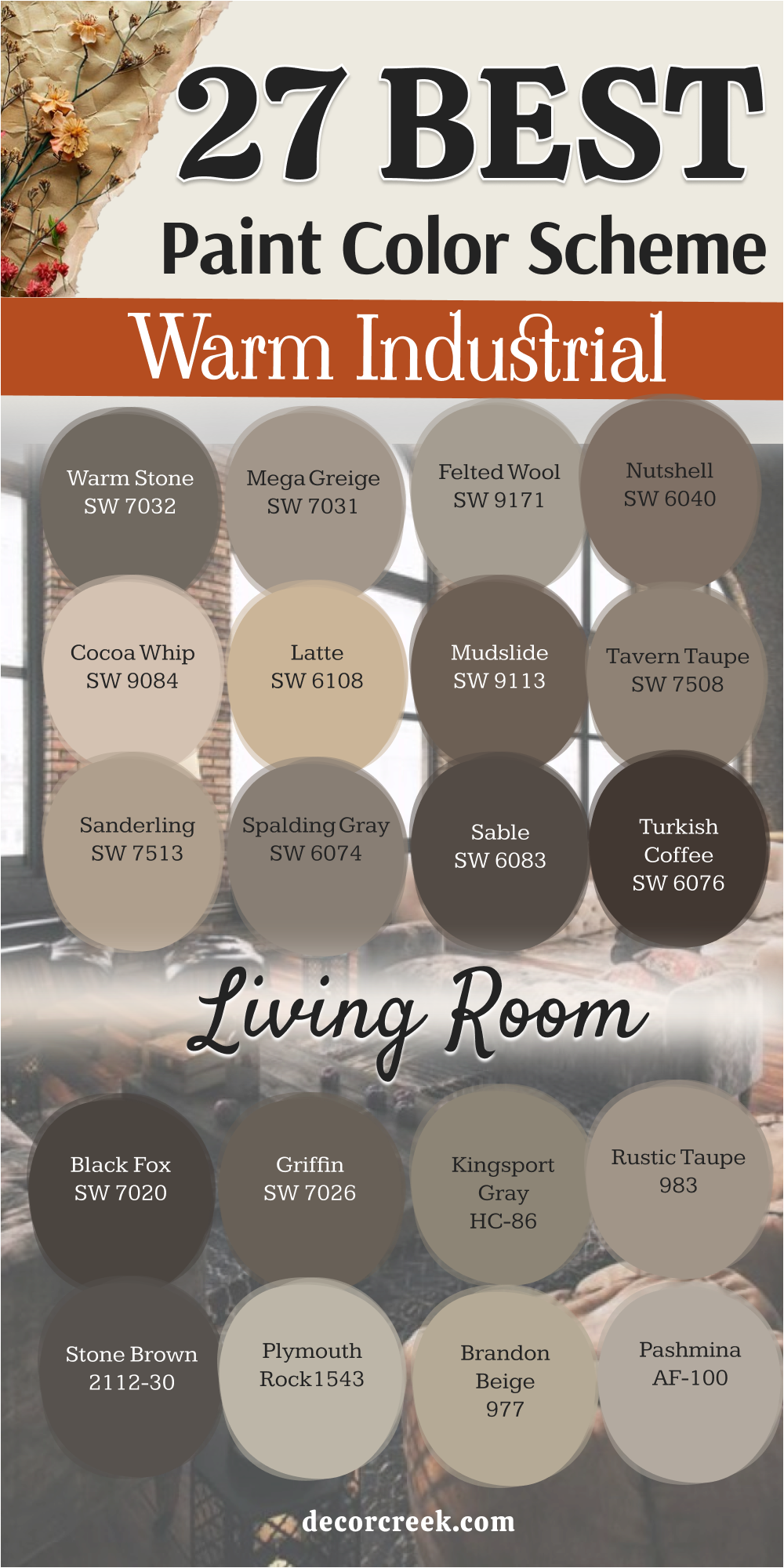
30 Boho Industrial Living Room Paint Color Palette
Canyon Clay SW 6054
Canyon Clay SW 6054 is a deep, muted terracotta that brings an instant soul to a room filled with cold metal. This color reminds me of the sun-baked pottery found in a globetrotter’s collection.
It acts as a perfect warm backdrop for a black iron bookshelf filled with trailing plants and vintage books.
Best used in: accent walls, fireplace surrounds, and dining nooks
Pairs well with: Shoji White SW 7042, black iron, and woven rattan The key rule of this color for boho industrial style is to use it to provide an earthy, organic warmth that counters the “factory” feel.
Redend Point SW 9081
Redend Point SW 9081 is a soft, soulful beige with a pink-cinnamon undertone. This color reminds me of the natural clay plasters used in artistic urban lofts.
It is a very versatile “new neutral” that makes a space feel incredibly welcoming and calm, especially when paired with light gray concrete floors.
Best used in: main living room walls, bedrooms, and entryways
Pairs well with: Pure White SW 7005, dark wood, and sage green accents The key rule of this color for boho industrial style is to use it as a soft, blush-toned base that breathes life into structured spaces.
👉 Read the full guide for this color HERE 👈

Cavern Clay SW 7701
Cavern Clay SW 7701 is a bright, energetic terracotta that feels like a sunset in the desert. This color looks amazing next to exposed red brick and raw wood beams.
It brings a “found” and rustic energy to the home, making it feel less like a modern building and more like a curated sanctuary.
Best used in: accent walls, entryways, and kitchen islands
Pairs well with: Alabaster SW 7008, turquoise accents, and dark leather The key rule of this color for boho industrial style is to use it to inject a sense of adventure and warmth into a neutral room.
👉 Read the full guide for this color HERE 👈

Spicy Hue SW 6342
Spicy Hue SW 6342 is a rich, medium-toned orange with a lot of depth. This color reminds me of the exotic spices found in an open-air market.
It is a bold choice that works beautifully when you want to highlight industrial window frames or black metal railings. It creates a very creative and high-energy atmosphere.
Best used in: accent walls, dens, and creative studios
Pairs well with: Snowbound SW 7004, navy blue, and galvanized metal The key rule of this color for boho industrial style is to use it to create a vibrant, artistic focal point.
👉 Read the full guide for this color HERE 👈
Copper Mountain SW 6356
Copper Mountain SW 6356 is a glowing, metallic-toned brown that looks like a sheet of oxidized copper. This color brings a high-end, artistic feel to the industrial theme.
It feels very sophisticated when paired with warm yellow lighting and lots of indoor greenery.
Best used in: media rooms, dining rooms, and cabinetry
Pairs well with: Greek Villa SW 7551, dark iron, and emerald green The key rule of this color for boho industrial style is to use it to mimic the look of aged, industrial metals in a warm way.
👉 Read the full guide for this color HERE 👈

Persimmon SW 6339
Persimmon SW 6339 is a light, juicy orange-terracotta that feels very fresh and optimistic. This color reminds me of the hand-painted tiles found in Mediterranean workshops.
It is a great way to brighten up a dark industrial corner and make it feel more lived-in and friendly.
Best used in: breakfast nooks, small bathrooms, and accent walls
Pairs well with: Extra White SW 7006, light oak, and black hardware The key rule of this color for boho industrial style is to use it to add a playful, sunny element to a raw space.
Fired Brick SW 6335
Fired Brick SW 6335 is a deep, traditional red that feels very solid and historic. This color reminds me of the sturdy clay bricks of old city factories.
It brings a lot of strength and authority to a room. I love using it in a home library or a hallway to create a sense of permanence and classic style.
Best used in: library walls, entryways, and accent walls
Pairs well with: Alabaster SW 7008, dark walnut, and silver hardware The key rule of this color for boho industrial style is to use it to emphasize the historic, structural roots of the building.
Moroccan Spice SW 6060
Moroccan Spice SW 6060 is a rich, dark terracotta with a hint of brown that feels very exotic and moody. This color looks like the dyed leathers and textiles of a busy bazaar.
It provides a beautiful, dark backdrop for macramé wall hangings and light-colored wooden furniture.
Best used in: bedrooms, cozy dens, and cabinetry
Pairs well with: Creamy SW 7012, teal accents, and brass The key rule of this color for boho industrial style is to use it to create a deep, travel-inspired mood.
👉 Read the full guide for this color HERE 👈
Oakmoss SW 6180
Oakmoss SW 6180 is a deep, forest green with a lot of gray mixed in. This color brings a natural, plant-like feel to a home filled with stone and metal.
It reminds me of the moss growing on old brick walls in a hidden city courtyard. It works perfectly in a living room filled with large indoor trees.
Best used in: living rooms, home offices, and exteriors
Pairs well with: Shoji White SW 7042, tan leather, and black iron The key rule of this color for boho industrial style is to use it to introduce a heavy, organic forest element.
👉 Read the full guide for this color HERE 👈
Relentless Olive SW 6425
Relentless Olive SW 6425 is a medium-toned green with a very strong yellow undertone. This color reminds me of vintage military equipment or old canvas tents.
It brings a rugged, adventurous feel to the home. It looks very smart when paired with dark wood and black metal lamps.
Best used in: kitchens, mudrooms, and accent walls
Pairs well with: Pure White SW 7005, dark walnut, and copper The key rule of this color for boho industrial style is to use it for a rugged, utility-inspired look.
Ripe Olive SW 6209
Ripe Olive SW 6209 is a very dark, moody green that feels extremely sophisticated and secure. This color looks like the deep shadows of a botanical garden.
It is a bold choice that makes gold or brass fixtures look like pieces of jewelry. It creates a very private and focused feeling in any room.
Best used in: master bedrooms, dens, and kitchen cabinetry
Pairs well with: Alabaster SW 7008, cognac leather, and warm brass The key rule of this color for boho industrial style is to use it to add a sense of deep, organic luxury.
👉 Read the full guide for this color HERE 👈

Artichoke SW 6179
Artichoke SW 6179 is a medium-light green with a very soft and dusty appearance. This color reminds me of the sage-colored equipment used in old workshops.
It brings a very artistic and creative touch to a living room. It feels very fresh and calm, especially when paired with light wood and white textiles.
Best used in: living rooms, bedrooms, and bathrooms
Pairs well with: Greek Villa SW 7551, dark iron, and woven rugs The key rule of this color for boho industrial style is to use it to add a touch of artistic, vintage color.
👉 Read the full guide for this color HERE 👈
Messenger Bag SW 7740
Messenger Bag SW 7740 is a deep, earthy green-brown that feels very established and sturdy. This color reminds me of the heavy canvas bags used by city explorers.
It brings a lot of class and weight to the boho industrial theme. It handles shadows beautifully and looks great under soft, warm lighting.
Best used in: home offices, dens, and exteriors
Pairs well with: Shoji White SW 7042, tan leather, and black hardware The key rule of this color for boho industrial style is to use it to provide a sense of grounded history.
Saguaro SW 6419
Saguaro SW 6419 is a vibrant, mid-tone green that feels very active and natural. This color looks like the cacti found in a desert landscape.
It is a great choice for those who want to bring a lot of energy and life to their walls. It pairs beautifully with light-colored stone and silver metal fixtures.
Best used in: accent walls, kitchens, and creative studios
Pairs well with: Snowbound SW 7004, light oak, and terracotta pots The key rule of this color for boho industrial style is to use it to create a fresh, high-energy natural focal point.
Riverway SW 6222
Riverway SW 6222 is a deep, blue-green-gray that has a lot of personality. This color reminds me of the painted metal on old machinery or the water of a city canal.
It is a very bold and artistic choice that brings a lot of life to the walls. It works beautifully for kitchen cabinets or a high-end accent wall.
Best used in: cabinetry, accent walls, and dining rooms
Pairs well with: Steam AF-15, warm wood, and brass hardware The key rule of this color for boho industrial style is to use it to create a moody, artistic focal point.
👉 Read the full guide for this color HERE 👈

Moscow Midnight SW 9142
Moscow Midnight SW 9142 is a very dark, teal-toned blue that is extremely moody and sophisticated. This color feels like the deep shadows of a city library at night.
It is a powerful color that makes any white art or furniture look extremely bright and sharp. It creates a very private and secure feeling.
Best used in: accent walls, media rooms, and entryways
Pairs well with: Classic Gray OC-23, silver hardware, and light oak The key rule of this color for boho industrial style is to use it to create deep contrast and a sense of modern mystery.
👉 Read the full guide for this color HERE 👈
Luxe Blue SW 6537
Luxe Blue SW 6537 is a rich, royal navy that brings a splash of classic color to the home. This blue looks amazing next to exposed orange bricks and raw metal pipes.
It feels very high-end and polished, providing a beautiful contrast to the raw materials of an industrial loft.
Best used in: dining rooms, bedrooms, and kitchen islands
Pairs well with: Alabaster SW 7008, tan leather, and light wood The key rule of this color for boho industrial style is to use it when you want to add a sense of classic elegance to a raw room.
👉 Read the full guide for this color HERE 👈
Tempe Star SW 6229
Tempe Star SW 6229 is a deep, sophisticated blue with a strong gray undertone. This color reminds me of the painted metal doors found in old city offices.
It brings a sense of order and tradition to a room filled with raw materials and plants. It looks particularly handsome under warm yellow light bulbs at night.
Best used in: living rooms, home offices, and cabinetry
Pairs well with: Stonington Gray HC-170, Cloud White OC-130, and brass The key rule of this color for boho industrial style is to use it when you want a blue that feels like it has historic weight.
👉 Read the full guide for this color HERE 👈
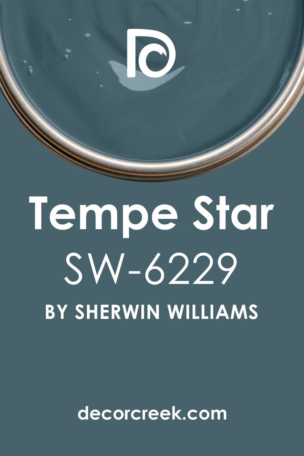
Smoky Azurite SW 9148
Smoky Azurite SW 9148 is a medium-dark blue with a dusty, purple-gray undertone. This color reminds me of the semi-precious stones found in an artist’s workshop.
It brings a very creative and spiritual touch to the boho industrial theme. It creates a very calm and steady atmosphere that is perfect for relaxation.
Best used in: bedrooms, bathrooms, and reading nooks
Pairs well with: Chantilly Lace OC-65, dark iron, and silver accents The key rule of this color for boho industrial style is to use it to add a sophisticated, artistic splash of cool color.
👉 Read the full guide for this color HERE 👈
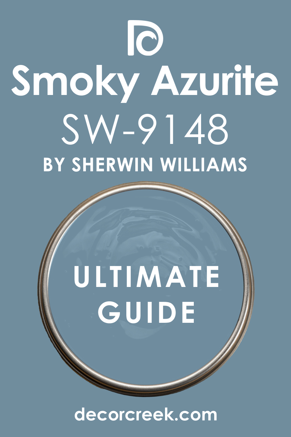
Blue Spruce 1637
Blue Spruce 1637 is a beautiful, mid-tone blue-green that feels very cool and fresh. This color reminds me of the pine trees found in a mountain forest.
It is a great choice for those who want a color that feels natural but still very modern. It looks very clean next to white trim and stainless steel appliances.
Best used in: kitchens, bathrooms, and laundry rooms
Pairs well with: Pure White SW 7005, light oak, and black metal The key rule of this color for boho industrial style is to use it to create a crisp, nature-inspired environment.
Rainforest Foliage 2040-10
Rainforest Foliage 2040-10 is a very dark, near-black green that is extremely sophisticated. This color looks like the thickest part of a jungle canopy.
It brings a lot of drama and mystery to an industrial room. I use it to make a small library or entryway feel very special and bold.
Best used in: accent walls, cabinetry, and front doors
Pairs well with: Classic Gray OC-23, copper, light oak, and white textiles The key rule of this color for boho industrial style is to use it as a dark, jewel-toned alternative to standard black.
Hidden Sapphire CSP-690
Hidden Sapphire CSP-690 is a rich, glowing blue that brings a lot of energy and depth. This color feels like a rare gem found in an urban excavation.
It is a fantastic choice for those who want a bold, creative accent. It pairs beautifully with dark wood and warm brass light fixtures for a high-end look.
Best used in: accent walls, media rooms, and built-in shelving
Pairs well with: Simply White OC-117, cognac leather, and gold The key rule of this color for boho industrial style is to use it to add a sense of luxury and creative energy.
👉 Read the full guide for this color HERE 👈
Hazy Skies OC-48
Hazy Skies OC-48 is a light, sophisticated gray-green that has a very clean and airy feel. This color reminds me of the soft shadows in a greenhouse.
It is a great choice for making a small room feel much more open and quiet. It provides a beautiful and soft contrast to darker industrial elements like iron furniture.
Best used in: bedrooms, living rooms, and small entryways
Pairs well with: Chantilly Lace OC-65, dark walnut, and silver hardware The key rule of this color for boho industrial style is to use it as a bright, nature-tinted base.
Natural Cream OC-14
Natural Cream OC-14 is a warm, inviting off-white that feels extremely homey. This color reminds me of the untreated fabrics and linens used in a bohemian home.
It is a great choice for those who want to soften the industrial side of their home. It creates a very steady and reliable atmosphere that makes the room feel lived-in.
Best used in: whole-house painting, living rooms, and kitchens
Pairs well with: Anonymous SW 7046, dark walnut, and black iron The key rule of this color for boho industrial style is to use it to add a layer of comfort to a raw space.
👉 Read the full guide for this color HERE 👈

Muslin OC-12
Muslin OC-12 is a classic, warm beige that feels like a piece of vintage fabric. This color reminds me of the sun-bleached walls of a desert home.
It is an excellent choice for a room with a lot of natural light, as it creates a glowing, comfortable environment that softens the cold edge of metal.
Best used in: living rooms, bedrooms, and dining areas
Pairs well with: White Dove OC-17, black iron, and terracotta accents The key rule of this color for boho industrial style is to use it to maximize the feeling of sun-drenched, organic comfort.
👉 Read the full guide for this color HERE 👈

Shaker Beige HC-45
Shaker Beige HC-45 is a rich, medium-toned beige that feels very established and sturdy. This color looks like the heavy stone and wood foundations of historic city buildings.
It brings a sense of order and tradition to a room filled with raw materials and plants. It provides a perfect middle ground for varied decor.
Best used in: hallways, living rooms, and exteriors
Pairs well with: Cloud White OC-130, dark iron, and reclaimed wood The key rule of this color for boho industrial style is to use it as a dependable, historic neutral.
👉 Read the full guide for this color HERE 👈

Leather Saddle Brown 2100-20
Leather Saddle Brown 2100-20 is a deep, rich brown that feels extremely earthy and honest. This color reminds me of the natural leather used in a saddlery or workshop.
It is a bold choice for those who want a more traditional warmth. It creates a very focused and grounded feeling in a study or den.
Best used in: home offices, library walls, and accent walls
Pairs well with: Creamy SW 7012, copper accents, and dark leather The key rule of this color for boho industrial style is to use it to provide a sense of vintage, handcrafted history.
Maple Syrup 1105
Maple Syrup 1105 is a warm, medium-dark brown with a honey-like glow. This color reminds me of the natural wood patinas found on antique workbench tops.
It brings a lot of warmth and character into a room filled with glass and metal. It creates a very steady and reliable atmosphere that is perfect for a busy home.
Best used in: living rooms, kitchen islands, and cabinetry
Pairs well with: Simply White OC-117, black hardware, and warm wood The key rule of this color for boho industrial style is to use it to add organic, honey-toned warmth.
Caramel Apple 1042
Caramel Apple 1042 is a rich, reddish-brown that feels very warm and welcoming. This color reminds me of the dark, stained wood of old factory desks.
It brings a lot of organic warmth to a room filled with machines and metal. It creates a very luxurious feeling that is still very rugged and honest.
Best used in: accent walls, dens, and cabinetry
Pairs well with: Simply White OC-117, cognac leather, and warm brass The key rule of this color for boho industrial style is to use it to add a sense of deep, organic luxury.
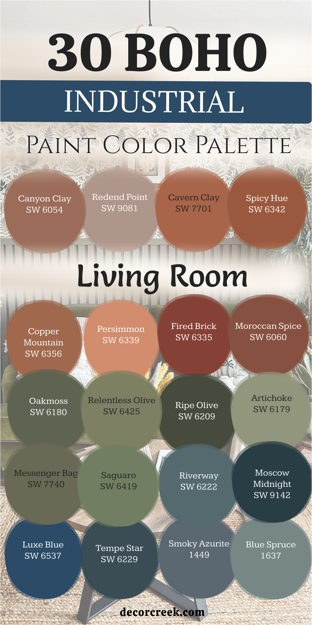
33 Rustic Industrial Living Room Paint Color Scheme
Porcelain SW 0053
Porcelain SW 0053 is a very soft, warm off-white that feels like the clean surface of antique ceramics. In a rustic industrial space, it acts as a gentle highlight against rough-sawn wood and dark iron.
I find it is much more forgiving than a pure white because it holds a tiny bit of “dusty” warmth that prevents it from looking too clinical.
Best used in: bedrooms, living room walls, and trim
Pairs well with: Rookwood Sash Green SW 2810, dark walnut, and black iron The key rule of this color for rustic industrial style is to use it to provide a clean, “found” backdrop that softens heavy architectural elements.
👉 Read the full guide for this color HERE 👈
Creamy SW 7012
Creamy SW 7012 is a rich, inviting off-white that feels like a sun-warmed linen sheet. This color reminds me of the painted wood in a cozy workshop.
It is one of the most reliable choices for making a room with large metal windows feel much more domestic and friendly. It brings a steady, peaceful light to the space.
Best used in: kitchens, whole-house walls, and ceilings
Pairs well with: Thunderous SW 6201, dark leather, and copper accents The key rule of this color for rustic industrial style is to use it to add a layer of soft, traditional comfort to a raw space.
👉 Read the full guide for this color HERE 👈

Antique White SW 6119
Antique White SW 6119 is a classic, warm neutral with a definite yellow-beige undertone. This color looks like the pages of an old book or a vintage map.
It is a fantastic choice if you want to emphasize the “rustic” side of your home, as it creates a glowing atmosphere that pairs beautifully with reclaimed barn wood and amber lighting.
Best used in: living rooms, hallways, and dining areas
Pairs well with: Black Forest Green HC-187, bronze hardware, and warm wood The key rule of this color for rustic industrial style is to use it to create a sense of historic warmth and age.
👉 Read the full guide for this color HERE 👈
Dover White SW 6385
Dover White SW 6385 is a soft, creamy white that has been a favorite for decades. It reminds me of the whitewashed stone of a country cottage.
In an industrial setting, it provides a nice contrast to cold steel pipes without making the room feel chilly. It is very versatile and handles different types of light very well.
Best used in: kitchens, trim, and small living areas
Pairs well with: Roycroft Pewter SW 2848, silver hardware, and light gray stone The key rule of this color for rustic industrial style is to use it as a crisp but warm “bridge” neutral.
👉 Read the full guide for this color HERE 👈
Casa Blanca SW 7571
Casa Blanca SW 7571 is a sophisticated off-white that leans toward a light tan. This color reminds me of the soft sand in a rural driveway.
It is a great choice for those who want a bright space that still feels very “solid” and earthy. It creates a very steady and organized feeling that is perfect for a large, open-concept home.
Best used in: open-floor plans, living rooms, and entryways
Pairs well with: Homburg Gray SW 7622, dark wood, and galvanized metal The key rule of this color for rustic industrial style is to use it to provide a sturdy, nature-tinted base.
👉 Read the full guide for this color HERE 👈
Steamed Milk SW 7554
Steamed Milk SW 7554 is a light, velvety neutral that feels very balanced and quiet. This color reminds me of the natural, untreated wood used in farm construction. It is a fantastic choice if you want a neutral that is more interesting than basic white but still very airy. It looks very smart next to dark iron light fixtures.
Best used in: bedrooms, sunrooms, and bathrooms
Pairs well with: Elephant Ear SW 9168, cognac leather, and light oak The key rule of this color for rustic industrial style is to use it to create an airy, minimalist space that still feels welcoming.
👉 Read the full guide for this color HERE 👈
Wool Skein SW 6148
Wool Skein SW 6148 is a beautiful, mid-tone neutral with a subtle green-tan undertone. This color reminds me of raw wool or dry grass.
It brings a very natural and earthy touch to an industrial living room. It works perfectly in rooms with a lot of wooden beams and helps the metal accents feel like part of a nature-inspired design.
Best used in: living rooms, mudrooms, and kitchens
Pairs well with: Mountain Road SW 7743, black hardware, and reclaimed wood The key rule of this color for rustic industrial style is to use it to introduce a subtle, organic earthiness.
👉 Read the full guide for this color HERE 👈

Nomadic Desert SW 6107
Nomadic Desert SW 6107 is a warm, mid-tone tan that feels very grounded and sturdy. This color reminds me of the sun-baked earth outside a historic workshop.
It is a step darker than many neutrals, which makes it excellent for creating a cozy, secure atmosphere in a room with very high ceilings.
Best used in: large living rooms, entryways, and exteriors
Pairs well with: Dover White SW 6385, dark iron, and leather furniture The key rule of this color for rustic industrial style is to use it to add warmth and structural weight to a large room.
👉 Read the full guide for this color HERE 👈

Tatami Tan SW 6116
Tatami Tan SW 6116 is a rich, medium-toned tan that carries a lot of organic character. This color looks like the natural straw or wood found in traditional crafts.
It brings a lot of class and history to the rustic theme. It handles natural light beautifully and provides a very warm, golden glow during the late afternoon.
Best used in: dining rooms, bedrooms, and library spaces
Pairs well with: Garden Gate SW 6167, warm brass, and dark walnut The key rule of this color for rustic industrial style is to use it to create a sense of handcrafted history and warmth.
👉 Read the full guide for this color HERE 👈
Bungalow Beige SW 7511
Bungalow Beige SW 7511 is a sophisticated, warm gray-beige that has a very soft and balanced feel. This color looks like the smooth plaster on a historic wall.
It is a great choice for those who want a neutral that is more interesting than basic beige. It works perfectly in rooms that feature both metal pipes and soft textiles.
Best used in: master suites, living rooms, and hallways
Pairs well with: Pure White SW 7005, black metal, and linen textiles The key rule of this color for rustic industrial style is to use it for a soft, professional look that doesn’t feel cold.
👉 Read the full guide for this color HERE 👈
Sanderling SW 7513
Sanderling SW 7513 is a mid-tone neutral with a very clean and stony personality. This color reminds me of the sand and stone used in modern architectural concrete.
It is a very neutral choice that works well in almost any industrial design plan. It provides a perfect middle ground that coordinates easily with both light and dark furniture.
Best used in: hallways, kitchens, and home offices
Pairs well with: Extra White SW 7006, Iron Ore SW 7069, and silver accents The key rule of this color for rustic industrial style is to use it as a dependable, “stony” neutral that stays clear of yellow tones.
👉 Read the full guide for this color HERE 👈
Thunderous SW 6201
Thunderous SW 6201 is a deep, moody gray with a strong green-blue undertone. This color looks like a stormy sky over an old industrial harbor.
It is a fantastic tool for grounding a room and adding a lot of mystery. I love using it on a fireplace wall or as an accent in a room with a lot of light-colored wood.
Best used in: accent walls, fireplace surrounds, and exteriors
Pairs well with: Creamy SW 7012, cognac leather, and copper The key rule of this color for rustic industrial style is to use it to add a sense of infinite, organic depth.
Homburg Gray SW 7622
Homburg Gray SW 7622 is a dark, sophisticated blue-gray that has a very strong and established feel. This color reminds me of the heavy metal doors or slate tiles used in historic city buildings.
It brings a sense of order and tradition to a room filled with raw materials. It looks particularly handsome under warm lighting.
Best used in: home offices, dining rooms, and cabinetry
Pairs well with: Casa Blanca SW 7571, brass hardware, and dark wood The key rule of this color for rustic industrial style is to use it when you want a blue-gray that feels like it has real historic weight.
👉 Read the full guide for this color HERE 👈
Roycroft Pewter SW 2848
Roycroft Pewter SW 2848 is a medium-dark gray with a very strong architectural personality. This color reminds me of the brushed metal and ironwork found in high-end industrial designs.
It is a very practical choice for rooms that get a lot of daily use, providing a clean and organized feeling that is still very rugged.
Best used in: kitchens, mudrooms, and living room walls
Pairs well with: Dover White SW 6385, Tricorn Black SW 6258, and silver The key rule of this color for rustic industrial style is to use it as a dependable, mid-tone gray that highlights raw materials.
👉 Read the full guide for this color HERE 👈
Elephant Ear SW 9168
Elephant Ear SW 9168 is a rich, warm gray that leans toward taupe. This color reminds me of the weathered stone foundations of an old city factory.
It brings a lot of organic warmth into a room filled with machines and metal. It creates a very balanced and polished look that feels very high-quality and sturdy.
Best used in: whole-house walls, living rooms, and bedrooms
Pairs well with: Steamed Milk SW 7554, dark walnut, and black hardware The key rule of this color for rustic industrial style is to use it to blend mechanical design with natural, muddy warmth.
👉 Read the full guide for this color HERE 👈
Mountain Road SW 7743
Mountain Road SW 7743 is a deep, moody green with a strong gray personality. This color reminds me of the moss and lichen on a mountain cliff.
It brings a very natural and earthy touch to a home filled with stone and iron. It is a great way to add color while still keeping things very professional and grounded.
Best used in: living rooms, home offices, and exteriors
Pairs well with: Wool Skein SW 6148, cognac leather, and black iron The key rule of this color for rustic industrial style is to use it to introduce a natural element that softens the look of structural metal.
👉 Read the full guide for this color HERE 👈
Rookwood Sash Green SW 2810
Rookwood Sash Green SW 2810 is a dark, sophisticated green that feels very earthy and established. This color reminds me of the painted metal doors or old structural supports in historic buildings.
It brings a lot of class and weight to an interior. I often recommend it for painting a kitchen island or a cozy den.
Best used in: kitchen islands, accent walls, and dens
Pairs well with: Porcelain SW 0053, dark leather, and brass hardware The key rule of this color for rustic industrial style is to use it to create a sophisticated, moody vibe that is connected to nature.
👉 Read the full guide for this color HERE 👈
Garden Gate SW 6167
Garden Gate SW 6167 is a medium-dark green with a very soft and balanced feel. This color reminds me of the weathered metal statues found in old city parks.
It brings a very natural and earthy touch to a home. It looks wonderful when paired with dark iron light fixtures and wooden furniture, creating a quiet and organized feeling.
Best used in: living rooms, bedrooms, and exteriors
Pairs well with: Tatami Tan SW 6116, Alabaster SW 7008, and dark wood The key rule of this color for rustic industrial style is to use it to introduce a natural, metallic green that softens hard edges.
👉 Read the full guide for this color HERE 👈
Dried Thyme SW 6186
Dried Thyme SW 6186 is a sophisticated, mid-tone green with a lot of gray mixed in. This color reminds me of the sage plants in a farmhouse garden.
it is a very calm and steady choice that feels very established. It works beautifully with black iron bed frames and reclaimed wood furniture, adding a peaceful, vintage color.
Best used in: bedrooms, home offices, and cabinetry
Pairs well with: Greek Villa SW 7551, black hardware, and dark wood The key rule of this color for rustic industrial style is to use it to add a touch of artistic, vintage color to a raw space.
👉 Read the full guide for this color HERE 👈

Briarwood HC-175
Briarwood HC-175 is a warm, mid-tone neutral that bridges the gap between gray and brown perfectly. This color reminds me of the weathered wood of an old farm fence.
It is a fantastic choice for those who want an industrial look that feels very cozy and homey. It brings a sense of history and comfort to the modern home.
Best used in: living rooms, entryways, and whole-house walls
Pairs well with: White Dove OC-17, black metal, and woven textiles The key rule of this color for rustic industrial style is to use it to add organic warmth to a room with cold metal elements.
👉 Read the full guide for this color HERE 👈
Stone House 1039
Stone House 1039 is a rich, warm beige that has a very classic and inviting feel. This color reminds me of the natural, untreated stone used in historic construction.
It is a great choice for those who want to soften the “industrial” side of their home. It creates a very steady and reliable atmosphere that makes the room feel very lived-in.
Best used in: living rooms, dining rooms, and whole-house painting
Pairs well with: Cloud White OC-130, dark walnut, and black iron The key rule of this color for rustic industrial style is to use it to add a layer of domestic comfort to a raw, open space.
Alexandria Beige HC-77
Alexandria Beige HC-77 is a sophisticated, medium-dark neutral that leans toward a warm, muddy gray. This color looks like the old, sun-baked plaster on the walls of a historic city building.
It brings a lot of class and weight to the industrial theme. It creates a very private and focused feeling that is perfect for relaxation.
Best used in: home offices, dining rooms, and cabinetry
Pairs well with: Simply White OC-117, dark wood, and brass accents The key rule of this color for rustic industrial style is to use it to create a refined, “old-world” urban vibe.
👉 Read the full guide for this color HERE 👈
Grant Beige HC-83
Grant Beige HC-83 is a light, sophisticated “greige” that has a very soft and balanced feel. This color looks like the heavy wool or stone found in a rustic loft.
It is a great choice for those who want a wall color that is both cozy and very professional. It handles natural light beautifully and stays true to its neutral roots.
Best used in: living rooms, master bedrooms, and hallways
Pairs well with: Simply White OC-117, dark walnut, and silver hardware The key rule of this color for rustic industrial style is to use it as a soft, dependable backdrop for varied materials.
👉 Read the full guide for this color HERE 👈

Ranchwood CC-500
Ranchwood CC-500 is a medium-dark brown with a stony personality. This color reminds me of the weathered wood and stone walls of city buildings.
It brings a lot of natural character into a room filled with glass and metal. It has a very professional look that makes a room feel like it has real history and a grounded, reliable atmosphere.
Best used in: living rooms, entryways, and exteriors
Pairs well with: Alabaster SW 7008, black metal, and dark wood The key rule of this color for rustic industrial style is to use it to blend mechanical design with the natural colors of earth and stone.
Rustic Brick 2091-20
Rustic Brick 2091-20 is a deep, earthy red that brings an instant soul to a room. This color reminds me of the sturdy clay bricks of old city factories.
It is a bold choice that works beautifully when you want to highlight industrial window frames or raw wood beams. It creates a very creative and high-energy atmosphere.
Best used in: accent walls, fireplace surrounds, and dining areas
Pairs well with: Cloud White OC-130, black iron, and weathered wood The key rule of this color for rustic industrial style is to use it to emphasize the historic, structural roots of the building.
Bricktone Red 2005-30
Bricktone Red 2005-30 is a warm, mid-tone orange-terracotta that feels very fresh and optimistic. This color reminds me of the hand-painted tiles or sun-baked pottery found in a globetrotter’s collection.
It is a great way to brighten up a dark corner and make it feel more lived-in and friendly.
Best used in: accent walls, entryways, and kitchens
Pairs well with: Simply White OC-117, light oak, and black hardware The key rule of this color for rustic industrial style is to use it to add a playful, sunny element to a raw space.
Chestertown Buff HC-9
Chestertown Buff HC-9 is a rich, warm yellow-tan that feels very historical and high-end. This color looks like the sun-drenched walls of an old urban warehouse.
It brings a lot of glowing warmth into a room, which helps to balance out the cold feeling of metal and glass. It creates a very welcoming and friendly atmosphere.
Best used in: living rooms, dining rooms, and entryways
Pairs well with: White Dove OC-17, dark wood, and iron accents The key rule of this color for rustic industrial style is to use it to maximize the feeling of sun-warmed comfort.
👉 Read the full guide for this color HERE 👈
Powell Buff HC-35
Powell Buff HC-35 is a light, creamy tan that feels very balanced and clean. This color reminds me of the natural, untreated wood used in workshop furniture.
It is a fantastic choice if you want a neutral that feels very quiet and steady. It looks very sophisticated when paired with black metal shelving and light gray stone.
Best used in: bedrooms, kitchens, and hallways
Pairs well with: Cloud White OC-130, dark iron, and cream fabrics The key rule of this color for rustic industrial style is to use it for a soft, understated, and clean look.
👉 Read the full guide for this color HERE 👈
Lenox Tan HC-44
Lenox Tan HC-44 is a classic, mid-tone tan that brings a sense of deep history to the walls. This color reminds me of the heavy canvas tarps or leather used in old workshops.
It is a fantastic choice if you have a lot of white furniture and want the walls to provide a subtle, warm contrast that isn’t too dark.
Best used in: living rooms, dining rooms, and hallways
Pairs well with: Simply White OC-117, dark walnut, and galvanized metal The key rule of this color for rustic industrial style is to use it to provide a sturdy, dependable background that isn’t white.
👉 Read the full guide for this color HERE 👈
Kendall Green HC-166
Kendall Green HC-166 is a deep, saturated green-gray that has a lot of personality. This color reminds me of the painted metal on old machinery or the dark shutters of a historic building.
It is a very bold and artistic choice that brings a lot of life to the walls. It works beautifully for kitchen cabinets or a high-end accent wall.
Best used in: cabinetry, accent walls, and home offices
Pairs well with: Steam AF-15, warm wood, and brass hardware The key rule of this color for rustic industrial style is to use it to create a moody, artistic focal point.
Black Forest Green HC-187
Black Forest Green HC-187 is a very dark, near-black green that is extremely sophisticated. This color looks like the thickest part of a forest or the painted ironwork on old structural beams.
It brings a lot of drama and mystery to an industrial interior. I use it to make a small library or entryway feel very special and exclusive.
Best used in: accent walls, cabinetry, and front doors
Pairs well with: Classic Gray OC-23, copper, light oak, and white textiles The key rule of this color for rustic industrial style is to use it as a dark, jewel-toned alternative to standard black.
👉 Read the full guide for this color HERE 👈
Bittersweet Chocolate 2114-10
Bittersweet Chocolate 2114-10 is a very dark, rich brown that is nearly black. This color reminds me of the old, oil-stained wooden floors or heavy beams in a historic factory.
It brings a lot of warmth and organic character to an interior. It creates a very luxurious feeling that is still very rugged and honest.
Best used in: accent walls, dens, and built-in shelving
Pairs well with: Swiss Coffee OC-45, cognac leather, and warm brass The key rule of this color for rustic industrial style is to use it to add a sense of deep, organic luxury and history.
Wenge AF-180
Wenge AF-180 is a deep, sophisticated dark brown with a subtle purple-gray undertone. This color looks like the dark, heavy tropical woods used in high-end furniture.
It brings a lot of modern drama and strength to a living room. It makes white furniture and bright art look absolutely stunning and sharp, providing a powerful edge.
Best used in: accent walls, media rooms, and entryways
Pairs well with: Simply White OC-117, silver hardware, and light oak The key rule of this color for rustic industrial style is to use it to add a sense of infinite, modern depth and structural weight.
👉 Read the full guide for this color HERE 👈
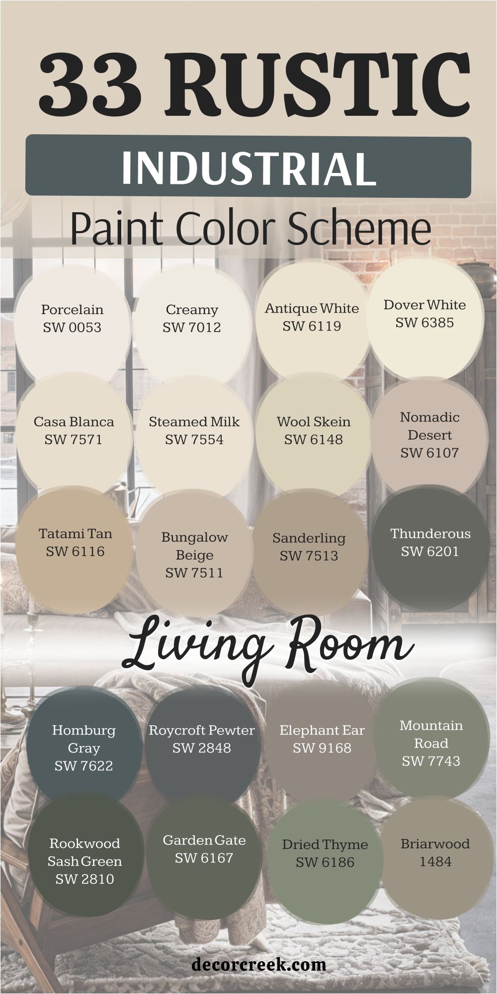
My Final Thoughts About 41 Industrial Design Paint Color Ideas
Industrial design has undergone a profound transformation, moving far beyond its origins as a cold, utilitarian collection of gray concrete walls and exposed mechanical pipes to become a sophisticated philosophy centered on the raw honesty and structural beauty of materials. By strategically utilizing “bridge” shades such as Accessible Beige SW 7036 or Revere Pewter HC-172, you can effectively neutralize the inherent harshness of cold steel and polished concrete, resulting in a living environment that feels genuinely inviting and cozy without ever stripping away its authentic industrial soul.
This evolution is further enriched by the thoughtful integration of deep, organic tones—such as the misty Evergreen Fog SW 9130 or the sun-baked, earthy Canyon Clay SW 6054—which weave together the free-spirited essence of Boho and the rugged charm of Rustic styles, ultimately making the interior feel significantly more multidimensional, curated, and lived-in rather than merely staged.
The true hallmark of a masterfully designed industrial space lies in the delicate execution of balance: while commanding dark accents like Black Fox SW 7020 or Urbane Bronze SW 7048 serve to sharpen architectural silhouettes and celebrate the strength of metal fixtures, the presence of warm, creamy neutral bases acts as the essential glue that binds together disparate elements like reclaimed wood, aged leather, and soft woven textiles.
This intentional layering ensures that the visual weight of the room remains grounded while still feeling airy and spacious. Ultimately, a meticulously curated color palette possesses the power to transform a space that once felt like a sterile warehouse or a forgotten factory into a high-end modern sanctuary—a place where the rigid, mechanical aesthetics of the industrial age harmoniously and beautifully coexist with the undeniable necessity of domestic warmth, tranquility, and everyday comfort.